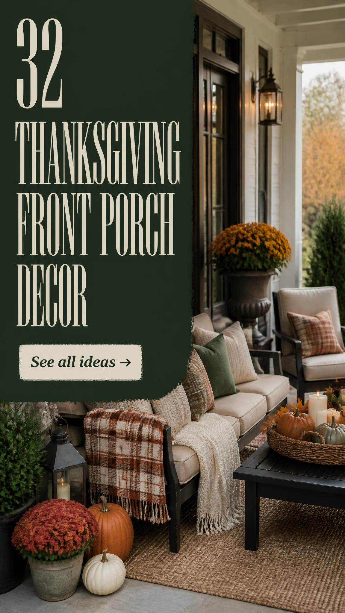
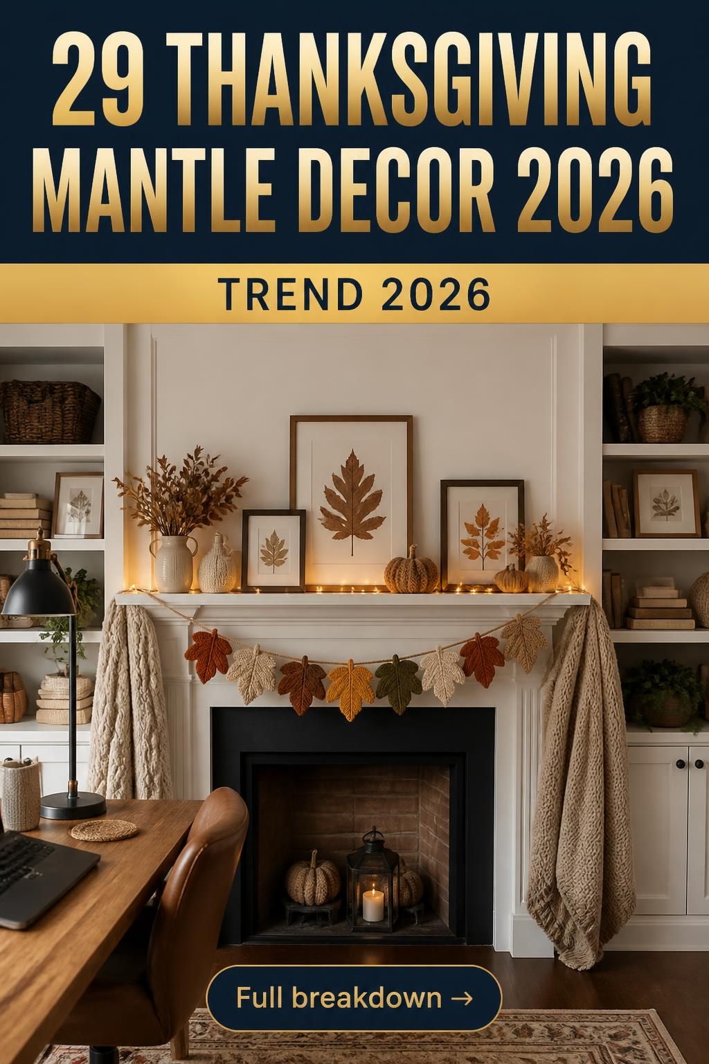
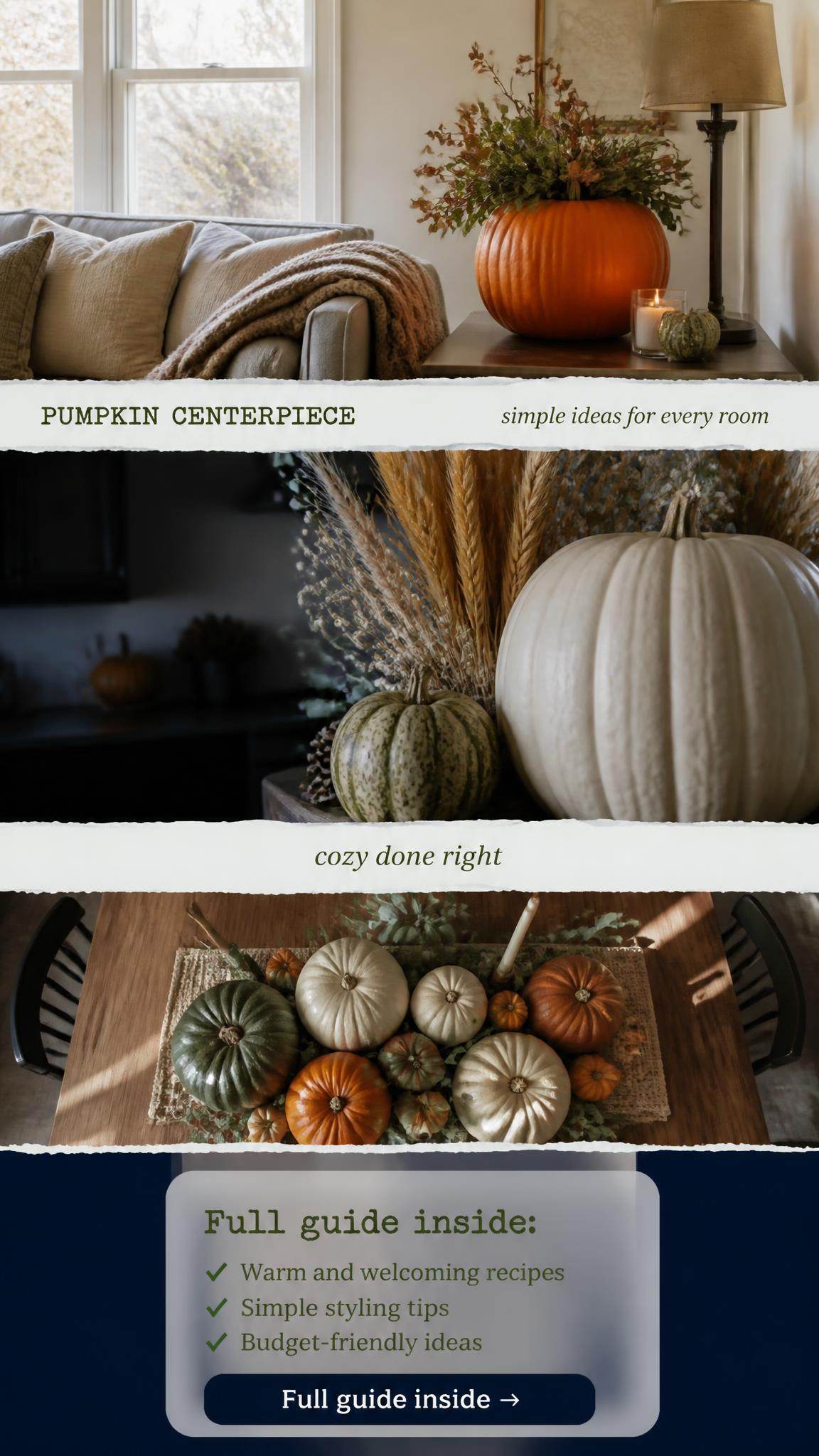
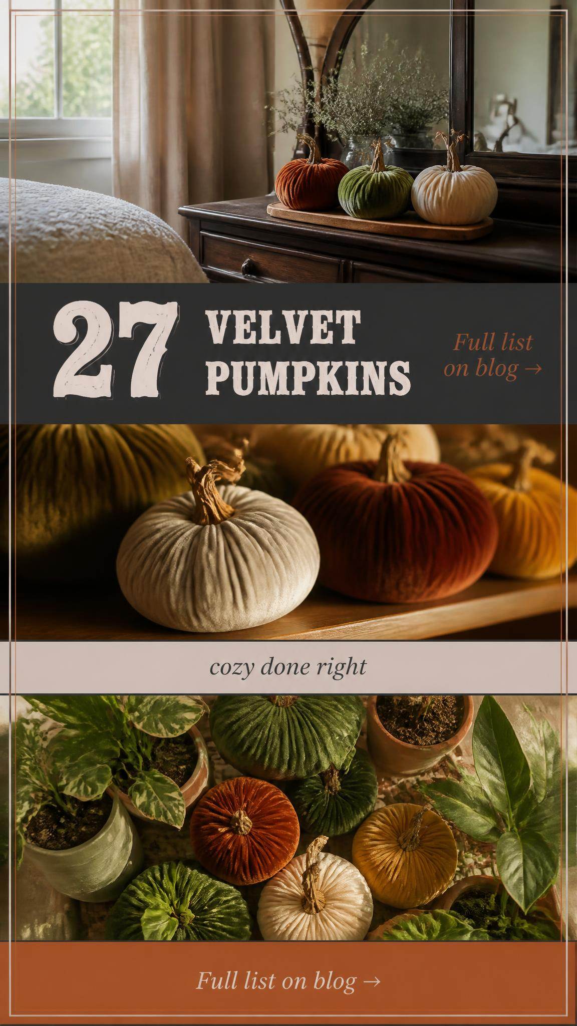
You know that feeling? You’ve scrolled through hundreds of neutral fall decor pins, but nothing feels quite right for your actual home. It’s a specific kind of inspiration fatigue. But what if the perfect, cozy, not-trying-too-hard fall vibe was just a few curated ideas away? We’ve done the deep dive for you, filtering through options at places like Target, Crate & Barrel, and even thrift stores to find what works right now. This isn’t just another photo dump; it’s a playbook of 32 distinct, achievable ideas for bringing warm, neutral fall style into your home, covering everything from rustic farmhouse to modern minimalist looks. We’re talking about the calming, nature-inspired aesthetic that continues to dominate home design in 2026 because it grounds us. And stay until the end — we break down the most common mistakes that can ruin these looks. Pin this guide for later — your future self will thank you when it’s time to actually decorate.
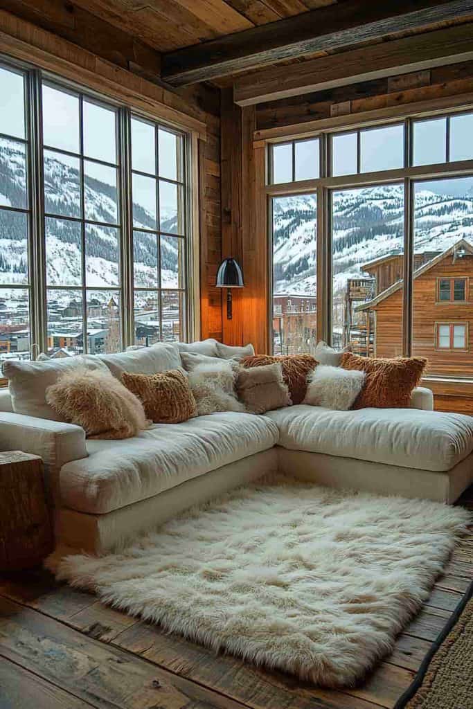
1. Cozy Mountain Retreat with Layered Neutral Textures
This look is all about mastering the art of layering textures within a tight color palette. The success here comes from the sheer variety: the plushness of the faux fur rug, the fluff of the pillows, the rustic roughness of the wood planks on the walls and ceiling, and the cool smoothness of the glass windows. It creates a rich sensory experience without using a single bright color. The massive windows also play a key role, essentially making the snowy mountain landscape a piece of dynamic, large-scale art that brings the outdoors in, preventing the wood-clad room from feeling too dark or enclosed.
🔧 How-To Brief
When you’re dealing with a large sectional sofa, the key to making it look styled (and not just like a pillow graveyard) is to create visual triangles. Start with your largest pillows in the corners—think 24×24 inches. Then, layer a smaller 20×20 or 22×22 inch pillow in front of each. Finish each grouping with a lumbar pillow in a contrasting texture, like a chunky knit or a fuzzy bouclé. This creates depth and keeps the arrangement from looking flat. Don’t be afraid to mix and match textures, as long as they stay within your neutral color family.
2. Calm Living Space with Natural Stone and Terracotta
The visual recipe here is surprisingly simple and effective for achieving a grounded, earthy feel. Think of it as 60% foundational textures, 30% soft upholstery, and 10% natural accents. The 60% is your non-negotiable backdrop: the natural stone wall and warm wood beams. The 30% comes from the large, light beige sectional and soft pillows that prevent the hard surfaces from feeling cold. The final 10% is the terracotta and ceramic vases with greenery, which inject just enough color and life to animate the space. You could swap the beige sofa for a light gray one and the terracotta for aged brass, and the formula would still hold.

⭐ The One Thing
An exposed natural stone wall is an absolute dream, but it’s important to be realistic about living with one. They can make a room feel significantly darker, as the uneven surface absorbs more light than a smooth, painted wall. You’ll likely need to compensate with more robust lighting, both ambient and task. Also, depending on the type of stone and how it’s sealed, it can be a real dust collector. It’s not a deal-breaker, but be prepared for a bit more maintenance than simple drywall.
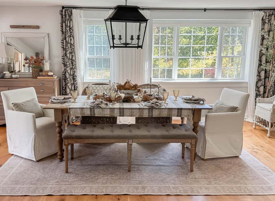
3. Autumnal Dining with a Neutral Plaid Tablecloth
The single element holding this entire scene together is the neutral plaid tablecloth. Take it away, and you have a perfectly nice, but season-less, dining room. The tablecloth does all the heavy lifting: it introduces a subtle autumnal pattern without screaming “fall,” adds a layer of softness to the hard wood table, and provides the perfect neutral backdrop for the centerpiece of pumpkins and gourds. It’s the textural and visual anchor that says “cozy gathering” and instantly warms up the combination of white slipcovers and a gray bench.
⚠️ Real Talk
- Dining Table & Seating: $1,500 – $4,000
- Chandelier: $300 – $800
- Table Linens (tablecloth, napkins): $100 – $250
- Decor (centerpiece, pumpkins, gourds): $75 – $200
- TOTAL: $1,975 – $5,250
- Budget alternative: Find a similar dining set on Facebook Marketplace (~$500), use a budget-friendly tablecloth from Target or HomeGoods (~$30), and use real mini pumpkins and gourds from a local farm or grocery store (~$20) for a total look under $600.
4. A Moody Fall Vignette with Gourds and Candlelight
This is a perfect example of how to create a beautiful, small-scale fall moment on any surface. You can build a similar vignette in about 10 minutes for under $40. Here’s how:
- Start with a base. A simple round tray, like this dark gray one, defines the space and makes the arrangement feel intentional. A cutting board or a stack of coffee table books also works.
- Introduce height. The lit candle in the smoky brown glass holder is the tallest element, creating a focal point.
- Add your main subject. Cluster a handful of small ornamental gourds in various colors and shapes around the candle. Don’t arrange them too perfectly.
- Incorporate a natural element. A single branch of dried leaves—magnolia, oak, or eucalyptus—adds an organic, slightly wild shape that breaks up the roundness of the gourds.
- Check your balance. Step back and ensure the elements feel balanced but not perfectly symmetrical. Done!

|
📋 Copy HEX 🔗 Share |
📐 Style Math
Using real ornamental gourds and pumpkins for your fall decor is a lovely, authentic touch, but they don’t last forever. In a typical indoor environment, you can expect most varieties to last for a few weeks to a couple of months before they start to soften or show signs of decay. To prolong their life, keep them in a cool, dry spot away from direct sunlight. For a zero-maintenance option that you can reuse every year, invest in high-quality faux gourds. The initial cost is higher, but they pay for themselves after a season or two.
5. Stone Fireplace with a Deep Green Garland
The magic here is in the powerful use of contrast. The rough, light cream color of the stone provides a beautiful textured backdrop that makes the dark elements pop. The nearly-black mantel acts as a strong horizontal line, grounding the arrangement, while the deep green of the garland provides a rich, natural color that feels lush and autumnal. The final touch is the textural contrast between the hard stone, smooth mantel, woven basket, and soft brown blanket. Each material makes the others look more interesting. Compare this with the dark shiplap fireplace in Idea #21 to see a different approach to contrast.

🧹 Maintenance Reality
You don’t need a custom-built stone fireplace to get this cozy, rustic vibe. You can create a surprisingly convincing look for a fraction of the cost. Start with a basic fireplace surround from a big-box store or even a simple DIY box frame. Apply a high-quality, peel-and-stick stone veneer (around $10-$20 per square foot). For the mantel, use a simple stained pine or poplar board. Find a realistic-looking faux garland from a craft store like Michaels or JOANN, which you can often get for under $50 with a coupon. The entire project can be done for under $400.
6. Rustic Living Room with a Sunburst Mirror Gallery Wall
Hanging a gallery wall can feel intimidating, but the trick is to start with a large anchor piece and build around it. In this case, it’s the sunburst mirror. Place your largest piece slightly off-center on the wall. Then, lay out all your other frames on the floor to figure out an arrangement you like before putting any nails in the wall. A good rule of thumb is to keep the spacing between frames consistent, usually around 2-3 inches. Mix horizontal and vertical orientations, and don’t be afraid to combine different frame materials and art styles to create a collected, personal look.

🎯 What Makes It Work
The curated gallery wall is a trend with serious staying power because it’s the antithesis of generic, mass-produced art. It’s a form of storytelling. In an age of digital photo streams, creating a physical collection of art, photos, and objects on your wall feels personal and intentional. The inclusion of pieces like the sunburst mirror, alongside more traditional prints, shows a move towards mixing media and creating displays that reflect individual personality rather than a single, rigid design style. It’s your home’s personal Pinterest board, brought to life.
7. A Dough Bowl Centerpiece with a Large Woven Pumpkin
While every element in this centerpiece is lovely, the single item that truly makes it special is the oversized woven pumpkin. Its texture is a perfect counterpoint to the smooth wood of the dough bowl, and its scale is what gives the arrangement presence and stops it from looking dinky. If you swapped it for a few smaller pumpkins, the effect would be much less impactful. It serves as the undeniable focal point, with the greenery and pinecones acting as its supporting cast. This piece understands that in neutral decor, texture and scale have to do the work that bright color does elsewhere.

💡 Designer Tip
A long, substantial centerpiece like this works best on a dining table that is at least 72 inches long, in a room with at least 120 square feet of space. On a smaller table, it would feel overwhelming and leave no room for actual place settings. For a round table or a smaller rectangular one (48-60 inches), you’d want to scale down. Instead of the long dough bowl, opt for a round tray and use one large woven pumpkin as the central focus, surrounded by a few smaller decorative items. The principle of a textural anchor remains the same, just adjusted for the surface area.
8. Autumn Table Glow with Pillar Candles and Pumpkins
This cozy scene is a masterclass in atmospheric balance. The formula is approximately 50% dark foundation + 30% warm light + 20% natural accents. The dark wooden table and the brick fireplace in the background create a moody, rich base. The warm glow from the white pillar candles and the yellow throw blanket provide the light and life, cutting through the darkness. The final 20% comes from the organic shapes and colors of the pumpkins, gourds, and scattered leaves, which add autumnal character. Remove any one of these elements, and the scene loses its magic balance.

🔥 Trending Context
An arrangement with multiple open-flame pillar candles is undeniably beautiful, but it requires vigilance. Never, ever leave lit candles unattended, especially when surrounded by flammable materials like dried leaves. Always place them on a stable, heat-resistant surface and ensure they are far from any drafts, curtains, or curious pets and children. For a worry-free alternative that gives you 90% of the look, use high-quality flameless LED pillar candles. Many now have realistic flicker effects and can even be controlled with a remote. You get all the ambiance with none of the risk.
9. Bright, Open-Concept Room with Gold and Wood Accents
Before you commit to a bright, open-concept design like this, run through this quick checklist:
- Do you have a unified flooring material? Using the same hardwood throughout helps connect the different zones (living, dining) and makes the entire space feel larger and more cohesive.
- What is your core color palette? This look relies on a very tight palette of white, warm wood, and black, with gold as the single metallic accent. Sticking to it is crucial for a serene, uncluttered feel.
- Have you planned your lighting zones? Notice the separate pendant over the dining area. Defining zones with dedicated lighting is key in an open plan.
- Is your furniture scaled correctly? In a large, open room, small furniture can look lost. The substantial sofa and large ottoman are appropriately scaled for the space.

✅ Before You Start
This space feels so harmonious because it uses repetition to create a visual rhythm. The warm wood tone of the ceiling beams is repeated in the legs of the dining chairs and the flooring. The black of the dining chairs is echoed in the frames of the gallery wall art. The curved shape of the dining chairs is subtly mirrored in the rounded corners of some of the art pieces. This repetition of color, material, and shape guides your eye through the space and makes the different functional areas feel like they belong together, creating a polished and intentional design.
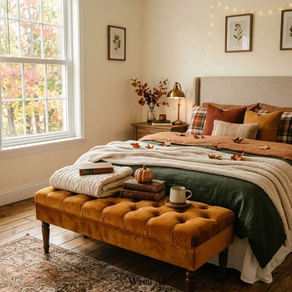
10. A Cozy Bedroom with Green, Rust, and Plaid Bedding
Creating this layered, cozy bedroom look involves several key pieces. Here’s a potential cost breakdown:
- Upholstered Bed/Headboard: $400 – $1,500
- Bedding (duvet, sheets, plaid blanket): $250 – $700
- Amber Velvet Bench: $150 – $400
- Lighting & Decor (lamp, art, string lights): $100 – $300
- TOTAL: $900 – $2,900
- Budget alternative: Keep your existing bed, but get the look with a new rust-colored duvet set from Target (~$70), a plaid throw from Amazon (~$25), and find a vintage bench to reupholster in amber velvet (fabric cost ~$50) for a total refresh under $200.
|
📋 Copy HEX 🔗 Share |
💰 Budget Breakdown
A velvet bench is a fantastic way to add a touch of luxury and rich color to a room, but it requires a bit of specific care. Velvet has a ‘pile’ (the raised surface of the fabric), which can get crushed or marked easily. It’s also a magnet for dust, lint, and pet hair, so regular vacuuming with an upholstery attachment is a must. For spills, blot immediately with a dry cloth; don’t rub. While durable, it’s not the most carefree choice for a home with young kids or pets who might see it as a prime scratching post or climbing gym.
11. A Playful Stack of Textured Fabric Pumpkins
You can absolutely get this charming, textured look without spending a fortune on designer fabric pumpkins. This is a classic DIY project! You can find countless tutorials online for making pumpkins out of old sweaters, velvet scraps, or affordable fabric from a craft store. A few bags of poly-fil, a needle and thread, and some real pumpkin stems (or twigs from the yard) are all you need. You could recreate this entire stack of three for less than $20 in materials, allowing you to customize the colors and textures perfectly to your decor.

📏 Scale Guide
that makes this simple arrangement so delightful is the stark contrast in textures. You have the fuzzy, almost cartoonish softness of the bright orange pumpkin sitting directly on top of the smooth, light-absorbing velvet of the olive green and rust pumpkins. This textural play is what makes your eye linger. It creates visual interest that is far more powerful than if they were all made of the same material. It’s a great reminder that when working with neutrals or a simple color scheme, texture is your most powerful tool.
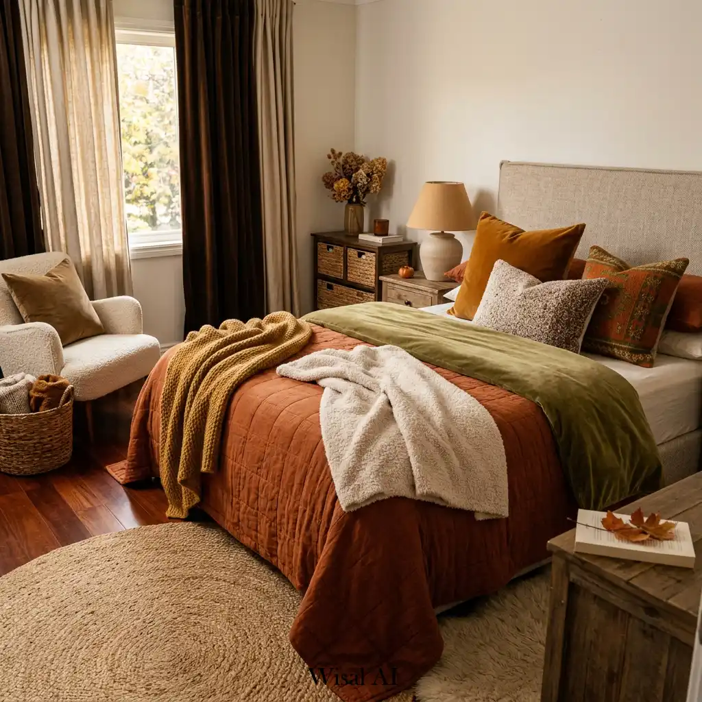
12. Bedroom Layered in Rust, Olive, and Cream Textiles
The color formula for this perfectly autumnal bedroom is all about warm, earthy balance. It breaks down to roughly 50% Cream/Beige, 30% Rust/Terracotta, and 20% Olive Green. The cream acts as the bright, neutral base on the walls, headboard, and sherpa blanket, keeping the room from feeling too dark. The rust is the star player, bringing in that undeniable fall warmth via the quilted bedspread. The olive green, used as a rich accent on the velvet throw, is the perfect complementary color to the rust, making both hues appear richer and more saturated. This is a deeper, more saturated take on the bedroom in Idea #10.
💸 Get This Look For Less
To get that effortlessly layered, ‘casually tossed’ look on a bed, there’s a specific method. Start with your main coverlet or duvet. Then, fold your next layer—like the olive green velvet throw here—in thirds lengthwise and lay it across the bottom third of the bed. Finally, take your chunkiest, most textured blanket (the cream sherpa), and don’t fold it at all. Pinch it in the middle and drape it diagonally across one of the bottom corners of the bed. It should look relaxed and inviting, not perfectly neat and tidy.
13. Mid-Century Lounge with Brass and Greenery
Mid-century modern design continues to be popular well into the 2020s for a reason: its principles are timeless. The focus on clean lines, natural materials like wood, and functionality over fussiness feels incredibly relevant today. This room is a perfect example. The dark wood of the chairs and credenza has a warmth and character that newer materials often lack. As our lives get more cluttered and digital, there’s a collective craving for homes that feel calm, organized, and connected to nature—all hallmarks of the mid-century aesthetic.

🔧 How-To Brief
A combined dining and lounge area like this works best in a room that’s at least 15 feet by 20 feet (300 sq ft). You need enough space to allow for comfortable traffic flow around both the dining table and the lounge seating. The key is to create distinct zones without walls. The area rug under the lounge chairs clearly defines that space, while the chandelier centers the dining area. For this to work, you also ideally need ceilings that are at least 9 feet high to accommodate a statement pendant light without it feeling cramped.
14. Intimate Tabletop Display with a Black Metal Lantern
This moody little vignette is easy to replicate on a side table or console. It should take you less than five minutes. Here’s the step-by-step:
- Lay your foundation. The round woven mat adds texture and defines the zone for your decor.
- Place your hero item. The black metal lantern is the tallest and most visually dominant piece. Position it slightly to the back and off-center.
- Add a contrasting shape and material. The ribbed dark ceramic vase offers a different texture and a more organic shape. Place it next to the lantern.
- Bring in nature. Tuck a small variegated plant or some dried stems into the vase.
- Scatter the small details. Arrange the little gourds in a casual cluster in the foreground, letting them spill off the mat slightly to look more natural.

⭐ The One Thing
That warm, orange glow from the lantern is key to the cozy mood here. While a real candle is always an option (with the usual safety precautions), consider the color temperature of your light source if you opt for an LED. Many basic LED candles emit a cool, slightly blueish light that can kill the cozy vibe instantly. Look specifically for ‘warm white’ or ‘amber glow’ LED candles. They often cost a dollar or two more, but they do a much better job of mimicking the color and flicker of a real flame, which is essential for achieving this autumnal ambiance.
15. Braided Straw Pumpkins on a Wooden Cutting Board
The star of this show is undoubtedly the braided texture of the pumpkins. In a world of velvet and fabric pumpkins, the natural, rustic feel of braided straw is a refreshing change. It introduces a handcrafted, slightly rustic element that feels authentic and warm. The texture does all the work here, creating visual interest and depth in a very simple, monochromatic arrangement. Without that specific woven detail, this would just be a couple of beige shapes on a board; with it, it’s a thoughtful, textural still life.

⚠️ Real Talk
This arrangement is a fantastic lesson in the power of monochromatic texture. The entire color palette is just shades of brown and beige—the light beige of the smaller pumpkin, the medium brown of the larger one, the dark wood of the cutting board, and the off-white of the mug. Because the colors are so similar, your eye is forced to notice the differences in texture instead: the tight braids of the straw, the smooth grain of the wood, the glossy finish of the ceramic, and the soft fringe of the textile. It’s a sophisticated way to create a rich look without using any color.
16. Fall Console Table with a Glowing Pumpkin Lantern
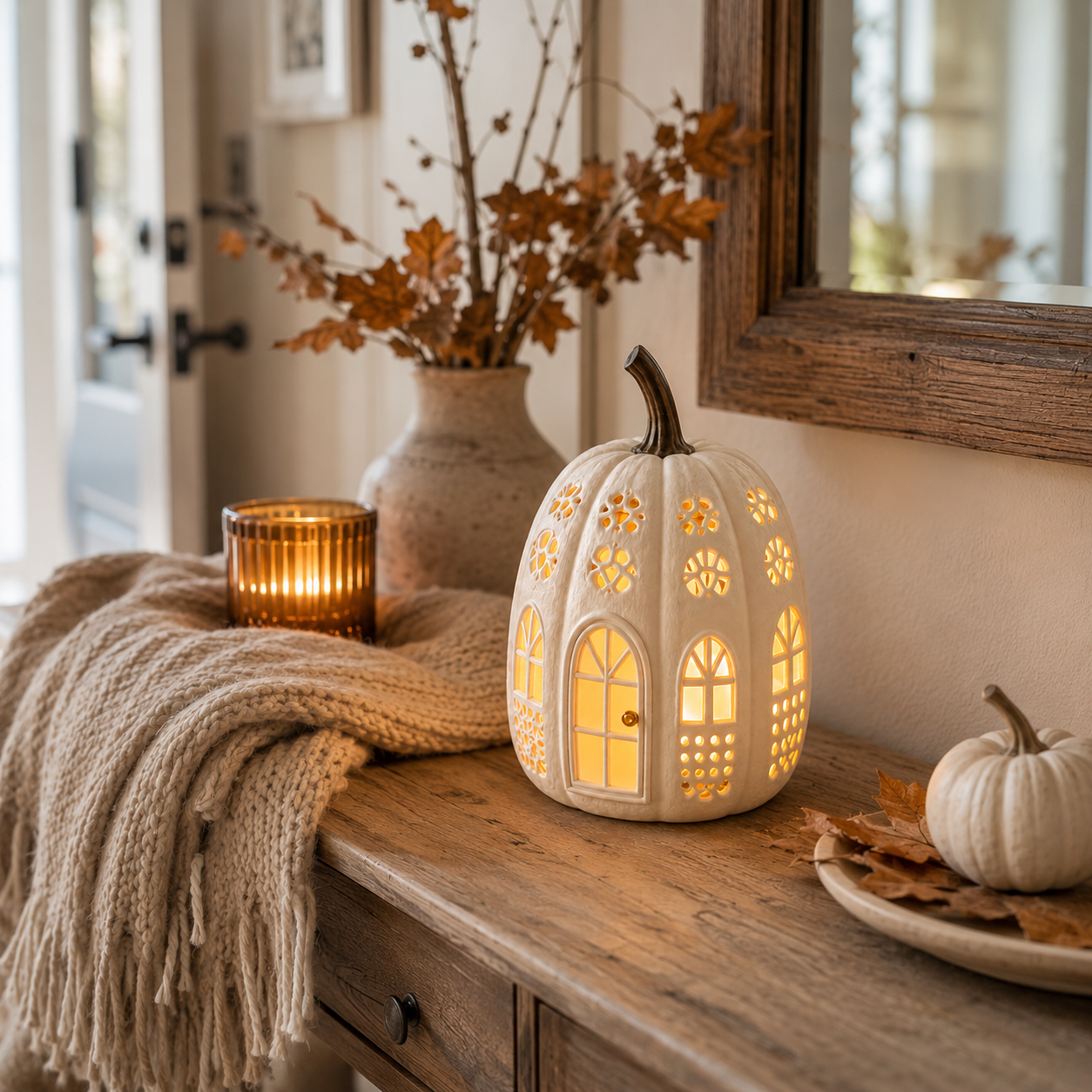
Styling a console table effectively often comes down to the classic ‘rule of thirds’ and varying heights. Imagine the table is divided into three sections. In the left third, you have the tall vase with foliage. In the right third, you have the low tray with small items. The center is anchored by the mid-height pumpkin lantern and candle. The chunky knit throw is draped asymmetrically to break up the straight lines and connect all three zones. This formula—tall, medium, and low—creates a balanced and visually pleasing arrangement that looks curated, not cluttered. It’s a much more formal approach than the simple table in Idea #31.
📐 Style Math
A solid wood console table can be a real investment, but you can achieve this rustic, cozy look on a much smaller budget. Keep an eye on Facebook Marketplace or your local thrift stores for a simple sofa table or console, even if the finish isn’t perfect. A quick sanding and a coat of dark walnut stain or even chalk paint can completely transform it for under $30. For decor, stores like HomeGoods and T.J. Maxx are goldmines for seasonal items like ceramic pumpkins and amber glass candle holders at a fraction of the price of specialty decor shops.
17. Desktop Decor with a Wooden Clock and Small Pumpkins
The formula for a perfectly styled small surface like a desktop or shelf is about balancing function and beauty. Think of it as: 40% Greenery + 30% A Functional Object + 20% Seasonal Accents + 10% Personal Touch. Here, the plant in the white pot provides the living, green element. The wooden clock is the functional piece. The miniature pumpkins and dried orange slice are the clear seasonal nod. The woven brown ball adds a final touch of texture and personality. This recipe ensures the surface feels decorated and intentional, but still practical.

🧹 Maintenance Reality
Introducing a live plant into your fall decor is a wonderful way to add life and a pop of natural color. However, as the days get shorter and the light becomes less intense in the fall and winter, you may need to adjust your care routine. The plant might need less water than it did in the summer, as its growth slows down. Be careful not to overwater, which can lead to root rot. If your home gets particularly dry from heating, consider lightly misting the leaves every few days to keep the plant happy.
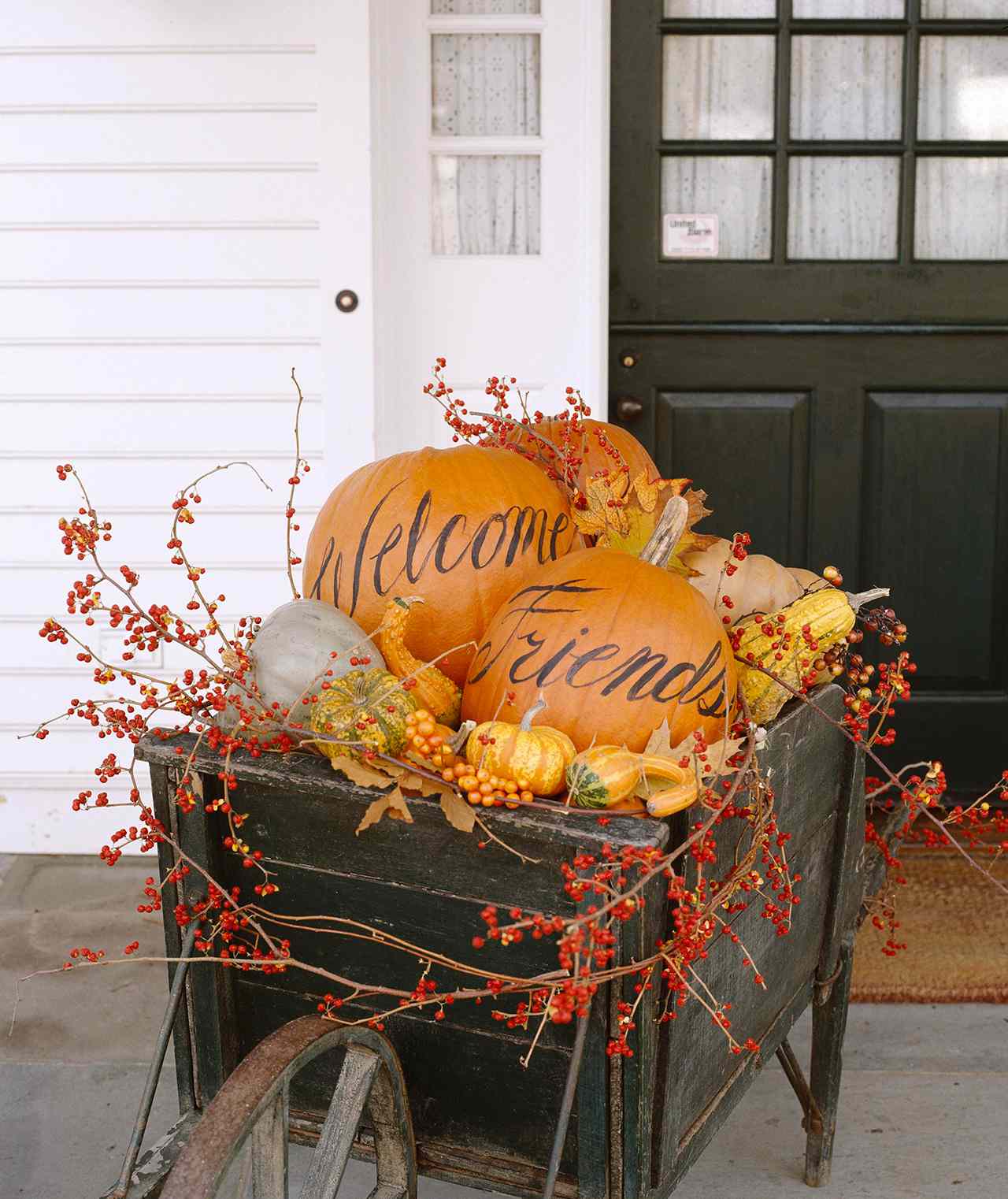
18. Serene Bedroom with a Wooden Slat Headboard
The defining feature of this calm, minimalist bedroom is the wooden slat headboard. It is the perfect synthesis of modern lines and natural warmth. It provides architectural interest and texture without the softness (and potential dust) of an upholstered headboard. It acts as a focal point that is both striking and serene, setting the tone for the entire room. The clean vertical lines draw the eye upward, while the warm wood grain prevents the neutral space from feeling sterile. It’s a statement piece that whispers instead of shouts.
🎯 What Makes It Work
This space feels so successful because it perfectly balances clean, hard lines with soft, welcoming textures. The strong vertical lines of the slat headboard and the sharp angles of the bedside table are juxtaposed with the plush, layered bedding, the gentle curve of the round mirror, and the organic shape of the dried branches. This interplay between hard and soft, straight and curved, is what creates a dynamic yet peaceful atmosphere. It’s a room that feels both organized and deeply comfortable at the same time.
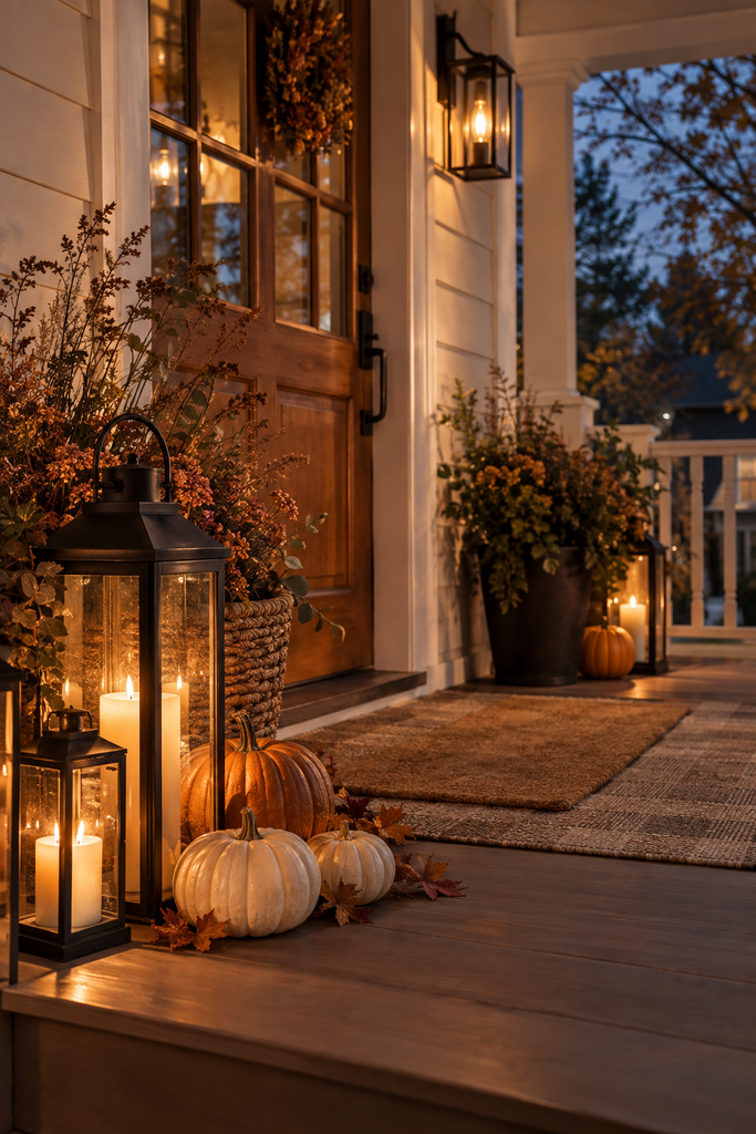
19. A Welcoming Fall Porch with Lanterns and Pumpkins
Creating this abundant, layered porch look requires a mix of items. Here’s a possible budget:
- Black Metal Lanterns (set of 2-3): $80 – $250
- Assorted Real Pumpkins: $40 – $100 (depending on size and variety)
- Fall Wreath for Door: $50 – $150
- Potted Foliage/Mums: $30 – $75
- Layered Doormats: $40 – $80
- TOTAL: $240 – $655
- Budget alternative: Purchase lanterns at end-of-season sales for next year. Get pumpkins from a local farm stand for better prices. Make your own wreath with a grapevine base and foraged materials. This could bring the total cost down to under $100.
💡 Designer Tip
An inviting fall porch is a joy, but it’s important to choose materials that can stand up to the elements. Not all decor is made for outdoor use. Many faux pumpkins and foliage will fade quickly in direct sunlight. Wreaths made with hot glue can fall apart on a hot afternoon. Textiles like doormats and pillows should be specifically rated for outdoor use to resist mildew and fading. And if you’re using lanterns with real candles, ensure they are well-protected from wind and never place them where they could be knocked over by a delivery or a gust of wind.
20. Vibrant Fall Wreaths on Deep Blue Double Doors
When you have double doors, the rule for wreaths is simple: go for a matched pair. Using two identical wreaths creates a pleasing symmetry that enhances the formal architecture of the double doors. As for size, a good guideline is that the wreath’s diameter should be about two-thirds the width of a single door. Any smaller, and the wreath will look undersized and lost; any larger, and it will overwhelm the door. These wreaths are perfectly scaled, making a bold statement without looking cartoonish.

🔥 Trending Context
This look is a masterclass in using complementary colors. The deep, cool blue of the doors and the warm, vibrant orange of the pumpkins and berries sit opposite each other on the color wheel. Placing them together makes each color appear more intense and vibrant. The blue makes the orange look warmer, and the orange makes the blue look richer. The neutral grapevine, green foliage, and black-and-white ribbon act as grounding elements that keep the bold color combination from being overwhelming. It’s a sophisticated, high-impact color strategy.
21. A Cozy Fireplace Nook with Wheat and Pumpkin Decor
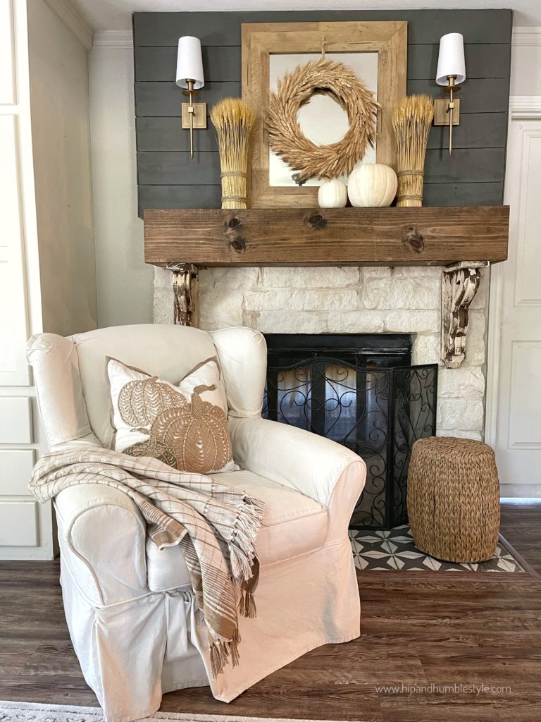
This cozy corner follows a refined rustic formula: 60% Light Neutrals + 30% Dark Accents + 10% Metallics. The 60% is the calming base of the white slipcover chair, light stone fireplace, and white pumpkins. The 30% comes from the dark grey shiplap and the rich wood mantel, which add depth and drama. The final 10% is the warm glow of the brass sconces, which brings a touch of elegance and prevents the grey and white from feeling too cold. This precise balance is what makes the nook feel both airy and snug. Notice how the dark shiplap creates a more dramatic focal point than the light stone in Idea #5.
✅ Before You Start
To create a dedicated reading nook like this that feels generous and not cramped, you’ll want a corner with at least 5×5 feet (25 sq ft) of clear floor space. This allows for a comfortable armchair (typically around 30-35 inches wide and deep), a small ottoman or side table, and enough room to walk around it comfortably. The key is that it feels like its own destination, not just a chair shoved into a corner. If your space is smaller, you can achieve a similar feel by placing a comfy chair next to a fireplace without the ottoman.
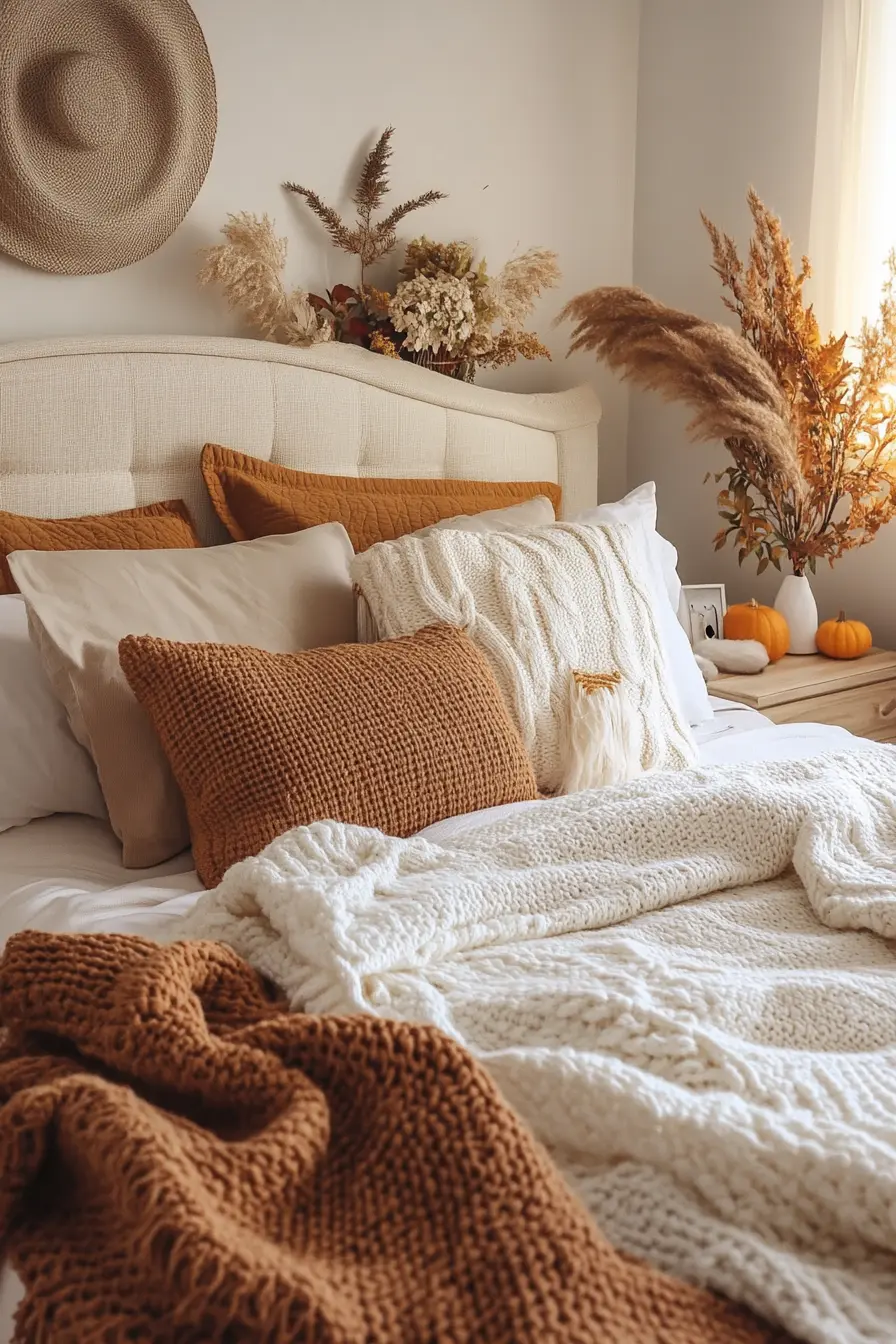
22. Bedroom with Tufted Headboard and Dried Pampas Grass
The single element that elevates this bedroom from simply ‘cozy’ to ‘on-trend autumnal’ is the dramatic spray of dried pampas grass and botanicals behind the headboard. It adds height, organic texture, and a wild, slightly undone beauty that contrasts perfectly with the neat, tufted headboard and layered bedding. It’s a large-scale gesture that feels both soft and architectural. Without it, the room would still be lovely, but it would lack that ‘wow’ factor, that one piece that makes you stop and look twice.
💰 Budget Breakdown
Pampas grass is stunning, but here’s the honest truth: it sheds. A lot. To minimize the fluff flying around your bedroom, there’s a trick. Once you’ve arranged your pampas stems exactly as you want them, take them outside and give them a generous coating of a strong-hold hairspray. This helps to set the delicate plumes and significantly reduces shedding. Even so, you’ll want to place them in a low-traffic area where they won’t be brushed against constantly. It’s a high-impact look, but it’s not entirely zero-maintenance.
23. Miniature Gourd Centerpiece on a Rustic Table
You don’t need a florist or a big budget to create a charming fall centerpiece. This entire look can be sourced from your local grocery store or a farmer’s market in October for less than $10. A bag of mixed miniature gourds and pumpkins is usually just a few dollars. Pair them with a simple tray you already own—a metallic one like this, a small wooden cutting board, or even a ceramic plate. It’s a great reminder that impactful seasonal decor doesn’t have to be expensive or complicated; sometimes the most authentic touches are the simplest.

📏 Scale Guide
Creating a quick, effortless centerpiece like this takes less than two minutes. It’s all about embracing imperfection.
- Start with a small tray or plate to contain your arrangement. This makes it feel intentional.
- Place your most interesting or colorful gourd slightly off-center. In this case, it’s the striped orange pumpkin.
- Cluster the remaining gourds around it. Don’t line them up; let them touch and overlap naturally.
- Add one non-gourd element for interest, if you have one. A few nuts in their shells, a sprig of dried herbs, or a single fall leaf would work beautifully.
- Step back. The goal is a casual, just-gathered look, not perfect symmetry.
24. Kitchen Counter Decor with Rust-Toned Leaves and Apples
This vignette works so well because of its incredibly disciplined color story. The palette is essentially just three colors: the clean white of the subway tile and crock, the warm brown of the wood cutting boards, and the rich rust-orange of the leaves. The red and yellow apples fit perfectly within this warm scheme. By keeping the color story so tight and simple, the arrangement feels cohesive and calming, rather than chaotic. It proves that you only need a few well-chosen hues to create a powerful seasonal statement.

💸 Get This Look For Less
Styling your kitchen countertops for the season is fun, but it’s a delicate balance. It’s easy to go from ‘charming vignette’ to ‘unusable, cluttered mess’. The key is to consolidate. Instead of scattering fall items all over the counter, group them together in one or two dedicated zones, as seen here. Use trays and cutting boards to contain your arrangements. This signals that these are ‘decor zones’, leaving the rest of your counter space free for actual cooking and prep. Always prioritize function in a kitchen; decor should be the accent, not the main event.
25. Rustic Mantel with Jute String Art and “FALL” Pumpkins
The standout element on this mantel is undeniably the large jute string art leaf. While the pumpkins and garland are classic fall fare, the string art provides a unique, handcrafted focal point that feels personal and creative. Its neutral color and rustic texture are perfectly in keeping with the theme, but its graphic quality and large scale set it apart from typical fall decor. It’s an unexpected choice that elevates the entire arrangement from predictable to memorable.
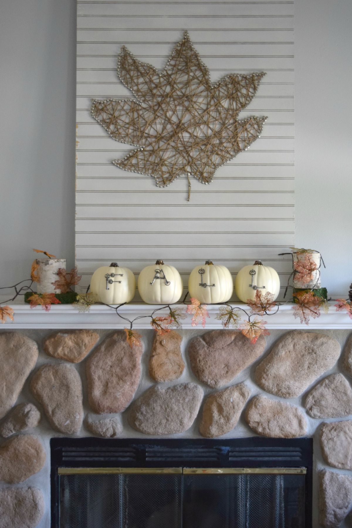
🔧 How-To Brief
When styling a mantel, layering is your best friend. Don’t just line things up in a single row. Start with a large, flat piece against the wall, like the striped panel and string art here. Then, place your tallest items on the mantel itself—in this case, the birch log candle holders. Next, add your medium-height objects, like the ‘FALL’ pumpkins. Finally, drape a garland along the front edge to add depth and connect everything together. This front-to-back layering creates a rich, dimensional look that has far more impact than a simple lineup.
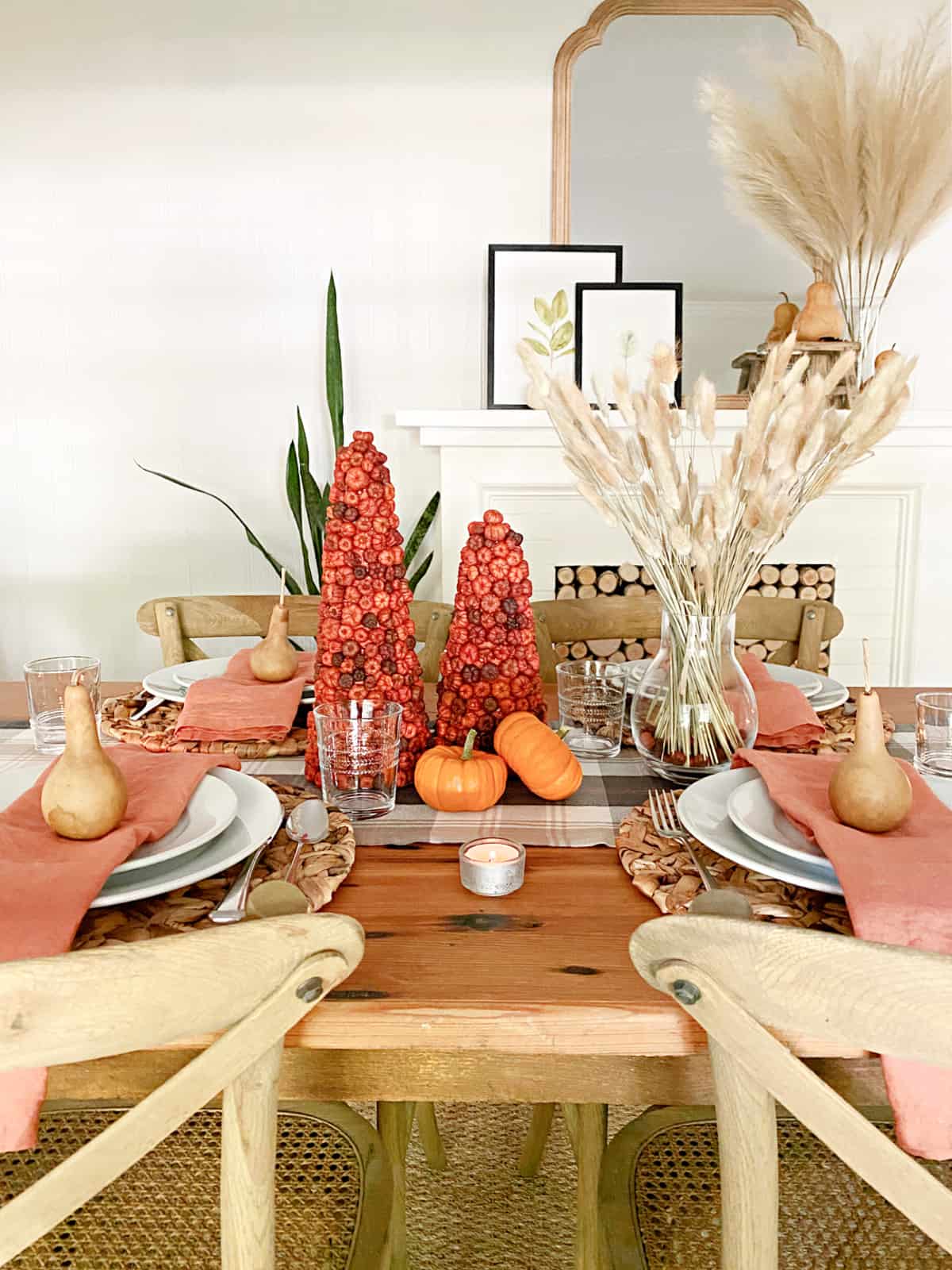
26. Dining Table with Berry Cones and Coral Napkins
This warm, inviting tablescape follows a simple harvest formula: 50% Rustic Wood + 30% Natural Textures + 20% A Single Bold Color. The rustic wood table provides the foundational warmth. The natural textures—woven placemats, plaid runner, dried pampas grass—add softness and complexity. The final, crucial 20% is the pop of vibrant coral/rust in the napkins and berry cones. This single, confident color choice brings the whole table to life and gives it a distinctly autumnal energy. It’s a more colorful approach than the neutral plaid table in Idea #3.
⭐ The One Thing
The use of dried grasses like pampas continues to be a huge trend because it taps into our collective desire for natural, sustainable decor. It’s part of the broader ‘biophilic design’ movement—the idea of bringing the outdoors in. Unlike fresh flowers, dried botanicals last for years, making them a more eco-friendly and budget-conscious choice. Their soft, feathery texture and muted, earthy tones are the perfect complement to a neutral fall palette, adding a touch of wild, organic beauty to structured interiors.
27. Serene Living Room with a Dried Grass Arrangement
This room is a perfect case study in how to execute a monochromatic color scheme without it being boring. The key is an obsessive focus on texture. Every major piece is a shade of cream or beige, but each has a distinct feel: the smooth fabric of the sofa, the bumpy texture of one pillow, the ribbed knit of another, the high pile of the area rug, the smooth wood of the coffee table, and the feathery softness of the dried grasses. Your eye stays engaged because it’s constantly discovering these subtle shifts in surface and material. It feels serene and sophisticated, not bland.
⚠️ Real Talk
A light neutral sectional sofa is beautiful, airy, and incredibly versatile, but it requires a commitment to maintenance. It will show dirt, spills, and pet hair much more readily than a darker color. If you have kids or pets, consider a sofa with removable, machine-washable cushion covers—it’s a game-changer. Alternatively, look for high-performance fabrics (like Crypton or Sunbrella) that are specifically designed to resist stains and be easy to clean. Regular vacuuming and immediate spot treatment of any spills are non-negotiable for keeping a light sofa looking fresh.
28. Airy Dining Space with Herringbone Floors and Brown Sofa
When hanging pendant lights over a dining table, scale and height are everything. A common mistake is hanging them too high. A good rule of thumb is that the bottom of the pendant should be 30-36 inches above the tabletop. This creates an intimate pool of light and connects the fixture to the table, defining the dining zone. For a large spherical pendant like this, you’ll need ceilings that are at least 9 feet high to ensure there’s still enough clearance above it for the room to feel spacious. In a room with 8-foot ceilings, a more flush-mounted fixture would be a better choice.

📐 Style Math
Floor-to-ceiling curtain panels are one of the most effective tricks in a designer’s playbook for making a room feel taller and more grand. To get this look, mount your curtain rod as high as possible—ideally 4-6 inches below the ceiling or crown molding. Extend the rod 6-12 inches beyond the window frame on each side. This makes the window appear wider and allows the panels to be pulled back completely, maximizing natural light. The curtains should just ‘kiss’ the floor or puddle slightly for a luxurious, tailored finish.
29. Modern Living Room with a Large Upholstered Ottoman
The single most important piece in this room is the large, upholstered ottoman. It’s a multitasking hero. It serves as a coffee table (with the addition of a tray), extra seating for a crowd, and a place to put your feet up. But most importantly, its substantial size and soft texture anchor the seating area and provide a comfortable counterpoint to the clean lines of the dresser and the large, cool-toned artwork. Swapping it for a traditional wood or metal coffee table would make the room feel significantly less inviting and comfortable.

🧹 Maintenance Reality
A large, custom upholstered ottoman can cost upwards of $1,000, but you can get this look for much less. First, check Facebook Marketplace for used ottomans. People often sell them when they buy a new sofa, and you can find great deals. If it’s the wrong color, you can have it reupholstered for a few hundred dollars or even try a DIY slipcover. Alternatively, you can build a simple plywood box frame and top it with high-density foam and batting, then upholster it yourself. It’s a weekend project that can save you a huge amount of money.
30. A Dramatic Dried Botanical Arrangement in a Window
Creating a dramatic dried floral arrangement like this one is about embracing asymmetry and bold shapes. It’s a 15-minute project.
- Choose your vessel. A tall, solid, neutral-colored vase like this white jug provides a stable and clean base that lets the botanicals be the star.
- Establish your height and shape. Start with your tallest, most structural branches. Place them in the vase and let them lean naturally to one side to create an asymmetric ‘L’ or crescent shape.
- Add your focal flowers. Insert the large, dark protea-like flowers low down in the arrangement, near the mouth of the vase. This grounds the arrangement.
- Fill in with texture. Use lighter, wispier grasses and smaller stems to fill in the gaps and add another layer of texture and color.
- Edit. Step back and remove any pieces that feel cluttered. Less is often more.

🎯 What Makes It Work
This arrangement is so effective because it uses the window as a natural frame and light source. Placing the dark, dramatic botanicals against the bright light coming from the window creates a beautiful silhouette effect. The light shines through the more delicate grasses, making them glow, while the solid forms of the gourds and vase are thrown into sharp relief. It’s a clever way to use natural light to add drama and highlight the different shapes and textures within your decor. The composition feels like a classic still life painting.
31. Classic Entryway with a Light Wood Staircase
An entryway is your home’s first impression, and the goal is to create an immediate sense of arrival and style. The key is to have a clear focal point. Here, the beautiful staircase and the large vase with branches serve that purpose. A simple console or pedestal table provides a ‘drop zone’ for keys or mail, but more importantly, a surface for decor. A large-scale piece of art or a mirror hung above the table can make a small entryway feel much larger. Finally, good lighting—either from a window or a beautiful fixture—is non-negotiable. This is a more formal and architectural take on an entry table compared to the rustic console in Idea #16.

💡 Designer Tip
This refined, classic look is built on a precise ratio of materials: 60% Warm Wood + 30% Off-White + 10% Black. The light oak of the staircase and herringbone floor creates a warm and inviting base. The off-white on the walls, trim, and vase provides a crisp, clean backdrop that reflects light and makes the space feel bright. The crucial 10% comes from the black balusters and the dark pedestal table, which act as graphic accents that ground the space and keep the wood and white from feeling washed out. This balance feels timeless and sophisticated.
32. Cozy Window Sill Display with Walnuts and a Candle
The single thing that transforms this from a simple arrangement into a magical, cozy moment is the light. It’s not just the candle; it’s the combination of the single flame inside the hurricane vase and the warm, diffuse glow from the string of rattan ball lights. This layering of light sources creates depth and an undeniable feeling of warmth and intimacy. The light catches the texture of the walnuts and the smooth skin of the gourds, bringing the whole simple display to life. Without the lights, it would be a nice, static display. With them, it has a heartbeat.

🔥 Trending Context
This look is the definition of beautiful on a budget. You can recreate this entire scene using items you might already have, or can get very cheaply. The hurricane vase could be a simple glass jar from your kitchen. The ‘filler’ around the candle doesn’t have to be walnuts; it could be acorns collected from the yard, dried beans from the pantry, or small pebbles. The gourds can be found at any grocery store in the fall for a few dollars. The only potential purchase is a string of battery-operated fairy lights, which are widely available for under $10 from places like Amazon or Target.
Your Coziest Fall Starts Now
And there you have it—32 ways to embrace the quiet, cozy side of fall with neutral decor that feels personal and warm. Don’t feel like you have to do it all; sometimes one perfect vignette or a new set of textured pillows is all it takes to shift the mood of your entire home. The best spaces are the ones that tell your story. Now go save your favorites to your Pinterest board and start creating a home that feels like a warm hug this season.