You know that feeling when you finally find the standing mirror idea that looks *exactly* right for your space? That little thrill of “that’s the one!” is what this guide is all about. After filtering through hundreds of looks across high-end retailers and budget-friendly spots like Target and IKEA, we narrowed it down to the ideas that actually deliver. We’re serving up 32 distinct ways to use a standing mirror, covering styles from modern minimalist to warm and eclectic. For 2026, it’s all about using mirrors to create architectural interest and bounce natural light, a shift driven by our collective desire for brighter, more functional homes. And stay until the end — we break down the most common mistakes that can ruin these looks. 📌 Save this to Pinterest for later — you’ll want to revisit these ideas.
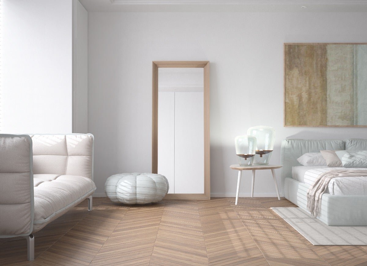
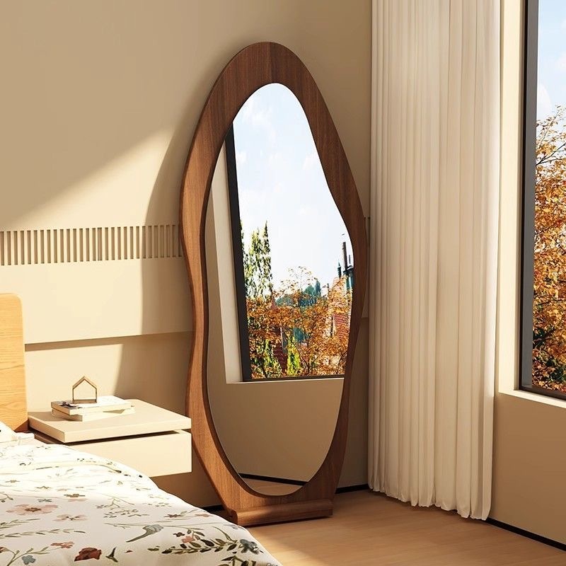
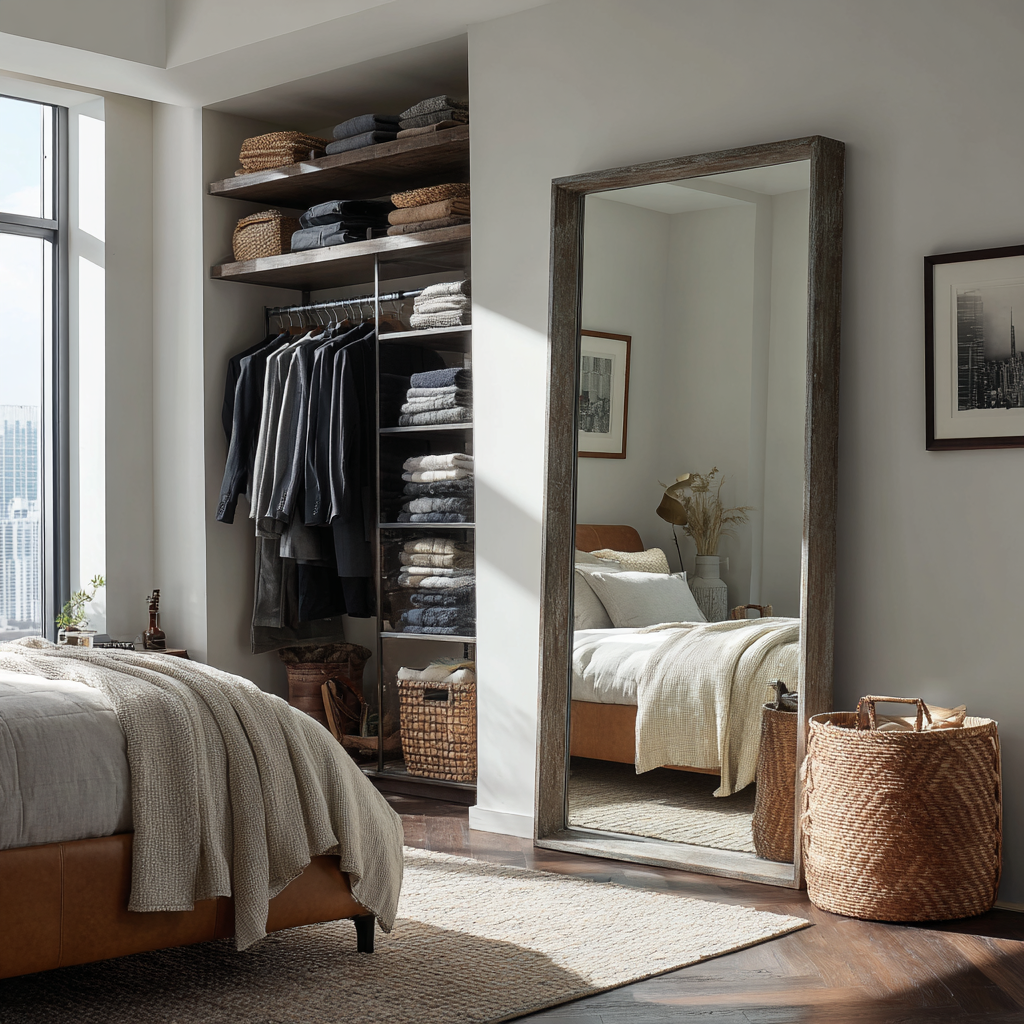
1. Use a Light Wood Mirror to Divide a Studio Space
What makes this setup so clever is how the mirror functions as more than just a place to check your reflection. It acts as a subtle, light-permeable room divider. Positioned between the sleeping and seating zones, it creates a sense of separation without closing off the space. The light wood frame harmonizes with the herringbone floors, while its reflection of the white walls and abstract art doubles the visual square footage and maintains the room’s bright, airy vibe. It’s a masterclass in multifunctional design for smaller or open-plan homes.
|
📋 Copy HEX 🔗 Share |
⭐ The One Thing
To perfectly replicate this look, the key is positioning. Place the mirror so it stands about two-thirds of the way across the line where you want to divide the space. For a standard 8-foot ceiling, choose a mirror that is at least 70 inches tall. This height is crucial for it to feel like a deliberate architectural element rather than just a floating accessory. Also, ensure the mirror is reflecting the brightest, least cluttered part of the room to maximize the sense of space and light.
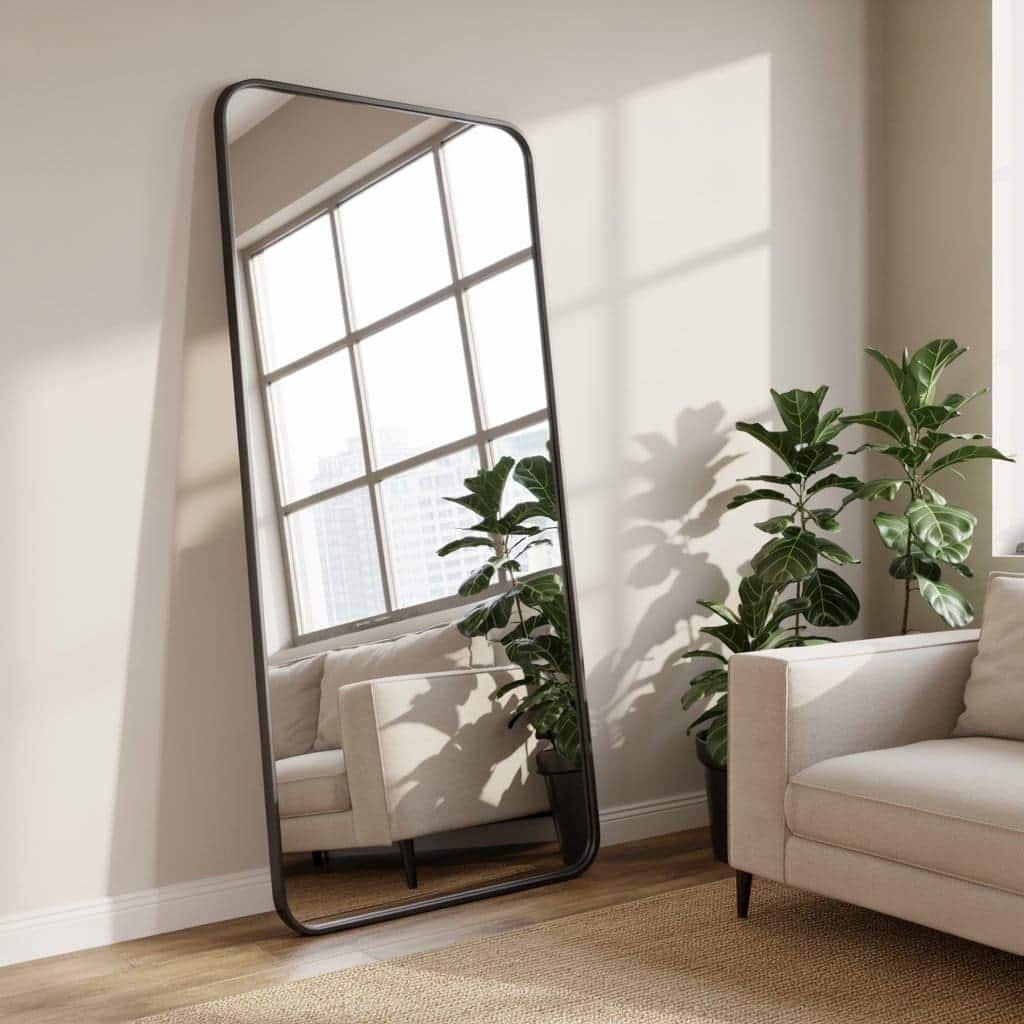
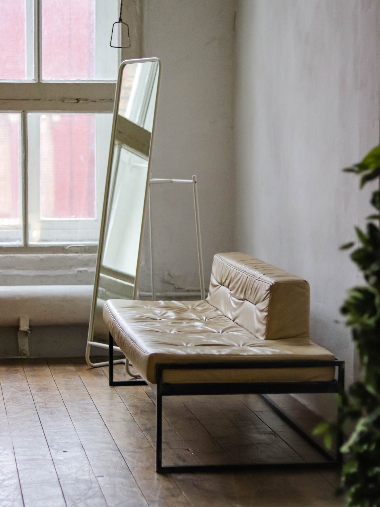
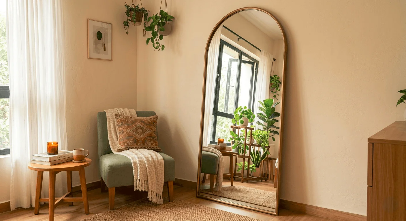
2. Let a Black-Framed Mirror Amplify Natural Light
that makes this corner magical is the mirror’s reflection. It’s not just reflecting a wall; it’s capturing and amplifying the beautiful, grid-like pattern of the large window. This move essentially doubles your natural light and brings the architectural detail of the window into the room as a piece of art. Without this specific reflection, the mirror would just be a simple black rectangle. With it, the corner becomes a dynamic play of light, shadow, and pattern that elevates the entire space. It’s a perfect example of using a mirror with intention.
|
📋 Copy HEX 🔗 Share |
💡 Designer Tip
This idea is ideal for rooms with at least 9-foot ceilings and a good source of natural light to reflect. It works best in a space that is a minimum of 12×12 feet, allowing the mirror to have breathing room without overwhelming the area. Placing a tall mirror like this in a smaller room (under 100 sq ft) can actually make the space feel more cramped. For smaller rooms, consider a leaner design like the one in Idea #7, which uses height without as much visual weight.
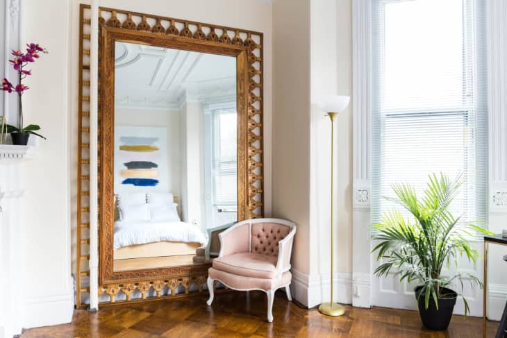
3. Pair an Ornate Gold Mirror with a Pop of Pink
Here’s a realistic look at what it takes to bring this elegant corner to life. The star of the show is the mirror, but the supporting cast is just as important for the overall effect.
|
📋 Copy HEX 🔗 Share |
📐 Style Math
- Main Furniture (Chair, Floor Lamp): $700 – $1,800
- Ornate Gold Mirror (Large): $600 – $1,500
- Textiles (Rug – not pictured but assumed): $300 – $800
- Decor/Accessories (Large Plant, Pot): $150 – $400
- TOTAL: $1,750 – $4,500
Budget alternative: Find a vintage mirror at a thrift store and gold-leaf it yourself. Source a similar pink chair from Wayfair or Facebook Marketplace, bringing the total cost down to around $700 – $1,500.
This look achieves its glamorous-yet-approachable feel through a balanced formula: 50% classic elegance (the ornate gold mirror, the wall molding), 30% modern fun (the tufted pink accent chair), and 20% natural texture (the herringbone wood floor and tall green plant). You could swap the pink for a bold emerald green or a deep navy blue and still maintain the same sophisticated energy. The key is to keep the “fun” element as a solid block of color to anchor the elaborate details of the mirror.
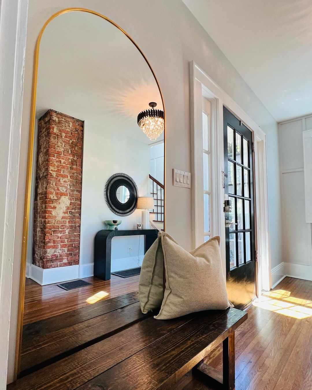
4. Brighten an Entryway with an Arched Gold Mirror
A beautiful arched mirror in an entryway is a fantastic way to make a first impression, but let’s be real about the placement. If your front door opens directly into a narrow hallway, placing a mirror and a bench opposite it can create a bottleneck. Before committing, use painter’s tape to mark out the footprint of the mirror and bench on the floor. Walk through the space for a day or two. If you’re constantly bumping into the “furniture,” you need to either choose smaller pieces or find a different wall to be your focal point.
|
📋 Copy HEX 🔗 Share |
✅ Before You Start
This entryway feels so grand and welcoming because of the powerful use of reflection and contrast. The arched gold mirror does more than just let you check your hair on the way out; it captures the light from the sparkling chandelier and reflects the depth of the room, making the space feel twice as large. The dark entryway door and bench provide a grounding contrast to the bright white walls and light-bouncing mirror, while the exposed brick column adds a layer of texture and history that feels curated and authentic.
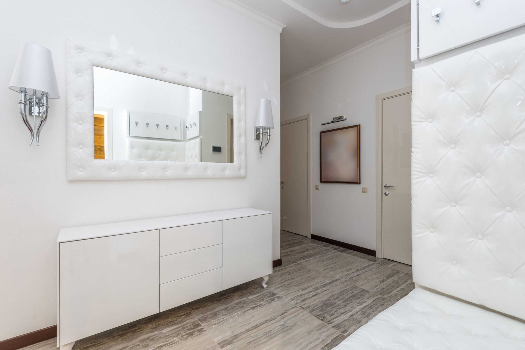
5. Create a Polished Hallway with a White Tufted Mirror
When creating a symmetrical look like this, sconce placement is non-negotiable. The vertical centerline of each sconce should be 4-6 inches from the side of the mirror frame. Height-wise, the middle of the light source (the bulb) should be at, or just slightly above, the horizontal centerline of the mirror. This ensures the light is cast evenly and feels balanced. Mounting them too high or too wide will make the entire vignette feel disjointed. Get out your tape measure and level for this one—eyeballing it won’t cut it.
|
📋 Copy HEX 🔗 Share |
🧹 Maintenance Reality
A tufted mirror frame is undeniably chic, but it’s essentially upholstery, and it requires care. This is not a low-maintenance choice, especially in a high-traffic hallway. Dust will settle into the tufts, and it can be a magnet for fingerprints or smudges from hands brushing past. Plan to vacuum it weekly with an upholstery attachment. For any spots, use a dedicated fabric cleaner. If you have pets or small children, you might consider a solid frame that gives a similar vibe with less upkeep, such as a lacquered white or metal frame.
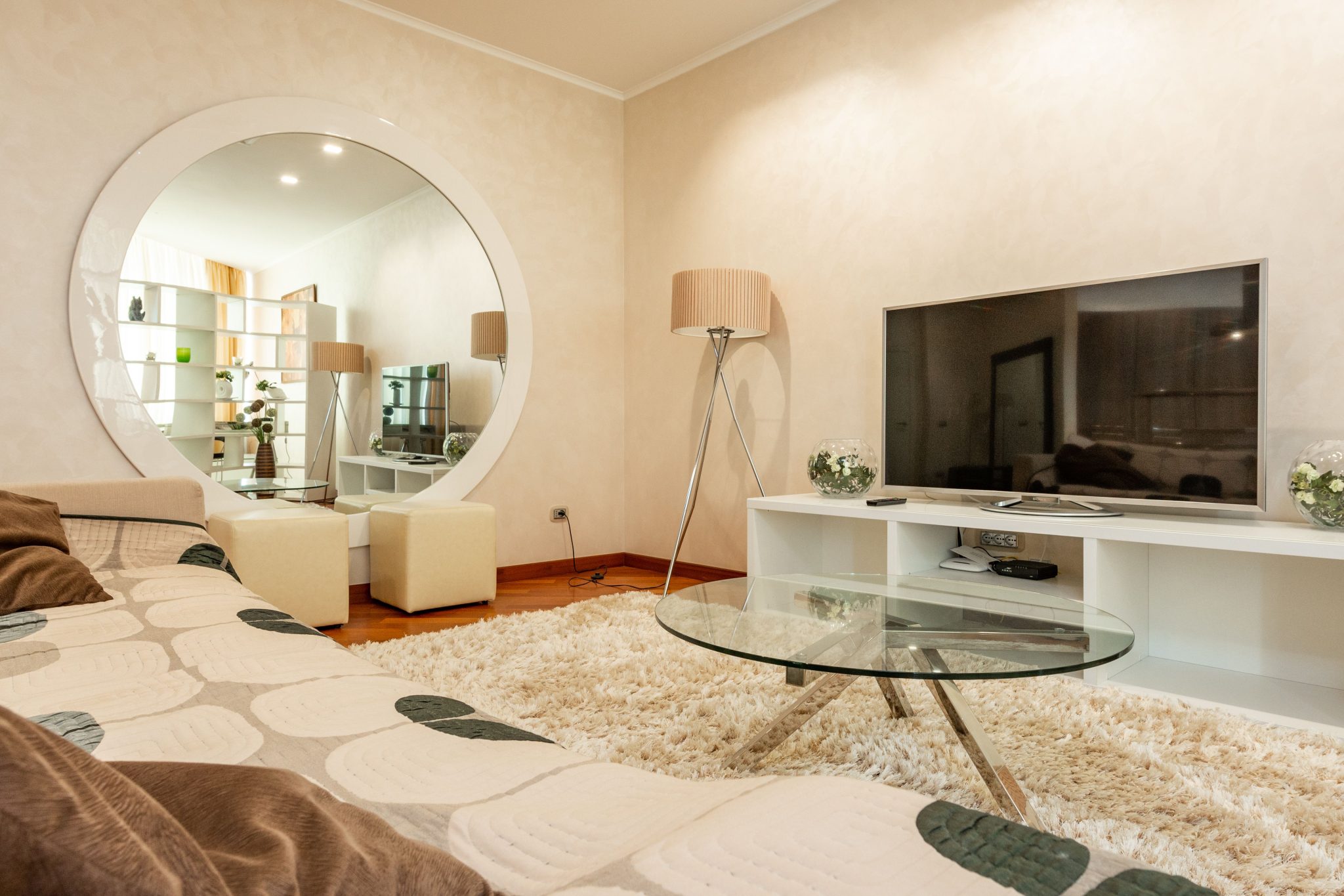
6. Anchor a Living Room with a Large Round Mirror
Hanging a heavy, large-scale round mirror securely behind a sofa is crucial. Here’s how to do it right:
|
📋 Copy HEX 🔗 Share |
🔥 Trending Context
- Locate Studs: Use a stud finder to locate the vertical studs in the wall behind your sofa. Mark them with a pencil. Your mounting hardware MUST go into studs.
- Measure and Mark: Decide on the height. A good rule of thumb is for the bottom of the mirror to be 6-8 inches above the back of the sofa. Mark the wall for your anchor points.
- Install Heavy-Duty Anchors: Do not use the flimsy picture hangers that come with the mirror. For a piece this size, use heavy-duty toggle bolts or lag bolts screwed directly into the studs.
- Get a Helper: This is a two-person job. Have one person lift the mirror while the other guides it onto the mounting hardware.
Time estimate: 45 minutes. Cost: $15 for heavy-duty mounting hardware.
The “bold and round” trend has been gaining momentum, and this room shows exactly why. In a world of rectangular screens, sofas, and windows, a large circular mirror provides a welcome moment of organic softness. It breaks up all the straight lines, feeling both modern and a little bit retro. This move is popular because it’s an easy, high-impact way to add a sculptural element to a room without having to invest in a complex or expensive piece of art. It feels curated, intentional, and adds instant personality.
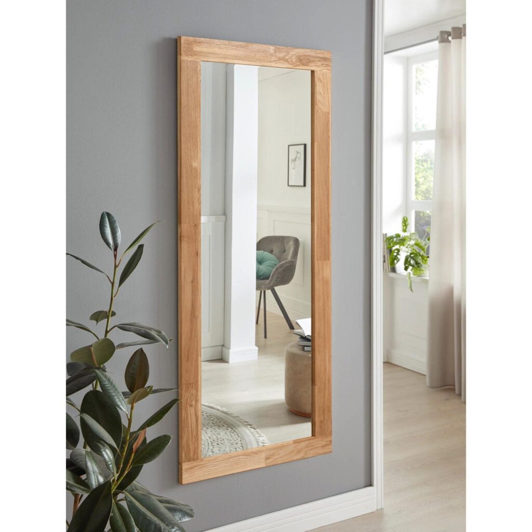
7. Add Warmth with a Natural Oak Framed Mirror
The single most important element here is the warm, natural oak frame of the mirror. In a room dominated by cool gray walls and soft white curtains, the wood provides a necessary touch of organic warmth and texture. If you were to swap this for a black or metal frame, the look would instantly feel colder and more generic. The oak connects to a growing desire for natural materials in our homes, grounding the space and making the minimalist aesthetic feel more inviting and livable. Compare this to the light wood in Idea #1, which serves a similar but distinct purpose.
|
📋 Copy HEX 🔗 Share |
💰 Budget Breakdown
You don’t need to spend a fortune to get this serene, natural vibe. While a solid oak mirror from a store like West Elm could cost $500+, you can achieve a very similar effect for much less. Check out Target’s Studio McGee or Threshold lines for wood-framed mirrors often priced around $100-$150. Even better, scour Facebook Marketplace for a basic, solid wood mirror. A quick sanding and a coat of light-toned wood stain can transform a dated piece into something that looks just like this for under $50.
8. Use a Simple Wood-Framed Mirror in a Hallway Nook
This composition works because of its simplicity and thoughtful balance. The mirror itself is unadorned, allowing its function—reflecting light and space—to take center stage. The dark potted plant to the right adds an asymmetrical, organic counterpoint. Its dark color and textured leaves prevent the scene from feeling sterile. The mirror is hung at a height that reflects the brightest part of the adjacent room, effectively “borrowing” light and making the hallway feel wider and more connected to the rest of the home.

|
📋 Copy HEX 🔗 Share |
💸 Get This Look For Less
This is a perfect solution for a narrow hallway or a small, underutilized wall space. It thrives in an area that is between 3 to 5 feet wide. The mirror should take up about 60-70% of the wall’s width to feel intentional. In a wider space, this single mirror and plant would look lost and undersized. For a larger wall, consider flanking the mirror with two smaller pieces of art or a pair of slim sconces to create a more substantial vignette that matches the scale of the wall.
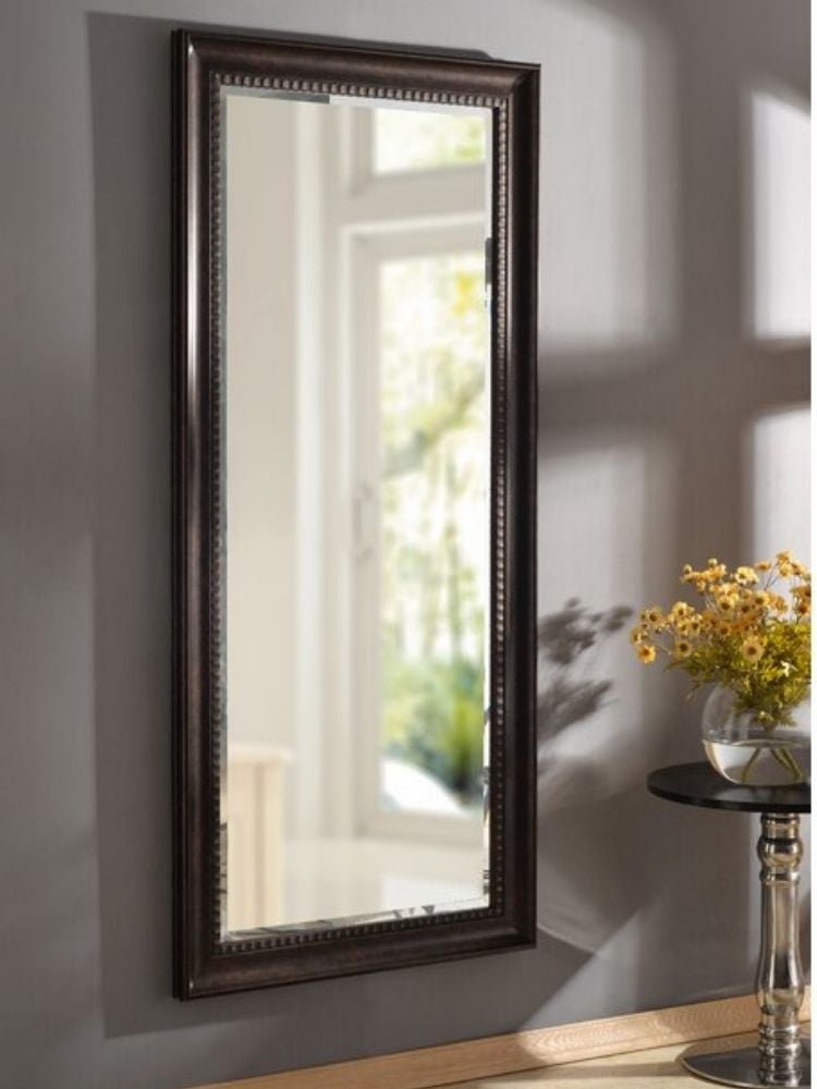
9. Contrast a Dark Wall with an Ornate Dark-Framed Mirror
When pairing a dark mirror frame with a dark wall, lighting becomes everything. The reason this works is the high-contrast reflection of the bright window. To replicate this, place your mirror on a wall adjacent to or directly opposite a window. If you don’t have a window handy, fake it. Position a floor lamp just out of frame so that its light source is what gets reflected. The goal is to make the mirror a source of brightness that punches through the deep, moody wall color. Without a bright reflection, the mirror will just look like a dark hole.
|
📋 Copy HEX 🔗 Share |
🎯 What Makes It Work
The yellow flowers are the undeniable hero of this scene. In a sophisticated, monochromatic space dominated by dark grays and browns, the vibrant pop of yellow is a jolt of energy and life. It prevents the mood from becoming too somber or stuffy. Removing the flowers would leave a perfectly nice, classic arrangement, but it would lack personality and joy. This small, inexpensive detail completely transforms the emotional temperature of the room, proving that sometimes the smallest choice makes the biggest impact.
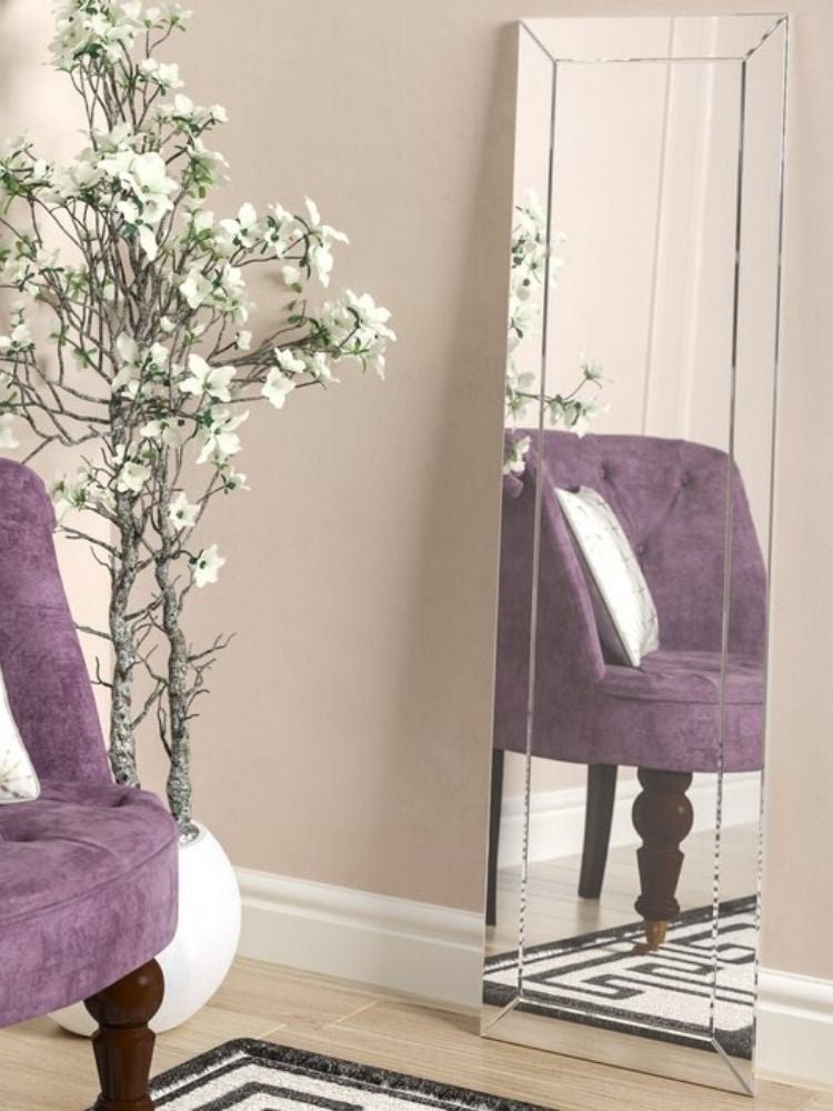
10. Reflect a Pop of Color with a Beveled Frameless Mirror
The visual success of this space comes from a daring yet simple formula: 70% soft neutrals (pale pink wall, light wood floor), 20% bold color (the purple velvet armchair), and 10% graphic punch (the black and white geometric rug). The frameless, beveled mirror acts as a neutral multiplier, reflecting all the elements without adding its own voice. You could swap the purple chair for an emerald green or deep teal one and the formula would hold perfectly, proving the versatility of the core concept.
|
📋 Copy HEX 🔗 Share |
🔧 How-To Brief
A large, frameless standing mirror leaning against a wall looks effortlessly chic, but it comes with a major caveat: safety. These mirrors are heavy. If you have kids, large pets, or live in an earthquake-prone area, leaning is a risk. It’s crucial to secure the top of the mirror to the wall with a safety strap or bracket, even if it’s resting firmly on the floor. This provides an invisible anchor that prevents tipping, giving you the casual, leaned look without the potential for a very dangerous accident.
11. Combine a Mirror and Valet in an Industrial Entryway
This setup works brilliantly because it pairs form with serious function, all unified by a strong visual theme. The repetition of the black metal arch shape in both the mirror and the valet stand creates an immediate sense of cohesion and order. Against the rustic, textured brick wall, these clean, modern lines provide a fantastic industrial contrast. It’s a complete ‘drop zone’ solution—a place to check your reflection, hang your coat, and drop your keys—that feels like a single, intentional piece of design rather than a random collection of furniture.
|
📋 Copy HEX 🔗 Share |
📏 Scale Guide
Before you commit to a coordinated set like this, take a moment to assess your actual needs. Here’s a quick checklist:
- Measure your space: Do you have the width for both pieces side-by-side with at least 6 inches of breathing room?
- Inventory your items: Will the hooks on the valet stand be enough for your daily coats and bags, or will it immediately become cluttered?
- Consider the surface: Is the integrated shelf large enough for your keys, wallet, and mail, or do you need a more substantial landing strip?
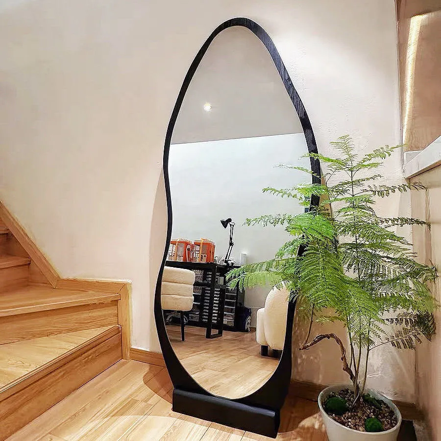
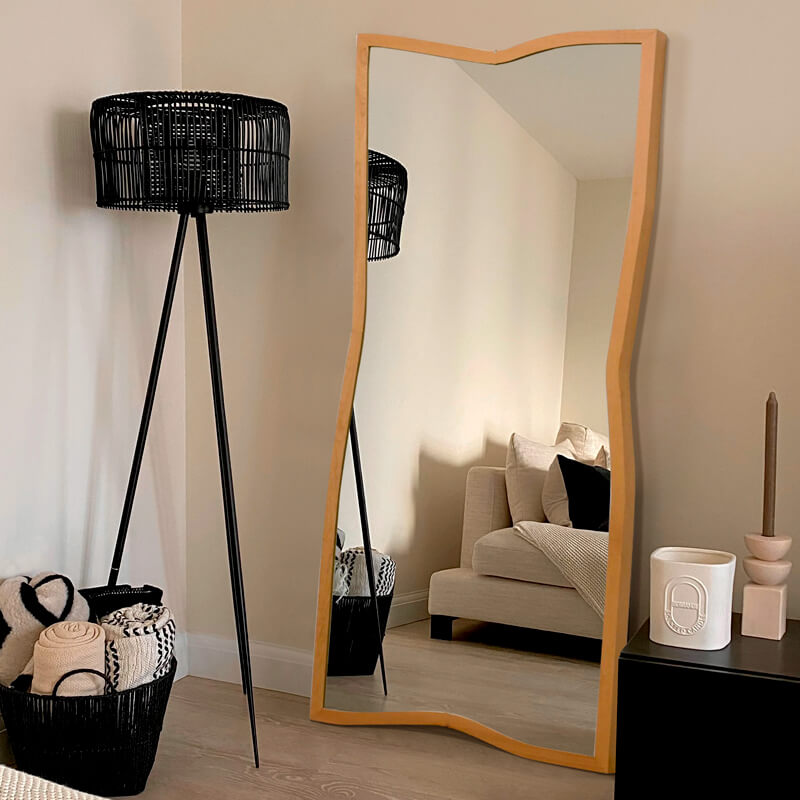
12. Make a Statement with a Sculptural Wood Mirror
The single element that makes this room unforgettable is the mirror’s organic, irregular shape. In a world full of rectangles and circles, this free-form wooden frame feels like a piece of functional sculpture. It defies expectation. By reflecting the autumn trees outside, it blurs the line between the interior and the natural world, reinforcing its own organic form. If this were a simple rectangular mirror, the room would be pleasant but forgettable. This sculptural choice makes it a true statement piece.
|
📋 Copy HEX 🔗 Share |
⚠️ Real Talk
We’re seeing a huge movement away from rigid, perfect forms and toward more organic, natural shapes—a trend often called “biophilic design.” This mirror is a perfect example. After years of crisp, minimalist lines, there’s a collective yearning for objects that feel more human, more natural, and less mass-produced. This sculptural mirror taps directly into that desire, bringing a sense of nature and artistry into the home in a way that feels both modern and timeless. It’s a trend with staying power because it’s rooted in our innate connection to the natural world.
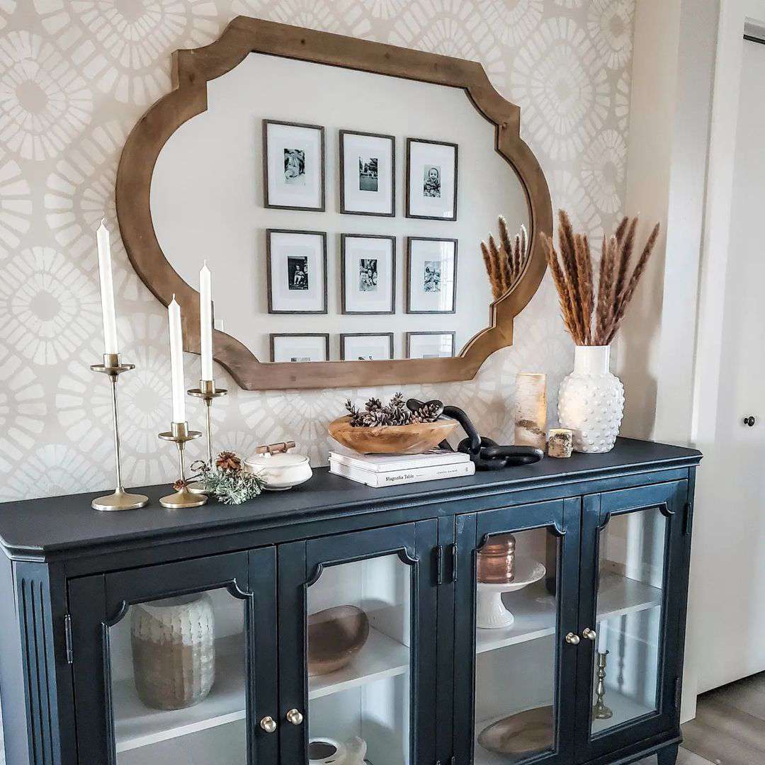
13. Hang a Carved Wood Mirror Above a Black Credenza
When hanging a heavy or visually dominant mirror over a piece of furniture, the spacing is key to making it look intentional. The bottom of the mirror frame should be 6 to 8 inches above the surface of the credenza. Any higher and it will look disconnected, floating randomly on the wall. Any lower and it will feel cramped, not allowing enough room for the decor on the credenza surface. This 6-8 inch gap creates a perfect visual break that allows both the mirror and the surface styling to shine.
|
📋 Copy HEX 🔗 Share |
⭐ The One Thing
This look is a beautiful exercise in layering textures and styles. Think of it as 40% classic (the black credenza, gold candlesticks), 40% rustic/boho (the carved wood mirror, dried pampas grass, pinecones), and 20% modern (the clean reflection of a graphic gallery wall). The patterned wallpaper acts as a neutral-but-interesting backdrop that ties it all together. The success lies in the tension between the formal credenza and the more relaxed, natural elements. It proves you don’t have to stick to just one style.
14. Tuck a Wavy Black-Framed Mirror by a Staircase
A full-length mirror is a fantastic addition to a landing or corner, but be very mindful of what it reflects. This one perfectly captures a view of another well-lit part of the home. However, it could just as easily reflect a messy bathroom, a cluttered hallway, or the underside of the staircase. Before you fall in love with a spot, place the mirror and then walk around the room. Look at its reflection from every common angle and pathway to ensure you’re doubling a view you actually want to see.
|
📋 Copy HEX 🔗 Share |
💡 Designer Tip
This corner vignette works because it’s a study in contrasting shapes. The clean, straight, diagonal lines of the wooden staircase are juxtaposed with the organic, soft, wavy lines of the black mirror frame. The potted fern adds another layer of natural, irregular shape. This deliberate contrast is what creates visual interest and makes the corner feel thoughtfully designed rather than like an afterthought. The minimal color palette of black, wood, and green allows the shapes themselves to be the main story.
15. Style an Arched Brass Mirror with Natural Textures
This serene, brass-accented corner look can be recreated on a much smaller budget. This is the perfect budget-friendly version of the more formal look in Idea #26. An arched brass mirror from a high-end store might run you $800+, but you can find nearly identical versions at HomeGoods or on Amazon for $150-$250. The wooden stool can be a thrift store find for $10. Woven baskets are inexpensive at places like IKEA or Target ($20-$40), and you can fill them with cuttings from your own houseplants or affordable options from a local nursery.
|
📋 Copy HEX 🔗 Share |
📐 Style Math
Creating that perfectly casual “stack of books” look on a stool is an art. Here’s how to nail it:
- Choose a Foundation: Start with the largest, heaviest book on the bottom. This creates a stable base.
- Vary the Size: Stack 2-3 more books on top, each slightly smaller than the one below it.
- Offset the Stack: Don’t align the spines perfectly. Rotate each book slightly so they are playfully offset.
- Add a Topper: Place a small, decorative object on top—like a small plant, a candle, or a beautiful rock—to finish the look.
Time estimate: 5 minutes. Cost: Free if you use books you own.
16. Create a Minimalist Corner with a White Mirror and Leather Chair
This scene is a great example of using visual weight to create balance. The beige tufted lounge chair is low and visually heavy, anchoring the corner. In contrast, the tall, slender white-framed mirror provides verticality without adding much visual bulk. The thin black metal frame of the chair and the clean lines of the mirror connect the pieces. This balance between a heavy base and a light, tall element is what makes the composition feel stable and intentional, rather than just two items placed in a corner.
|
📋 Copy HEX 🔗 Share |
✅ Before You Start
This minimalist arrangement is perfectly suited for a smaller room or a bedroom corner where space is at a premium, ideal for a room around 10×10 feet. Because the mirror frame is thin and the chair has an open base, neither piece takes up much visual space, preventing the corner from feeling crowded. In a large living room, these two pieces alone might feel a bit sparse. For a larger space, you would want to add a floor lamp and a more substantial side table to create a fuller, more balanced vignette.
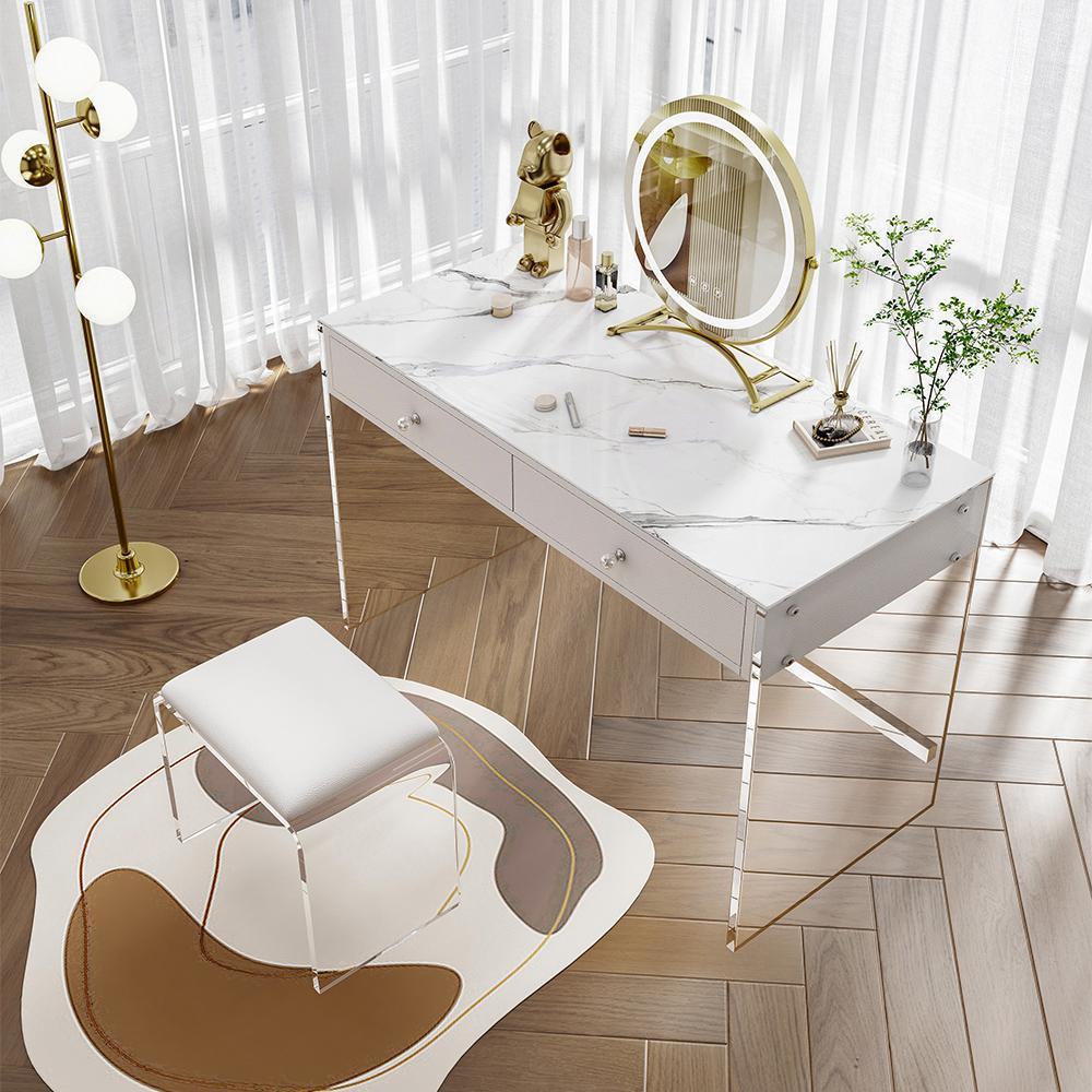
17. Design a Glam Vanity with an Illuminated Gold Mirror
The clear acrylic (or lucite) is the absolute star of this show. Using it for the desk legs and stool legs is a brilliant move that creates a “floating” effect. This makes the vanity feel incredibly light and airy, preventing the setup from looking bulky. It allows the focus to remain on the luxurious textures—the marble-patterned desk, the upholstered stool, the gold accents—without being weighed down. If you swapped the clear legs for solid white or gold ones, the entire look would feel heavier and much less magical.
|
📋 Copy HEX 🔗 Share |
🧹 Maintenance Reality
Clear acrylic furniture is stunning, but it is a magnet for dust, fingerprints, and tiny scratches. To keep it looking crystal clear, you’ll need to dust it with a microfiber cloth every other day. For smudges, use a special acrylic cleaner or just water with a tiny drop of dish soap—never use Windex or other glass cleaners containing ammonia, as they will cause the acrylic to become cloudy over time. Also, be mindful of placing sharp or rough objects on it, as it can scratch more easily than glass.
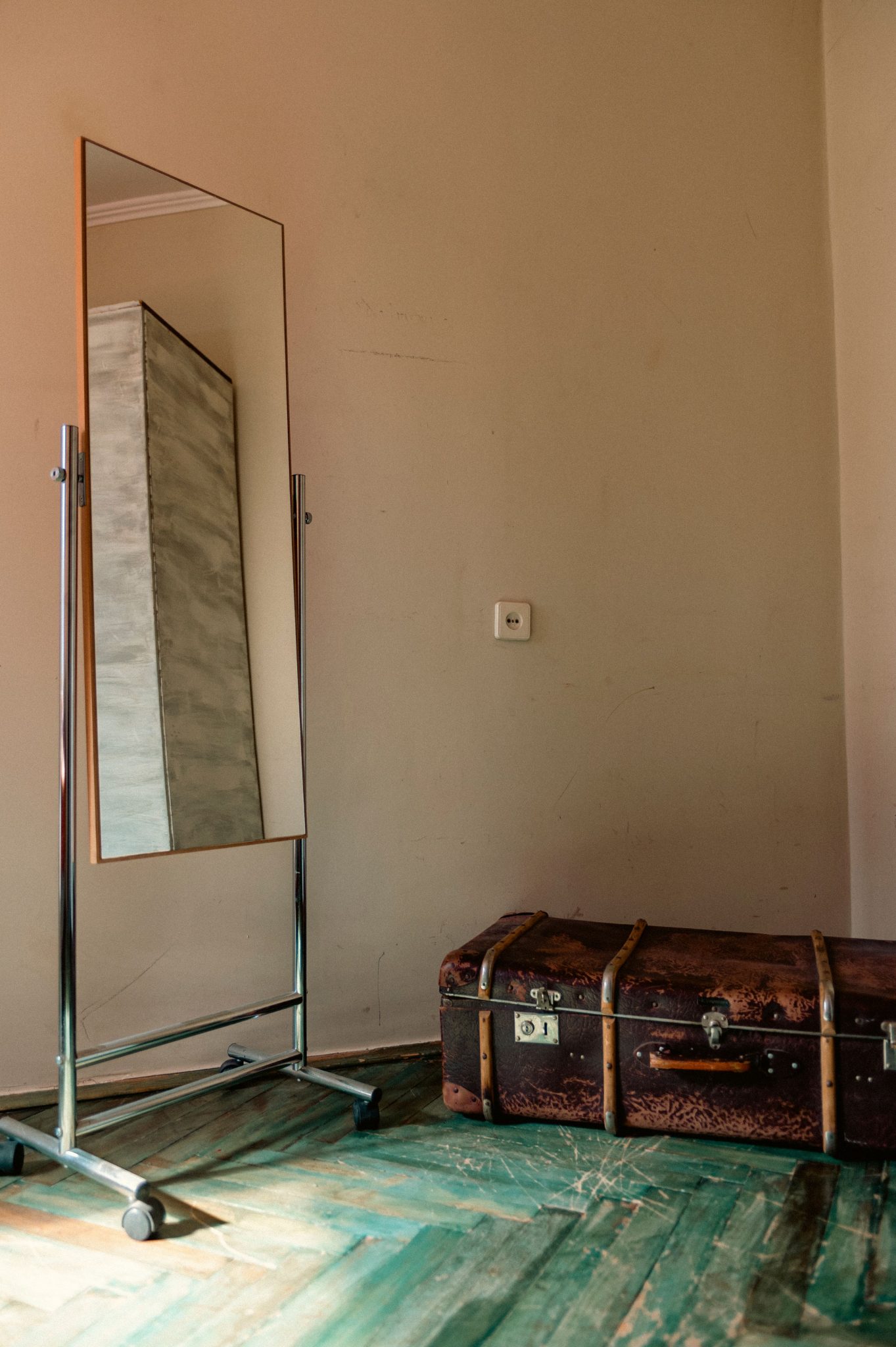
18. Juxtapose a Modern Mirror with a Vintage Trunk
The magic here is in the unexpected mix. Let’s call the formula: 50% sleek modern (the chrome and light wood mirror), 30% rustic vintage (the distressed dark brown trunk), and 20% bold color (the worn turquoise floor). It’s the visual equivalent of pairing a silk dress with combat boots. The contrast is what creates the personality. Keeping the wall a simple, light beige allows these three competing elements to have a conversation without the background shouting over them. This is a great example of how mixing eras can create a look that is totally unique to you. Compare this with the vintage feel of Idea #24.
|
📋 Copy HEX 🔗 Share |
🔥 Trending Context
This look taps into the “collected home” trend, which is a direct rebellion against the one-stop-shop, everything-matches look of the past. People want their homes to tell a story, to feel like a collection of items acquired over time. Pairing a brand-new, modern mirror with a beat-up vintage trunk creates an immediate sense of history and personality. It suggests that the homeowner appreciates both the past and the present, and isn’t afraid to break the rules. This eclectic approach is a hallmark of confident, personal style in 2026.
19. Go Bold with a Velvet-Framed Oval Standing Mirror
This design choice is successful because of its commitment to texture. The designer didn’t just stop at one interesting finish. The deep, plush texture of the dark velvet-like mirror frame is echoed in the nearby ottoman and contrasted beautifully by the shiny, metallic surface of the gold planters. The smooth, waxy leaves of the plants add yet another layer. This rich textural interplay is what makes the scene feel so luxurious and visually engaging. It invites you to touch and feel the different surfaces, creating a multi-sensory experience.
|
📋 Copy HEX 🔗 Share |
💰 Budget Breakdown
A thick, fabric-covered frame like this is a showstopper, but it’s also a dust magnet. That beautiful, deep velvet texture will catch and hold onto every airborne particle. This isn’t a “wipe-and-go” piece. You will need to regularly vacuum the frame with a soft brush attachment to keep it looking lush and clean. It’s also more susceptible to stains or damage than a wood or metal frame, making it a less practical choice for a high-traffic area, a kid’s room, or a home with curious pets.
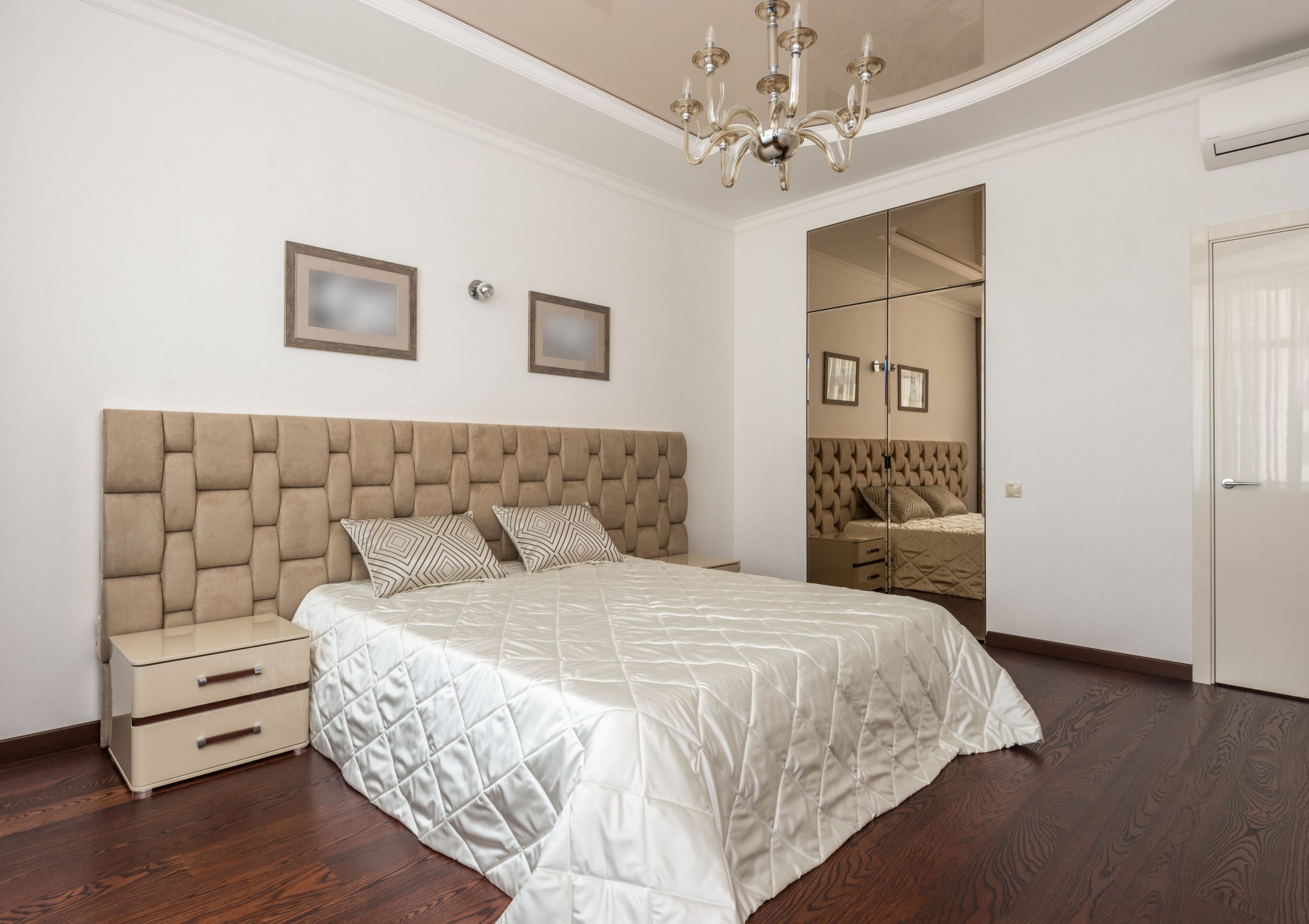
20. Expand a Bedroom with a Mirrored Wall
If you’re going to install a mirrored wall, don’t stop halfway. For maximum impact, the mirror panels should go from wall to wall and from floor to ceiling, as shown here. Any border of drywall around the mirror will break the illusion and make it look dated, like something out of the 1980s. A full wall of mirror, however, becomes a true architectural feature. It completely erases the boundary of the wall, creating a seamless and expansive reflection that makes the room feel infinitely larger. COMMIT to the concept.
|
📋 Copy HEX 🔗 Share |
💸 Get This Look For Less
A full mirrored wall is a bold move that works best in a moderately sized bedroom (around 12×12 to 15×15 feet) where you want to create a dramatic sense of space. In a very small room, it can sometimes feel a bit disorienting. In a very large room, it can feel cold and impersonal, like a dance studio. The key is to have enough soft textures—like the tall upholstered headboard, plush bedding, and a rug—to balance the hard, reflective surface of the mirrors and keep the room feeling cozy and inviting.
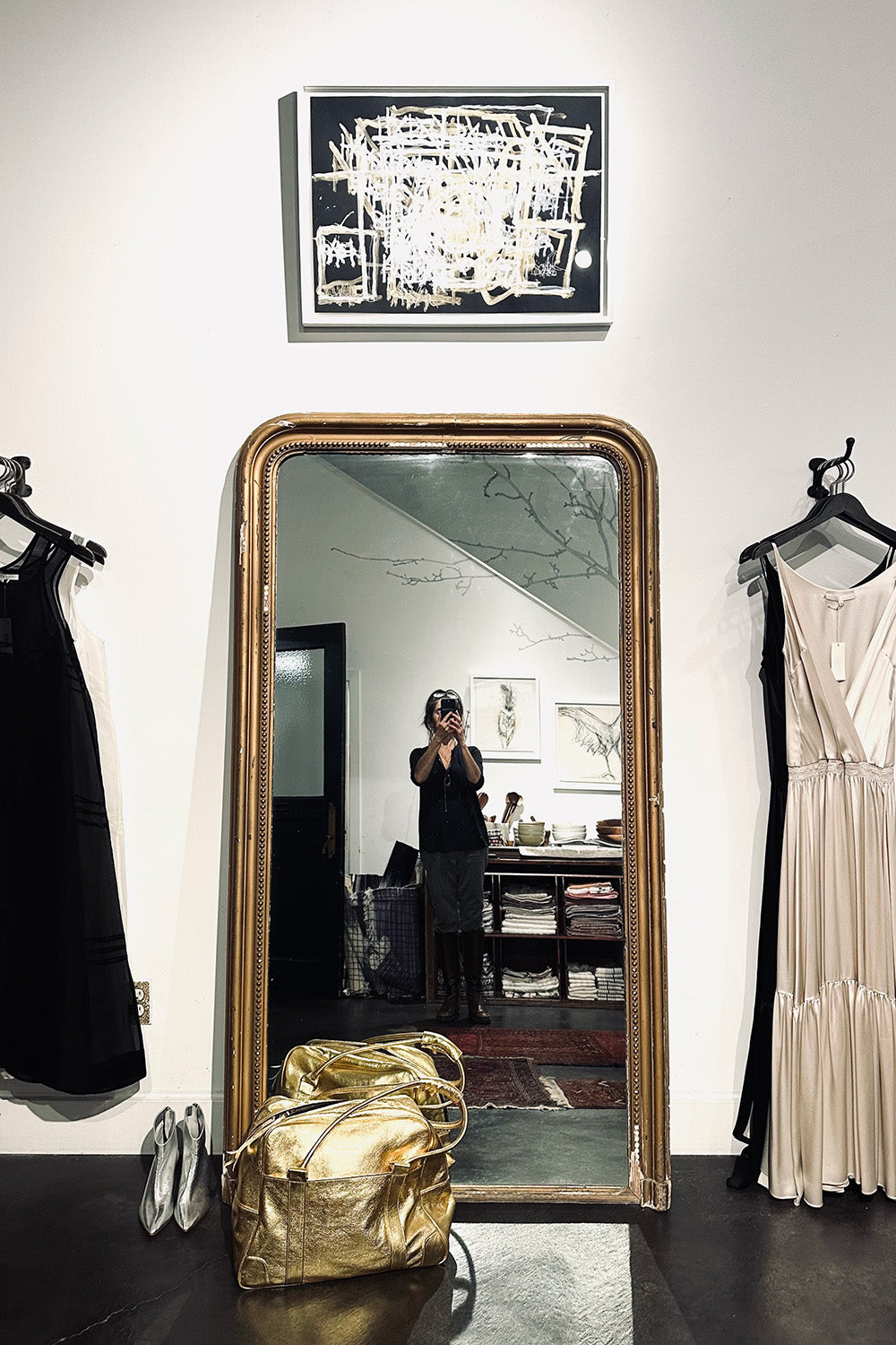
21. Create a Boutique Vibe with an Ornate Gold Mirror
The secret to this “personal boutique” aesthetic is the confident mix of high and low. The ornate, antique-style gold mirror feels incredibly luxe and established. Placing it next to simple, modern clothing racks and abstract art creates an eclectic tension. The mirror acts as the anchor, elevating everything around it. Without its grand, historic presence, the scene would just be a dressing area. With it, it becomes a curated, fashion-forward statement corner that feels personal and aspirational.
|
📋 Copy HEX 🔗 Share |
🎯 What Makes It Work
You can get this high-fashion look without the high-end price tag. The key is the mirror. Hunt for a large, ornate, vintage mirror on Facebook Marketplace or at a local consignment shop. Don’t worry if the frame is a bit damaged or the color is off—a can of gold spray paint (try Rust-Oleum Metallic Gold) works wonders. Pair it with simple, inexpensive black clothing racks from Amazon or IKEA. The contrast between the DIY-glam mirror and the utilitarian racks is what sells the look.
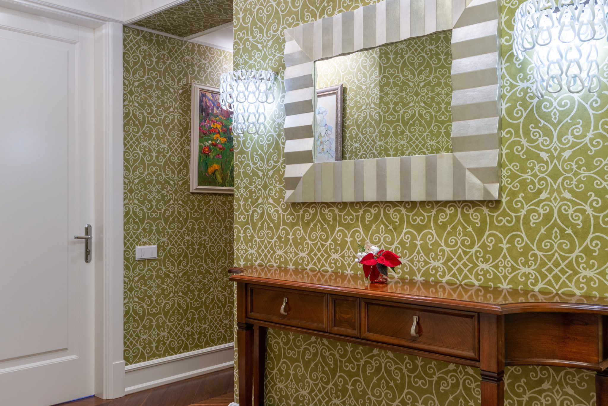
22. Mix Styles with Patterned Wallpaper and a Striped Mirror
This design succeeds by confidently breaking the old rule about not mixing patterns. It works because the patterns are of a different scale and style. The olive green wallpaper has a fine, intricate scroll pattern, while the mirror frame has a bold, simple, graphic stripe. This variation allows the two patterns to coexist without competing. The solid wood of the console table and the solid white of the door provide a place for the eye to rest, grounding the patterns and preventing them from becoming overwhelming. It’s a lesson in controlled maximalism.
|
📋 Copy HEX 🔗 Share |
🔧 How-To Brief
A word of caution on this look: it requires commitment. That stunning olive green patterned wallpaper isn’t a casual weekend project. Professional installation is often recommended for getting seams perfect, which adds cost. And if you change your mind in a few years, removing wallpaper can be a tedious, messy job. Before you fall in love with a bold paper, order a large sample and live with it on the wall for a week to make sure you truly love it. A similar effect with less commitment could be achieved with a peel-and-stick wallpaper.
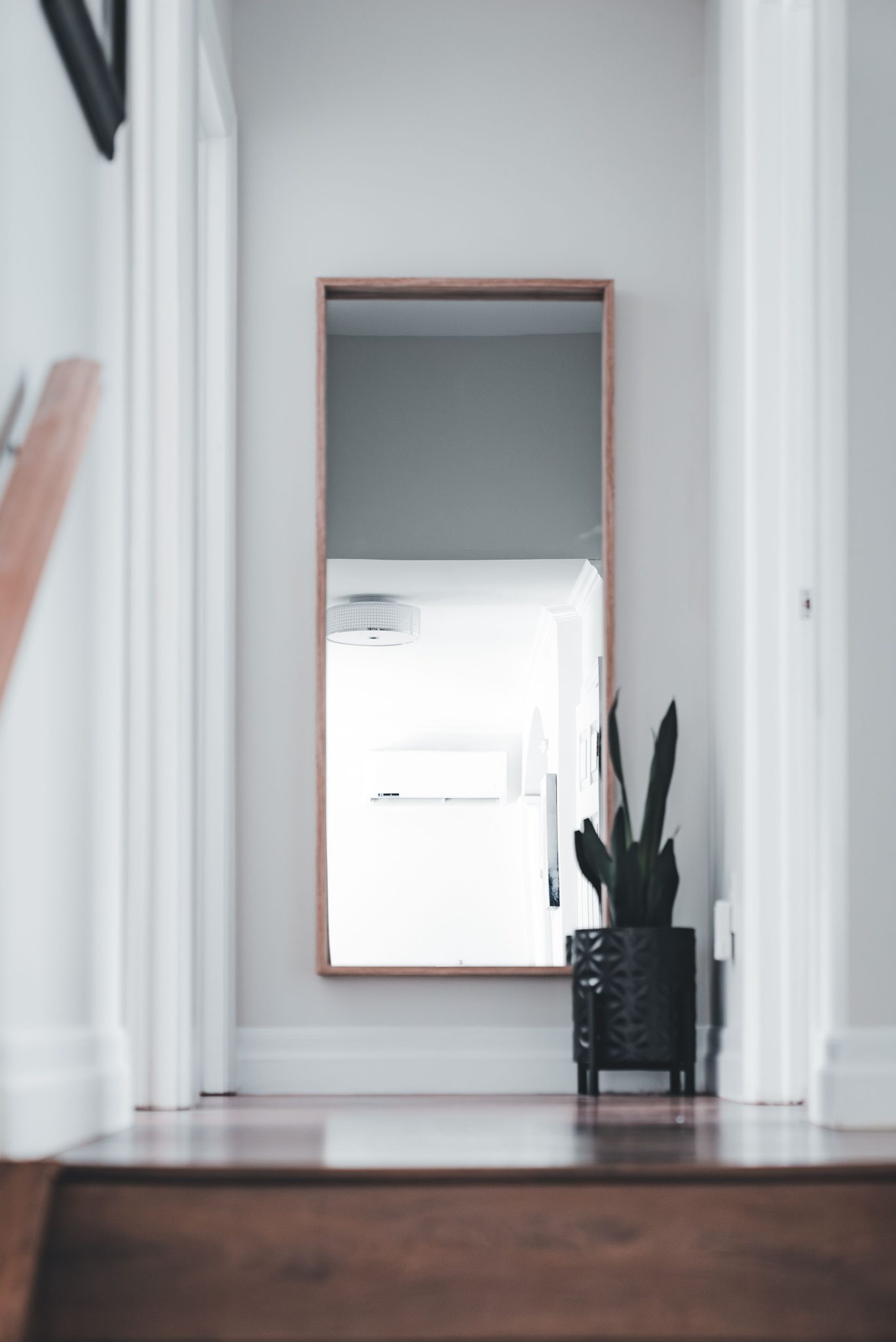
23. Brighten a Hallway Terminus with a Mirror and Plant
Placing a mirror at the end of a hallway is a classic designer trick for a reason, but the execution matters. To avoid the funhouse effect, the mirror should not be so large that it perfectly reflects the entire hallway back at you. The goal is to reflect light and offer a glimpse of another space, not to create an infinite reflection of the hallway itself. The sizing here is perfect—large enough to make an impact and bounce light, but not so large that it becomes disorienting. The plant helps to break up the reflection, adding to the effect.
|
📋 Copy HEX 🔗 Share |
📏 Scale Guide
The single most effective element here is the reflection of the light source. The mirror is strategically placed to capture the light from a nearby room or fixture, effectively turning a potentially dark and forgotten corner into a source of brightness. It pulls light down the hallway, making the entire passage feel more open and welcoming. The plant and the wooden frame are lovely supporting details, but the real work is being done by that bright, beautiful reflection. It’s a perfect illustration of using a mirror as a tool for light, not just for vanity.
24. Style a Leaning Mirror Next to an Open Closet
This space feels so calm and curated because of the repetition of natural textures. The distressed wood of the mirror frame talks to the dark wood of the floor. The light-colored woven rug speaks to the woven rattan baskets inside the closet. This textural conversation creates a cohesive and harmonious palette, making the separate elements feel like part of a unified design. It’s a sophisticated way to build a layered, interesting room without relying on bright colors or loud patterns. Even the leather of the bed frame adds to this earthy, textural story.
|
📋 Copy HEX 🔗 Share |
⚠️ Real Talk
An open closet system like this is beautiful, but it requires a serious commitment to tidiness. Your clothes become a part of the decor.
- Constant Curating: You have to be diligent about folding, hanging, and putting things away immediately. There’s no hiding clutter behind a closed door.
- Dusting: Exposed shelves and clothing will gather dust much faster than items in a closed closet. Plan for weekly dusting of all surfaces and an occasional lint-rolling of less-worn garments.
- Color Coordination: For it to look this serene, you’ll likely find yourself curating your wardrobe to fit a specific color palette, which can be an ongoing project.
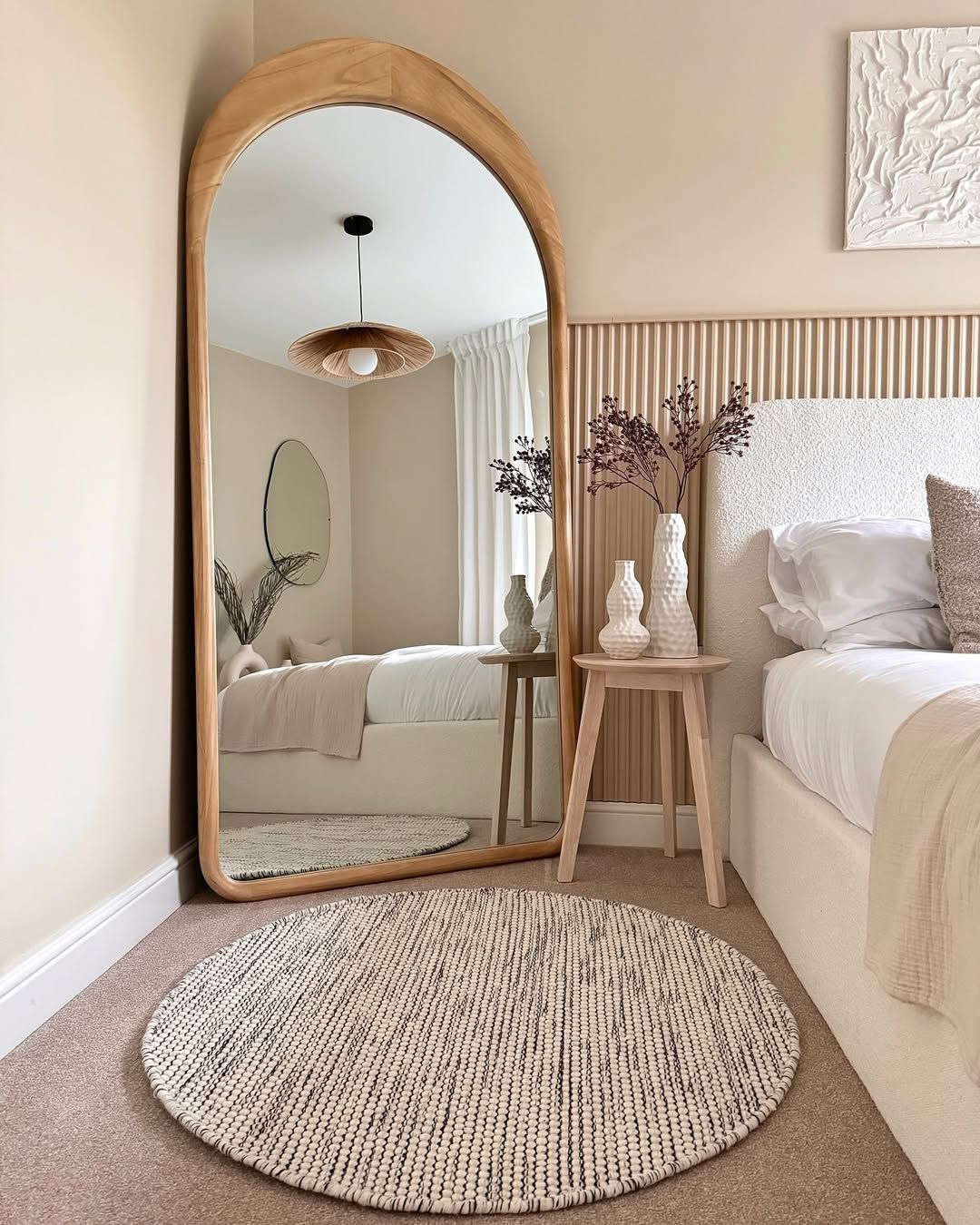
25. Layer Textures with an Arched Mirror and Woven Rugs
This serene bedroom gets its calming vibe from a simple but effective recipe: 60% neutral texture (the cream bed frame, the light wood frame of the arched mirror, the woven pendant), 30% soft surfaces (the bedding, the round textured rug), and 10% curated detail (the dried botanicals, the oval mirror). The key is the limited color palette. By sticking to creams, beiges, and light woods, the focus shifts from color to texture, creating a space that feels incredibly soothing and layered. The arched mirror adds a soft architectural element that anchors the whole look.
|
📋 Copy HEX 🔗 Share |
⭐ The One Thing
The idea of “layering” has been a designer buzzword for years, but in 2026 it has evolved. It’s no longer just about layering pillows and throws. It’s about layering textures, shapes, and even reflections. This room is a perfect example: we see the textured rug layered on the wood floor, the arched mirror reflecting another oval mirror, and dried botanicals adding a final layer of natural texture. This deep, multi-sensory layering is a response to our screen-filled lives, creating homes that feel tactile, real, and deeply comforting.
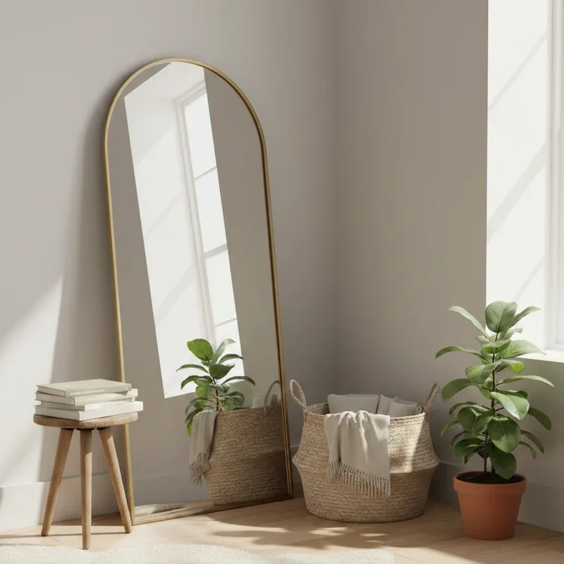
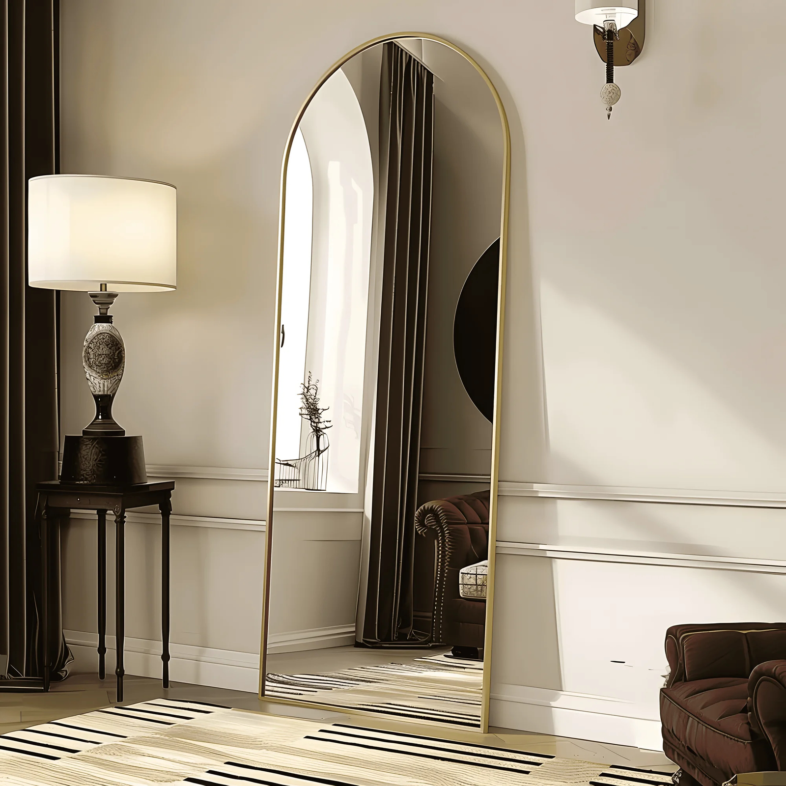
26. Add Elegance with an Arched Brass Full-Length Mirror
that elevates this entire scene from simply nice to truly elegant is the wainscoting. The crisp, white architectural molding provides a structured, classic backdrop that makes the other elements pop. The thin brass frame of the mirror looks richer against it, and the dark pleated curtains feel more dramatic. Without the wainscoting, it would be a mirror against a plain cream wall—perfectly fine, but lacking that sense of history and intentional detail. The wainscoting is the foundation that gives the room its refined character. For a more casual take, see Idea #15.
|
📋 Copy HEX 🔗 Share |
💡 Designer Tip
This corner demonstrates a mastery of mixing warm and cool tones. The brass frame of the mirror and the dark brown armchair bring in warmth and richness. These are balanced by the cooler tones in the striped rug and the light cream on the upper walls. This subtle temperature mixing is what gives the room depth and sophistication. Sticking to only warm or only cool tones can make a room feel flat. The interplay between them here creates a dynamic, balanced, and inviting space.
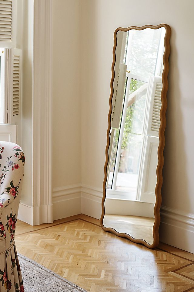
27. Soften a Corner with a Wavy Full-Length Mirror
Leaning a wavy or irregularly shaped mirror in a corner is a fantastic way to add a playful, organic touch. However, be aware that these novelty shapes can sometimes distort reflections, especially around the edges. Before you buy, if possible, check your reflection from a few feet away. Ensure it doesn’t create a funhouse effect that will be annoying in the long run. If you’re ordering online, read reviews carefully to see if other buyers have mentioned any distortion. Function should still follow form, even with a statement piece.
|
📋 Copy HEX 🔗 Share |
📐 Style Math
This cozy corner achieves its soft, inviting feel with a specific formula: 50% classic comfort (the floral armchair, the parquet flooring), 30% modern playfulness (the wavy wood mirror), and 20% crisp brightness (the white louvered shutters). The light wood of the mirror frame acts as a bridge, connecting the classic flooring with its own modern shape. It’s a great example of how to introduce a trendy element, like the wavy mirror also seen in Idea #14 and Idea #31, into a more traditional space without it feeling out of place.
28. Carve Out a Reading Nook with an Arched Mirror
This reading nook feels like a destination because of its clever triangular composition. The tall, vertical mirror forms one point of the triangle, the low, cozy armchair forms another, and the plant stand provides the third. This arrangement draws the eye in and around the corner, making it feel like a self-contained, intentional space rather than just furniture pushed into a corner. The arched mirror also reflects the window, pulling in light and making the nook feel brighter and more open than it actually is. If you love green, compare this to the color story in Idea #30.
|
📋 Copy HEX 🔗 Share |
✅ Before You Start
To make a reading corner truly functional, the lighting has to be right. While the reflected light from the window is beautiful, it won’t be enough for reading in the evening. There isn’t a lamp visible here, which is a common oversight. When creating a nook like this, you must incorporate a light source. A slim floor lamp tucked behind the chair or a small, stylish table lamp on the side table is essential to make the space usable after dark. Function should always be a partner to beauty.
29. Mix Materials with a Black Mirror, Gold Planter, and Marble Floor
The formula for this stunningly modern and fresh look is a masterclass in material mixing: 40% sleek modern (the matte black mirror frame and planter stand), 40% classic luxury (the light marble floor and shiny gold planter), and 20% organic life (the vibrant green plant). The light beige paneled wall acts as a quiet, neutral canvas that allows these powerful materials to take center stage without competing. It’s proof that you can mix matte and shiny, black and gold, hard and soft, and create something totally harmonious.
|
📋 Copy HEX 🔗 Share |
🧹 Maintenance Reality
The undeniable hero of this vignette is the shiny gold planter. In a space defined by the clean, straight lines and neutral colors of the mirror and floor, the warm, reflective, cylindrical planter is a showstopper. It breaks up the monochrome palette and adds a necessary touch of glamour and warmth. If the planter were black or white, the look would be far more sterile and less inviting. The gold provides that perfect, confident punctuation mark that says “this space is deliberately designed.”
30. Use a Green-Framed Mirror for a Pop of Color
This bedroom is a perfect example of effective color cohesion. The designer didn’t just place a green mirror in a room; they wove the color story throughout the space. The deep, forest green of the mirror frame is repeated in the round ottoman at the foot of the bed. A lighter, softer shade of sage green appears in the throw blanket. This repetition of a single color in varying shades and locations makes the design feel intentional and harmonious, rather than accidental. The warm beige walls provide the perfect neutral backdrop for the green to really sing.
|
📋 Copy HEX 🔗 Share |
🔥 Trending Context
Love the idea of a colorful mirror frame but can’t find one you like? DIY it! This is one of the easiest ways to get a custom look for less. Find a simple wood or metal-framed arched mirror from a place like IKEA, Target, or even a thrift store. Lightly sand the frame, apply a coat of primer (this is key for adhesion), and then two coats of your chosen color in a satin or matte finish. For under $40 in supplies, you can create a unique, colorful statement piece that perfectly matches your decor.
31. Combine a Wavy Mirror with a Tripod Floor Lamp
This corner’s calming, on-trend aesthetic is built on a clear formula: 50% organic shapes (the wavy mirror, the wicker lampshade), 30% graphic black accents (the lamp base, the woven basket, the pillow in the reflection), and 20% soft texture (the textiles in the basket, the sofa). The light wood and neutral walls provide a quiet backdrop that allows the interplay between the soft curves and the sharp black lines to be the focal point. This is the Scandi-Boho look, perfected. This is one of several great ways to use a wavy mirror, as seen in Idea #14 and Idea #27.
|
📋 Copy HEX 🔗 Share |
💰 Budget Breakdown
The black tripod floor lamp is the element that truly makes this corner work. While the wavy mirror is the trendy star, the lamp is the crucial supporting actor. It provides a strong, graphic, vertical element that balances the amorphic shape of the mirror. Its sharp, angular lines offer a necessary contrast to the mirror’s soft curves. Furthermore, its black color grounds the corner, connecting with the other black accents in the room to create a cohesive visual thread. Without the lamp, the mirror would feel a bit lost and less intentional.
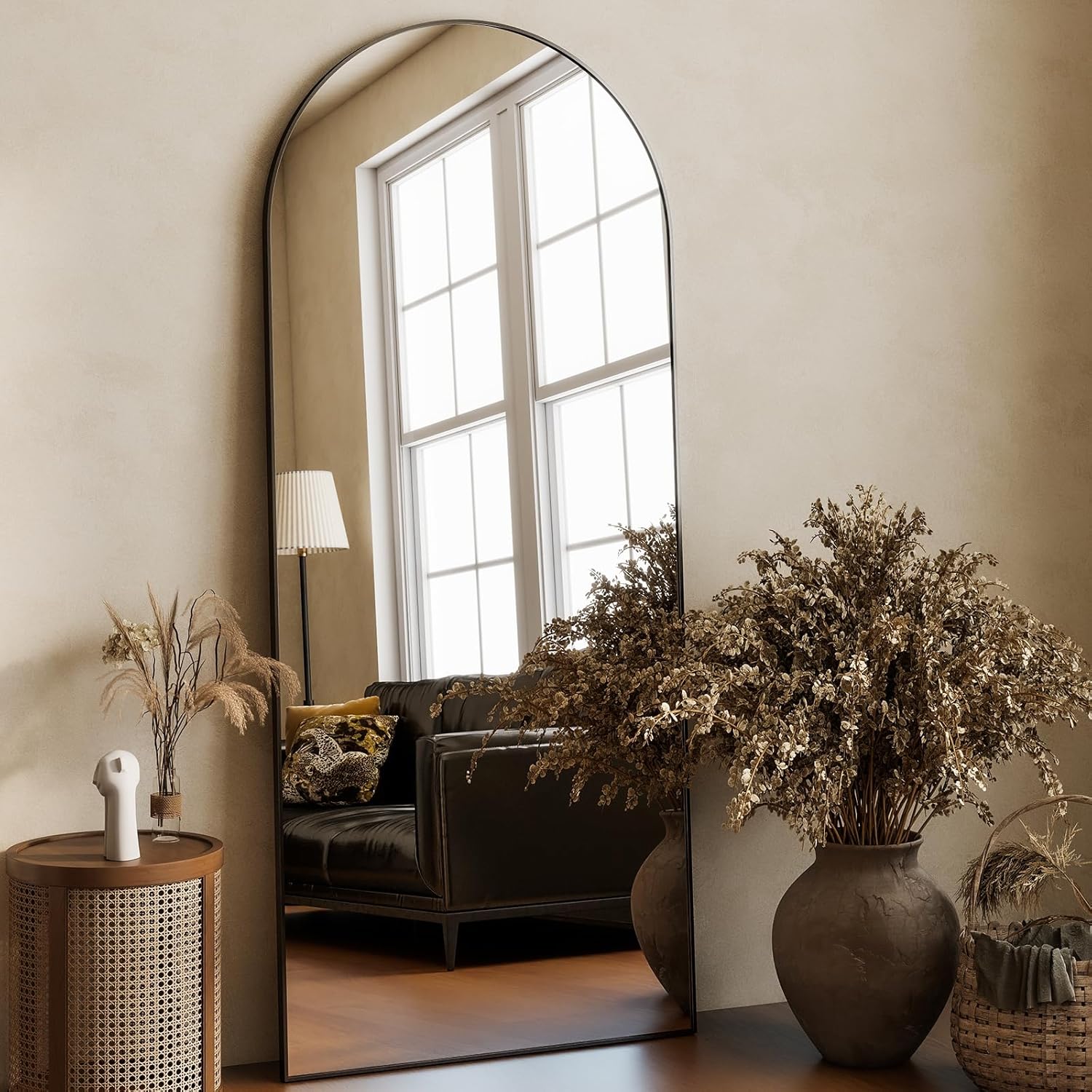
32. Ground an Arched Mirror with Earthy Dried Florals
The success of this design lies in its sophisticated use of framing. The large black-framed arched mirror is the primary frame, capturing a beautiful reflection of the window and sofa. But the designer didn’t stop there. They used the two large arrangements of dried botanicals to create a second, softer, organic frame *around* the mirror itself. This layering of frames adds depth and complexity, drawing the eye inward and making the vignette feel complete and thoughtfully composed. The texture of the beige wall provides the final subtle layer.
|
📋 Copy HEX 🔗 Share |
💸 Get This Look For Less
Dried botanical arrangements are a beautiful, long-lasting alternative to fresh flowers, but they aren’t entirely maintenance-free. Their primary enemy is dust. To keep them looking their best, you’ll need to gently dust them every few weeks. The best method is to use a hairdryer on its lowest, coolest setting, held about a foot away. You can also use a can of compressed air. Be gentle, as dried elements are brittle and can break easily. Also, keep them out of direct sunlight to prevent their earthy colors from fading over time.
Reflect Your True Style
A standing mirror is so much more than a functional object—it’s a powerful design tool that can bring light, depth, and personality to any room. Hopefully, these ideas have sparked some inspiration for your own space. Don’t be afraid to experiment to find what truly reflects you.
Ready to start planning? Head over to Pinterest and create a new board for your favorite looks from this article!