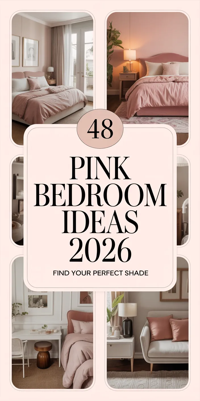
Pink room decor is having a powerful moment in 2026, and it’s no longer just about bubblegum walls or baby nurseries. From deep terracotta-tinged blushes to dusty rose accents paired with unexpected neutrals, this color family has matured into one of the most versatile tools in American interior design. Pinterest searches for pink interiors have surged as homeowners across the country seek warmth, personality, and a sense of calm that only this hue can deliver. Whether you’re decorating a teenager’s bedroom in suburban Chicago or refreshing a loft in downtown Portland, pink offers endless possibilities. In this article, you’ll discover inspired ideas that show how to bring pink into your home with style, confidence, and a fresh perspective for the year ahead.
1. Blush and Navy Layered Bedroom
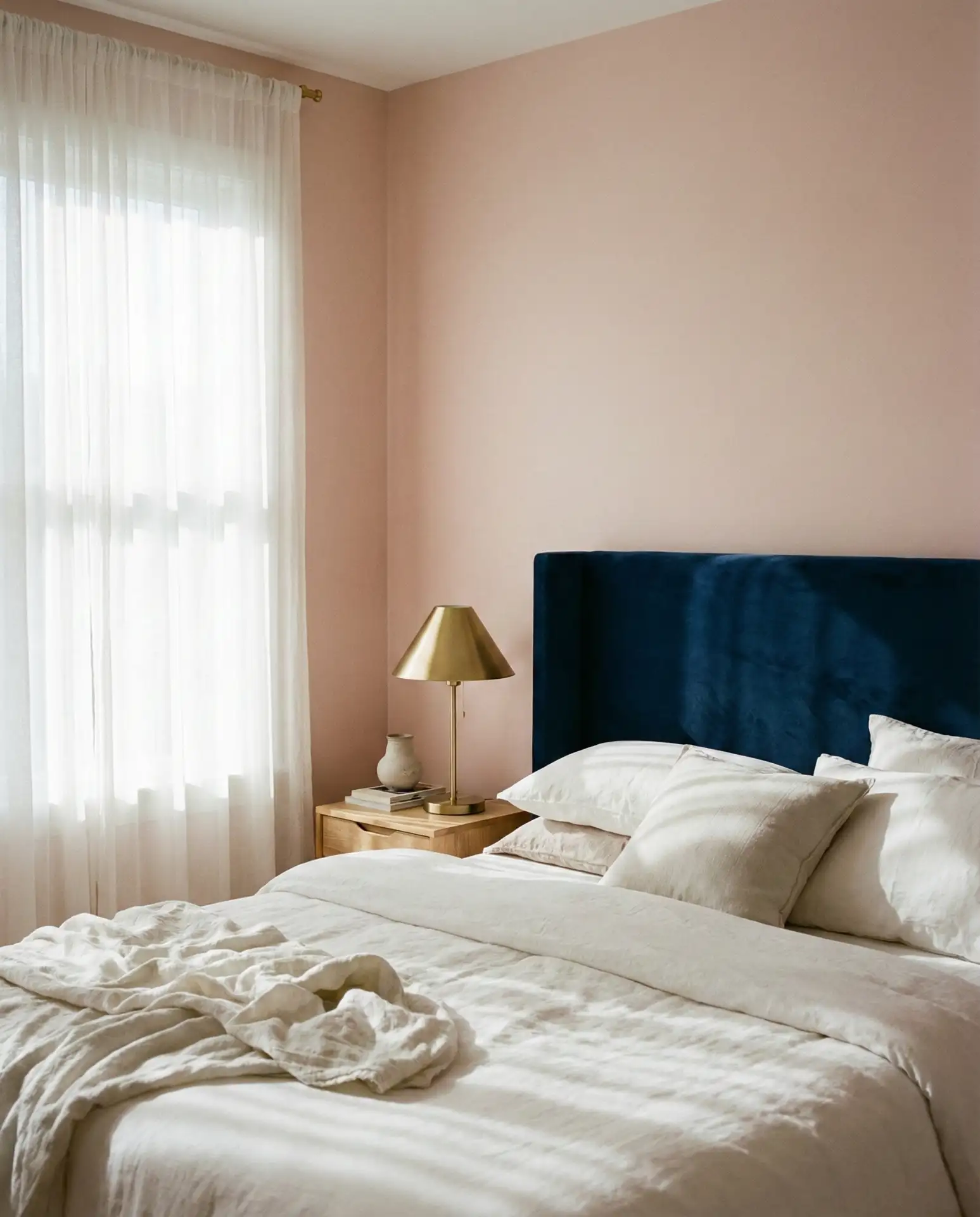
This pairing works beautifully in bedrooms where you want both softness and grounding. Blush tones on the walls or bedding create a serene backdrop, while navy and charcoal accents—think throw pillows, a velvet headboard, or framed art—add structure and sophistication. The contrast feels intentional without being loud, making it ideal for adults who want a grown-up take on pink without sacrificing warmth.
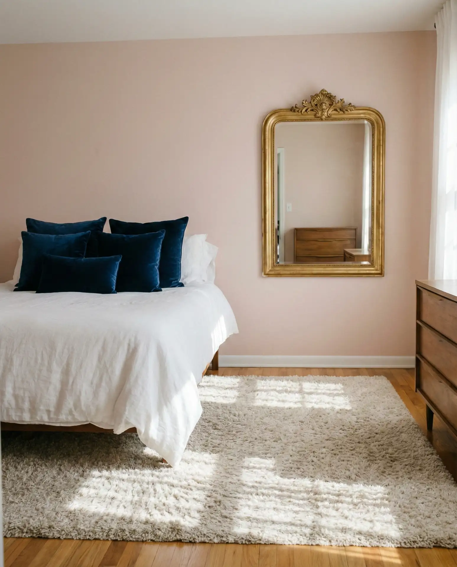
This combination works best in homes with good natural light, especially in the Northeast and Pacific Northwest, where cooler tones dominate the landscape. The blush softens the moodiness of navy, creating a balance that feels collected rather than contrived. It’s a smart choice for homeowners who want a bedroom that transitions easily from day to night, offering calm in the morning and coziness after dark.
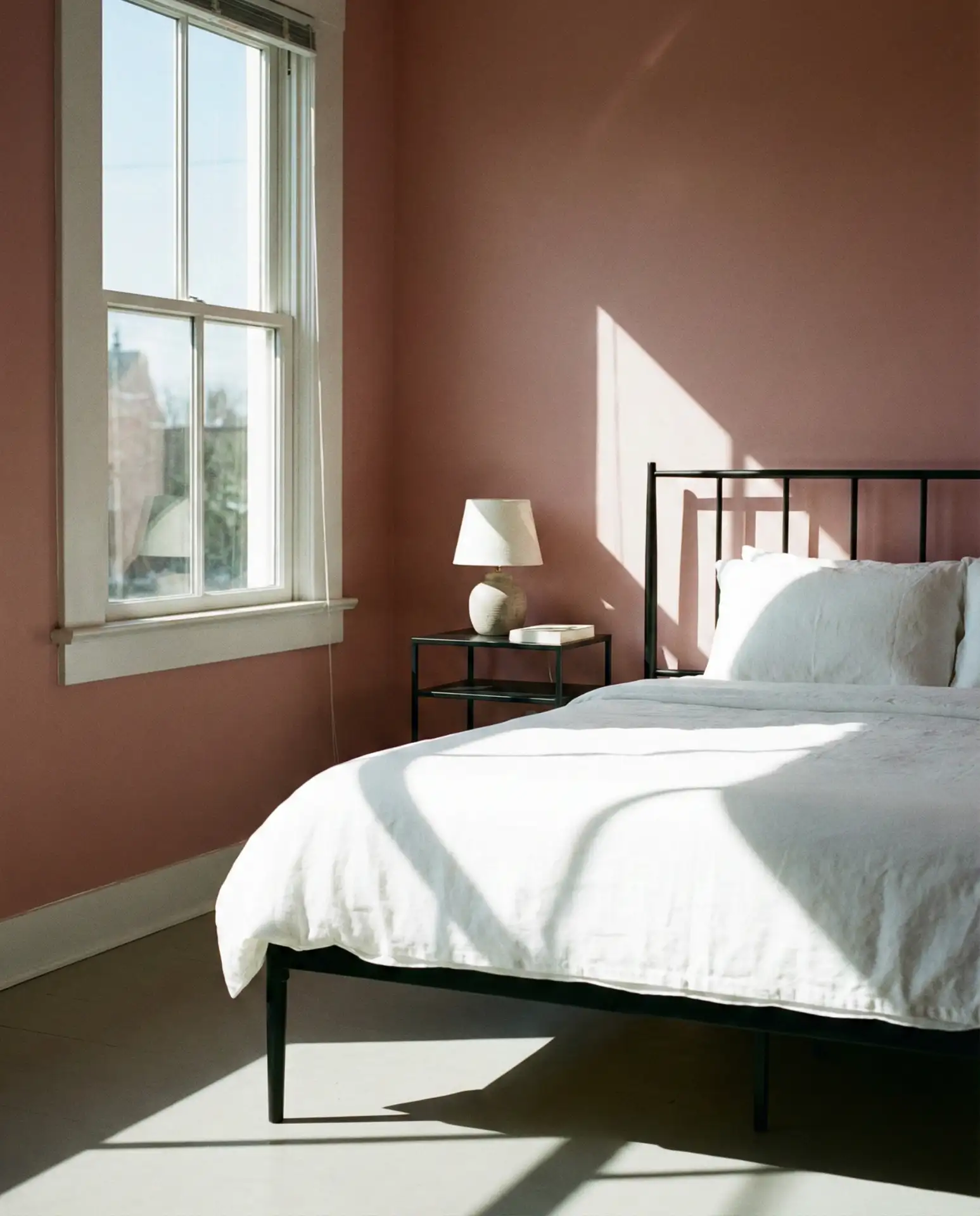
2. Soft Pink and White Minimalist Space
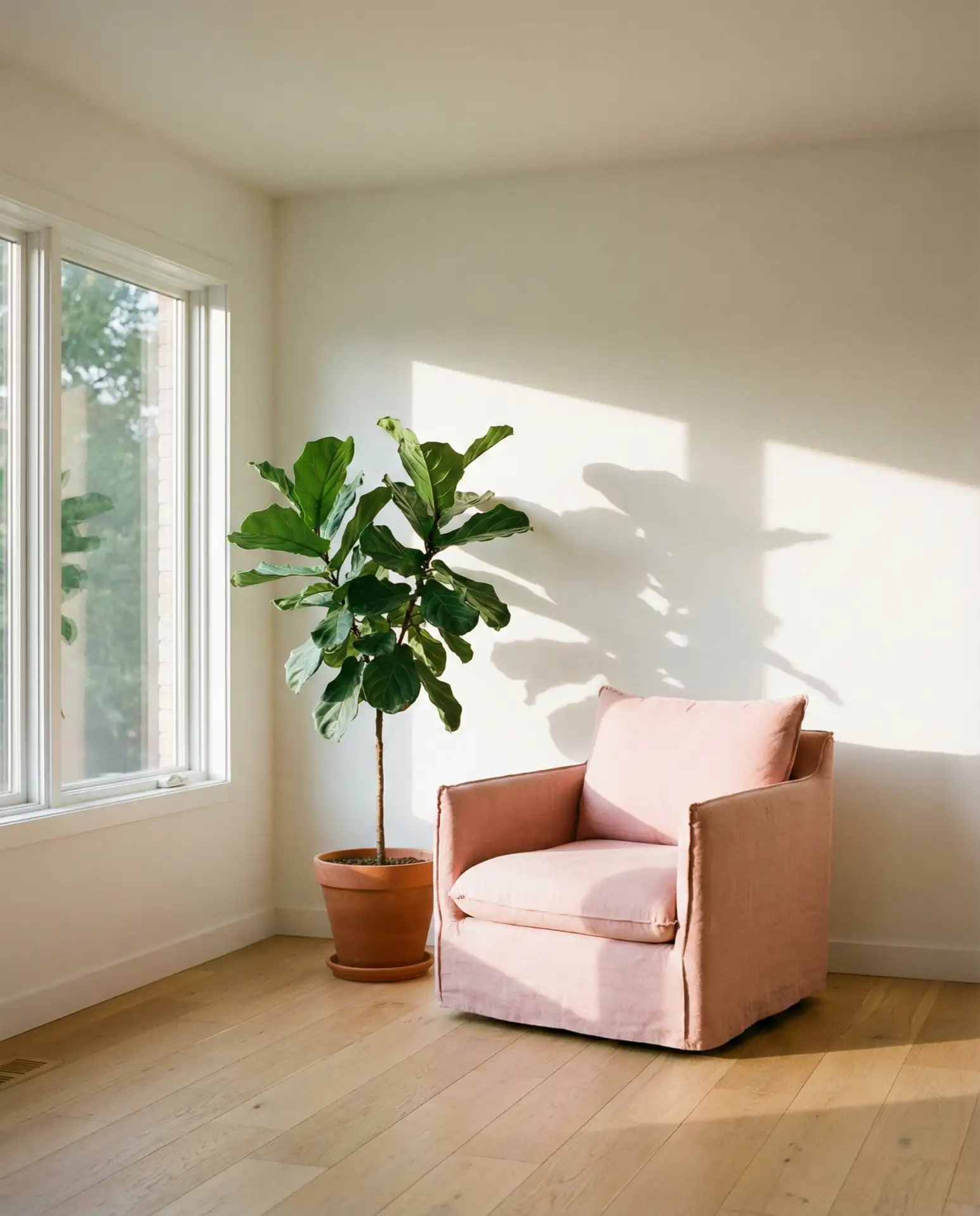
If you’re drawn to simple interiors but want to avoid stark coldness, soft pink paired with white and cream is the answer. This palette thrives in open-plan living rooms, home offices, or even entryways where you want visual breathing room. The pink doesn’t compete—it whispers. A single blush chair, a pale rose throw, or barely-there wall paint can transform a white room from clinical to inviting without adding visual clutter.
A common mistake here is choosing a pink that’s too saturated—it disrupts the minimalist intent. Stick to shades with gray or beige undertones, like “ballet slipper” or “powder puff.” Test samples in different lighting before committing. In Southern California and Arizona, where sunlight is intense, these soft pinks stay true all day without looking washed out or overly sweet.
3. Dark Pink Accent Wall in Modern Dining Room
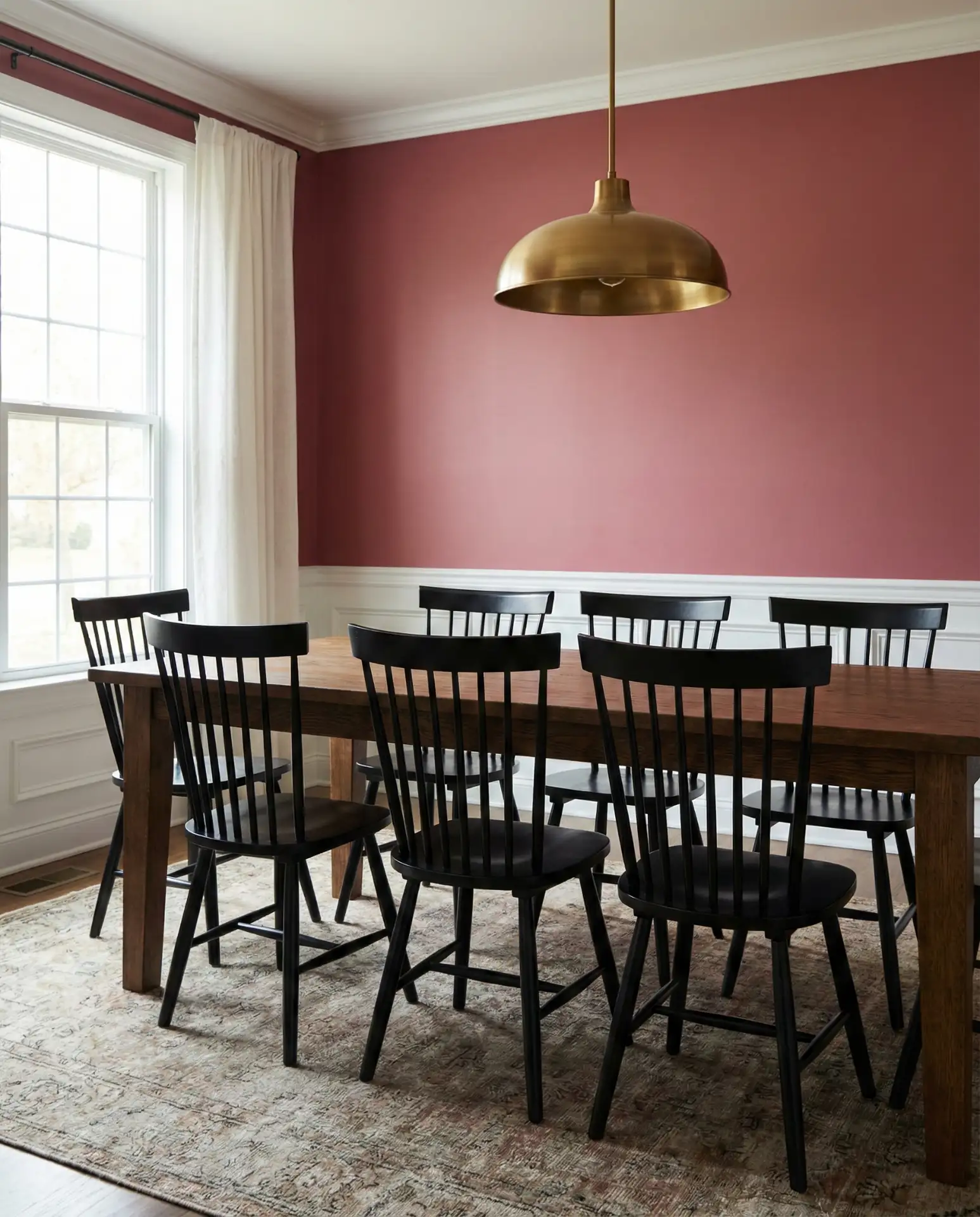
For those who want dark drama without going full charcoal or forest green, a deep rose or mauve accent wall delivers. This works especially well in dining rooms, where you’re aiming for intimacy and conversation. Pair it with black-framed art, a walnut dining table, and matte brass fixtures. The result feels both current and timeless, a sophisticated nod to the maximalist trend without overwhelming the room.
This approach thrives in homes with architectural detail—crown molding, wainscoting, or arched doorways—because the richness of the color highlights those features. In older homes across the Midwest and Mid-Atlantic, dark pink brings warmth to spaces that might otherwise feel heavy or dated. It’s also budget-friendly: one gallon of quality paint and a weekend can completely transform the room.
4. Light Pink and Green Nursery Refresh
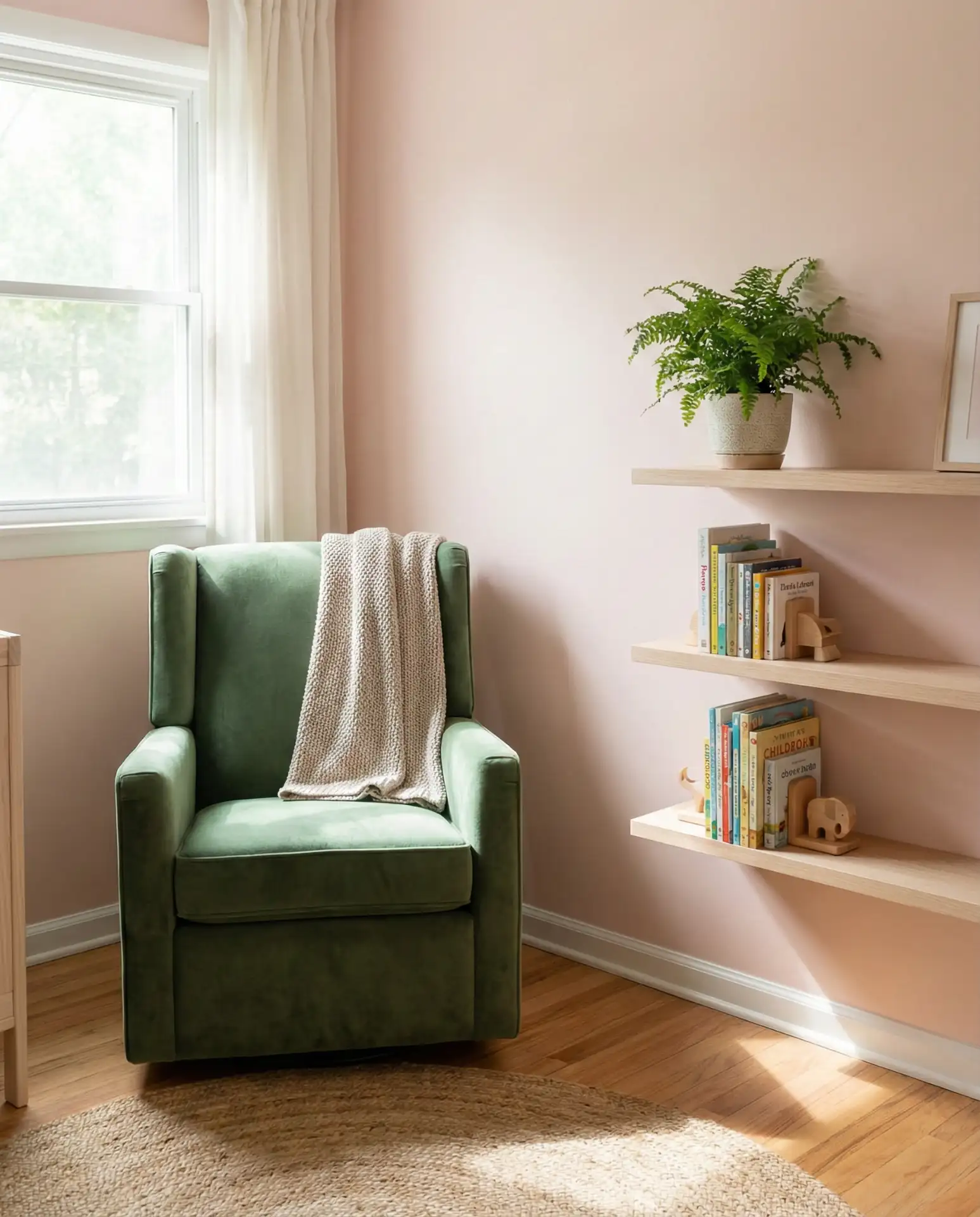
The classic combo of light pink and green and earth tones is back, but with a modern twist. Instead of pastel overload, try a muted sage or olive green alongside a barely-there blush. This palette feels gender-neutral, nature-inspired, and calming—perfect for a nursery or toddler’s room. Add natural wood furniture, woven baskets, and a jute rug to complete the look.
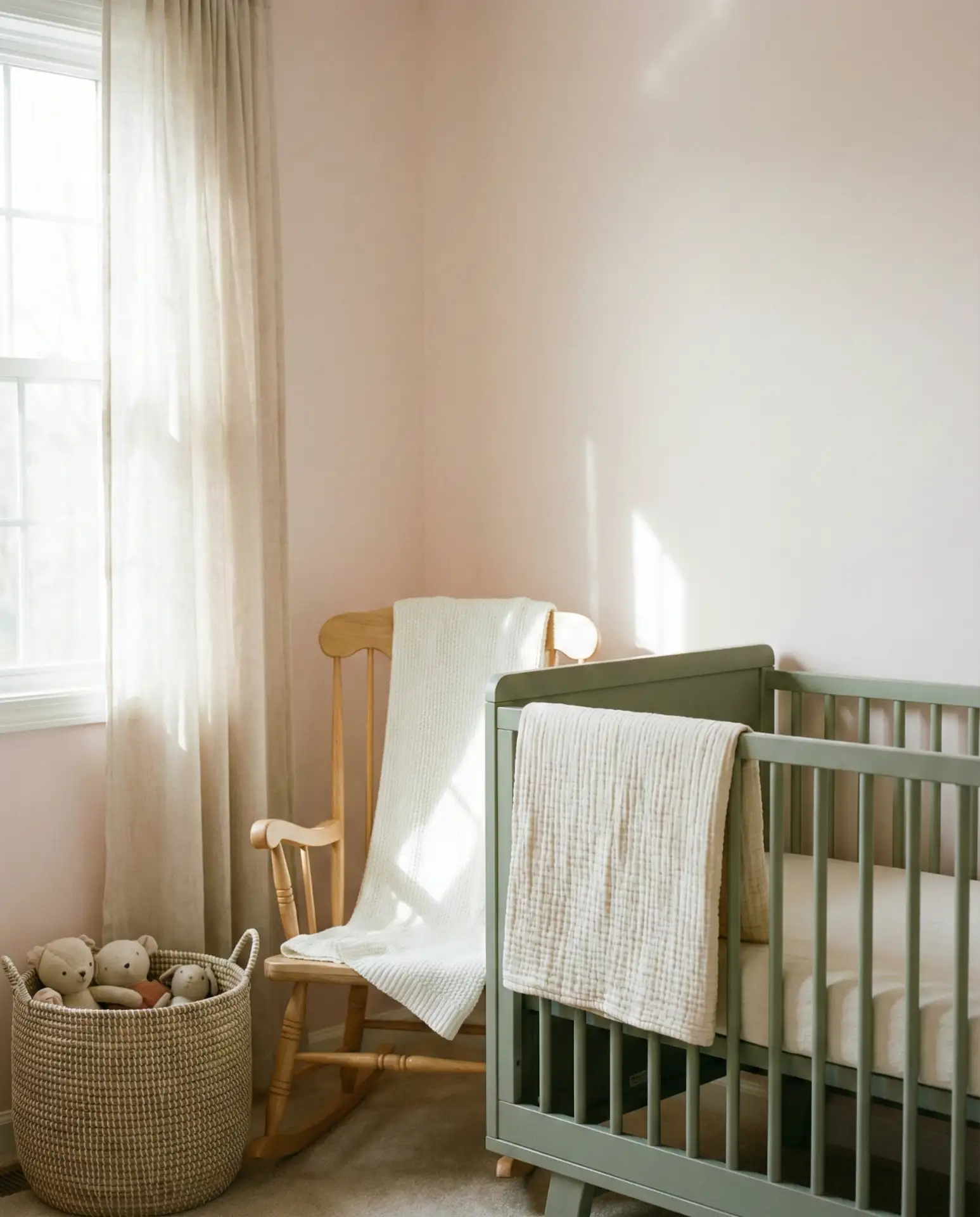
I recently spoke with a designer in Austin who noted that parents are moving away from overly themed nurseries and toward rooms that can grow with the child. This pink-and-green palette does exactly that—it’s soothing for an infant but sophisticated enough to work for a six-year-old. Swap out a few accessories, and the room evolves without needing a full repaint.
5. Hot Pink and Gold Glam Bedroom
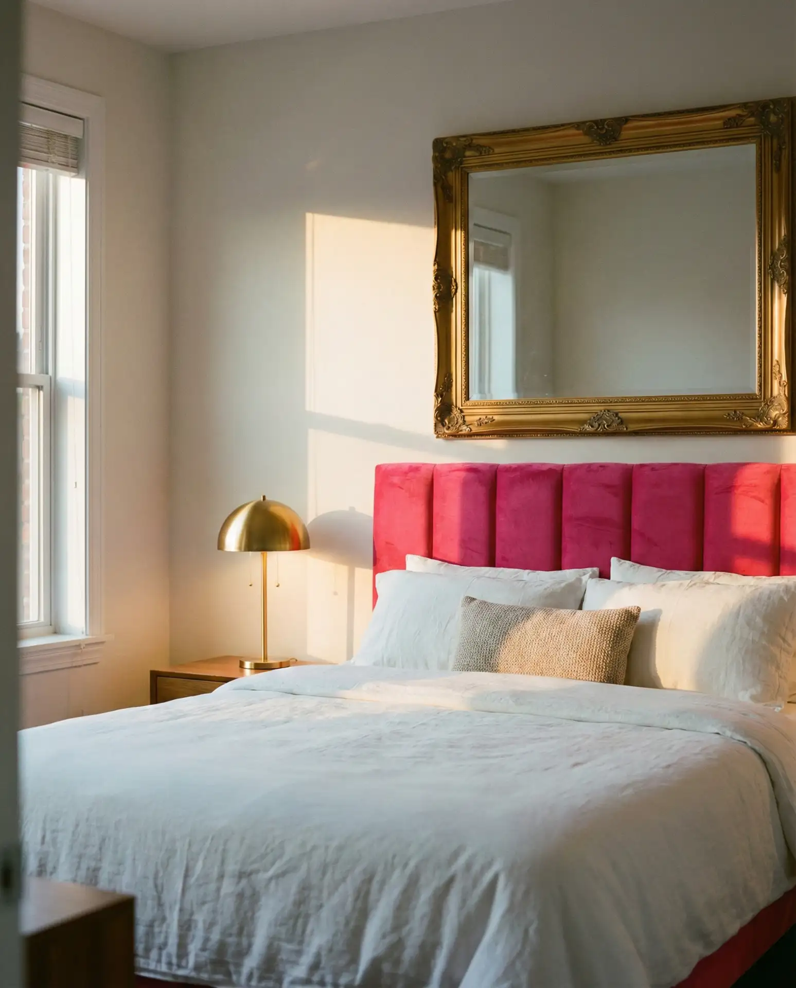
If you’re not afraid of color, hot pink paired with gold and brass accents creates a space that feels unapologetically bold. This works best in bedrooms or dressing areas where you want energy and personality. Think fuchsia velvet pillows, a gold-framed mirror, and metallic drawer pulls. The key is balance—let the pink be the star, and use gold sparingly as punctuation.
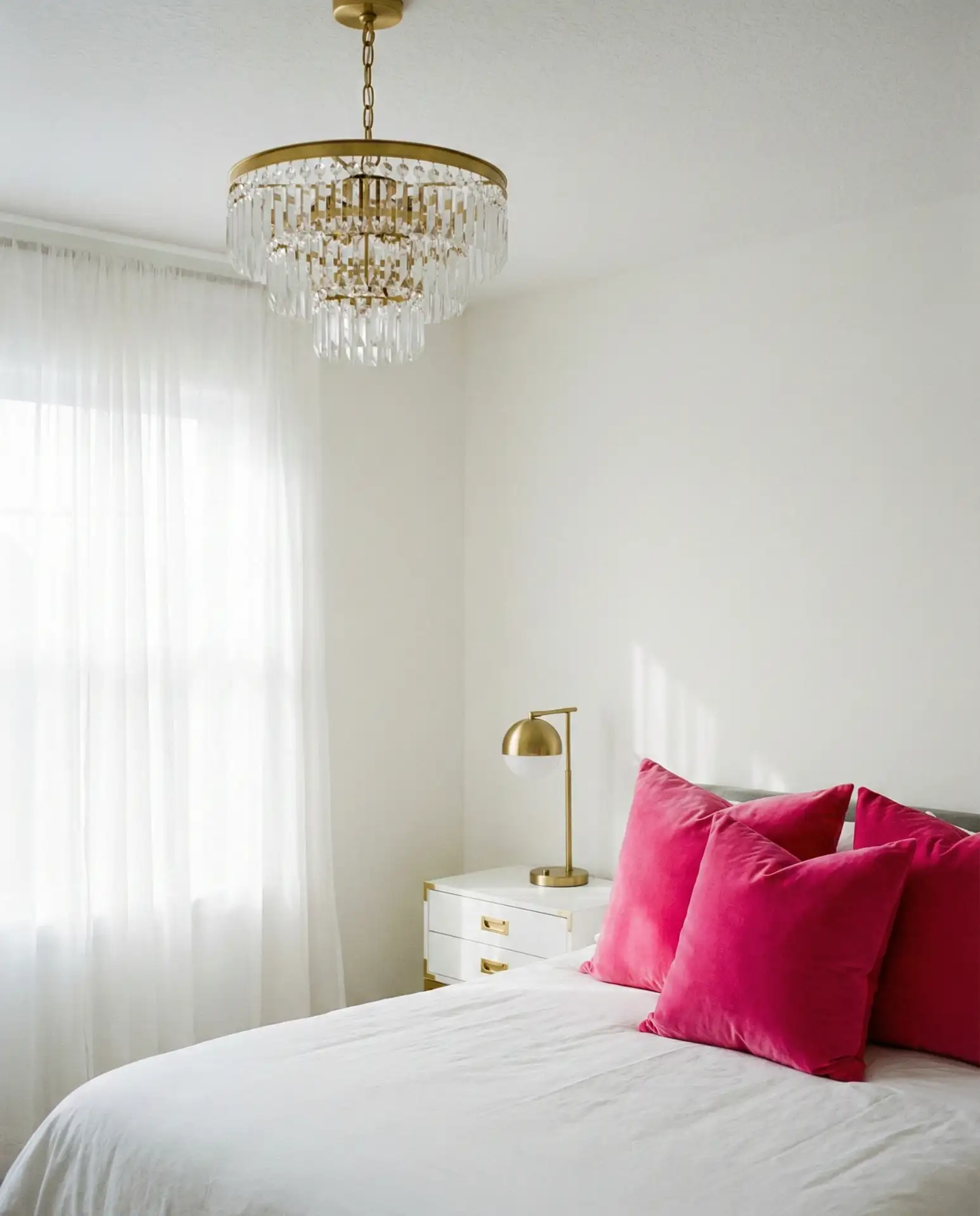
This look is particularly popular in urban areas like Miami, Los Angeles, and New York, where renters want to make a statement without permanent changes. Removable wallpaper in hot pink, gold peel-and-stick tile behind a vanity, or even a bold area rug can deliver the same effect. It’s a high-impact, relatively low-cost way to inject personality into a rental.
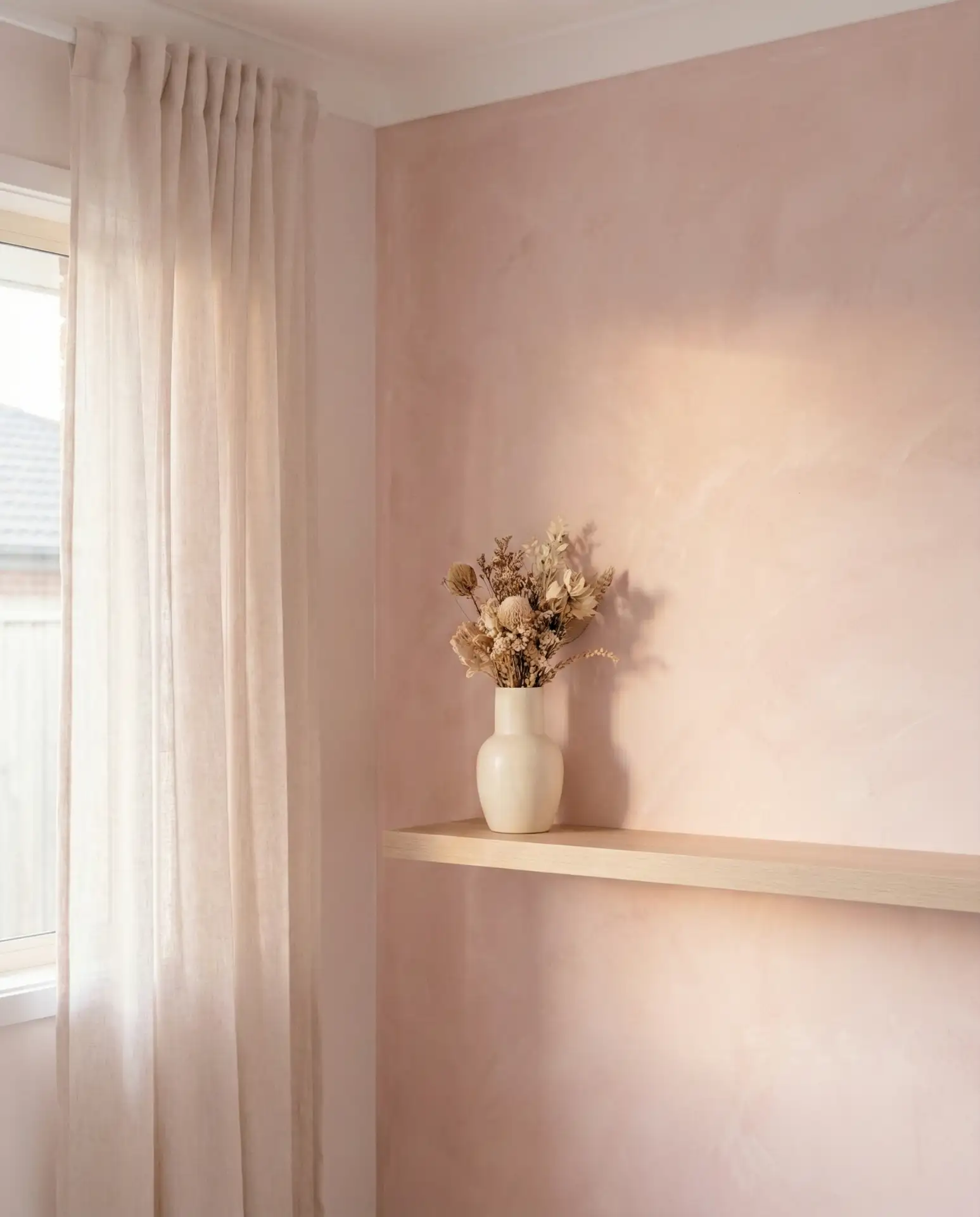
6. Vintage Pink Wallpaper Feature Wall
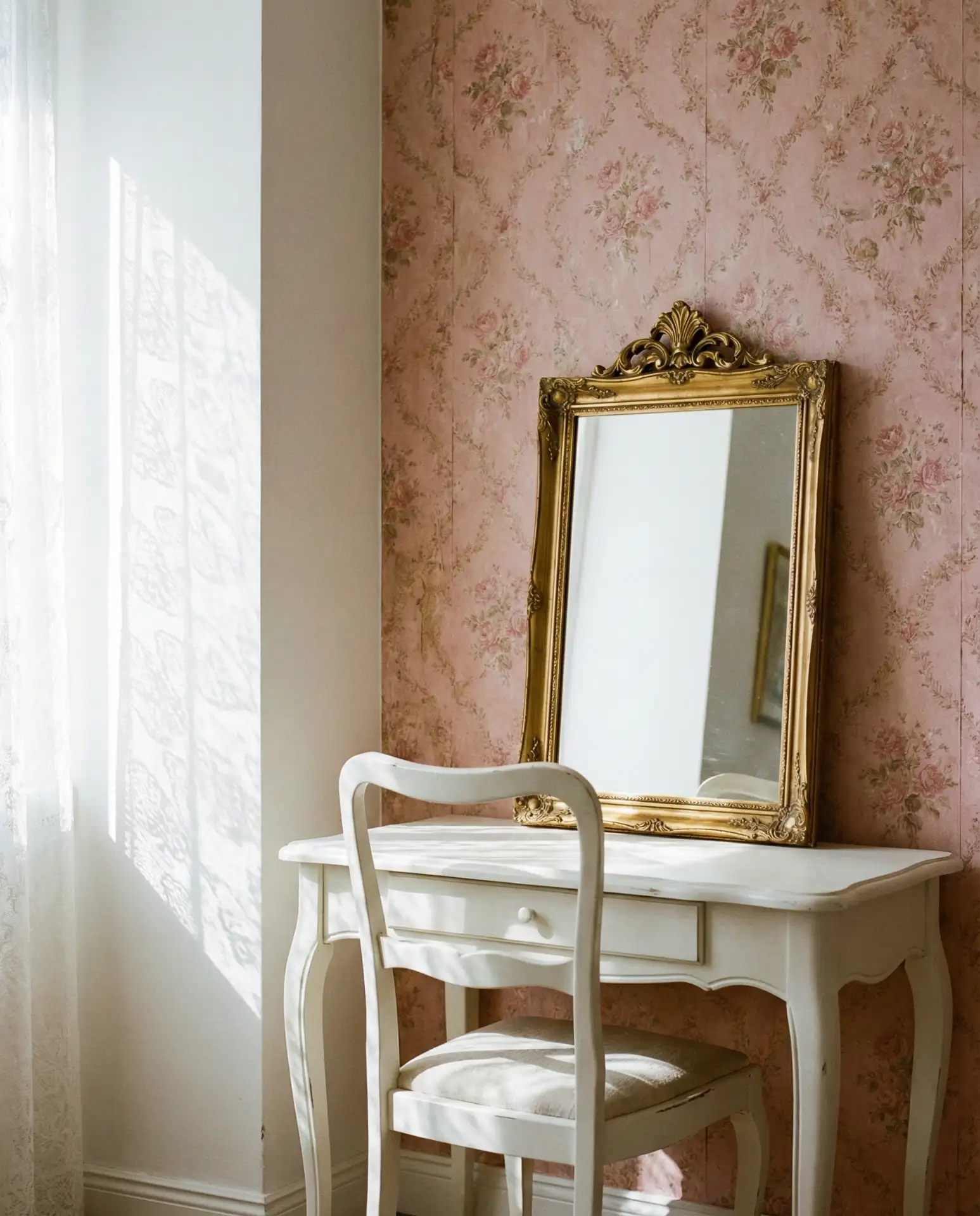
There’s something nostalgic and charming about vintage-inspired pink wallpaper, especially when it features delicate florals or Art Deco patterns. Use it on a single feature wall in a bedroom, powder room, or even a home office. The rest of the room should stay neutral—white trim, light wood, and minimal accessories—so the wallpaper becomes the focal point without overwhelming the space.
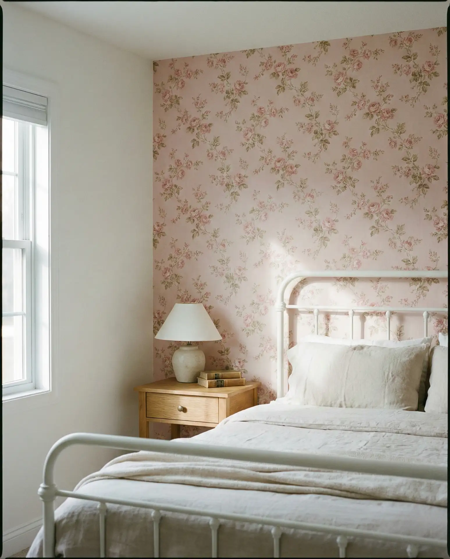
Wallpaper costs can range from $30 to $150 per roll depending on the brand and pattern complexity. For a standard 10×12 bedroom accent wall, budget around $200 to $400, including materials and adhesive. Peel-and-stick options are more forgiving for DIYers and won’t damage walls in rentals, making them a smart choice for commitment-phobes or those planning to move within a few years.
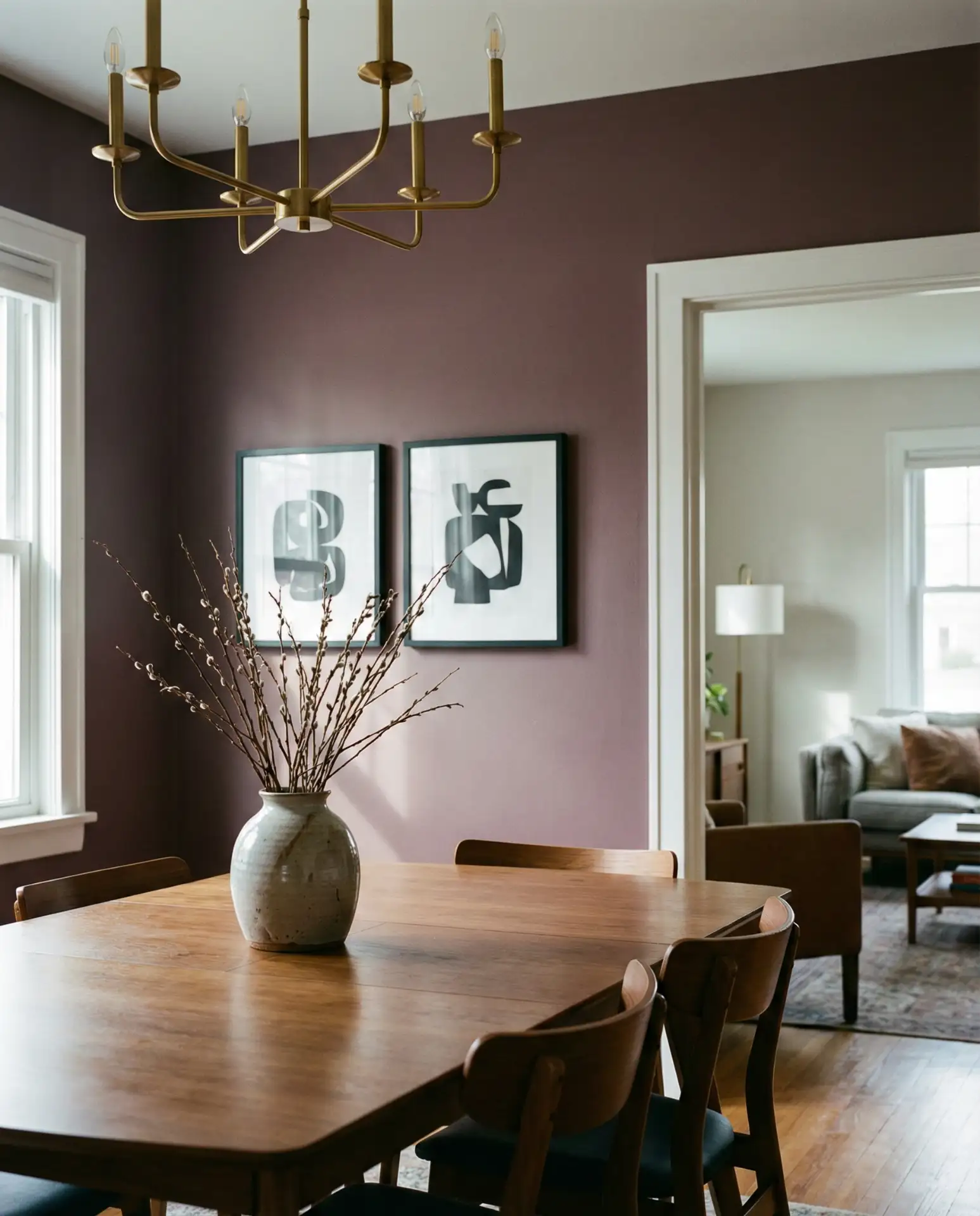
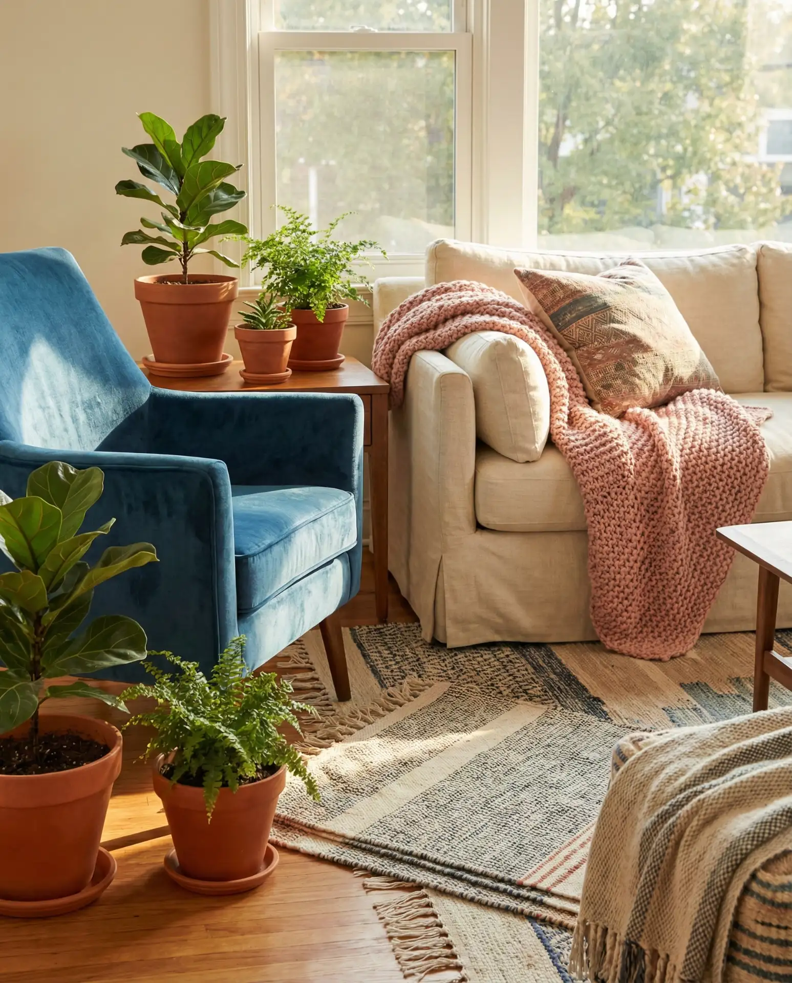
7. Blue and Pink Bohemian Living Room
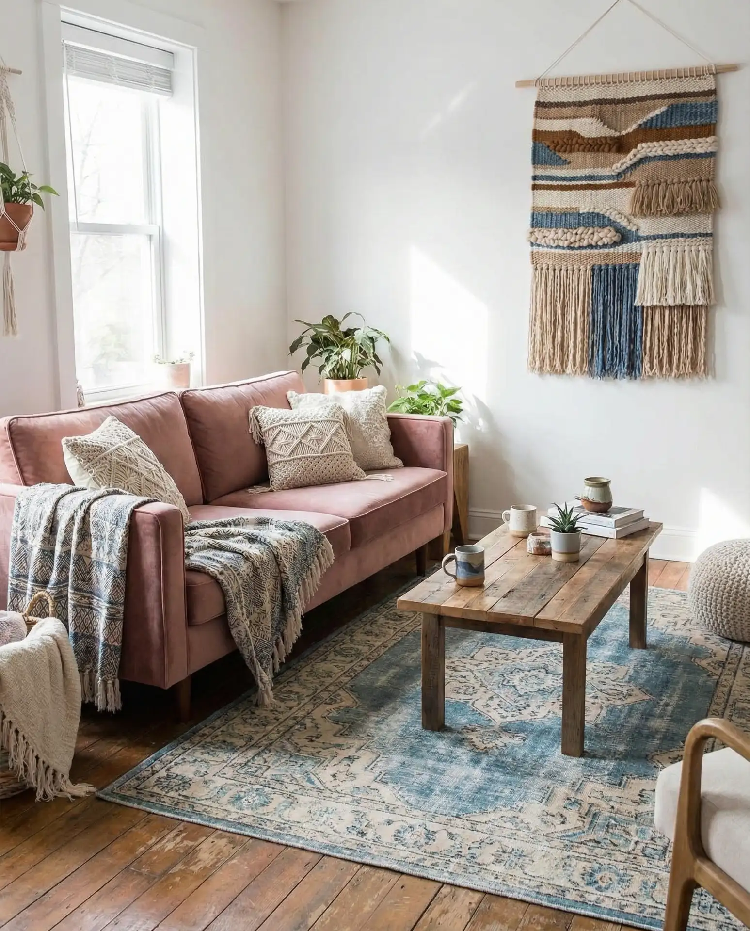
The unexpected pairing of blue and dusty pink brings a relaxed, globally inspired vibe to living rooms. Layer in textiles—Moroccan rugs, indigo throw pillows, and pink linen curtains—and mix metals and woods for an eclectic but cohesive look. This palette works beautifully in homes with lots of natural light, where the colors can shift and interact throughout the day.
Bohemian spaces work best in regions with warm climates—think the Southwest, Southern California, and parts of the Southeast—where indoor-outdoor living is common. The blue-and-pink palette feels airy and breathable, which suits homes that open onto patios or gardens. It’s also forgiving: you can add or subtract pieces over time without disrupting the overall aesthetic.
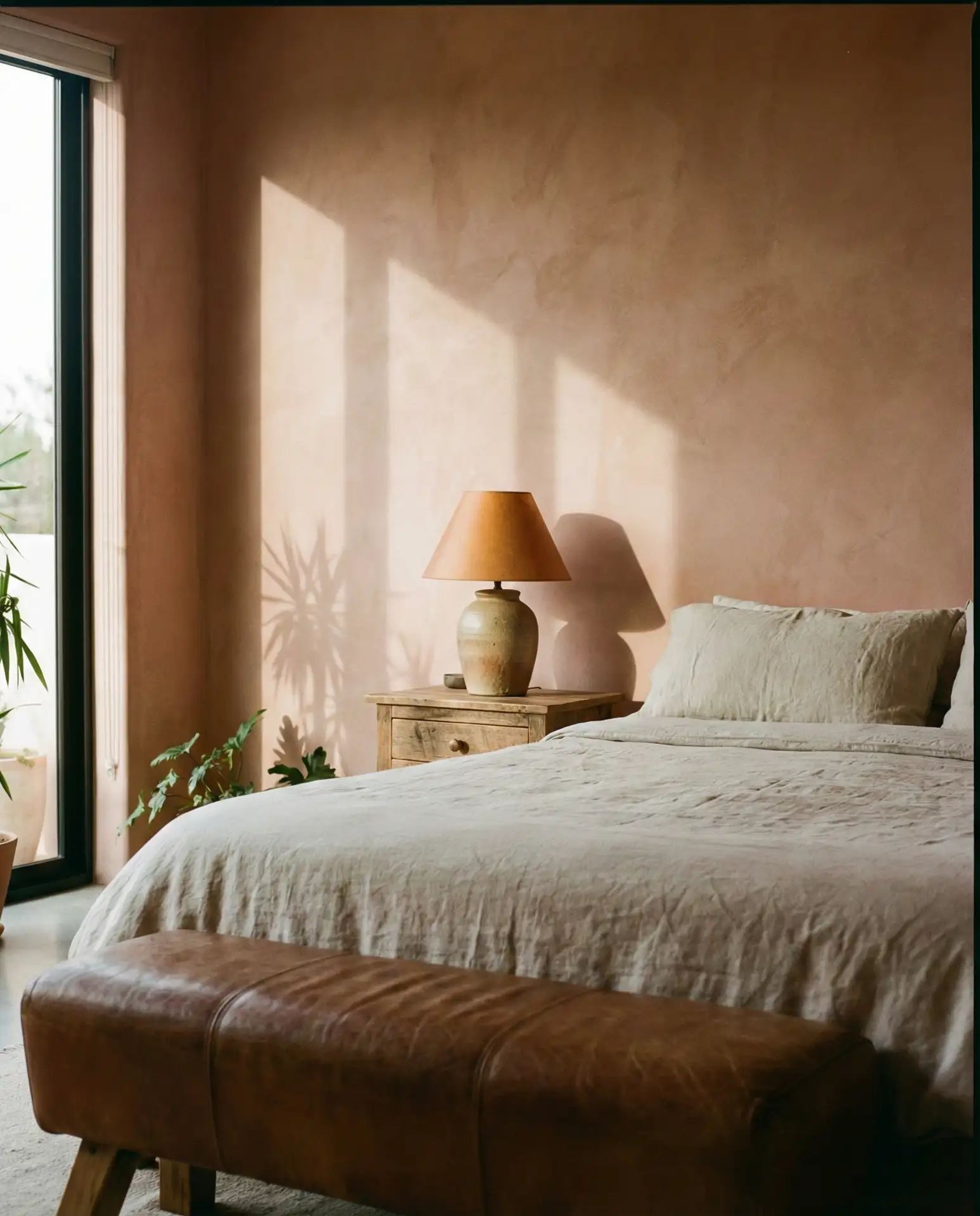
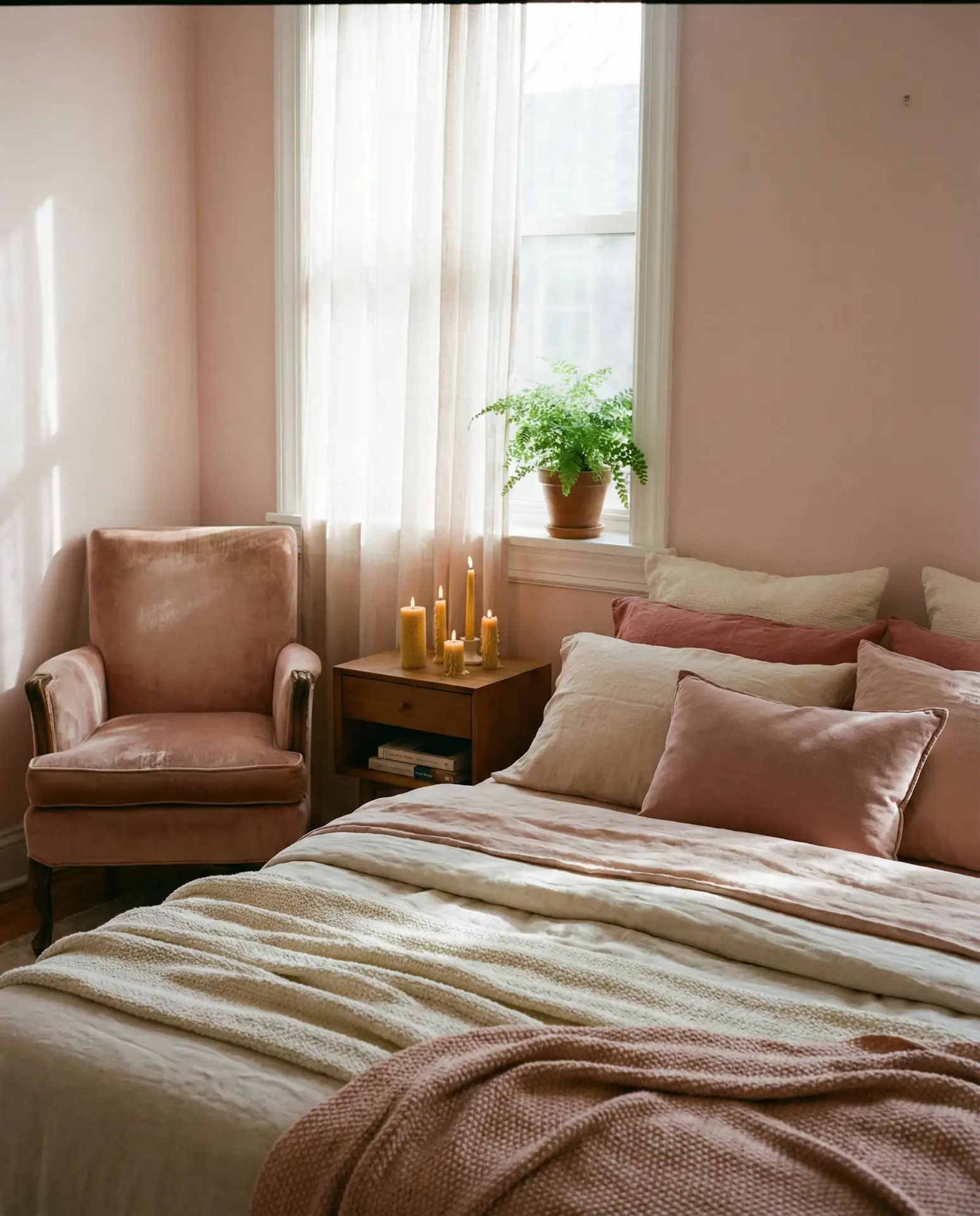
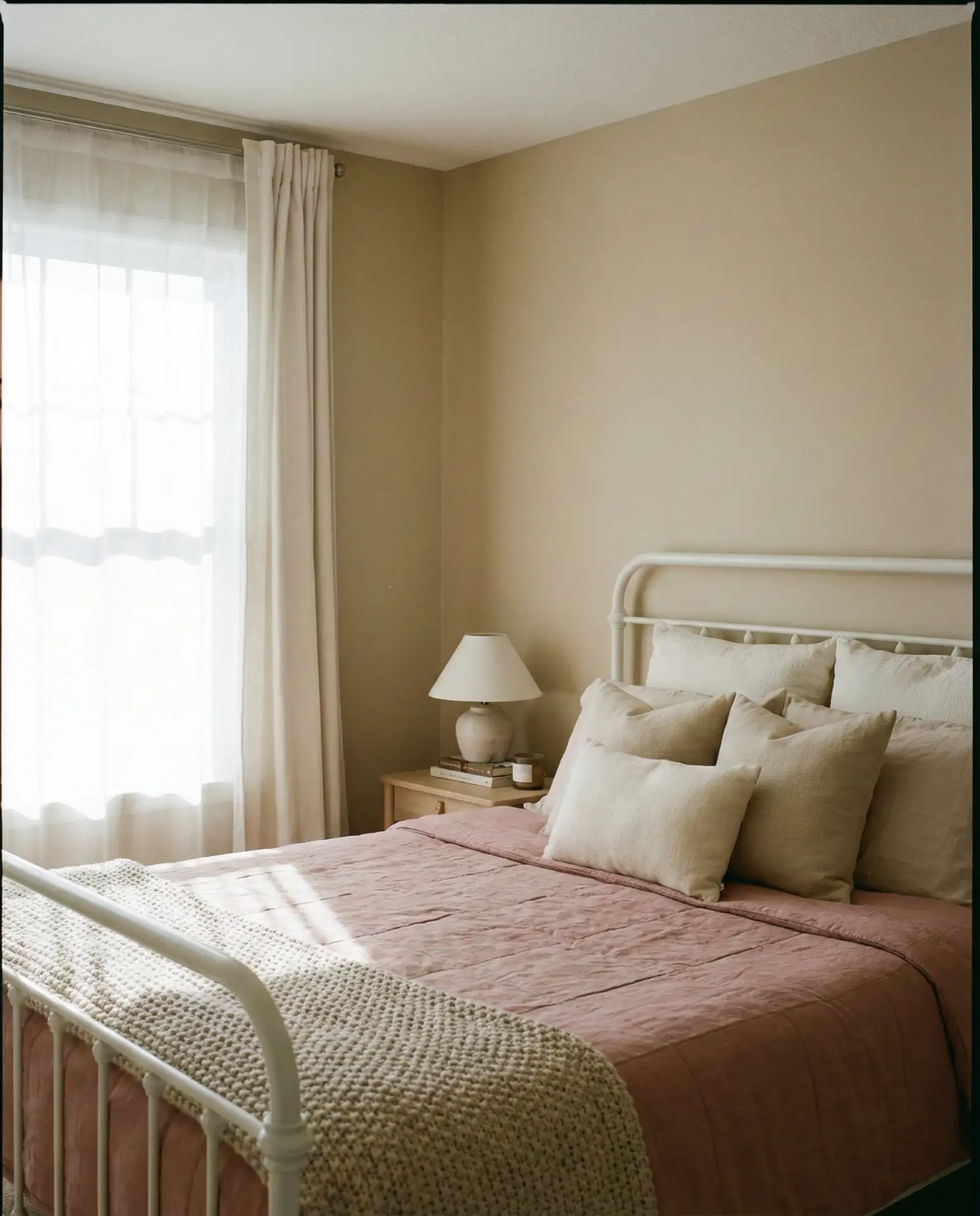
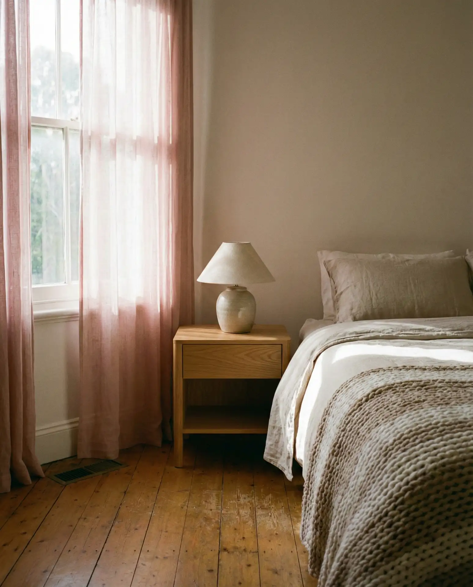
8. Pink and Brown Earthy Bedroom Retreat
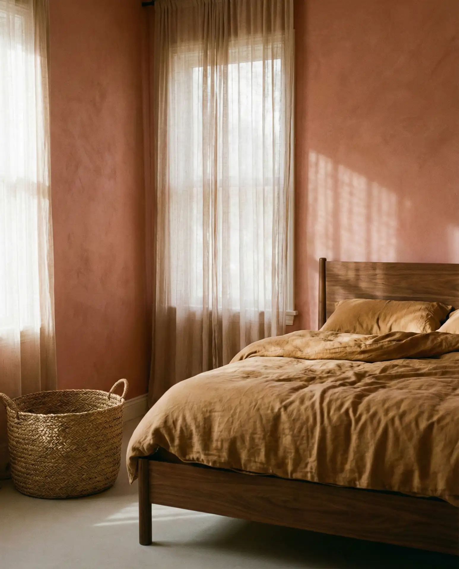
Pairing pink with brown and natural wood tones creates a grounded, organic feel that’s both modern and timeless. Think terracotta-tinged blush walls, a walnut bed frame, and camel-colored bedding. This palette appeals to homeowners who want warmth without sweetness, and it works across a range of architectural styles—from mid-century ranches to contemporary builds.
Real homeowners often underestimate how much brown can ground a pink room. A designer in Denver shared that many clients initially resist brown, fearing it will look dated, but once they see it paired with the right shade of pink, they’re converted. The trick is choosing rich, saturated browns—chocolate, cognac, or chestnut—rather than anything with orange or red undertones.
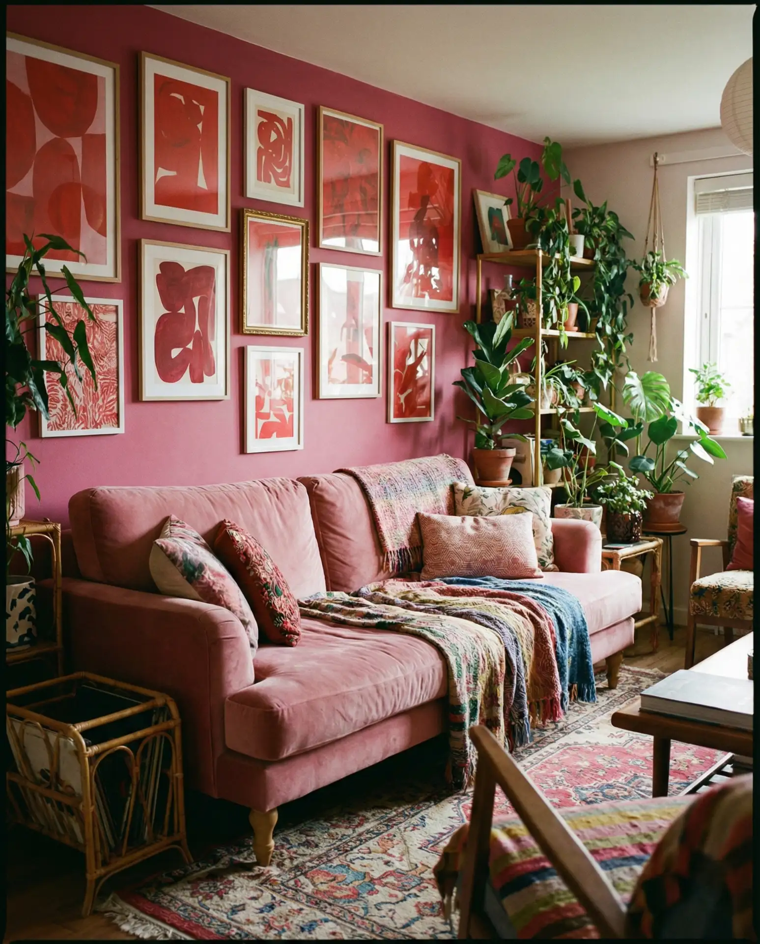
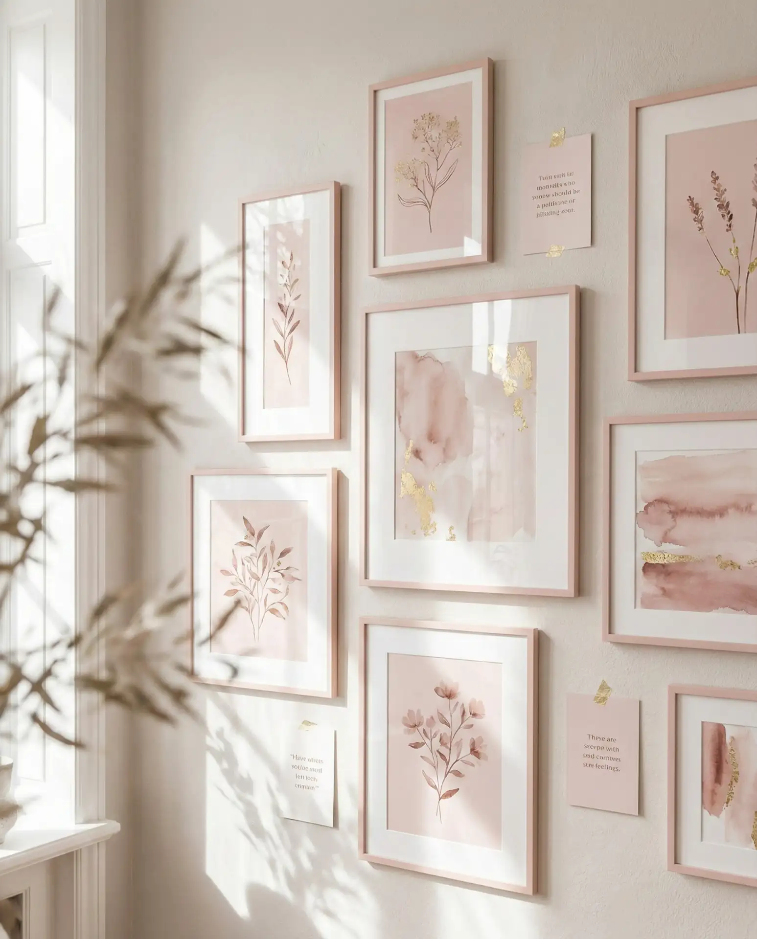
9. Cute Pink Gallery Wall for Teen Bedroom
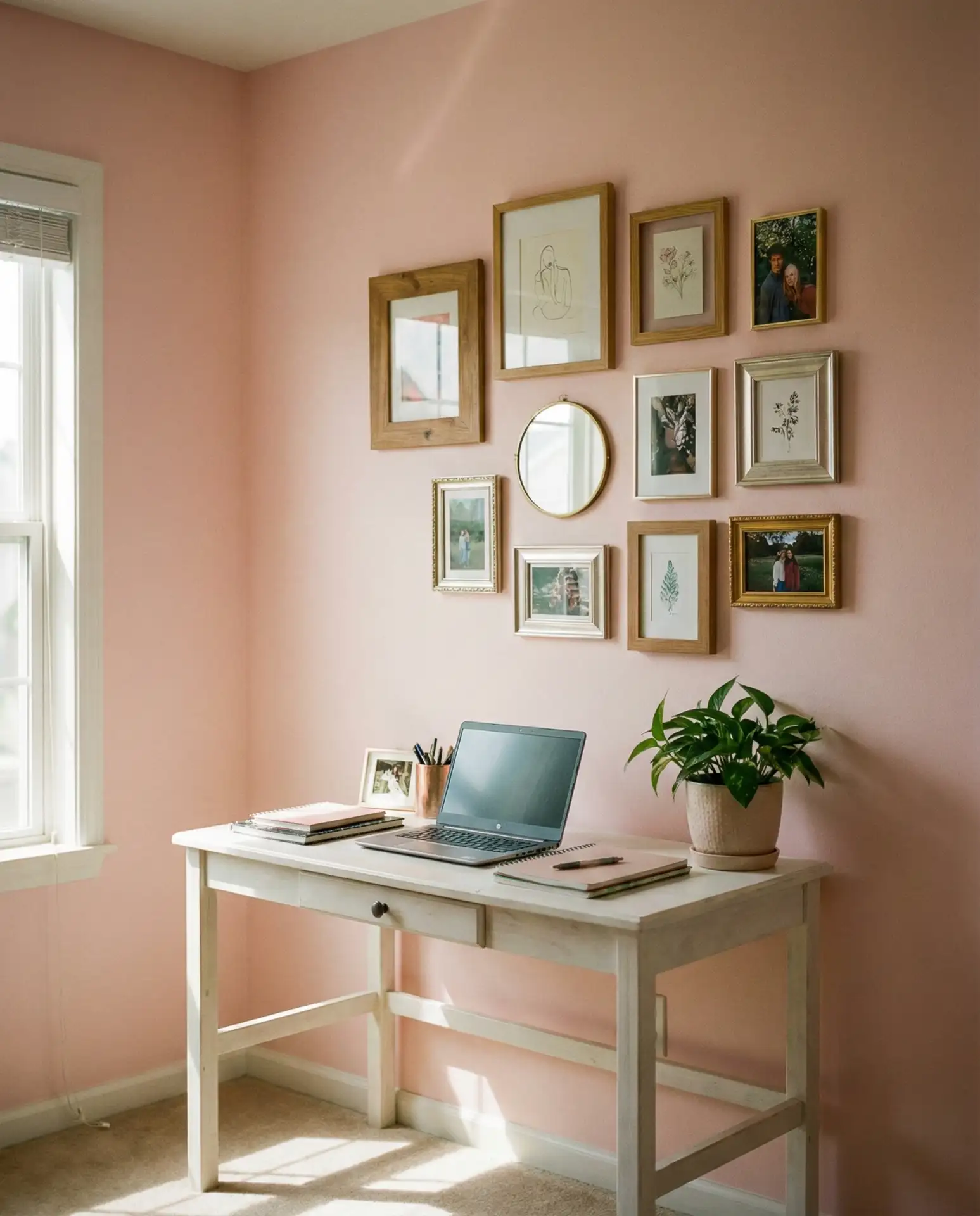
A cute and curated gallery wall is a perfect way to personalize a bedroom without committing to paint. Use a mix of framed prints, photos, and small mirrors in coordinating frames—white, gold, or light wood—and arrange them on a soft pink accent wall. This approach is ideal for bedrooms for teens who want a space that reflects their personality and can evolve as their tastes change.
Gallery walls are most successful when there’s a unifying element—whether that’s frame color, mat style, or a consistent theme in the artwork. For teens, this could be concert posters, Polaroids, or prints from favorite artists. The pink wall acts as a neutral backdrop that lets the gallery shine, and because it’s not a permanent fixture, it can be refreshed whenever inspiration strikes.
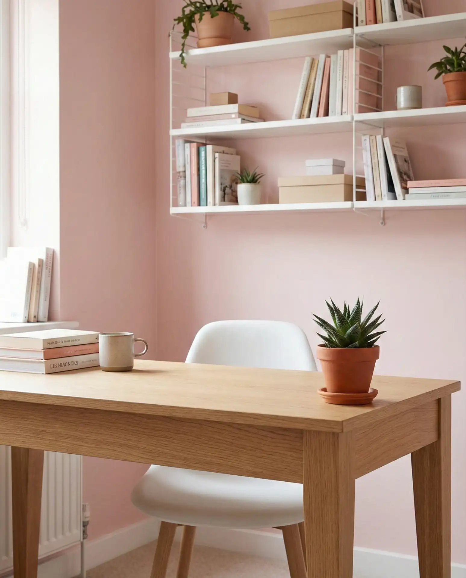
10. Aesthetic Pink Home Office Nook
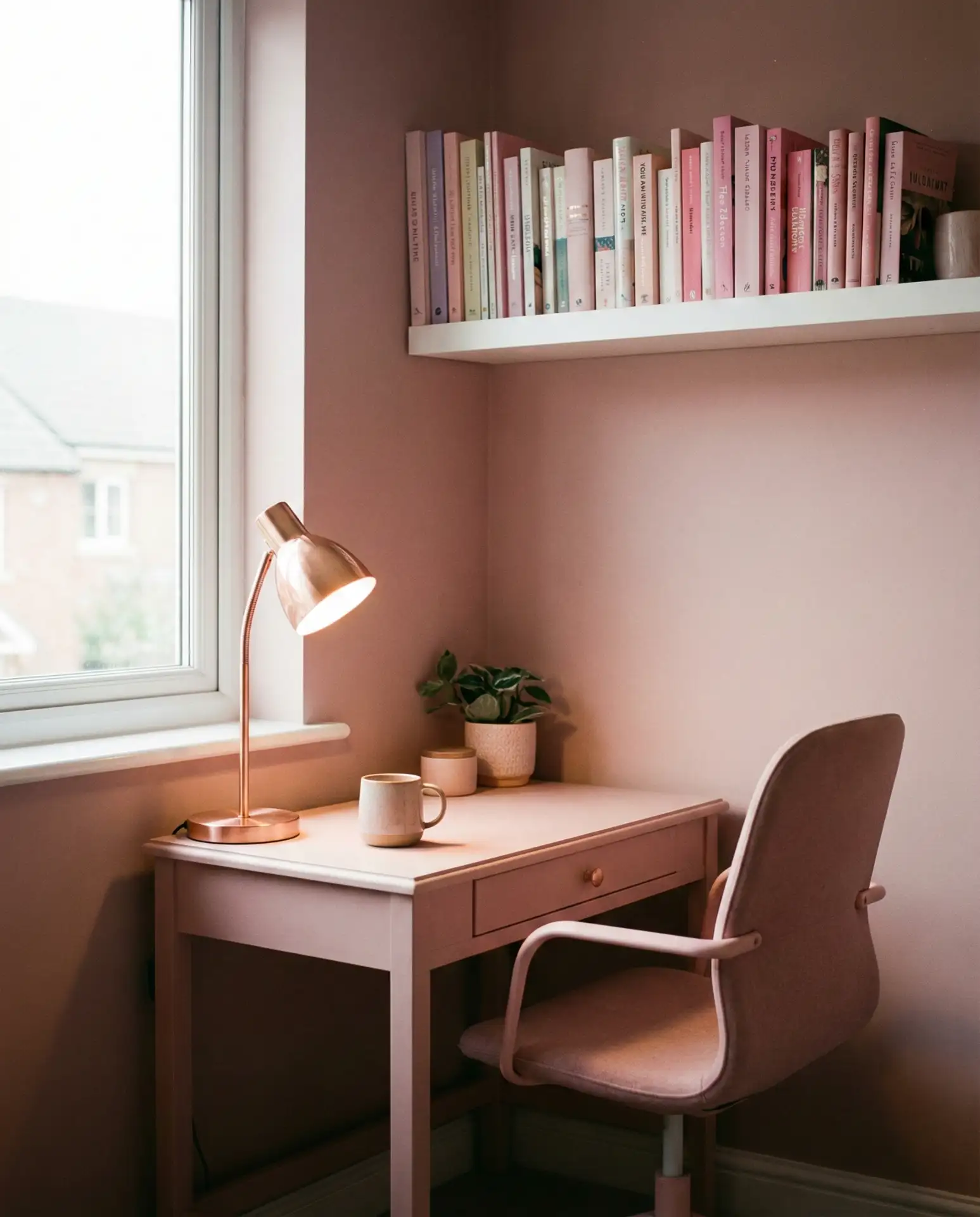
An aesthetic home office doesn’t have to be gray and corporate. A soft pink nook with a floating desk, open shelving, and thoughtful lighting can make remote work feel more creative and less draining. Add a blush chair, rose-gold desk accessories, and a few live plants. The result is a workspace that’s Instagram-ready but also genuinely functional.
In apartments and smaller homes, especially in cities like Seattle, Boston, and San Francisco, dedicating an entire room to an office isn’t always feasible. A pink nook carved out of a bedroom corner or living room alcove offers a clear visual boundary between work and life. It signals “this is a creative space” without requiring a door or major renovation.
11. Red and Pink Maximalist Living Room
For the adventurous, combining red and various shades of pink creates a vibrant, layered living room that’s anything but boring. Use reds in smaller doses—an accent chair, a patterned rug, or a piece of art—and let pinks dominate the walls and larger furniture. The effect is warm, energetic, and deeply personal, perfect for someone who’s tired of neutral-only interiors.
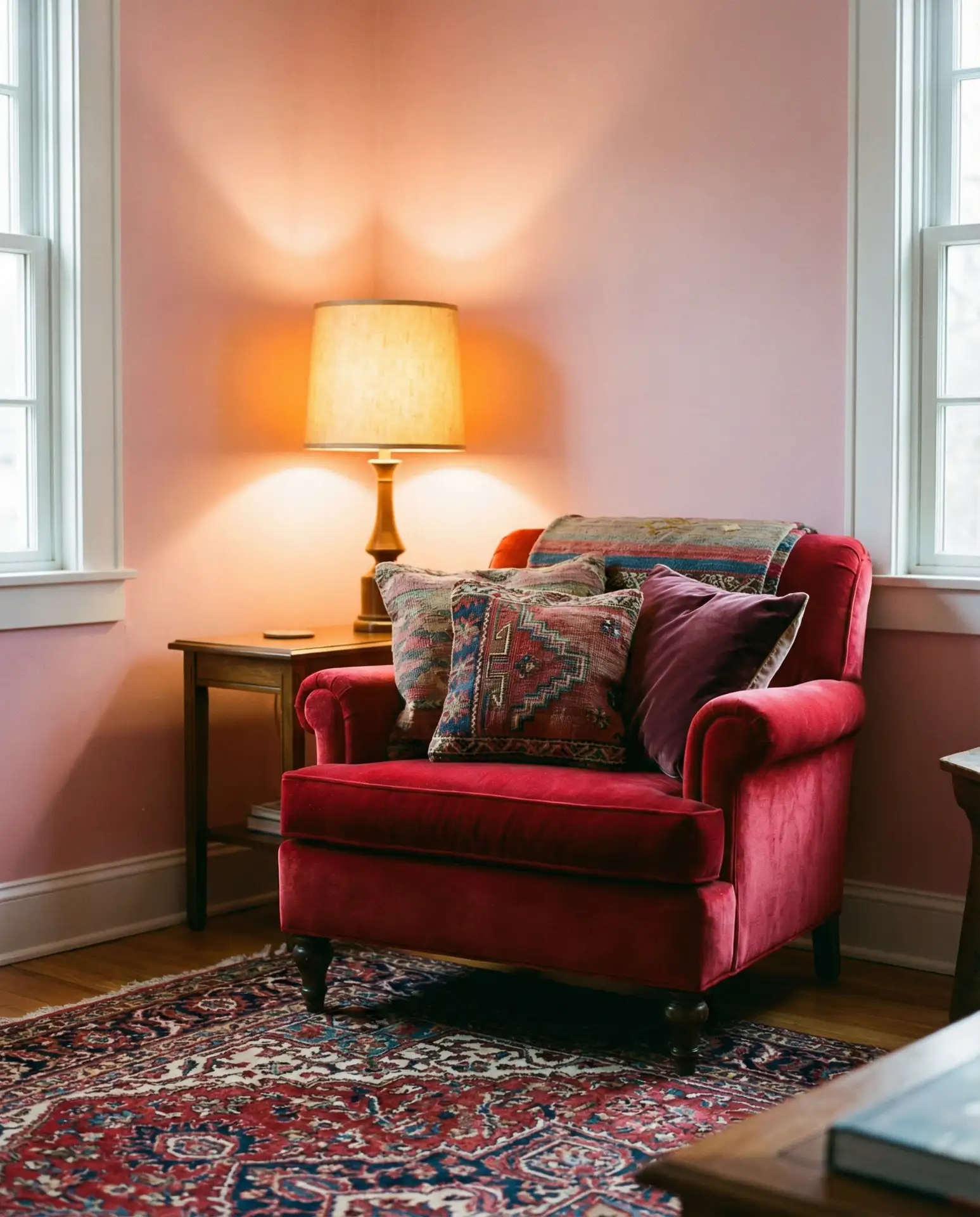
This style works best in homes with high ceilings or large windows, where the boldness won’t feel claustrophobic. In places like Brooklyn lofts or converted warehouses in Portland, the industrial bones of the space provide a counterbalance to the softness of pink and red. It’s also a look that rewards confidence—commit fully, and it reads as intentional; half-commit, and it just looks confused.
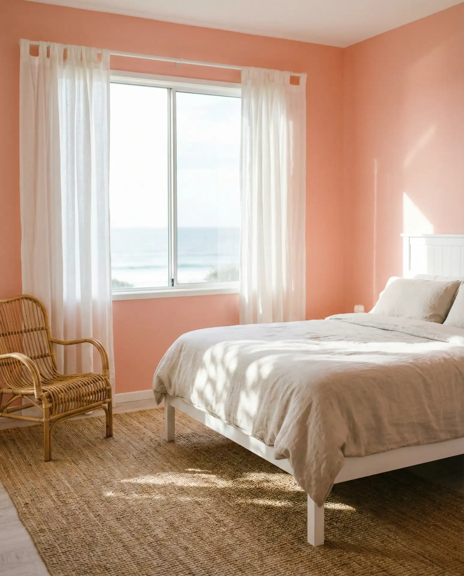
12. Orange and Pink Sunset-Inspired Bedroom
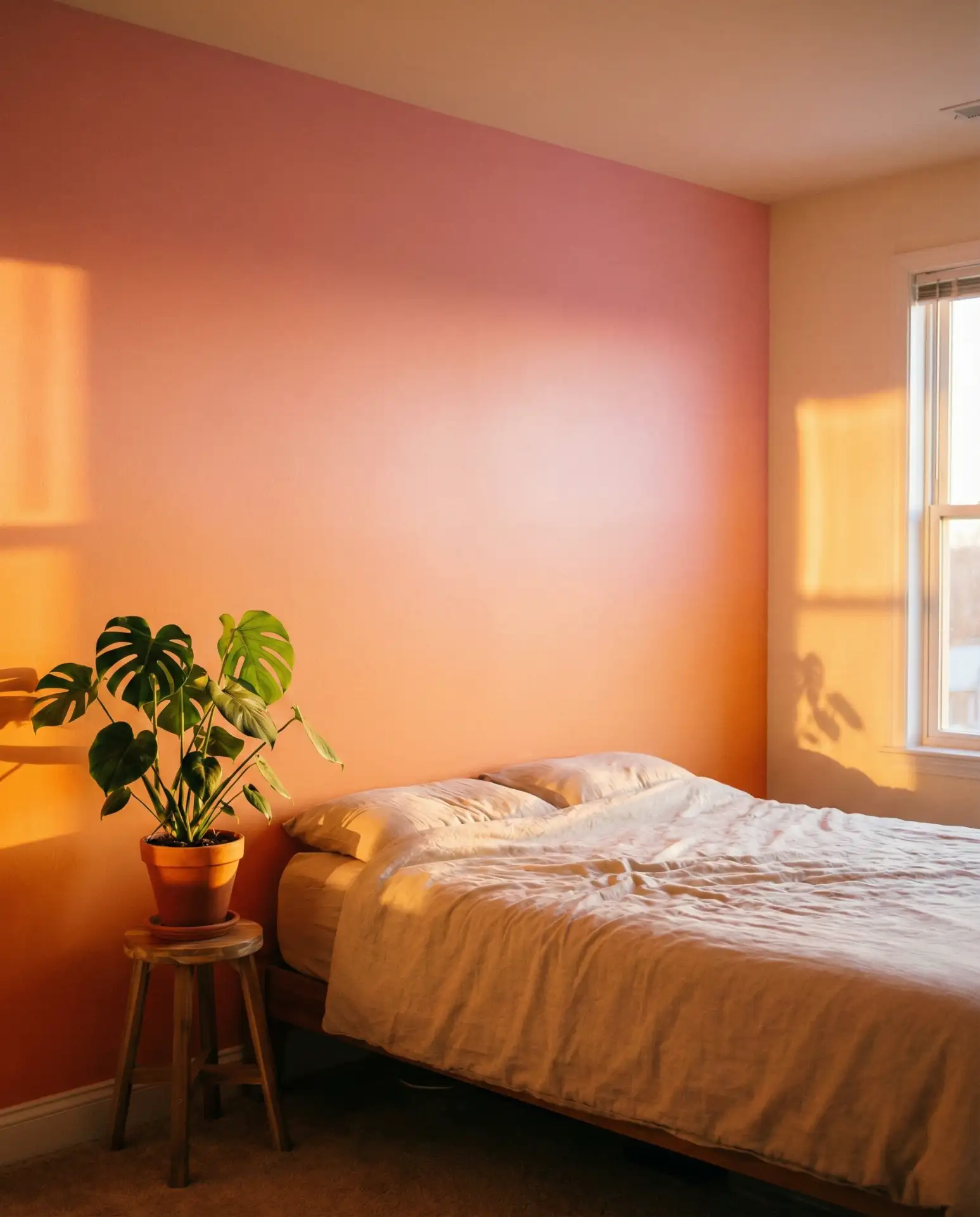
The warm gradient of orange and pink evokes the glow of a sunset, and it’s an unexpectedly soothing palette for bedrooms. Use coral or peach tones alongside blush for a room that feels cozy and optimistic. This combination works especially well in spaces with west-facing windows, where the natural evening light enhances the warmth of the colors.
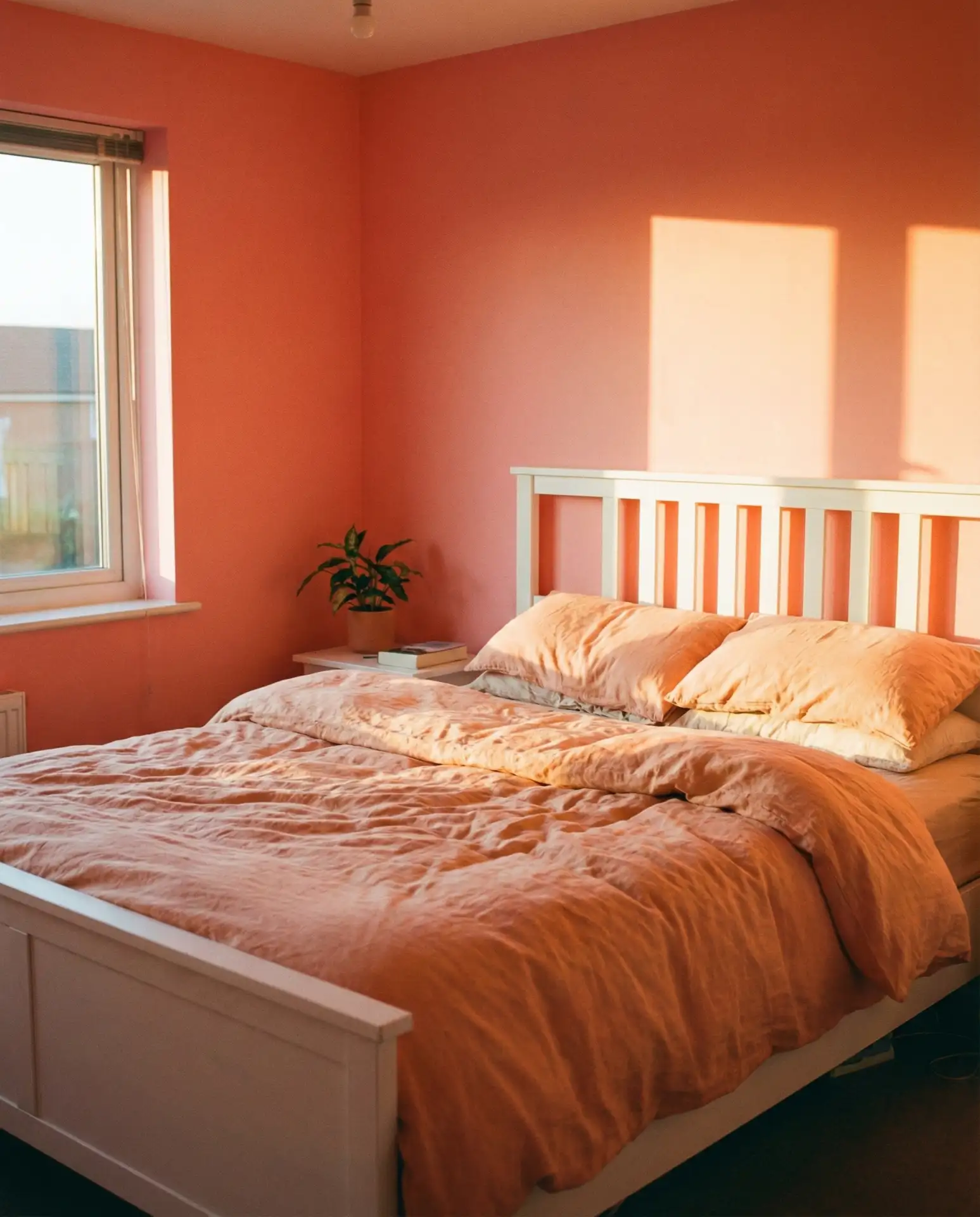
According to color psychology experts, warm tones like orange and pink can promote relaxation and emotional warmth, making them ideal for bedrooms. The key is to avoid anything too bright or neon—stick to muted, earthy versions of both colors. In Southern and Southwestern states, where sunsets are particularly dramatic, this palette feels like bringing the outdoors in.
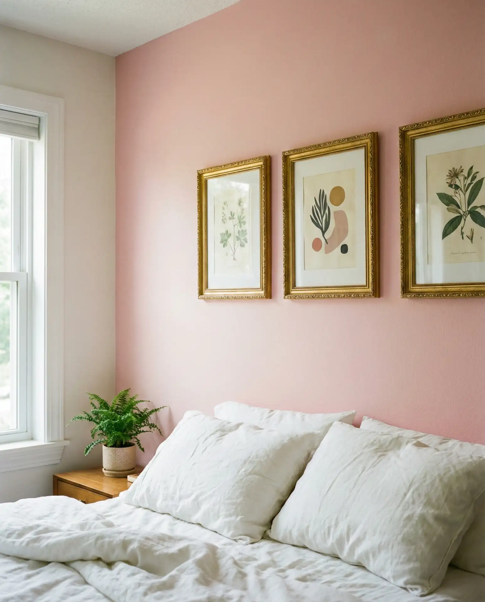
13. Girly Wall Decor with Pink Frames and Prints
A girly wall doesn’t have to mean over-the-top ruffles and bows. Instead, think curated prints in soft pink frames, mixed with black-and-white photography and subtle metallics. This approach works in bedrooms, walk-in closets, or even a powder room. It’s feminine without being juvenile, and it offers endless flexibility as your style evolves.
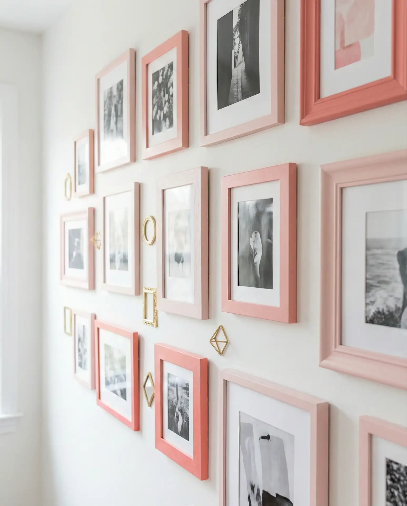
One common mistake is overloading the wall with too many frames or mismatched styles. Aim for visual rhythm—vary the sizes, but keep a consistent frame style or color family. In tight spaces like studio apartments or small bedrooms, a well-edited wall display can make the room feel larger and more intentional. It’s proof that “girly” can also mean sophisticated.
14. Your Dreams Pink Bedroom Sanctuary
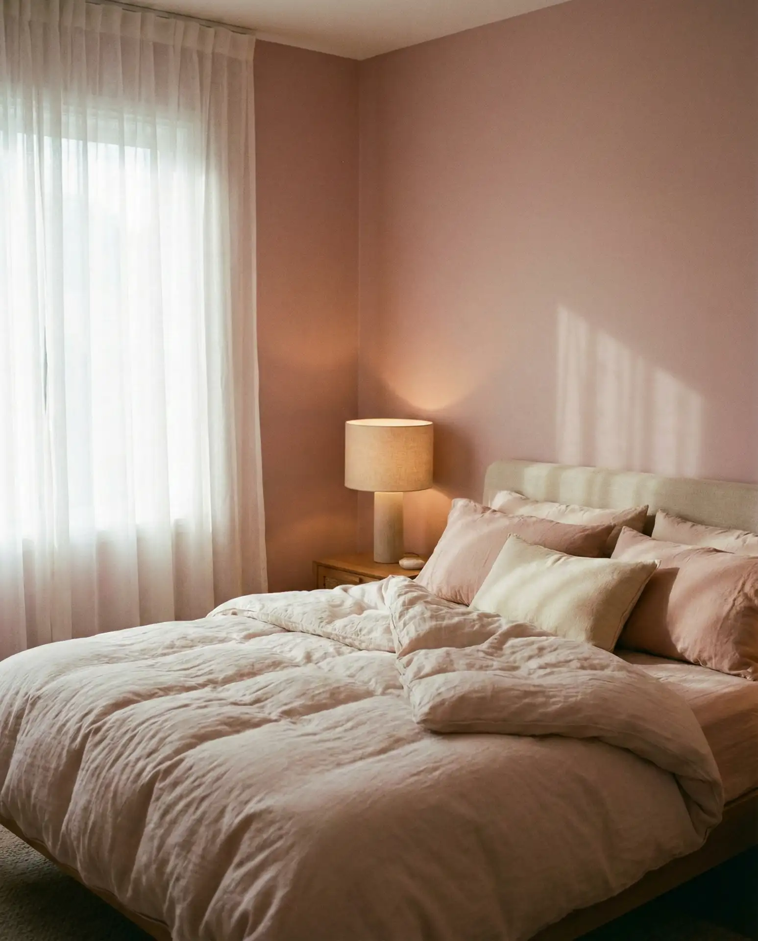
Creating your dream bedroom often means leaning into what makes you feel most at ease. If that’s pink, commit to it fully. Soft pink walls, plush bedding in coordinating tones, and ambient lighting can turn a standard bedroom into a personal sanctuary. Add blackout curtains, a few candles, and maybe a reading nook, and you’ve got a space designed around rest and rejuvenation.
I know a homeowner in Nashville who repainted her entire bedroom in a dusty rose after years of beige walls. She said it changed how she felt waking up every morning—more optimistic, more like herself. That’s the power of a color that resonates personally. Your bedroom should reflect who you are, not what a catalog tells you is trendy.
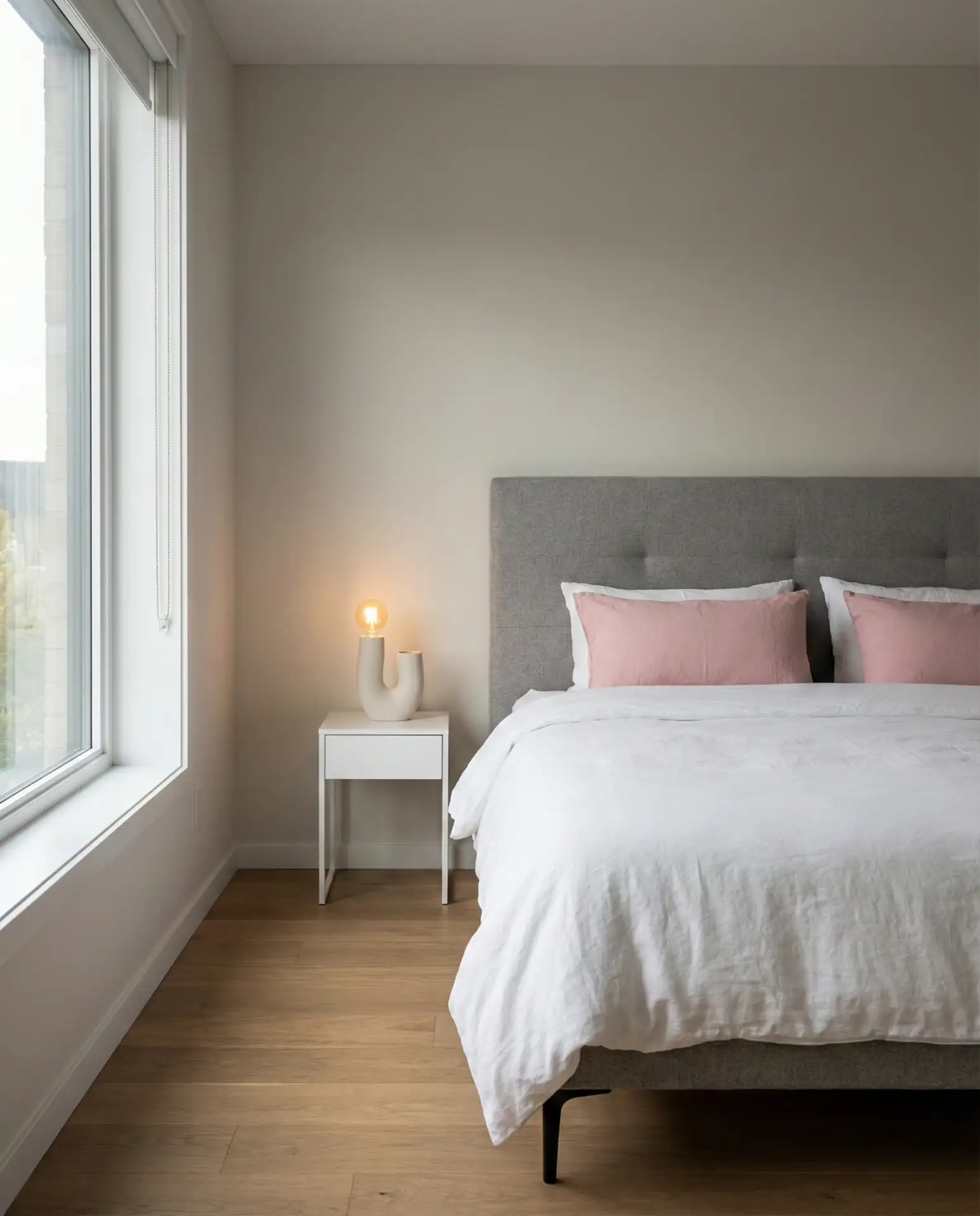
15. Black and Pink Modern Contrast Bedroom
The pairing of black and pink is bold, graphic, and undeniably modern. Use black for bed frames, nightstands, or window treatments, and let pink soften the space through walls, bedding, or art. This high-contrast look works best in bedrooms with strong architectural features—exposed beams, large windows, or interesting molding—that can hold their own against the drama.
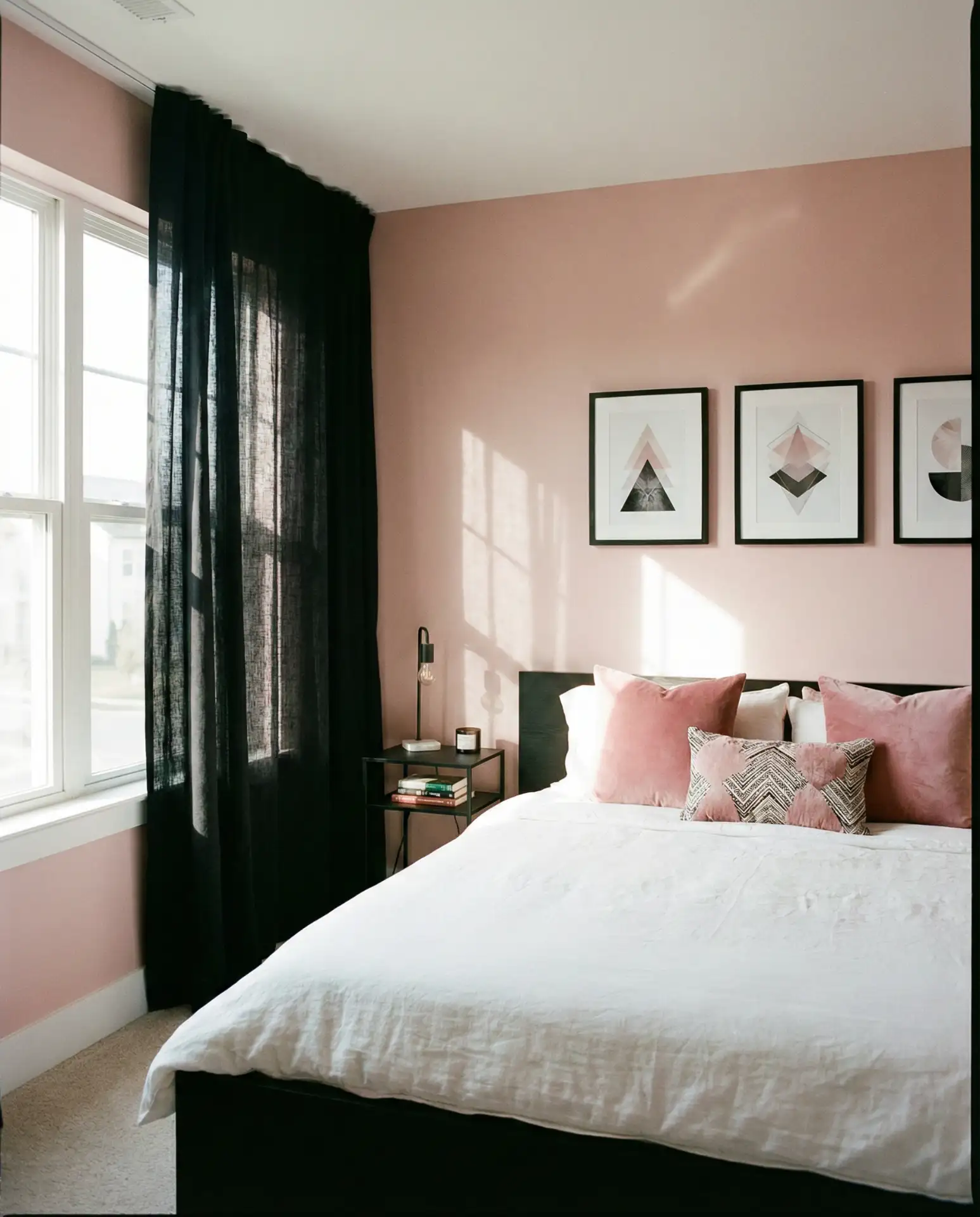
This palette is particularly popular among younger homeowners in urban areas—places like Chicago, Atlanta, and Philadelphia—where modern aesthetics dominate. The black-and-pink combo feels edgy without being cold, and it’s easy to adjust the balance depending on your comfort level. If full black furniture feels too heavy, try black accents like picture frames, drawer pulls, or a single statement piece.
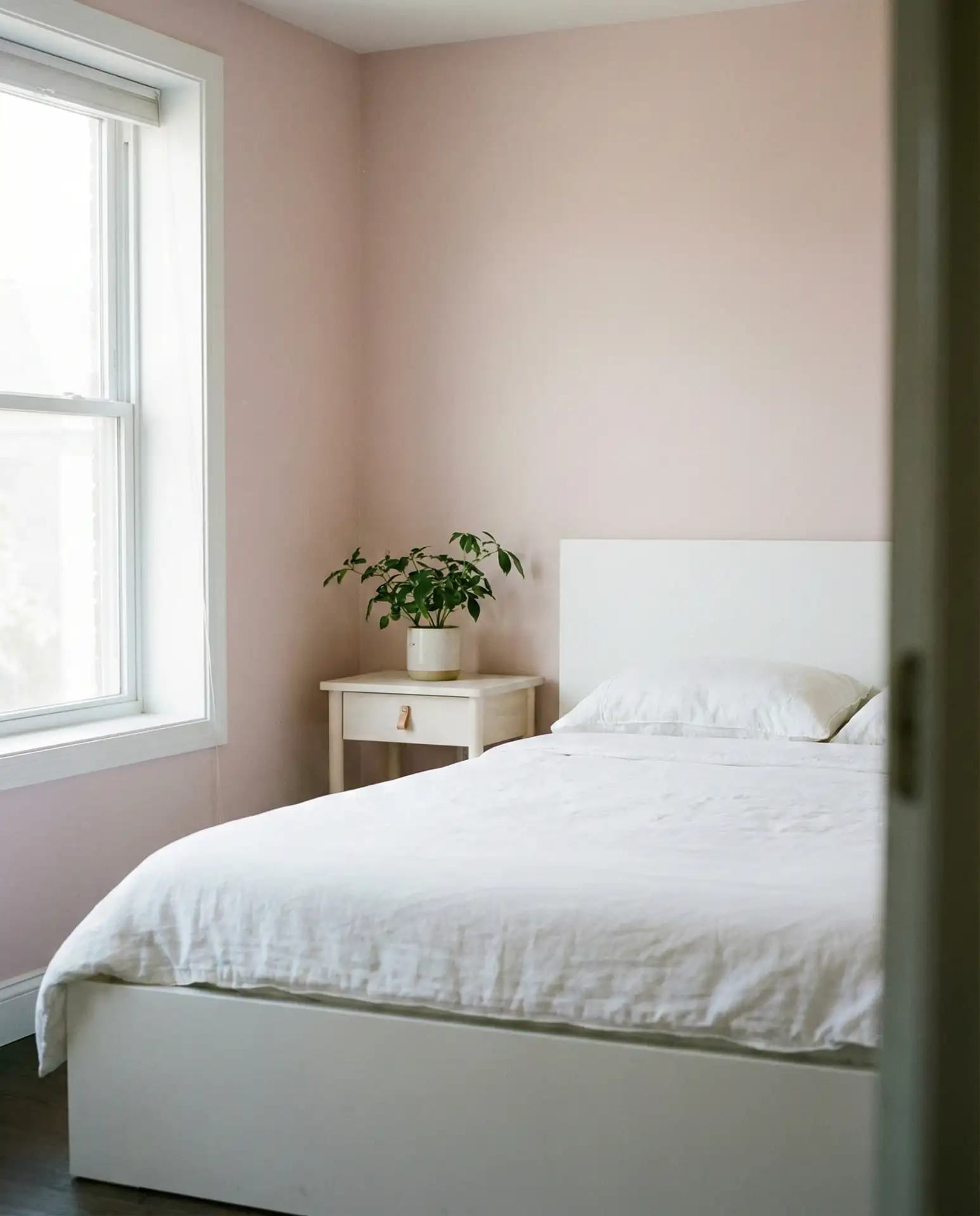
16. Ideas Bedrooms with Pink Textiles and Neutrals
If you’re hesitant about painting walls pink, start with ideas centered on textiles. A pink quilt, throw pillows, or curtains against neutral walls offer flexibility and seasonal adaptability. This is also a budget-friendly approach—you can refresh the room’s vibe with new bedding rather than repainting. It’s ideal for renters or anyone who likes to change their space frequently.
Textile-based color changes are particularly useful in climates with distinct seasons. In colder months, swap in heavier pink velvets or wools; in summer, go with lightweight linens in pale blush. This adaptability makes the room feel intentional year-round, and it’s far easier on the wallet than seasonal redecorating. Plus, if you tire of pink, swapping out textiles is a one-afternoon project.
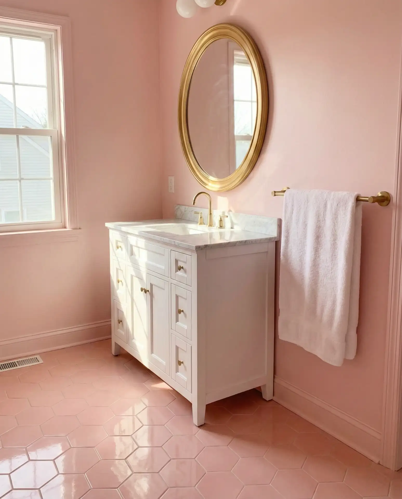
17. Inspo for Pink and Brass Bathroom
Looking for inspo? A pink bathroom with brass fixtures offers a blend of vintage charm and modern elegance. Think blush or dusty rose tiles, a brass faucet and mirror frame, and white subway tile as a grounding element. This works especially well in powder rooms or en suites where you want a jewel-box effect—something special and unexpected.
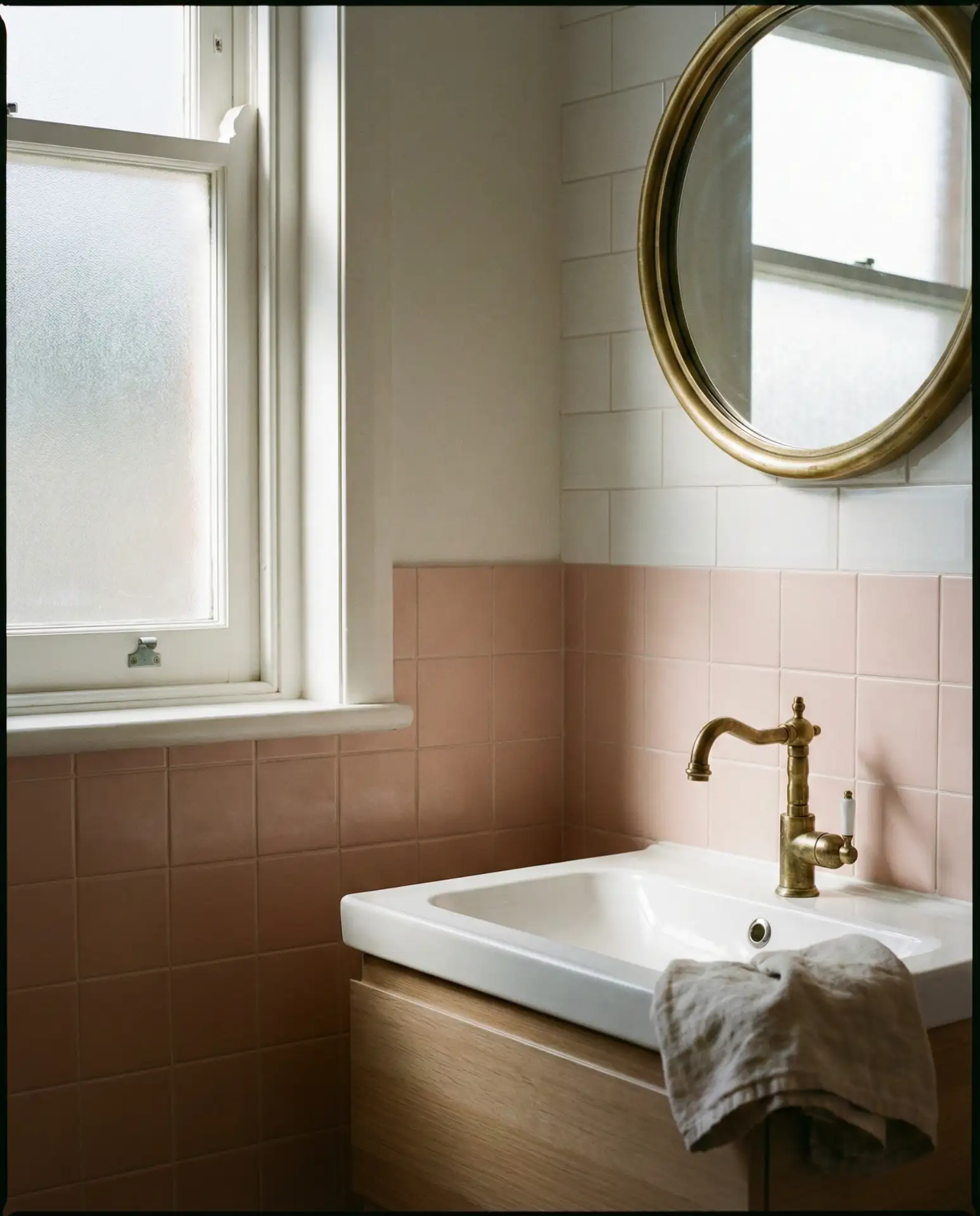
Bathrooms are one of the few spaces where bold color choices feel less risky because they’re typically smaller and more contained. A pink-and-brass bathroom can elevate the entire home, especially in older houses where original fixtures have been replaced with builder-grade chrome. Restoring warmth through color and metal choices brings character back without a full gut renovation.
18. Simple Pink Bedroom for Minimalists
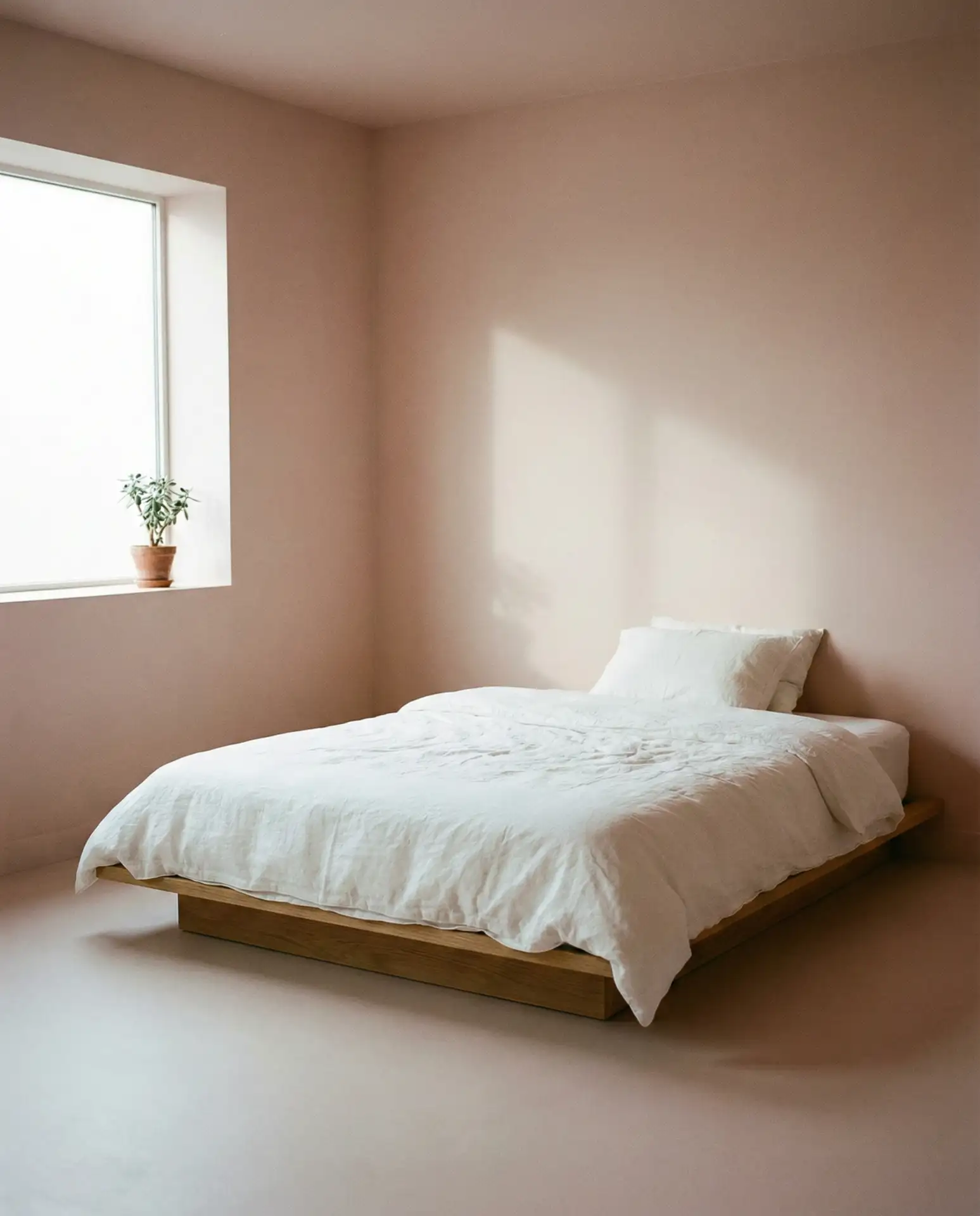
Minimalism doesn’t mean colorless. A simple pink bedroom with clean lines, limited furniture, and intentional decor proves that less can still be warm and inviting. Choose a single shade of pink, keep bedding crisp and white, and limit accessories to one or two meaningful pieces. The result is calm, uncluttered, and deeply restful.
In regions with strong design traditions around simplicity—like the Pacific Northwest or parts of New England—this approach resonates deeply. Pink adds just enough personality to prevent the room from feeling sterile, while the minimalist structure keeps it from feeling busy. It’s a balance that appeals to people who value both beauty and function equally.
19. Pink and White Coastal Bedroom
A coastal bedroom doesn’t have to be all blues and grays. Pairing white and soft coral or blush pink brings warmth to the beachy aesthetic. Add natural textures—rattan, linen, and jute—and keep the palette light and airy. This works beautifully in homes along the Atlantic or Gulf coasts, where the vibe is relaxed and the light is bright.
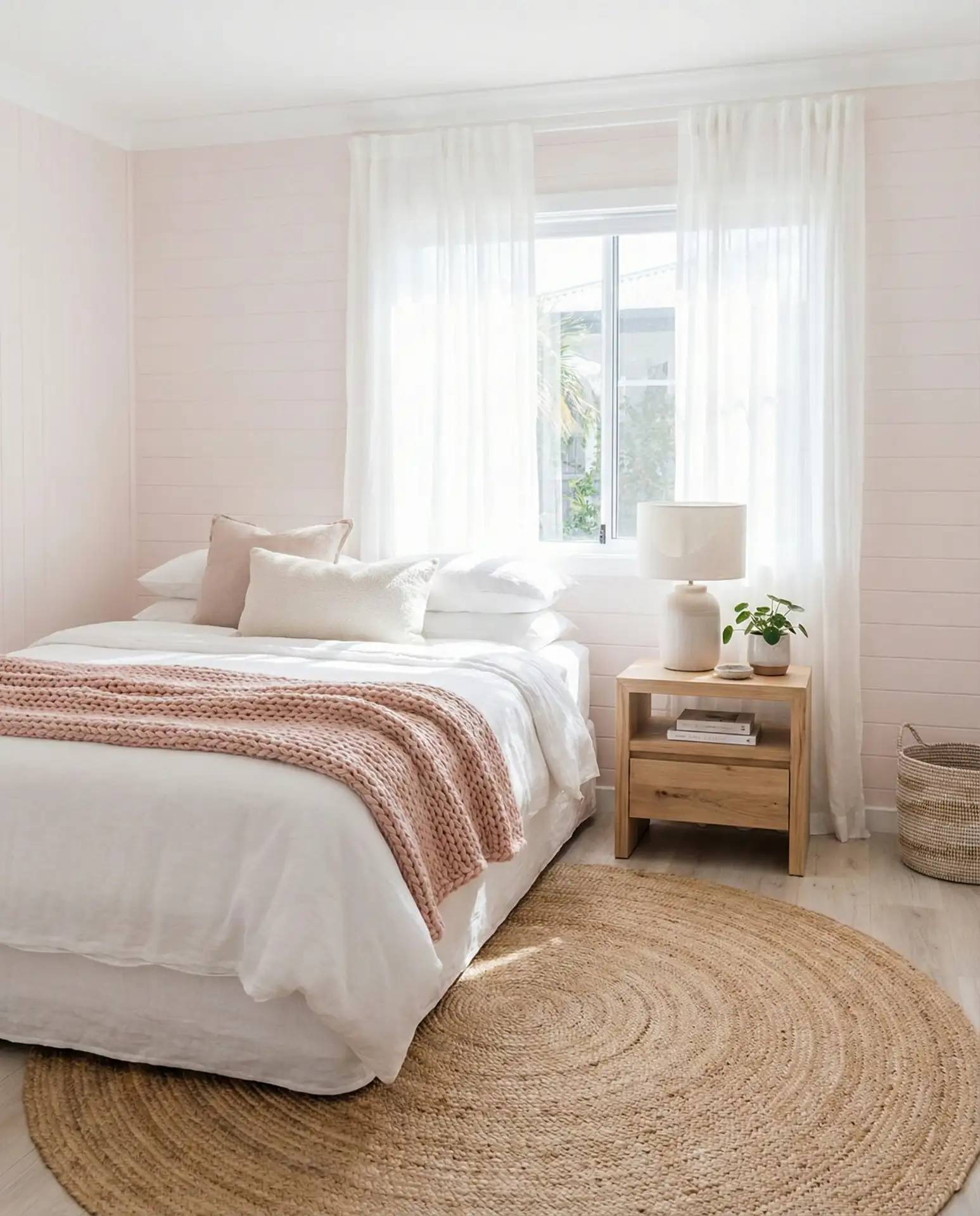
Coastal style is often about evoking a sense of place without being literal. You don’t need seashells and anchors to achieve the look—just light, texture, and the right color palette. Pink brings warmth that pure white or blue lacks, making the room feel lived-in and welcoming rather than hotel-like. It’s perfect for vacation homes or anyone who wants a year-round escape.
20. Pink Velvet Furniture in Living Room
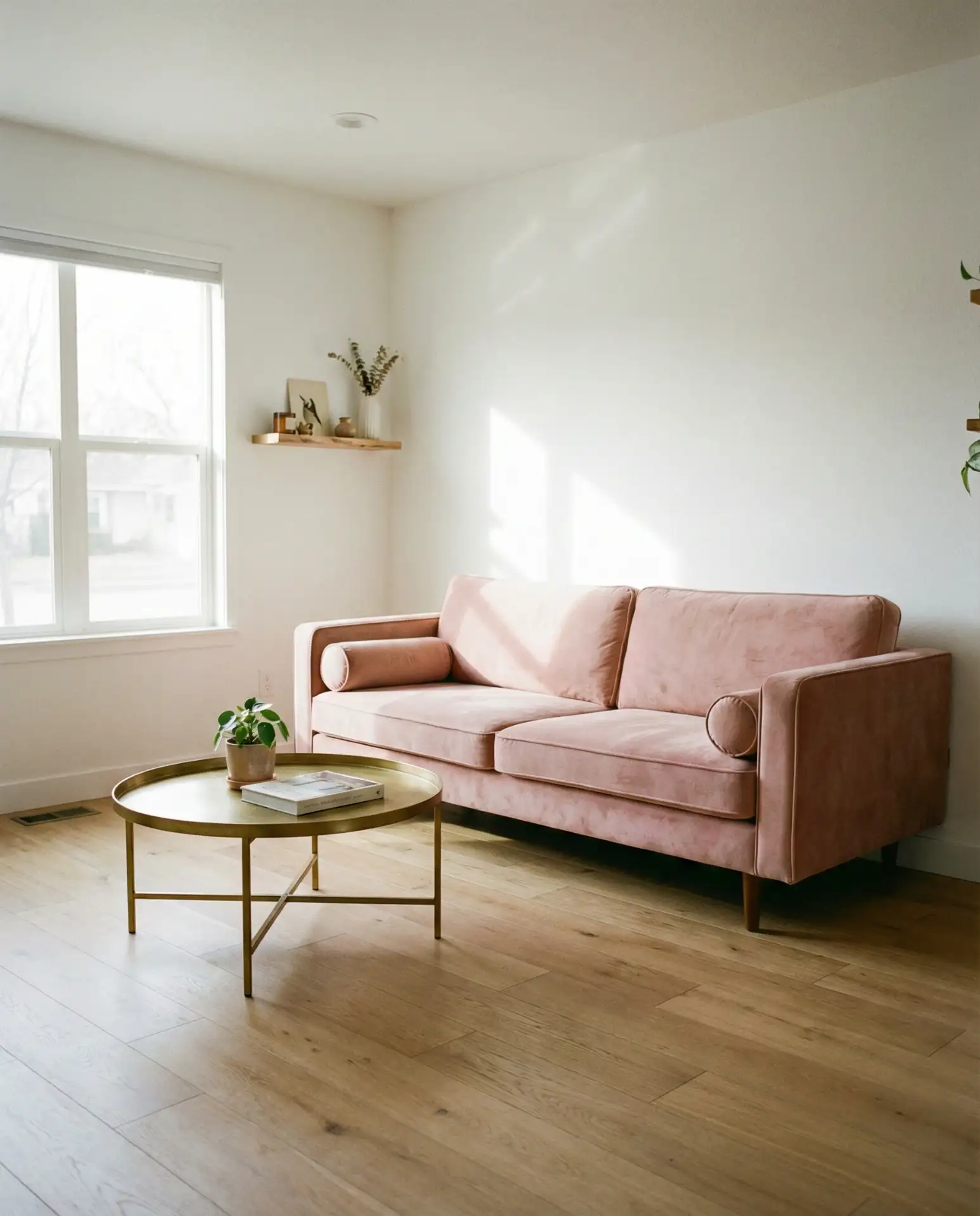
A pink velvet sofa or armchair is a statement piece that instantly elevates a living room. Pair it with neutral walls and flooring so the furniture takes center stage. This works in both modern and traditional homes, and it’s a surprisingly versatile choice—velvet’s texture adds depth, making the pink feel rich rather than flat.
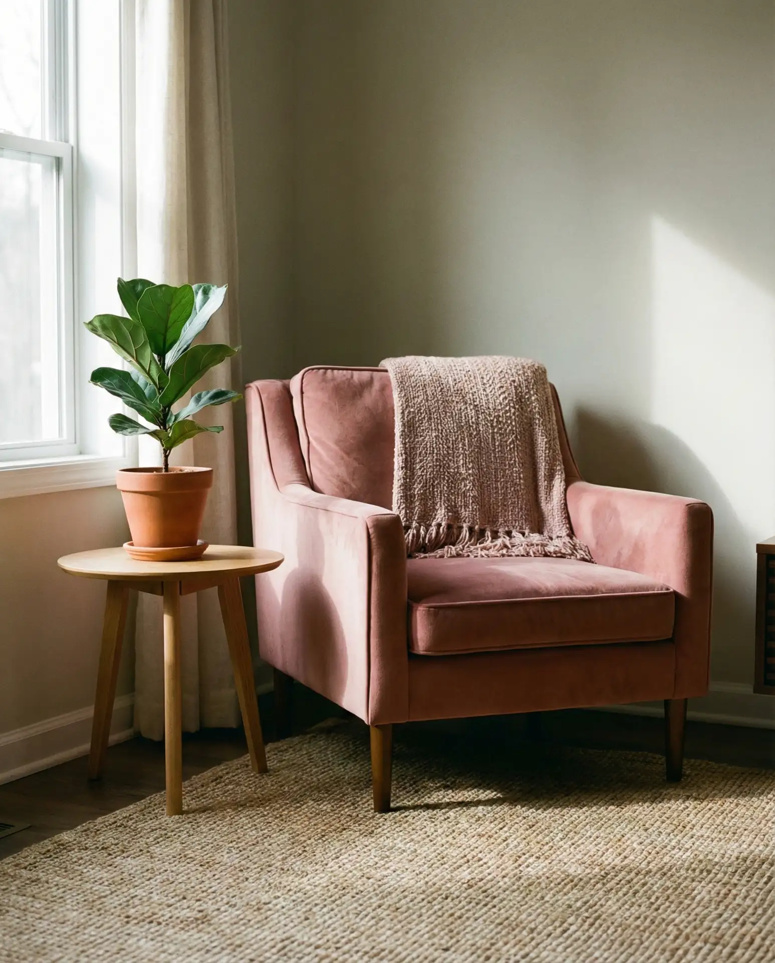
Velvet furniture requires a bit more care—regular vacuuming and occasional professional cleaning—but it’s worth it for the visual impact. In homes with pets or young children, consider a performance velvet that resists stains and wear. Brands like West Elm and Article offer durable options that don’t sacrifice style. The investment pays off in the longevity and wow factor of the piece.
21. Pink Ceiling Surprise in Dining Room
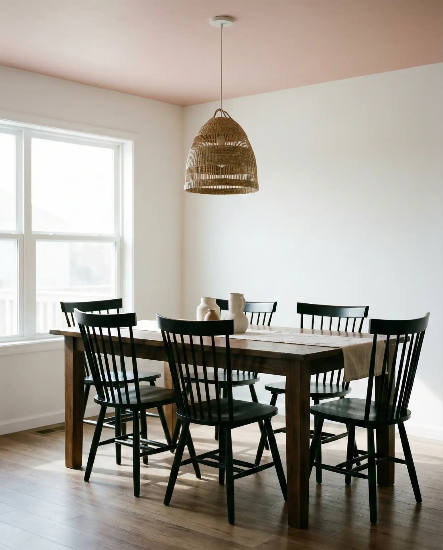
One of the most unexpected ways to use pink is on the ceiling. A soft blush or dusty rose ceiling in a dining room adds warmth and intimacy without overwhelming the space. Keep the walls white or neutral, and let the ceiling become the conversation starter. This works particularly well in rooms with high ceilings, where the color feels like a gentle embrace rather than a weight.
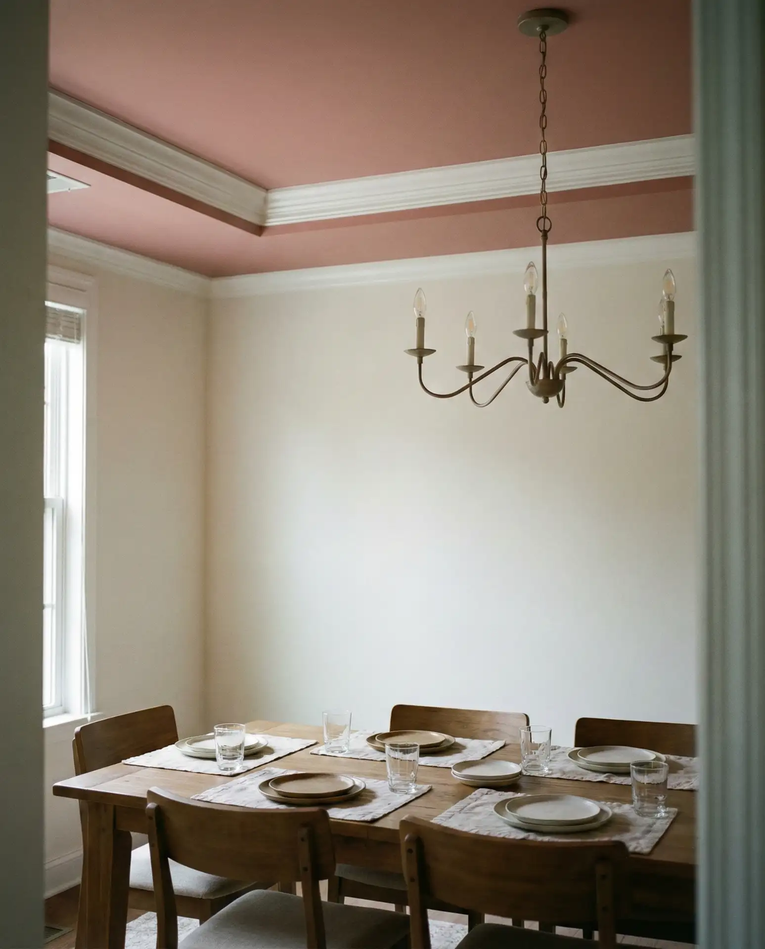
Painting a ceiling is one of the most budget-friendly ways to make a dramatic change. A gallon of paint and a weekend can transform a room, and because ceilings are less likely to show wear, the investment lasts. In historic homes with ornate molding or medallions, a pink ceiling highlights those details beautifully, drawing the eye upward and making the space feel grander.
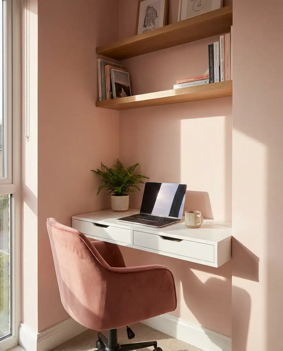
22. Pink Workspace with Natural Wood Desk
A pink workspace paired with a natural wood desk strikes a balance between warmth and professionalism. This setup works in home offices, craft rooms, or study nooks. The pink energizes without being distracting, and the wood brings grounding, organic texture. Add task lighting, a comfortable chair, and organized storage for a space that supports productivity and creativity.
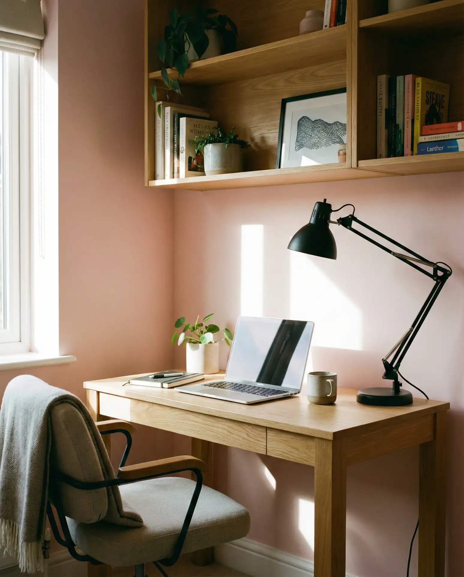
Experts in workplace psychology note that color can influence mood and focus. Pink, particularly in softer shades, can reduce stress and promote a sense of calm—useful when you’re staring down a deadline. Pairing it with natural materials like wood reinforces the connection to nature, which studies show can boost concentration and well-being. It’s a science-backed way to design a better workspace.
23. Pink and Gray Contemporary Bedroom
The combination of pink and gray has been a design staple for years, and it’s not going anywhere in 2026. Use charcoal or dove gray for larger furniture pieces and soft pink for bedding, curtains, or an accent wall. The pairing feels sophisticated and gender-neutral, making it a smart choice for guest rooms or shared bedrooms.
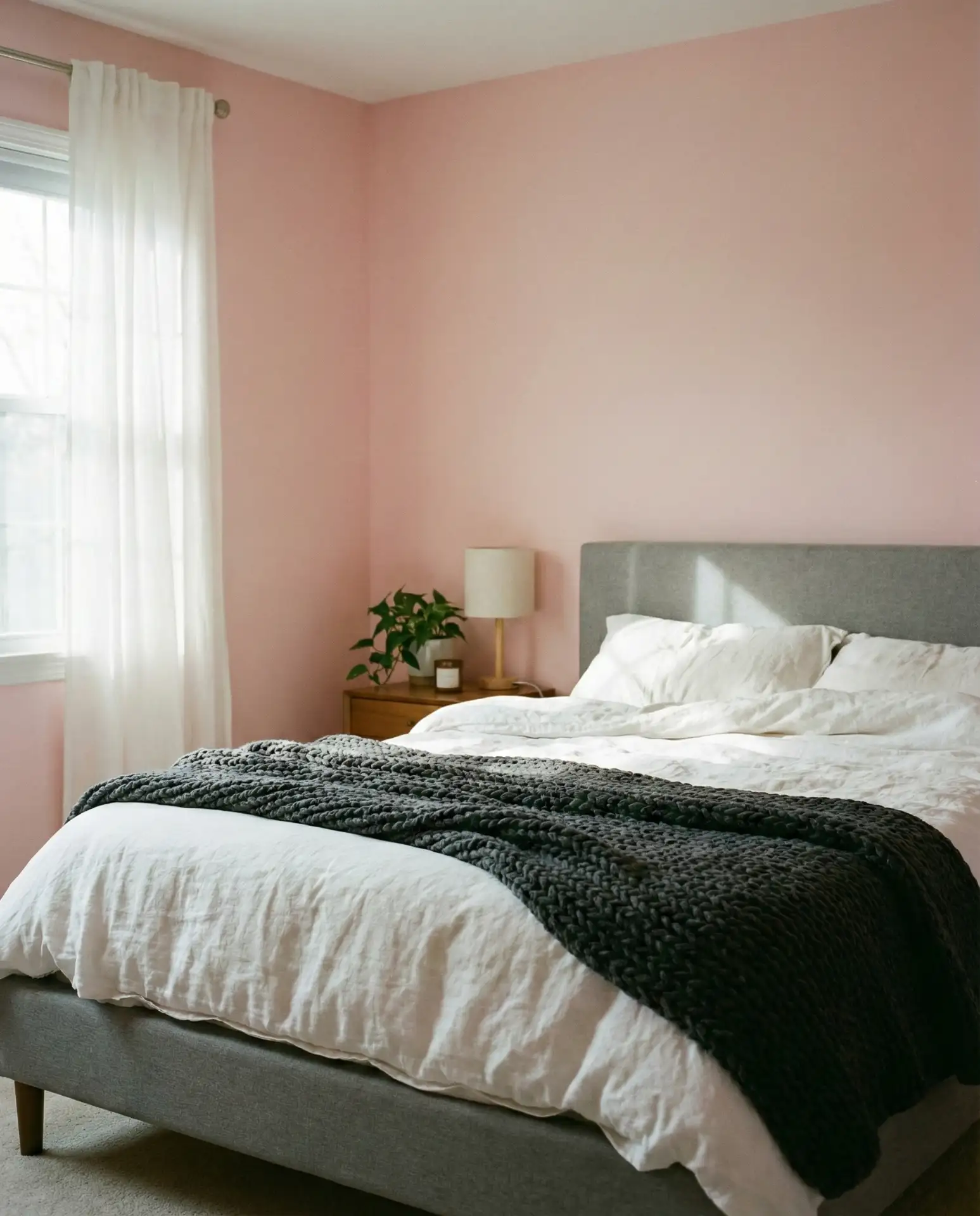
This palette is forgiving and easy to work with, making it ideal for first-time decorators or anyone looking for a safe but stylish option. Gray grounds the sweetness of pink, and pink warms the coolness of gray. It’s a mutually beneficial relationship that works across a range of lighting conditions, from the bright sun of the Southwest to the diffused light of the Pacific Northwest.
24. Pink Reading Nook with Built-In Shelving
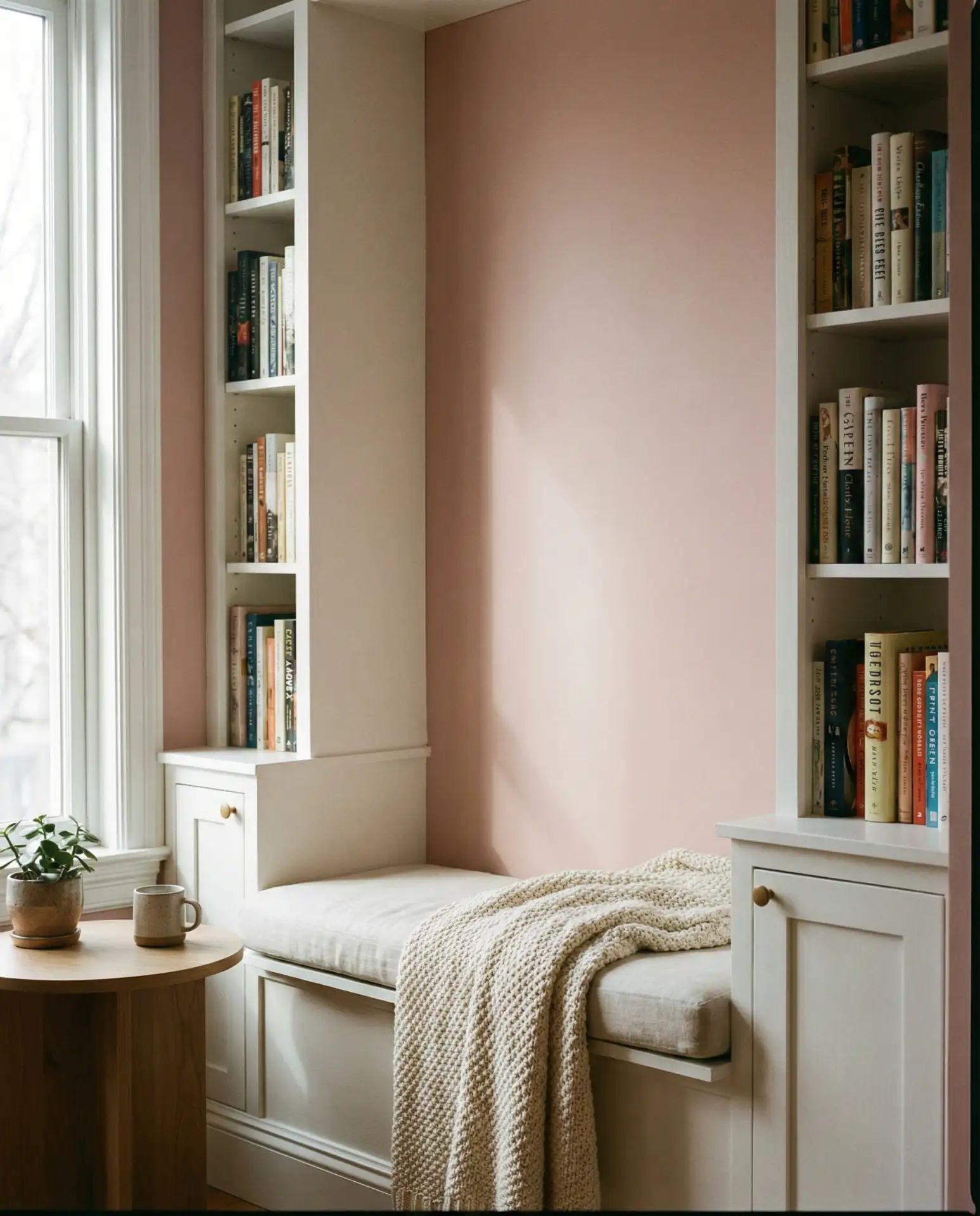
A pink reading nook with built-in shelving is the ultimate cozy corner. Paint the nook’s interior walls a soft blush, add a cushioned bench or window seat, and line the shelves with favorite books. This is a space designed for escape and comfort, and the pink makes it feel like a private retreat even in a busy household.
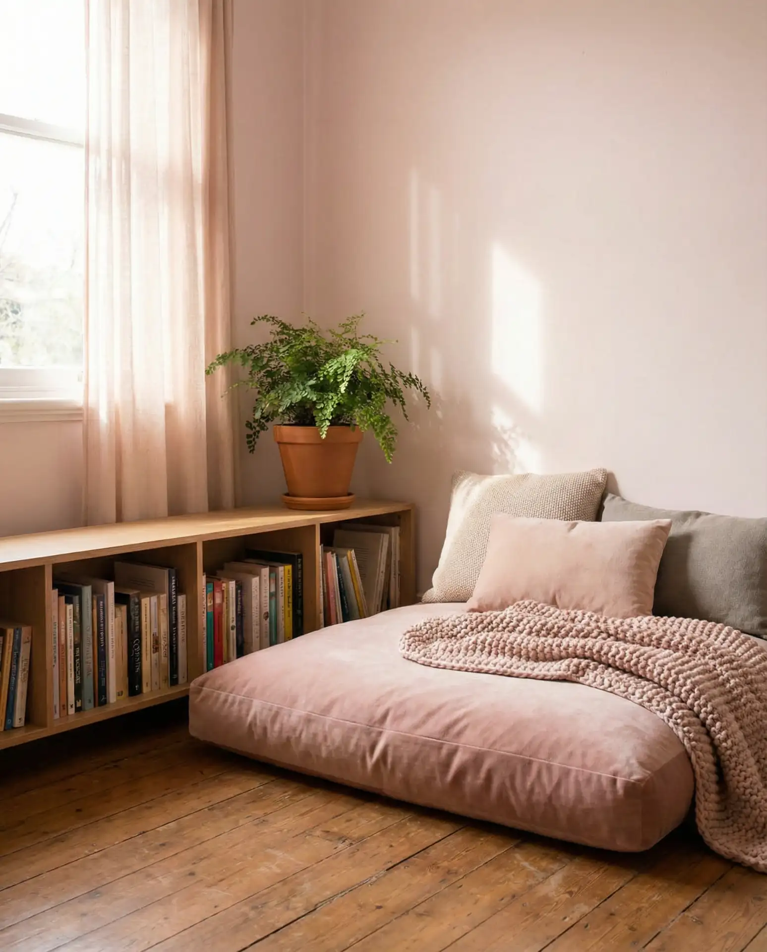
Reading nooks are most successful when they’re tucked into underutilized spaces—alcoves, bay windows, or the corner of a bedroom. The pink adds personality and signals that this is a special zone, not just leftover square footage. In homes with kids, a pink reading nook can encourage quiet time and a love of books, while in adult spaces, it’s a reminder to slow down and savor a good story.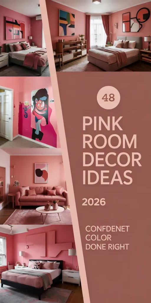
Conclusion
Pink room decor in 2026 is about more than just following a trend—it’s about creating spaces that feel personal, warm, and intentionally designed. Whether you’re drawn to bold fuchsia accents or barely-there blush tones, there’s a version of pink that will work in your home. The key is to experiment, trust your instincts, and remember that your space should reflect who you are, not what a magazine tells you to be. What’s your favorite pink idea from this list? Share your thoughts in the comments below, and let’s keep the conversation going.