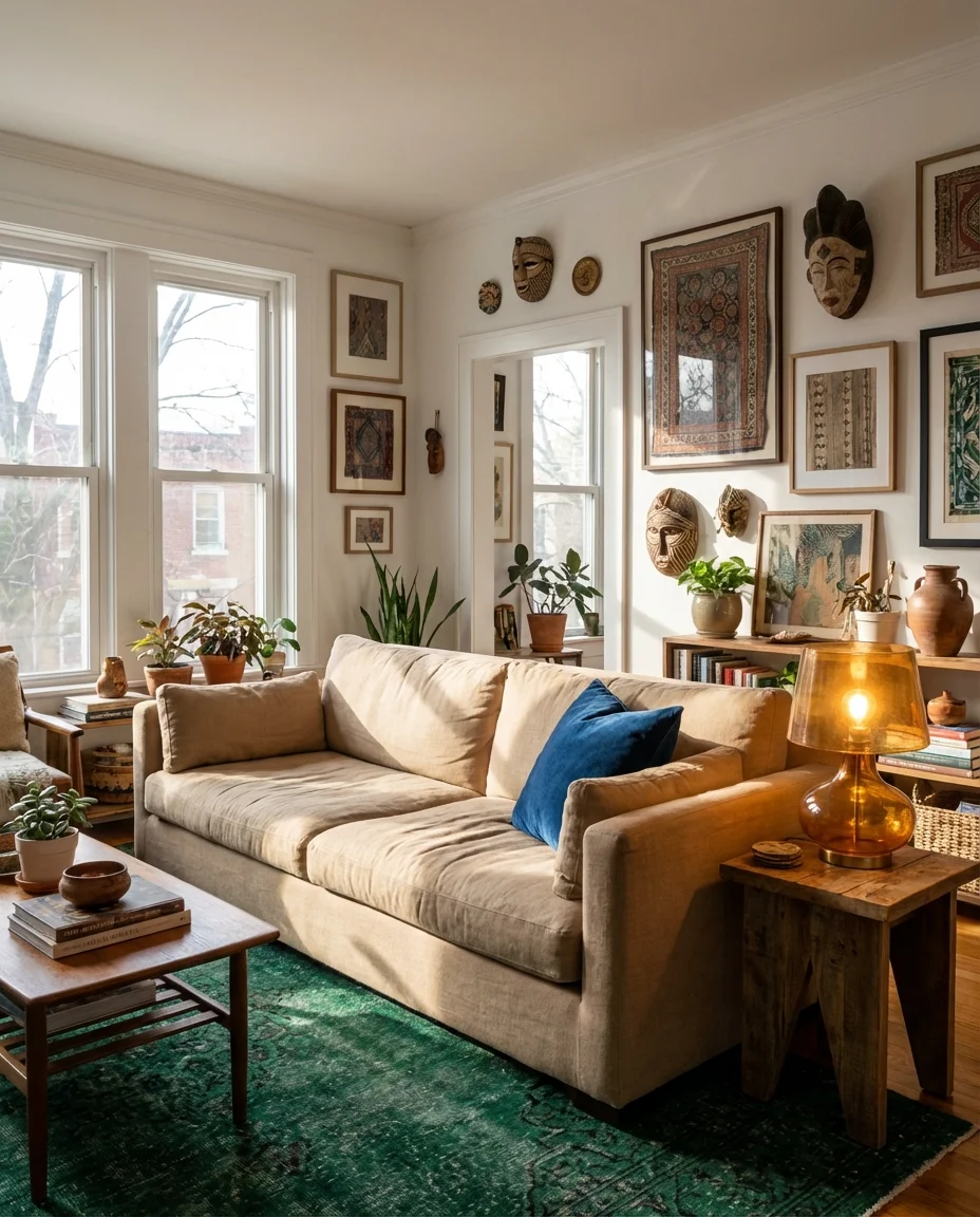
Color is having a serious moment in American living rooms right now—and if your Pinterest feed looks anything like ours, you already know it. Whether you’re drawn to moody, drama-forward palettes or soft, grounding neutrals, 2026 is the year interiors stopped playing it safe. From deep forest greens to sun-warmed creams and oceanic teals, the way we’re thinking about living room color has shifted into something far more personal and intentional. In this article, we’re walking through of the most inspiring color schemes for living rooms this year—each one with styling tips, real context, and a mood that actually matches the way people live today.
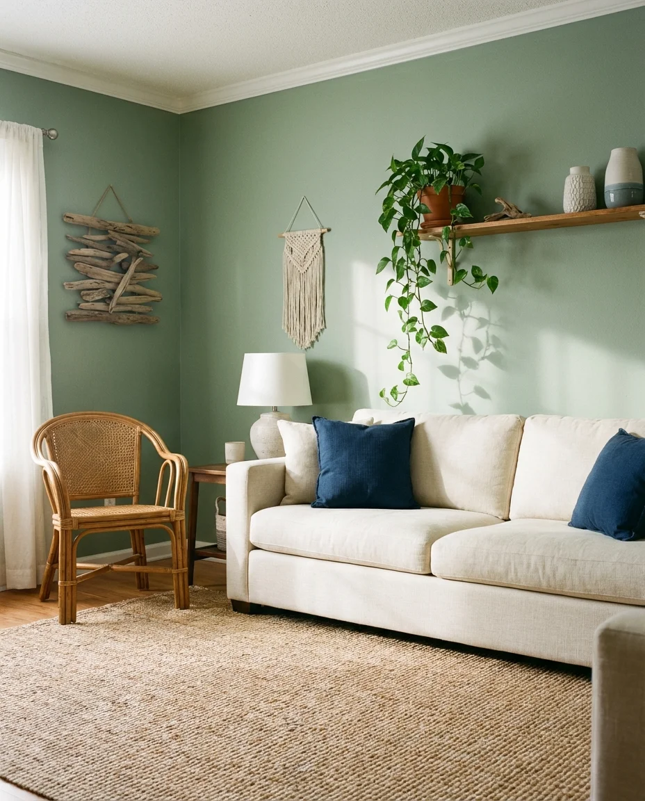
1. Sage Green Walls with a Cream Sofa
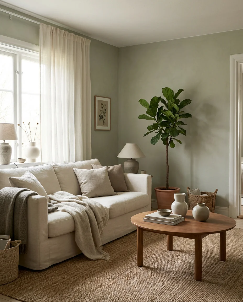
There’s something almost instinctively calming about pairing sage green walls with a cream sofa—it’s the kind of combination that makes a room feel like a long exhale. Sage sits in that beautiful in-between territory: not too bold, not too safe. It reads as earthy and organic, which is exactly why it’s dominated mood boards for the past year. Against a creamy, off-white sofa, the green feels grounded rather than overwhelming, and the overall effect is layered, lived-in, and genuinely inviting.
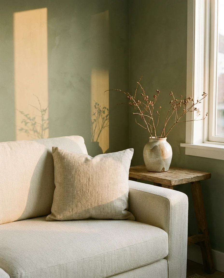
This palette works especially well in rooms that get a lot of natural light—the green shifts beautifully from cool to warm throughout the day. Style it with honey-toned wood accents, rattan baskets, and a few textural throws to keep things from feeling too polished. One common mistake people make here is choosing a sage that leans too gray or too yellow; the sweet spot is a true, slightly muted green that stays consistent under different lighting conditions. Swatching before committing is non-negotiable with this one.
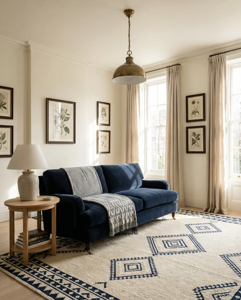
2. Navy Blue Sofa in a Light Neutral Room
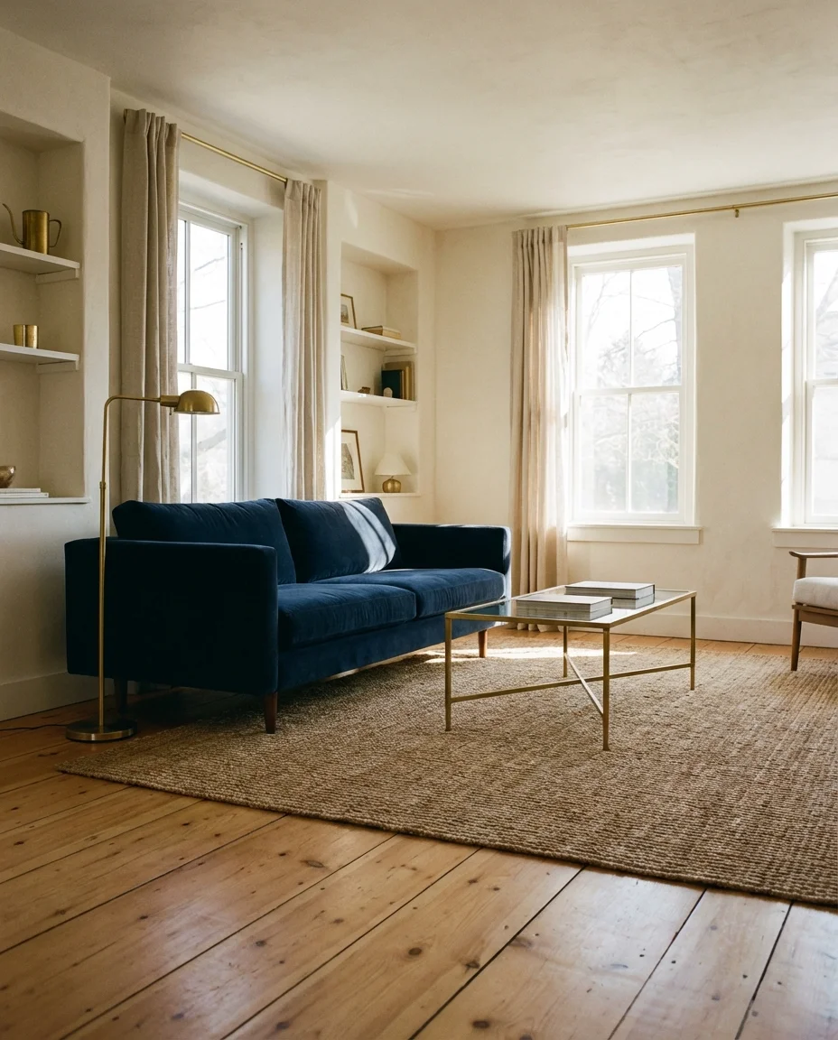
A navy blue sofa—or navy couch—is one of those pieces that interior designers quietly recommend to almost everyone. It’s rich without being loud and classic without being boring. When placed in a room with light walls (think warm white, soft linen, or pale greige), the navy becomes the anchor that everything else orbits around. The contrast is effortless: the room feels collected, considered, and a little bit sophisticated without trying too hard.
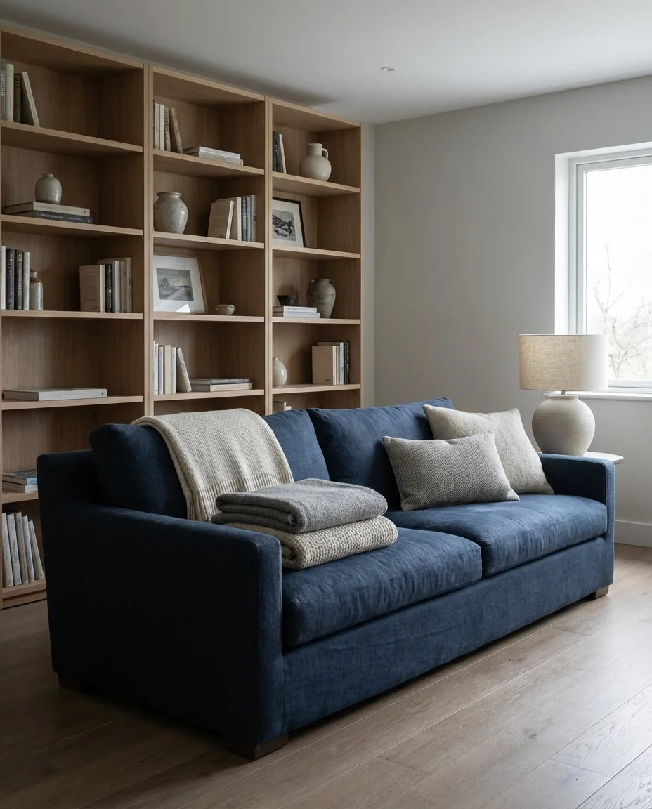
Think of a navy sofa the way you’d think of a great blazer—it dresses up anything around it. Add brass or gold hardware on side tables, a warm-toned rug, and a mix of cream and dusty blue throw pillows. This setup translates beautifully across American home styles, from coastal New England cottages to modern West Coast open-plan layouts. Budget-wise, navy upholstery is widely available at every price point—from IKEA slipcovers to custom velvet—making it one of the most accessible ways to add color to a space.
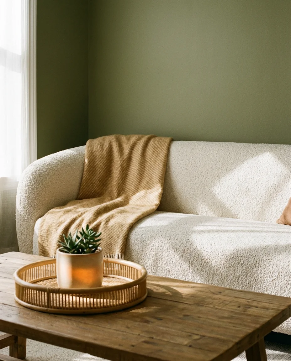
3. Olive Green Walls with Warm Wood Tones
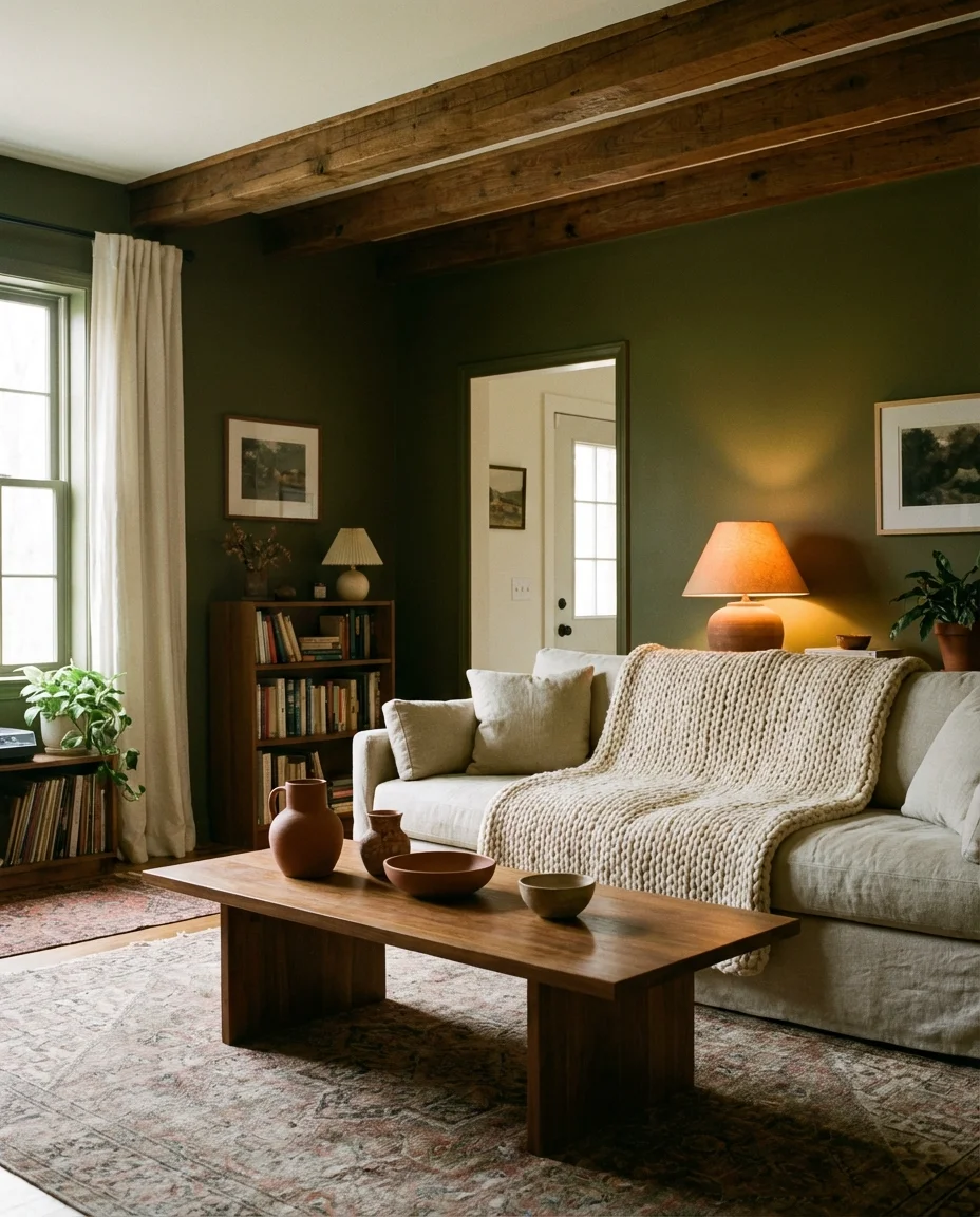
If olive green isn’t already on your radar, let this be the nudge. It’s richer and more complex than sage, carrying warm, almost golden undertones that make it feel distinctly cozy in the fall and winter months. When paired with natural wood furniture—think walnut, oak, or even honey pine—the result is a room that feels like a cabin retreat without any of the kitsch. It’s earthy, intentional, and deeply appealing to the part of all of us that wants to feel more grounded at home.
This palette genuinely thrives in rooms where you want to encourage slowness—a reading nook, a den, or any space that doubles as a retreat from the day. One real homeowner we heard from painted her Connecticut living room olive green after years of white walls and said it was the single best design decision she’d ever made. The room finally felt like it belonged to her. Layer in burnt orange, rust, or deep burgundy accents, and you’ll have something truly special on your hands.
4. Dark Blue Walls with a Grey Sofa
Pairing dark blue walls with a grey sofa is one of those bold moves that pays off consistently—it’s moody, sophisticated, and surprisingly versatile. The key is choosing the right grey: a warm mid-tone works better than a cool light grey, which can read as cold or flat in a dark room. Together, the two create a deeply saturated, enveloping atmosphere that feels intentionally designed rather than accidentally stumbled into. It’s the kind of living room that looks incredible in candlelight.
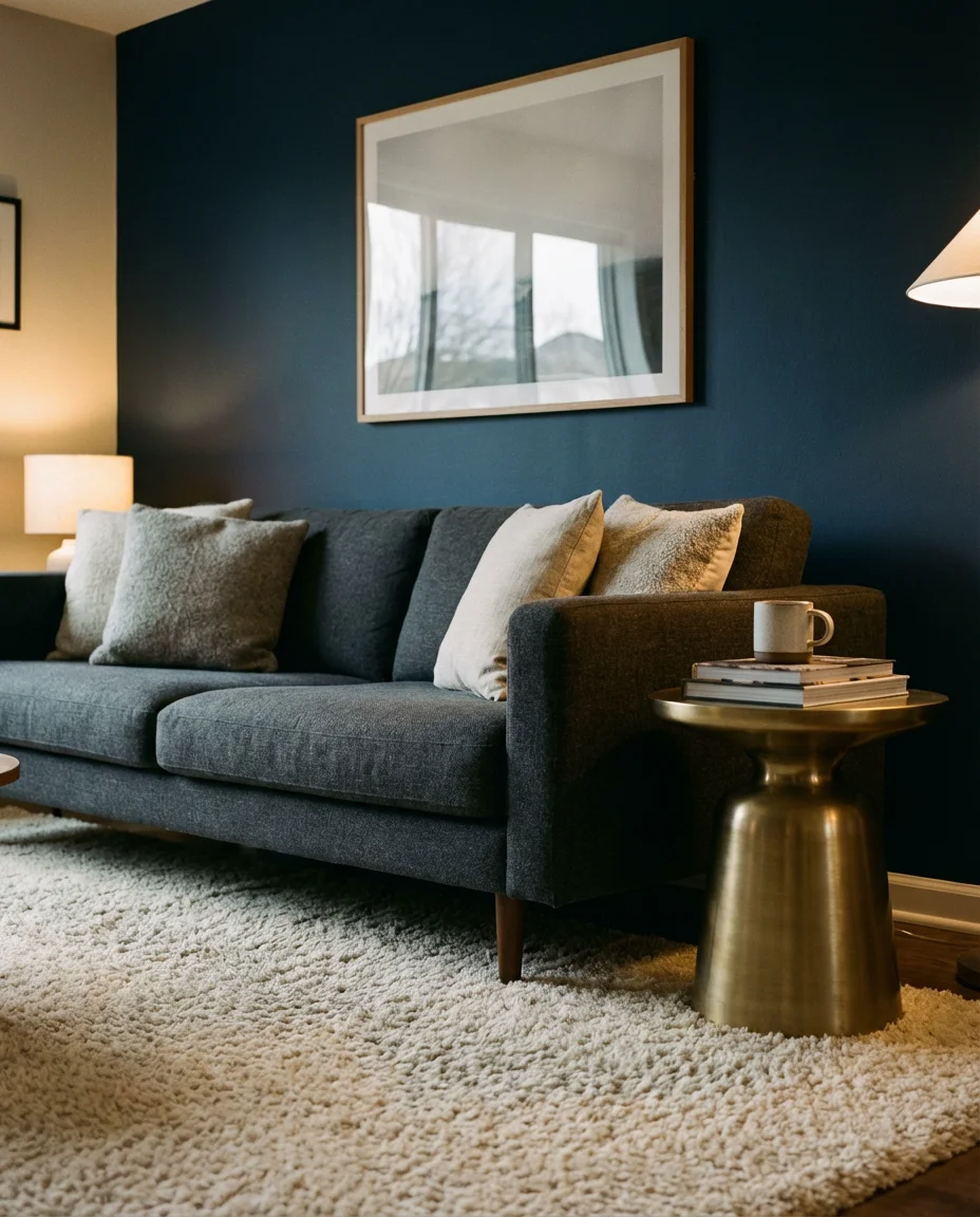
Where this combination works best is in rooms that already have strong architectural character—think crown molding, a fireplace, or tall ceilings. The dark walls amplify those features rather than fight them. Bring in warm metallic accents (gold, brass, or bronze), a few plants, and plenty of layered lighting sources. Avoid the common mistake of under-lighting a dark room—it’s not the paint color that makes a space feel gloomy, it’s the lack of light layers to counterbalance it.
5. Blue and Green Living Room with Natural Textures
The blue and green combination is having a full-on revival, and it makes total sense—both colors pull from nature’s most abundant palette. The trick is keeping the balance intentional: one color should dominate while the other plays a supporting role. A green sofa against a blue-painted wall, or navy accents layered into a sage-green room, both work beautifully. When you add natural textures—rattan, linen, wood, stone—the palette becomes less decorator-ish and more genuinely organic.
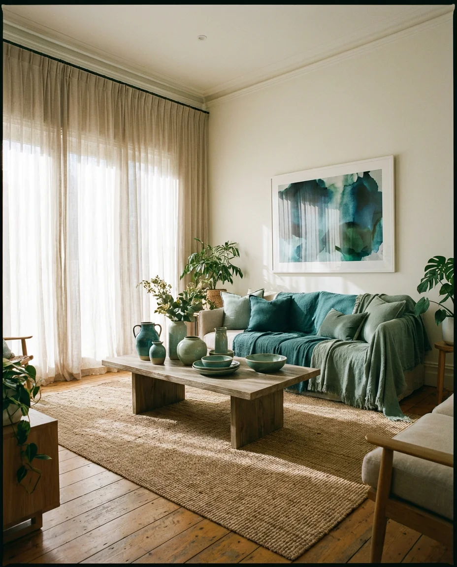
This palette has real staying power in American coastal homes and Pacific Northwest interiors, where the connection to the natural landscape outside matters. An interior designer once described blue-green rooms as “rooms that breathe”—there’s always a sense of air and movement in them that fully saturated single-color rooms don’t quite achieve. If you’re nervous about going all-in, start with a blue-green printed rug or a set of mixed cushions before committing to paint.
6. Earthy Terracotta and Cream Living Room
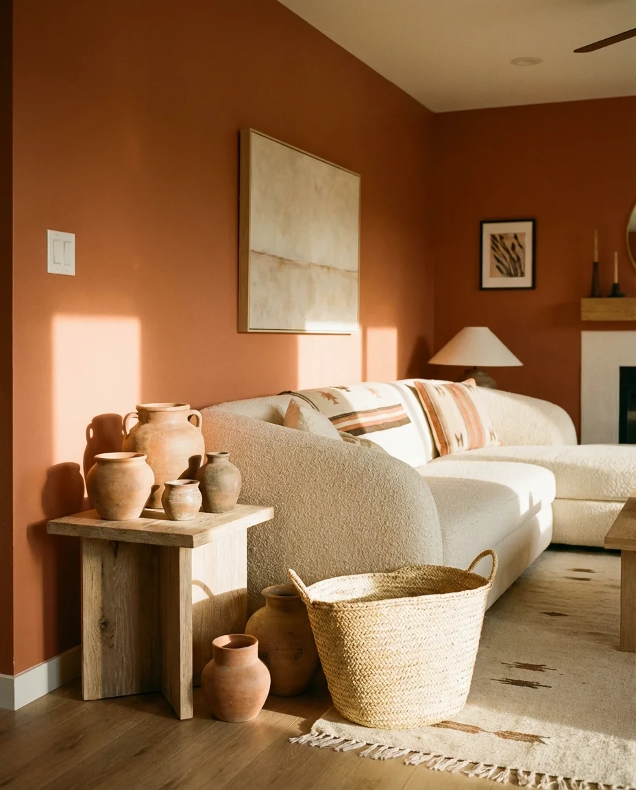
The earthy palette of terracotta and cream is one of the most searched living room looks right now—and for good reason. It channels the warmth of Southwestern interiors, the softness of Mediterranean homes, and the accessibility of modern American design all at once. A cream couch or beige sofa anchors the room, while terracotta walls, clay pottery, and warm-toned textiles layer in that unmistakable richness that feels both ancient and completely current.
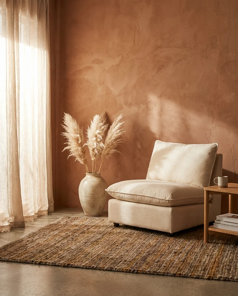
This is the palette that works beautifully in apartments where you can’t paint—bring in terracotta through pillows, throws, wall art, and ceramics, and let a cream sofa or loveseat hold the base. At a practical level, cream upholstery can feel high-maintenance, but performance fabrics have come a long way. Look for bouclé blends or stain-treated velvet options that give you the creamy look without the constant anxiety. It’s a setup that photographs beautifully in natural light, which is probably why it performs so well on Pinterest.
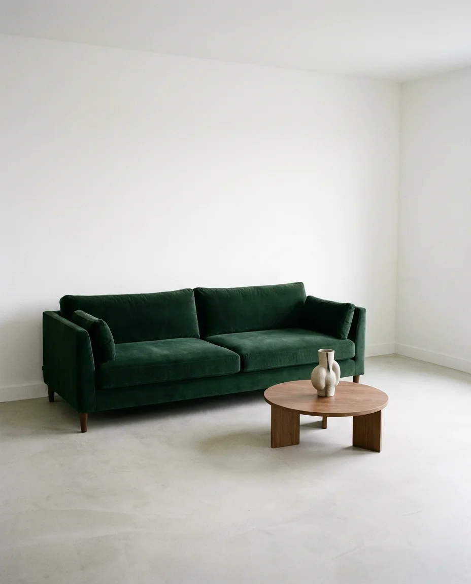
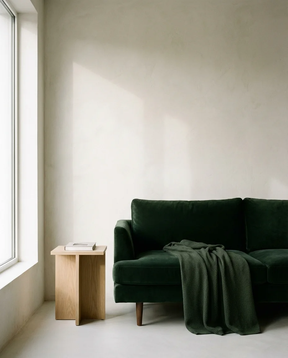
7. Dark Green Accent Wall with a Camel Couch
Few color pairings hit the same note of understated luxury as dark green against a camel couch. The deep green—think forest, bottle, or hunter—gives the room a richness that feels almost jewel-like, while the warm amber-gold of a camel-colored sofa cuts through any heaviness and keeps things feeling alive. It’s a combination that reads as both masculine and refined, though it genuinely works for any aesthetic when styled thoughtfully.
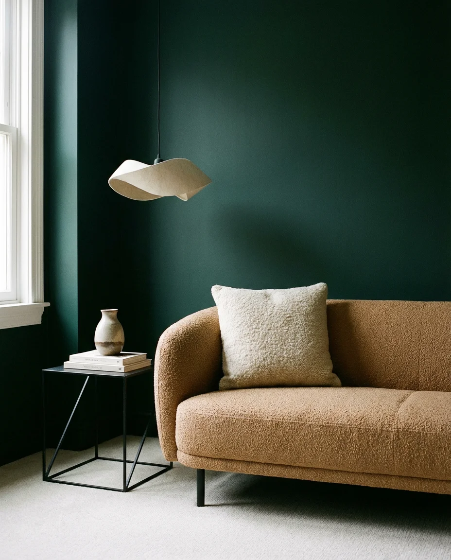
From a practical standpoint, an accent wall is a lower-commitment way to test a dark color before going all-in. Paint just the wall behind your sofa or fireplace in a deep forest green, keep the remaining walls in a warm white or cream, and let your camel couch do the heavy lifting in the middle. This setup is particularly well-suited to open-plan American living rooms where you want to define zones visually without building walls. The warmth of the camel prevents the green from feeling cold or corporate.
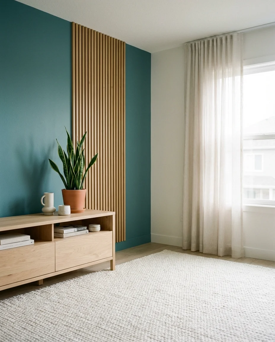
8. Teal Living Room with White and Wood
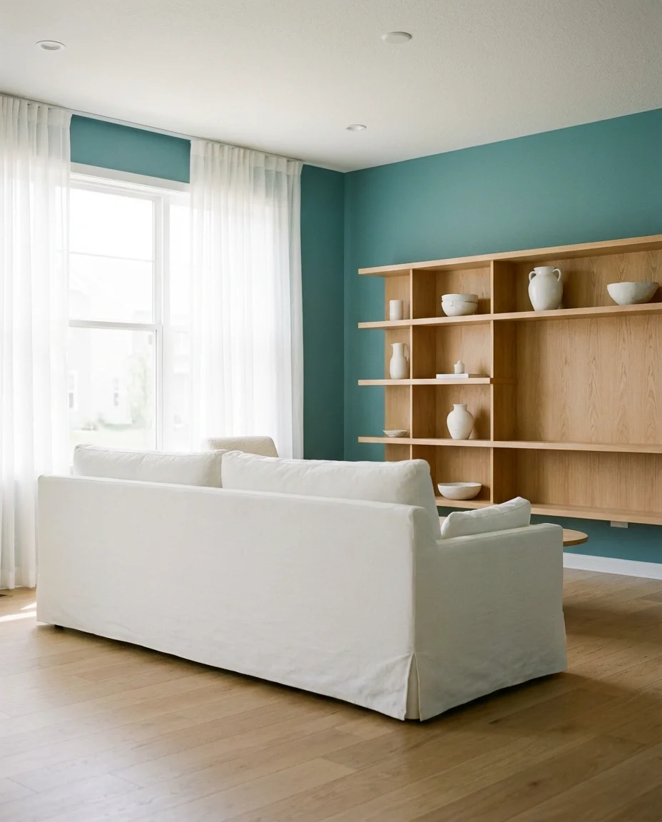
Teal is one of the most interesting colors in the spectrum—it straddles blue and green in a way that gives it almost chameleon-like flexibility. In a living room, teal walls or a teal sofa paired with crisp white and natural wood creates a fresh, slightly retro vibe that references both mid-century modern design and contemporary coastal living. It’s a palette that feels energetic without being aggressive, which makes it easier to live with over time than you might expect.
Teal tends to perform best in rooms that already have good natural light—in a north-facing or dim room, it can pull too cool. The white keeps it from going too dark, while the wood adds the organic warmth that prevents the whole thing from feeling like a spa waiting room. This combination is a favorite in Florida, California, and Pacific Northwest homes, where the outdoors-in ethos drives most design decisions. If you’re renting, a teal throw blanket and coordinating cushions over a neutral sofa can get you ninety percent of the way there.
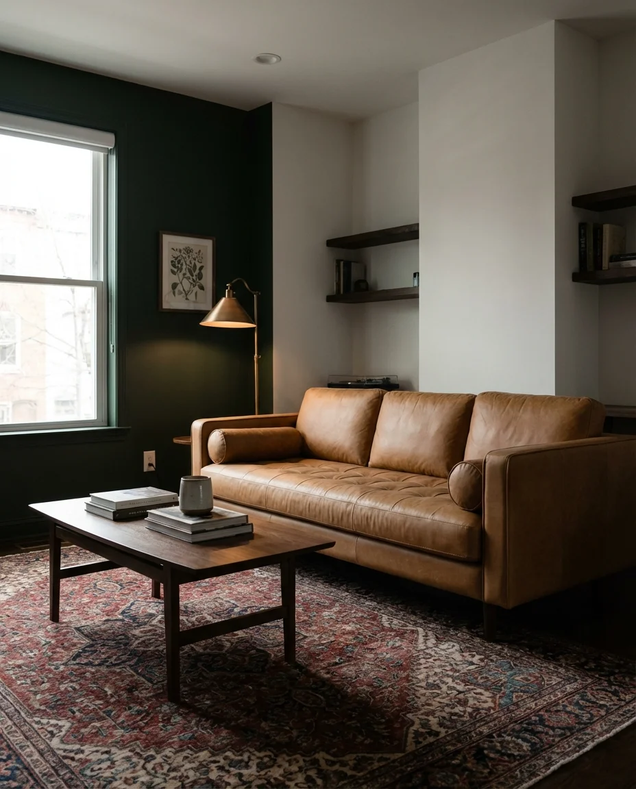
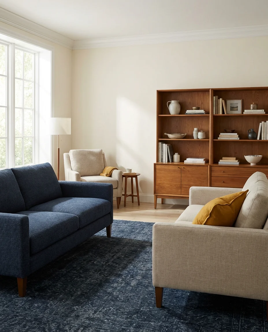
9. Blue and Brown Living Room Palette
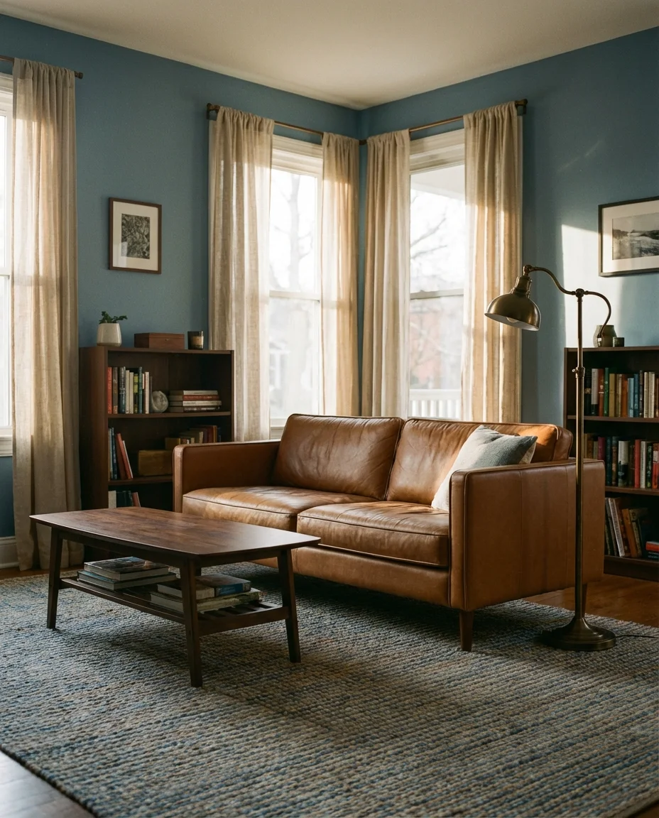
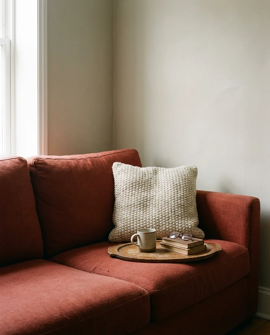
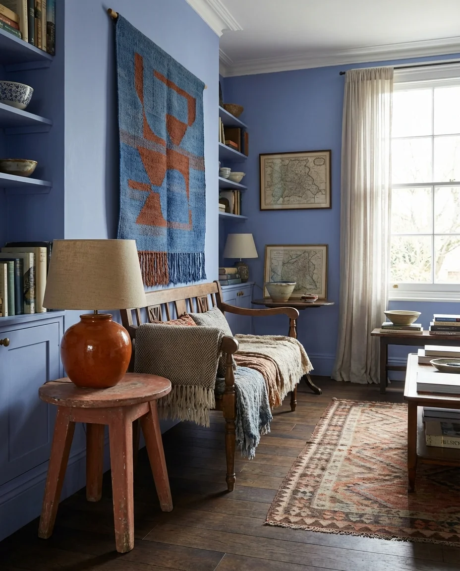
The blue and brown palette is one of those combinations that disappeared from the mainstream for a while and has come back stronger and more sophisticated than ever. Where the early 2000s version felt heavy and dated, today’s interpretation is lighter and more nuanced—think dusty blue walls against rich cognac leather, or a soft cobalt sofa against warm chocolate wood floors. The contrast between the cool blue and the grounding warmth of brown creates a balance that feels genuinely comfortable rather than decorative.
An interior stylist once noted that blue and brown succeed together for the same reason denim and leather do—they’re both rugged materials from nature that have been refined through craft. That same logic applies to interiors. This combination genuinely suits masculine-leaning spaces as much as gender-neutral family rooms, and it ages gracefully. The biggest misstep here is going too dark on both—keep at least one of the two relatively light so the room retains its sense of openness and air.
10. Light Blue Walls with a Cream Couch
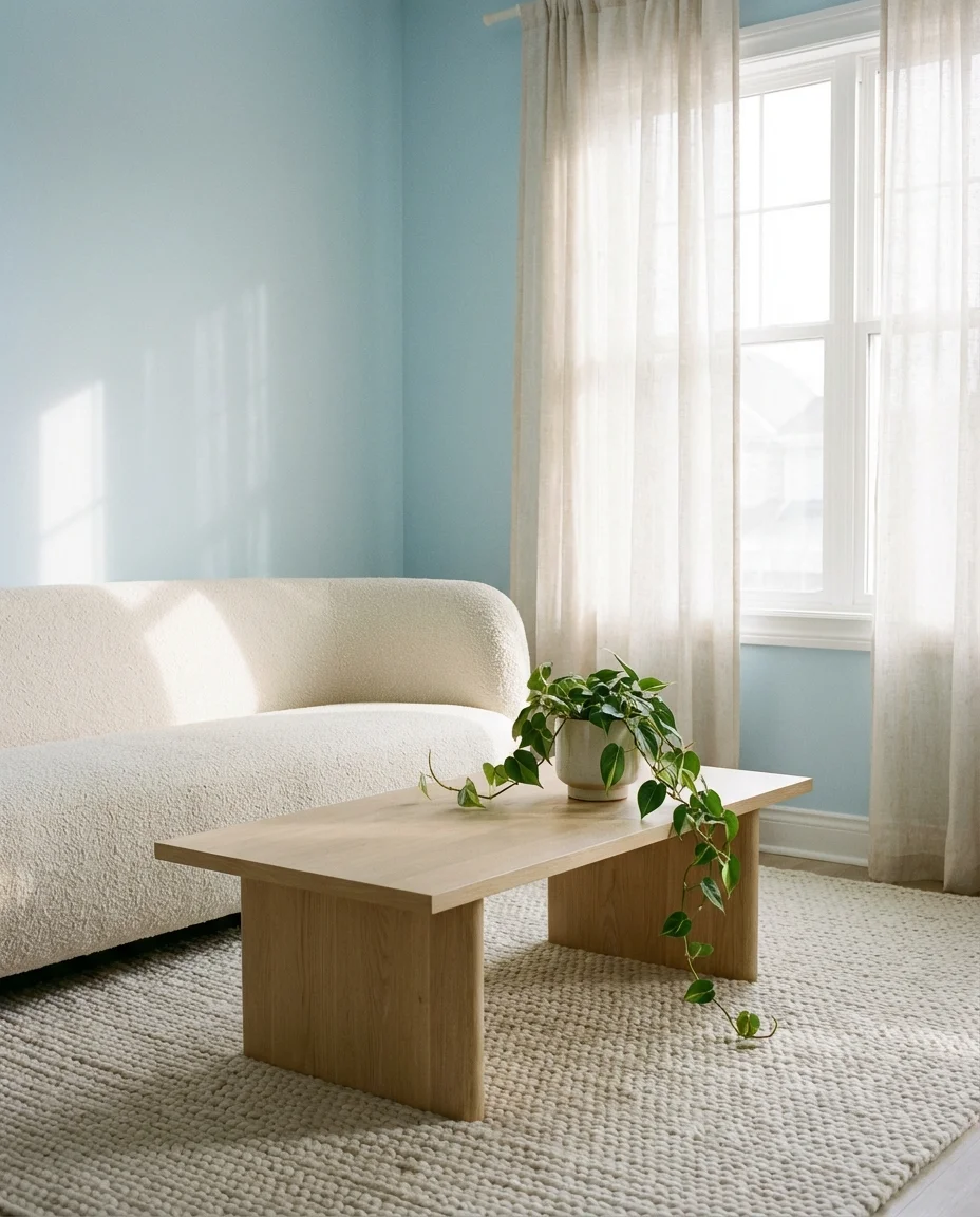
Light blue walls paired with a cream couch might be the most quietly perfect living room combination of the year. There’s an effortless quality to this pairing—it’s soft, it’s restful, and it makes a room feel larger and more open almost instantly. Light blue reads as airy and serene without tipping into the clinical coldness that some pale blues can carry. Grounded by a warm cream sofa, the whole arrangement radiates a kind of gentle sophistication that doesn’t demand attention but absolutely earns it.
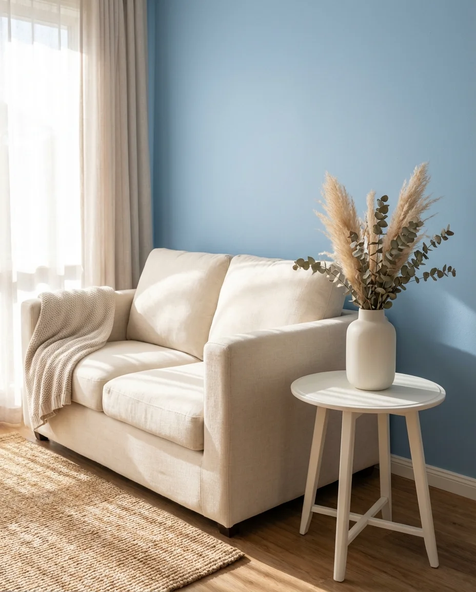
This is the color scheme that works particularly well in smaller spaces or rooms without much natural light—the lightness of both tones prevents the room from ever feeling boxed in. In real homes, this palette is especially popular in apartments across the Northeast and Mid-Atlantic, where square footage is limited and creating a sense of space matters. One styling trick: anchor the room with a slightly darker element, like a navy or charcoal rug, to give the light palette some visual weight and prevent it from floating away into prettiness without purpose.
11. Charcoal Couch in a Bright, Colorful Room
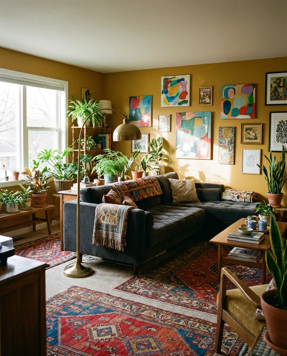
A charcoal couch is often treated as the most neutral option in the sofa aisle, but it’s actually one of the most dynamic pieces you can place in a colorful room. Dark charcoal or near-black upholstery acts like a grounding force—it pulls the room together, defines the seating area, and gives even the most eclectic or colorful palette somewhere to rest. Surround it with mustard yellow walls, earthy terracotta accents, or a bold botanical print, and the charcoal sofa suddenly looks anything but boring.
Think of the charcoal couch the way you’d think of a great pair of dark jeans—it goes with almost everything you already own, it elevates the rest of the palette, and it actually improves with age. This approach is particularly smart for homeowners who love color but aren’t ready to commit to colorful walls. You get the drama from your accessories, your art, your textiles, and your plants, while the sofa holds the center with quiet confidence. Budget-friendly charcoal sofas are everywhere right now, making this one of the most accessible living room transformations available.
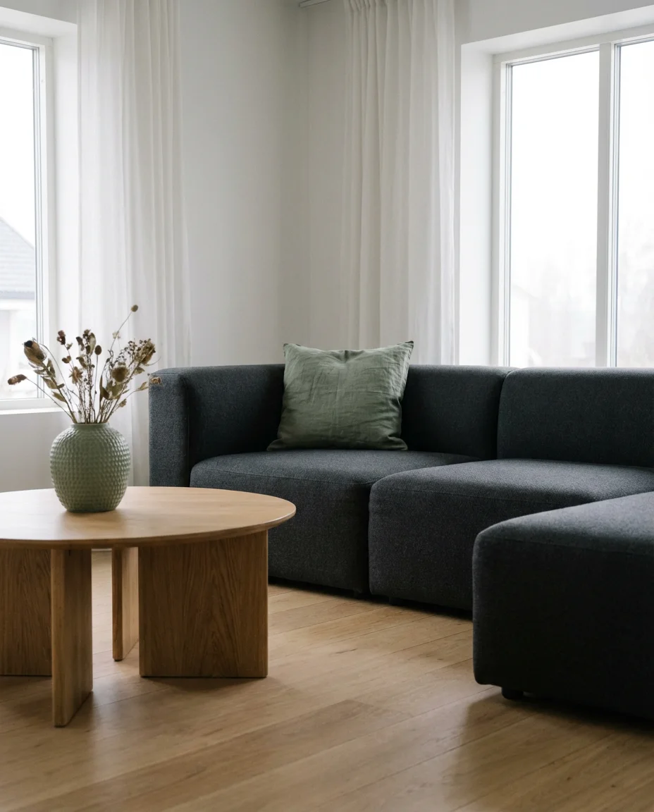
12. Green and Blue Living Room with Cozy Textures
If you want a living room that feels like a real retreat—the kind of space that makes you want to cancel plans and stay home—a green and blue palette loaded with cozy textiles is your answer. Think chunky knit throws, velvet cushions, deep pile rugs, and linen curtains. The colors themselves already carry warmth and depth, but it’s the layering of textures that transforms a pretty color scheme into something that genuinely wraps around you. This is about tactile comfort as much as visual beauty.
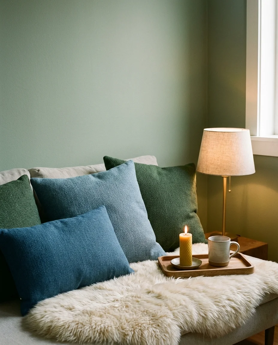
The blue-green-texture trifecta is especially beloved by Midwesterners and Pacific Northwesterners—people who spend real time indoors during colder months and want their living rooms to do emotional heavy lifting. Adding a fireplace, even a faux one, takes this palette from beautiful to transcendent. One practical note: when layering multiple textures in a color palette this rich, keep the pattern play minimal. Solid or near-solid textiles let the colors speak; too many competing prints and the coziness tips into chaos.
13. Red Sofa as a Bold Focal Point
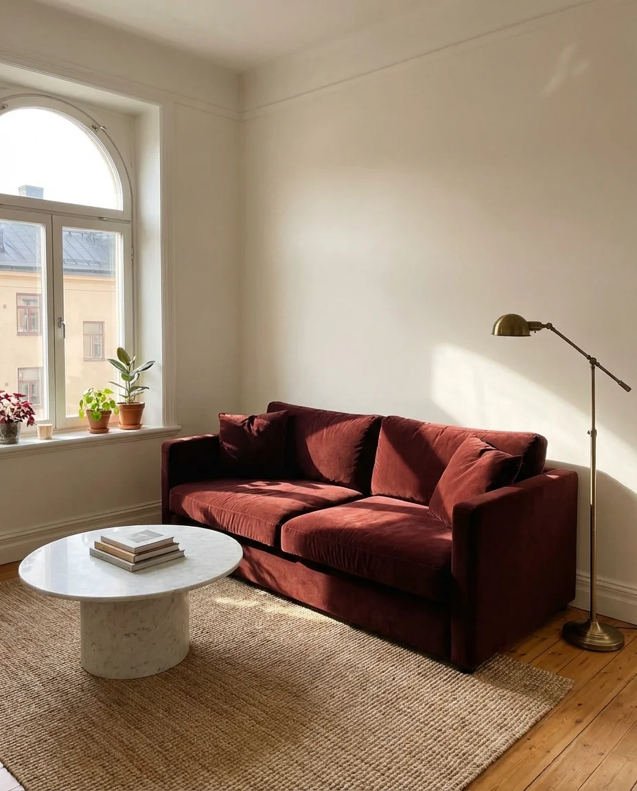
A red sofa is the interior design equivalent of a statement necklace—it does the work so nothing else has to. In 2026, red upholstery has shed its 1980s associations and reemerged as something genuinely chic, particularly in deeper, more complex shades like burgundy, brick, or oxblood. Against neutral walls—warm white, sand, or soft greige—a red sofa creates a focal point so strong and confident that the room essentially designs itself around it. It’s the move for people who want their living room to feel alive.
The most common mistake people make with a red sofa is over-decorating around it. Let the sofa be the star: keep pillows in neutral tones (cream, camel, or off-white), choose artwork with warm but not competing colors, and resist the urge to add too much pattern elsewhere. Red sofas have been spotted in the homes of design professionals from Brooklyn to Austin to Seattle in recent years—a sign that the stigma is well and truly gone. If you’re nervous, start with a deep burgundy, which behaves almost like a neutral in dim lighting.
14. Navy Blue and Yellow Living Room
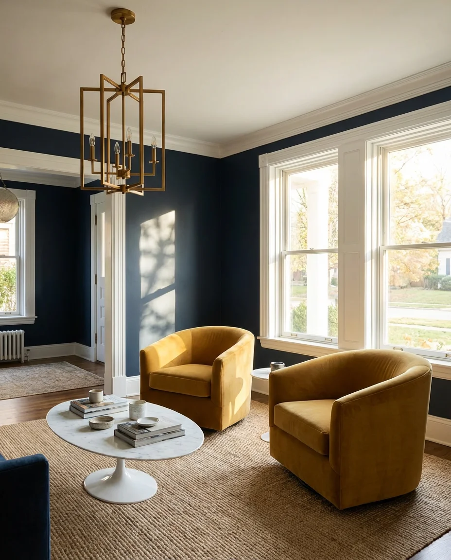
The blue and yellow combination has deep roots in both traditional American interiors and European country homes, but its current iteration is anything but traditional. Today’s take softens the contrast—instead of bright primary yellow, think mustard, ochre, or antique gold paired with a rich dark blue. The result feels sophisticated and energetic at the same time, like a palette that’s been carefully edited rather than thrown together. It’s a color scheme that photographs remarkably well, which partly explains its endless presence on Pinterest boards.
This is a palette that works beautifully in traditional American home styles—Craftsman bungalows, Colonial revivals, and Farmhouse layouts. The contrast between navy and mustard echoes the kind of color storytelling you’d find in historic American quilts, which gives it an authenticity that trend-forward palettes sometimes lack. For a budget-conscious approach, navy paint is widely available and very affordable, while a few mustard-toned cushions, a throw, and a piece of art can inject the yellow without a major investment.
15. Dark Grey Sofa with Sage Green Accents
A dark grey sofa—whether charcoal, slate, or deep graphite—paired with sage green accents is one of those combinations that feels both modern and timeless. The cool depth of dark grey is softened beautifully by sage, which brings just enough warmth and organic color to keep the room from feeling austere. This works especially well in contemporary and Scandinavian-influenced interiors where restraint and quality materials take center stage. It’s a quiet palette that rewards close attention.
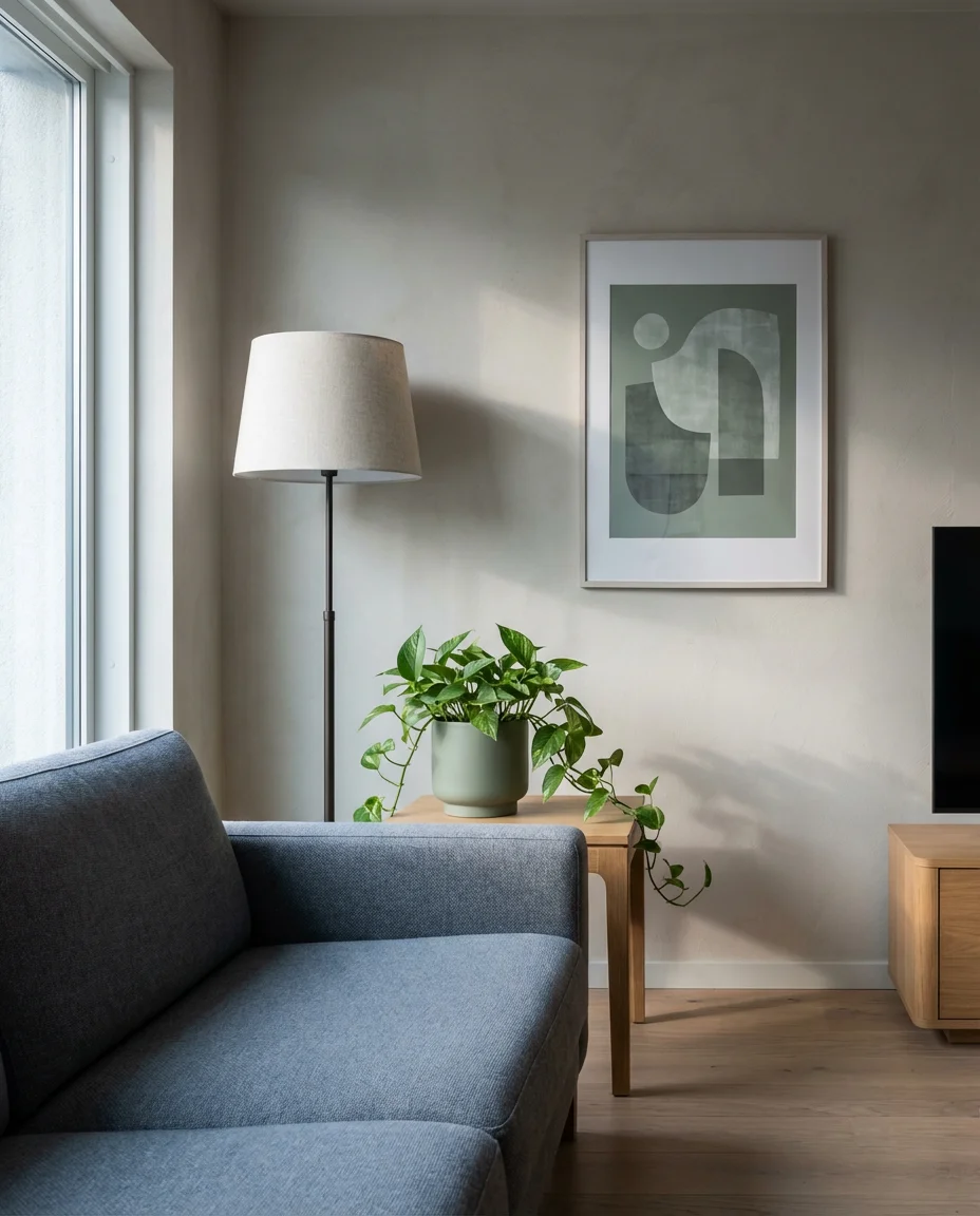
An interior designer working on a Seattle townhouse recently described this combination as “the palette that respects the architecture without fighting it.” The grey recedes and supports; the sage punctuates and breathes. For accessorizing, bring in natural materials: linen, untreated wood, and matte ceramics. A single sage-toned abstract print or a cluster of sage ceramic vessels can do the work of an entire accent wall. This palette is also particularly forgiving with different flooring tones—it reads well against both light wood and concrete, which makes it easier to implement across a wide range of existing interiors.
16. Beige Sofa with Rich Jewel-Tone Accents
A beige sofa is the ultimate blank canvas—and in 2026, the most interesting thing you can do with one is surround it with rich, deeply saturated jewel tones. Think deep sapphire blue throw pillows, an emerald green area rug, burgundy velvet accent chairs, or amethyst-toned art. The beige acts as a breathing space between these bold accents, preventing the room from feeling overwrought while still allowing the color to take center stage. It’s maximalism with a safety net.
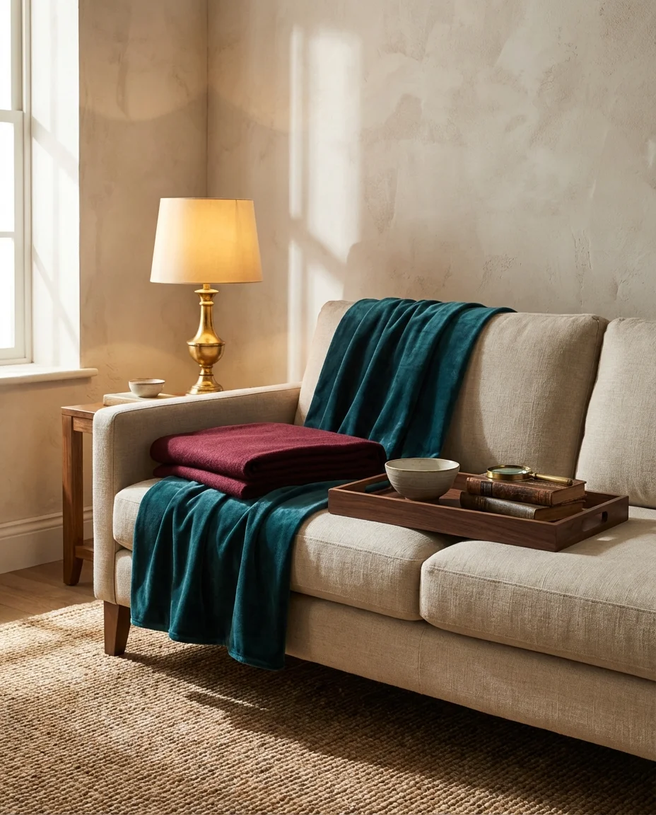
Real homeowners who love color but don’t want to commit to a single palette often gravitate toward this approach—and it makes complete sense from a flexibility standpoint. You can rotate your jewel-tone accents seasonally: cooler sapphires and emeralds in summer and warmer garnets and ambers in fall and winter. The beige sofa becomes a year-round investment that adapts to however your taste evolves. This is also a smart move in rental apartments where you can’t paint—the sofa becomes your anchor, and you build the whole palette in accents, art, and textiles.
17. Navy Blue Sofa with Warm Whites and Brass
A navy blue sofa—or navy couch—becomes something truly special when paired with the warmth of off-white walls and brass metal accents. This is a palette that sits at the intersection of American traditional and contemporary European design, and it works almost regardless of the room’s architectural style. The navy grounds the space with authority, the warm whites keep it light and breathable, and the brass adds that unmistakable note of warmth and craftsmanship that elevates the whole arrangement into something that feels intentionally designed.
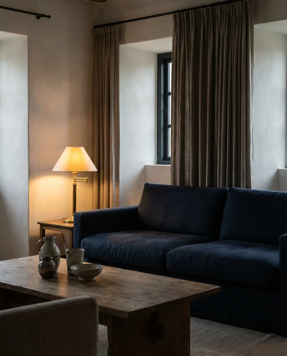
Where this combination truly shines is in evening lighting. During the day, the navy pops cleanly against the warm white in natural light. At night, with brass lamps casting their amber warmth, the whole room shifts into something far more intimate and atmospheric. This is the kind of living room that feels equally good for a dinner party and a quiet night in—which, if you think about it, is exactly what any living room should be. Swap throw pillows seasonally between cream, rust, and forest green to keep the palette feeling fresh without touching the main elements.
18. Olive Green and Cream Living Room with Rattan
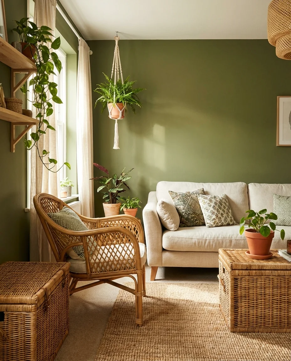
Pairing olive green with a cream sofa and rattan accents is essentially the formula for the most-saved living room on Pinterest right now. There’s a botanical, greenhouse-adjacent quality to this look that feels incredibly timely—we’re all trying to bring more nature indoors, and this palette is one of the most convincing ways to do it. The cream provides softness, the olive adds depth and earthiness, and the rattan introduces that handcrafted, organic warmth that no synthetic material can replicate.
This palette genuinely suits both large, open living rooms and smaller, cozier spaces. In a smaller room, the olive and cream combination creates depth without heaviness, especially when you keep the ceiling and trim white. The rattan accents—chairs, pendants, trays, and baskets—add layers of visual interest without adding visual weight, which is a crucial distinction in tighter spaces. Budget-wise, rattan and cane furniture have become incredibly accessible at mainstream retailers, so you can achieve this look for far less than you might expect.
19. Blue Living Room with Warm Earthy Accents
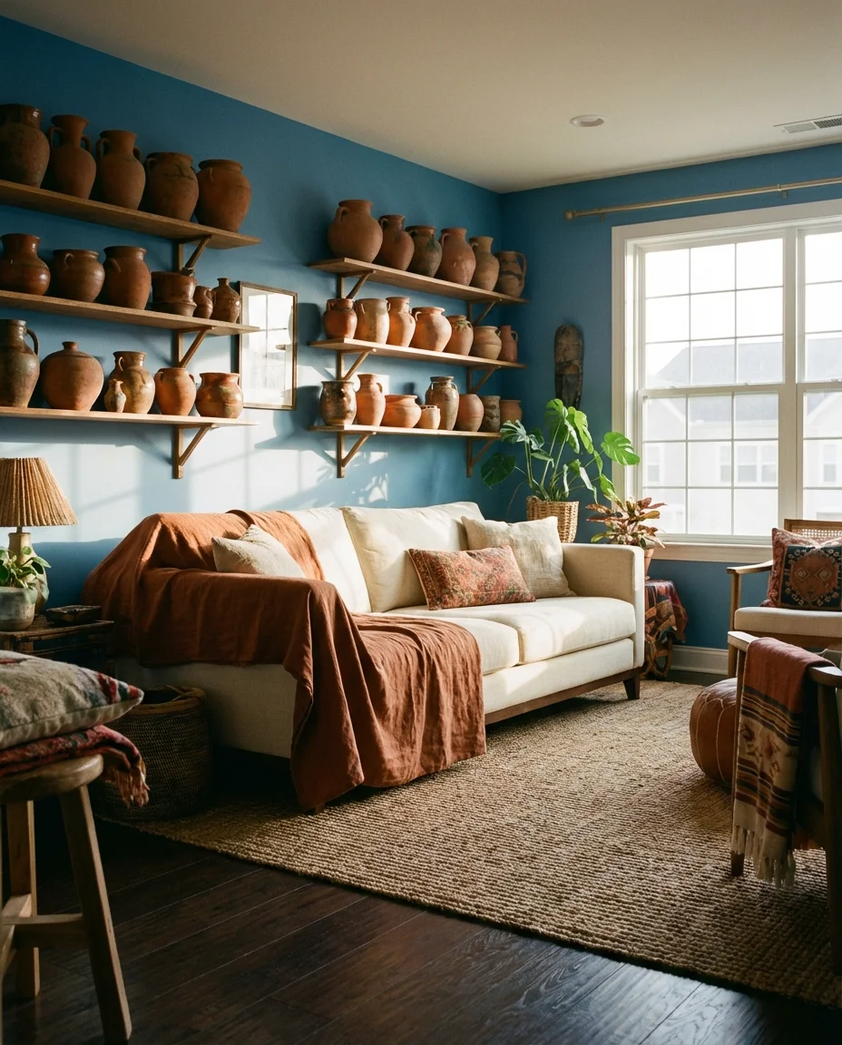
A blue living room with earthy terracotta, clay, and rust accents is a combination that feels both cosmopolitan and grounded at the same time. The blue—whether it’s a mid-tone periwinkle, a hazy slate, or a deeper indigo—provides a cool, airy foundation, while the warm earth tones keep the room from drifting into cold or clinical territory. It’s a pairing that has roots in Moroccan interiors, Southwestern American design, and contemporary European decorating, and somehow it feels completely at home in all three contexts.
The earthy accents are easy to introduce gradually—start with a terracotta pot, a rust-toned throw, or a clay-colored candle holder and see how the balance feels before adding more. What happens in blue rooms with warm earthy touches is that your eye naturally moves around the space, drawn by the contrast between cool and warm. That movement keeps the room feeling alive and interesting without being visually overwhelming. It’s one of the most dynamic color relationships you can create in a living space, and it doesn’t cost a lot to get right.
20. Dark Green Sofa in a Neutral Minimal Room
A dark green sofa placed in a stripped-back, minimal room with white or plaster walls and clean-lined wood furniture is one of the most visually compelling looks you can achieve right now. The sofa becomes a piece of sculpture—a rich, botanical presence in an otherwise restrained space. This isn’t about greenery or nature references; it’s about the inherent beauty of a deeply saturated color against an uncluttered backdrop. Think of it as the living room equivalent of a single extraordinary piece of art in an otherwise white gallery.
This setup rewards quality over quantity—every piece in the room needs to earn its place because there’s nowhere to hide in a minimal space. That means choosing the sofa carefully: look for clean, architectural lines rather than overly cushy or sectional styles. Hunter green, bottle green, or forest green in velvet or a dense textured weave will look more intentional than something in matte performance fabric. The minimal surround also means your few accessories matter enormously—a single large-scale plant, one well-chosen piece of art, and a beautiful rug are all you need.
21. Sage Green and Terracotta Boho Living Room
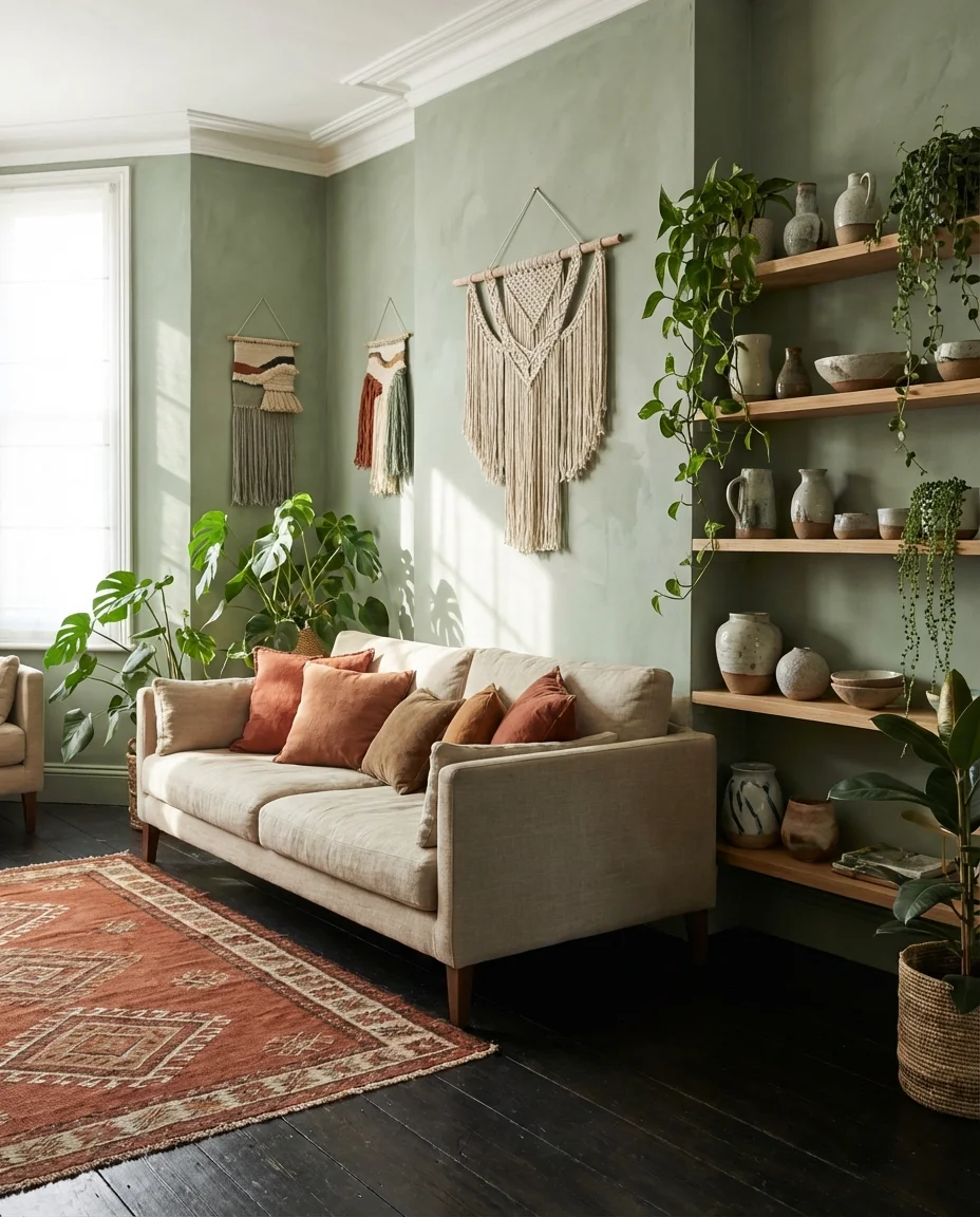
If there’s one color combination that’s almost genetically coded into the boho aesthetic, it’s sage green and terracotta. Together, they reference earth, clay, dried herbs, and desert light in a way that no other pairing quite manages. In a living room, this might look like sage-painted walls with terracotta throw pillows, a rust-toned patterned rug, and a collection of handmade ceramics. It’s layered, warm, and deeply personal—the kind of room that looks like it evolved over time rather than being styled all at once.
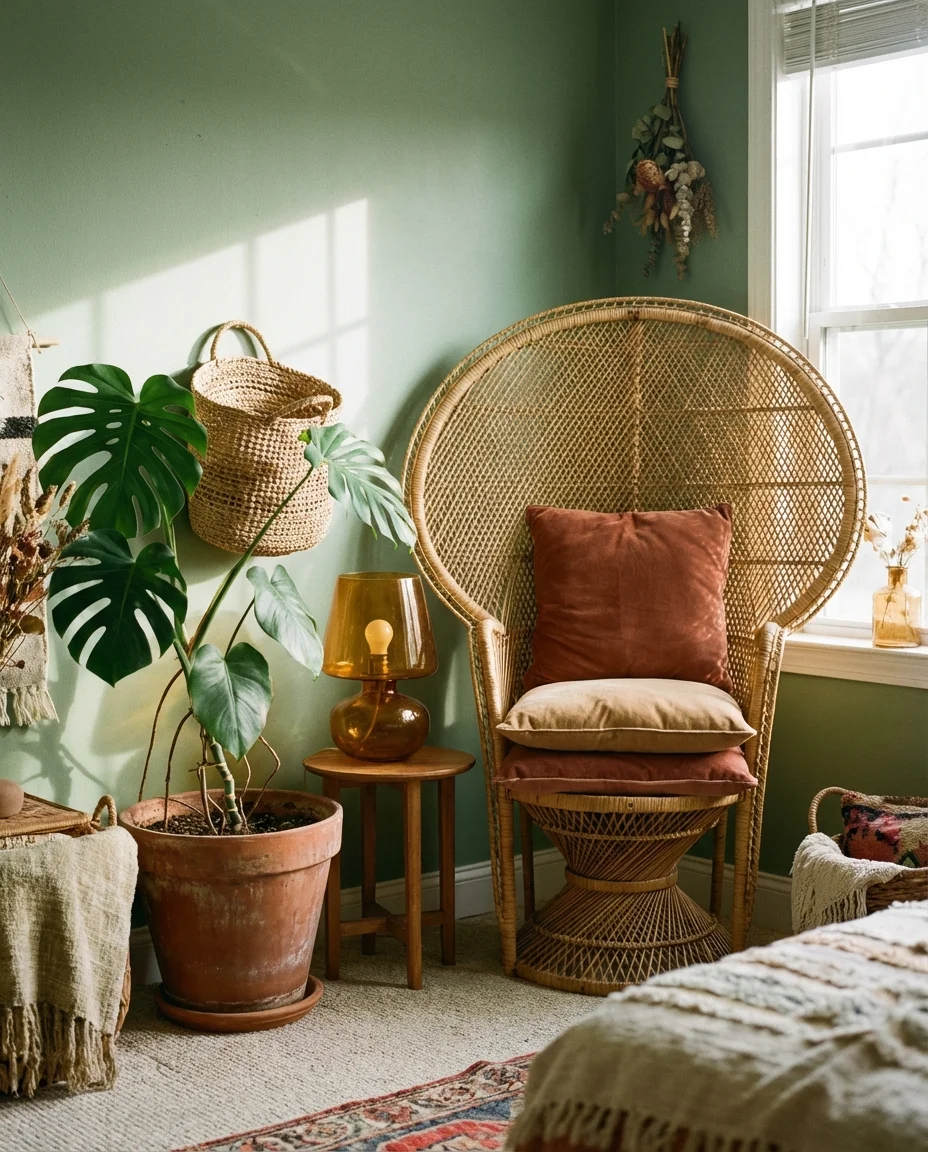
The boho approach is deeply forgiving from a budget standpoint—thrifted finds, vintage textiles, and handmade objects are not just acceptable here, they’re actively encouraged. A sage and terracotta room is one of the few spaces where a secondhand rug with years of character looks better than a new one, and where mixing mismatched ceramics from different sources creates a more authentic result than a matching set. This palette also ages gracefully—it softens and deepens over the years in a way that makes it feel more beautiful rather than more dated.
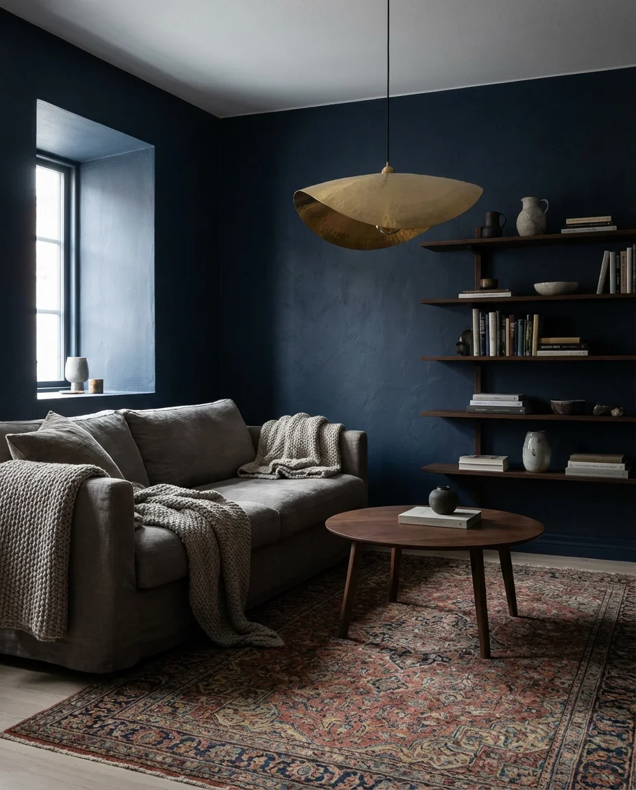
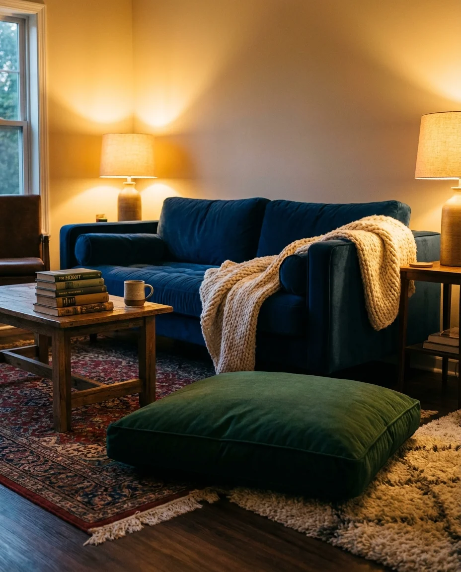
22. Moody Green and Blue Cozy Living Room
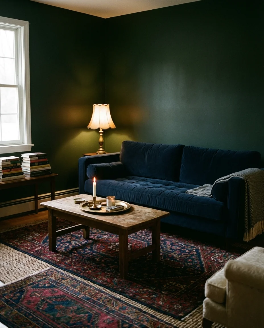
The final palette on our list might be the most emotionally resonant of all: a moody, deeply saturated room where dark green and dark blue meet in a space designed entirely around comfort. Think dark forest green walls, a navy couch, plush velvet cushions, candlelight, and a stack of books within arm’s reach. This is the living room that exists entirely in service of being deeply, completely at home. It’s a rejection of the bright-white minimalism that dominated for so long and an embrace of enclosure, warmth, and richness.
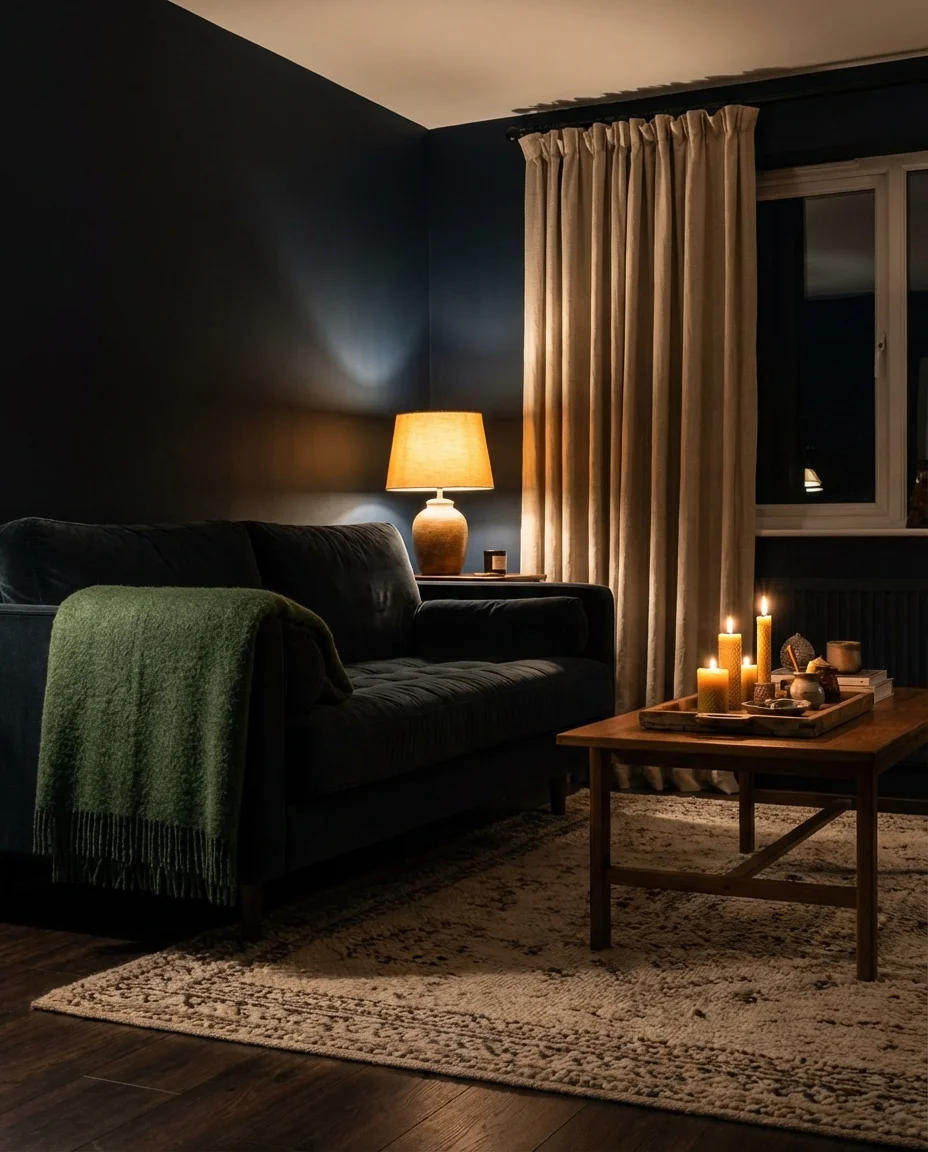
This palette thrives in rooms where the windows are small or the light is limited—rather than fighting those architectural realities, it leans into them completely. Dark rooms done well feel enveloping rather than closed-in, and the green-blue combination achieves that better than most. The key is layering your light sources: floor lamps, table lamps, candles, and perhaps a low pendant or sconce. Multiple warm light sources at different heights transform a dark room from gloomy to genuinely magical. It’s the living room that, once you’ve experienced it, makes every bright white room feel just a little bit empty by comparison.
Conclusion
Whether you’re ready to pick up a paintbrush or just experimenting with the idea of something new, we hope these color schemes have sparked something for you. Color is deeply personal—what feels bold to one person feels like home to another—and there’s no single right answer when it comes to your living room. We’d love to hear which palette is speaking to you most right now. Drop a comment below and tell us: which color scheme are you planning to try, and what room are you transforming?