As we move deeper into 2026, color trends for living rooms are shifting toward schemes that feel both grounded and expressive. American homeowners are turning to Pinterest not just for color swatches, but for complete mood boards that show how hues interact with furniture, architecture, and natural light throughout the day. Whether you’re working with a gray couch that needs a refresh, planning an accent wall, or simply craving a space that feels more aligned with how you actually live, this year’s palette offers something for every style and floor plan. The ideas ahead explore everything from bold saturated tones to serene neutrals, with practical guidance tailored to real American homes.
1. Warm Terracotta with Natural Wood Accents
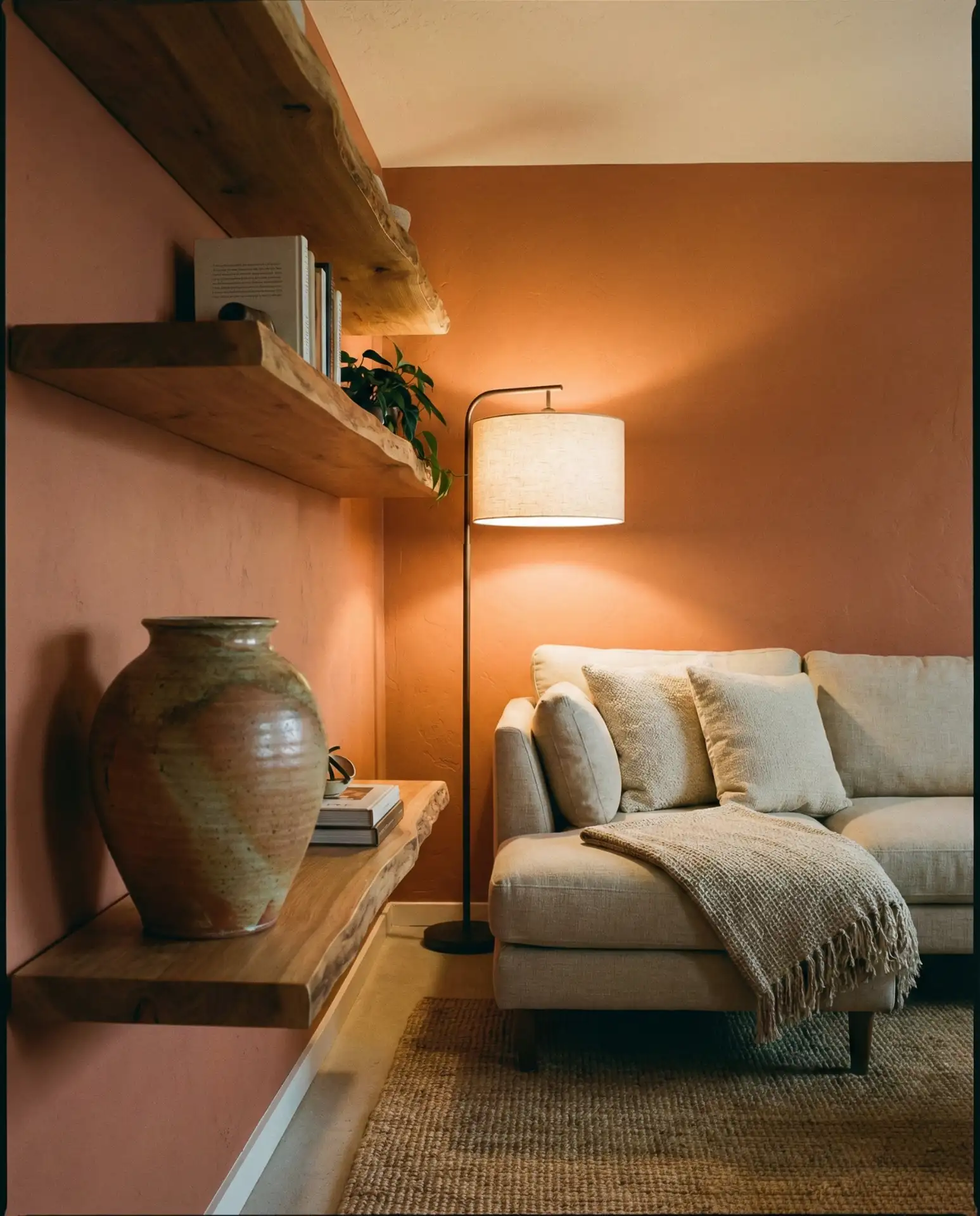
Terracotta has become a go-to for homeowners seeking warm and cozy interiors that still feel current in 2026. This earthy, clay-inspired orange works beautifully in living rooms with abundant natural light, where it glows during golden hour and softens under evening lamps. Pair it with light oak or maple trim, and you’ll create a natural and earthy foundation that feels collected rather than decorated. It’s especially effective in open-plan homes where the living room flows into an open kitchen, unifying both spaces with a single grounding hue.
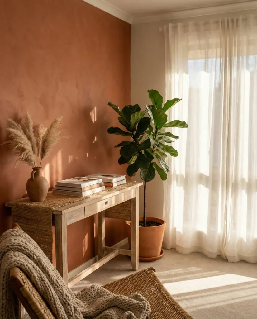
Where it works best: Terracotta shines in Southwest-inspired homes, mid-century modern spaces, and even updated farmhouse interiors. It reads as sophisticated rather than trendy when you keep surrounding colors muted—think ivory, sand, and charcoal. Avoid pairing it with cool grays or stark whites, which can make the warmth feel out of place. Instead, let terracotta anchor a room filled with textures: jute rugs, linen throws, and unglazed pottery.
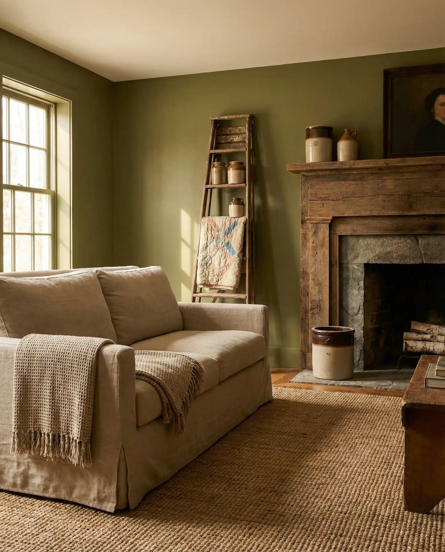
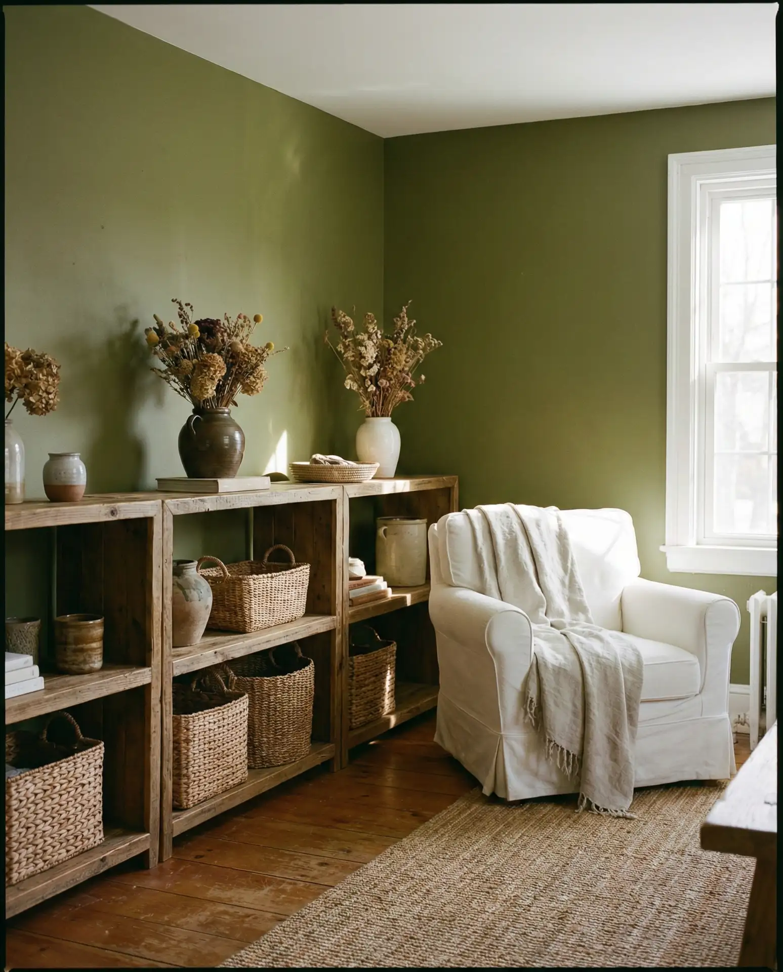
2. Sage Green Walls with Brass Hardware
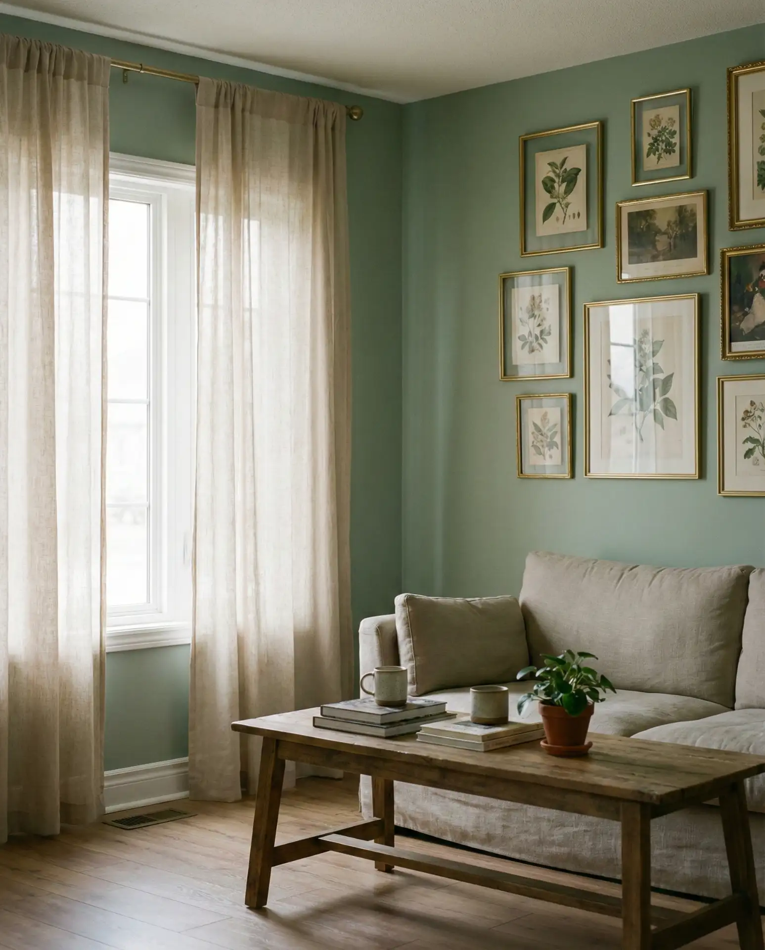
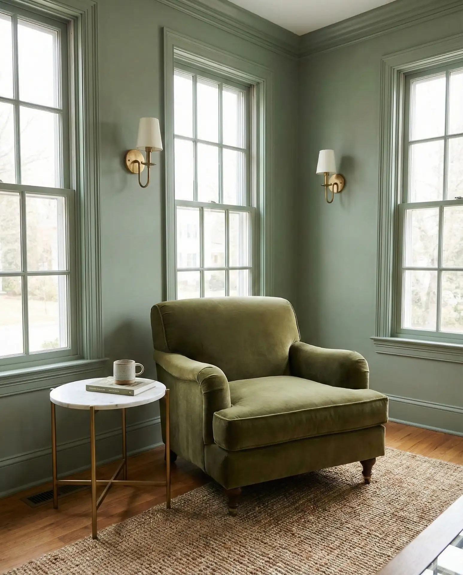
Green has fully matured from accent color to main event, and sage in particular offers a neutral and serene quality that works across architectural styles. This muted, grayish green feels at home in both traditional and modern living rooms, especially when paired with warm metallics like aged brass or brushed gold. It’s a color that adapts to its surroundings: in a north-facing room, it leans cooler and more contemplative; in a south-facing space, it picks up golden undertones and feels almost buttery.
Budget angle: Sage is forgiving when it comes to paint quality. Even mid-tier brands render it well, so you can allocate more of your budget to statement hardware or textiles. A single gallon typically covers 400 square feet, meaning most living rooms need only two gallons for full coverage. If you’re working with built-in shelves, consider painting the interior backs in a slightly deeper sage to add subtle dimension without introducing a new color entirely.
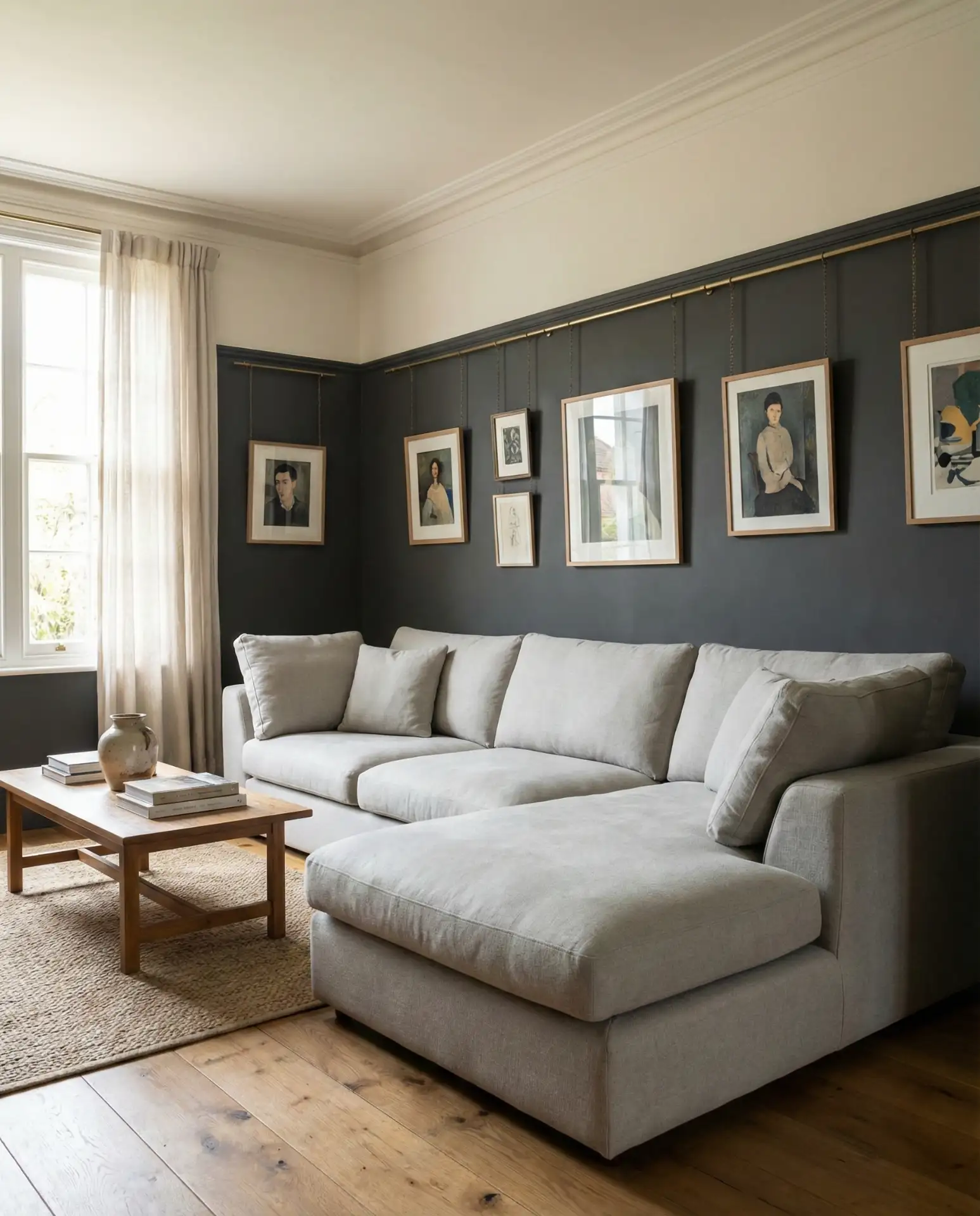
3. Charcoal Accent Wall Behind a Grey Couch
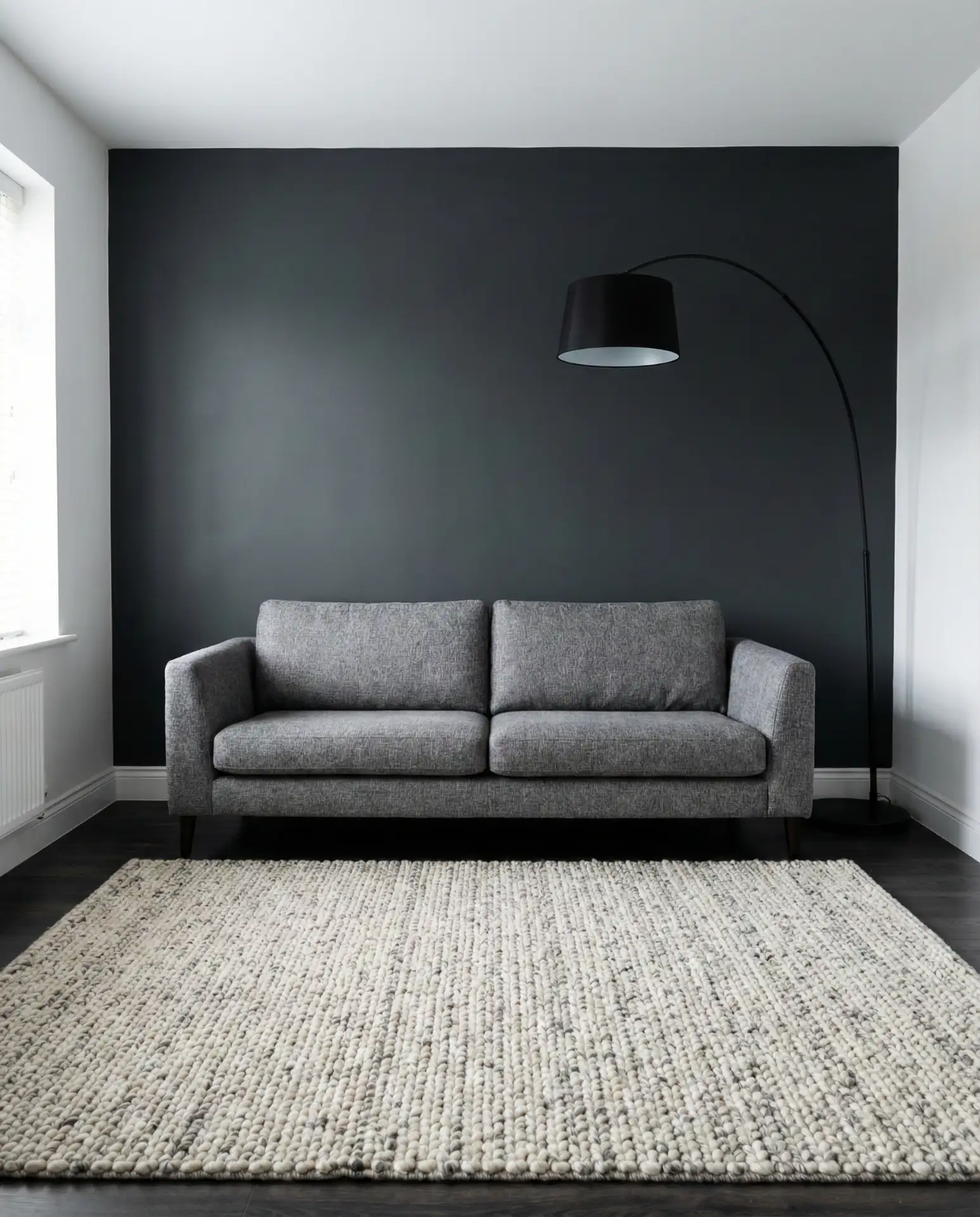
If you’ve been living with a grey couch that feels a little too safe, a charcoal accent wall can provide instant structure without overwhelming the room. This approach works especially well in large living rooms where a single wall of deep, near-black gray creates a focal point and makes furniture arrangements feel intentional. The key is contrast: keep adjacent walls in a soft white or pale greige so the charcoal reads as deliberate rather than cave-like. This trick is borrowed from hotel design, where dark walls are used to make spaces feel more intimate and curated.
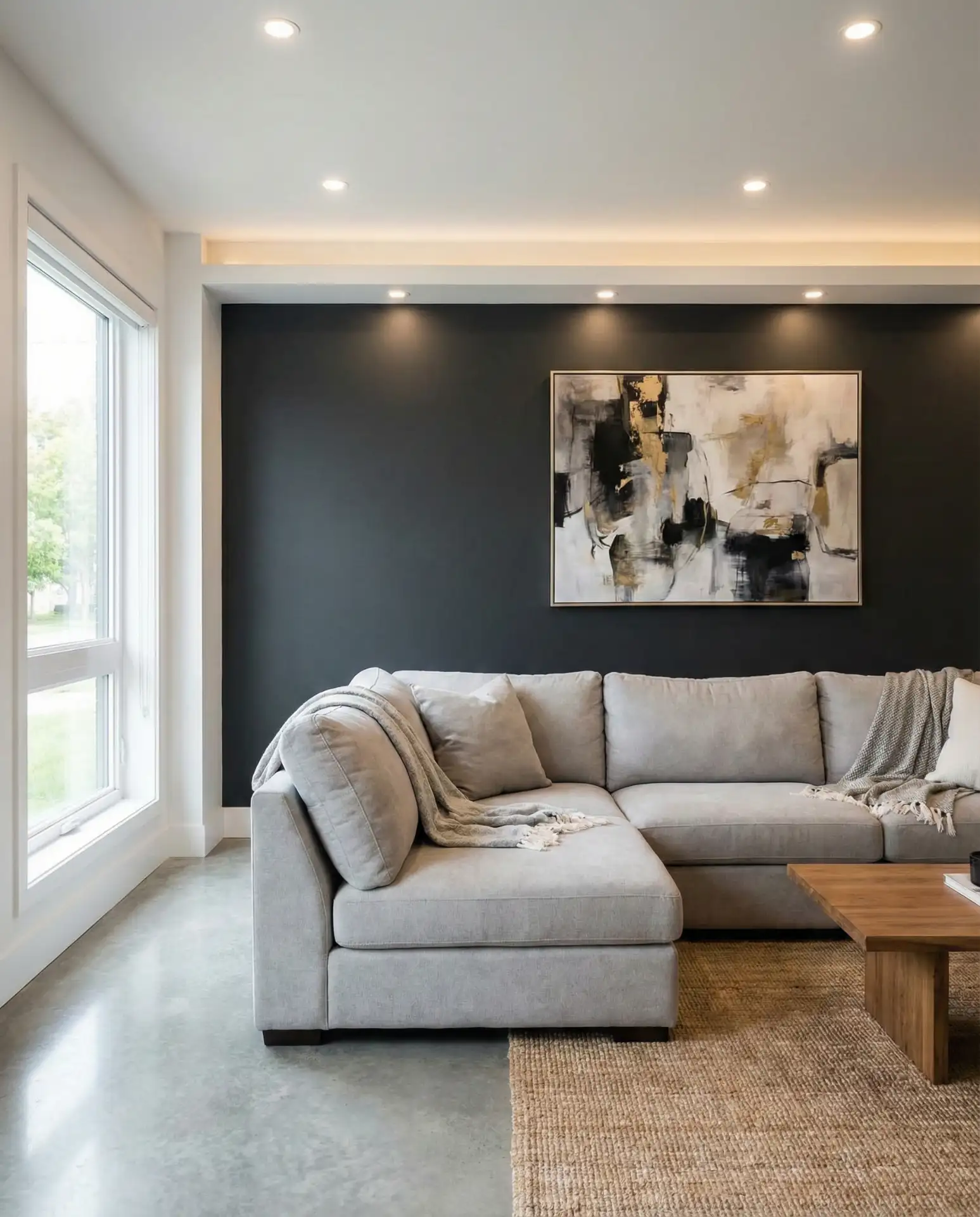
Real homeowner behavior: Many people worry a dark wall will make a room feel smaller, but the opposite is often true—it creates depth and makes the perimeter of the room less defined. The wall essentially recedes, especially if you hang large-scale art or a mirror that reflects light from the opposite side of the room. One common mistake is stopping the charcoal at the ceiling line; for a more polished look, carry it onto the ceiling by about six inches, then transition to white. This creates a shadow line that feels architectural.
4. Soft Blush with Oak Flooring
Blush pink has evolved from a millennial cliché into a genuinely versatile, neutral, and serene backdrop, especially when it leans more beige than bubblegum. In 2026, the most successful versions are those with enough gray in the mix to feel sophisticated rather than sweet. This color works particularly well in homes with honey-toned oak floors, where the warmth of the wood prevents the blush from reading as cold or sterile. It’s also a smart choice for living rooms that double as home offices, since it’s easier on the eyes during long screen sessions than stark white.
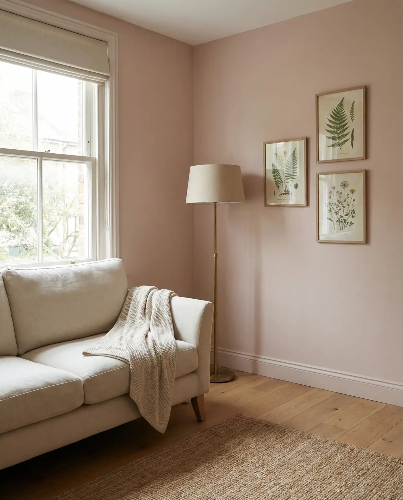
American lifestyle context: Blush has become popular in coastal California and Pacific Northwest homes, where homeowners want warmth without the heaviness of traditional beiges. It’s also a favorite in urban lofts, where it softens industrial features like exposed ductwork or concrete columns. If you’re in a rental, blush is a safe bet—it’s neutral enough that most landlords won’t blink, but it still gives the space personality.
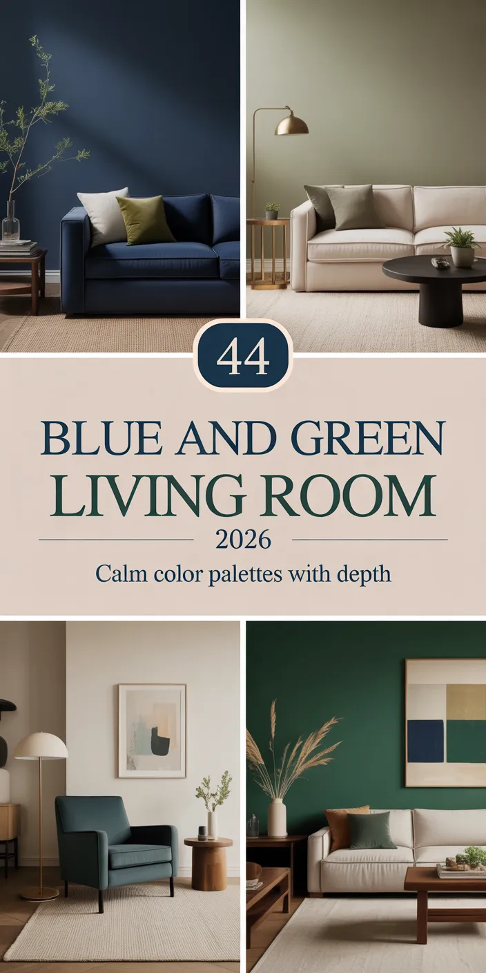
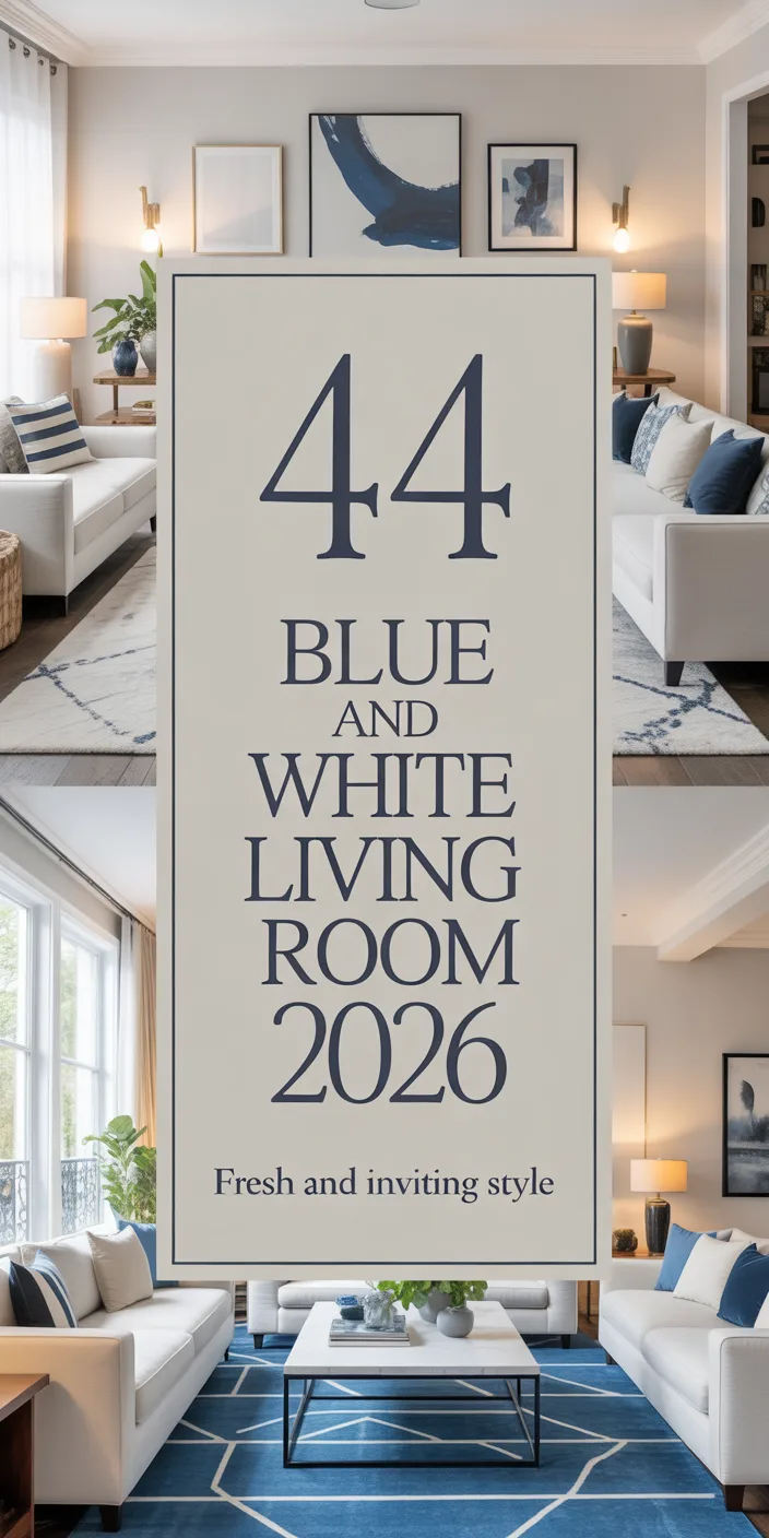
5. Navy Blue with White Wainscoting
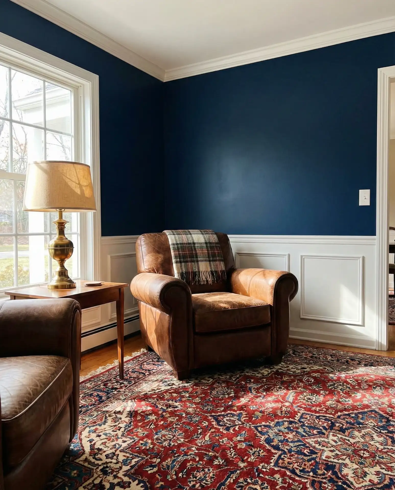
Blue continues to dominate American interiors, and navy remains the most foolproof option for those who want drama without veering into bold and vibrant territory. When paired with white wainscoting or board-and-batten, it evokes the kind of classic New England elegance that never goes out of style. This combination works beautifully in both farmhouse and traditional homes, offering a grounding counterpoint to lighter furniture and natural textures. Navy also has the advantage of making ceilings appear higher, especially when the wainscoting stops at the one-third mark.
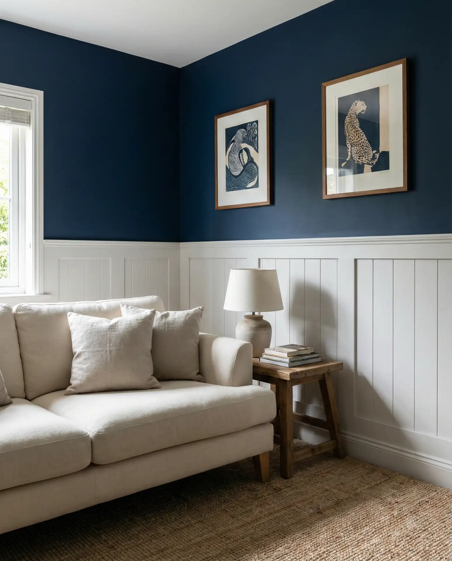
Practical insight: Navy can skew purple or green depending on the undertones, so always test a sample in your space before committing. Look for versions labeled “true navy” or “classic navy” to avoid unwanted shifts. The wainscoting doesn’t have to be pristine white—an off-white with a hint of cream will keep the look from feeling too stark. And if you’re working with existing trim that’s yellowed over time, a fresh coat in the same off-white will tie everything together without the need for a full repaint.
6. Creamy White with Black Window Frames
Creamy white remains a cornerstone of modern American homes in 2026, especially in spaces with large windows where natural light is abundant. The creaminess prevents the space from feeling clinical, while black-framed windows or French doors provide architectural definition. This pairing is especially popular in new builds and renovations, where the black frames are often standard, and it works across a range of styles—from minimalist lofts to updated colonials. The key is to keep the cream warm, not stark, so it complements rather than competes with the black.
Where it works best: This combination thrives in open-concept homes where the living room flows into a kitchen and dining area. The creamy white unifies the space, while the black frames act as visual anchors that define zones without the need for walls. It’s also ideal in homes with vaulted ceilings or exposed beams, where the contrast between light walls and dark architectural elements creates a sense of drama. If you’re installing new windows, consider matte black rather than glossy—it reads as more sophisticated and won’t show fingerprints.
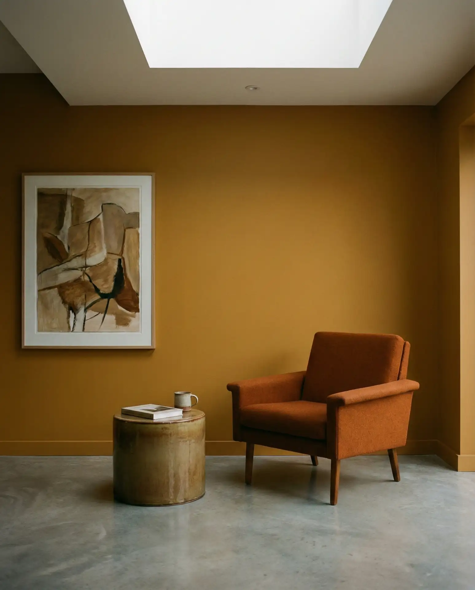
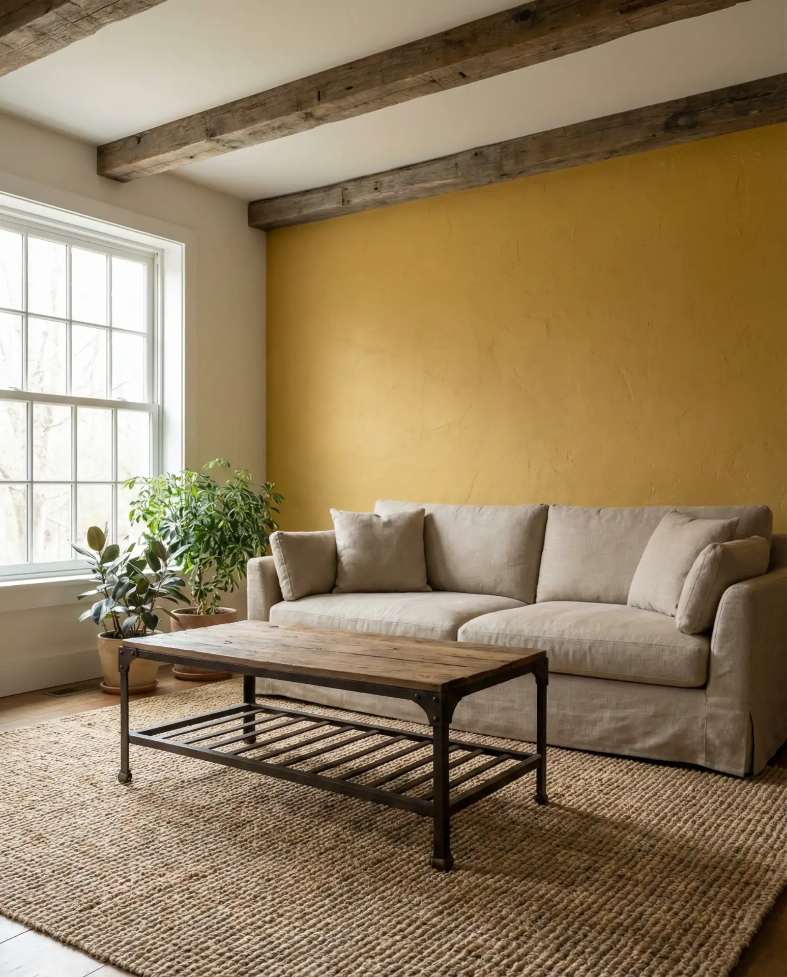
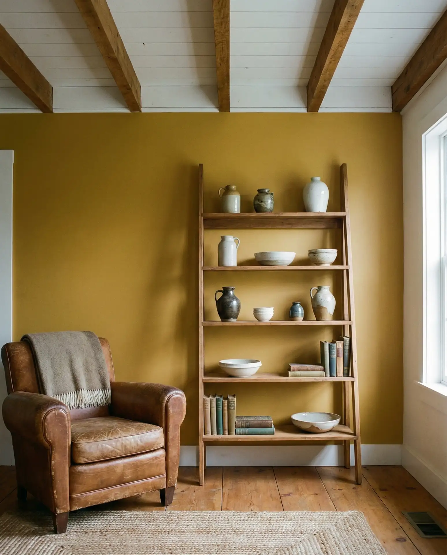
7. Ochre Yellow with Concrete Floors
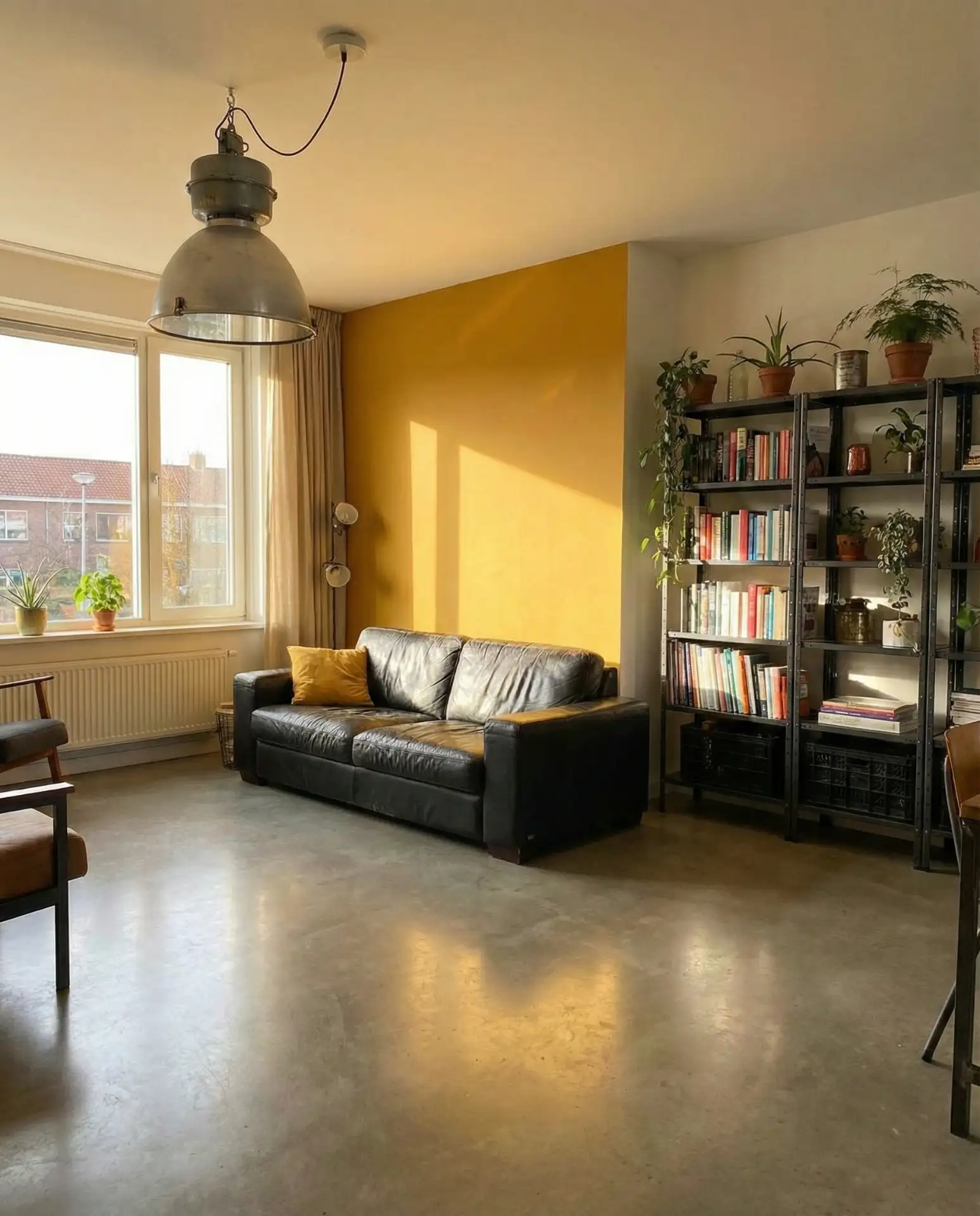
Ochre—a muted, earthy yellow with brown undertones—has become a favorite in bold yet livable interiors. Unlike brighter yellows, which can feel juvenile or overly cheerful, ochre has a grounded, almost mineral quality that pairs beautifully with industrial materials like polished concrete or raw steel. This combination is especially striking in modern lofts and converted warehouses, where the warmth of the ochre softens the coolness of the concrete. It’s a color that shifts throughout the day, glowing amber in morning light and deepening to rust by evening.
Expert-style commentary: Ochre works because it sits at the intersection of warm and neutral—it has enough color to feel intentional but enough subtlety to avoid overwhelming a space. Designers often use it as a full-room color rather than an accent, which allows the hue to envelop the space and create a cohesive mood. If you’re hesitant to commit to four walls, start with an accent wall behind a media console or built-in shelves, where it can frame your belongings and make them feel more curated.
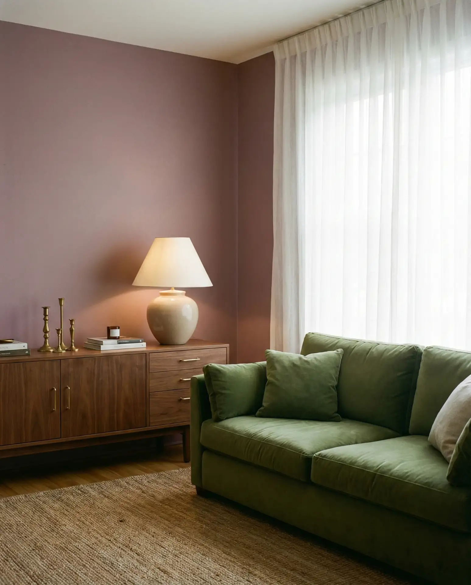
8. Dusty Mauve with Walnut Furniture
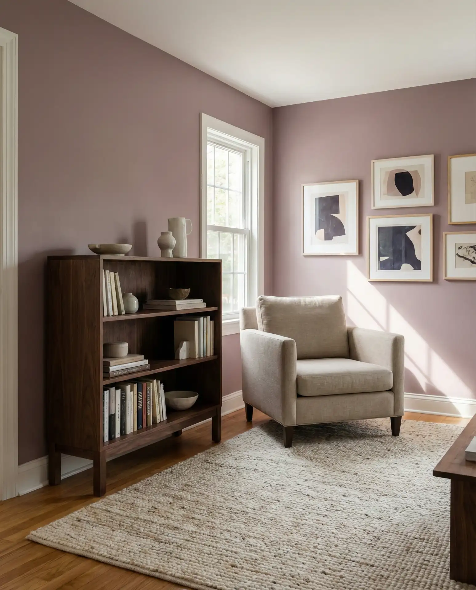
Dusty mauve—a grayish purple with pink undertones—offers a cozy alternative to more expected neutrals like beige or gray. This color feels especially current in 2026, where it’s being used in living rooms with rich, dark wood furniture like walnut or mahogany. The contrast between the soft, muted wall color and the deep, warm wood creates a layered, collected look that feels both vintage and contemporary. It’s a color that works particularly well in homes with good natural light, where it reads as sophisticated rather than dull.
Micro anecdote: A friend in Portland painted her living room in dusty mauve after years of living with builder-grade beige. She was surprised by how much warmer the space felt, even though the color itself reads cool. The key, she said, was pairing it with textiles in rust and terracotta, which brought out the pink undertones and made the room feel like it had been thoughtfully layered over time.
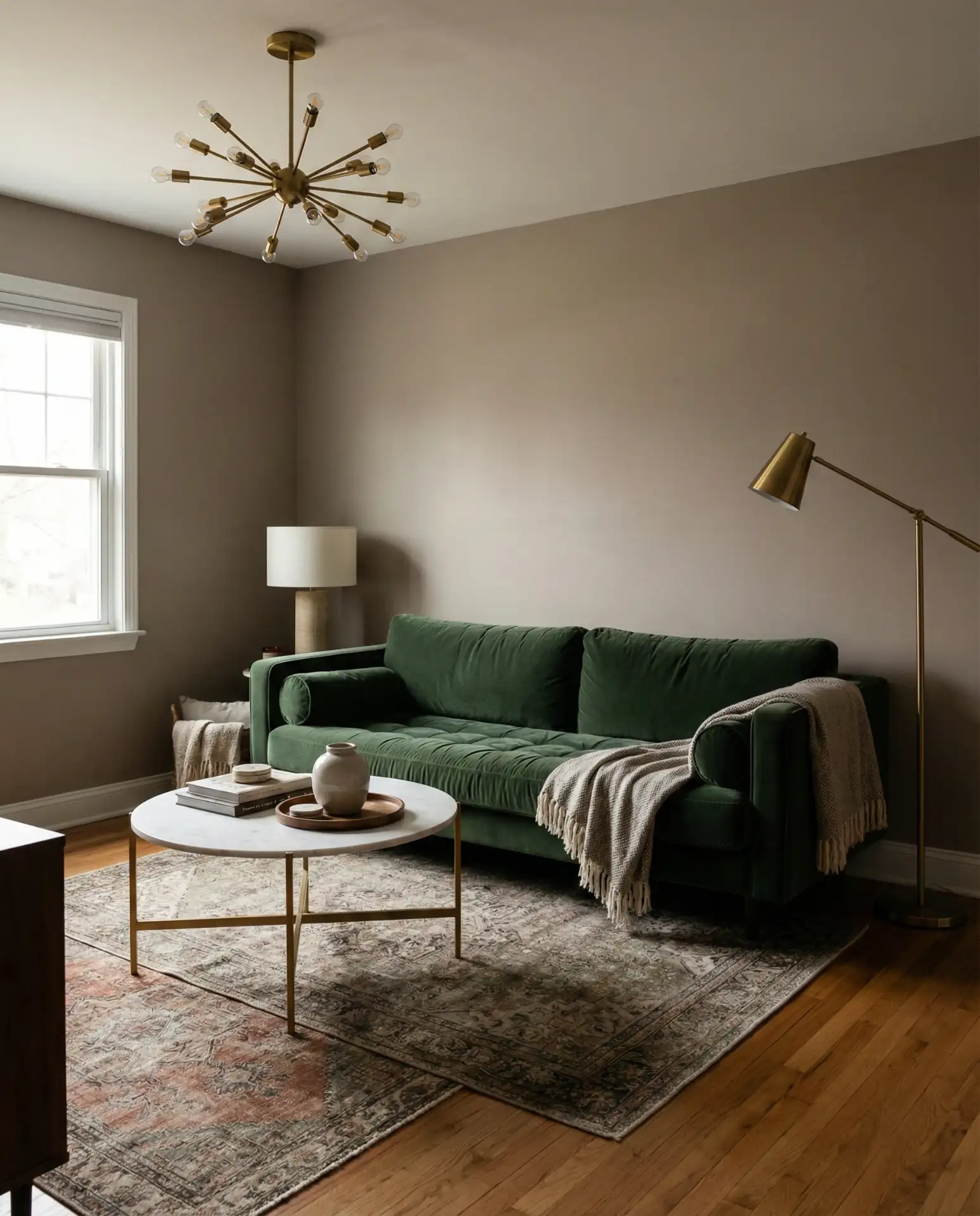
9. Forest Green with Leather Accents
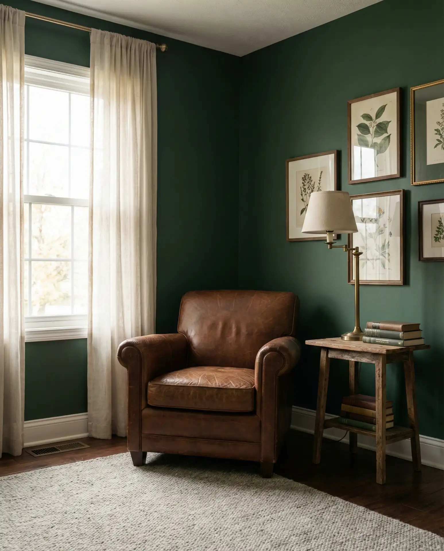
Forest green has become a go-to for homeowners seeking a natural and earthy palette that still feels dramatic. This deep, saturated green works beautifully in living rooms with leather furniture—think cognac sofas or saddle-colored armchairs—where the warmth of the leather prevents the green from feeling too moody. It’s a color that evokes old libraries and English country homes, but when paired with modern lighting and clean-lined furniture, it feels entirely current. Forest green also has the advantage of making art and textiles pop, since it provides such a rich backdrop.
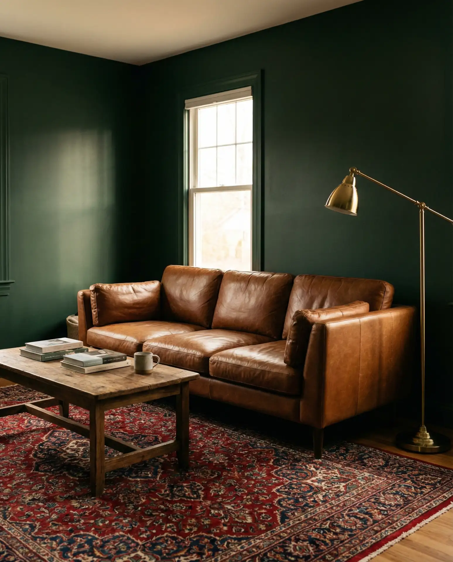
Common mistakes and how to avoid them: The biggest error with forest green is not committing fully—painting just one accent wall can make the room feel disjointed. Instead, paint all four walls and the ceiling in the same hue, which creates a cocoon-like effect that’s actually calming rather than oppressive. Another mistake is pairing it with cool-toned metals like chrome or brushed nickel; warm brass, copper, or even matte black will harmonize much better with the green’s inherent warmth.
10. Warm Gray with White Oak Built-Ins
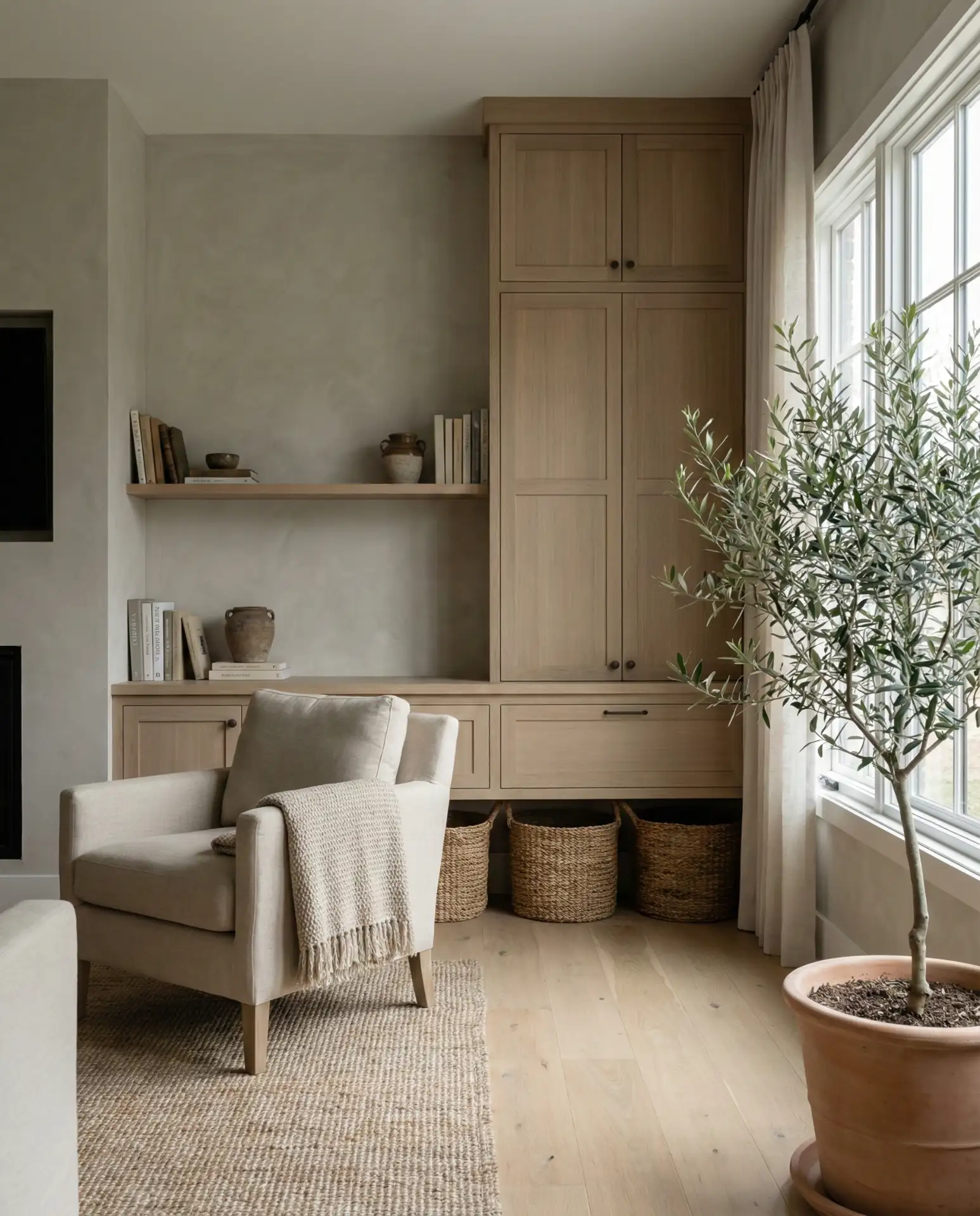
Warm gray—sometimes called “greige”—remains a staple in neutral and serene American homes, especially those with custom millwork or built-in shelves in white oak. This pairing offers a modern take on traditional paneling, where the pale wood brings warmth and texture to an otherwise minimal palette. The key is choosing a gray with enough beige or taupe in it to prevent the space from feeling cold. This combination is particularly popular in large open-plan homes, where the built-ins help define the living room without closing it off from adjacent spaces.
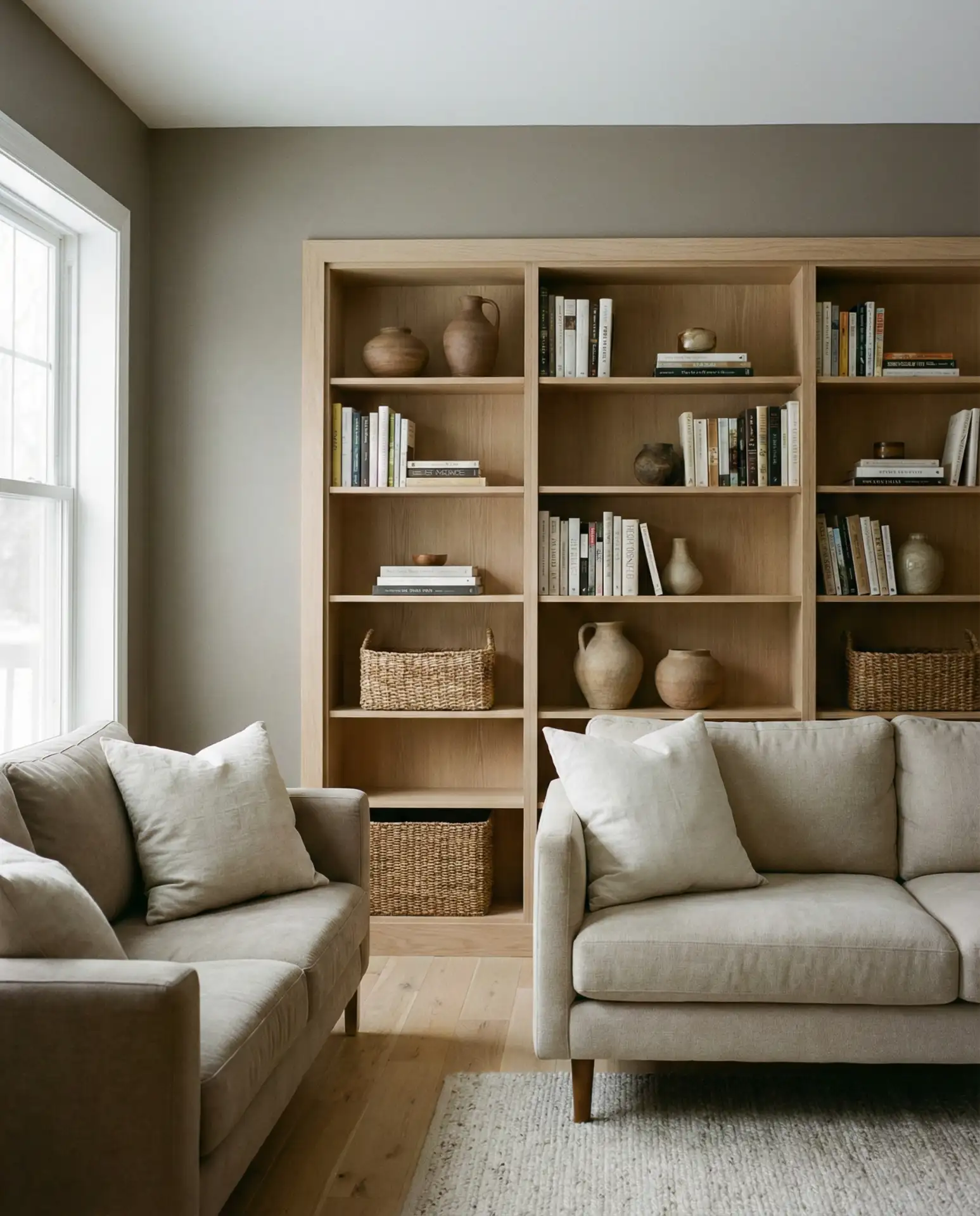
Budget angle: Built-ins can be expensive, but even a simple shelving unit from a home improvement store, stained in white oak, will give you a similar effect. If you’re working with a gray couch or other gray furniture, make sure your wall color is a few shades lighter to avoid a monochromatic look that feels flat. Consider adding in warm metals like brass or copper in your lighting and hardware to tie the gray and oak together.
11. Mustard Yellow Accent Wall in a Rustic Space
Mustard yellow has carved out a niche in rustic and farmhouse interiors, where its richness complements reclaimed wood, wrought iron, and other heritage materials. Unlike brighter yellows, mustard has a depth and earthiness that feels rooted in history, making it a natural fit for homes with exposed beams or shiplap walls. An accent wall in mustard can anchor a seating area, especially when paired with furniture in natural linen or faded denim blue. It’s a color that works year-round, feeling sunny in summer and warm in winter.
Real homeowner behavior: Many people hesitate to use mustard because they associate it with the 1970s, but today’s versions are more refined and less orange. The trick is to keep the rest of the room fairly neutral—whites, creams, and soft grays—so the mustard feels intentional rather than overwhelming. If you’re working with a brown couch, mustard can actually be a great backdrop, since the two colors share warm undertones that harmonize naturally.
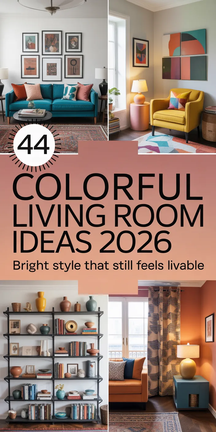
12. Soft White with Pops of Coral
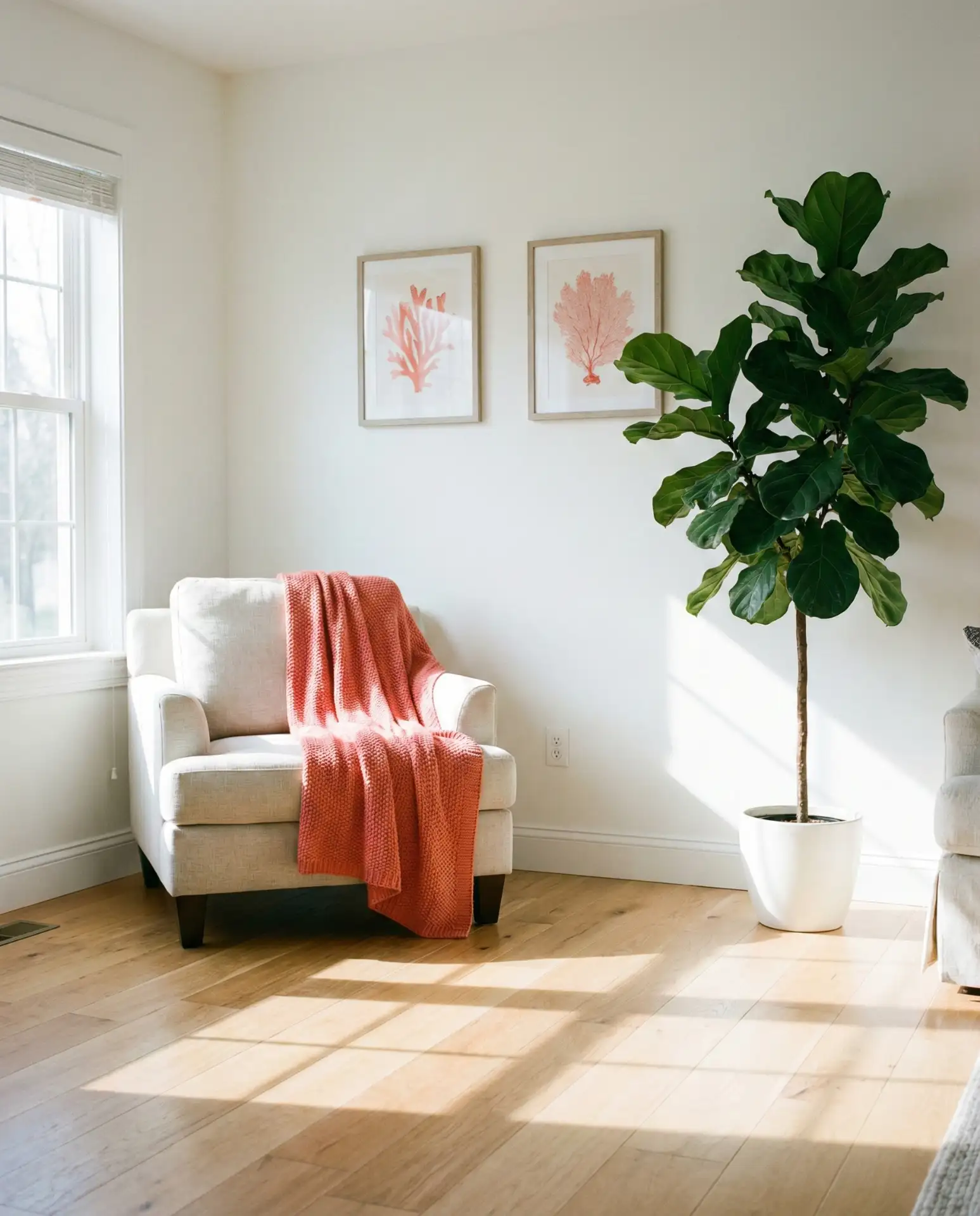
Soft white provides a bright and airy foundation in 2026, especially in small open kitchen and living room layouts where visual continuity matters. When you introduce coral through pillows, throws, or artwork, you get warmth and personality without committing to a bold wall color. Coral is having a quiet resurgence—not the neon versions of the 2010s, but softer, salmon-leaning shades that feel more grown-up. This approach is ideal for renters or anyone who likes to switch up their decor seasonally, since the color can be swapped out easily.
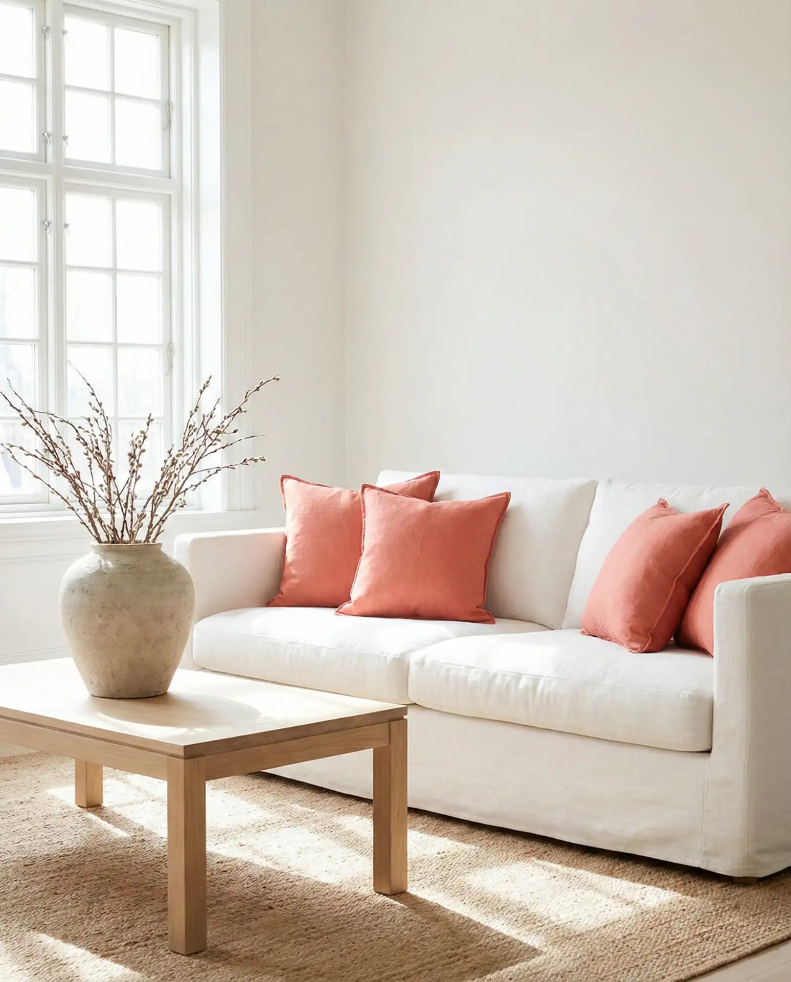
American lifestyle context: Coral works particularly well in coastal regions—Florida, Southern California, and the Gulf Coast—where it echoes the colors of sunsets and tropical flowers. It’s also popular in Southwestern homes, where it pairs beautifully with terracotta and adobe. If you’re in a cooler climate, coral can still work, but you’ll want to balance it with warmer neutrals like beige or cream rather than stark whites, which can make the coral feel out of place.
13. Charcoal and Cream Two-Tone Walls
Two-tone walls—charcoal on the bottom, cream on top—create architectural interest in living rooms that lack original detail. This technique works especially well in modern homes with flat walls and minimal trim, where the color break adds a horizontal line that makes the room feel more expansive. The charcoal grounds the space and hides scuffs from furniture and foot traffic, while the cream keeps the room from feeling too dark. The division is typically placed at chair-rail height, about 32 to 36 inches from the floor, but you can adjust based on your ceiling height and the proportions of your furniture.
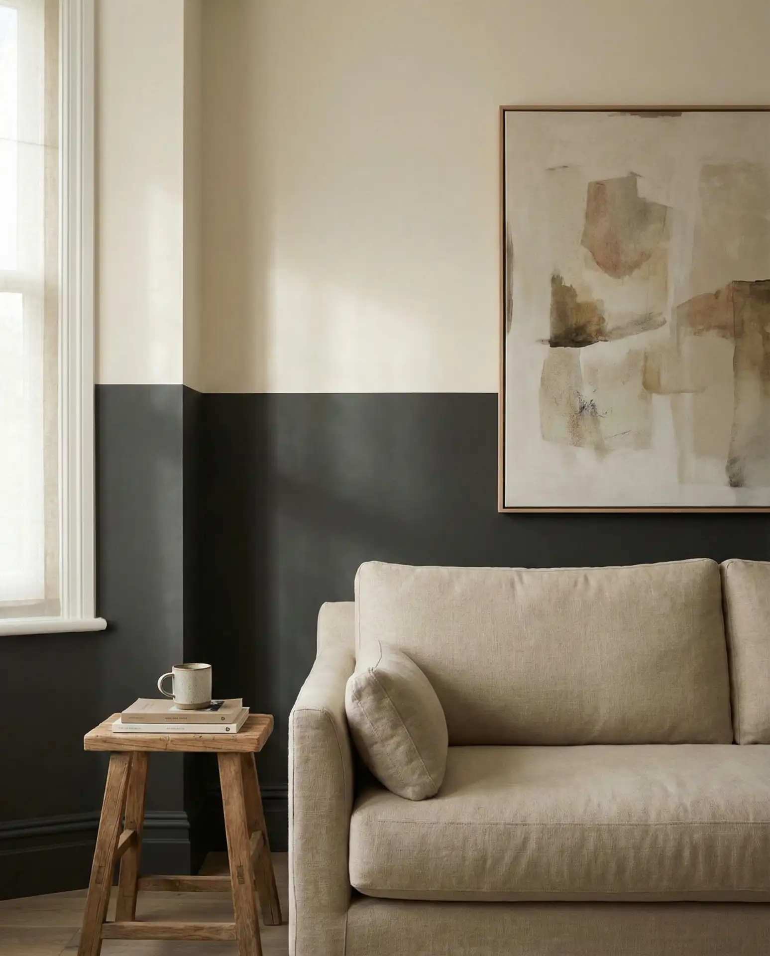
Practical insight: The key to a clean two-tone look is a perfectly straight line where the colors meet. Use a laser level to mark the division, then apply painter’s tape and seal it with a thin bead of the base color before painting the top coat—this prevents bleed-through and ensures a crisp edge. If you’re painting over existing dark walls, prime the cream section first to avoid having to apply multiple coats.
14. Pale Blue with Light Pine Furniture
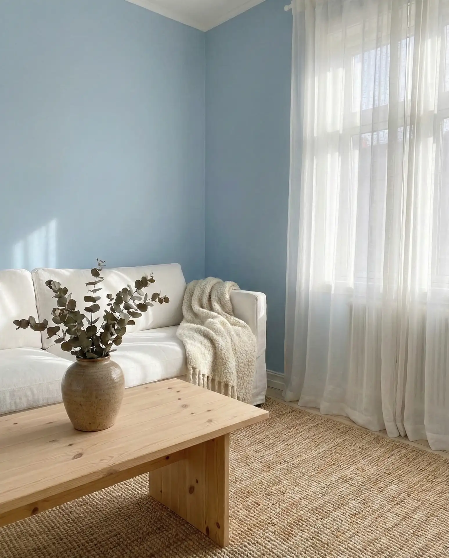
Pale blue—sometimes called powder blue or sky blue—brings a neutral and serene quality to living rooms, especially when paired with light pine or blonde wood furniture. This combination evokes Scandinavian interiors, where pale colors and natural wood create spaces that feel calm and uncluttered. The blue works particularly well in north-facing rooms, where it can counteract the coolness of the light, and in bright south-facing spaces, where it keeps things from feeling too warm or yellow. It’s a color that recedes visually, making even small living rooms feel more spacious.
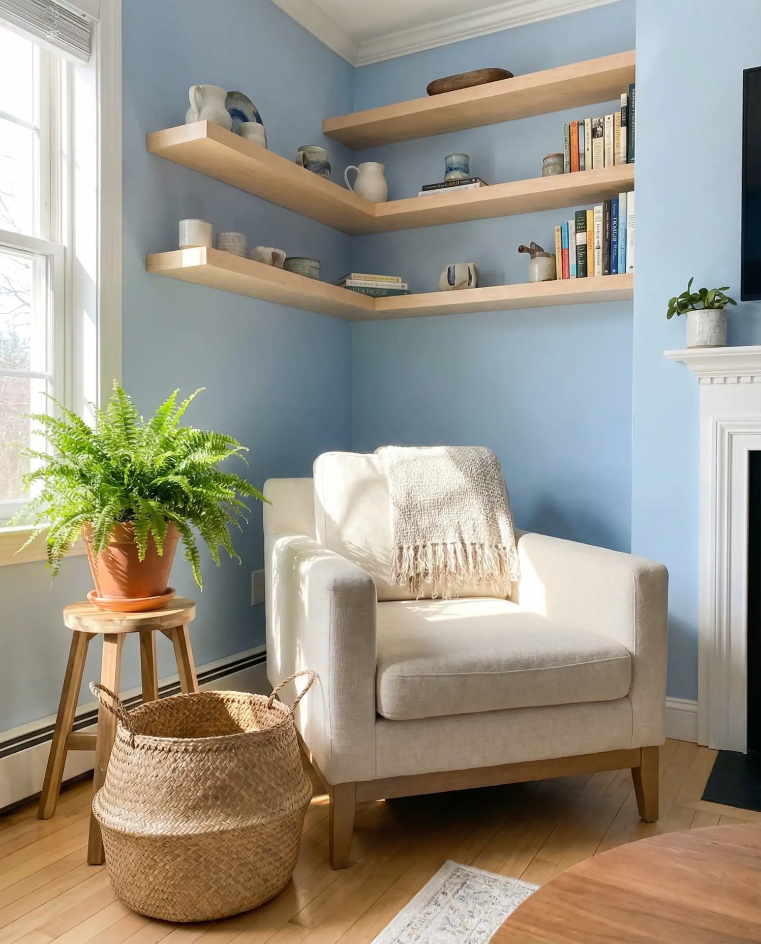
Where it works best: Pale blue thrives in casual, family-oriented spaces—think beach houses, suburban homes, and converted bungalows. It’s forgiving of wear and tear, since scuffs and marks blend in rather than standing out. If you have pets or young children, this is a smart choice. It also pairs beautifully with nautical or coastal decor but works just as well in more modern settings when you keep accessories minimal and the lines clean.
15. Burnt Orange with Dark Brown Couch
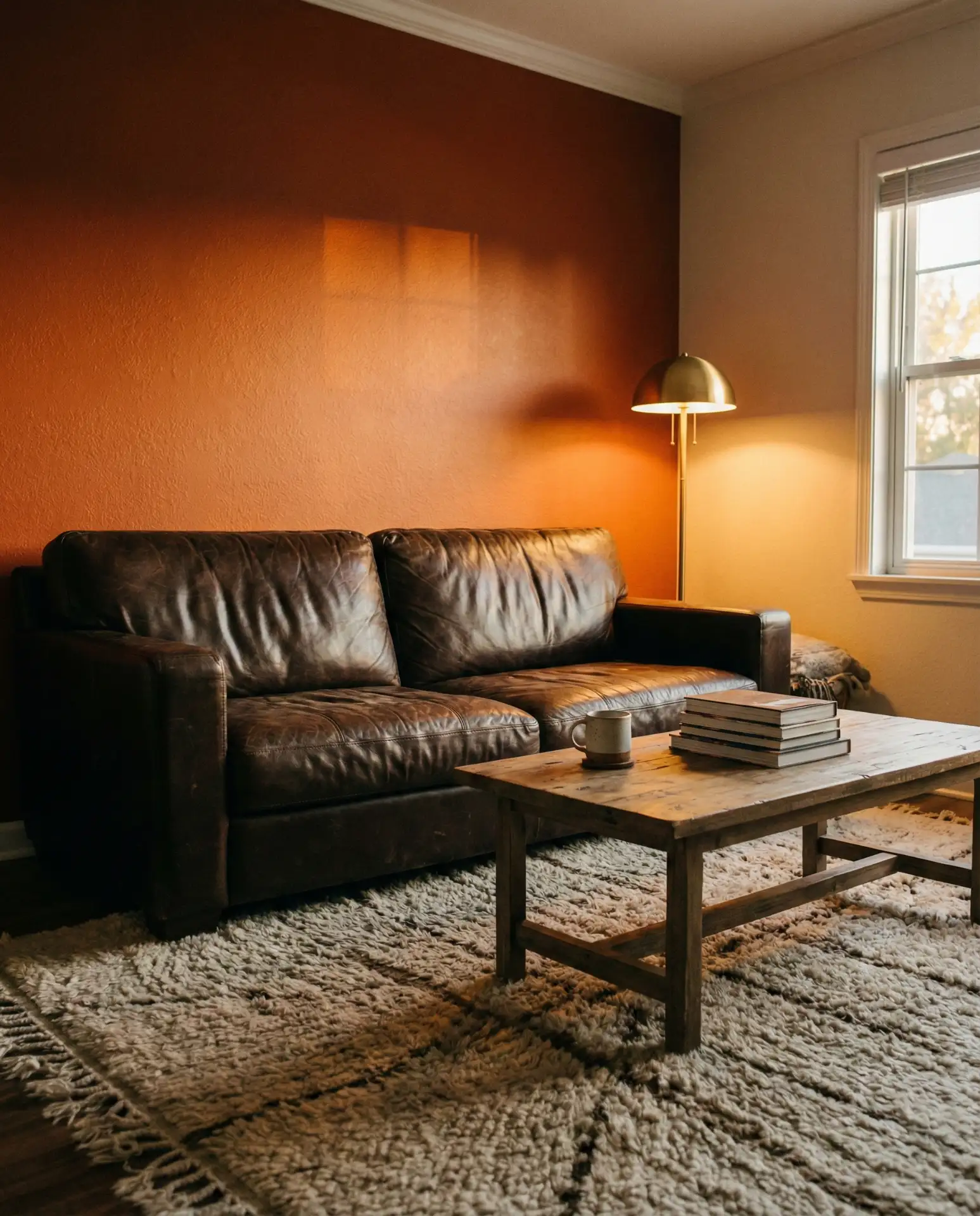
Burnt orange has become the bold and vibrant choice for living rooms anchored by dark brown couch ideas, where the saturated wall color and deep furniture create a layered, enveloping space. This pairing works because both colors share warm, earthy undertones—there’s no fighting between cool and warm tones. The key is to keep the orange muted rather than neon; think of the color of autumn leaves or clay pots, not traffic cones. This combination is especially popular in cozy dens and media rooms, where the dark, warm palette makes the space feel intimate and inviting.
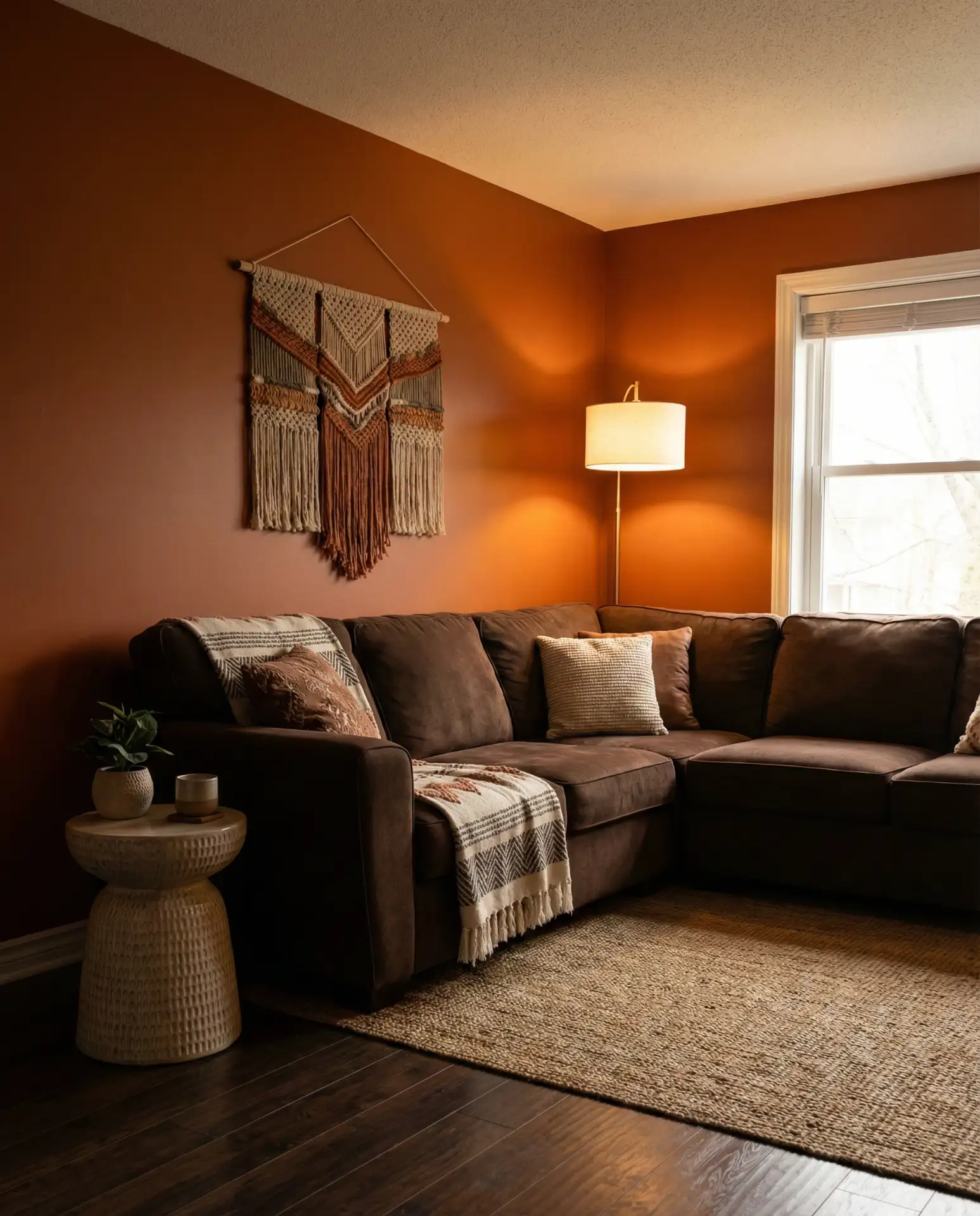
Expert-style commentary: Burnt orange is one of those colors that benefits from good lighting—too dim, and it can feel oppressive; too bright, and it loses its richness. Consider installing dimmer switches so you can adjust the mood throughout the day. And don’t be afraid to layer in other warm tones like mustard, terracotta, or rust through pillows and throws. The result is a space that feels collected and intentional, as if the colors have been chosen over time rather than all at once.
16. Soft Lavender with White Trim
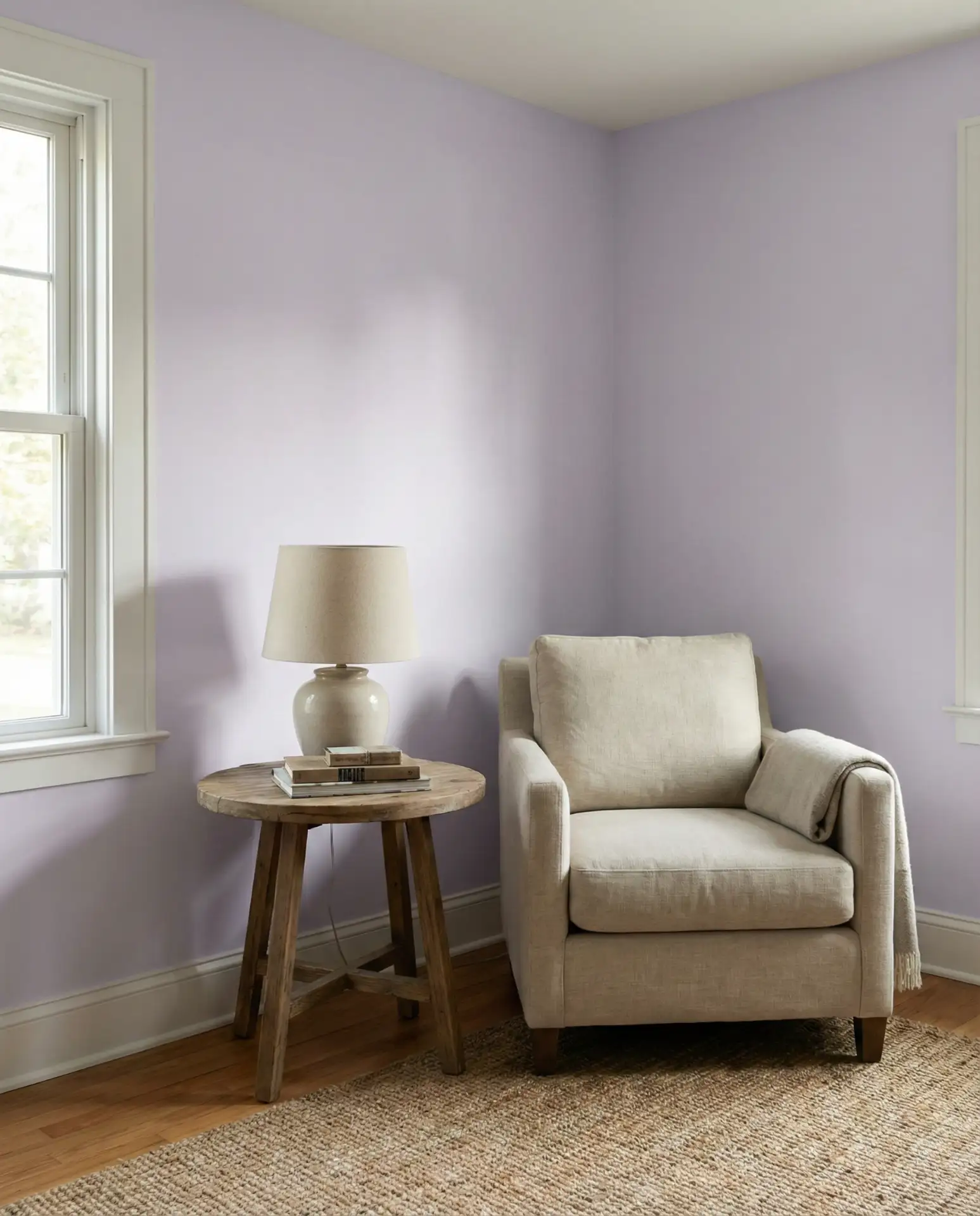
Soft lavender—a pale purple with gray undertones—offers a neutral and serene alternative to more common pastels like pale blue or blush. This color works beautifully in living rooms with crisp white trim, where the contrast keeps the lavender from feeling too sweet or juvenile. It’s a color that reads differently depending on the light: in the morning, it leans cooler and more gray; by late afternoon, it picks up pink undertones and feels warmer. Lavender is particularly popular in 2026 among homeowners looking for something that feels fresh but not trendy, calming but not boring.
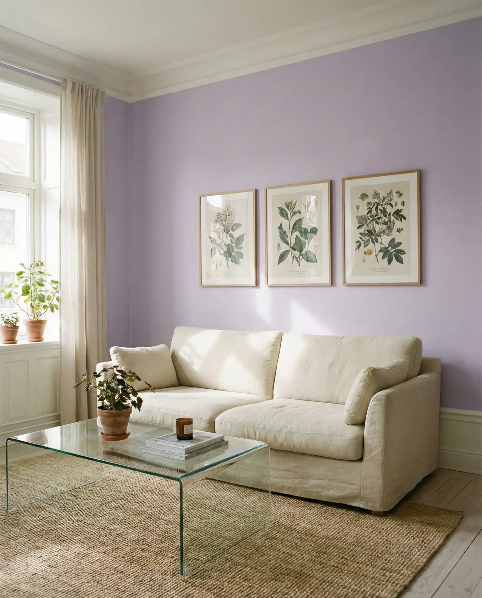
Micro anecdote: A designer I know in Brooklyn uses soft lavender in her own home, pairing it with vintage furniture and brass accents. She says clients are often surprised by how neutral it feels in person—photos make it look more purple than it actually is. The key, she insists, is to test the color in your own space and live with it for a few days before committing, since lavender is one of those colors that can shift dramatically depending on your light exposure.
17. Olive Green in a Farmhouse Setting
Olive green—a yellowish, muted green—has become a signature color in farmhouse and rustic interiors, where it pairs beautifully with reclaimed wood, galvanized metal, and vintage textiles. Unlike forest green, which leans cool and dark, olive has warmth and softness that makes it easier to live with. It’s a color that feels both historic and current, evoking everything from 18th-century American farmhouses to mid-century Scandinavian design. Olive works particularly well in living rooms with built-in shelves or open shelving, where it provides a backdrop that makes books and ceramics pop.
Common mistakes and how to avoid them: Olive can skew too yellow or too brown if you’re not careful, so look for versions that are clearly green-based. Another mistake is pairing it with cool whites or grays, which can make the olive look muddy. Instead, use warm whites, creams, and natural wood tones to complement the green’s inherent warmth. And if you’re painting all four walls, consider leaving the ceiling white to keep the room from feeling too enclosed.
18. Bright White with Colorful Art in an Open Kitchen
Bright white walls remain the default choice in many American homes, especially in open kitchen and living room layouts where visual flow is a priority. But in 2026, the most successful white spaces are those that use art, textiles, and accessories to introduce color rather than relying on the walls to do the heavy lifting. This approach offers maximum flexibility—you can change the entire look of the room by swapping out a few key pieces without repainting. It’s particularly popular among younger homeowners who like to update their spaces frequently and in homes with large windows where natural light is the real star.
Budget angle: White paint is universally available and affordable, which means you can spend less on the walls and more on statement pieces like oversized art or a designer light fixture. If you’re working with a small open kitchen, white walls will make the space feel larger and more cohesive. Just make sure to use a washable finish—eggshell or satin—so you can wipe down splatters and scuffs without damaging the paint.
19. Taupe with Brass Fixtures
Taupe—a neutral that sits between beige and gray—remains one of the most versatile wall colors in 2026, especially when paired with warm brass or gold fixtures. This combination offers a warm and cozy foundation that works across a range of furniture styles, from modern to traditional. The key is choosing a taupe that leans warm rather than cool; look for versions with undertones of pink, caramel, or mushroom rather than green or gray. Taupe is particularly forgiving in homes with mixed wood tones, where it acts as a neutral bridge that ties everything together.
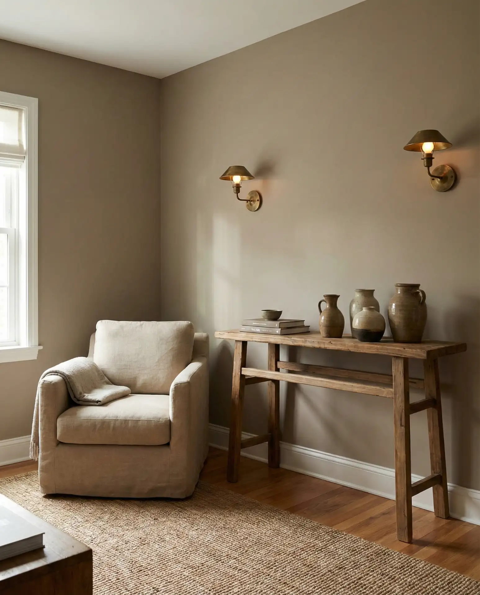
Practical insight: Taupe can look dramatically different in various lighting conditions, so it’s essential to test samples on multiple walls and observe them at different times of day. What looks warm and inviting in morning light might appear drab by evening. If you’re replacing light fixtures, consider aged brass or brushed brass rather than polished brass, which can look too formal. The slight patina of aged brass complements taupe’s understated warmth perfectly.
20. Deep Teal with Gold Accents

Deep teal—a blue-green hybrid that leans more blue than green—offers a bold alternative to safer neutrals while still feeling sophisticated enough for formal living rooms. This color works particularly well with gold or brass accents, which echo the warmth in the teal and prevent it from feeling cold. Teal is having a moment in 2026, especially in homes with traditional architecture—think Victorian row houses or prewar apartments—where it honors the building’s history while still feeling current. It’s a color that demands attention but rewards it with depth and richness that cheaper alternatives can’t match.
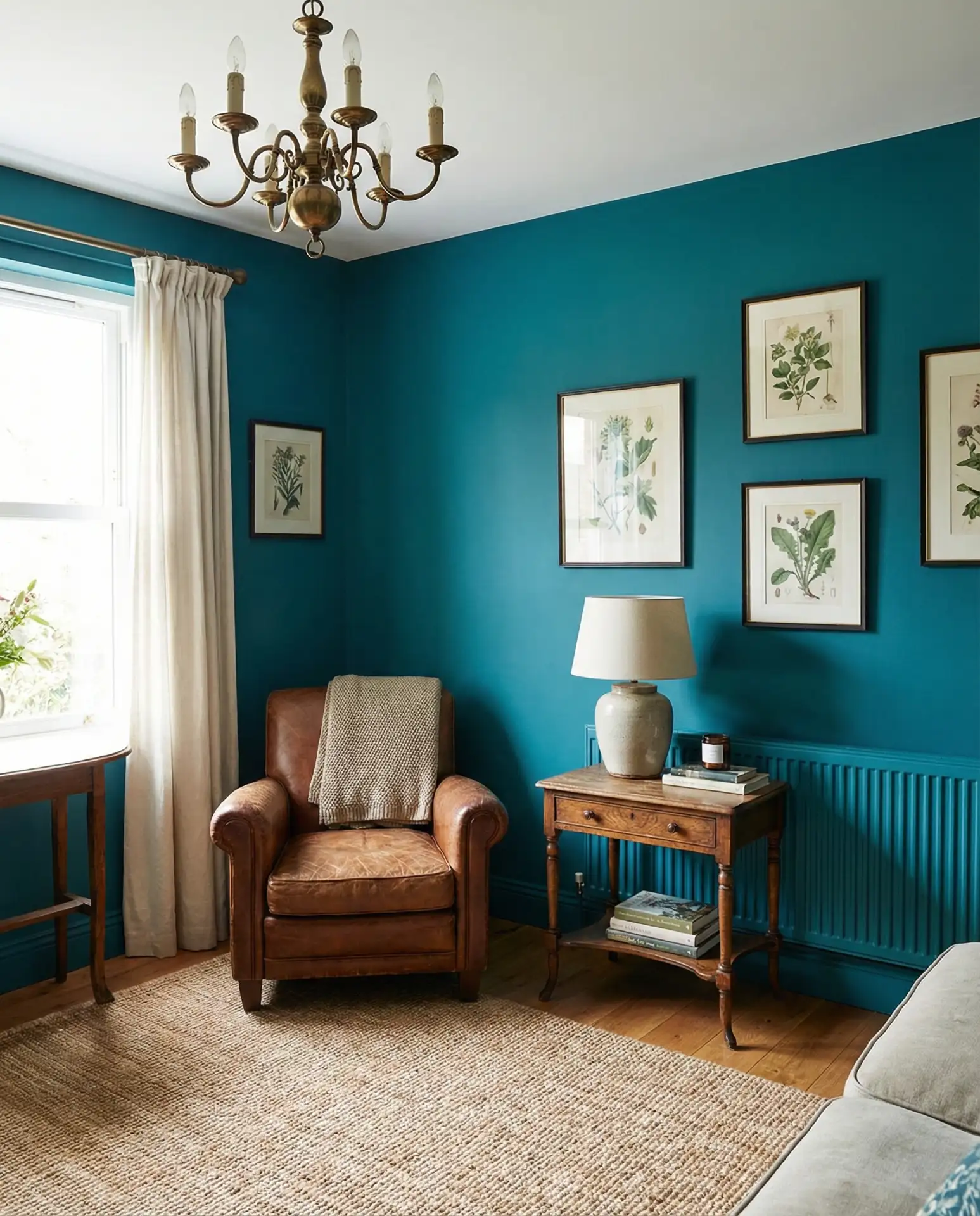
Where it works best: Teal thrives in rooms with high ceilings and good natural light, where the depth of the color can be fully appreciated. It’s less successful in small, dark spaces, where it can feel oppressive. If you’re working with a gray couch, teal provides a striking contrast that makes the gray feel intentional rather than safe. Consider adding in textiles with hints of emerald, navy, or peacock blue to create a layered, tonal look.
21. Peachy Pink in an Indian-Inspired Interior
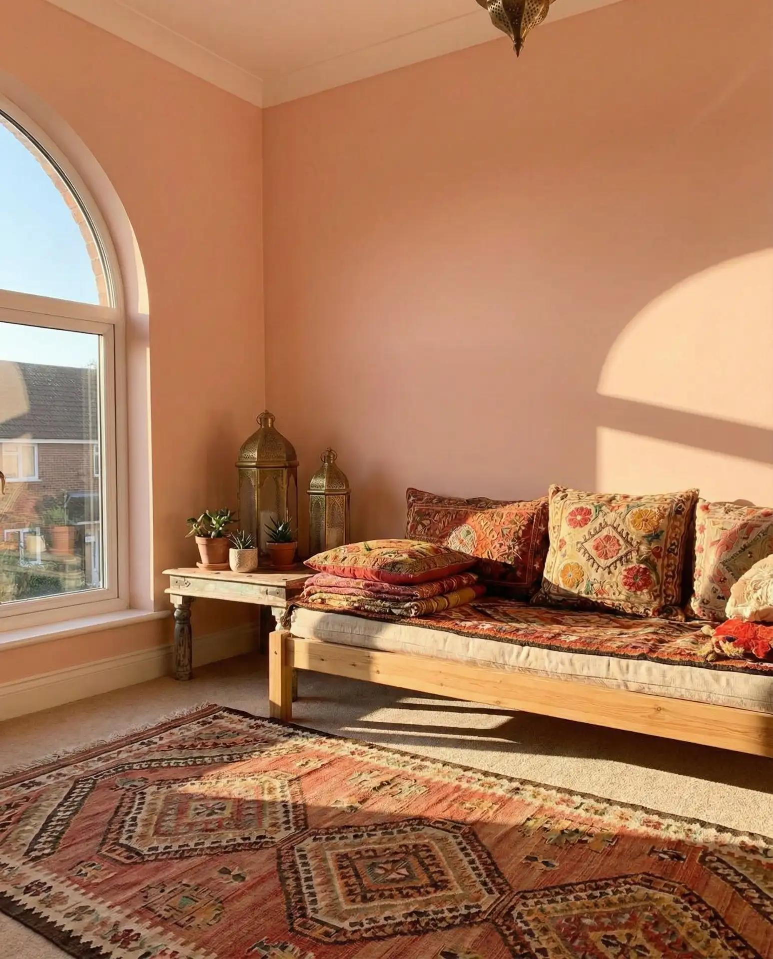
Peachy pink—a warm, orange-tinged pink—has found a home in Indian-inspired interiors, where it pairs beautifully with jewel tones, rich textiles, and ornate patterns. This color feels both warm and cozy and exotic, evoking the architecture of Rajasthan and the soft light of desert sunsets. It works particularly well in living rooms with lots of textiles—think embroidered pillows, silk throws, and kilim rugs—where the peachy pink acts as a warm backdrop that makes colors sing. It’s a color that feels collected and worldly, as if the space has been curated over years of travel.
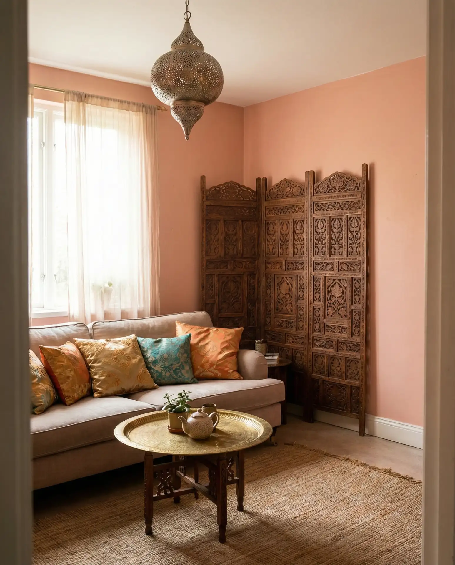
Real homeowner behavior: Many American homeowners are drawn to global design but worry about it feeling costumey or inauthentic. The trick with peachy pink is to layer it gradually—start with the wall color, then add one or two statement textiles, and build from there. This color works best when it’s part of a larger, thoughtfully curated aesthetic rather than a single stand-alone element. It also pairs beautifully with natural materials like rattan, jute, and unfinished wood, which help ground the richness and prevent it from feeling too precious.
22. Pale Gray with Calming Blue Undertones
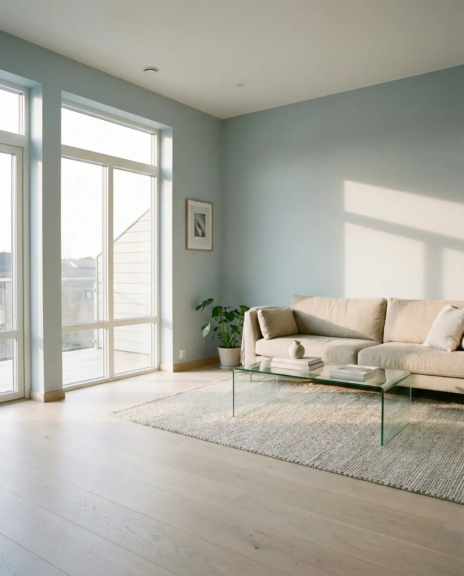
Pale gray with blue undertones offers a neutral and serene backdrop that’s slightly cooler than traditional warm grays, making it ideal for living rooms that get a lot of natural light. This color is sometimes called “blue-gray” or “slate,” and it’s become a favorite in modern and Scandinavian-inspired homes where simplicity and calming palettes are priorities. The blue undertones prevent the gray from looking flat or lifeless, adding a subtle dimension that changes throughout the day. It’s a particularly smart choice in homes with cool-toned floors like concrete or gray tile, where warm grays can clash.
American lifestyle context: This color has become popular in tech hubs like Seattle, San Francisco, and Austin, where homeowners gravitate toward minimalist, Zen-like interiors that feel calm and uncluttered. It’s also a smart choice for homes with open sight lines, where a consistent, quiet color palette helps create visual flow. If you’re working with a brown couch, this cooler gray can provide a pleasing contrast, though you’ll want to add in warm textiles and wood tones to keep the space from feeling too sterile.
Conclusion
Living room color trends in 2026 reflect a broader shift toward authenticity and intention—spaces that feel personal, lived-in, and thoughtfully considered. Whether you’re drawn to the drama of forest green or the quiet sophistication of pale blue-gray, the key is choosing colors that resonate with how you actually live. Don’t be afraid to test samples, trust your instincts, and build your palette gradually. Drop a comment below and share which color you’re trying first—or tell us about a color combination that’s working in your own home.