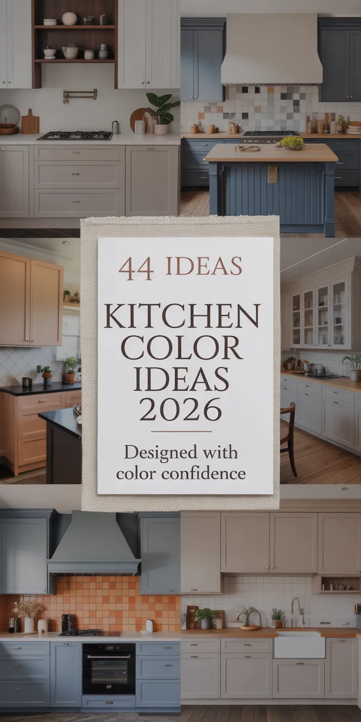
If you’ve spent the last few months scrolling through Pinterest for kitchen inspiration, you’ve probably noticed a shift. Gone are the days of playing it safe with all-white walls. Today’s kitchens are embracing personality, depth, and unexpected color choices that feel both timeless and decidedly 2026. Whether you’re drawn to moody tones, soft farmhouse aesthetics, or bold contemporary palettes, this year’s kitchen paint trends reflect how we actually want to live—not how design magazines tell us we should. Let’s explore ten color ideas that are reshaping American kitchens right now.
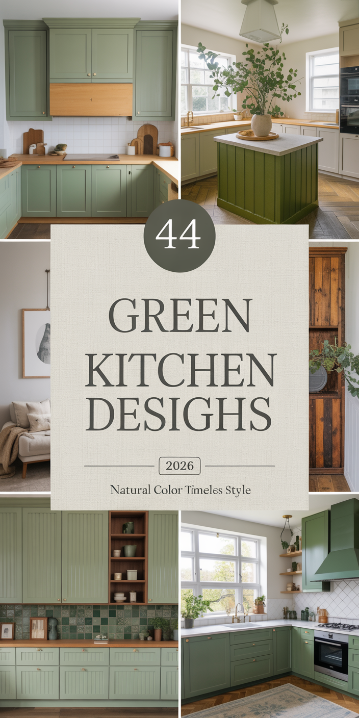
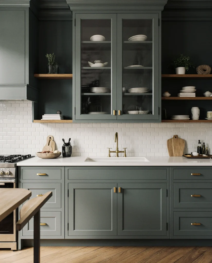
1. Deep Forest Green with Oak Cabinets
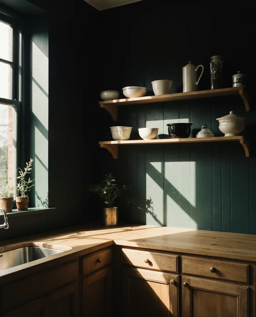
There’s something deeply satisfying about pairing a rich forest green with natural oak cabinets. This combination feels lived-in and warm, avoiding the sterile quality of purely modern design. The green works beautifully in kitchens that get good natural light, where it shifts from jewel-toned during the day to something more contemplative in evening hours. Homeowners are choosing this look for kitchens with open shelving or traditional framing, where the modern farmhouse aesthetic feels intentional rather than trendy. 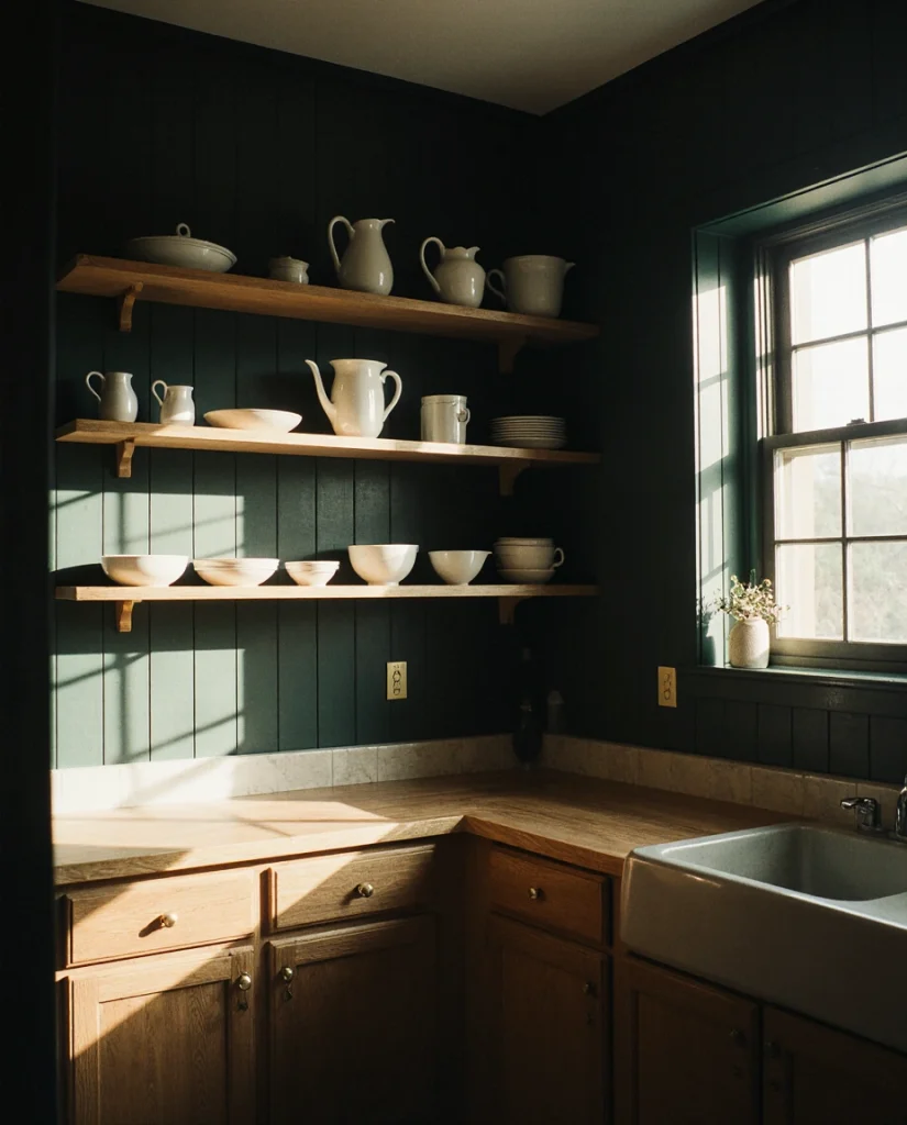
This pairing speaks to a deeper American shift toward authenticity in home design. Many people are moving away from the Instagram-perfect, all-white kitchen because it doesn’t feel like home—it feels like a hotel. Real families with kids, pets, and actual cooking happening need walls that hide a tomato sauce splatter and still look intentional. Forest green with oak is forgiving and sophisticated, a combination you’ll see in heritage homes as much as in newly renovated spaces.
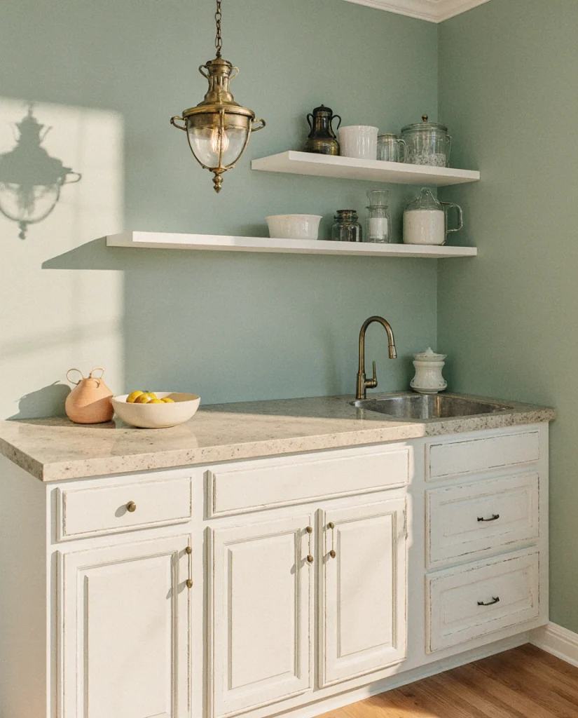
2. Warm Greige with White Cabinets
If bold color feels too risky, consider greige—that sophisticated blend of grey and beige that’s been quietly stealing the show. Paired with crisp white cabinets, greige creates a backdrop that’s neutral without being boring. It’s the kind of color that looks different depending on your lighting, your mood, and the time of day. Designers and homeowners alike are embracing this modern approach because it provides visual interest while remaining a safe long-term investment. 
Here’s the practical reality: most Americans who paint their kitchens don’t repaint them every two years. You want a color that will feel fresh in 2026, 2028, and beyond. Greige accomplishes this because it sits in the sweet spot between trend and timelessness. Sherwin Williams’ “Accessible Beige” and “Urbane Bronze” in lighter values have become kitchen standards for exactly this reason—they’re flexible, they age well, and they work with almost every cabinet and countertop choice you make.
3. Moody Charcoal with Green Cabinets
For the bold decorators, this combination represents a complete departure from conventional kitchen design. Moody charcoal walls paired with green cabinets create drama and unexpected sophistication. This approach works best in kitchens with substantial natural light or good overhead lighting, because the goal is richness, not a cave-like feeling. The dark wood tones in the cabinets play beautifully against the charcoal, creating depth and visual complexity.
A common mistake homeowners make is underestimating lighting requirements. A moody charcoal kitchen without proper task lighting and ambient lighting becomes depressing rather than dramatic. Add under-cabinet lights and quality pendant fixtures, and consider a semi-gloss paint finish on the walls to reflect light subtly. Benjamin Moore’s “Hale Navy” and “Caliente” are options many homeowners choose when they want moody depth with longevity.
4. Soft Sage with Rustic Wood Beams
The farmhouse trend isn’t disappearing—it’s evolving. Soft sage green walls provide the perfect backdrop for rustic wood beams, vintage hardware, and the kind of cottage aesthetic that speaks to Americans’ desire for slower living. This color is gentle, nature-inspired, and works especially well in kitchens with skylights, high ceilings, or vintage architectural details. The palette feels intentional without the overly designed quality of some farmhouse spaces. 
Real homeowner behavior shows us that people choosing sage green often do so because it reminds them of gardens, nature, and places that feel grounding. Anecdotal evidence from designers suggests that homeowners who choose this palette report higher satisfaction over time—they’re not chasing trends but expressing genuine aesthetic values. This matters because it’s a color you can live with happily for five, ten, or even fifteen years.
5. Warm Cream with Natural Wood and Modern Details
Don’t underestimate the power of warm cream in a modern farmhouse kitchen. When paired with natural wood elements and contemporary hardware, warm cream creates a balanced aesthetic that honors both tradition and current design sensibilities. This approach works beautifully in living room-adjacent kitchens where visual flow matters and in schemes that need to feel cohesive across open-plan spaces. The key is choosing a cream with warmth rather than starkness. 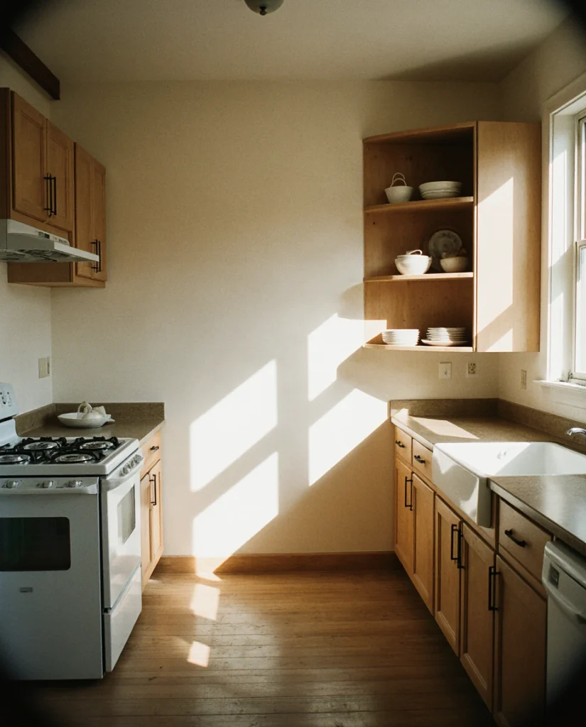
From a budget perspective, warm cream is an excellent choice because it works with existing elements. If you’re keeping oak cabinets, stone countertops, or vintage appliances, warm cream bridges the gap beautifully without requiring additional investments. Benjamin Moore’s “Swiss Coffee” and Sherwin Williams’ “Alabaster” are foundational creams that serve this purpose well, offering enough warmth to feel intentional without being trendy.
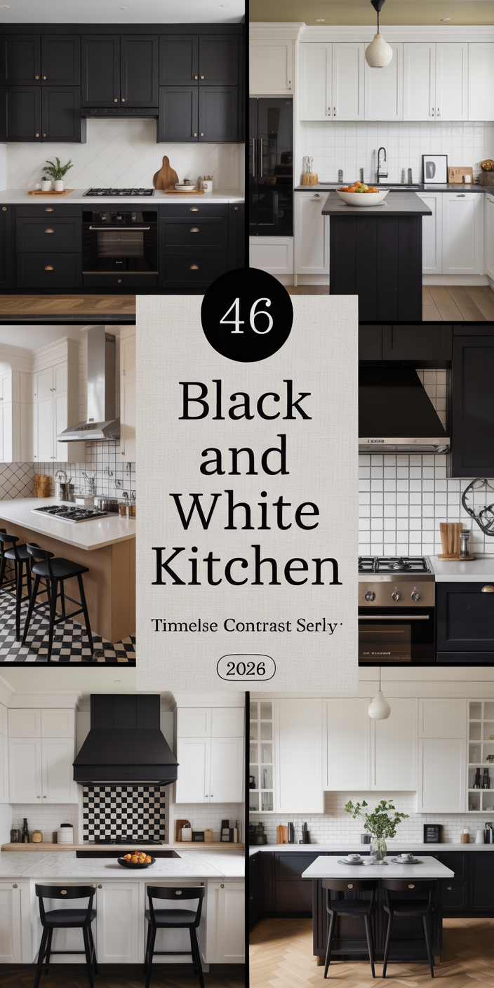
6. Deep Charcoal with White Open Shelving
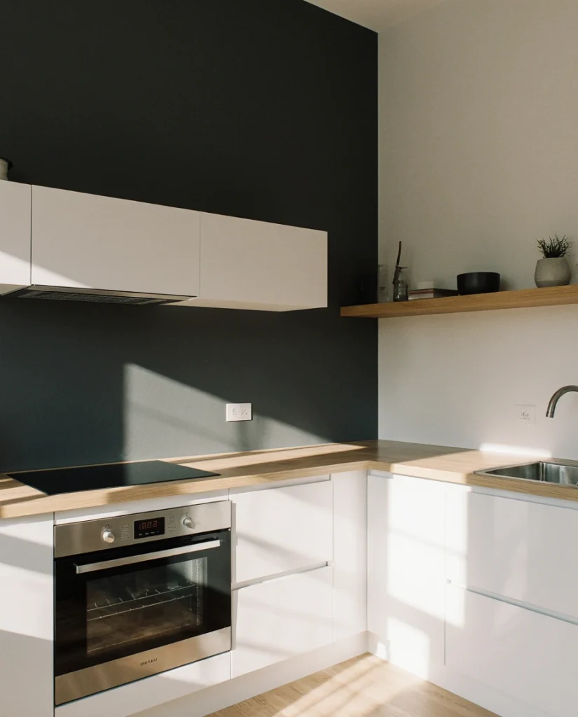
High contrast is having a moment, and deep charcoal walls with bright white open shelving create visual drama that’s undeniably appealing. This modern approach works best in kitchens with strong geometric lines, contemporary hardware, and a willingness to keep shelves organized and styled. The interplay between the dark walls and white shelving creates movement and visual interest without requiring additional pattern or color complexity. 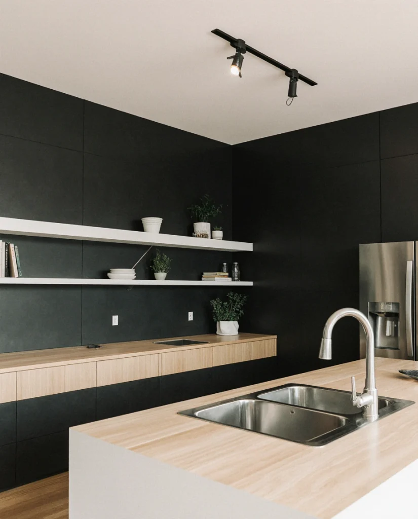
Where this works best: kitchens with excellent natural light, kitchens belonging to people who genuinely enjoy styling and organizing open shelves, and kitchens in homes where the rest of the design aesthetic is decidedly contemporary. This isn’t a forgiving color or style choice—it demands intention and upkeep. But for those who commit to it, the visual payoff is significant and distinctly 2026.
7. Pale Blue with Traditional Cabinetry
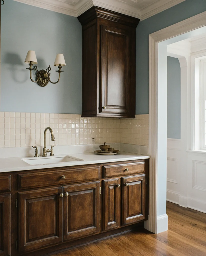
Pale blue is experiencing a quiet renaissance, particularly in kitchens with cherry wood cabinetry or traditional painted styles. This earthy, calming color creates a connection to water and sky without feeling childish or dated. The combination feels distinctly American—evoking both coastal sensibilities and Americana farmhouse traditions. Works beautifully with brass hardware, subway tile backsplashes, and the kind of white trim work that defines traditional interiors. 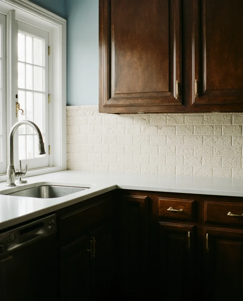
As per the comments of some specialists of the field, pale blue is both trendy and timeless at the same time, as it appears in design and interior publications of the industry for high profile clients and it is quite popular, but not too frequently seen. Benjamin Moore’s Blue Heron and Sea Salt by Sherwin-Williams have the softness required, yet still do not lean too much towards grey.
8. Warm Taupe with Mixed Wood Tones
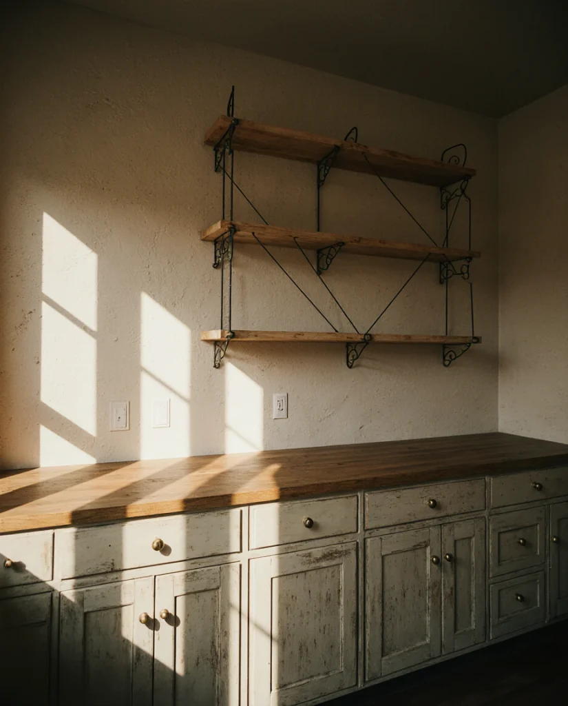
The warmth and sophistication of taupe is the understated softness of the “modern farmhouse” vision. With oak cabinets, wood flooring, and perhaps dark wood accents (think shelving), taupe provides the warmth, sophistication, and richness for the walls without clashing. This vision allows the materials to be respected and not have to compete. The effect is a soft visual breath that flows around the kitchen and living room. 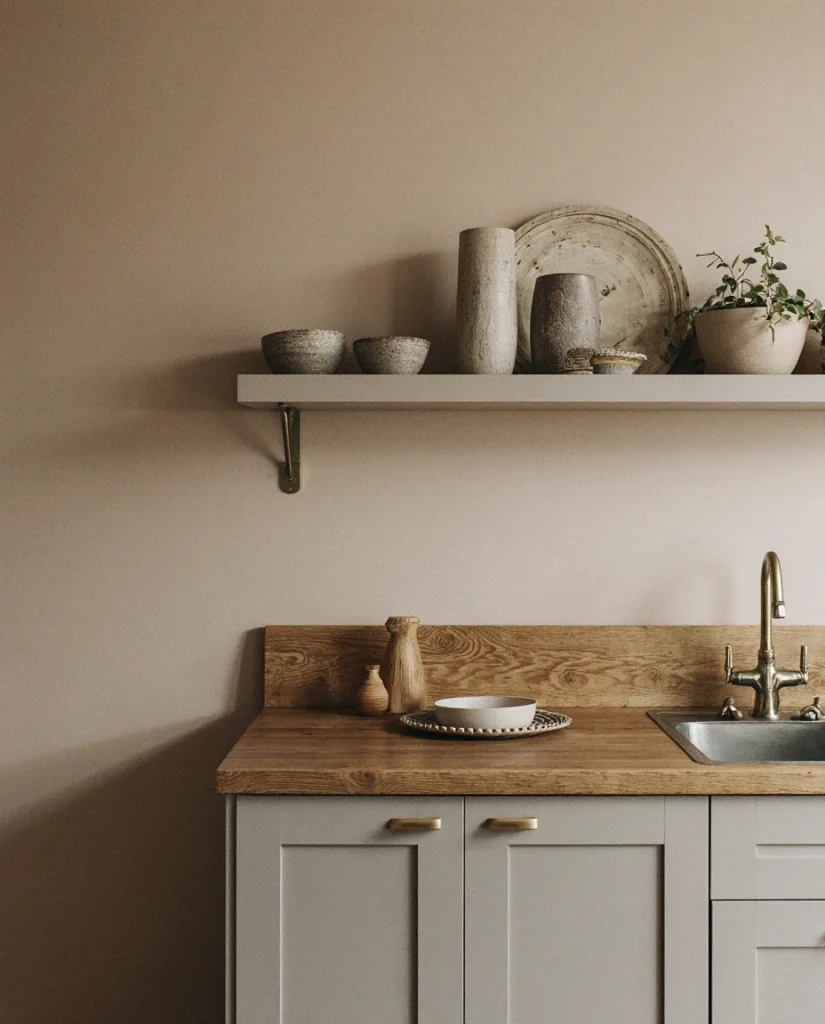
This color exemplifies practical insight: it solves a real design problem for real homes. Most Americans don’t gut their kitchens and start fresh with matched wood tones. You work with what you have, and taupe is masterfully forgiving in these scenarios. It’s a background color that enhances rather than competes, allowing your actual kitchen activities and the light itself to be the focal points.
9. Muted Terracotta with Neutral Cabinetry
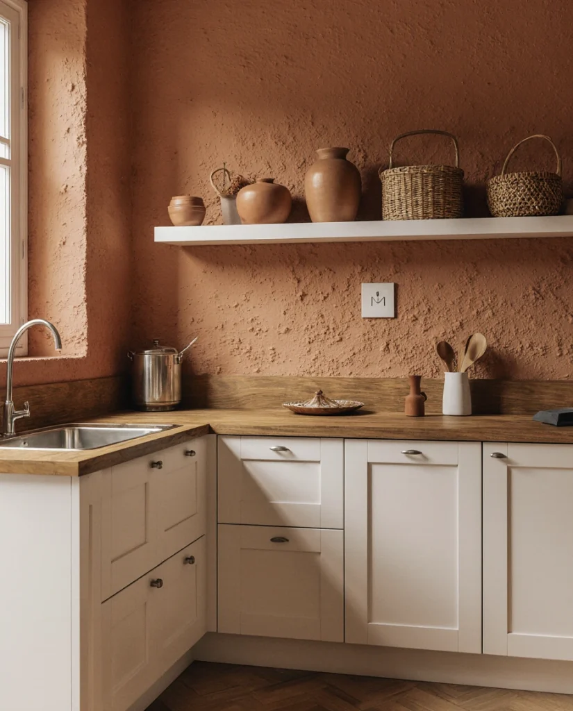
For those seeking warmth without intensity, muted terracotta offers an earthy, sophisticated alternative to bold reds or oranges. Paired with white cabinets or natural wood, this color brings Mediterranean and Southwestern influences into contemporary American kitchens. The schemes that work best here include natural fibers, warm lighting, and materials that feel handmade rather than industrial. It’s a choice that feels increasingly relevant in 2026’s return to human-scale design. 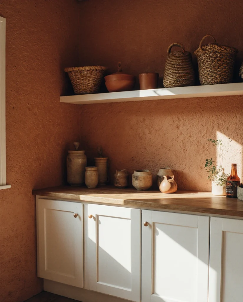
Real-world context: American kitchens inspired by Mediterranean and Southwestern design are becoming more prevalent, particularly in regions like California, Arizona, and New Mexico, but also in urban homes where people are creating intentional cultural references. Muted terracotta bridges the gap between bohemian and refined, making it accessible for people who want color without edginess.
10. Soft Greige with Modern Fixtures and Green Accents
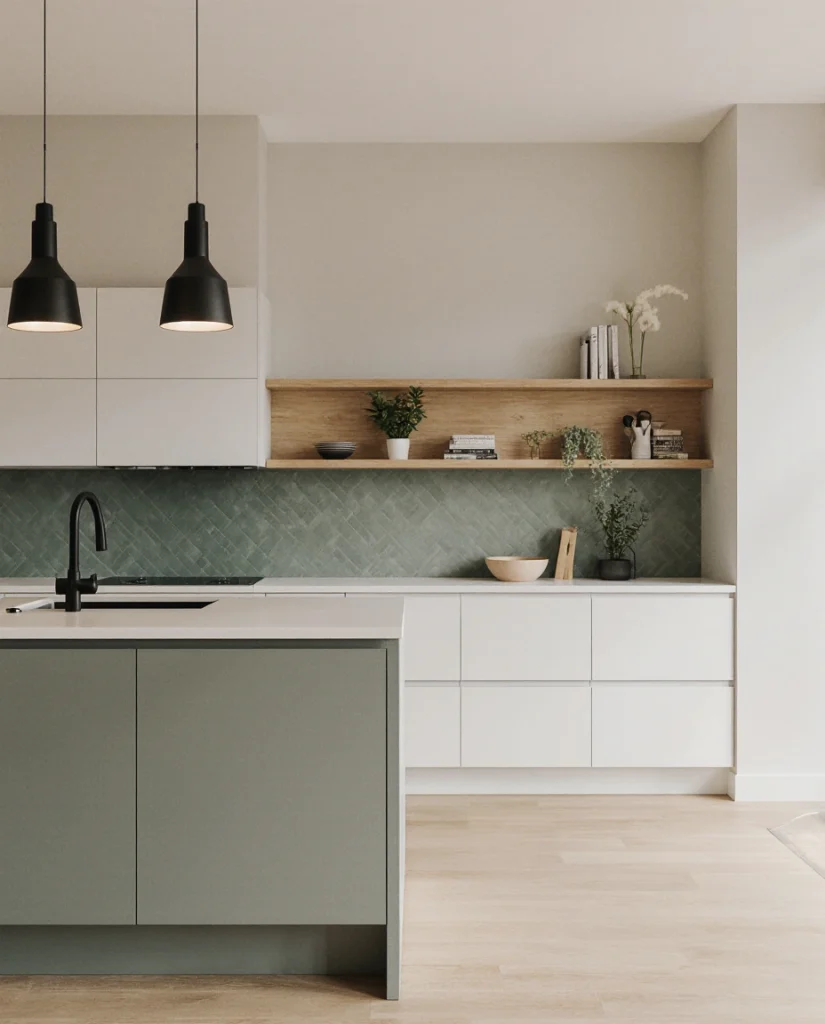
Closing with nuance: soft greige walls with contemporary modern fixtures and strategic green accents in paint, tile, or cabinetry represent the sophisticated color-blocking trend. This approach uses neutrality as a canvas for intentional pops of color—perhaps a green island, green tile backsplash, or green cabinetry on one wall. It honors both the desire for calm, neutral spaces and the contemporary push toward personality and warmth. 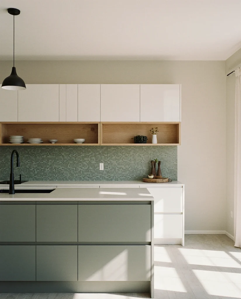
Common mistakes to avoid: using too many accent colors and losing visual cohesion, choosing a greige that leans too gray and becomes cold, or selecting a green accent that doesn’t coordinate with your natural light. The strength of this approach is its flexibility—you can adjust accent colors over time without repainting walls. Sherwin Williams’ “Urbane Bronze” mixed with Benjamin Moore’s “October Mist” creates the balanced, sophisticated palette this idea requires.
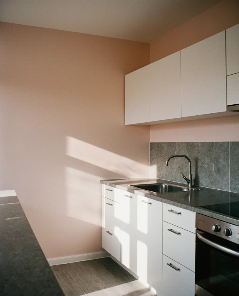
11. Dusty Blush with Black Cabinetry
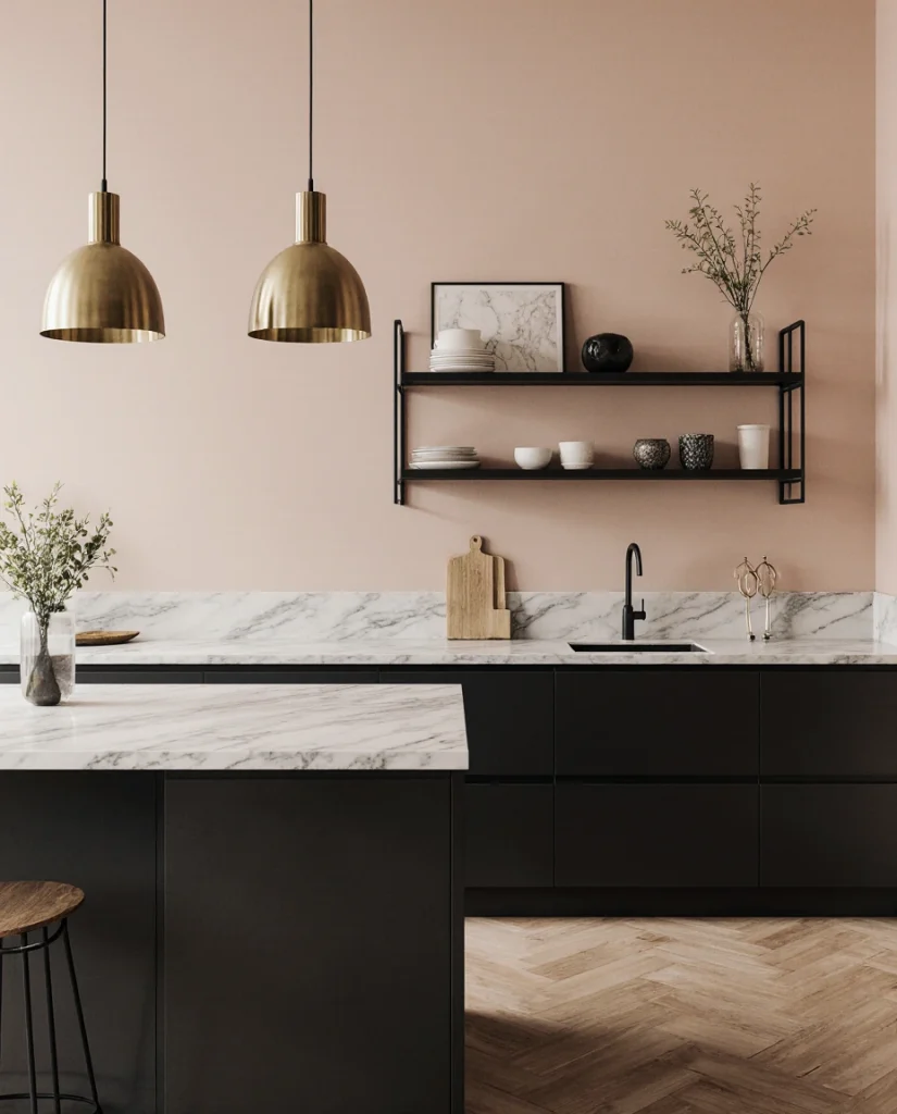
Dusty blush has quietly become one of 2026’s most unexpected kitchen colors, particularly when paired with bold black cabinetry. This combination works beautifully in contemporary spaces and feels especially strong in kitchens with exposed brick or natural stone. The modern contrast between soft femininity and graphic darkness creates visual tension in the best possible way. It’s a palette that reads as intentional and designer-curated without requiring a designer’s budget. 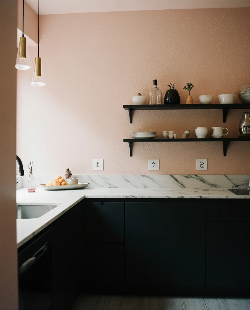
Where this works best: apartments and homes in urban settings where design-forward choices feel at home, kitchens with industrial bones or exposed elements, and spaces where the homeowner is confident about personal style. This isn’t a color that whispers—it speaks clearly. But for those who choose it, the visual payoff is immediate and memorable.
12. Warm Ivory with Shaker-Style Cabinetry
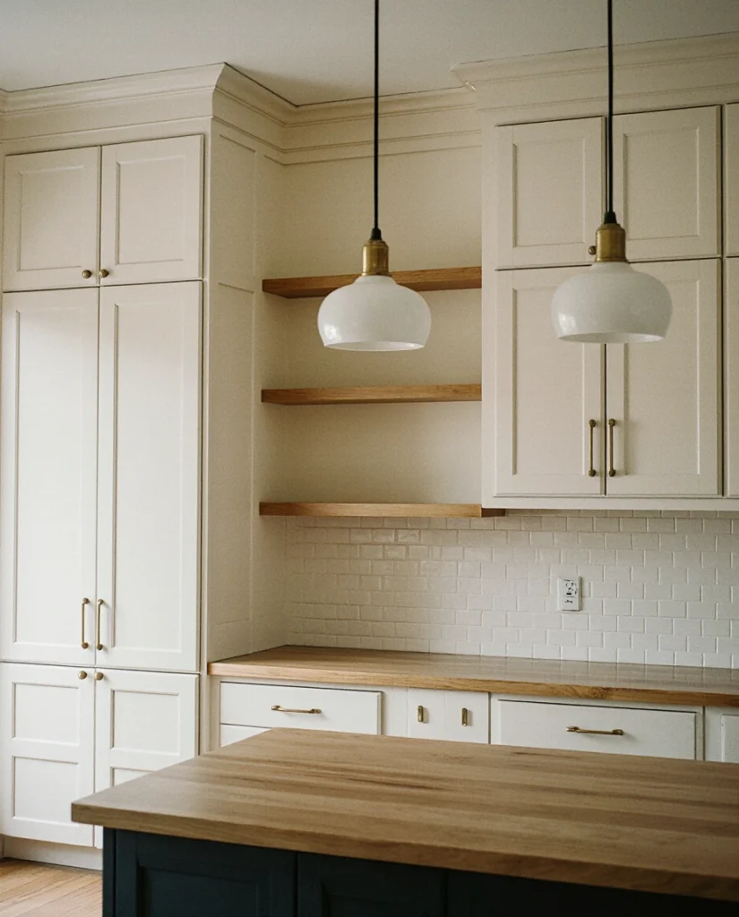
Sometimes the most timeless choice is also the most underrated. Warm ivory walls with traditional white Shaker-style cabinets create a serene, approachable aesthetic that never feels dated. This farmhouse combination works across regions and architectural styles because it’s fundamentally about simplicity and craftsmanship. The beauty lies in the quality of materials and hardware rather than in bold color statements. 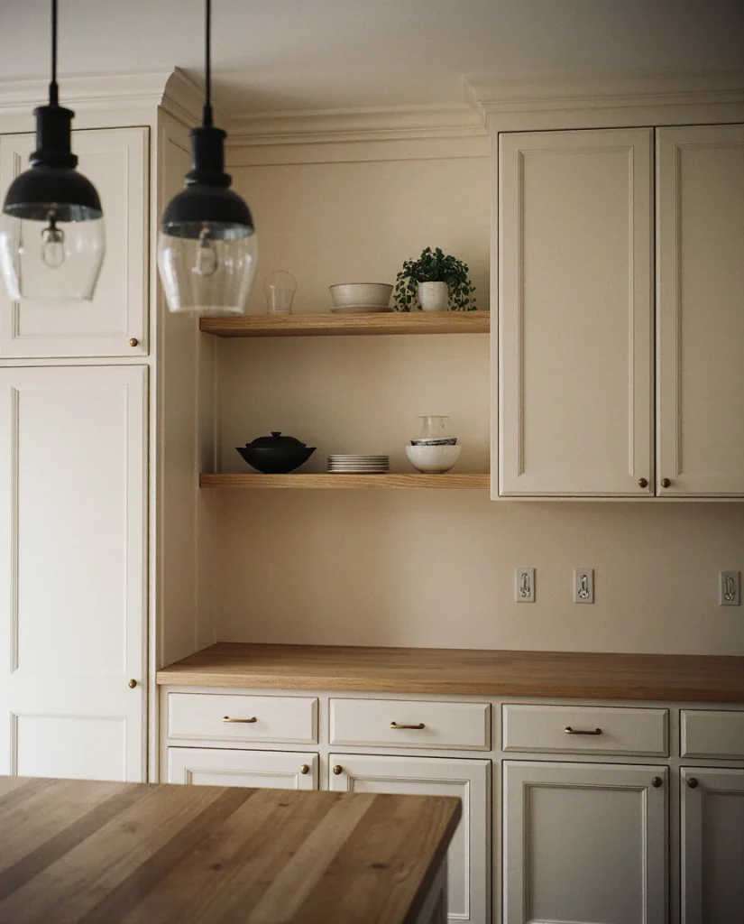
Practical insight: this palette represents the longest-term investment in terms of style longevity. Warm ivory and white Shaker kitchens have remained desirable for decades and show no signs of falling from favor. If you’re uncertain about bold colors, this foundation allows you to add personality through accessories, textiles, and open shelving styling rather than permanent wall color.
13. Soft Olive Green with Natural Light
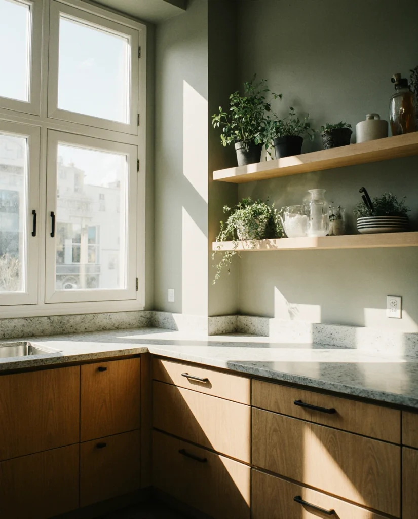
Distinct from forest green or sage, soft olive occupies a sophisticated middle ground that works beautifully in kitchens with excellent natural light. Paired with natural wood elements and modern fixtures, this green creates warmth and visual sophistication. It’s the kind of color that references nature without feeling overly botanical—perfect for cottage-style kitchens that lean contemporary rather than purely traditional. 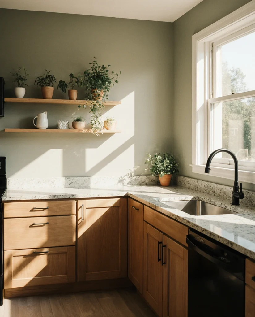
Real homeowner behavior shows that people choosing soft olive often describe the experience as calming and focused. Unlike bolder greens, this shade recedes slightly, allowing other design elements to stand forward. It’s a color that works equally well in a minimalist modern kitchen or a warmly curated traditional space—remarkable flexibility for a saturated hue.
14. Deep Navy with Brass Accents
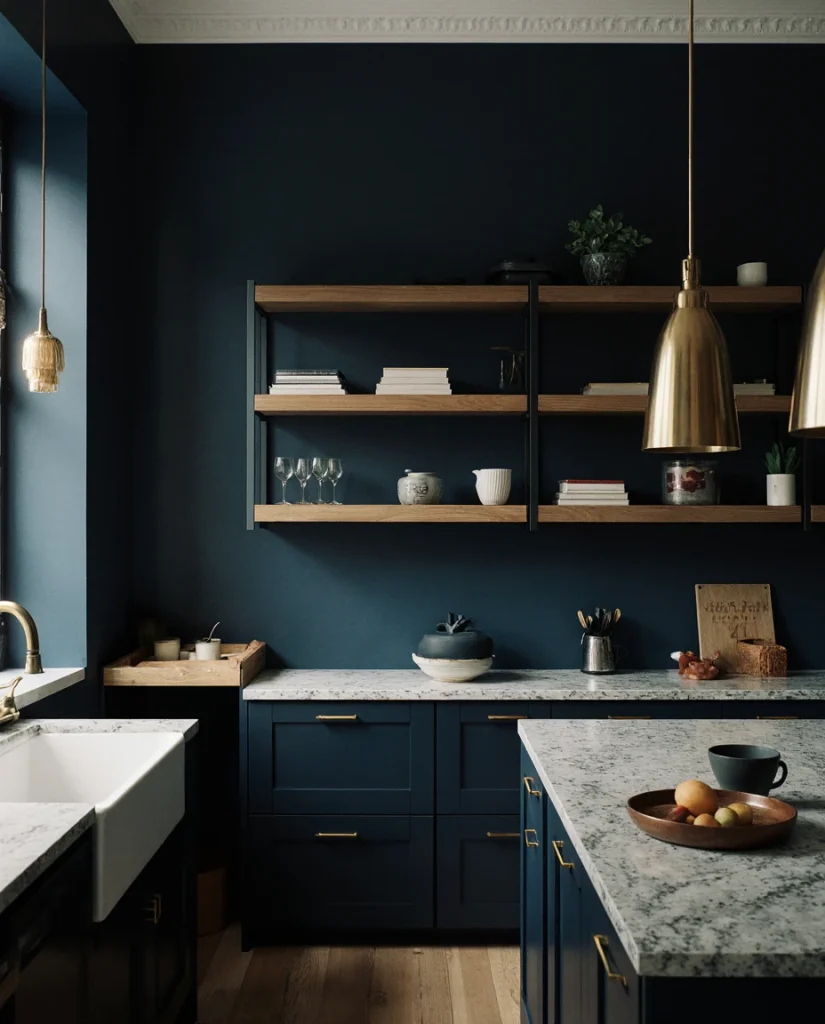
Deep navy represents timeless sophistication, and in 2026, homeowners are pairing it with substantial brass fixtures and hardware for maximum visual impact. This moody palette works particularly well in kitchens with dark wood open shelving or cabinetry that echoes the wall color. The depth creates a jewel-box effect that feels intimate rather than claustrophobic when lighting is handled thoughtfully. 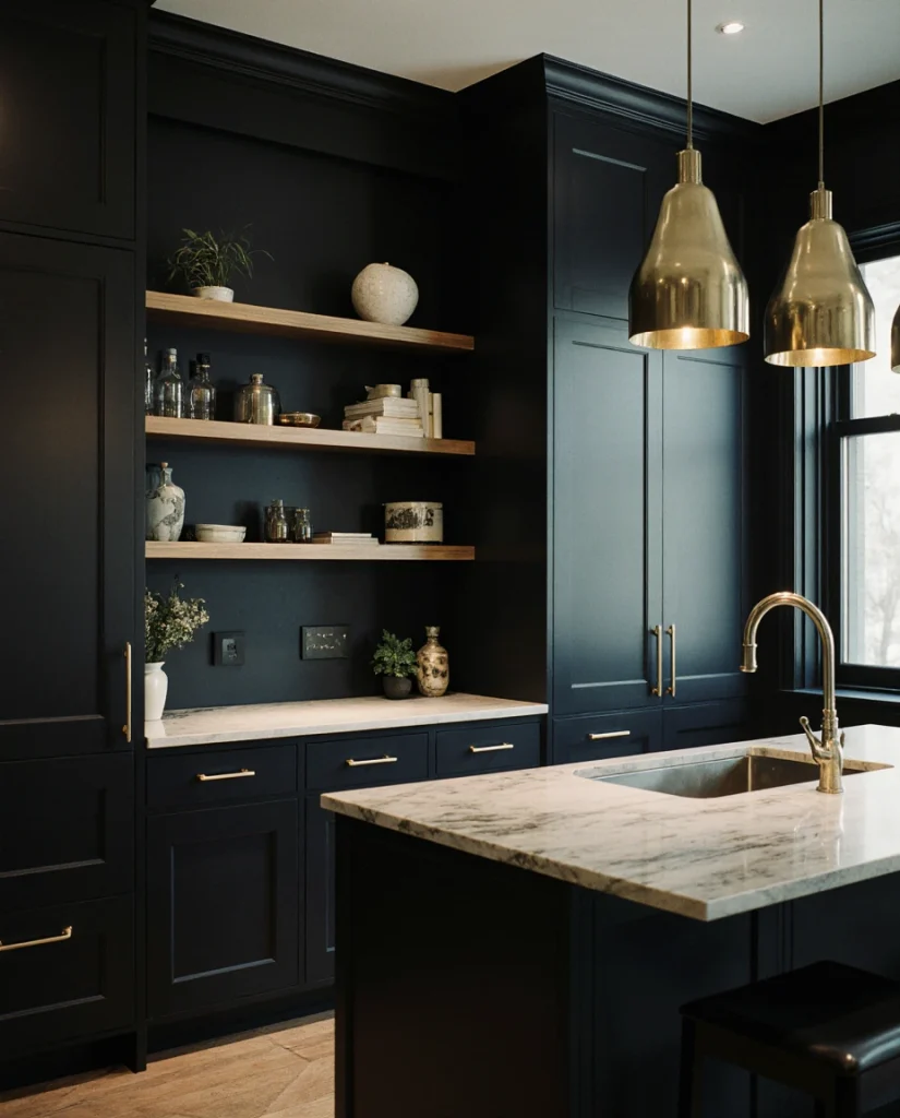
Budget and price angle: deep navy with brass is achievable without luxury pricing. The sophistication comes from commitment to the palette rather than expensive materials. A well-chosen navy paint, solid brass hardware from accessible retailers, and thoughtful lighting can create a space that reads as far more expensive than the actual investment required.
15. Warm Wheat with Cottage Details
Wheat—a warm, golden-toned neutral—brings comfort and approachability to rustic and farmhouse-inspired kitchens. This color particularly suits homes with vintage or reproduction hardware, open shelving displaying dishware, and the kind of lived-in aesthetic that feels intentional. It works beautifully with white cabinets or natural wood, creating a foundation that honors both tradition and contemporary comfort. 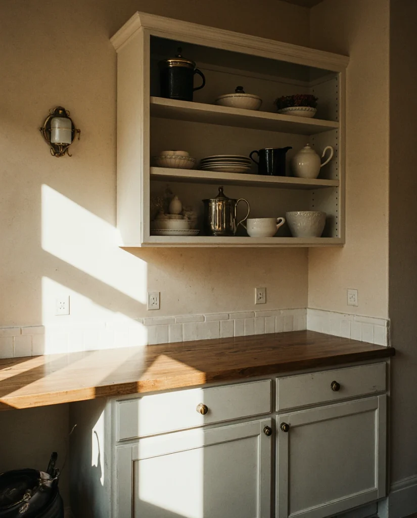
Micro anecdote: one designer notes that homeowners choosing warm wheat often report feeling instantly welcomed in their kitchens—it’s a color that encourages gathering and cooking rather than merely passing through. The warmth is inherent to the undertone, making the space feel naturally inviting without requiring additional design effort.
16. Cool Grey with Green Kitchen Island
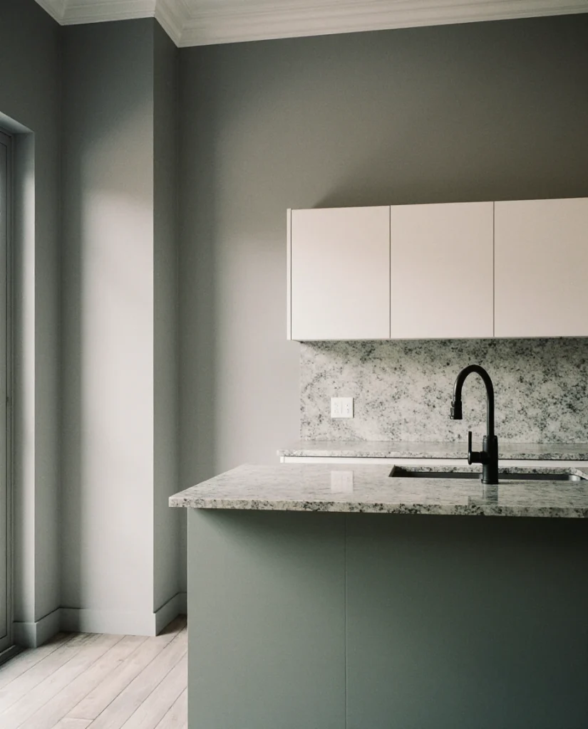
Contemporary color blocking reaches its apex with cool grey walls and a bold green kitchen island. This scheme’s approach allows homeowners to commit to color without painting an entire kitchen. The cool grey keeps the overall space feeling fresh and modern, while the green island becomes the focal point and functional art. Works exceptionally well in open-plan kitchens adjacent to living room spaces where visual separation matters. 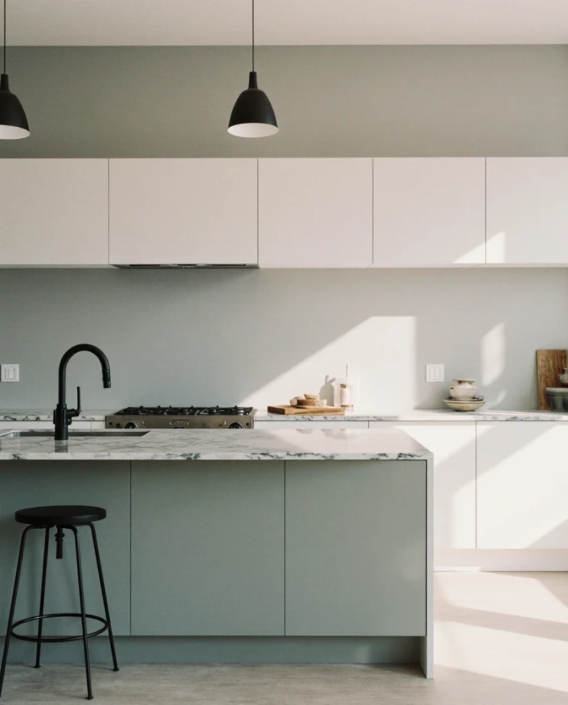
Common mistakes to avoid: choosing a grey that’s too cold or institutional, selecting an island green that doesn’t coordinate with your natural light, or failing to commit to the color-blocking concept through flooring and additional design choices. When executed with intention, however, this approach creates a kitchen that feels curated and distinctly 2026.
17. Soft Greige-Pink with Modern Simplicity
There’s an emerging interest in deeply muted pinks that lean more greige than blush—colors that feel almost neutral until you notice the pink undertone. Paired with white cabinets and modern stainless steel fixtures, this palette creates unexpected warmth. The schemes that work best here avoid pattern and texture, allowing the subtle color to be the statement. It’s architectural and refined rather than decorative. 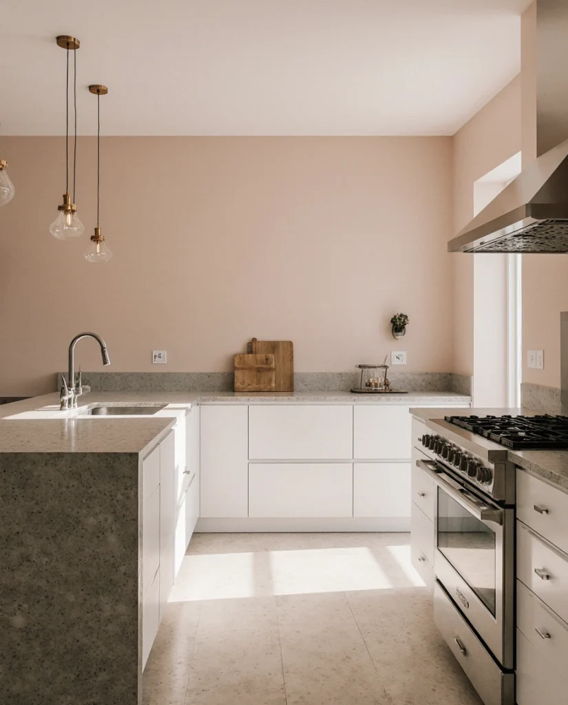
Expert-style commentary: Interior designers are increasingly working with these deeply muted, barely-there colors because they satisfy the desire for personalization while maintaining the spacious feeling that modern homeowners prioritize. It’s a sophisticated understanding that color doesn’t require saturation to have presence.
18. Warm Terracotta-Red with Wood Details
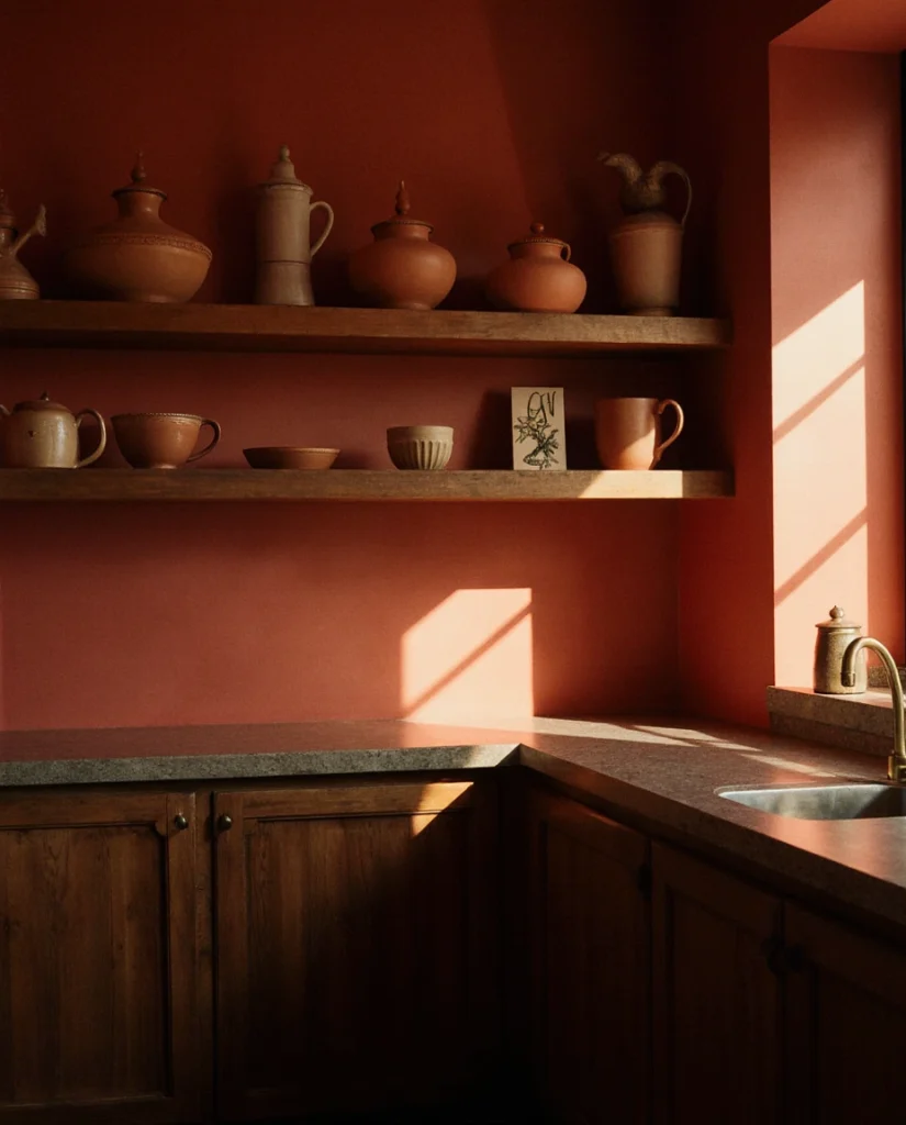
For the genuinely adventurous, warm terracotta-red creates a kitchen that feels alive and energetic. This earthy color works best with substantial wood elements—open shelving, wooden countertops, or substantial dark wood accents that prevent the space from feeling frivolous. The key is pairing it with natural materials rather than sleek modern finishes, creating a rustic warmth that feels grounded.
American lifestyle context: this palette resonates particularly with homeowners influenced by Southwestern, Mediterranean, or bohemian design traditions. It’s especially popular in regions like Arizona, New Mexico, and coastal California, but it’s increasingly appearing in urban kitchens where people are intentionally creating cultural references and travel-inspired spaces.
19. Pale Grey with Scandinavian Minimalism
Scandinavian design continues to influence American kitchens, and pale grey walls embody this aesthetic perfectly. Paired with light natural wood cabinetry, white countertops, and absolutely minimal ornamentation, this palette creates calm and functionality. The grey is warm enough to avoid coldness but neutral enough to feel like a backdrop for living. Works beautifully in open kitchens that flow into adjacent spaces. 
Where it works best: apartments and smaller homes where visual clutter feels overwhelming, households that prioritize functionality and simplicity, and spaces where natural light is abundant. This palette is exceptionally forgiving of imperfection because the entire aesthetic celebrates clarity and intentionality.
20. Muted Sage with Vintage Brass Hardware
A distinct approach from other sage suggestions, this version pairs muted sage with authentically vintage brass hardware rather than reproduction pieces. The combination creates a kitchen that feels curated from actual finds rather than designed from a Pinterest board. This modern farmhouse aesthetic works beautifully with white cabinets, natural stone, and the kind of cottage-inspired design that honors genuine history. 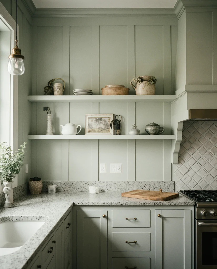
Real homeowner behavior: people drawn to this combination often describe themselves as collectors or vintage enthusiasts. They choose this palette specifically to showcase existing hardware or sourced pieces, making the kitchen feel like a personal collection rather than a matching suite from a catalog.
21. Deep Charcoal with Warm Wood Tones
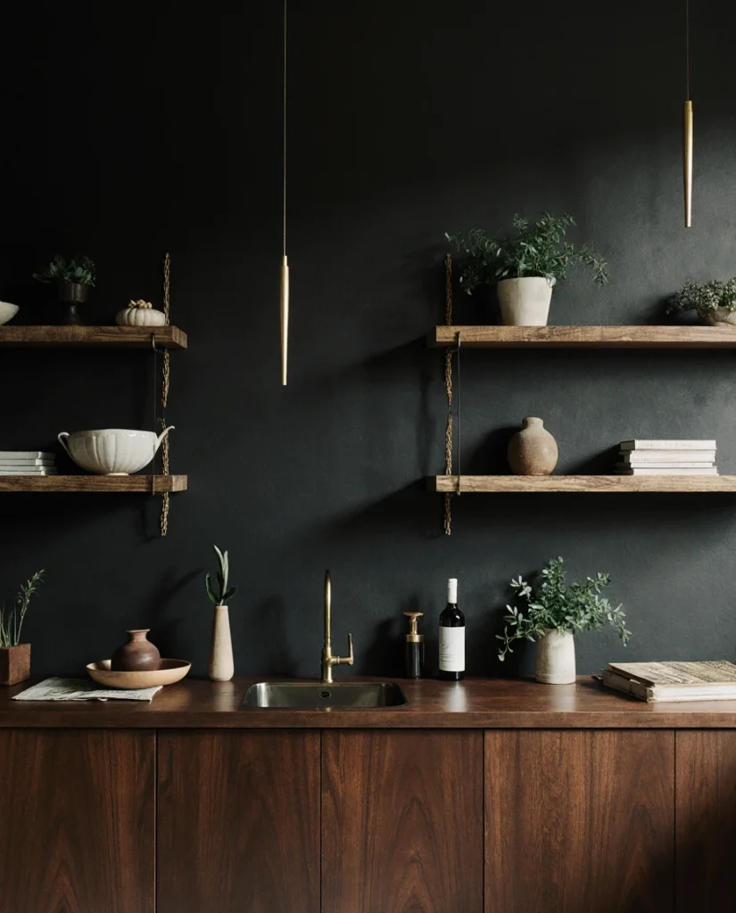
Closing with drama: deep charcoal walls paired with substantial warm wood tones create a kitchen that feels grounded and confident. This moody palette works particularly well with cherry wood cabinetry or reclaimed wood elements that provide warmth against the dark backdrop. The interplay between deep walls and golden wood creates visual richness that sophisticated homeowners choose deliberately. It’s a modern interpretation of traditional richness. 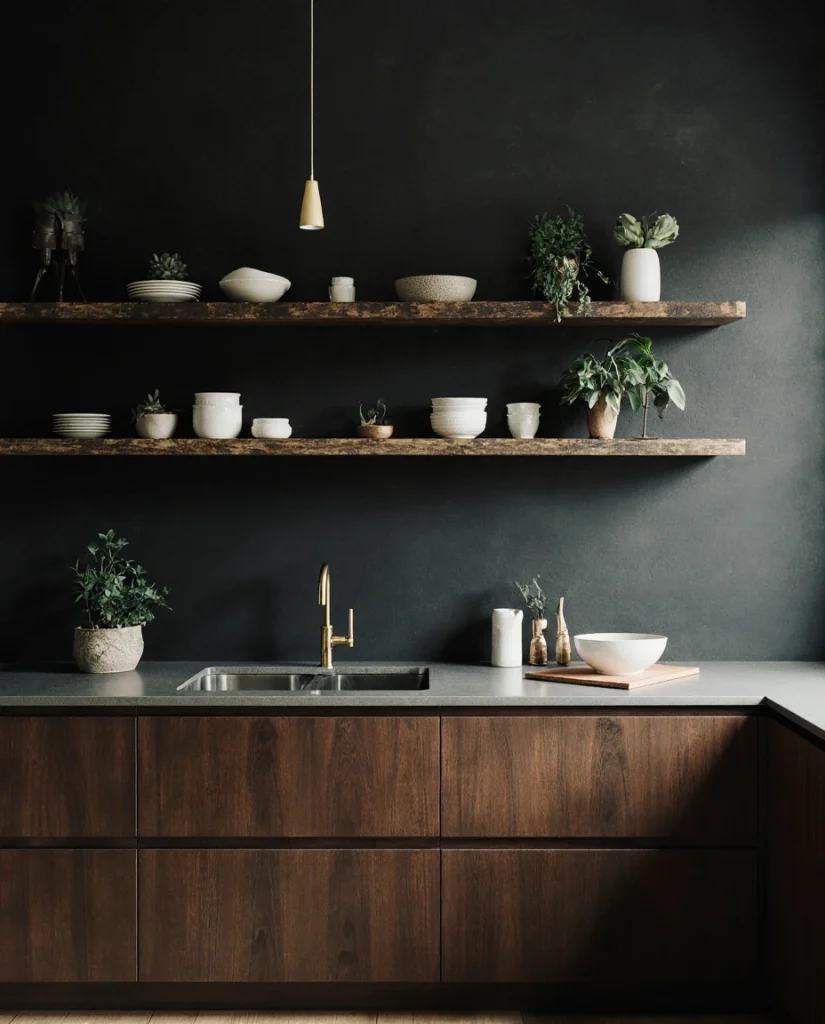
Practical insight: homeowners choosing this combination often discover that the contrast between dark walls and warm wood creates a naturally balanced space that doesn’t require additional visual effort. The darkness recedes visually while the wood advances, creating depth and sophistication without requiring pattern, texture, or additional color. 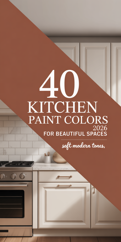
Conclusion
Twenty-one distinct directions, and we’ve only scratched the surface of 2026’s kitchen color possibilities. Whether you’re drawn to minimalist Scandinavian palettes, maximalist bohemian warmth, sophisticated moody richness, or nature-inspired farmhouse comfort, there’s genuinely a color direction here that aligns with your home and your values. The most important step is beginning—choose a color that makes you smile every morning, and everything else falls into place. Share your final choice in the comments or let us know which combination caught your eye. We’re excited to see how your kitchen transformation unfolds.