Kitchen color is having a major moment in 2026, and if you’ve been scrolling through Pinterest lately, you’ve probably noticed the shift. Americans are moving away from the all-white everything trend and embracing warmer, more personal palettes that reflect how we actually live in our kitchens. Whether you’re planning a full remodel or just want to refresh your space with paint, this year’s color ideas range from earthy neutrals to unexpected bold choices. Below, you’ll find inspiring kitchen color concepts that blend current design trends with timeless appeal, each one tailored to help you create a space that feels both stylish and genuinely yours.
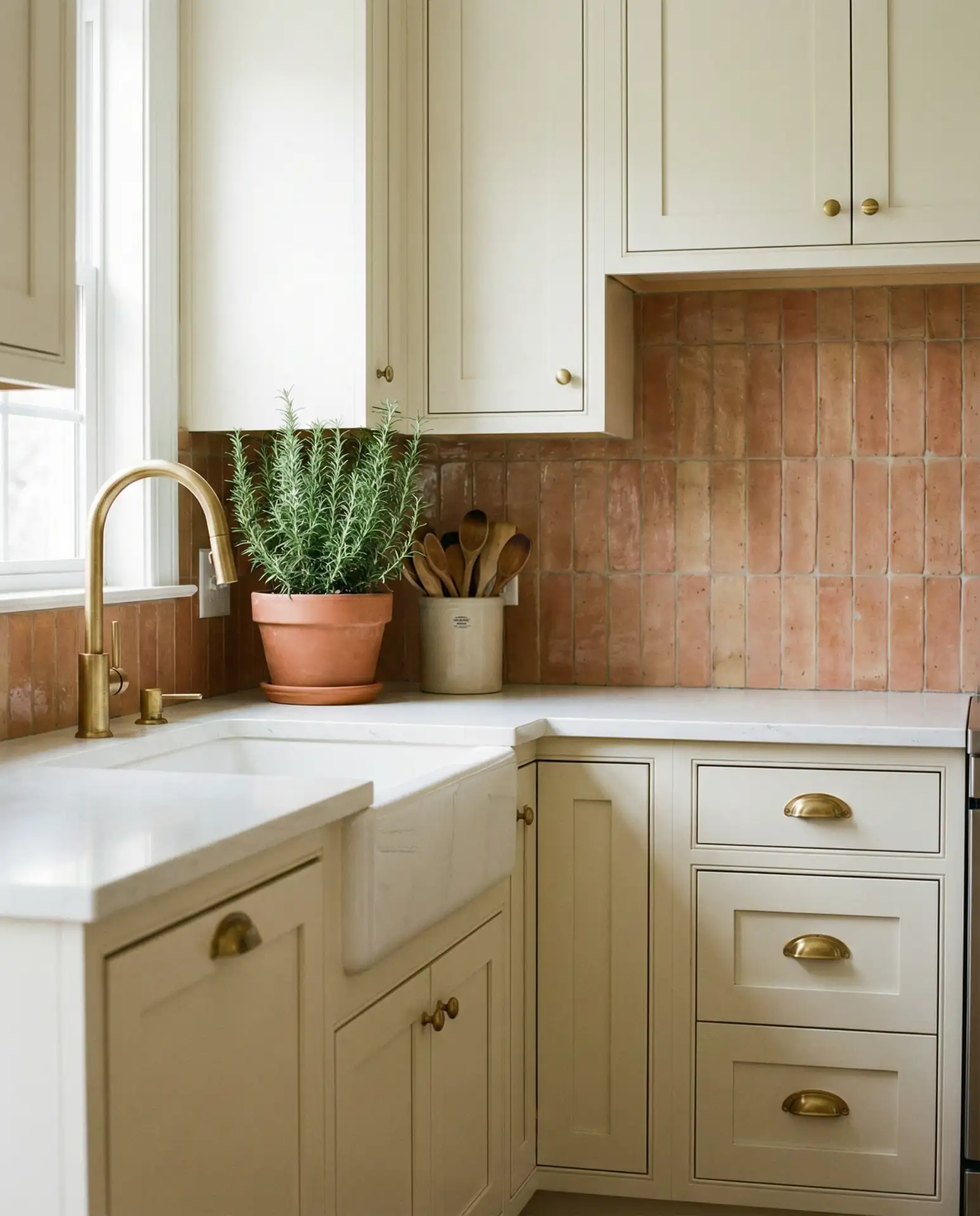
1. Warm Terracotta Walls with Natural Wood Cabinets
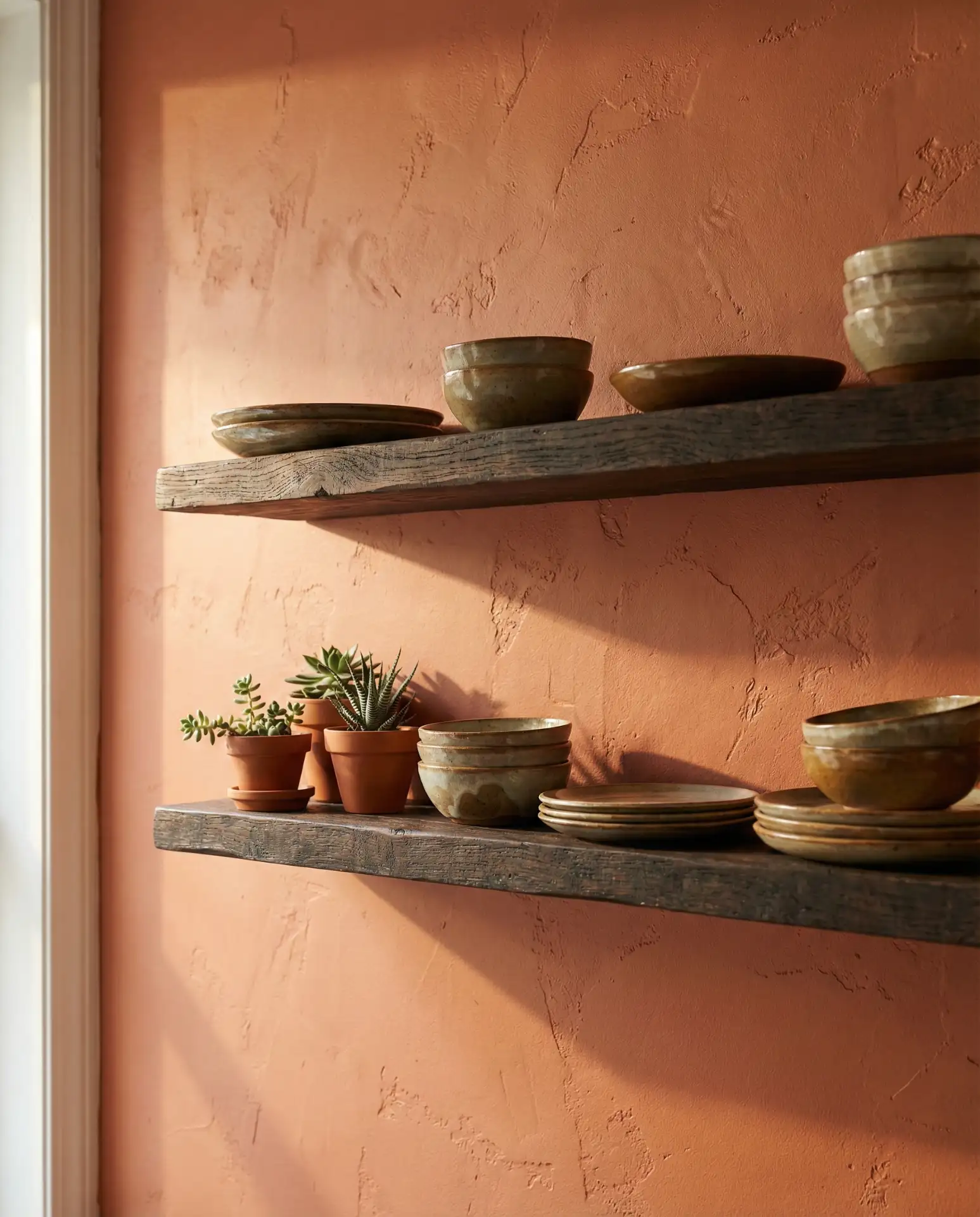
Terracotta is making a major comeback in 2026 kitchens, especially on walls, where it adds instant warmth without overwhelming the space. This earth tone pairs beautifully with stained cabinets in oak or walnut, creating a layered, organic look that feels both modern and timeless. The color works particularly well in kitchens with plenty of natural light, where it shifts from soft peach in the morning to rich clay by evening.
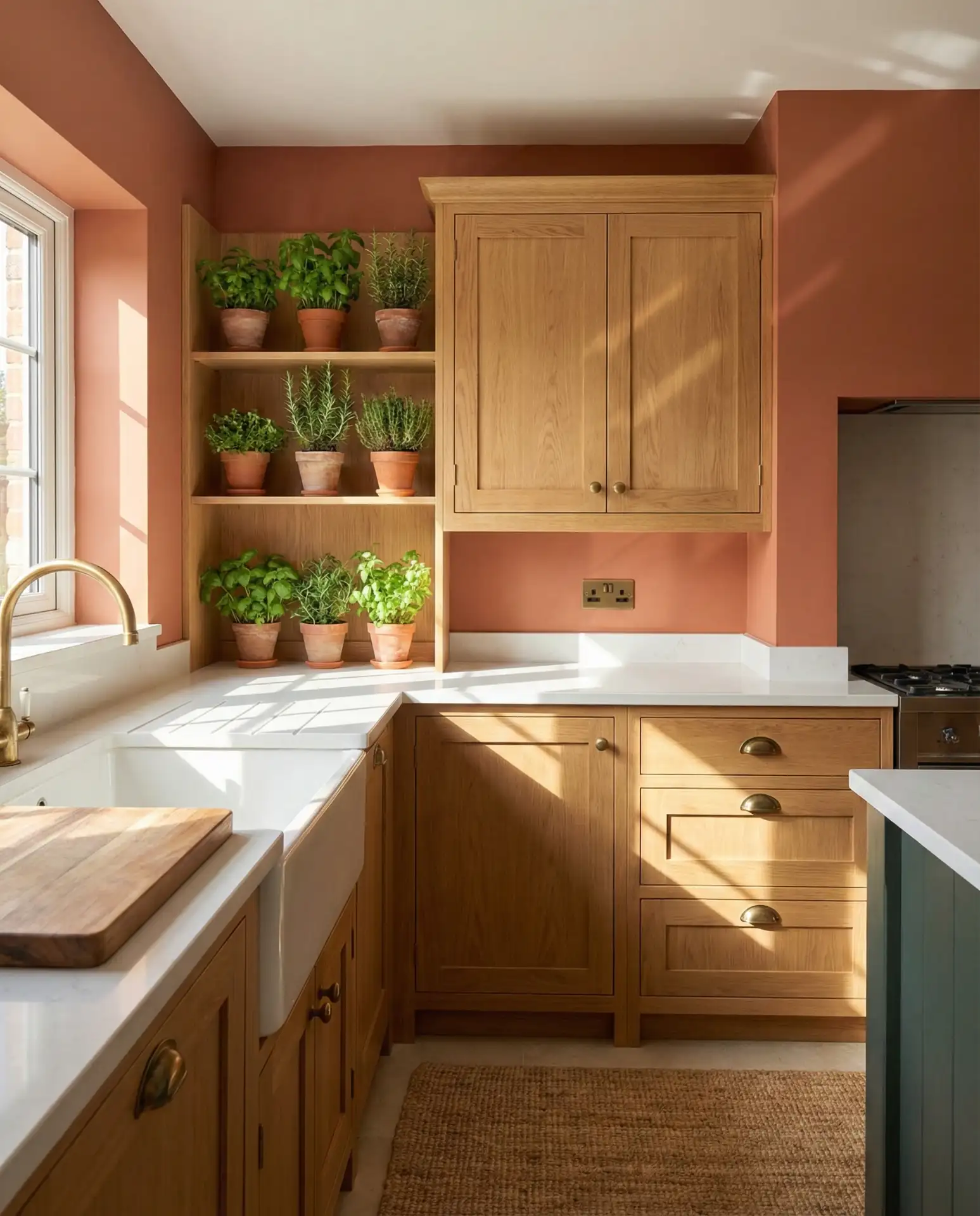
This color combination works best in homes where the kitchen opens to living spaces, as the terracotta acts as a warm bridge between rooms. It’s especially popular in the Southwest and California, where homeowners want to bring outdoor desert tones inside. If you’re worried about commitment, try painting just one accent wall behind open shelving to test the color before going all in.
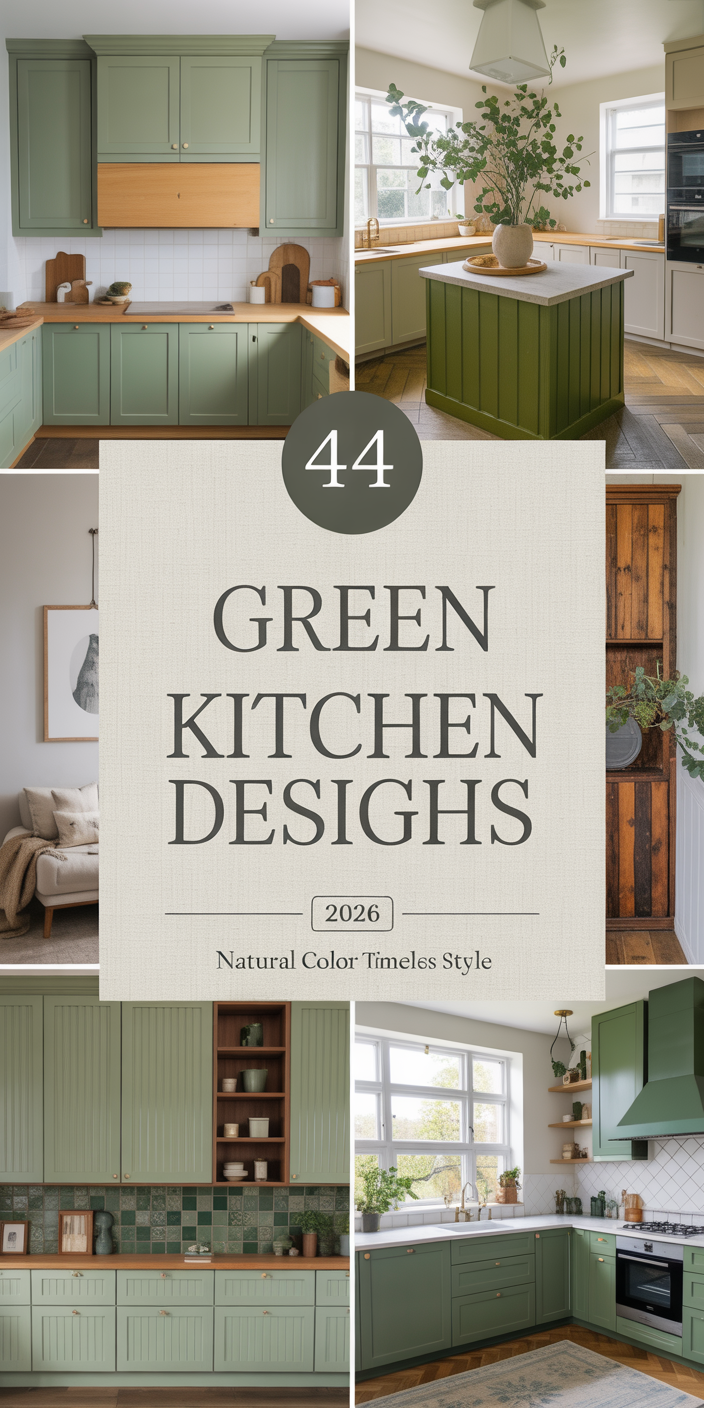
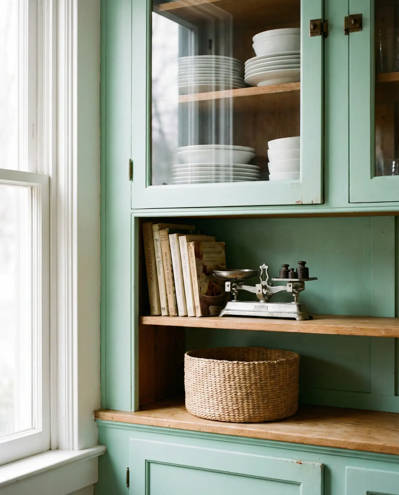
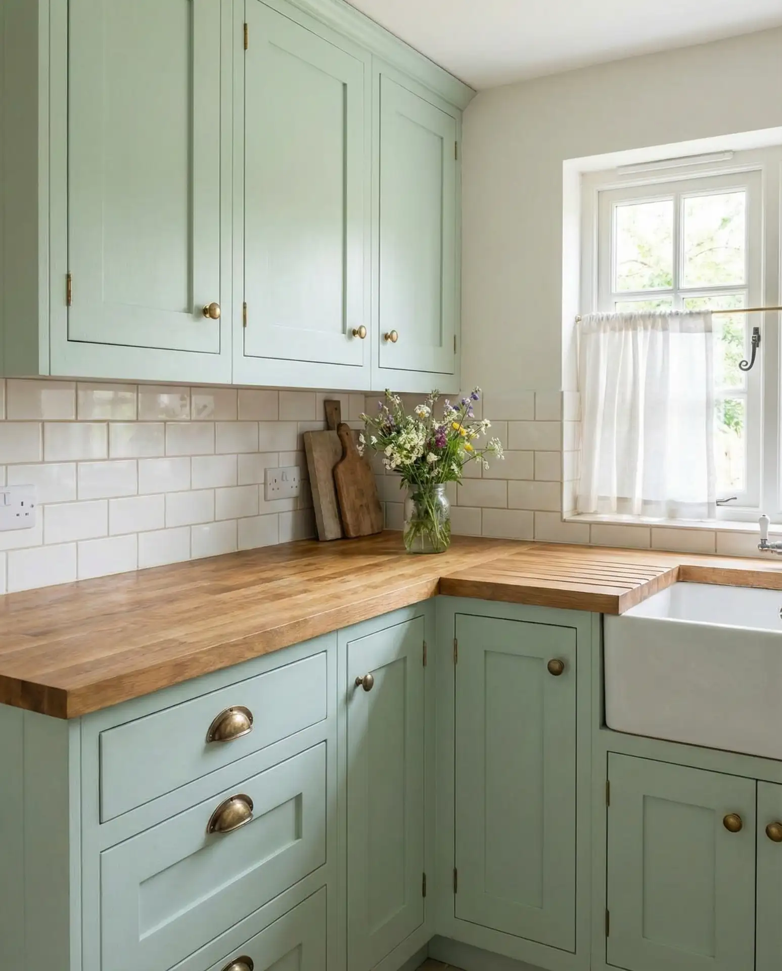
2. Sage Green Cabinets with Creamy White Walls
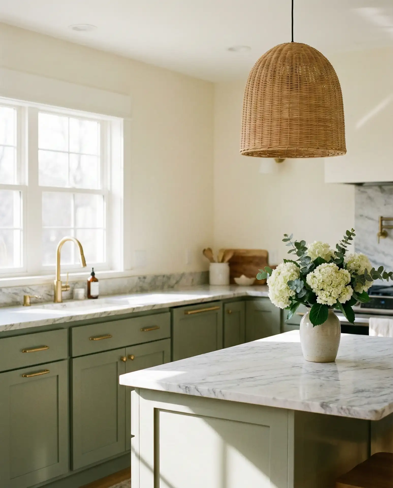
Sage green has evolved from trendy to classic, and painting cabinets in this soft, earthy hue instantly gives your kitchen a collected, lived-in feel. When paired with neutral cream or off-white walls, the green reads as sophisticated rather than overwhelming. This combination is particularly effective in farmhouse and transitional kitchens where you want color without sacrificing versatility.
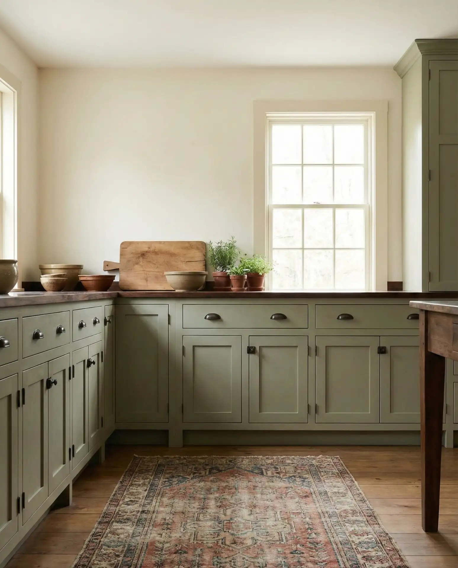
A common mistake with sage green is choosing a shade that’s too gray or too yellow. Test your paint sample in both morning and evening light, and hold it next to your countertops before committing. The right sage should have a balanced, slightly dusty quality that shifts beautifully throughout the day without looking muddy or washed out.
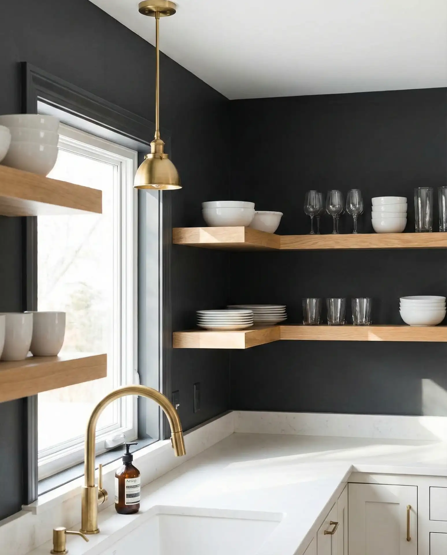
3. Charcoal Cabinets with Warm Brass Accents
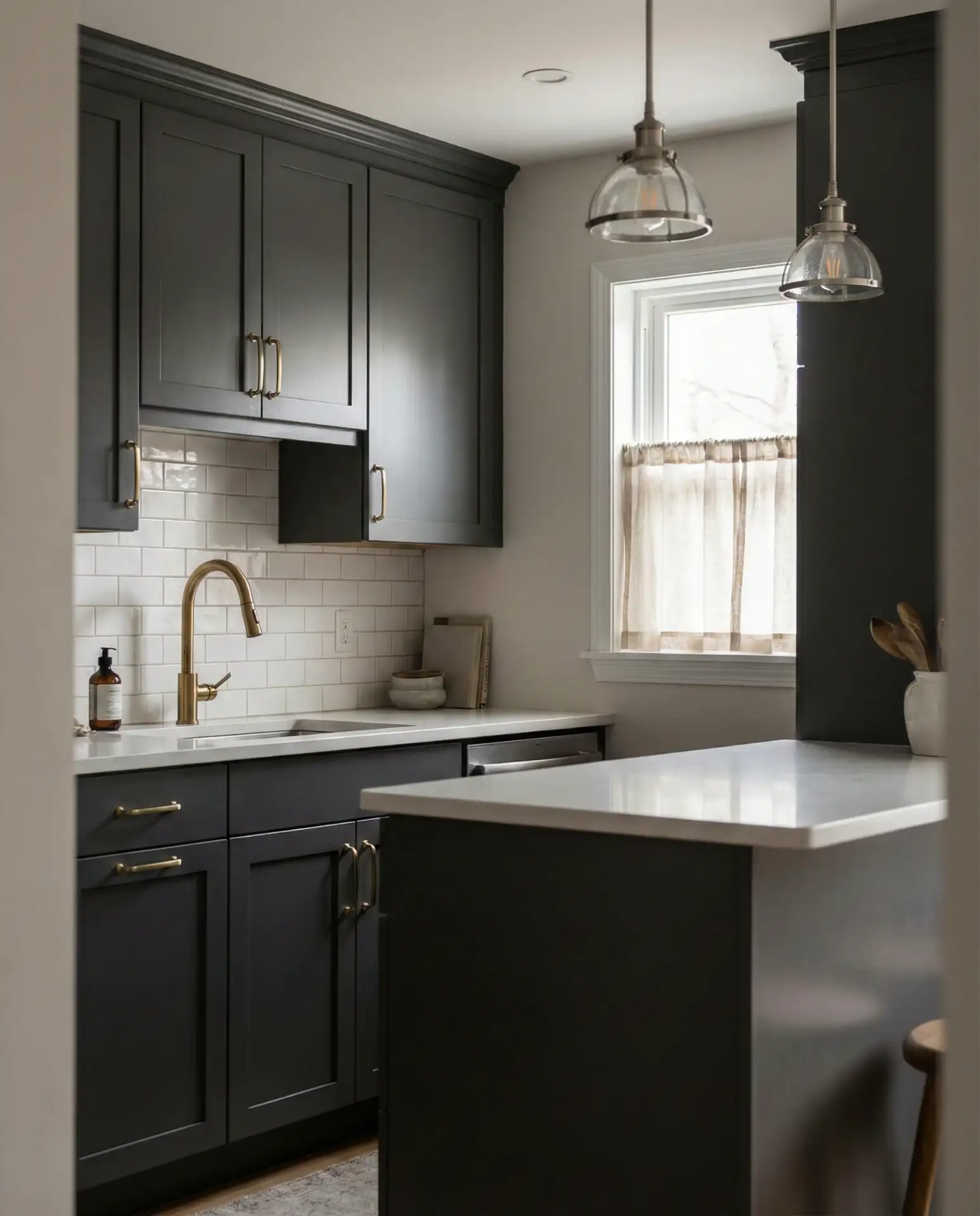
Deep charcoal cabinets are the sophisticated alternative to stark black, offering drama without the harshness. This color creates a modern backdrop that makes brass hardware, light fixtures, and faucets absolutely sing. The look works especially well in tiny kitchens where you might think dark colors would close in the space, but when executed with adequate lighting and reflective surfaces, it actually adds depth and dimension.
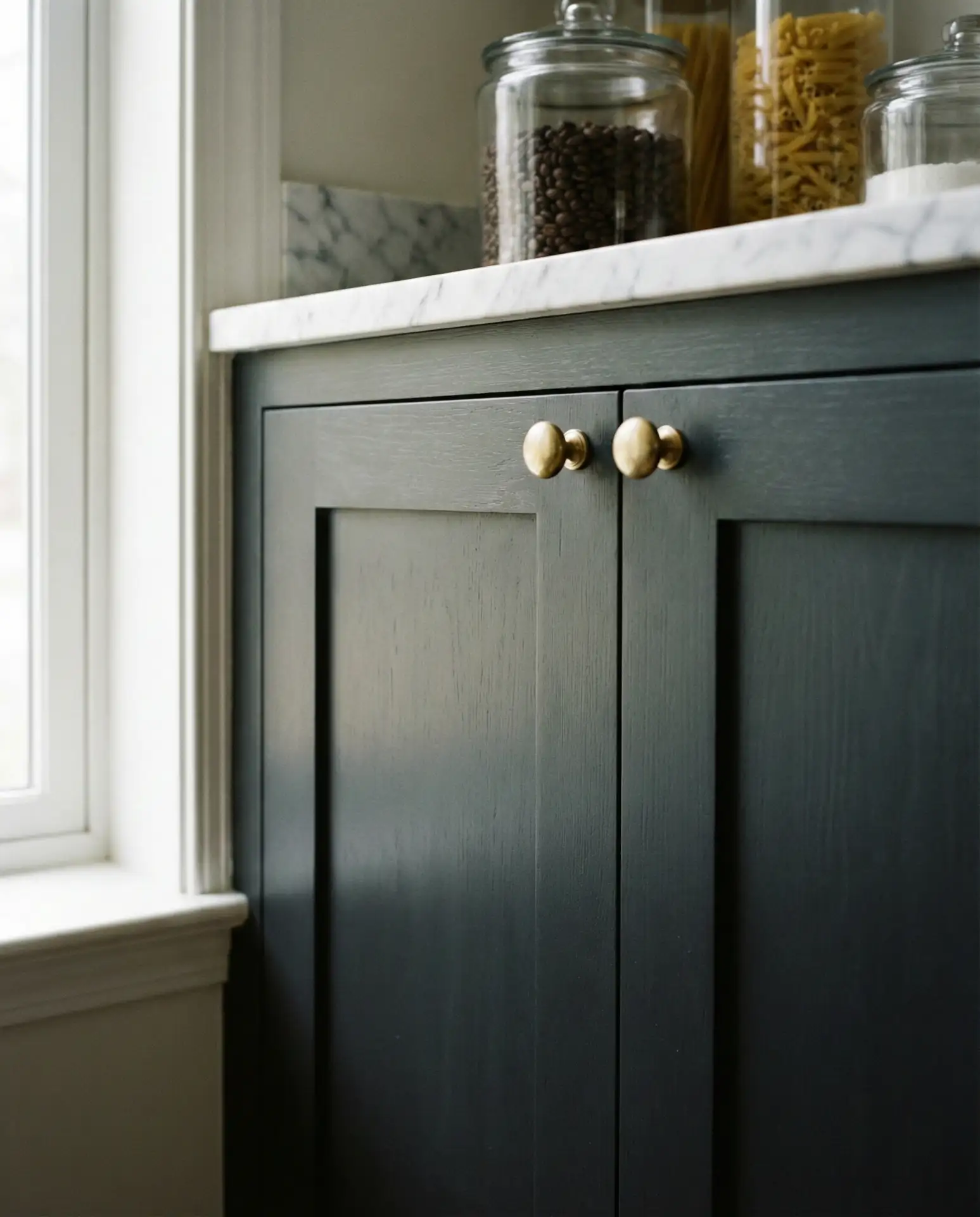
In the Midwest and Northeast, where natural light can be limited during winter months, homeowners are pairing charcoal cabinets with under-cabinet LED strips and multiple overhead fixtures. This ensures the space feels intentional and moody rather than cave-like. It’s a surprisingly practical choice for busy families since the darker finish hides fingerprints and wear better than lighter colors.
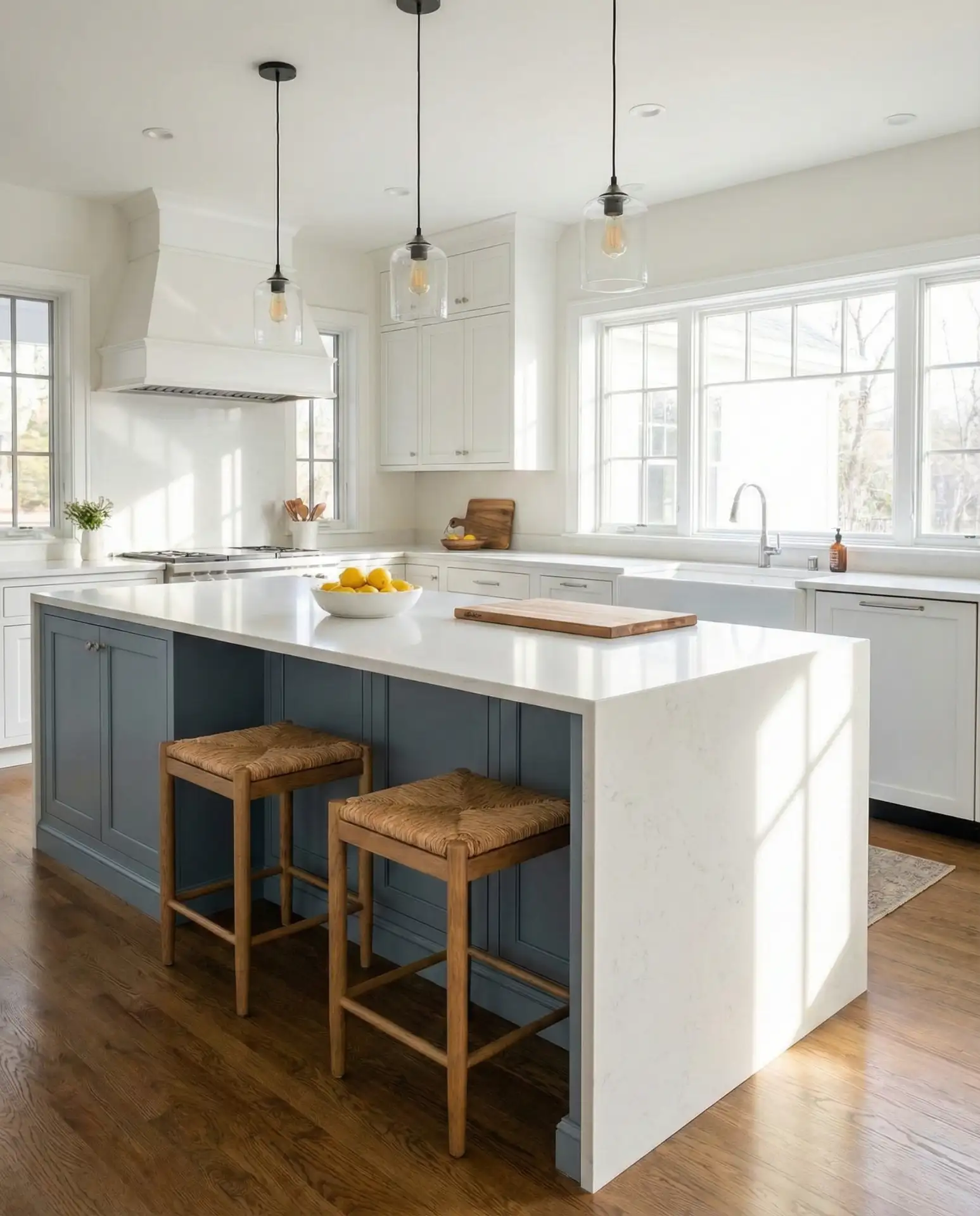
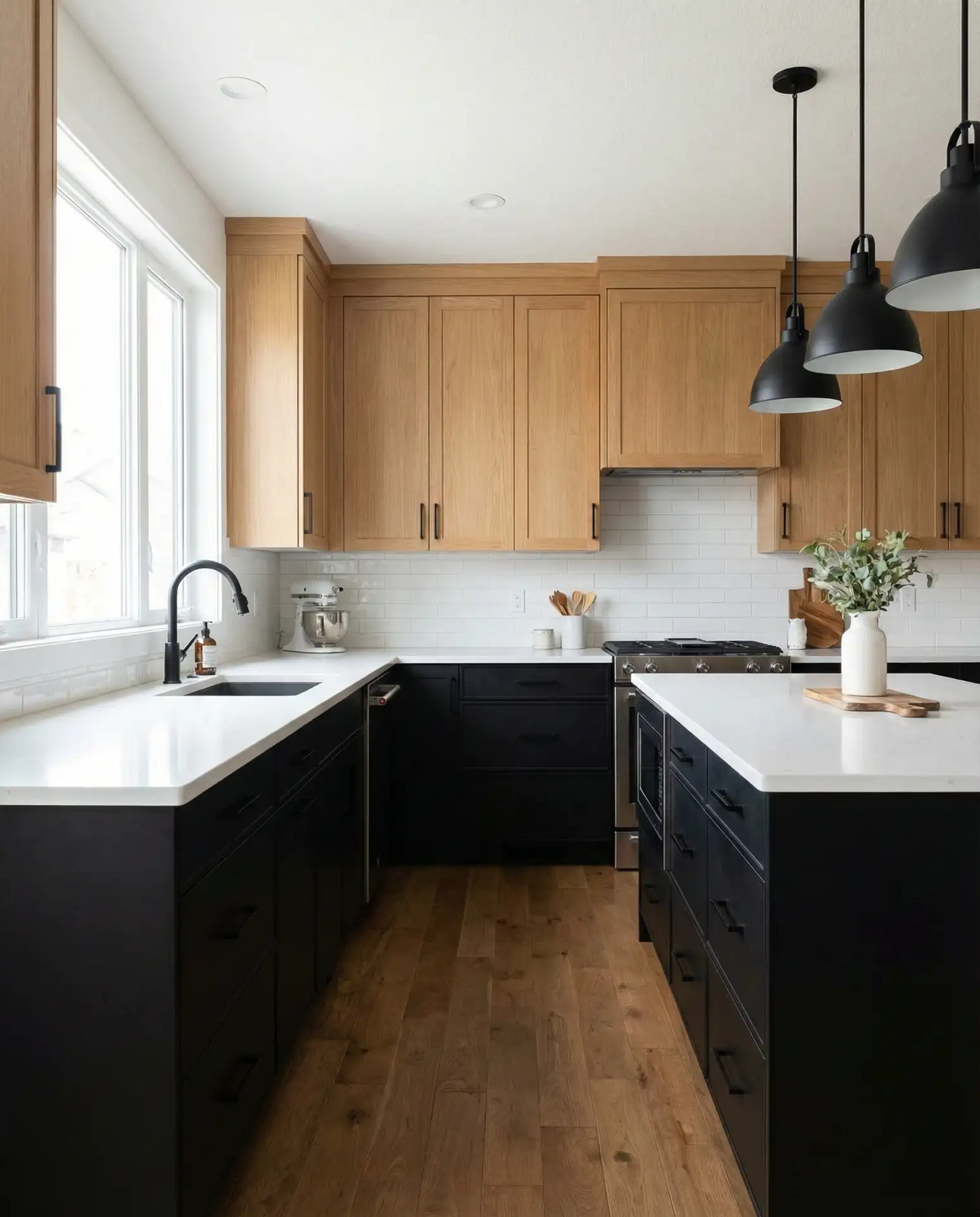
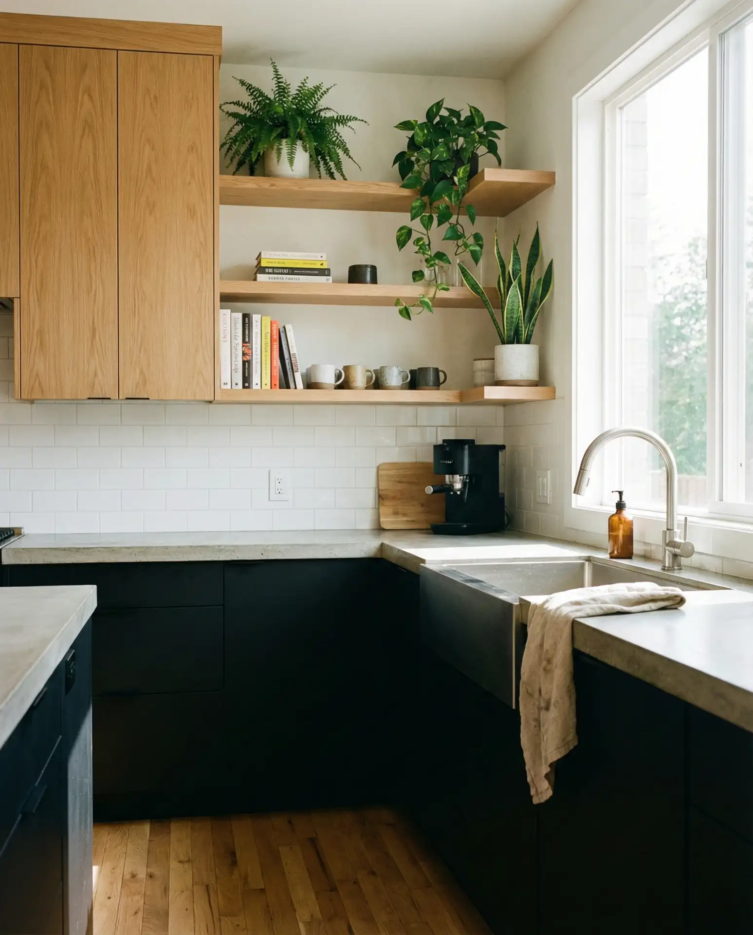
4. Two-Tone: Navy Lowers with White Uppers
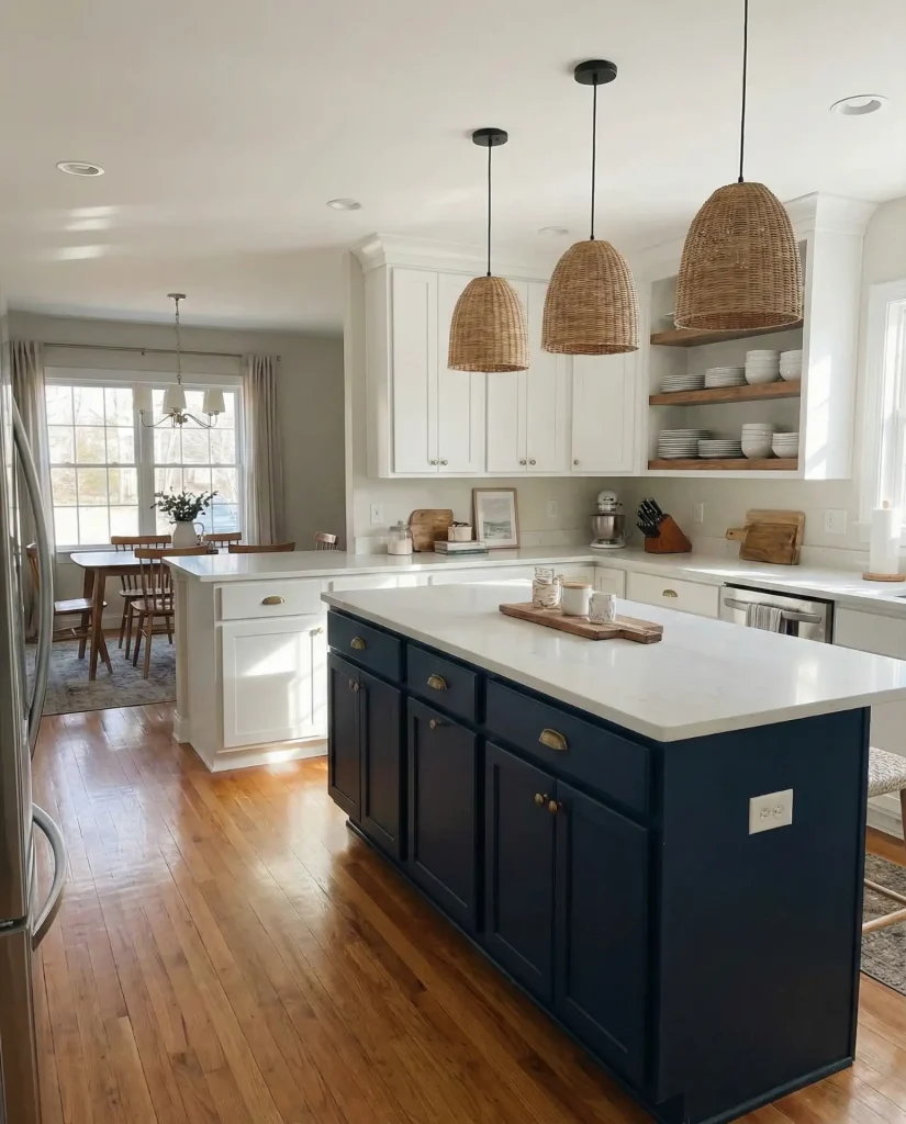
The two-tone cabinet trend continues strong in 2026, with navy blue lower cabinets and white cabinets up top creating perfect visual balance. This approach gives you the bold and vibrant color you crave while keeping the upper half of the room light and airy. It’s especially effective in kitchens with standard eight-foot ceilings, where all-dark cabinets might feel heavy.
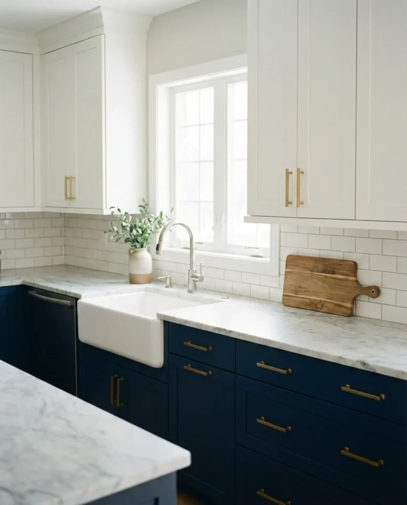
I recently visited a friend in Portland who had just finished this exact color scheme, and what struck me was how grounded the space felt. The navy anchored the room, while the white cabinets kept it from feeling like a design statement that would tire quickly. She mentioned she was initially worried about it feeling too trendy, but a year in, she still loves walking into that kitchen every morning.
5. Soft Blush Pink Walls with Natural Wood Tones
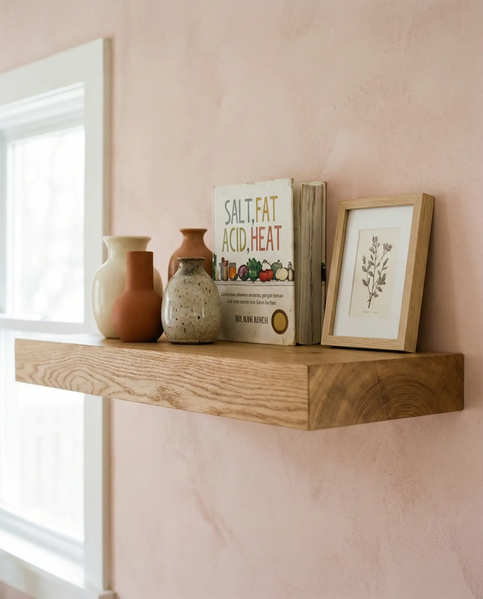
Blush pink has matured beyond the millennial pink moment into something far more sophisticated, especially in pastel iterations that read as barely-there warmth on walls. Paired with brown cabinets in natural wood finishes, this creates a warm and inviting space that feels both contemporary and somehow nostalgic. The combination works beautifully in cottage and transitional styles where you want softness without sacrificing grown-up appeal.
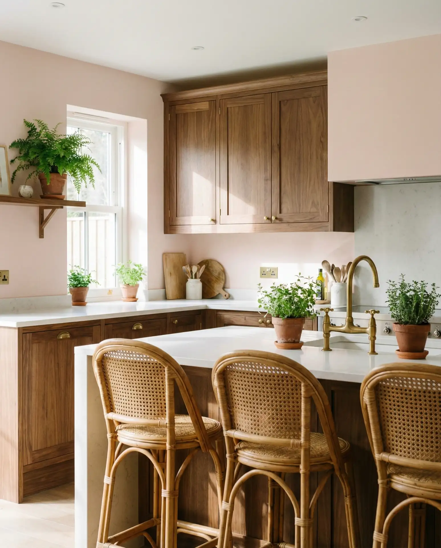
Budget-wise, this is one of the most accessible updates you can make. A gallon of quality blush paint runs about $45-65, and if your cabinets are already wood, you’re simply working with what you have. The key is choosing a blush with enough gray or beige undertones that it doesn’t read as juvenile. Look for names like “barely pink,” “whisper blush,” or “dust rose” rather than anything candy-colored.
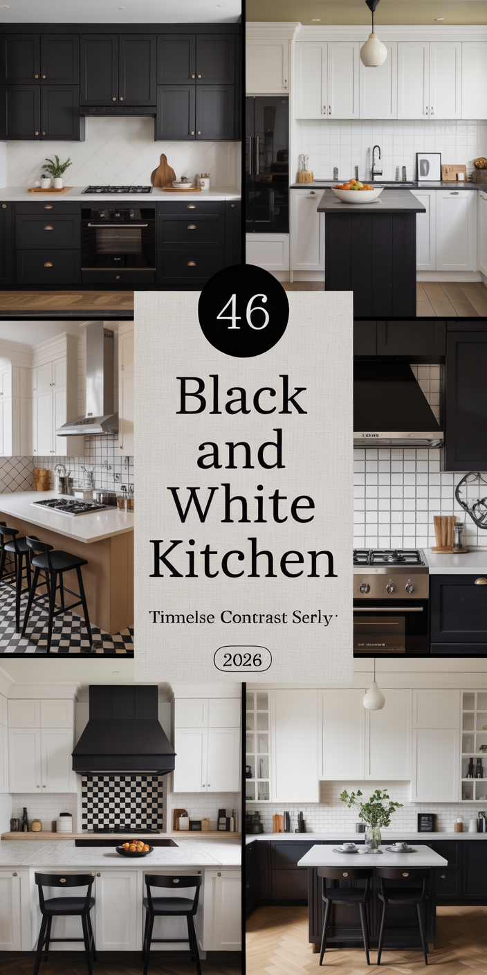
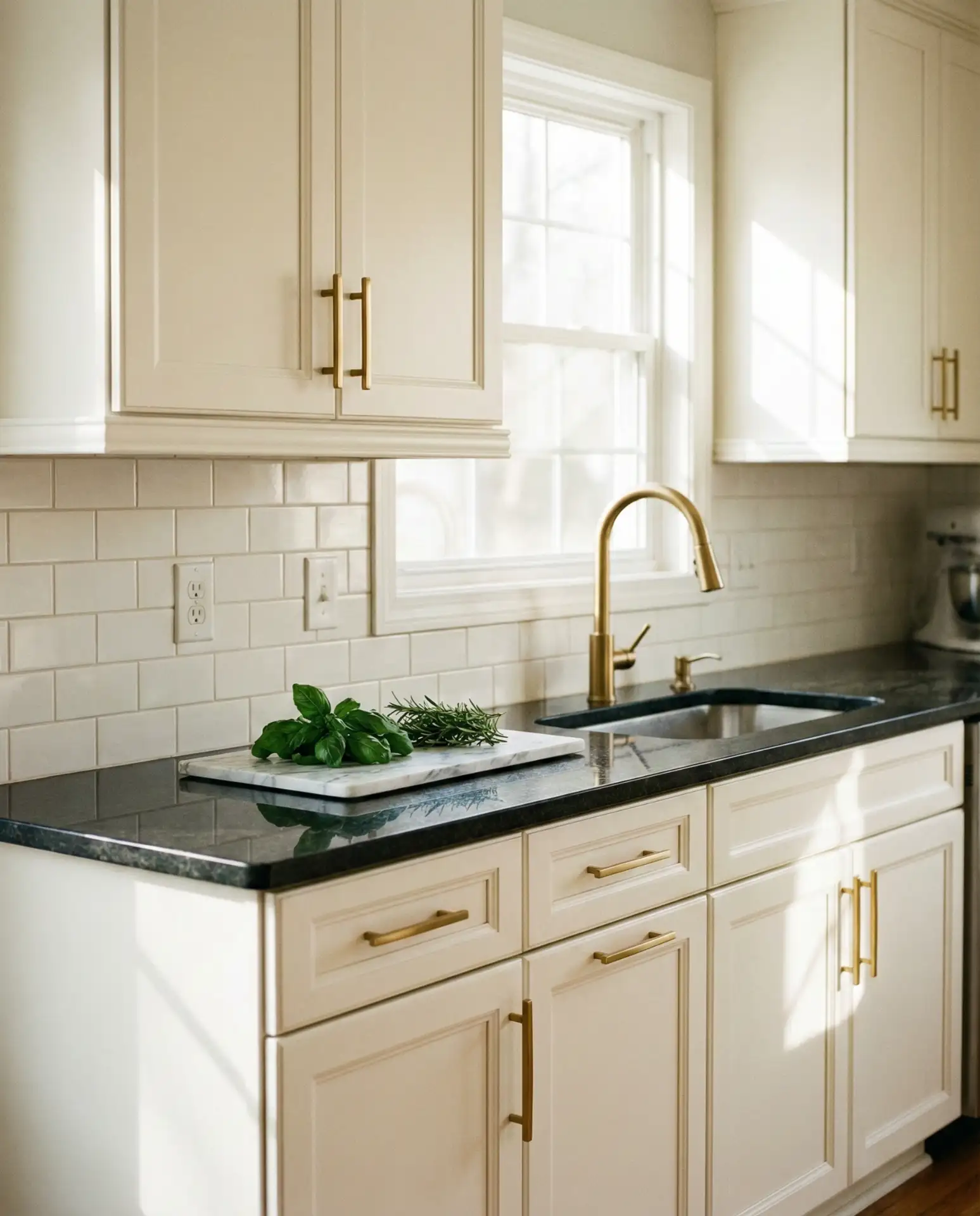
6. Classic White Cabinets with Black Countertops
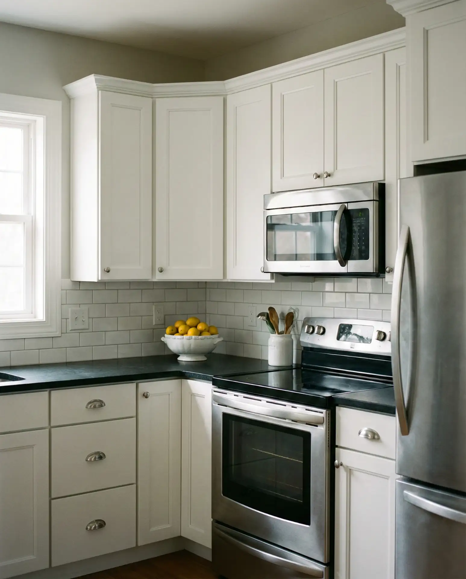
Sometimes the most effective color scheme is the most straightforward one. Crisp white cabinets paired with dramatic black countertop surfaces create high-contrast impact that never goes out of style. This combination works across nearly every design aesthetic, from modern to traditional, and gives you a clean canvas to layer in personality through accessories, backsplash choices, and hardware finishes.
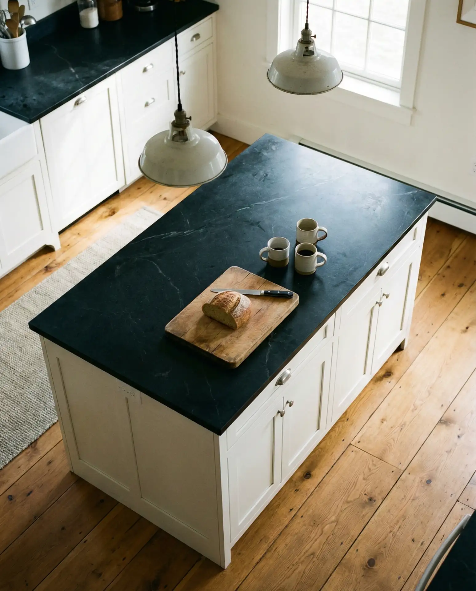
The beauty of this pairing is its flexibility. As design trends shift, you can easily update the space by swapping out hardware, changing the backsplash, or introducing new colors through textiles and decor. Real homeowners consistently report that this combination holds up well to daily family life, with the black counters hiding stains and the white cabinets brightening the space even in homes with limited natural light.
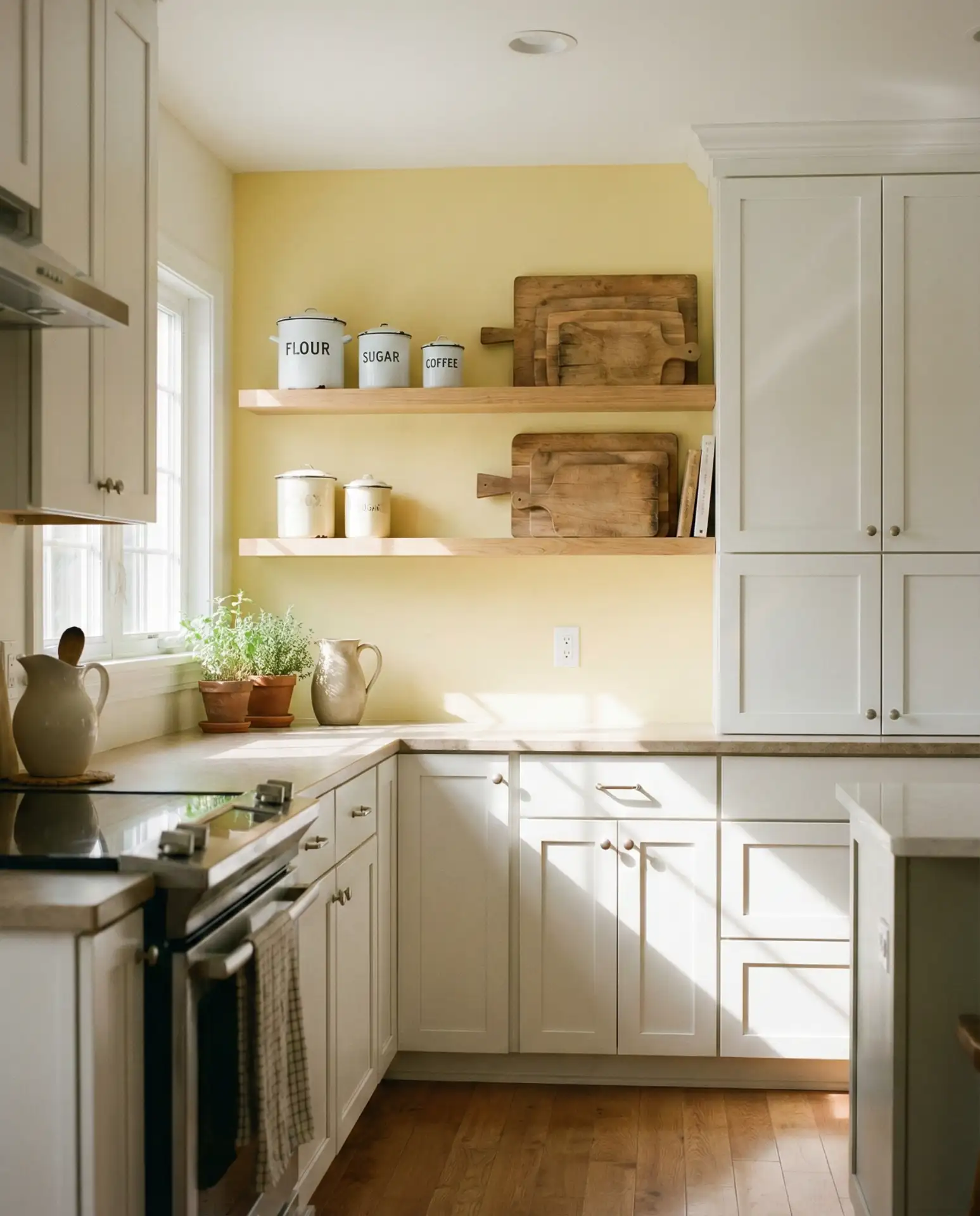
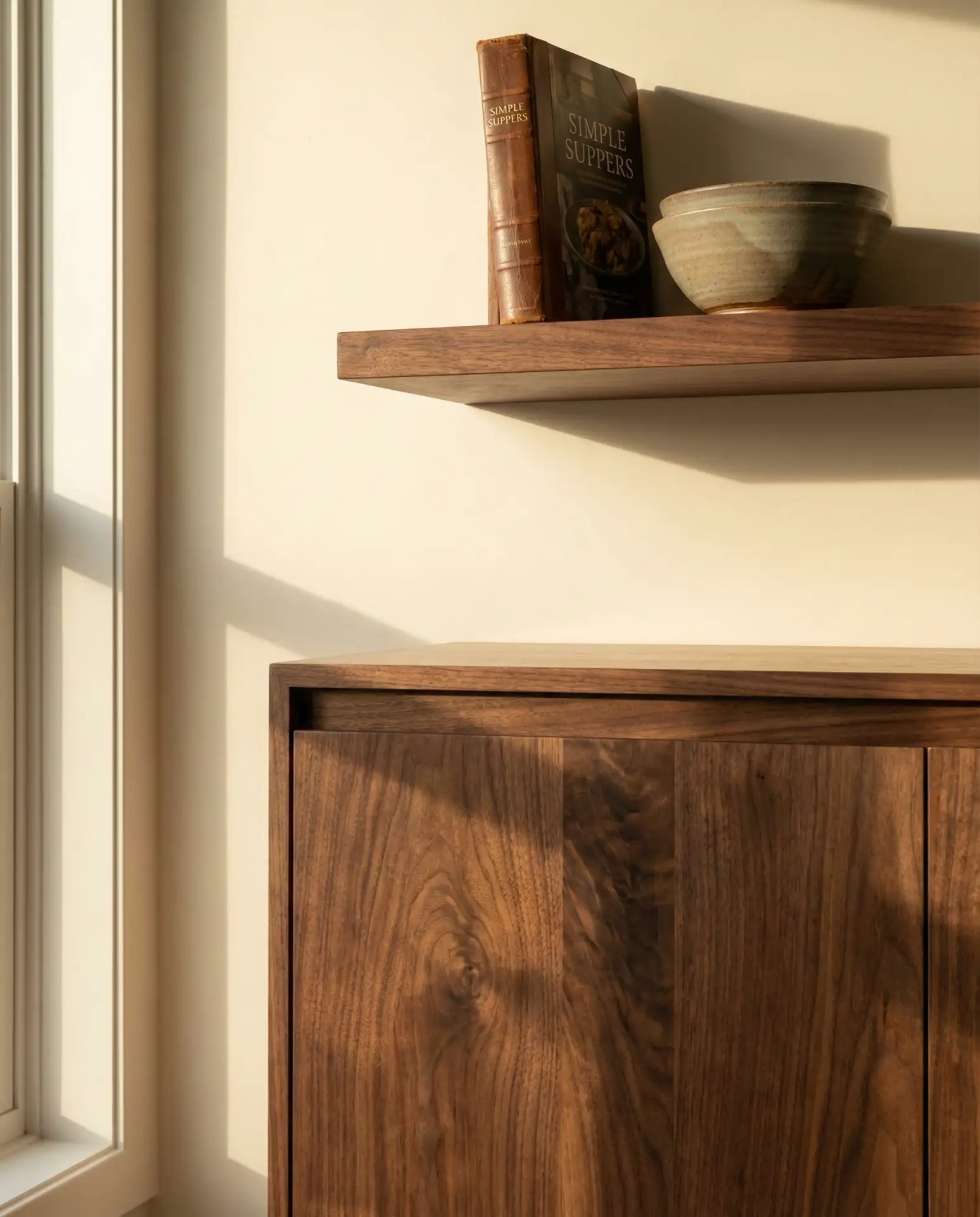
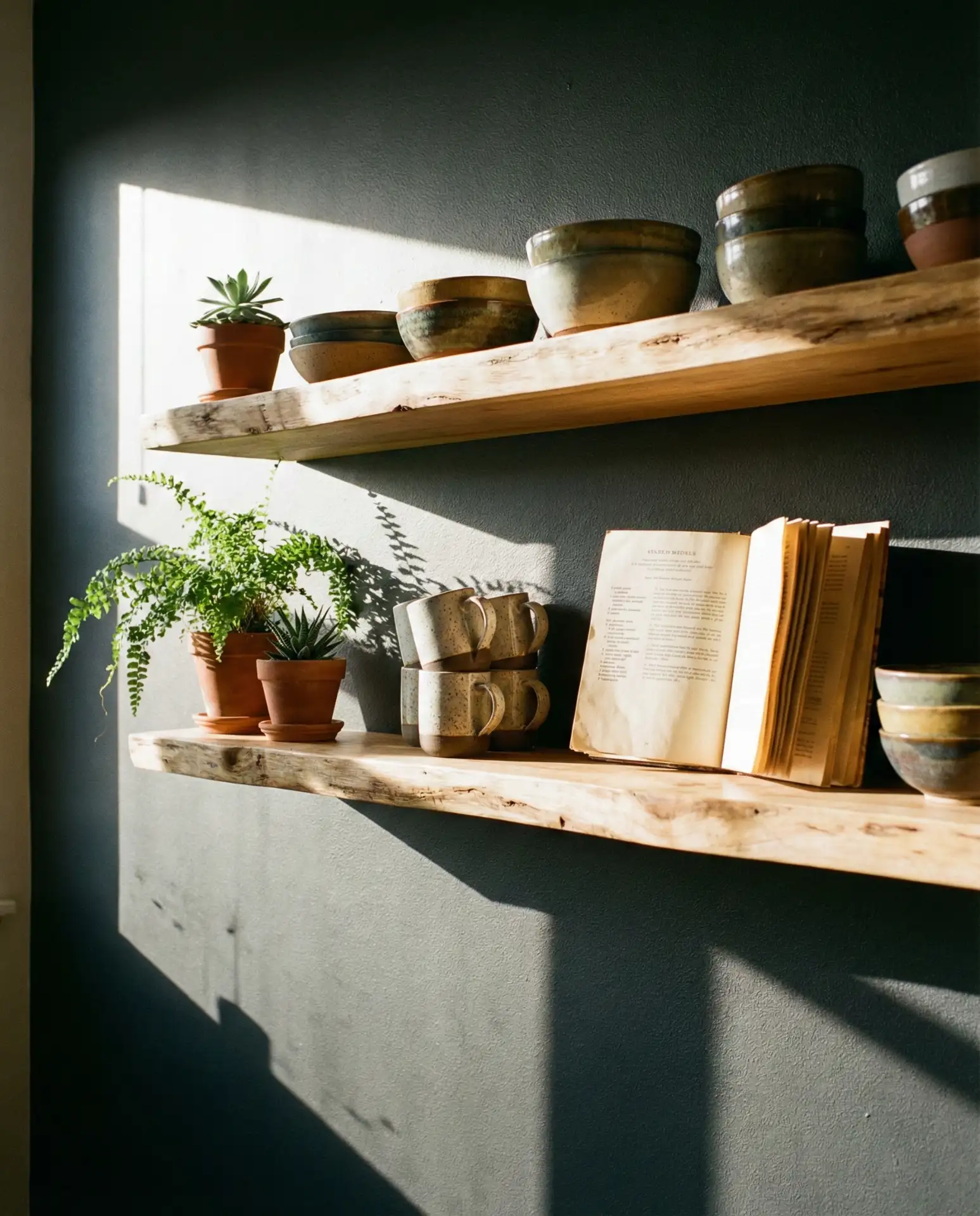
7. Warm Honey Oak Open Shelving
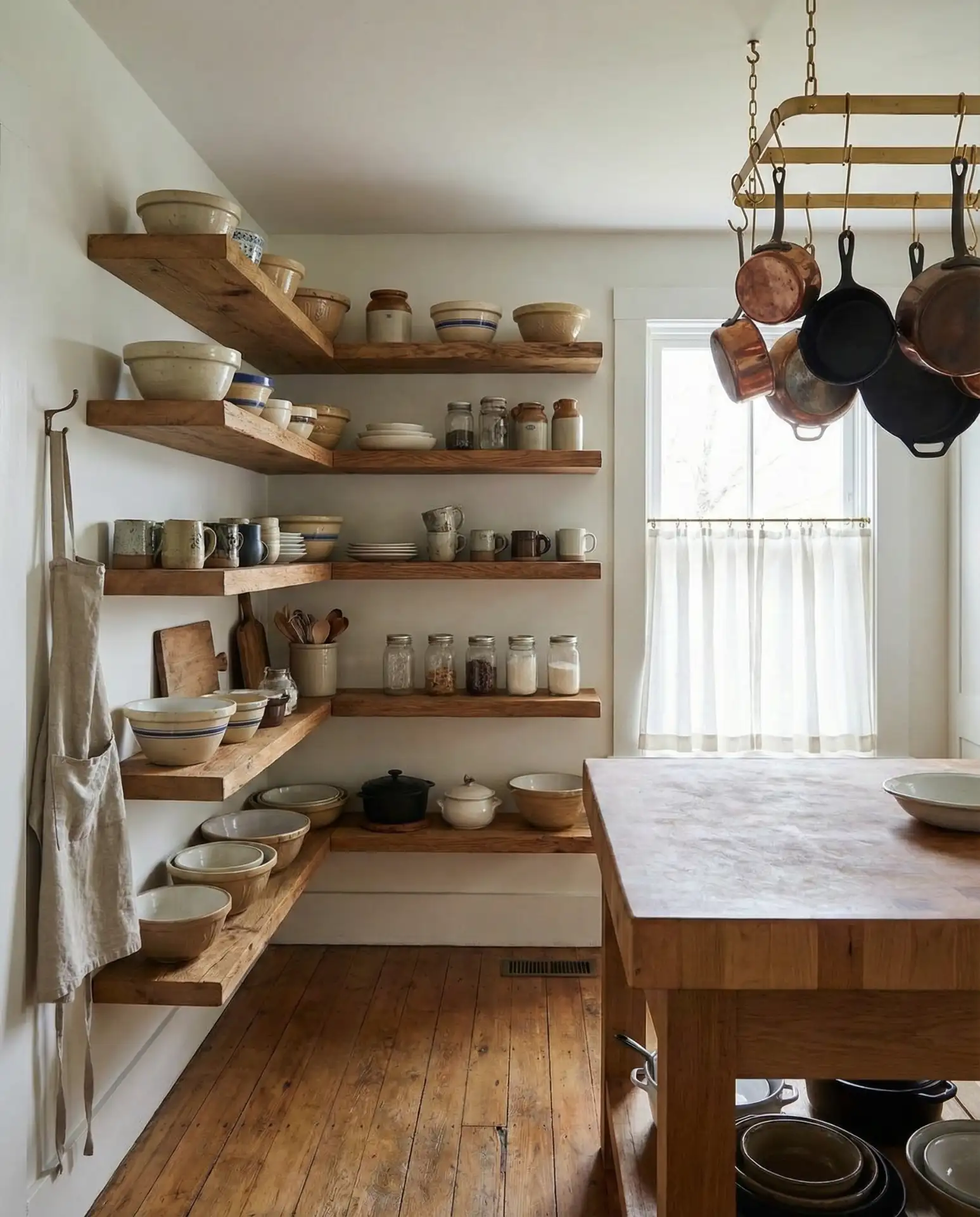
Honey oak is having a serious revival moment, especially in open shelving configurations that showcase the wood’s natural beauty. These warm brown cabinets’ walnut-adjacent tone brings instant coziness to a kitchen and pairs beautifully with white or cream wall paint. The rustic appeal works particularly well in kitchens where you want to display dishes, cookbooks, and collected objects rather than hiding everything behind closed doors.
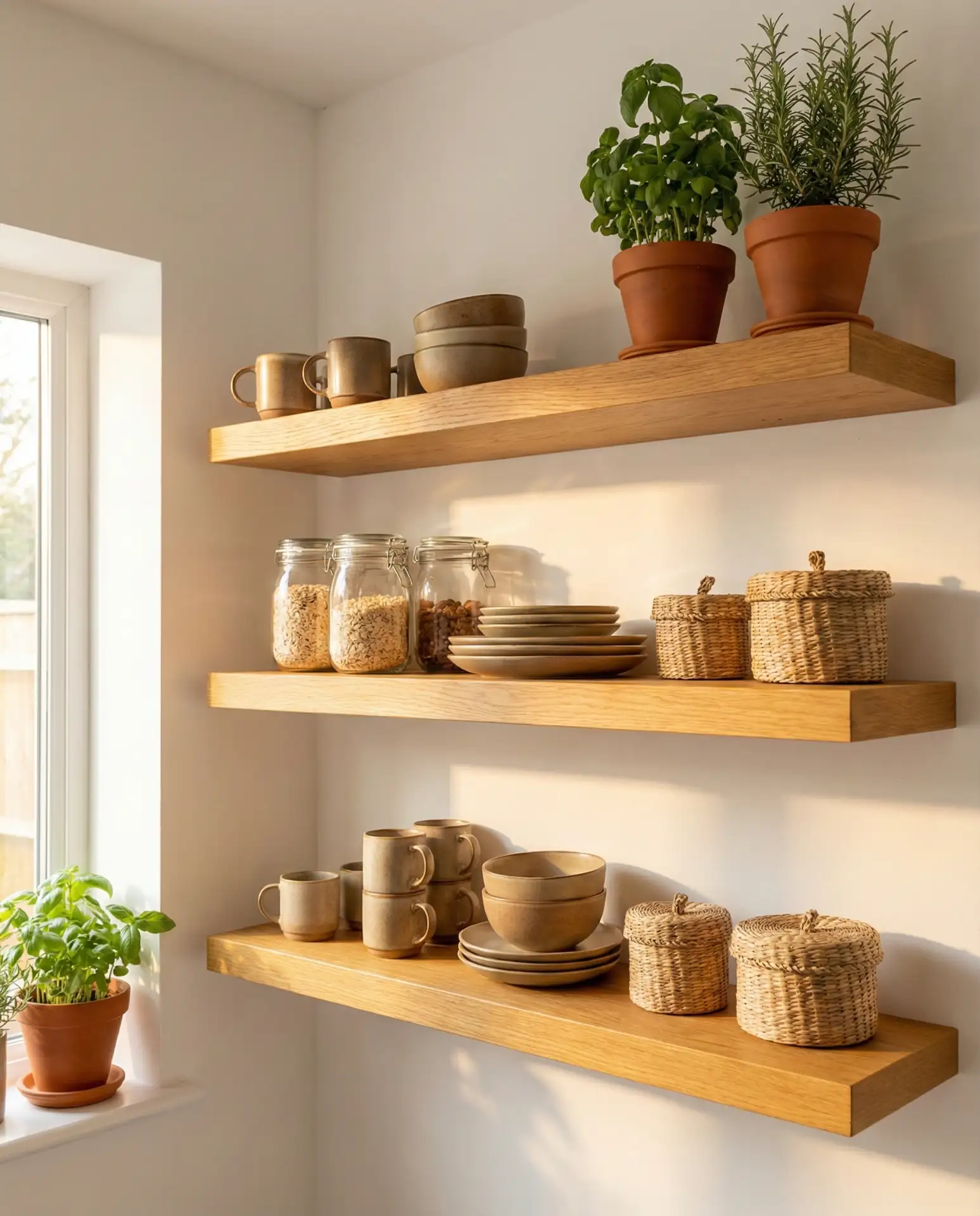
Open shelving works best in kitchens where you genuinely use and love your dishes. If you’re someone who rotates through mismatched mugs from various vacations or has a collection of inherited serving pieces, this display method turns those items into decor. However, it requires more maintenance than closed cabinets—expect to dust shelves and wipe down dishes more frequently, especially if you cook often.
8. Moody Green-Gray on Full Cabinet Run
This complex color sits somewhere between forest green and charcoal, creating a relaxing atmosphere that feels both grounded and sophisticated. Painting cabinets in this earth tone gives the kitchen a cocooning quality that’s perfect for 2026’s emphasis on sanctuary spaces. The color has enough depth to hide everyday wear while still feeling lighter and more approachable than pure black or navy.
Expert designers recommend this color for kitchens with at least two windows or strong overhead lighting. Without adequate light, the green-gray can read too dark and lose its beautiful complexity. When done right, though, it creates the kind of space where you want to linger over morning coffee or evening meal prep, with a richness that feels expensive regardless of your actual budget.
9. Creamy White with Colorful Tile Backsplash
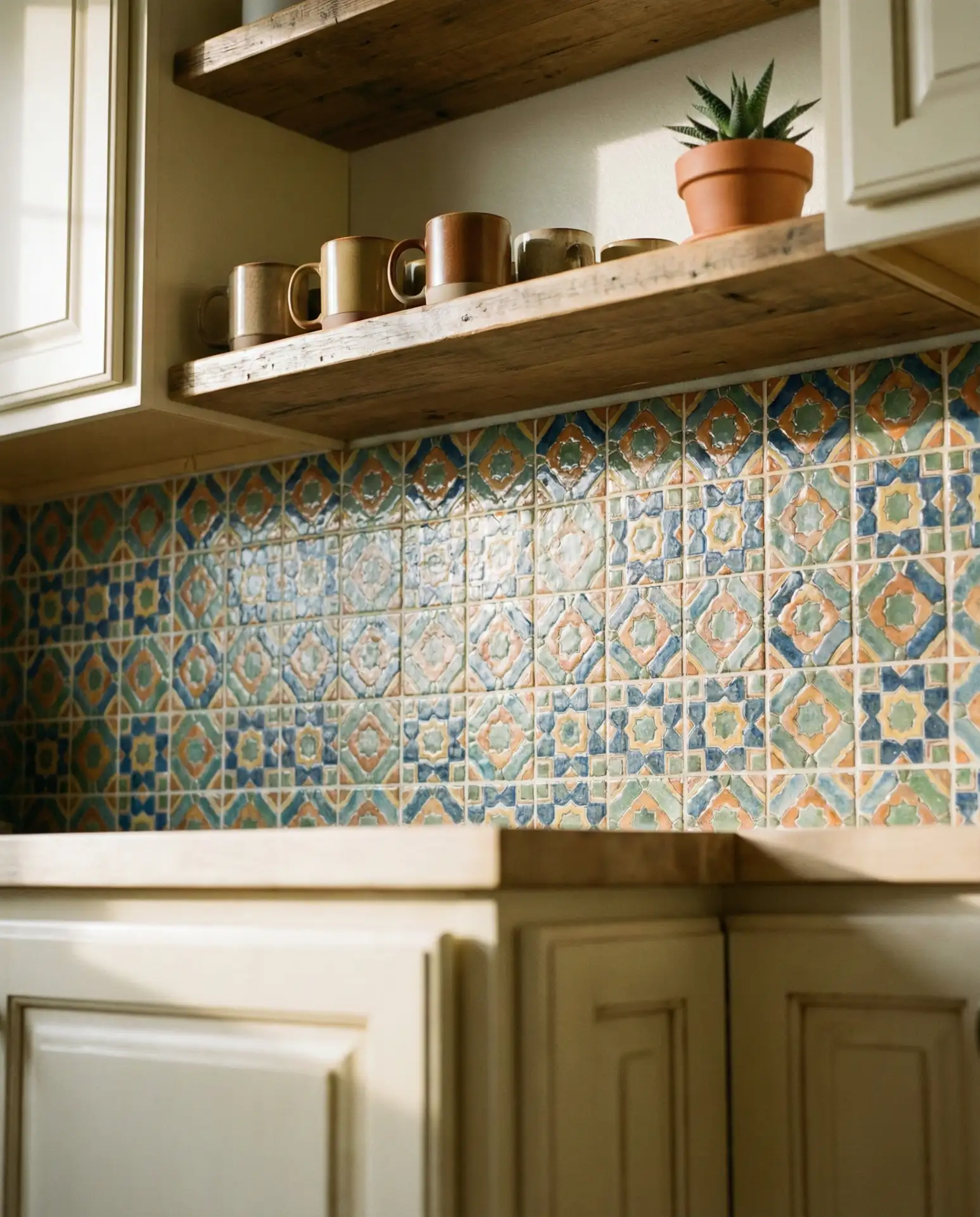
When you commit to neutral cabinets and walls, the backsplash becomes your opportunity for personality. Creamy white cabinets provide the perfect backdrop for a bold and vibrant tile installation, whether that’s geometric patterns, hand-painted ceramics, or colorful zellige tiles. This approach lets you experiment with color in a way that’s relatively easy to change if your tastes evolve.
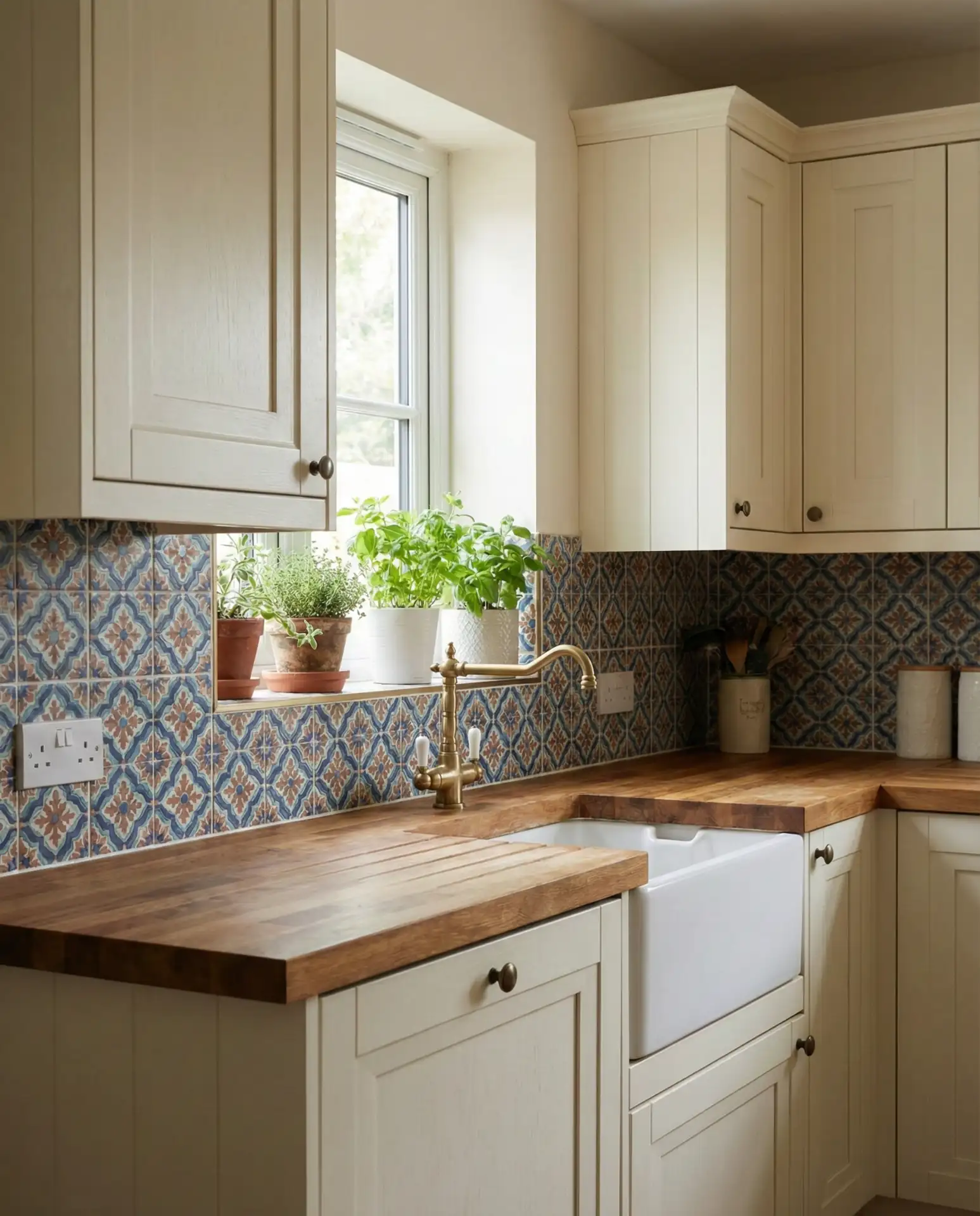
In cities like Austin and Nashville, where homeowners tend to embrace eclectic style, this formula is everywhere. The tile is where the budget can vary dramatically—from $8 per square foot for basic ceramic patterns to $40+ for artisan handmade tiles. The investment is worth it if you’re keeping cabinets neutral, as the backsplash effectively becomes the room’s jewelry.
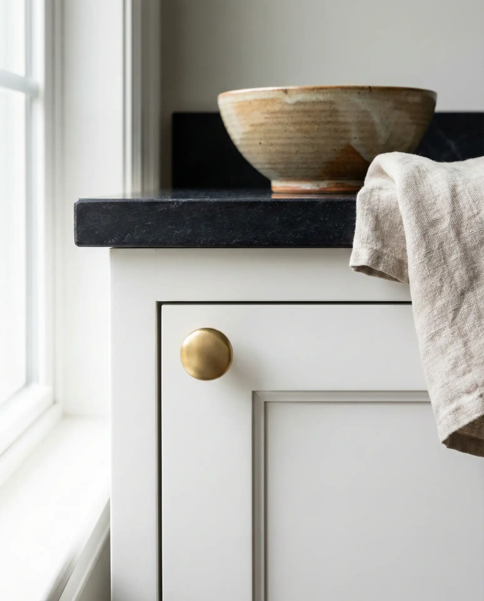
10. Pale Gray Cabinets with Warm Wood Floors
Soft gray cabinets have staying power precisely because they’re so adaptable. When you pair them with warm-toned wood flooring, you create a relaxing balance between cool and warm that prevents the space from feeling either sterile or too busy. This neutral foundation works beautifully in open floor plans where the kitchen flows into living areas, providing visual continuity without requiring identical finishes throughout.
The most common mistake with gray cabinets is choosing a shade that’s too cool or blue-toned, which can make the kitchen feel institutional rather than inviting. Always test your gray sample against your actual flooring and countertop materials, and view it in both natural and artificial light. A gray with slight greige undertones will feel much warmer and more livable than a pure cool gray.
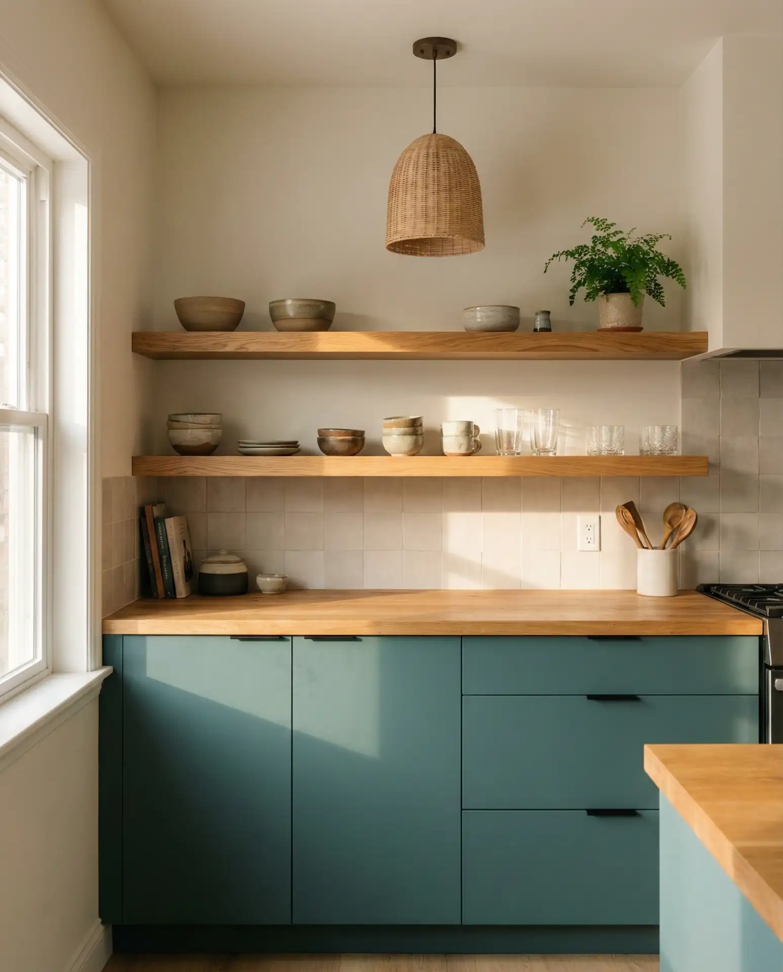
11. Deep Teal Lower Cabinets with Natural Upper Shelving
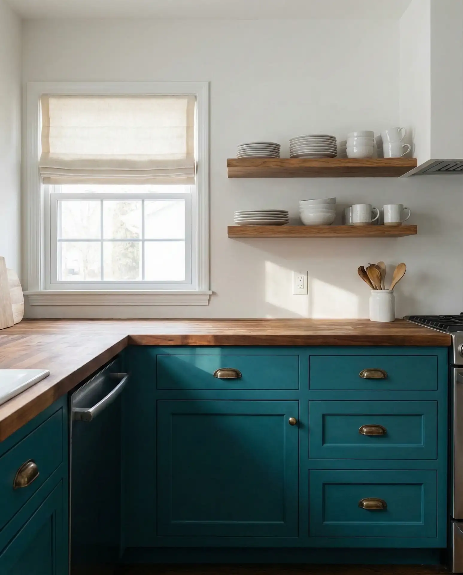
Teal brings an unexpected richness to kitchens that want color without going full jewel tone. When applied to lower cabinets with open natural wood shelving above, you get the best of both worlds: grounding color below and airy display space up top. This unique combination works especially well in cottage- and coastal-inspired kitchens where you want personality without overwhelming walls or sacrificing functionality.
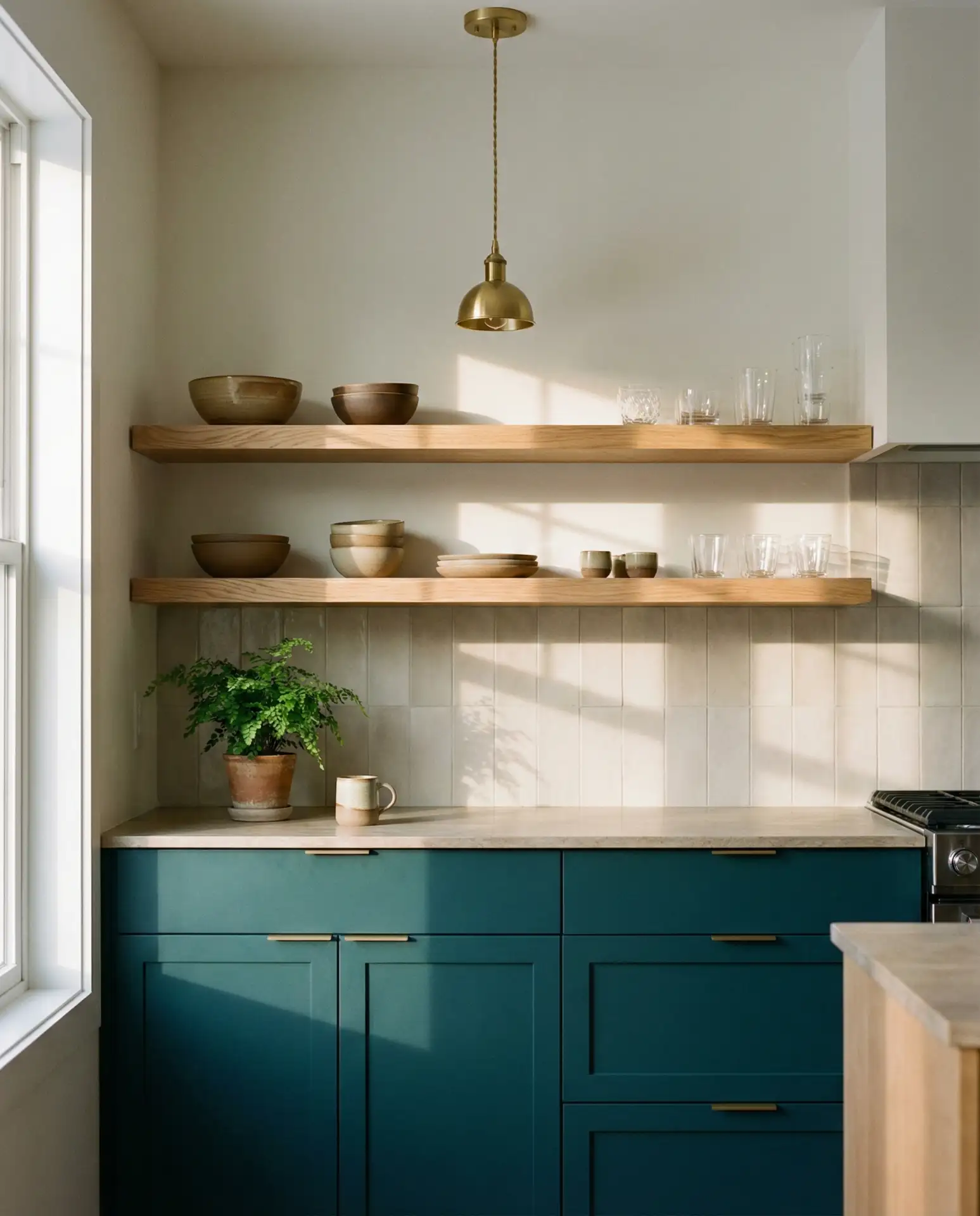
This works best in homes where you’re comfortable with some maintenance—open shelving requires regular dusting, and teal cabinets show dust and fingerprints more readily than lighter shades. That said, homeowners who commit to this look tend to love it fiercely. The combination feels collected and personal rather than builder-grade, and the shelving gives you a reason to invest in beautiful everyday dishes you’ll actually enjoy using.
12. Butter Yellow Accent Wall with White Perimeter
A soft butter-yellow accent wall instantly makes a kitchen feel sunnier, even on gray days. When the rest of your walls and cabinets remain white, that single yellow wall becomes a cheerful focal point rather than overwhelming the space. This is a particularly smart choice in kitchens that face north or have limited natural light, where you need all the brightness you can get without resorting to harsh artificial solutions.
In the Pacific Northwest, where cloudy weather dominates much of the year, designers often recommend exactly this approach to clients who want color but worry about commitment. The yellow feels optimistic without being childish, and because it’s contained to one wall, you can repaint it easily if you decide to change direction in a few years. It’s low-risk color therapy for your kitchen.
13. Walnut Brown Cabinets with Warm Cream Walls
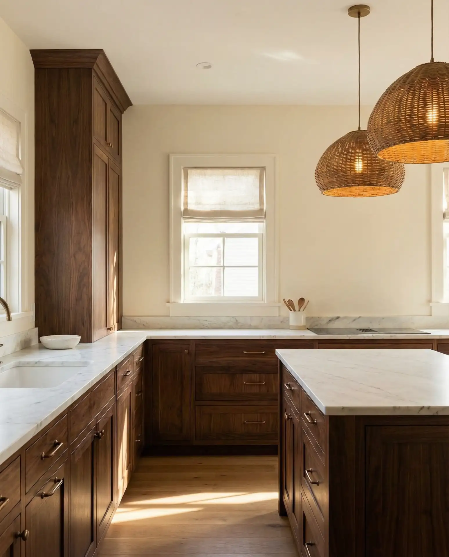
Rich brown cabinets with walnut finishes create an immediate sense of quality and permanence in a kitchen. When paired with soft cream wall paint, the wood tones become the star without making the space feel dark. This combination is particularly popular in 2026 as homeowners move away from the gray-everything trend and embrace warmer, more earth-tone palettes that feel grounded and substantial.
From a practical standpoint, walnut cabinets are an investment—expect to pay significantly more than painted options. However, they age beautifully and hide wear better than lighter woods. Many homeowners find that the upfront cost pays off in longevity and timeless appeal. If real walnut is out of budget, high-quality walnut veneer or even well-done walnut-stained oak can deliver similar warmth at a fraction of the price.
14. Soft Blue-Gray Island with White Perimeter Cabinets
Painting just the island in a soft blue-gray while keeping perimeter cabinets white creates instant visual interest without the commitment of coloring the entire kitchen. This modern approach works beautifully in kitchens where the island serves as both workspace and gathering spot, essentially turning it into the room’s furniture piece. The subtle color adds depth without disrupting the kitchen’s overall neutral lightness.
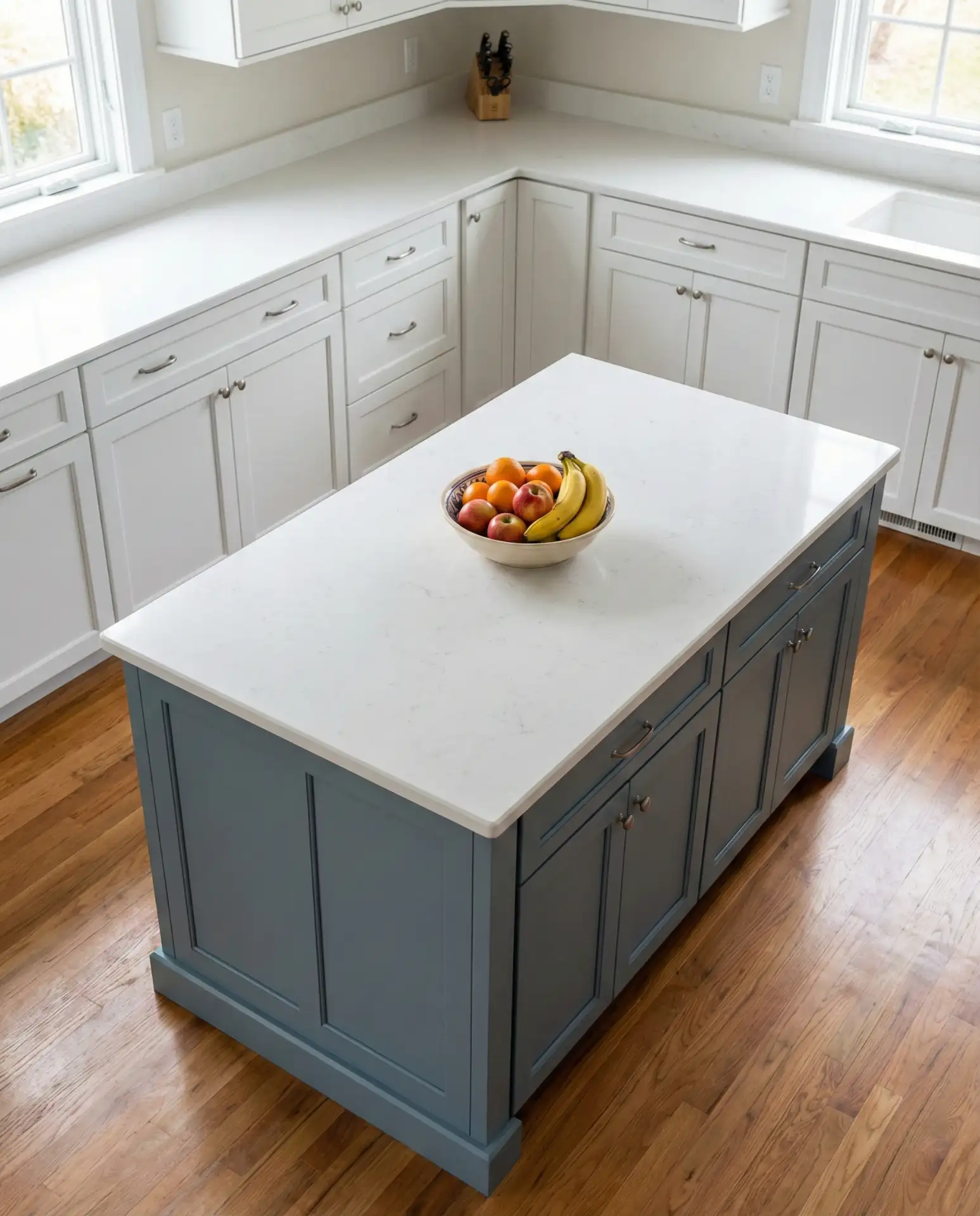
This is one of those changes that delivers maximum impact for relatively minimal cost. If you already have an island, it’s simply a weekend paint project rather than a full renovation. The key is choosing a blue-gray that leans slightly warm rather than icy—test samples against your white cabinets to ensure they feel harmonious rather than jarring. The contrast should feel intentional but not stark.
15. Rustic Outdoor Kitchen with Stone and Cedar
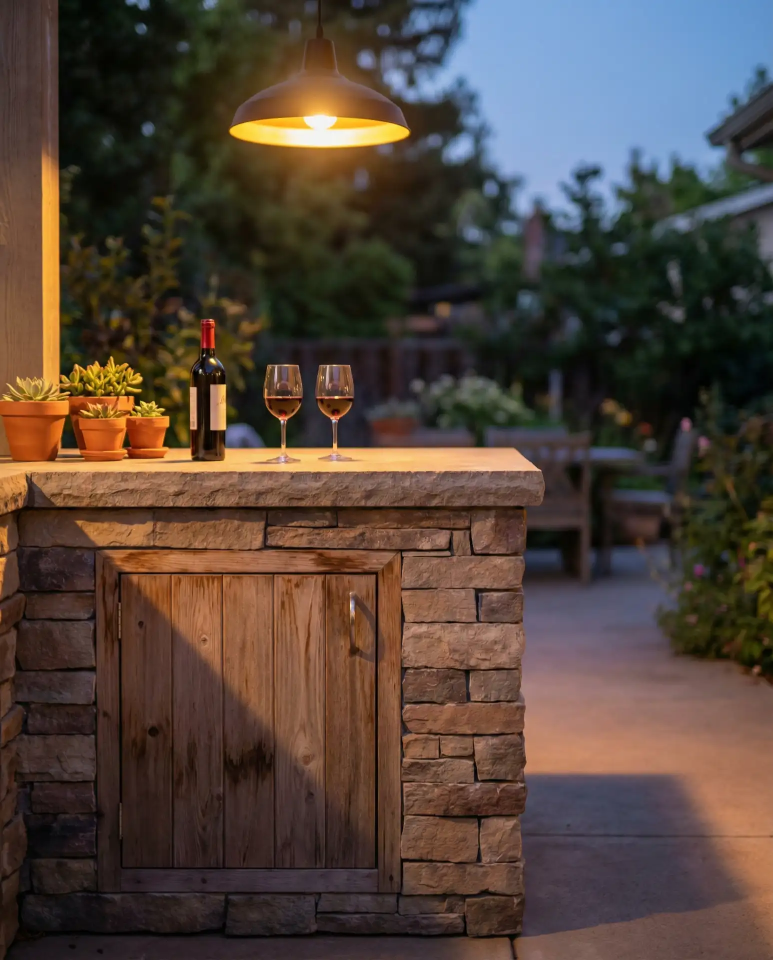
The color palette of an outdoor kitchen leans heavily on natural materials rather than paint, with stone in grays and taupes paired with warm cedar or ipe wood creating a rustic yet refined look. This earthy combination withstands weather while feeling like an intentional extension of your home’s interior. The beauty here is in texture and patina rather than a specific paint color, letting materials age gracefully outdoors.
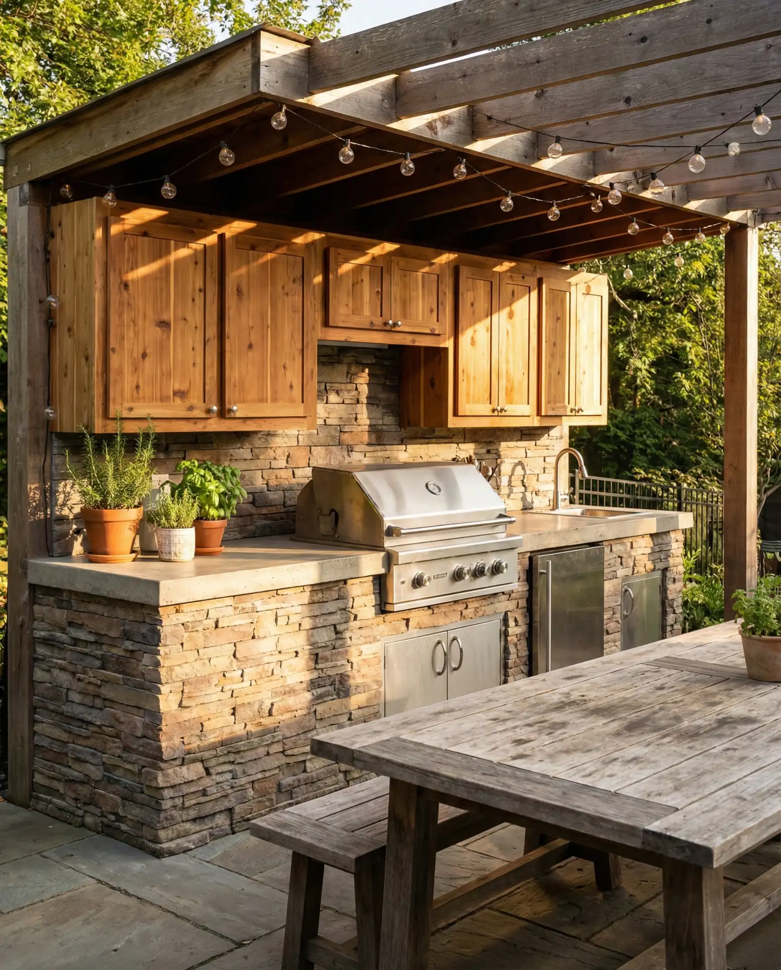
Outdoor kitchens work best in regions with extended warm seasons—California, Texas, Florida, and the Southwest lead in outdoor kitchen installations. If you’re in a climate with harsh winters, choose materials rated for freeze-thaw cycles and ensure proper drainage to prevent water damage. The initial investment is significant, typically $5,000-$25,000 depending on features, but it extends your living space and adds considerable value to your property.
16. Black Lower Cabinets with Light Wood Uppers
This dramatic two-tone combination flips the traditional formula by placing dark color on the bottom and light material on top. Black lower cabinets ground the space and hide the inevitable scuffs and spills that happen at floor level, while light-stained cabinets in oak or maple keep the upper portion of the kitchen from feeling heavy. It’s a modern twist on two-tone kitchens that feels fresh in 2026 precisely because it defies convention.
One homeowner I know in Brooklyn tried this in her galley kitchen and was initially worried the black would make the narrow space feel smaller. Instead, she found that the dark base actually receded visually, while the light wood uppers drew the eye upward, making the ceiling feel higher. She did make sure to install good task lighting under the upper cabinets, which is crucial with this scheme.
17. Warm Terra Cotta Tile Backsplash with Cream Cabinets
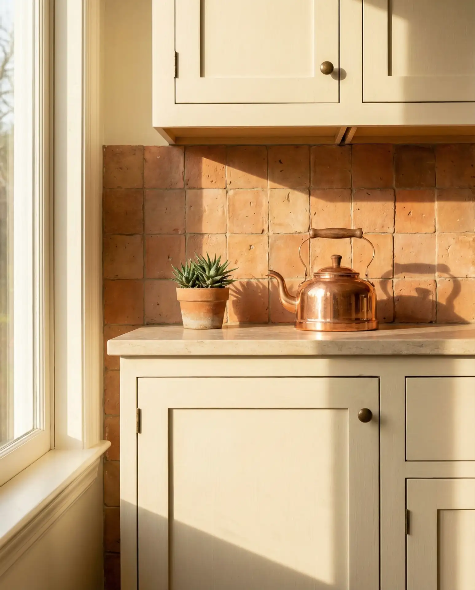
Terra cotta tile in elongated subway or zellige formats brings an earthy, handmade quality to kitchens with neutral cream cabinets. The warm orange-red tones add instant personality and work particularly well in farmhouse and Mediterranean-inspired spaces. Unlike paint, which you commit to for large surfaces, the backsplash lets you experiment with this earth tone in a contained area that’s relatively easy to change if you eventually tire of it.
The cost of handmade terra cotta tile varies wildly depending on whether you choose domestic or imported options. Domestic terra cotta runs $10-18 per square foot, while imported Spanish or Moroccan tiles can reach $25-40 per square foot. For a standard backsplash area of 30-40 square feet, budget $500-$1,500 for materials. Installation adds another $300-600 depending on your region and the complexity of the pattern.
18. Pale Mint Cabinets in a Tiny Cottage Kitchen
Pale mint green feels simultaneously nostalgic and current, especially in tiny cottage kitchens where you want color that doesn’t overwhelm limited square footage. This pastel hue reflects light beautifully and creates a cheerful atmosphere without the visual weight of darker shades. When paired with white countertops and simple hardware, mint cabinets deliver charm without sacrificing the practicality needed in a compact space.
In coastal areas like Cape Cod and Maine, mint green has long been a traditional cottage color that’s now experiencing renewed appreciation. The key to keeping it from feeling saccharine is pairing it with vintage or antique elements—aged brass hardware, reclaimed wood counters, or vintage textiles. These authentic touches prevent the mint from reading as overly cute and instead make it feel like a carefully curated choice.
19. Charcoal Gray Walls with Natural Wood Open Shelves
Deep charcoal walls create a cocooning effect that makes open natural wood shelving pop as both functional storage and a sculptural element. This bold and vibrant choice works surprisingly well in kitchens with good natural light, where the dark walls recede and let the displayed dishes, cookware, and pantry items become the visual focus. It’s a modern approach that feels more like a curated gallery than a traditional kitchen.
A common mistake here is using charcoal walls with closed cabinets in a similar dark tone, which can make the space feel cave-like. The open shelving breaks up the darkness and adds essential visual breathing room. Expert designers recommend this combination for kitchens with at least 150 square feet and multiple light sources. In smaller or darker spaces, consider using the charcoal on just one accent wall.
20. Warm White Cabinets with Black Countertops and Gold Hardware
The classic combination of white cabinets and black countertop surfaces gets elevated with warm gold hardware that adds just enough warmth to prevent the space from feeling too stark. This trio hits the sweet spot between traditional and contemporary, working beautifully in farmhouse, transitional, and even modern kitchens. The gold introduces a jewelry-like quality that makes everyday cabinet doors feel more considered.
Real homeowners report that gold hardware requires slightly more maintenance than chrome or nickel—it shows fingerprints more readily and benefits from weekly wipes with a soft cloth. However, most find this minor upkeep worth it for the warmth and elegance gold brings. If you’re concerned about the hardware looking dated, choose simple shapes in brushed or satin finishes rather than shiny brass, which tends to feel more trend-specific.
21. Deep Forest Green Full Cabinets with Brass Details
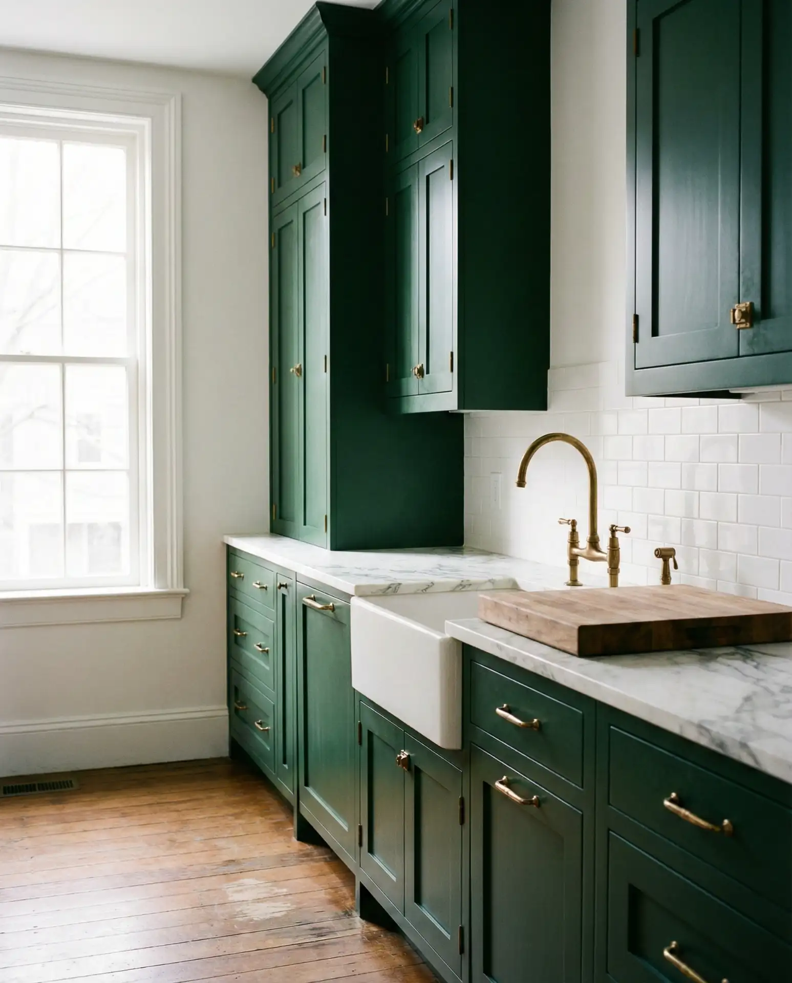
Rich forest green cabinets from floor to ceiling create a jewel-box effect that’s both bold and vibrant and surprisingly warm and inviting. When accented with aged brass hardware and fixtures, the green takes on an heirloom quality that feels like it’s been there for decades. This unique color choice works particularly well in 2026 as homeowners seek alternatives to navy and black that still deliver dramatic impact.
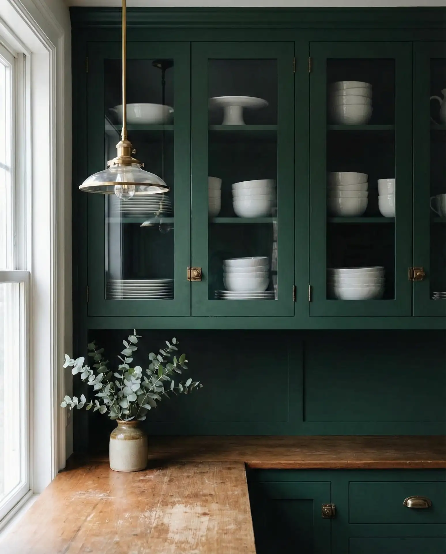
This color scheme works best in homes with high ceilings and abundant natural light. In a standard kitchen with eight-foot ceilings, consider using the forest green on lower cabinets only and keeping uppers white or glass-front to prevent the space from feeling too enclosed. The investment in quality brass hardware is worth it here—cheap brass will tarnish quickly and undermine the sophisticated look you’re after.
22. Warm Beige Cabinets with Terracotta Tile Floor
Soft beige cabinets paired with terracotta tile flooring create a layered earth-tone palette that’s incredibly relaxing and grounding. This combination has strong rustic Mediterranean influences but translates beautifully in American homes, particularly in the Southwest and California, where indoor-outdoor living is valued. The warm tones work together to make the kitchen feel like a natural gathering spot rather than a sterile work zone.
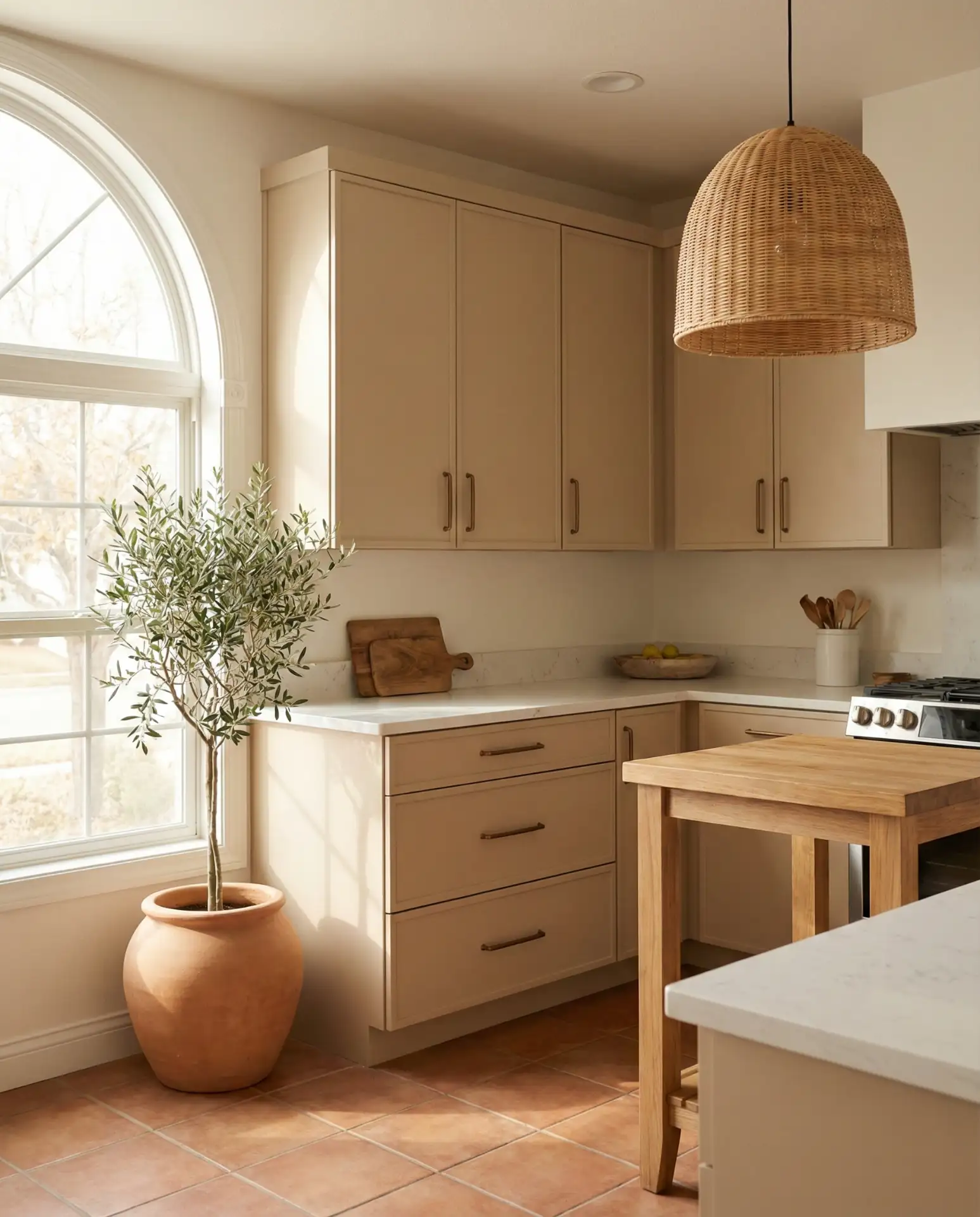
Budget considerations matter here, as quality terracotta tile flooring runs $8-15 per square foot for machine-made options and $15-30 for handmade. Installation adds another $5-12 per square foot depending on your region. However, the investment pays off in durability—terracotta tile properly sealed can last 50+ years and develops a beautiful patina over time. It’s also naturally cool underfoot, a real advantage in warm climates.
Conclusion
These kitchen color ideas for 2026 prove that you don’t have to choose between timeless appeal and current trends. Whether you’re drawn to earthy neutrals, unexpected pastels, or dramatic dark tones, there’s a color direction here that can transform your kitchen into a space you genuinely love spending time in. Take screenshots of your favorites, test paint samples in your actual lighting, and don’t be afraid to commit to the color that makes you excited to walk into your kitchen every morning. Drop a comment below and let us know which idea you’re planning to try first.