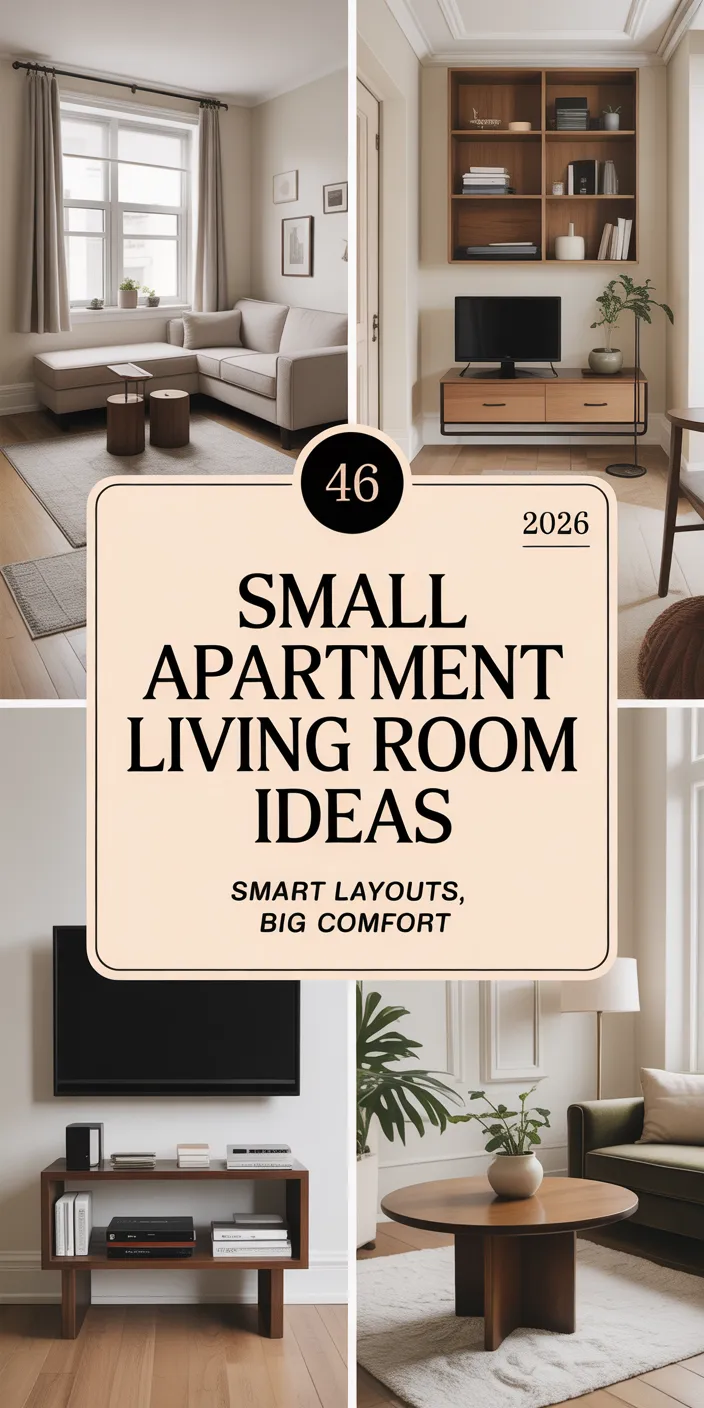
Grey living rooms have become a cornerstone of American home design, offering a sophisticated neutral backdrop that works beautifully across traditional colonials, modern lofts, and cozy ranch homes alike. In 2026, homeowners are searching Pinterest for ways to make grey feel fresh, layered, and personal—moving beyond the minimalist trends of the past decade toward spaces that feel warm, textured, and lived-in. Whether you’re drawn to dark, moody tones, airy light palettes, or unexpected color pairings, grey provides the perfect foundation. This guide walks you through inspiring ideas that blend timeless style with the latest design directions, helping you create a living room that feels both on-trend and unmistakably yours.
1. Cozy Grey and Cream Layers
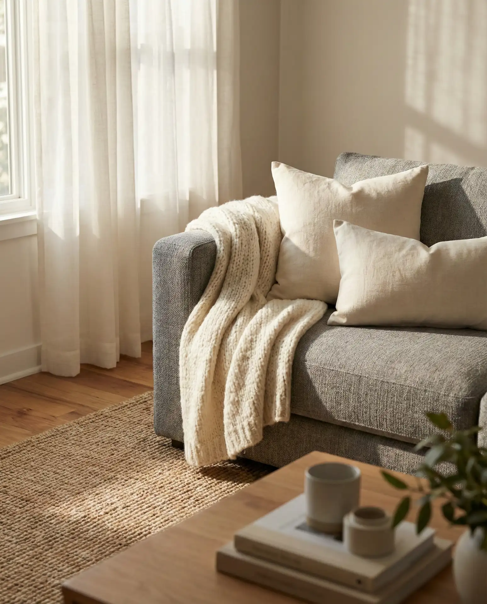
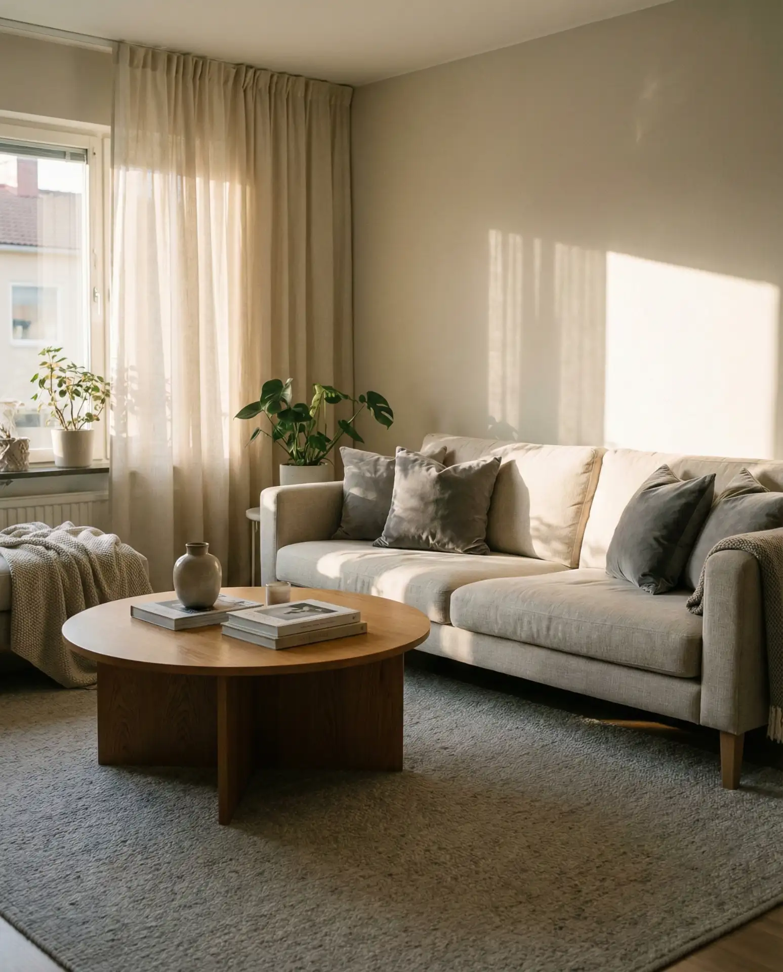
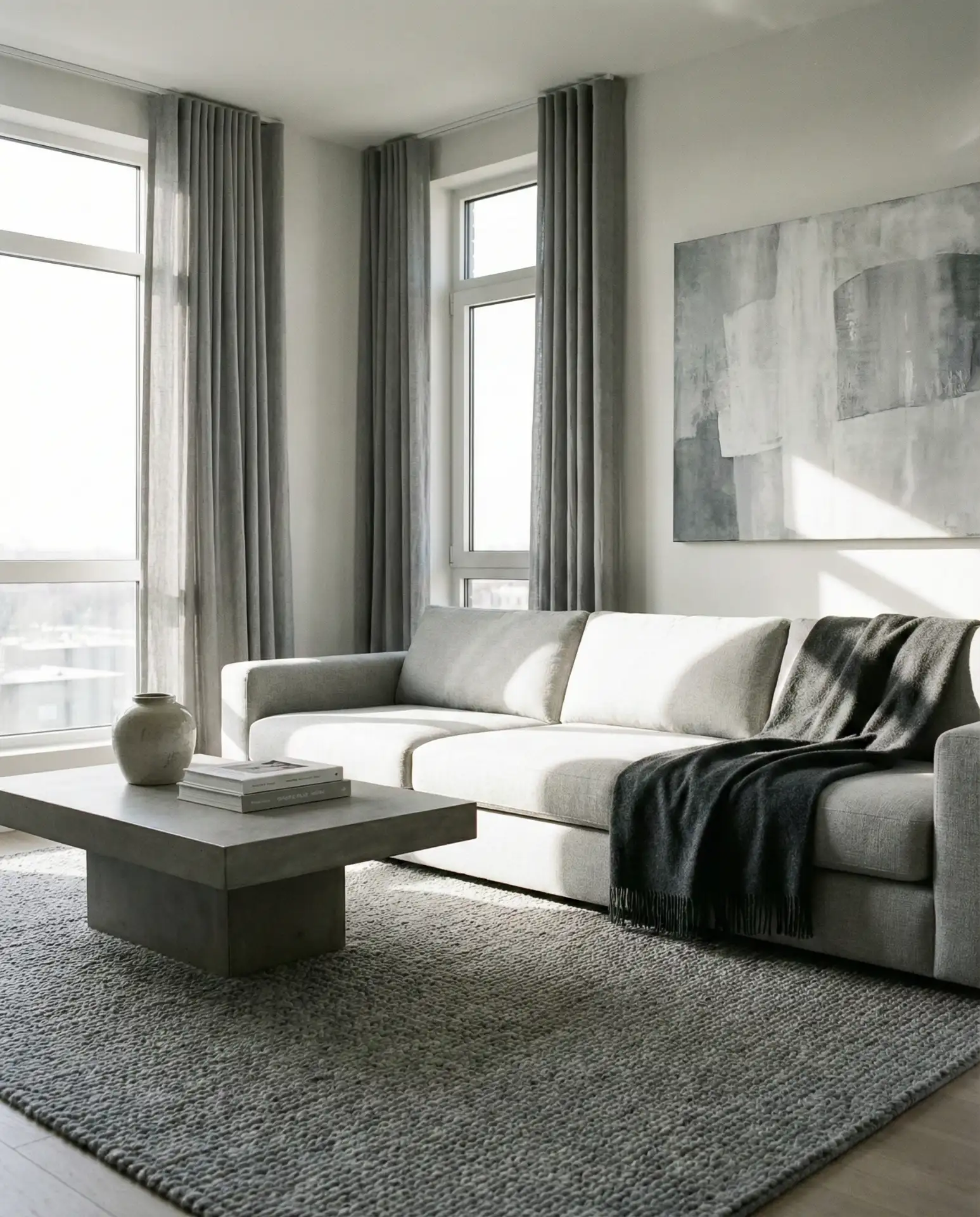
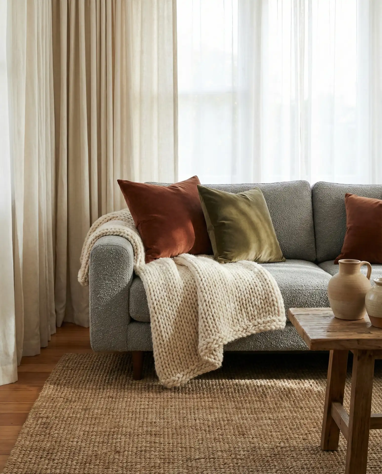
A gray sofa paired with cream and ivory throws creates an inviting foundation that feels soft without sacrificing sophistication. This combination works especially well in open-concept spaces where the living room flows into the kitchen, offering visual warmth that balances stainless steel appliances and hard surfaces. Layering different textures—linen cushions, wool blankets, a chunky knit pouf—adds depth and keeps the palette from feeling flat.
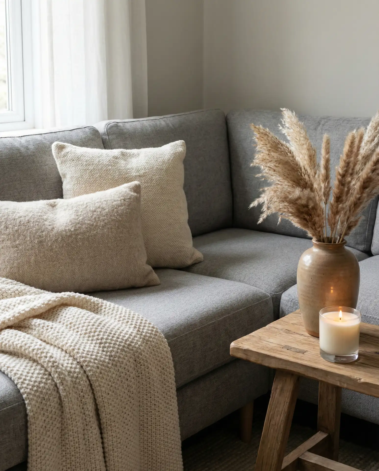
This approach works best in homes with good natural light—think south-facing windows in a Denver bungalow or a bright New England saltbox. The cream tones reflect daylight beautifully, making smaller living rooms feel more spacious. If your space lacks windows, consider adding a floor lamp with a warm bulb to mimic that soft glow and prevent the grey from reading too cool or institutional.
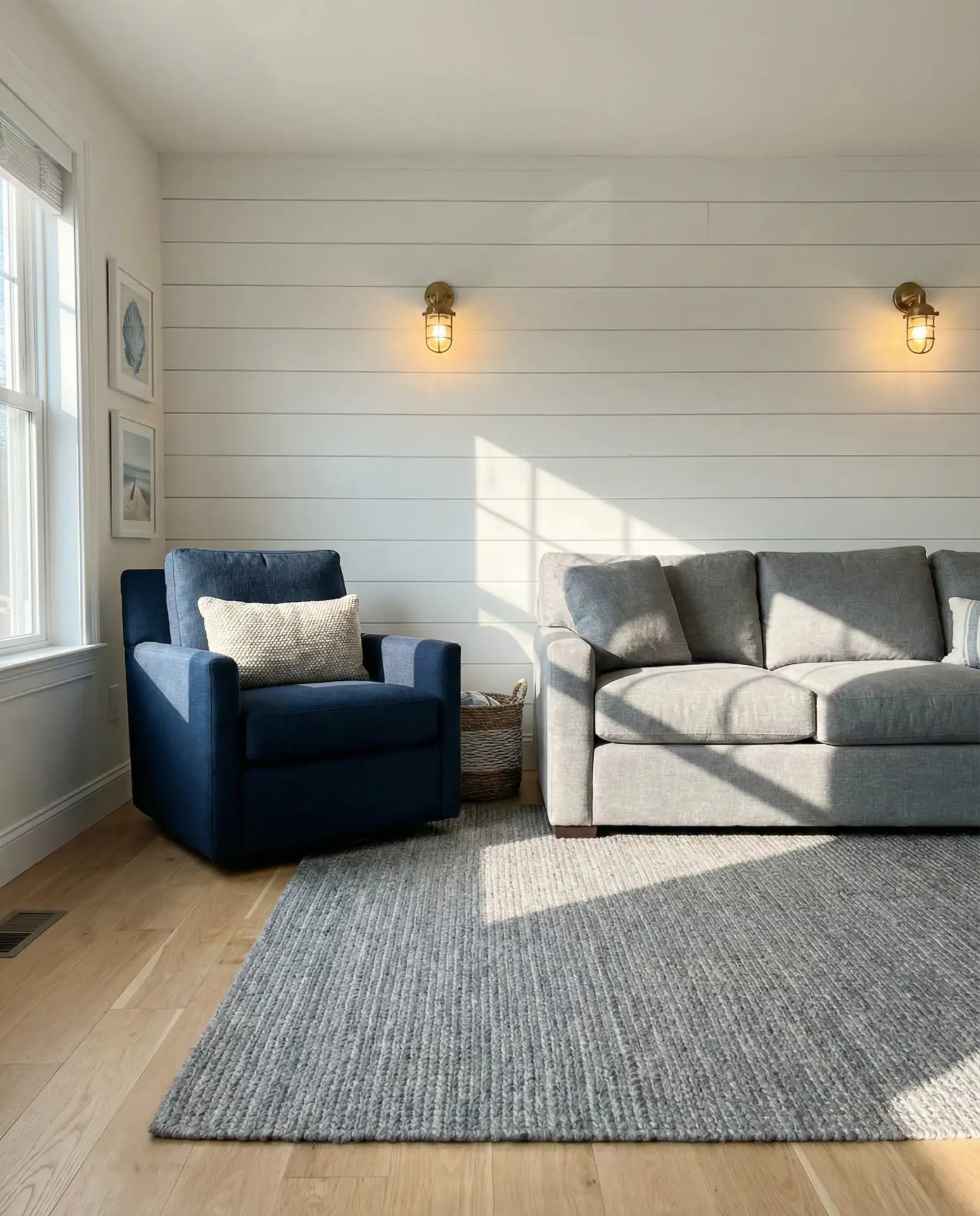
2. Navy Blue and Grey Contrast
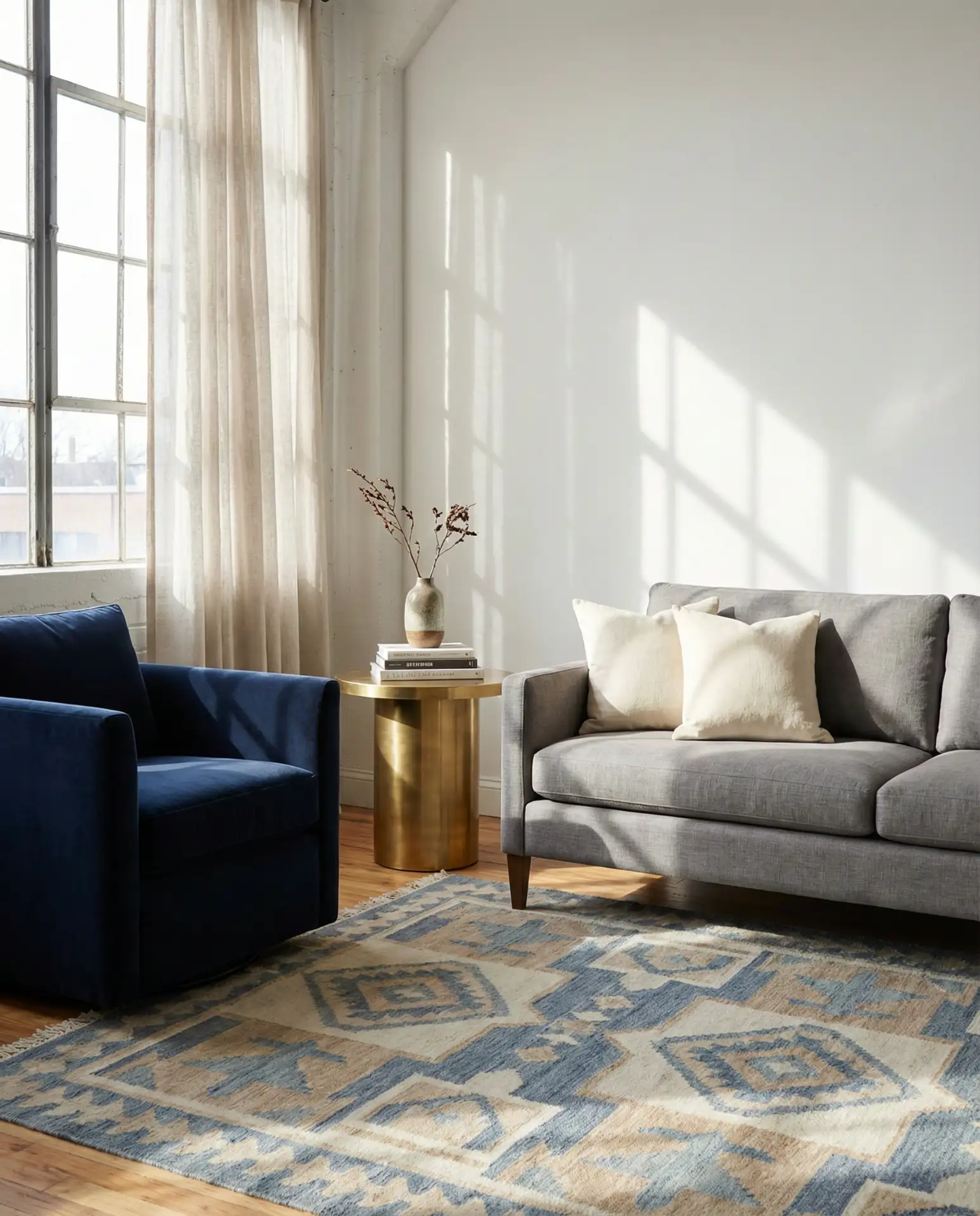
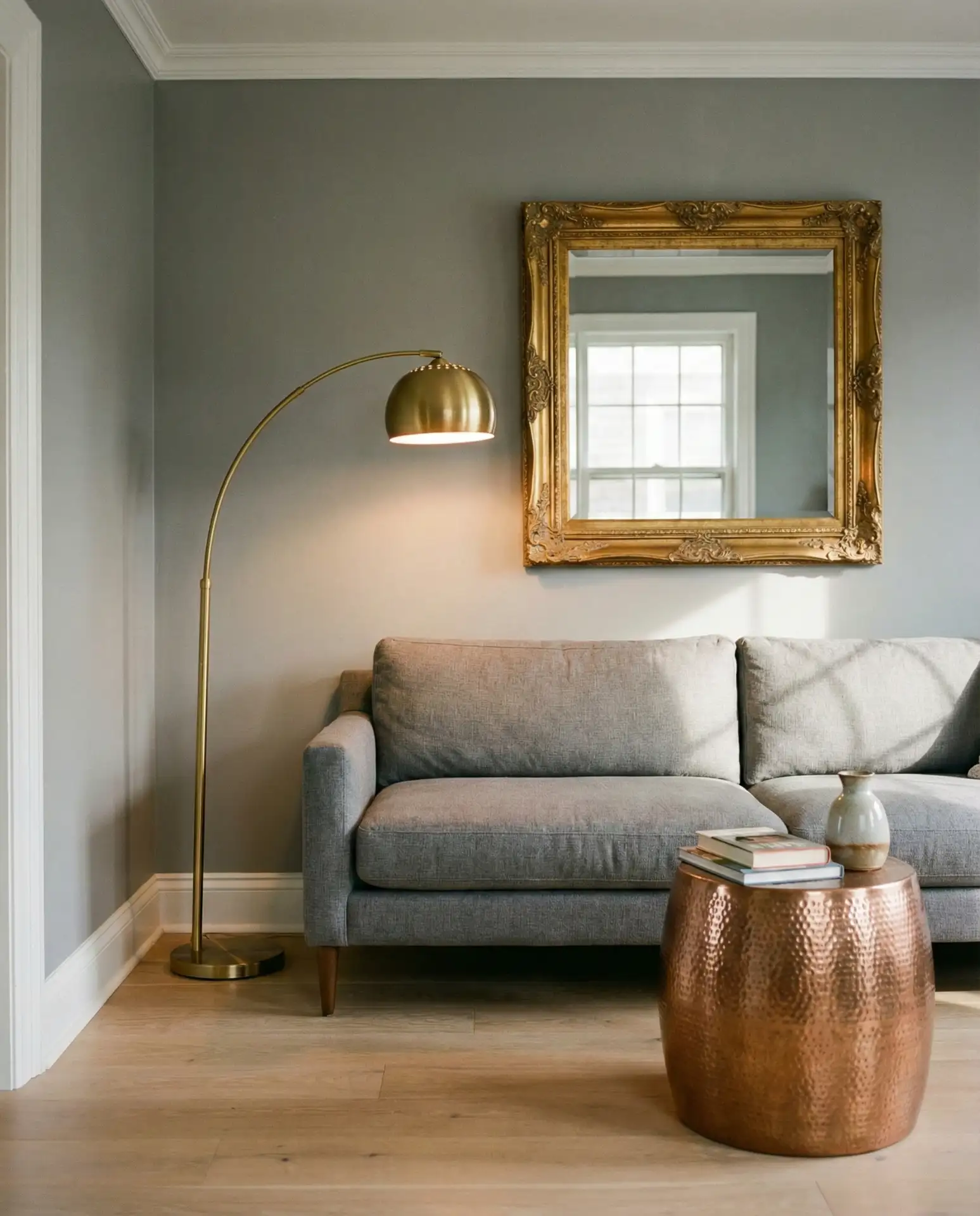
Pairing navy blue accent chairs with a medium grey sofa brings a classic, preppy energy that feels equally at home in a Boston brownstone or a California coastal cottage. The combination offers enough contrast to feel intentional without overwhelming the eye, and it grounds lighter wall colors beautifully. Add brass hardware or gold-framed mirrors to warm up the cool tones and create visual interest.
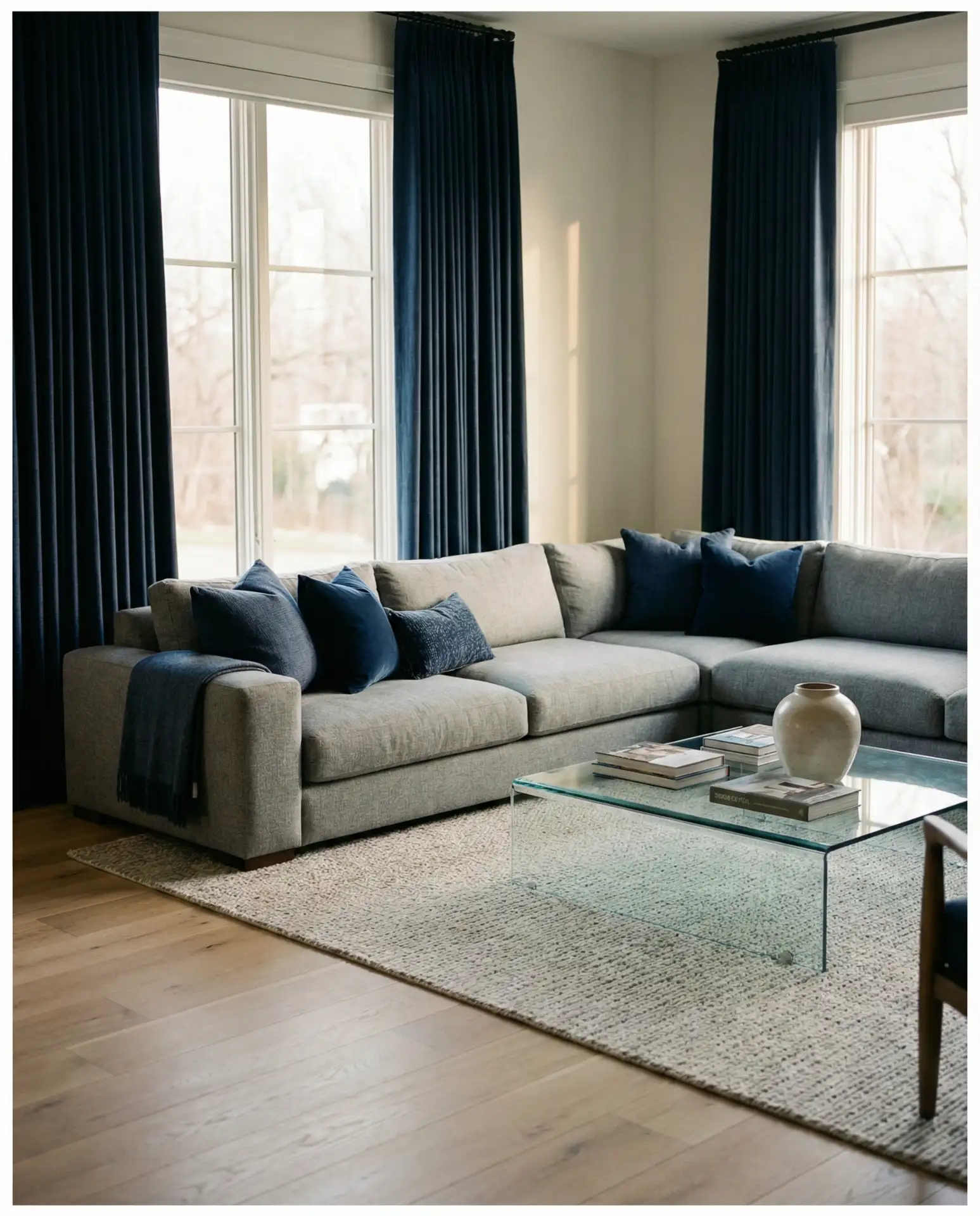
A common mistake is choosing navy that’s too dark or too saturated, which can make the room feel heavy. Test fabric swatches in your actual lighting—what looks rich in the store might read almost black at home. Aim for a navy with just a hint of brightness, especially if your living room doesn’t get strong afternoon sun.
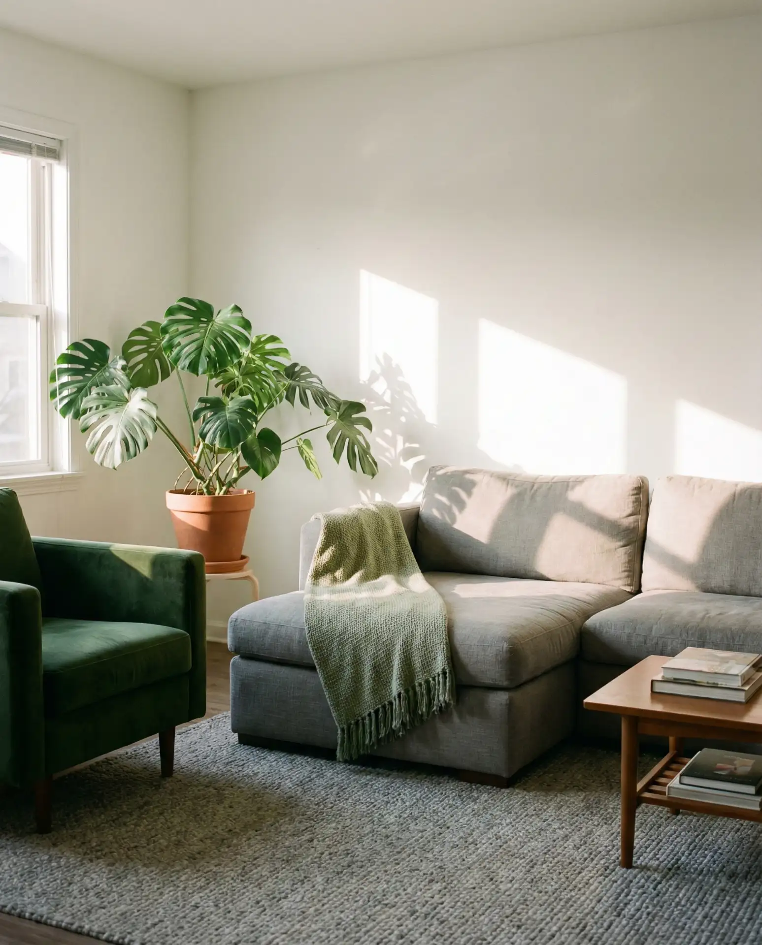
3. Sage Green and Grey Serenity
Soft sage green walls with a charcoal grey sofa create a calming, nature-inspired palette that’s trending heavily on Pinterest in 2026. This pairing works beautifully in homes near wooded areas or in urban apartments craving a connection to the outdoors. Layer in natural materials like rattan, linen, and unfinished wood to reinforce the organic feel.
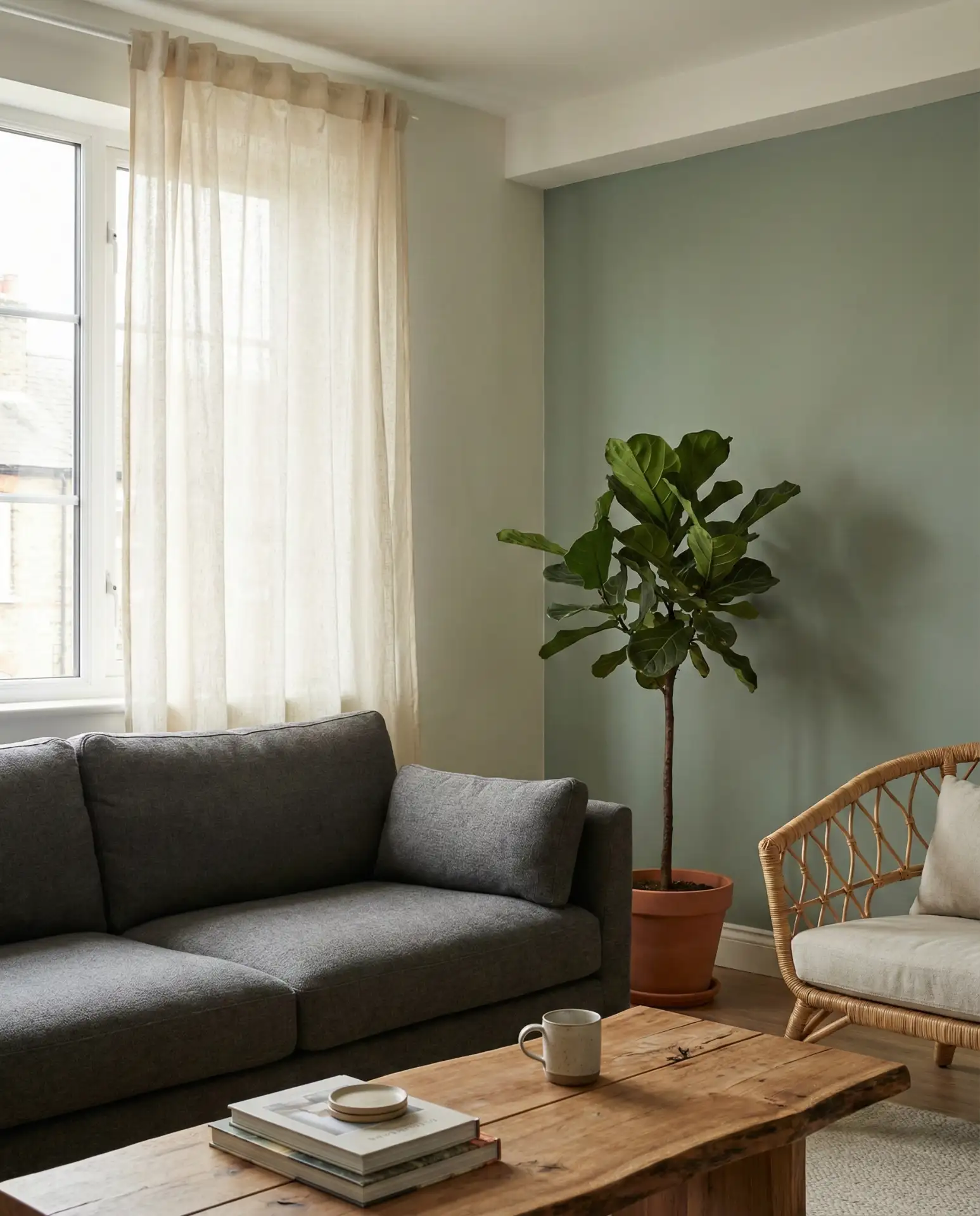
Expect to pay around $40–$60 per gallon for quality sage green paint from brands like Farrow & Ball or Benjamin Moore. The investment is worth it—cheaper paints can read too yellow or too blue under different lighting. Sample at least two shades on your wall and observe them throughout the day before committing.
4. Black and White Modern Edge
A black and white living room anchored by a grey sectional feels crisp, graphic, and unmistakably modern. Think black window frames, white walls, and grey upholstery that ties the contrast together without competing. This palette thrives in loft-style spaces with high ceilings and plenty of natural light, where the starkness reads as intentional rather than cold.
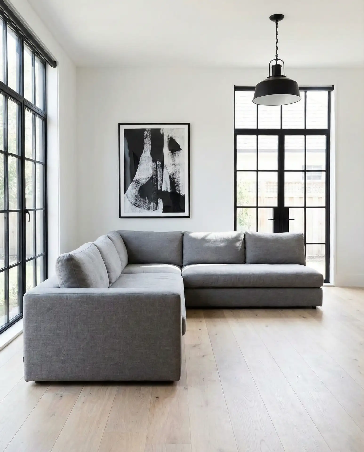
In my experience visiting homes in Brooklyn and Seattle, homeowners who nail this look always add one unexpected warm element—a caramel leather chair, a terracotta planter, or a jute rug. It keeps the space from feeling too sterile and adds a human touch that makes you actually want to sit down and stay awhile.
5. Beige and Grey Warmth
Combining beige and warm grey tones creates a cozy living room that feels grounded and inviting. This palette is particularly popular in the Midwest and South, where homeowners gravitate toward softer, more traditional color schemes. A beige sectional with grey throw pillows and a greige area rug offers a seamless transition that never feels dated.
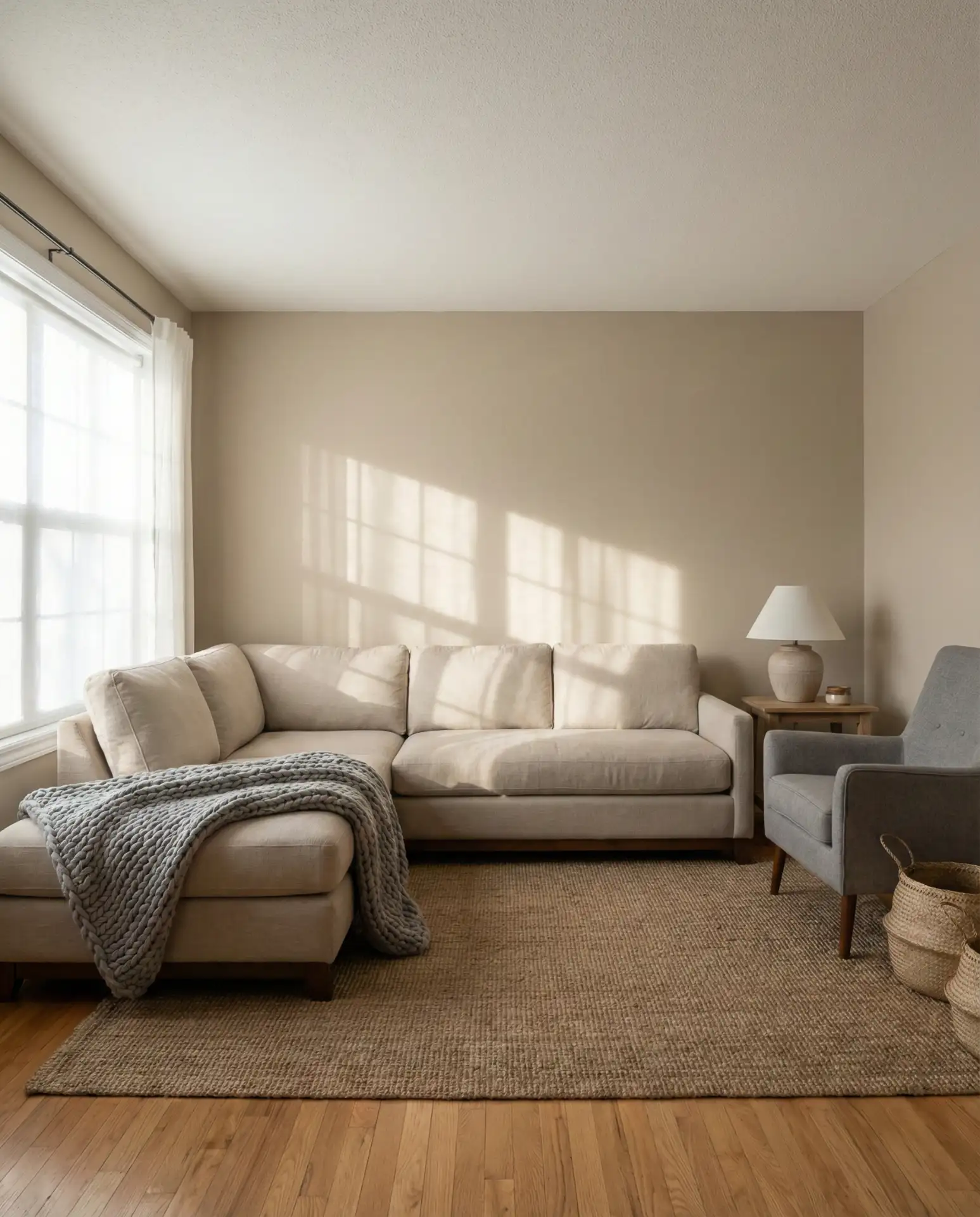
This combination works best in rooms with oak or maple flooring, where the warm undertones in the wood echo the beige upholstery. If you have cool-toned flooring like ash or white oak, lean toward greyer beiges to avoid a clash. The goal is harmony, not contrast—everything should feel like it belongs to the same tonal family.
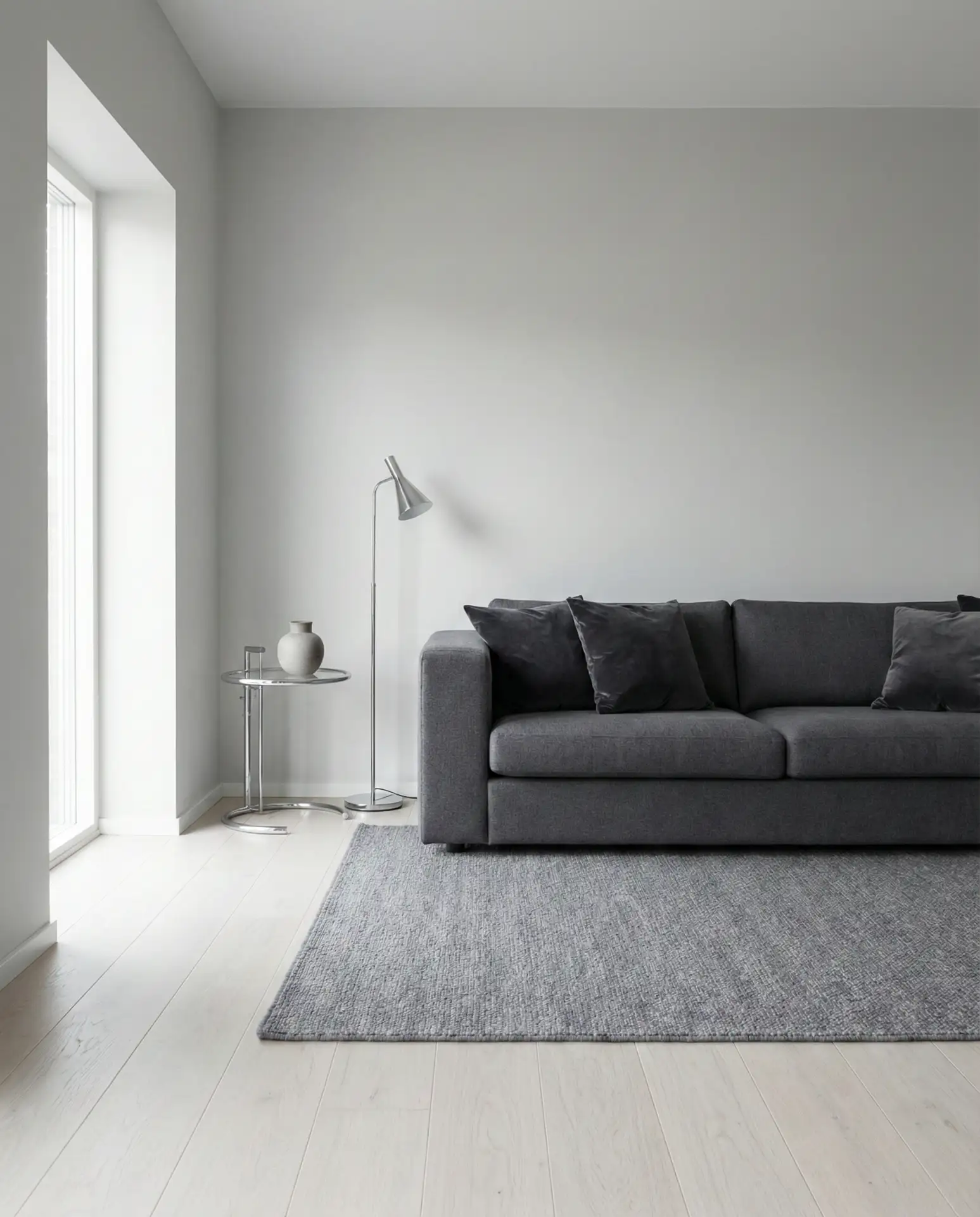
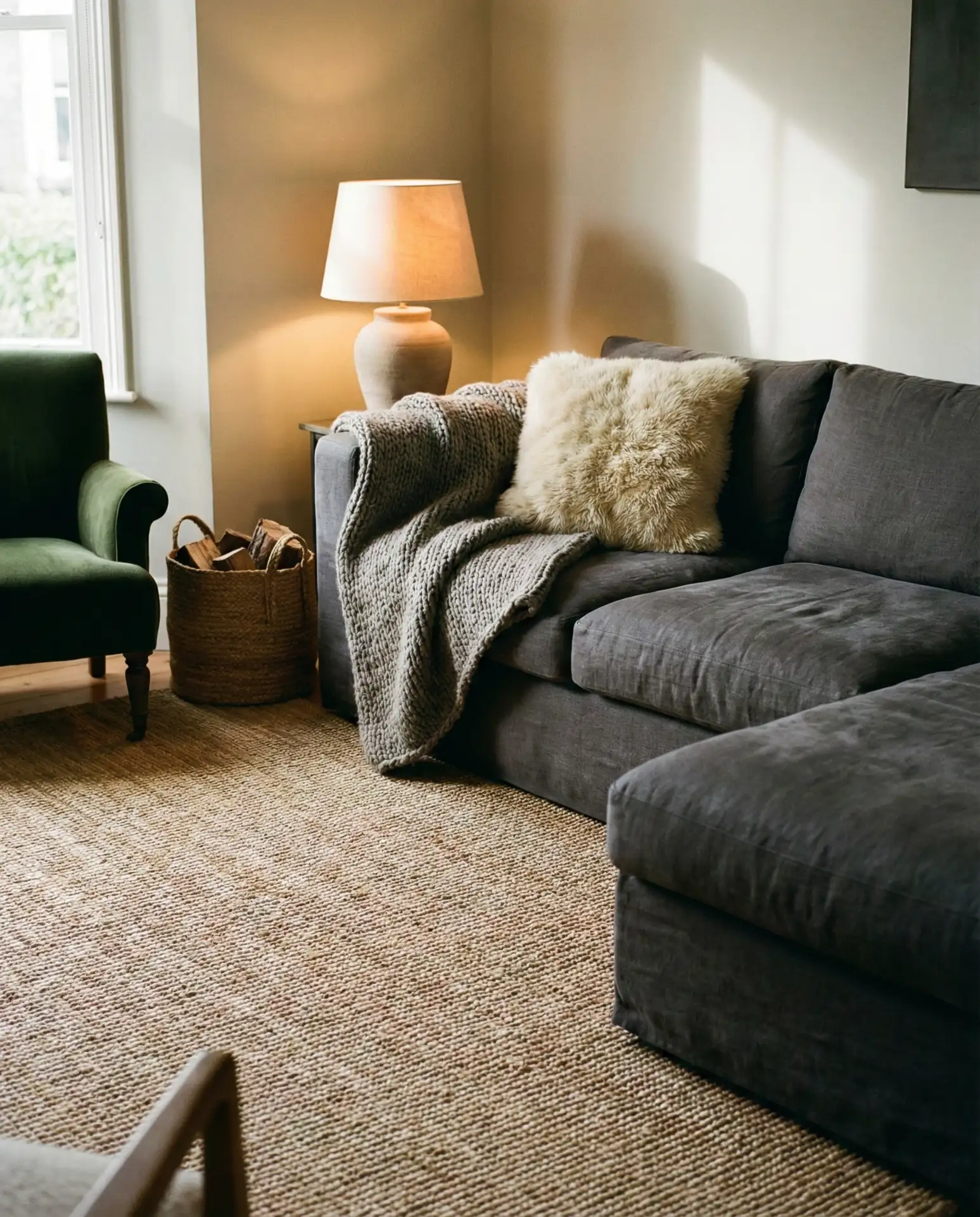
6. Dark Grey Moody Drama
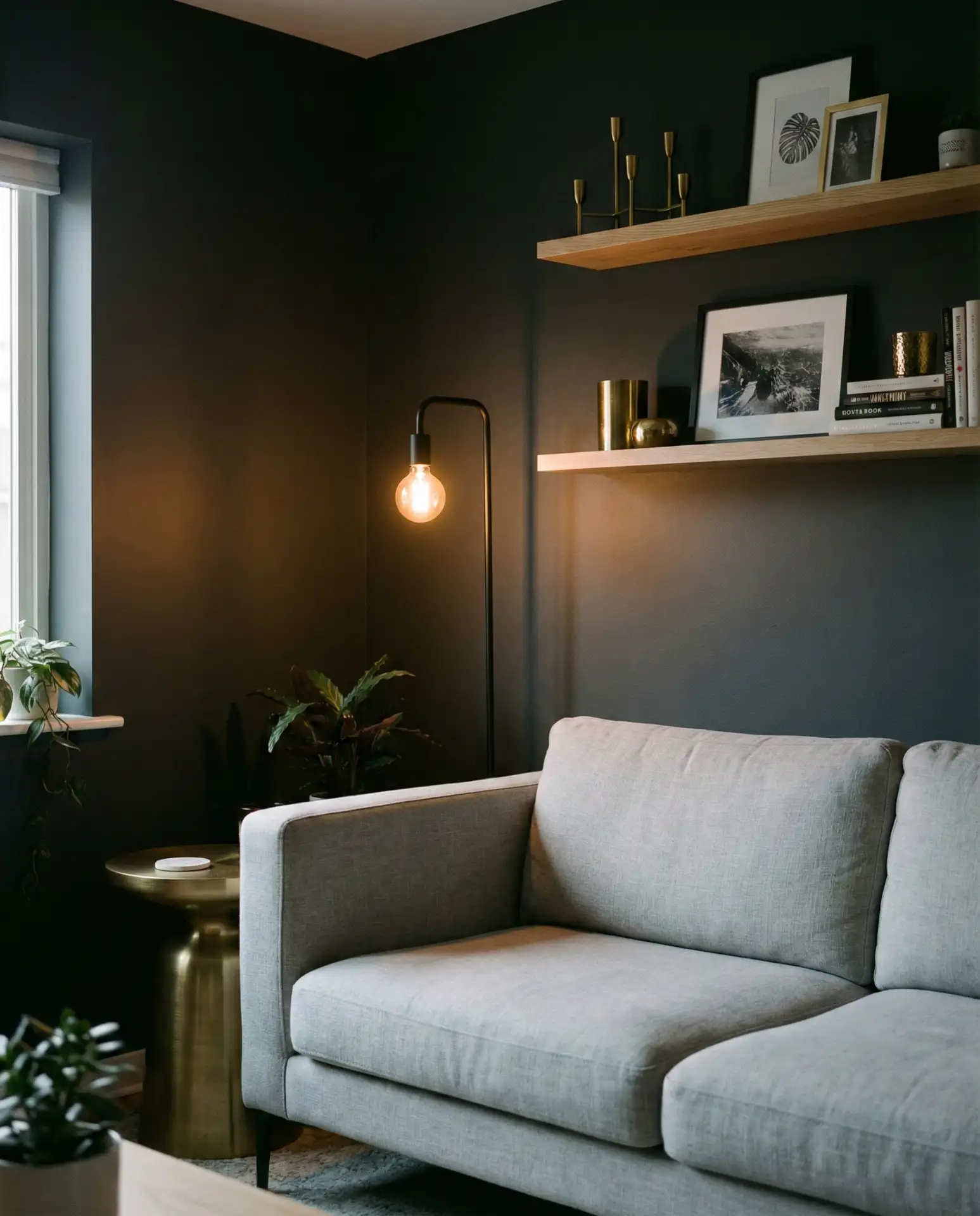
Dark charcoal walls with a lighter grey sofa create a moody, enveloping atmosphere that’s perfect for evening entertaining or movie nights. This approach requires confidence—it’s not for everyone—but when executed well, it transforms a living room into a true retreat. Balance the darkness with plenty of layered lighting: floor lamps, table lamps, and candles all help prevent the space from feeling cave-like.
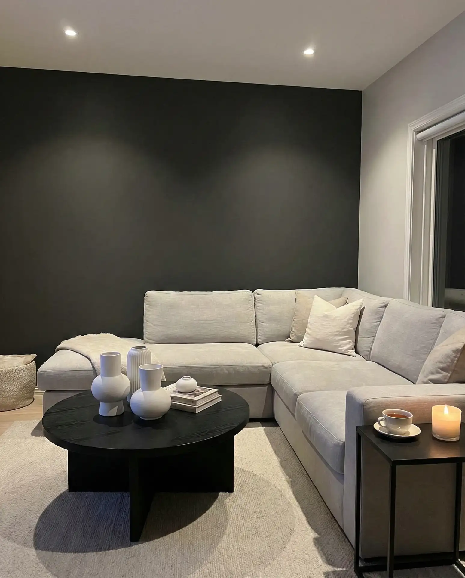
Real homeowners often underestimate how much artificial light is needed in a dark-walled room. Plan for at least three separate light sources, each with a dimmer if possible. Without this, the space can feel oppressive rather than sophisticated, especially during overcast days or long winter evenings.
7. Light Grey and Airy Whites
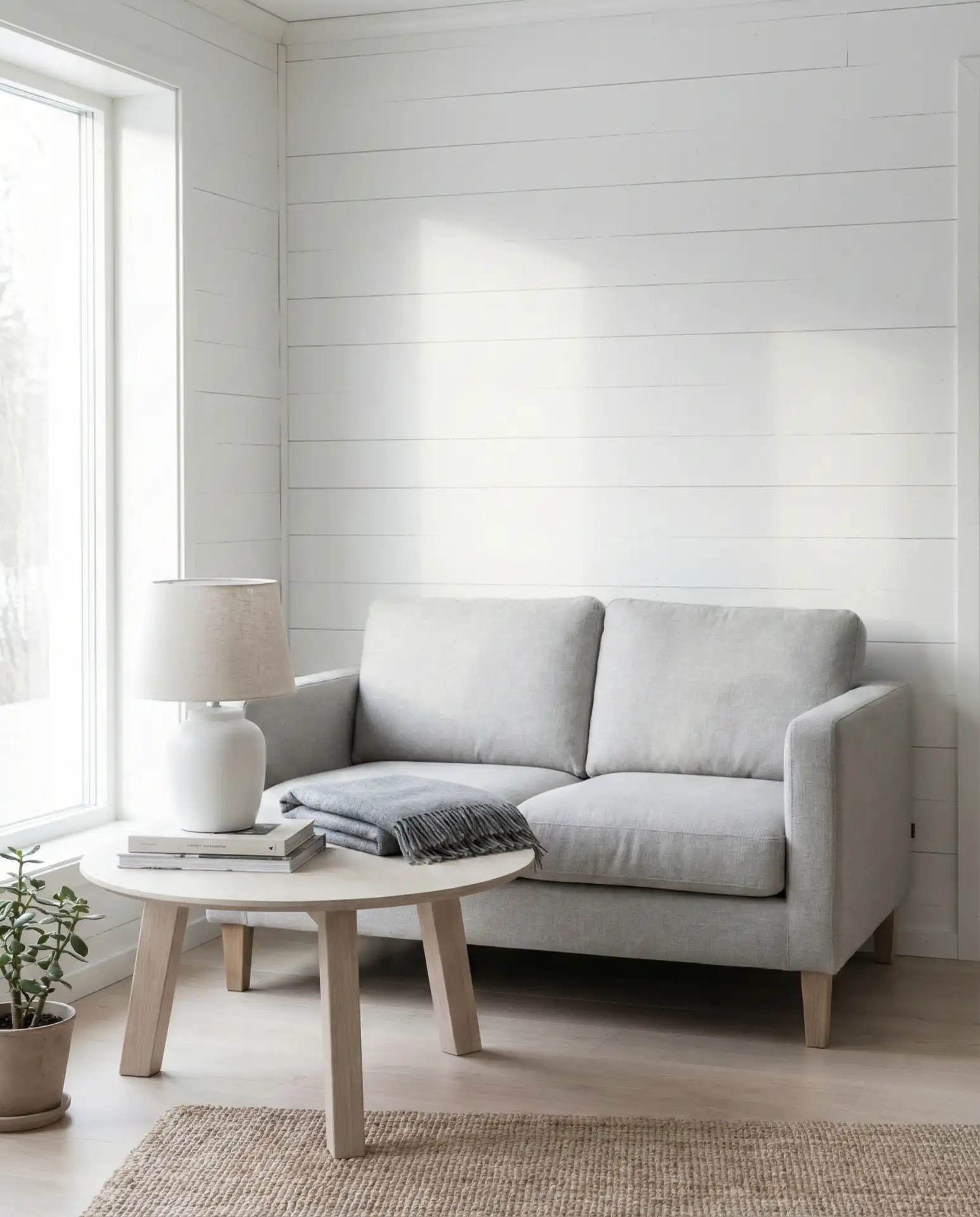
Pairing light dove grey upholstery with crisp white and trim creates a bright, Scandinavian-inspired living room that feels effortlessly clean. This palette is ideal for smaller spaces or rooms with limited natural light, as the pale tones reflect whatever light is available. Add texture through wool, linen, and shearling to keep the room from feeling too sparse.
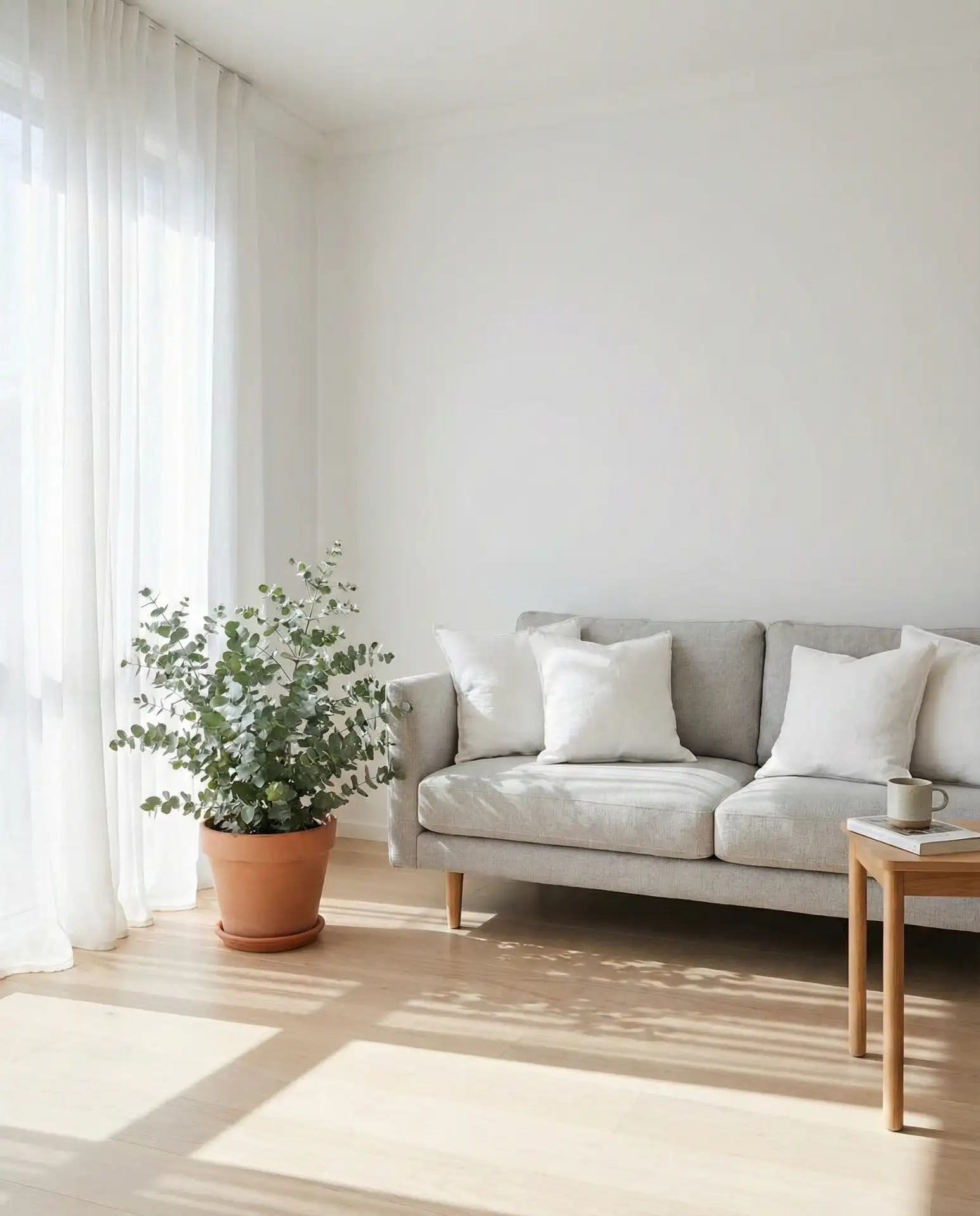
In coastal towns from Maine to Southern California, this palette is a go-to for homeowners who want a fresh, beach-adjacent feel without literal nautical clichés. The key is keeping the grey warm-toned—look for greys with just a hint of beige or taupe to prevent the room from reading too sterile or hospital-like.
8. Royal Blue Statement Pieces
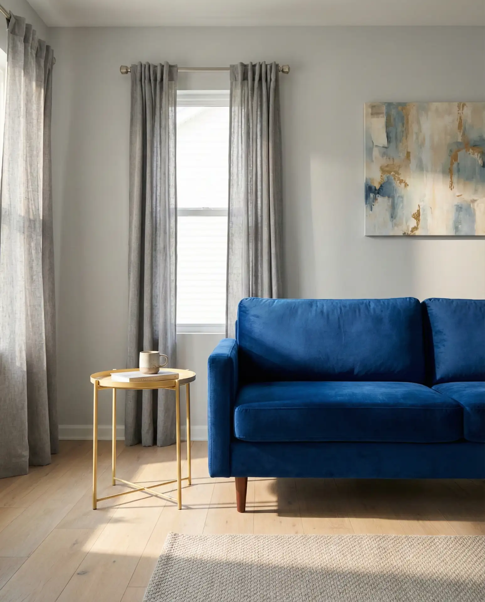
A royal blue velvet sofa against soft grey walls makes a bold, jewel-toned statement that feels both luxurious and approachable. This combination has been gaining traction on Pinterest as homeowners move away from all-neutral schemes and embrace richer, more saturated colors. Pair with brass or gold accents to amplify the luxe factor.
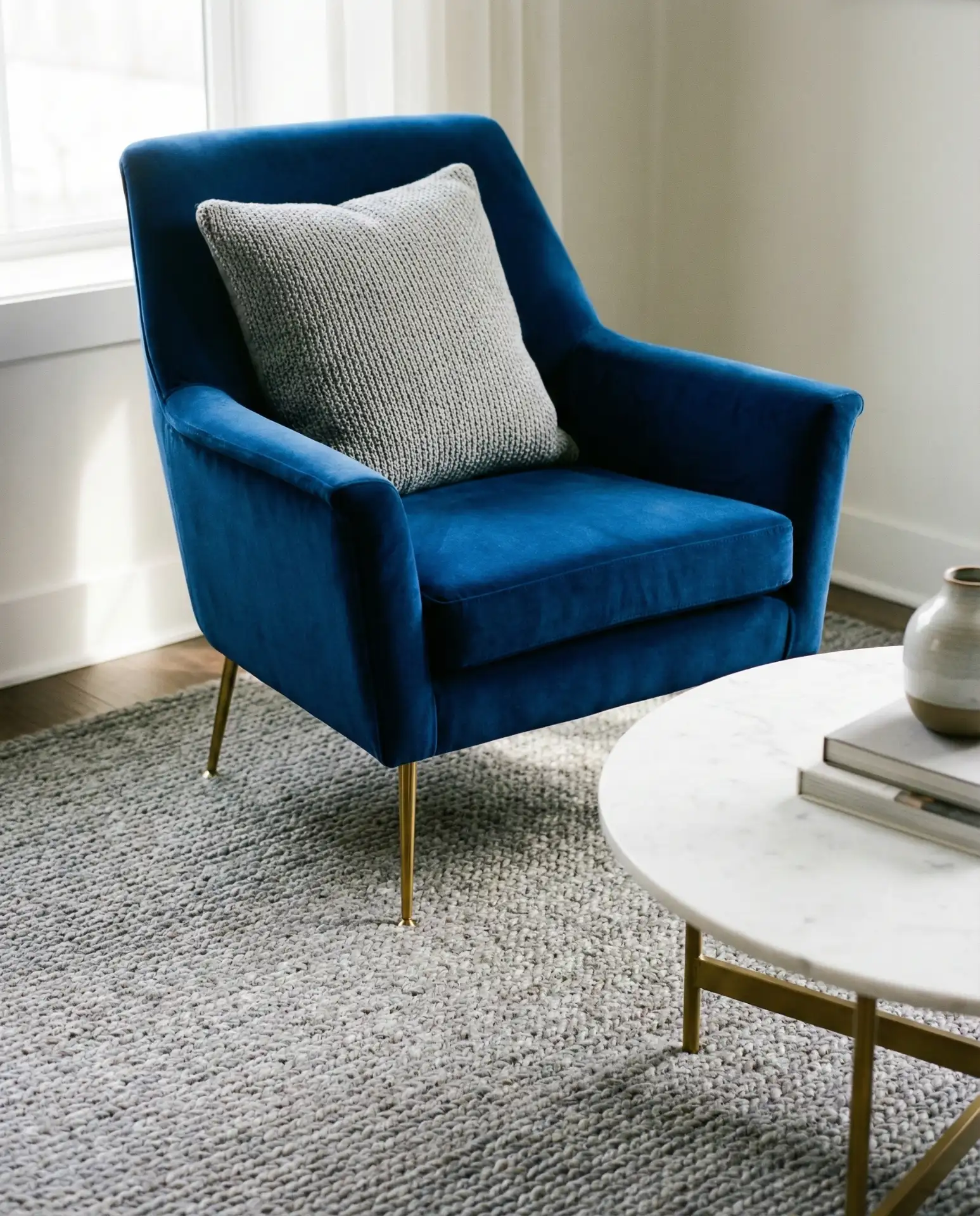
Designers often recommend this pairing for formal living rooms or spaces where you entertain frequently—the blue reads as confident and memorable without feeling trendy or juvenile. A quality velvet sofa typically runs $1,500–$3,500, but the visual impact far exceeds the investment, especially if you keep the rest of the room relatively simple.
9. Brown and Grey Earthy Balance
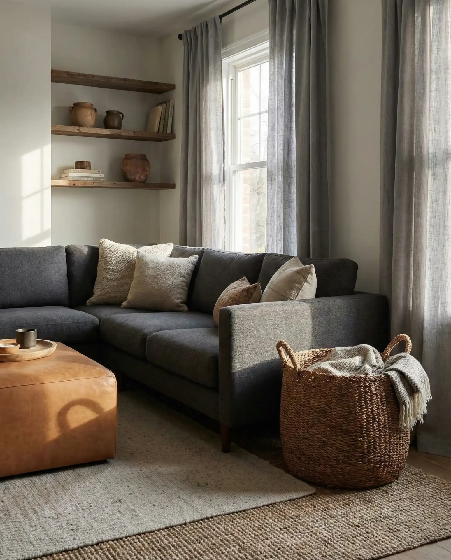
Mixing brown and grey tones—think a grey sofa with cognac leather chairs—creates an earthy, masculine-leaning palette that feels grounded and timeless. This combination is particularly effective in homes with exposed brick, wood beams, or other rustic architectural details. The warmth of the brown prevents the grey from feeling cold, while the grey keeps the brown from reading too heavy.
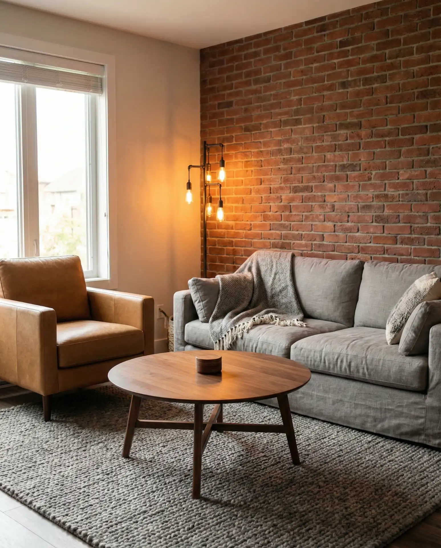
A friend in Austin recently redid her living room with this palette and mentioned how much easier it is to keep looking fresh compared to all-white schemes. The brown leather ages beautifully, developing a patina that adds character, while the grey upholstery hides minor wear and doesn’t show stains as readily as lighter fabrics.
10. Pink and Grey Soft Sophistication
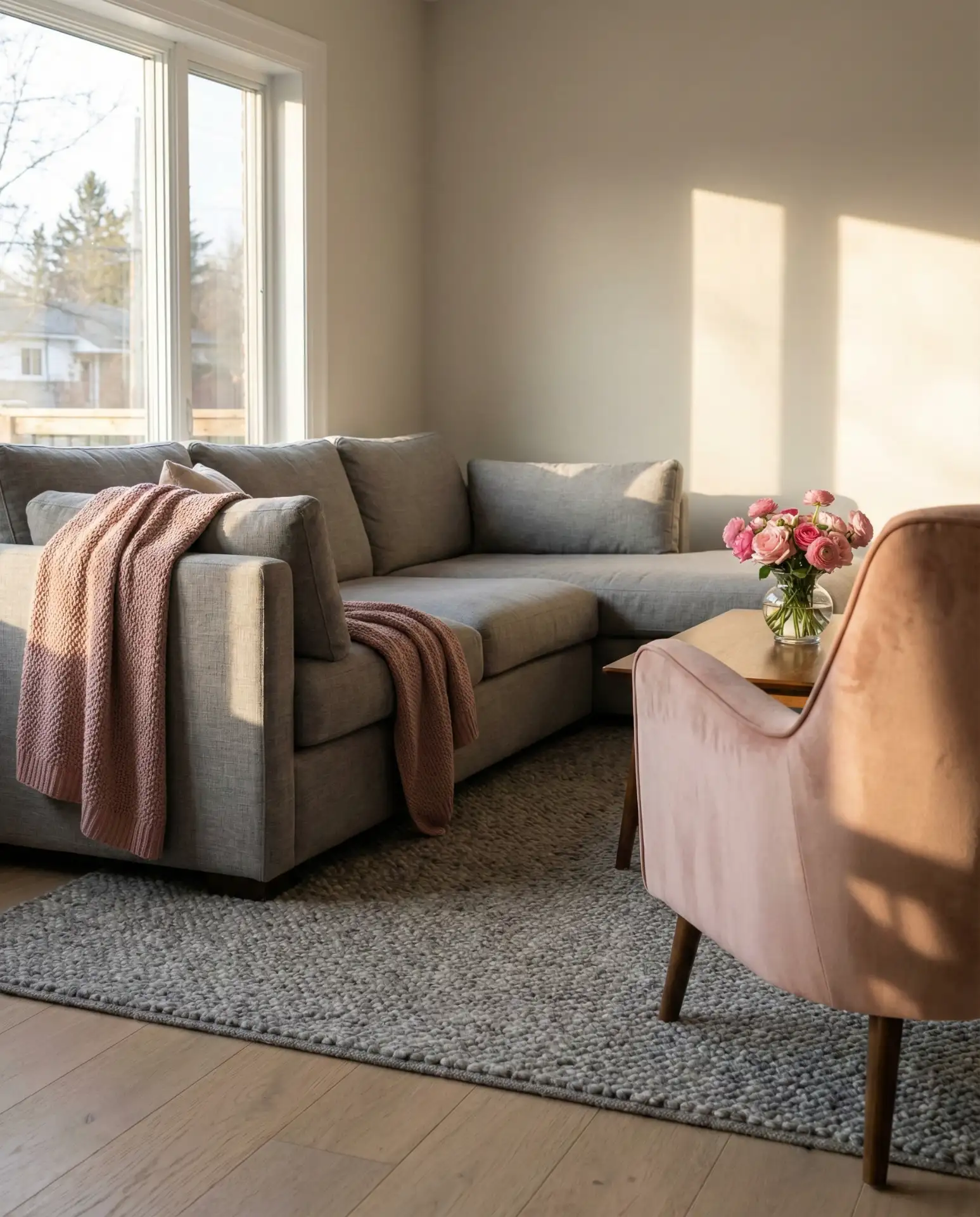
Dusty pink and charcoal grey create a sophisticated, feminine-leaning palette that’s grown up and refined. This isn’t bubblegum pink—it’s muted blush tones that read almost neutral. The combination works beautifully in both traditional and modern spaces, especially when you layer in velvet, silk, and other tactile fabrics.
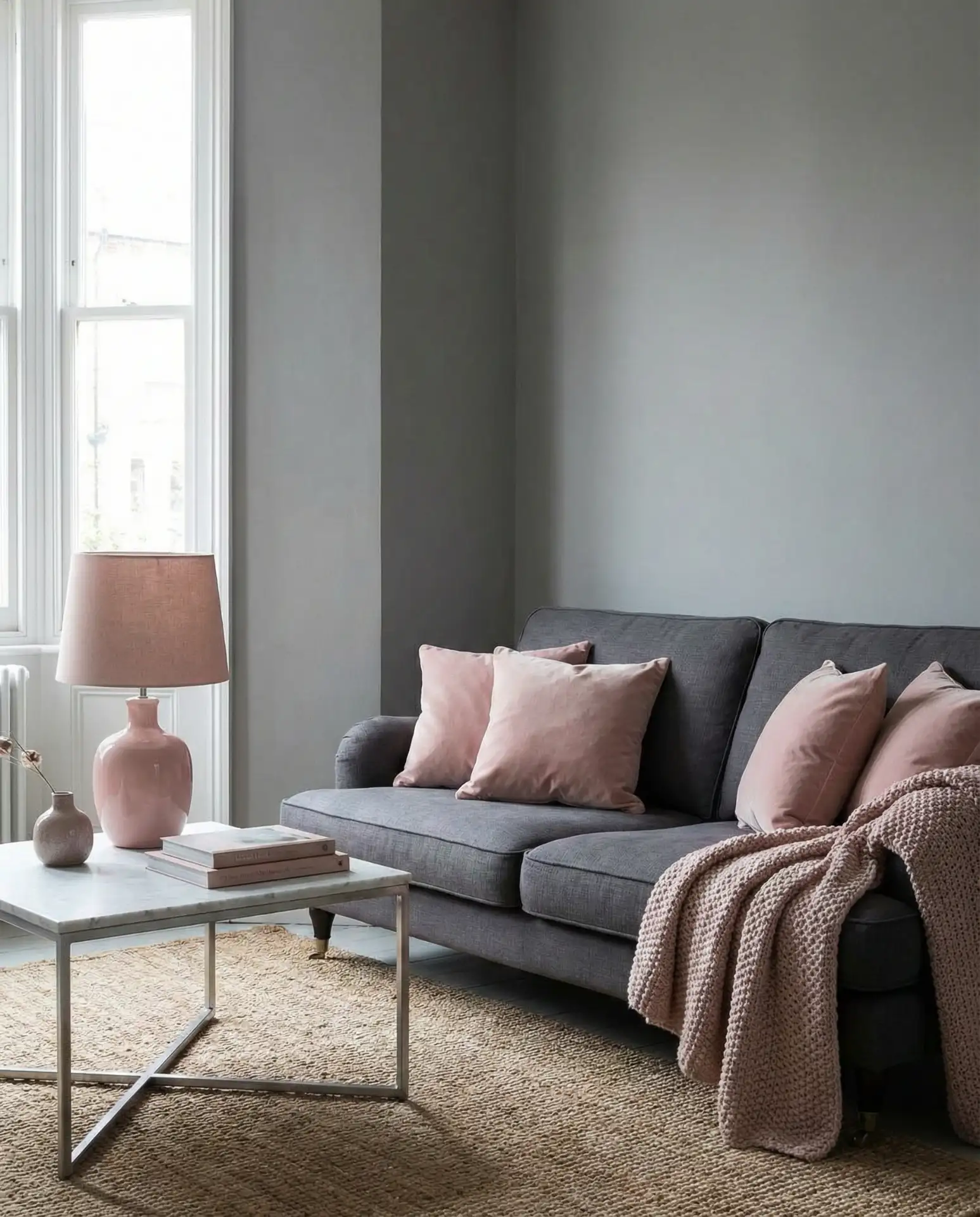
This palette is most successful in homes with good natural light—north-facing rooms or spaces with small windows can make the pink look muddy or dull. If you’re working with limited light, choose a pink with warmer peachy undertones rather than cooler mauve shades, and make sure your artificial lighting has a warm color temperature.
11. Teal and Grey Vibrant Pop
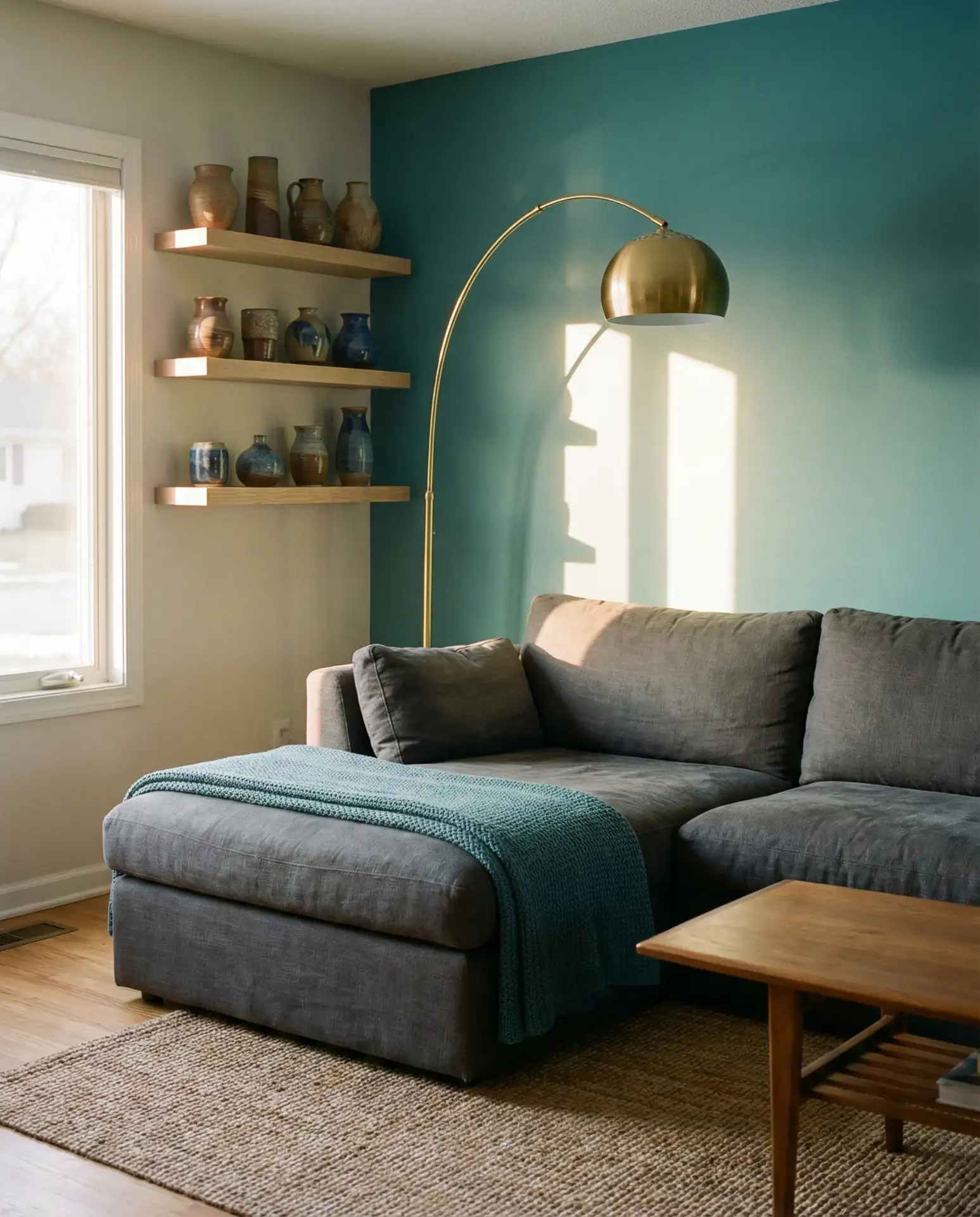
Teal and medium grey offer a fresh, energizing color scheme that feels coastal without being overtly nautical. Teal accent pillows, a teal rug, or even a teal accent wall can enliven a grey sofa and bring personality to an otherwise neutral room. This pairing works especially well in homes near water—beach towns, lakefront properties, or riverfront lofts.
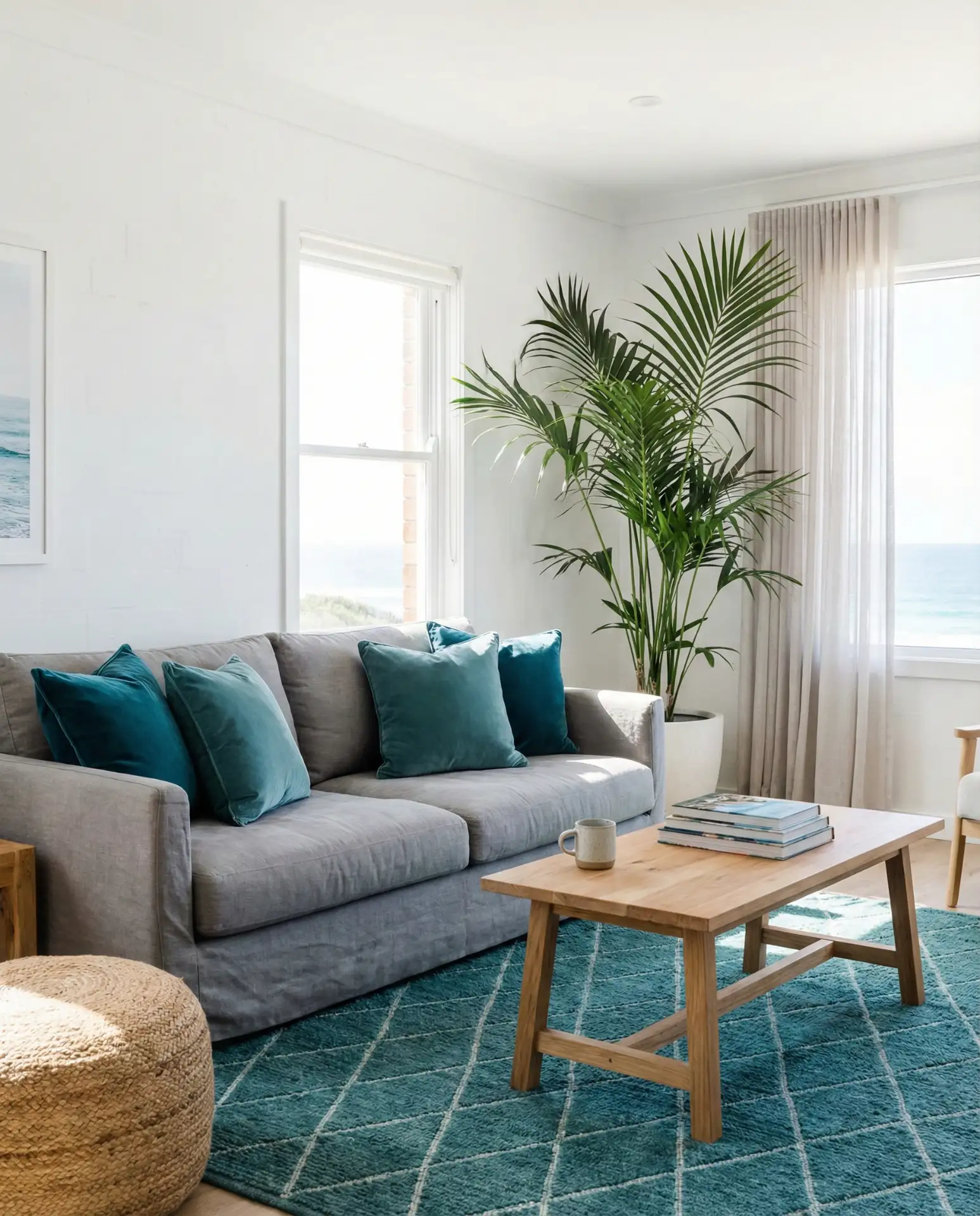
Budget-conscious homeowners can test this palette inexpensively by starting with teal accessories—pillows, throws, or artwork—before committing to larger investments like upholstery or paint. You’ll quickly discover if the color energizes you or starts to feel overwhelming, and you can adjust accordingly without breaking the bank.
12. Yellow and Grey Cheerful Brightness
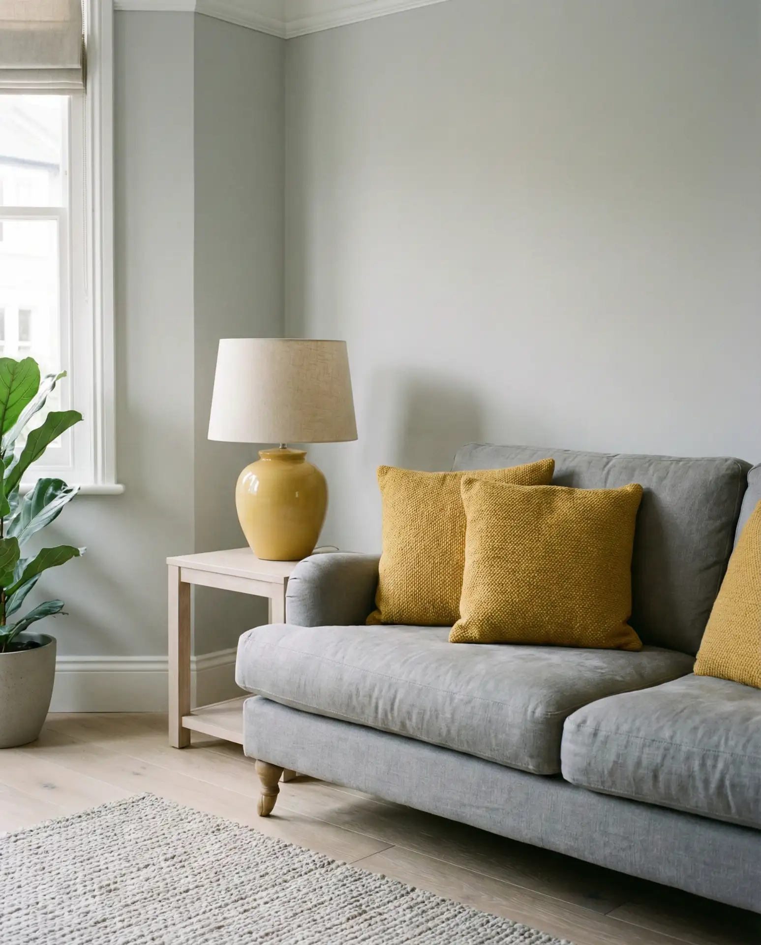
Pairing soft yellow and cool grey creates a cheerful, optimistic living room that feels sunny even on overcast days. This combination is ideal for north-facing rooms that need a boost of warmth or for anyone who craves a bit of color without going too bold. Opt for muted mustard or buttery tones rather than bright lemon to keep the palette sophisticated.
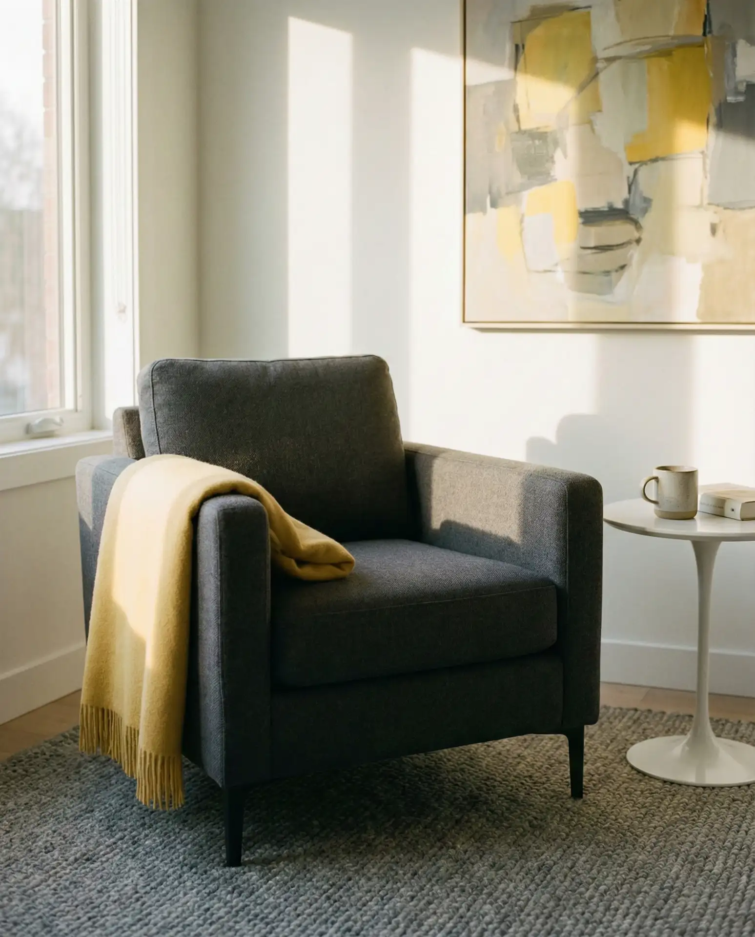
A common pitfall is choosing a yellow that’s too saturated or too warm, which can clash with cooler greys and make the room feel disjointed. Sample yellow fabric swatches against your grey upholstery in natural light to ensure the undertones harmonize—you’re looking for a subtle connection, not a jarring contrast.
13. Purple and Grey Regal Touch
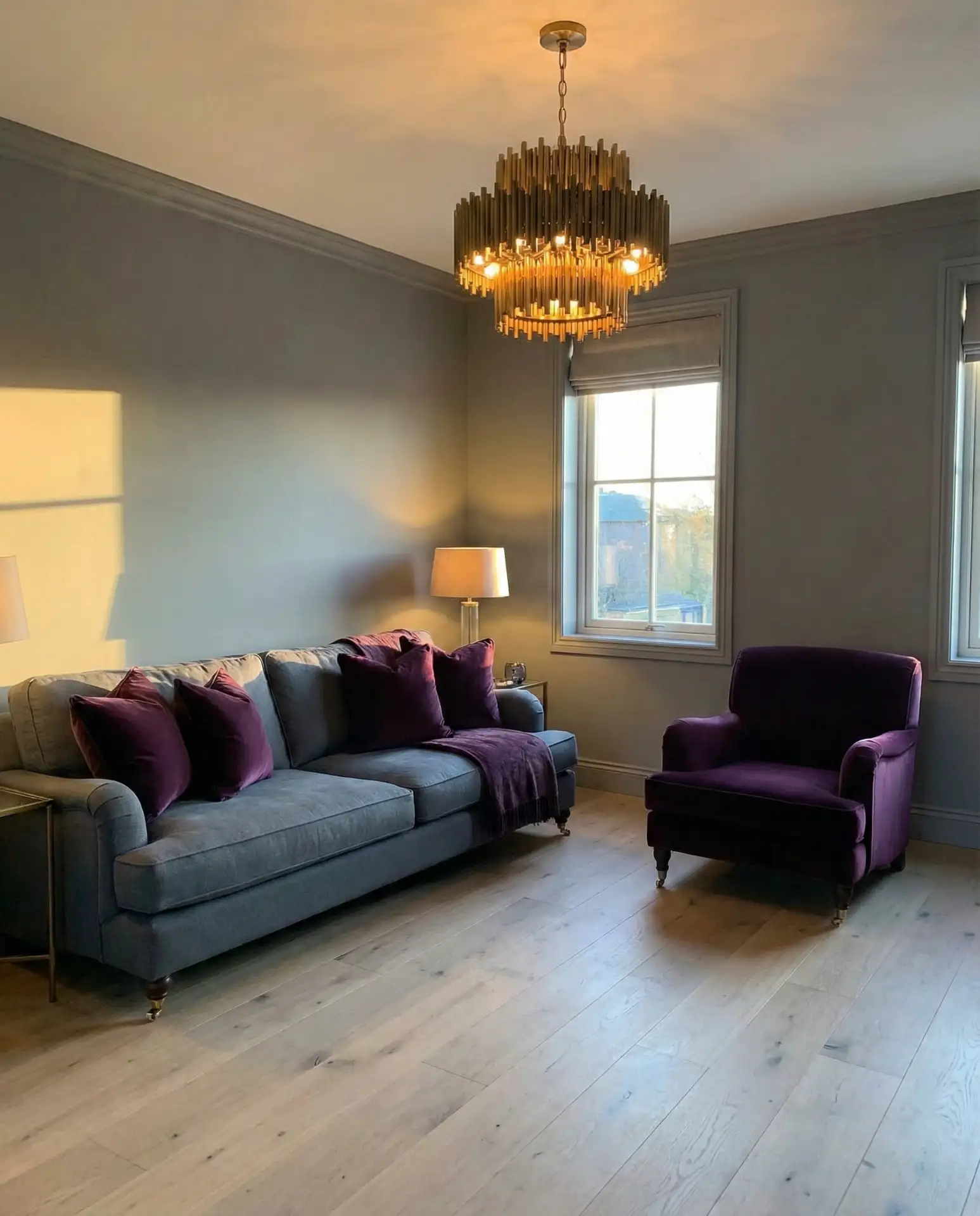
Deep purple and slate grey bring a regal, dramatic quality to a living room without feeling overly formal. Think eggplant velvet pillows on a grey sofa, or a purple accent chair flanking a grey sectional. This palette has a vintage-inspired elegance that works beautifully in Victorian homes or spaces with ornate architectural details.
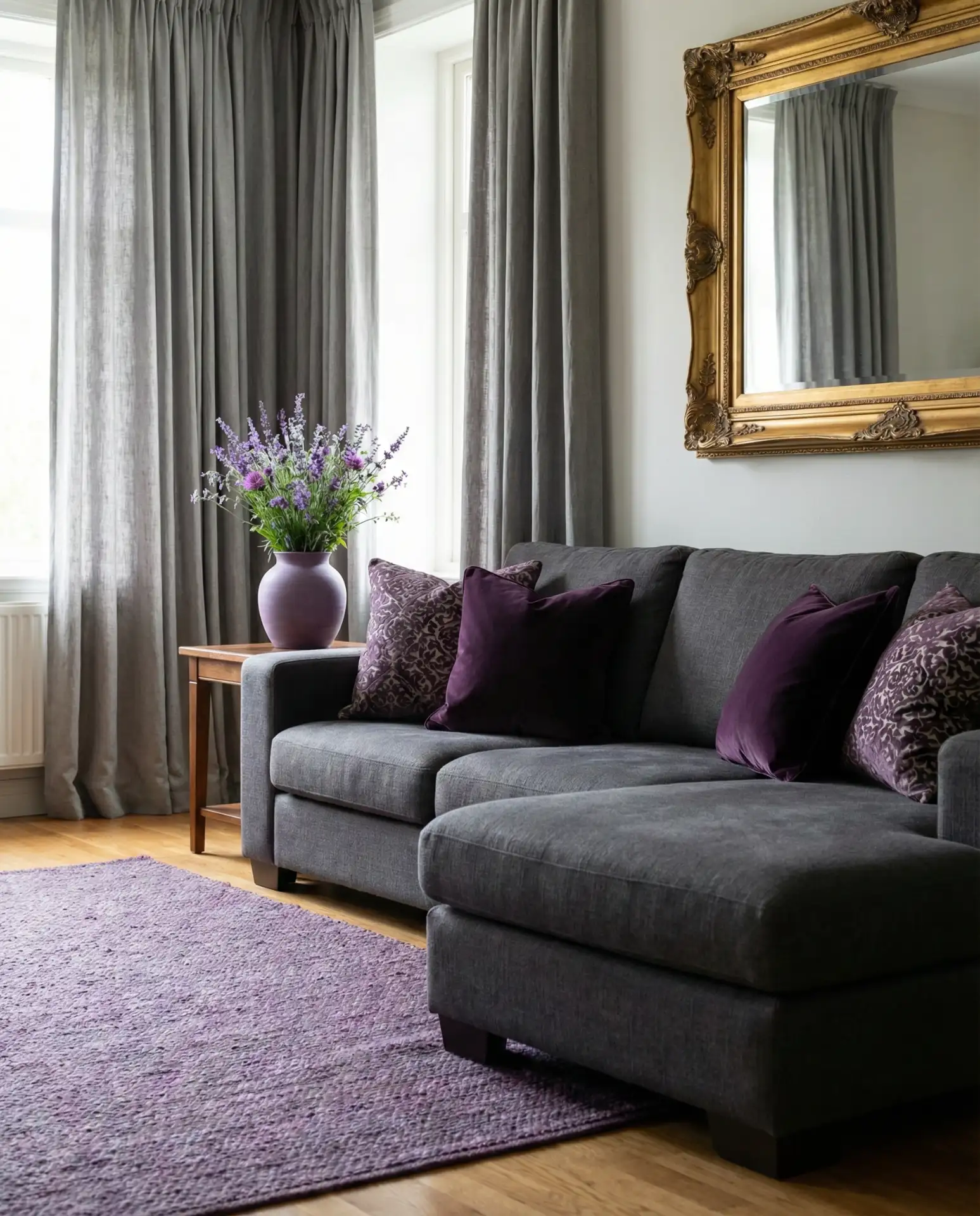
In practice, this color scheme requires thoughtful restraint—too much purple can tip into whimsical or juvenile territory. Keep purple accents to about 20% of the room’s visual weight, using grey as the dominant neutral to anchor the space and maintain sophistication.
14. Burgundy and Grey Rich Warmth
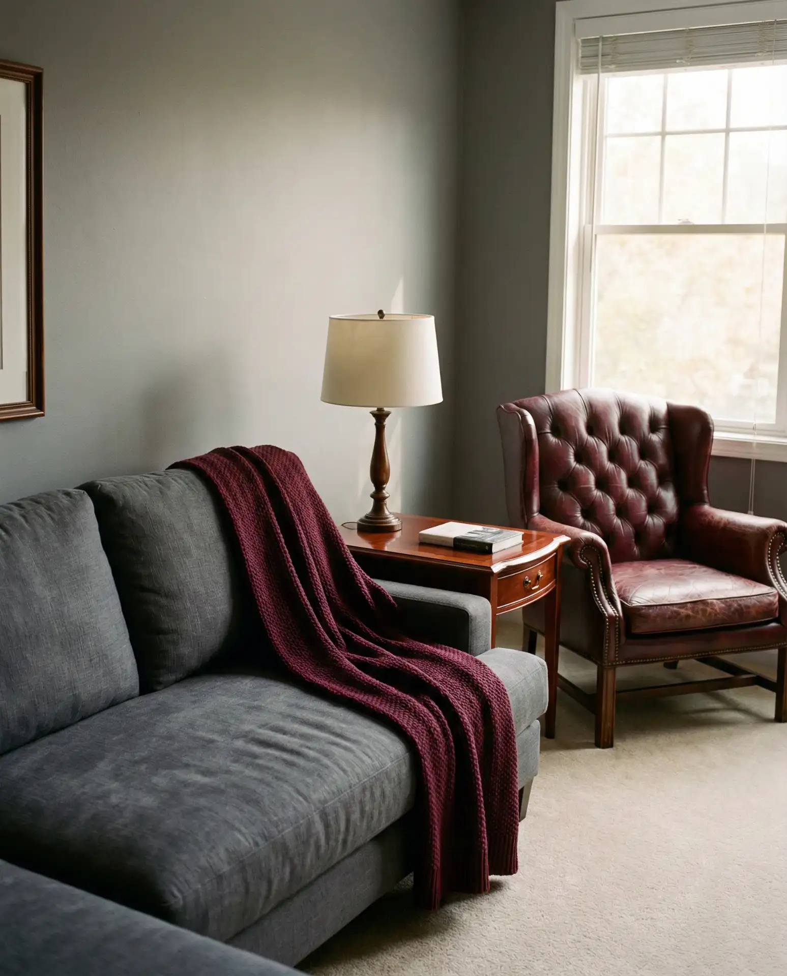
Mixing burgundy and charcoal grey creates a warm, wine-inspired palette that feels both classic and current. This combination is particularly effective in traditional homes or spaces with dark wood furniture, where the burgundy echoes the richness of mahogany or cherry finishes. Use burgundy sparingly—in throw pillows, a single armchair, or artwork—to avoid overwhelming the room.
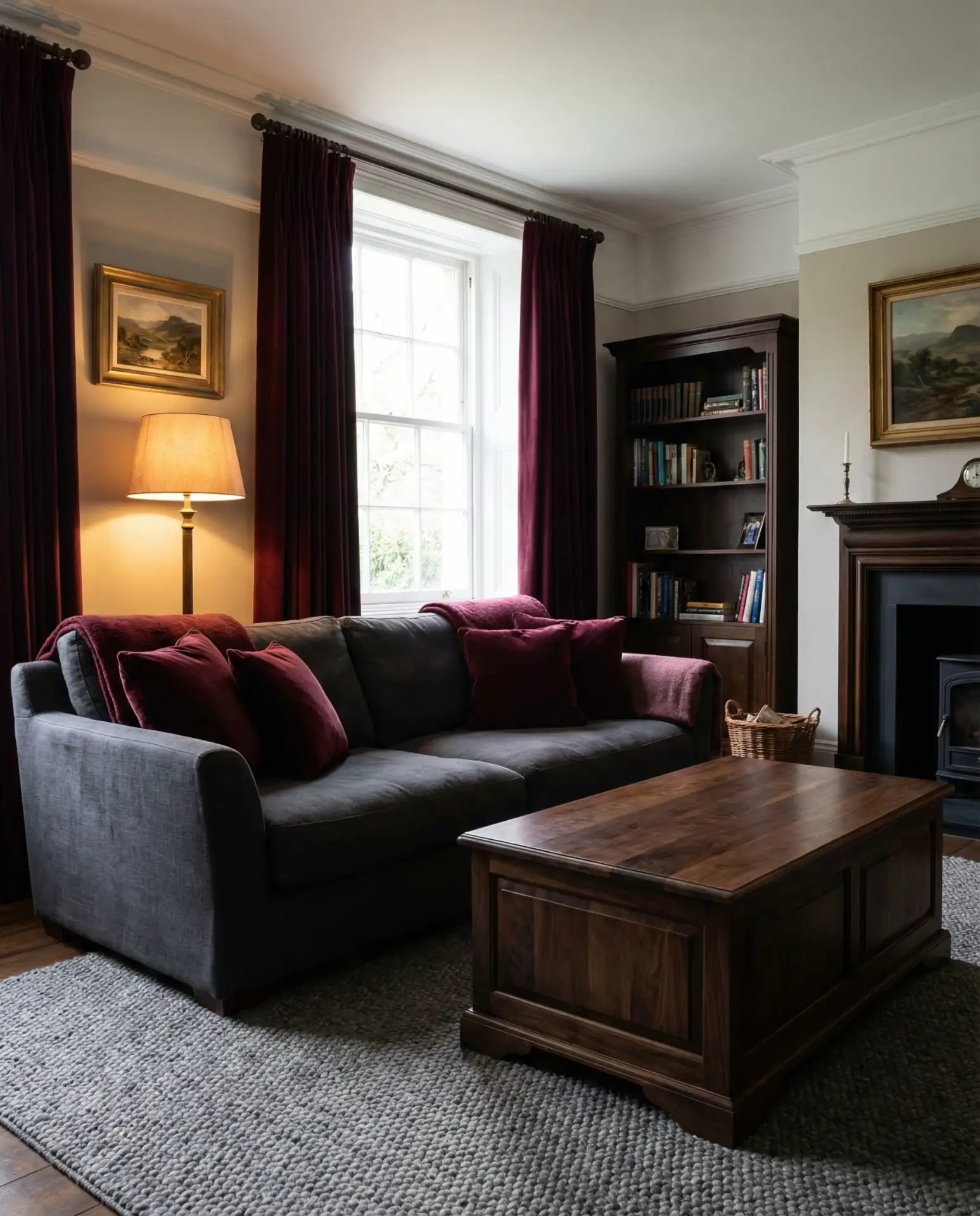
This palette works best in rooms with warm-toned wood floors like oak or walnut. If you have cool grey or whitewashed floors, the burgundy can feel disconnected from the rest of the space. Consider adding a jute or sisal rug to bridge the gap and tie the warm and cool elements together.
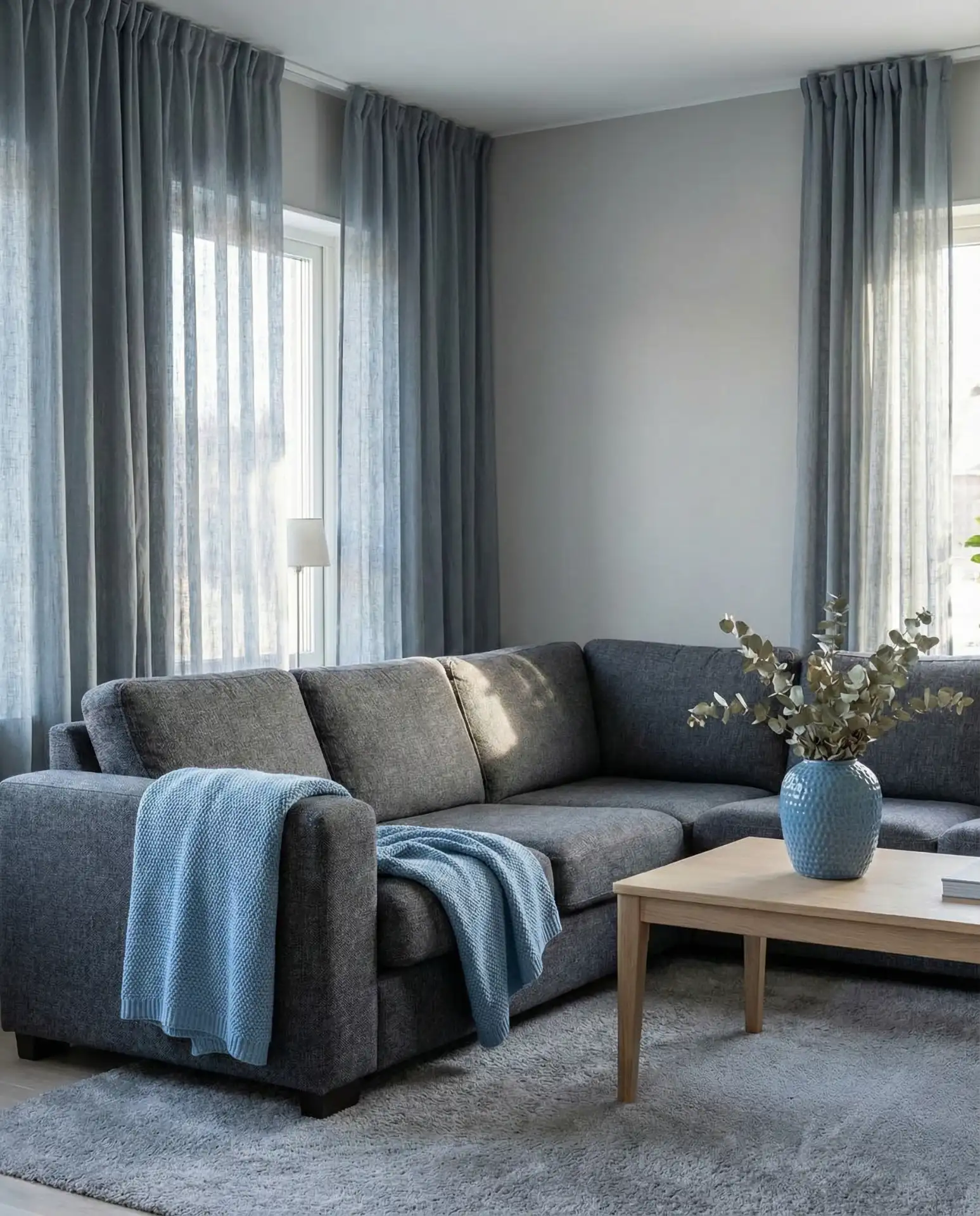
15. Dark Blue and Grey Coastal Depth
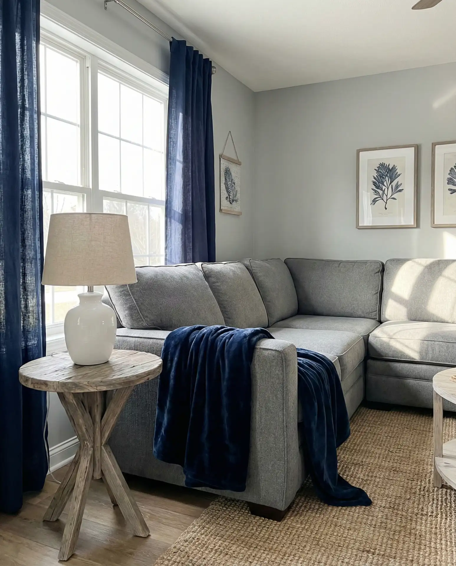
Dark blue paired with soft grey evokes a sophisticated coastal vibe without the expected turquoise or sandy beige. This palette feels modern and slightly unexpected—perfect for homeowners who love the beach but want to avoid literal seashell decor. Layer in natural textures like linen, rope, and driftwood-inspired furniture to reinforce the coastal connection.
Real coastal homeowners—from Cape Cod to San Diego—often mention that this palette ages better than brighter beach themes. The darker blue doesn’t show fading from sun exposure as readily, and it maintains a grown-up sensibility even as design trends shift. Expect to repaint or reupholster less frequently than with more saturated colors.
16. Green and Grey Natural Harmony
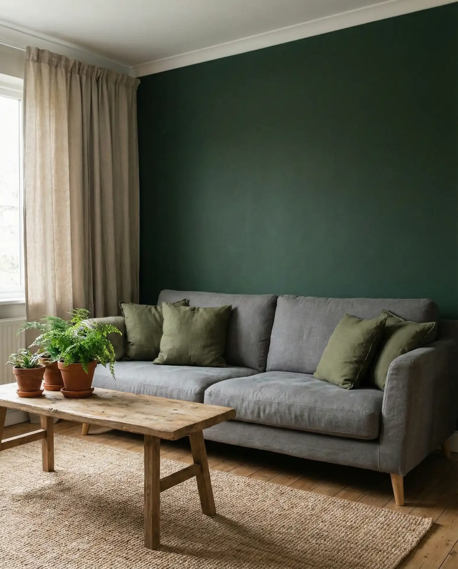
Soft olive or forest green and medium grey create a grounded, nature-inspired palette that feels calm and restorative. This combination works beautifully in homes surrounded by trees or greenery, as it creates a seamless visual transition between indoors and out. Add plenty of live plants to reinforce the organic theme and bring life to the space.
According to interior designers working in the Pacific Northwest and New England, this palette is especially effective in homes with large windows or glass doors that frame outdoor views. The green tones inside echo the landscape beyond, creating a cohesive visual flow that makes rooms feel larger and more connected to their surroundings.
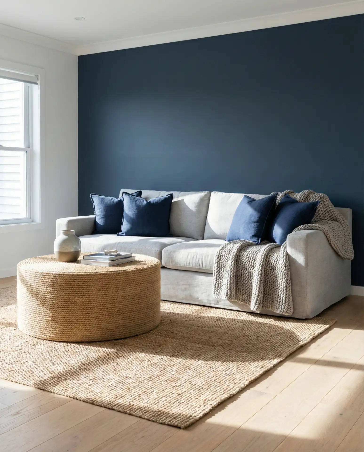
17. Blue and Grey Layered Calm
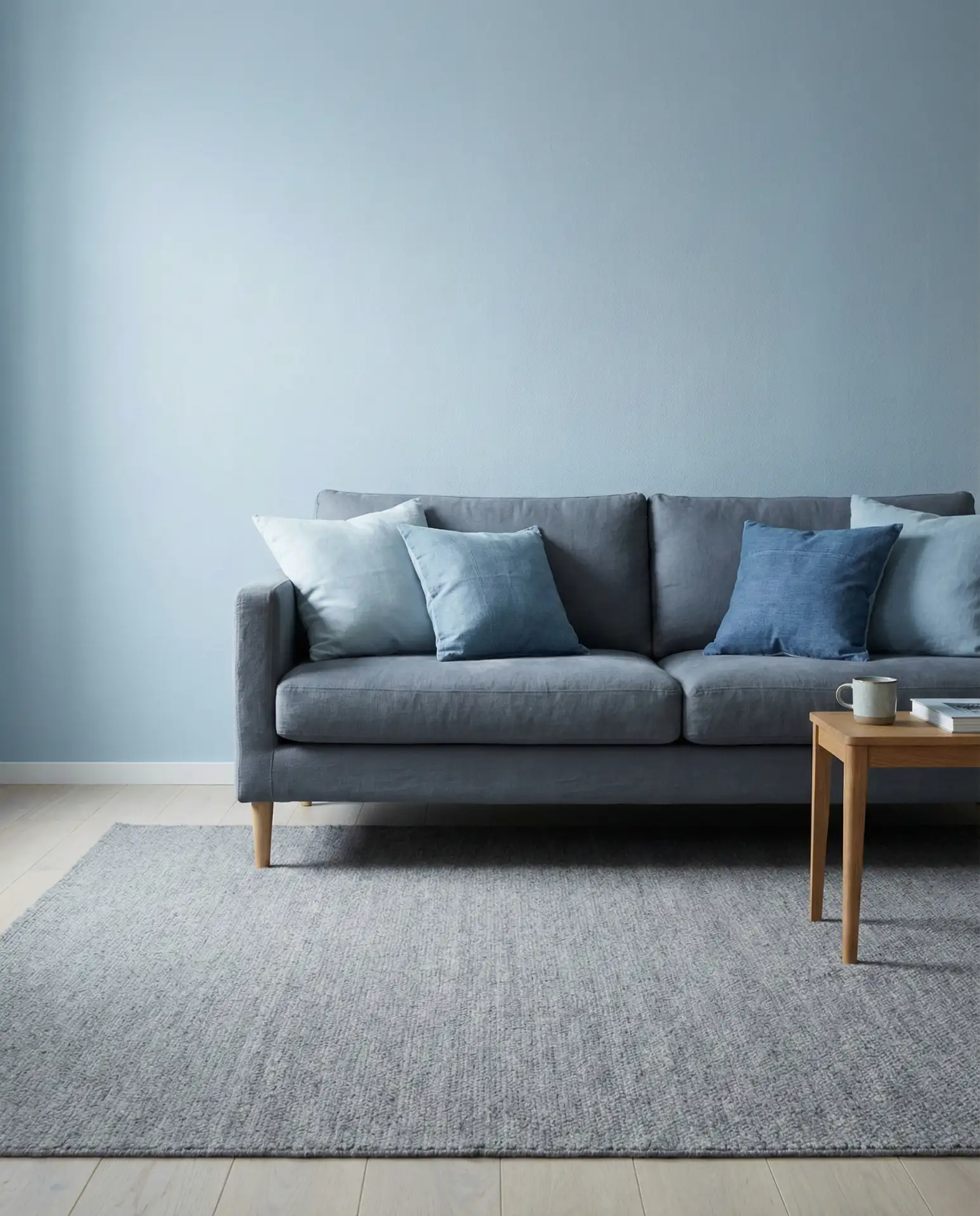
Mixing multiple shades of blue with varying tones of grey creates a layered, monochromatic scheme that feels sophisticated and intentional. Think powder blue walls with a slate grey sofa and denim blue pillows. This approach requires a good eye for color—each shade should be distinct enough to read separately but close enough in tone to feel cohesive.
This palette works best in bedrooms or reading nooks within the living room—spaces where you want to encourage relaxation and calm. The tonal variation keeps the eye engaged without creating visual tension, making it an ideal choice for anyone sensitive to overly stimulating environments or busy patterns.
18. Modern Grey Monochrome
An all-grey living room—from pale dove walls to charcoal upholstery—creates a sleek, modern monochrome that feels intentional and gallery-like. This approach demands attention to texture and layering to avoid flatness. Mix matte and glossy finishes, combine smooth fabrics with nubby weaves, and vary the grey tones from light to dark across different elements.
A neighbor in Chicago went full monochrome grey in her loft, and she mentioned the space photographs beautifully, but she had to be strategic about introducing warmth through lighting and greenery. Without those elements, the room felt cold and uninviting in person, even though it looked stunning in photos.
19. Grey Living Room Color Schemes with Metallics
A gray living room enhanced with brass, copper, or gold metallics feels luxurious without being ostentatious. The warm metal tones add visual interest and prevent the grey from feeling flat or institutional. This is one of the most popular color schemes on Pinterest for 2026, as homeowners seek ways to elevate neutral palettes without committing to bold colors.
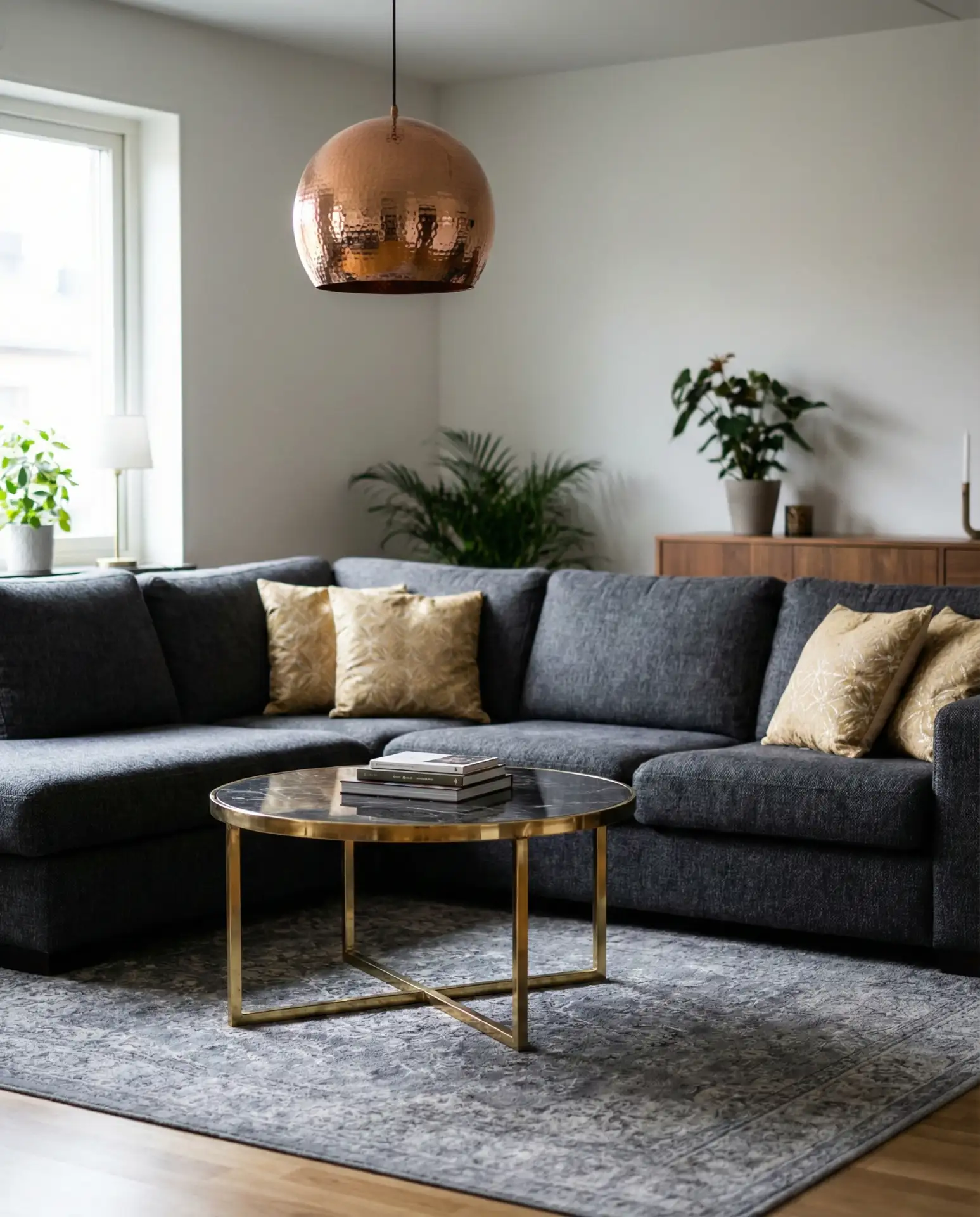
From a budget perspective, you don’t need to invest in solid brass furniture to achieve this look. Mixed-metal finishes on lighting, picture frames, and drawer pulls can deliver the same effect at a fraction of the cost—expect to spend $30–$100 per piece for quality metallic accents from brands like West Elm or CB2.
20. Navy and Grey Nautical Elegance
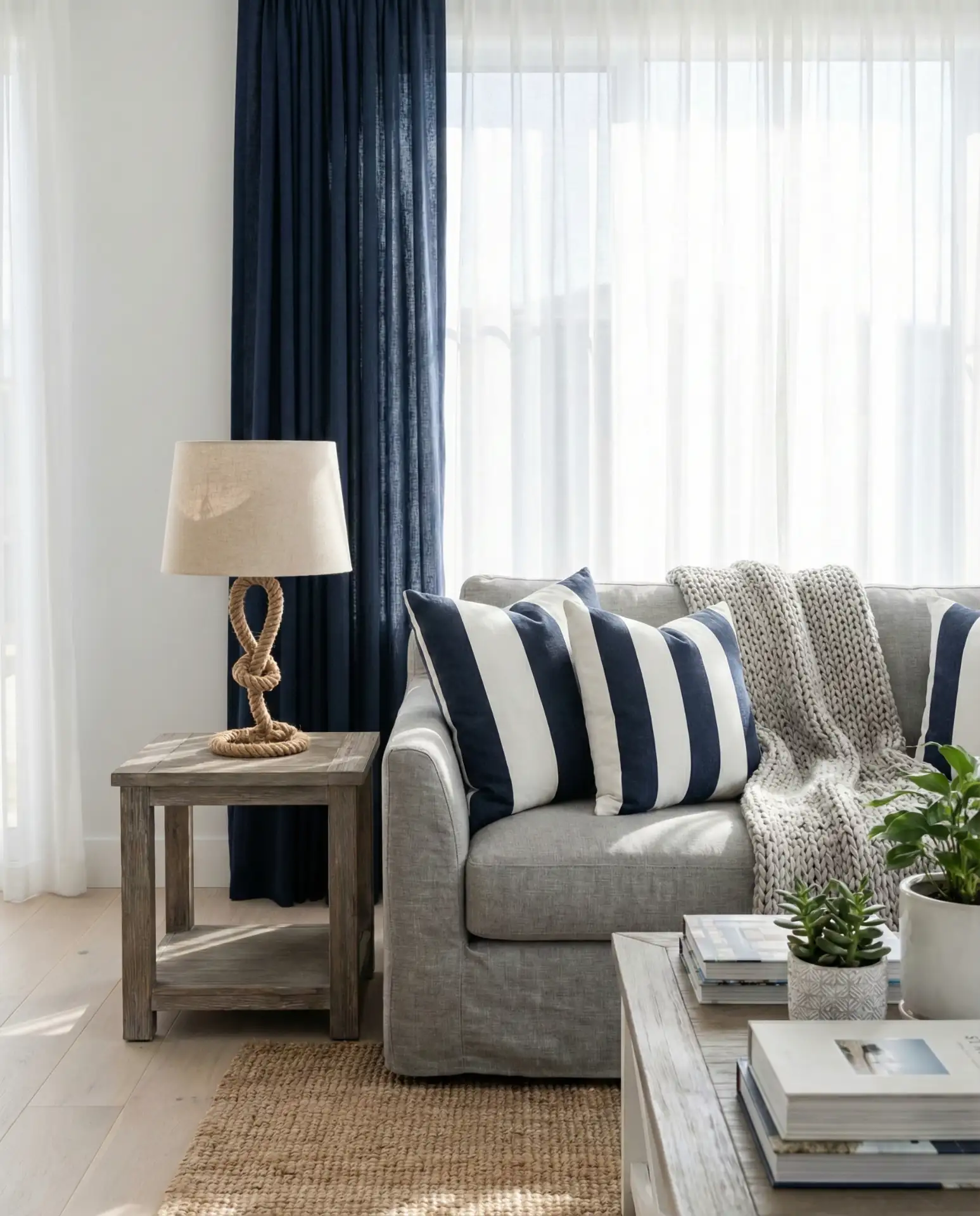
Pairing navy and grey with crisp white trim creates a timeless nautical palette that never feels dated. This combination is a staple in coastal New England homes and Southern California beach houses, where it bridges traditional and contemporary aesthetics. Avoid literal anchors or sailboat motifs—the color palette alone communicates the coastal reference.
This palette is particularly forgiving for families with kids or pets—both navy and grey hide stains and wear better than lighter neutrals. Choose performance fabrics if you’re concerned about durability; brands like Crypton and Sunbrella now offer stylish options that don’t sacrifice aesthetics for function.
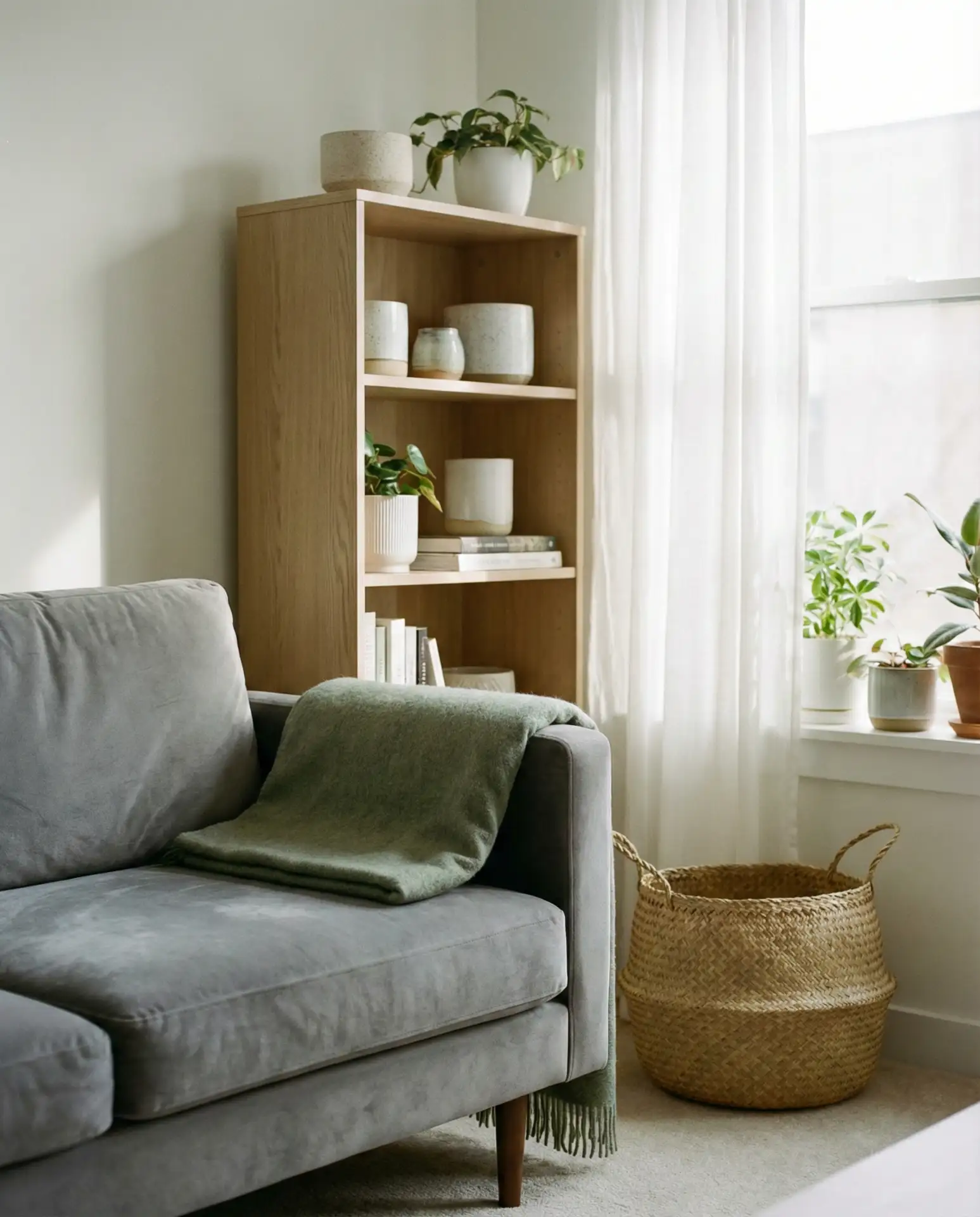
21. Cozy Grey with Natural Wood
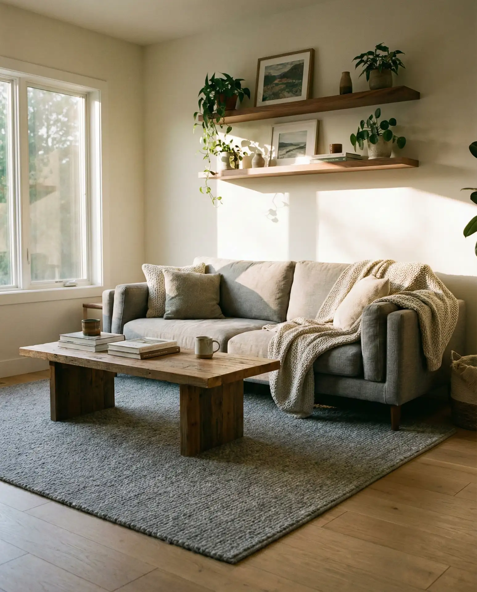
A cozy grey living room feels warmest when paired with plenty of natural wood tones—think oak coffee tables, walnut shelving, and reclaimed wood accent walls. The wood brings organic warmth that prevents the grey from feeling cold or sterile, creating a balanced, inviting space. This combination is especially popular in modern farmhouse and Scandinavian-inspired homes.
Avoid mixing too many wood tones in one room—stick to two or three finishes at most to maintain visual coherence. If you have oak floors, choose oak or ash furniture; if you prefer walnut, commit to that darker finish throughout. Mixing too many wood species can make a room feel chaotic rather than curated.
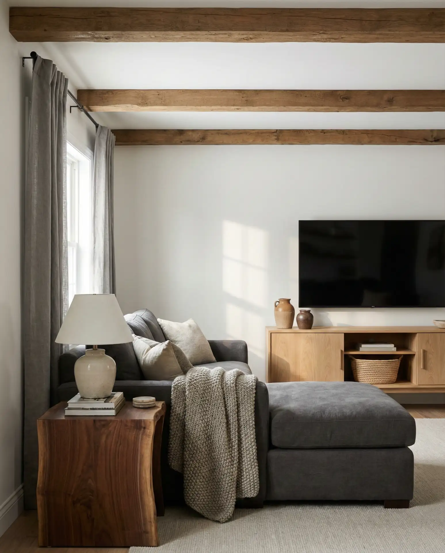
22. Grey Living Room Ideas with Textural Depth
The most successful grey living room ideas prioritize textural variety over color contrast. Layer a nubby bouclé sofa with velvet pillows, a chunky knit throw, and a jute rug to create visual interest within a monochromatic palette. This approach keeps the room from feeling flat while maintaining a calm, cohesive aesthetic that’s easy on the eyes.
Real homeowners consistently report that textured grey rooms photograph beautifully on social media, which is one reason this approach dominates Pinterest in 2026. The varied surfaces catch and reflect light differently throughout the day, creating a dynamic quality that keeps the space feeling fresh even when the color palette stays constant.
Conclusion
Whether you’re drawn to moody charcoal walls, cheerful yellow accents, or the timeless appeal of navy and grey, there’s a grey living room palette that fits your home and lifestyle. The key is balancing your color choices with thoughtful texture, appropriate lighting, and personal touches that make the space uniquely yours. Try starting with one or two ideas that resonate most, and don’t be afraid to experiment—grey is one of the most forgiving neutrals to work with. What’s your favorite combination from this list? Share your thoughts and your own grey living room projects in the comments below.