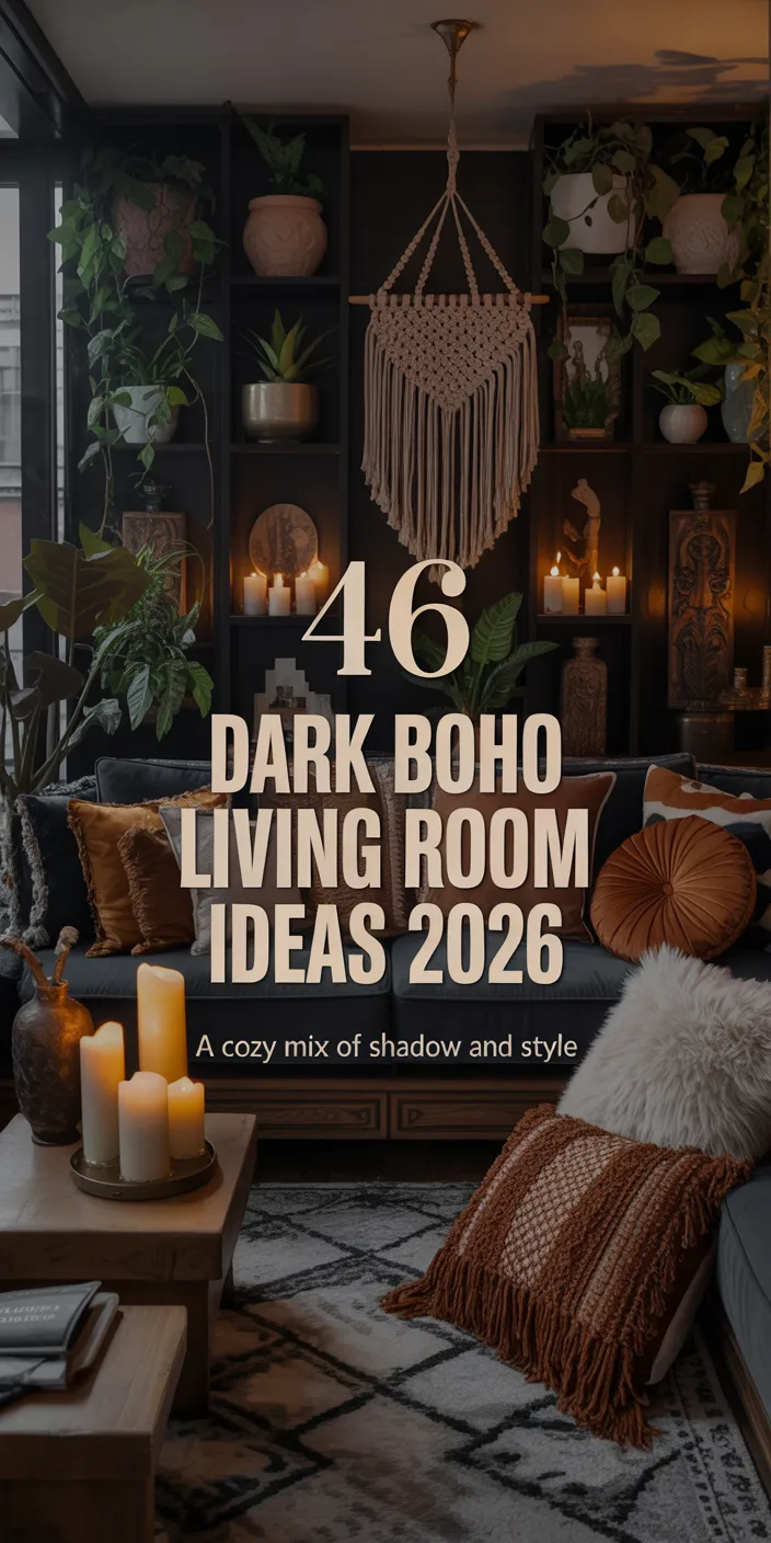
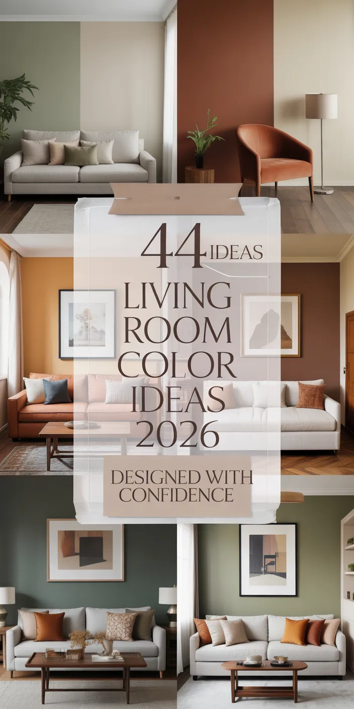
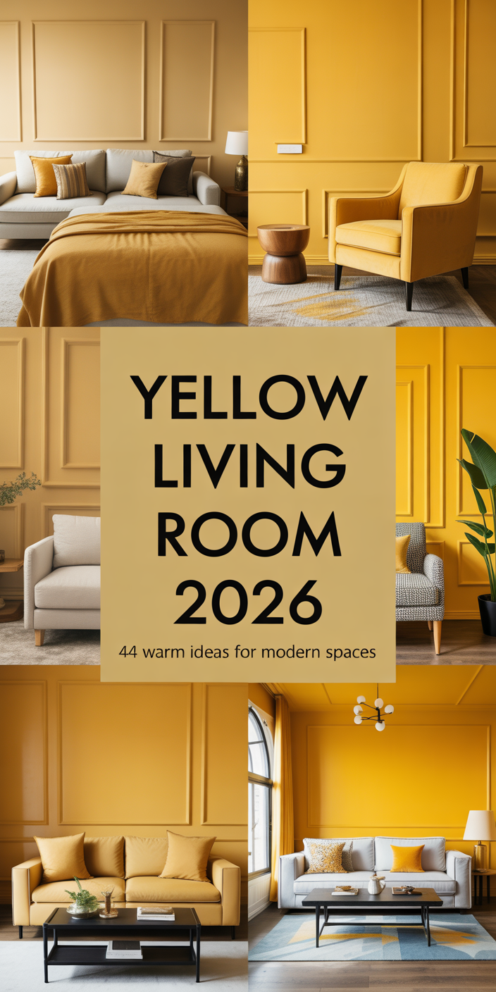
Green Living Room Ideas 2026: 41 Stylish Ways to Transform Your Space
Green living rooms are reclaiming their place as the heart of American homes in 2026, offering a refreshing antidote to years of neutral-only interiors. Designers and homeowners alike are rediscovering how versatile this color can be—from soft sage that whispers calm to deep forest tones that anchor a room with confidence. Whether you’re drawn to earthy palettes or bold, moody contrasts, green has a shade for every style and every space. Pinterest searches for green living room ideas have surged as people crave spaces that feel both grounded and alive. In this guide, you’ll find fresh ways to bring green into your living room, complete with design insights and practical tips for making each look work in real life.
1. Sage Green Walls with Natural Wood Accents

Soft sage tones create an instantly calming backdrop that works beautifully in both modern and traditional living rooms. Paired with natural wood furniture and woven textures, this palette feels organic and intentional without being overly designed. The neutral quality of sage makes it easy to layer with whites, creams, and even bolder accent colors when you want to shift the mood seasonally. It’s a color that ages well, never feeling too trendy or restrictive.
This combination works especially well in homes with good natural light, where the green can shift subtly throughout the day. In the Pacific Northwest and New England, where nature is part of the lifestyle, sage walls feel like an extension of the outdoors. Budget-conscious homeowners love this look because paint is one of the most affordable transformations—you can refresh an entire room for under $100. Just be sure to test samples in different lighting before committing, as sage can read gray or yellow depending on your space.
2. Dark Forest Green Feature Wall with Brass Lighting

A single forest green wall commands attention and provides a dramatic focal point without overwhelming the room. Paired with warm brass sconces or pendant lights, the look becomes both luxurious and grounded. This approach is ideal for living rooms where you want to create depth and intimacy, especially in open-concept layouts that can feel too expansive. The moody quality of deep green makes it perfect for evening gatherings and cozy winter nights. 
Where it works best: Rooms with high ceilings or abundant natural light can handle the weight of a dark green wall without feeling closed in. In Southern California bungalows and Brooklyn brownstones, this look has become a signature move for adding character to otherwise plain spaces. One designer I know swears by pairing forest green with blush or terracotta accents to soften the drama. The key is balance—let the green be the star, and keep surrounding walls light to maintain airiness.
3. Olive Green Sofa as a Statement Piece

An olive green sofa brings warmth and sophistication without the commitment of painting walls. This shade sits beautifully between yellow-green and brown-green, making it incredibly versatile for mixing with other colors. Unlike trendy jewel tones that can date quickly, olive feels timeless and works across multiple design styles—from mid-century modern to farmhouse to contemporary. It’s also forgiving with wear and pet hair, which makes it practical for real life. 
Olive sofas pair beautifully with grey, beige, and even burnt orange throw pillows for a layered, collected look. In Texas and Arizona, where earthy tones dominate, olive brings a refreshing alternative to the usual tan and brown palette. Pricing varies widely—vintage finds on Facebook Marketplace can run $300 to $600, while new pieces from brands like Article or West Elm start around $1,200. A common mistake is choosing a green that’s too bright or too dark; olive should feel muted and natural, not neon or black-green.
4. Emerald Green Accent Chairs with Neutral Walls

These accent chairs are bold, jewel-toned, and really bring a lot of personality and life to a space, but they also do not completely overwhelm it. When positioned against a soft, warm greige or white wall, it really helps them be these jewel-like centerpieces that really help to elevate any space. Emerald is also a color that can be found in a lot of velvet or linen; however, it gives the chairs a very nice texture that helps really bring depth to the color and therefore elevates the space. It is also a designer trick to place two accent chairs instead of doing a full sofa swap, as they can do a lot more in terms of transforming a space than a cheap, full sofa replacement. 
This setup is a favorite among homeowners who want flexibility—accent chairs are easier to move and restyle than larger furniture. In urban apartments from Chicago to Seattle, emerald chairs add a touch of glamour without requiring a full renovation. Expert-style commentary: Designers often recommend balancing jewel tones with warm metallics like gold or brass to keep the look grounded rather than cold. Avoid pairing emerald with too many cool grays, which can make the space feel sterile.
5. Sage and Pink Color Palette for a Soft Modern Look

The combination of sage and pink has become a go-to for homeowners seeking a fresh, feminine aesthetic that still feels grown-up. This pairing softens the green and adds warmth, creating a space that’s inviting and modern. Think blush throw pillows, a dusty rose rug, or pink-toned artwork against sage walls. The color scheme works beautifully in smaller living rooms where you want to maximize light and airiness without going full white-on-white. 
Real homeowner behavior: Many people start with a single pink accent piece—a throw blanket or a single chair—and build from there. In Southern states where homes tend to have more traditional layouts, this palette offers a way to modernize without alienating older architectural details. One micro anecdote: A friend in Nashville painted her living room sage and added vintage pink velvet chairs from an estate sale, creating a room that feels both nostalgic and current. The key is choosing muted, dusty tones rather than bright bubblegum shades.
6. Green Walls with Brown Leather Furniture

Dark brown leather sofas combined with earth-tone green walls create a classic, timeless combination with both a rugged and refined feel. This combination originates in English countryside homes and translates wonderfully to American living rooms, especially those with rustic or industrial features. The warmth of the leather is balanced by the cool of the green, and, with time, both aged materials acquire a patina and character. 
This look is especially good in homes with wood flooring and exposed beams, as the natural materials create a seamless organic feel. This combination is a staple in mountain towns across Colorado and Vermont for its comfort and durability. Practical leather is an investment, however. Quality pieces of leather furniture start at about $1,500 and, with proper care, can last for decades. In order to prevent leather furniture from fading and drying out, avoid placing it in direct sunlight. To maintain suppleness and color depth, leather should be conditioned twice a year.
7. Light Green and Orange Accent Decor

Pairing light green with orange accents brings an unexpected burst of energy that feels retro yet fresh. Think terracotta planters, burnt orange throw pillows, or a rust-colored armchair against pale green walls. This color scheme nods to 1970s design without feeling dated, offering a playful alternative to more predictable pairings. It’s a great choice for homeowners who want their space to feel lively and personal. 
Where it works best: Sunnier climates like Southern California and Florida, where the warmth of orange feels natural and inviting. In the Midwest, this combination adds much-needed warmth during long gray winters. Common mistakes and how to avoid them: Too much orange can overwhelm a space. Stick to the 60-30-10 rule—60% green, 30% neutral, and 10% orange as the accent. This keeps the palette balanced and sophisticated rather than chaotic.
8. Dark Green and Gold Glam Living Room

Deep forest green paired with gold accents creates a glamorous, luxurious atmosphere reminiscent of Art Deco interiors. This combination works beautifully in formal living rooms or spaces where you want to make a bold statement. Gold mirrors, side tables, and lighting fixtures amplify the richness of the green, while velvet or silk fabrics add tactile luxury. The moody depth of dark green becomes even more dramatic when highlighted with warm metallics. 
This style has seen a resurgence in urban penthouses and renovated historic homes, particularly in cities like New York and San Francisco. Expert-style commentary: The key to pulling off this look is restraint—use gold as an accent, not a main color. Too much metallic can feel gaudy. A designer once told me that three to five gold pieces in a room is the sweet spot. Quality matters here; cheap gold-toned finishes read as fake, so invest in solid brass or quality-plated pieces.
9. Sage Green with Beige and Natural Textures

The pairing of sage and beige creates a serene, organic palette that’s both calming and versatile. Add in natural textures like jute, linen, and rattan, and you have a space that feels effortlessly pulled together. This is the ultimate cozy living room formula—soft, layered, and inviting without being fussy. The neutral base allows the green to shine without competing for attention. 
American lifestyle context: This palette is especially popular in coastal homes from Maine to Oregon, where the connection to nature is central to the aesthetic. It also works beautifully in apartments where you want to create a sense of calm and escape from urban intensity. Budget angle: Natural fiber rugs and baskets are affordable ways to add texture—World Market and Target offer great options under $200. The look feels expensive but doesn’t require a designer budget.
10. Emerald Green Built-In Shelving

Painting built-in bookshelves or cabinetry in emerald green transforms architectural features into stunning focal points. This approach adds color and personality without requiring new furniture or major renovations. The decor ideas are endless—style the shelves with books, plants, ceramics, and art for a curated, lived-in look. Emerald shelving works in both traditional and modern homes, bridging styles with ease. 
One homeowner I spoke with painted her outdated oak shelves emerald and said it completely transformed her 1980s living room into something magazine-worthy. In older homes across the Midwest and Northeast, this is an affordable way to update built-ins without ripping them out. Practical insight: Use a semi-gloss or satin finish for shelving—it’s easier to clean and shows off the color’s depth. Prep work matters: Sand, prime, and apply two coats for a professional result.
11. Green and Rust Color Scheme for Warmth

The combination of green and rust brings an earthy, autumnal warmth to living rooms that feels both grounded and inviting. Rust-colored textiles—pillows, throws, and curtains—pop beautifully against sage or olive green walls. This color scheme evokes the natural landscape and works particularly well in homes that emphasize organic materials and handcrafted decor. It’s a palette that feels collected over time rather than designed all at once. 
Where it works best: In the Southwest, this palette feels like an extension of the desert landscape. In New England, it brings warmth to colonial-style homes. Real homeowner behavior: Many people introduce rust gradually—starting with a single pillow or throw before committing to larger pieces. A common mistake is choosing rust shades that are too bright or too pink; aim for deeper, clay-based tones that feel natural and aged.
12. Pale Green Walls with Black Accents

Soft, pale green walls paired with black furniture and accents create a striking contrast that feels both modern and sophisticated. The light green keeps the space bright and airy, while black adds definition and edge. This combination works particularly well in minimalist or Scandinavian-inspired interiors where clean lines and simplicity are key. It’s a fresh alternative to the overused gray-and-white palette. 
Expert-style commentary: Black grounds a room and prevents pale green from feeling too sweet or juvenile. Use it in light fixtures, picture frames, and furniture legs for maximum impact. In urban lofts and contemporary homes, this pairing has become a signature look. Budget angle: Black accents are easy to source secondhand—thrift stores and vintage shops are full of black metal and wood pieces. Paint can transform older furniture into statement pieces for minimal cost.
13. Forest Green and Burnt Orange Cozy Living Room

The combination of deep forest green and burnt orange fosters a rich and comfortable ambiance suited for the fall and winter seasons. This palette is particularly ideal for a living room designed for relaxation and retreat with a book, as it is warm and enveloping. The earthy, natural undertones of both colors help create a warm and inviting environment any time of the year. Incorporating warm wood tones will complete the image of a cozy mountain cabin in the heart of the city. 
Micro anecdote: A couple in Montana painted their living room forest green and added vintage burnt orange chairs from a local antique shop. They said it instantly made their 1960s ranch feel like a design-forward retreat. Where it works best: In homes with wood paneling, exposed beams, or stone fireplaces. Common mistakes and how to avoid them: Too much dark color can make a room feel small. Balance deep tones with plenty of lighting—floor lamps, sconces, and candles all help.
14. Green and Gray Modern Minimalist Living Room

A gray and green palette offers a clean, contemporary look that’s easy to style and maintain. Soft greens pair beautifully with cool gray sofas and concrete or stone accents, creating a modern aesthetic that feels calm and uncluttered. This combination is a favorite in urban apartments and new construction homes where sleek lines and minimal decor are priorities. The neutral quality of gray allows green to take center stage without overwhelming the space. 
Real homeowner behavior: Many people choose this palette because it’s low-maintenance and adaptable—you can easily swap in seasonal accents without needing to repaint or buy new furniture. In cities like Seattle, Portland, and Denver, this look is everywhere, reflecting a preference for understated, functional design. Practical insight: Gray can read cold in spaces with poor lighting. Warm up the palette with wood furniture, wool rugs, and plants to keep the room from feeling sterile.
15. Olive Green and Pink Feminine Living Room

The unexpected pairing of olive green with pink creates a soft, feminine space that avoids feeling overly sweet. Olive grounds the pink, giving it a sophisticated, grown-up edge. This color scheme works beautifully with vintage or thrifted furniture, where mixing eras and styles is part of the charm. It’s a palette that feels personal and curated rather than matchy-matchy. 
American lifestyle context: In Southern cities like Charleston and Savannah, this palette fits beautifully with historic homes that have ornate molding and high ceilings. In modern apartments, it adds warmth and personality to otherwise plain spaces. Budget angle: Pink accents are easy to find at places like HomeGoods and TJ Maxx—pillows, throws, and small furniture pieces are often under $50. The key is mixing different shades of pink, from blush to dusty rose, to create depth.
16. Green Walls with Rustic Wood Furniture

Pairing green walls with rustic wood furniture creates a warm, organic aesthetic that feels grounded and timeless. This combination works across multiple shades of green—from pale mint to deep forest—and suits a variety of design styles, from farmhouse to modern cabin. The earthy quality of both green and wood makes this a natural pairing that never feels forced. It’s a look that ages beautifully as wood develops patina and character. 
Where it works best: In rural areas and small towns across the Midwest and South, where farmhouse style remains a design staple. Also popular in mountain communities where rustic materials are readily available. Practical insight: Reclaimed wood furniture is widely available through local craftspeople and online marketplaces like Etsy. Prices vary, but a quality coffee table typically runs $300 to $800. Look for pieces with natural imperfections—knots, grain variation, and weathering add character.
17. Dark Blue and Green Moody Color Scheme

Combining deep dark blue with forest green creates a rich, layered palette that’s both dramatic and sophisticated. This moody color scheme works beautifully in spaces where you want to create intimacy and depth. Think navy velvet sofas, forest green accent walls, and brass lighting that ties the two colors together. It’s a bold choice that rewards those willing to embrace darker tones. 
Expert-style commentary: This palette requires good lighting to prevent the room from feeling cave-like. Use multiple light sources—overhead, task, and ambient—to create layers of illumination. In historic homes and brownstones, this combination enhances architectural details like crown molding and wainscoting. Common mistakes and how to avoid them: Using only overhead lighting will flatten the space. Invest in dimmers and warm-toned bulbs (2700K) to bring out the richness of the colors.
18. Light Green and Beige Scandinavian Style

The combination of light green and beige embodies Scandinavian design principles—simplicity, functionality, and connection to nature. This palette creates a serene, airy space that feels effortless and calming. Add in white accents, natural wood, and minimal decor, and you have a living room that’s both beautiful and livable. The neutral base allows you to change accents seasonally without disrupting the overall aesthetic. 
Real homeowner behavior: Scandinavian style appeals to people who want their homes to feel uncluttered and peaceful. In northern states like Minnesota and Wisconsin, where winters are long, this light, airy palette helps combat seasonal darkness. Budget angle: IKEA and H&M Home offer affordable Scandinavian-inspired pieces. A beige linen sofa from IKEA starts around $500, while similar styles at higher-end retailers can cost $2,000+. The look is achievable at any price point.
19. Green Living Room with Vintage Decor Ideas

Vintage decor ideas pair beautifully with green living rooms, creating spaces that feel collected and timeless. Think mid-century modern furniture, antique mirrors, and retro lighting against sage or olive walls. The key is mixing pieces from different eras rather than creating a museum-like period room. Green provides a versatile backdrop that allows vintage finds to shine without competing for attention. 
Micro anecdote: A designer I know furnished her entire living room from estate sales and Craigslist, spending less than $1,000. She painted the walls sage and let the vintage pieces do the talking. Where it works best: In older homes with original hardwood floors and architectural details, where vintage furniture feels contextually appropriate. Practical insight: Patience is key when sourcing vintage—it can take months to find the right pieces. But the payoff is a unique space that can’t be replicated from a catalog.
20. Green and Brown Earthy Living Room

The combination of green and brown creates a deeply earthy, grounded palette that feels both timeless and versatile. This pairing works across multiple shades—from light sage with tan to deep forest with chocolate brown. The natural connection between these colors makes them easy to layer with wood furniture, leather, and natural textiles. It’s a palette that celebrates organic materials and brings the outdoors in. 
American lifestyle context: This palette is a favorite in the Pacific Northwest, where the connection to nature is part of daily life. It also works beautifully in Southwestern homes, where earthy tones dominate the landscape. Real homeowner behavior: Many people layer different shades of brown—from caramel to espresso—to create depth and interest. Common mistakes and how to avoid them: Too much brown can feel heavy. Balance with white or cream accents in pillows, throws, and artwork to keep the space feeling fresh.
21. Green Living Room with Cozy Layered Textiles

Creating a cozy green living room is all about layering textiles—throw blankets, pillows, rugs, and curtains in varying textures and shades. This approach adds depth and warmth, making the space feel inviting and lived-in. Mix linen, velvet, wool, and cotton for tactile variety. The neutral quality of softer greens makes them ideal for this layered look, as they provide a calming backdrop that doesn’t fight with patterns and textures. 
Expert-style commentary: The most effective method of layering is having different scales and textures together. For example, combining chunky knit blankets, velvet pillows, jute rugs, and soft sheepskin throws. This method is also integral for colder regions of the Northern U.S. to achieve a warm and inviting aesthetic for the long and cold winters. Budget angle: Affordable textiles can be found at thrift stores and online marketplaces. For instance, a vintage wool blanket can serve the same purpose and add the same character for a fraction of the price of a wool blanket from a designer. Layering looks can focus on any combination of pieces, and the price doesn’t matter.

Conclusion
Which of these green living room ideas speaks to you? The soft sage palette, bold emerald accents, or moody forest tones? Each style and shade can alter your room for the better. Let us know your favorite style and finish in the comments, or your green living room story. We’d be happy to hear what is working in your living space!


