Gallery walls are having a serious moment right now, and if your Pinterest feed is any indication, Americans everywhere are rethinking blank walls as one of the most personal design opportunities in their homes. Whether you’re working with a narrow hallway, a sprawling living room, or even a bathroom corner that gets zero love, a thoughtfully curated gallery wall can completely transform how a space feels. In 2026, the trend has moved well beyond matching frames and symmetrical grids—today it’s about mixing eras, layering textures, and telling your actual story. Read on for inspiring gallery wall ideas that will help you figure out exactly what works for your home, your style, and your budget.
1. Vintage-Inspired Black and White Photo Wall
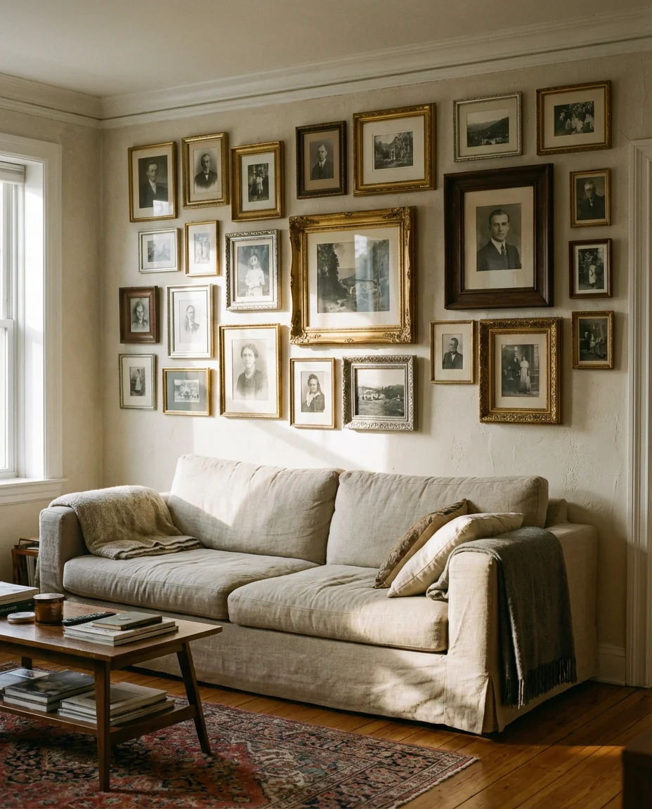
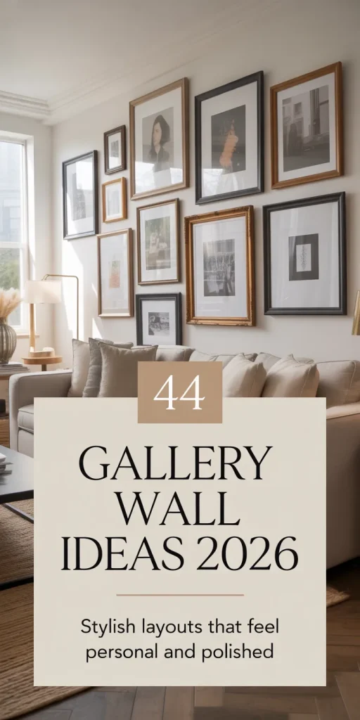
There’s something deeply nostalgic about a vintage-inspired wall covered in black and white photo prints. This look works beautifully in a living room where the lack of color actually lets the composition breathe and the stories within each frame do all the talking. Mismatched antique frames in gold, silver, and dark walnut add the kind of visual richness you simply can’t achieve with a matchy set from a big box store. The key is pairing different sizes—large anchor prints surrounded by smaller candid shots—so the eye has somewhere to travel.
This arrangement works best on a large, uninterrupted wall—think the expanse behind a sofa or along a wide staircase landing. Design pros often suggest starting with your largest piece centered at eye level, then building outward organically rather than measuring everything to the millimeter. That slight imperfection is actually what gives the wall its lived-in, collected-over-time quality that no algorithm can replicate.
2. Eclectic Living Room Gallery with Mixed Frames
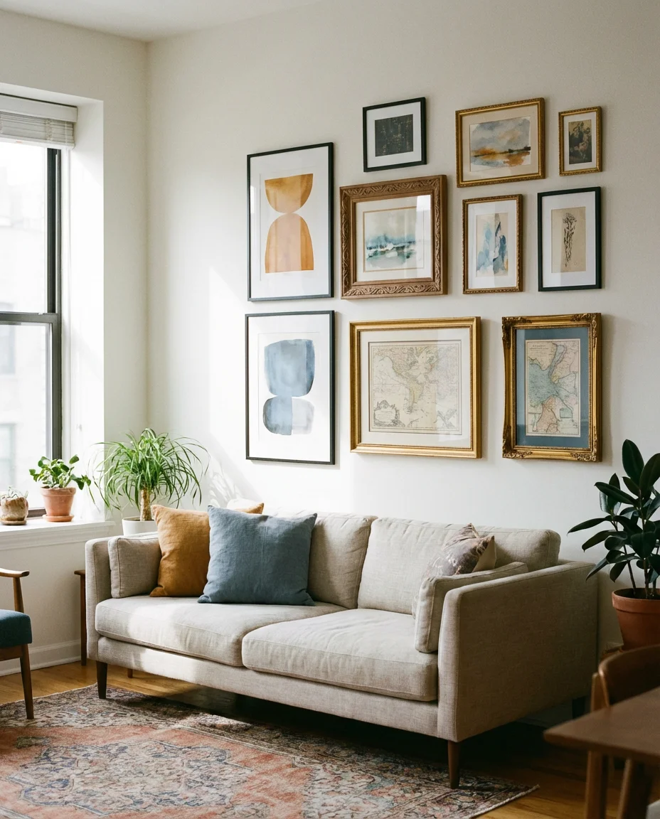
An eclectic gallery wall in the living room is the design equivalent of a really good dinner party conversation—a little unpredictable, layered with personality, and impossible to forget. The magic happens when you deliberately mix frame styles: sleek black metal next to carved wood next to a gilded baroque number. Add in a variety of art types—oil painting reproductions, watercolors, vintage maps, and abstract prints—and the wall takes on a curated-collector vibe that looks like it evolved naturally over years of intentional living.
One common mistake people make is going too random—eclectic doesn’t mean chaotic. Pull it together with a consistent color thread running through each piece, whether that’s a warm amber tone in every artwork or a recurring shade of dusty blue. That invisible connective tissue is what separates a gallery wall that looks intentional from one that just looks like you ran out of storage space.
3. Colorful Bedroom Gallery Above the Headboard
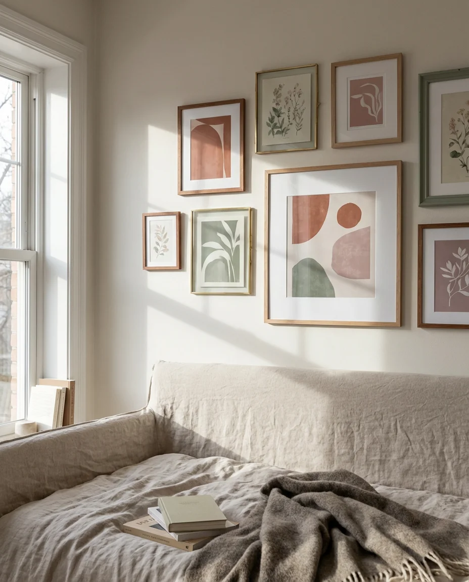
A colorful gallery wall above a bedroom headboard acts like a permanent piece of art installation—it frames the whole sleeping nook and gives the room a focal point that even the most beautiful bedding can’t achieve on its own. In 2026, the palette skewing toward terracotta, sage, dusty rose, and cobalt has made its way into bedroom gallery arrangements. Mixing bold abstract prints with softer botanical illustrations keeps the energy vibrant without veering into overwhelming territory. Matching your frame colors loosely to your existing bedding palette pulls the whole look together.
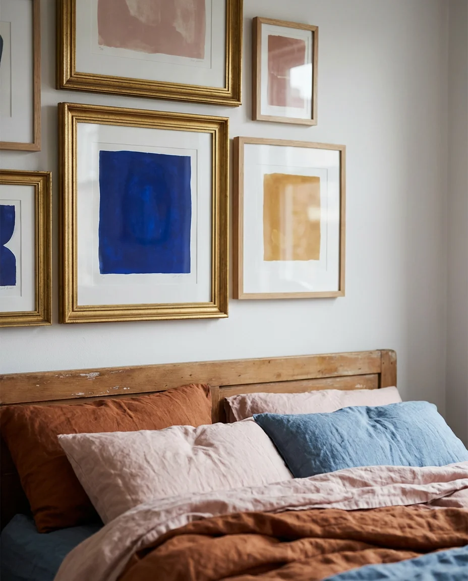
Budget-savvy decorators know that printable art from Etsy can make this wall incredibly affordable—you can download a full set of cohesive prints for under $20, print them at a local shop, and frame them yourself. This is especially smart in a rental bedroom where you want maximum impact without a big investment, since the whole thing comes down as easily as it went up.
4. Family Photo Gallery in the Hallway
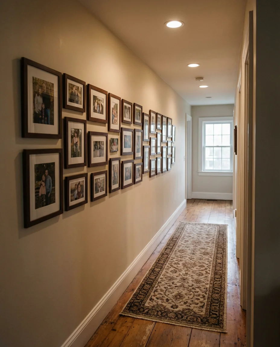
A hallway lined with family photos is one of those design choices that feels genuinely personal in a way that no store-bought décor can replicate. The narrow corridor format actually works in your favor here—a long horizontal arrangement of family portraits creates a natural timeline, from childhood snapshots to recent adventures. Keeping frames in a consistent warm wood tone helps unify the display even when the photos themselves vary wildly in style and era. This is the kind of wall that makes guests slow down and actually look.
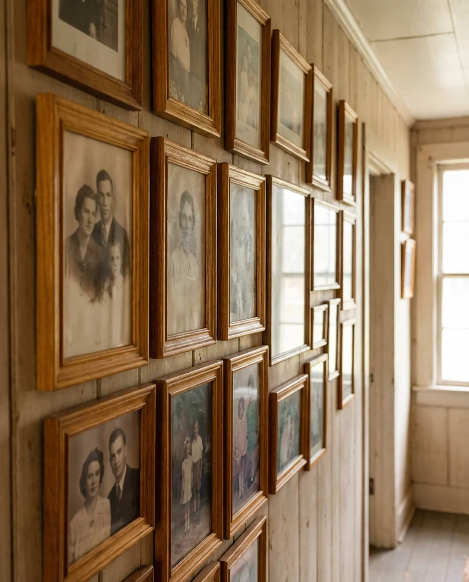
Many American families use the hallway gallery as a living archive—adding new frames each year after the annual holiday photo shoot. One homeowner in Austin described it as her “family museum,” a place where her kids could look back at every phase of their childhood just by walking from the front door to the kitchen. That kind of emotional resonance is what makes the hallway gallery so enduring as a design tradition.
5. Bohemian Bedroom Wall with Woven Textiles and Art
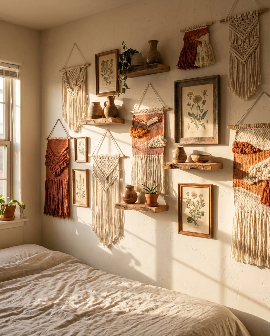
A bohemian gallery wall breaks all the traditional rules in the best possible way—instead of sticking purely to framed art, it weaves in macramé hangings, woven tapestries, small decorative shelves, and even dried floral bundles to create a layered, textural display. In a bedroom, this approach softens the entire space, introducing warmth and an organic, handmade quality that feels like an antidote to the hyper-polished interiors dominating social media. Earth tones, rust, cream, and forest green tend to anchor these bohemian arrangements beautifully.
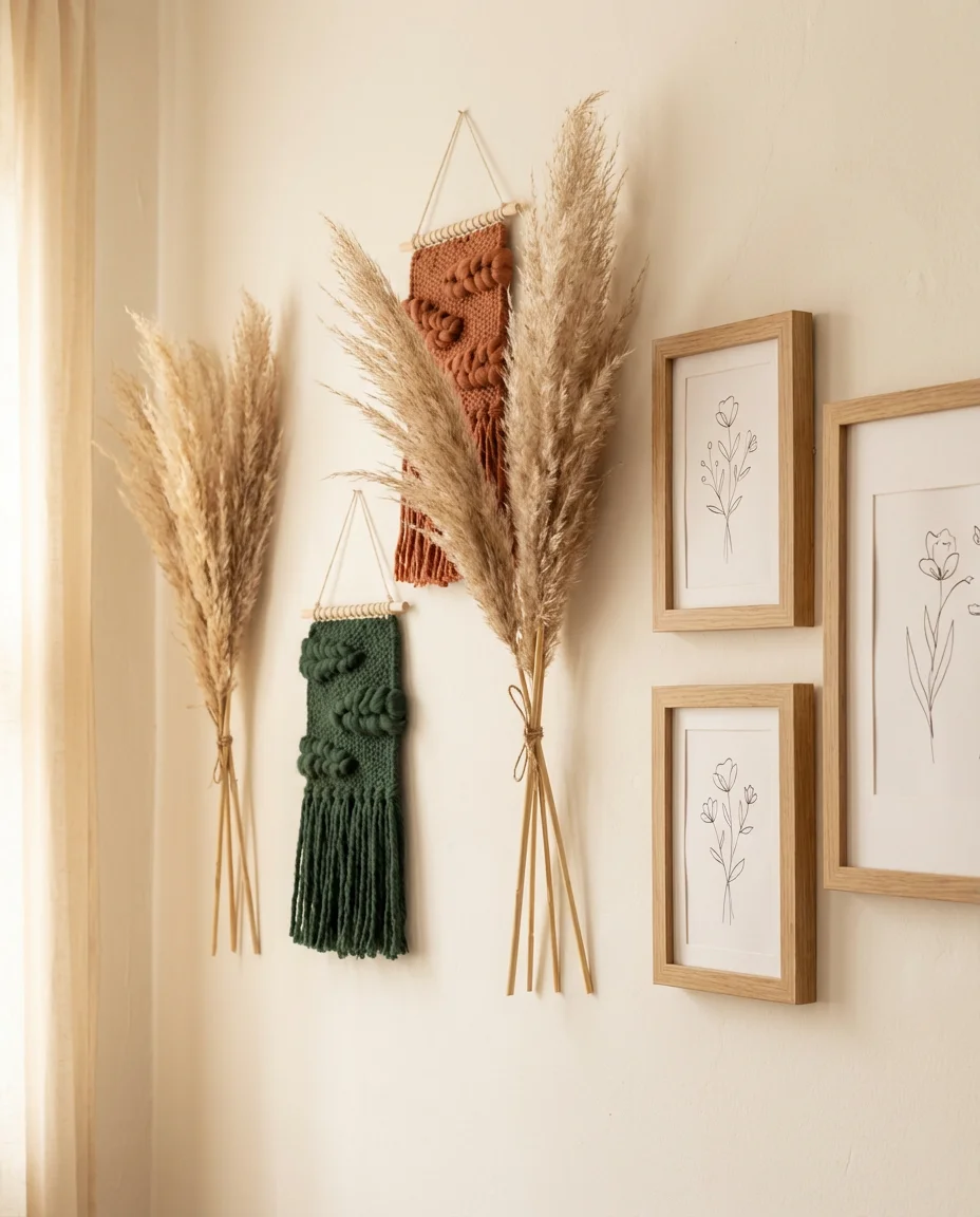
This style suits renters and DIY enthusiasts particularly well because many of the elements—woven hangings, pampas grass, and small prints—can be affixed with removable hooks and strips. Building the wall gradually over time as you discover new pieces at flea markets and craft fairs also leans naturally into the aesthetic, since boho style celebrates the collected and imperfect over the instantly complete.
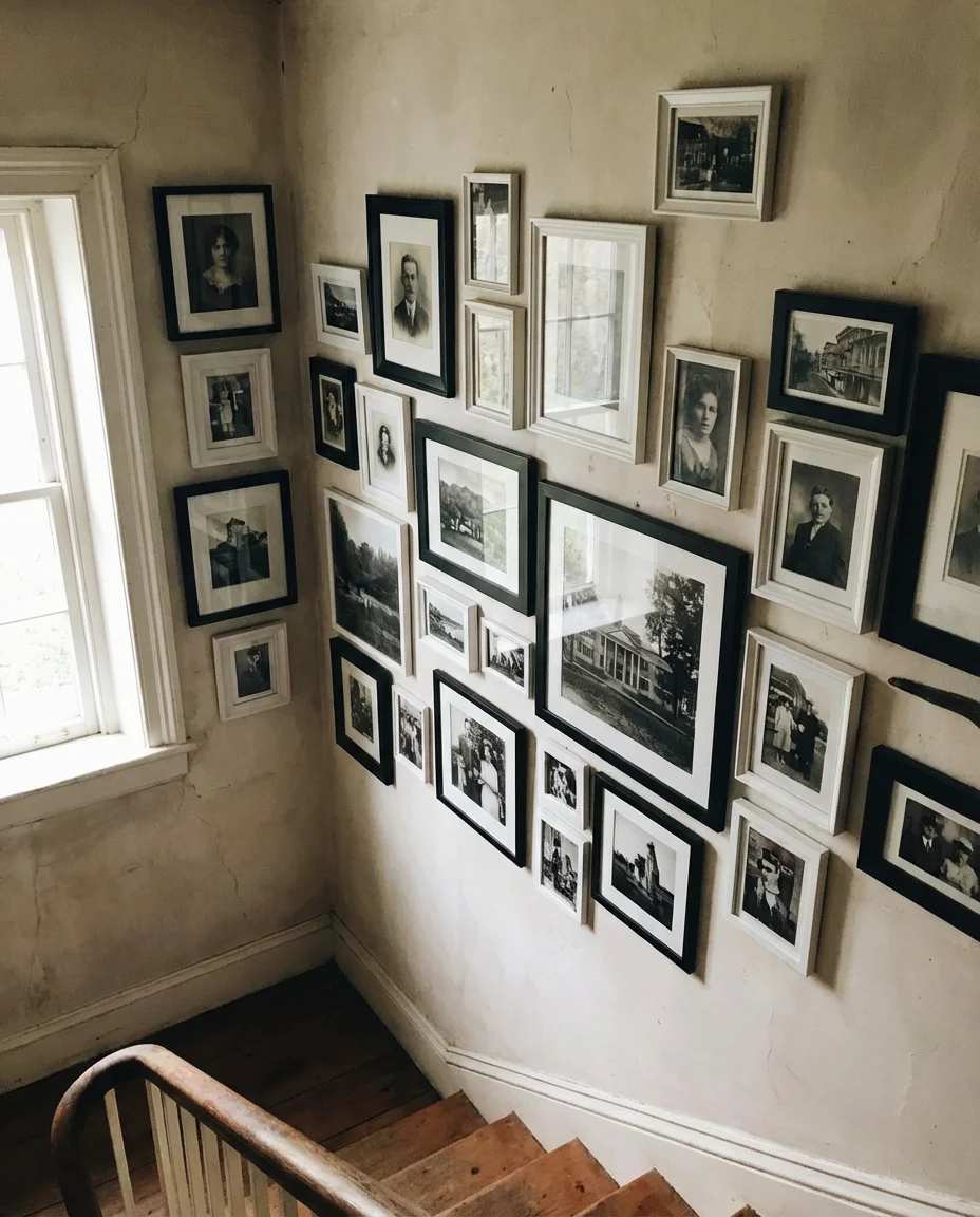
6. Staircase Gallery Wall with Ascending Frames
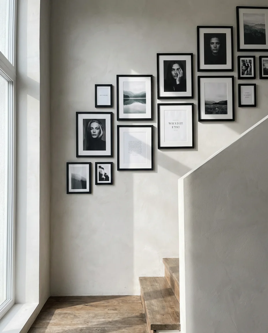
The wall running alongside a staircase is arguably the most dramatic canvas in any home, and an ascending gallery arrangement takes full advantage of that diagonal momentum. The trick is keeping the spacing between frames consistent as they climb upward so the eye follows a natural visual staircase of its own. Family portraits mixed with landscape prints and typographic art work beautifully here—the variety keeps the ascent visually interesting rather than repetitive. Matte black frames on a warm white wall remain one of the most timeless choices for this layout.
Interior designers often recommend laying all the frames out on the floor in the exact arrangement you plan to hang them before committing a single nail to the wall. It sounds obvious, but it saves enormous frustration—especially on a staircase where crooked spacing is immediately visible to anyone going up or down. Chalk a light pencil line following the stair angle as your guide rail, and hang from that invisible diagonal for clean, professional results.
7. Kitchen Picture Ledge Gallery
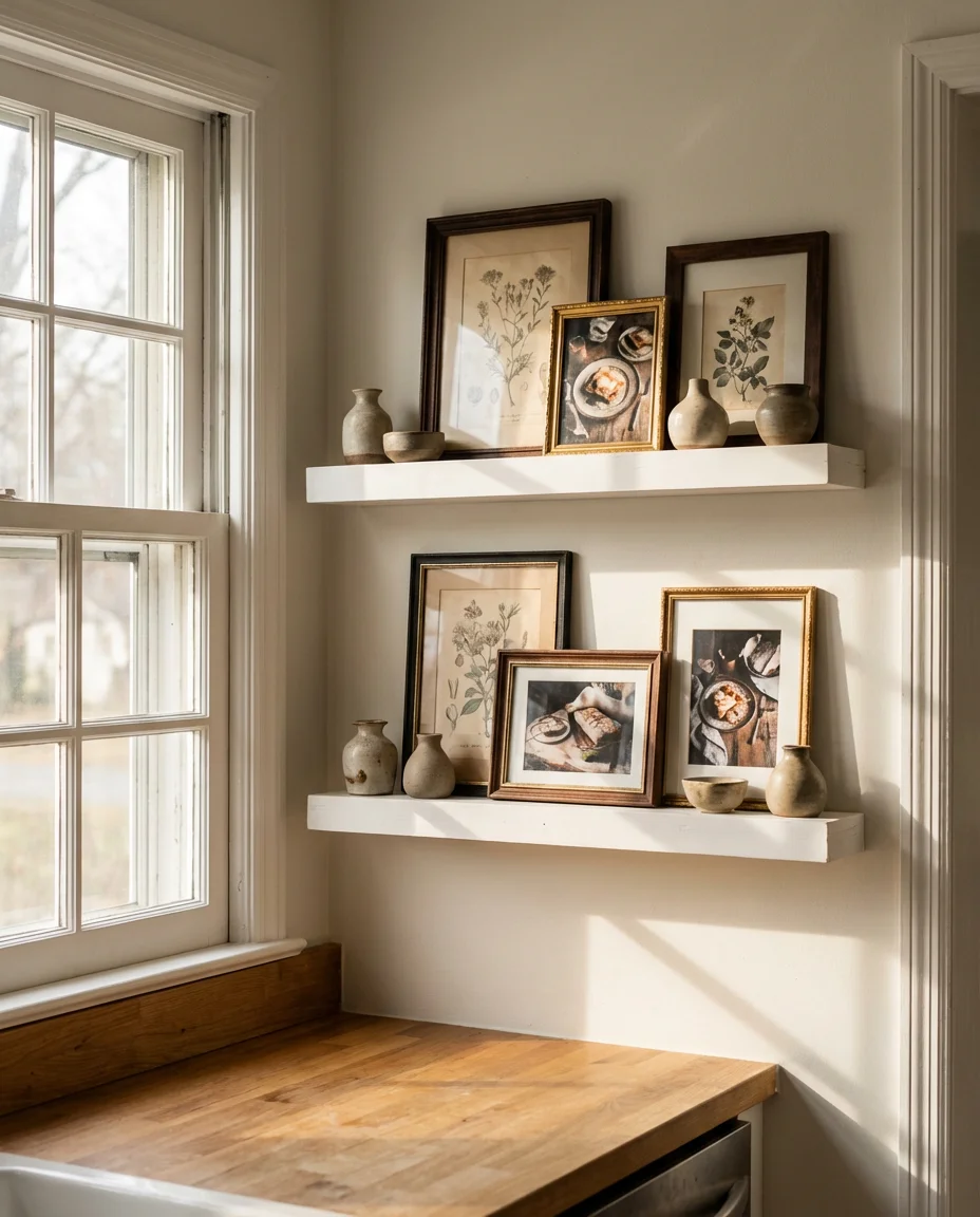
Bringing a gallery wall into the kitchen might sound unexpected, but a simple row of picture ledge shelves creates a casually stylish display that works beautifully between upper cabinets or along a blank breakfast nook wall. The beauty of ledge-style galleries is that you can swap prints with the seasons, add in small ceramics or vintage tins, and generally keep things feeling fresh without touching a single nail. Warm food photography, vintage botanical prints of herbs and produce, or abstract art in earthy tones all feel right at home in a kitchen setting.
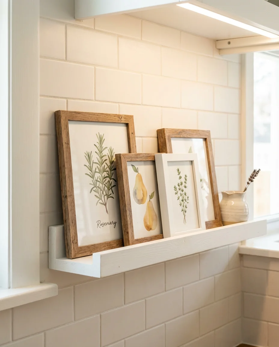
Picture ledges are one of the smartest investments you can make in a rental kitchen—they require minimal installation, do zero damage to walls, and give you complete flexibility. A pair of IKEA Mosslanda shelves costs under $30 total and can hold a rotating gallery that keeps the kitchen feeling updated through every season and trend cycle. The low commitment makes them especially popular with younger renters who want a styled home but aren’t ready to commit to permanent changes.
8. Travel Gallery Wall in the Home Office
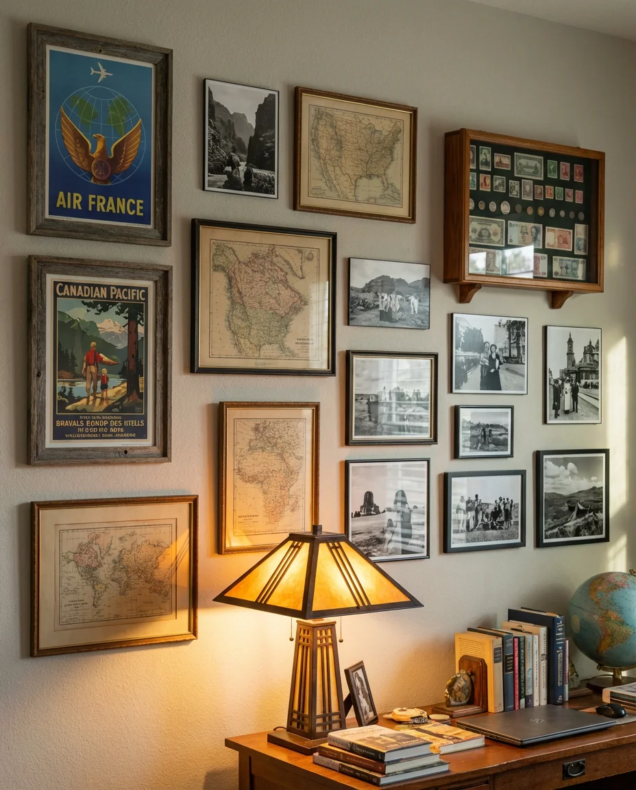
A travel-themed gallery in an office space does double duty—it makes the room feel personal and inspiring while subtly reminding you of the adventures that make the daily work worthwhile. Think vintage travel posters from beloved destinations, framed maps with pins marking every city you’ve visited, passport-sized photos printed large, and even scraps of foreign currency or ticket stubs displayed in small shadow boxes. The result is a workspace that tells your story rather than looking like a generic productivity setup from a furniture catalog.
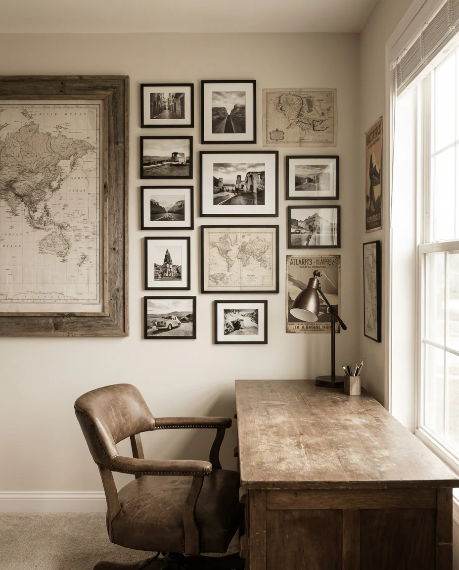
This wall works best when you keep the color palette somewhat unified—many travel enthusiasts gravitate toward a warm sepia-and-cream tone for vintage pieces, then pop in one or two vivid color photographs as contrast anchors. It’s a wall that genuinely evolves as your life does, which gives it an energy that static, perfectly matched art arrangements simply can’t match. Place it directly in your sightline from the desk for maximum motivational effect.
9. DIY Entryway Gallery on a Budget
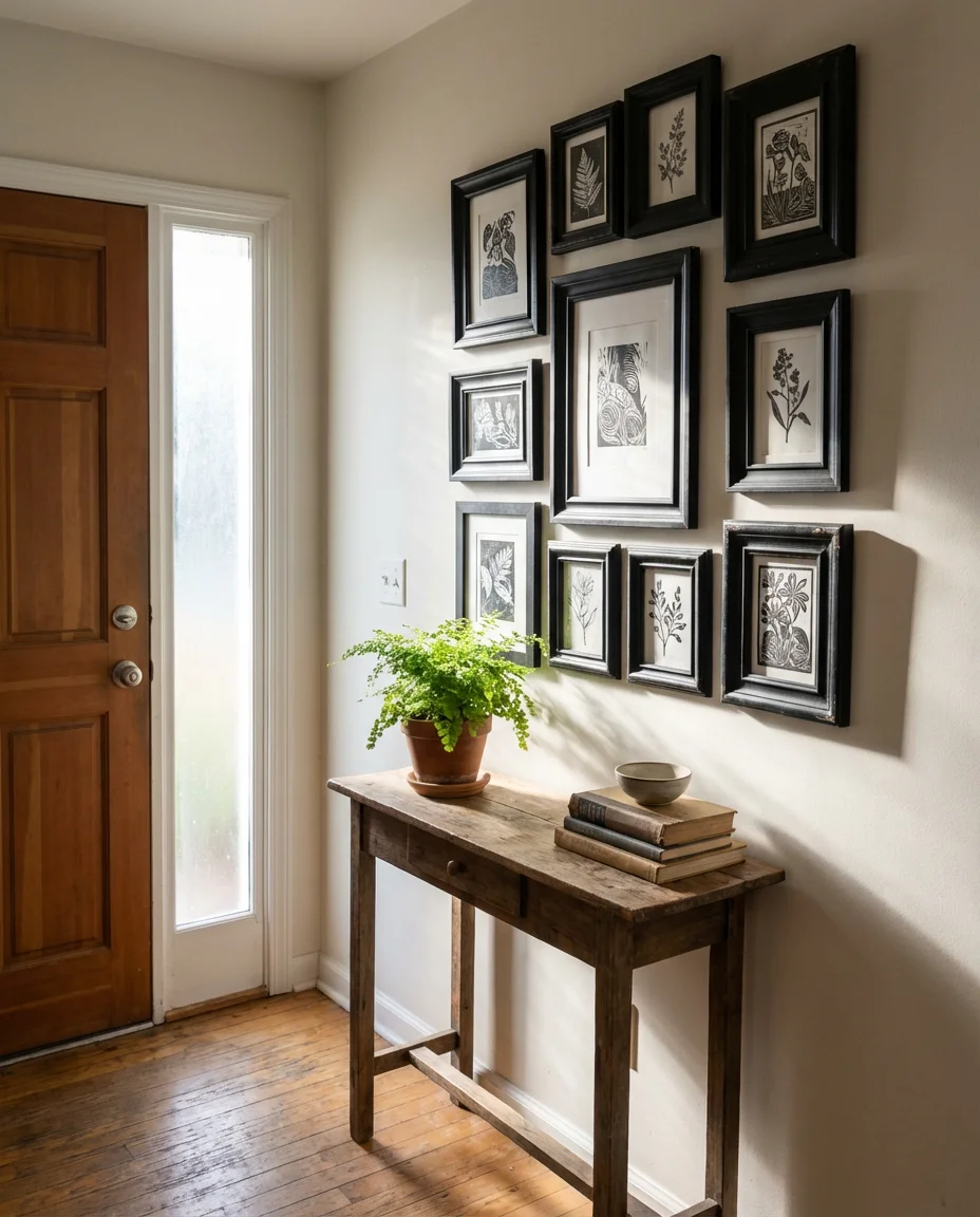
The entryway is the first thing you see when you walk through the door, and a well-executed DIY gallery wall transforms it from a functional drop zone into something that genuinely welcomes you home. You don’t need expensive art—thrifted frames painted in a uniform color, free printable art, and even pages torn from oversized coffee table books can create a cohesive and impressive display for well under $50. The small scale of most entryways actually makes this an ideal beginner project because you’re working with a limited footprint where minor mistakes are easy to correct.
A real homeowner in Nashville shared that she built her entire entryway gallery using $2 thrift store frames and free art she found on Unsplash—the whole wall cost her eleven dollars and takes every guest’s breath away. The secret is painting all the frames the same matte black color, which instantly makes the mismatched shapes and sizes look intentionally curated rather than randomly assembled. Uniformity in frame color is the single most powerful trick for making budget gallery walls look expensive.
10. Mirror Gallery Wall for a Small Space
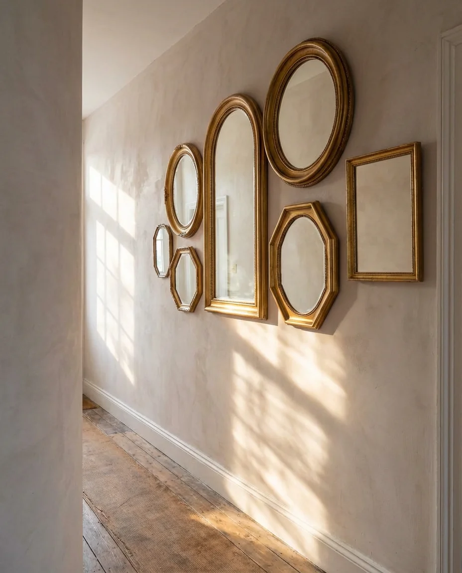
A mirror gallery wall is one of the most functional design moves you can make in a small room or a dim hallway—it bounces light, creates depth, and makes compact spaces feel significantly larger. Mixing mirror shapes—round, arched, hexagonal, and ornate—while keeping finishes consistent in antique gold or brushed brass gives the arrangement the layered look of an art gallery without sacrificing any of the practical light-amplifying benefits. This trend has dominated Pinterest boards for years, and in 2026 it’s evolved toward even more adventurous shapes and asymmetrical layouts.
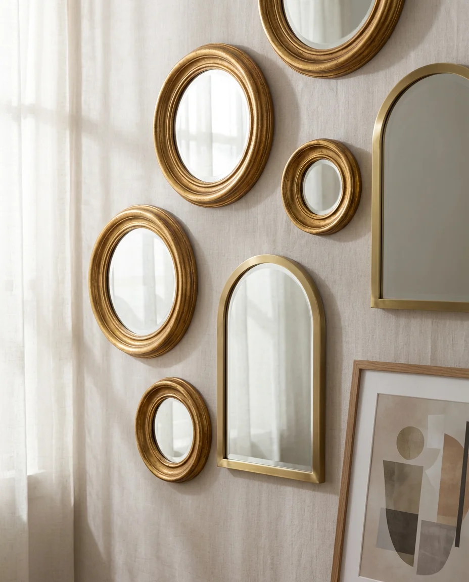
Where this idea truly shines is in apartments and smaller homes where every square foot has to earn its keep. Position the cluster opposite a window to maximize the light reflection, and consider mixing in one or two framed art pieces among the mirrors to break up the repetition and keep the wall from feeling like a funhouse. The combination of reflective and flat surfaces creates a sophisticated tension that elevates the whole space.
11. Wedding Photo Gallery in the Dining Room
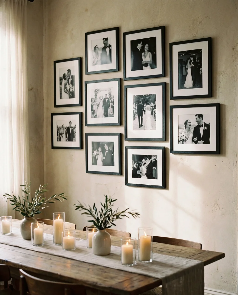
Dedicating the dining room wall to a curated wedding photo gallery feels romantic without being excessive—especially when you edit down to only your absolute favorites and present them in beautiful, matted frames. The dining room is where families gather, celebrate milestones, and host the dinners that become memories, so anchoring it with imagery from your own love story feels deeply fitting. Black and white processing unifies photos taken at different moments of the day and elevates even casual candid shots to something that looks intentional and timeless.
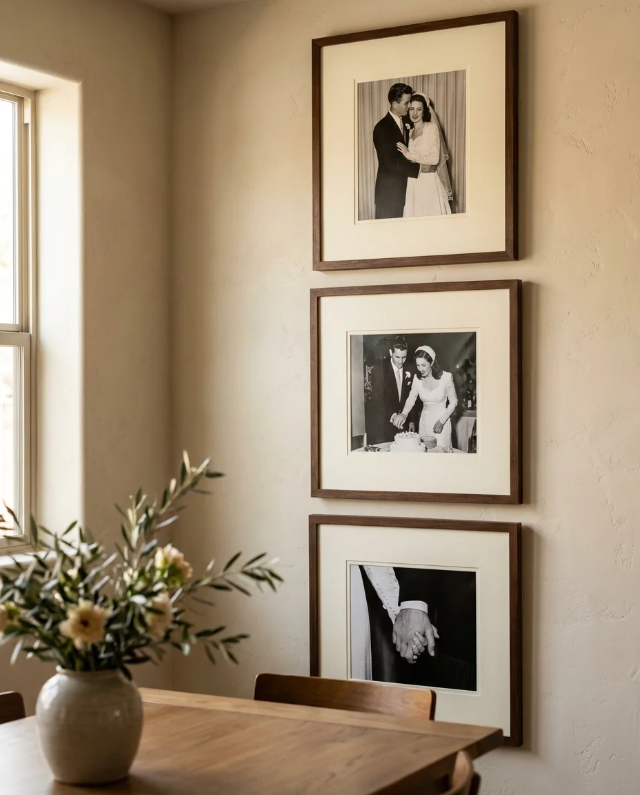
Many couples treat this wall as a slow-build project—starting with a few key prints right after the wedding, then adding anniversary photos over the years to create a living timeline of their relationship. It’s a deeply personal choice that guests consistently notice and comment on, and it gives the dining room a warmth that no purchased art could ever replicate. Consider commissioning a custom film photographer to shoot a few intimate portraits specifically for this wall.
12. Bathroom Gallery Wall with Small Botanicals
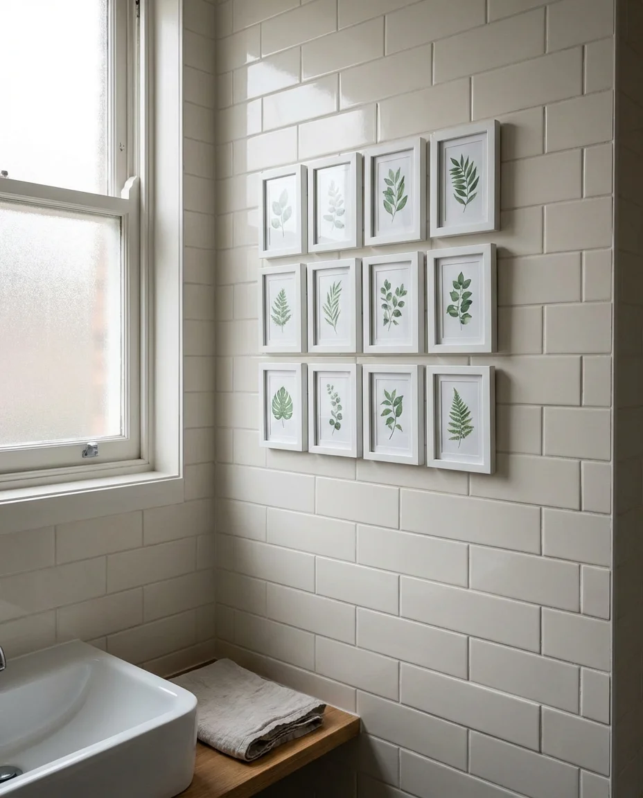
A small bathroom gallery is one of the most underrated opportunities in the home—those walls spend most of their life bare when they could be doing something charming and unexpected. A tight grouping of small botanical prints in matching white frames brings a spa-like serenity to even the most utilitarian bathroom. The scale matters enormously here: in a small room, six or eight petite frames clustered together have far more impact than one large piece because the grouping creates a sense of abundance and intention that a single image can’t achieve.
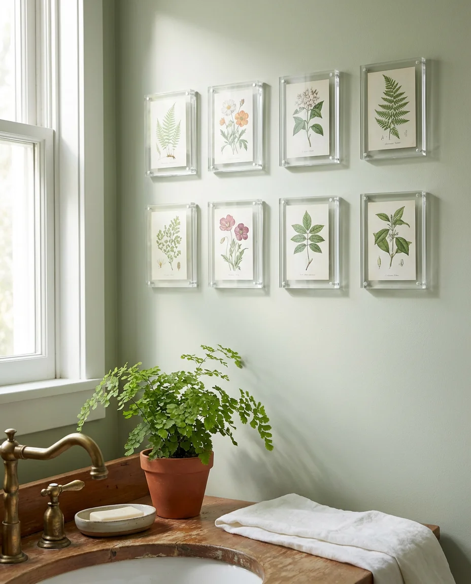
Humidity is a real consideration for bathroom art—always use prints rather than original artwork, and consider acrylic frames, which are lighter, shatter-resistant, and more forgiving in wet environments than glass. A framer once noted that the number one thing that destroys bathroom art isn’t the moisture itself but the temperature swings from hot showers, so proper glass or acrylic sealing on the front of prints makes a measurable difference in longevity.
13. TV Wall Gallery Surrounding a Flat Screen
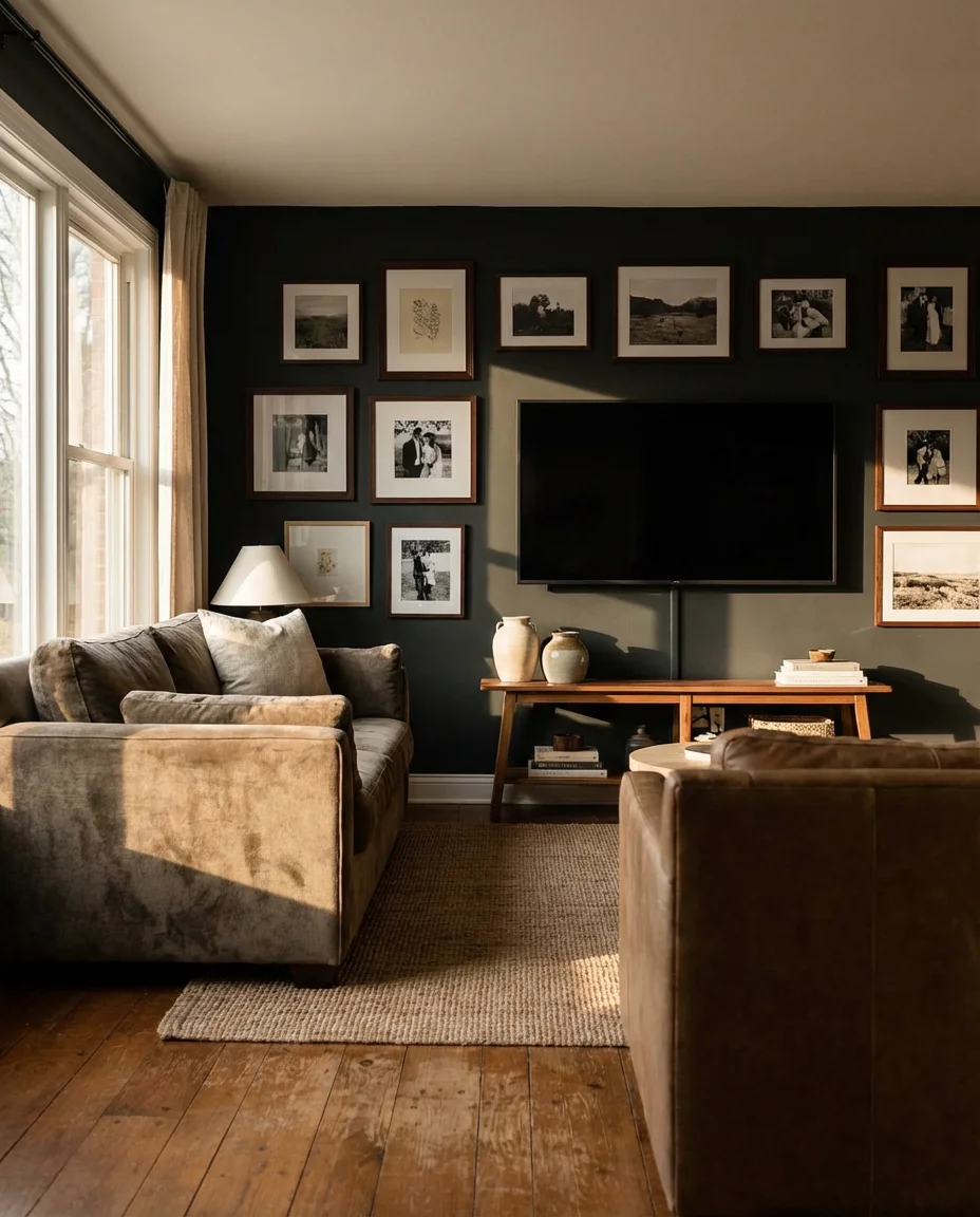
One of the most clever gallery wall applications right now involves building an art arrangement around—rather than instead of—the TV. Treating the flat screen as simply one element within a larger composition completely changes how the television reads in the room. When it’s off, the TV becomes almost invisible within the surrounding artwork; when it’s on, the gallery provides context and visual interest that prevents the screen from dominating the entire wall. This works best in a living room where you want the space to feel curated even during movie nights.
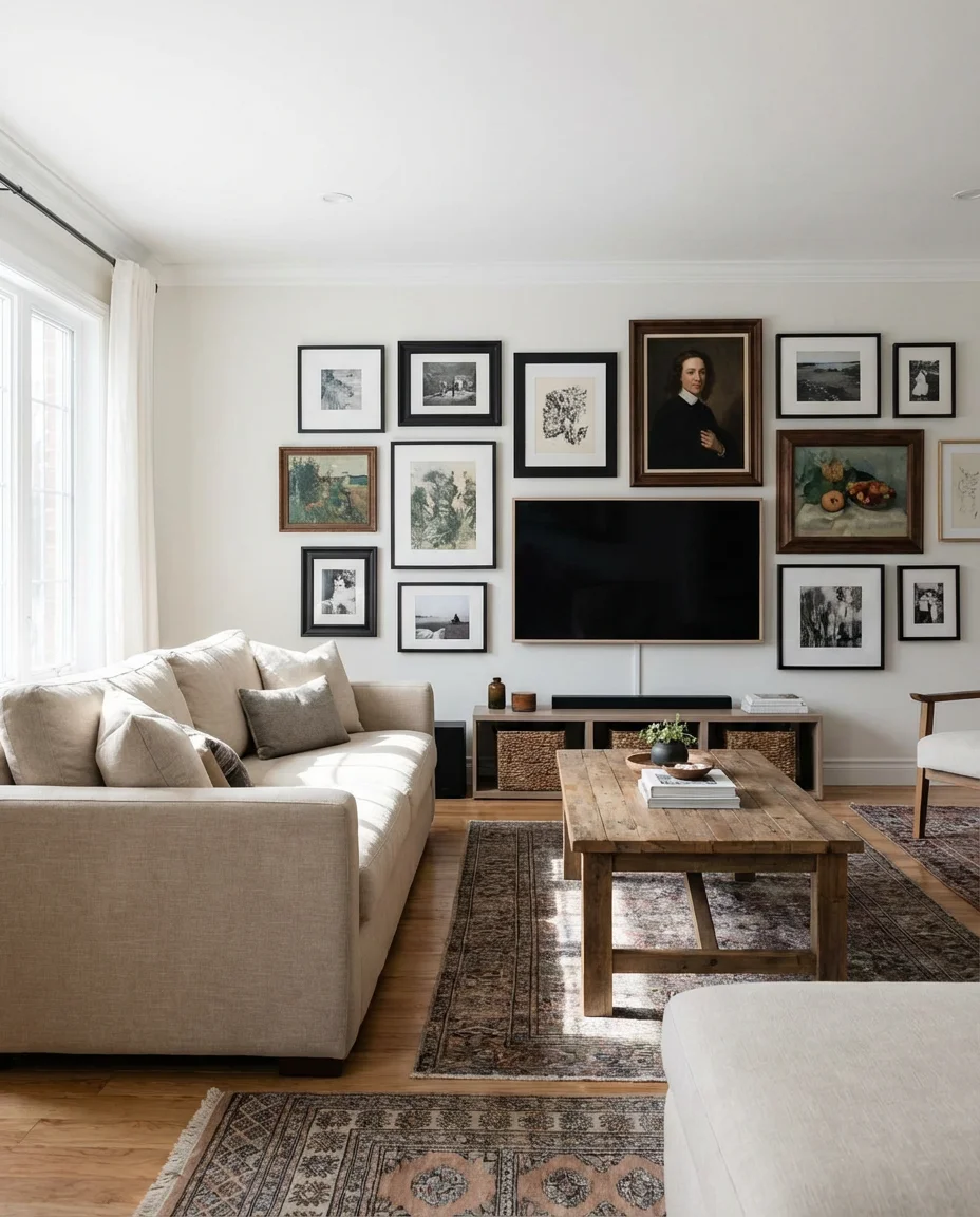
The most common mistake with TV gallery walls is hanging art too close to the screen, which creates a cluttered look and makes the wall feel anxious rather than composed. Leave at least six inches of breathing room on all sides of the television, and keep the art within that immediate halo slightly smaller in scale so the TV doesn’t compete awkwardly with oversized pieces. Darker frames tend to help the TV recede into the composition more naturally.
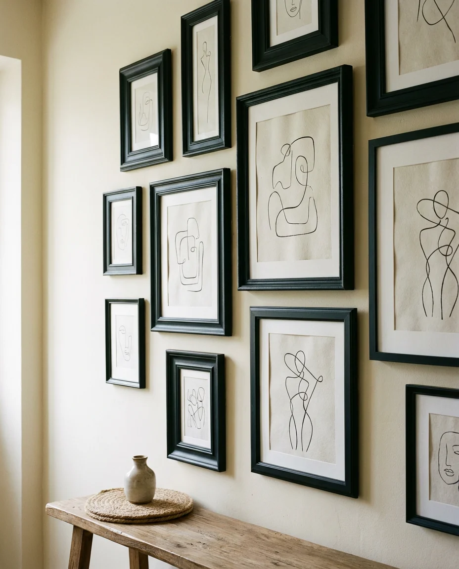
14. Unique Shaped Frame Gallery in the Entryway
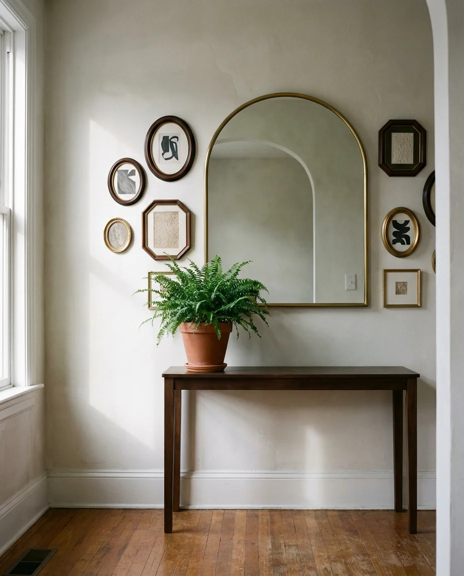
Playing with unique frame shapes—arched, oval, octagonal, and asymmetrical—in an entryway gallery creates an instant conversation piece before guests have even taken off their shoes. This is especially effective in a transitional-style home where you want a traditional space to feel a little more current and unexpected. Mixing a large arched mirror with smaller oval and rectangular frames in complementary finishes creates a composed but distinctly non-generic display that feels like it came from a boutique hotel lobby rather than a mass-market home goods store.
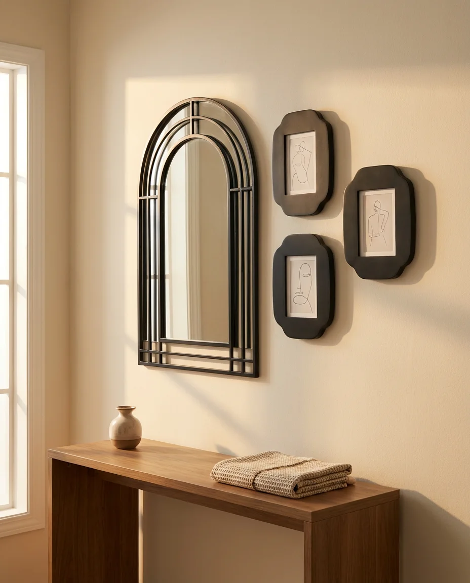
This style has an impressive visual return relative to cost—you don’t need to fill every frame with expensive art. Simple abstract shapes, single-word prints, or even beautiful sheets of decorative paper work beautifully within architectural frames because the frame itself is doing most of the aesthetic heavy lifting. Spend your budget on two or three statement frames and fill the rest with inexpensive or DIY art to achieve maximum impact efficiently.
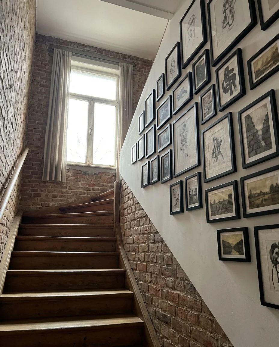
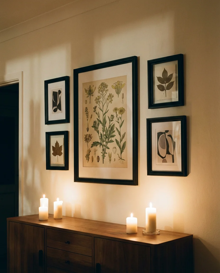
15. Vintage Map and Travel Print Staircase Wall
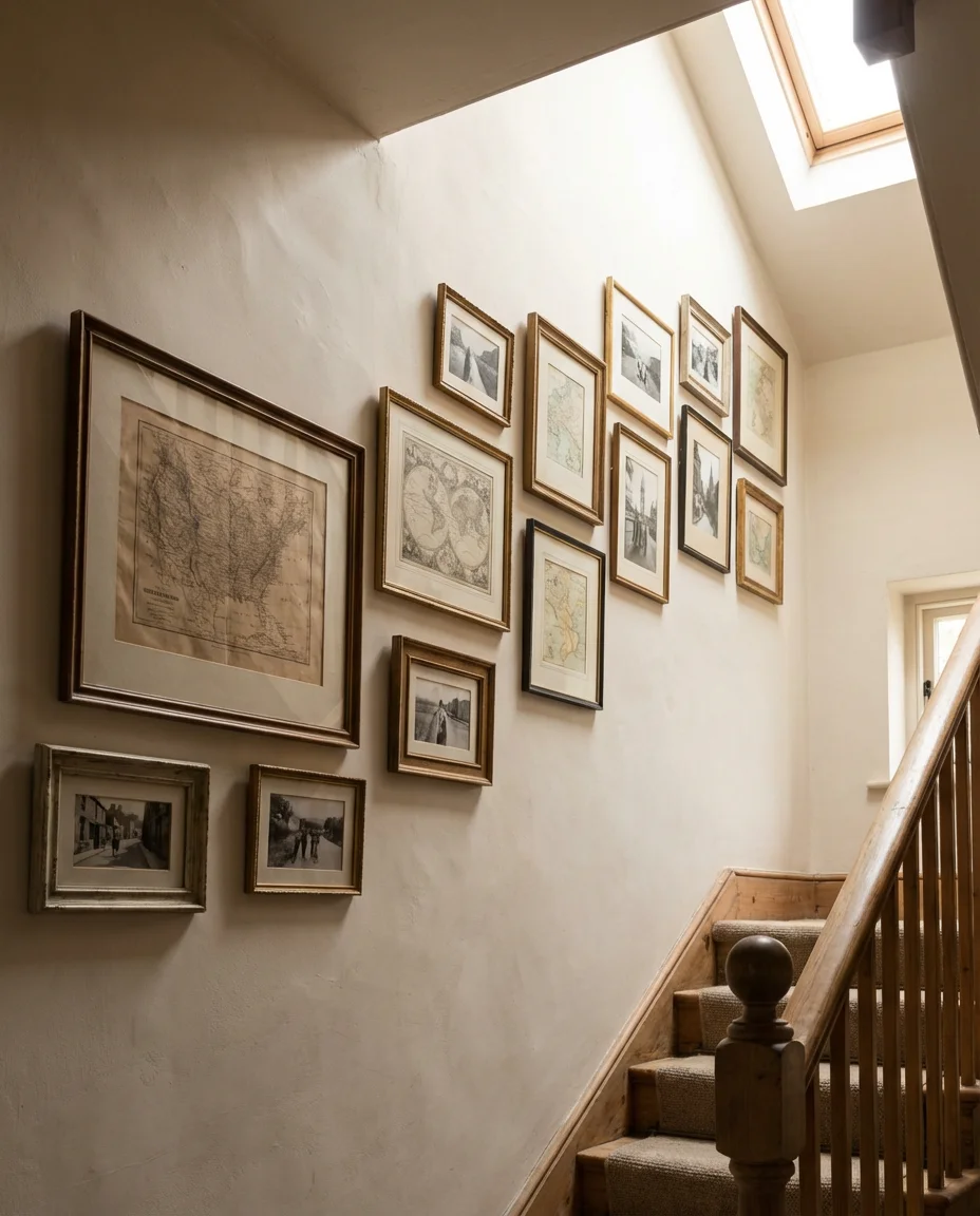
Combining vintage maps with travel photography along a staircase creates a narrative gallery that rewards closer inspection with every pass. Old cartographic prints have a warmth and texture that reproduction art often lacks—the aged paper tones, hand-drawn coastlines, and elegant typography are genuinely beautiful objects in their own right. Mix in black-and-white travel photographs, pressed botanical specimens from destinations you’ve visited, and even old foreign stamps matted and framed, and the staircase becomes a worldly, story-rich corridor that sets a remarkable tone for the whole home.
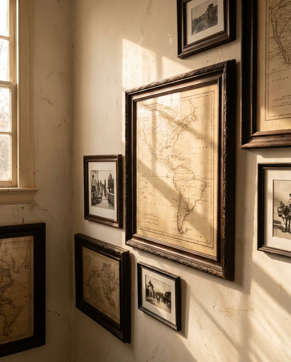
Authentic vintage maps can be found for surprisingly reasonable prices at estate sales, antique fairs, and online marketplaces—many original 19th-century prints go for $15–$40, which is far less than reproduction art of comparable visual quality. The authenticity adds a depth of character and a genuinely interesting story to share when guests inevitably ask about them. It’s one of those wines that genuinely gets better with age.
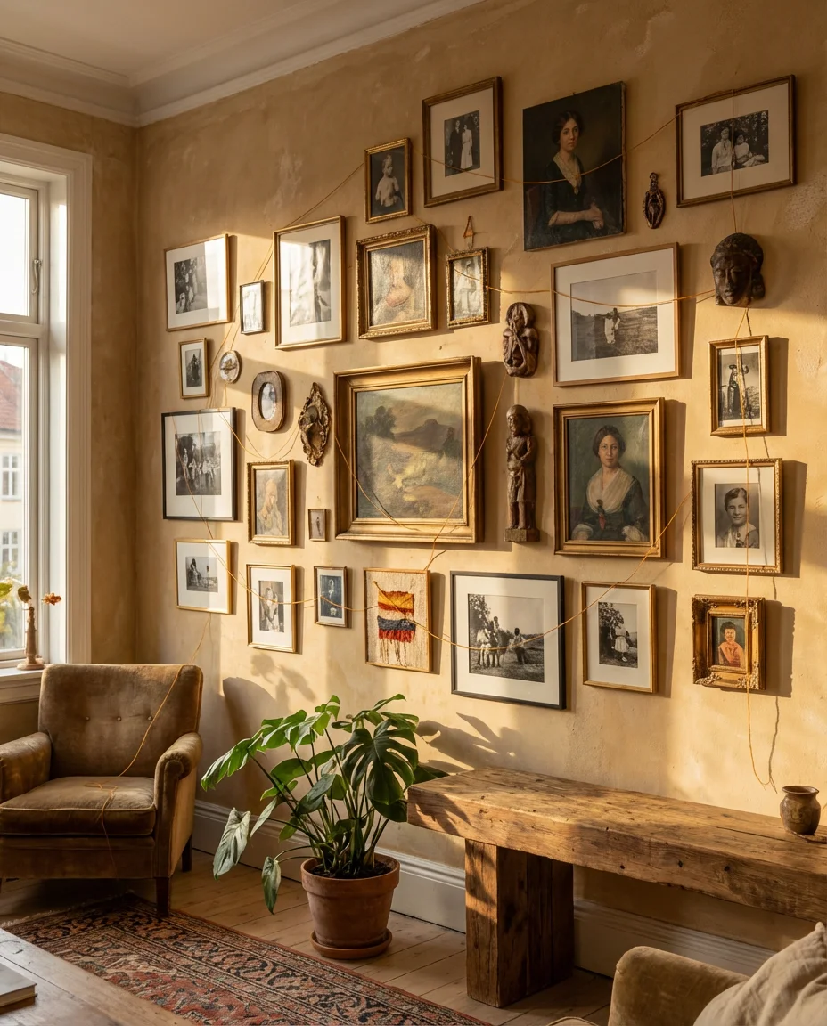
16. Eclectic Shelves and Art Mix in the Living Room
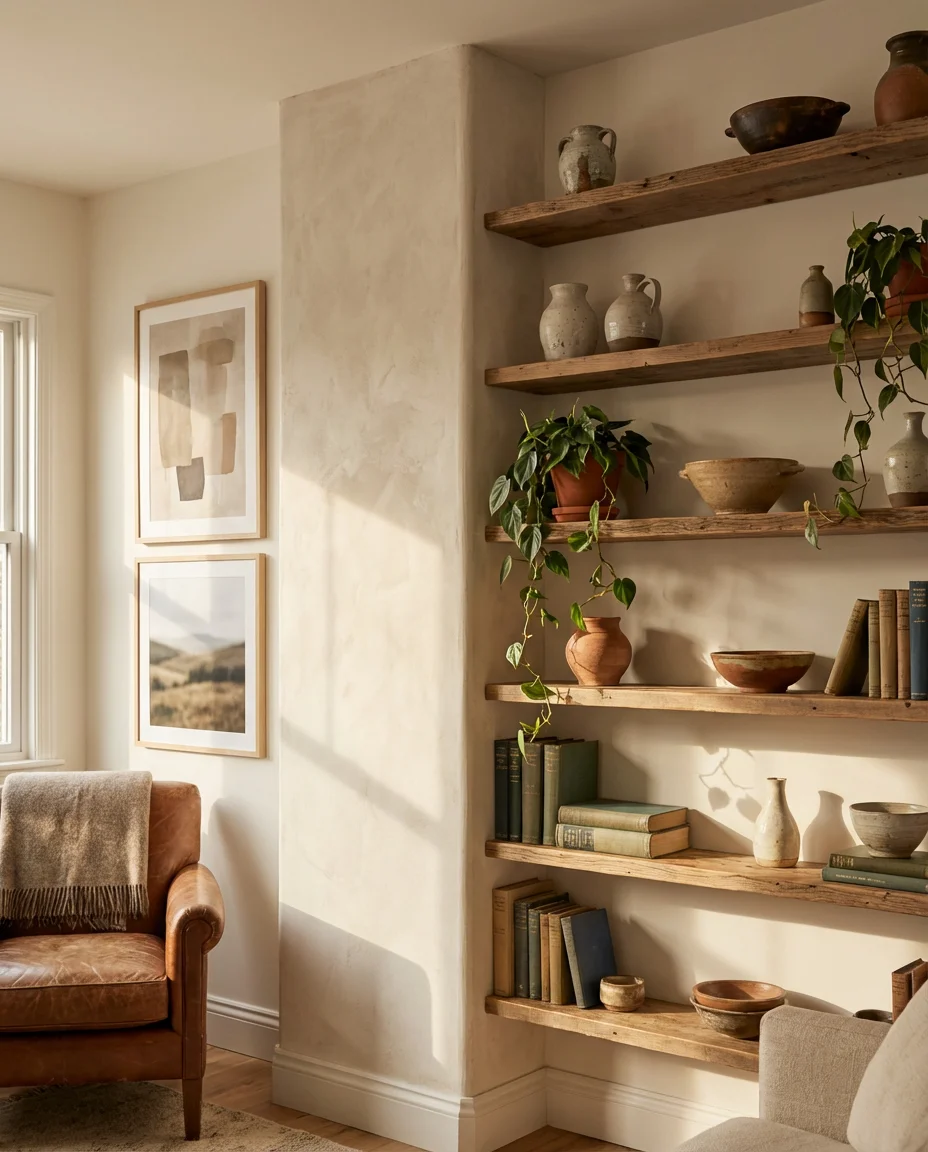
Incorporating floating shelves into an eclectic gallery wall creates a three-dimensional display that blends art and objects in a way that feels genuinely lived in. Instead of a flat arrangement of frames, you layer in small sculptures, stacked books with beautiful spines, trailing plants, and ceramics alongside the artwork. The result is a living room feature wall that looks more like a well-curated cabinet of curiosities than a conventional gallery, and it gives you enormous flexibility to refresh the look by simply swapping objects seasonally.
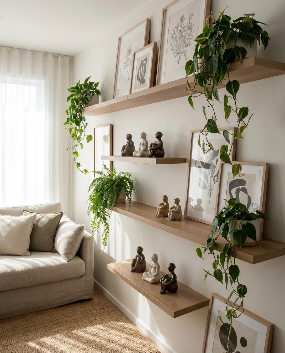
The rule of odds applies powerfully here—arrange shelf objects in groups of three or five rather than even numbers, which the human eye naturally finds more dynamic and interesting. Keep the largest framed art pieces anchored to the wall behind and between shelves so they provide a backdrop that visually grounds the three-dimensional elements in front. This layered approach is a hallmark of the interior design aesthetic that dominates the most-saved home inspiration posts on Pinterest year after year.
17. Colorful Children’s Art Gallery in the Family Room
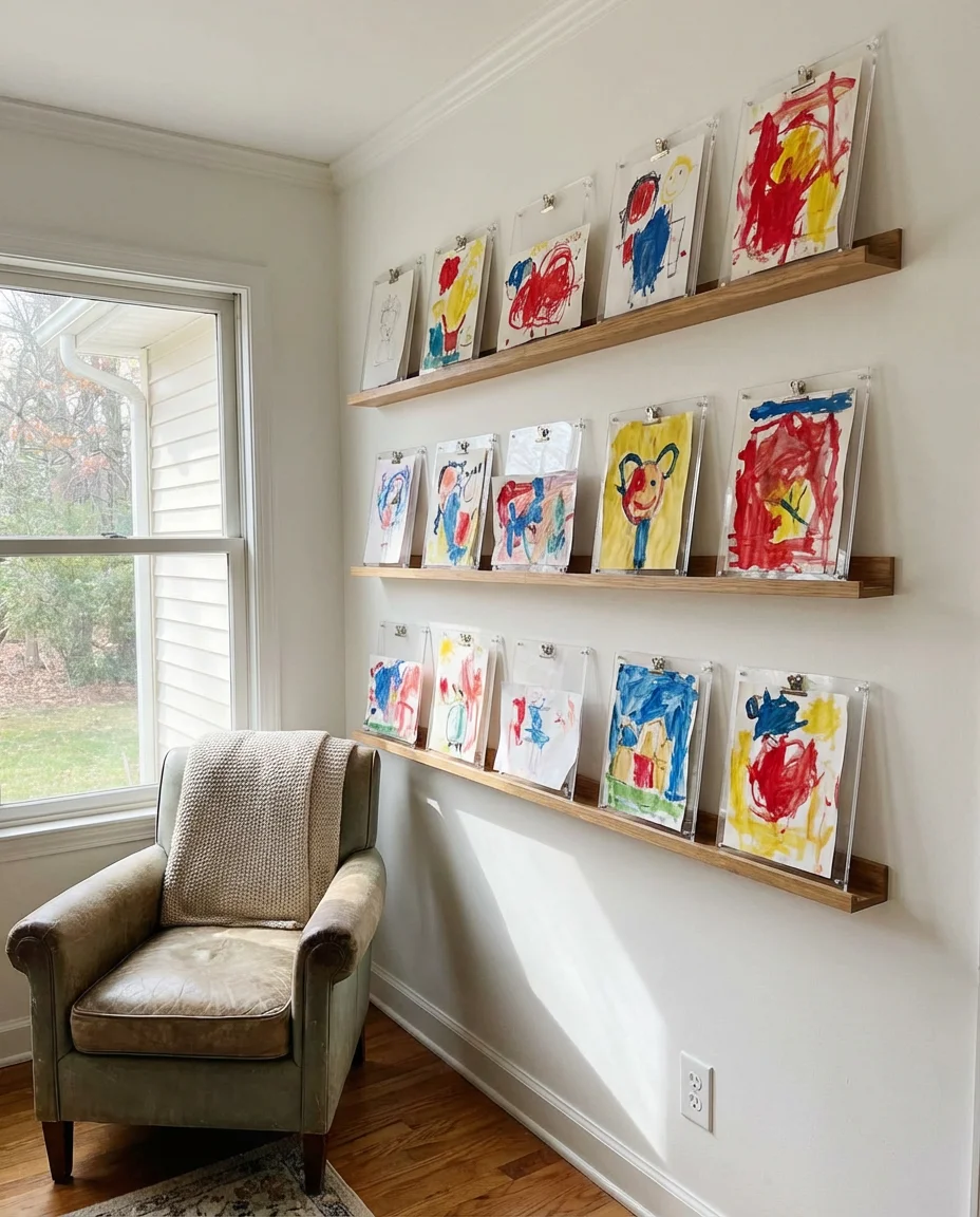
Turning your kids’ artwork into a rotating colorful gallery display is one of the most wholesome and genuinely cheerful things you can do with a family room or playroom wall. Dedicating a row of clip frames or simple ledge shelves to an ever-changing exhibition of children’s drawings and paintings honors their creative output while keeping the space feeling fresh. The irregular compositions and vibrant palette of children’s art are genuinely beautiful in their own right—there’s an energy and freedom in a six-year-old’s painting that most professional prints simply can’t match.
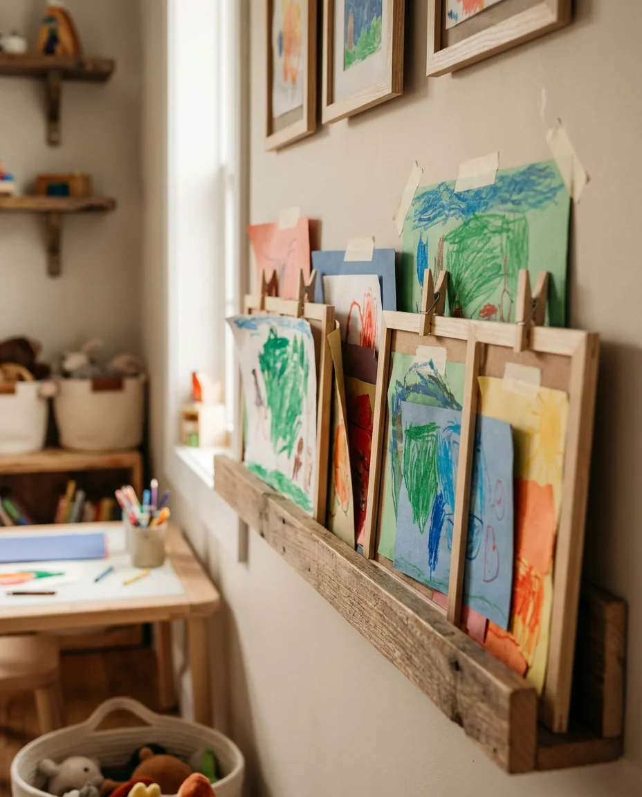
Many families in the US have adopted the clip rail or picture ledge system specifically because it lets kids be involved in curating their own gallery—choosing which pieces go up, rotating favorites, and seeing their work displayed with the same seriousness as museum art. Child development experts note that this kind of validation significantly boosts creative confidence in young children, making the gallery wall as much a parenting tool as a design choice.
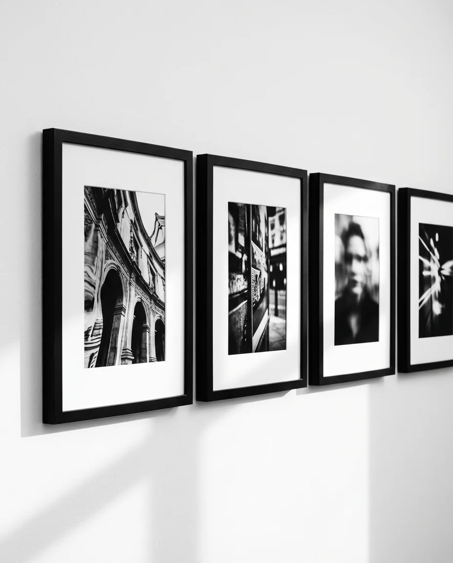
18. Black and White Photo Grid in the Office
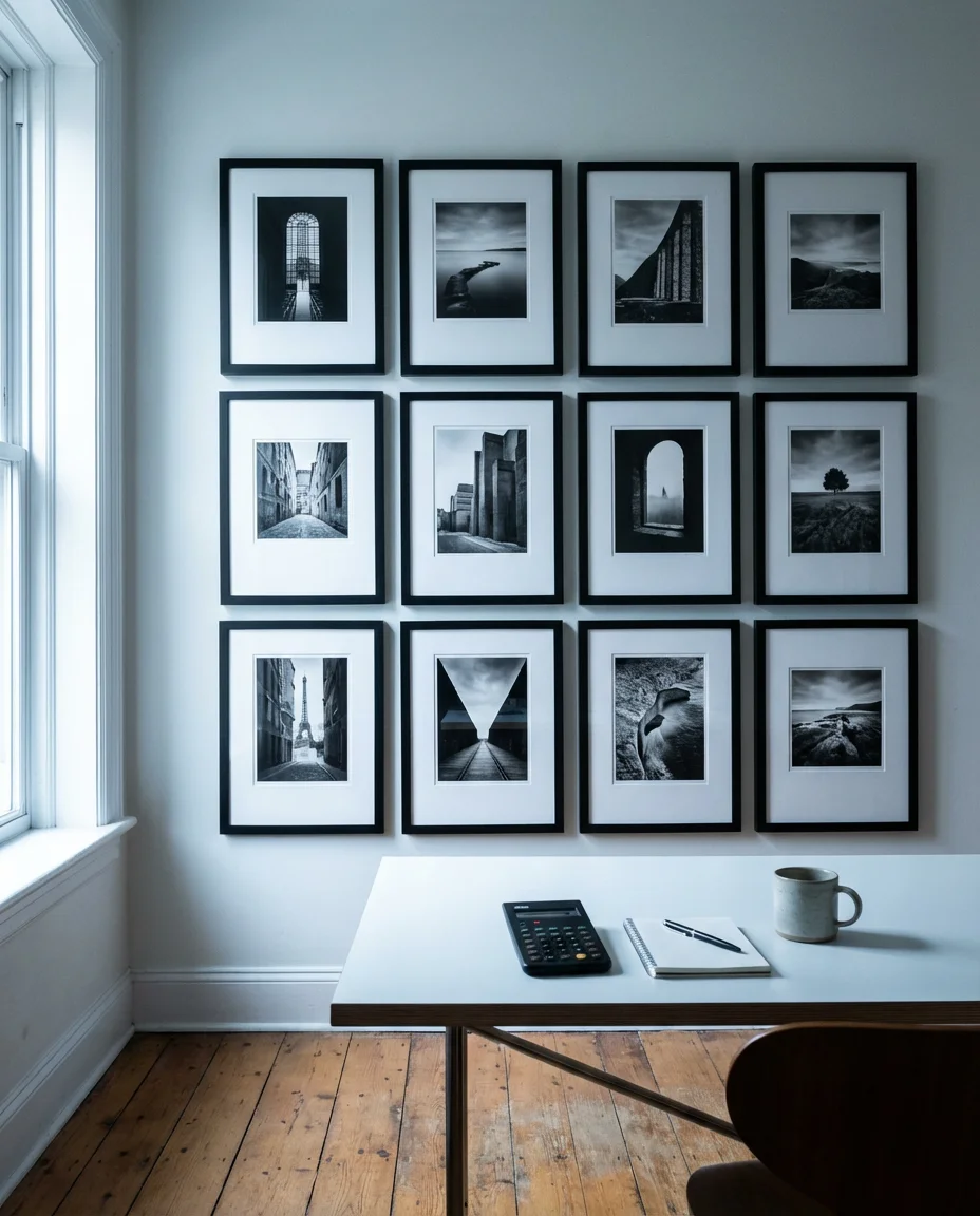
A precise grid of black and white photo prints brings an editorial, almost magazine-spread quality to a home office wall. Unlike the organic, asymmetrical gallery styles popular in living spaces, the grid format has a clean authority that feels appropriate for a workspace—it says “I have my life together” in the best possible way. The monochromatic treatment unifies an otherwise wildly diverse collection of images: architecture, portraiture, landscapes, and abstract textures all coexist beautifully when the color is stripped away and the composition becomes the sole focus.
For the grid to read as intentional rather than accidental, frame size and mat consistency are everything—a 3×4 or 4×4 arrangement of identically framed 8×10 prints with matching white mats is essentially foolproof and creates an impact that looks far more expensive than it actually is. Order prints from an online lab in bulk, and you can typically build a full 12-print grid for under $80 including frames from IKEA. It’s one of the highest-impact, lowest-cost gallery options available.
19. Dining Room Gallery with Oversized Art Anchor
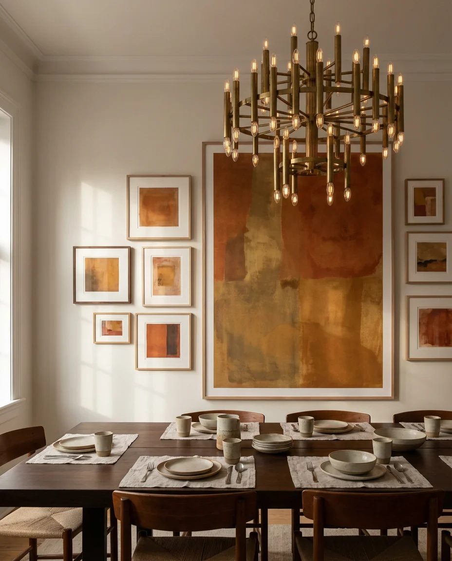
In a dining room, anchoring a gallery wall around one dramatic oversized print creates a focal arrangement that feels both sophisticated and approachable. The large piece does the heavy lifting compositionally, while the smaller surrounding works add context and layering without competing. This approach works especially well in formal dining rooms where you want the art to feel significant enough to hold its own against a substantial dining table and a statement chandelier. Abstract art, large-scale botanical prints, and oversized black and white photography are all strong candidates for the anchor position.
Sizing is critical and often the place where people go wrong—in a dining room with an eight-foot ceiling, your anchor piece should be at least 24×30 inches to command the wall appropriately, with smaller works ranging from 5×7 to 11×14 filling the surrounding space. An art consultant once described the ideal anchor-to-satellite ratio as similar to a solar system: one dominant mass with smaller bodies in its orbit. The metaphor is a little nerdy, but it genuinely works as a practical guide.
20. Bohemian Living Room Tapestry and Art Mix
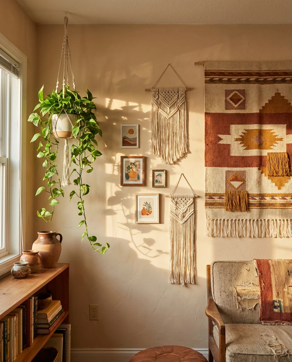
A bohemian gallery in the living room that mixes woven tapestries, macramé panels, framed prints, and hanging plants creates one of the warmest and most enveloping room atmospheres in contemporary decorating. The key differentiator from a generic boho look is curation—every element should have a story or a reason for being there, whether it’s a tapestry brought back from a market in Oaxaca or a print by an independent artist you discovered at a local craft fair. That intentionality comes through in the finished result even to guests who can’t articulate exactly why the wall feels so right.
This style also happens to be among the most forgiving for imperfect walls and rental restrictions—textile hangings cover a multitude of sins, including old nail holes, uneven plaster, and awkward wall jogs. In regions like the Southwest and Pacific Northwest, where bohemian design has particularly deep cultural roots, this kind of wall feels genuinely connected to local aesthetics rather than trend-chasing, which gives it a longevity that more fashion-forward styles don’t always sustain.
21. Vintage Kitchen Wall with Retro Prints and Frames
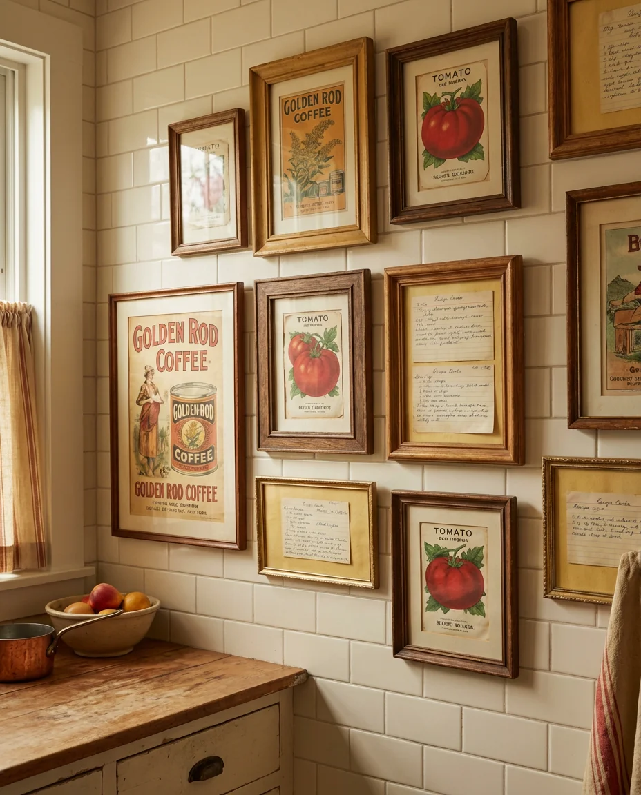
A vintage-themed gallery in the kitchen taps into a deep American nostalgia for mid-century home aesthetics—think retro seed packet prints, old diner menus framed as art, vintage Coca-Cola ads matted in cheerful reds and yellows, and hand-lettered recipe cards blown up to poster size. This style is particularly effective in kitchens with subway tile, butcher block counters, and open shelving, where the retro art feels architecturally consistent with the surrounding materials. The warm color palette of vintage printing—faded ochres, brick reds, and muted greens—adds tremendous coziness to a space that can otherwise feel cold and utilitarian.
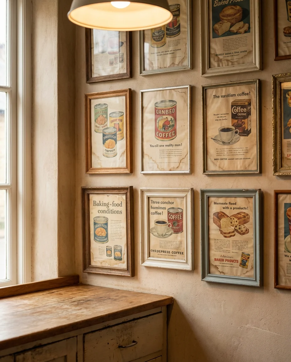
Vintage kitchen art is one of the most accessible gallery wall categories for collectors on a budget—authentic mid-century food advertisements, seed catalogs, and grocery store signage turn up regularly at estate sales and flea markets for just a few dollars apiece. The imperfect condition of original vintage prints—slight foxing, faded edges, minor tears—actually enhances the aesthetic rather than detracting from it, making this one of the rare categories where you’re rewarded for buying inexpensive originals over pristine reproductions.
22. Minimalist Family Photo Grid in a Modern Entryway
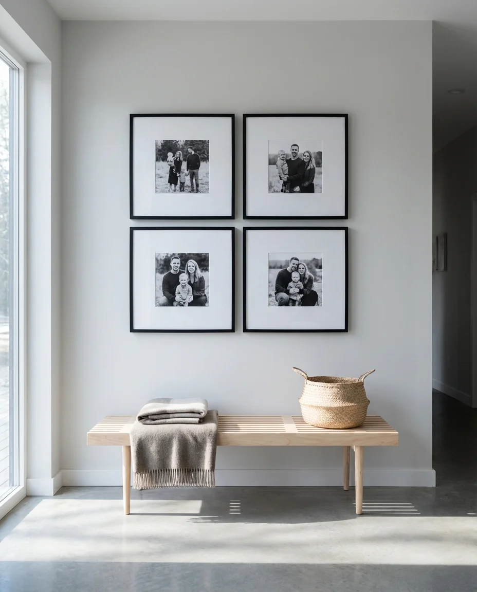
A clean, restrained grid of family portraits in a modern entryway marries the personal warmth of family photos with the graphic clarity of contemporary design. All photos printed in the same finish and framed identically—think thin matte black frames with generous white mats—create a display that feels editorial and considered rather than sentimental and cluttered. This is the gallery wall for the person who wants their home to feel personal and deeply human without sacrificing the clean lines and visual quiet that modern interior design delivers so well.
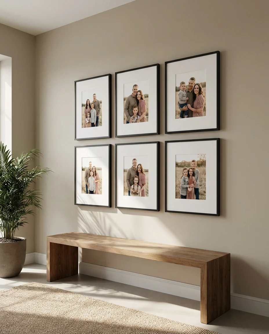
For this look to land, photo selection is everything—choose images where the lighting is consistent, the backgrounds are relatively simple, and the composition of each shot feels intentional. Many families hire a photographer for a single afternoon session specifically to get a set of images that will work together on this kind of wall. The investment is almost always worth it: a well-executed family photo grid in the entryway is the kind of design choice that guests remember and compliment years after the fact, making it one of the most lasting and meaningful gallery wall investments you can make.
 Conclusion
There’s really no wrong way to build a gallery wall in 2026 — the only rule is that it should feel genuinely like you. Whether you’re drawn to the organized precision of a black and white photo grid or the layered, anything-goes energy of a bohemian textile mix, the ideas here are meant as starting points rather than instructions. We’d love to hear what direction you’re taking your own walls—drop your ideas, questions, or photos of your finished gallery in the comments below, and let’s keep the conversation going.