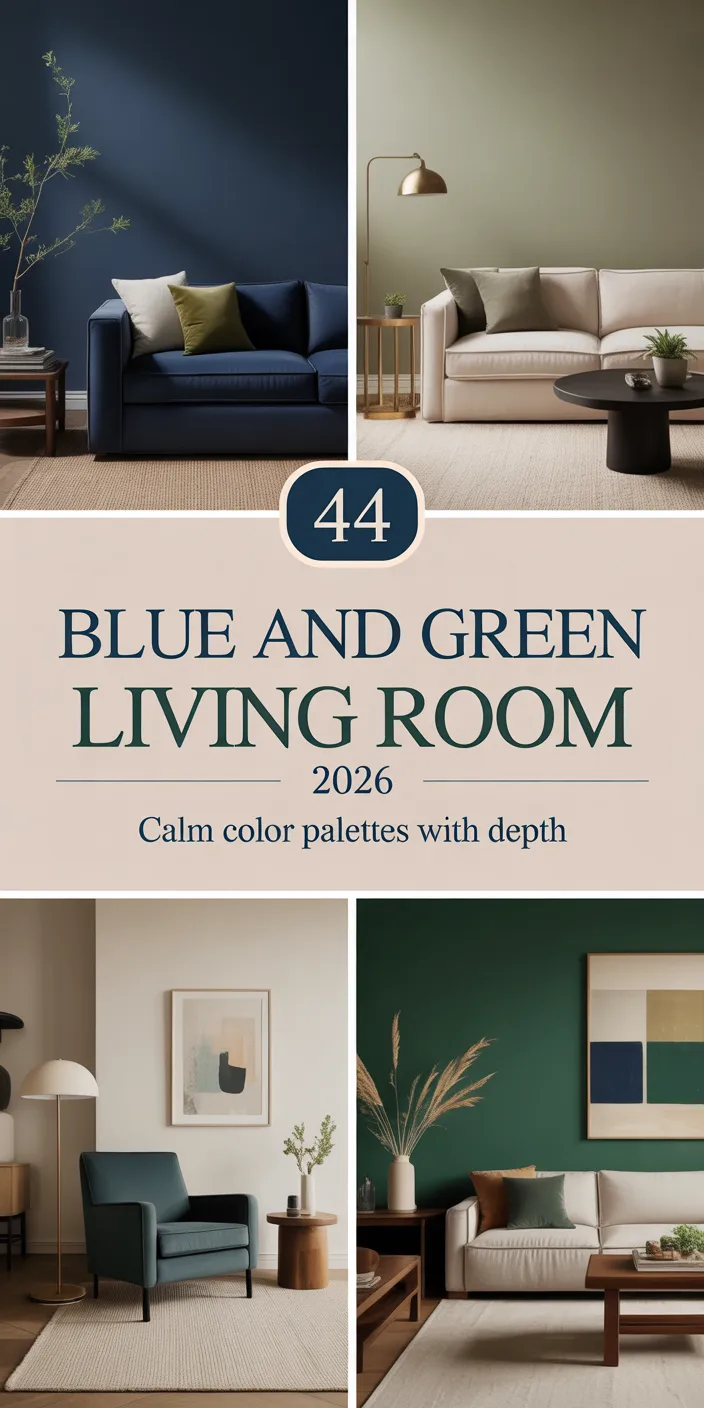
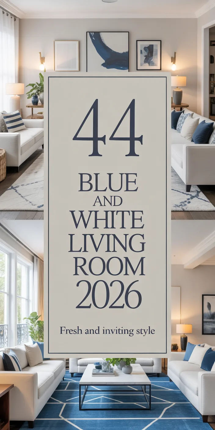
Blue living rooms continue to dominate American home design searches in 2026, especially on Pinterest, where homeowners look for fresh ways to bring calm, sophistication, and personality into their spaces. Whether you’re drawn to deep midnight tones or soft powder hues, blue offers endless versatility that works in apartments, suburban homes, and everything in between. This guide walks you through beautifully curated blue living room ideas that blend current trends with timeless appeal, helping you create a space that feels both on-trend and authentically yours.
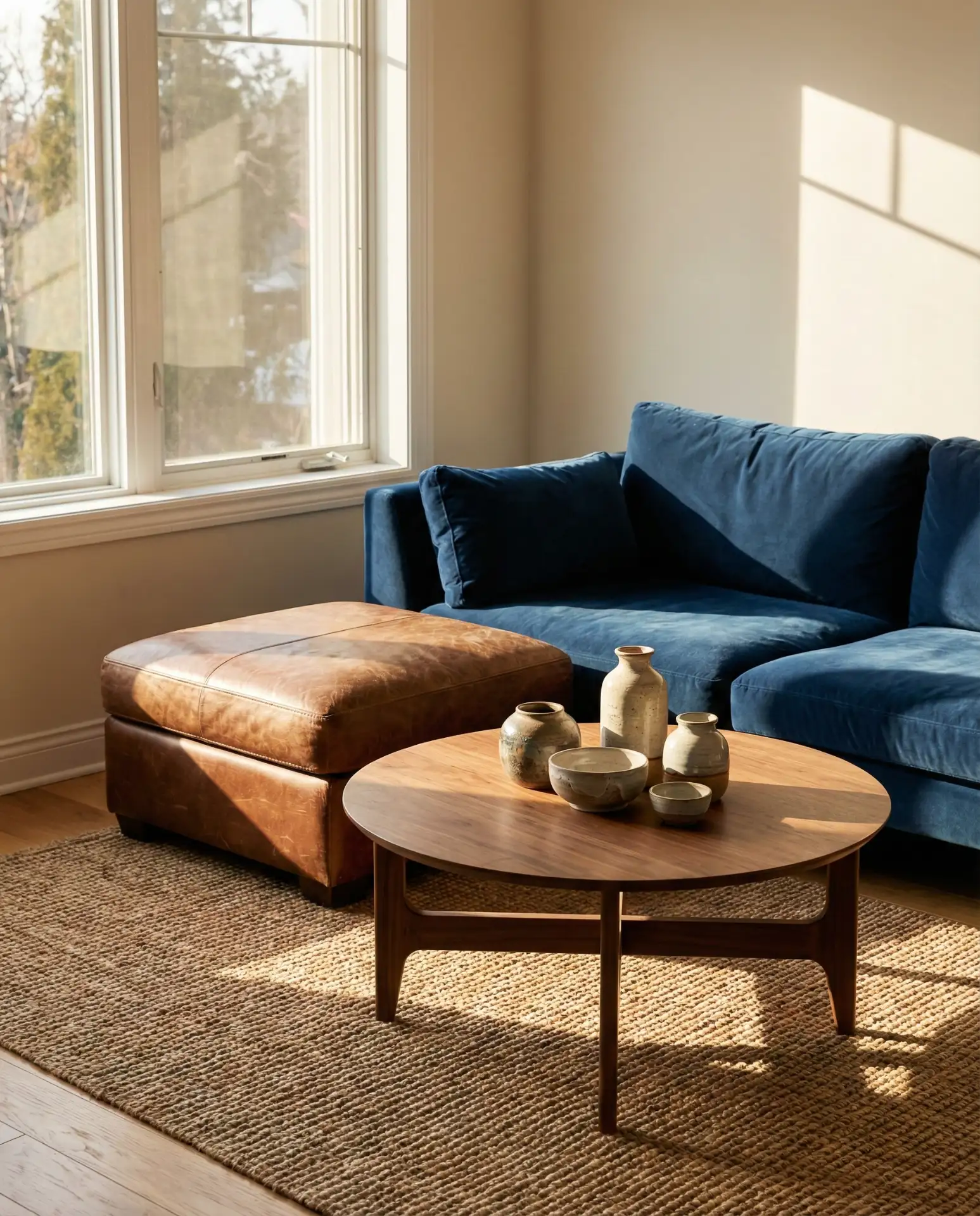
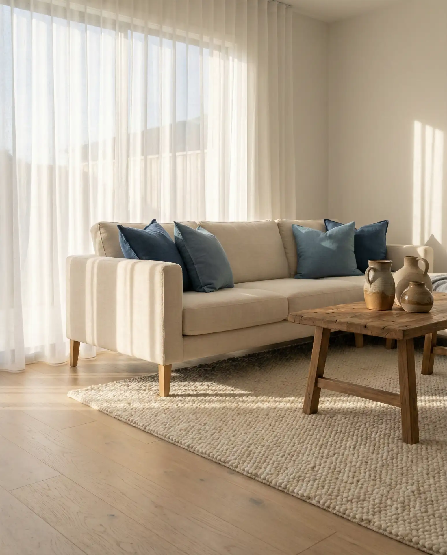
1. Navy and Cream Elegant Seating
This approach pairs navy upholstery with cream and warm neutral accents to create a living room that feels both formal and inviting. The contrast between deep blue seating and soft ivory throws or pillows adds dimension without overwhelming the eye. It’s a go-to choice for anyone wanting a classic look that still feels current and collected.
This combination works best in living rooms with plenty of natural light, where the navy anchors the space and the cream keeps it from feeling too heavy. In coastal New England homes or urban lofts, this pairing strikes a balance between sophistication and ease. You can layer in brass or gold hardware to elevate the look further without adding visual clutter.
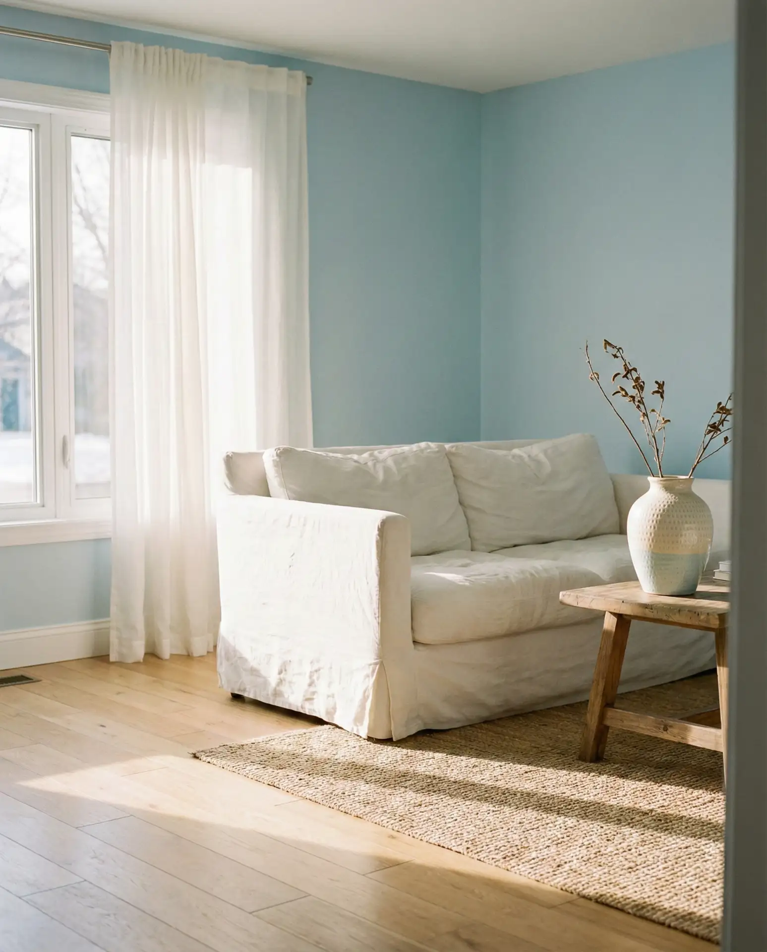
2. Light and Airy Coastal Walls
A light blue wall treatment brings an effortless brightness that mimics open skies or calm water, making it ideal for smaller living rooms or spaces that lack strong natural light. Pair it with white trim, linen curtains, and natural wood furniture to lean into a modern coastal aesthetic that doesn’t feel overly themed or kitschy.
Homeowners in warmer climates like Florida or Southern California often gravitate toward this palette because it keeps interiors feeling cool even during hot months. The key is to avoid going too pastel—opt for a blue with just enough gray undertone to maintain sophistication. This approach works beautifully in open-concept layouts where the living room flows into dining or kitchen spaces.
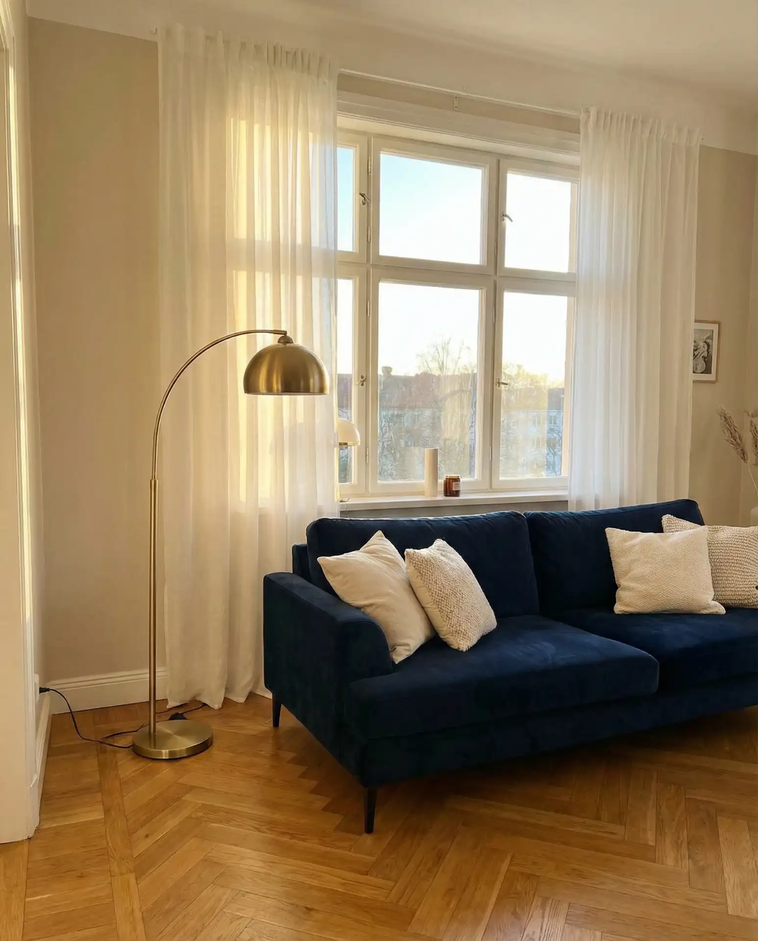
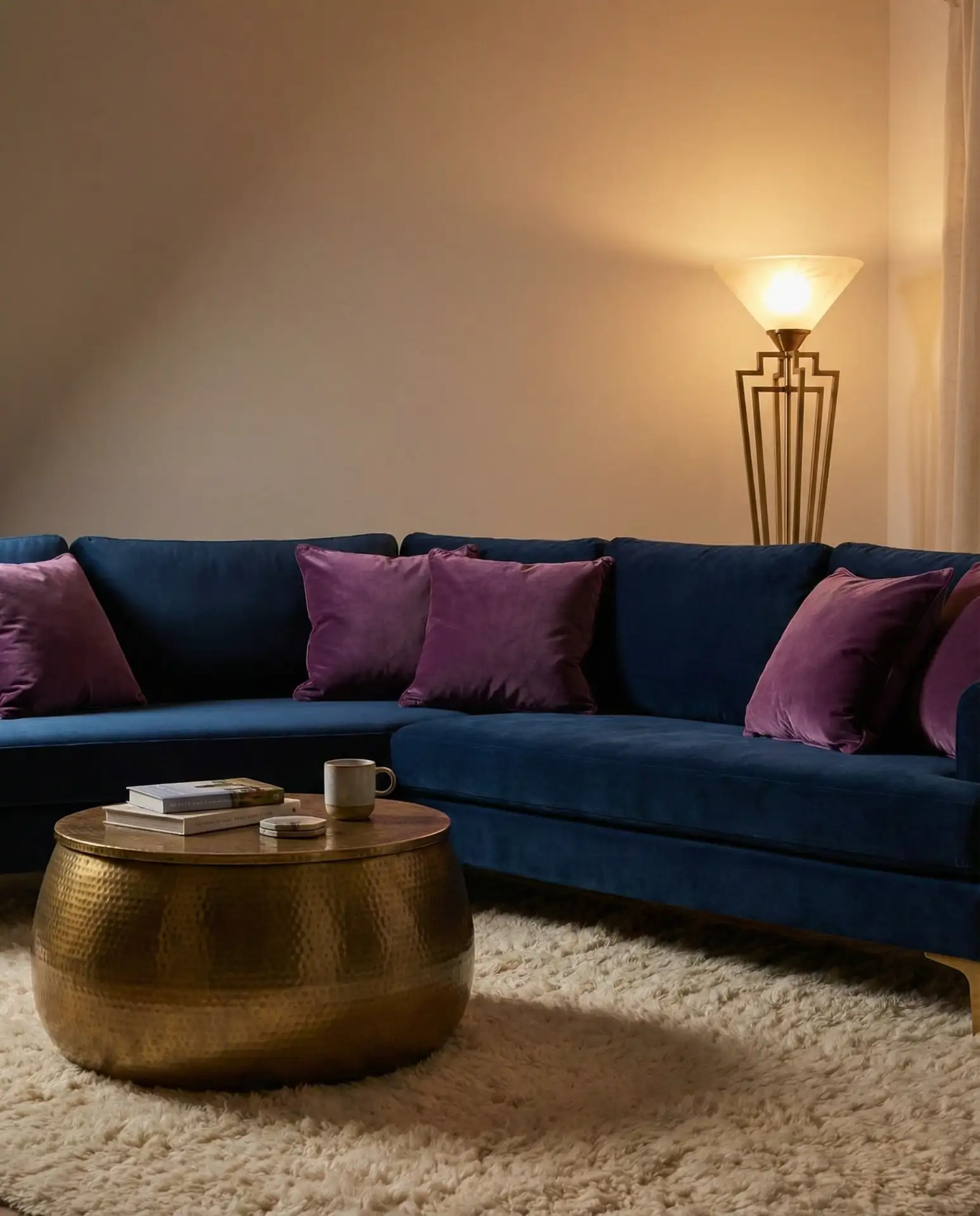
3. Midnight Drama with Brass Accents
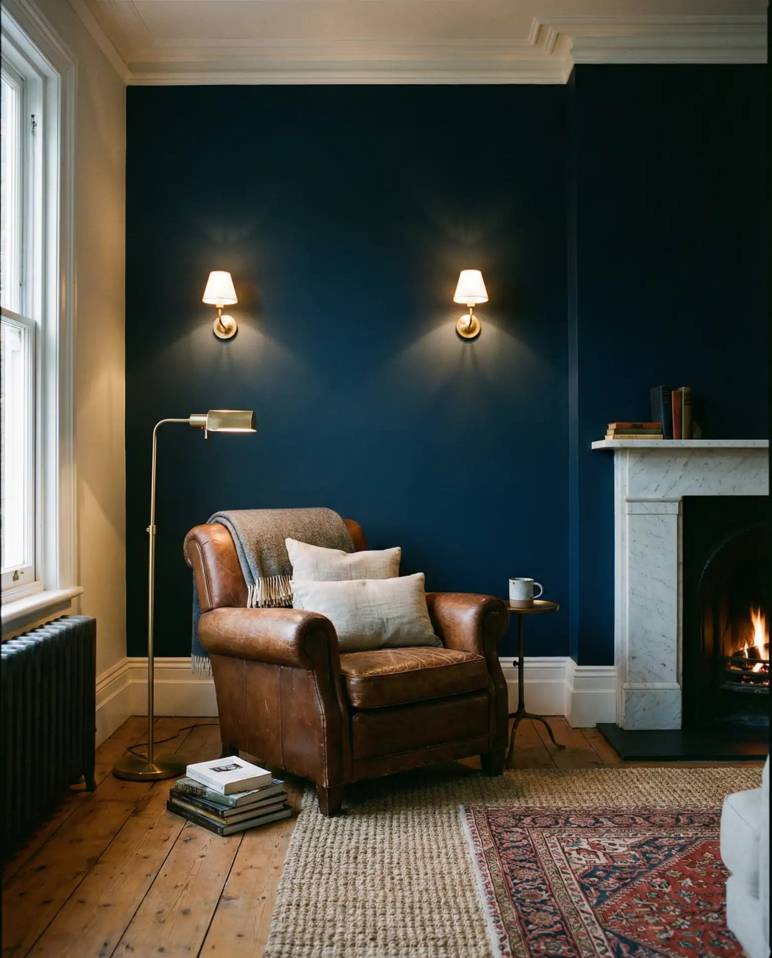
For those who love bold statements, midnight blue walls or furniture create instant drama and depth. This dark hue works surprisingly well in both large and small spaces, especially when balanced with warm metallics like brass or copper. The result is a living room that feels intimate, luxurious, and perfectly suited for evening gatherings.
A common mistake is pairing dark blue with too many cool tones, which can make a room feel cold. Instead, introduce warm wood, amber glass, or terracotta accents to soften the space and add dimension. This palette thrives in urban apartments and historic homes where architectural details like crown molding or exposed brick can play off the richness of the blue.
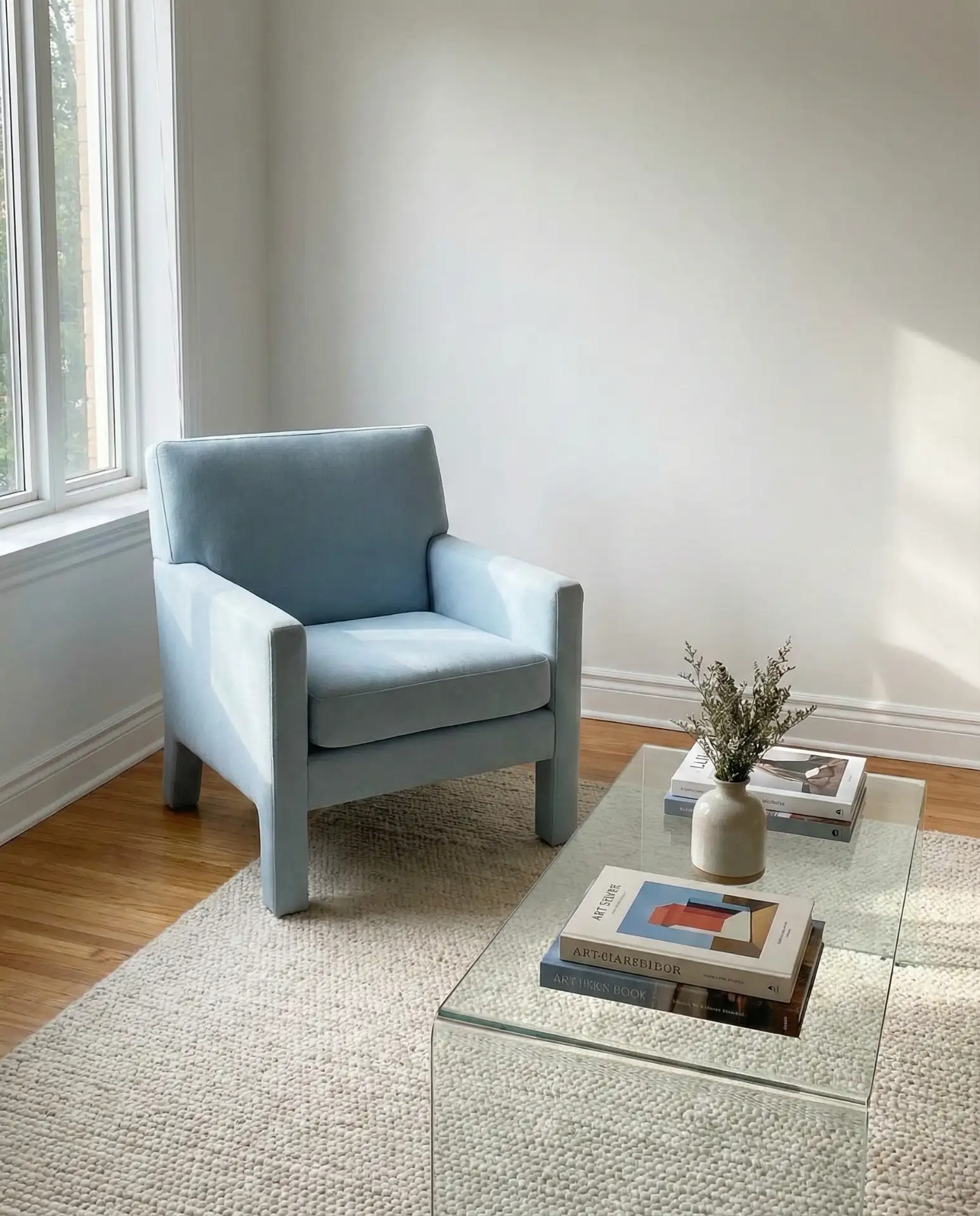
4. Powder Blue and White Minimalism
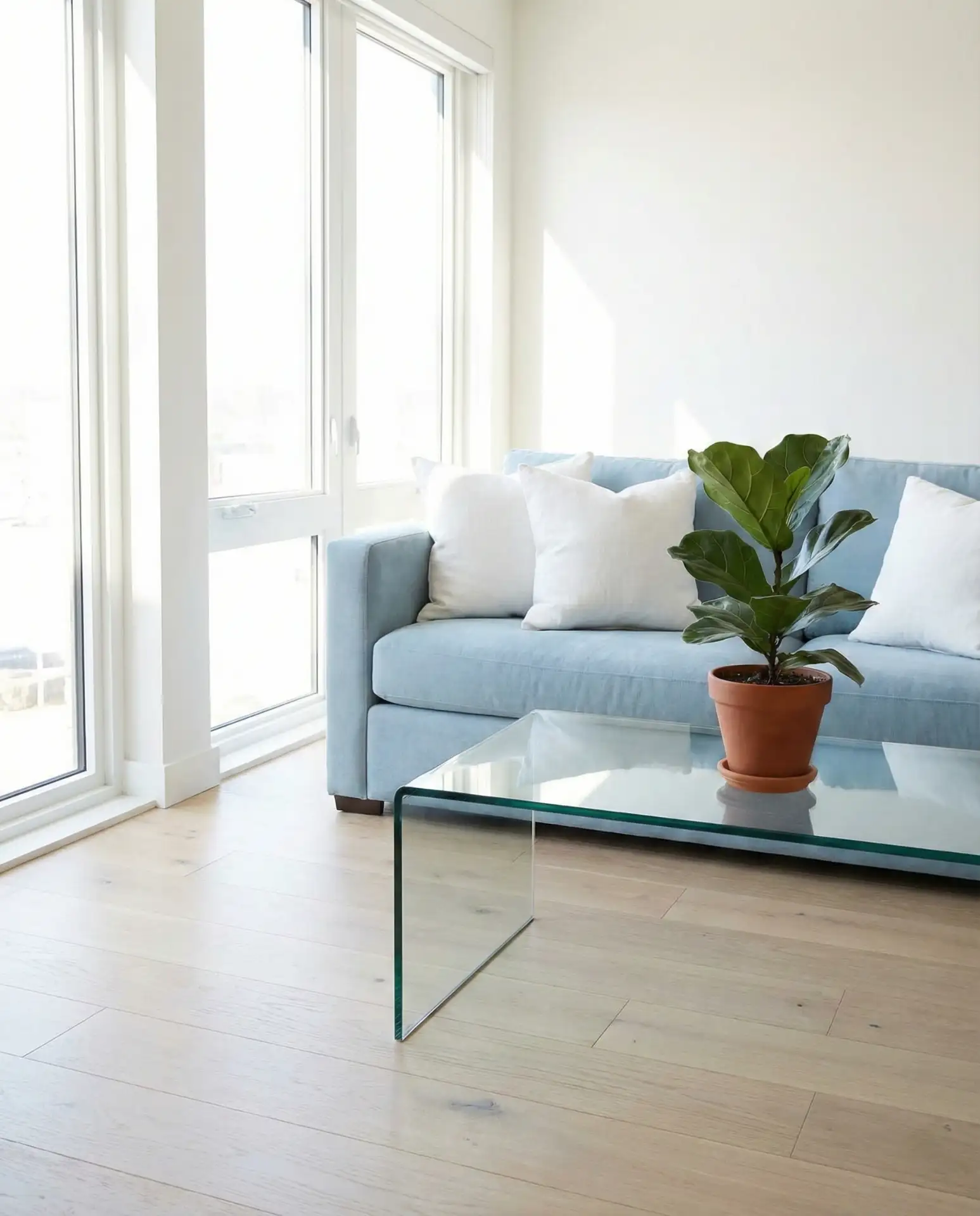
A powder blue and white pairing delivers a clean, serene look that’s perfect for anyone who prefers understated elegance. This combination feels fresh without being overly sweet, making it ideal for modern minimalist homes where every piece of furniture serves a purpose and nothing feels excessive or decorative just for the sake of it.
This look works best in spaces with strong natural light and minimal architectural distractions. Think loft apartments in Brooklyn or renovated ranch homes in the Pacific Northwest. Keep accessories simple—a single ceramic vase or a wool throw is often all you need to complete the room without cluttering the visual field.
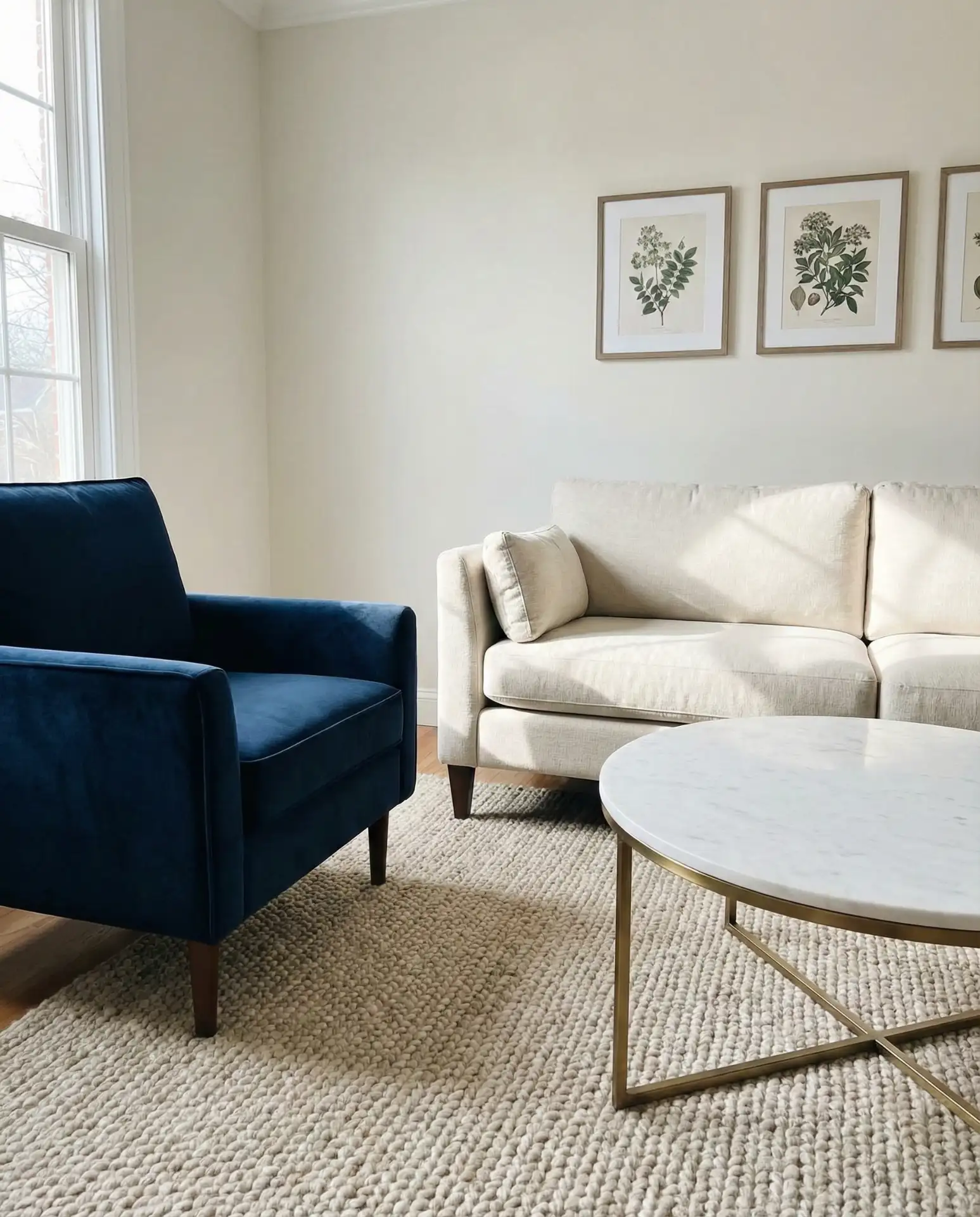
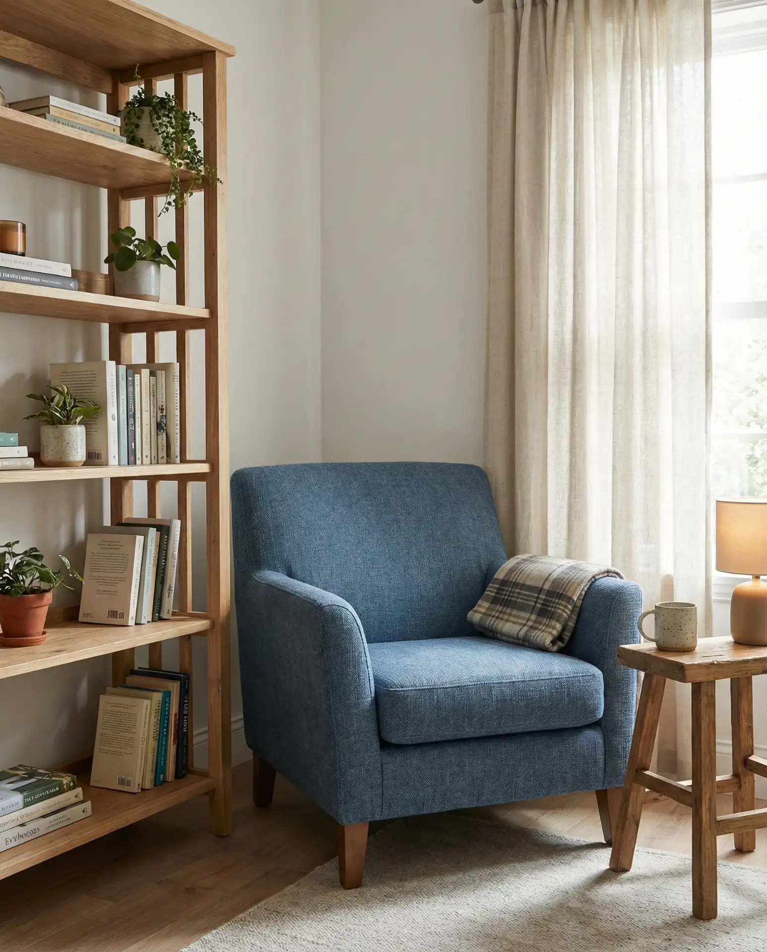
5. Royal Blue Statement Furniture
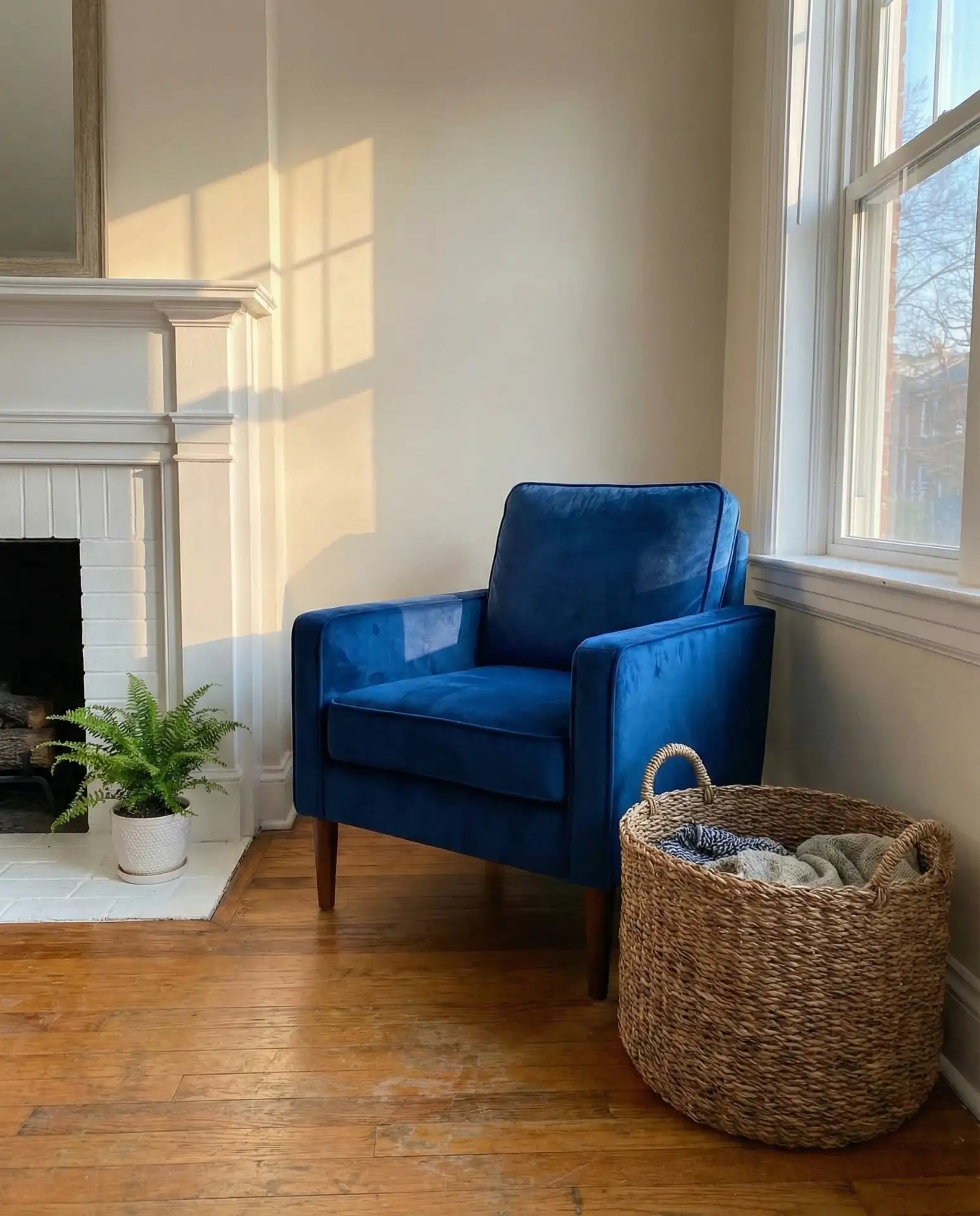
A single piece of royal blue furniture—like a sofa, armchair, or even a credenza—can anchor an entire living room and set the tone for the rest of the design. This shade is vibrant without being overwhelming, especially when the surrounding palette stays neutral with whites, grays, or warm woods.
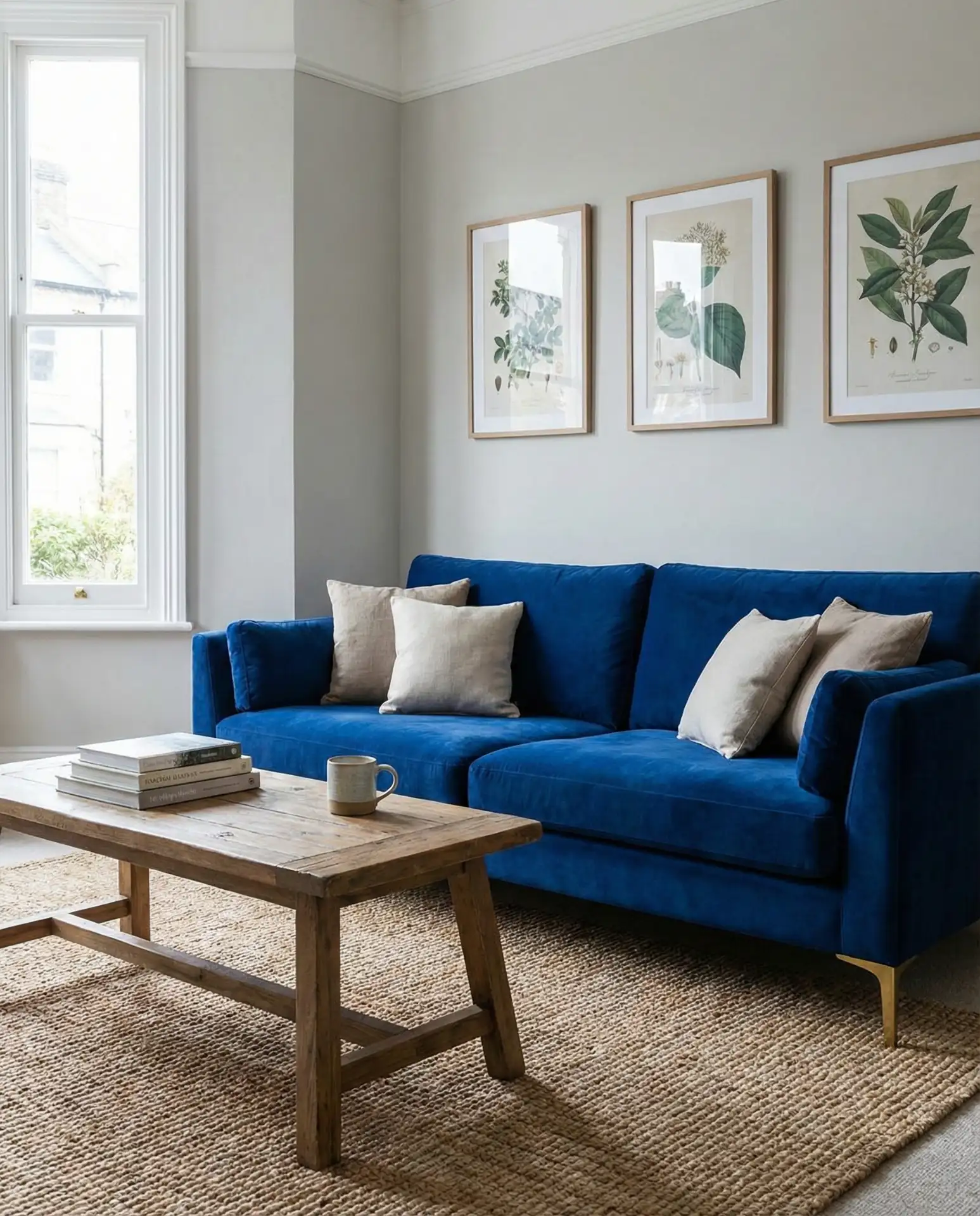
Designers often recommend this approach for clients who want color but aren’t ready to commit to painting walls. A royal blue piece can be reupholstered or moved to another room later, giving you flexibility as your style evolves. It’s particularly popular in suburban homes where families want a living room that feels polished but is still kid-friendly.
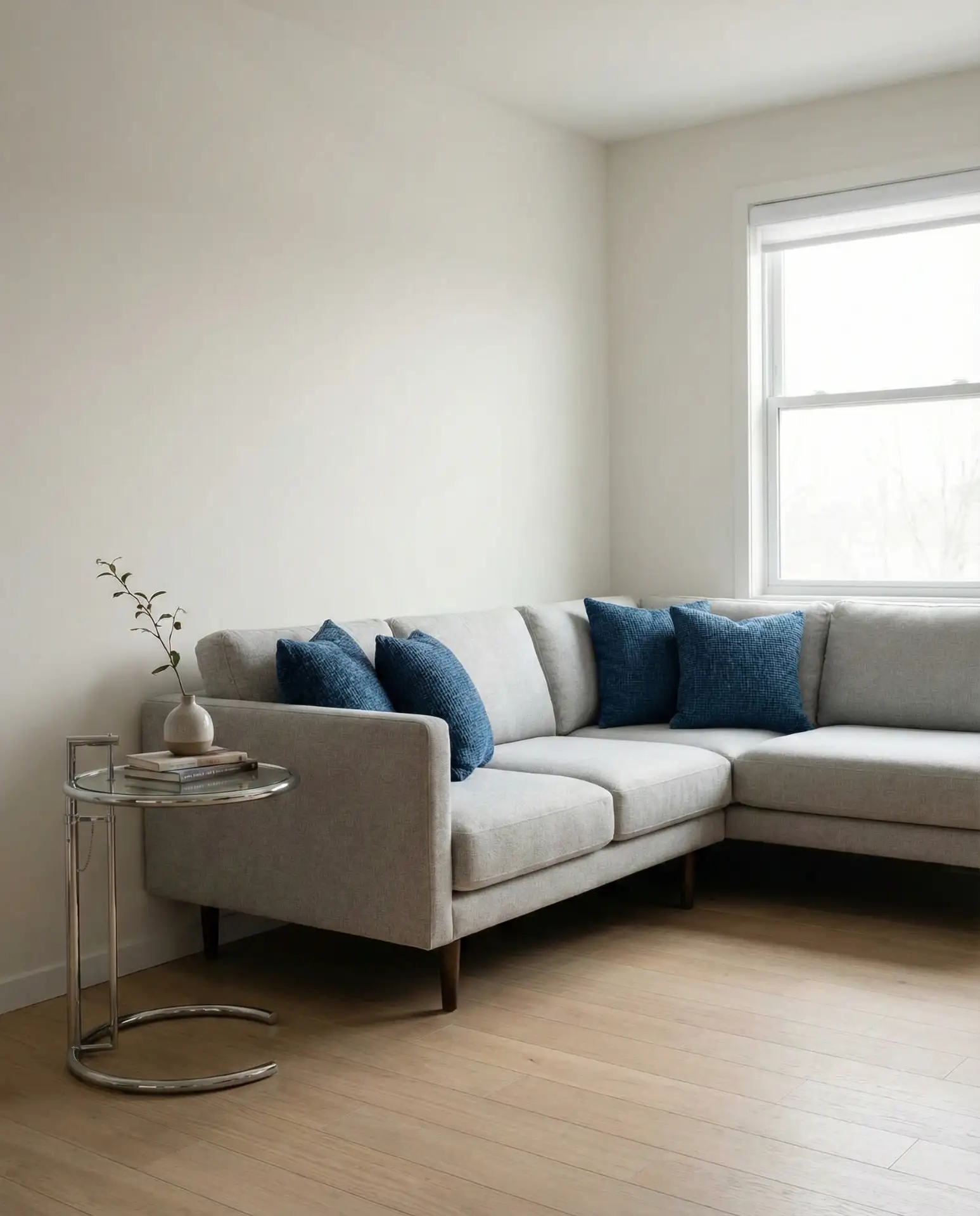
6. Grey and Blue Layered Textures
Combining grey and blue in various textures—like a charcoal linen sofa with blue velvet pillows or a blue rug over gray flooring—adds sophistication and visual interest without relying on bold color contrasts. This pairing feels modern and grounded, making it a favorite for open-plan living spaces where continuity between rooms matters.
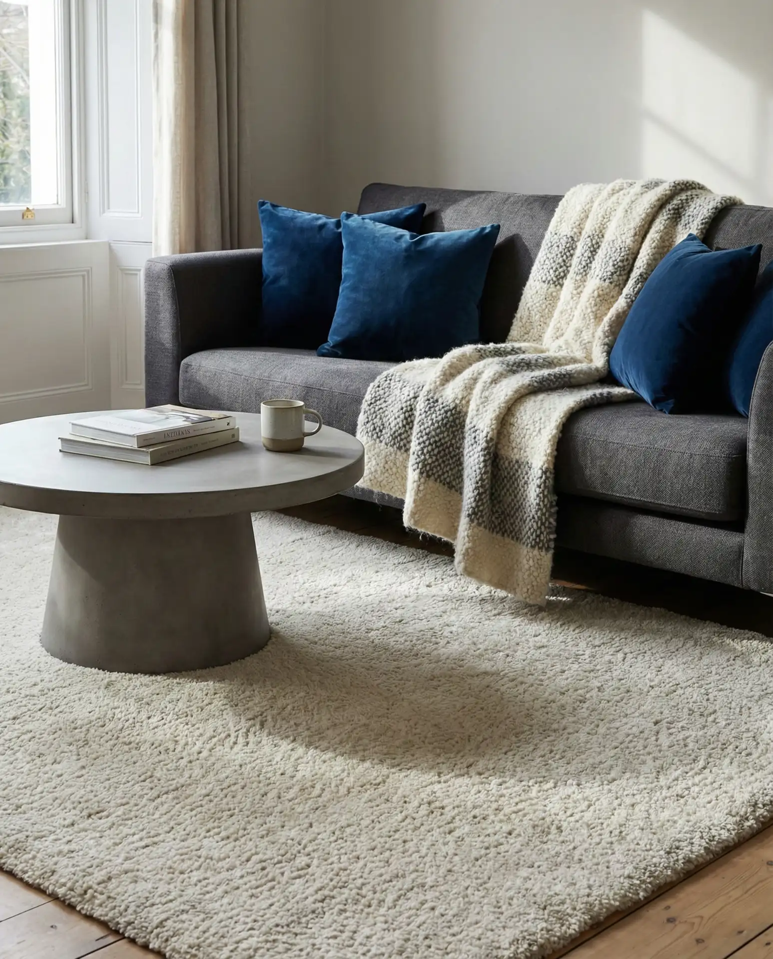
This palette is especially effective in condos and townhouses where you want a cohesive look across multiple floors or rooms. The neutral gray acts as a bridge between blue accents and other colors, making it easy to introduce seasonal decor or swap out accessories without redecorating entirely. It’s also budget-friendly since you can gradually add blue elements over time.
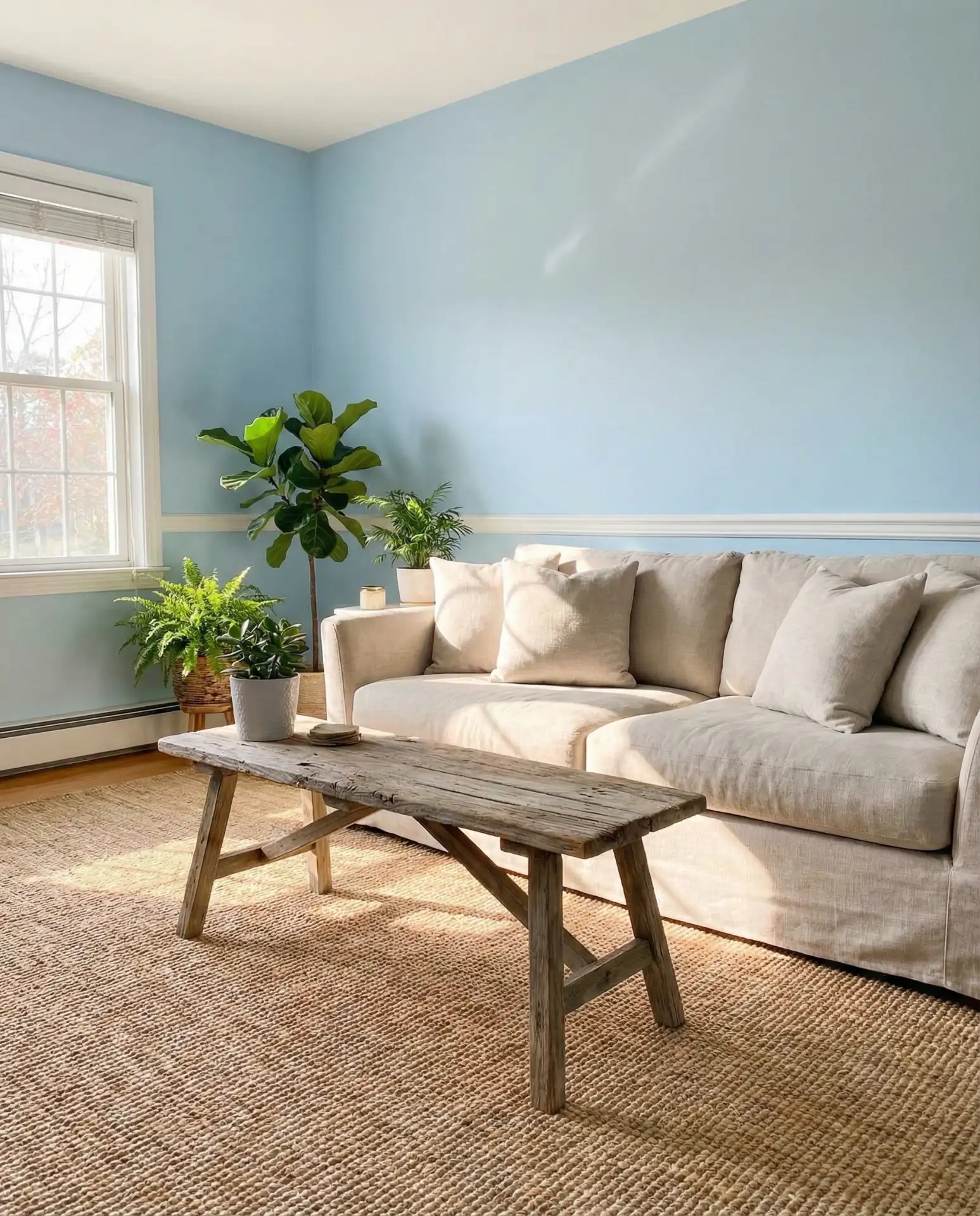
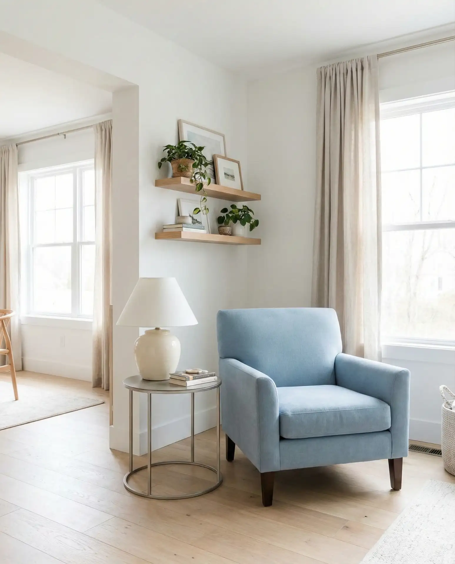
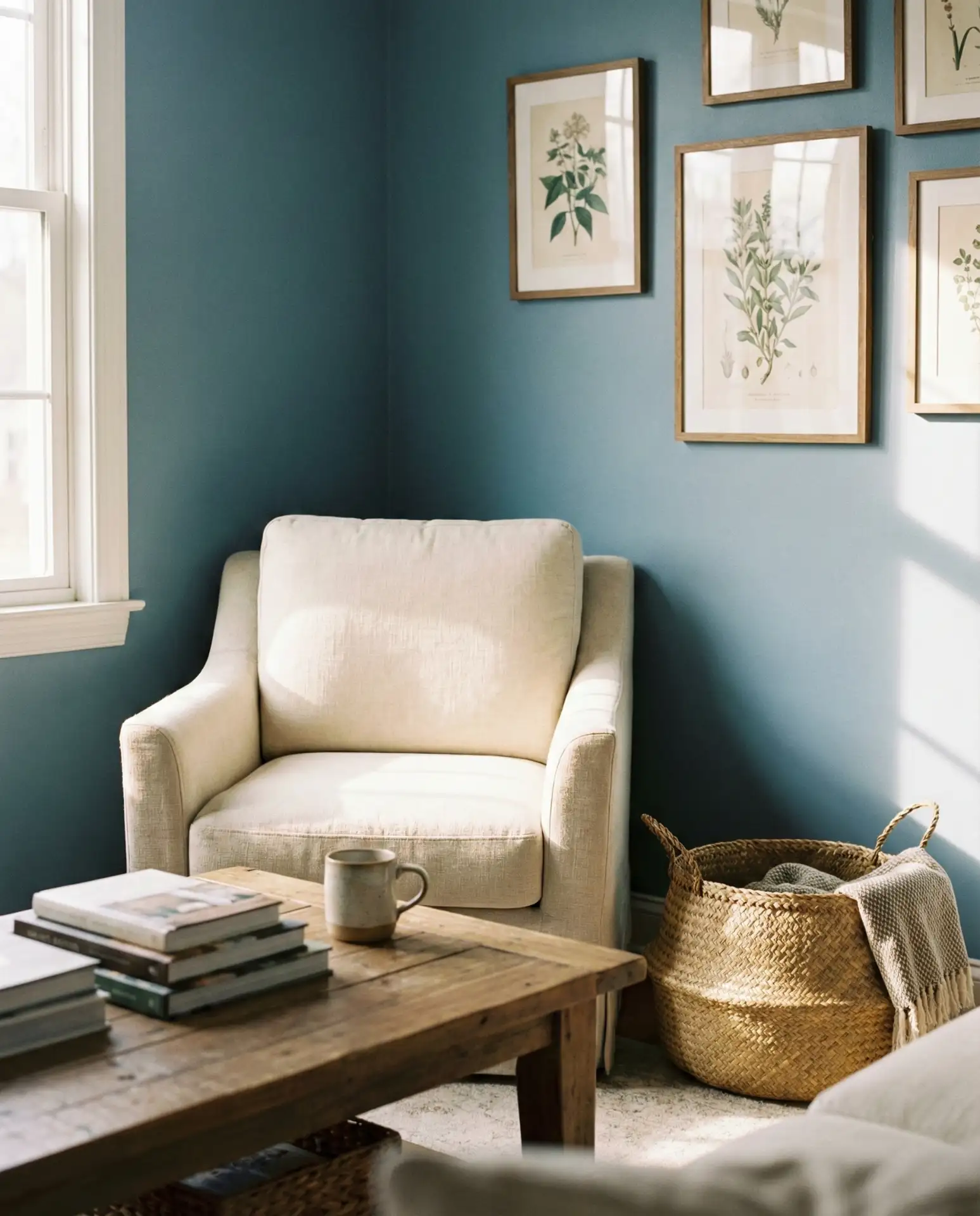
7. Beige and Soft Blue Warmth
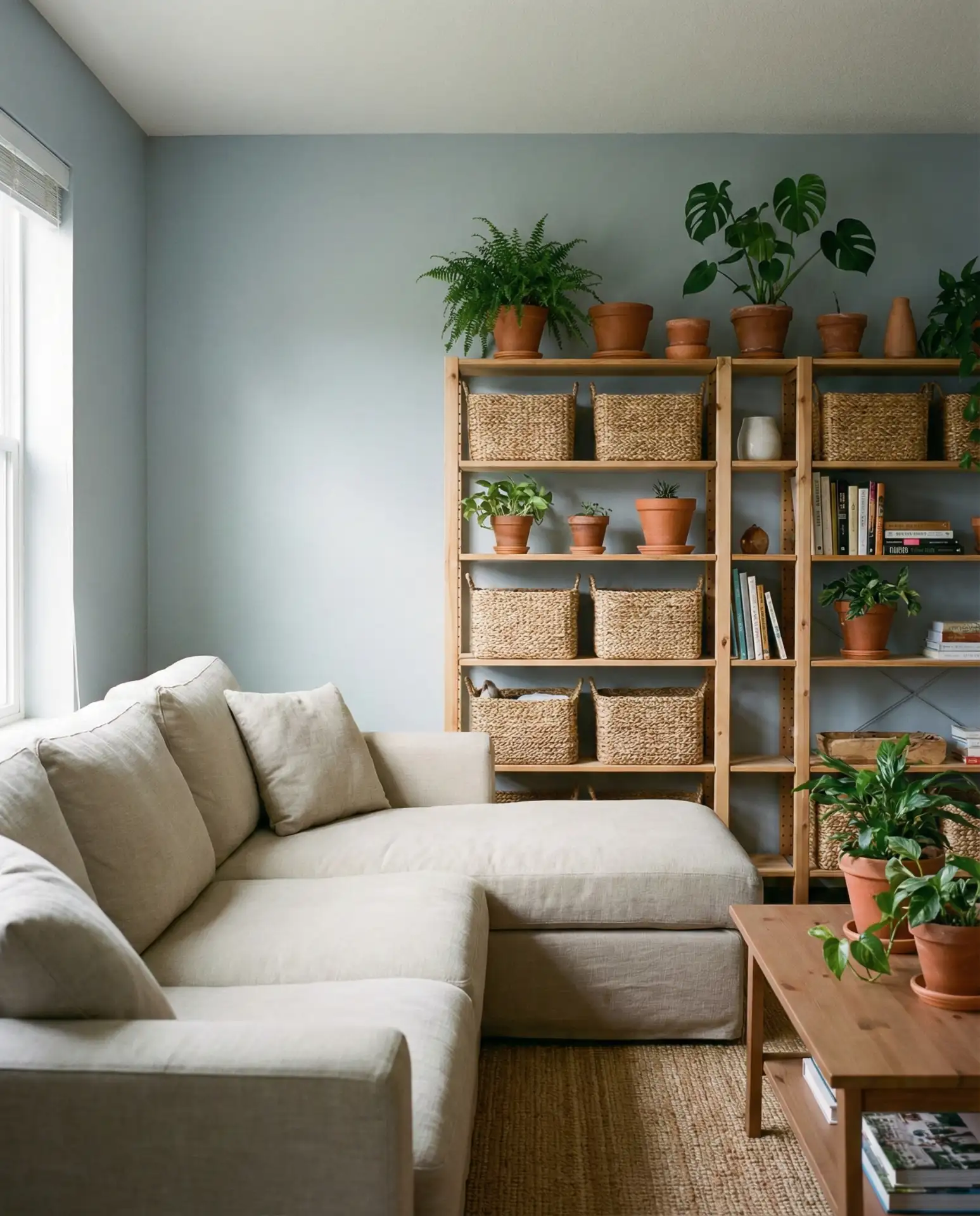
A beige and soft blue combination brings warmth and approachability to a living room, making it feel inviting without sacrificing style. This duo works beautifully in spaces where you want a neutral foundation with just enough color to keep things interesting, and it pairs effortlessly with natural materials like rattan, jute, or oak.
A friend recently redid her living room using this palette and found that it made her space feel larger and more cohesive, especially after swapping out her old dark furniture. The beige keeps things grounded, while the blue adds a subtle lift, preventing the room from feeling too monochromatic or flat.
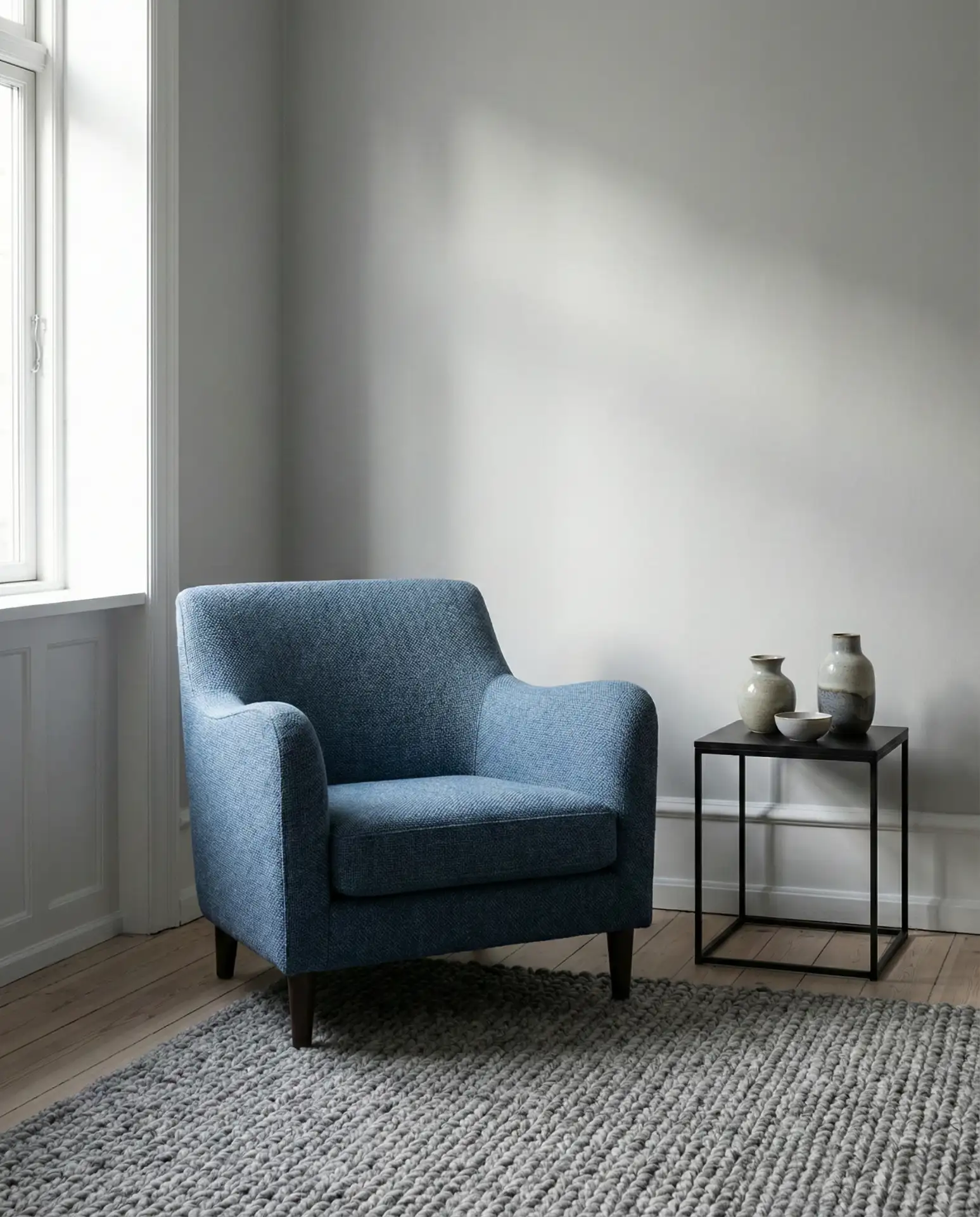
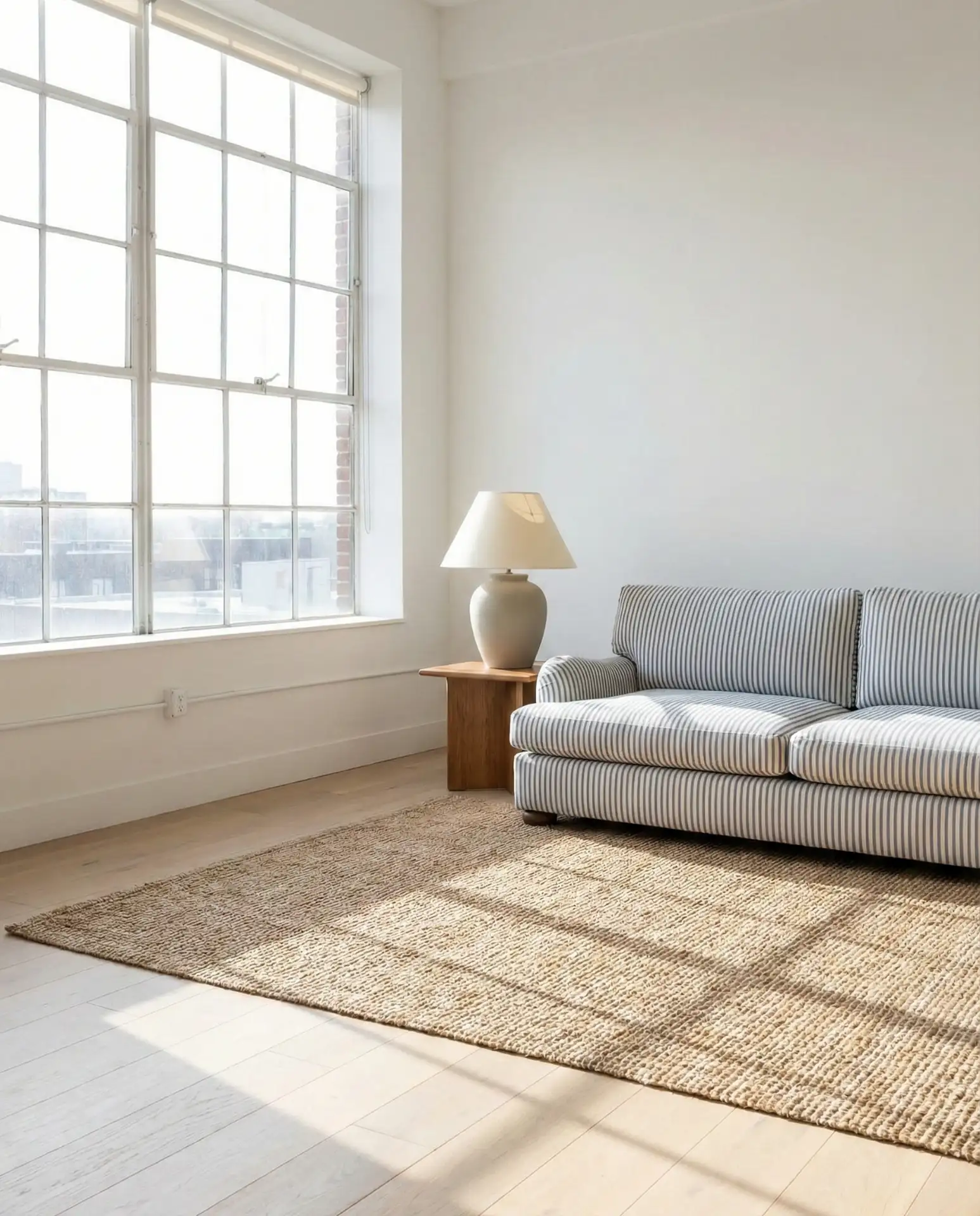
8. Denim Blue Casual Comfort
A denim blue palette brings a relaxed, lived-in quality that’s perfect for family-friendly living rooms. This mid-tone blue is forgiving, hides everyday wear well, and pairs beautifully with whites, tans, and natural wood tones. It’s the kind of color that feels effortlessly cool without trying too hard.
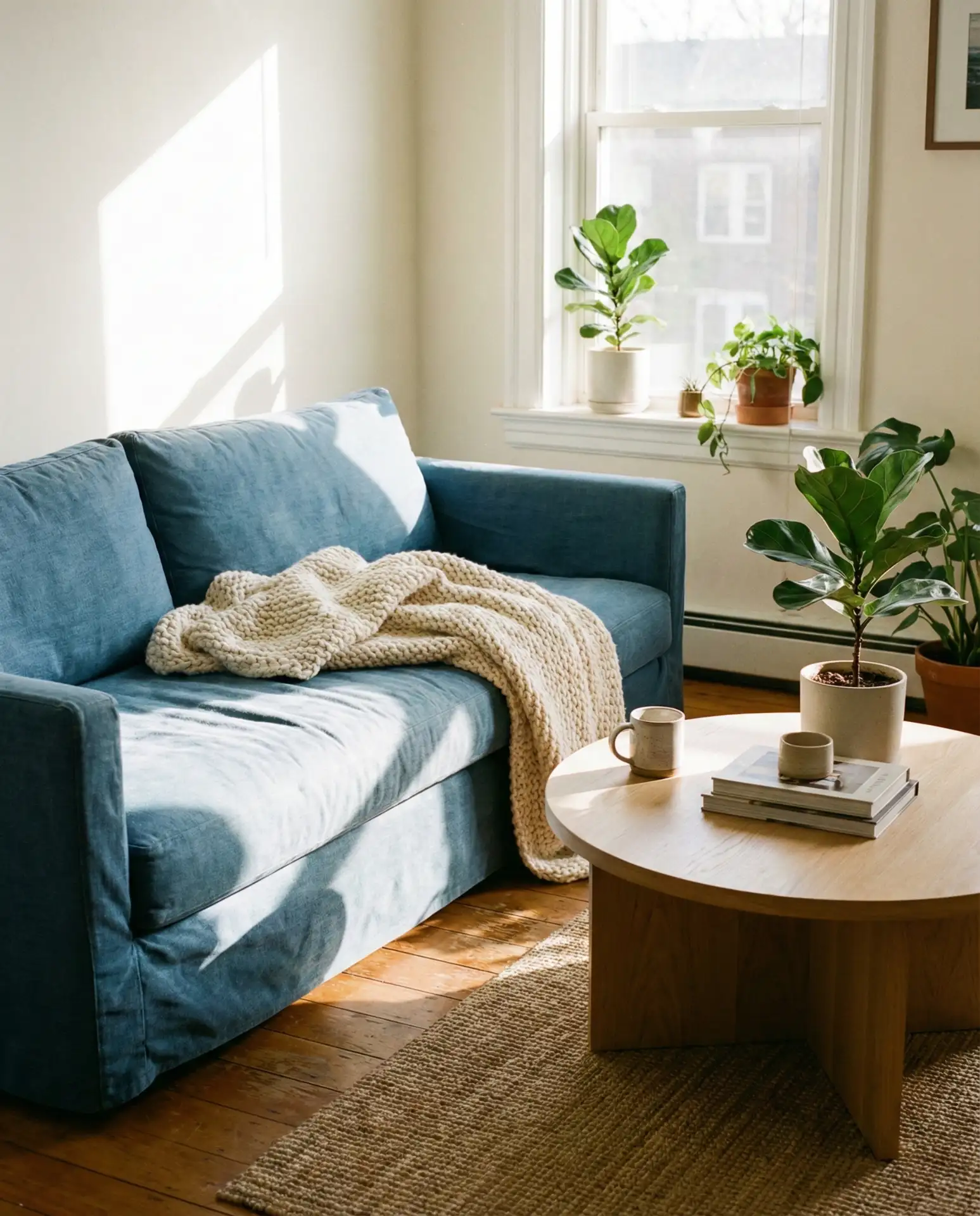
Real homeowners often choose denim blue for high-traffic living rooms because it’s practical and stylish at the same time. It doesn’t show stains or fading as obviously as lighter shades, and it works across multiple design styles—from farmhouse to contemporary. If you have kids or pets, this is a smart choice that doesn’t sacrifice aesthetics for function.
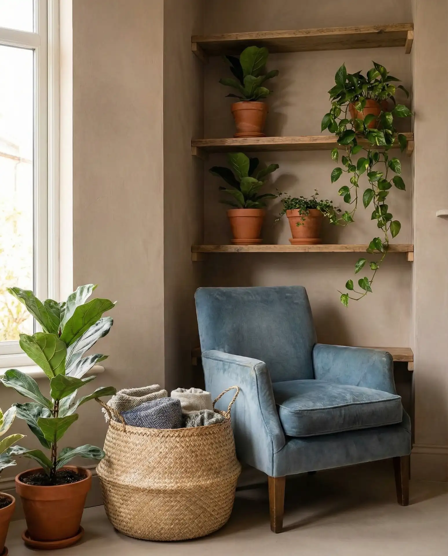
9. Green and Blue Botanical Blend
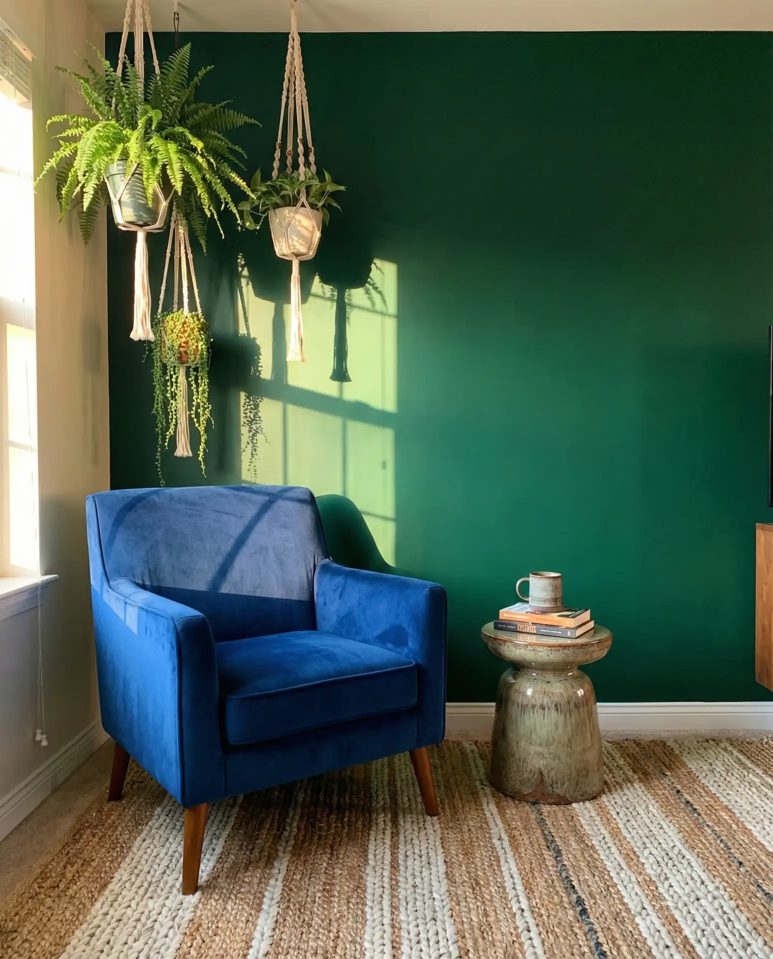
Bringing green and blue together creates a naturally harmonious palette inspired by the outdoors. This combination works especially well when you introduce plenty of live plants, botanical prints, or natural textures like wicker and linen. It’s a refreshing take that feels organic and calming, perfect for those who want their living room to feel like a retreat.
This palette is especially popular in the Pacific Northwest and other regions where the landscape leans heavily green. The blue grounds the space, while the green adds life and movement, making the room feel connected to nature even in urban settings. Avoid going too matchy—vary the shades and textures to keep things interesting.
10. Pastel Blue Softness
A pastel blue living room offers a gentle, calming aesthetic that feels especially fitting in bedrooms-turned-sitting rooms or nurseries that double as family spaces. This shade is light enough to keep a room feeling airy but still provides more personality than stark white or beige. It’s a subtle way to introduce color without overwhelming the senses.
Budget-conscious decorators appreciate pastel blue because it’s easy to work with existing furniture and doesn’t require a full room overhaul. A single gallon of paint can transform a space, and since the shade is so forgiving, even DIY paint jobs tend to look polished. Pair with white trim and natural wood accents to keep the look clean and modern.
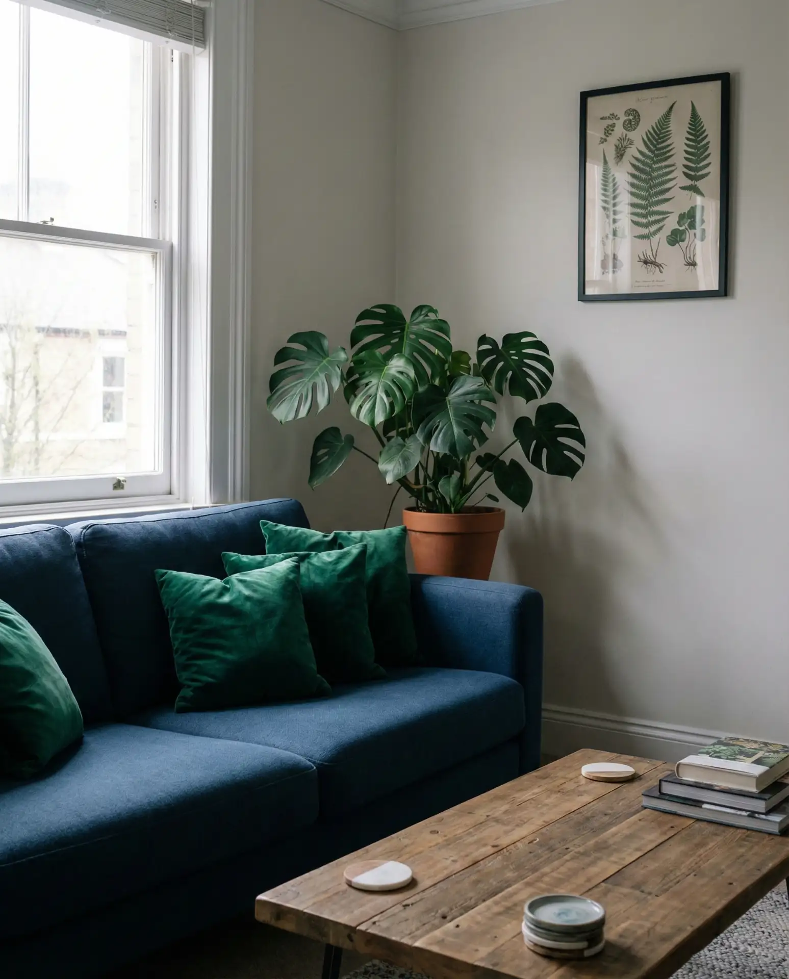
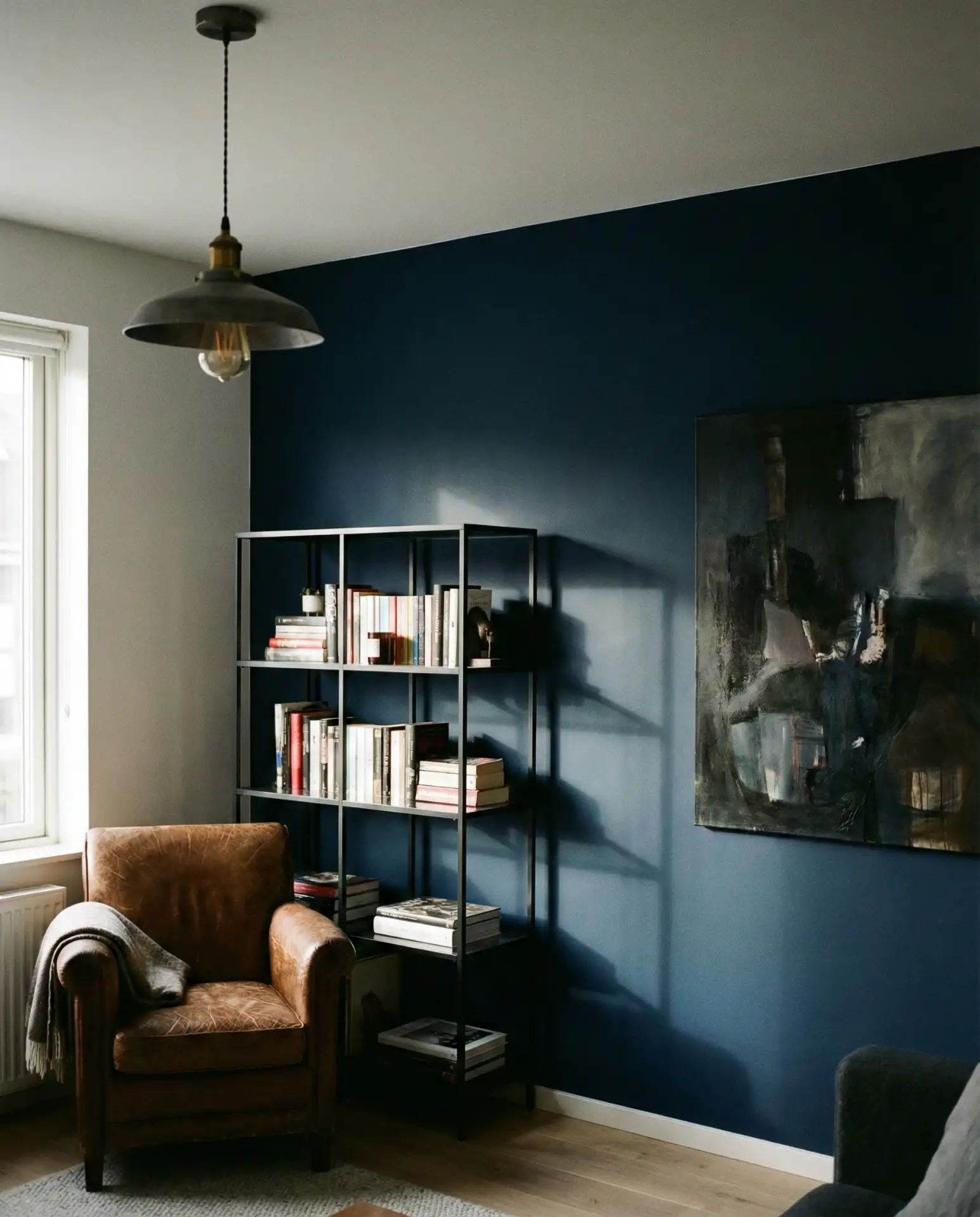
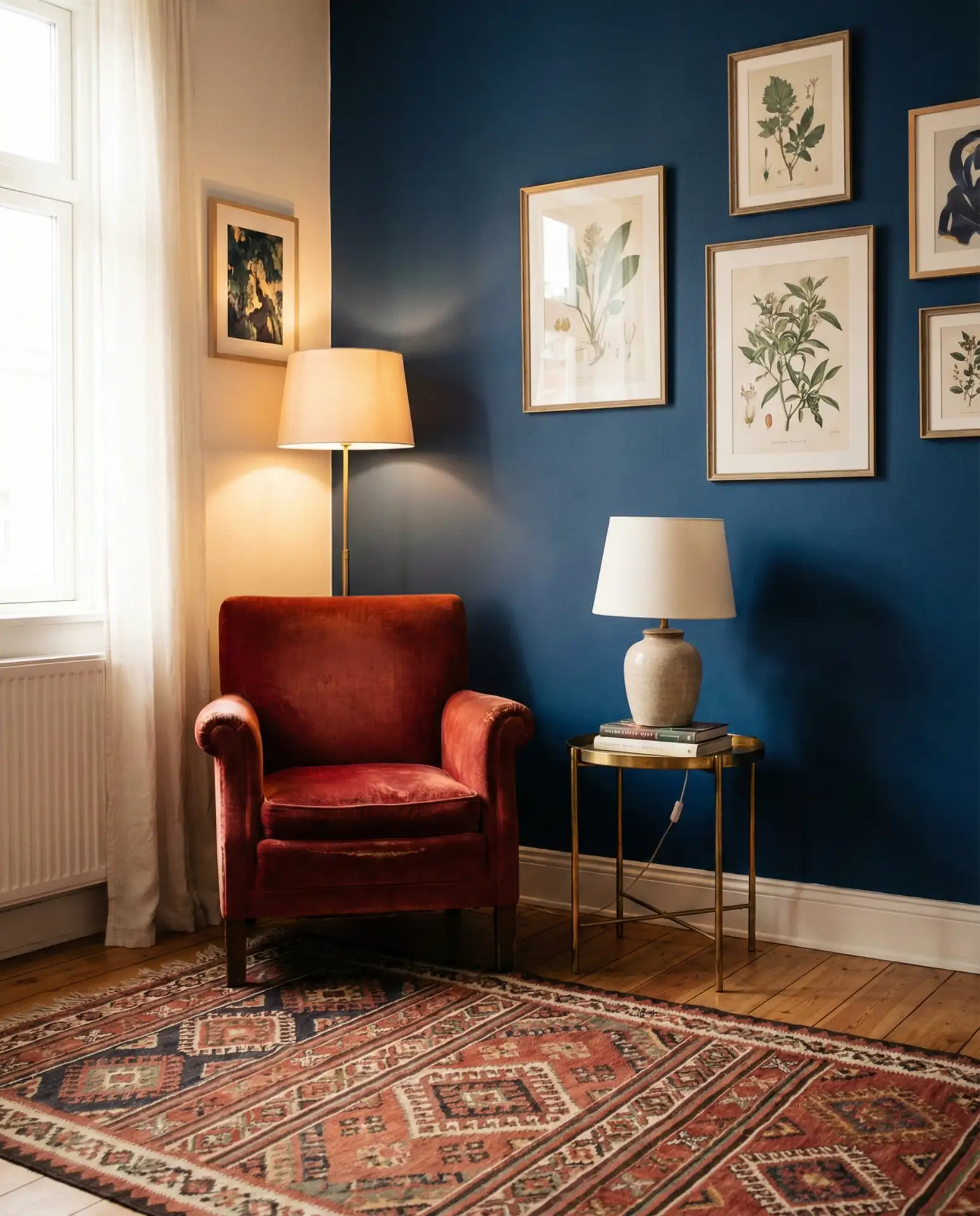
11. Brown and Blue Grounded Elegance
The pairing of brown and blue feels earthy and sophisticated, especially when you use rich leather, walnut wood, or terracotta alongside medium to dark blue tones. This combination has roots in traditional design but feels completely current when executed with clean lines and modern furnishings.
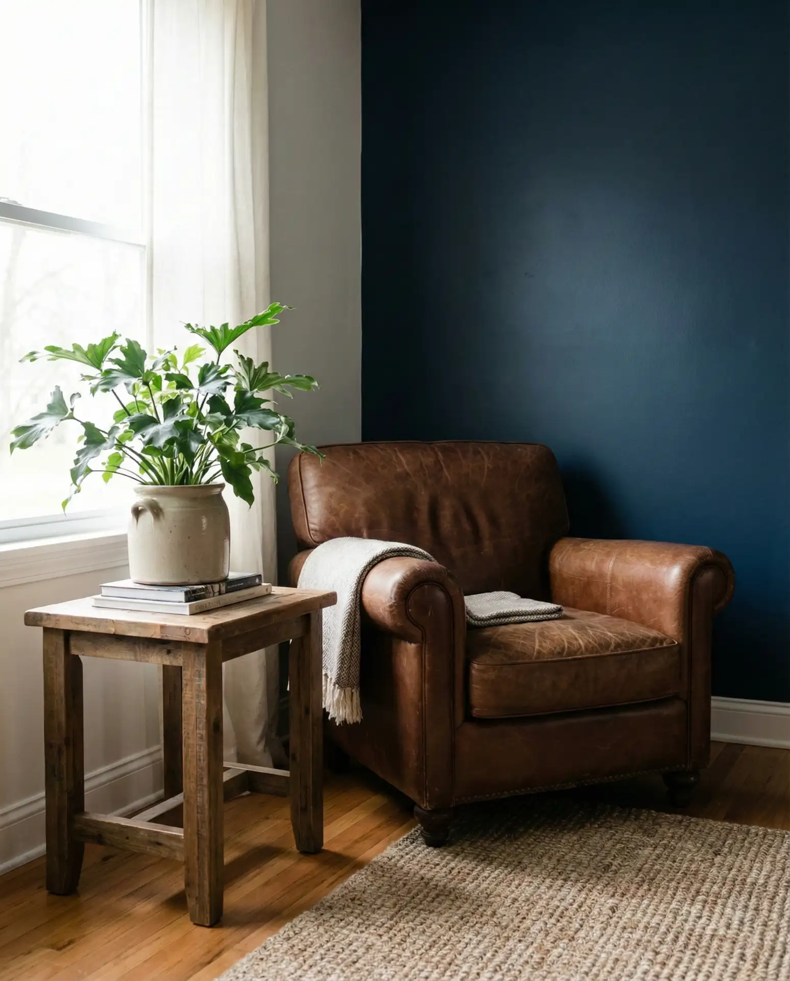
This palette works beautifully in homes with existing wood finishes—think mid-century modern furniture or Craftsman-style trim. The brown tones add warmth and prevent the blue from feeling too cool or sterile, which is especially important in regions with long winters like the Midwest or Northeast. It’s a timeless combination that ages well and adapts to changing trends.
12. Black and Blue High Contrast
A black and blue palette delivers bold, graphic impact that works especially well in contemporary or industrial-style living rooms. The contrast between deep blue and matte black creates a striking foundation that allows textures and architectural details to really stand out. This isn’t a timid approach—it’s for those who want their space to make a statement.
To avoid a space feeling too dark or heavy, balance black and blue with plenty of white, light wood, or metallic accents. This approach thrives in lofts with high ceilings or rooms with large windows where natural light can offset the darker tones. If you’re nervous about committing, start with black and blue accessories before painting or reupholstering major pieces.
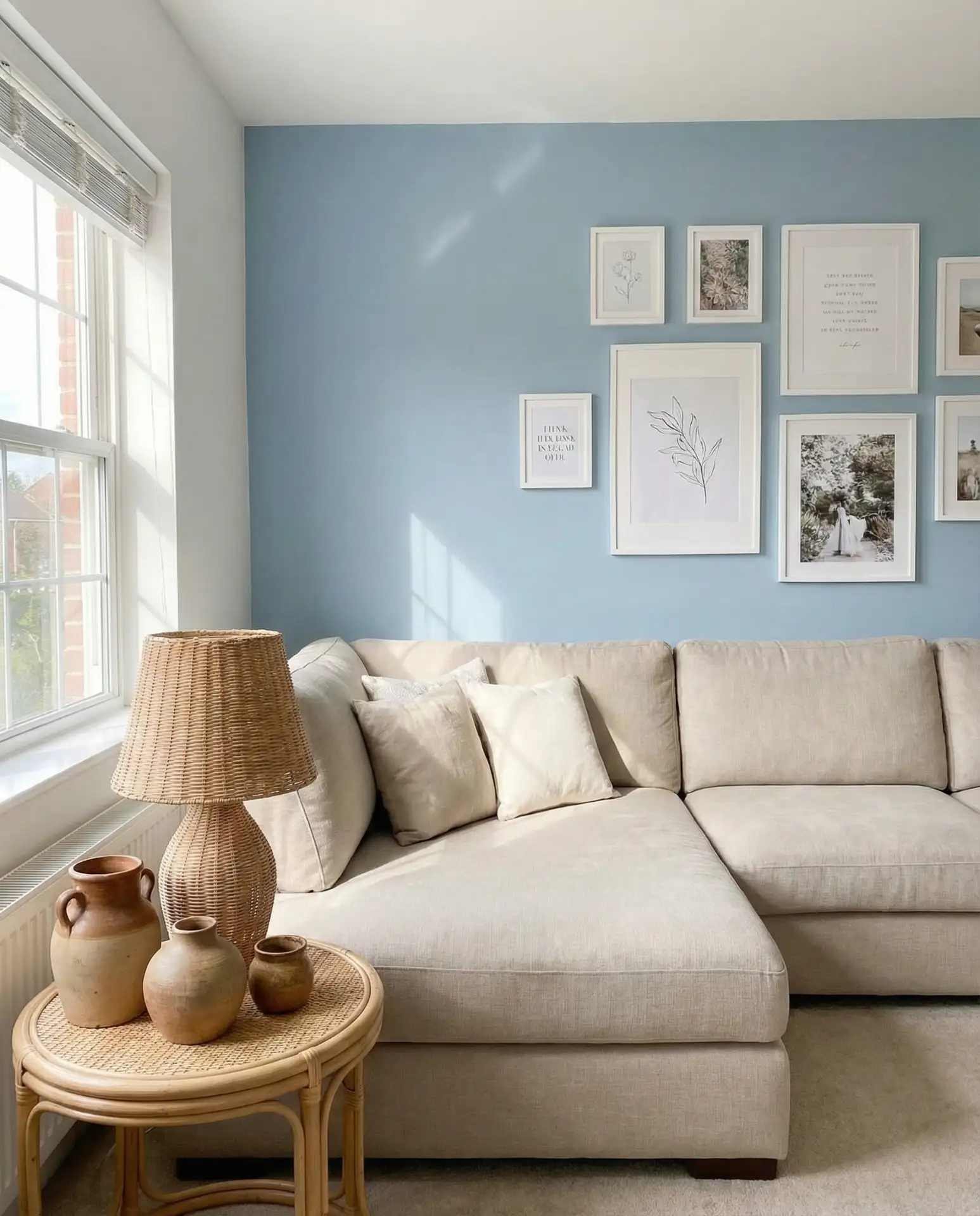
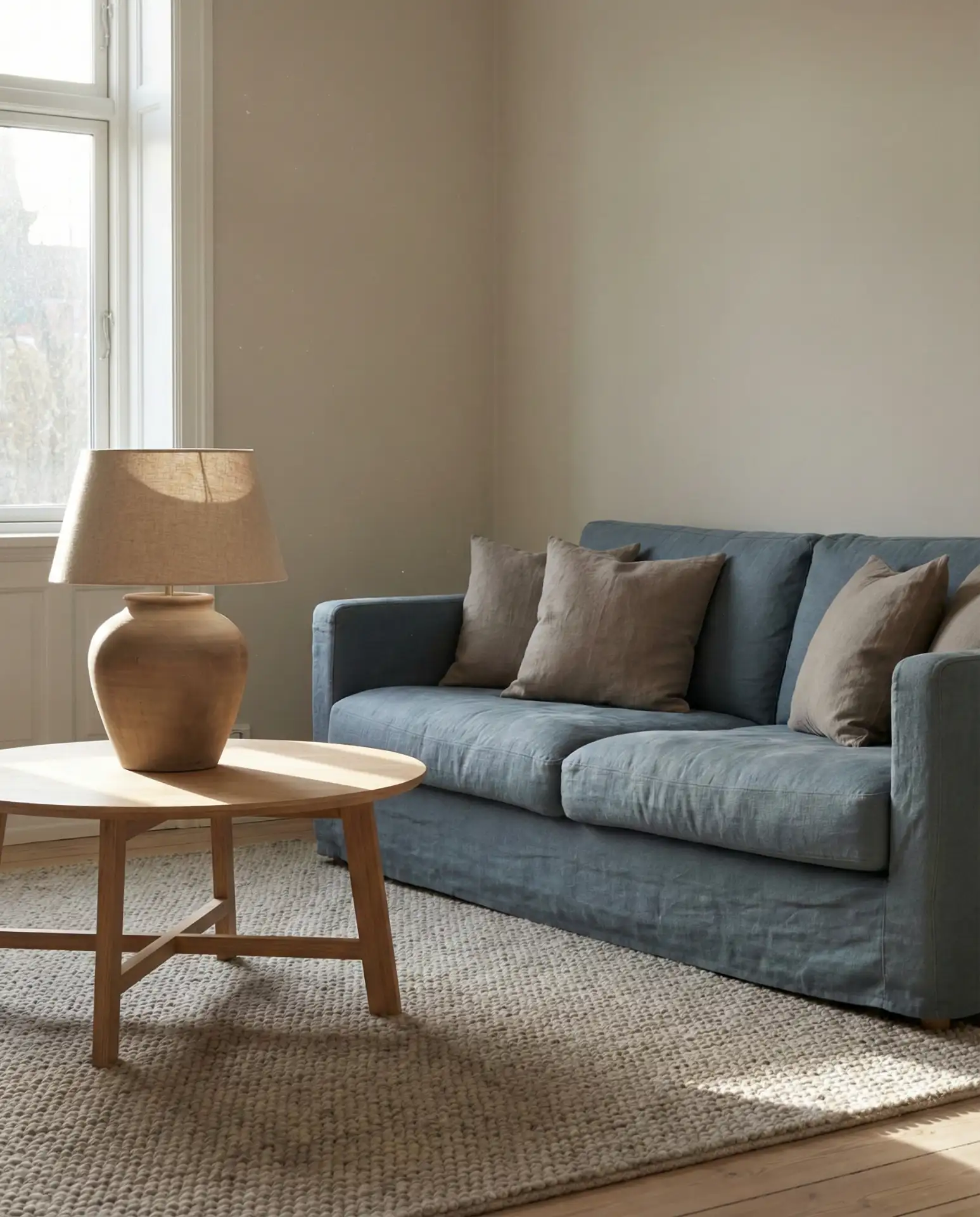
13. Taupe and Dusty Blue Neutrality
A taupe and dusty blue combination offers a muted, sophisticated palette that’s perfect for anyone who loves neutrals but wants just a hint of color. This pairing feels understated and refined, making it ideal for living rooms that need to transition seamlessly from day to night or from casual family time to formal entertaining.
Interior designers often suggest this palette for clients who want a timeless look that won’t feel dated in five years. The muted tones allow artwork and personal collections to take center stage, and the overall effect is calming without being bland. It’s a particularly smart choice for open-concept homes where the living room needs to coordinate with adjacent spaces.
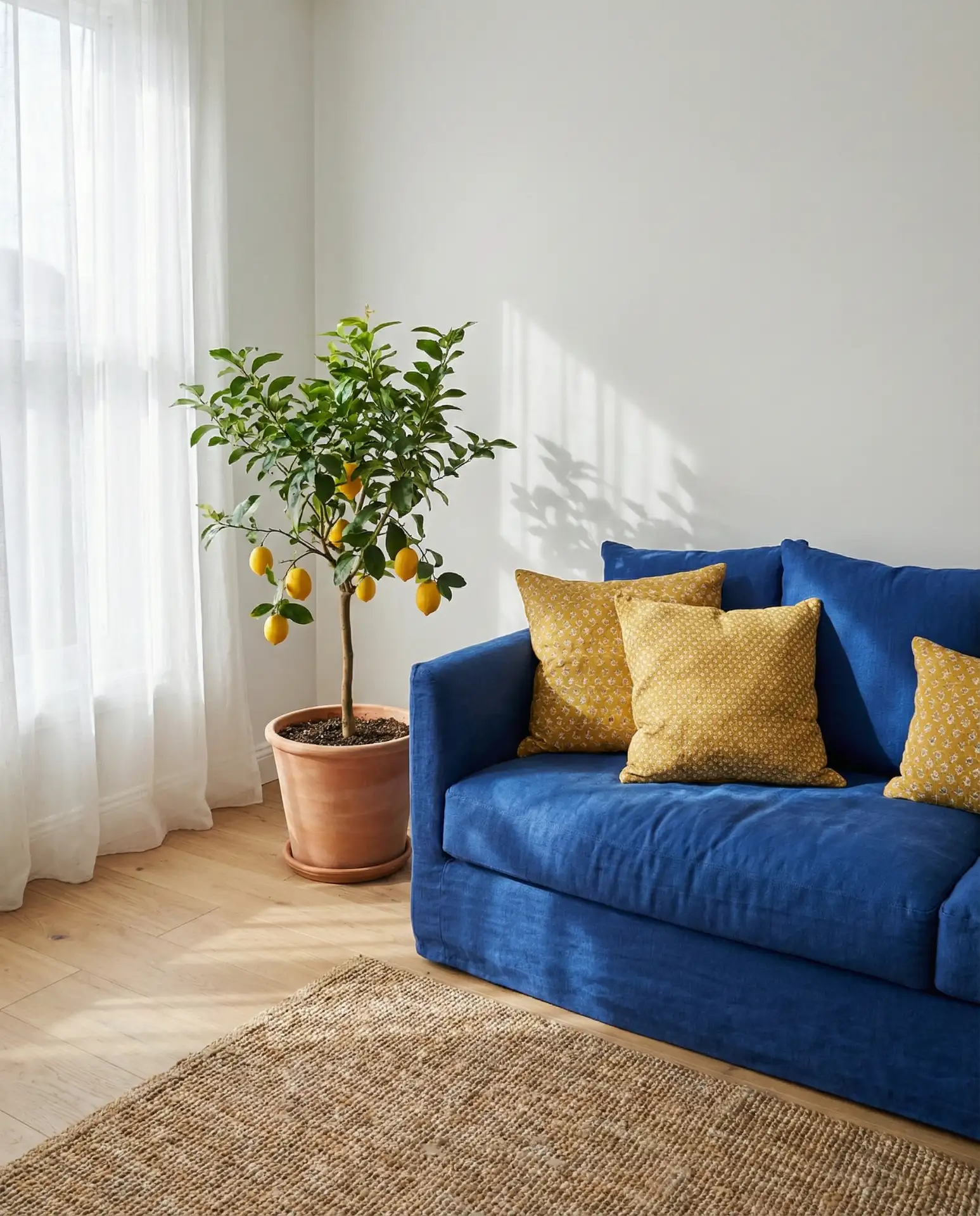
14. Yellow and Blue Cheerful Contrast
Pairing yellow and blue creates an energetic, optimistic vibe that feels fresh and welcoming. This classic combination works across multiple design styles—from preppy coastal to eclectic bohemian—and it’s especially effective in rooms that get morning light, where the yellow tones can really shine.
This pairing is particularly popular in Southern states like Georgia and Texas, where homeowners lean into bright, cheerful interiors that mirror the sunny climate. Keep the yellow accents in check—too much can feel overwhelming—and let the blue serve as the dominant color to maintain balance. A few well-placed yellow pillows or a single statement chair is often all you need.
15. Pink and Blue Unexpected Harmony
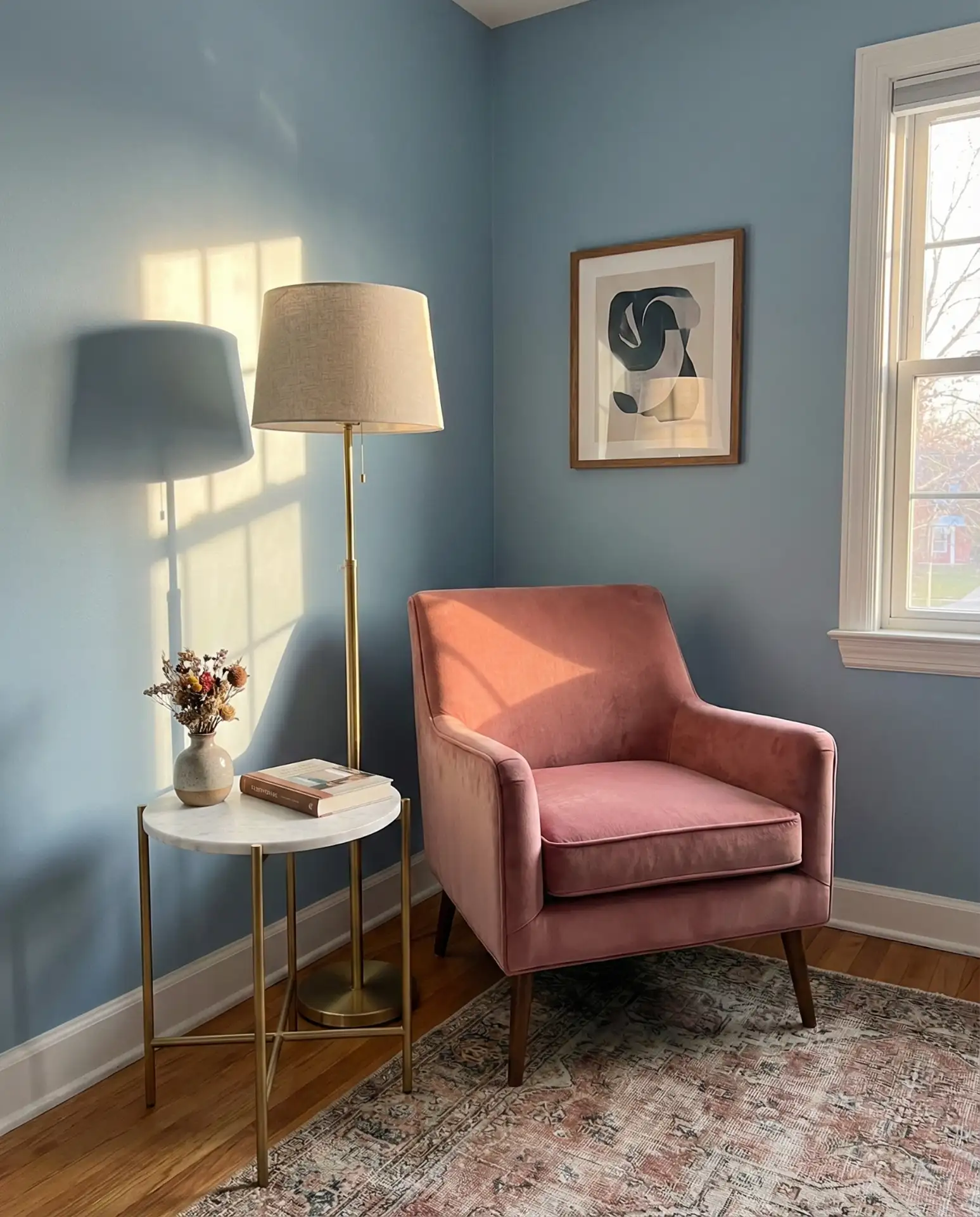
Combining pink and blue might sound unconventional, but when done with a light touch, it creates a surprisingly sophisticated and modern living room. Think blush pink accents against soft blue walls or a blue sofa with dusty rose pillows—the key is keeping both shades muted and letting neutral tones balance the palette.
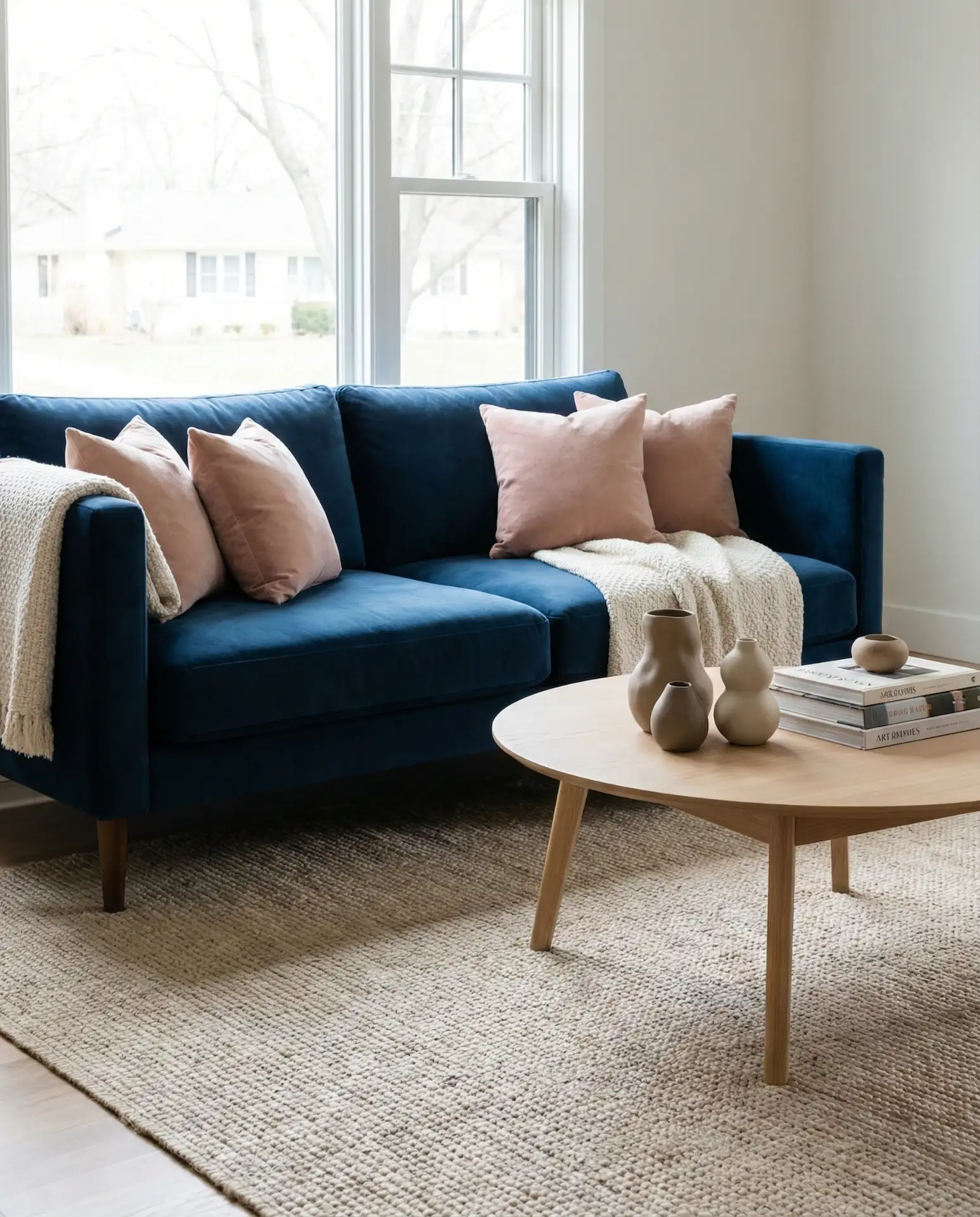
This palette gained traction after appearing in design magazines and showrooms, where stylists demonstrated how pink and blue can feel grown-up and chic rather than nursery-themed. The trick is avoiding primary shades and instead choosing dusty, grayed-out versions of both colors. It’s a fresh alternative for anyone tired of the usual neutral combinations.
16. Red and Blue Bold Energy
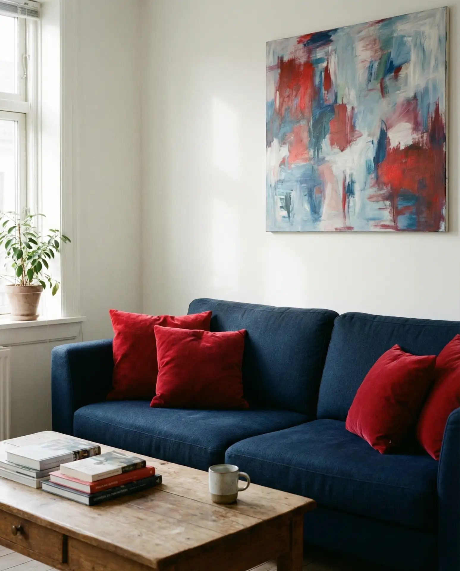
A red and blue pairing brings undeniable energy and personality to a living room, making it ideal for those who aren’t afraid of color. This combination works best when one shade dominates—usually blue—with red serving as a punchy accent through pillows, artwork, or a single statement piece. The result is dynamic and memorable.
Many homeowners make the mistake of using too much of both colors, which can feel chaotic. Instead, let blue cover larger surfaces and introduce red sparingly for impact. This approach is especially effective in traditional homes where you want to honor classic color pairings while still keeping the look current and livable.
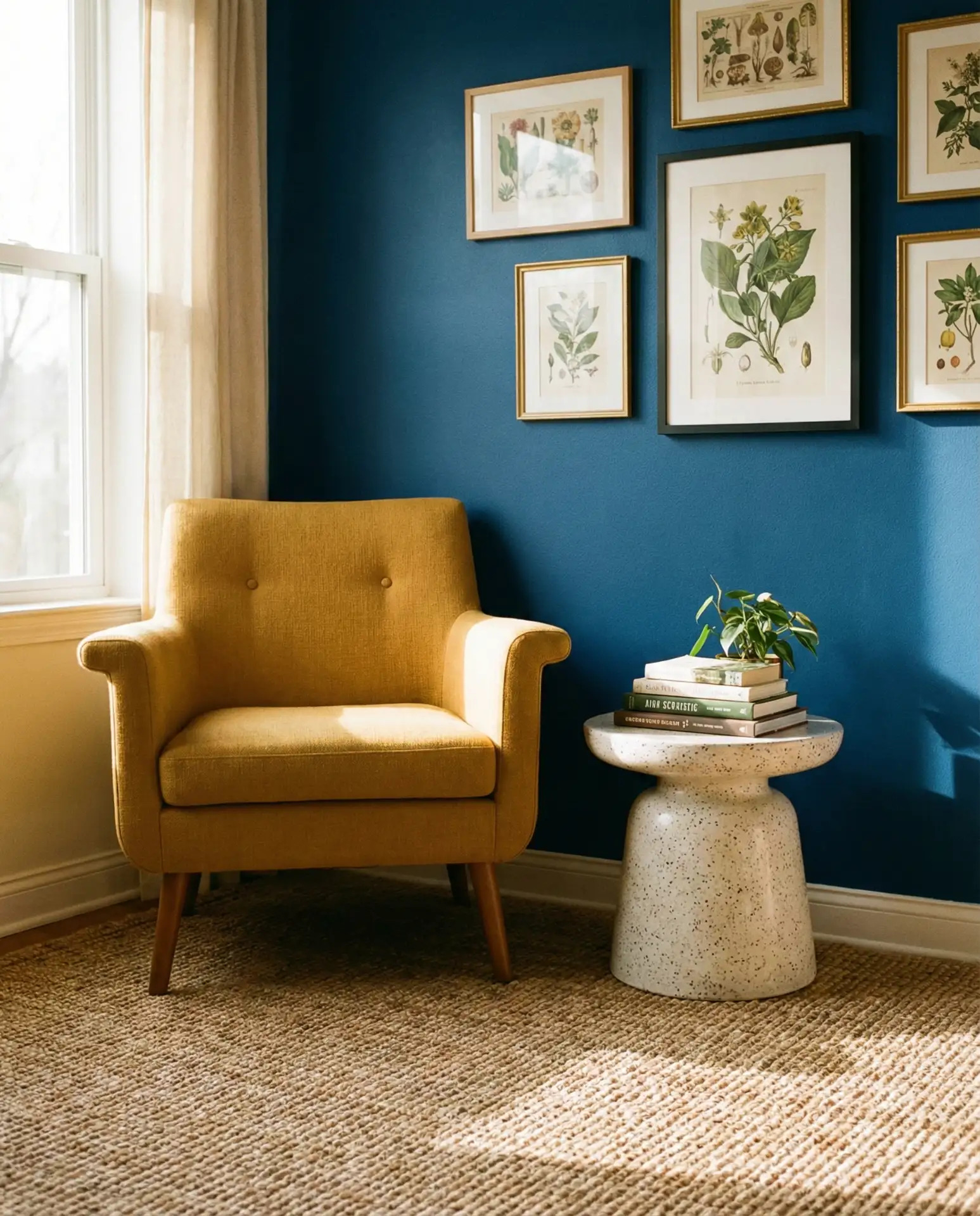
17. Purple and Blue Jewel Tones
A purple and blue palette creates a rich, luxurious atmosphere that’s perfect for evening entertaining or creating a cozy retreat. These jewel tones work beautifully together because they share similar undertones, and when paired with metallic accents like gold or brass, the effect is both opulent and inviting.
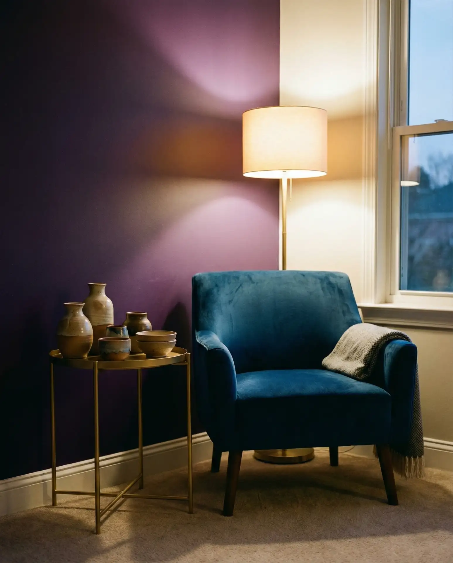
This combination is particularly popular in urban apartments and historic homes where residents want a dramatic, curated look. To keep it from feeling too heavy, incorporate plenty of white or cream through trim, curtains, or larger furniture pieces. This balance ensures the jewel tones feel intentional rather than overwhelming.
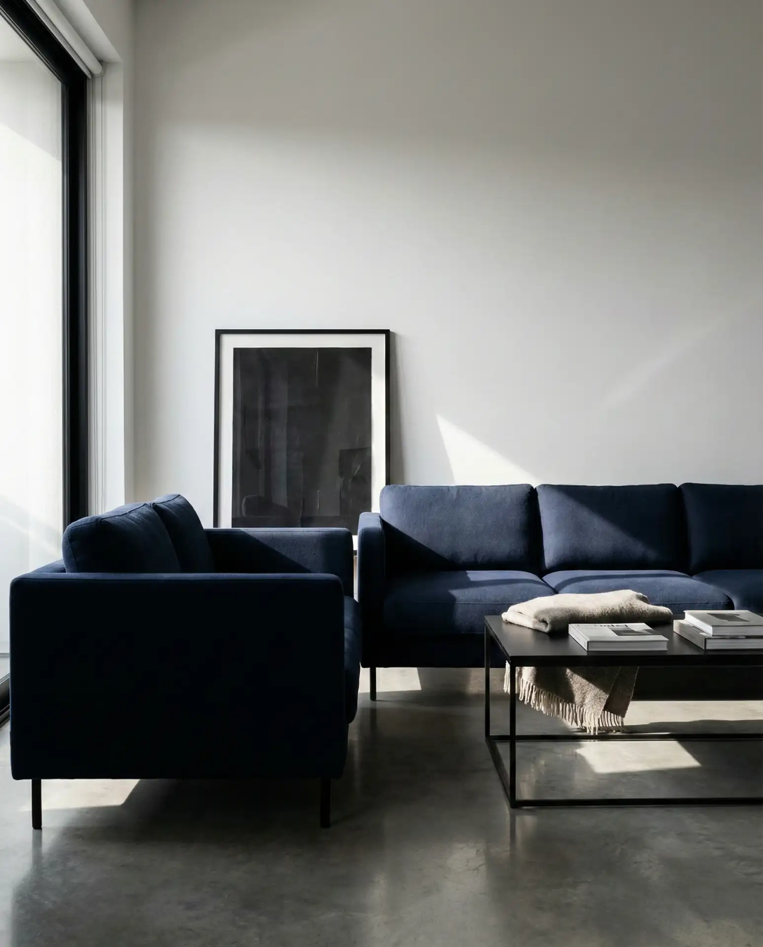
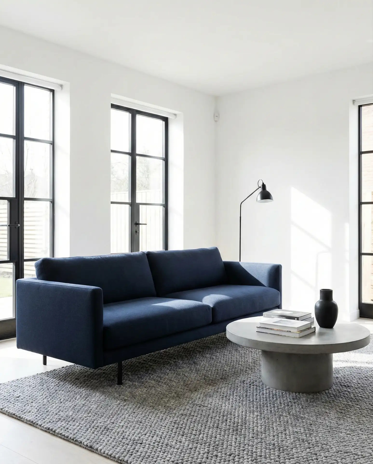
18. Modern Navy Minimalism
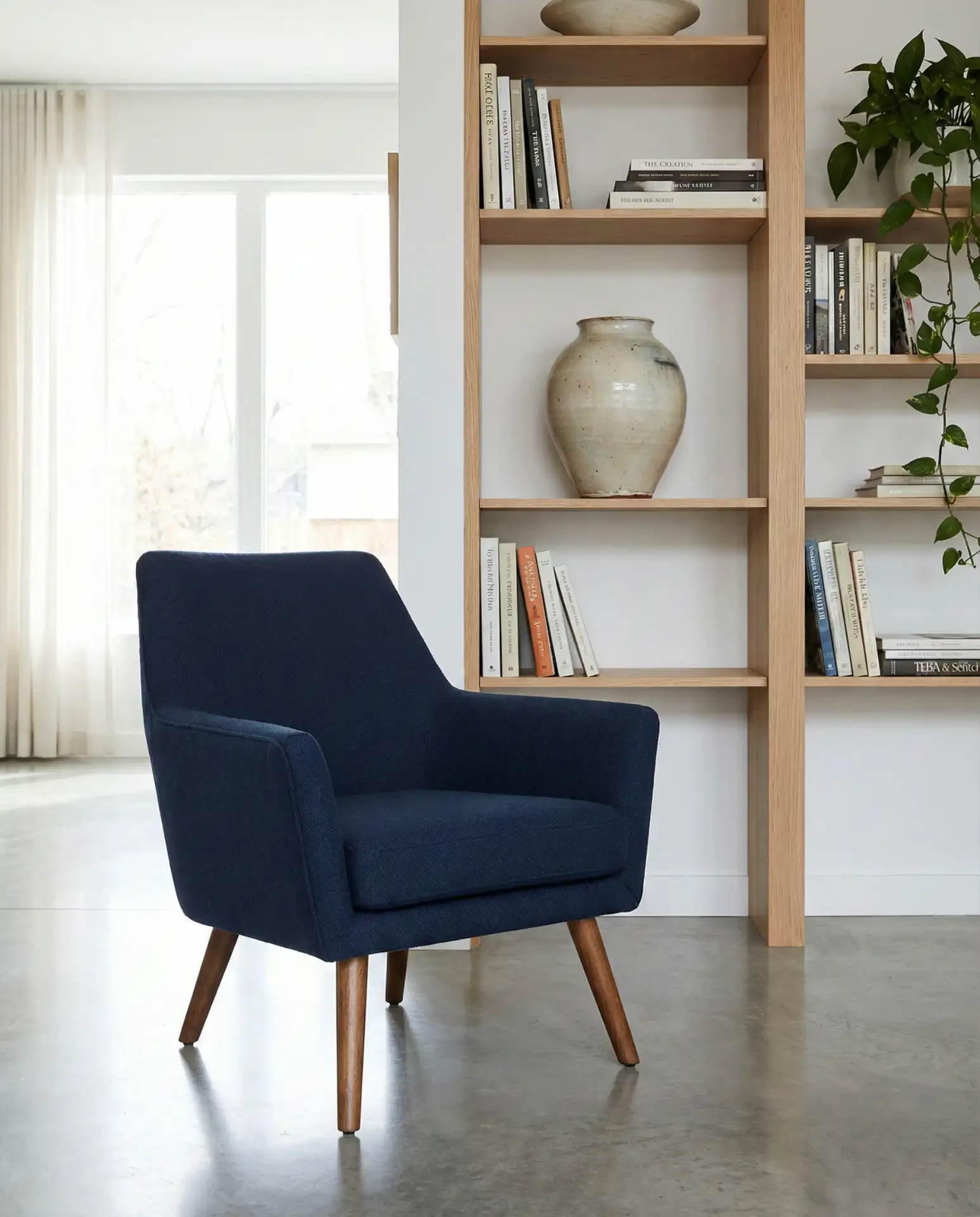
A modern navy living room embraces clean lines, minimal ornamentation, and a restrained color palette that lets the quality of materials speak for itself. This approach is ideal for those who appreciate Scandinavian or Japanese-inspired design, where less is more and every piece has a purpose.
This style works exceptionally well in compact urban apartments where maximizing space and light is critical. The navy adds depth without requiring additional decor, and the minimalist approach prevents the room from feeling cluttered. Invest in a few high-quality pieces rather than filling the space with accessories—it’s a more sustainable and visually impactful choice.
19. Bohemian Brown and Blue Layers
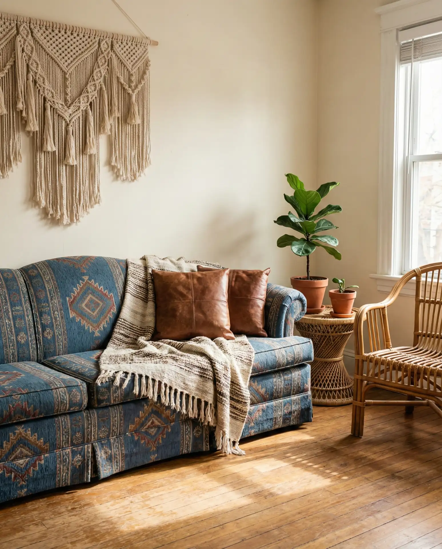
A bohemian brown and blue living room celebrates texture, pattern, and globally inspired decor. Think layered rugs, woven wall hangings, and a mix of vintage and handmade pieces that come together in a relaxed, collected way. This style is all about creating a space that feels personal and traveled, not matchy or overly curated.
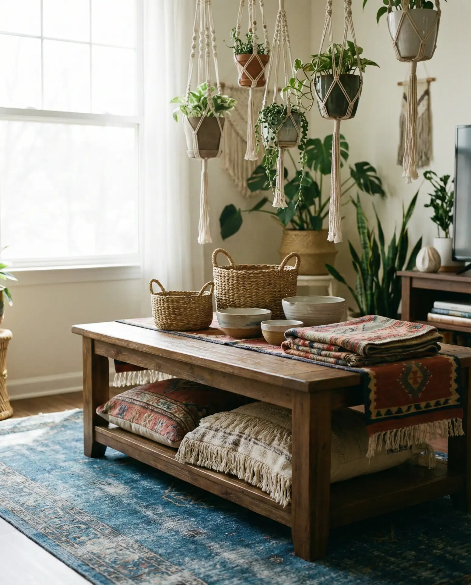
This aesthetic is especially popular in the Southwest and California, where the influence of Spanish colonial architecture and desert landscapes naturally lends itself to earthy, eclectic interiors. Don’t be afraid to mix patterns or pile on textiles—the key to successful boho style is layering with intention and choosing pieces that genuinely speak to you.
20. Gray and Modern Blue Sleekness
A gray and modern blue pairing delivers a sleek, contemporary look that feels polished and professional. This combination is a favorite in new construction homes and renovated spaces where the architecture is minimal and the finishes are high-end. It’s the kind of palette that photographs beautifully and translates well across different design styles.
This palette is incredibly forgiving when it comes to maintenance—both gray and modern blue hide everyday wear well, making it practical for busy households. It also provides a neutral backdrop that allows you to rotate seasonal decor or accent colors without needing to repaint or replace major furniture pieces.
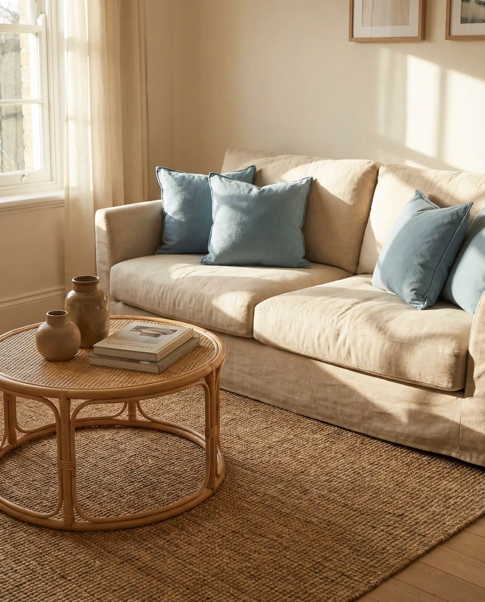
21. Cream and Blue Timeless Softness
A cream and blue combination offers a soft, timeless aesthetic that never goes out of style. This pairing feels gentle and inviting, making it perfect for living rooms where comfort and relaxation are the priority. It’s a palette that works beautifully in both traditional and transitional homes, bridging the gap between classic and contemporary.
Real estate agents often recommend this palette to sellers because it appeals to a wide range of buyers and photographs beautifully for listings. The cream keeps things feeling warm and approachable, while the blue adds just enough interest to prevent the space from looking too neutral or bland. It’s a safe choice that still has plenty of character.
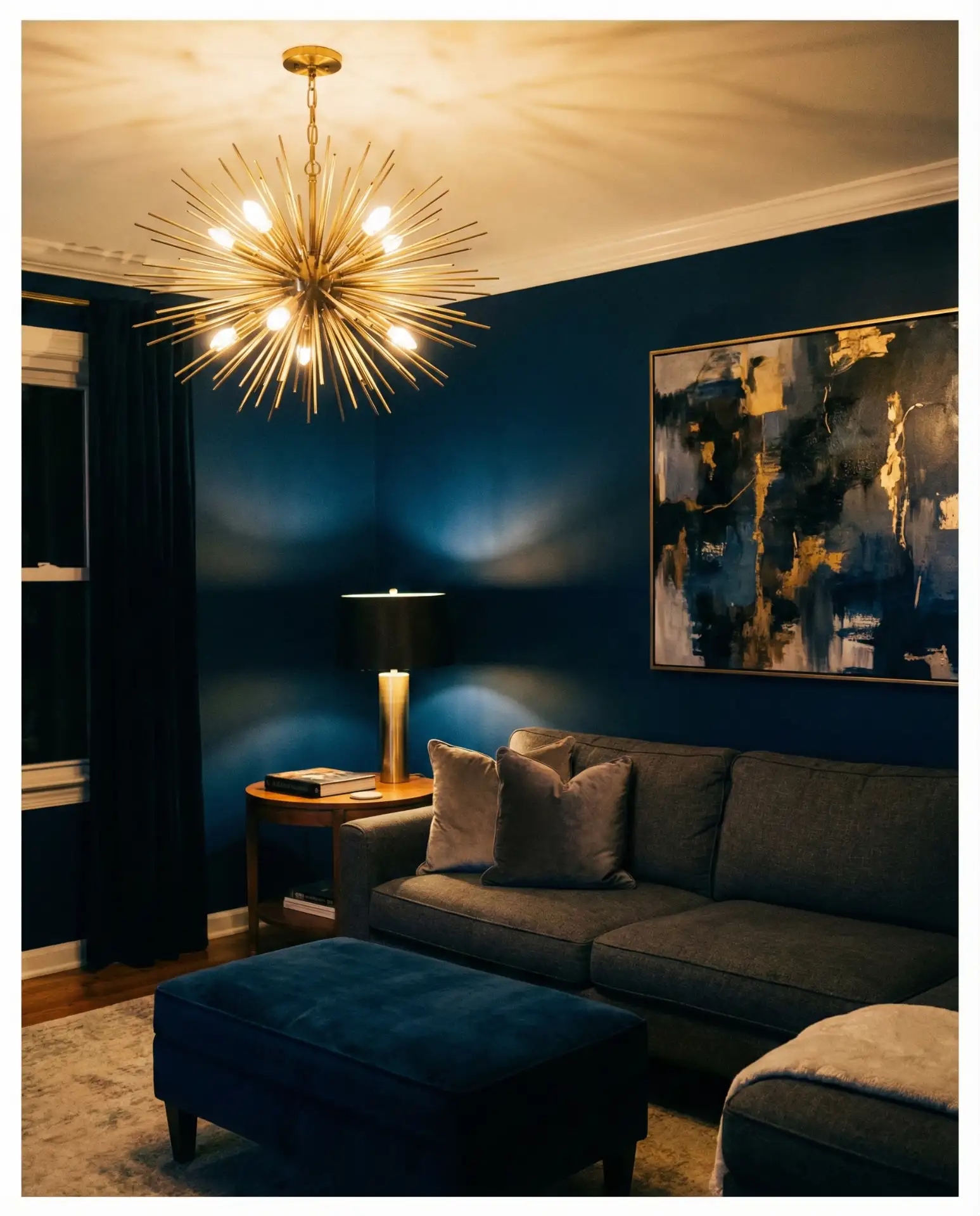
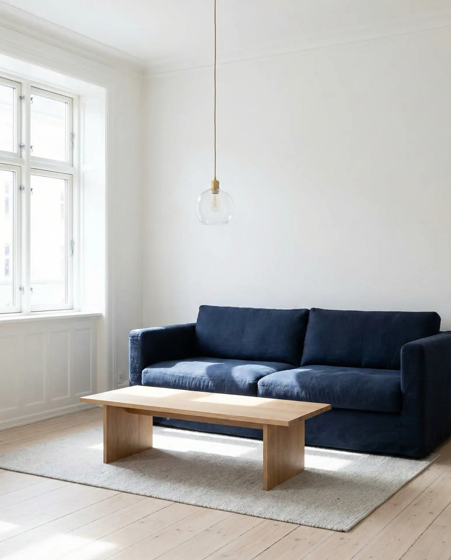
22. Dark Blue Moody Sophistication
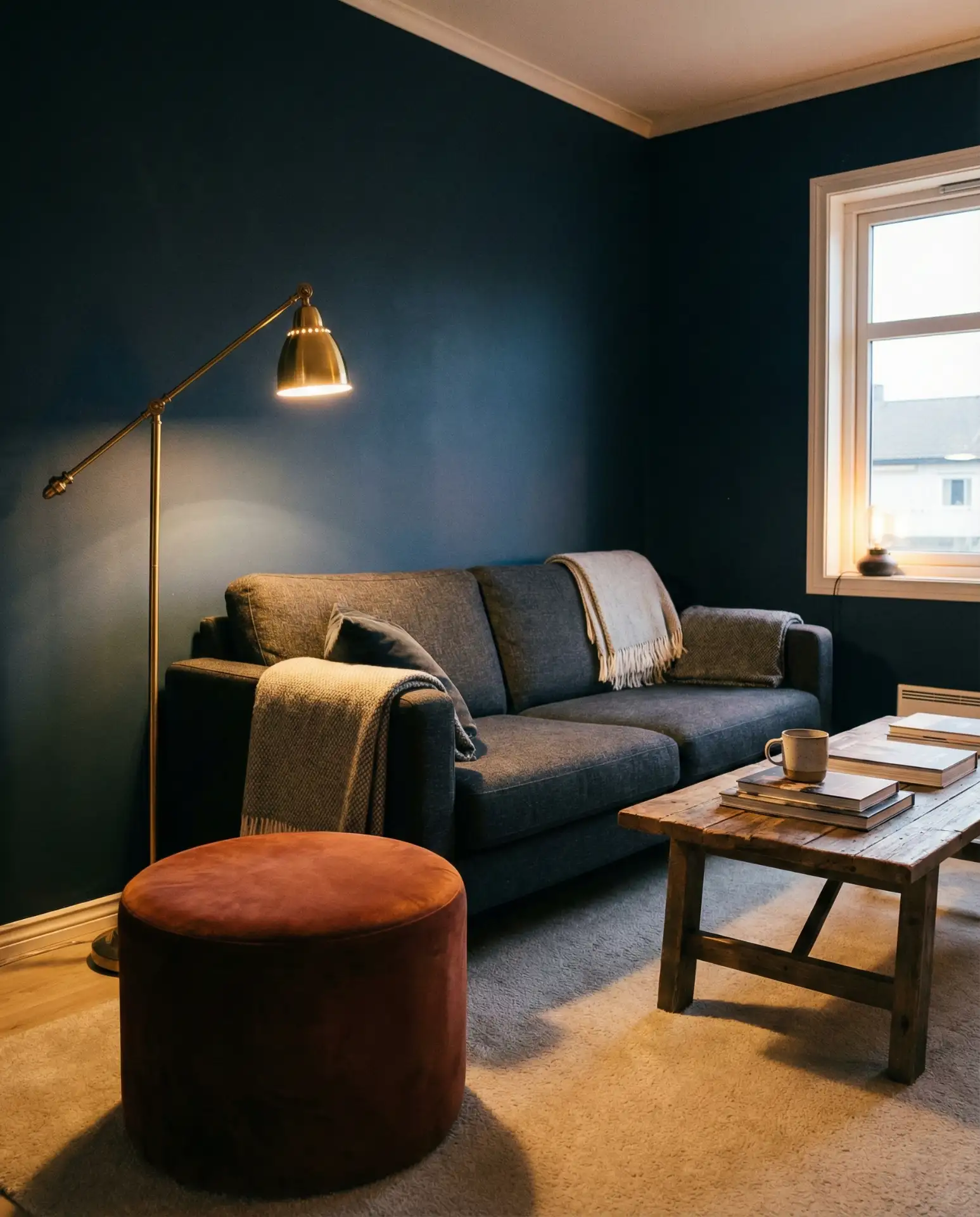
A dark blue living room creates a moody, sophisticated atmosphere that’s perfect for those who want their space to feel intimate and cocoon-like. This shade works particularly well in rooms with high ceilings or large windows, where the darkness adds drama without making the space feel cramped or closed in.
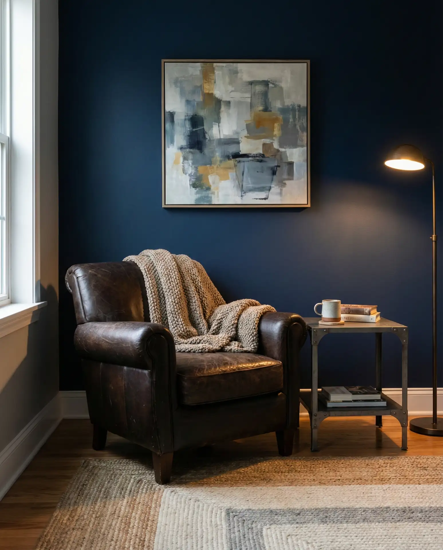
This look requires commitment and confidence, but the payoff is a living room that feels truly unique and memorable. Balance the darkness with plenty of light sources—floor lamps, table lamps, and candles all help create warmth and dimension. And don’t skip the white or light-colored accents; they’re essential for preventing the space from feeling too heavy or one-note.
23. White and Blue Crisp Freshness
A white and blue living room feels crisp, clean, and eternally fresh—like a coastal cottage or a Mediterranean villa. This combination is ideal for anyone who wants a bright, airy space that feels effortlessly elegant. It’s a palette that never goes out of style and works beautifully in homes of all sizes and architectural styles.
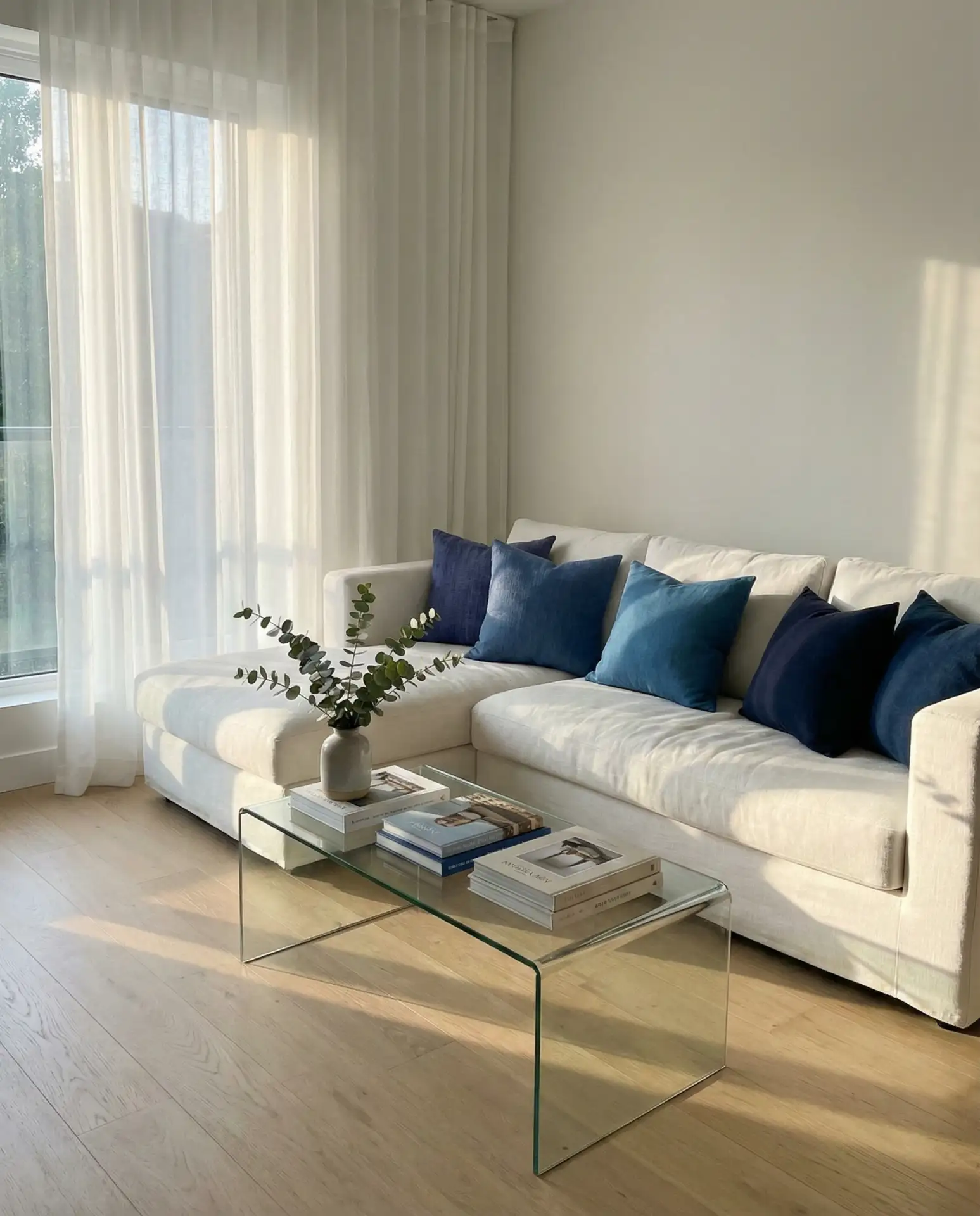
This pairing is especially popular in beach communities and warm-weather regions where the goal is to keep interiors feeling cool and uncluttered. The white reflects light and makes small rooms feel larger, while the blue adds personality and prevents the space from feeling too sterile or clinical. It’s a foolproof combination that works for first-time decorators and seasoned designers alike.
Conclusion
These blue living room ideas offer something for every style, budget, and home layout. Whether you’re drawn to dramatic dark tones or soft pastel washes, blue continues to prove its versatility and staying power in American interiors. Share your favorite idea in the comments below, or let us know which palette you’re planning to try in your own space.