Blue kitchens are having a major moment in 2026, and it’s easy to see why. From serene pastels to bold navy tones, blue brings a sense of calm, sophistication, and timeless elegance that white and gray just can’t match. American homeowners are flocking to Pinterest for fresh inspiration, drawn to the versatility of blue—whether it’s a full cabinetry transformation, a statement island, or a subtle backsplash accent. This color works beautifully in both modern and traditional spaces, offering endless opportunities to personalize your kitchen. In this article, we’re showcasing stunning blue kitchen ideas that will help you discover the perfect shade, style, and layout for your home.
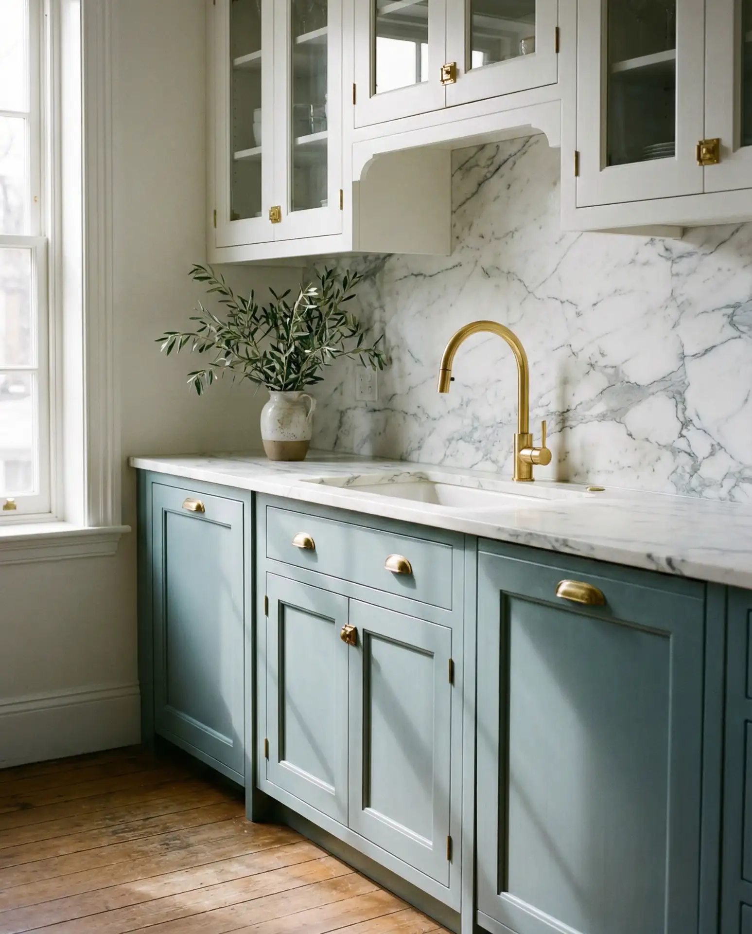
1. Navy Cabinets with Brass Hardware
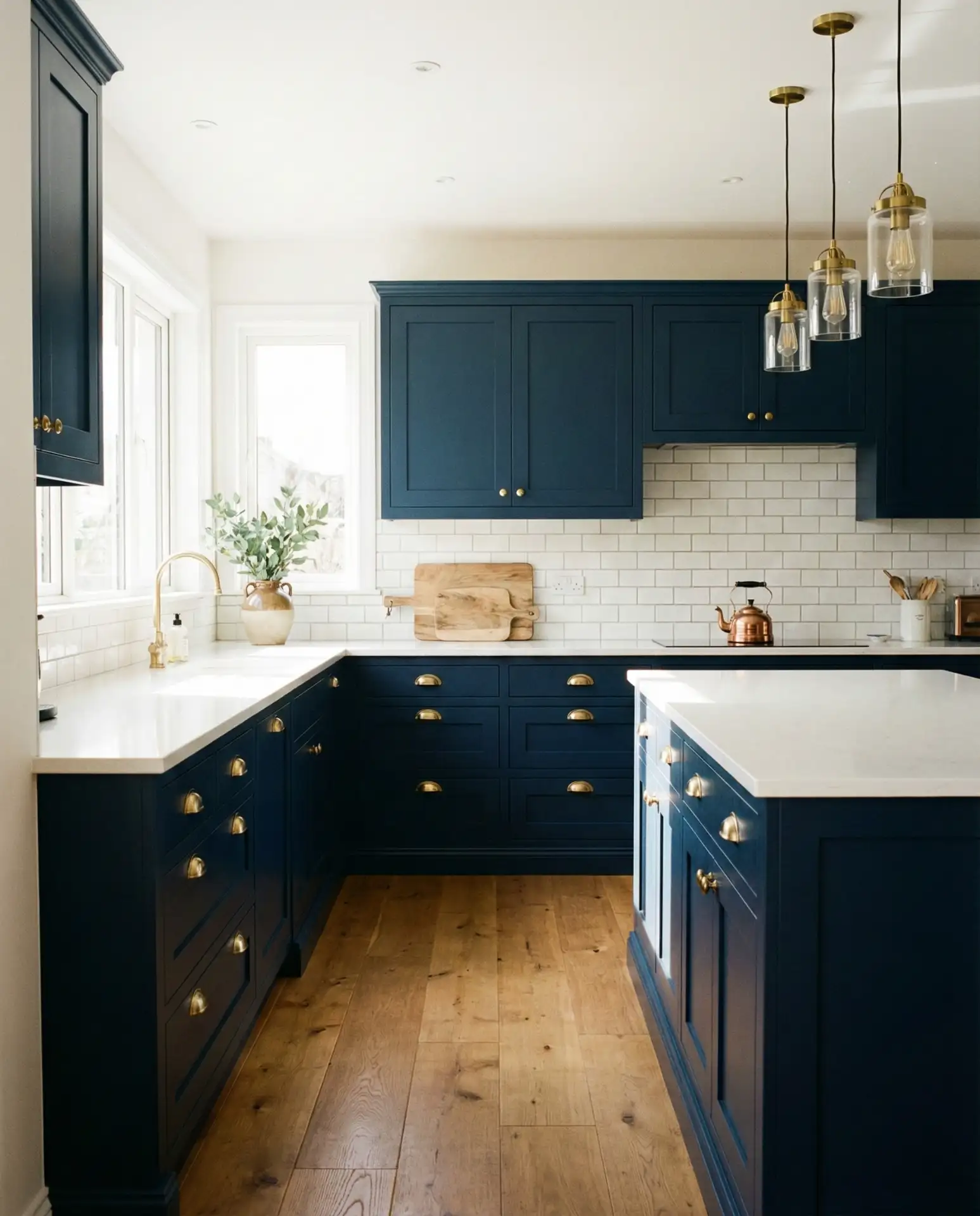
A navy kitchen with gleaming brass pulls and knobs is the epitome of refined elegance. This combination works beautifully in both galley-style and open-concept layouts, where the deep blue cabinets anchor the space while warm metallic accents catch the light. The richness of navy brings a grounded, almost nautical sophistication that feels both classic and contemporary. Pair it with white countertops or light wood floors to keep the space from feeling too heavy. 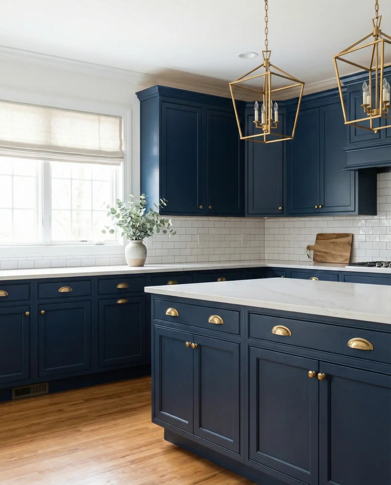
This look works best in kitchens with plenty of natural light, as the dark cabinetry can absorb brightness. If your space lacks windows, consider under-cabinet lighting to highlight the brass details and keep the room from feeling cave-like. Many homeowners make the mistake of pairing navy with cool-toned metals like chrome, which can clash—stick with warm finishes like brass, gold, or copper for a cohesive, upscale feel.
2. Pastel Blue Island with White Perimeter
If you’re not ready to commit to blue throughout the entire kitchen, a pastel blue island is the perfect compromise. This approach keeps the perimeter white and airy while introducing a soft pop of color at the heart of the room. Pastel blues evoke a sense of calm and openness, making them ideal for kitchens where you want to maintain a light, breezy atmosphere. The island becomes a focal point without overwhelming the space. 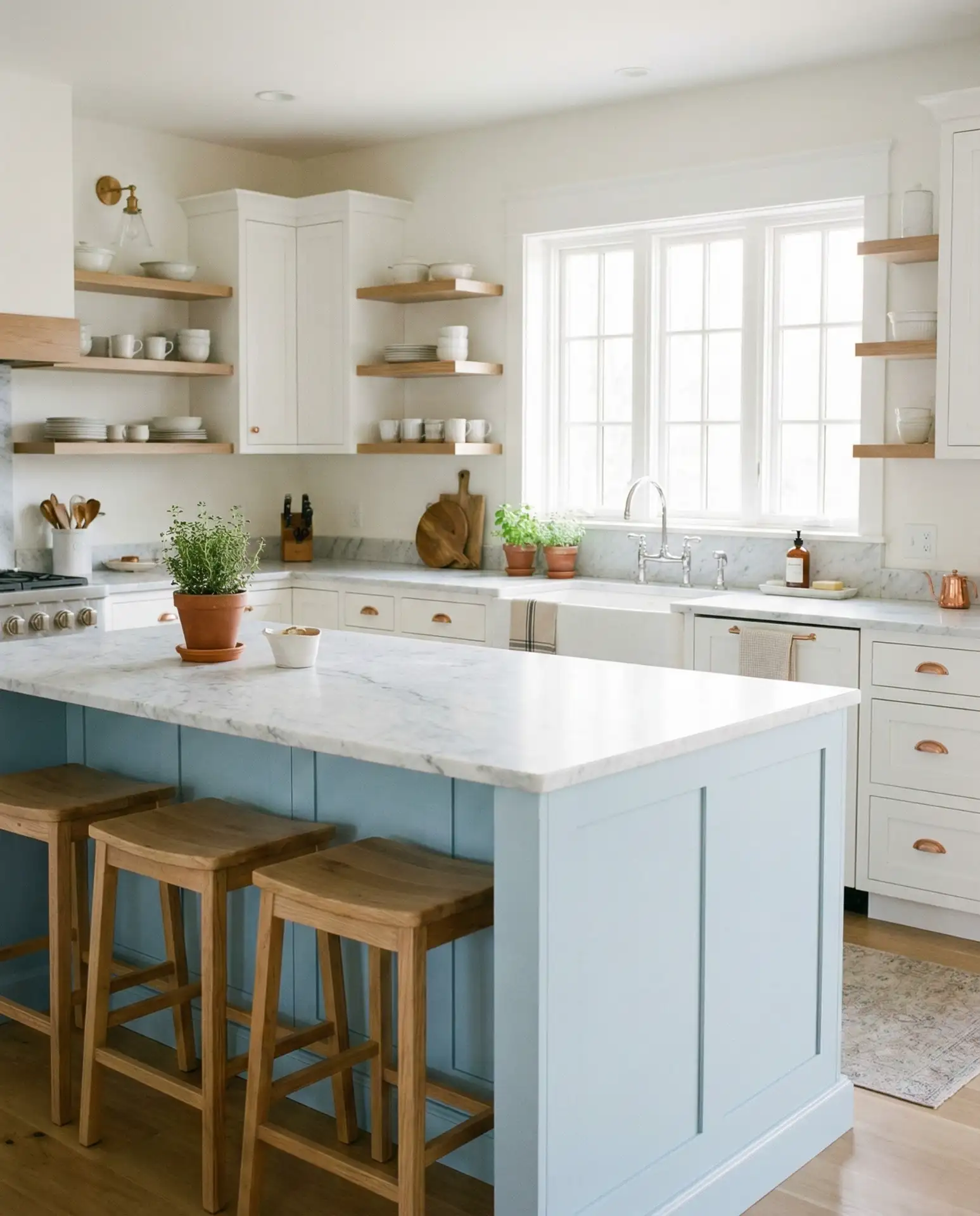
In the Midwest and Pacific Northwest, where natural light can be softer and more diffused, pastel blue islands have become a go-to choice for adding personality without sacrificing brightness. A friend recently painted her island in a pale sky blue, and she says it completely transformed the room—guests always comment on it. The key is choosing a shade that’s pigmented enough to read as intentional, not washed out.
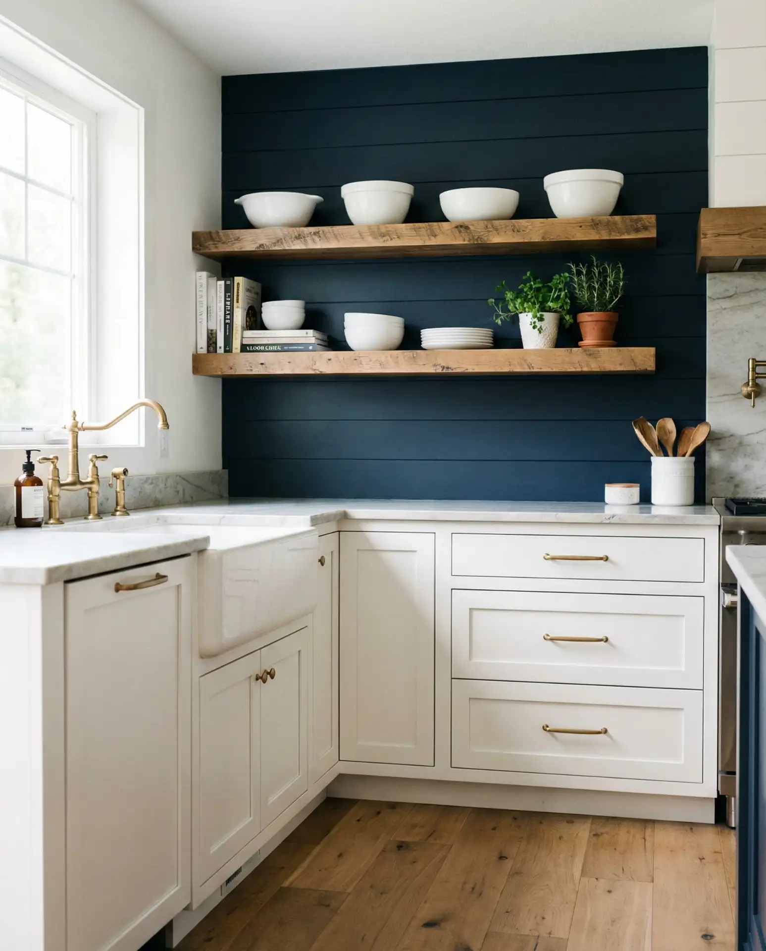
3. Dark Moody Walls with Open Shelving
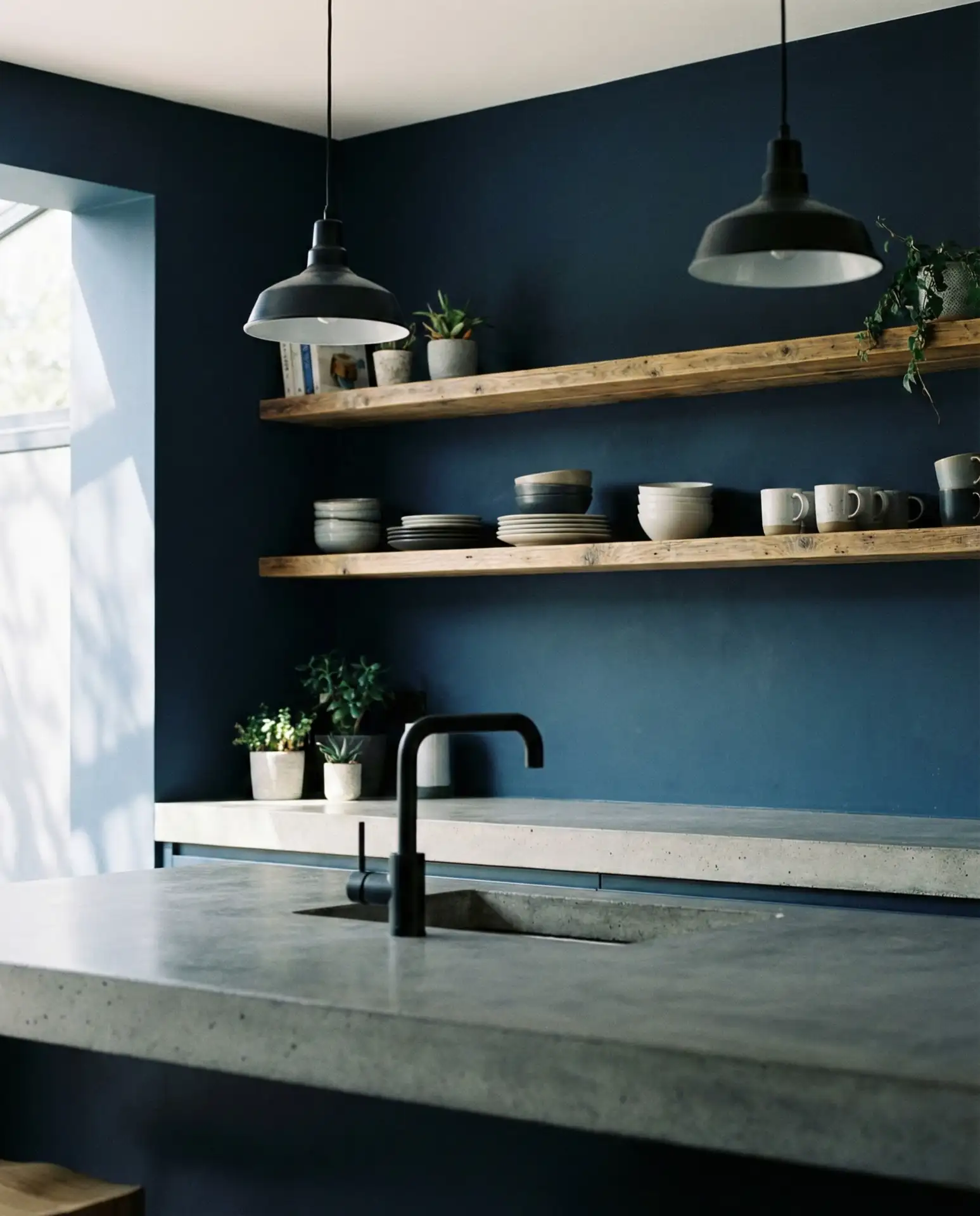
For a bold, dramatic look, consider painting your kitchen walls in a dark blue hue and balancing it with open wooden shelving. This modern approach creates depth and intimacy, turning your kitchen into a cozy, enveloping space rather than a sterile work zone. The contrast between the deep blue and natural wood and ceramics on the shelves adds warmth and texture. It’s a favorite among city dwellers who want their kitchens to feel more like living spaces. 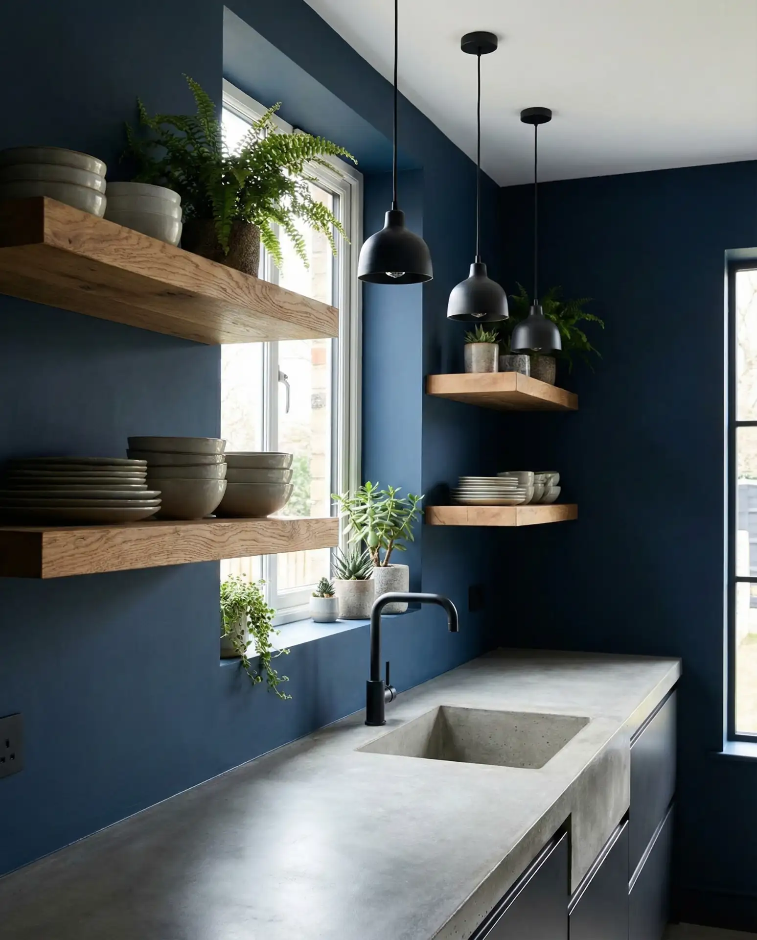
Expert designers often recommend this look for kitchens with high ceilings or large windows, as it can make smaller, windowless spaces feel cramped. The trick is to keep the upper shelving light and uncluttered—too many items can create visual chaos against a dark backdrop. If you’re considering this style, test paint samples in different lighting conditions throughout the day to ensure the color doesn’t skew too purple or black.
4. Light French Country Cabinetry
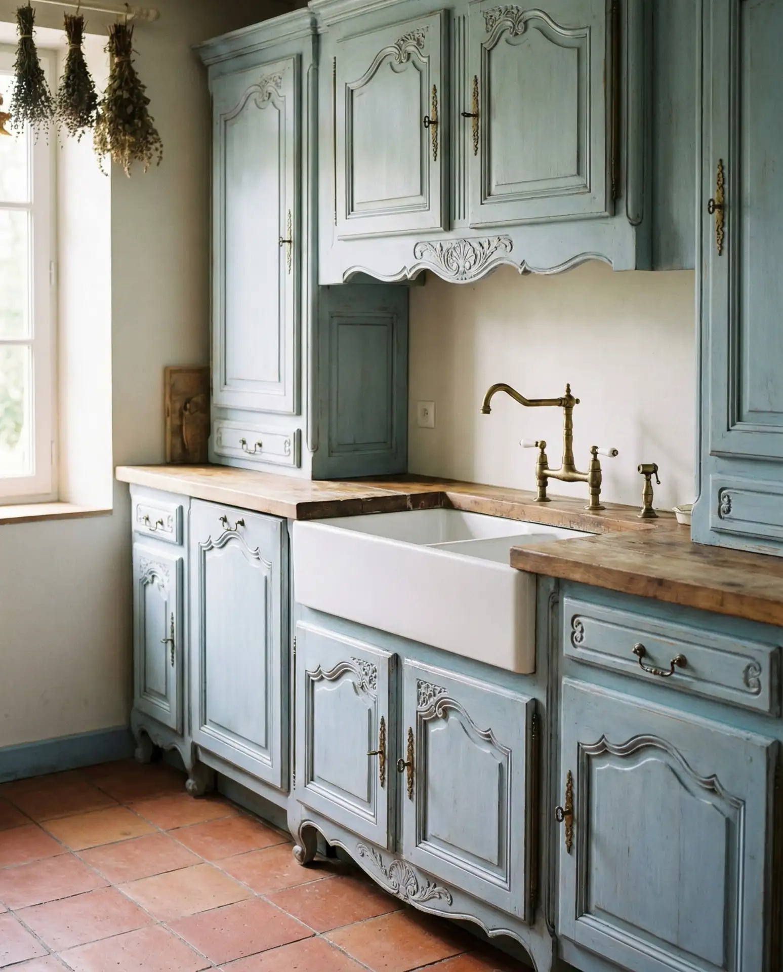
A light blue kitchen with French country charm brings a sense of elegance and history to modern American homes. Think soft powder blue cabinets with ornate molding, vintage-style hardware, and perhaps a farmhouse sink. This style has surged in popularity as homeowners seek warmth and character in their interiors, moving away from the cold minimalism of the last decade. The color feels both nostalgic and fresh, especially when paired with butcher block countertops or terracotta tile floors. 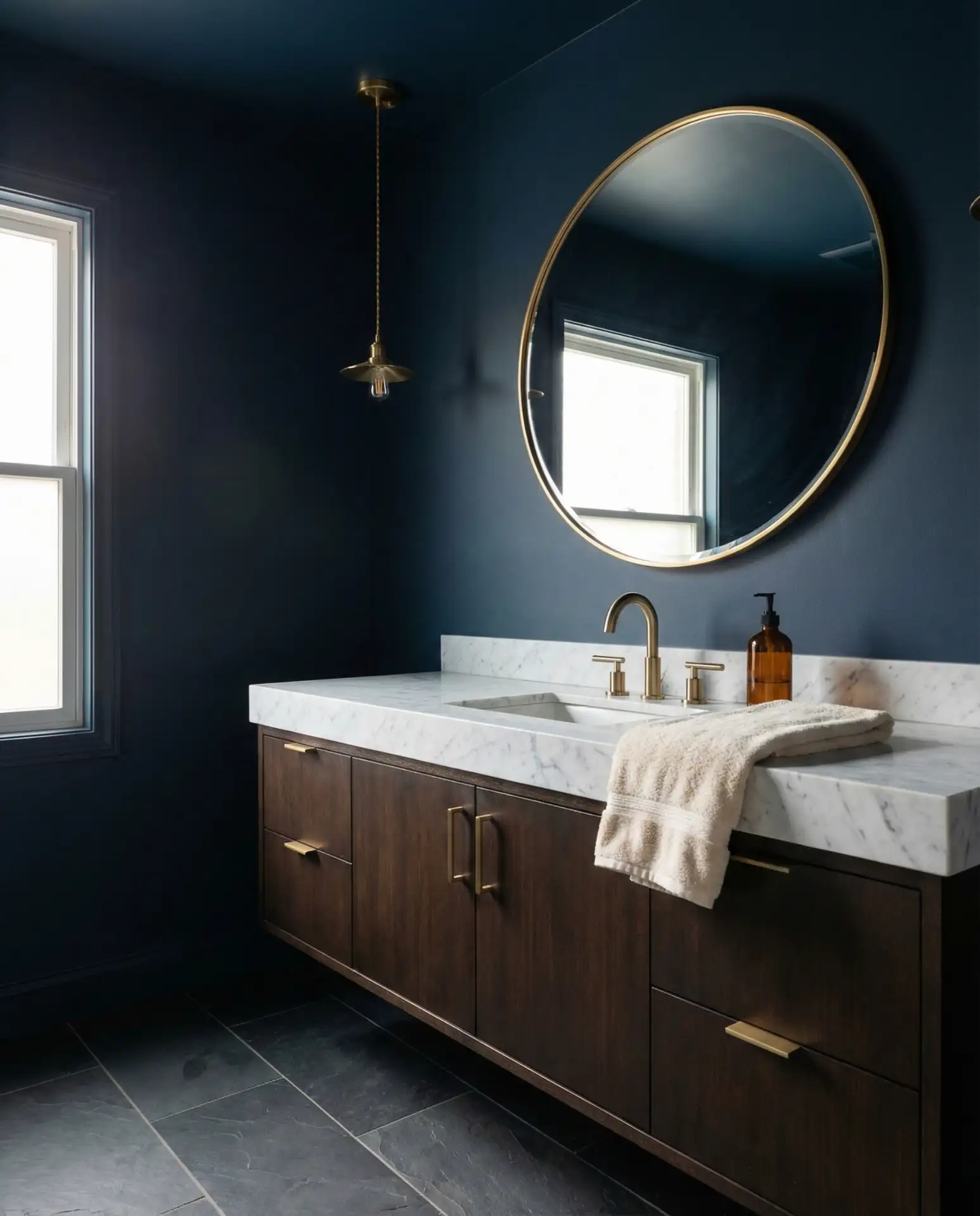
Budget-wise, achieving this look doesn’t require custom cabinetry—several big-box retailers now offer French-inspired door styles that can be painted in your chosen blue. The real investment is in the details: quality hardware, a statement range hood, and perhaps a vintage chandelier. Many homeowners opt for a DIY paint job on existing cabinets, which can save thousands while still delivering that coveted French countryside aesthetic.
5. Duck Egg Blue with Marble Backsplash
Duck egg blue is a unique shade—somewhere between green and blue, with a soft, muted quality that feels both vintage and contemporary. When paired with a white marble backsplash, it creates a sophisticated, high-end look that’s become a Pinterest favorite. The subtle veining in the marble echoes the complexity of the paint color, creating a cohesive, layered design. This combination works particularly well in kitchens with plenty of natural light, where the color can shift throughout the day. 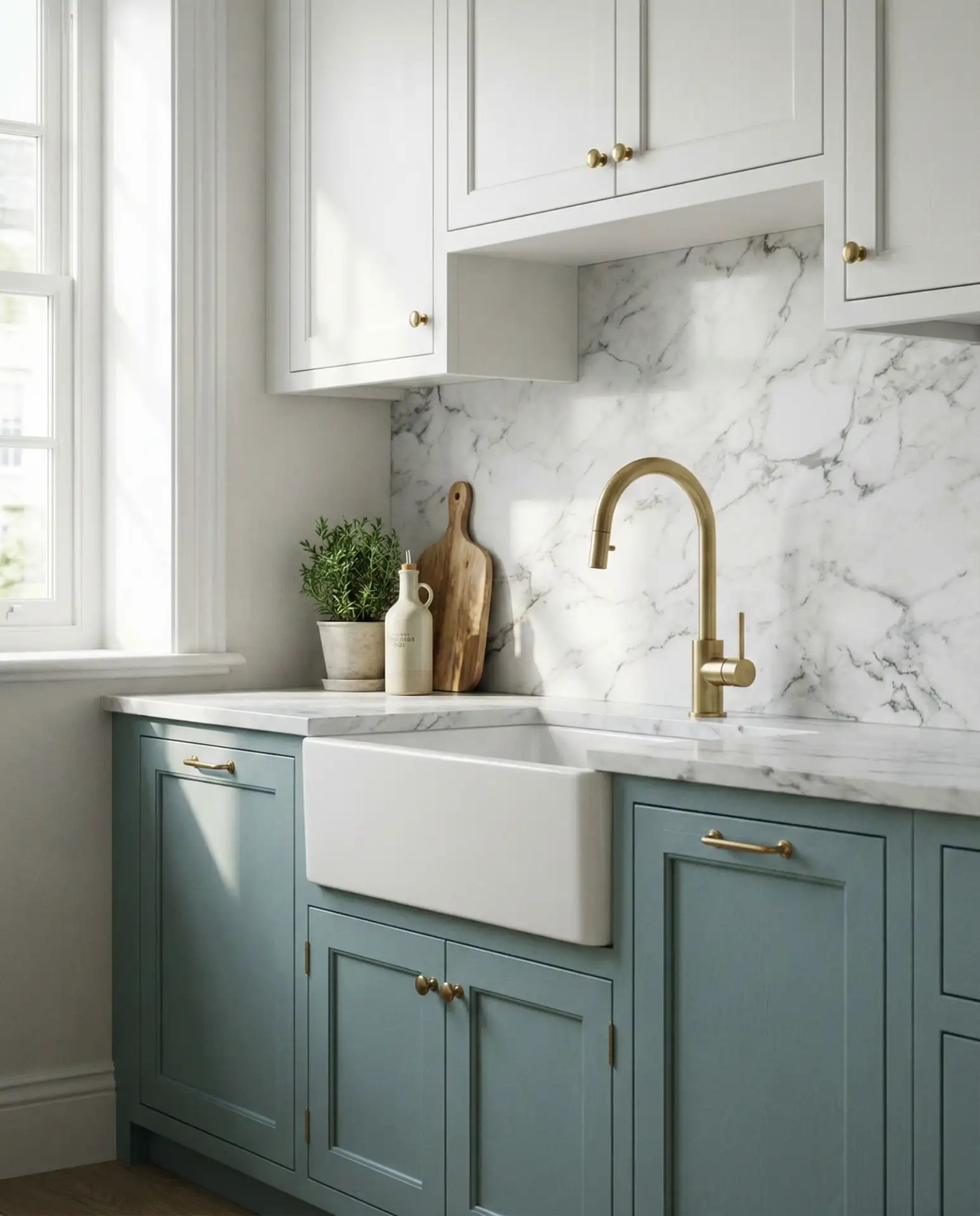
In the Northeast, where historic homes often feature original architectural details, duck egg blue has become a go-to for homeowners looking to honor traditional aesthetics while updating for modern living. The color reads as timeless rather than trendy, which is crucial for resale value. If you’re working with a real estate timeline in mind, this is one of the safer blue choices—it appeals to a wide audience without feeling generic.
6. Cobalt Accent Wall Behind Open Shelves

A cobalt blue accent wall behind open shelving creates instant drama and serves as a gallery-like backdrop for your favorite dishes, glassware, and decor. This approach is perfect for renters or anyone who wants to experiment with color without committing to painted cabinetry. The intense, saturated blue makes white ceramics and glassware pop, turning everyday items into display-worthy art. It’s a low-cost, high-impact way to inject personality into your kitchen. 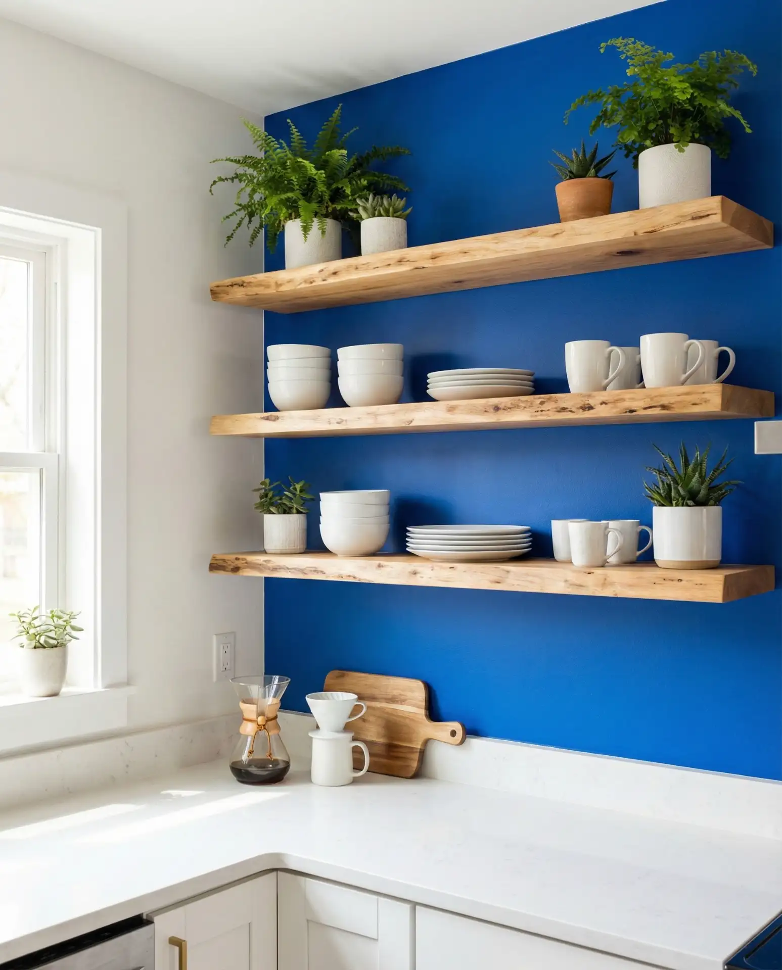
Real homeowners often report that this is one of the easiest DIY projects with the most dramatic results. One gallon of paint and a weekend afternoon can completely transform a kitchen alcove or breakfast nook. The key is to keep the shelving and items displayed relatively minimal—too much clutter can overwhelm the bold background. Consider limiting your palette to white, wood, and one or two accent colors for a curated, intentional look.
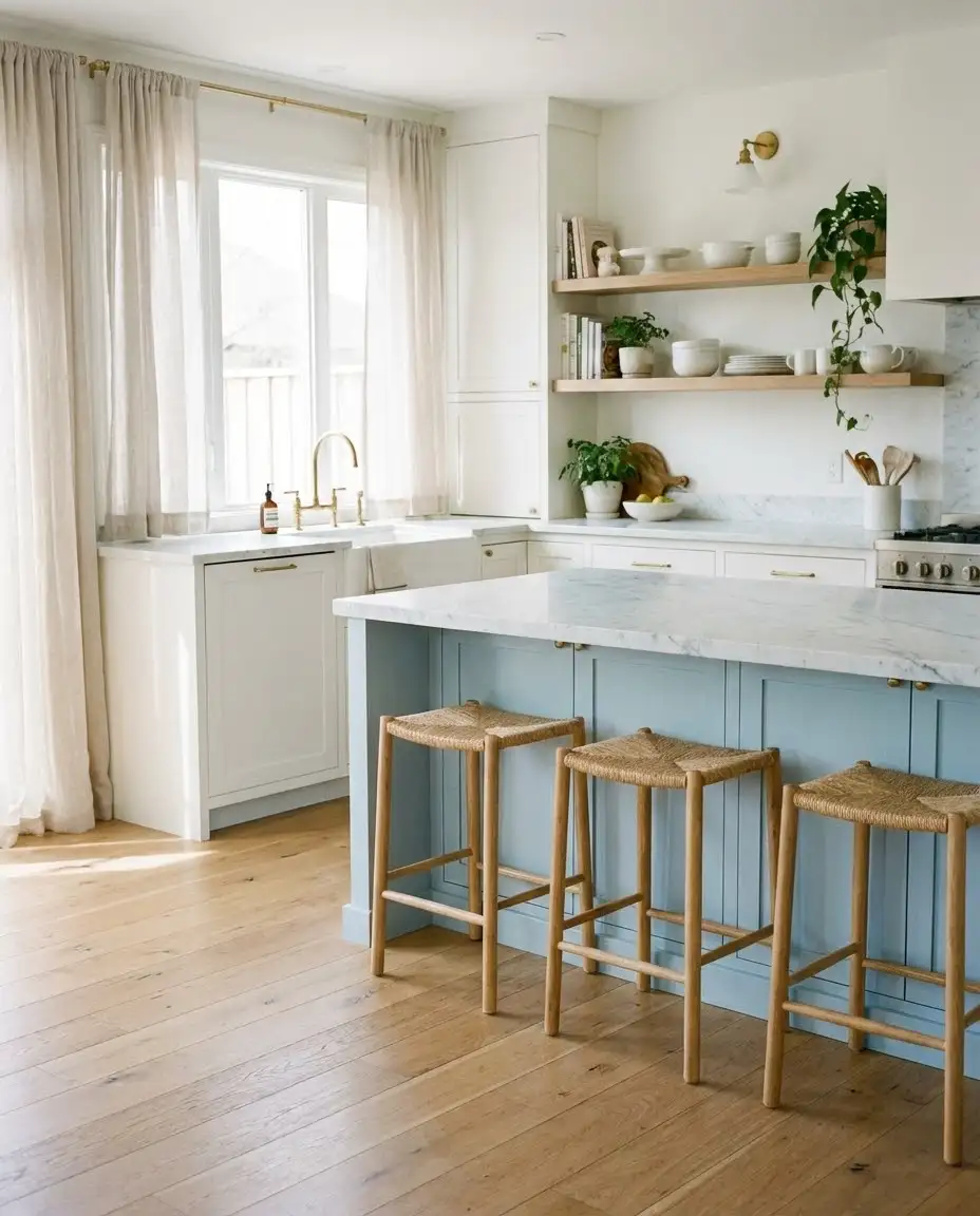
7. Pale Blue with Warm Wood Tones
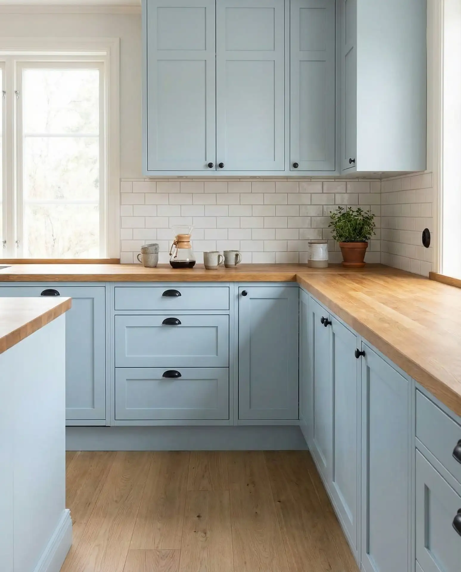
A pale blue kitchen with warm wood and accents strikes a perfect balance between cool and warm tones. This combination feels organic and calming, ideal for open-plan homes where the kitchen flows into living spaces. The soft blue provides a soothing backdrop while honey-toned oak or walnut flooring, countertops, or bar stools add richness and grounding warmth. It’s a particularly popular choice in Scandinavian-inspired interiors that prioritize natural materials and understated elegance. 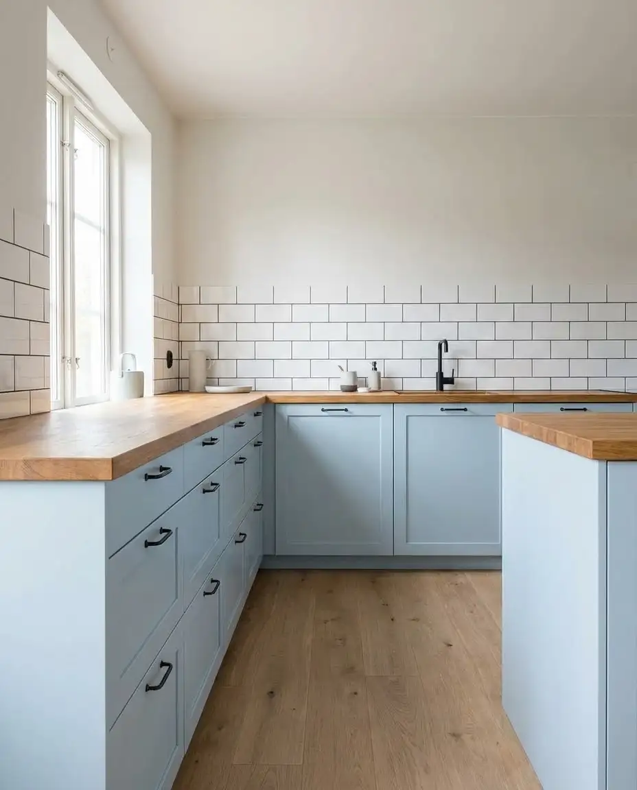
According to kitchen designers, this pairing works best when you let the wood be the star—choose a pale blue that’s whisper-soft rather than saturated, so the two elements complement rather than compete. Many homeowners make the mistake of choosing a blue that’s too cool or grey-toned, which can clash with warm wood and create visual tension. Test your paint next to your wood samples in natural light to ensure harmony.
8. Navy and White Checkerboard Floor
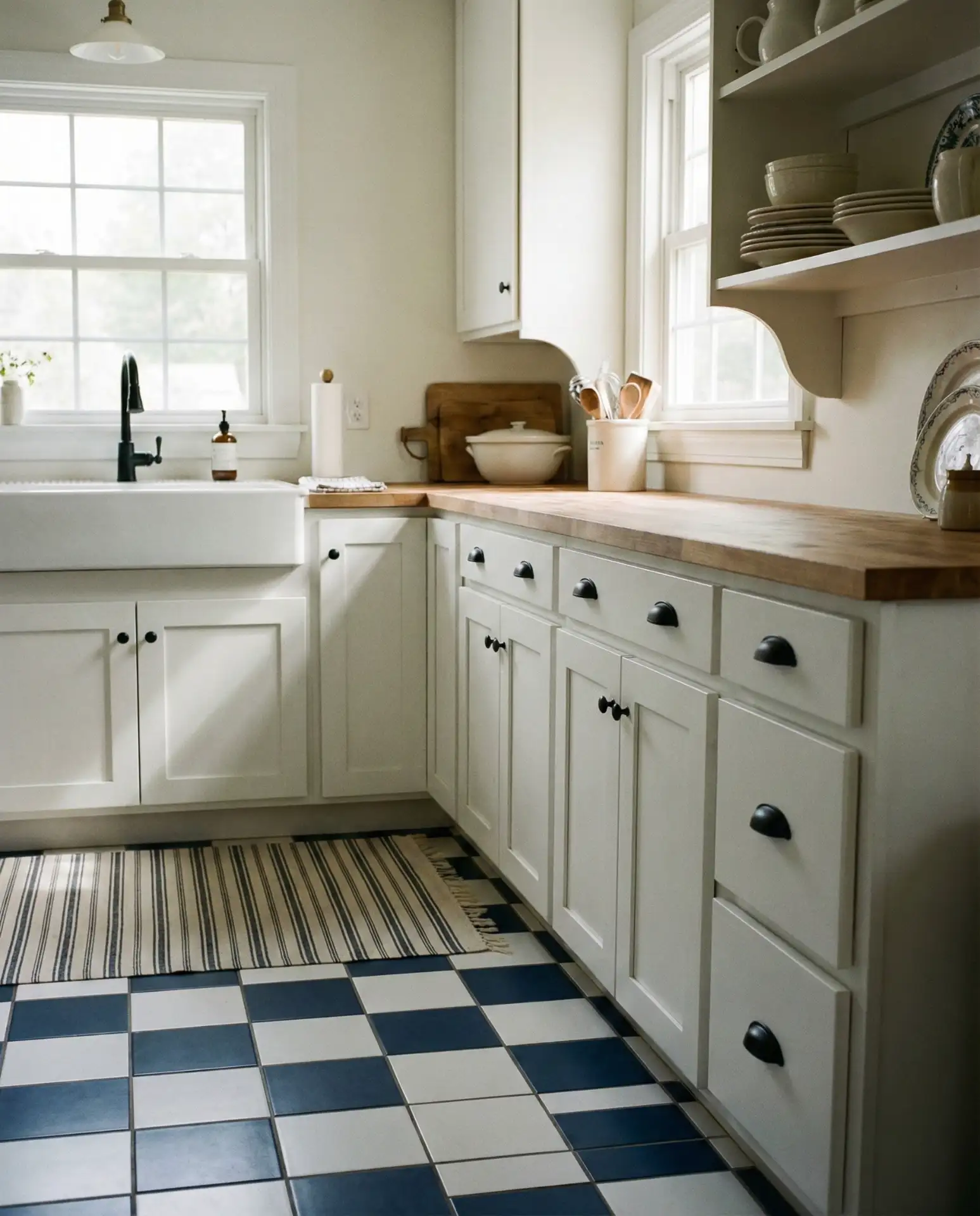
A navy and white and checkerboard floor is a bold, retro-inspired choice that instantly elevates any kitchen. This classic pattern has made a major comeback as homeowners embrace playful, personality-driven design over bland, builder-grade neutrals. The floor becomes the statement piece, allowing you to keep cabinetry and walls more subdued. It works beautifully in vintage-style kitchens but can also ground ultra-modern spaces with a touch of nostalgia and contrast. 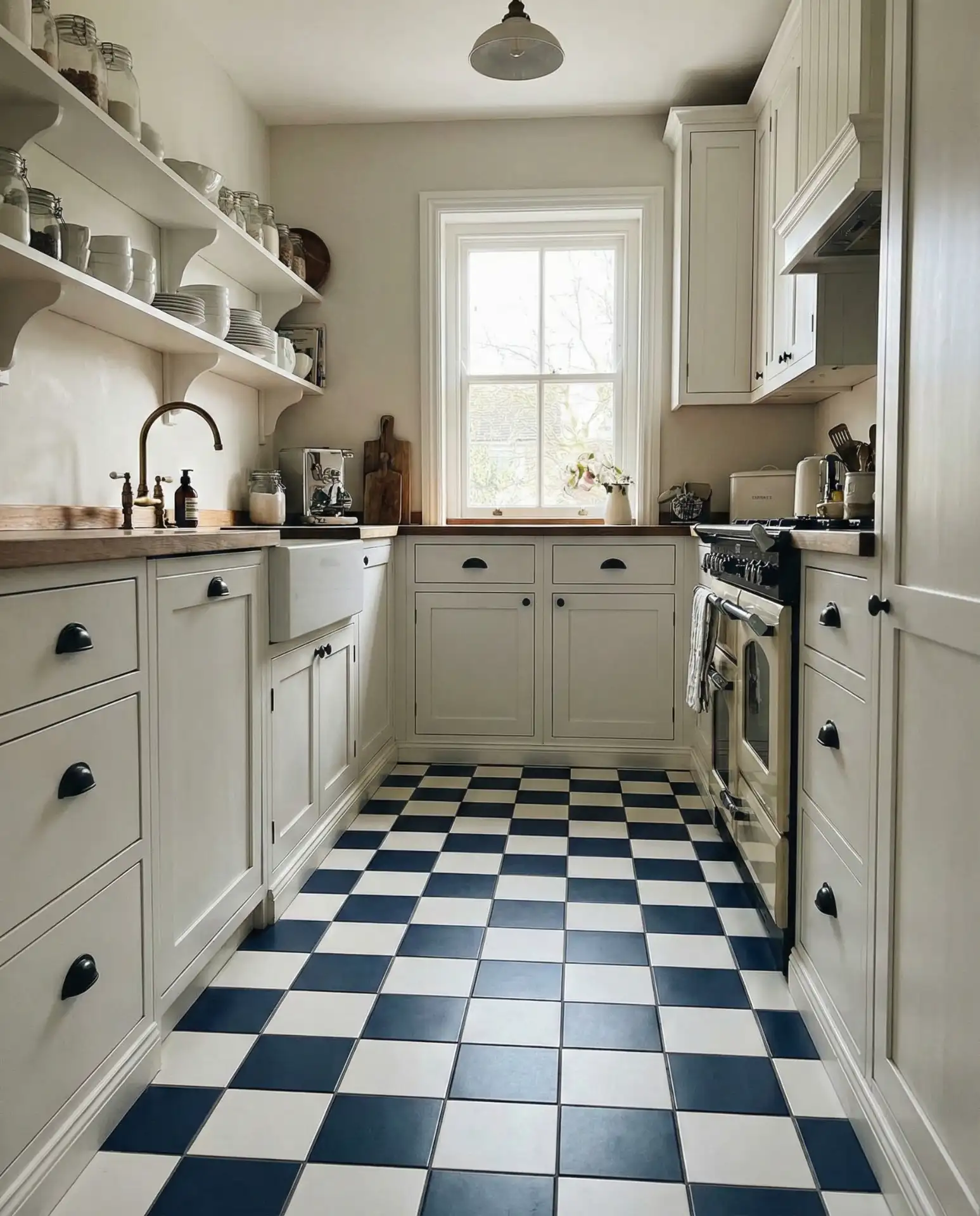
A common mistake is pairing this busy floor with equally bold cabinetry or backsplash, which can make the room feel chaotic. Instead, keep upper elements simple—white or light wood cabinets, minimal hardware, and clean-lined appliances. If you’re concerned about the pattern feeling overwhelming, consider using it only in a breakfast nook or smaller galley kitchen rather than a sprawling open layout. The scale of your space matters significantly with this design choice.
9. Sky Blue Upper Cabinets with White Lowers
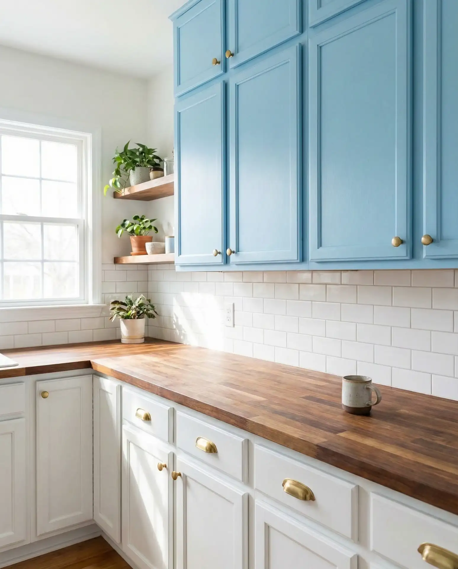
Painting upper cabinets in a soft sky blue while keeping lowers white and crisp creates visual interest and draws the eye upward, making ceilings feel higher. This two-tone approach has become increasingly popular as homeowners seek to add color without overwhelming smaller kitchens. The light blue on top feels airy and open, while the white base keeps the space grounded and functional. It’s a particularly smart choice for kitchens with limited natural light. 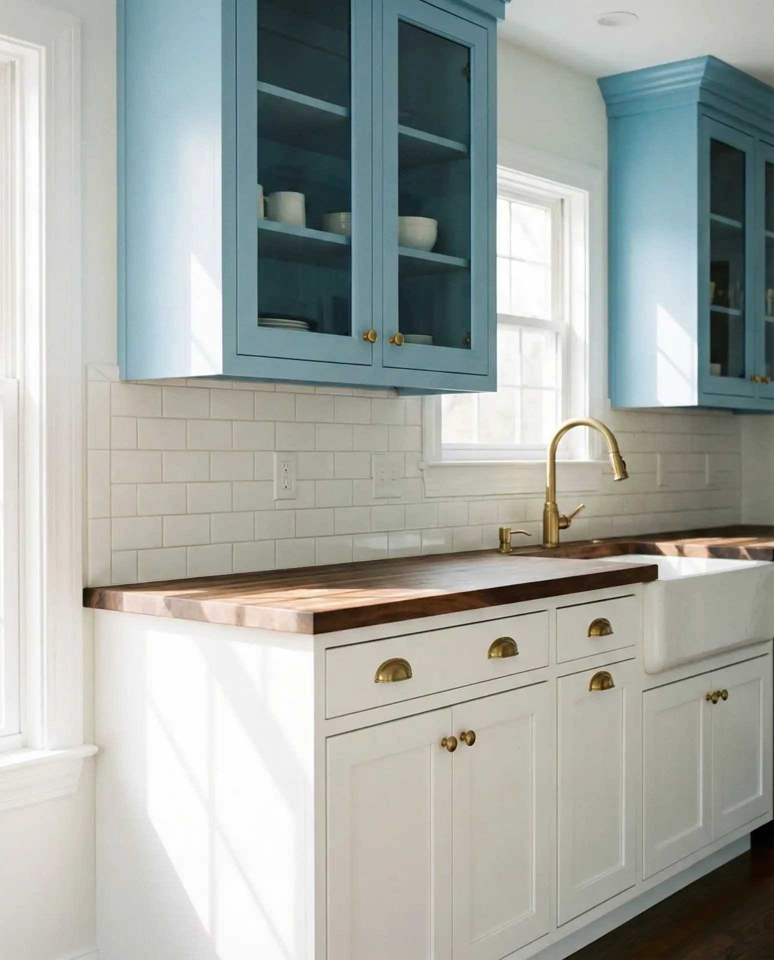
In Southern California, where indoor-outdoor living is prized, this color scheme beautifully echoes clear skies and brings a sense of the outdoors in. It’s also a forgiving choice for DIY painters—if you’re not thrilled with the upper color, it’s far easier to repaint wall-mounted cabinets than base units filled with heavy dishes and appliances. Just make sure your blue has enough saturation to read as intentional rather than simply “off-white.”
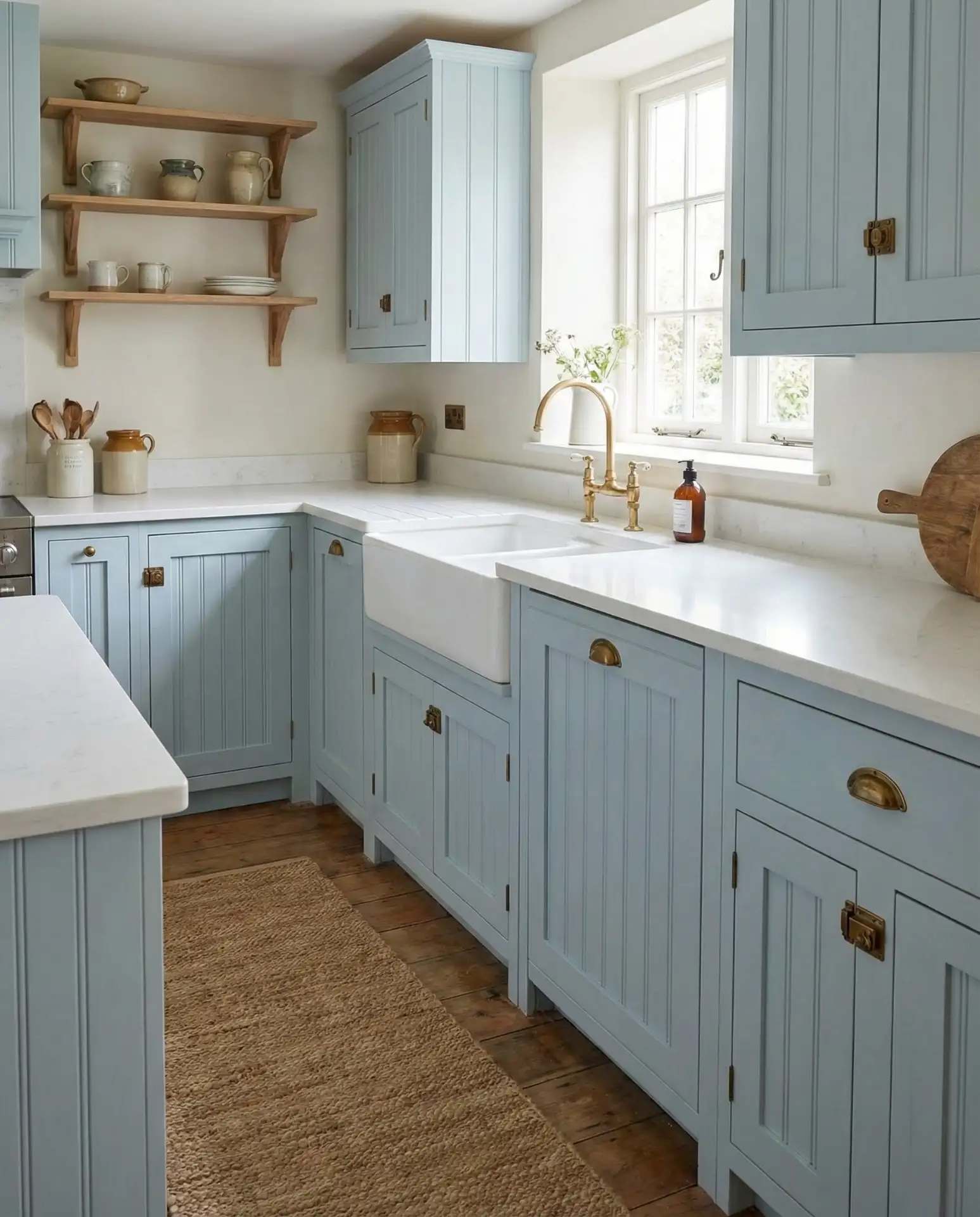
10. Dusty Blue with Brass and Leather Accents
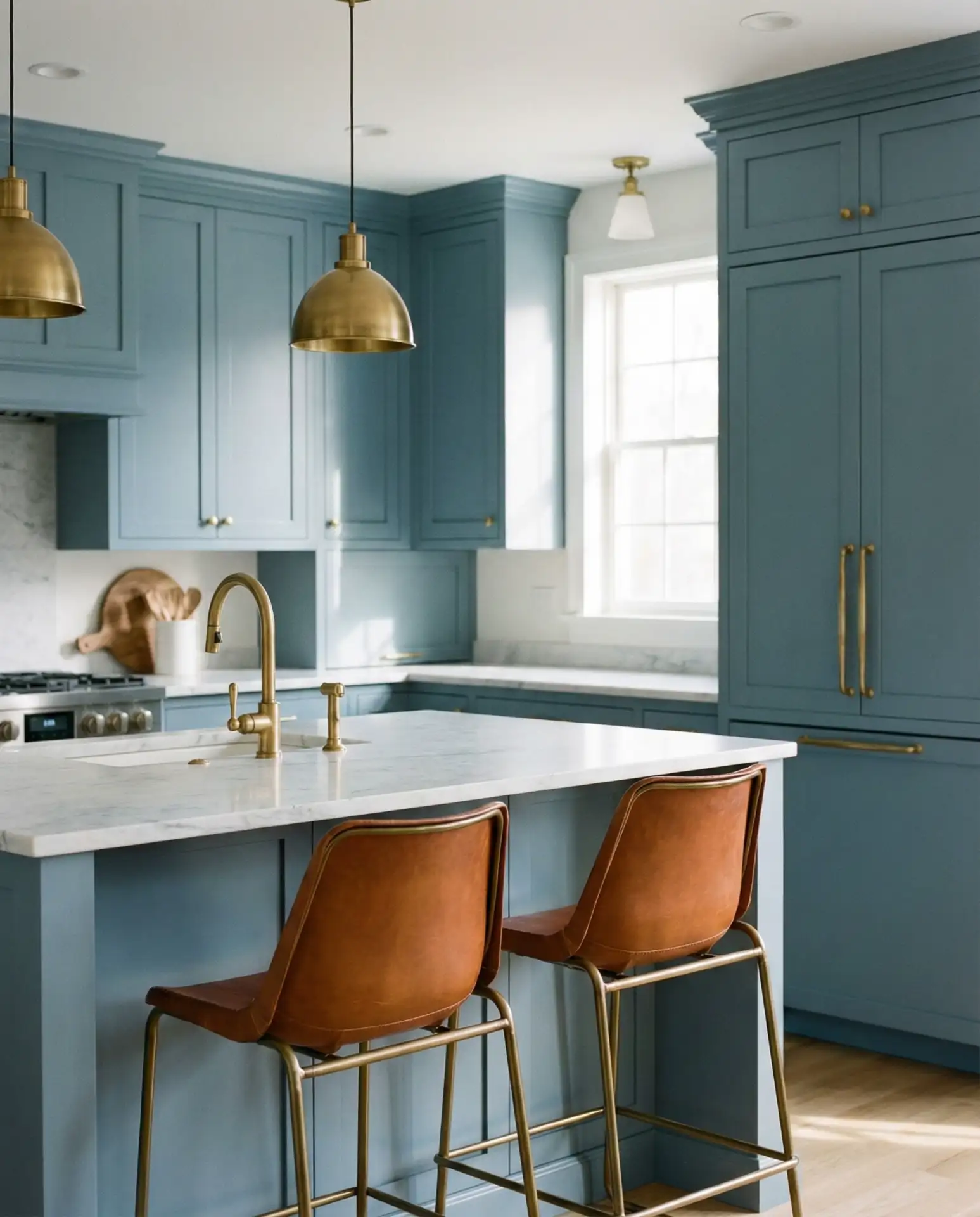
A dusty blue kitchen with brass fixtures and leather bar stool seats creates a sophisticated, lived-in look that feels both elegant and approachable. This muted shade of blue has a greyish undertone that makes it incredibly versatile—it reads as neutral enough to work with a wide range of accent colors and materials. The combination of cool blue, warm brass, and rich leather adds layers of texture and refinement. It’s a favorite among interior designers for its timeless, editorial quality. 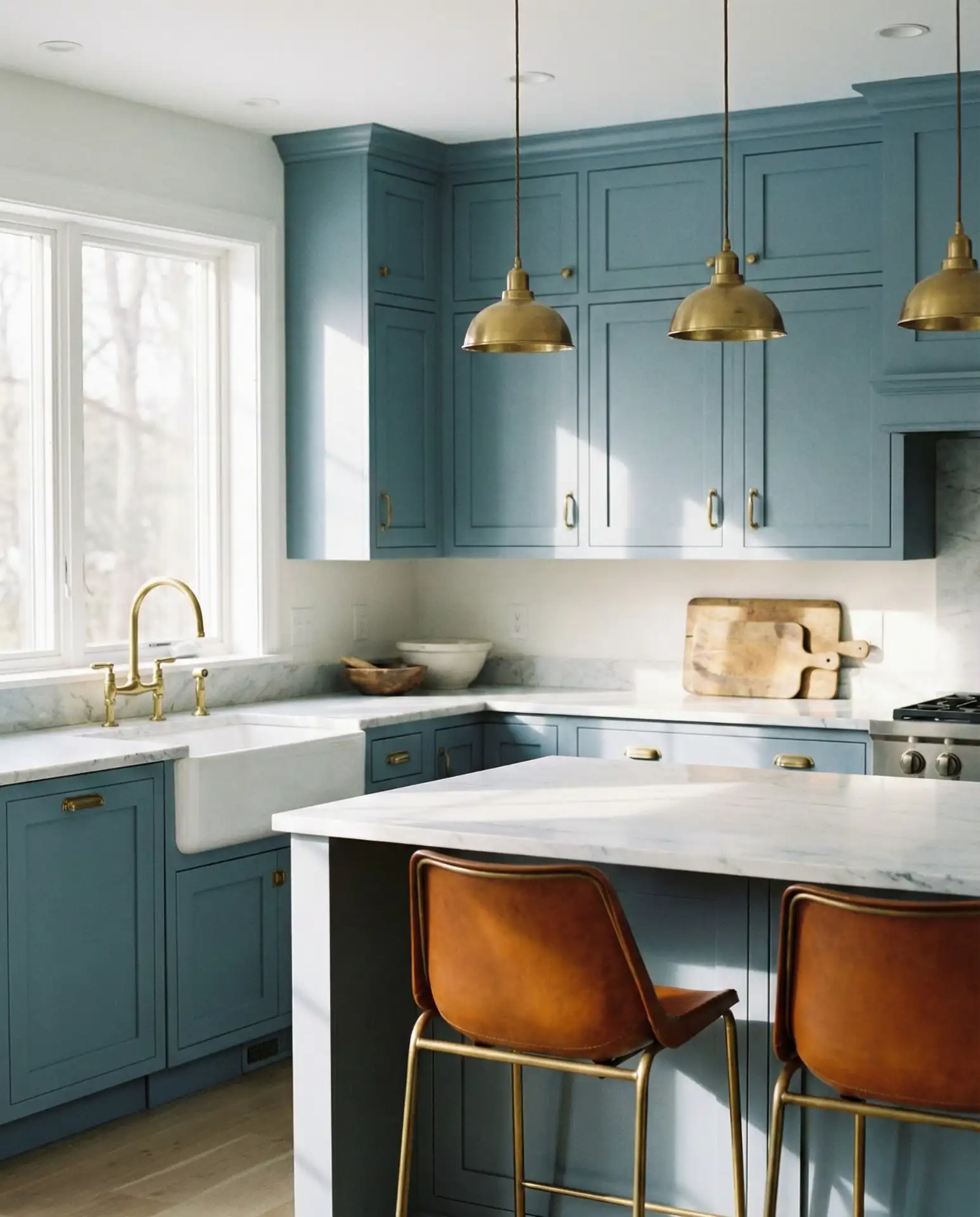
This palette works best in kitchens that get moderate natural light—too much sun can wash out the dusty tones, while too little can make the space feel drab. If your kitchen faces north, consider adding warm-toned lighting to bring out the richness of the brass and leather. Many homeowners underestimate how much these material choices matter; cheap chrome instead of brass or vinyl instead of leather significantly diminishes the overall impact.
11. Cornflower Blue with Black Hardware
Cornflower blue is a vibrant, cheerful shade that sits between medium and bright on the spectrum—not quite navy, not quite pastel. When paired with matte black hardware and fixtures, it takes on a more grounded, contemporary edge. This combination has become especially popular in modern farmhouse kitchens, where the bright blue adds energy while black accents provide structure and definition. The contrast is striking without being harsh, making the space feel both fresh and intentional. 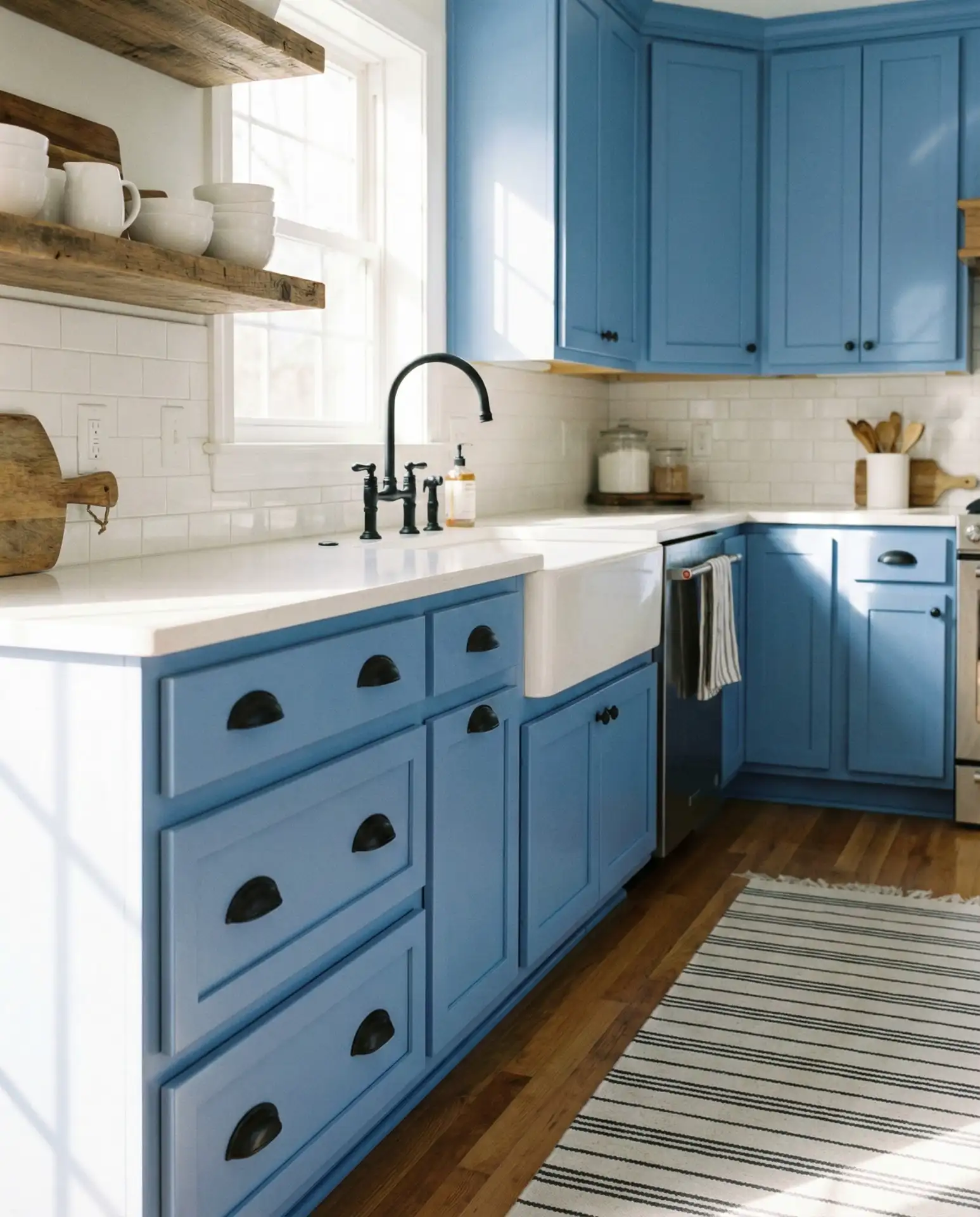
In the South, where kitchens tend to be more colorful and personality-driven, cornflower blue has become a go-to alternative to the overdone “Haint blue” porch ceiling trend. One homeowner in Georgia shared that she wanted something cheerful that would hold up to her state’s intense sunlight, and this blue delivered. Just be mindful of your lighting—under warm LED bulbs, cornflower can skew slightly purple, so test samples with your actual light fixtures before committing.
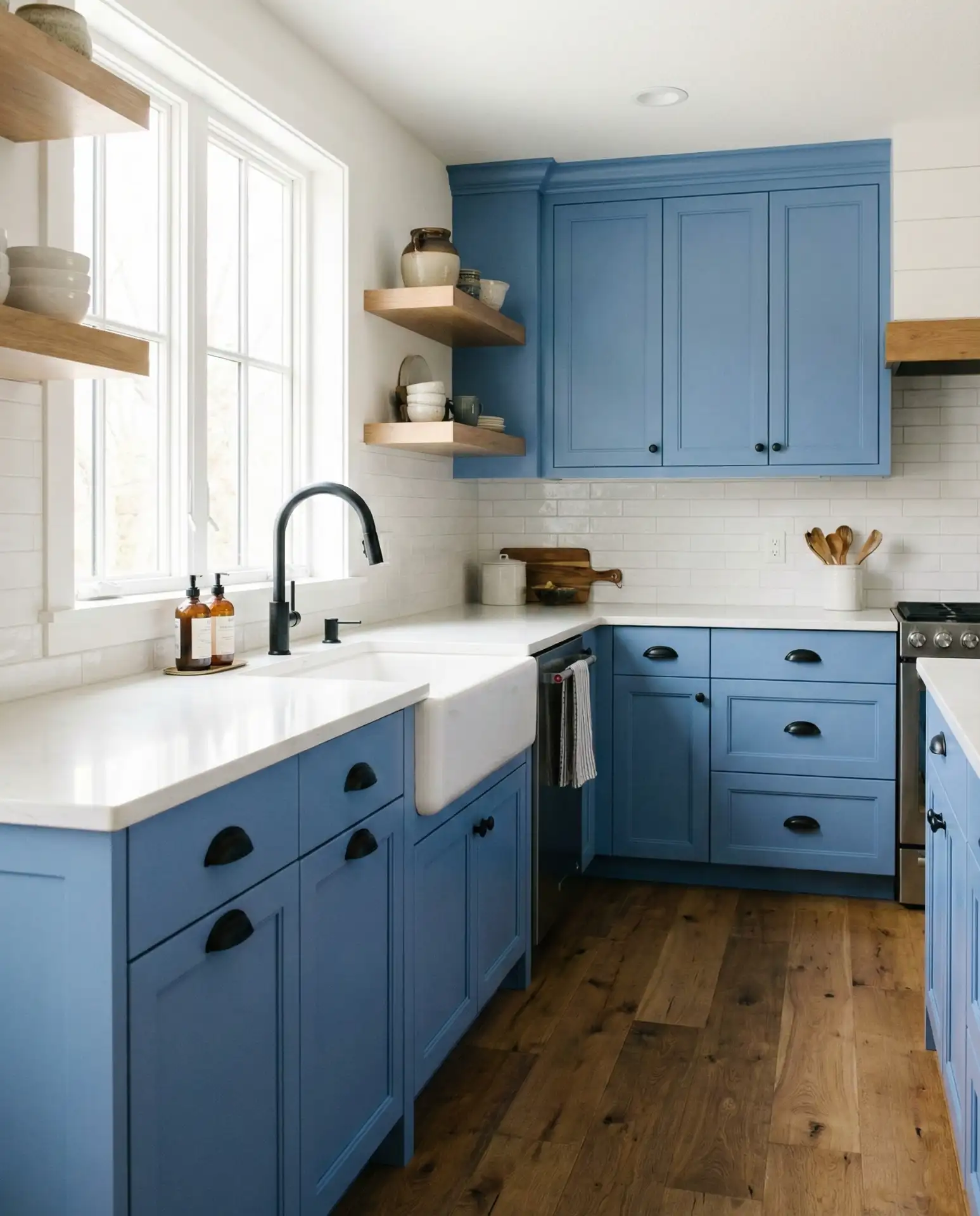
12. Grey-Blue Minimalist Cabinets
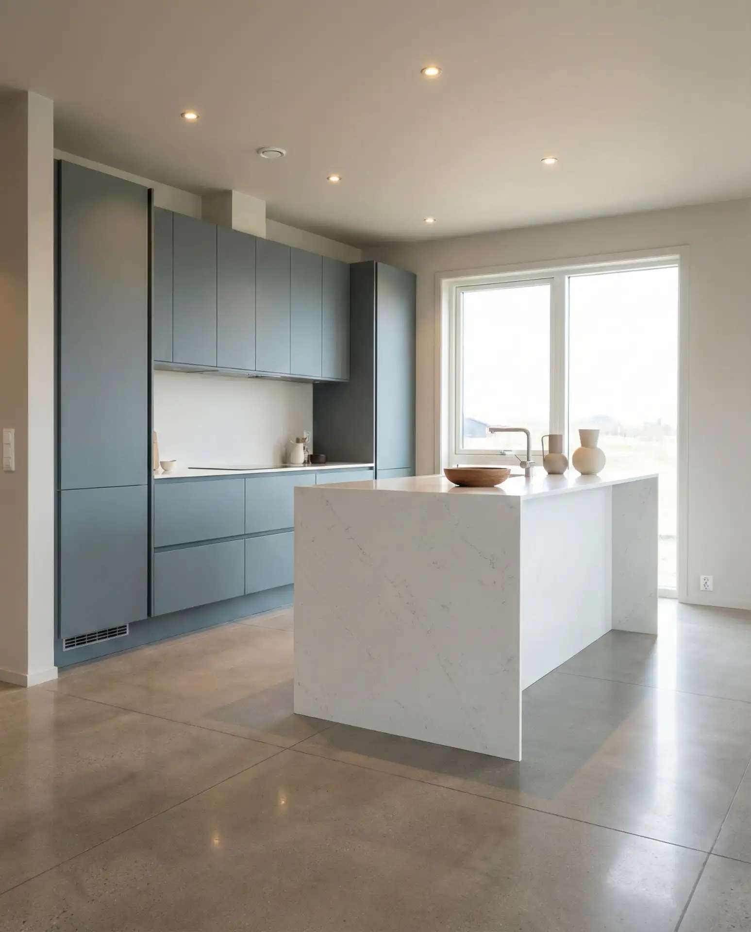
A grey-blue kitchen with sleek, handleless cabinets delivers a minimalist aesthetic that’s calming and contemporary. This subdued shade straddles the line between grey and blue, offering the warmth of blue with the neutrality of grey. It’s perfect for homeowners who want color but prefer an understated, Scandinavian-inspired look. The absence of visible hardware creates clean lines and a seamless, modern appearance that feels intentionally designed rather than default-neutral. 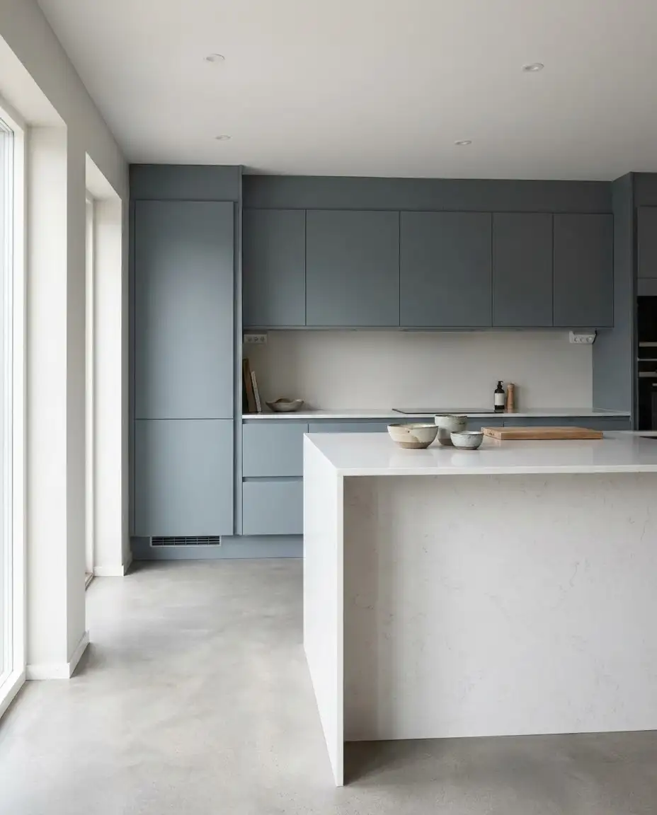
Practical insight: Grey-blue is one of the most forgiving paint colors for kitchens because it doesn’t show fingerprints and smudges as readily as pure white or dark navy. This makes it ideal for busy families or anyone who wants a beautiful kitchen without constant upkeep. The key is choosing a grey-blue with enough pigment to avoid looking muddy—test it next to your flooring and countertops to ensure it doesn’t disappear into blandness.
13. Blue and Yellow Cottage-Style Kitchen
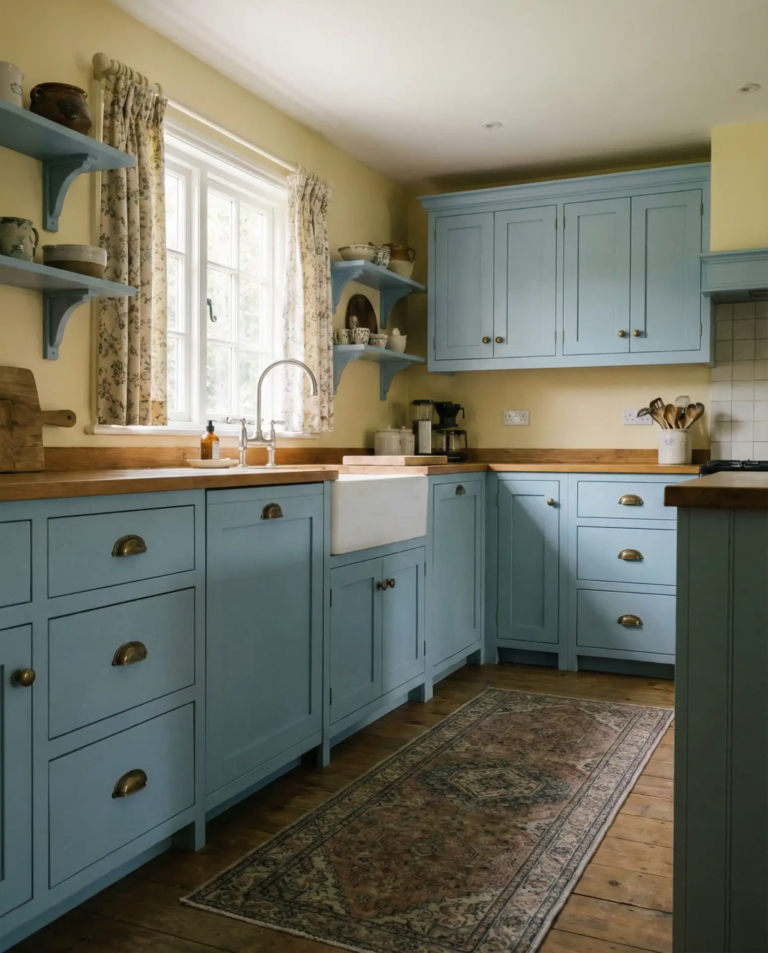
A blue and yellow kitchen brings a sunny, cheerful energy that’s perfect for cottage or coastal-style homes. This classic color pairing feels fresh and timeless—think soft sky blue cabinets with buttery yellow walls or accessories. The combination evokes summer mornings and Mediterranean villas, making your kitchen a joyful place to start the day. It’s a bold choice that requires confidence, but when done right, it’s utterly charming and full of personality. 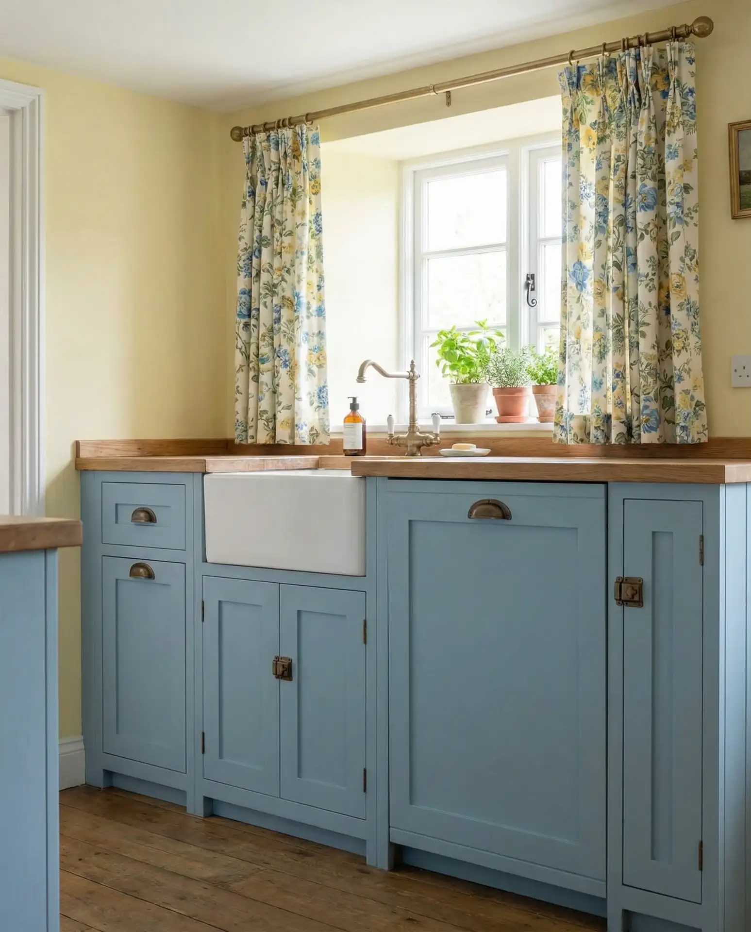
This color scheme works best in kitchens with ample natural light and white or light-colored countertops to prevent the space from feeling too saturated. In New England, where coastal cottage style is beloved, homeowners often pair this palette with white beadboard wainscoting and open shelving displaying yellow pottery or vintage Fiestaware. A common mistake is choosing shades that are too bright or primary—aim for softened, muted versions of both blue and yellow for a sophisticated rather than kindergarten-classroom effect.
14. Blue Subway Tile Backsplash
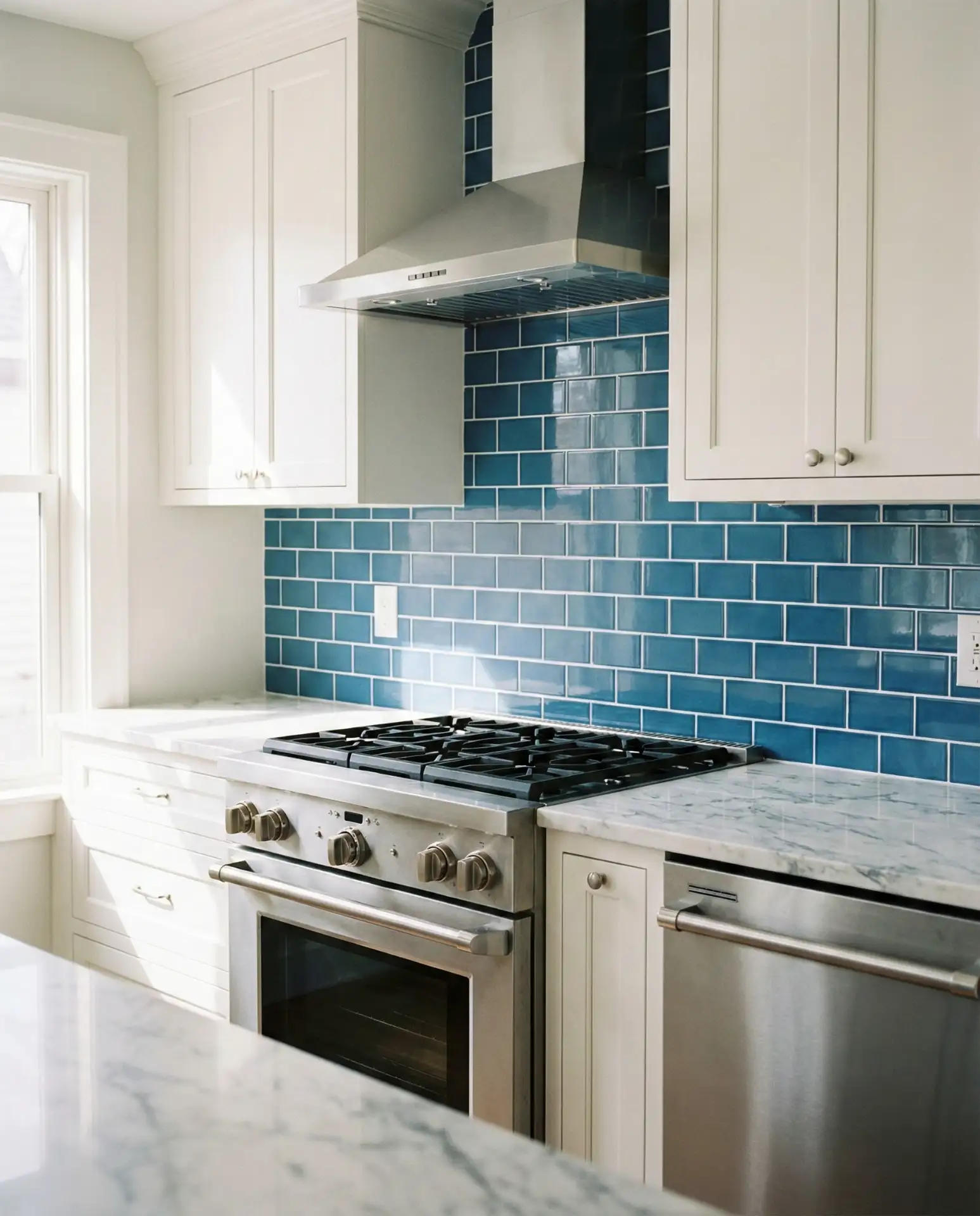
A blue subway tile backsplash is a simple way to introduce color without committing to painted cabinets. Whether you choose glossy ceramic in a bright robin’s egg or matte glazed tiles in a deeper shade, this approach adds visual interest while keeping the rest of the kitchen neutral. The linear pattern of subway tile is classic and versatile, working equally well in traditional and modern spaces. It’s one of the most budget-friendly ways to achieve a blue kitchen aesthetic. 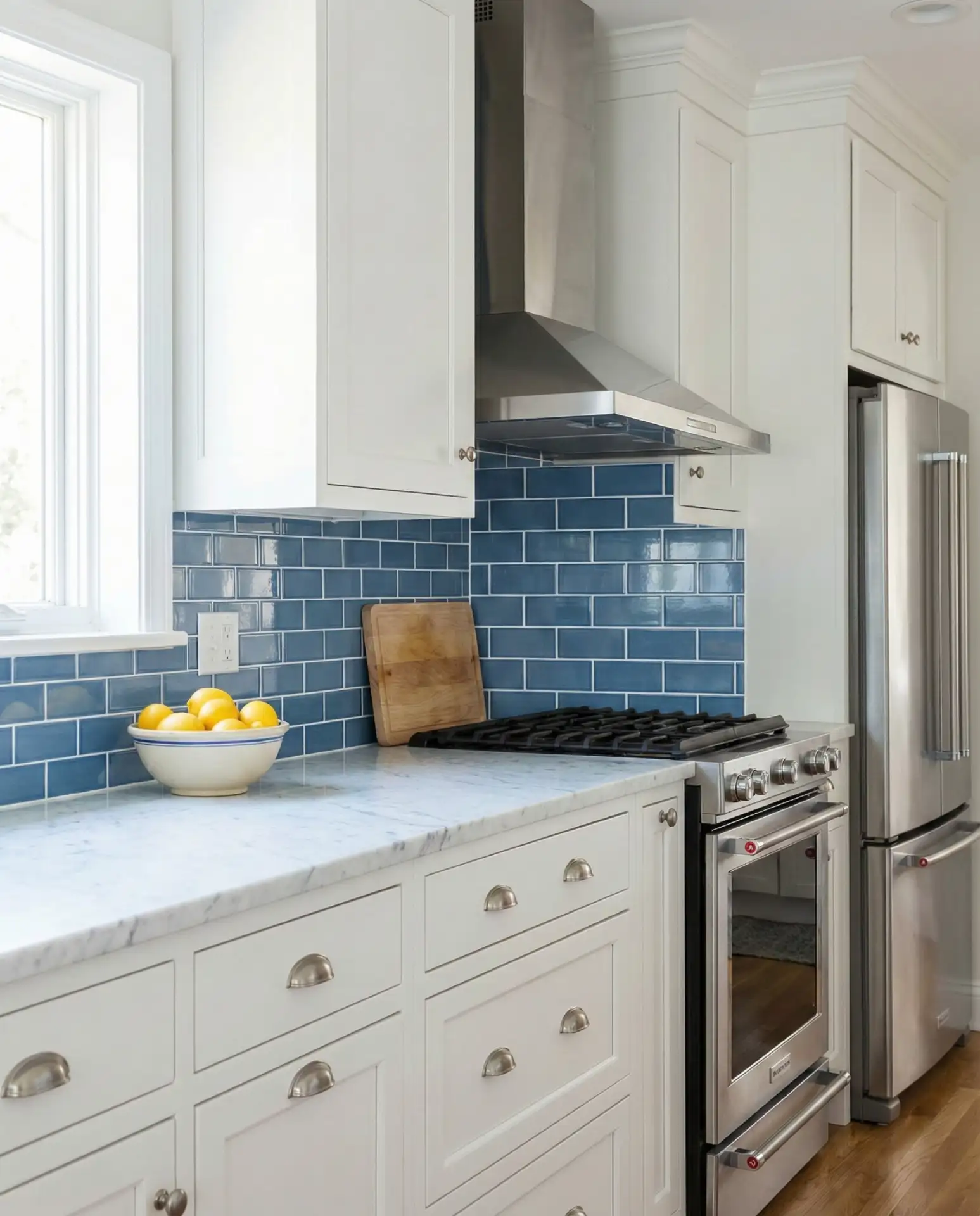
A neighbor recently installed a cerulean blue backsplash in her otherwise all-white kitchen, and it completely transformed the space from builder-grade bland to magazine-worthy. She mentioned it cost less than $300 in materials for a standard-sized backsplash. The key is to keep grout lines consistent and choose a shade that has enough saturation to make an impact but won’t feel dated in five years. If you’re DIYing, don’t skip the tile spacers—uneven grout lines are immediately noticeable.
15. Teal-Blue Island with Waterfall Edge
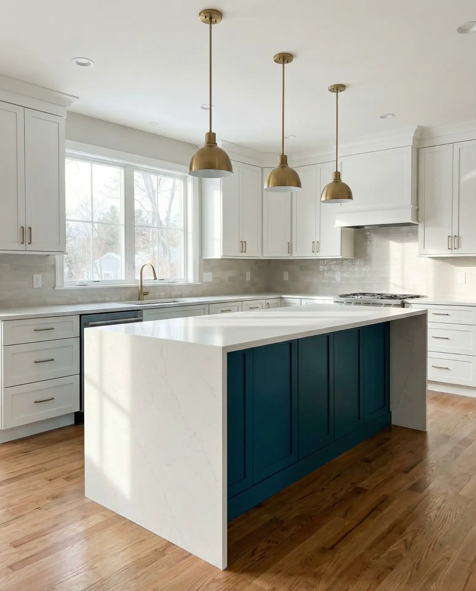
A teal-blue island with a waterfall edge countertop is a showstopper—luxurious, sculptural, and undeniably modern. The waterfall edge, where the countertop material extends vertically down the sides, creates a seamless, high-end look that’s become a hallmark of contemporary kitchen design. When paired with a rich teal-blue base, it transforms the island into a true focal point. This combination works best with solid-surface materials like quartz or marble that showcase the continuous flow. 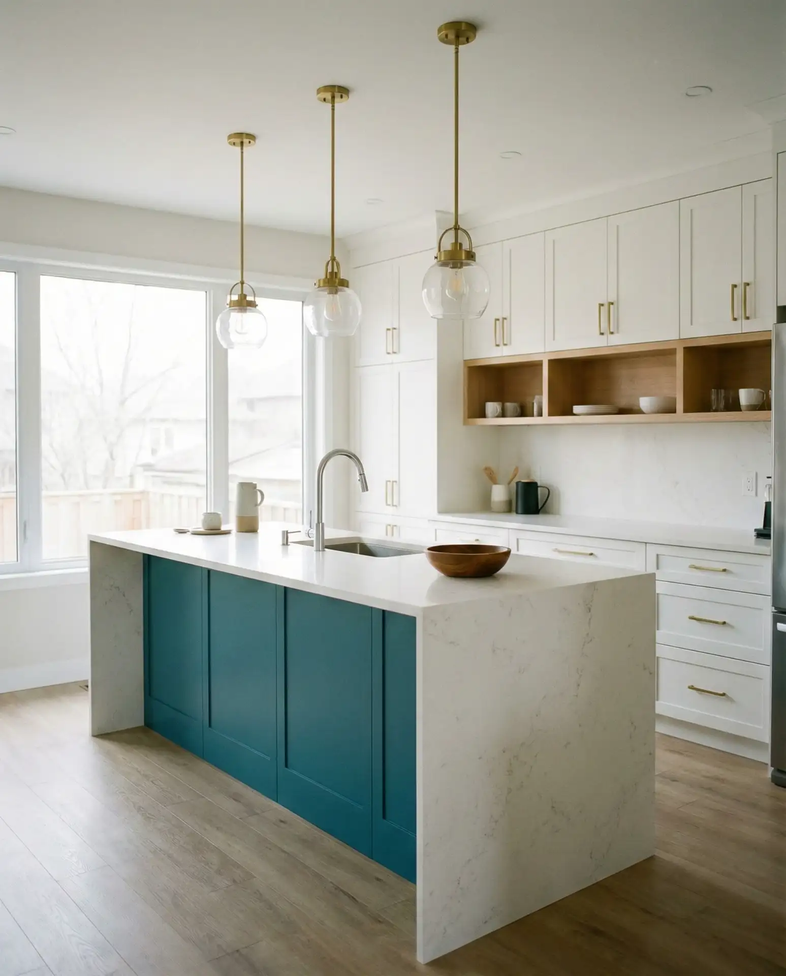
Budget angle: Waterfall countertops are a premium feature, typically adding $500-$1,500 to your countertop costs depending on material. However, they make any island feel custom and expensive, so if you’re investing in one statement piece, this is it. Many homeowners report that this feature gets more compliments than any other element in their kitchen. Just make sure your cabinet base is perfectly level—any imperfection will be magnified by the dramatic vertical surface.
16. Soft Blue Beadboard Cabinets
Soft blue beadboard cabinets bring texture and cottage charm to any kitchen. The vertical grooves of beadboard add visual interest and a handcrafted quality that flat-panel cabinets can’t match. This style is particularly popular in beach houses and farmhouse-style homes, where the casual, relaxed vibe is paramount. The pale blue color enhances the light, airy feeling while the beadboard detail keeps things from looking too plain or modern. It’s a timeless choice that feels both nostalgic and fresh. 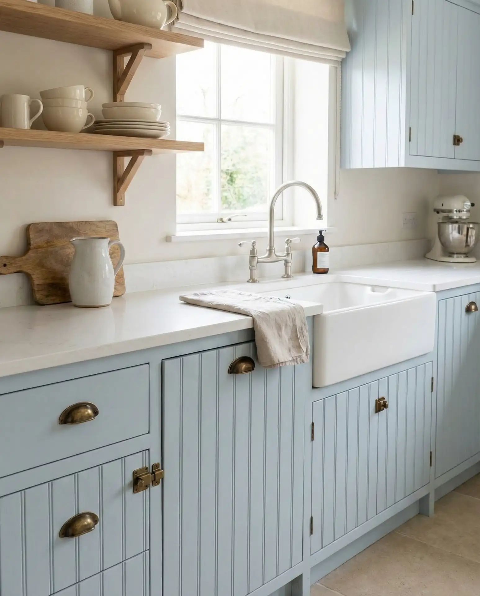
Along coastal areas from Cape Cod to the Carolinas, beadboard cabinets in soft blues are almost a design requirement—they capture that breezy, seaside aesthetic perfectly. The texture also does a nice job of hiding minor dings and wear, making it practical for high-traffic kitchens. If you’re considering this look, stick with a satin or eggshell finish rather than high-gloss; the latter can emphasize every imperfection in the beadboard grooves and look plasticky rather than charming.
17. Blue Kitchen with Pink Accents
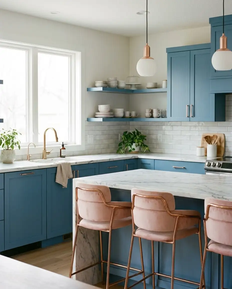
A blue and pink kitchen might sound unconventional, but when executed with restraint, it’s incredibly sophisticated. Think medium blue cabinets with blush pink bar stools, rose gold hardware, or dusty pink decor accents. This unexpected pairing has become a favorite among design-forward homeowners who want to break free from safe neutrals. The key is keeping the pink subtle and sophisticated—muted tones rather than bubblegum brights. The combination feels modern, feminine, and refreshingly different. 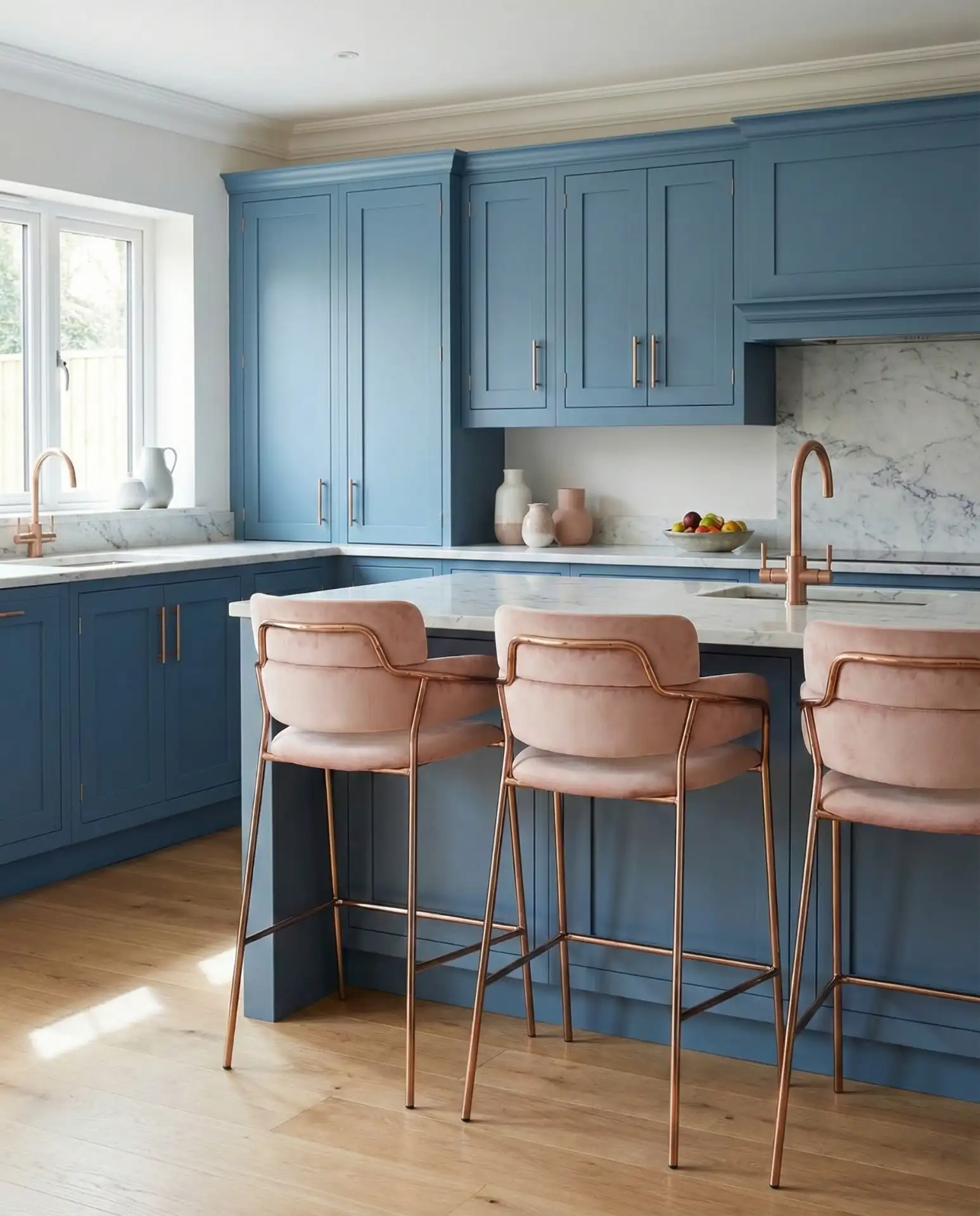
Real homeowner behavior: Many people who choose this palette start with blue cabinets and then gradually add pink through easily changeable elements like textiles, dishes, or small appliances. This approach allows you to test the combination without permanent commitment. If you’re nervous about the pairing, begin with a single pink accent—maybe a vintage pink KitchenAid mixer or a set of blush pink dish towels—and see how it feels before investing in larger pieces like upholstered seating.
18. Navy Shiplap Feature Wall
A navy shiplap feature wall brings texture, depth, and architectural interest to your kitchen without the commitment of painted cabinets. This approach is particularly popular in modern farmhouse and transitional kitchens, where the horizontal lines of shiplap add visual movement and the deep navy creates drama. It works beautifully as a backdrop for open shelving, behind a range, or defining a breakfast nook. The combination of texture and color makes the wall feel intentional and designed. 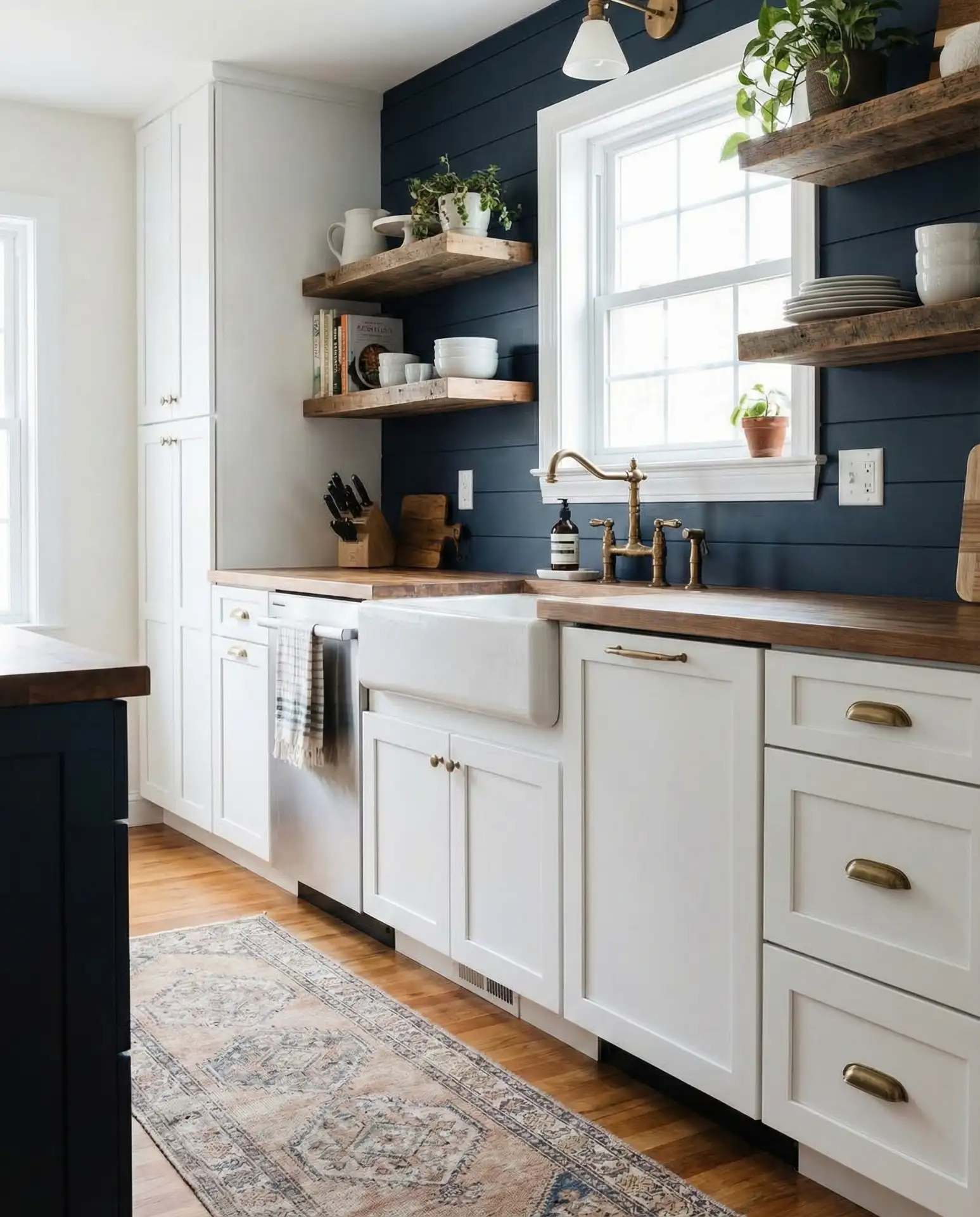
Where it works best: This feature shines in open-concept spaces where you want to define the kitchen zone without building walls. The horizontal lines of shiplap naturally draw the eye across the space, making narrow galley kitchens feel wider. Just be aware that real wood shiplap can warp in humid environments, so if you live in a particularly damp climate, consider MDF or engineered options designed for high-moisture areas. And whatever you do, don’t install it directly behind a range without proper heat shielding.
19. Bright Blue Open Shelving Display
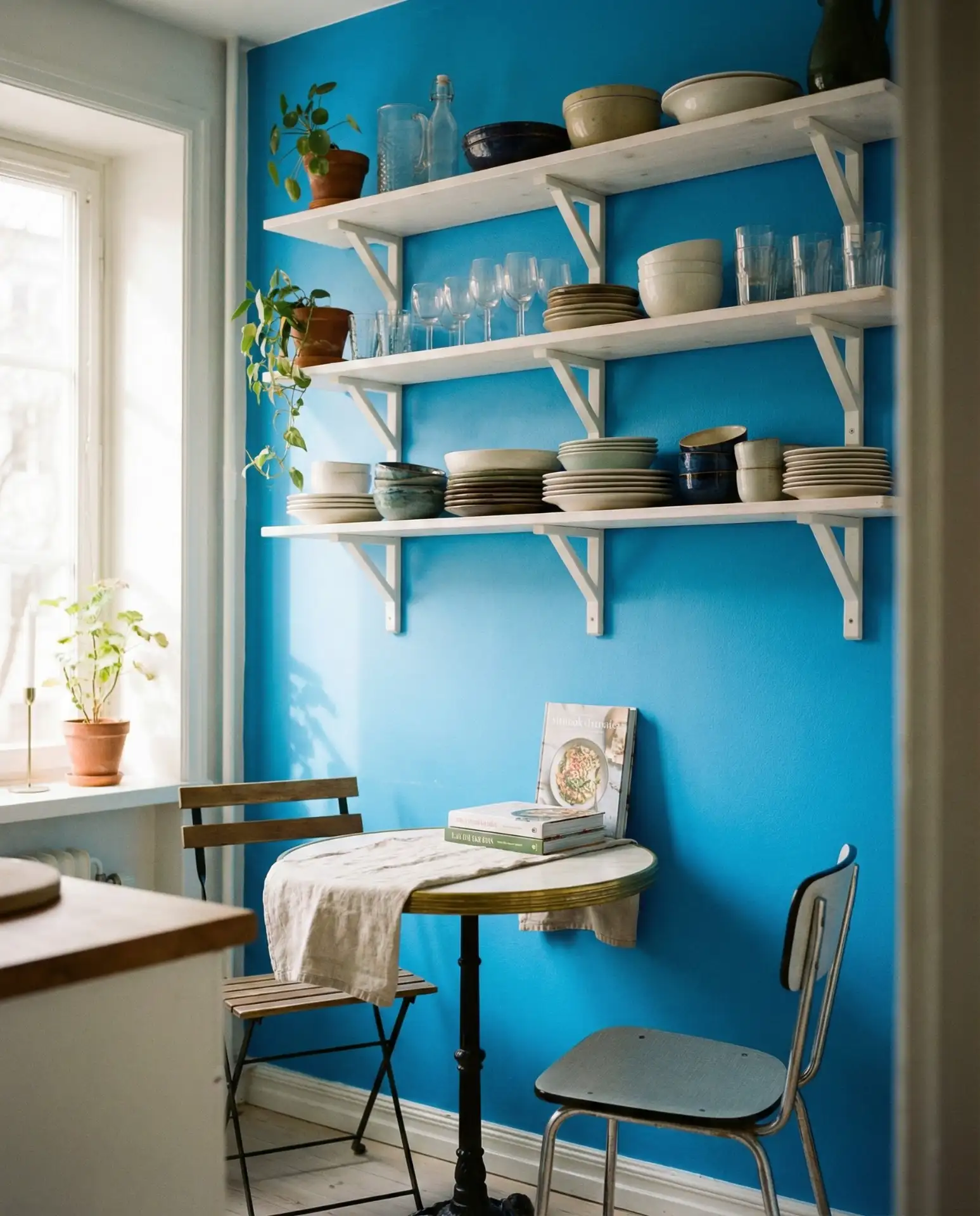
Bright blue painted walls behind open shelving create an energetic, gallery-like display for your kitchen essentials. This approach turns functional storage into visual art—white dishes, glassware, and cookbooks pop against the saturated background. It’s an easy way to add color if you’re renting or not ready to paint entire cabinets. The inspiration often comes from European bistros and cafes, where colorful walls and open storage are standard. It brings personality and warmth to even the smallest spaces. 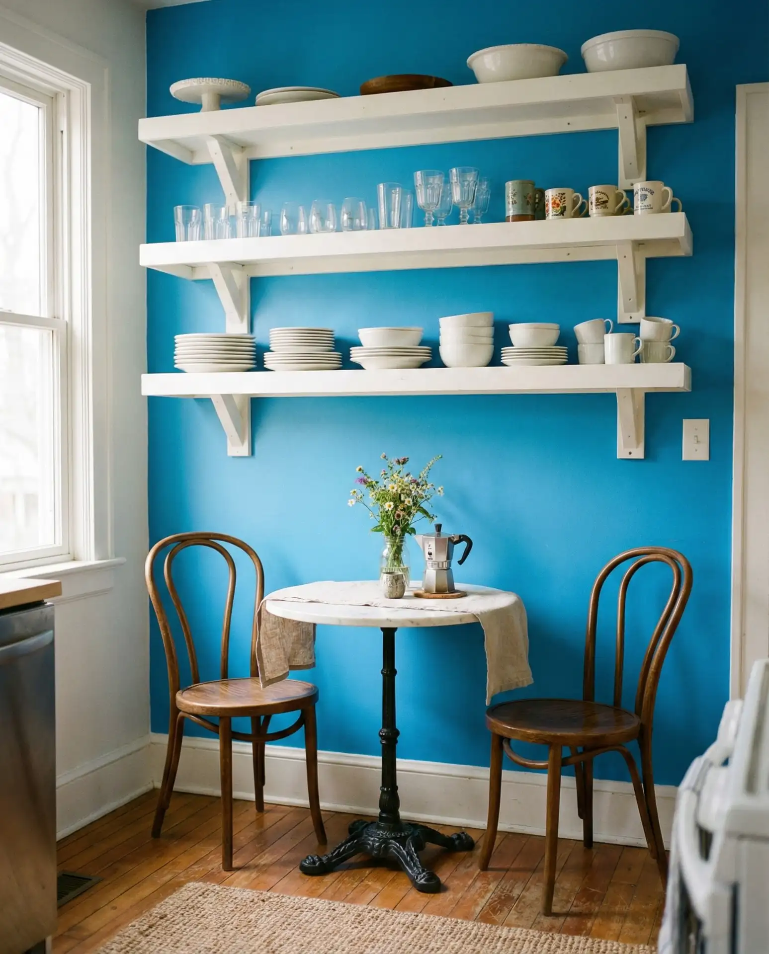
Expert-style commentary: Designers emphasize that this look requires curation—you can’t just throw any items on the shelves and expect it to look cohesive. Stick to a limited color palette (mostly whites, woods, and one accent color), vary heights and shapes for visual interest, and leave some breathing room—not every inch needs to be filled. Think of it as styling a bookshelf rather than storing dishes. And yes, open shelving means you’ll need to dust regularly, but many homeowners find the visual impact worth the extra maintenance.
20. Slate Blue Lower Cabinets with Glass Uppers
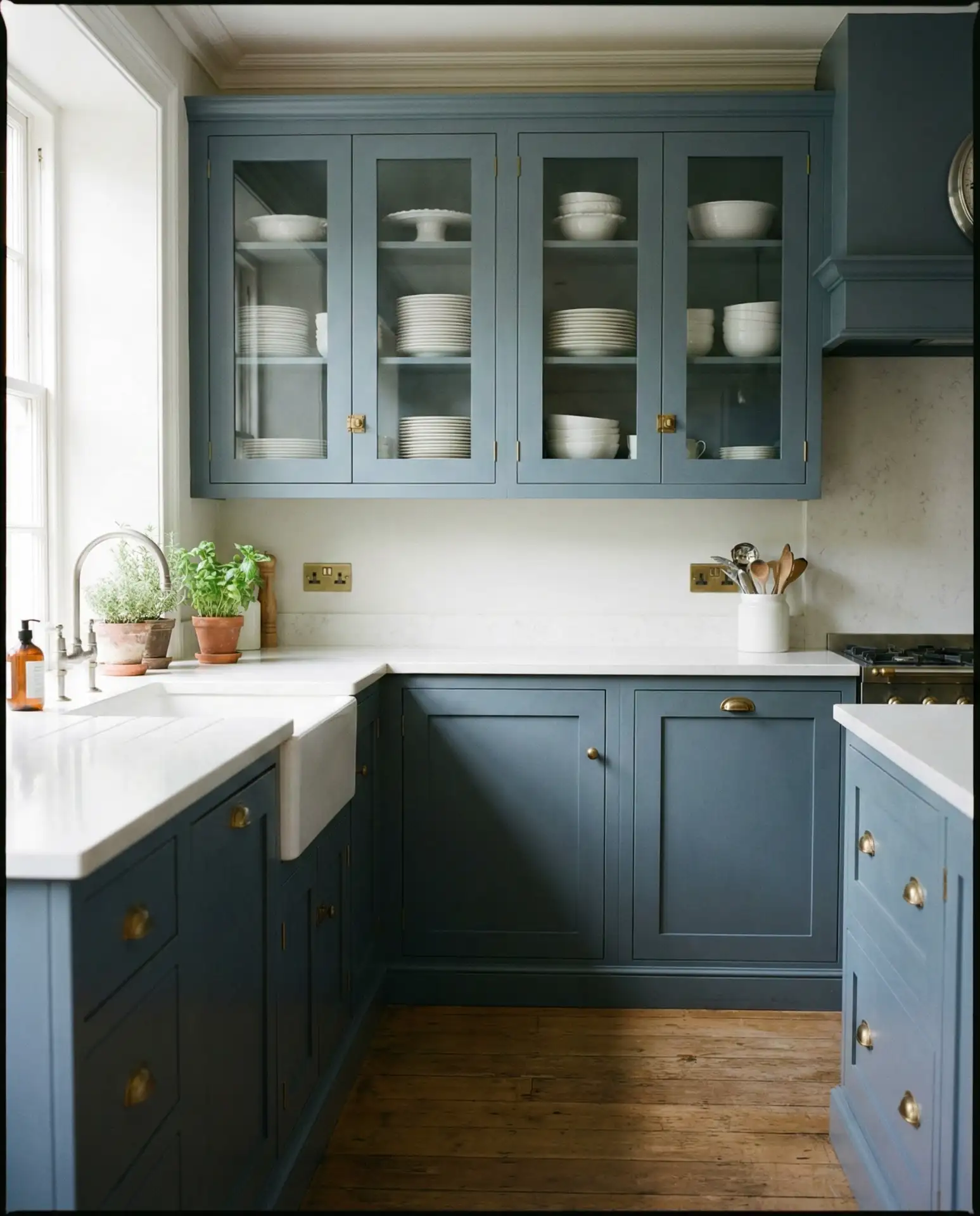
Slate blue lower cabinets paired with glass-front upper cabinets create a sophisticated, layered look that’s both practical and beautiful. The darker base anchors the space while the glass uppers maintain openness and prevent the kitchen from feeling heavy. This combination allows you to display favorite dishes or glassware while keeping everyday clutter hidden below. It’s a smart design choice for smaller kitchens where solid upper cabinets might feel oppressive. 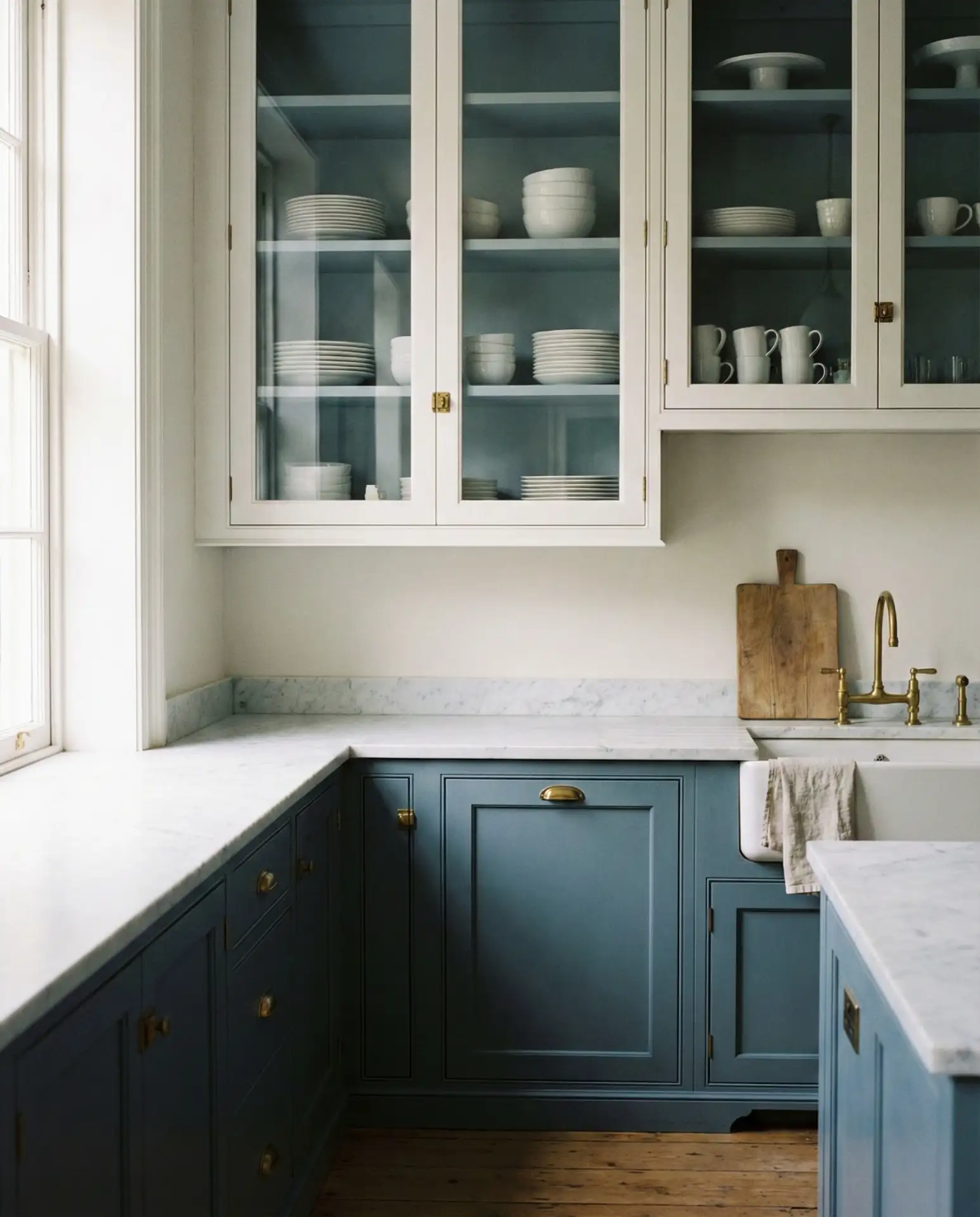
A friend in Portland chose this layout for her 1920s bungalow kitchen, and she says the glass fronts keep her more organized—knowing people can see inside motivates her to keep things tidy. The slate blue grounds the room without making it feel dark, especially with the white countertops and ceiling reflecting light. One common mistake is installing glass cabinets without interior lighting; adding puck lights or LED strips inside makes all the difference, turning them from functional storage into beautiful display cases.
21. Robin’s Egg Blue Vintage Appliances
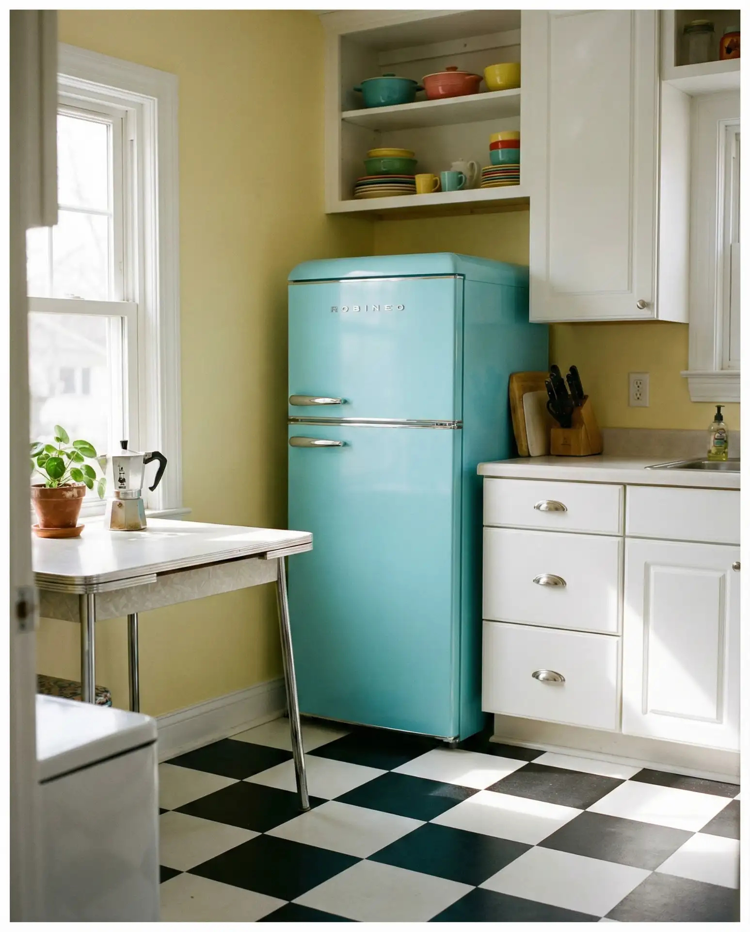
Robin’s egg blue vintage-style appliances—think SMEG refrigerators or Big Chill ranges—add instant retro charm and personality to your kitchen. This cheerful, slightly aqua-tinted blue has a nostalgic 1950s feel that works beautifully in both authentically vintage kitchens and modern spaces that want a playful pop of color. The appliances become statement pieces, allowing you to keep cabinets and walls neutral. It’s a fun way to inject character without overwhelming the space with color. 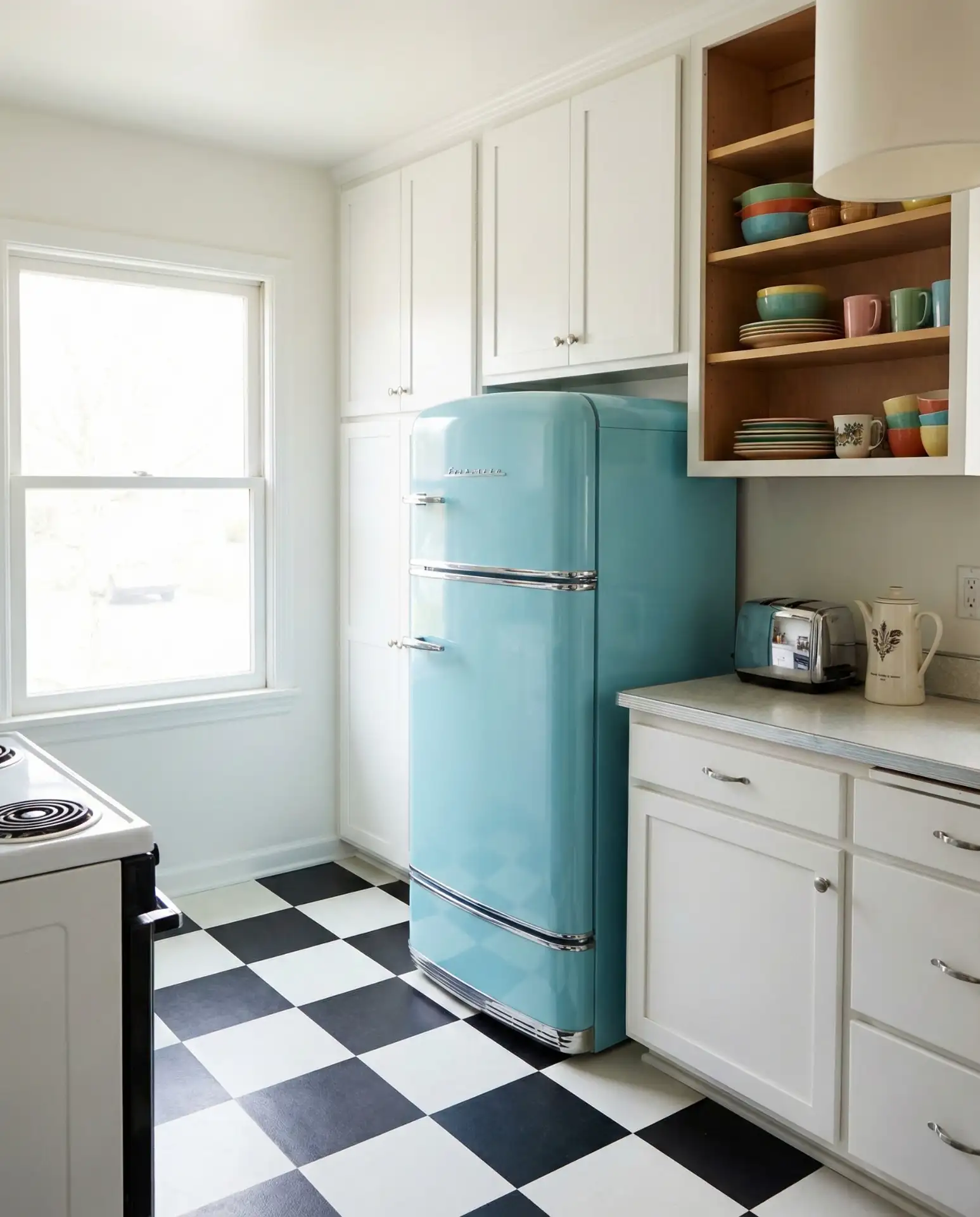
Budget angle: These statement appliances are definitely an investment—a vintage-style refrigerator can run $2,000-$5,000. However, they hold their value well and can last for decades with proper care. Many homeowners view them as the focal point of their kitchen design, building the entire color scheme around the appliance color. If the price tag is too steep, consider sourcing actual vintage appliances from estate sales or restoration specialists—you’ll get authentic character at a fraction of the cost, though you may sacrifice some modern conveniences.
22. Midnight Blue Kitchen with Brass Details
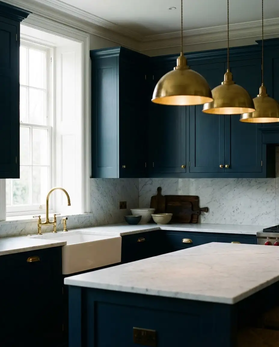
A midnight blue kitchen—even darker than navy—creates a dramatic, jewel-box effect that’s both intimate and luxurious. This is the boldest choice on the spectrum, working best in larger kitchens with ample natural light or in homes where the kitchen is meant to feel like a separate, special room rather than an open great-room space. Paired with brass hardware, fixtures, and pendant lights, the deep blue becomes glamorous rather than gloomy. It’s a favorite among homeowners who want their kitchen to make a statement. 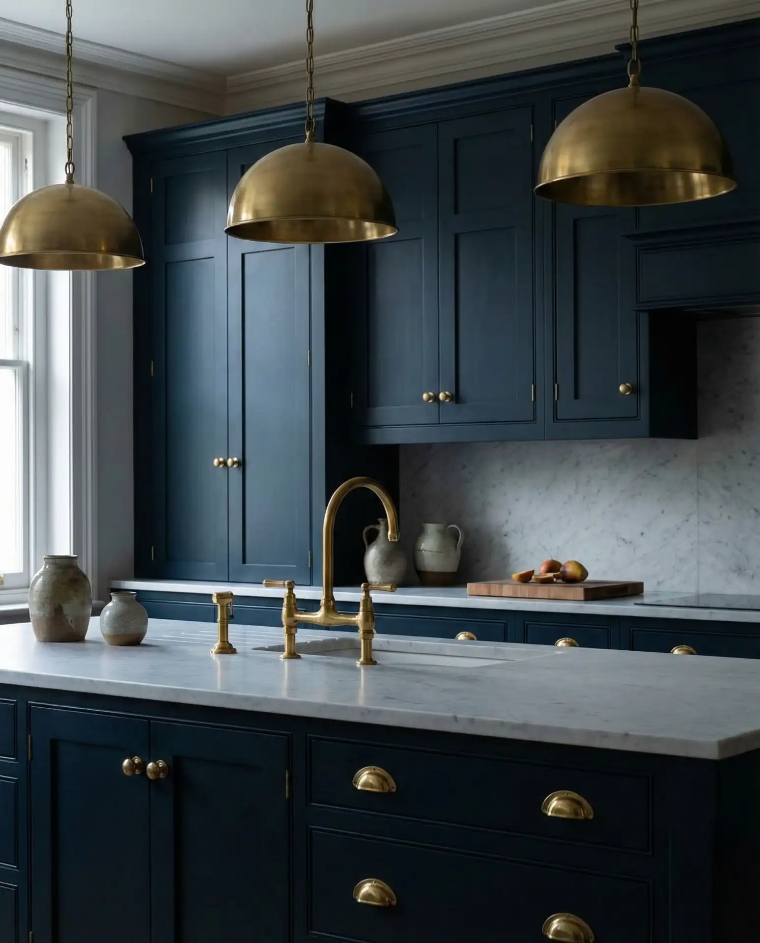
In urban lofts and brownstones, particularly in cities like Chicago and Boston, midnight blue kitchens have become a way to create drama in otherwise open, industrial spaces. The dark color helps define the kitchen zone and adds sophistication. However, this is not a forgiving color choice—every fingerprint, water spot, and crumb shows up clearly on dark cabinetry. Plan for higher-maintenance cleaning, or choose a matte finish rather than high-gloss to better hide smudges and everyday wear.
23. Blue Patterned Tile Backsplash
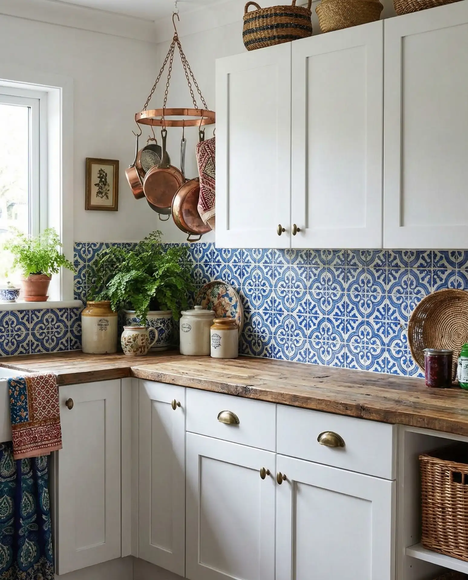
A blue patterned tile backsplash—whether Moroccan-inspired zellige, geometric cement tiles, or hand-painted ceramics—adds artistry and cultural richness to your kitchen. This approach lets you embrace blue in a concentrated, high-impact area without committing to painted cabinets or walls. The pattern becomes a focal point, transforming a functional surface into a design statement. It works beautifully in eclectic, bohemian, or Mediterranean-style kitchens where personality and craftsmanship are valued. 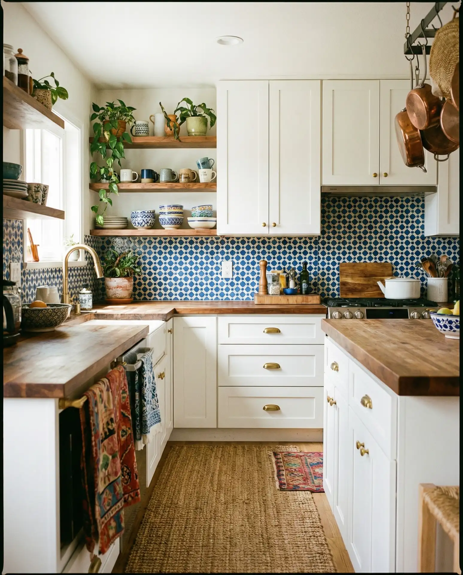
Common mistakes: Many people choose patterned tile that’s too small or too busy for their space, resulting in visual chaos rather than cohesion. A good rule of thumb is that if your kitchen is small or your cabinets are ornate, choose a simpler pattern; if you have a larger kitchen with plain cabinets, you can go bolder. Also, make sure your tile pattern aligns properly at corners and around outlets—sloppy installation is glaringly obvious with geometric patterns. Consider hiring a professional for this one unless you have serious DIY tile experience.
24. Blue Kitchen Island with Built-In Seating
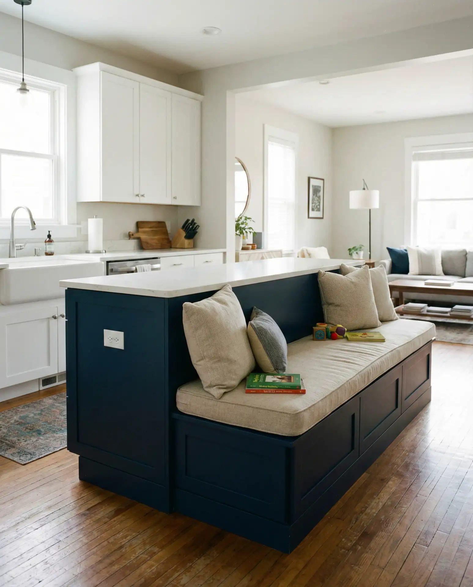
A blue island with built-in bench seating creates a casual, family-friendly gathering spot while adding significant color impact. This design maximizes space efficiency—the seating tucks neatly under the counter when not in use—and the blue cabinetry defines the island as the heart of the kitchen. It’s particularly popular in open-concept homes where the kitchen flows into dining and living areas, creating a natural separation without walls. The built-in seating also offers hidden storage opportunities underneath the benches. 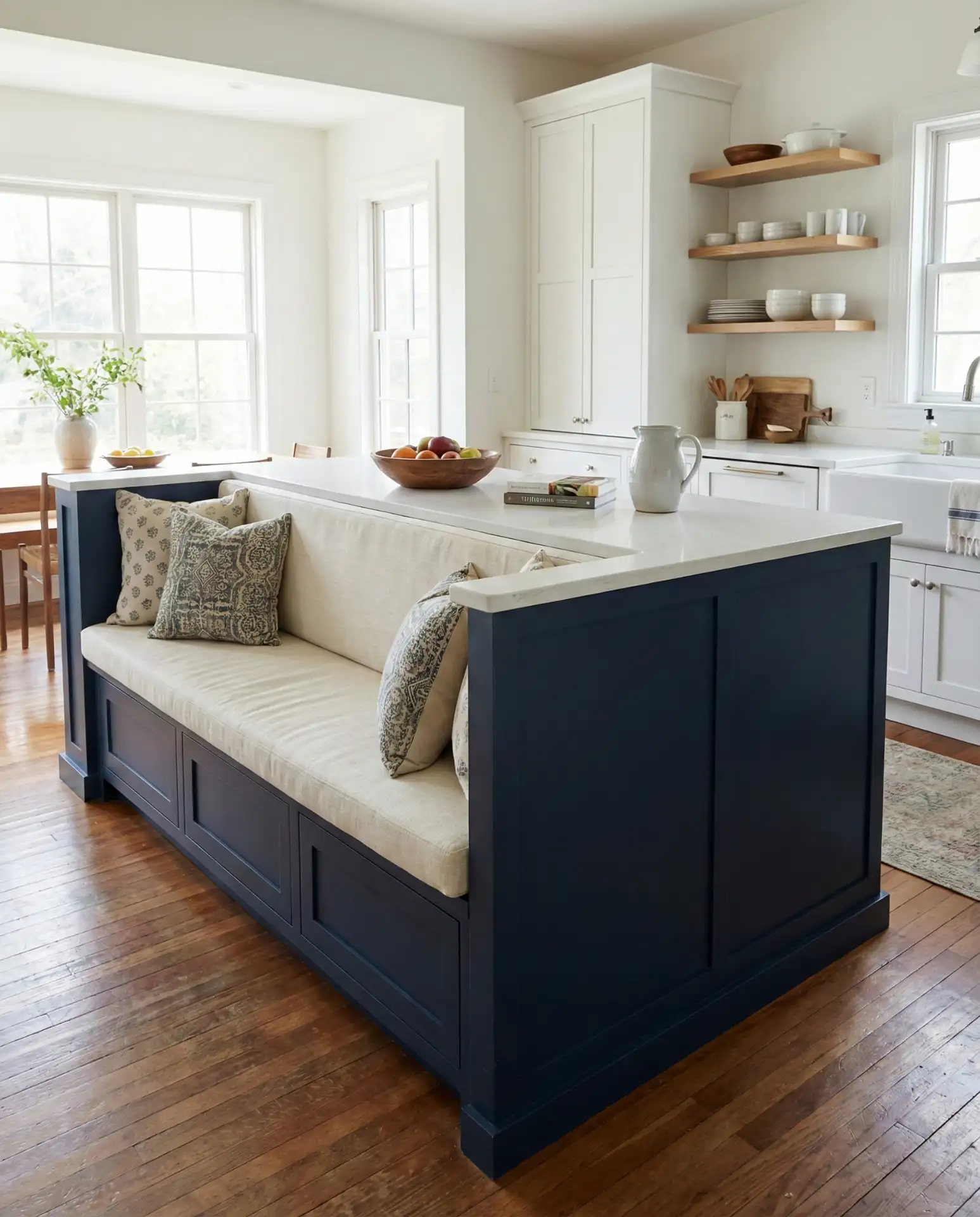
Practical insight: Built-in seating works best when paired with cushions or upholstered seats for comfort—bare wood benches look good but aren’t practical for lingering over morning coffee or homework sessions. Choose fabrics that can handle spills and crumbs, or opt for vinyl or leather that wipes clean easily. Many families report that this seating becomes the most-used spot in the entire house, so invest in quality materials that can withstand daily use. And make sure there’s adequate overhang on the countertop—at least 12 inches—so people can sit comfortably without bumping their knees.
Conclusion
From soft pastels to dramatic navy tones, blue kitchens offer endless possibilities for creating a space that’s uniquely yours. Whether you’re planning a full renovation or simply looking to refresh your current kitchen with a new island color or backsplash, these ideas demonstrate the incredible versatility of blue. We’d love to hear which of these designs inspired you most—drop a comment below and let us know which blue kitchen idea you’re planning to try in your own home!