There’s something about blue and green together that just feels alive—like a room took a deep breath and exhaled something effortless and cool. As we move through 2026, this color pairing has officially moved from trend to staple on Pinterest boards across America, and it’s not hard to see why. Whether you’re drawn to deep navy with forest green or soft sage with powder blue, this combination offers infinite ways to create a space that feels layered, personal, and completely of the moment. In this article, we’re walking you through 22 of the most inspiring blue and green living room ideas—from moody and dramatic to light and breezy—so you can find the look that’s right for your home.
1. Navy and Sage: The Classic Pairing Reimagined
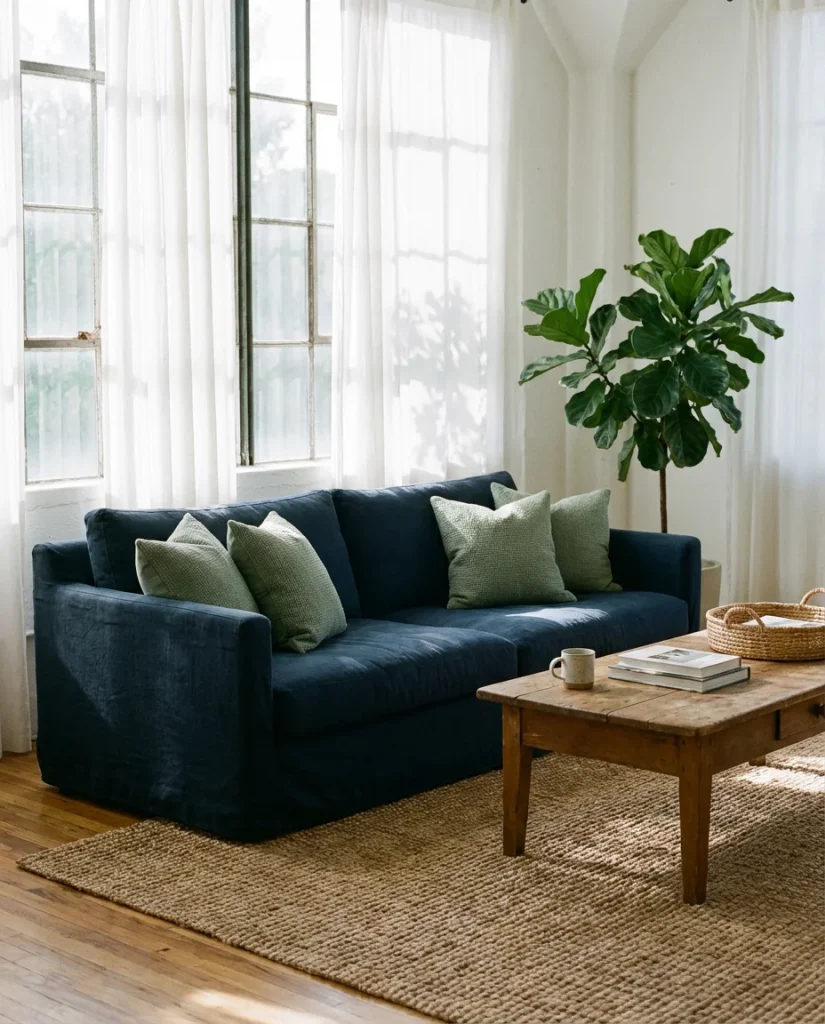
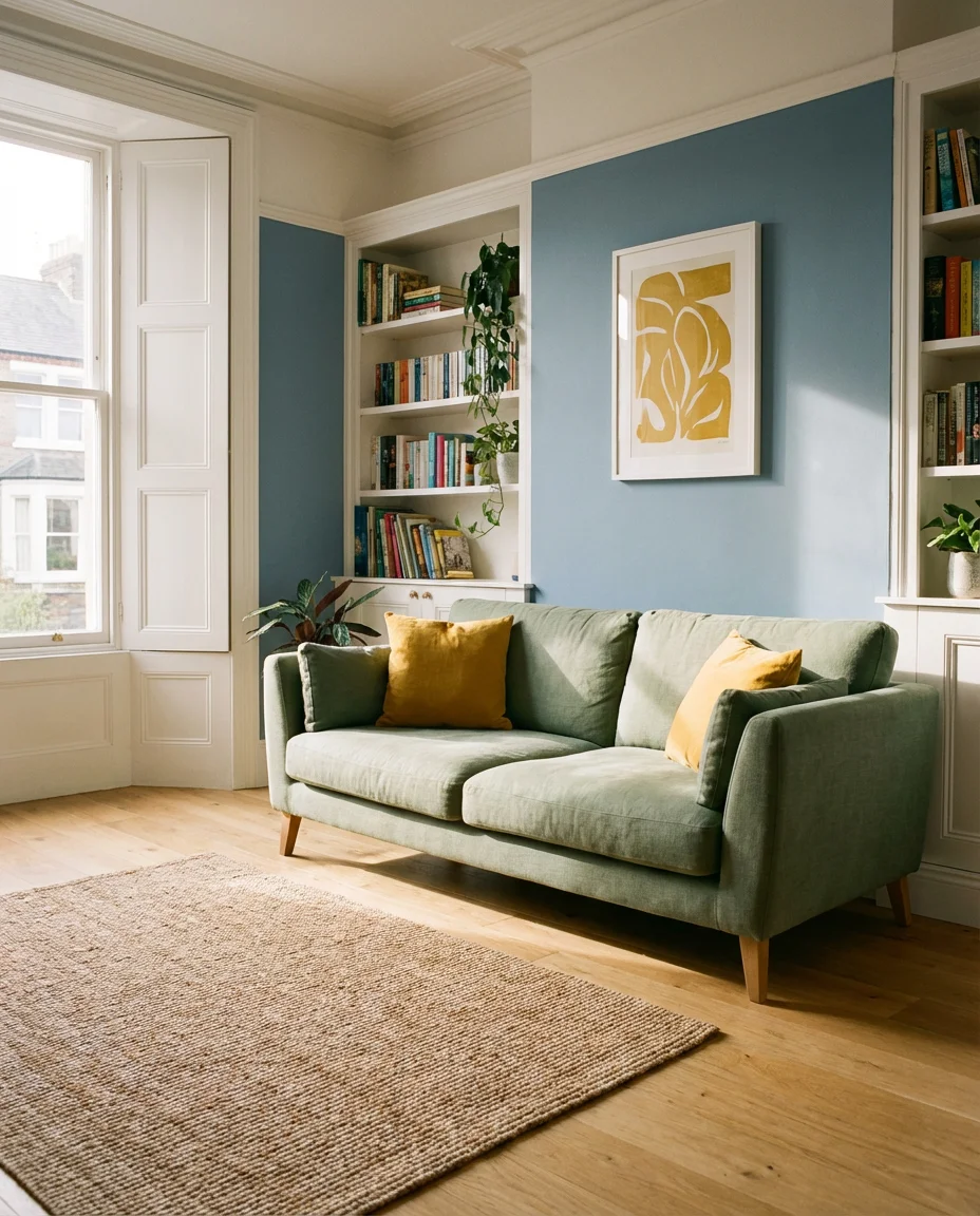
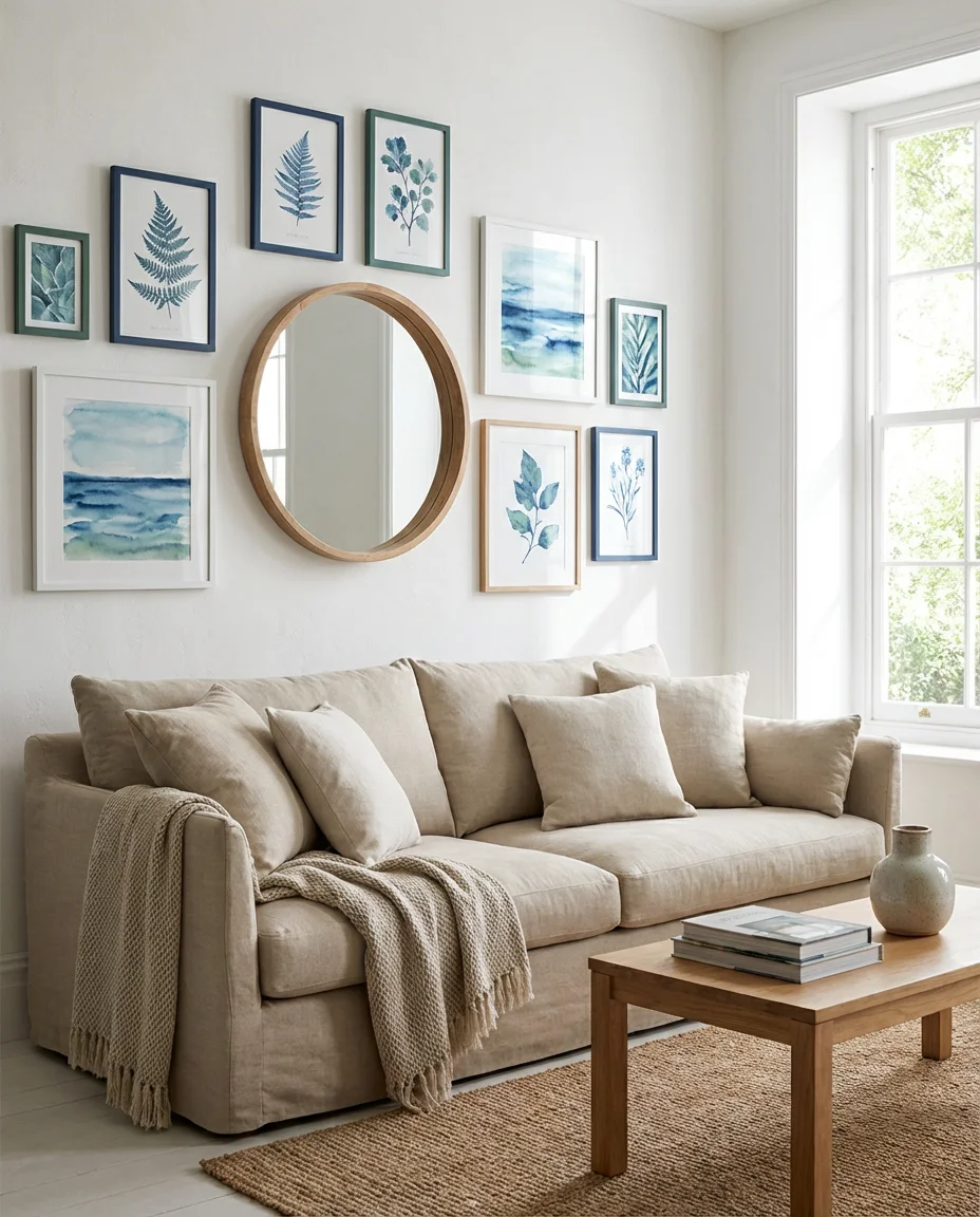
If there’s one color scheme that feels both timeless and refreshingly current, it’s navy paired with sage green. The depth of navy grounds a room, while sage brings that organic, earthy exhale that modern interiors crave. Think of a deep navy linen sofa anchored by sage green throw pillows, a jute rug, and warm wood accents. This isn’t a bold risk—it’s a calculated investment in a palette that will look just as sophisticated five years from now as it does today. The contrast is balanced, the energy is calm, and the result is a living room that feels genuinely collected rather than assembled.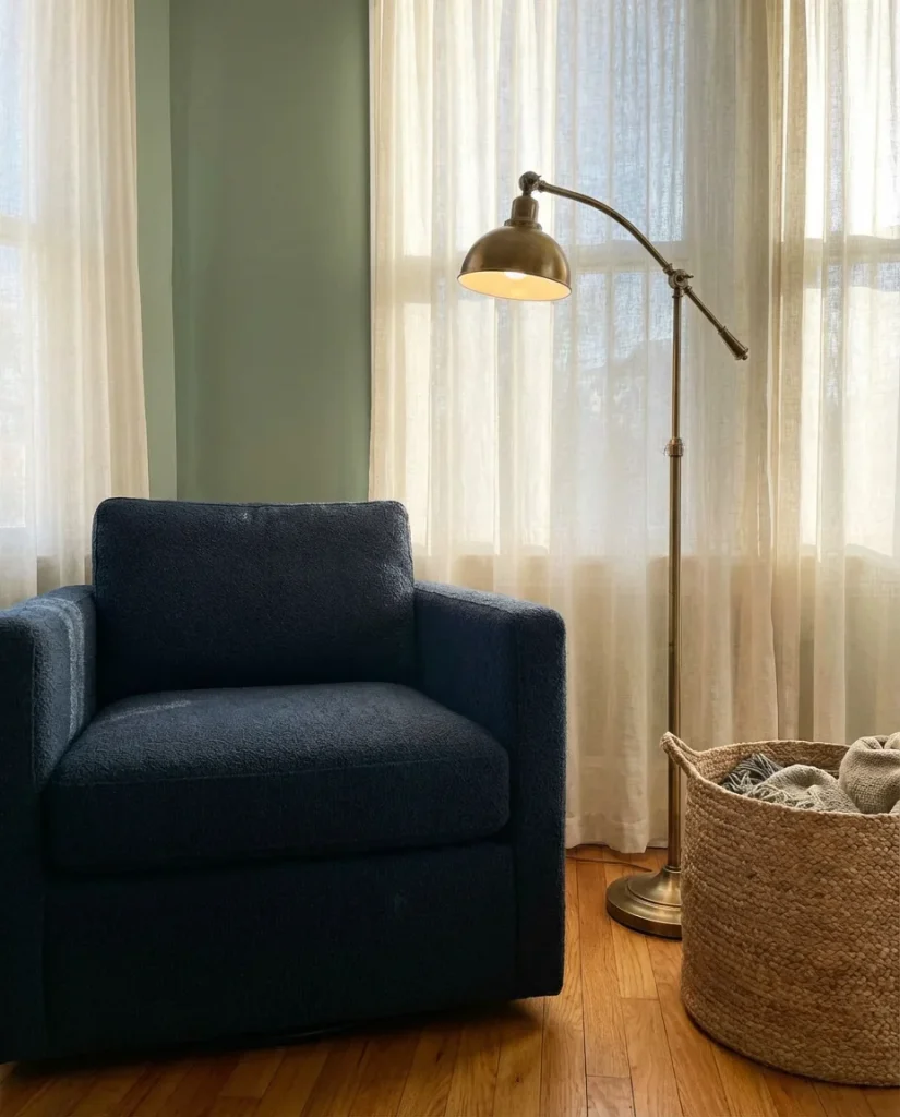
This pairing works particularly well in spaces with natural light, where the navy won’t feel too heavy and the sage can pick up the green tones from any outdoor views. It’s one of those combinations that interior designers often recommend to clients who want something with staying power—not a trendy room, but a forever room. Layer in natural materials like linen, rattan, and aged brass hardware, and you’ve got a living room that earns its place in every design roundup for years to come.
2. Moody Dark Walls with Emerald Accents
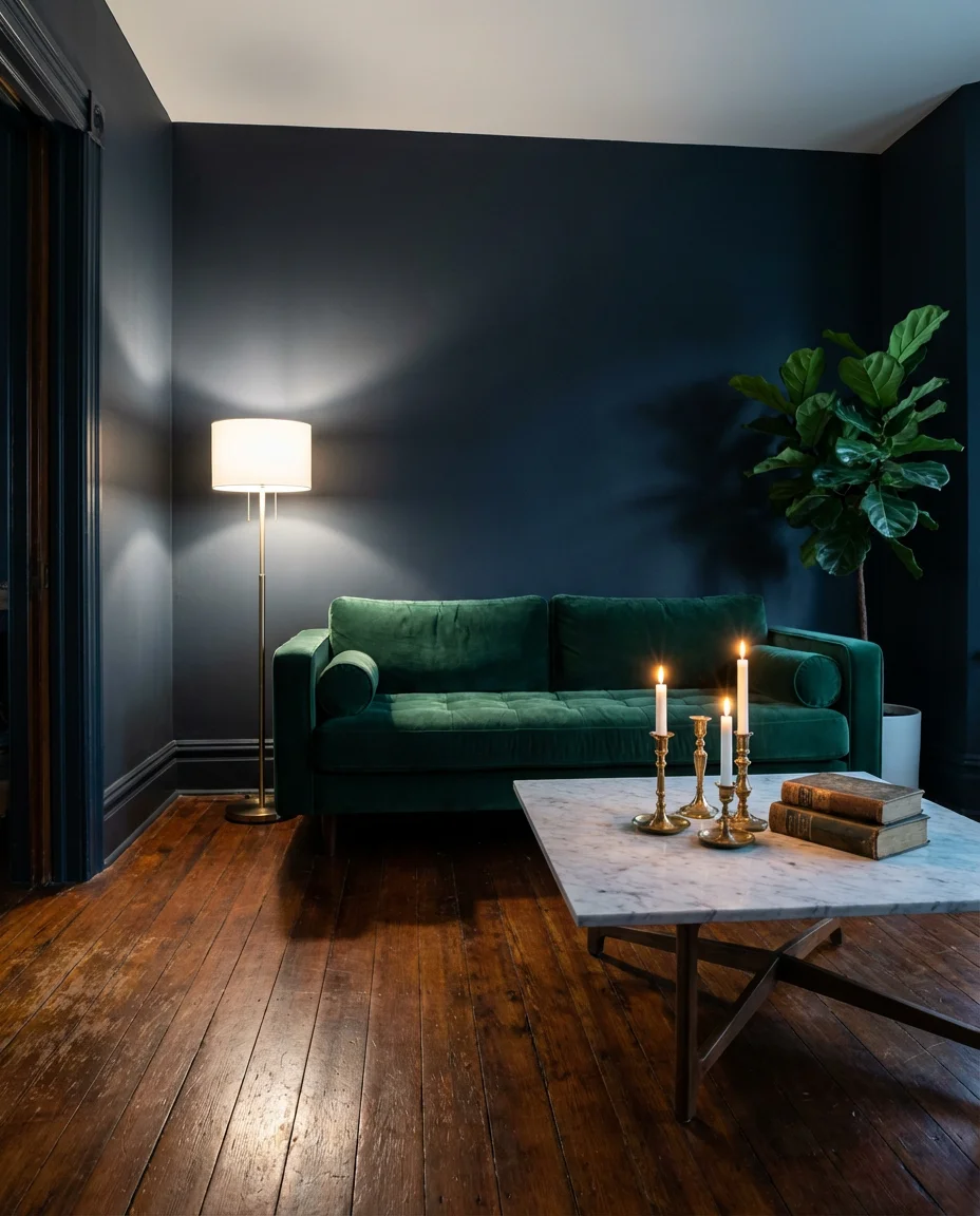
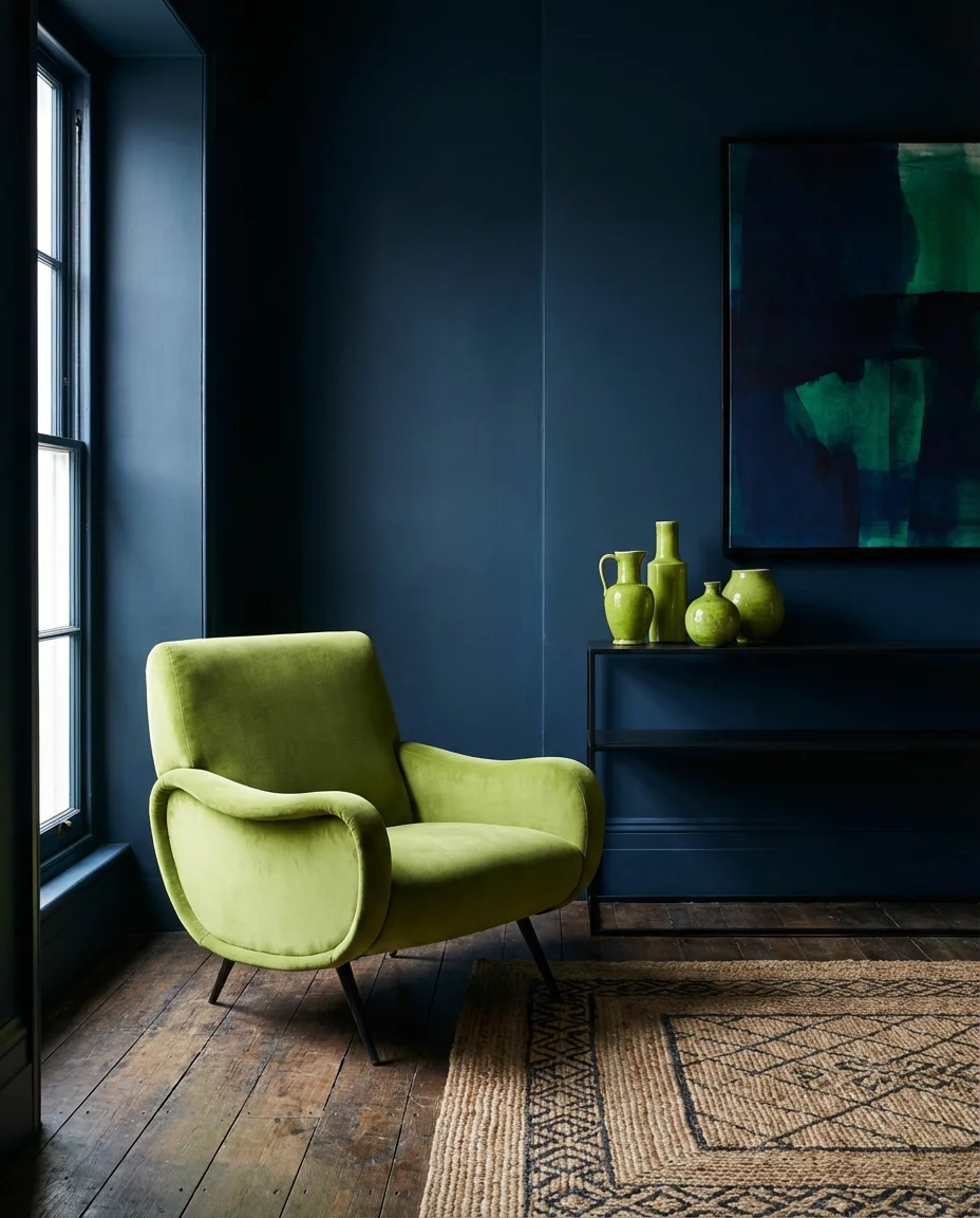
For the homeowner who isn’t afraid to go deep, a moody living room with dark walls and emerald green accents is nothing short of breathtaking. Imagine a charcoal or near-black blue wall—something like Farrow & Ball’s Hague Blue—offset by jewel-toned emerald in the form of velvet cushions, a dramatic side chair, or a bold area rug. The result is a room that feels like a sophisticated, intimate retreat: the kind of space where you pour a glass of something good and let the evening settle around you. This approach is ideal for rooms that don’t get a lot of direct sunlight, where the darkness actually becomes an asset rather than a challenge.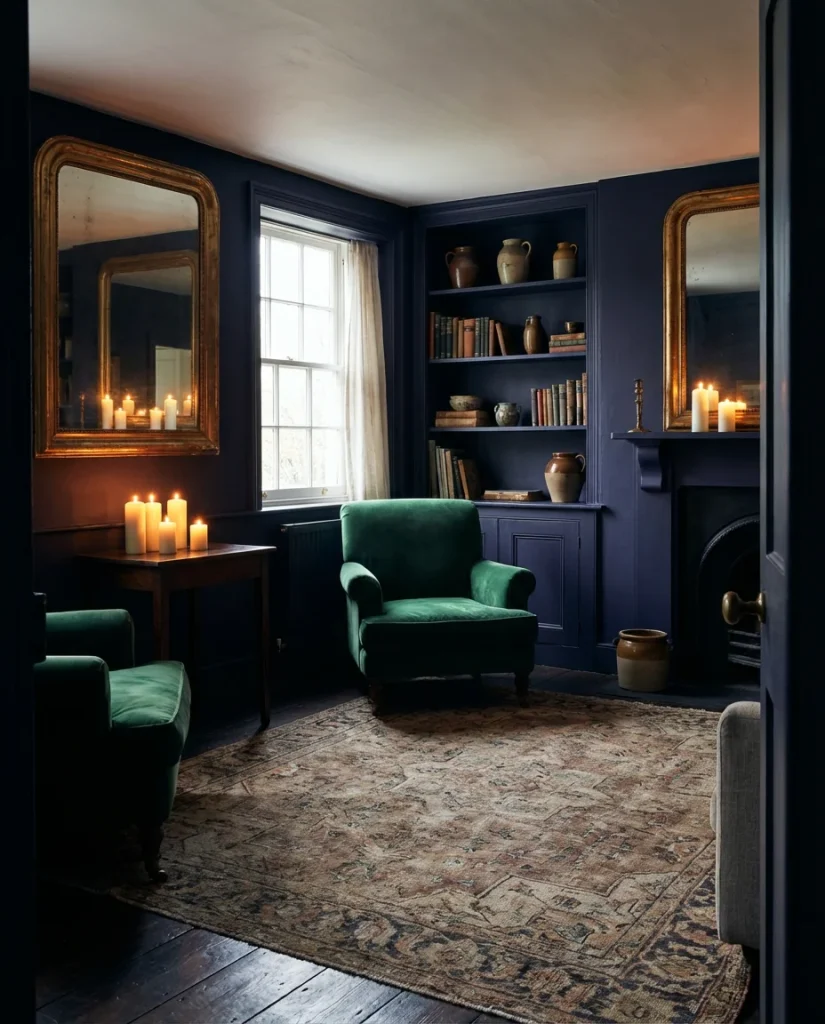
The common mistake in moody rooms is underestimating the power of light. A dark-walled room needs strategic illumination—layered lighting from floor lamps, table lamps, and even a statement pendant can completely transform the experience from “cave” to “cozy haven.” Add metallic accents in bronze or deep gold to catch the light and warm up the palette. This isn’t a budget room—quality materials matter here because they’re more visible. A velvet sofa in a rich emerald green is worth the investment when it becomes the crown jewel of the entire space.
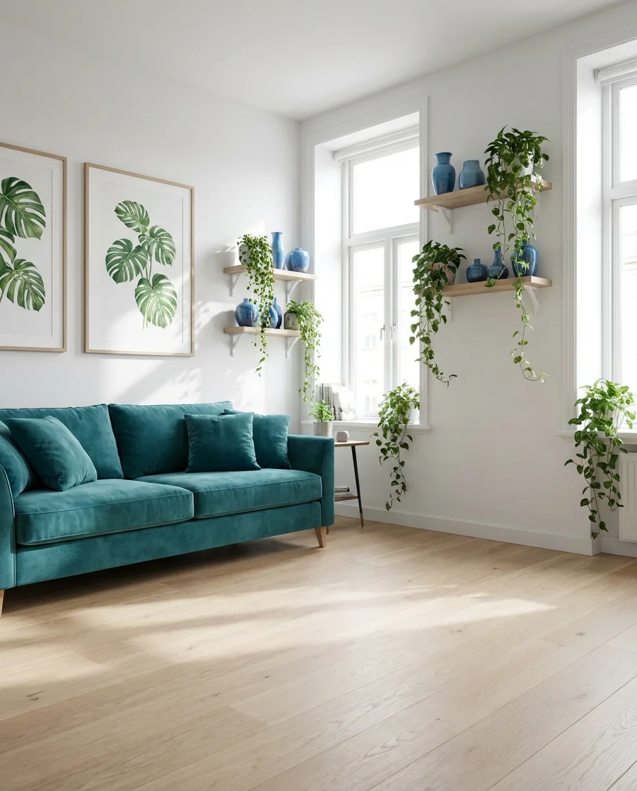
3. Light and Airy Blue with Soft Green Botanicals
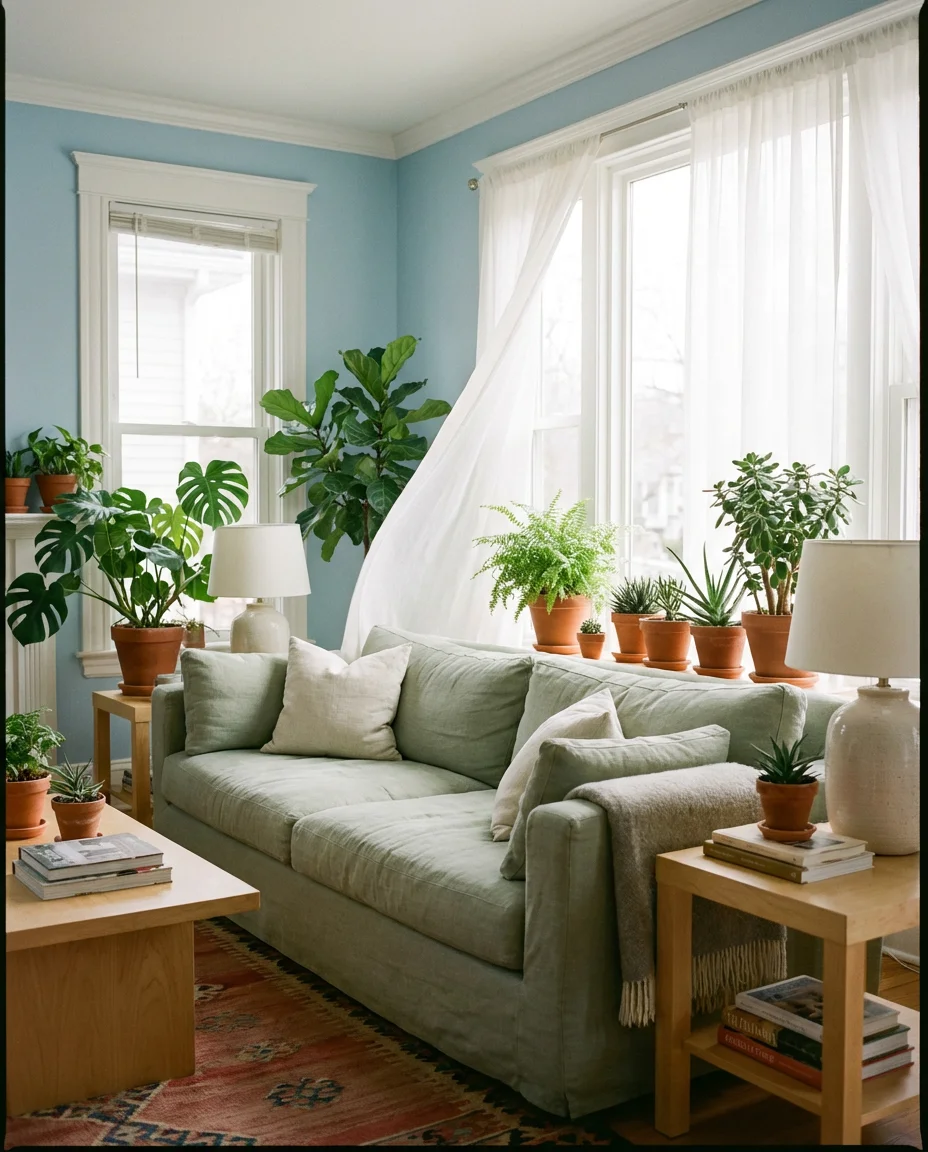
Not every blue and green living room has to announce itself dramatically. A light, airy interpretation of this palette—think powder blue walls, pale sage upholstery, and an abundance of live greenery—creates a space that feels like a perpetual weekend morning. This approach is enormously popular on Pinterest because it photographs beautifully and translates naturally into real homes across the country, from coastal cottages to suburban open-plan living rooms. The softness of the palette means it pairs effortlessly with white trim, blonde wood furniture, and simple linen textiles, keeping the whole room feeling clean without being cold.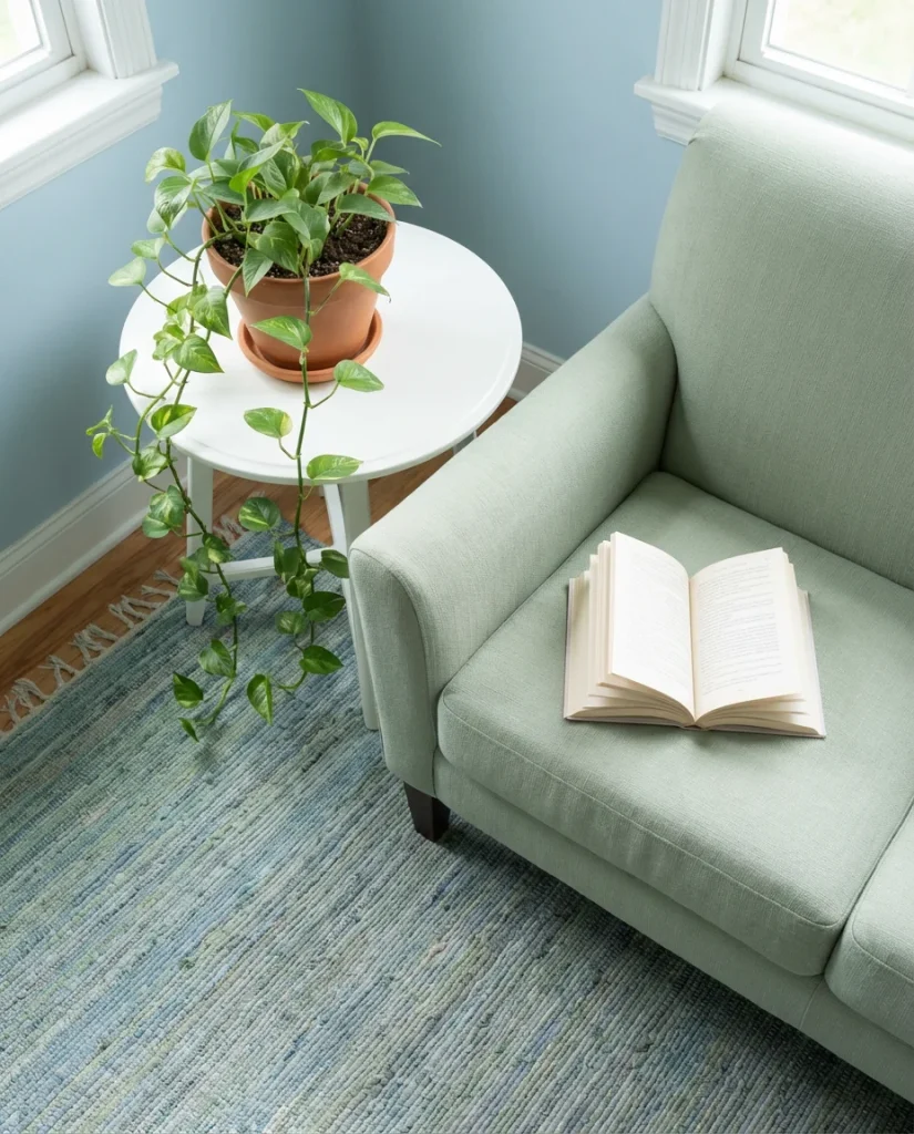
Where this look works best is in south- or east-facing rooms that get a good dose of morning or afternoon sun. The natural light activates both the blue and the green, keeping them from reading as flat or washed out. A practical tip for homeowners pulling this look together: don’t restrict your greenery to large statement plants alone. Layer in small succulents, trailing vines on shelves, and a mix of leaf shapes to create depth and visual interest. The botanicals do a lot of the heavy lifting in this palette—they’re not decoration; they’re structural.
4. Modern Blue and Green Color Scheme with Geometric Rugs
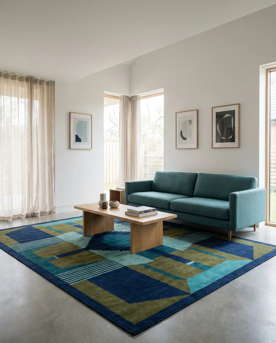
A modern take on the blue and green color scheme inspiration leans into clean lines, bold geometric patterns, and a confident mix of cool tones. Here, the rug becomes the conversation starter—a graphic Moroccan-style or mid-century geometric in blues and greens ties together the whole room without requiring every piece of furniture to coordinate perfectly. This approach suits open-concept homes and minimalist interiors where the architecture itself is fairly neutral. The furniture can be simple: a streamlined sofa in soft teal, an accent chair in deep petrol blue, and a low-slung coffee table in natural wood or white lacquer.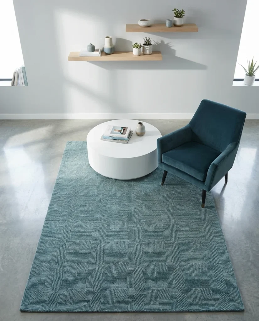
One homeowner in Portland shared that she found the perfect geometric rug at an estate sale for $40 and built her entire living room around it—proof that this look doesn’t require a designer budget. The key is finding a rug with both blue and green in its pattern, then letting those tones guide every other decision in the room. Once the rug is in place, the rest of the room practically decorates itself. Keep walls neutral to let the rug breathe, and resist the urge to over-accessorize—the pattern is doing the work.
5. Farmhouse Blue and Green Living Room
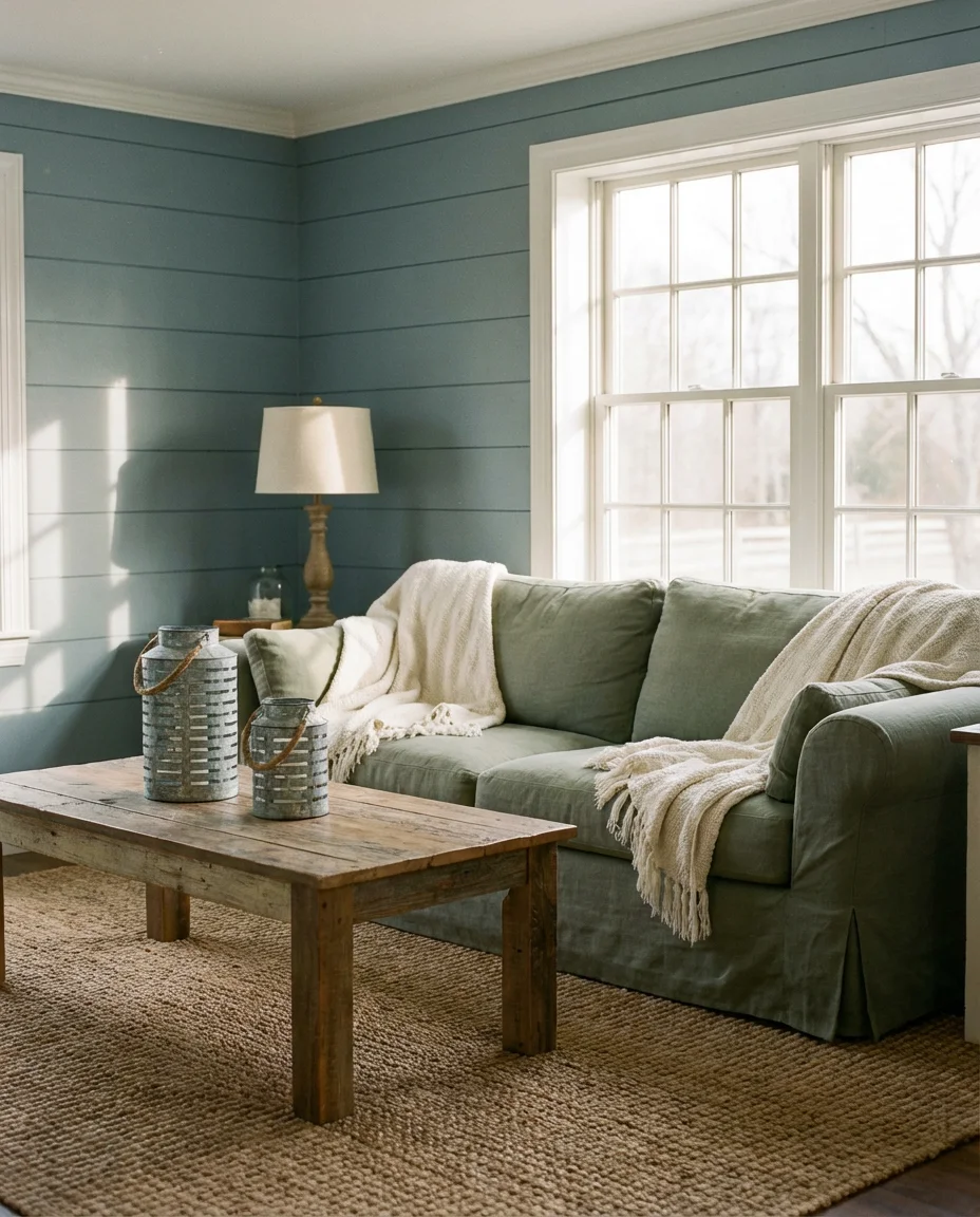
The farmhouse aesthetic has long been a staple of American interior design, and it adapts beautifully to a blue and green palette. Think shiplap walls painted in a soft dusty blue, a deep sage green linen sofa, and layers of cream and natural linen throughout. Add a reclaimed wood coffee table, galvanized metal accents, and a cozy braided rug underfoot. This isn’t the stark, bleached-out farmhouse of a decade ago—it’s warmer, more personal, and full of the kind of lived-in comfort that families actually want in their everyday living spaces. The blue and green palette adds a freshness that keeps the farmhouse look from feeling dated.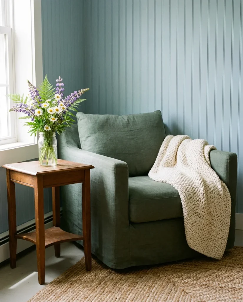
The farmhouse blue and green look is particularly well-suited to homes in the American South and Midwest, where this palette feels connected to the natural landscape outside—the sage of dry fields, the blue of wide-open sky. An expert decorator would tell you that the secret to keeping farmhouse style from going stale is texture: mix rough-hewn wood with soft linen, metal with cotton, and smooth ceramic with woven baskets. When every texture in the room tells a story, the color palette becomes secondary—just a thread that ties everything together beautifully.
6. Blue and Green with Brown Wood Accents
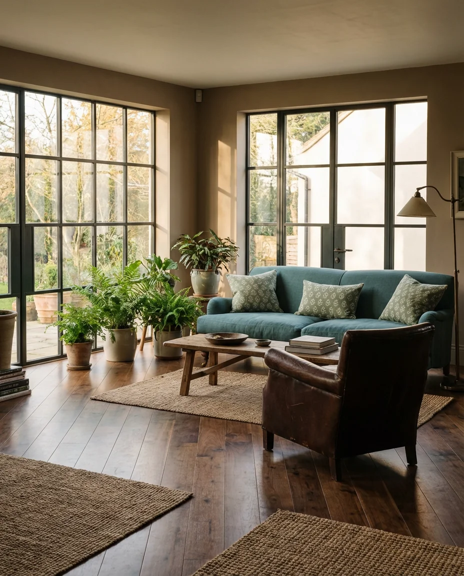
One of the most grounding combinations you can bring into a blue and green living room is warm brown—whether through hardwood floors, a walnut coffee table, or leather upholstery. Brown acts as a natural bridge between the two cool tones, adding warmth and preventing the room from feeling overly coastal or clinical. A teal sofa against deep walnut floors, surrounded by sage green textiles and chocolate leather accents, creates a palette that feels rooted and rich without sacrificing the freshness of the blue-green dynamic. This is a look that resonates strongly with homeowners who want a nature-inspired interior that still feels sophisticated.
From a budget perspective, this combination is also one of the most flexible. Brown wood elements are often the most affordable furniture category—secondhand shops, estate sales, and warehouse stores are full of solid wood pieces in rich brown tones. If you already have hardwood floors or a wood coffee table, you’re essentially halfway there. The blue and green layers can come in through paint, textiles, and plants—all relatively low-cost updates that can dramatically shift the feeling of a room without a full renovation.
7. Blue, Green, and Pink: An Unexpected but Beautiful Trio
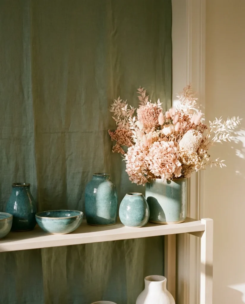
Adding pink to a blue and green living room sounds risky, but in practice it’s one of the most charming and Pinterest-worthy combinations you can attempt. The key is keeping the pink soft—dusty rose, antique blush, or warm terracotta pink—rather than anything hot or saturated. Against a backdrop of muted teal and sage green, a blush throw or dusty rose accent chair introduces an unexpected warmth and a touch of femininity that makes the space feel curated and layered. This palette shows up frequently in color scheme mood boards for young professionals and first-time homeowners who want something beyond the expected.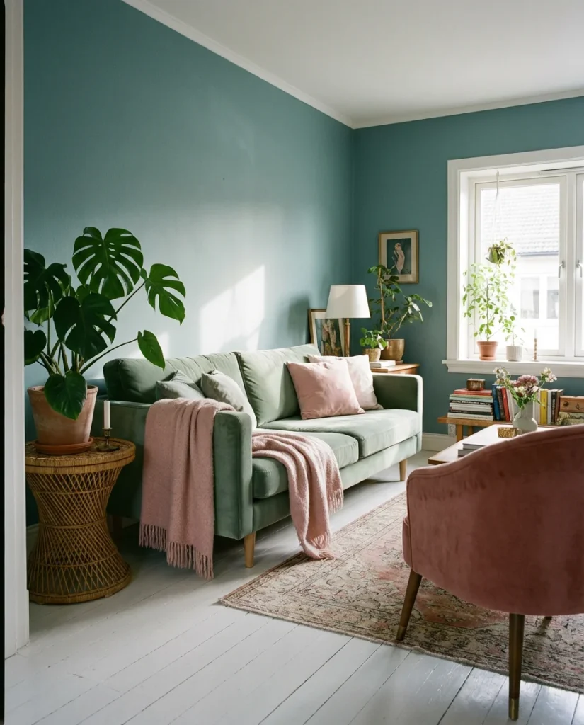
In terms of the American lifestyle context, this palette resonates particularly well in cities like Austin, Nashville, and Charleston—places where design culture prizes personality and eclecticism over rigid adherence to a single aesthetic. It’s a palette that says, “I have taste, and I’m not afraid to play.” The best version of this room doesn’t match too precisely—a blush pillow here, a rose-tinted candle there—because the pink should feel discovered rather than designed in. That improvisational quality is exactly what makes it work.
8. Grey, Blue, and Green: The Sophisticated Neutral Trinity
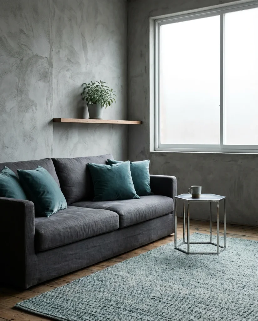
For a more subdued and modern interpretation of the blue and green theme, bringing grey into the mix creates a palette that feels elevated and genuinely sophisticated. A warm dove grey wall provides the perfect neutral backdrop for a slate blue sofa and sage green accent chairs, with natural linen and brushed nickel details completing the look. This is the kind of color scheme that reads as quietly luxurious—nothing screams for attention, but every element feels considered. It suits open-plan apartments, contemporary townhomes, and anyone who loves design but prefers their rooms to feel serene rather than stimulating.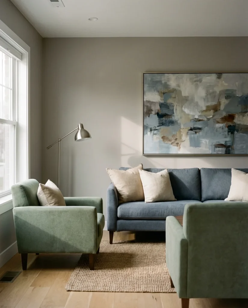
Interior designers who work with grey-blue-green palettes often note that the risk here is letting the room feel too cool—all three tones can veer cold if not balanced correctly. The fix is always warmth: warm-toned wood, cream-colored textiles, and lighting with a lower color temperature (2700–3000K bulbs rather than cool white). A single warm element—like a cognac leather side table tray or a terracotta candle—can shift the entire temperature of the palette toward comfort without undermining its calm sophistication.
9. Blue and Green with Orange and Terracotta Accents
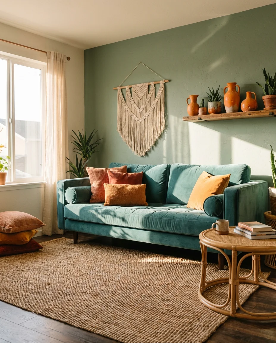
On the color wheel, blue and orange are complementary—meaning they intensify each other when placed side by side. When you bring terracotta or burnt orange into a blue and green living room, the result is a vibrant, energetic space that feels both global and grounded. Think a teal sofa with terracotta throw pillows, sage green walls with an orange-tinted abstract print, or a dusty blue rug punctuated by warm orange ceramic accents. This palette has a distinctly Southwestern and bohemian edge that works beautifully in airy, high-ceilinged rooms where the contrast can fully breathe.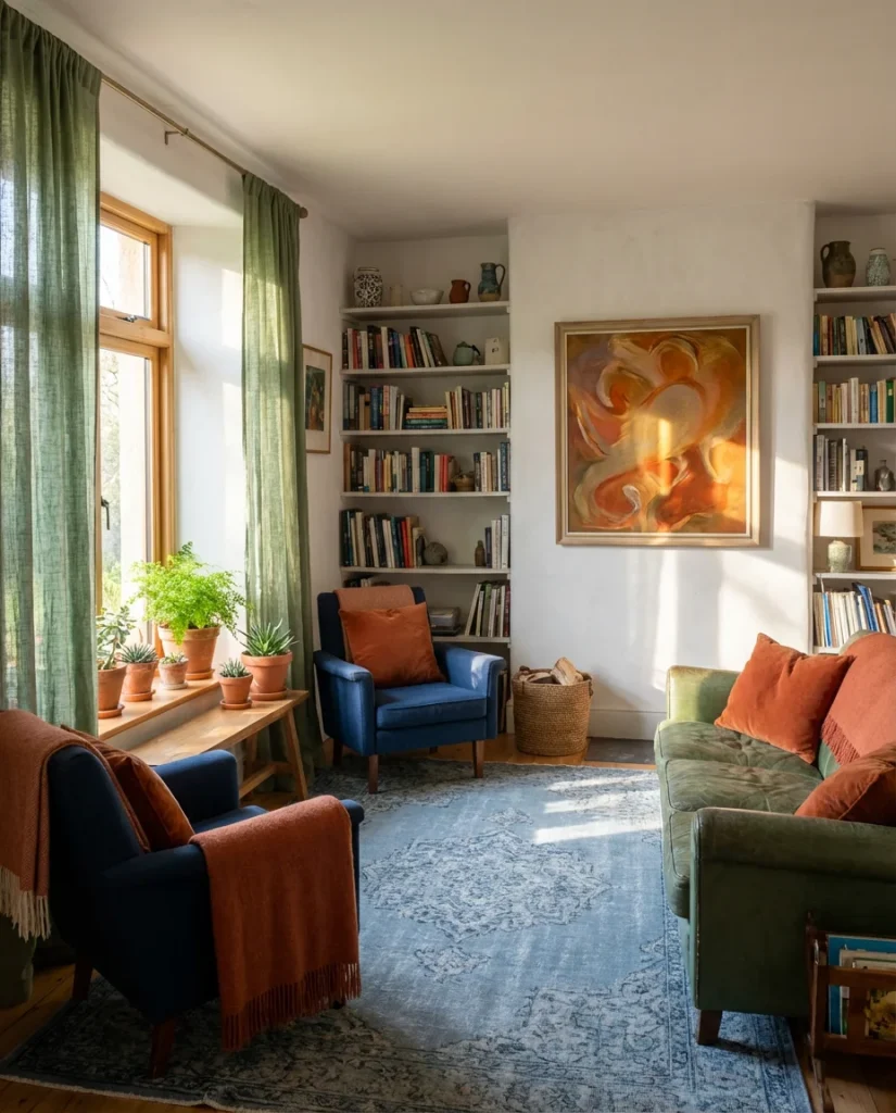
This combination is especially popular in states like New Mexico, Arizona, and Colorado, where the natural landscape itself offers this exact palette—the blue of mountain sky, the green of pine and sage, and the orange-red of desert earth. Homeowners in these regions often report that bringing these colors indoors creates an almost seamless connection between their living spaces and the views outside. If you’re working with this palette in a less obviously Southwestern setting, lean into the warmth with textured ceramics and natural fibers to ground the combination.
10. Royal Blue and Forest Green: Bold and Dramatic
Royal blue and forest green are not for the faint of heart—but for the homeowner who embraces drama, they’re one of the most visually stunning combinations in the current design landscape. This isn’t a room that whispers; it announces. A royal blue velvet sofa against a deep forest green accent wall is the kind of statement that stops people mid-conversation when they walk into a room. The aesthetic here is maximalist in spirit but controlled in execution—every element is rich, every texture intentional, and every accent deliberate. Gold hardware, dark wood, and aged brass fixtures complete the picture.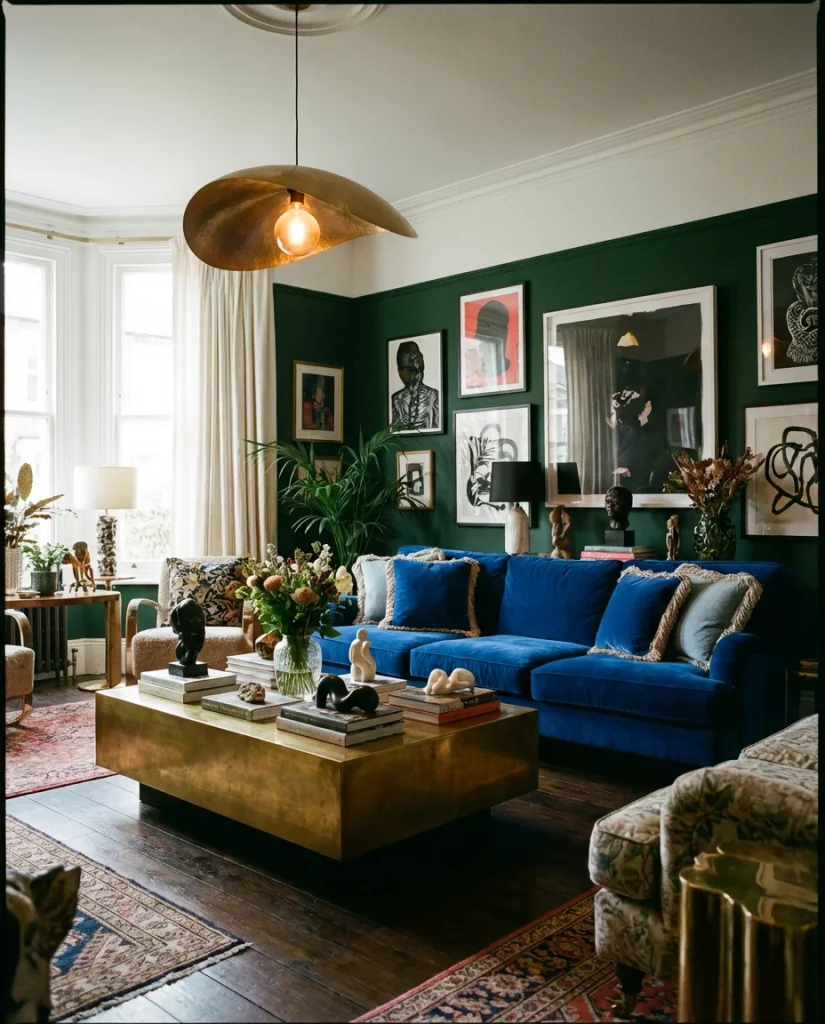
A micro-anecdote worth considering: a designer in Brooklyn reportedly painted one wall of a client’s living room in forest green and brought in a royal blue sofa as a “temporary” solution while waiting for the “right” furniture—and the client loved it so much they never changed it. Sometimes the combinations that seem most risky on paper are the ones that feel most alive in person. The secret is committing fully. Half-hearted attempts at bold palettes always look uncertain. When you go royal and forest, you go all in.
11. Blue and Green with Yellow Accents for a Sunny Lift
A few carefully placed yellow accents can transform a blue and green living room from serene to radiantly joyful. Think mustard yellow throw pillows on a sage green sofa, a chartreuse lamp on a teal side table, or a golden yellow abstract print against a dusty blue wall. Yellow energizes without overwhelming—it’s the equivalent of opening a window in a room that’s been closed all day. This palette has the color scheme mood board quality that makes it perpetually shareable on Pinterest, and it’s especially popular among young families and homeowners who want a living room that feels genuinely happy.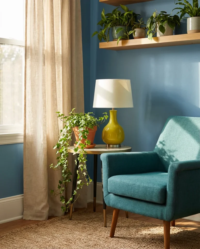
Where this look works best is in north-facing rooms that don’t receive much direct sunlight. The yellow accents compensate for the lack of warmth that natural light usually provides, essentially tricking the eye and the mood into perceiving the room as sunnier than it actually is. It’s a practical, low-cost intervention—a couple of mustard cushions and a yellow candle can meaningfully shift the energy of a north-facing room without touching the walls. For a more committed version, a single statement lamp in chartreuse or golden yellow is one of the most effective purchases you can make.
12. Pale Blue and Pale Green: Soft and Serene
There’s a quietly growing movement in American interiors toward extremely soft, almost-neutral palettes—and pale blue paired with pale green is at the forefront of this shift. Think barely-there mint walls with the softest whisper of sky blue on the upholstery, cream linens, and white oak floors. The result is a room that feels like a spa in the best possible way: restorative, spacious, and deeply calm. This palette is particularly well-suited to bedrooms-turned-sitting-rooms or smaller living spaces where darker tones would feel oppressive. It breathes, it expands, and it invites rest.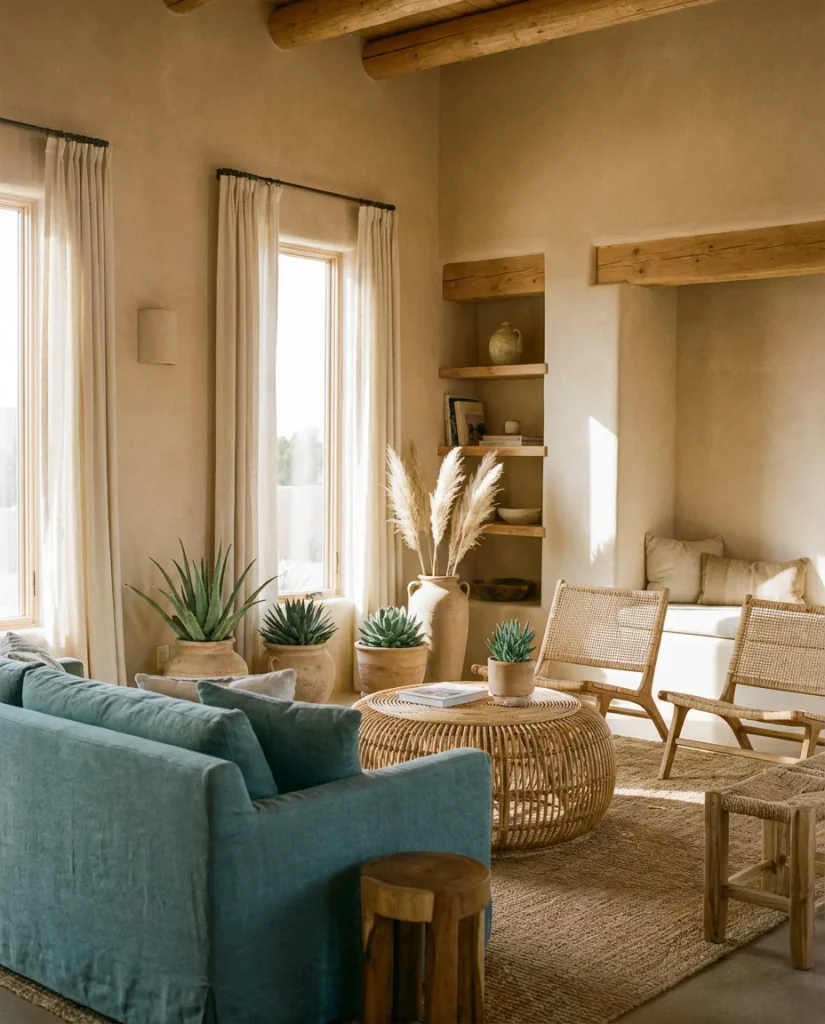
Real homeowners who’ve committed to this palette often describe the same experience: the room never feels “too much.” In an era of sensory overload, a pale blue and pale green living room offers genuine relief. The key practical insight is in the finishes—matte or eggshell paint finishes are essential here, since gloss would harden the softness of the palette. Similarly, choose textiles with natural fibers and no sheen. Every surface should absorb light rather than reflect it, creating that characteristic soft, enveloping quality that makes pale palettes so deeply restful.
13. Blue and Green Decor with White Walls
White walls are the great enabler of interior design—they let color do exactly what it wants to without interference. A living room with crisp white walls and blue and green decor has an almost gallery-like quality: the furniture, textiles, and art read like curated installations against a clean backdrop. A teal velvet sofa, green botanical prints, blue ceramic accents, and a mix of trailing plants create a lush, jewel-box effect that still feels fresh and spacious. This is an excellent starting point for renters who can’t paint walls or for homeowners who want the flexibility to change their accent palette seasonally.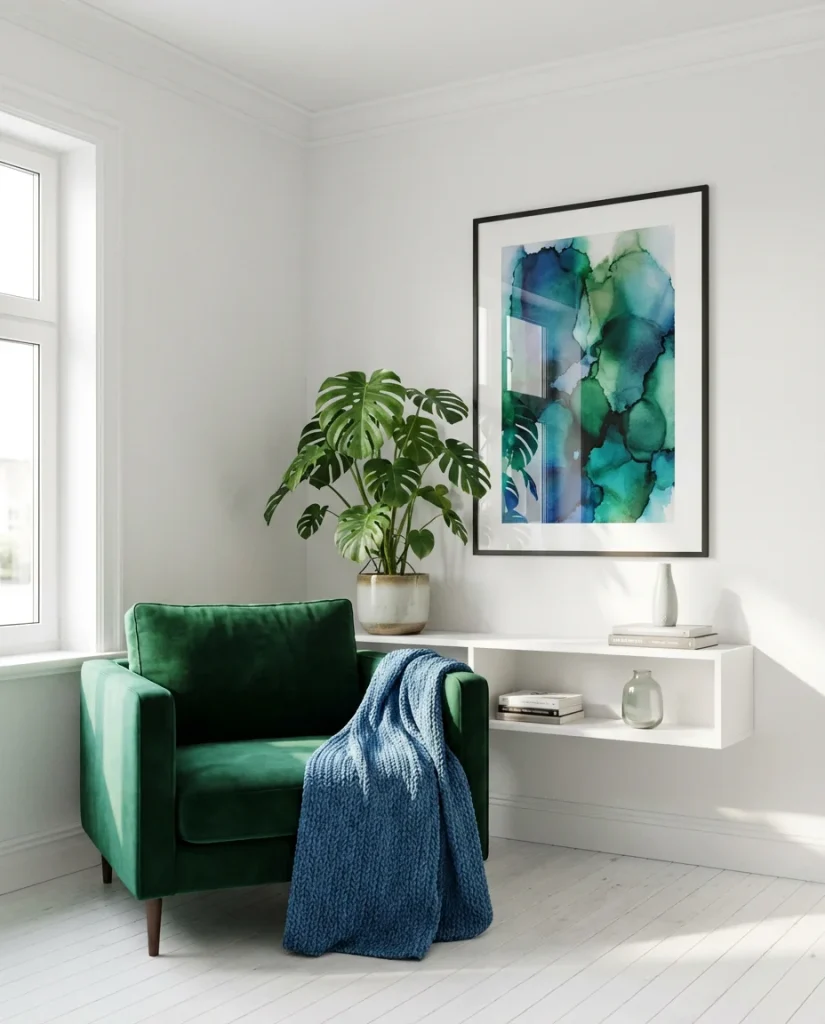
From a real homeowner behavior perspective, the white-wall approach is almost universally the first step people take when they’re testing a new color palette. It’s lower-commitment than repainting, allowing you to audition blue and green through objects before making any permanent decisions. The smart move is to start with one large piece—a sofa, a rug, or a significant piece of art—in your preferred blue or green, then build around it. White walls will accommodate whatever direction you choose to take next, making this an endlessly flexible foundation.
14. Teal and Olive: The Earthy Version
If sage green is the gentle, romantic version of green, olive is its more rugged, outdoorsy sibling—and paired with teal, it creates a living room palette that feels genuinely organic. This combination reads as deeply nature-inspired: the teal of a forest creek, the olive of late-summer foliage. It suits interiors with natural stone, raw concrete, exposed brick, or timber beams—materials that benefit from a palette that doesn’t try too hard. A teal linen sofa with olive green cushions, a woven rattan coffee table, and dark-stained wood shelves create a space that feels like a well-appointed mountain retreat without requiring a single ski lift in the vicinity.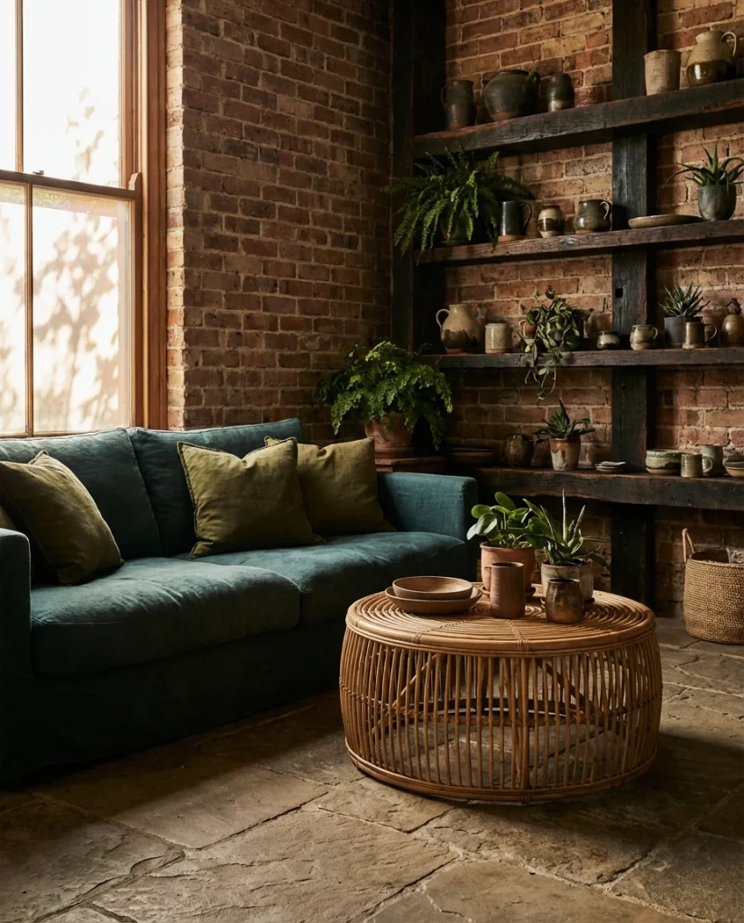
This palette is having a particular moment in the American Pacific Northwest, where the surrounding landscape of ferns, moss, and waterways directly informs interior choices. Homeowners in Seattle, Portland, and the surrounding areas are gravitating toward teal-and-olive combinations because they feel like a genuine extension of the environment outside. If you’re outside of that region, you can still achieve the grounded, organic quality of this palette by prioritizing raw and natural materials over anything polished or synthetic.
15. Tan and Blue-Green: A Warm Desert Palette
Pairing sandy tan with a muted blue-green creates one of the most pleasing and easy-to-live-with palettes in contemporary interior design. The tan reads as warm and inviting, the blue-green reads as cool and refreshing—and together they balance each other in a way that feels intrinsically harmonious. Think of a sandstone-toned living room with a dusty teal sofa, woven tan rattan furniture, and sage green plants everywhere. This palette calls to mind the beauty of the American Southwest: open sky over adobe, clear water in a canyon pool. It’s sun-bleached and beautiful, and it’s earning enormous traction in interior design spaces right now.
An interior expert would point out that the success of this palette hinges on the quality of the tan—it needs warmth, not coolness. Avoid beiges that lean gray or pink; look for sand, caramel, and dune tones that carry real warmth. Benjamin Moore’s “Pale Oak” and Sherwin-Williams’ “Accessible Beige” are popular starting points that interior designers frequently pair with soft teal-greens to achieve this balanced, desert-modern look. Once the wall color is right, the rest of the room falls into place with surprising ease.
16. Blue and Green Wall Decor Ideas to Transform Any Room
When the sofa and the rug are staying put, wall decor ideas become your most powerful tool for introducing a blue and green palette. A gallery wall mixing blue abstract prints, green botanical illustrations, and a few mirrors in simple frames can completely transform the feeling of a neutral living room without touching a single piece of furniture. For a more immersive approach, a large-format blue and green canvas above the sofa anchors the entire room in the palette. Color scheme inspiration drawn from nature—ocean horizons, woodland canopies, and tropical foliage—provides endless subject matter for wall art that feels fresh and personally meaningful.
![]()
The most common mistake people make with blue and green wall art is going too small. A tiny print in the center of a large wall reads as an afterthought rather than a design choice. Size up your art significantly—a piece that feels almost too large in the store is often exactly right on the wall. If you’re building a gallery wall, commit to at least five pieces to create the critical mass that reads as intentional. Fewer than that and it begins to feel accidental. Also make sure there’s both blue and green represented—balance in the palette matters as much on the wall as anywhere else in the room.
17. Dark Blue with Lime and Neon Green Accents
For the design adventurer willing to step outside the comfort zone, pairing a dark inky blue with electric lime or neon green accents produces a living room that feels unapologetically contemporary—even a little punk. This is not a traditional combination, but it’s one that’s appearing with increasing frequency in high-end design publications and the apartments of style-forward millennials and Gen Z homeowners who treat their living room as a form of self-expression. Against dark midnight blue walls, a single lime green sculptural chair or a set of acid-green ceramic vases reads like an electric charge running through the room.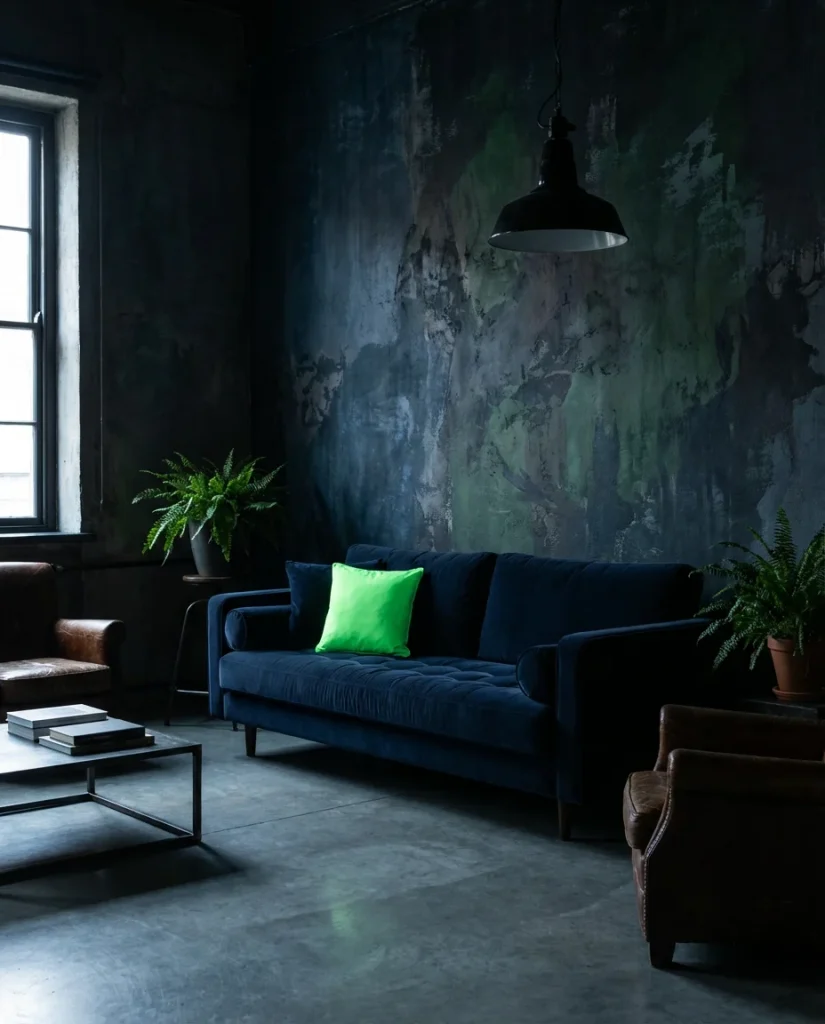
This palette demands quality and intentionality in a way that softer combinations do not. When the contrast is this high, every element is visible and every imperfection magnified. The dark blue walls need to be applied with care—this is the time to hire a professional painter or, at minimum, do two full coats of high-quality paint. The lime or neon green accents should be used sparingly—one or two pieces maximum—because the power of this combination comes from contrast, not volume. Less is definitively more in a room where the colors themselves are this loud.
18. Blue and Green with Red Accents: A Maximalist Delight
Bringing red into a blue and green living room is a maximalist’s dream—a combination that’s been beloved in traditional Indian, Moroccan, and British colonial interiors for centuries. In a contemporary context, the trick is balance: a small amount of red goes a very long way. A single red accent cushion on a teal sofa, a crimson ceramic piece on a sage green shelf, or a vintage red kilim rug on a wood floor can pull a blue and green room into vivid, warm-blooded life. This is a palette for people who believe that more color is always better and who have the confidence to prove it.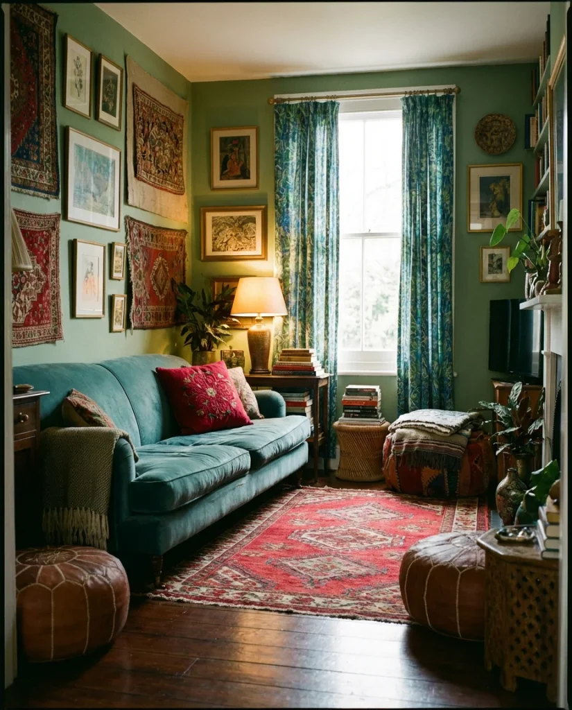
From an American lifestyle standpoint, this combination resonates particularly with homeowners who collect antiques, travel souvenirs, and vintage pottery because it provides a palette framework that can absorb an enormous variety of objects without becoming chaotic. The blue and green provide the organizing principle, and the red acts as the surprise element that gives the collection energy. If you’re a collector or a thrifter, blue-green-red is one of the most forgiving and rewarding palettes you can build your room around.
19. Coastal Blue and Green Living Room
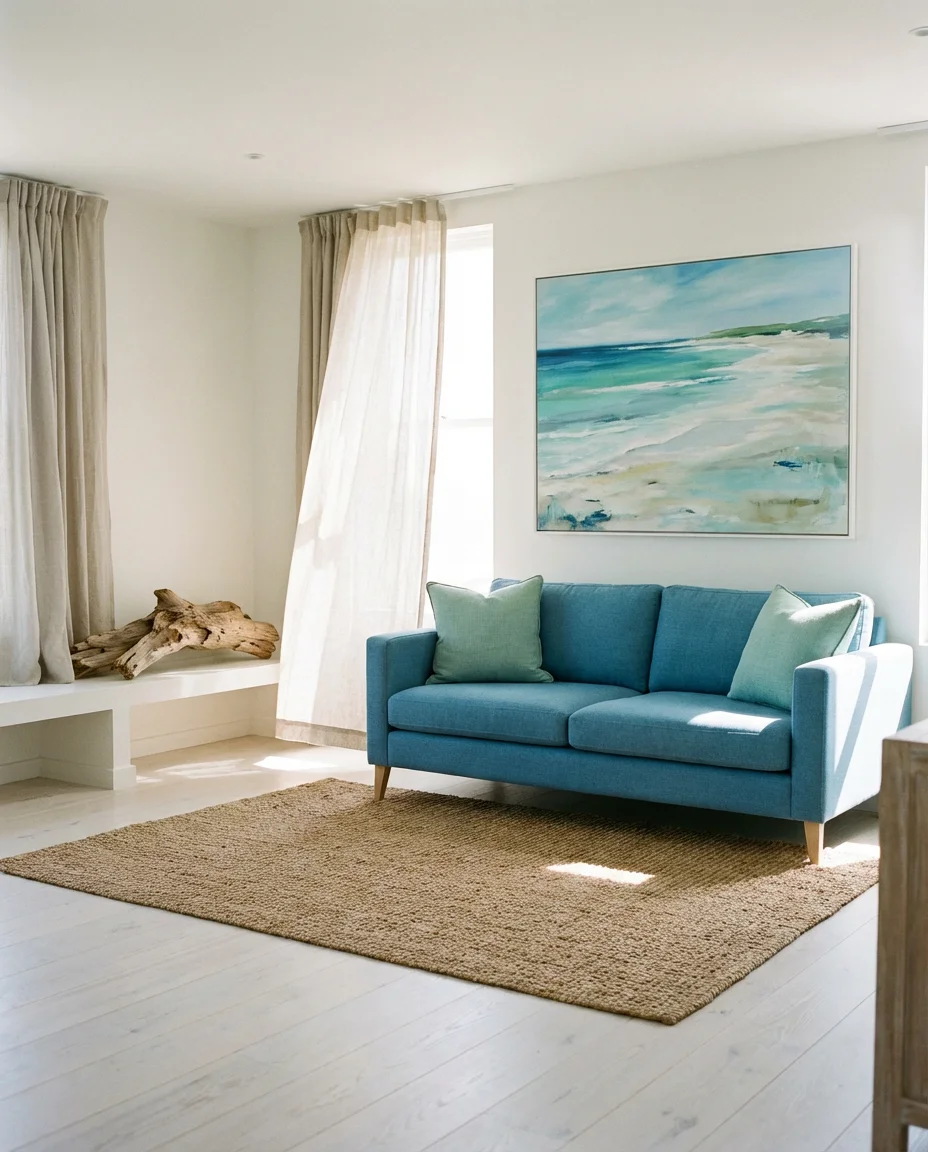
The coastal living room has evolved significantly since its white-and-nautical-stripe heyday. In 2026, a sophisticated modern coastal aesthetic leans into ocean-inspired blues and sea-glass greens, with natural materials that recall sun-bleached driftwood and woven sea grass. Think a cerulean blue sofa on whitewashed planks, with seafoam green accents, linen everything, and a blue and green abstract piece that could be surf or sky or both. This is the living room of someone who actually lives near the water—or who deeply wishes they did. It’s relaxed, warm-hearted, and eternally one of the most-searched aesthetic categories on Pinterest among American coastal and Sun Belt homeowners.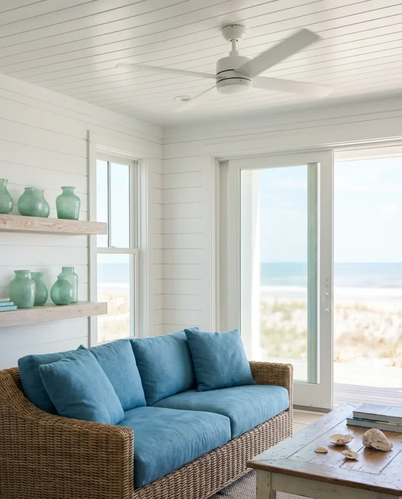
A real homeowner in Cape Cod shared that she built her living room entirely around a single piece of sea glass—a tumbled piece of ocean-tinted glass she found on a beach walk that contained exactly the blue-green she’d been searching for. She had the paint store match it, and it became the organizing color for the entire room. This is actually a brilliant approach: find a natural object that captures the precise tone you’re after and use it as your reference point. Nature’s versions of blue-green are always more interesting than any paint chip.
20. Blue, Green, and Cream: Timeless Elegance
Cream is the secret weapon of blue and green living room design. Where white can feel clinical and cool alongside these tones, cream brings an organic warmth and richness that makes the whole palette glow. A sage green sofa on a cream-toned rug, against deep blue walls softened by cream linen curtains, creates a room that feels both classic and completely fresh. This combination works across a huge range of American home styles—Colonial, Craftsman, mid-century ranch, and modern farmhouse all benefit from this palette’s ability to bridge the traditional and the contemporary without committing fully to either.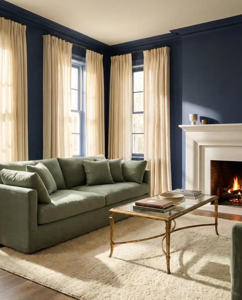
The cream and blue-green palette is particularly well-suited to older homes—pre-war apartments, Victorian houses, and mid-century ranches—where the architectural details (crown molding, wainscoting, and original fireplaces) benefit from the warm neutrality that cream provides. A common mistake is using too-bright white to trim out these rooms, which creates a harsh contrast against the blue-green palette. Opt for a soft off-white or ivory trim instead, and watch how much more unified and harmonious the entire room becomes. This is the kind of refinement that separates a good room from a great one.
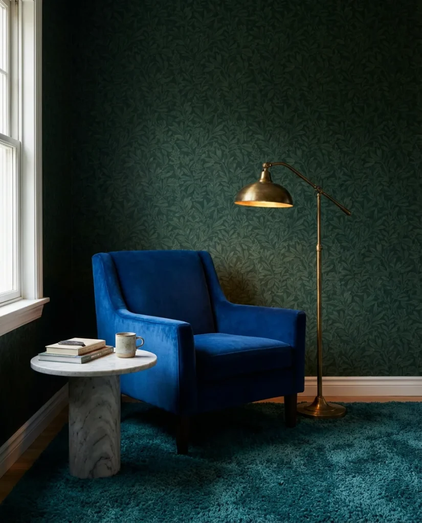
21. Navy Blue and Hunter Green: A Study in Depth
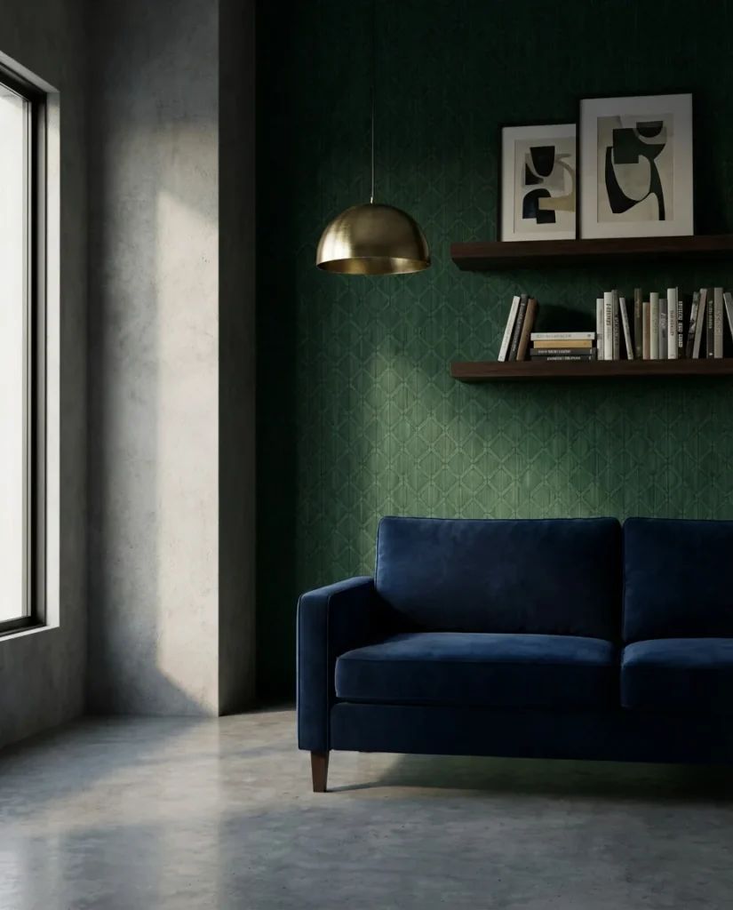
When two deep, saturated tones meet—navy and hunter green—the result is a living room of exceptional depth and character. This is not a palette for people who want their rooms to feel airy; this is for those who want them to feel profound. Against white-trimmed millwork, the combination takes on an almost Victorian richness, while in a more modern space with minimal trim and concrete floors, it reads as boldly contemporary. A navy blue tufted sofa alongside hunter green curtains, with brass or antique gold accents throughout, creates a room that could have stepped out of a prestigious New England estate—or an ultra-cool boutique hotel.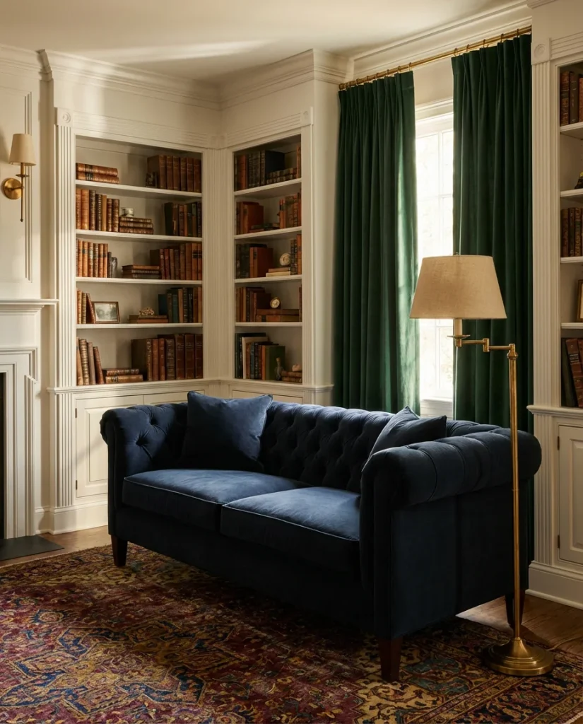
From a budget and practical standpoint, achieving a navy-and-hunter-green room doesn’t require buying all-new furniture. Slipcovers and paint are the quickest routes in: a navy slipcover on an existing sofa can be found for well under $200, and a hunter green painted accent wall costs roughly the same in quality paint and supplies. The investment is in the finishing touches—brass hardware, quality lighting, and one or two genuinely good textiles—that elevate the space from “I painted it dark” to “this was completely intentional.” The distinction is always in the details.
22. Blue and Green Living Room with Statement Lighting
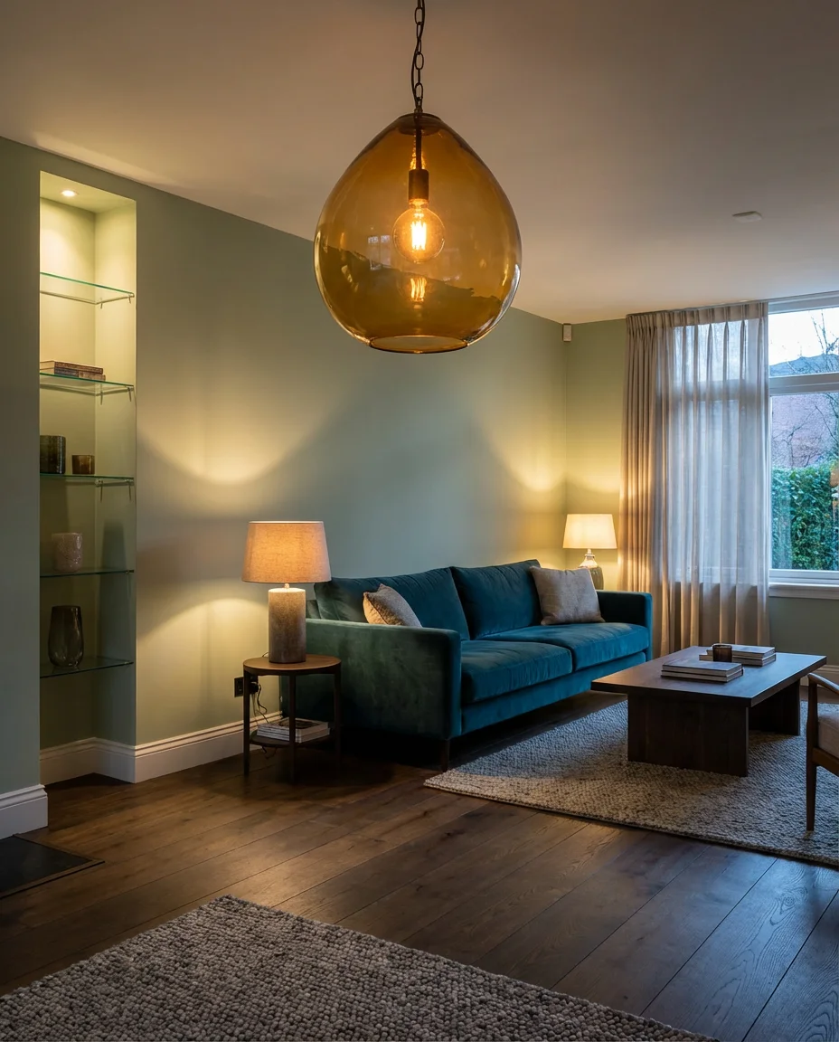
Lighting is the element of interior design most often treated as an afterthought—and in a blue and green living room, it’s arguably the most important decision you’ll make. The right light can make a dusty teal sing or turn a sage green into something luminous. In 2026, the trend is toward statement pendants and sculptural floor lamps that feel like art in their own right. Think of a hand-blown glass pendant in amber or smoke above a teal sofa, or a large rattan arc lamp casting warm pools of light over sage green upholstery. The modern blue and green aesthetic embraces lighting that’s functional and beautiful in equal measure.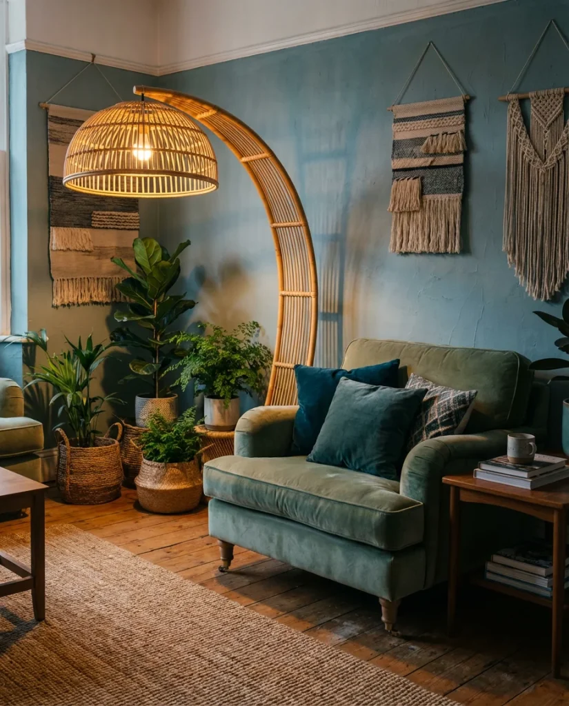
The practical insight here is about layering: never rely on a single overhead light source in a blue and green room. The palette needs warmth from multiple angles to look its best. A pendant, a floor lamp, and two table lamps will do more for this color combination than the most expensive sofa you could buy. Warm-toned bulbs in the 2700K range are essential—cool white light turns sage green gray and makes navy look flat. Lighting is the investment most homeowners make last and wish they’d made first. In a blue and green living room, it’s the one element you truly cannot afford to get wrong.
Conclusion
Whether you’re drawn to the drama of navy and forest green or the lightness of pale blue and sage, the blue and green living room is one of the most versatile and rewarding palettes you can choose for your home in 2026. Each of these ideas offers a different entry point, and there’s no wrong door to walk through. We’d love to hear which combinations are speaking to you—drop your thoughts, questions, and photos in the comments below, and let’s keep the conversation going.