Bedroom color schemes are evolving in 2026 with a strong shift toward earthy tones, sophisticated neutrals, and nature-inspired palettes that help create personal sanctuaries. American homeowners are increasingly turning to Pinterest for visual inspiration as they plan bedroom makeovers that balance style with emotional comfort. Whether you’re designing a space for couples, updating a guest room, or simply seeking a more relaxing retreat, this year’s color trends offer something for every taste and lifestyle. From rich forest greens to warm terracottas and calming mauves, these bedroom color schemes reflect a desire for rooms that feel both timeless and deeply personal. Let’s explore the palettes that are defining bedroom design this year.
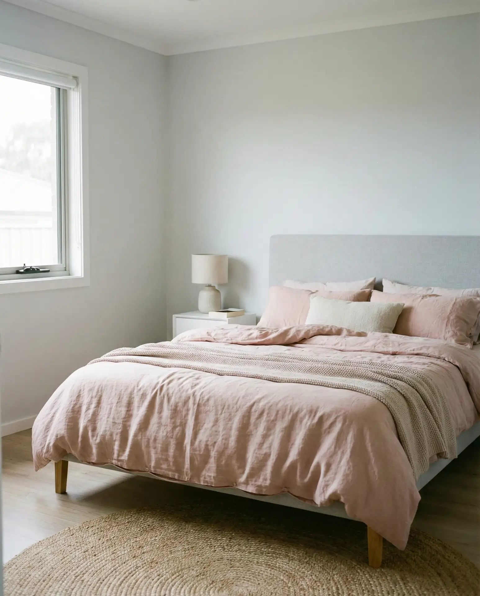
1. Mauve and Cream Serenity
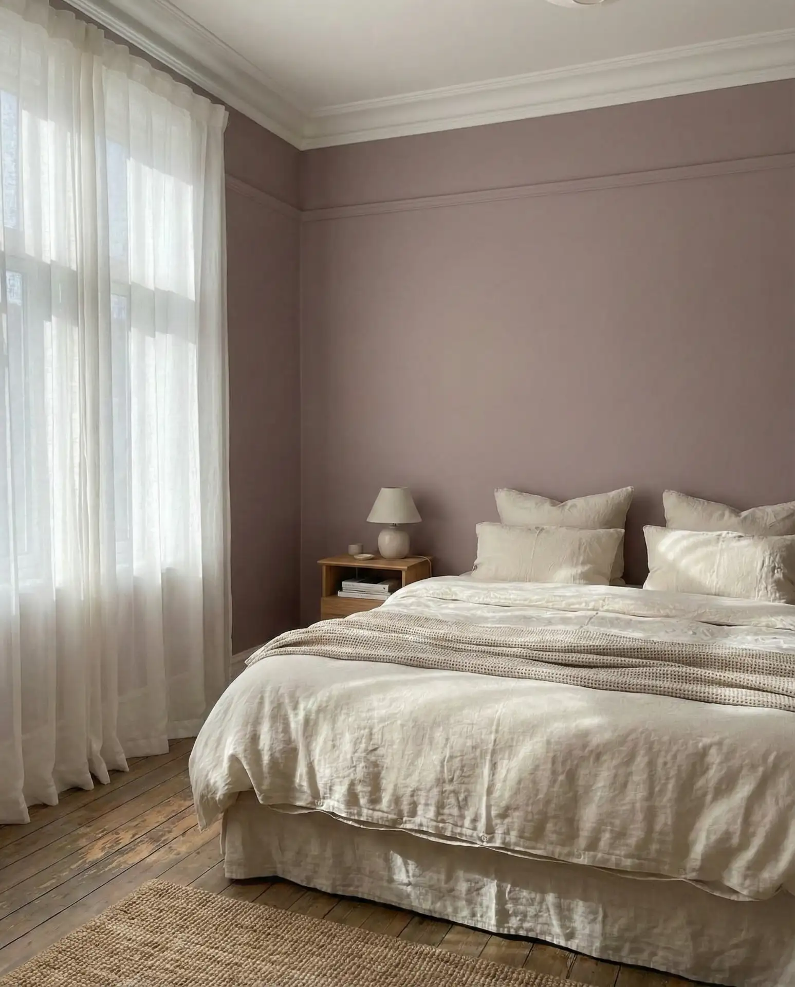
This mauve-focused palette brings understated elegance to any bedroom, pairing soft dusty rose walls with creamy white trim and linens. It’s a relaxing scheme that works beautifully in master bedrooms where calm is the priority, and it complements both traditional and modern furnishings. The color feels romantic without being overly feminine, making it a thoughtful choice for couples who want something warmer than gray but more sophisticated than pink.
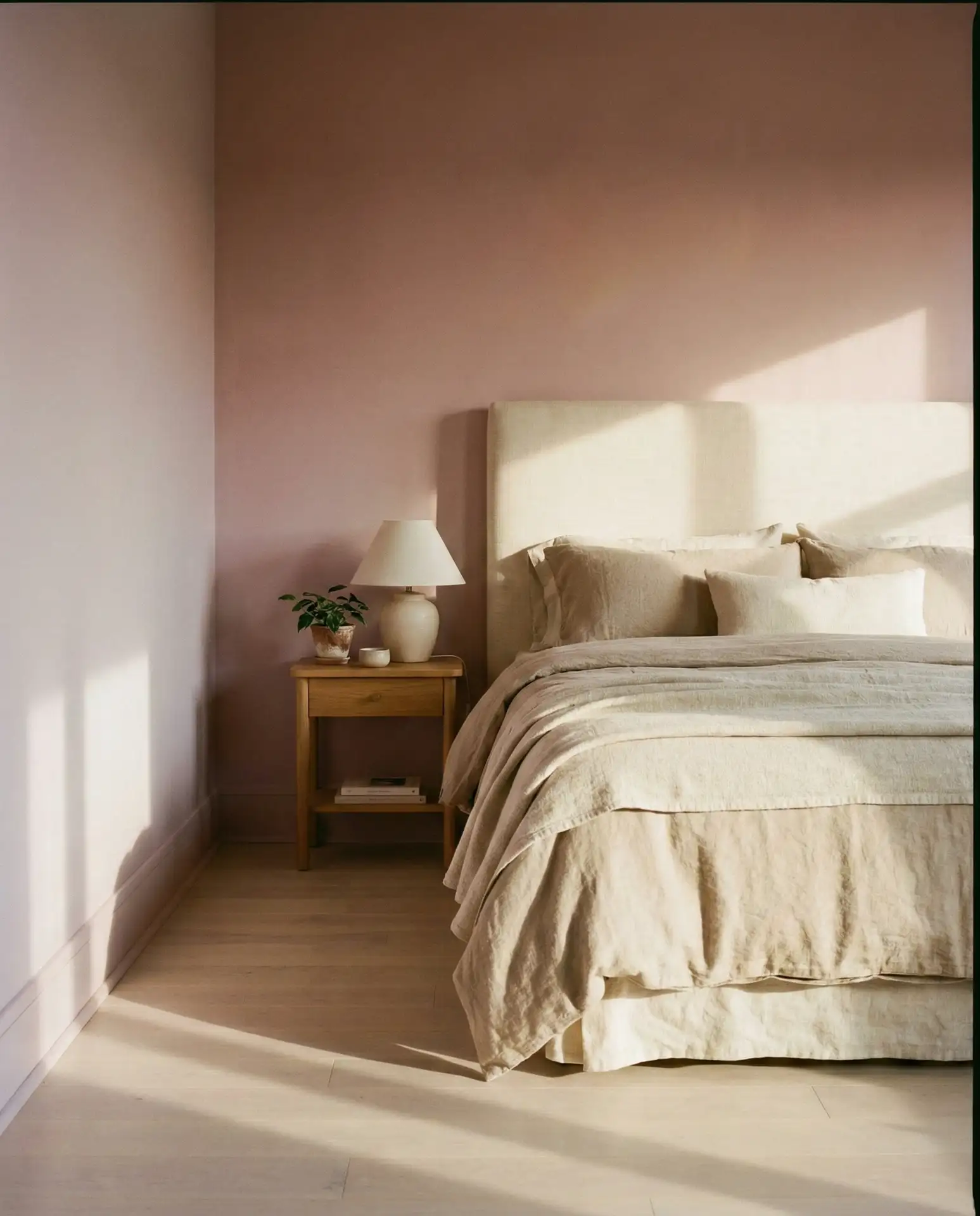
This scheme works best in rooms with plenty of natural light, where the mauve can shift from cool to warm depending on the time of day. Many homeowners layer in textured throws and linen curtains to add depth without overwhelming the softness of the palette. It’s also forgiving with wood tones—both light oak and walnut furniture feel at home here. One common mistake is choosing a mauve that’s too purple; test samples in your actual bedroom lighting to ensure it reads as a muted, earthy rose rather than lavender.
2. Grey Headboard with Soft White Walls
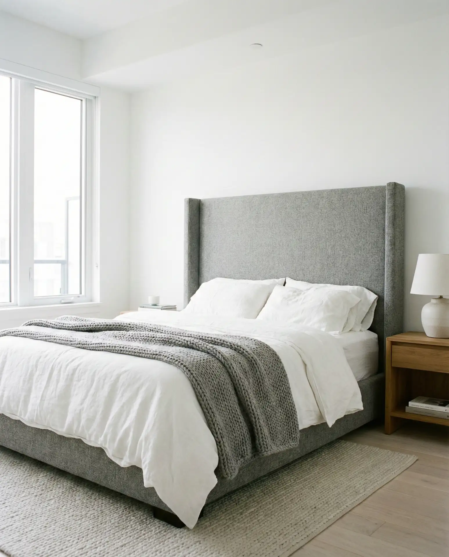
A grey headboard anchors this clean, versatile scheme that’s ideal for minimalists or anyone building a neutral foundation. Pairing it with soft white or off-white walls creates a backdrop that adapts to changing décor styles and seasonal updates. This is one of the most popular ideas on Pinterest for good reason—it’s timeless, easy to execute, and works in apartments, suburban homes, and everything in between.
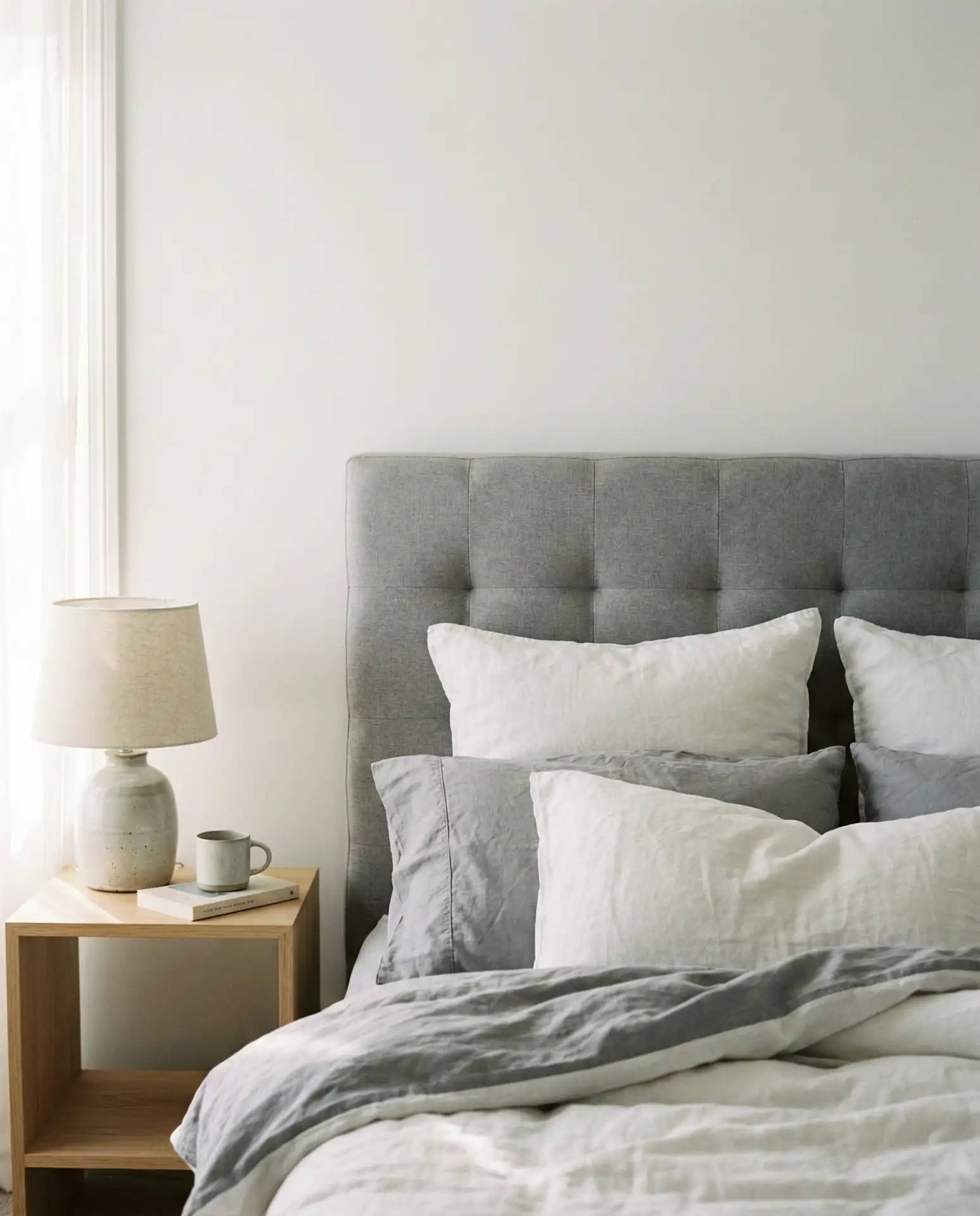
In the Midwest and Northeast, where homes often have smaller bedrooms, this scheme helps rooms feel larger and more open. The grey headboard provides just enough visual weight to prevent the space from feeling sterile, while the white walls reflect light beautifully. Budget-conscious decorators appreciate that grey upholstered headboards are widely available at stores like West Elm, Target, and Wayfair, often starting around $200 for a queen size. Adding texture through linen duvet covers or a wool rug keeps the look from feeling flat.
3. Teal Accent Wall with Warm Neutrals
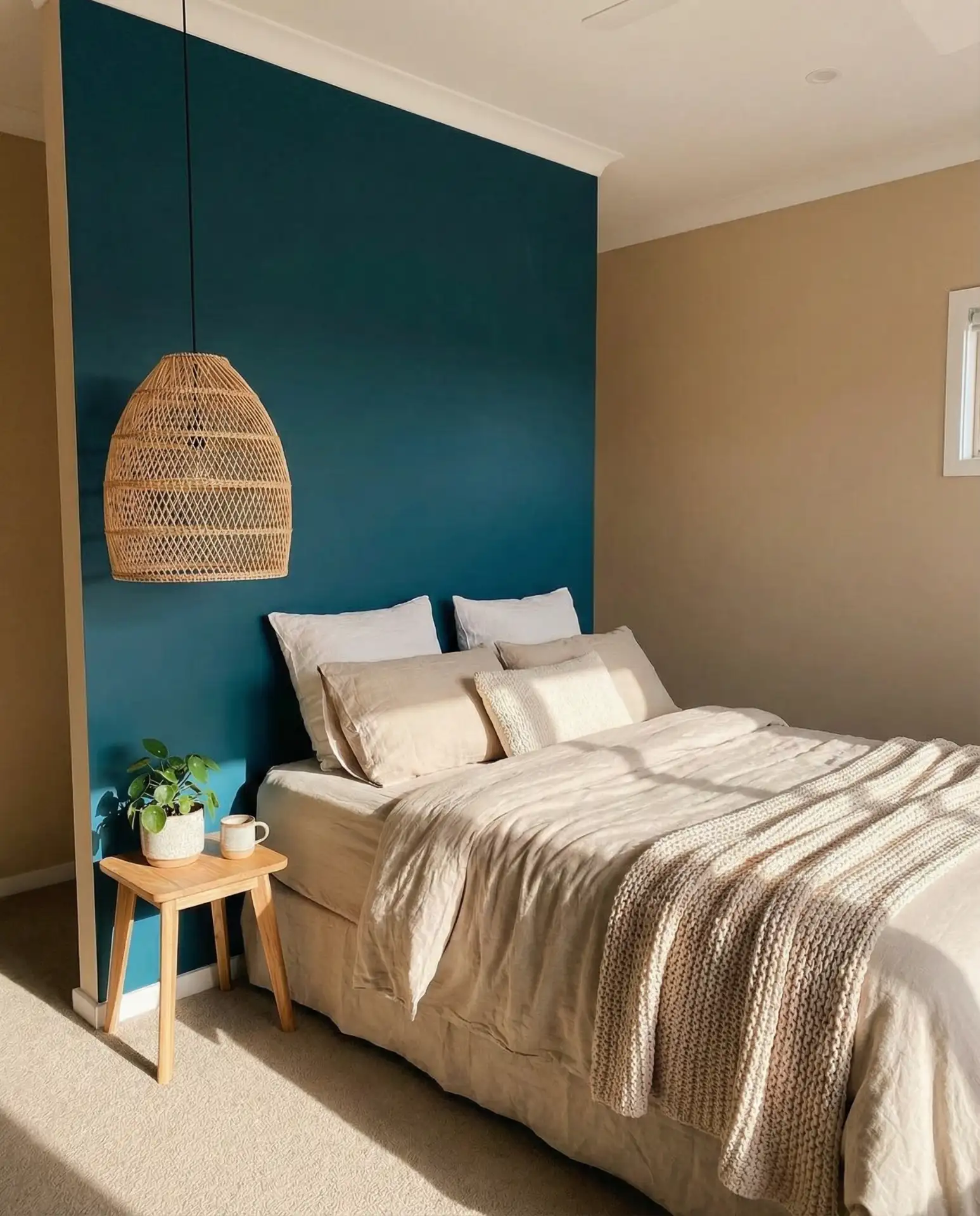
A bold teal accent wall behind the bed instantly transforms a neutral bedroom into something more dynamic and personal. Pairing it with beige, cream, or tan on the other walls keeps the look balanced rather than overwhelming. This approach is especially appealing to younger homeowners who want color but aren’t ready to commit to a fully saturated space.
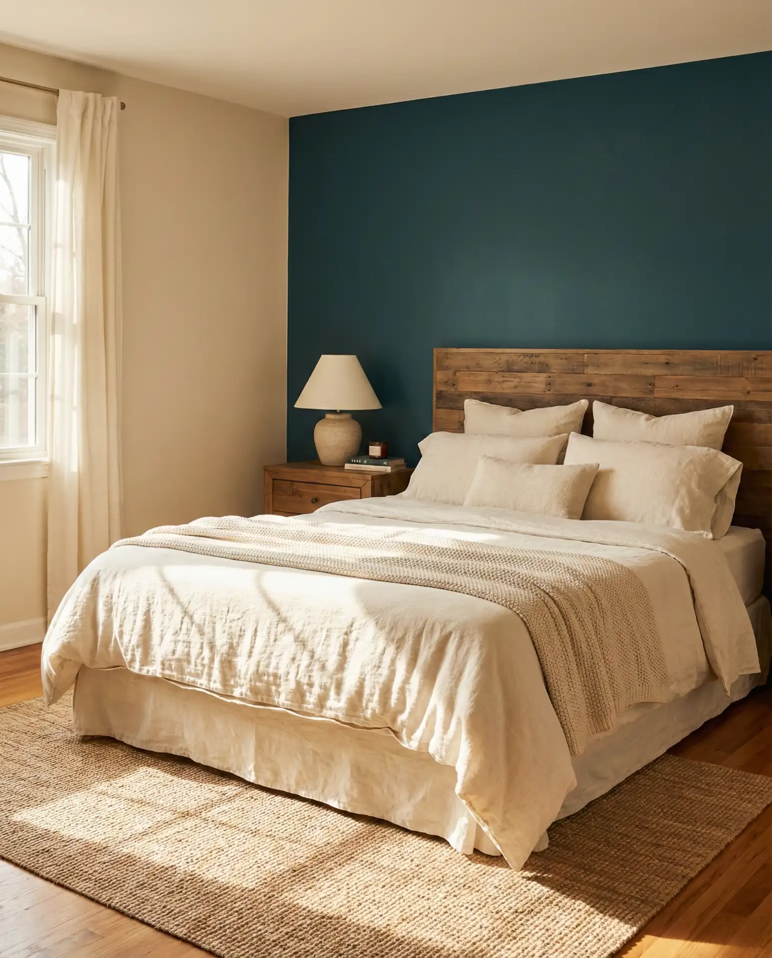
Teal works surprisingly well in both coastal and desert climates—it reads as refreshing in beach towns and grounding in arid regions like Arizona or New Mexico. A designer once told me that teal is one of the few saturated colors that doesn’t fatigue the eye over time, which is why it’s gaining traction in bedrooms. It pairs beautifully with brass or gold fixtures, natural wood furniture, and greenery. If you’re hesitant, start with a smaller wall or test the color in a corner before committing to the space behind your bed.
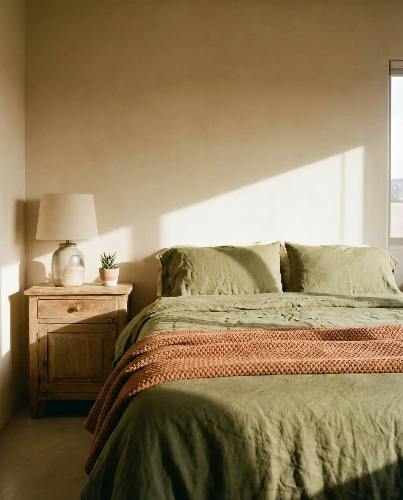
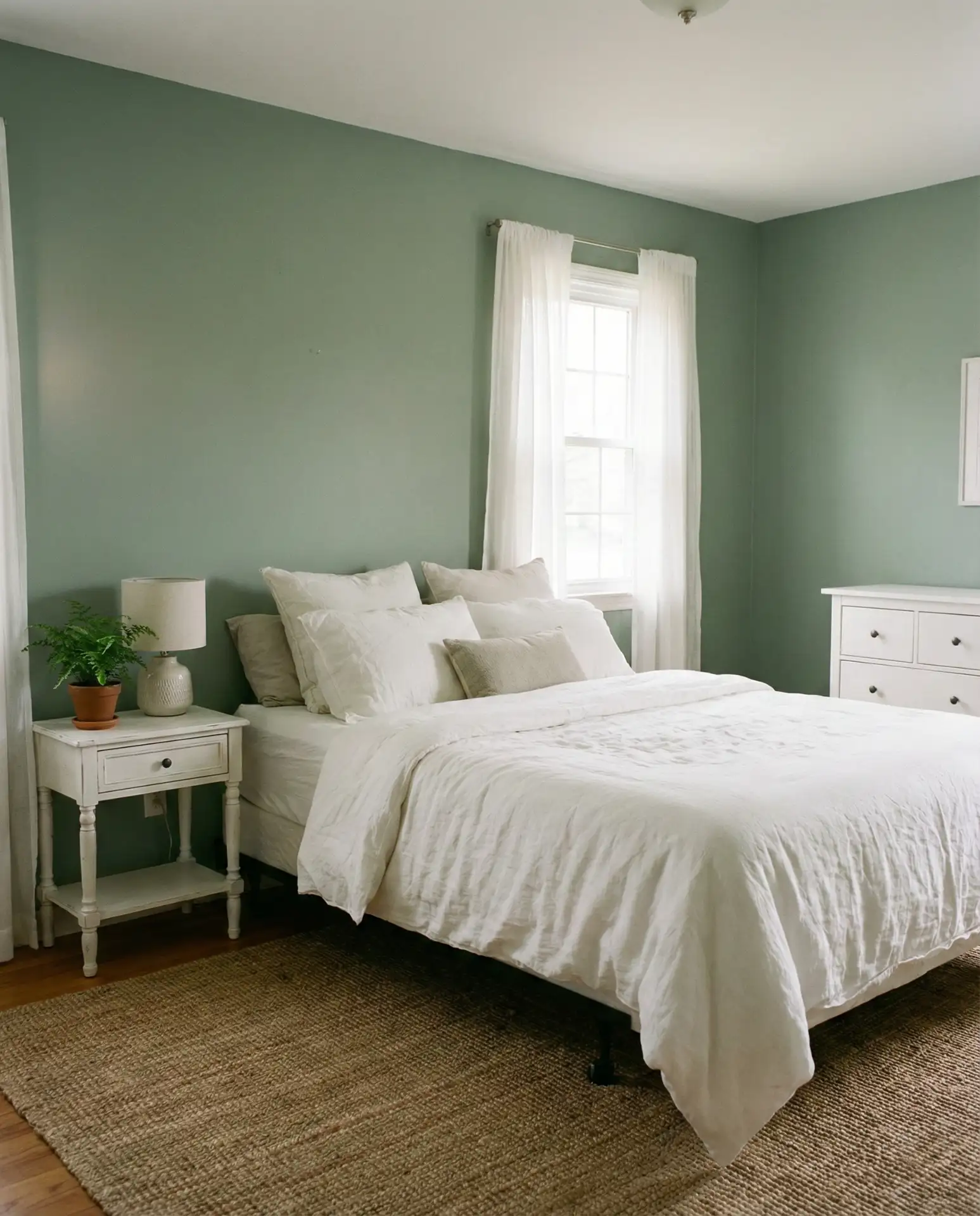
4. Olive Green and Linen Neutrals
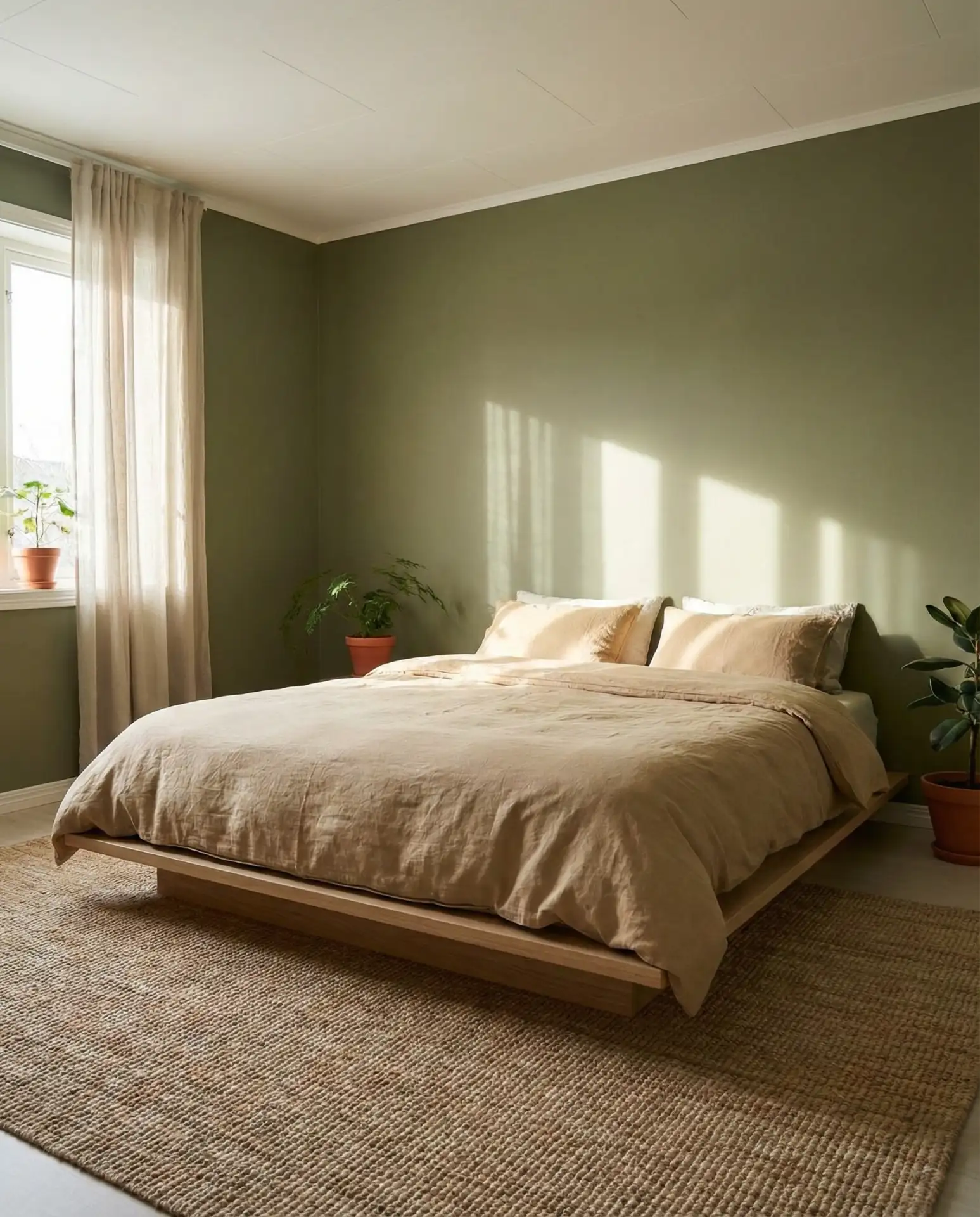
An olive green palette rooted in earthy tones brings a grounded, organic feel to bedrooms, especially when combined with linen textures and light wood. This scheme is perfect for those seeking a connection to nature without going full forest or jungle. The muted green reads as sophisticated rather than bold, making it a favorite for modern spaces that lean toward Scandinavian or Japanese-inspired design.
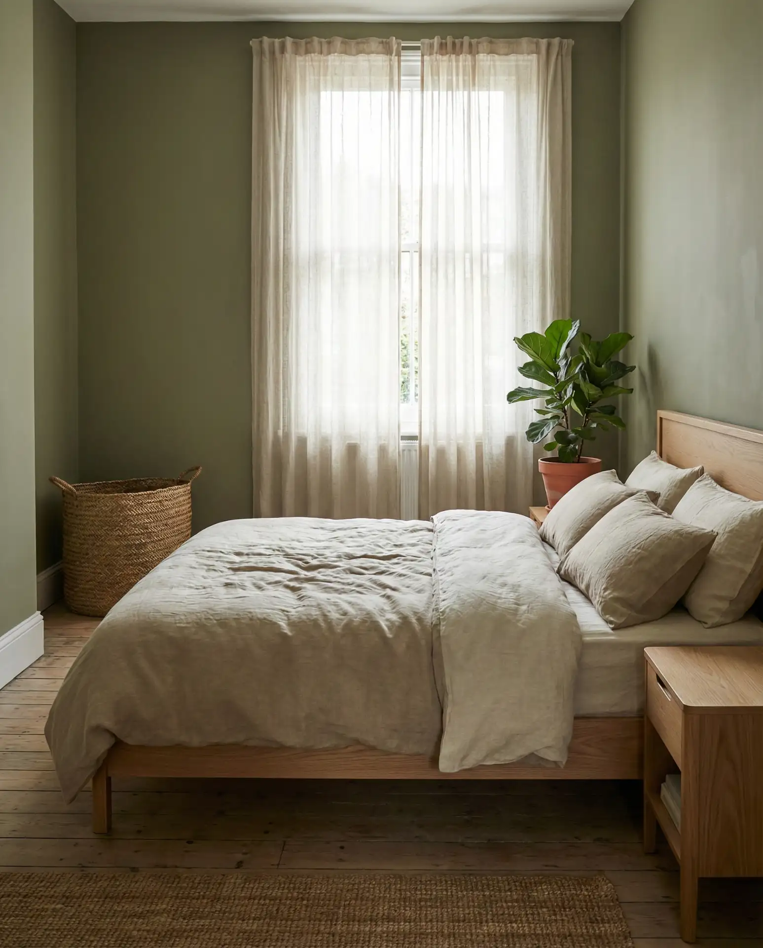
Olive green works best in rooms with good natural light, as it can feel heavy in darker spaces. Many American homeowners are choosing this color for bedrooms that face east or south, where morning and midday sun keep the space bright. It’s also a smart choice for guest bedrooms, as it feels welcoming without being too personalized. Budget tip: Benjamin Moore’s “Wethersfield Moss” and Sherwin-Williams’ “Olive Grove” are both excellent olive shades that run around $70 per gallon and cover well in two coats.
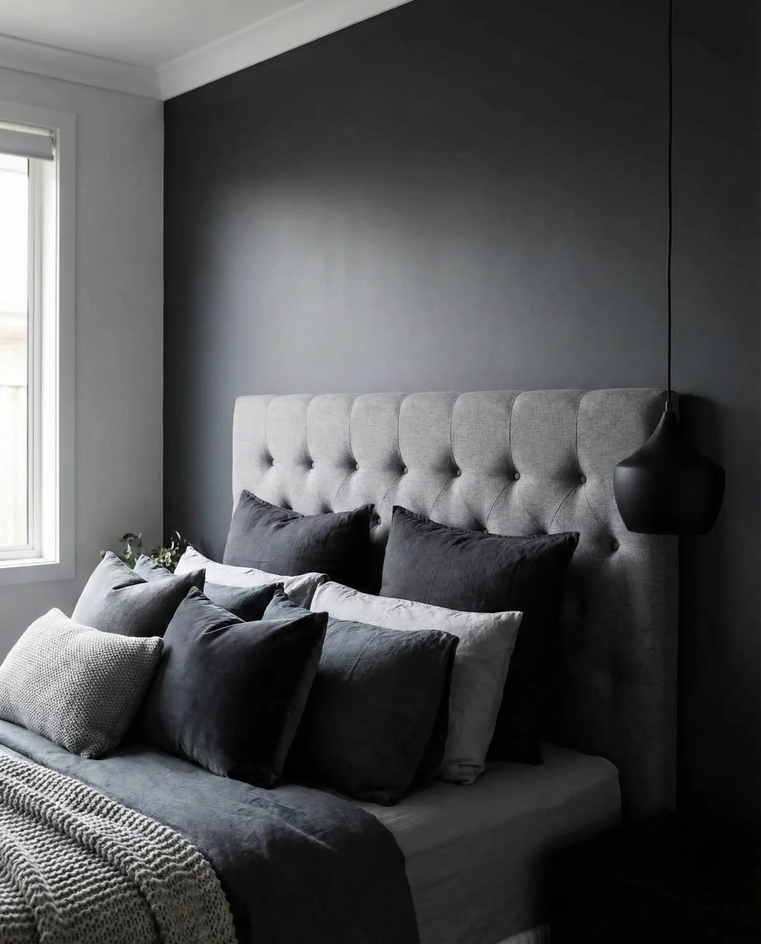
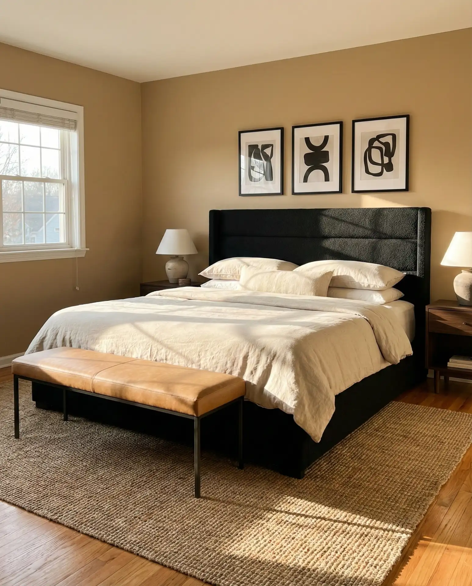
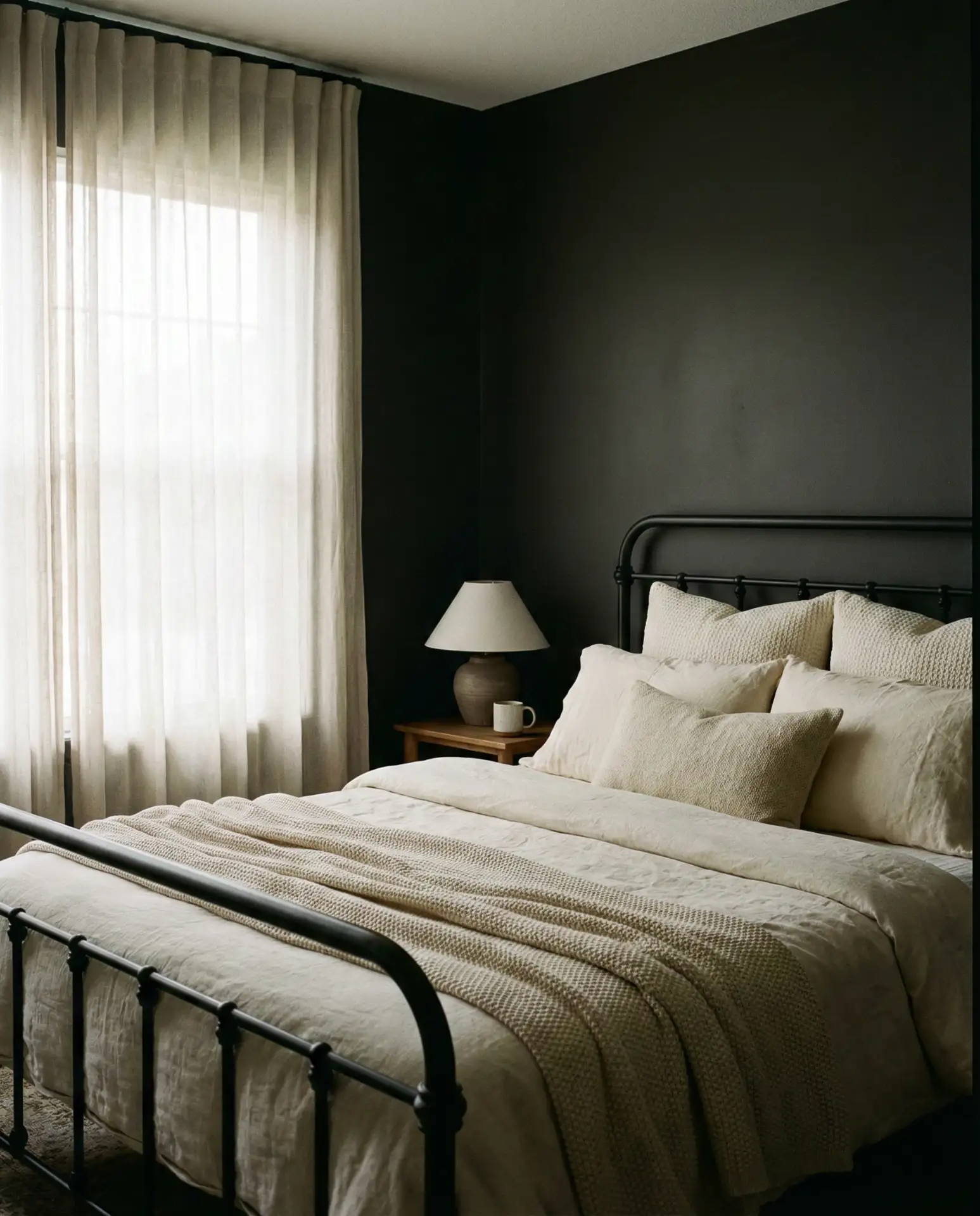
5. Black Headboard with Bright White Contrast
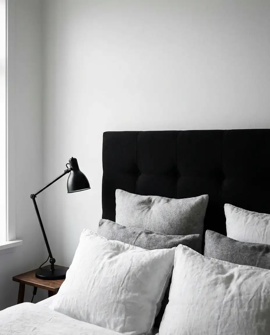
A black headboard creates high-impact contrast in a white or light-walled bedroom, offering a classy and architectural focal point. This scheme works beautifully in modern homes and lofts where clean lines and bold contrasts define the aesthetic. It’s also surprisingly versatile—you can soften it with warm textiles or lean into the drama with metallic accents and sculptural lighting.
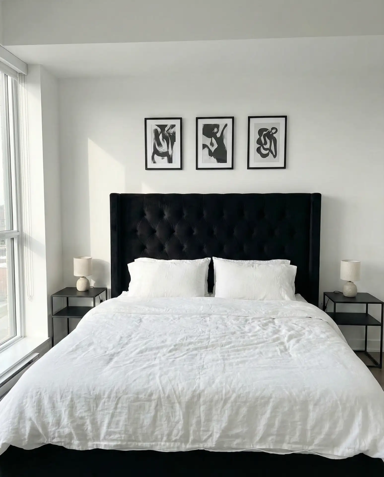
This look is especially popular in urban apartments and townhouses, where space is limited but style expectations are high. The black headboard grounds the room and prevents an all-white space from feeling cold or clinical. Real homeowner behavior shows that people often add warmth through wood nightstands, brass lamps, or a jute rug to balance the starkness. If you’re worried about the room feeling too masculine, incorporate soft textures like velvet cushions or a chunky knit throw.
6. Gray Headboard in a Monochrome Palette
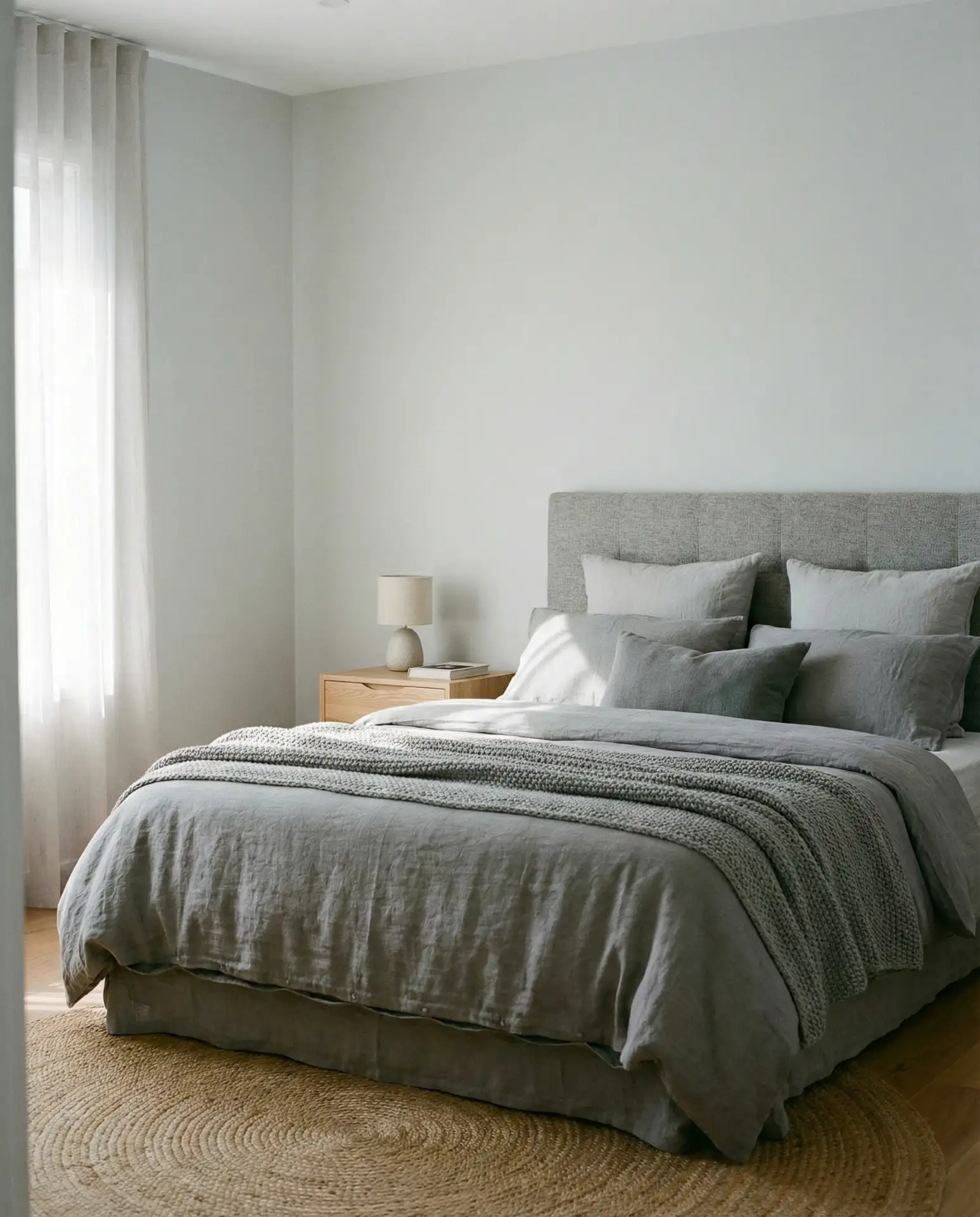
A gray headboard set against medium to light gray walls creates a sophisticated monochrome scheme that’s both cozy and refined. Layering different shades of grey with varied textures—linen, velvet, wool—adds depth without introducing color. This palette is ideal for those who appreciate a neutral bedroom that still feels intentional and designed.
Where it works best: in Pacific Northwest homes where natural light is often soft and diffused, or in modern condos where a restrained palette complements architectural features. The key is to avoid flat, builder-grade gray—choose shades with warm or cool undertones that complement your lighting. A friend recently painted her Seattle bedroom in Benjamin Moore’s “Chelsea Gray” with a slightly darker gray headboard, and the layered effect feels incredibly calming. Don’t skip texture here; it’s what prevents the space from feeling dull.
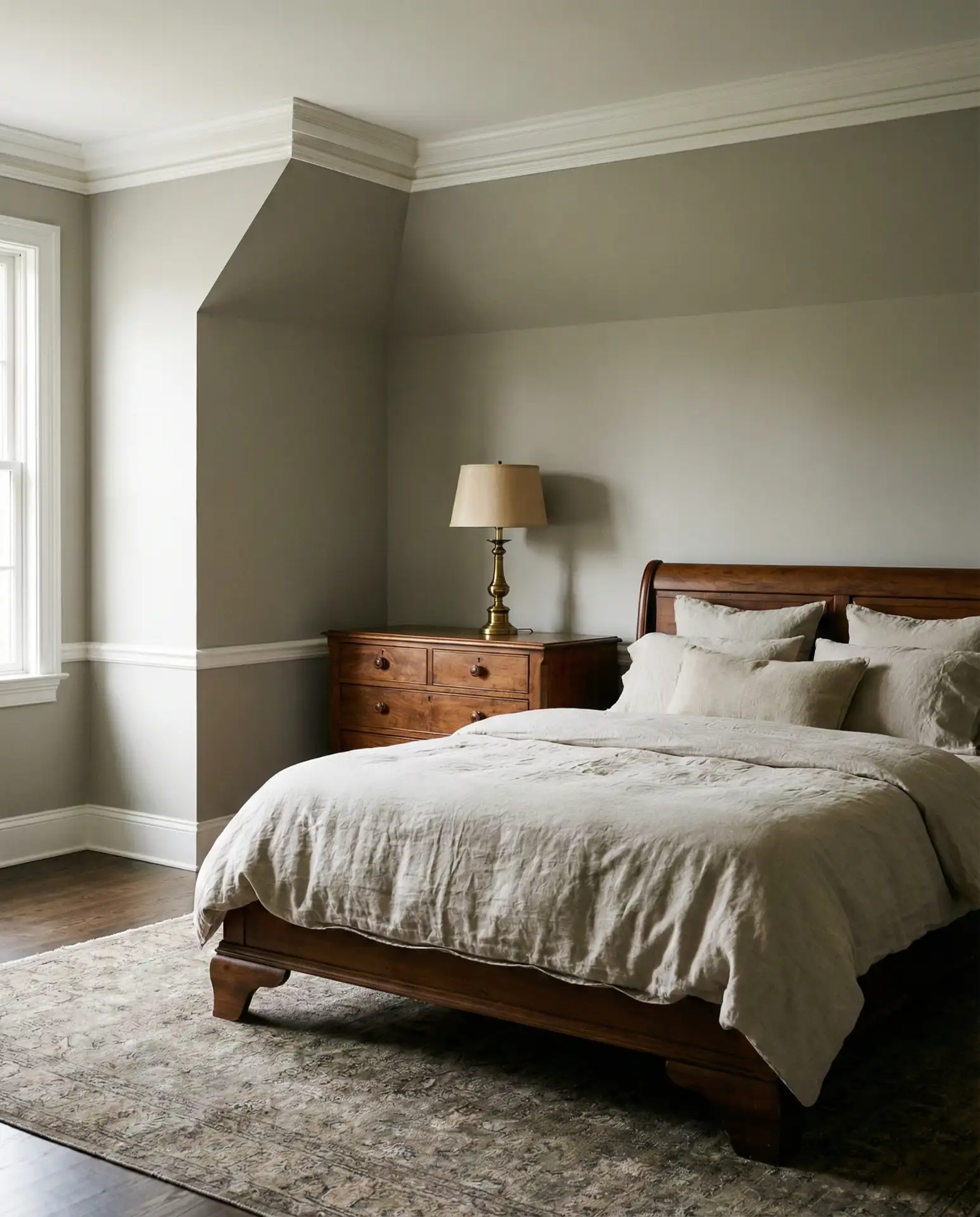
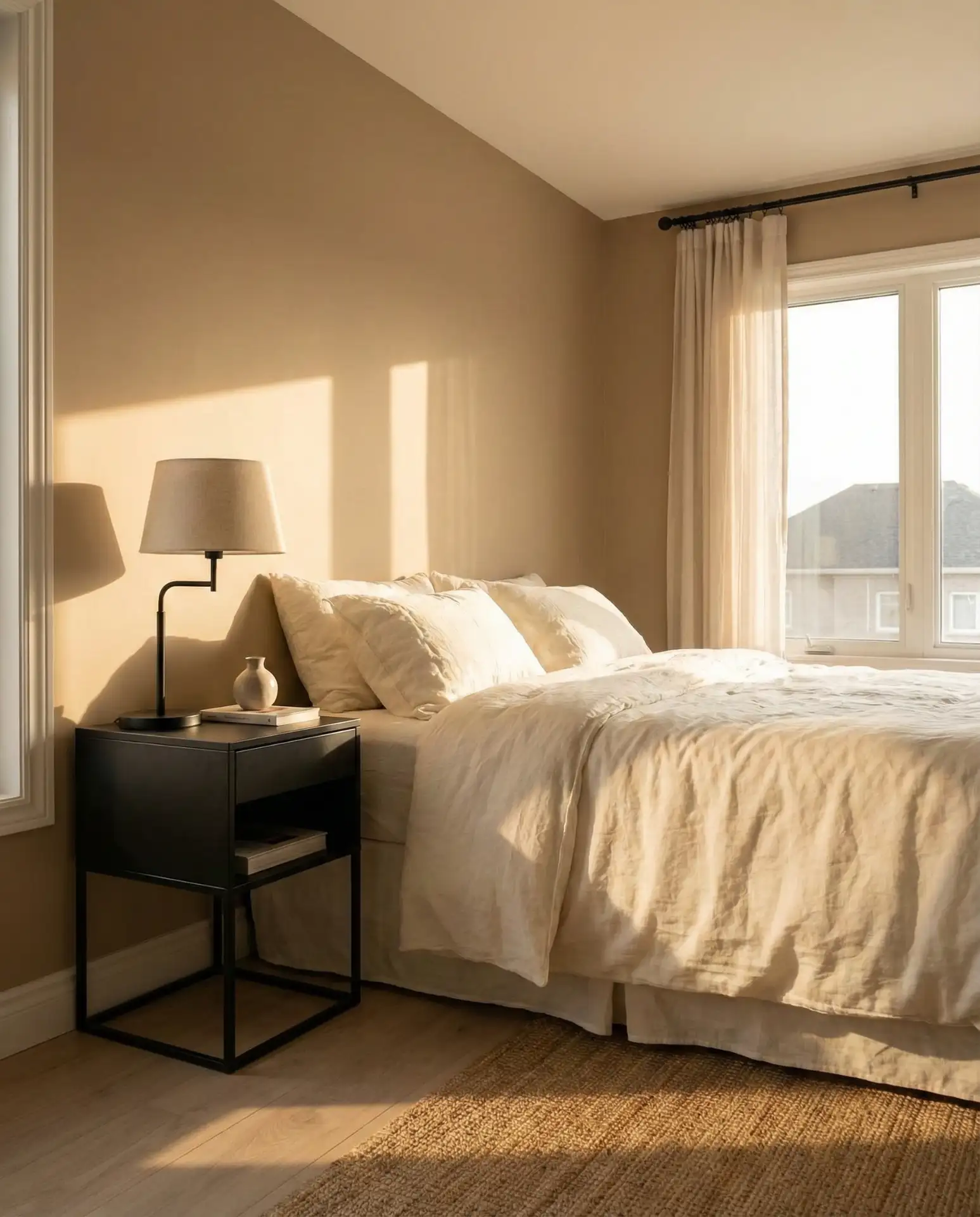
7. Beige Headboard with Warm Whites
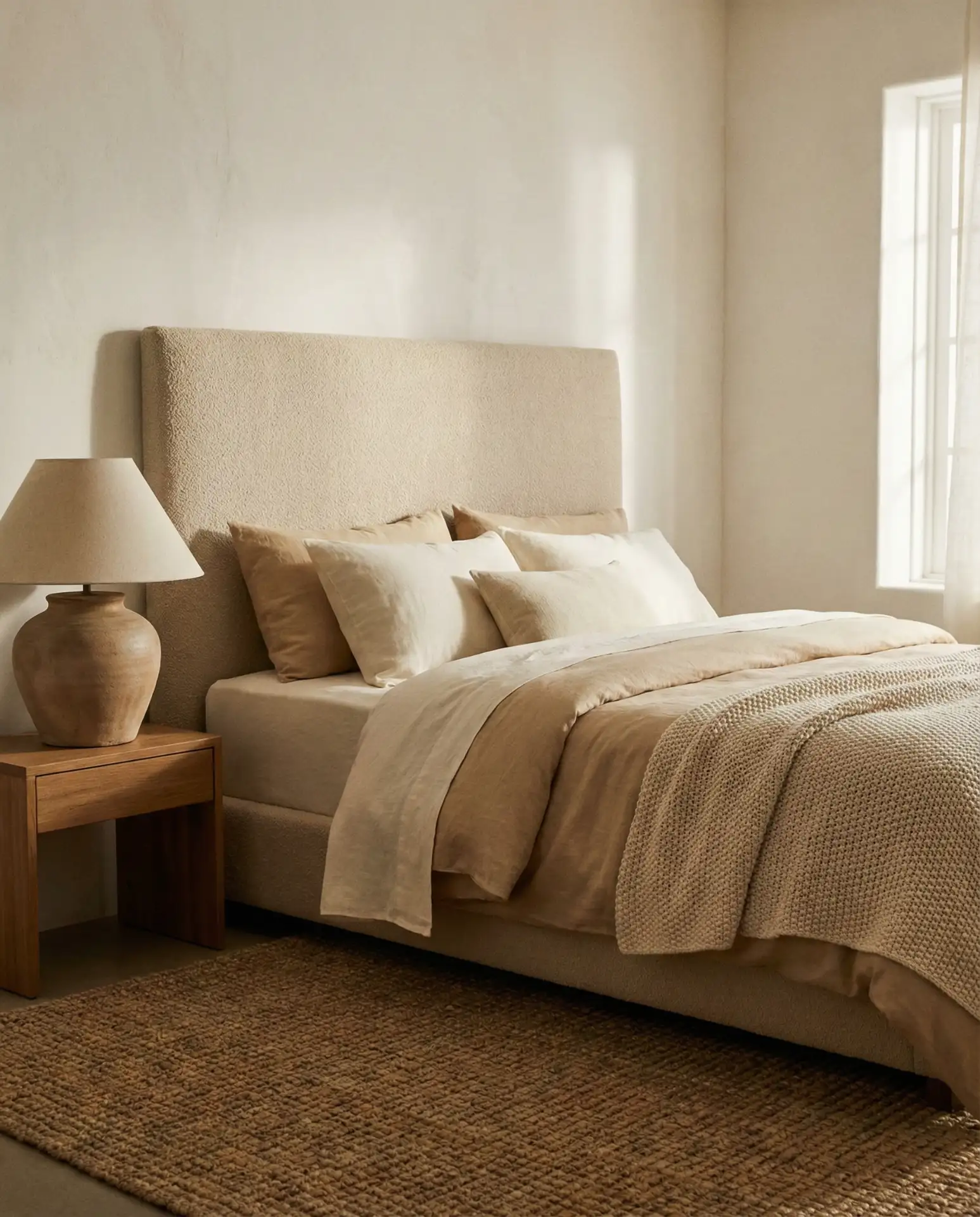
A beige headboard paired with warm white or ivory walls is one of the most cozy neutral schemes available, offering a soft, enveloping feel. This palette is incredibly forgiving—it works with almost any wood tone, hides imperfections, and creates a serene backdrop for sleep. It’s also one of the most Googled ideas for couples renovating their primary bedroom.
This scheme has a practical advantage: it ages gracefully. As paint and fabric naturally fade over time, the warm tones blend rather than clash. Many homeowners in the South, where sunlight is strong, prefer this palette because it doesn’t show sun damage as harshly as cooler whites or grays. Expert commentary suggests choosing a beige with slight pink or yellow undertones to keep it from looking washed out. Add interest with patterned throw pillows, a textured blanket, or a piece of statement art above the bed.
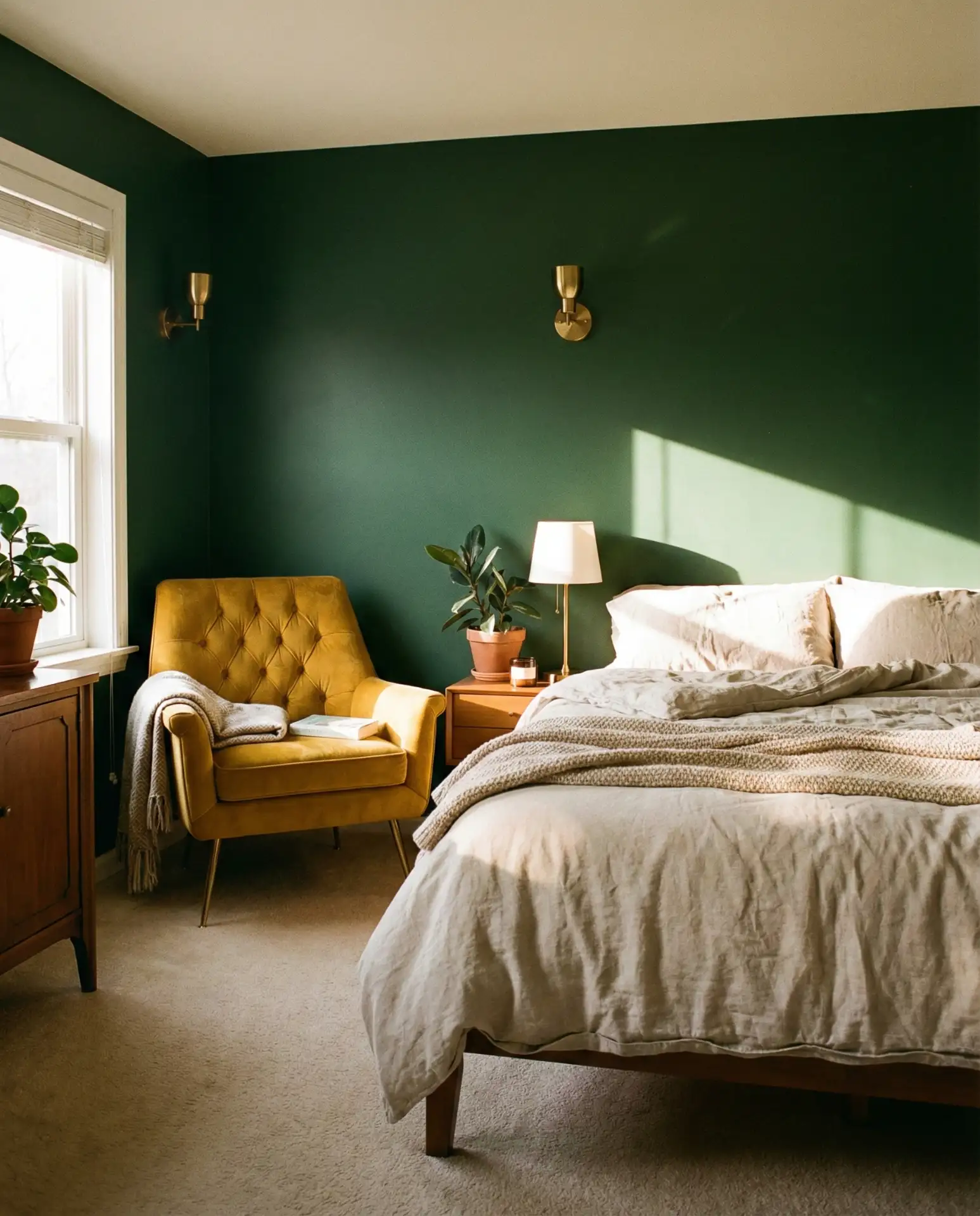
8. Forest Green Accent Wall
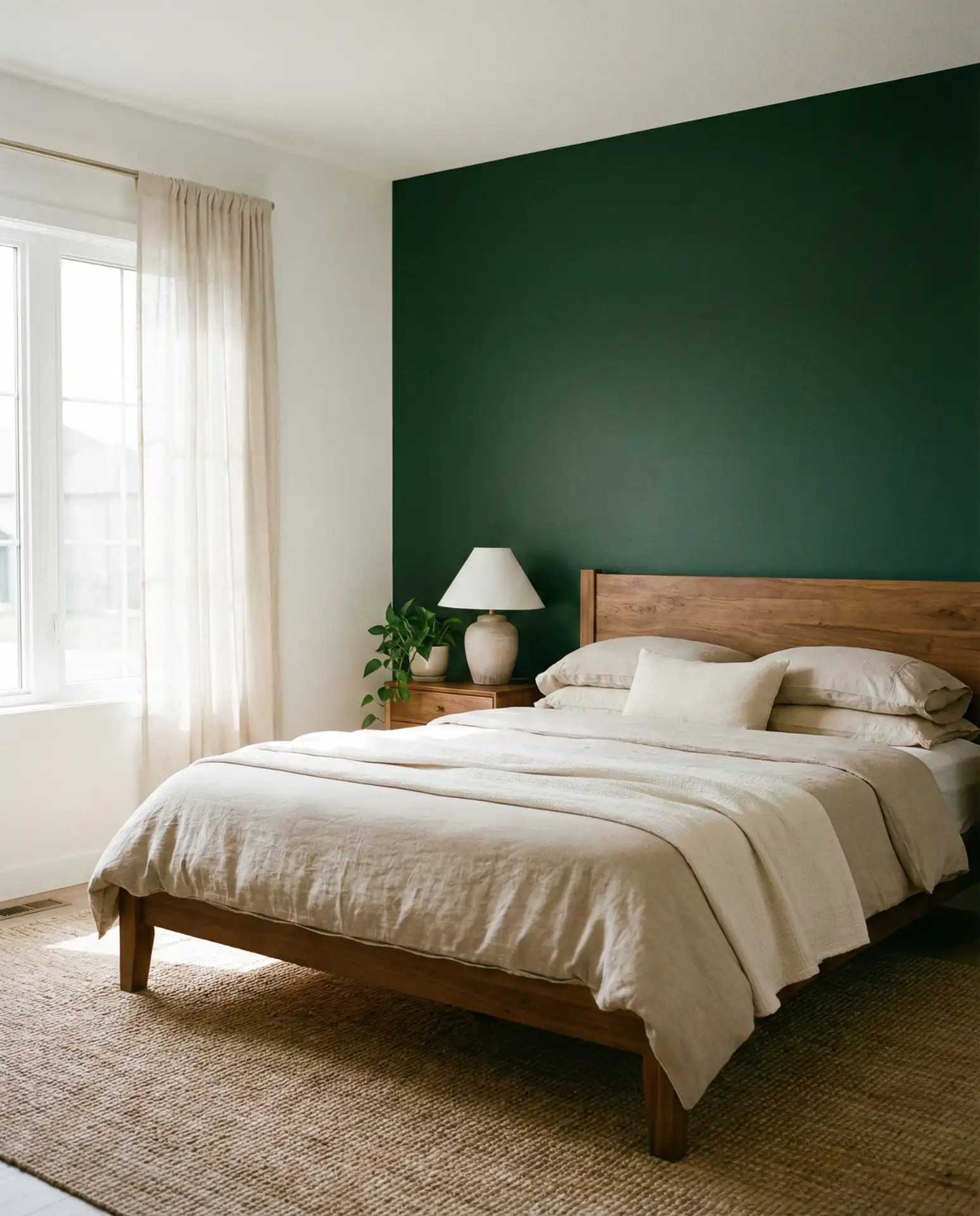
A forest green accent wall delivers a bold, nature-inspired statement that feels both grounding and luxurious. This dark green hue works particularly well behind the bed, where it creates a dramatic backdrop without overwhelming the room. It’s a favorite among design-savvy Americans who want to bring the outdoors in and are drawn to the richness of jewel tones.
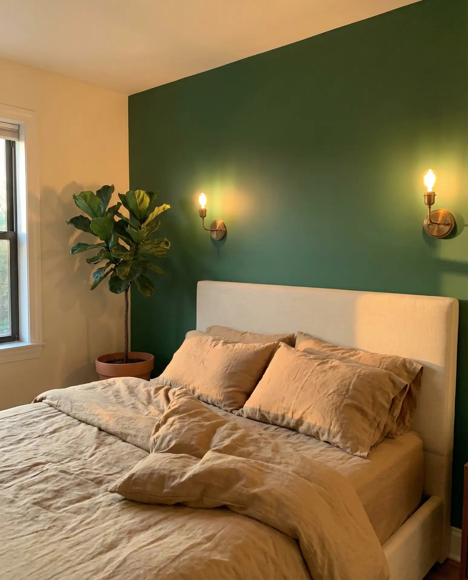
A common mistake is pairing forest green with too many other dark colors, which can make the space feel cave-like. Instead, balance it with plenty of white or cream, natural wood, and good lighting—both overhead and task. In New England and the Pacific Northwest, where evergreen landscapes are part of daily life, this color feels especially resonant. Budget angle: a single gallon of quality forest green paint (around $60-80) can cover a typical accent wall, making this a high-impact, low-cost update.
9. Blue and White Coastal Calm
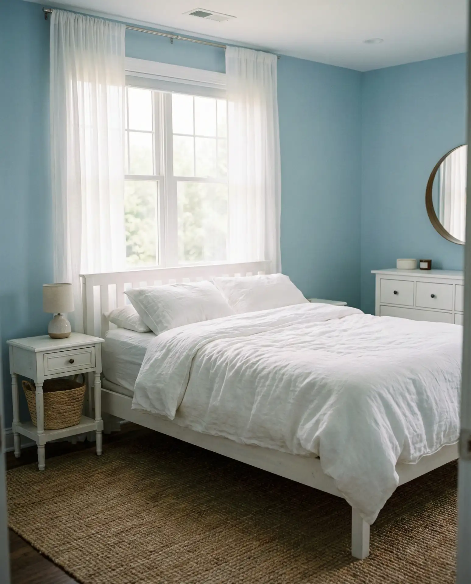
A soft blue and white palette is a perennial favorite for bedrooms, evoking coastal tranquility and timeless appeal. Whether you choose powder blue, sky blue, or a slightly deeper cerulean, pairing it with crisp white trim and linens creates a relaxing retreat. This scheme is especially popular in beach towns and waterfront properties but works just as well inland for those craving a serene escape.
In Southern California and Florida, this palette is practically a regional signature, but it’s also making a comeback in Midwestern suburbs where families want a calming, family-friendly bedroom. Real homeowner behavior shows that people often add natural fiber rugs, woven baskets, and beach-inspired art to reinforce the coastal theme. One small tip: if your blue reads too cool or stark, warm it up with a few honey-toned wood pieces or a cream throw blanket.
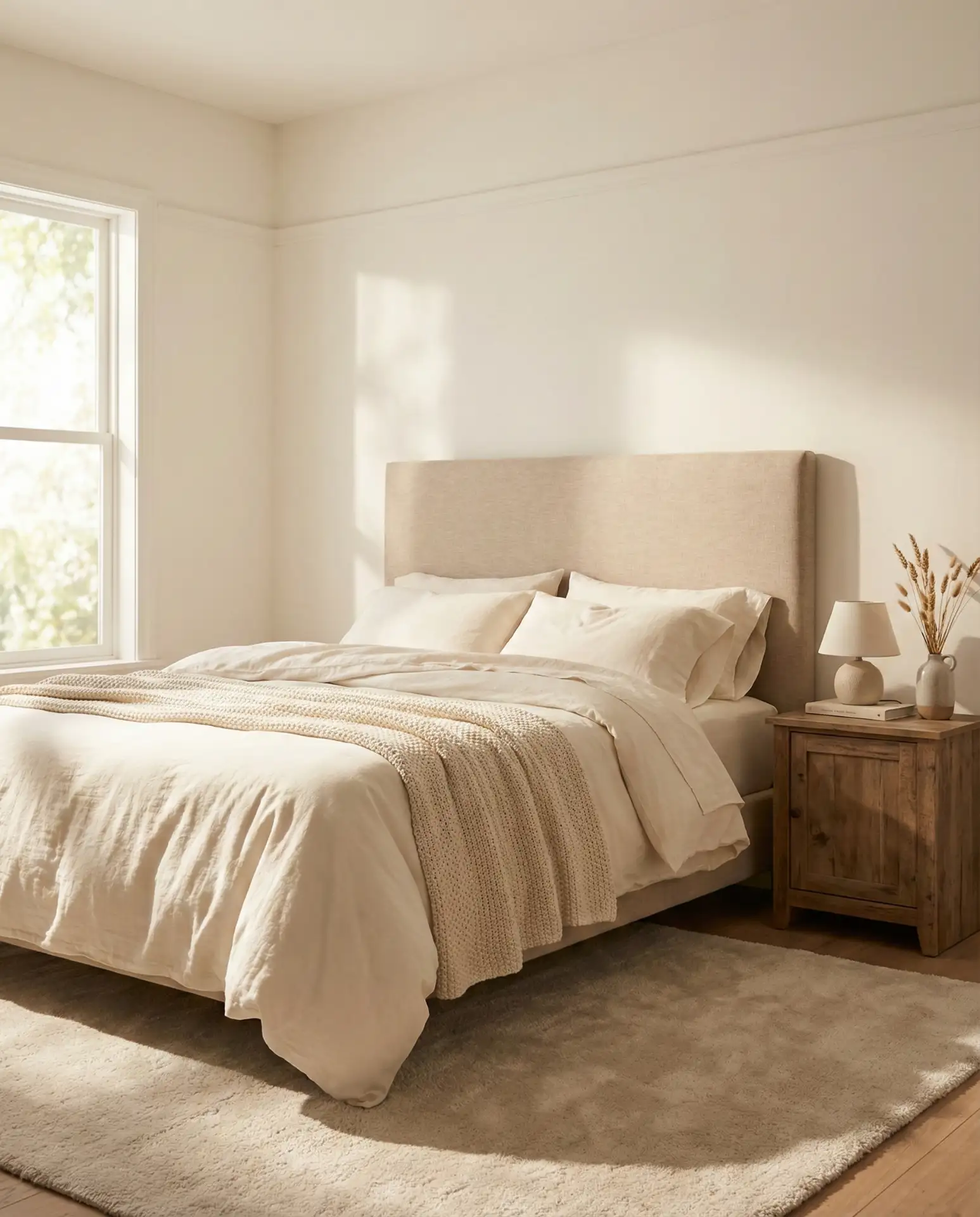
10. Cozy Neutral Layers
A cozy neutral scheme built on layers of beige, tan, cream, and soft white creates a bedroom that feels like a warm hug. This approach prioritizes texture over color—think linen duvet covers, wool throws, velvet cushions, and woven rugs. It’s one of the most sought-after ideas for anyone designing a space meant for rest and rejuvenation.
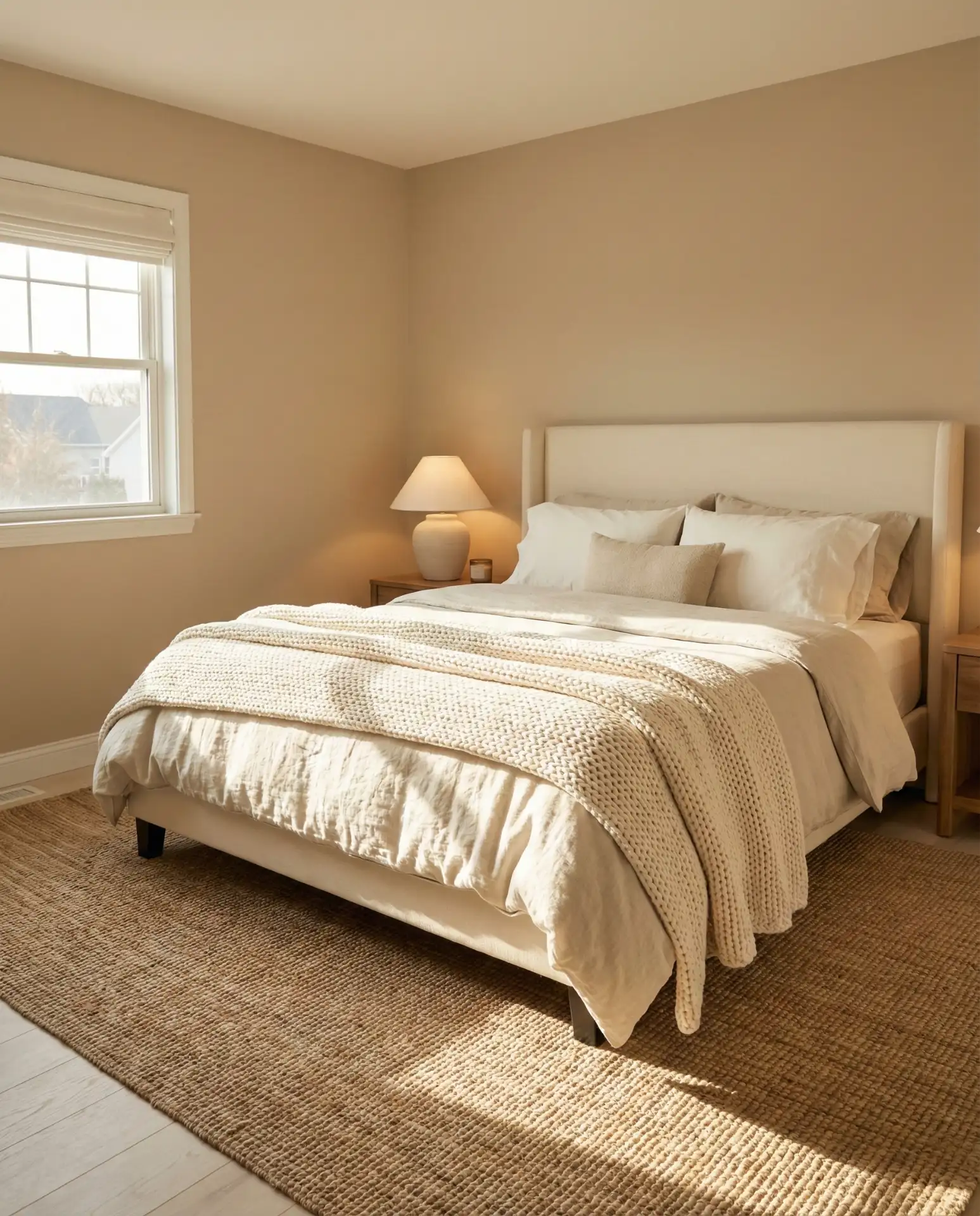
Where it works best: in colder climates like Minnesota, Montana, or Maine, where bedrooms need to feel like a refuge during long winters. The key to success is variety in texture—smooth, nubby, soft, structured—so the eye has something to explore even in a limited color range. Many decorators add a single accent color (sage green, dusty rose, or terracotta) in small doses through art or a single pillow to keep the look from feeling too uniform.
11. Modern Black and Tan Contrast
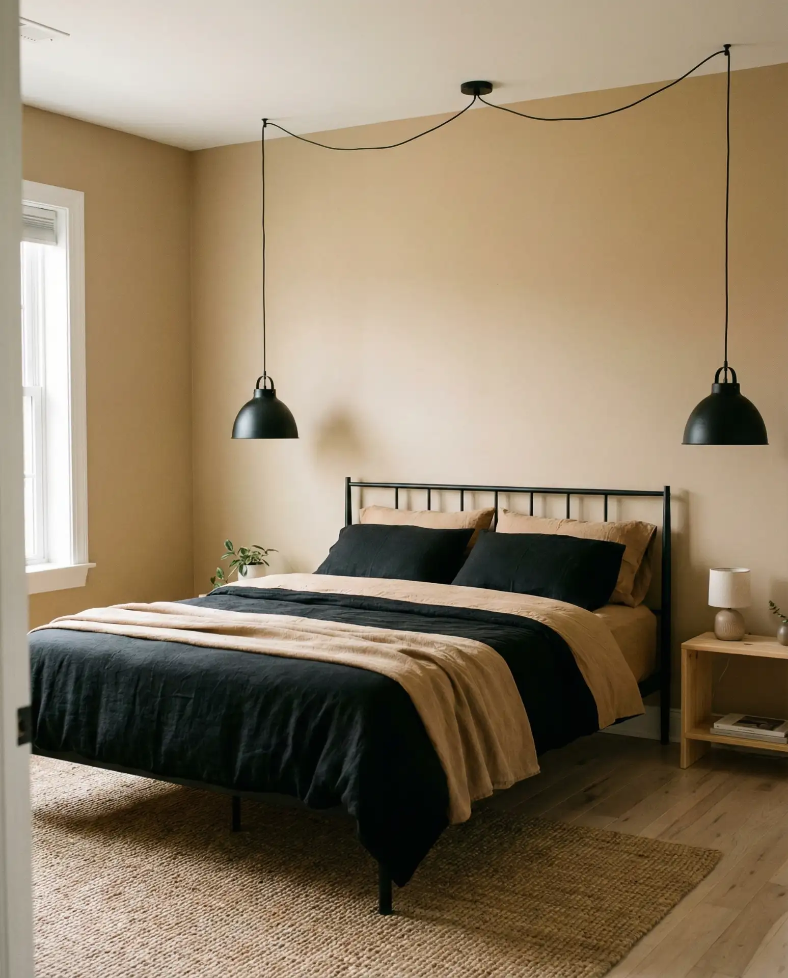
This modern palette pairs matte black accents—headboard, lighting, frames—with warm tan or camel walls for a look that’s both sophisticated and grounded. It’s a favorite for men designing bachelor pads or for couples who want a bedroom that feels polished rather than sweet. The contrast between the deep black and earthy tan creates visual interest without relying on bright colors.
An interior designer once mentioned that this scheme is ideal for those who want a bedroom that doesn’t read as “decorated” but still feels complete. The tan softens the harshness of black, while the black prevents the tan from feeling too soft or dated. It works especially well in urban lofts and contemporary homes with high ceilings and clean lines. Add texture through a leather chair, a wool rug, or linen curtains to keep the space from feeling too austere.
12. Cozy Charcoal and Cream
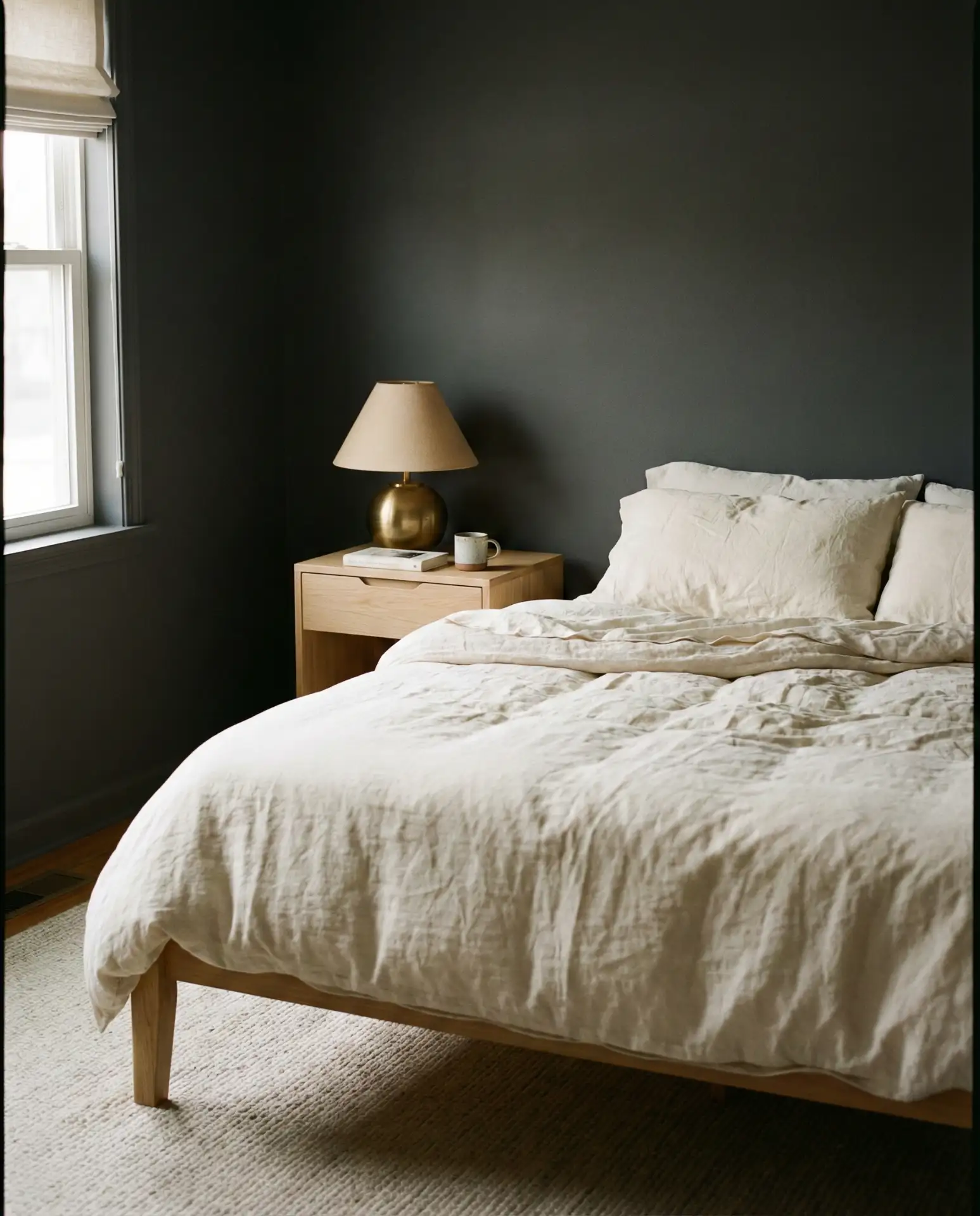
A cozy charcoal wall paired with cream bedding and accents creates a moody yet inviting bedroom perfect for deep sleep. The dark walls wrap the room in warmth, while the light textiles keep it from feeling too heavy. This is a popular choice among younger homeowners who want something more daring than beige but still relaxing and functional.
This palette works best in rooms with ample natural light—think west-facing bedrooms or spaces with large windows. Without enough light, charcoal can feel oppressive. A common mistake is choosing a charcoal with blue undertones when your lighting is warm; test samples in both morning and evening light. Many people also add plants, warm wood furniture, and soft lighting to balance the darkness and bring life to the space.
13. Dark Green and Mustard Warmth
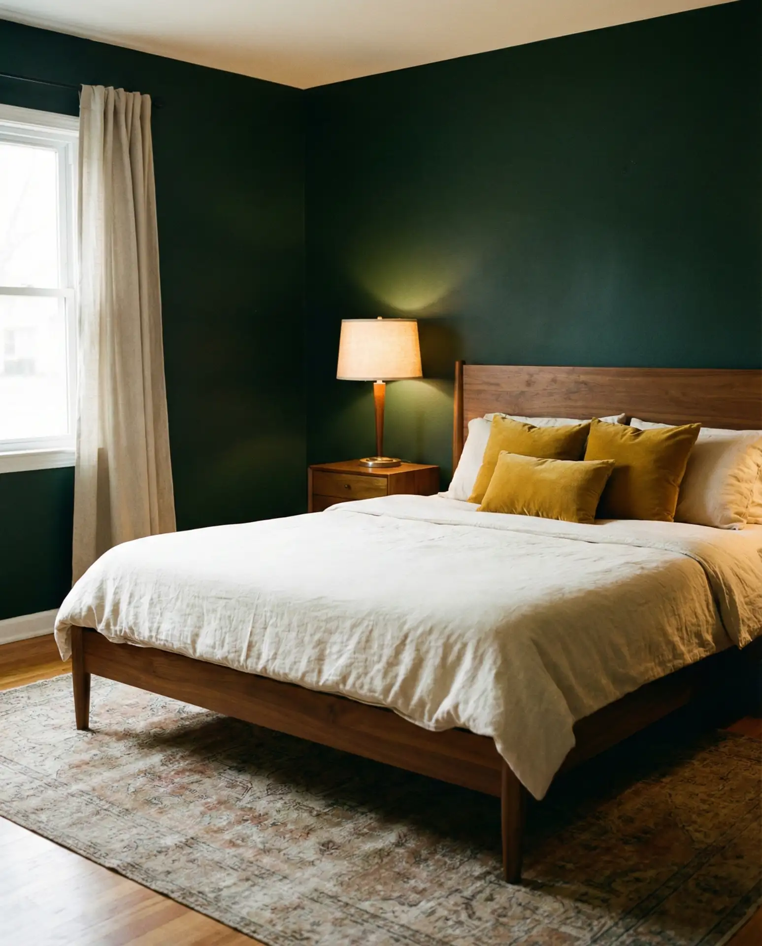
Pairing dark green walls with mustard yellow accents creates a bedroom scheme that’s rich, warm, and unexpectedly cozy. The deep green provides a grounded base while the mustard—whether in throw pillows, a blanket, or a chair—adds a shot of optimism. This combination is especially appealing to those who appreciate vintage or eclectic interiors.
This palette is popular in Portland, Austin, and other cities with a strong DIY and vintage culture. Budget tip: if you’re hesitant to commit to dark green walls, start with mustard accents and a green duvet cover or curtains to test the combination. You can always paint later. The key is to keep the mustard warm and earthy—avoid anything too bright or neon—and balance the two colors with plenty of neutrals and natural materials.
14. Classy Navy and Brass
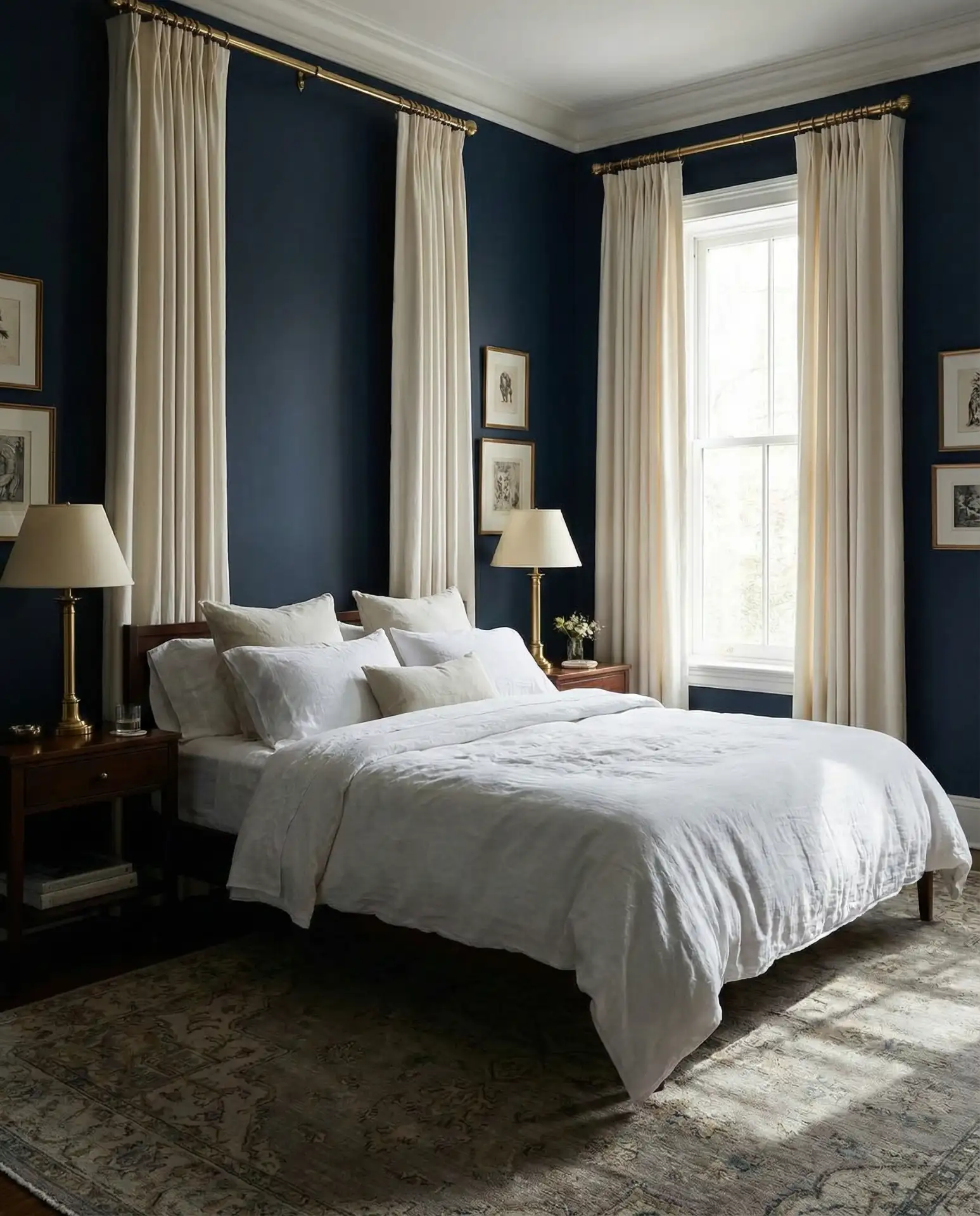
A deep navy bedroom accented with brass fixtures and hardware is undeniably classy and sophisticated. Navy walls create a cocoon-like environment that’s perfect for sleep, while brass adds warmth and a touch of glamour. This is one of the most pinned color schemes for modern traditional homes and urban apartments.
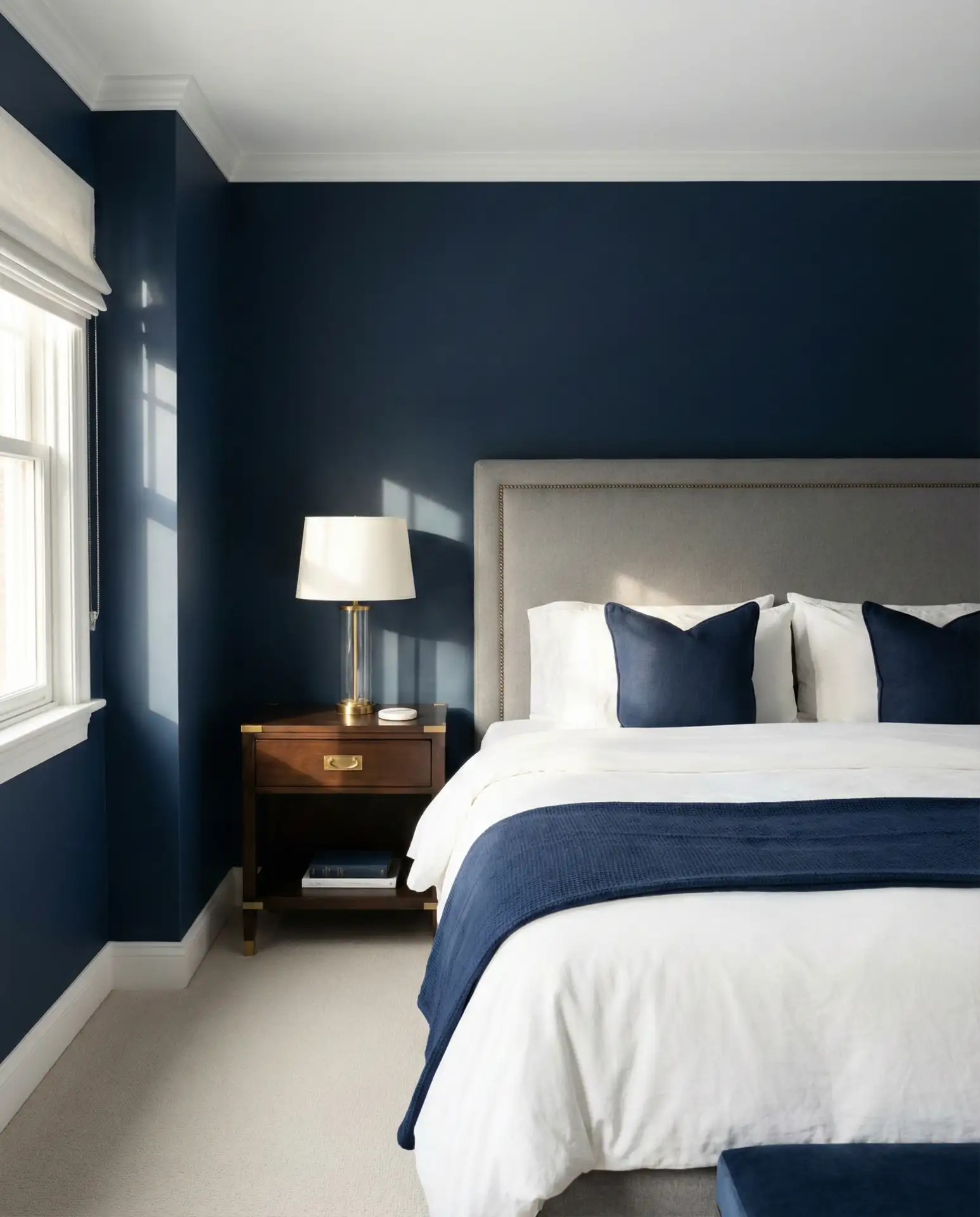
Where it works best: in historic homes, brownstones, and older apartments where architectural details like crown molding and baseboards can be highlighted in white or cream against the navy. The brass adds warmth that prevents the navy from feeling too cold or institutional. Real homeowner behavior shows that people often layer in velvet cushions, linen curtains, and art with gold frames to reinforce the luxe feel. Keep lighting layered—overhead, bedside, and accent—so the room doesn’t feel cave-like at night.
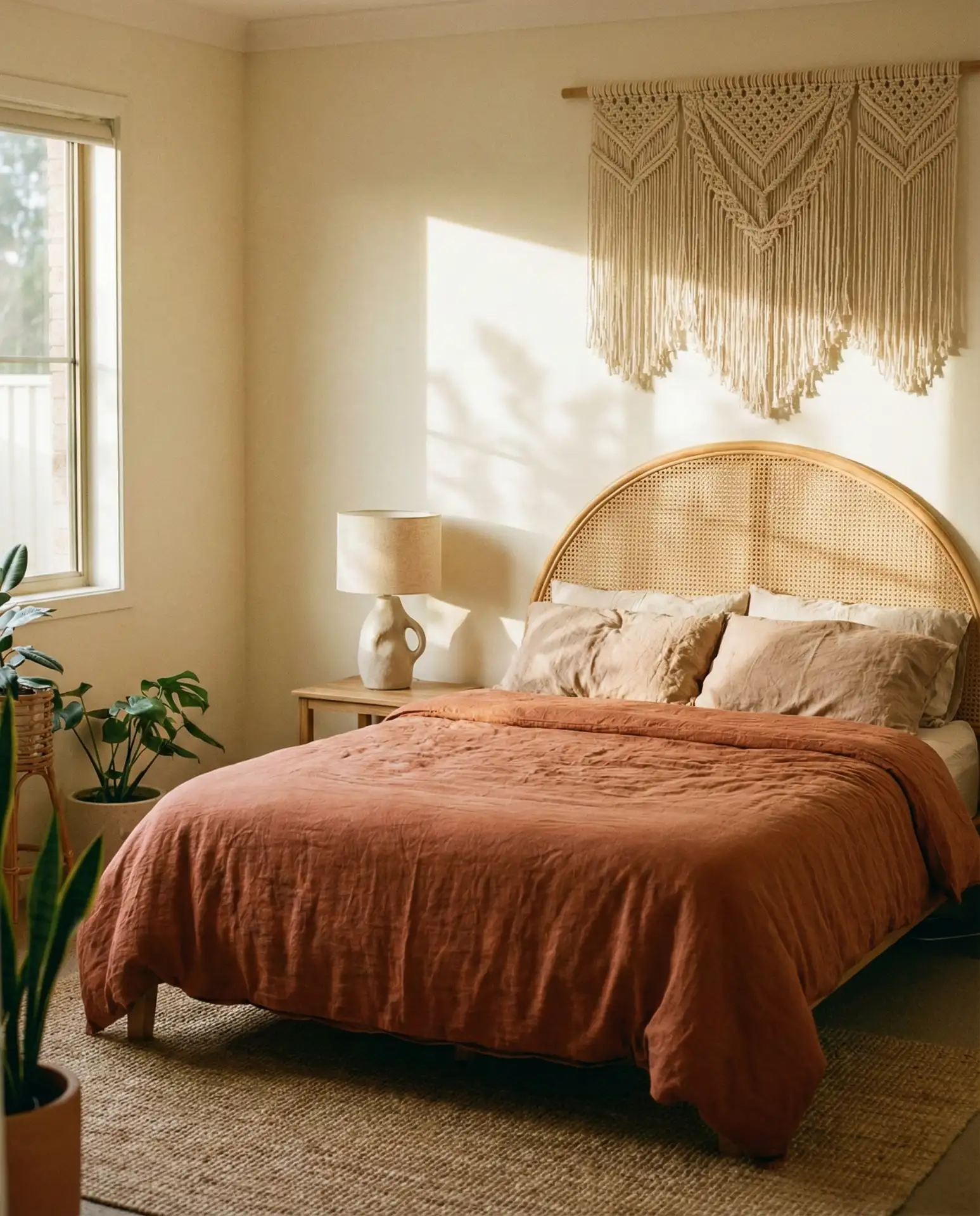
15. Olive and Terracotta Earthiness
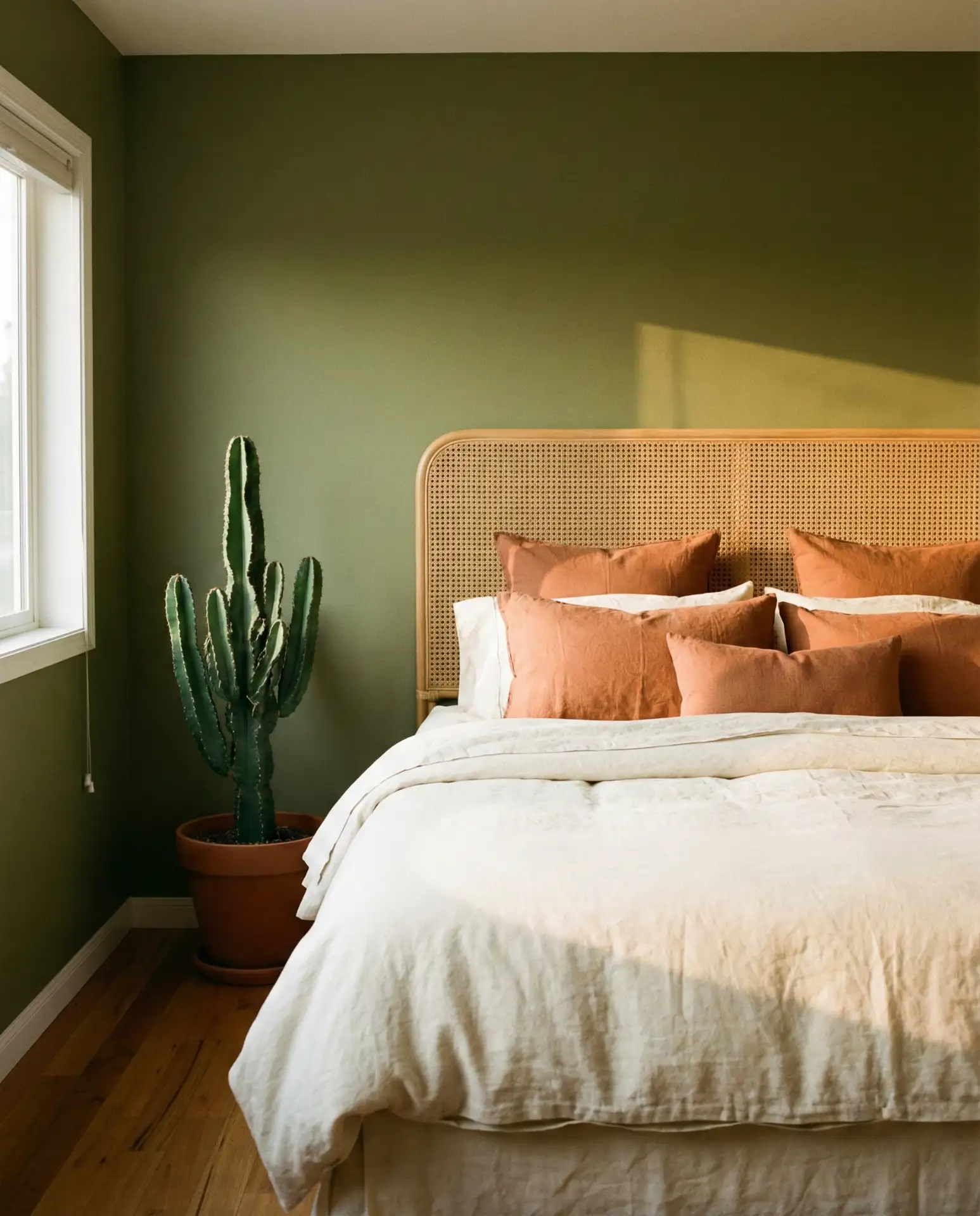
Combining olive green with terracotta brings an unmistakably earthy warmth to the bedroom, evoking sun-baked landscapes and natural materials. This palette feels both grounded and adventurous, making it a favorite for those inspired by Mediterranean, Southwestern, or California desert aesthetics. It’s a refreshing departure from cooler neutrals and works beautifully with natural wood and woven textures.
In New Mexico, Arizona, and Southern California, this palette resonates deeply with the regional landscape and architecture. A friend recently redecorated her Phoenix guest bedroom using olive walls and terracotta accents, and guests consistently comment on how restful it feels. The combination works best when you introduce plenty of natural light and avoid synthetic materials. Handwoven rugs, ceramic pottery, and linen textiles all reinforce the organic, handmade quality of the palette.
16. Grey and Blush Softness
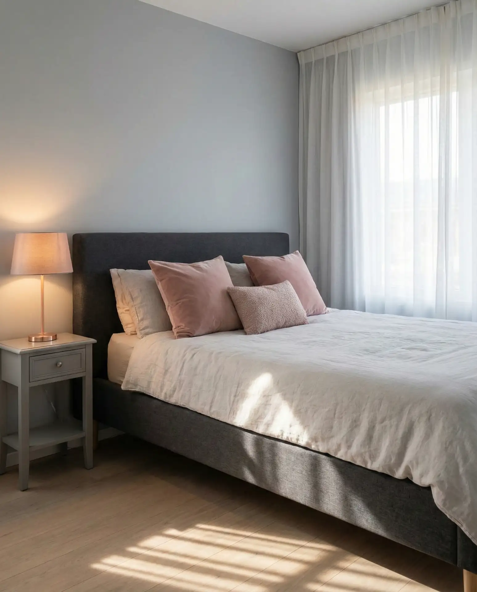
A pairing of grey walls with blush pink accents offers a soft, contemporary alternative to traditional pink bedrooms. The grey provides a neutral, calming base while the blush adds just enough warmth and femininity without feeling childish. This is a go-to scheme for young professionals and anyone looking for a modern take on a classic color pairing.
Expert commentary suggests that this palette works best when the grey has warm undertones—avoid anything too blue or cold. The blush can be introduced through bedding, artwork, or a single accent chair rather than committing to painted walls. Many homeowners in metropolitan areas like New York, Chicago, and San Francisco choose this scheme for its sophistication and versatility. It pairs beautifully with marble, brass, and glass accessories for a polished, Instagram-ready look.
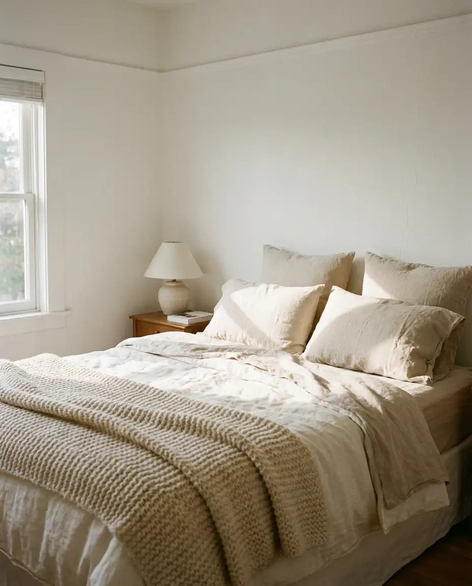
17. Neutral Linen Layers
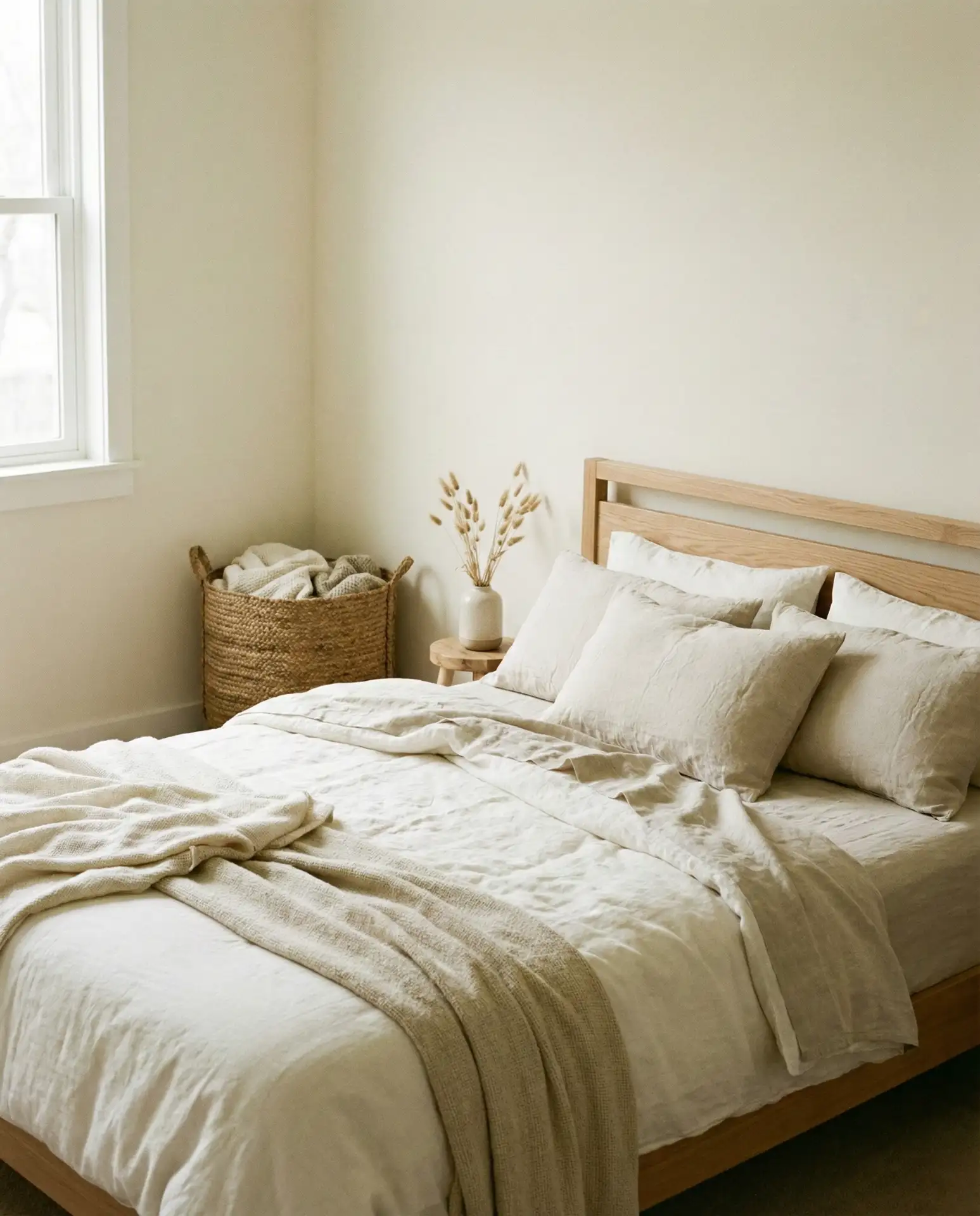
An all-neutral bedroom built on natural linen fabrics in ivory, oat, and sand creates a space that’s effortlessly relaxing and timeless. The focus here is on quality materials and subtle variations in tone rather than color contrast. This scheme is ideal for minimalists and anyone seeking a calm, uncluttered retreat.
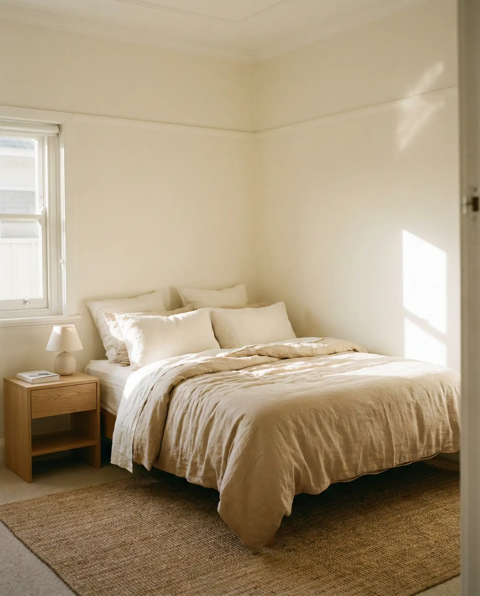
This approach has a practical side benefit: linen softens with every wash, so your bedroom actually gets more comfortable over time. In warm climates like the Southeast, linen bedding is prized for its breathability. A common mistake is choosing linen in pure white, which can show stains easily—opt for natural, undyed tones instead. To prevent the space from feeling bland, incorporate sculptural wood furniture, textured pottery, and live plants to add visual interest.
18. Men’s Modern Charcoal and Leather

A charcoal and leather scheme designed for men combines deep grey walls with leather furniture accents—a bench, chair, or headboard—for a masculine, polished look. This modern palette feels intentional and mature without being overly stark. It’s perfect for bachelor pads, home offices doubling as guest rooms, or anyone who prefers a refined, understated aesthetic.

Where it works best: in lofts, condos, and modern apartments where clean lines and quality materials are prioritized over decorative flourishes. Leather adds warmth and ages beautifully, developing a patina that enhances the room’s character over time. Budget angle: quality leather furniture is an investment, but you can start with a leather bench or chair (around $300-600) and build from there. Avoid over-accessorizing—this palette thrives on restraint and a few well-chosen pieces.
19. Guest Bedroom Sage and White
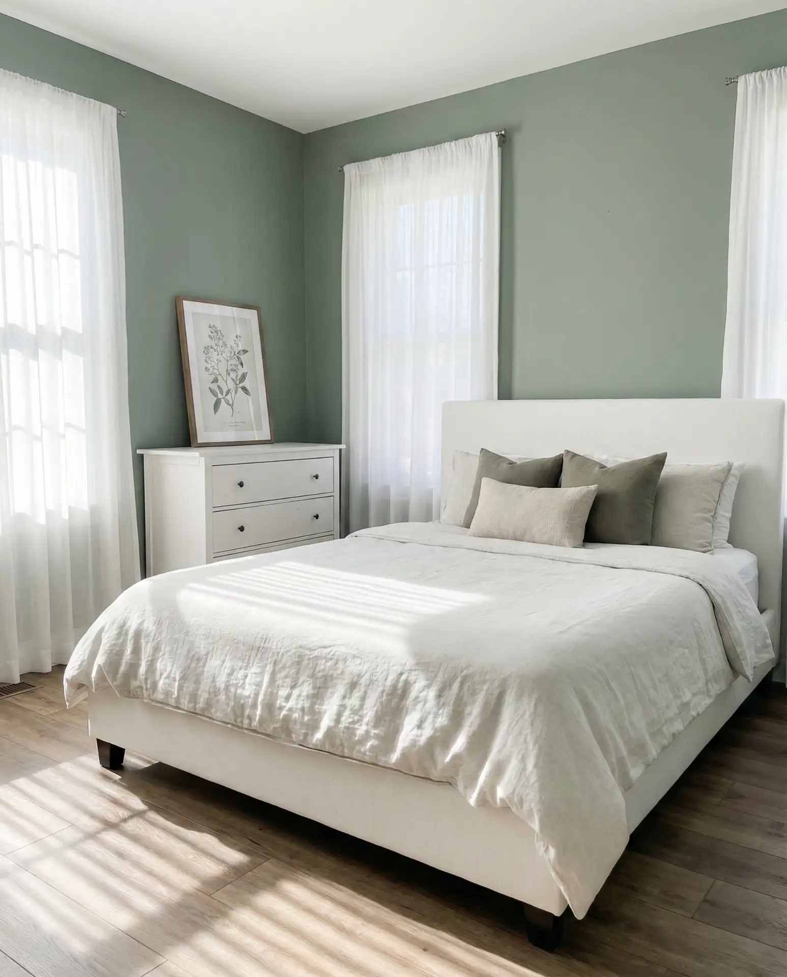
A soft sage green paired with crisp white is a universally appealing choice for a guest bedroom. Sage is calming without being too personal, making visitors feel welcomed without imposing the homeowner’s specific taste. This palette is one of the most practical ideas for multifunctional spaces that also serve as home offices or flex rooms.
Real homeowner behavior shows that people often choose this palette for guest rooms because it photographs well and makes small spaces feel larger. In suburban homes across the Midwest and Mid-Atlantic, sage and white guest bedrooms are a staple. The color is forgiving with different lighting conditions and pairs beautifully with wood, rattan, or metal furniture. To add personality without overwhelming guests, consider a single piece of local art or a vintage mirror above the dresser.
20. Farrow and Ball Inspired Sophistication
Inspired by Farrow and Ball paint colors, this scheme uses complex, layered hues like “Elephant’s Breath” grey-beige or “Green Smoke” grey-green for walls, paired with carefully chosen white trim. These are paints with depth and character, creating a classy backdrop that feels both historic and contemporary. The palette appeals to design enthusiasts who appreciate nuance and craftsmanship.
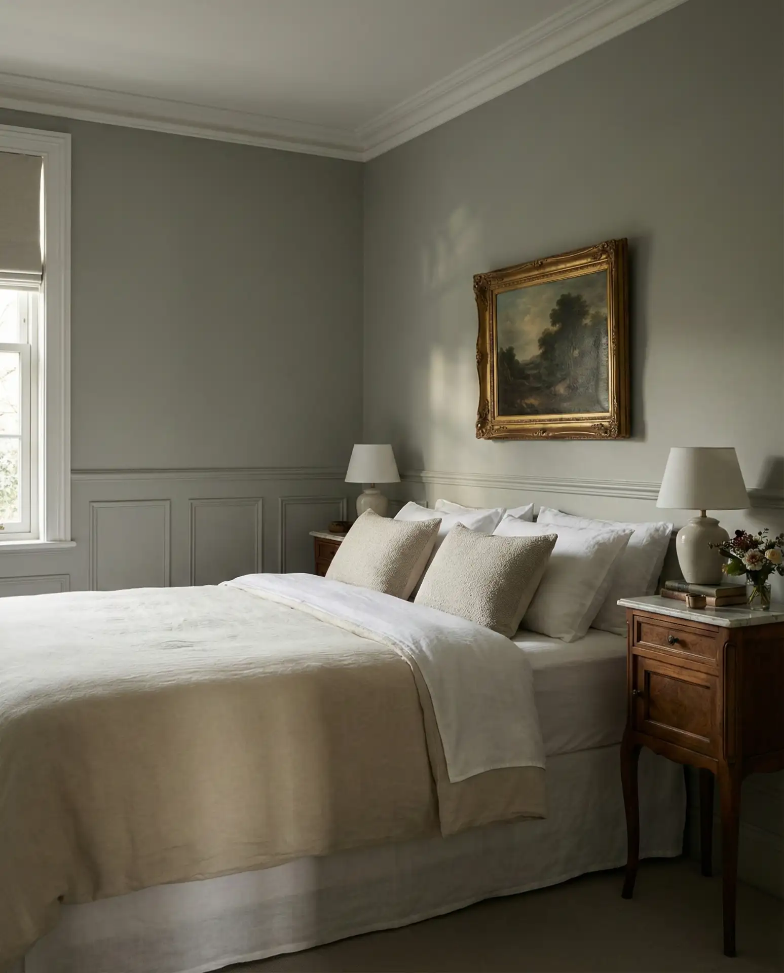
Farrow and Ball paints are premium (around $110 per gallon), but many homeowners find the investment worthwhile for the unique depth and finish. If you’re budget-conscious, brands like Benjamin Moore and Sherwin-Williams offer excellent color-matched alternatives for a fraction of the price. These complex neutrals work best in homes with architectural detail—crown molding, wainscoting, or historic features that benefit from subtle color. Avoid pairing them with stark white; opt for a softer white with warm undertones to maintain the palette’s sophistication.
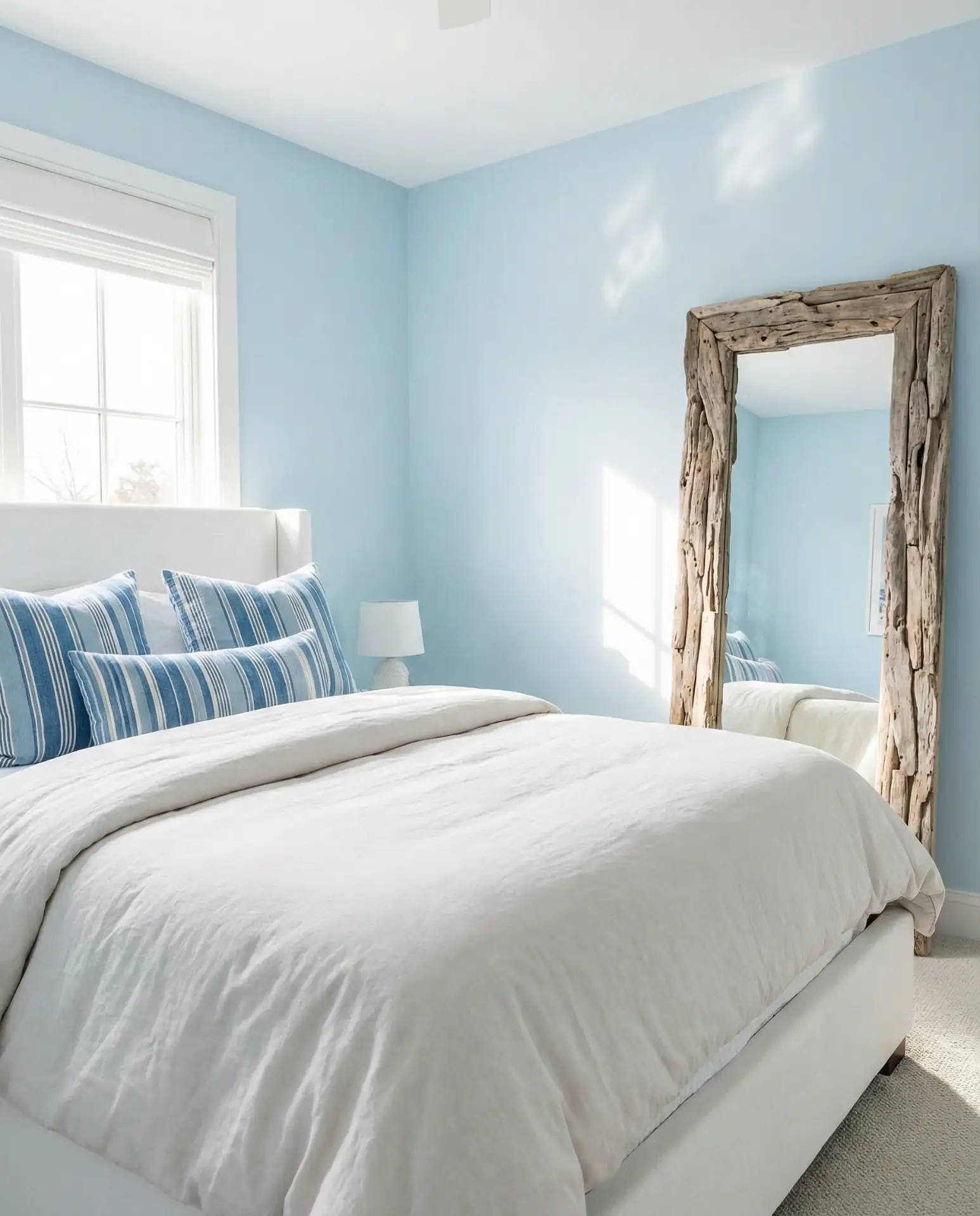
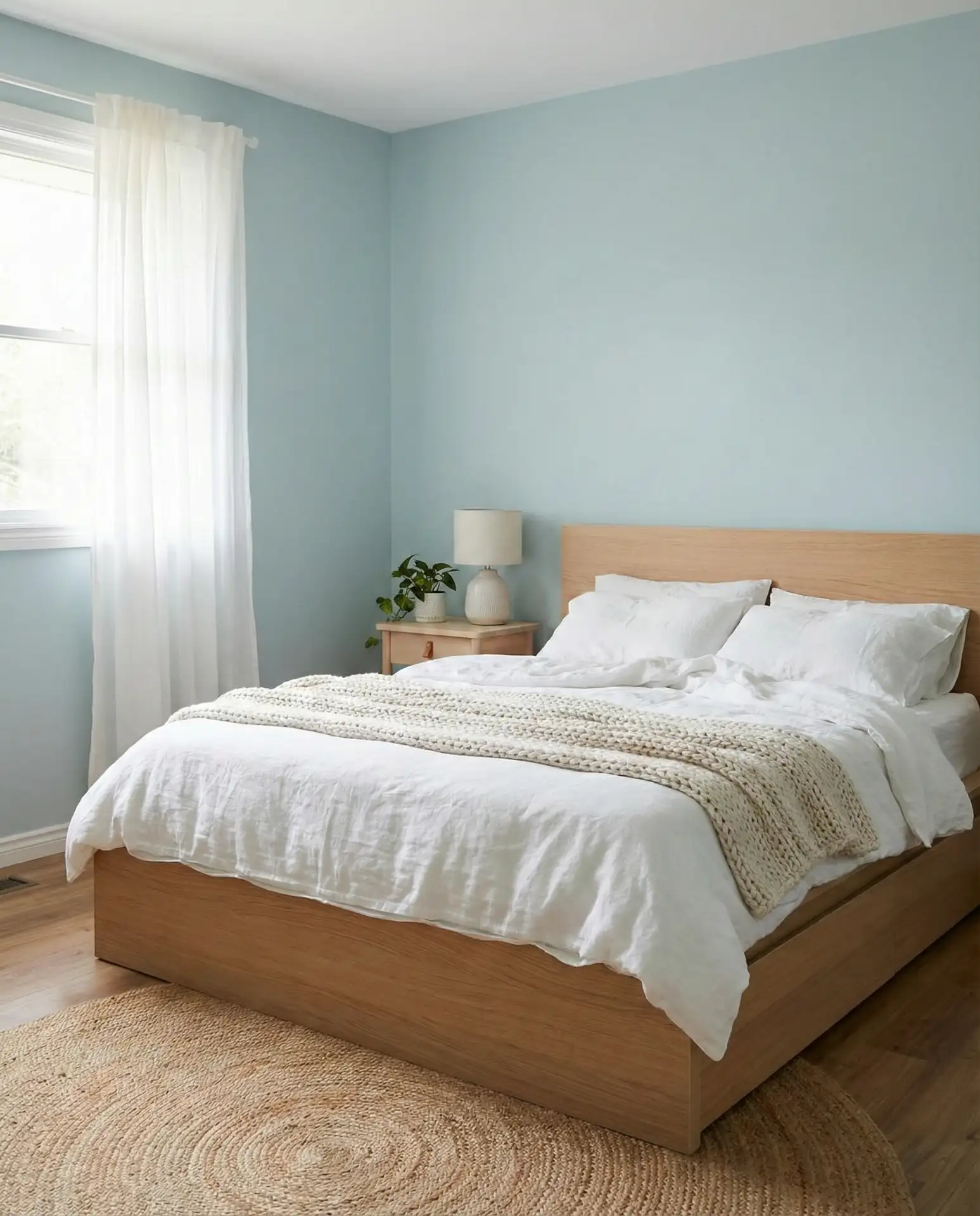
21. Relaxing Spa Blue
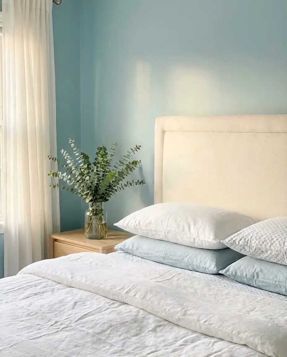
A pale spa blue creates a bedroom that feels instantly relaxing, reminiscent of high-end wellness retreats and luxury hotels. This shade is cooler than coastal blues but warmer than greys, occupying a sweet spot that’s both calming and uplifting. It’s an ideal choice for anyone prioritizing sleep quality and mental wellness in their bedroom design.
This color works best in bedrooms with good natural light, where it can shift subtly throughout the day. In windowless or dimly lit rooms, spa blue can read flat or cold. Many homeowners pair it with warm wood tones and soft textiles to add warmth and prevent the space from feeling too clinical. Budget tip: invest in blackout curtains or shades in a complementary neutral to maximize sleep quality while maintaining the calming color on the walls. Small touches like a linen throw or woven basket keep the look from feeling too spa-like and more like a lived-in bedroom.
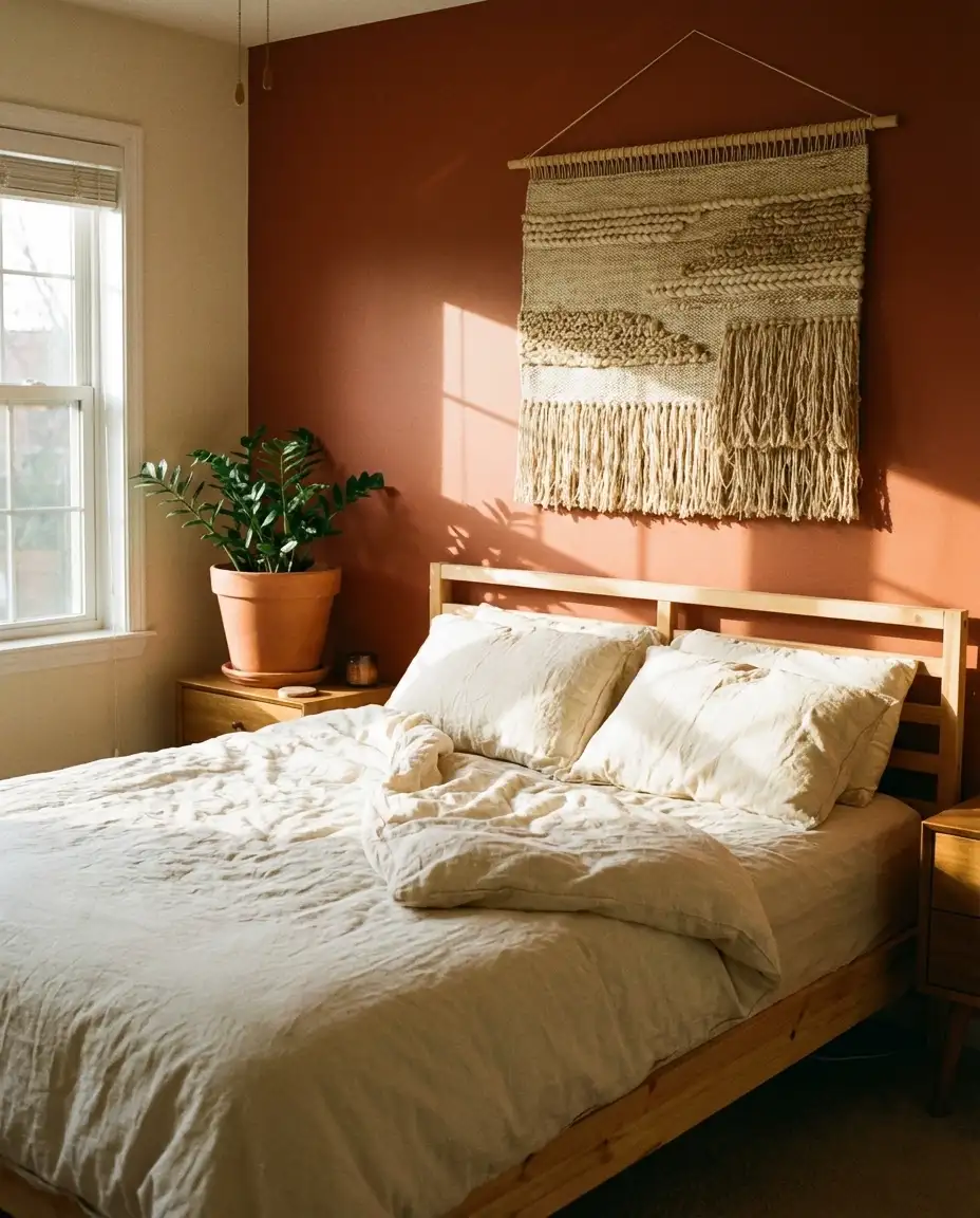
22. Cozy Terracotta Warmth
A terracotta accent wall or bedding set introduces warm, sun-baked color into a bedroom, evoking Southwest landscapes and Mediterranean charm. This cozy hue pairs beautifully with cream, beige, and natural wood, creating a space that feels grounded and inviting. It’s especially popular among those drawn to bohemian or global-inspired design.
A common mistake is choosing a terracotta that’s too orange or too red—test samples in your bedroom’s specific lighting to find a balanced, earthy tone. In regions like New Mexico, Texas, and California, terracotta feels deeply connected to the local landscape and architecture. Many people layer in patterns through textiles—striped blankets, geometric pillows, or kilim rugs—to add visual interest without overwhelming the warmth of the base color. Keep the rest of the palette neutral to let the terracotta shine.
23. Modern Neutral with Black Accents
A neutral bedroom punctuated with strategic black accents—lighting, frames, hardware—offers a modern look that’s both timeless and on-trend. The neutrals provide a soft, calming base while the black adds definition and prevents the space from feeling washed out. This scheme is popular among design-conscious Americans who want a bedroom that feels current without relying on fleeting trends.
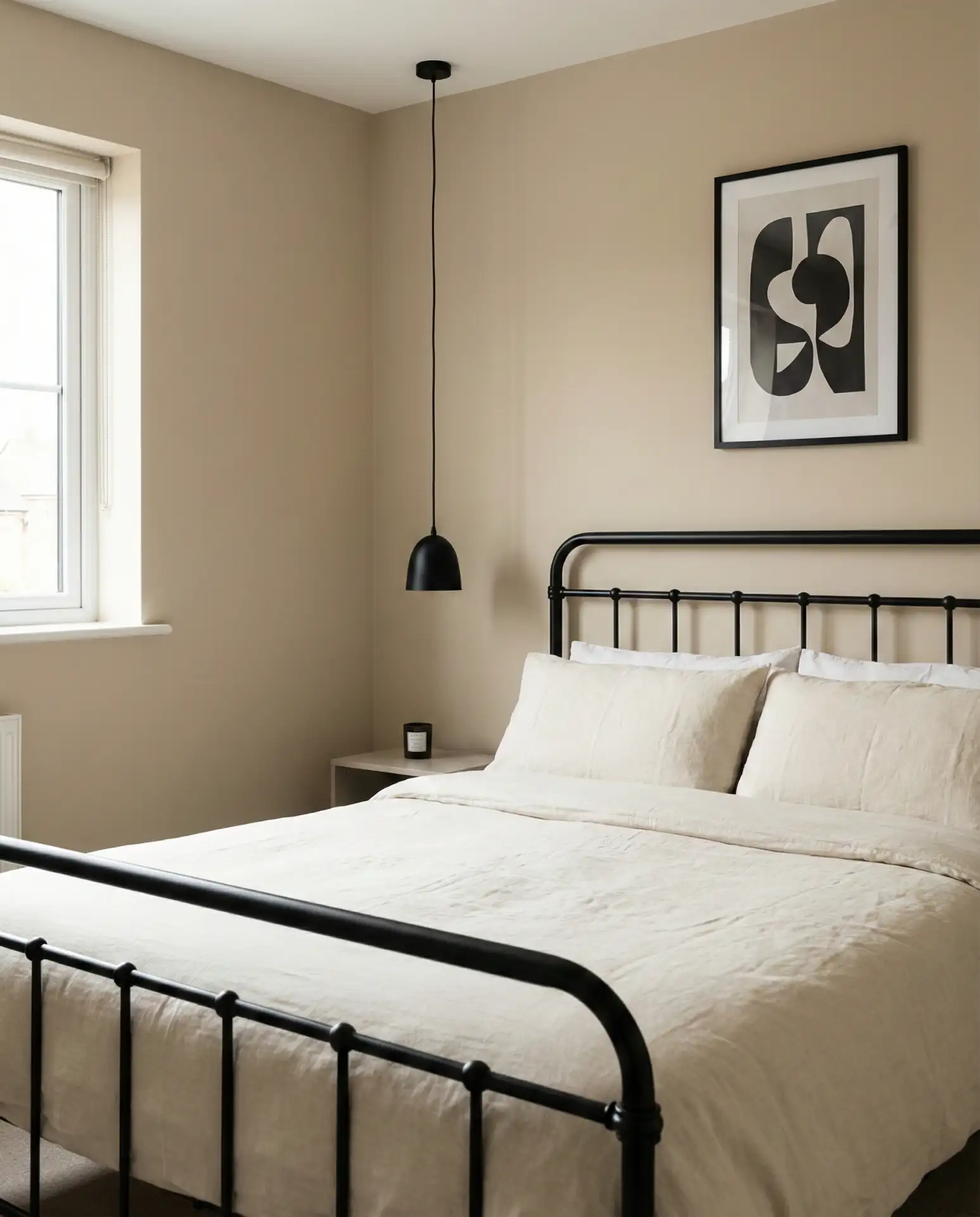
This palette thrives on balance—too much black and the room feels harsh; too little and it loses definition. Aim for roughly 10-15% black in the overall composition. In cities like Denver, Seattle, and Boston, where modern design is popular, this scheme appears frequently in newly built condos and renovated homes. Real homeowner behavior shows that people often start with black lighting fixtures and gradually add other black elements as they refine the space. Texture is your friend here—mix matte and glossy finishes, soft and hard materials, to keep the neutrals from feeling flat.
Conclusion
These 23 bedroom color schemes offer a wide range of possibilities for creating a space that feels personal, restful, and beautifully designed. Whether you’re drawn to the warmth of earthy tones, the calm of coastal blues, or the sophistication of layered neutrals, there’s a palette here that can transform your bedroom into the retreat you deserve. Share your favorite scheme or your own bedroom color story in the comments below—we’d love to hear what’s inspiring you in 2026.