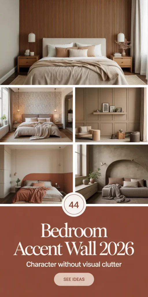
Bedroom accent walls have never felt more personal—or more searched. In 2026, Americans are turning to Pinterest by the millions, looking for that one wall that transforms a plain room into something that actually feels like them. Whether you’re renting a starter apartment in Austin or finally renovating the primary suite you’ve been putting off for years, the right accent wall can do the heavy lifting your entire room needs. From moody limewash finishes to classic board and batten, this roundup covers 22 of the freshest, most livable ideas making waves right now—with practical advice to help you bring them home.
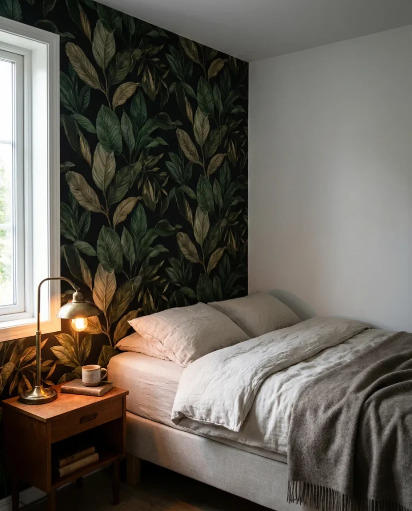
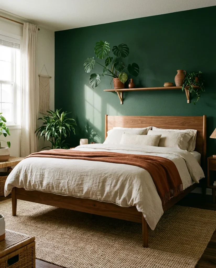
1. Deep Green Velvet Bed Wall
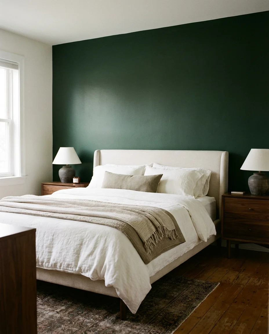
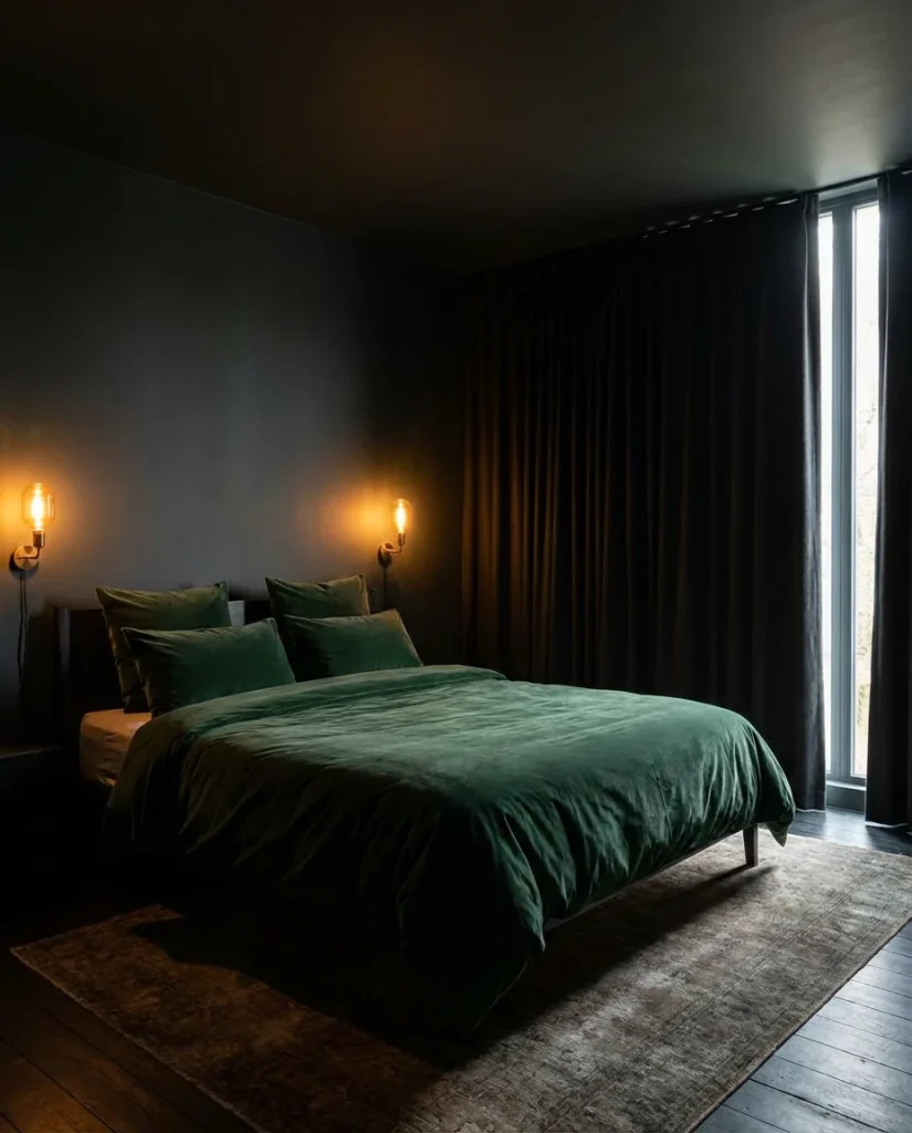
There’s something almost hypnotic about pairing a dark green wall with a plush upholstered bed—it wraps the space in a quiet, enveloping richness that feels both modern and timeless. This look works especially well in primary bedrooms where the goal is total retreat. Paint the wall directly behind the headboard in a deep forest or hunter green, then let the bedding and wood tones breathe around it. Moody and grounded, this combination photographs beautifully, which is exactly why it keeps circulating on Pinterest boards season after season.
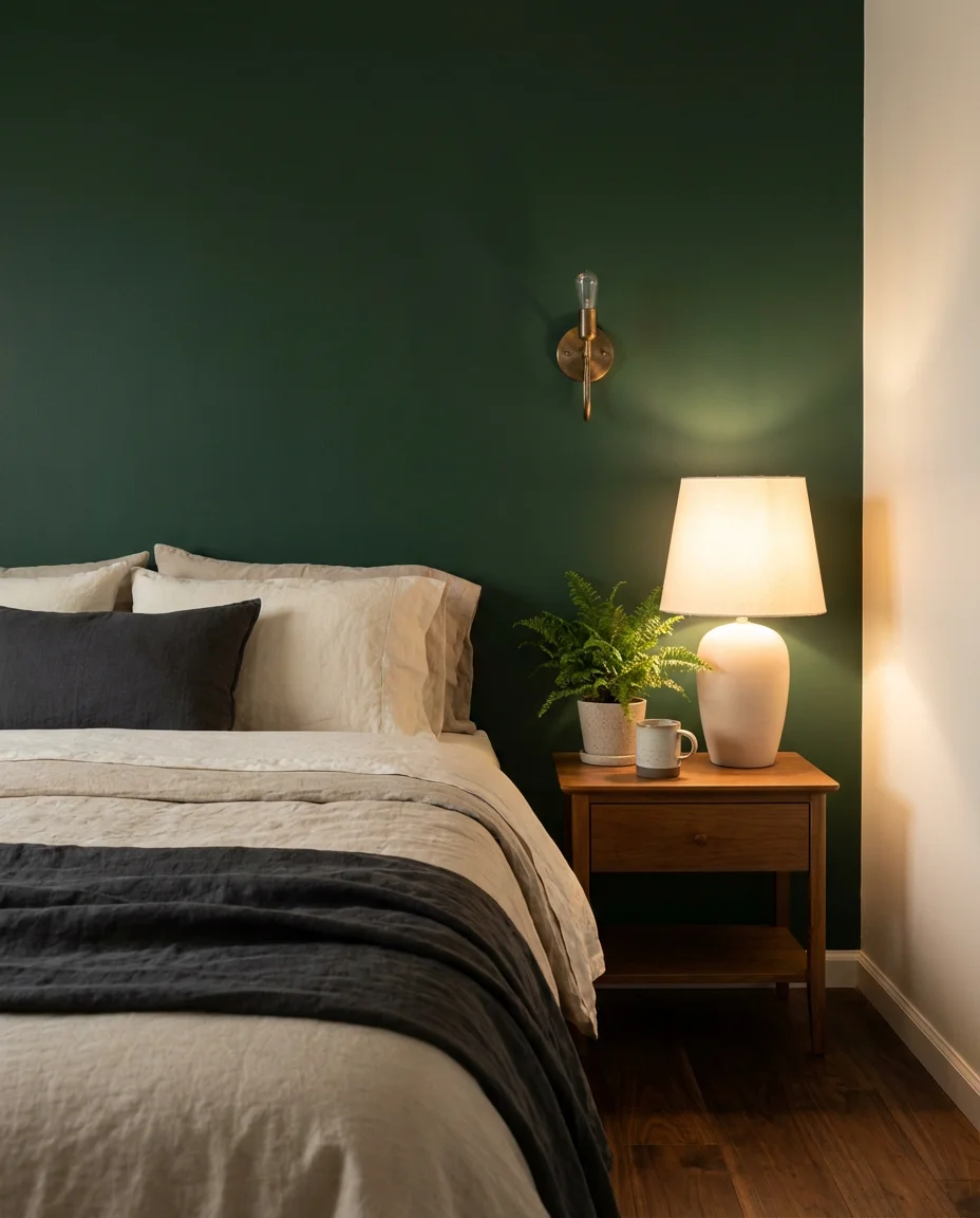
If you’re going this route, resist the urge to paint all four walls the same shade—the contrast is what makes the accent wall pop. Designer tip: choose a green with blue undertones for cooler, more sophisticated rooms, or earthy olive undertones for warmer, cozier vibes. A matte or eggshell finish prevents glare and reads more luxurious than satin. This is one of those choices that looks expensive without actually requiring a renovation budget—a gallon of quality paint and a weekend afternoon is all it takes.
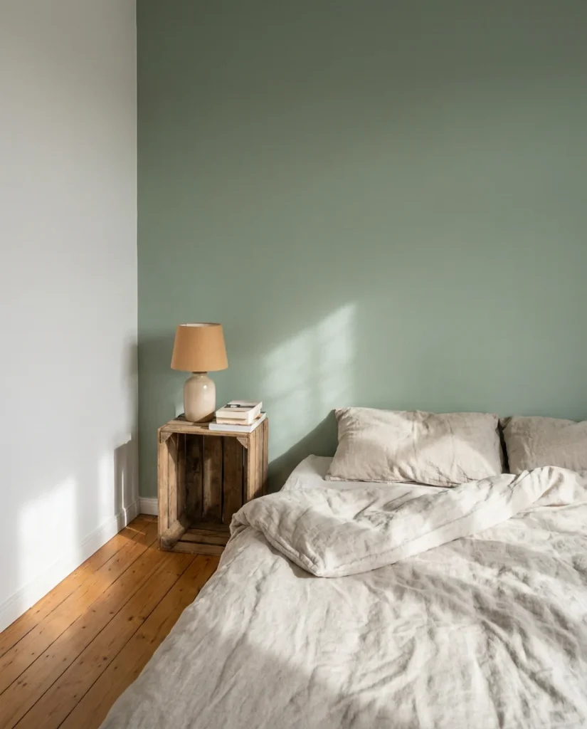
2. Limewash Texture in Sage
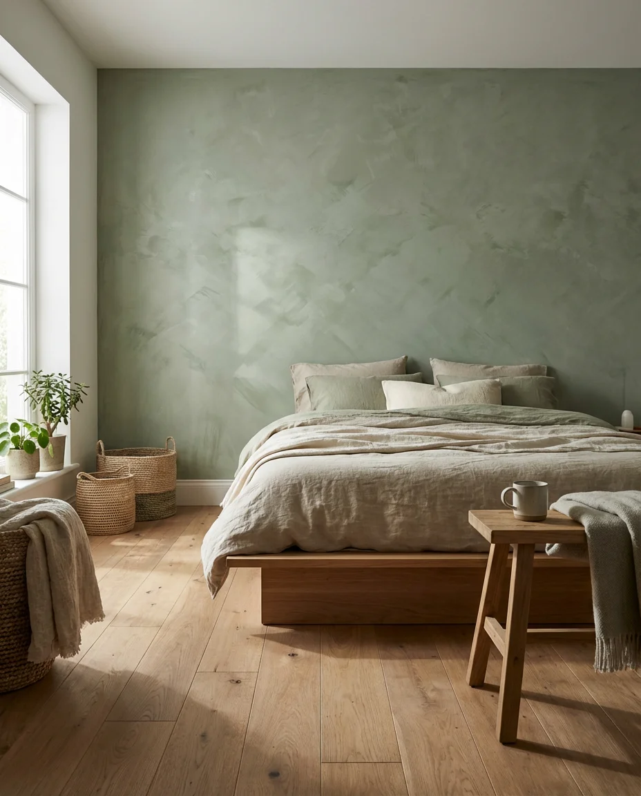
The limewash trend isn’t slowing down—if anything, it’s getting more nuanced. In 2026, homeowners are gravitating toward sage green limewash as a softer, more breathable alternative to full-dark accent walls. The technique involves layering a diluted mineral-based paint in uneven, overlapping strokes, which creates a naturally aged, almost fresco-like surface. It’s tactile, organic, and surprisingly forgiving for a DIY project, which explains why it’s one of the most-pinned bedroom finishes of the year.
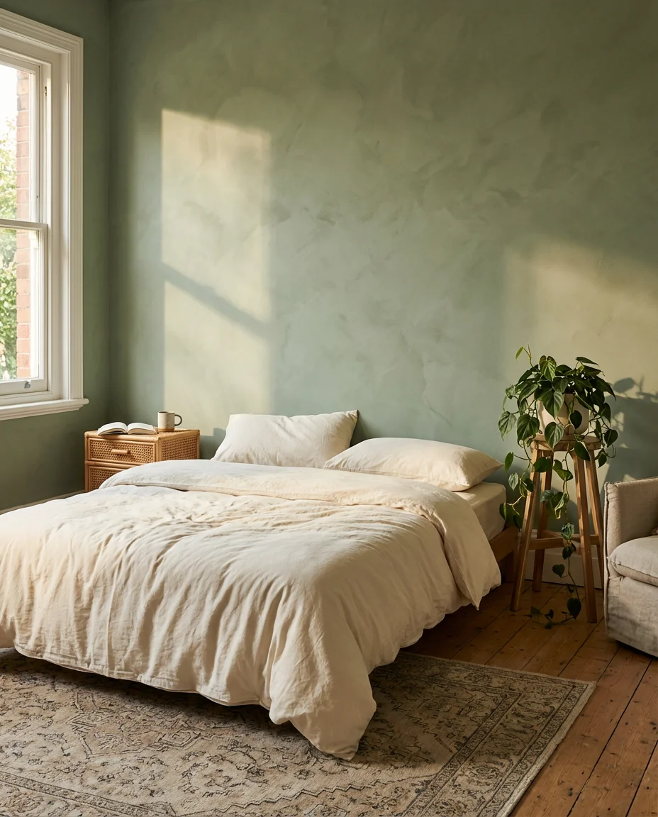
Where it works best: north-facing bedrooms that need warmth without going dark, or rooms with natural wood floors that benefit from the earthy, muted green palette. The one mistake people make with limewash is overworking it—too many layers in the same direction kill the variation that makes the finish look authentic. Work in X-shaped strokes, let each layer dry slightly before adding the next, and step back frequently. You want it to look like the wall has a story, not like it was repainted too many times.
3. Navy Blue Board and Batten
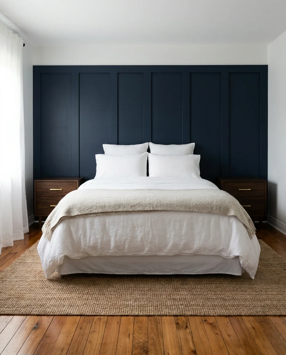
Board and batten has been a staple of American interior design for generations, but pairing it with a saturated navy blue paint color gives this classic treatment a completely fresh identity. The vertical battens break up the wall visually while the deep color adds the kind of intentional drama that makes a bedroom feel designed rather than decorated. It’s a combination that reads equally at home in a coastal New England cottage and a modern urban apartment—which might explain its staying power.
The key to budget-friendly success here is MDF trim boards—they’re inexpensive, paintable, and cut cleanly. A homeowner in Ohio shared that she completed her full headboard wall with board and batten for under $120 in materials, including paint. The battens were spaced 8 inches apart, which gave the wall a more refined, tailored look than wider spacing. Paint everything—the boards and wall—the same navy for a seamless, high-end result. Crisp white bedding and brass or gold hardware make the whole scheme sing.
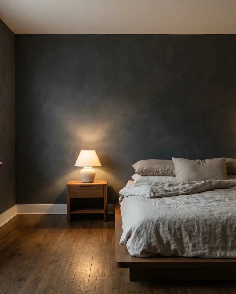
4. Iron Ore Accent Wall—Drama Done Right
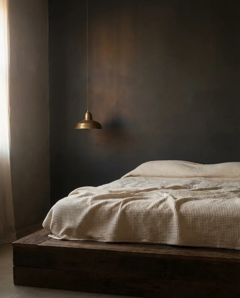
Sherwin-Williams’ Iron Ore has quietly become one of the most requested paint colors for bedroom accent walls in recent years—and in 2026, it’s absolutely everywhere. This near-black charcoal with warm undertones manages to feel both dark and inviting, never cold or oppressive. It pairs naturally with white trim, natural linen, and any wood tone from blonde oak to deep walnut. The result is a wall that anchors the entire room without making it feel smaller—when done right, it actually makes ceilings feel taller by contrast.
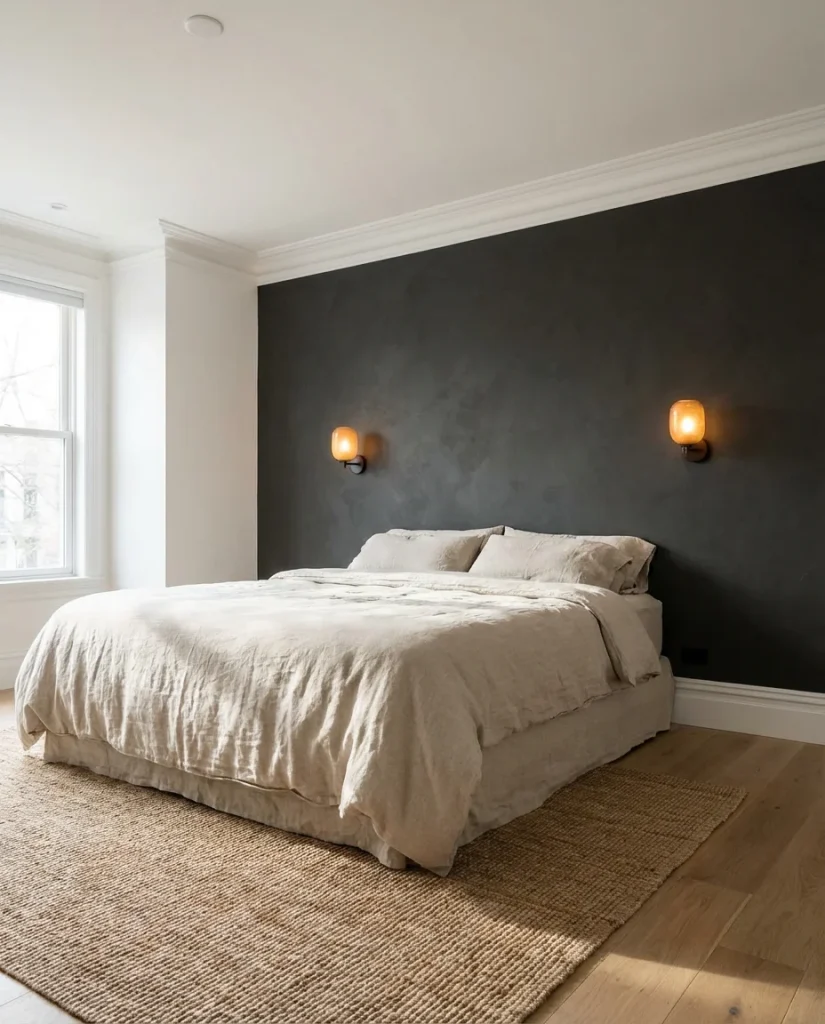
One common mistake with deep charcoals: people forget to account for lighting. In a room with limited natural light, Iron Ore can feel oppressive rather than dramatic. The fix is layered lighting—a statement pendant, bedside sconces, and perhaps an LED strip along the headboard ledge. Each light source warms the color and reveals the subtle brown undertone that makes this shade so livable. For renters who want this look without commitment, removable wallpaper in similar deep charcoal tones has become remarkably convincing.
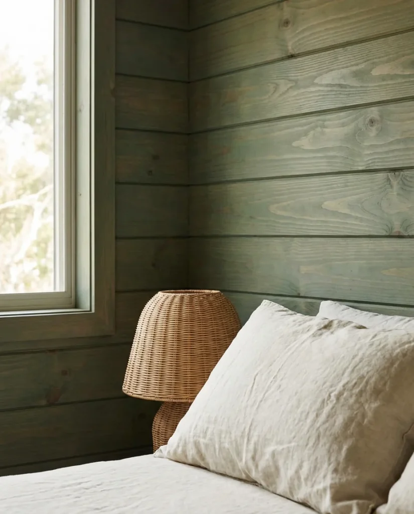
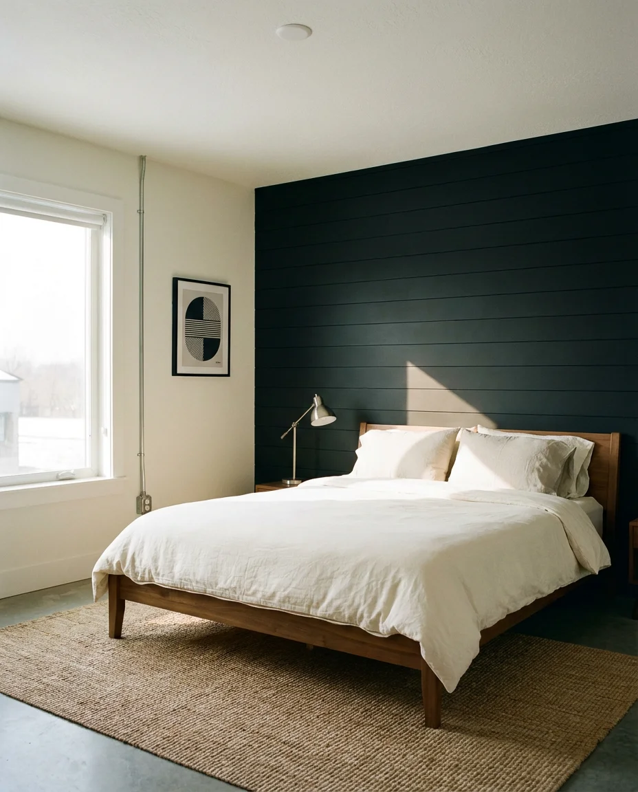
5. Shiplap Bedroom Wall—Modern Farmhouse
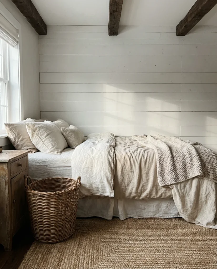
Shiplap in the bedroom has evolved well beyond the white farmhouse aesthetic that defined the early 2010s. Today’s interpretations are richer—painted in warm greige, aged linen, or soft black—and the horizontal lines create a sense of relaxed, horizontal calm that suits a sleep space beautifully. When used as an accent behind the bed, shiplap adds architectural interest without requiring a contractor, making it a favorite weekend DIY project for homeowners across the country.
Real shiplap from a lumberyard is surprisingly affordable—typically $1 to $3 per linear foot—and installation is manageable for a confident beginner. For those who want the look without the carpentry, tongue-and-groove planks from big-box stores go up in an afternoon with construction adhesive and a nail gun. The style works best in bedrooms with higher ceilings, where the horizontal lines don’t cut the room too short. Finish with a semi-gloss for an easy-to-clean, slightly reflective surface that bounces morning light beautifully.
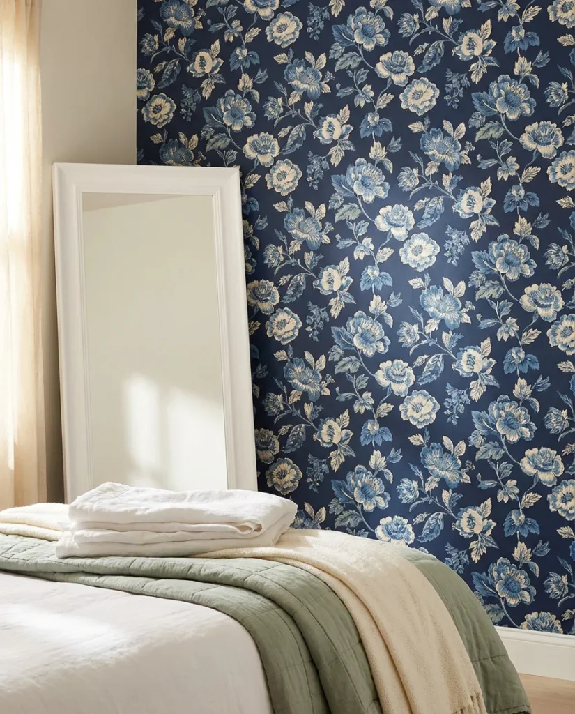
6. Moody Black Wallpaper with Botanical Prints
If paint feels too permanent or too plain, wallpaper on a single accent wall opens up a world of visual storytelling. In 2026, the most compelling bedroom wallpaper choices lean toward black backgrounds with layered botanical, bird, or abstract prints—rich, museum-quality patterns that transform the wall behind the bed into something closer to art than décor. This approach works beautifully in both rented and owned spaces, since modern peel-and-stick options have made installation and removal essentially stress-free.
Wallpaper this bold pairs best with a room that stays relatively quiet everywhere else. Think: simple white or cream walls on the remaining three sides, neutral bedding, and one or two thoughtfully chosen décor pieces rather than a lot of competing patterns. The scale of the print matters enormously—oversized botanicals need generous wall space to breathe, while smaller repeating patterns suit more compact rooms. Measure the wall carefully before ordering; most quality wallpaper runs $50–$150 per double roll, so accurate measurements save real money.
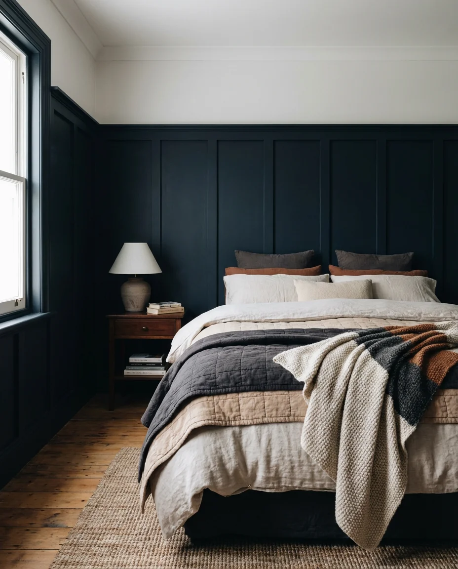
7. Wainscoting in a Guest Bedroom
Wainscoting brings a quiet elegance to a guest bedroom that makes visitors feel genuinely welcomed rather than simply accommodated. Unlike full accent walls, wainscoting covers only the lower third of the wall—typically 32 to 48 inches—with raised or recessed paneling, creating a layered effect that adds depth and architectural character even in smaller rooms. The upper wall is often painted a soft contrasting tone, which frames the bed and furniture without overwhelming the space.
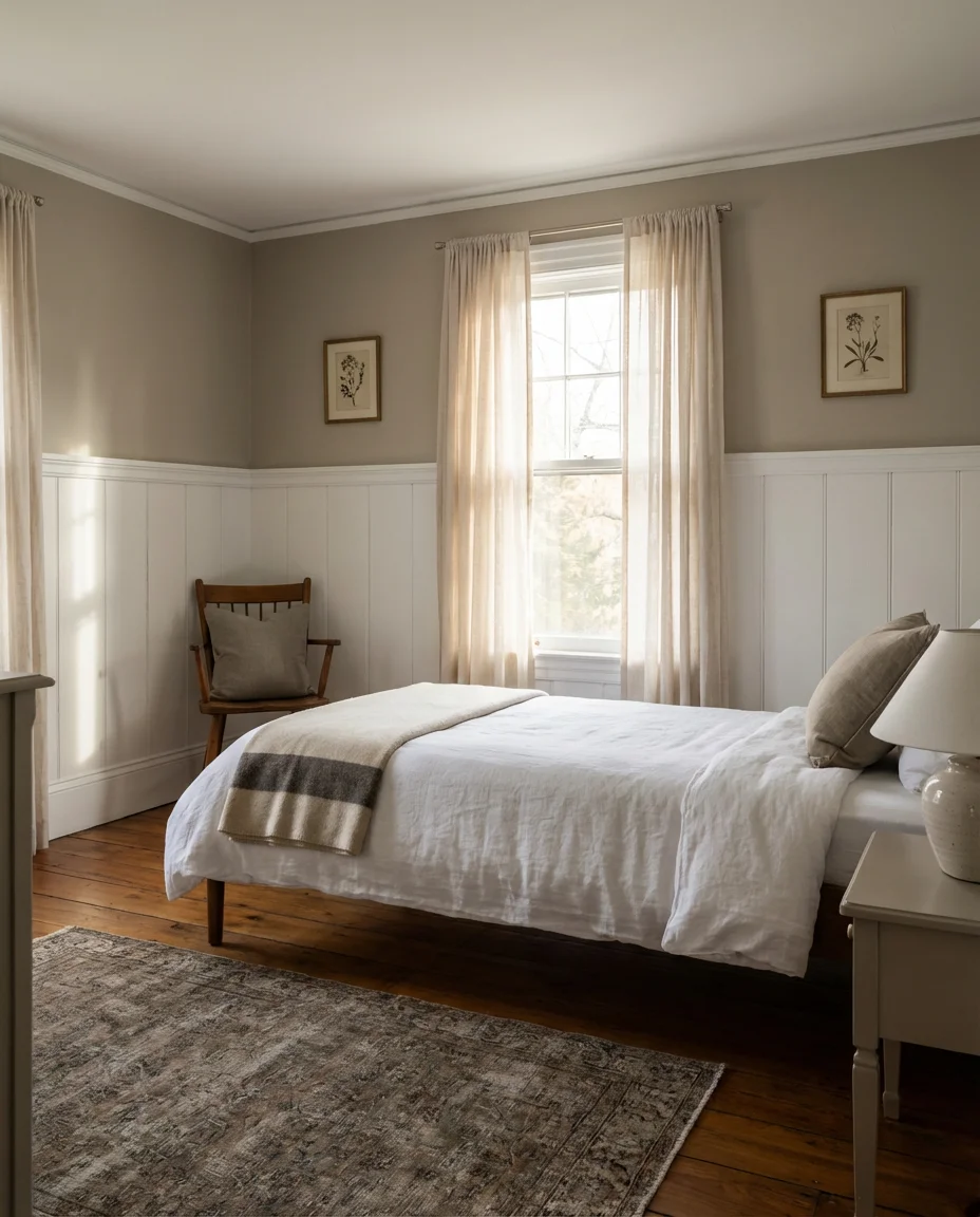
This is a detail that punches well above its cost. Pre-made wainscoting panels from home improvement stores start around $40 per panel, and a standard guest room wall can typically be completed for $200–$350 in materials. The American tradition of paneled walls traces back to colonial-era homes where it served as insulation—today it’s purely aesthetic but carries with it a sense of craftsmanship that guests consistently notice and comment on. Paint the panels and upper wall in two tones from the same color family for a cohesive, polished result.
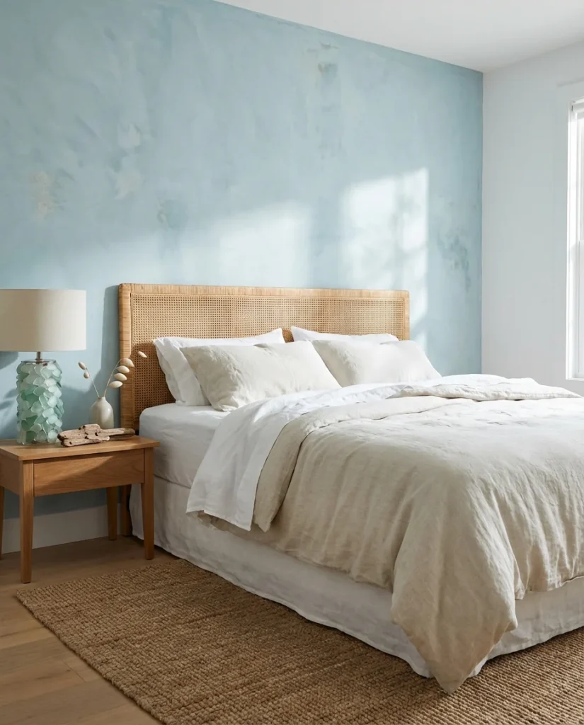
8. Sage Green Paint—Soft and Serene
Sometimes the simplest idea is the best one. A single wall painted in a dusty, muted sage green can shift the entire emotional register of a bedroom—cooler, calmer, and more grounded. This is one of those ideas for paint colors that works across almost every style, from minimalist Scandinavian rooms to maximalist collected-over-time spaces. The muted gray-green hue sits comfortably alongside warm woods, terracotta accents, and creamy whites, making it one of the most versatile choices in the current color landscape.
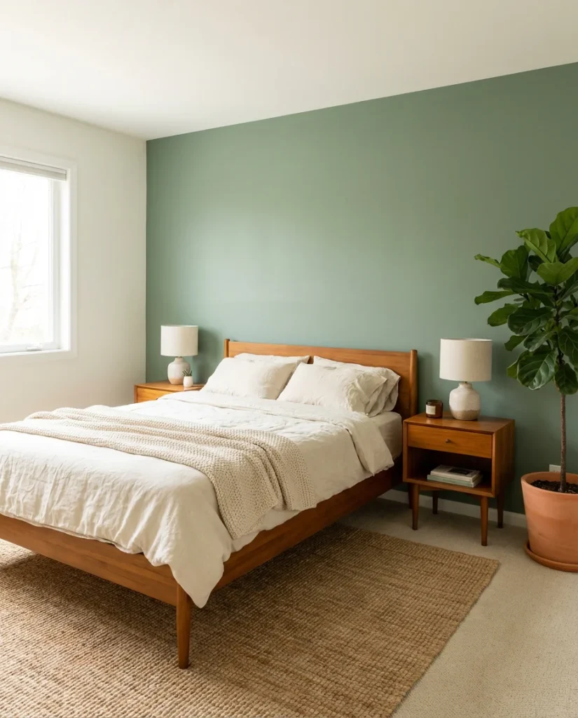
In the Pacific Northwest and Northern California, sage green accent walls have become almost a design shorthand for “calm and considered.” Interior designers in these regions recommend it frequently for primary bedrooms because of the way it interacts with natural light—in the morning it reads cool and fresh, by evening it warms considerably. Top picks for 2026 include Benjamin Moore’s Saybrook Sage, Farrow & Ball’s Mizzle, and Sherwin-Williams’ Softened Green. Sample before committing—these colors shift dramatically between artificial and natural light.
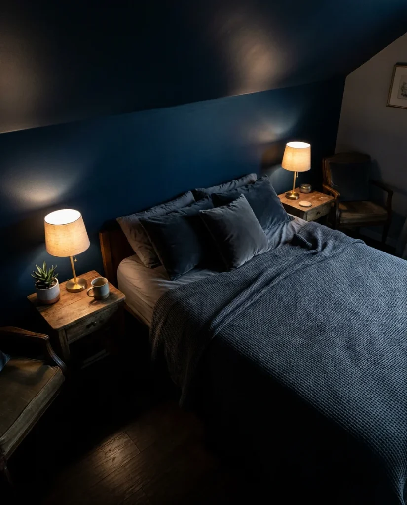
9. Dark Blue Window Wall Treatment
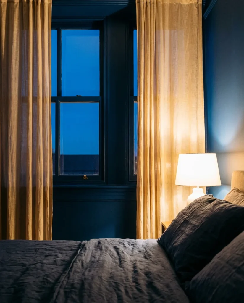
Painting the wall that contains the main window in a deep blue creates an effect that’s part cocooning, part gallery—the natural light acts as a constantly shifting spotlight on the color throughout the day. This is a slightly unconventional take on the accent wall concept, but it rewards the risk handsomely. The window becomes a framed moment rather than just a practical opening, and the blue wall provides a dramatic backdrop that makes even ordinary curtain panels look intentional and styled.
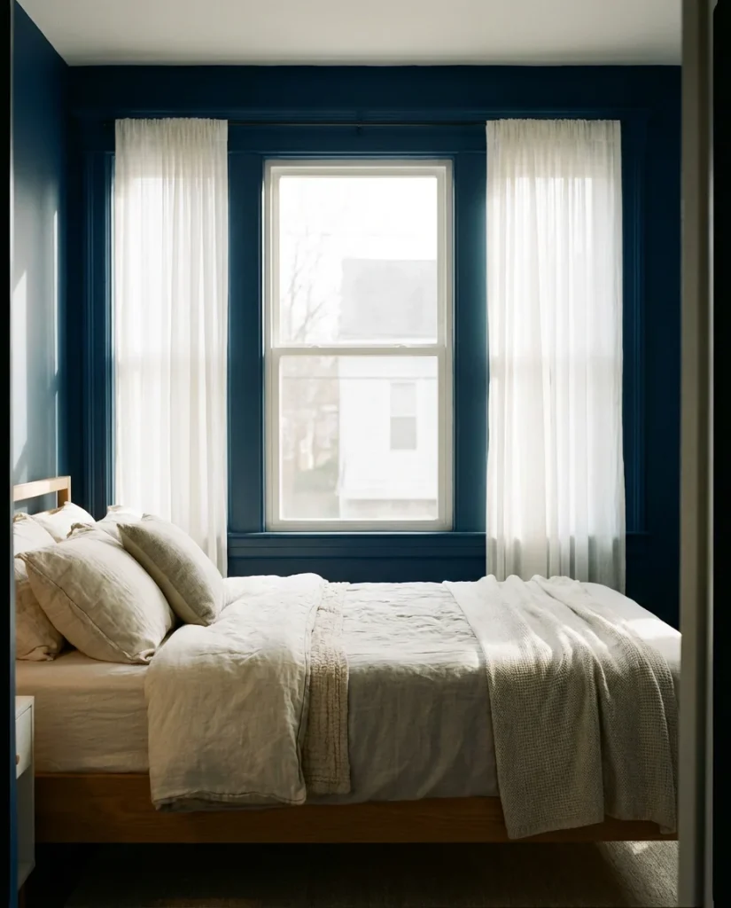
Expert-level advice: when painting a window wall a deep color, extend the color onto the window trim and even the window sill for a graphic, intentional look rather than a half-finished one. This technique is called “color drenching,” and it’s been widely praised by designers for its ability to make architectural details disappear into the color field, creating a more seamless, immersive effect. Pair with sheer linen curtains rather than blackout panels to keep the color reading as atmospheric rather than cave-like.
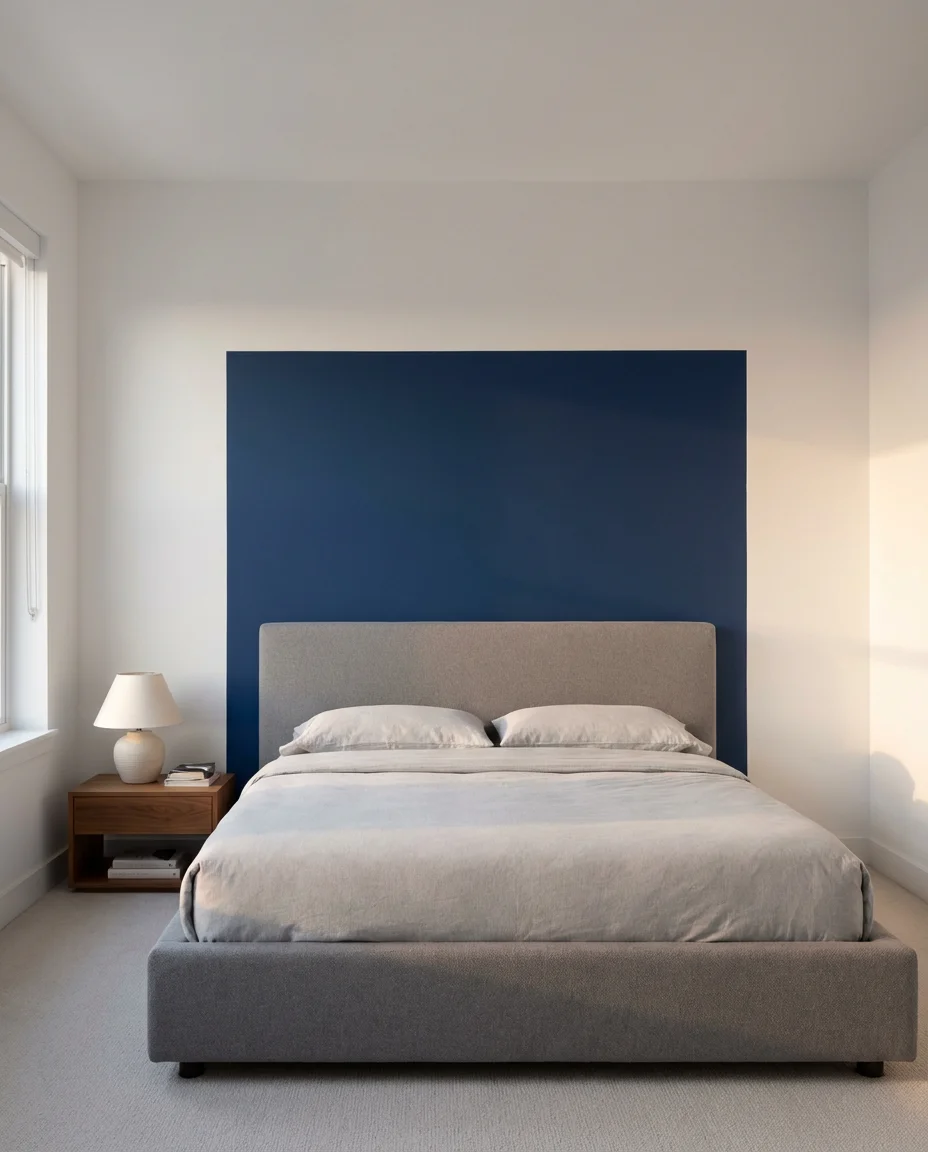
10. Modern Navy Primary Bedroom Wall
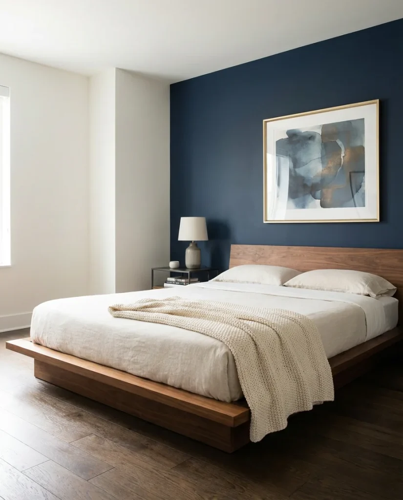
For the primary bedroom, navy in a modern context means clean lines, minimal clutter, and a color that reads as sophisticated rather than heavy. Think of the navy accent wall as the visual anchor for a room that might otherwise feel too neutral to make a statement. Behind a low-profile platform bed, navy creates an almost cinematic backdrop—especially when paired with warm brass or matte black hardware throughout the space. This is the kind of update that makes a room feel like it was designed, not just furnished.
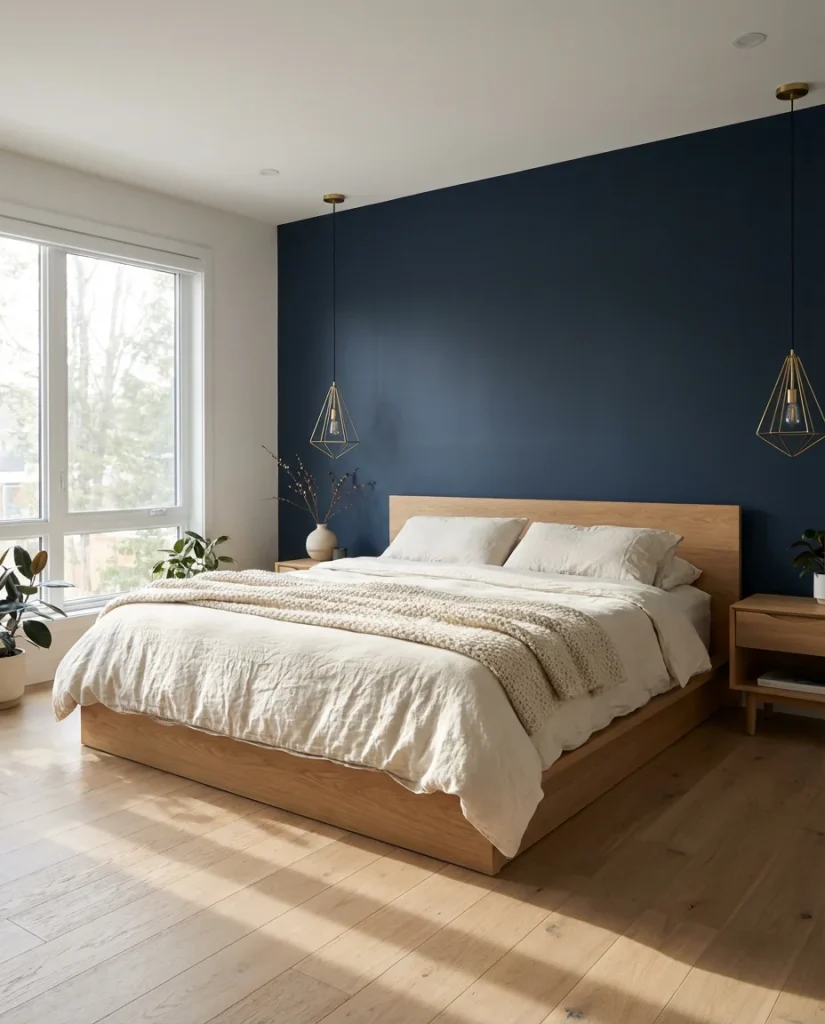
Americans searching for this look on Pinterest tend to be in their 30s and 40s, trading in the rustic-chic aesthetic of their first homes for something with a little more edge. The navy accent wall delivers on that desire without requiring a full renovation. Choose a true navy—not too purple, not too bright—and apply it in a flat or matte finish for the most sophisticated result. Navy paired with natural linen, blonde wood, and greenery feels simultaneously timeless and very much of the moment.
11. DIY Painted Geometric Accent Wall
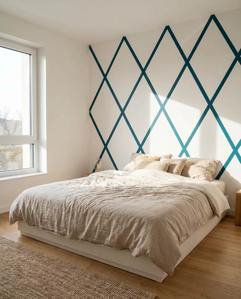
For those who want something truly one-of-a-kind, a painter’s tape geometric design turns a plain wall into a handcrafted focal point—and the entire project costs little more than a few rolls of tape and a quart of contrasting paint. This is a genuinely great DIY project for renters too, since the design is achieved entirely with paint applied to the existing wall color. Simple diamond patterns, overlapping triangles, or asymmetric color blocks are all approachable for beginners and produce dramatically satisfying results.
The most important step in a tape-and-paint geometric wall is burnishing every edge of the tape with a credit card or putty knife before painting—this prevents bleed-through that ruins crisp lines. Remove tape while the paint is still slightly wet, not fully dry, pulling back at a 45-degree angle for the cleanest edges. Colors that work especially well: deep teal on white, terracotta on cream, or charcoal on a warm greige. Plan the pattern on graph paper first, and mark your wall lightly with a level and pencil before applying any tape.
12. Dark Moody Bedroom—Full Commitment
Sometimes one accent wall isn’t enough—and the moody bedroom trend fully embraces going all-in with dark color on multiple surfaces. Wrapping the bed wall and ceiling in the same deep charcoal or midnight blue creates a cave-like intimacy that’s genuinely unlike anything a single accent wall can achieve. This isn’t for everyone, but for those who’ve always wanted a bedroom that feels more like a boutique hotel than a suburban ranch house, this is the move.
Where it works best: larger bedrooms with 9-foot or higher ceilings, ideally with at least one large window. The color is so absorptive that artificial lighting needs to be planned carefully—recessed ceiling lights lose impact here, but warm Edison-style sconces, table lamps with amber-toned bulbs, and candles create exactly the atmosphere you’re going for. Keep bedding in soft, textural fabrics—velvet, waffle weave, heavy linen—to add visual and tactile richness that prevents the room from feeling stark.
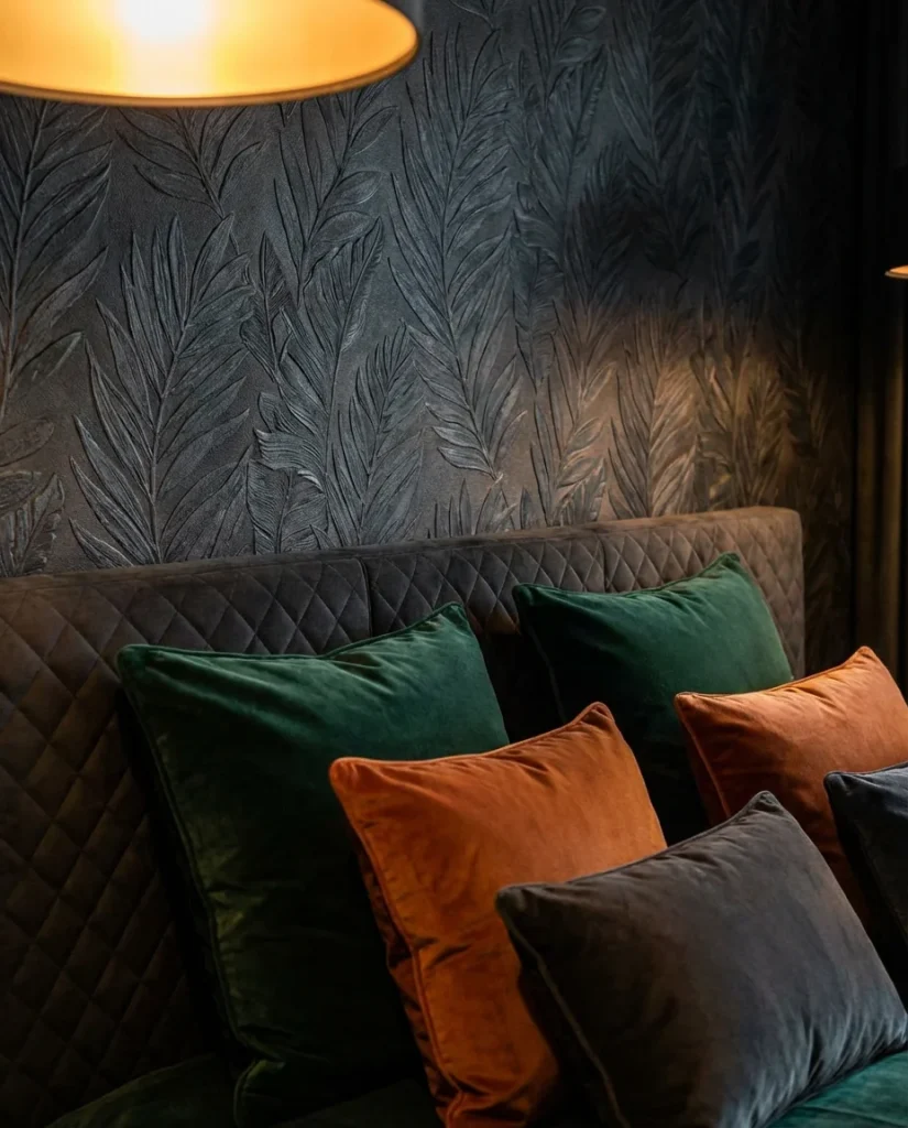
13. Green Shiplap—Nature-Inspired Texture
Combining the texture of shiplap with a nature-forward green creates an accent wall that feels genuinely organic—like a bedroom that grew rather than was decorated. The horizontal wood grain against a painted or stained green surface evokes forest floors, weathered barns, and coastal cottages all at once. It’s a combination that has been especially popular in the mountain West and Pacific Northwest, where bringing the outdoors in is practically a design philosophy rather than just a trend.
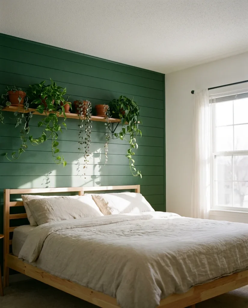
For maximum impact, paint the shiplap in a deep forest green and leave the ceiling and remaining walls in a clean white—the contrast is stark and striking. Alternatively, a pale seafoam or eucalyptus stain over natural wood gives a more relaxed, sun-bleached coastal feel. Real homeowners report that this combination photographs exceptionally well in natural light, which is part of why it circulates so effectively on Pinterest and Instagram. Add potted plants, woven baskets, and natural fiber rugs to lean fully into the biophilic aesthetic.
14. Black Accent Wall with Gallery Lighting
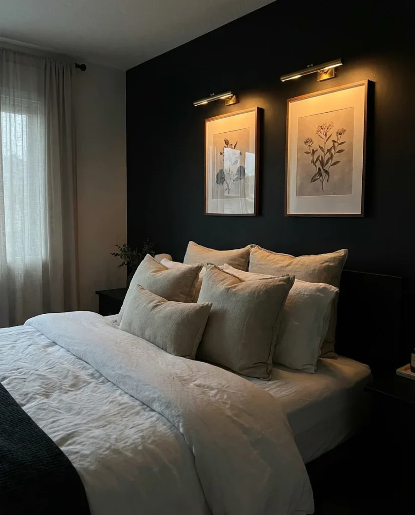
A true black accent wall behind the bed turns the entire wall into a gallery-ready surface—anything hung against it becomes immediately elevated, as if displayed in a museum rather than a bedroom. This is a particularly powerful approach for art lovers, photography enthusiasts, or anyone with a collection of meaningful objects they want to showcase properly. The black acts as negative space, visually disappearing and allowing the displayed pieces to command attention without competition.
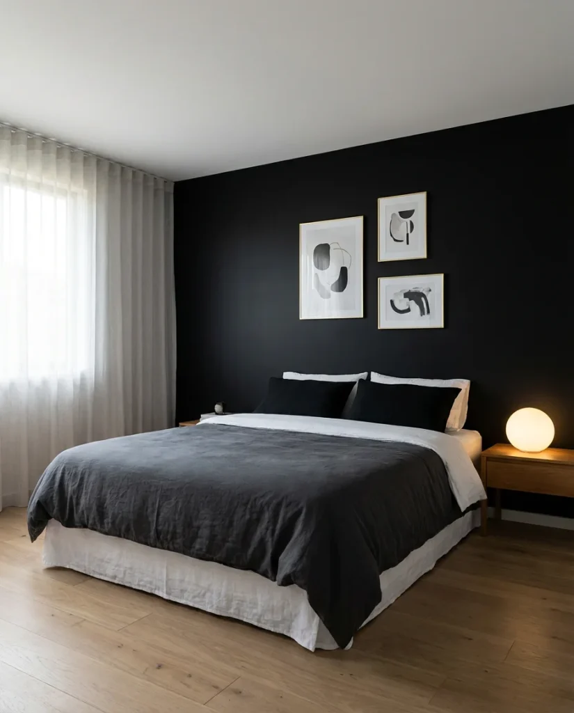
Budget-wise, this is one of the highest-impact, lowest-cost updates possible. A deep black like Farrow & Ball’s Pitch Black, Benjamin Moore’s Black Beauty, or even flat black interior paint from any hardware store runs the same price as any other paint—the drama is entirely in the color choice, not the product. Frame your art in thin gold or natural wood frames for maximum visual contrast, and consider installing small picture lights above key pieces for an after-dark gallery effect that feels genuinely special.
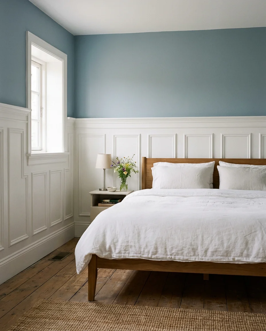
15. Farmhouse Wainscoting with Soft Blue Upper Wall
Classic farmhouse style gets a thoughtful refresh when wainscoting panels in crisp white are paired with a pale, dusty blue upper wall. This two-tone approach frames the room like a piece of folk art—structured and traditional below, airy and soft above. It’s especially effective in bedrooms with modest square footage, where the visual division of the wall actually makes ceilings feel taller and the room feel more considered and intentional.
This combination has deep roots in American vernacular design—painted wainscoting in bedrooms was a practical and aesthetic staple in 19th-century farmhouses across New England and the Midwest. Today’s version replaces the original beadboard with flat or recessed panel wainscoting for a slightly more refined look, but the spirit is the same: humble materials used with care and intention. Soft blues like Benjamin Moore’s Woodlawn Blue or Sherwin-Williams’ Meditative pair beautifully with the white panels without feeling cold or overly nautical.
16. Limewash Iron Ore Wall—Textured Depth
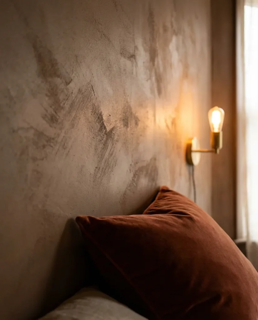
Combining the technique of limewash with the depth of iron ore creates something that plain paint simply cannot replicate—a wall surface that seems almost to breathe, with variation in tone and texture that shifts as light moves across it throughout the day. This is one of those finishes that looks more expensive than it is and that people consistently mistake for a professional plaster treatment. It’s moody without being oppressive and textural without being busy.
Practical insight: authentic mineral limewash paint—brands like Portola Paints, Roman Clay by Backdrop, or Classico Limewash by Fresco—behaves very differently from regular latex. It has low coverage, meaning multiple thin layers are required, and it continues to evolve as it cures over several weeks. The first 24 hours can look alarmingly patchy—resist the urge to add more paint immediately. Trust the process, let each layer dry fully, and the finished result will reward your patience with a complexity that standard paint can’t touch.
17. Color-Blocked Headboard Wall
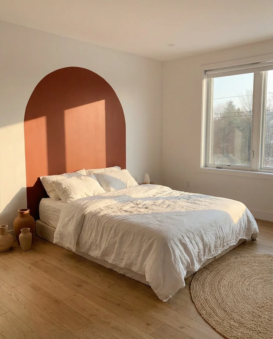
A color-blocked headboard wall takes the accent wall concept a step further by using two or three paint colors in bold, graphic shapes directly behind the bed. The most common approach paints a large rectangle or arch shape in a deep or contrasting hue that frames the headboard like an oversize piece of art. This technique is particularly popular in modern and contemporary bedrooms, where the clean geometry of the paint shapes reinforces the room’s overall aesthetic language.
The arch format—a painted half-circle or full arch centered behind the headboard—has been one of the most-pinned bedroom ideas for two consecutive years running. It’s simple to execute with a projector or a large piece of string used as a compass, costs almost nothing beyond the paint itself, and creates a focal point with real visual impact. Deeper tones like terracotta, forest green, or navy work best, as pale colors against a similarly light wall don’t create sufficient contrast to make the shape read clearly from across the room.
18. Navy Blue Wallpaper—Graphic Patterns
Patterned wallpaper in deep navy blue brings a completely different energy than solid paint—it adds rhythm, repetition, and visual complexity that transforms a single wall into a fully designed architectural moment. In 2026, the most compelling patterns range from large-scale geometric trellis work to vintage toile updated in modern proportions. Used behind the bed wall of a guest room or primary suite, this treatment instantly elevates the space from “nice bedroom” to “room in a boutique hotel you’d actually want to stay in.”
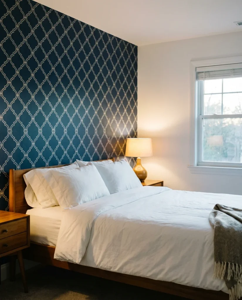
A real homeowner in suburban Chicago shared that she spent an afternoon installing peel-and-stick navy floral wallpaper on her guest room accent wall, and guests have since started asking if they can stay longer just to wake up in that room. The psychological impact of a well-chosen wallpaper isn’t trivial—pattern activates the brain differently than flat color, creating a sense of richness and intention that makes a room feel truly personal. Budget around $200–$400 for a single wall in a standard bedroom, and always order one extra roll for matching and repairs.
19. Sage Green Board and Batten—Quiet Luxury
When board and batten meets sage green, the result is the design equivalent of a deep breath—structured, calm, and quietly beautiful. This combination has been embraced by the “quiet luxury” aesthetic that has dominated home design conversation over the past two years, offering visual interest through texture and craftsmanship rather than bold color or pattern. The vertical lines of the battens add height, the sage grounds the room in nature, and the overall effect is one of understated sophistication.
This works best in primary and guest bedrooms where the goal is rest and recovery rather than stimulation. Designers who work in the quiet luxury space recommend painting both the boards and the recessed wall sections the exact same sage—the monochromatic approach makes the texture visible without the color contrast becoming too assertive. Pair with warm-toned bedding in oatmeal, ivory, or rust, and choose hardware in aged brass or unlacquered brass for an authentically imperfect, timeworn quality that suits this aesthetic perfectly.
20. Dark Green Accent Wall with Warm Wood Tones
Deep dark green and warm wood tones are one of those combinations that interior designers have known about for decades but that the Pinterest era has introduced to an entirely new generation of home decorators. The richness of a deep green—think bottle green, racing green, or the deep forest shades favored by Farrow & Ball—is softened and warmed by the organic quality of wood furniture, flooring, or architectural elements. Together, they create a room that feels like it belongs somewhere specific, with a point of view that’s rare in the age of mass-market furniture.
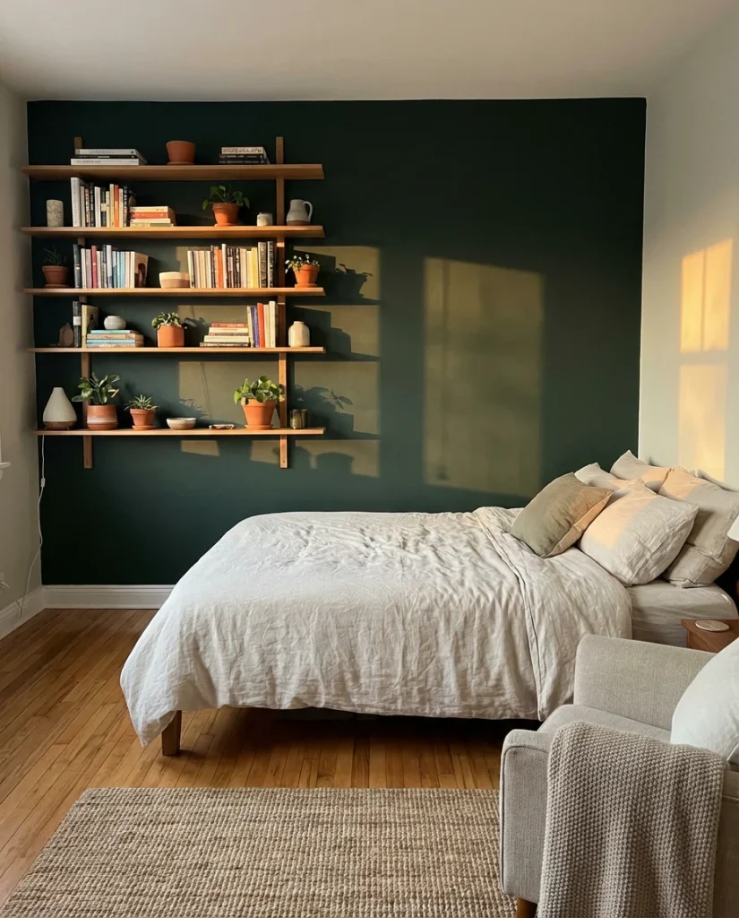
The golden rule with this combination is to let the green be the star—keep the wood tones in their natural state or with a clear or very light stain rather than painting them. Painted white furniture against a dark green wall can feel stark; natural wood against the same green feels warm and collected. A walnut bed frame, oak floating shelves, or even a simple bamboo side table all contribute the earthy warmth this combination needs. Add a few trailing plants, and the room starts to look genuinely magazine-worthy.
21. Black Shiplap Feature Wall
Painting shiplap in flat black is a high-contrast, high-impact accent wall choice that suits modern and industrial-leaning bedroom aesthetics particularly well. The combination of the rustic texture of horizontal wood planks with the graphic severity of true black creates a visual tension that’s genuinely interesting—it feels like two design languages having a productive argument. Against white ceilings and light floors, a black shiplap wall commands every eye that enters the room.
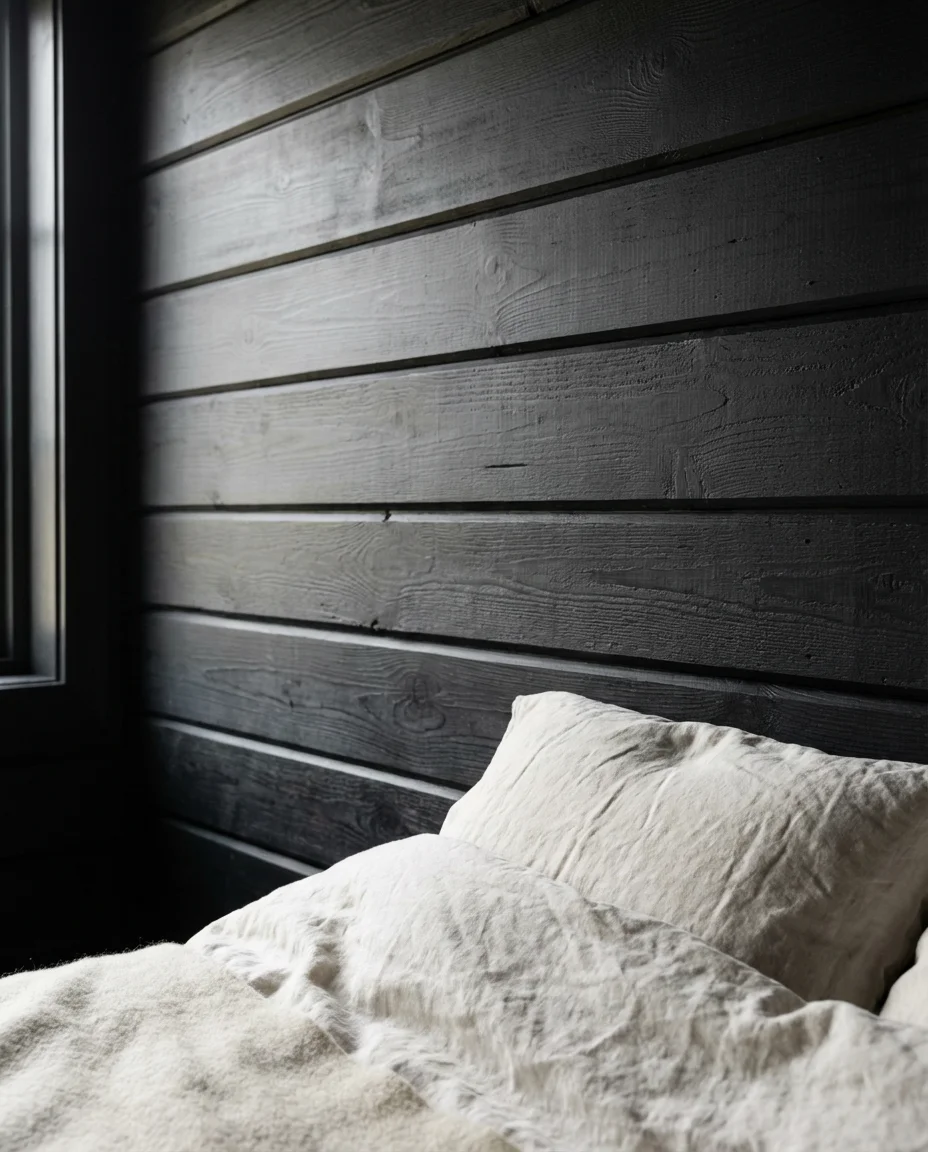
American homeowners who’ve made this choice consistently report that the fear of “too dark” was unfounded—when executed well, a black shiplap wall actually makes a room feel larger by pushing the wall visually backward. The key is keeping the other three walls and the ceiling genuinely light, ideally in a warm white rather than a cool bright white. Warm whites—Benjamin Moore’s White Dove, Sherwin-Williams’ Alabaster—prevent the pairing from reading as stark or industrial, keeping the overall effect cozy and intentional rather than severe.
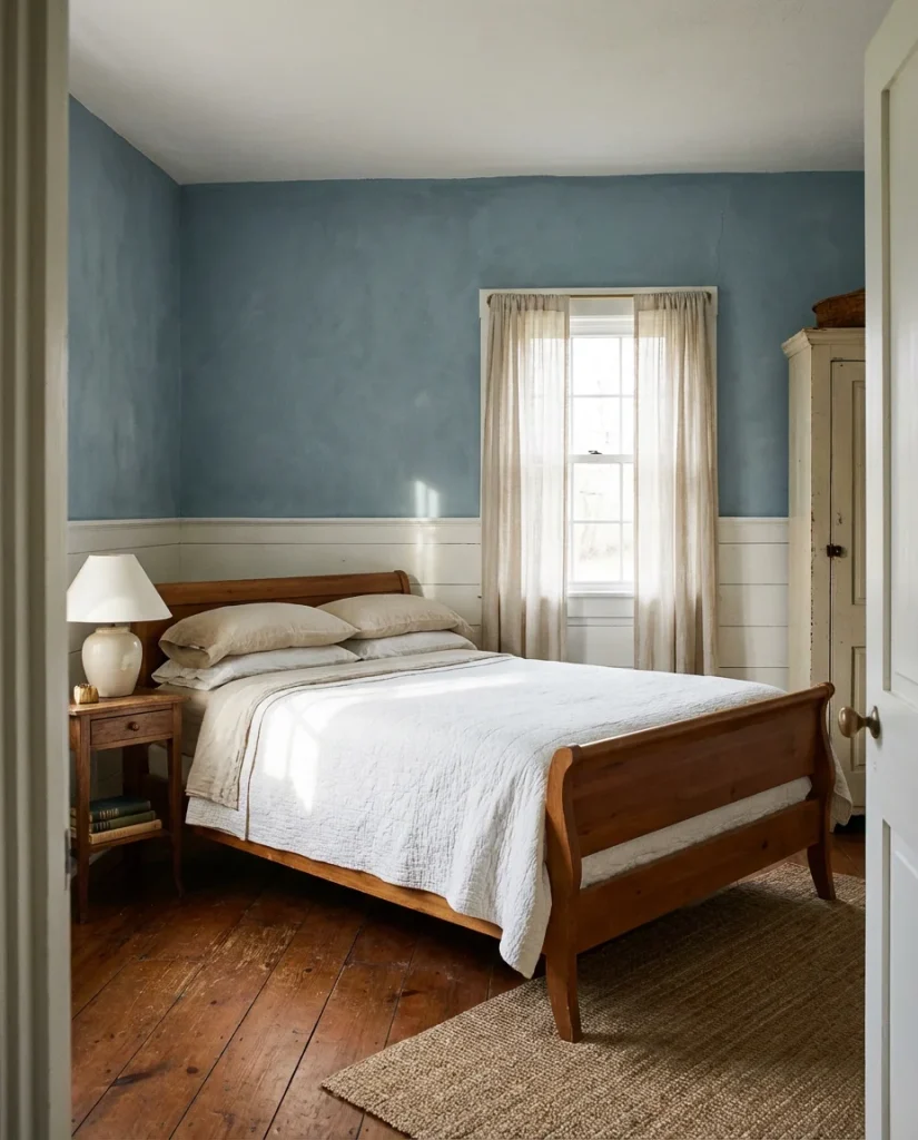
22. Soft Blue Limewash—Coastal Calm
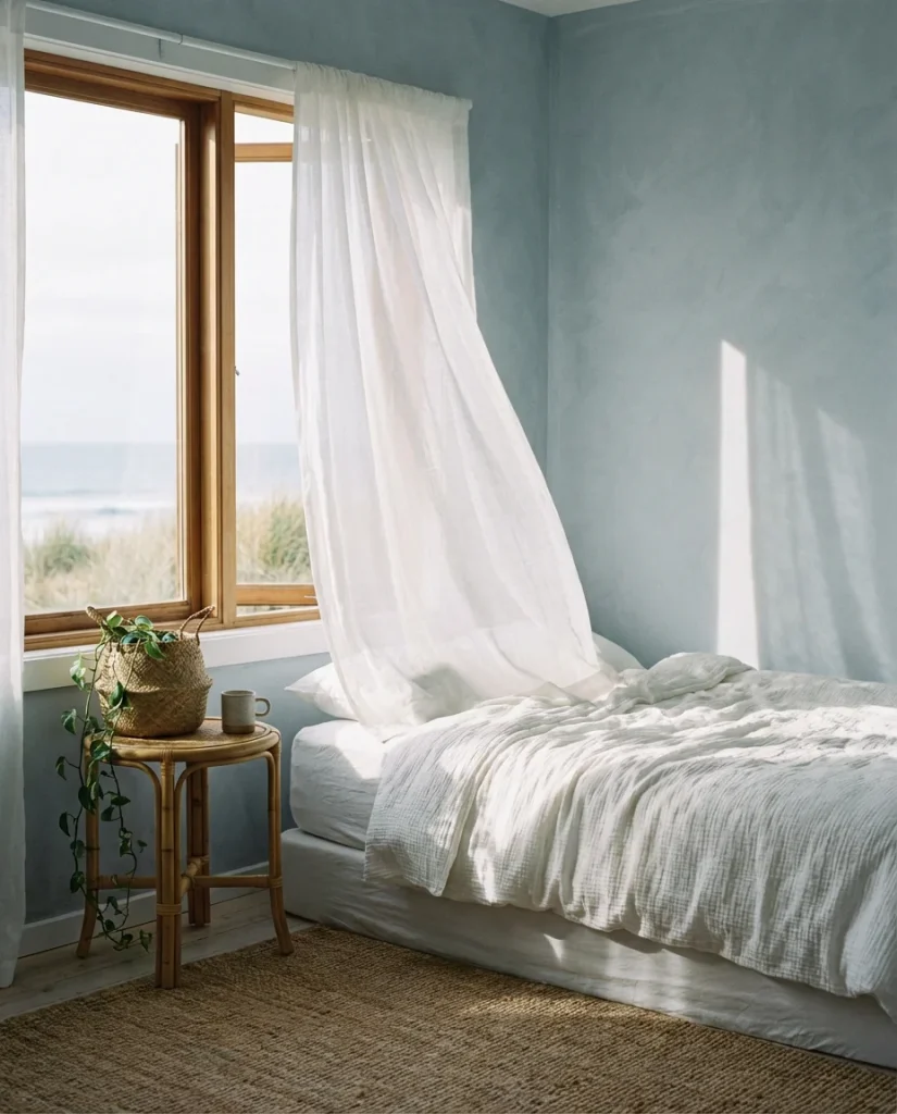
A limewash finish in soft, faded blue creates the most serene bedroom wall imaginable—it evokes weathered plaster in a centuries-old Mediterranean villa, a beach cottage with its windows permanently open to salt air, or the inside of a home that has been loved and lived in for generations. The pale blue tones shift between gray, aqua, and periwinkle as light changes throughout the day, giving the room an almost living quality. Combined with natural linen, rattan, and the occasional touch of warm brass, this finish defines coastal calm for the 2026 bedroom.
This finish has become a signature look in coastal communities from Maine to Malibu, but it translates just as beautifully inland—anywhere a bedroom needs to feel like an exhale. The biggest pitfall is choosing a blue that’s too saturated; limewash is inherently a soft, low-chroma technique, and a too-vivid blue will fight the natural variation of the finish rather than working with it. Stick to dusty, gray-toned blues—think sky at dawn rather than ocean at noon. The overall effect should make you want to take off your shoes and stay awhile.
 Conclusion
Bedroom accent walls are one of the most rewarding home updates you can make—high impact, relatively affordable, and endlessly customizable to your own taste and your home’s particular personality. Whether you go bold with Iron Ore and black shiplap or quietly beautiful with sage limewash and board and batten, the right wall can shift the entire feeling of a room you spend a third of your life in. We’d love to hear which of these ideas sparked something for you—drop your thoughts in the comments below, and let us know if you’ve tackled any of these looks in your own bedroom.