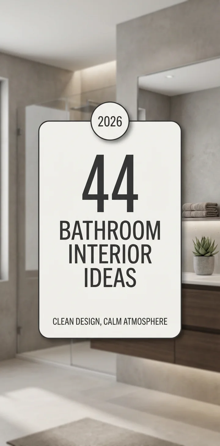
Bathroom design is entering a bold new chapter in 2026, where color becomes the defining feature of personal sanctuary spaces. American homeowners are moving beyond safe neutrals and embracing everything from earthy terracottas to dramatic charcoals, seeking spaces that reflect individuality and wellness. Pinterest boards are flooded with searches for bathrooms that balance serenity with personality—whether it’s a powder room energized by vibrant jewel tones or a primary suite wrapped in nature-inspired greens. This guide presents 23 inspiring color directions that capture what’s resonating right now, blending timeless appeal with fresh, forward-thinking palettes perfect for any bathroom size or style.
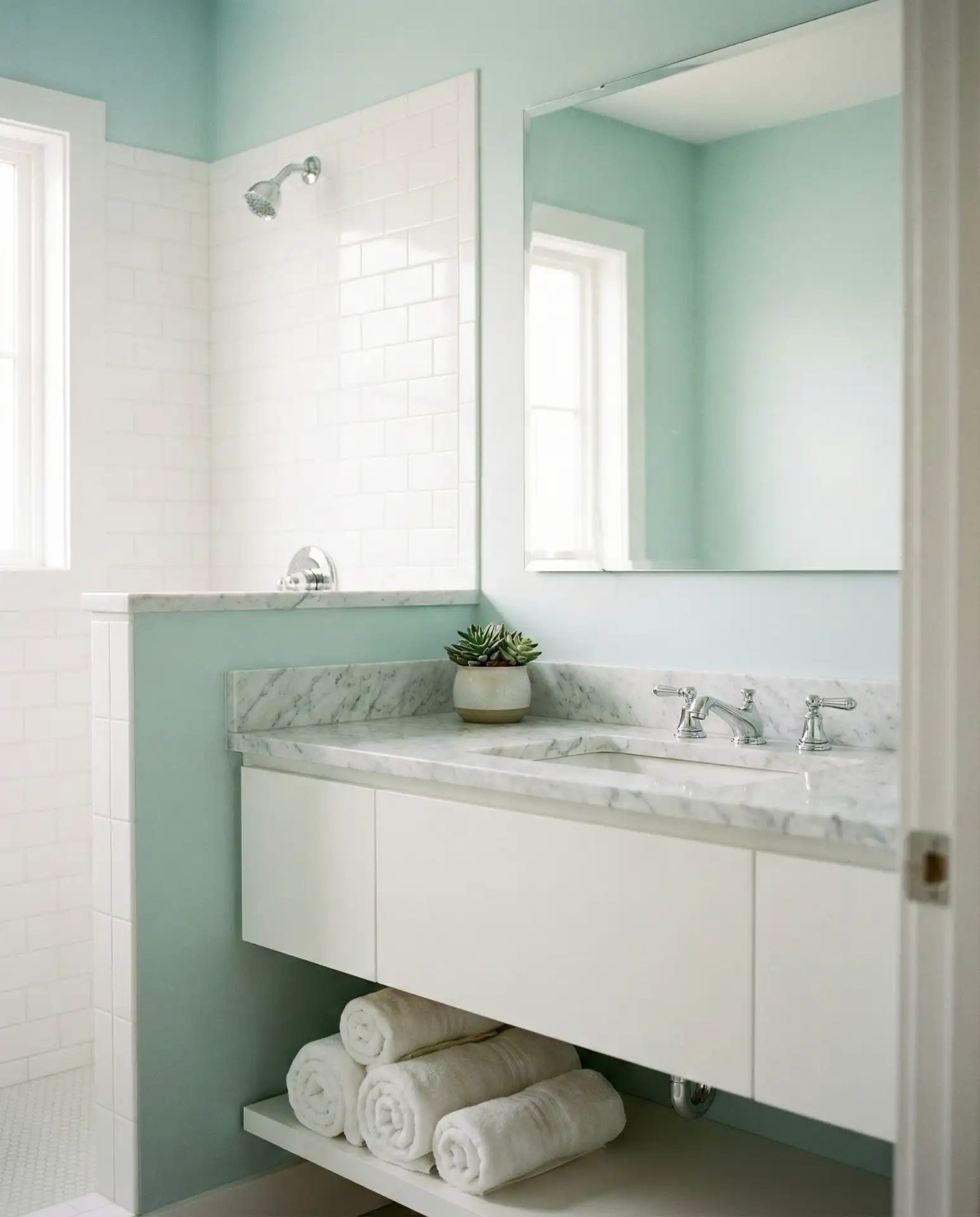
1. Soft Sage Green in a Small Bathroom
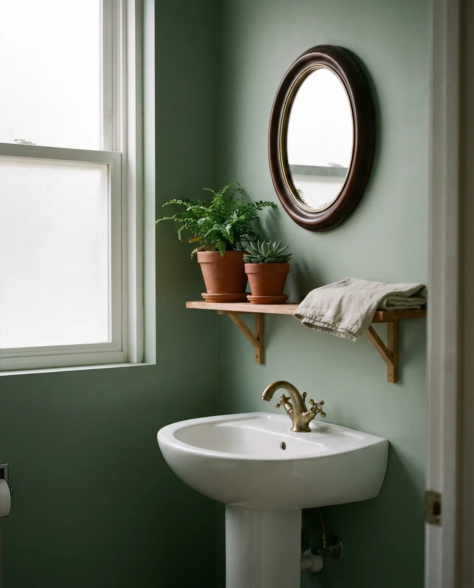
A small bathroom wrapped in soft sage green delivers instant calm without overwhelming the space. This 2026 favorite works beautifully in tiny powder rooms where natural light is limited, as the muted green reflects warmth while maintaining a clean, airy feel. Pair it with white trim and brass fixtures for a look that feels both modern and organic, turning even the most compact layout into a retreat. 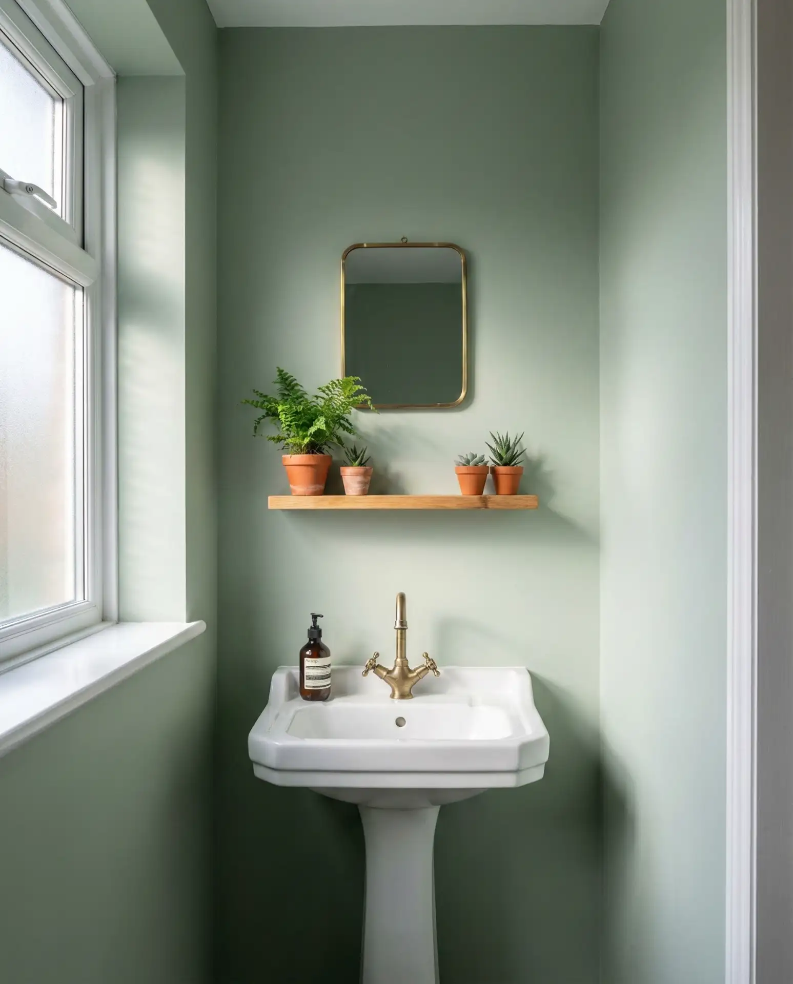
This palette works best in bathrooms with white subway tile or beadboard wainscoting, where the green can breathe without competing textures. Many designers recommend testing samples in both morning and evening light, as sage shifts beautifully throughout the day. It’s a forgiving choice for first-time DIYers, hiding minor imperfections while adding sophistication that photographs beautifully for resale.
2. Charcoal Gray Vanity with White Marble
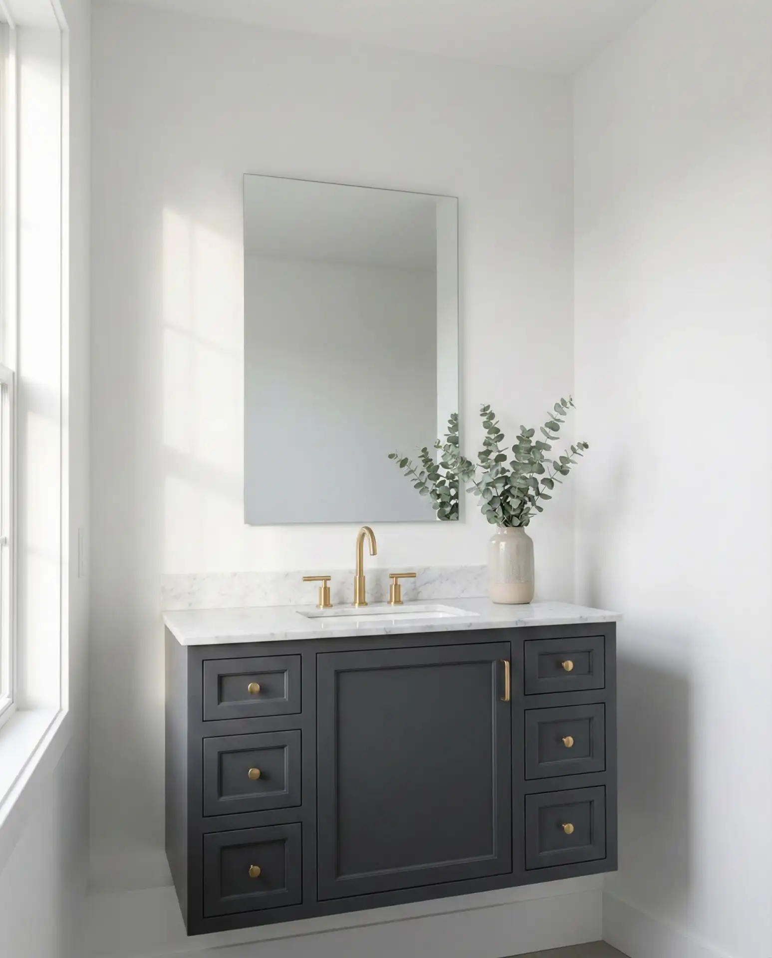
A gray vanity in deep charcoal creates instant drama when paired with crisp white marble countertops. This trending combination anchors modern bathrooms with a sculptural quality, offering contrast that feels deliberate rather than stark. The dark cabinetry grounds the space while white veining in the marble keeps everything lifted and luxurious, perfect for main bathrooms where you want a statement piece. 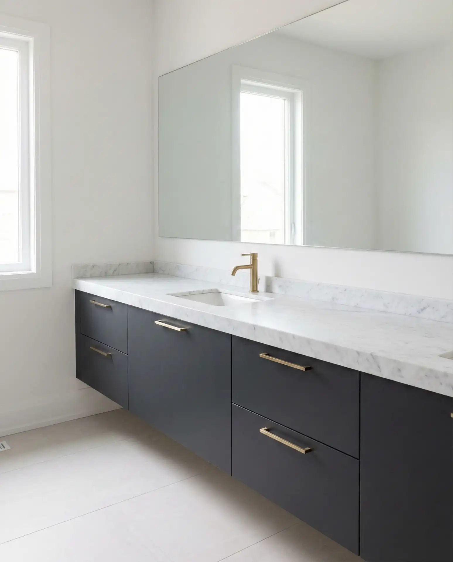
A common mistake is choosing gray that’s too blue-toned, which can read cold in artificial light. Instead, look for charcoals with subtle brown or green undertones that warm up under bathroom lighting. This approach avoids the sterile feel some homeowners regret after installation, ensuring the space feels inviting at all hours.
3. Warm Terracotta Accent Wall
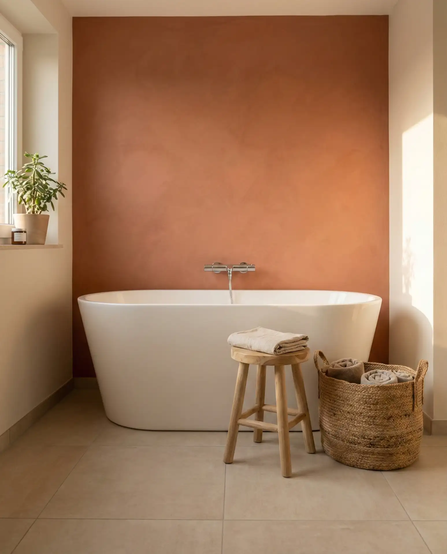
Terracotta brings earth tone warmth into bathrooms without committing to full-room color. A single accent wall in this rustic and natural hue creates a focal point behind a freestanding tub or vanity, channeling the Southwest’s sun-baked beauty. It pairs beautifully with neutral beiges and creamy whites, making it ideal for homeowners who want personality without visual overwhelm in their guest bath. 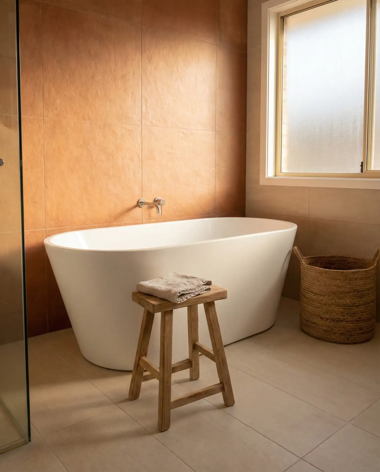
This color thrives in homes across Arizona, New Mexico, and California, where the connection to desert landscapes feels authentic. One homeowner in Tucson painted just the tub wall in terracotta and left the rest cream—the result was a spa-like space that felt personal rather than trendy, proving that restraint often yields the most memorable design.
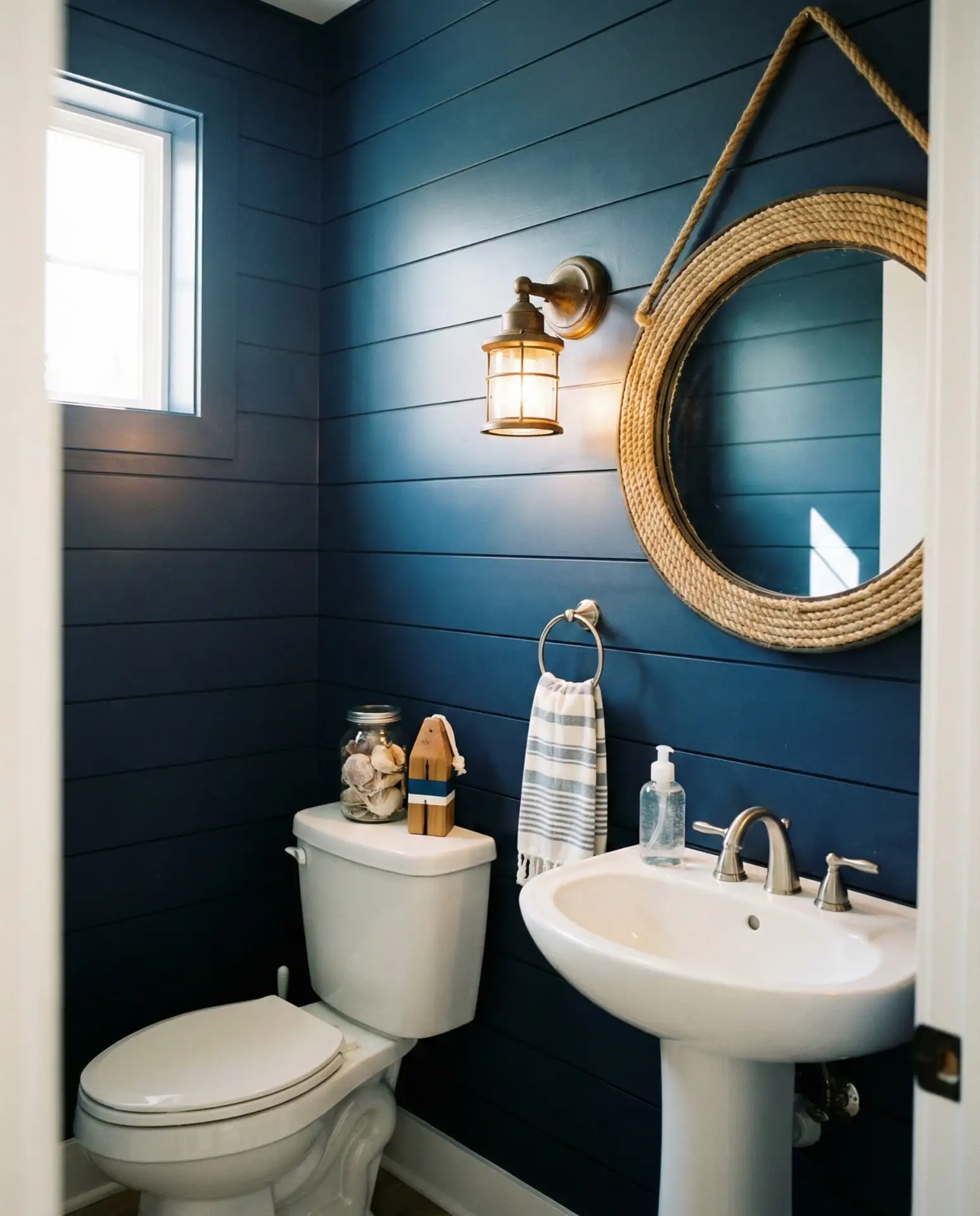
4. Navy Blue Shiplap in a Half Bath
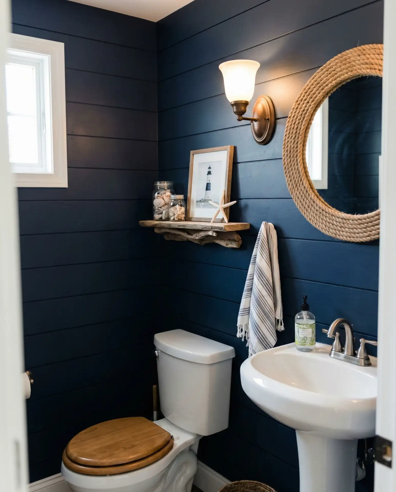
A half bath wrapped in navy blue shiplap delivers coastal charm with surprising versatility. This blue shade reads both modern and farmhouse depending on your fixtures—chrome leans contemporary, while oil-rubbed bronze nods to tradition. The horizontal lines of shiplap add dimension to tight quarters, making powder rooms feel intentionally designed rather than forgotten spaces. 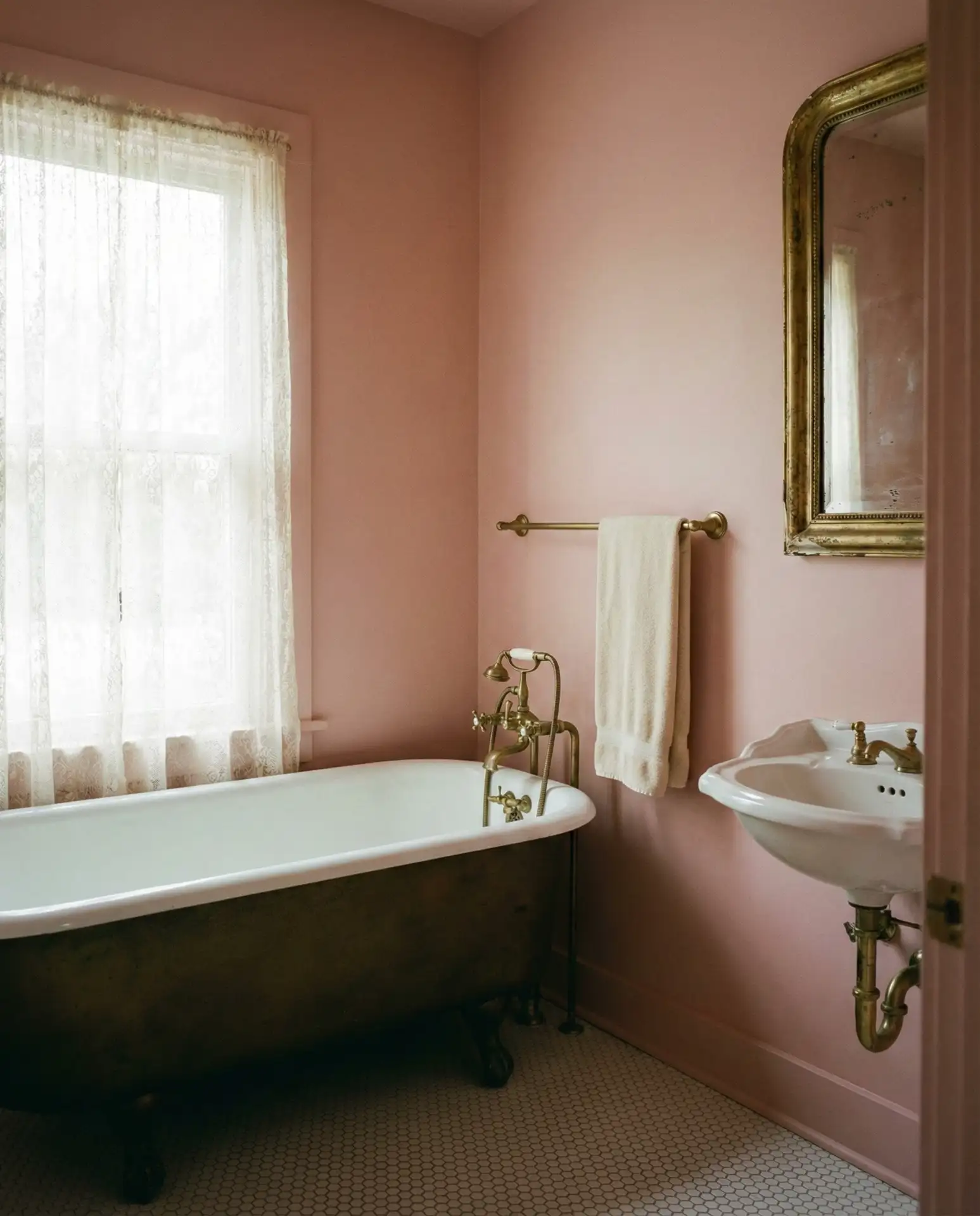
Many homeowners budget around $200-$400 for materials in a typical half bath shiplap project, making this a high-impact upgrade that doesn’t require professional installation. Pre-primed boards cut down on time, and the navy hides minor gaps better than lighter colors, making it forgiving for weekend DIY warriors tackling their first accent wall.
5. Blush Pink with Brass Fixtures
Blush pink is emerging as the unexpected neutral and serene choice for 2026, especially in vintage-inspired bathrooms. This soft, dusty rose creates warmth without leaning juvenile, and when paired with aged brass fixtures, it channels old Hollywood glamour. The color flatters skin tones in mirrors and photographs beautifully, making it a favorite among design-conscious millennials renovating their first homes. 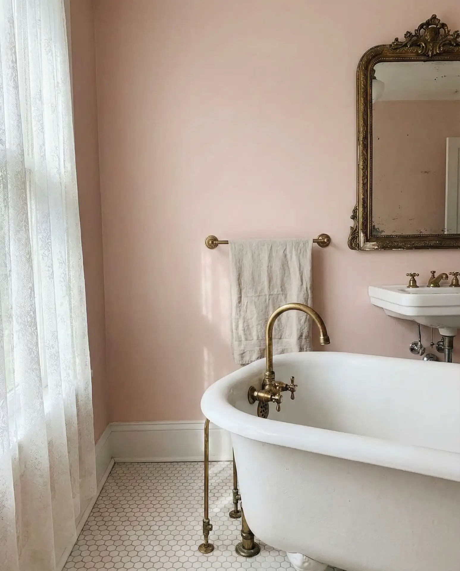
Where it works best: in bathrooms with abundant natural light or south-facing windows, where the pink stays soft and romantic rather than too saturated. North-facing rooms may require a slightly warmer blush to avoid looking washed out. Pair with white marble or subway tile to keep the palette grounded and sophisticated.
6. Forest Green Cabinetry
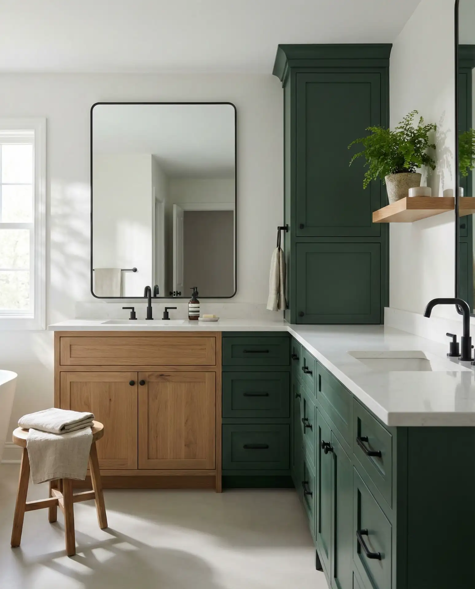
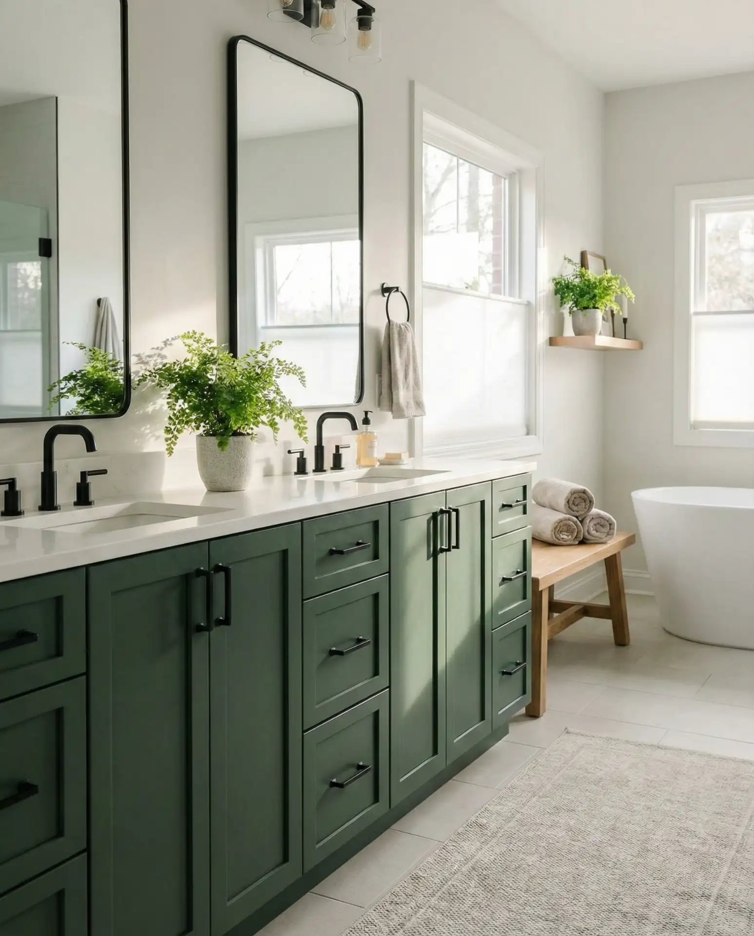
Real homeowner behavior shows that people who commit to green cabinetry rarely regret it, but they often wish they’d gone bolder from the start. The key is choosing a true forest green rather than a muddy olive, which can read dated. Test samples next to your lighting and existing finishes to ensure you’re getting the jewel-toned depth you’re after.
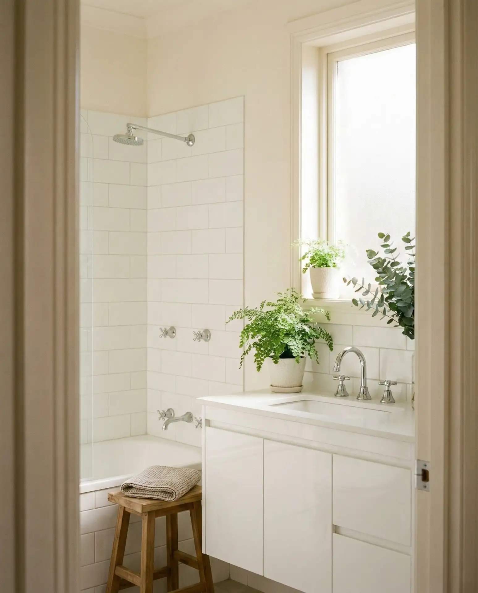
7. Crisp White Walls with Warm Wood Tones
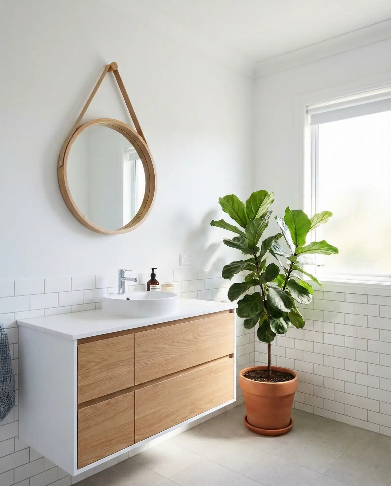
White walls remain timeless when layered with warm wood tones in a white vanity, shelving, or mirror frames. This neutral foundation allows rustic or modern accents to shine, creating a versatile backdrop that works across design styles. The combination feels fresh and clean while avoiding the cold, clinical vibe that can plague all-white spaces—the wood introduces organic texture and visual warmth. 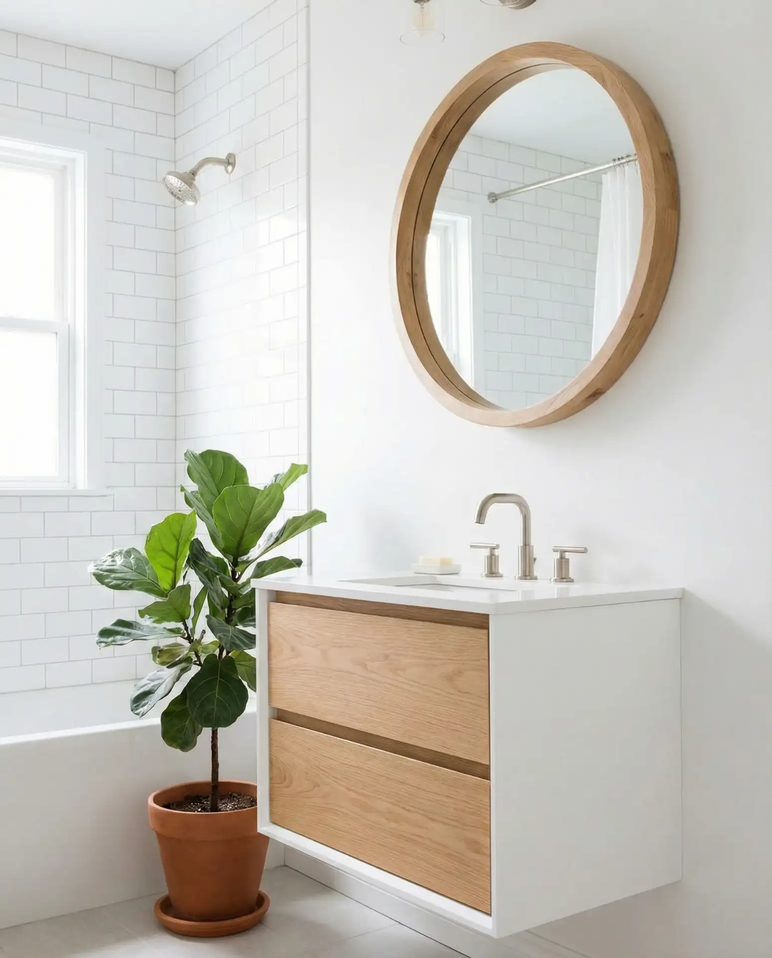
In the Pacific Northwest and New England, this palette resonates with homeowners seeking that hygge-inspired comfort without sacrificing brightness. It’s also budget-friendly: you can paint walls yourself and source affordable wood accents from places like CB2 or West Elm, keeping costs reasonable while achieving a custom, collected look.
8. Moody Black Walls with Gold Accents
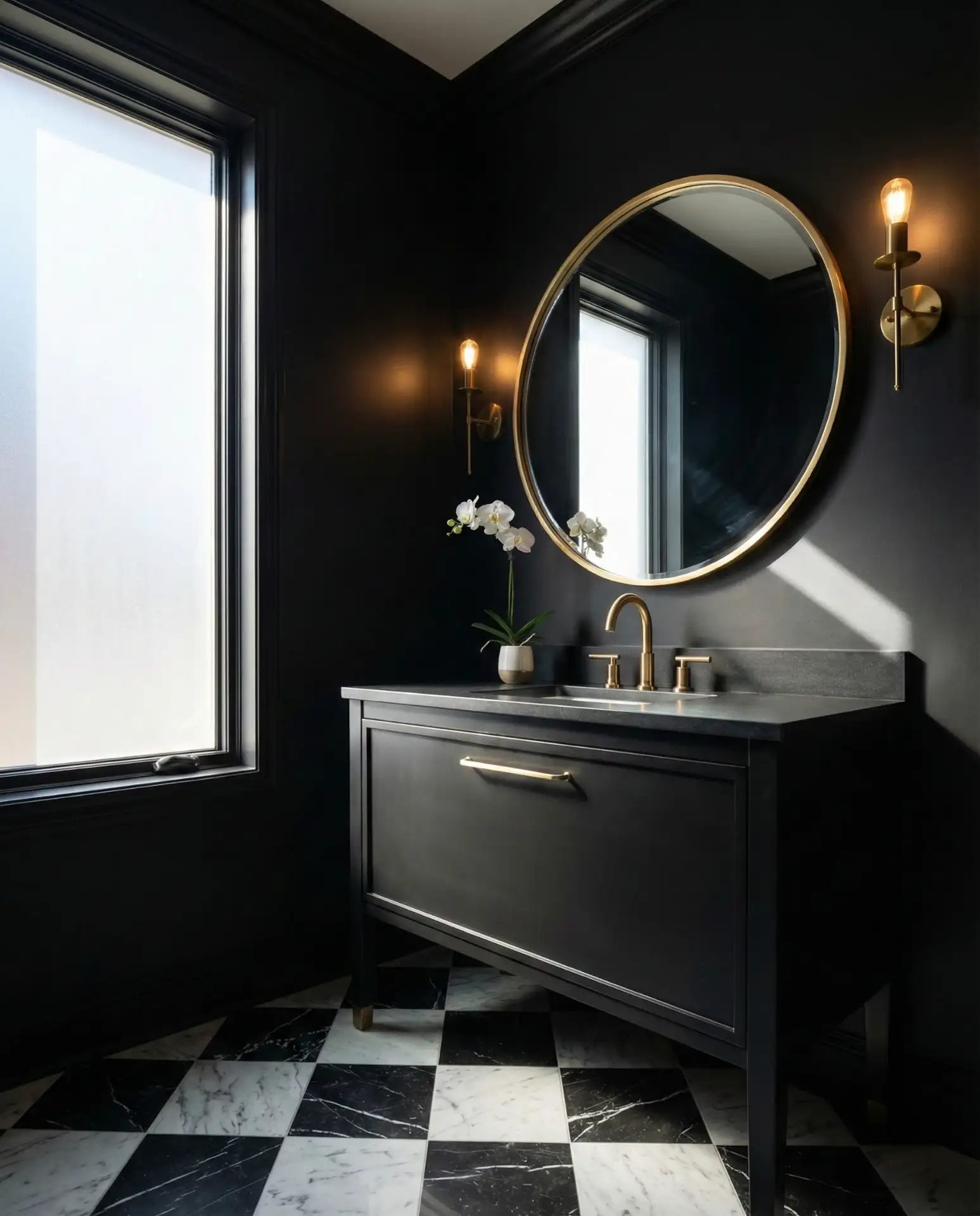
Black walls create the ultimate dark and moody bathroom, transforming a utilitarian space into a dramatic sanctuary. When balanced with gold or brass accents, the look feels luxurious rather than oppressive. This bold and vibrant choice works best in half baths or powder rooms where you’re not spending extended time, allowing you to lean into drama without overwhelming daily routines. 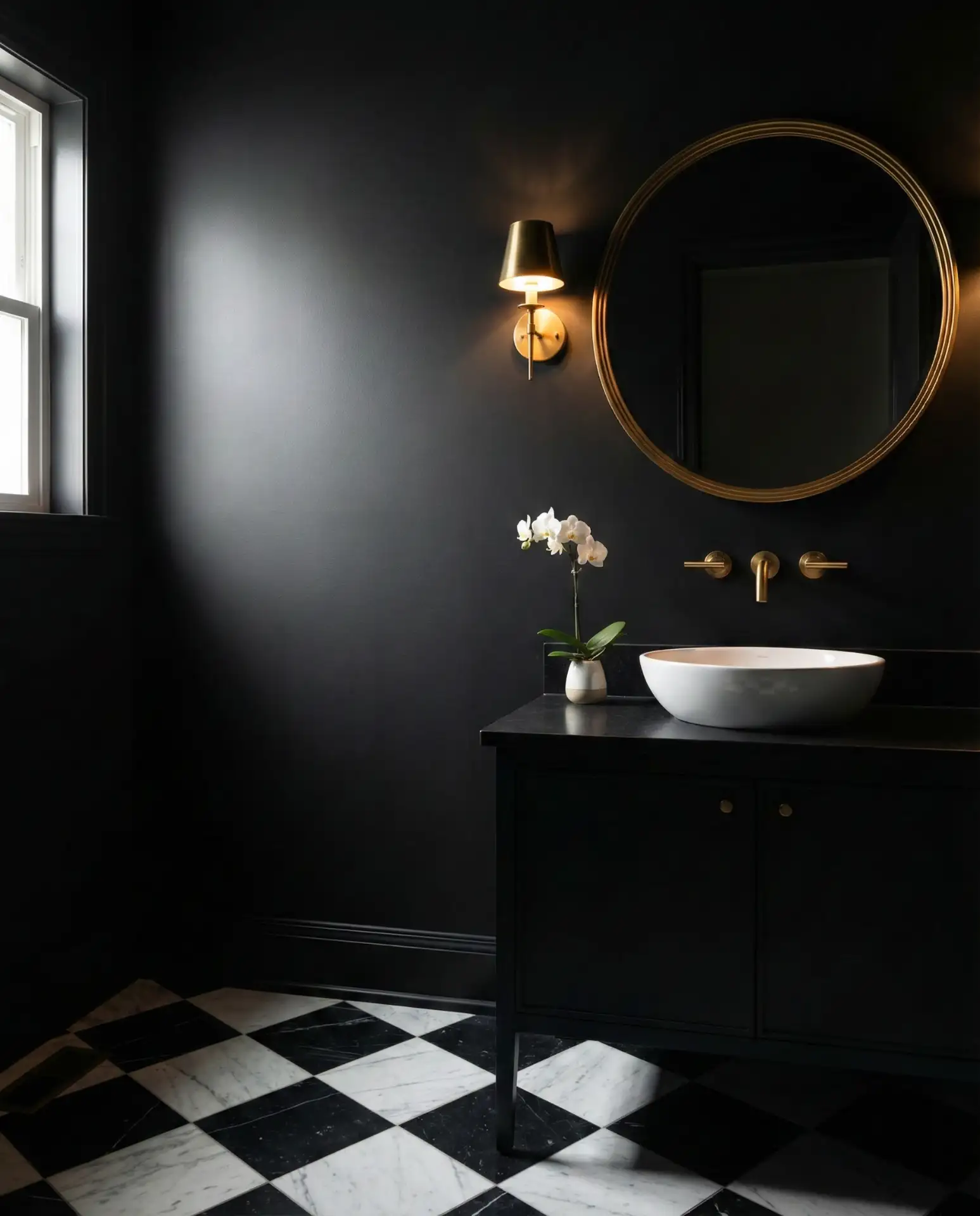
Expert designers suggest using a flat or matte finish on black walls to avoid highlighting every water spot or fingerprint. Semi-gloss can work on trim for subtle contrast, but matte keeps the vibe sophisticated and low-maintenance. Layer in multiple light sources—wall sconces, pendants, and candles—to prevent the space from feeling cave-like.
9. Soft Blue-Gray for Coastal Calm
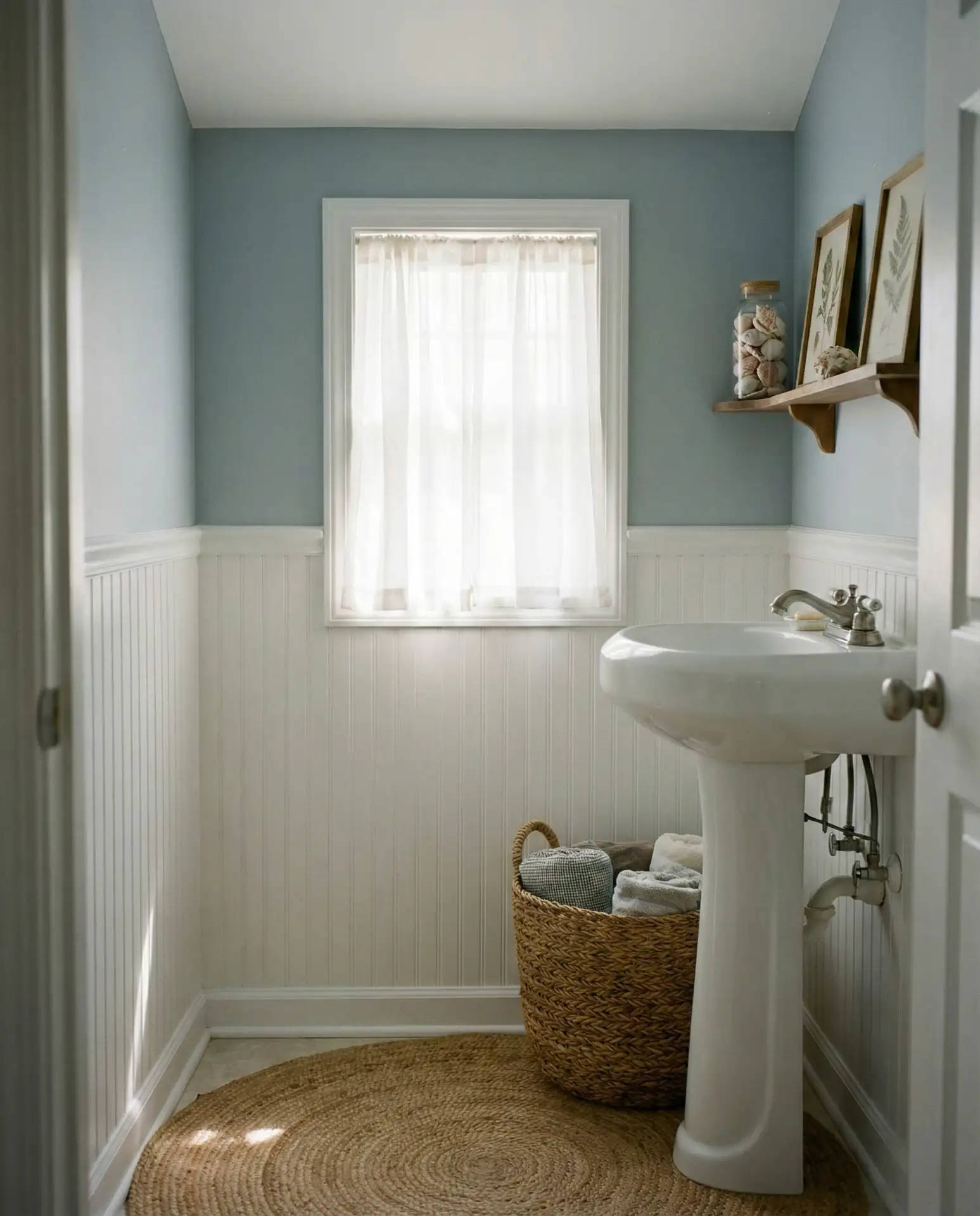
Soft blue-gray captures the essence of misty mornings by the ocean, making it perfect for homeowners chasing neutral and serene vibes. This blue and gray hybrid feels current without being trendy, working beautifully in small bathrooms where you want a sense of openness. It pairs effortlessly with white fixtures and natural fiber accents like jute or linen, creating a breezy, low-stress environment. 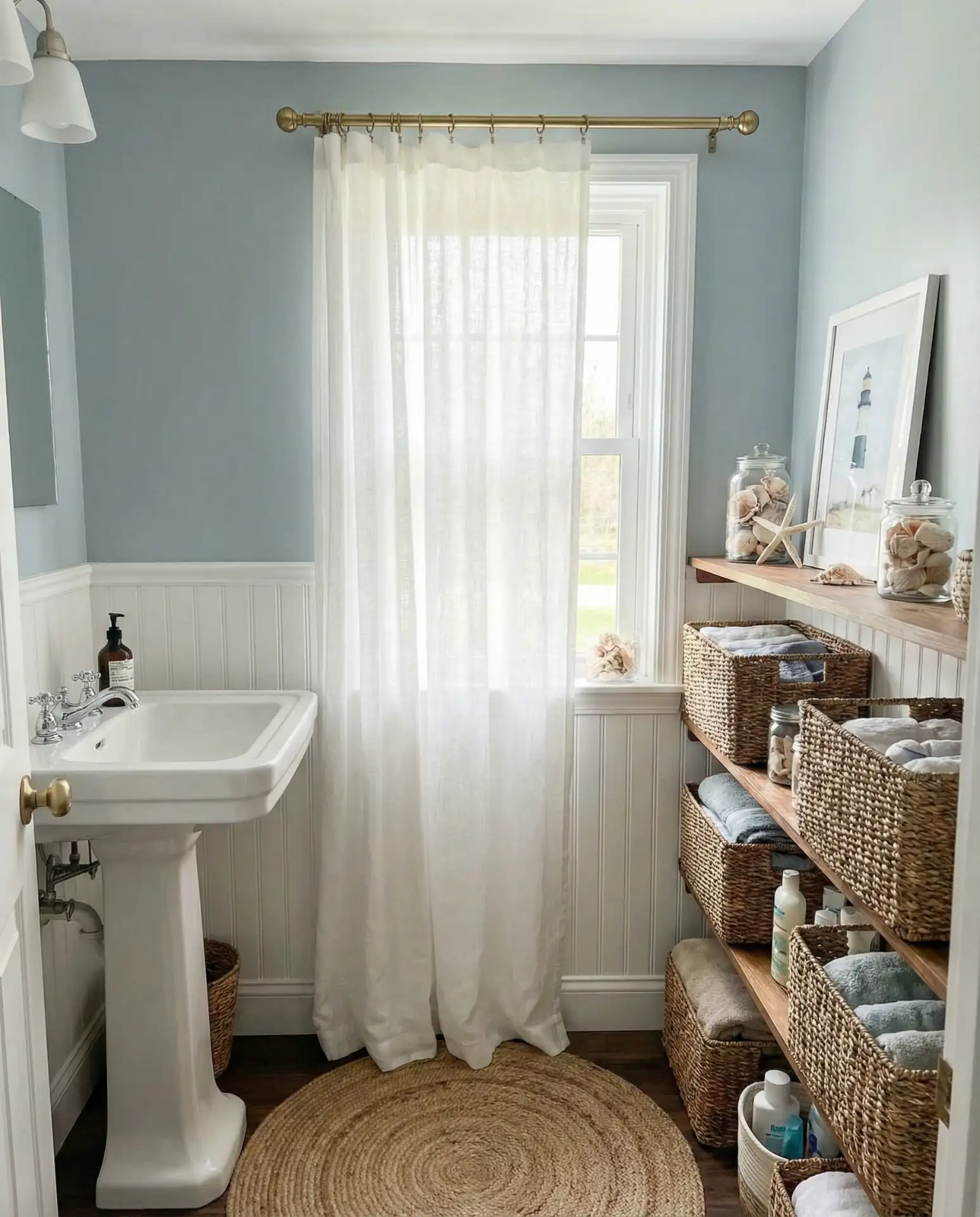
Where it works best: in coastal regions from Maine to Southern California, but also in landlocked areas where homeowners want to evoke vacation vibes year-round. The color’s chameleon quality means it reads differently depending on your lighting—cooler in north-facing rooms, warmer with southern exposure. Always test samples in your actual space before committing.
10. Warm Taupe with Black Fixtures
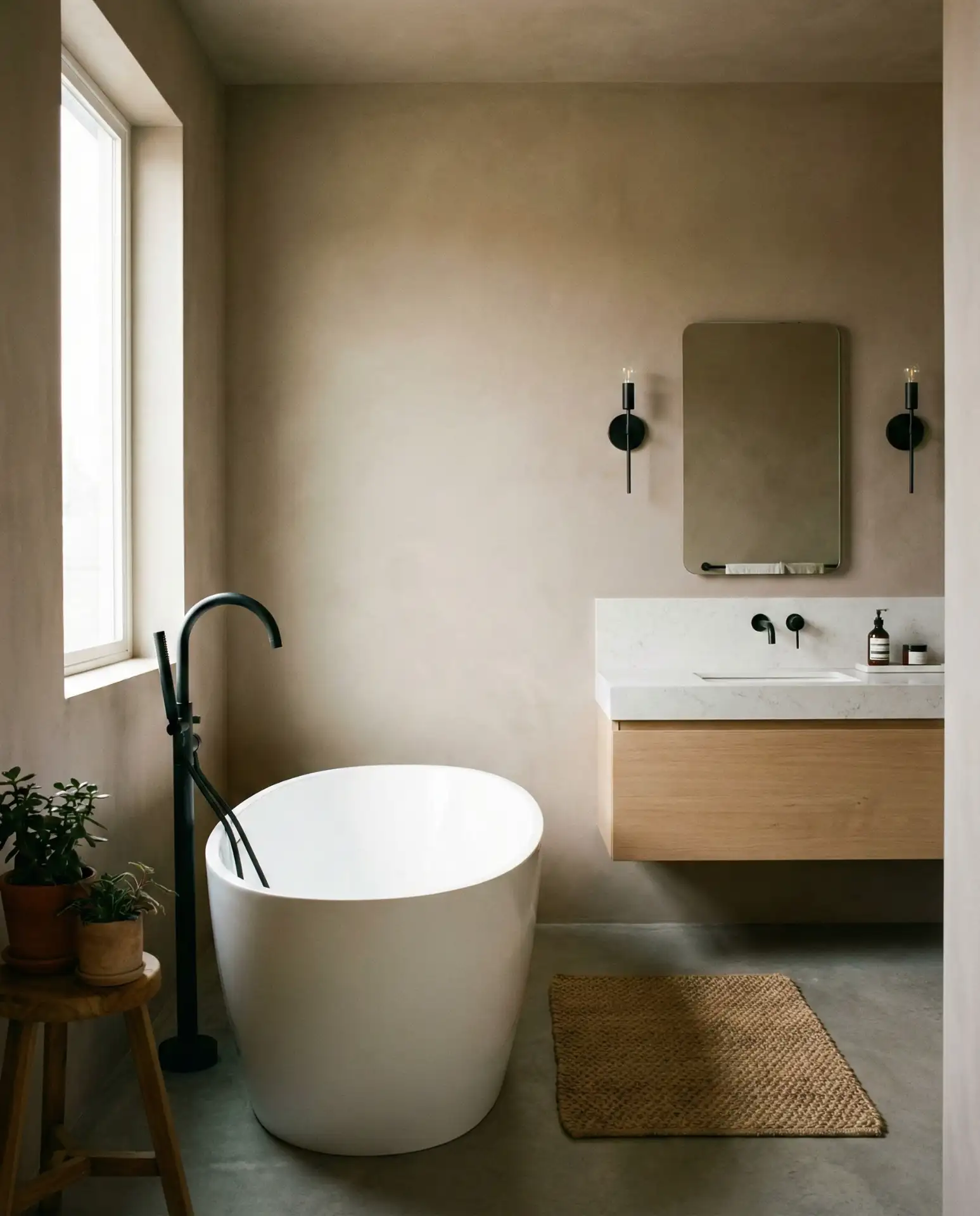
Warm taupe offers a neutral foundation that’s more sophisticated than beige, especially when contrasted with matte black fixtures. This earth tone works in modern and farmhouse settings alike, providing a soft backdrop that lets architectural details and hardware shine. The combination feels both current and timeless, making it a safe bet for homeowners worried about resale value. 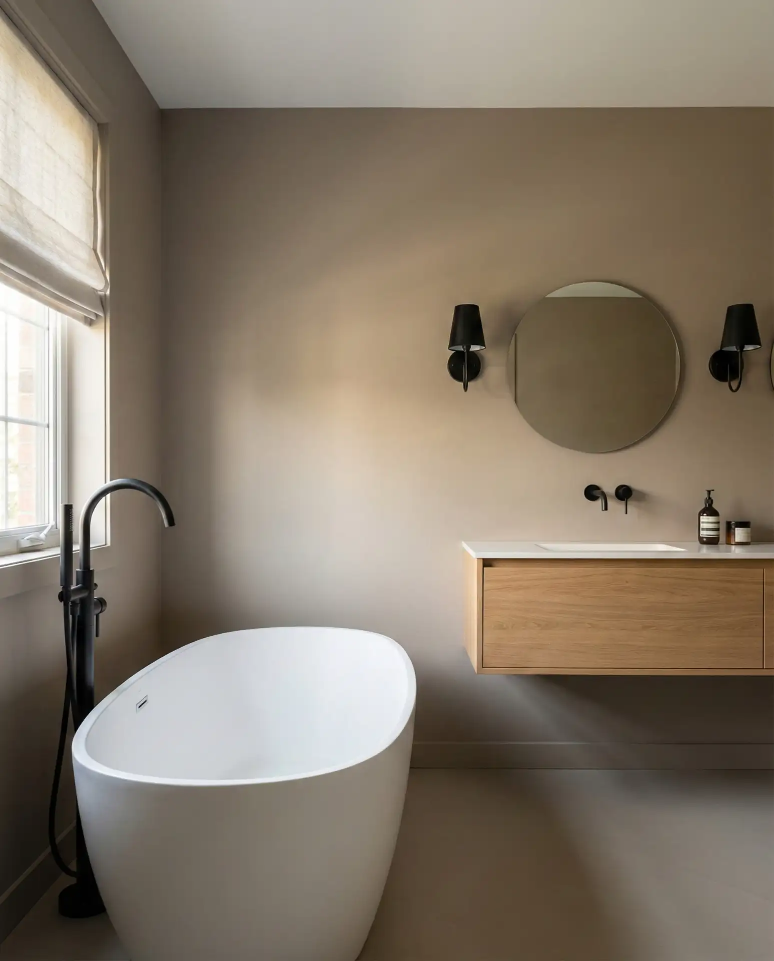
One designer in Austin noted that clients often choose taupe as a “safe” option but end up loving how versatile it is—easy to accessorize with everything from brass to chrome, and forgiving when kids inevitably leave toothpaste smudges on the walls. It’s the kind of color that quietly supports your life rather than demanding attention.
11. Sherwin Williams Alabaster Throughout
Sherwin Williams Alabaster has become the go-to white for entire bathroom makeovers, offering a warm, soft white that avoids the sterile feel of pure white. This neutral shade works in small bathrooms and large primary suites alike, creating a cohesive, airy feel when used on walls, trim, and even ceilings. It’s trending for its ability to work with any lighting situation, never looking too yellow or too blue. 
A practical insight: Alabaster shows remarkable consistency across different sheens, meaning your flat-finish walls will match your semi-gloss trim beautifully. Many painters recommend it for DIYers because it’s forgiving and doesn’t require perfect technique to achieve professional-looking results. It’s also available at most major retailers, making touch-ups easy down the line.
12. Dusty Lavender for a Vintage Feel
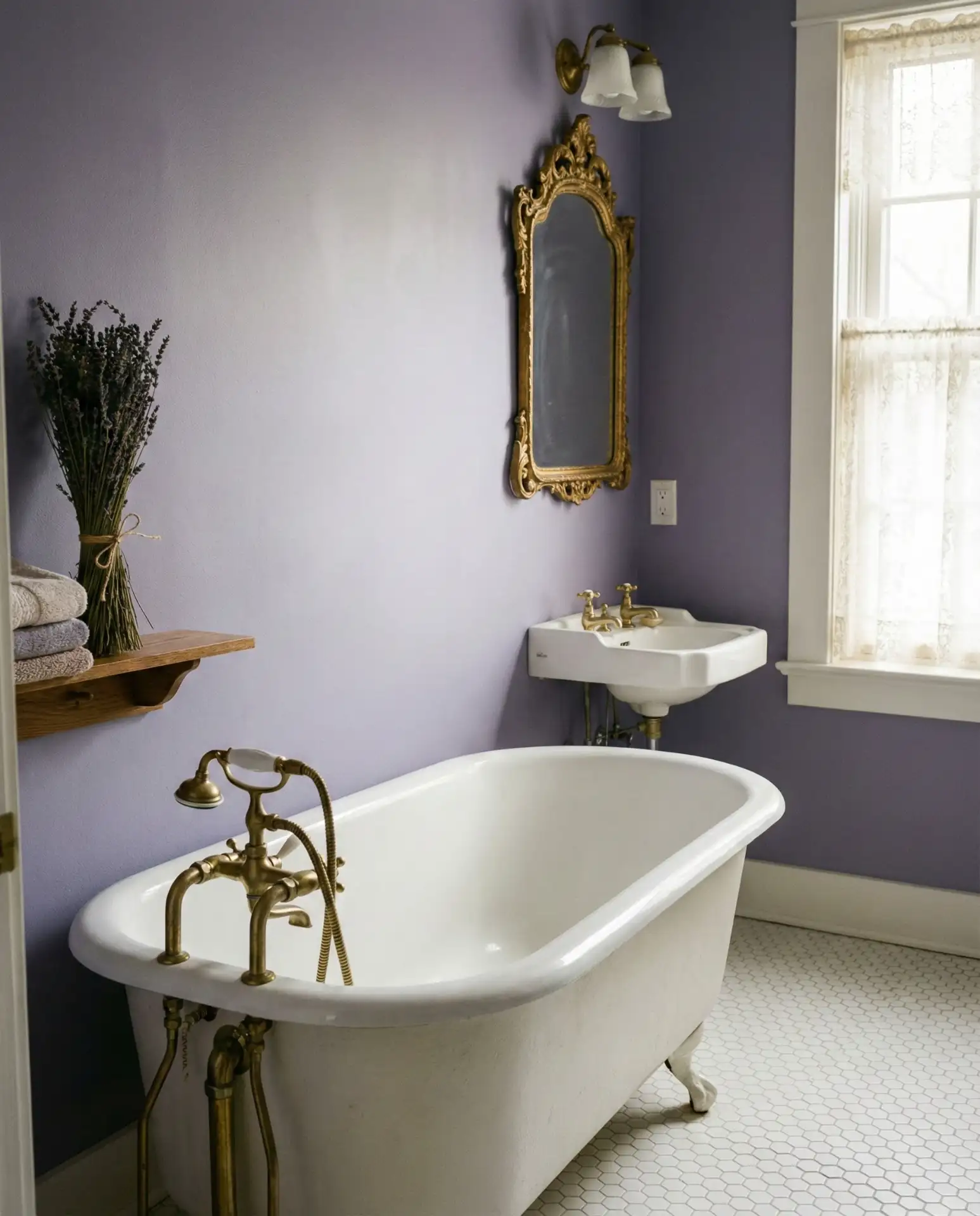
Dusty lavender brings vintage romance to bathrooms without feeling overly sweet or dated. This fun alternative to pink works beautifully in guest bathrooms where you want to create a memorable, welcoming atmosphere. The muted purple-gray hybrid pairs wonderfully with antique brass, white porcelain, and vintage-inspired tilework, creating a space that feels collected over time. 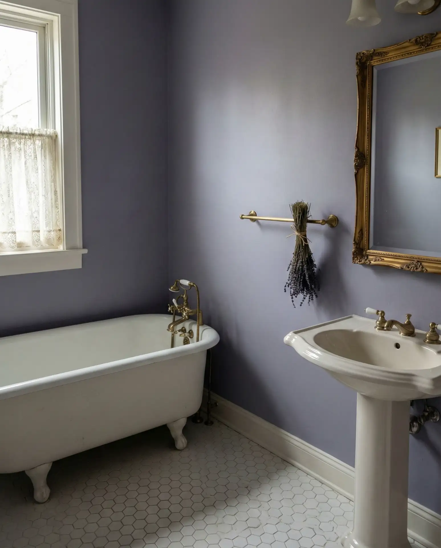
This color thrives in homes with vintage bones—think 1920s bungalows or Victorian townhouses—where the lavender feels like an authentic restoration rather than a modern imposition. One homeowner in Portland kept her original pedestal sink and simply painted the walls lavender, instantly elevating what was a tired space into something worth photographing.
13. Bright White with Colorful Tile Accents
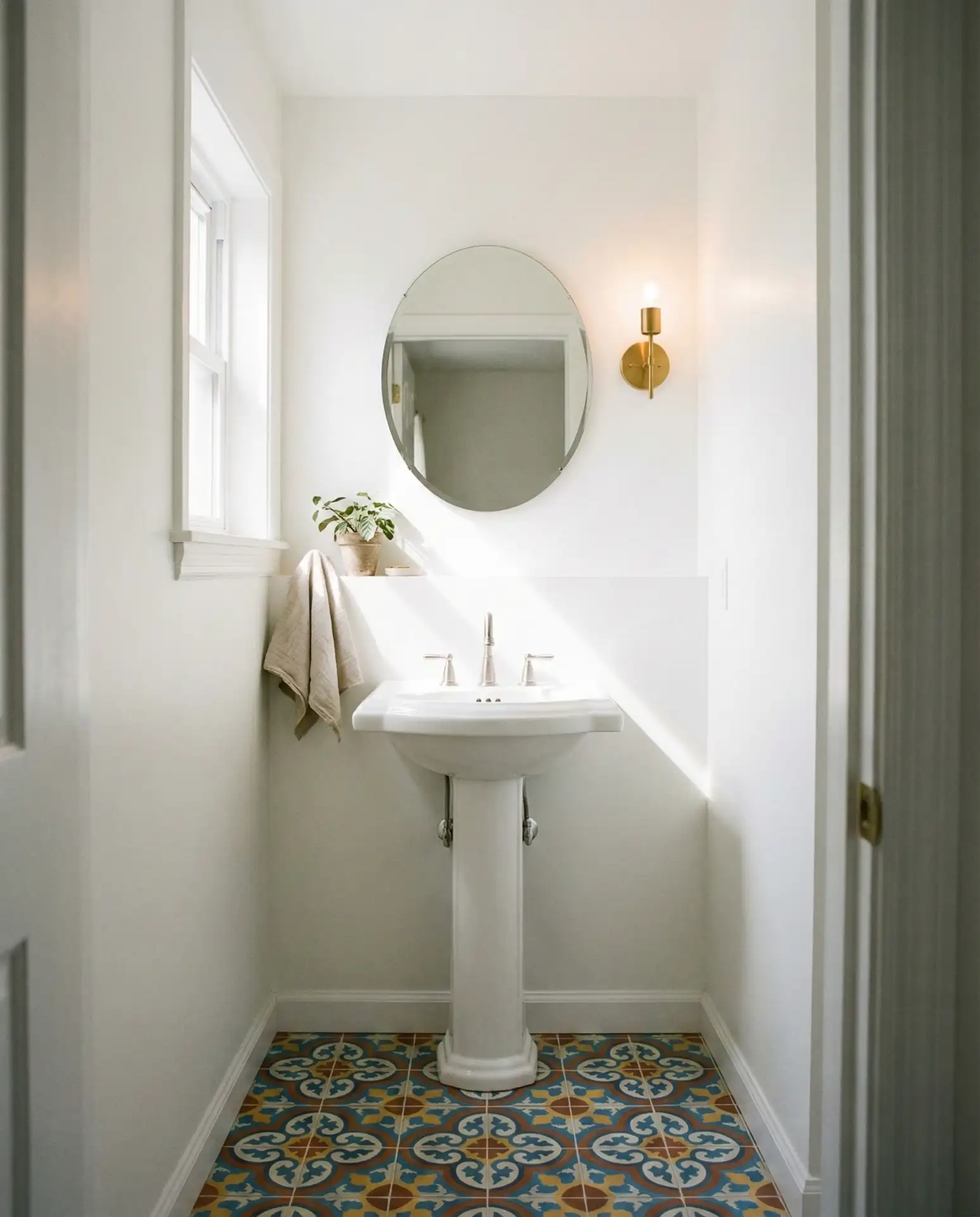
Bright white walls create the perfect canvas for bold and vibrant tile accents in fun patterns and colors. This approach works especially well in tiny bathrooms where you want to add personality without overwhelming the space—the white keeps things light while the tile provides visual interest. Think Moroccan zellige in jewel tones or hand-painted ceramics that become functional art. 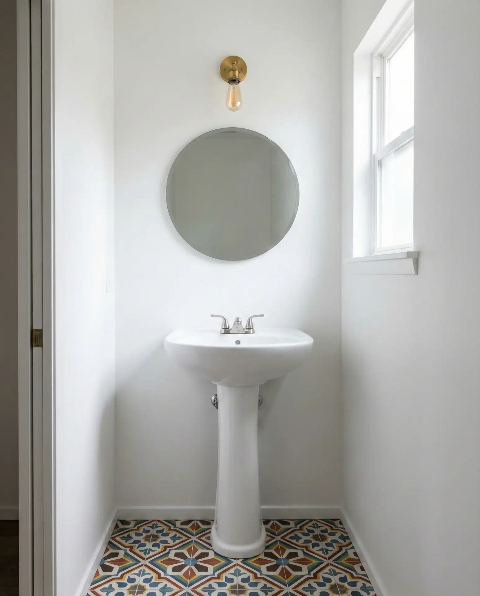
Common mistake: using too many tile patterns at once, which can create visual chaos. Instead, pick one patterned tile area—floor or shower niche—and keep everything else simple. This restraint lets your colorful tile shine as the focal point while maintaining a sense of calm and order in the overall space.
14. Earthy Olive Green
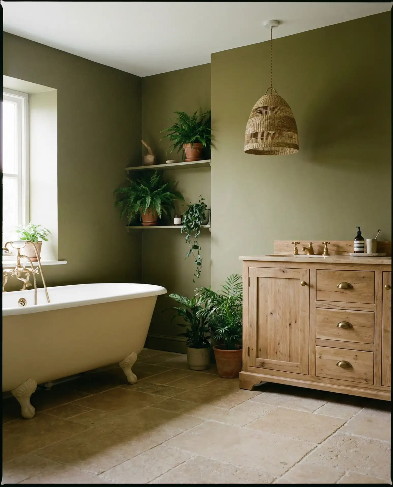
Olive green brings earth tone depth to bathrooms, offering a sophisticated alternative to lighter greens. This green shade works particularly well in rustic and farmhouse designs, grounding spaces with its connection to nature. Pair it with cream-colored fixtures and natural wood accents for a palette that feels organic and intentional, perfect for homeowners seeking a neutral and serene retreat. 
Budget-wise, olive green is a smart choice because it hides wear and minor imperfections better than lighter colors, meaning you can stretch time between repaints. It’s also increasingly available in peel-and-stick wallpaper options, allowing renters to experiment with this trending shade without permanent commitment or losing their security deposit.
15. Crisp Black and White Contrast
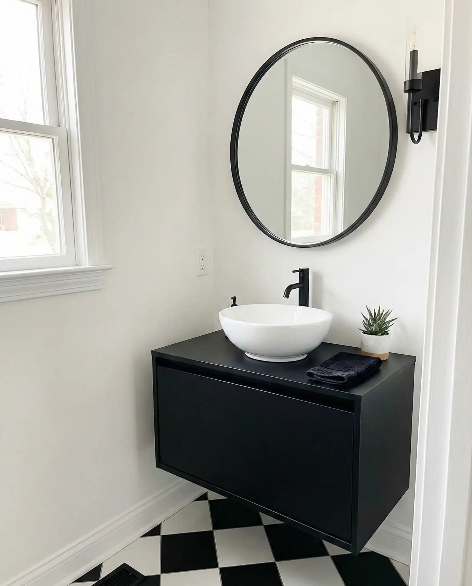
Classic black and white creates timeless modern drama, especially effective in half baths where high contrast makes a statement. This primary palette works with geometric floor tiles, subway walls, and either black or white fixtures depending on your preference. The stark contrast photographs beautifully and never goes out of style, making it ideal for design-minded homeowners committed to longevity over trends. 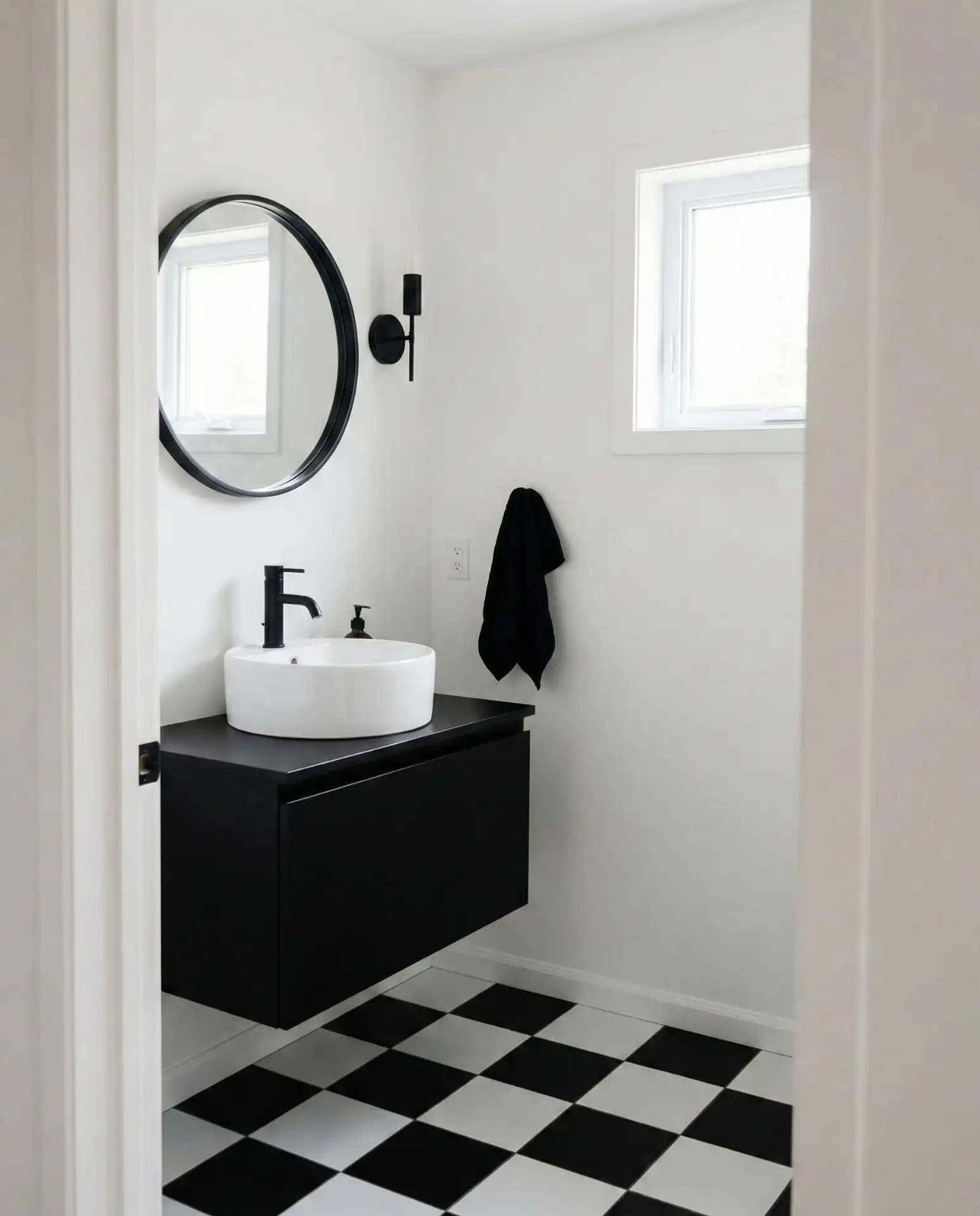
Where it works best: in powder rooms off entryways where you want to make a bold first impression. The graphic quality of black and white gives even modest spaces architectural weight. Add one organic element—a potted plant or wooden stool—to soften the starkness and prevent the space from feeling too much like a chessboard.
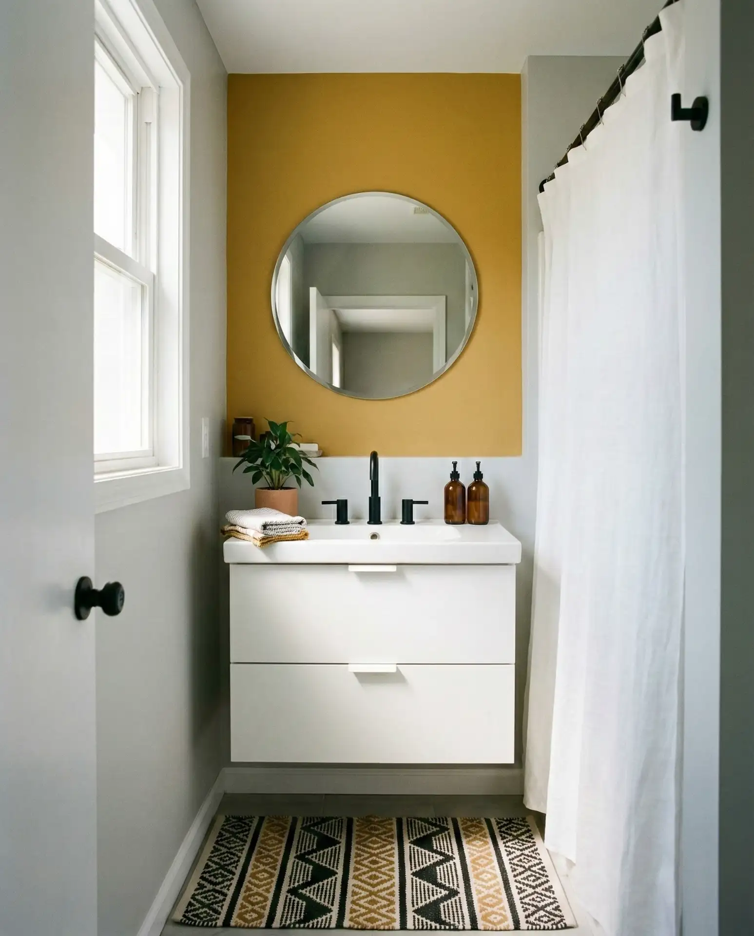
16. Warm Mustard Yellow Accents
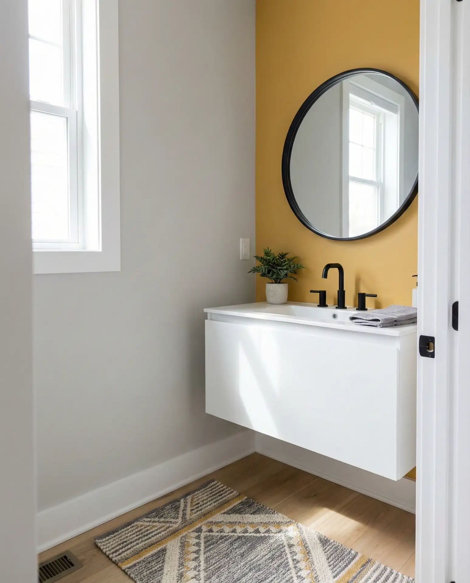
Mustard yellow accents inject fun energy into otherwise neutral bathrooms without requiring full-wall commitment. This bold and vibrant choice works beautifully on a single wall, inside shelving, or on cabinet interiors in small bathrooms where you want personality without overwhelm. The warm yellow pairs surprisingly well with gray, navy, and white, adding sunshine to even the dimmest spaces. 
Real homeowner behavior shows that people who use mustard yellow in bathrooms typically commit to it in small doses first—a painted medicine cabinet interior or accent stripe—before expanding. This gradual approach helps ensure you genuinely love living with the color. If it feels too bold, it’s easy to swap towels or accessories rather than repaint entire walls.
17. Soft Greige for Universal Appeal
Greige—that perfect gray-beige hybrid—has become the ultimate neutral for American bathrooms in 2026. This neutral and serene shade works across all bathroom sizes and styles, from modern to farmhouse, providing a warm backdrop that’s more sophisticated than builder-grade beige. It’s the color real estate agents consistently recommend for staging because it appeals to the widest possible audience. 
A practical insight from professional painters: greige looks dramatically different depending on your lighting temperature. Always test samples with your actual lightbulbs (typically 2700-3000K for bathrooms) rather than relying on daylight alone. What looks perfect at noon might read too pink or too green under evening artificial light, so testing at multiple times of day is essential.
18. Deep Teal with White Trim
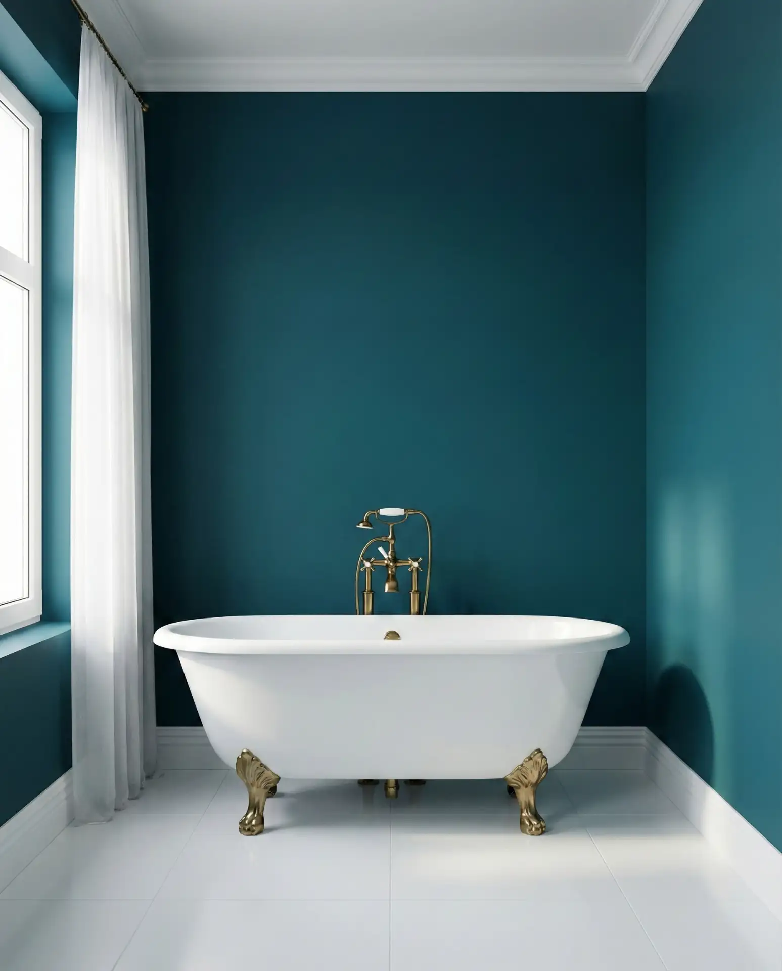
Deep teal delivers bold and vibrant color that feels both modern and vintage, working beautifully when balanced with crisp white trim and millwork. This rich blue-green hybrid creates depth without the heaviness of navy, making it suitable for main bathrooms where you want drama with sophistication. It’s particularly stunning with brass or gold fixtures that pick up the warm undertones. 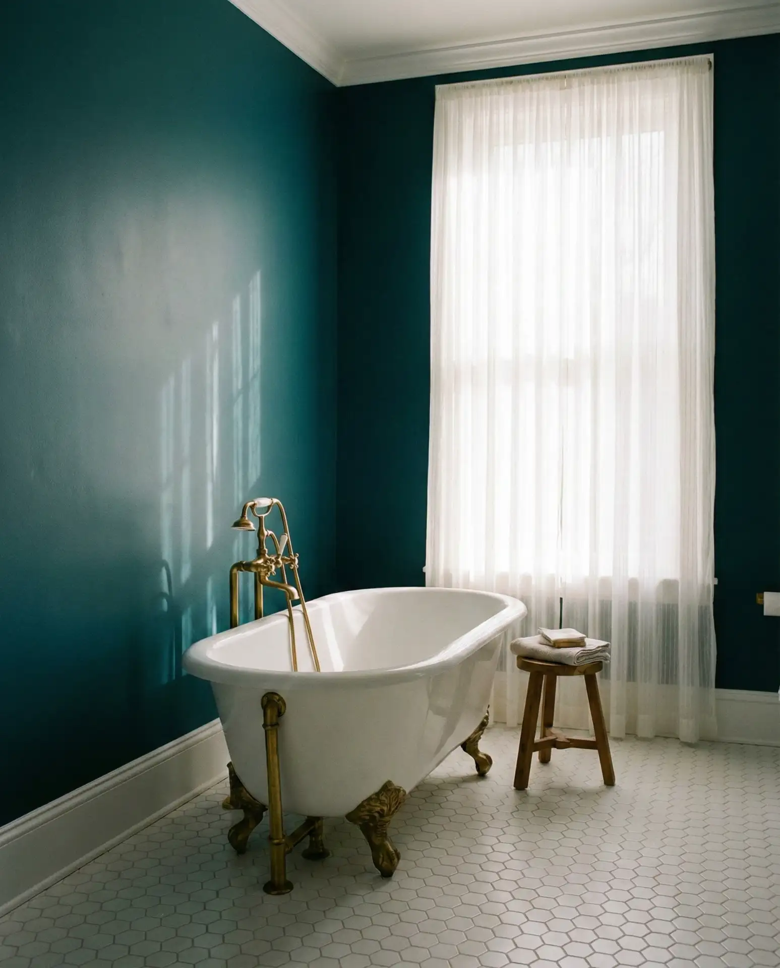
19. Soft Butter Yellow
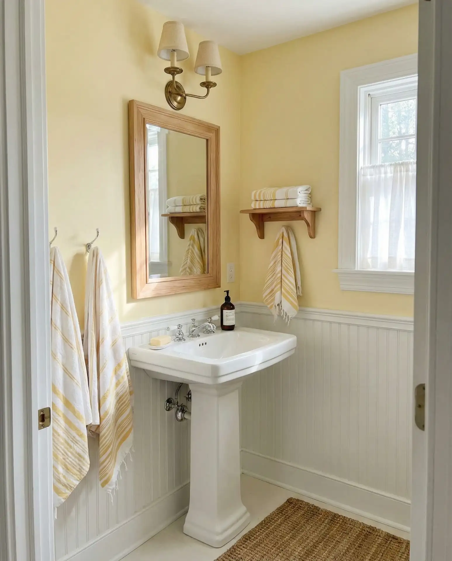
Soft butter yellow brings warmth and cheer to small bathrooms without the intensity of primary yellow. This fun yet sophisticated shade works particularly well in vintage-inspired spaces or farmhouse designs, evoking sunny mornings and simpler times. Pair it with white fixtures and natural wood tones for a palette that feels inviting year-round, especially in northern climates where sunshine is precious. 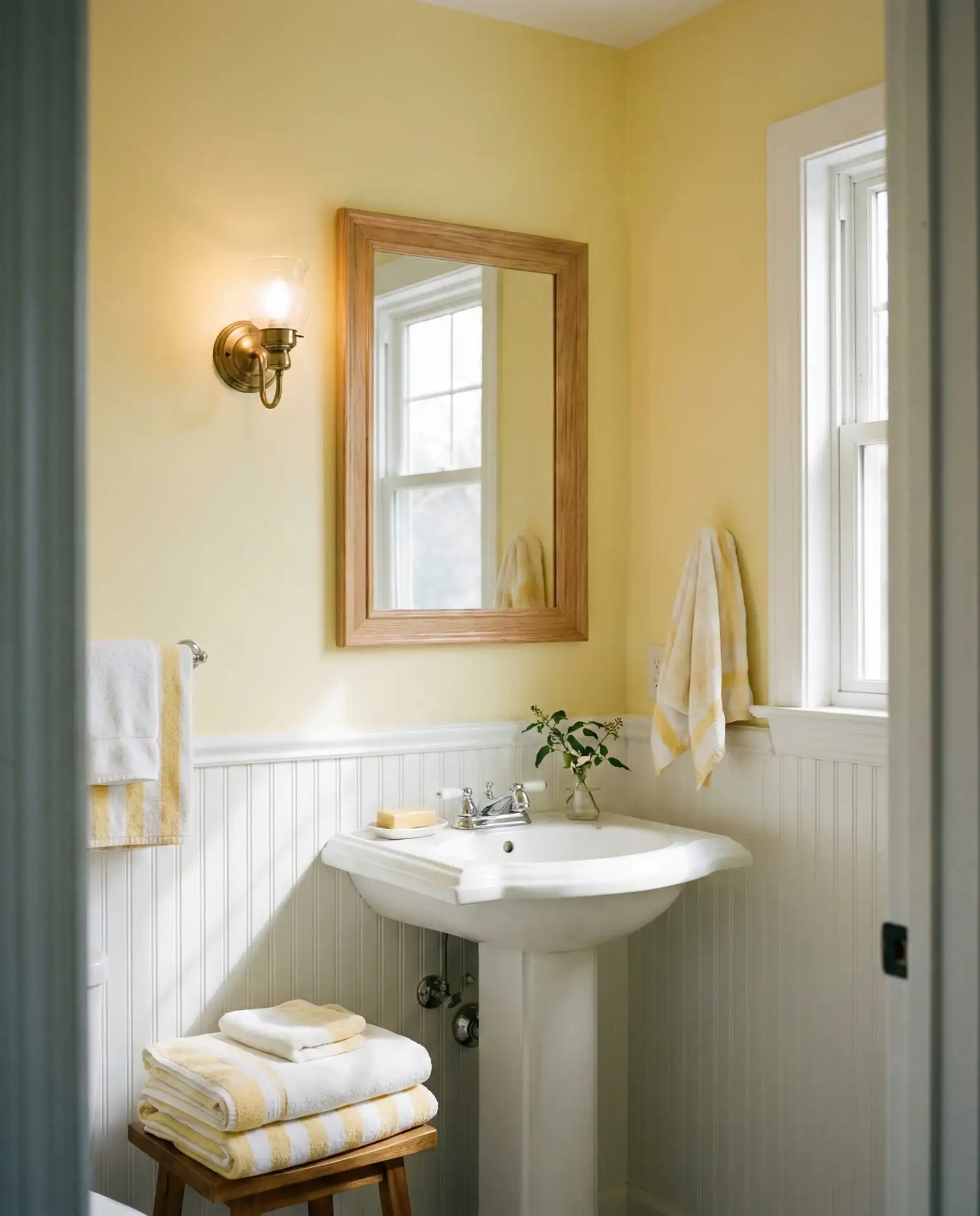
Expert commentary suggests butter yellow is making a comeback specifically because it’s cheerful without being childish—a difficult balance many 1990s yellows failed to achieve. The key is choosing a yellow with enough gray to keep it sophisticated. This updated approach makes butter yellow feel fresh rather than dated, perfect for homeowners renovating older homes while respecting their character.
20. Charcoal and Copper Combination
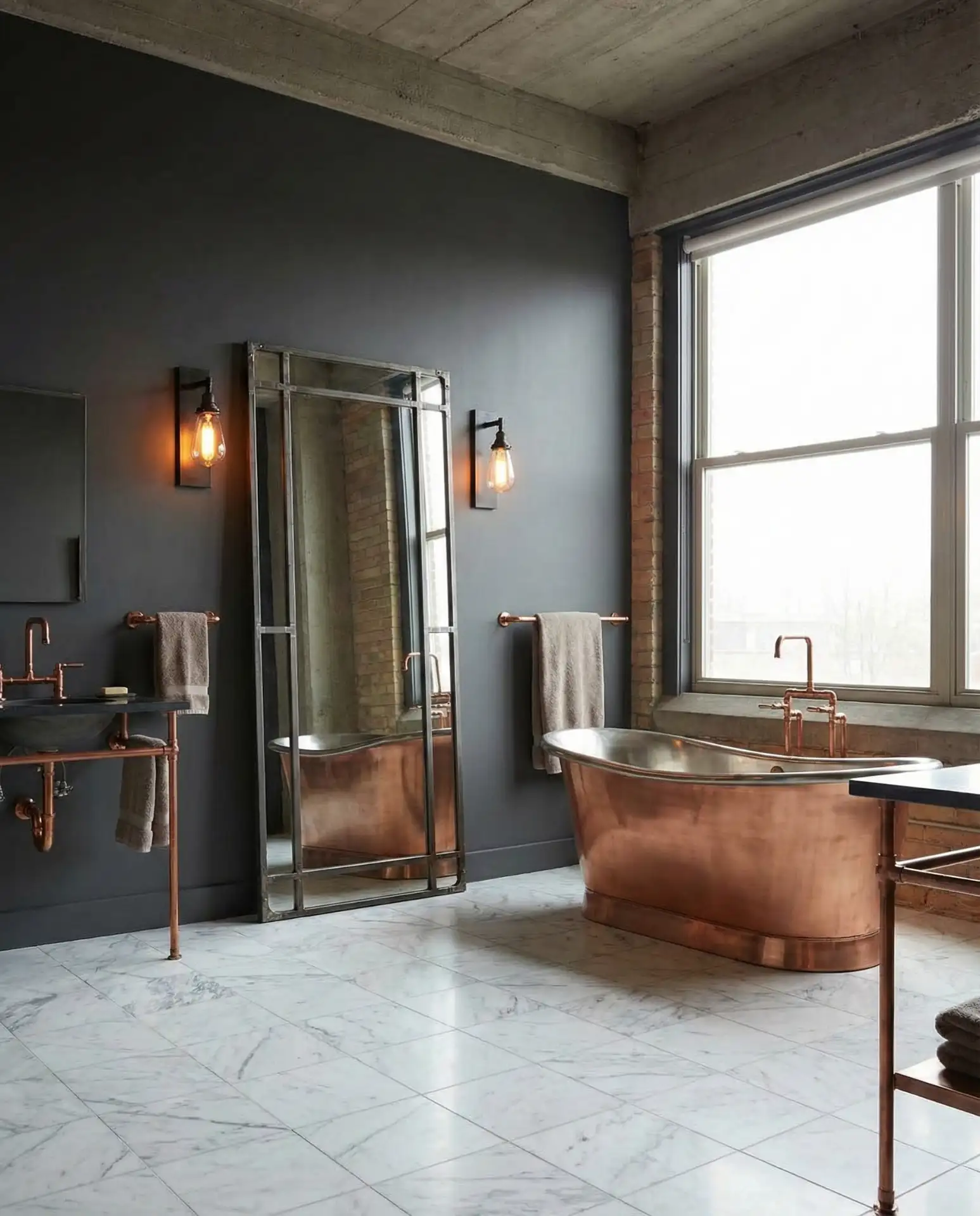
Charcoal gray walls paired with warm copper fixtures create an industrial-chic vibe that feels both modern and inviting. This dark and moody combination works especially well in large bathrooms where you have space to balance dark walls with adequate lighting and reflective surfaces. The copper adds warmth that prevents the charcoal from feeling cold or unwelcoming. 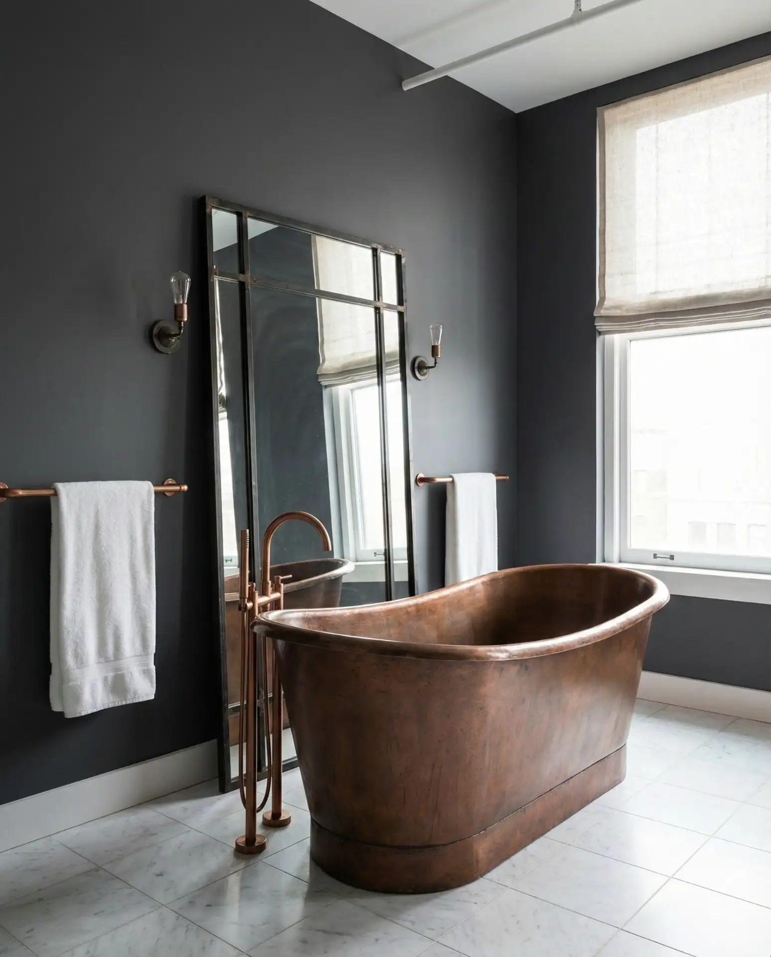
A common mistake homeowners make with dark walls is under-lighting the space. Plan for at least three light sources—overhead, task lighting at the vanity, and accent lighting near the tub or shower. This layered approach ensures your charcoal walls feel dramatic rather than oppressive, and the copper fixtures will truly glow when properly illuminated.
21. Pale Aqua for Spa Vibes
Pale aqua creates instant spa-like serenity in bathrooms, channeling the neutral and serene atmosphere of high-end wellness retreats. This soft blue works beautifully in small bathrooms and guest suites, promoting relaxation without reading too childish or generic. It pairs effortlessly with white marble, light woods, and chrome or brushed nickel fixtures for a clean, modern aesthetic. 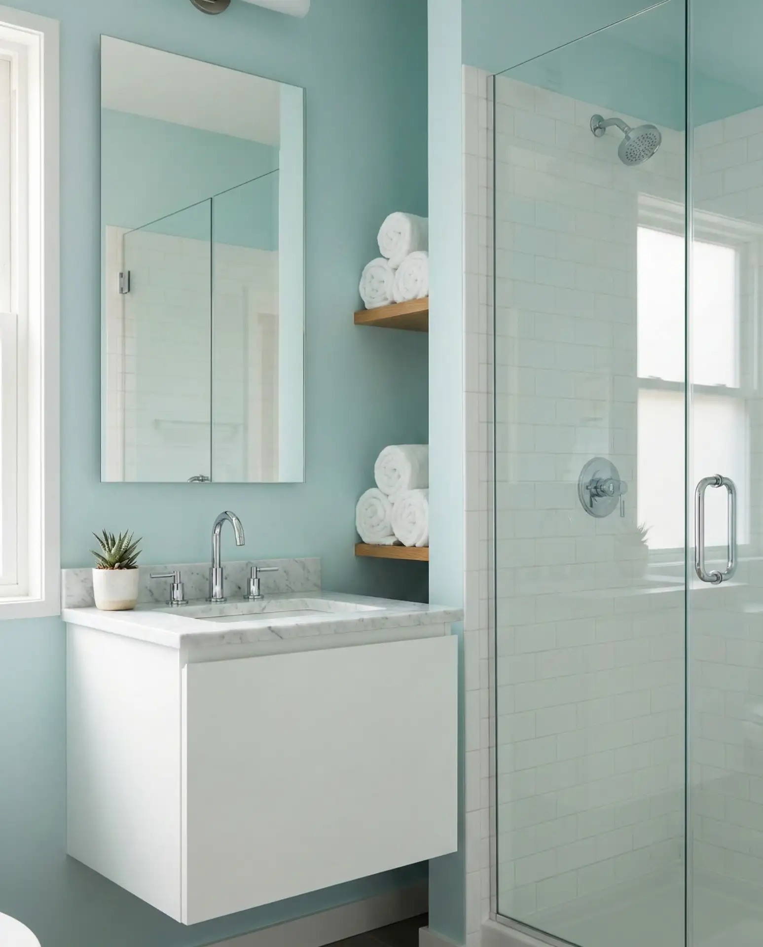
In coastal communities from Florida to California, pale aqua feels like a natural extension of the landscape, but it’s equally effective inland where homeowners crave vacation vibes in their daily routines. One designer in Denver noted that clients who choose this color report feeling noticeably more relaxed during their morning routines, proving that color psychology is more than just theory.
22. Warm Caramel with White Fixtures
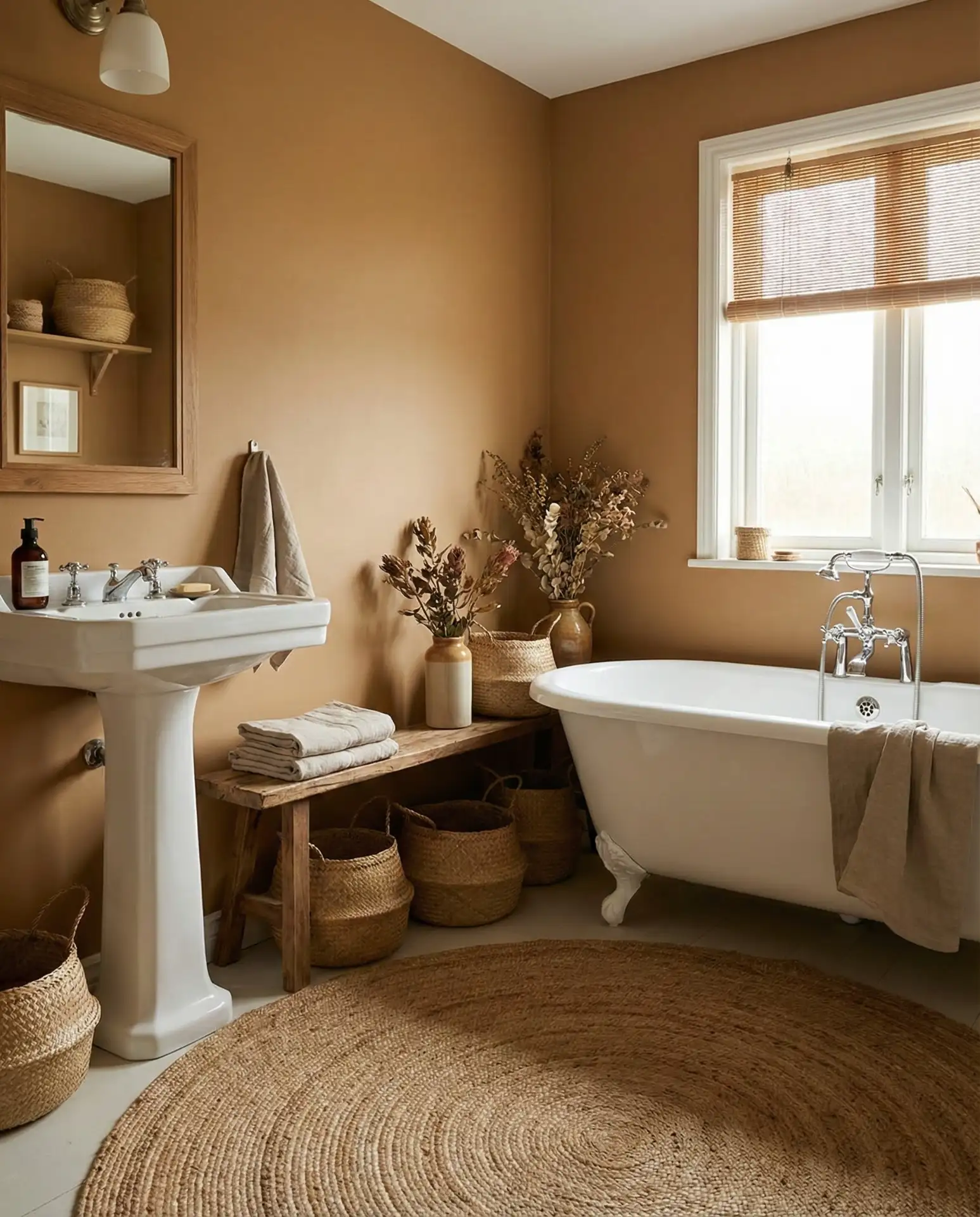
Warm caramel creates a cozy, embracing atmosphere that’s richer than standard beige but more neutral than terracotta. This earth tone works beautifully in rustic and natural bathrooms where you want warmth without going full-on country. Paired with crisp white fixtures and natural textures, caramel walls create a sophisticated backdrop that feels both current and timeless. 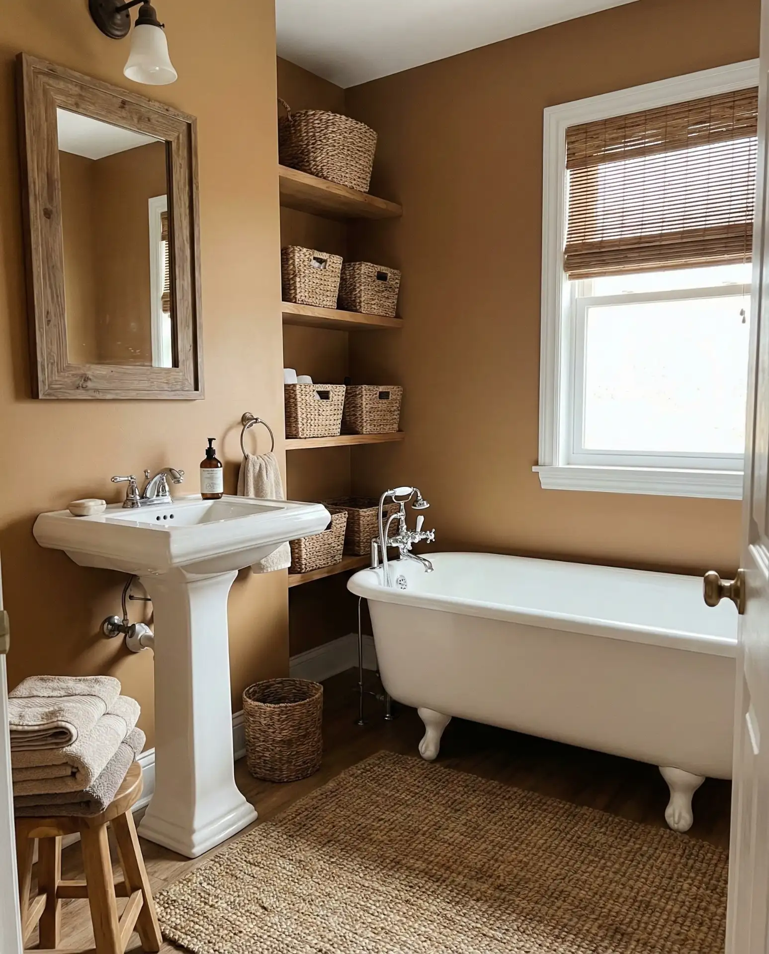
This color hits a budget-friendly sweet spot—it’s forgiving enough that you can use lower-priced paint without worrying about coverage issues, and it hides imperfections better than lighter colors. Many homeowners can complete a bathroom in caramel with just two coats, saving both time and money compared to finicky whites or deep jewel tones that demand perfect technique.
23. Icy Blue-White with Silver Accents
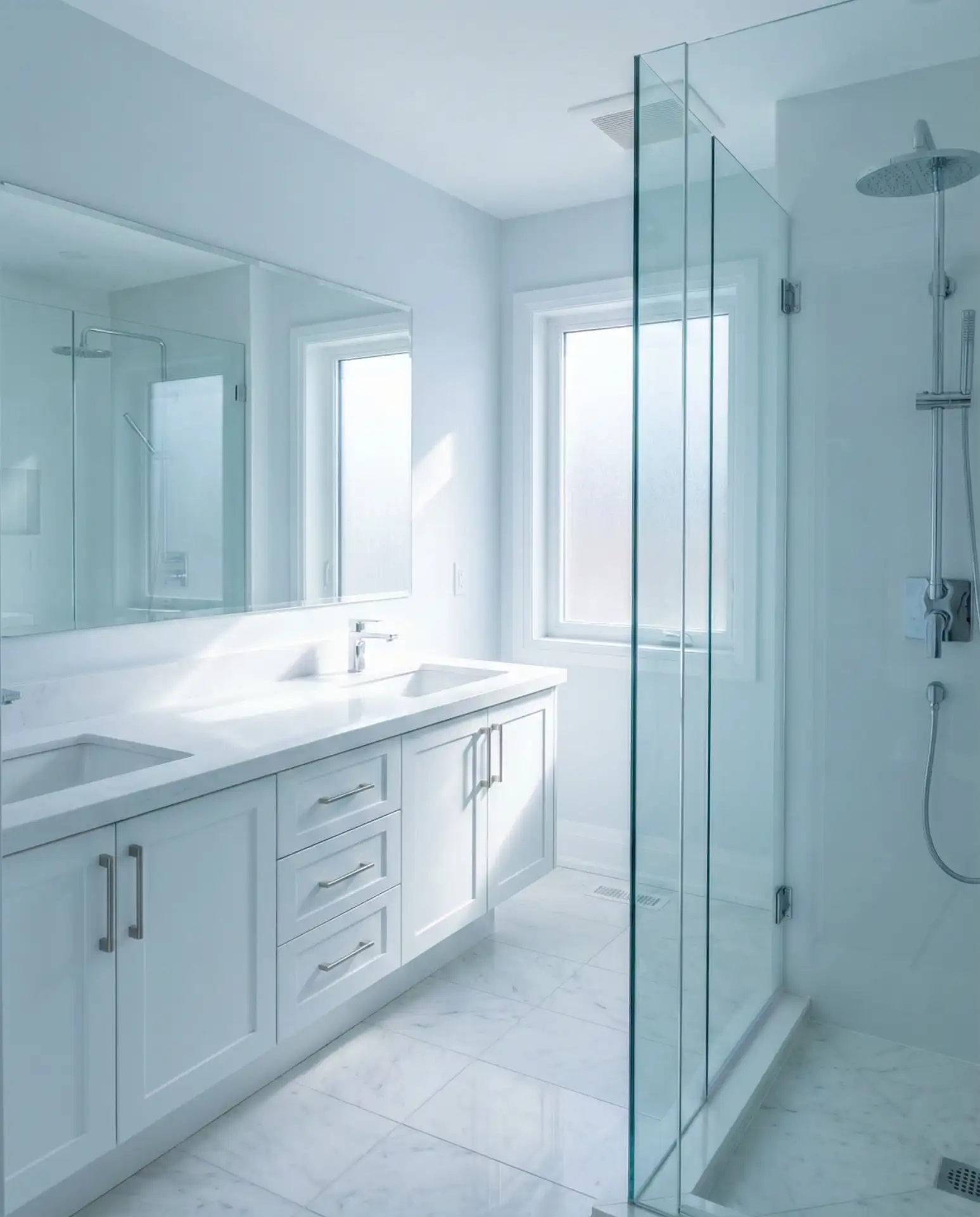
Icy blue-white creates a crisp, winter-fresh atmosphere that’s particularly appealing in modern bathrooms seeking a neutral and serene palette with subtle color. This barely-there blue tint in white paint adds dimension without committing to full color, working beautifully with silver or chrome fixtures for a cool, contemporary look. It’s especially effective in primary bathrooms where you want a spa-like environment. 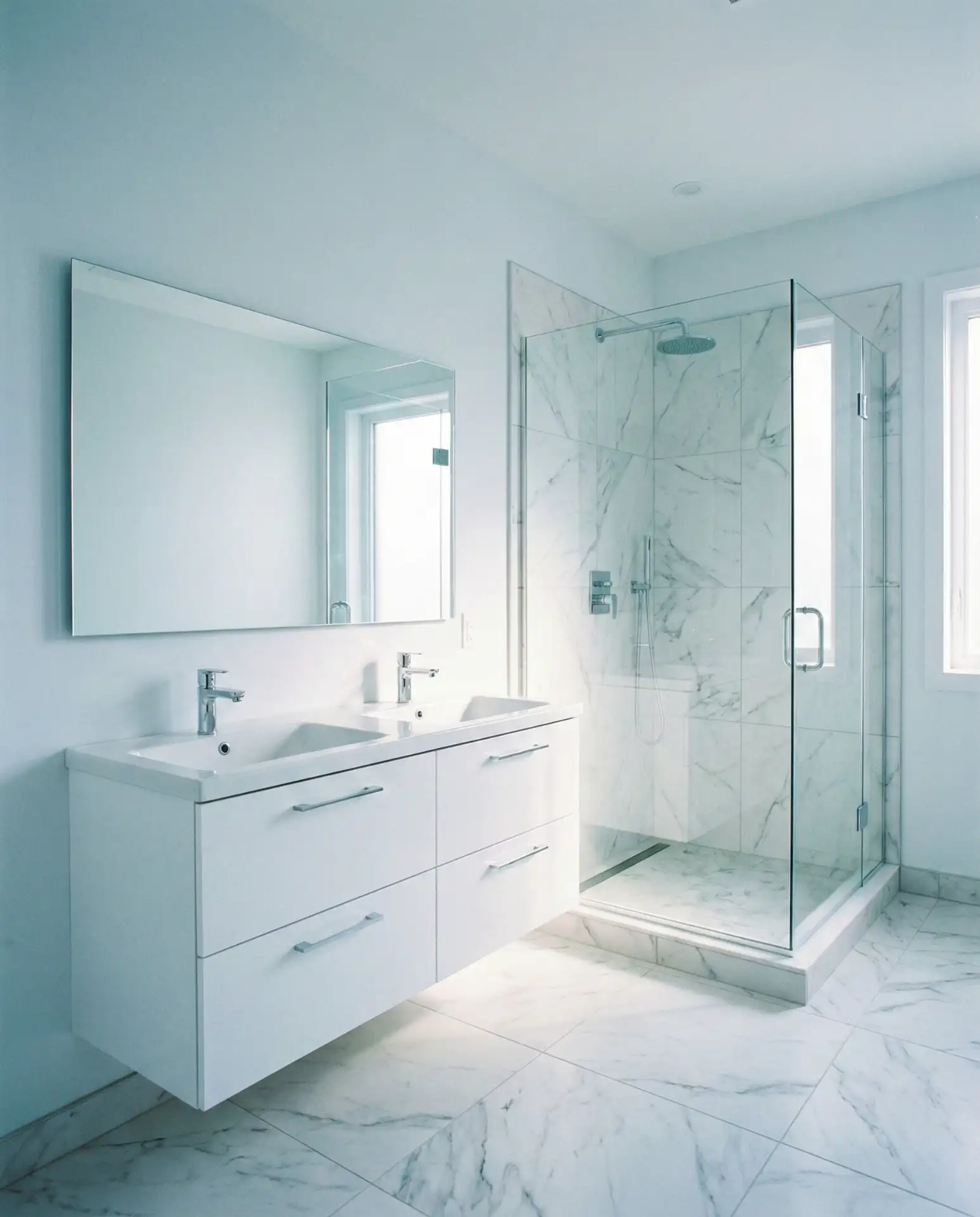
Where it works best: in sunlit bathrooms where the blue undertones can truly shine, creating an ethereal, almost crystalline quality. In darker rooms, this same color can read too cold, so south-facing exposure is ideal. Many homeowners in warmer climates choose this palette specifically because it psychologically cools the space, making steamy summer showers more pleasant.
Conclusion
These color directions represent the diversity of what’s inspiring homeowners in 2026—from grounding earth tones to energizing jewel tones, quiet neutrals to statement-making darks. The common thread is intentionality: choosing colors that serve both function and feeling, creating bathrooms that support your daily rituals while expressing your personal style. Which palette speaks to you? Share your favorite bathroom color moment in the comments below—we’d love to see what you’re planning or what’s already transformed your space.