Something shifted in the way Americans are thinking about their living rooms. After years of bright whites and open-concept everything, Pinterest boards are filling up with something richer—darker walls, layered textures, candlelit corners, and spaces that actually feel like a place to exhale. Moody living rooms are having a serious moment in 2026, and it’s not just an aesthetic trend; it’s a response to the way we want to feel at home. Whether you’re starting from scratch or just ready to dial up the atmosphere, this guide walks through 22 ideas that range from deeply dramatic to quietly earthy—all drawn from the looks people are saving, sharing, and obsessing over right now.
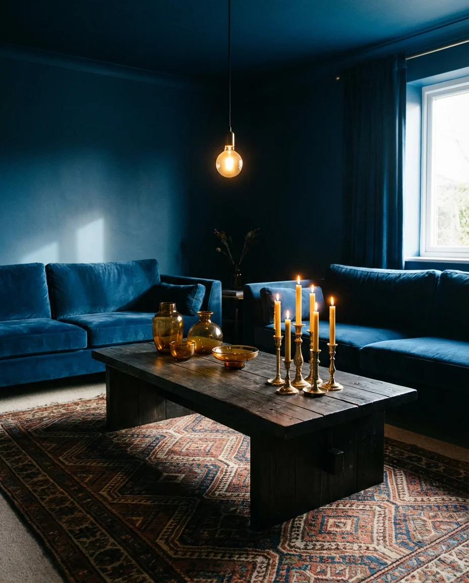
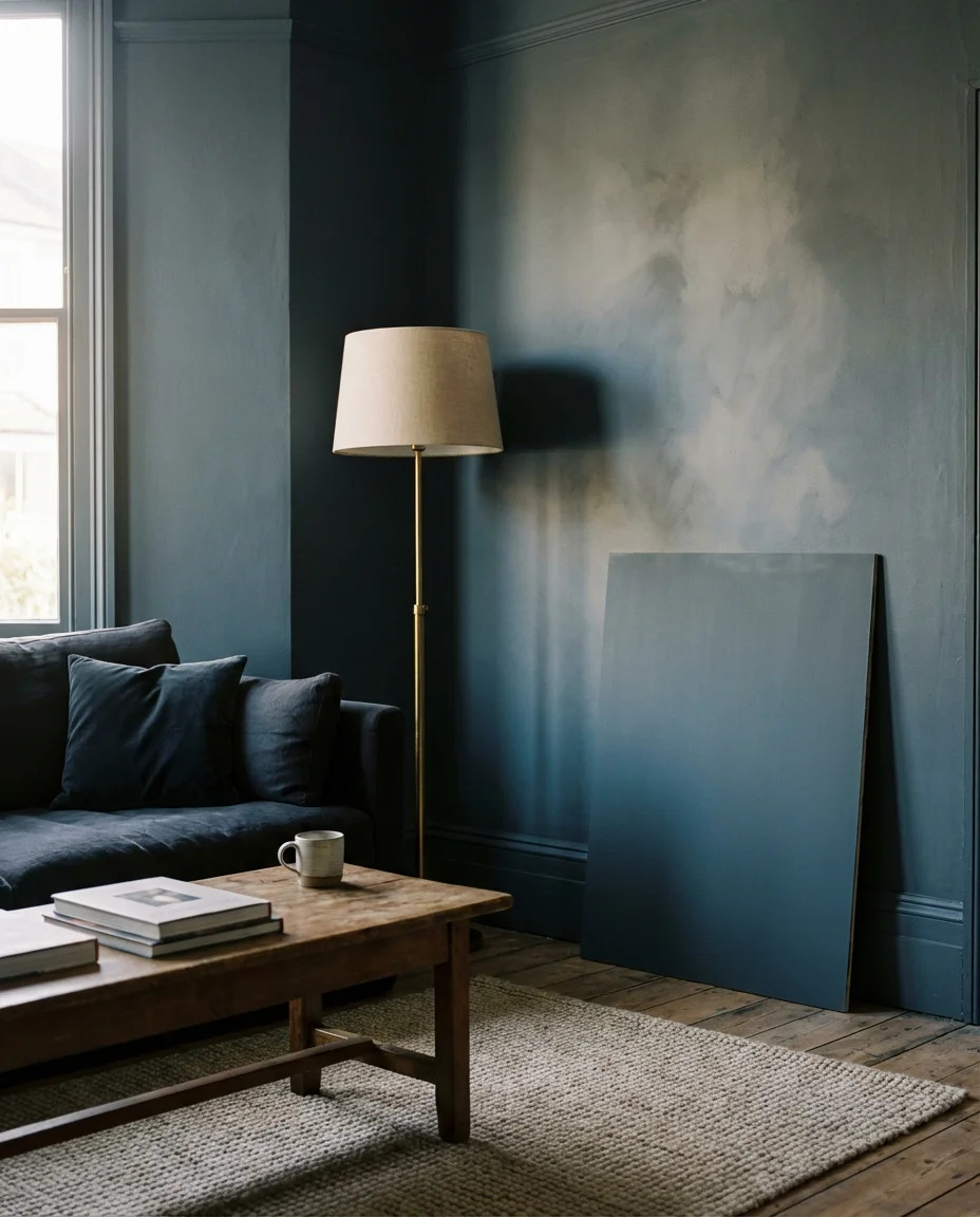
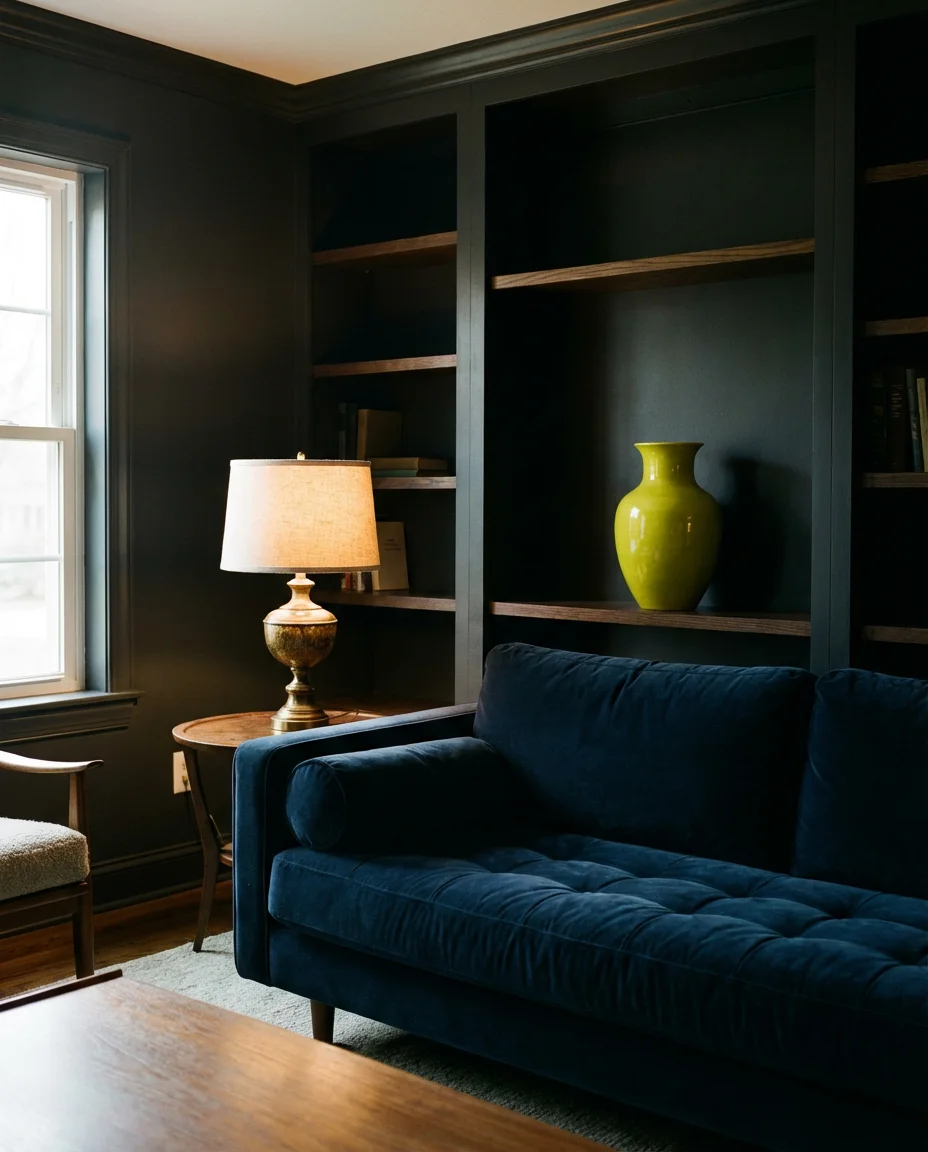
1. Midnight Blue Walls With Warm Brass Accents
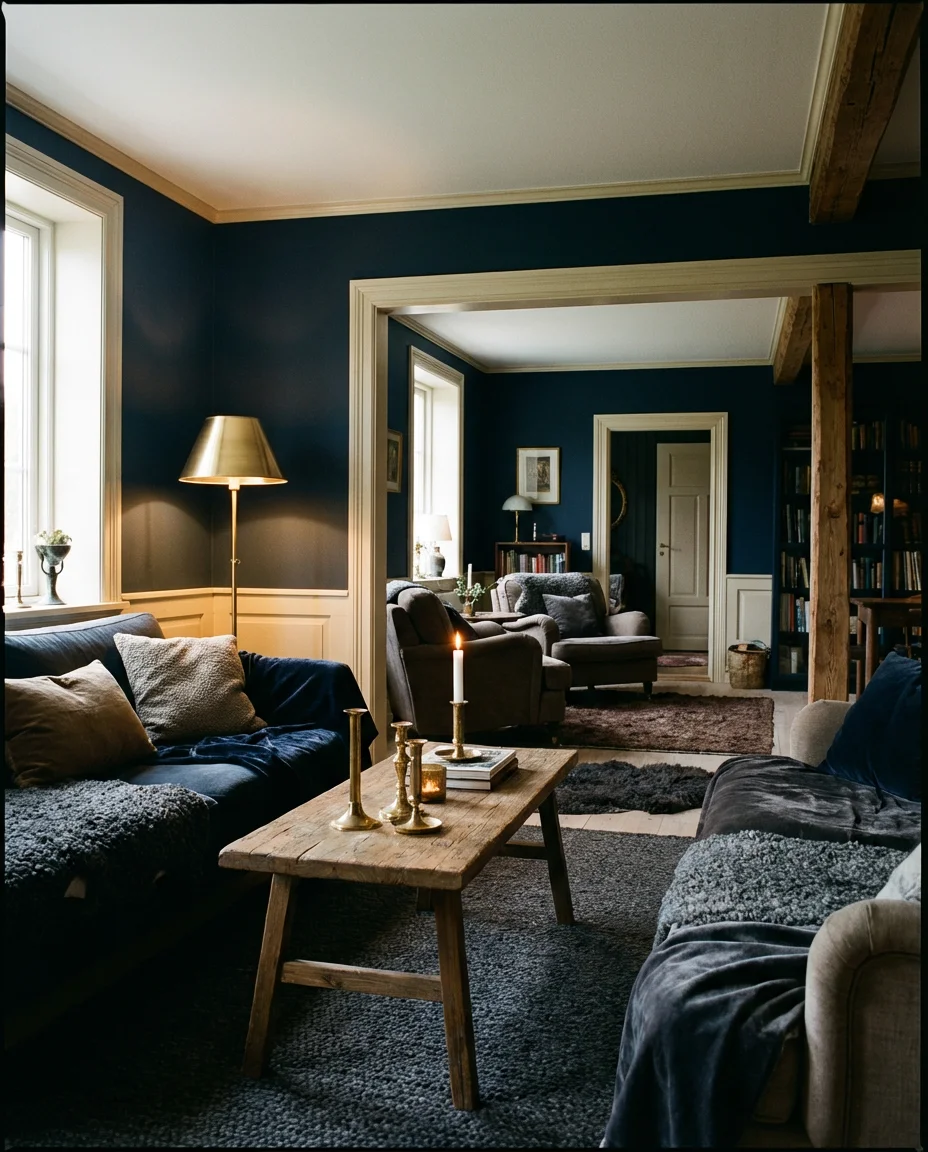
There’s a reason dark walls are dominating design conversations right now—they do something to a room that lighter shades simply can’t. Midnight blue, in particular, creates a moody living room color palette that feels both sophisticated and surprisingly warm when paired with brass. Think brushed gold floor lamps, antique-finish cabinet pulls, and a few burnished candleholders scattered across a low coffee table. The combination reads as collected and intentional, not overdone. It works beautifully in north-facing rooms that don’t get strong direct sun, where cool hues actually feel grounded rather than cold.
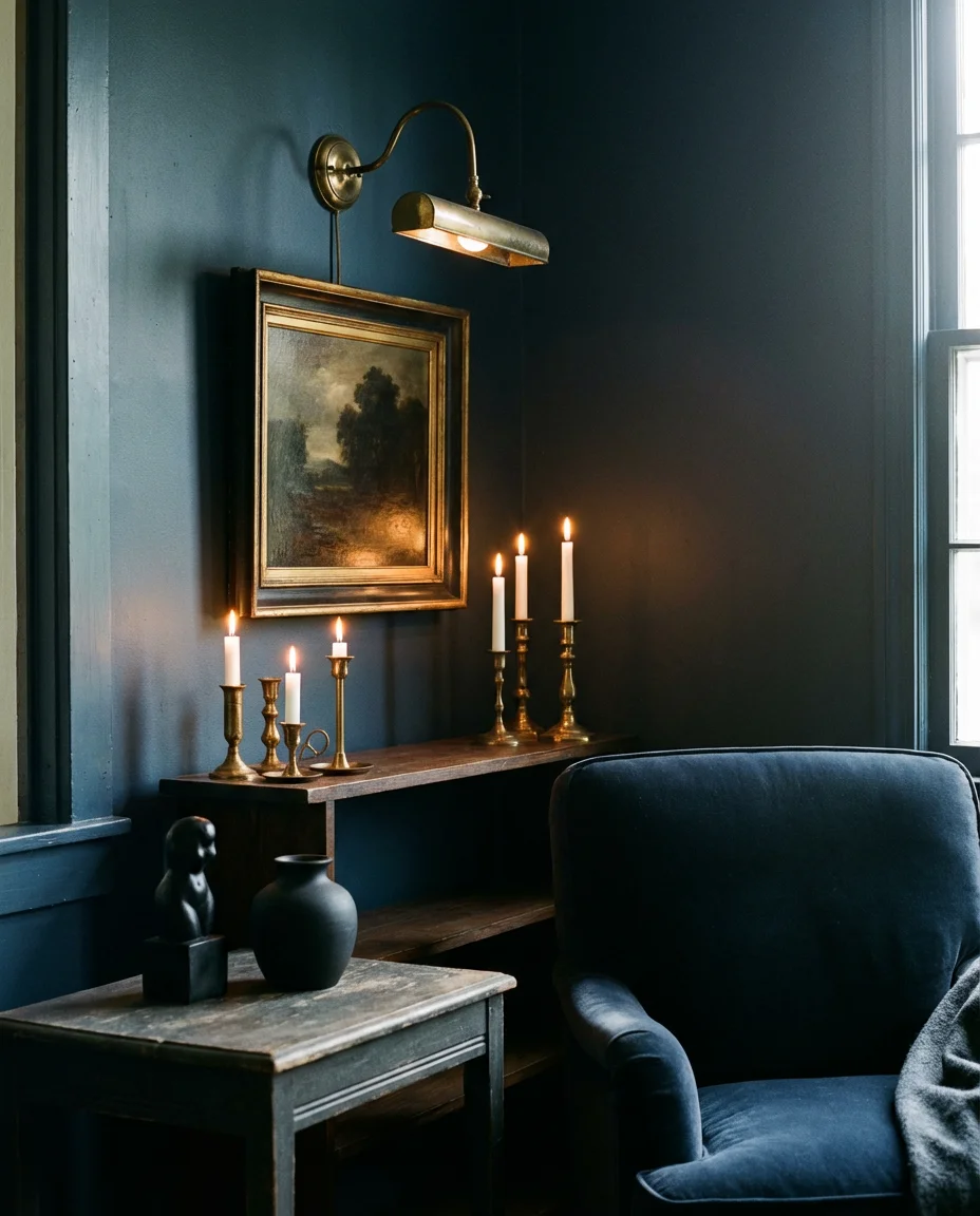
For Americans living in older homes with original moldings and trim, painting walls this deep shade while keeping the woodwork in a soft cream creates a gallery-like contrast that’s hard to achieve any other way. Benjamin Moore’s “Hale Navy” and Farrow & Ball’s “Hague Blue” are both worth testing in your space—sample pots are your best friend here, since these colors shift dramatically depending on your light source. One thing to avoid: going too matchy-matchy with your accessories. Brass works, but when everything is brass-toned, the richness gets lost. Mix in a matte black detail or two to keep things visually interesting.
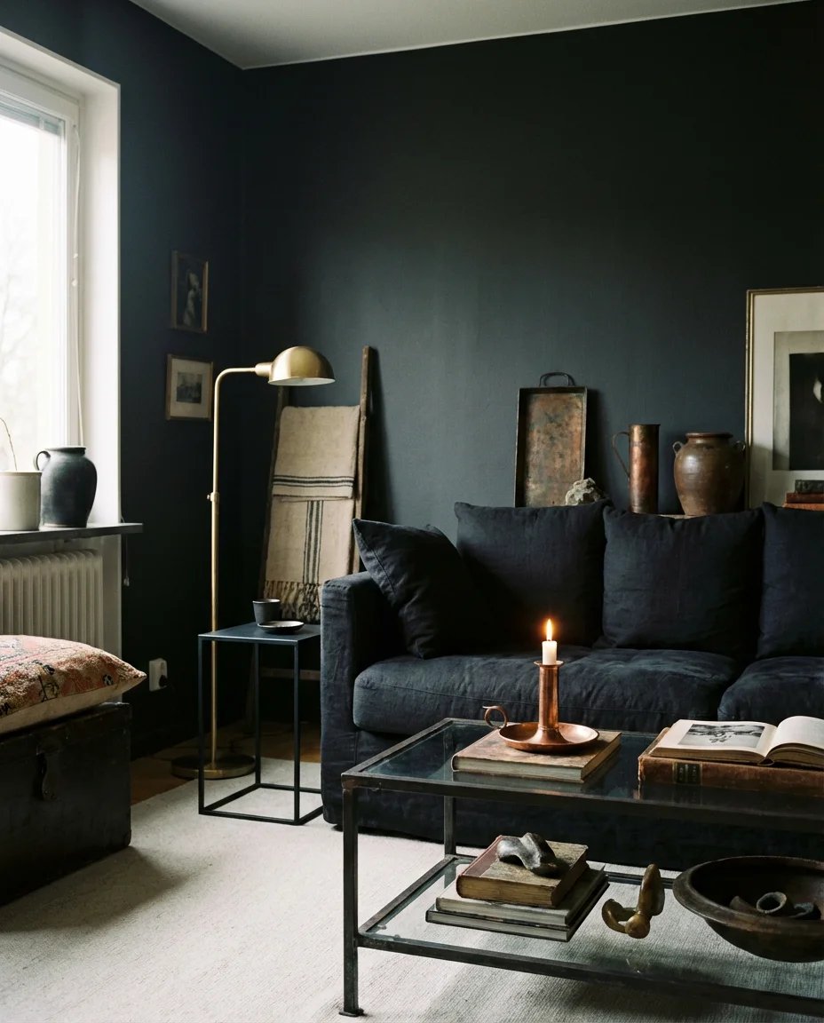
2. Cozy Fireplace Nook With Stone and Velvet
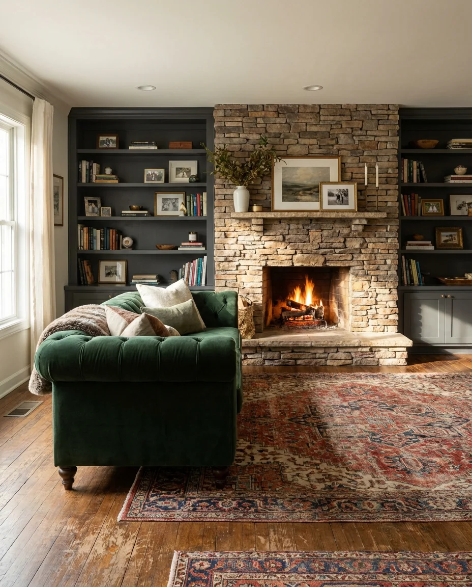
A fireplace is practically the beating heart of a cozy living room, and in 2026, designers are leaning hard into the romance of it. The look pairs raw or stacked stone surrounds with deep velvet seating—think a tufted chesterfield in forest green or oxblood pulled close to the hearth, flanked by built-in bookshelves painted in a moody charcoal. Layered area rugs soften the floor while adding visual warmth. This setup thrives in mountain homes, craftsman-style bungalows, and any space where the architecture already leans toward the cozy and traditional. It’s not about replicating an English manor—it’s about taking that energy and making it feel lived in.
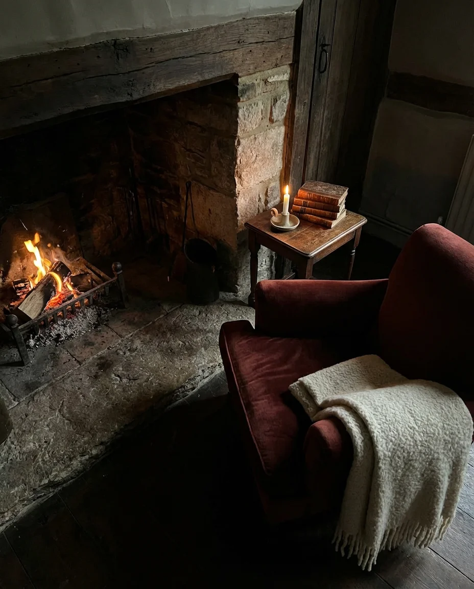
For homeowners who don’t have a real fireplace, an electric insert set into a custom stone-clad surround can achieve nearly the same effect—and with today’s realistic flame technology, guests often don’t notice the difference. A designer who works frequently with mountain cabin renovations once noted that velvet, more than any other fabric, absorbs and reflects firelight in a way that makes an entire room feel warmer before a single candle is lit. Budget-wise, you can replicate this look for less by sourcing velvet pillow covers and throws before committing to an upholstered piece—test the color family first and let the room guide you toward the right anchor furniture.
3. Earthy Terracotta and Warm Brown Tones
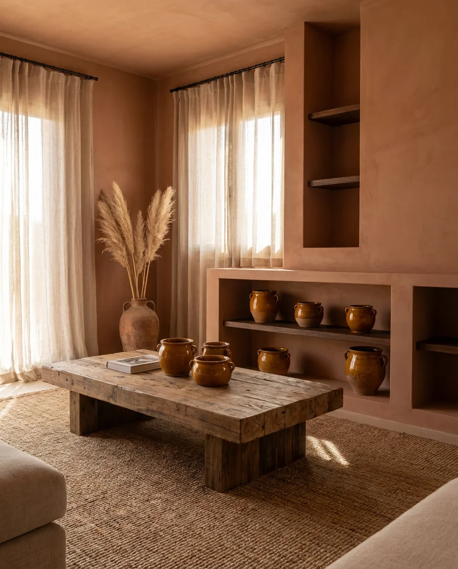
If full-on dark walls feel like a commitment you’re not ready to make, earthy terracotta and brown tones offer a gentler entry point into moody living room territory. This palette draws from Southwestern and Mediterranean design—warm clay walls, chunky wooden furniture, woven jute rugs, and ceramics in amber and rust. It’s one of the most searched aesthetic directions on Pinterest right now, particularly among homeowners in the Southwest and California who want interiors that feel connected to the landscape outside. The earthy warmth of these tones works in almost any lighting condition, making them more versatile than deeper navy or forest shades.
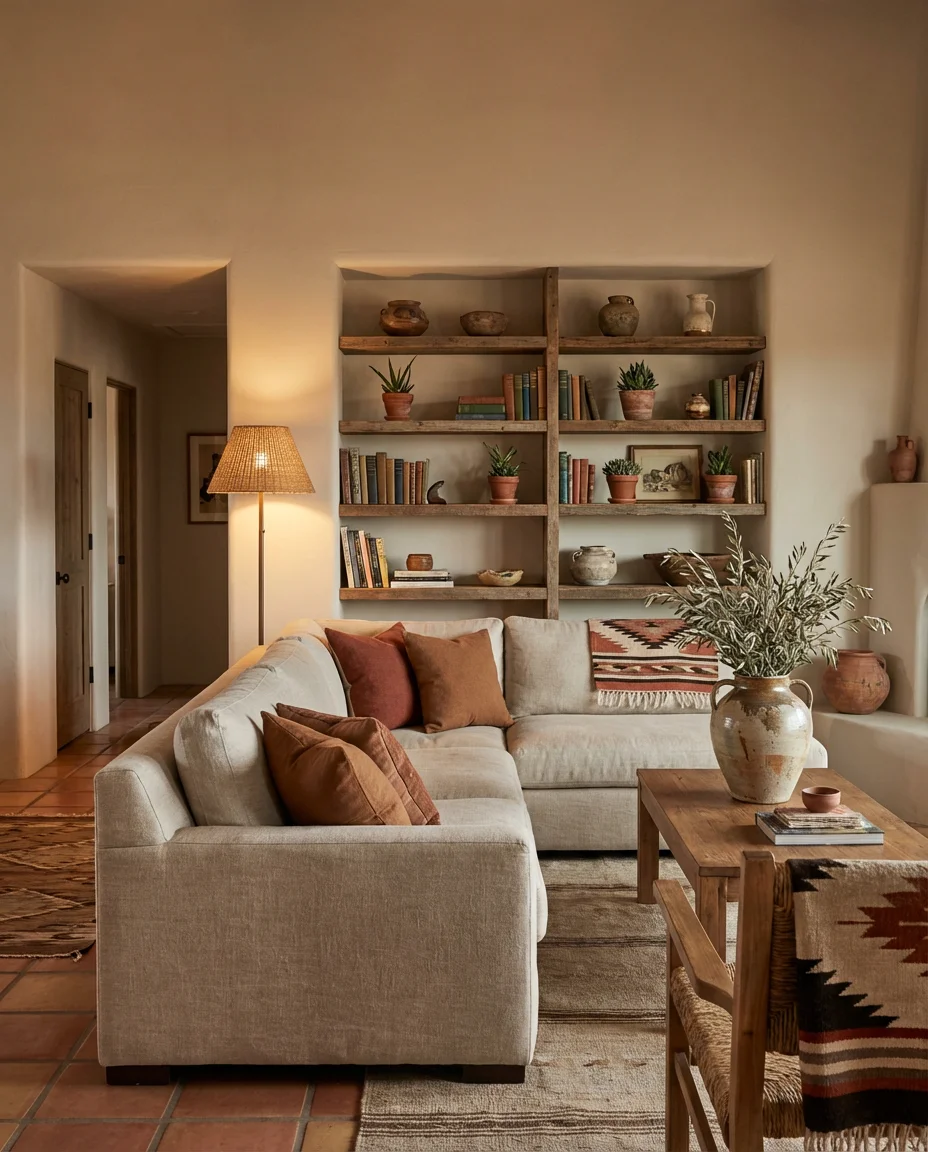
One of the most common mistakes people make with this palette is choosing a terracotta that reads too orange in artificial light—what looks perfect on a paint chip can feel like a pumpkin patch once the sun goes down. The fix is simple: always view samples in both natural and lamp light before committing. Sherwin-Williams’ “Cavern Clay” is a reliable choice that stays warm without going too saturated, and it pairs beautifully with linen sofas and raw wood coffee tables. Layer in a few dried pampas grass arrangements or olive branches in tall ceramic vases, and you’ve got a room that looks like it took years to curate—even if it came together over a single weekend.
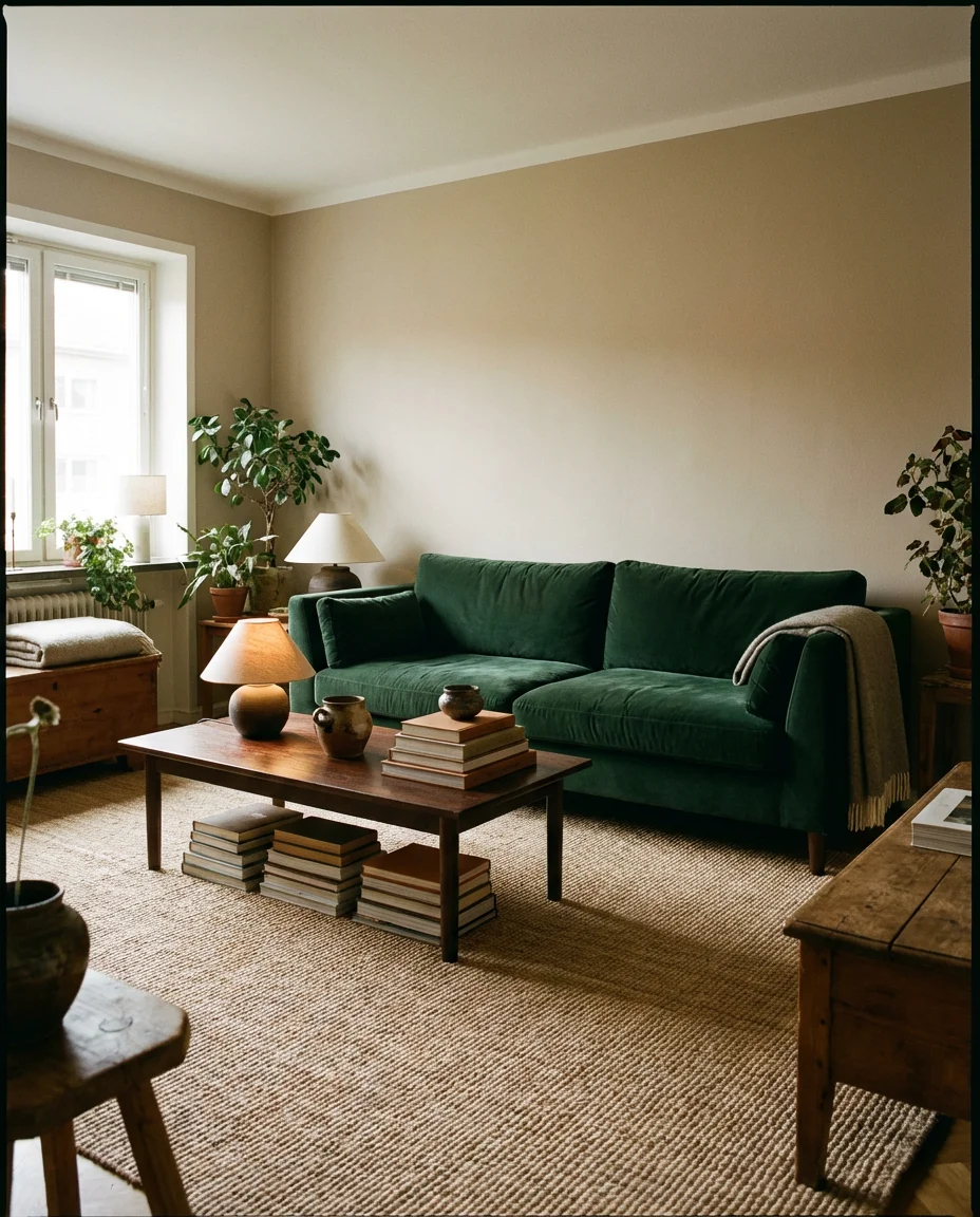
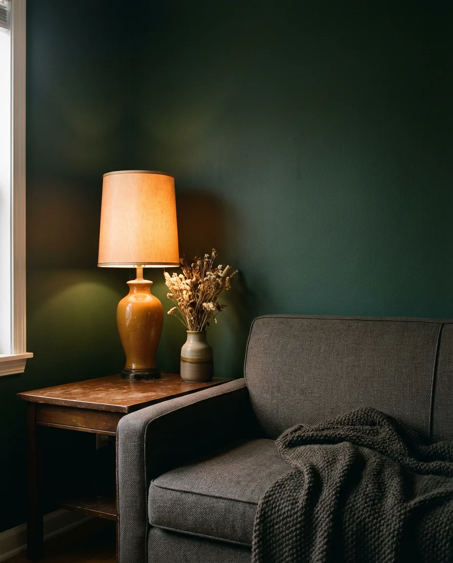
4. Dark Green Walls With an Organic Linen Sofa
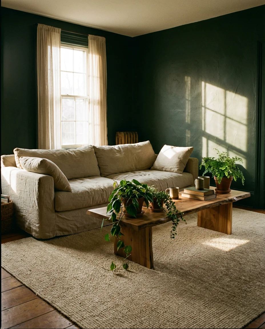
Dark green may be the most versatile color in the moody living room playbook right now. It reads as rich and enveloping without the heaviness that can come with charcoal or navy, and it pairs effortlessly with organic materials. An unbleached linen sofa—slightly rumpled, a little lived in—set against a deep hunter or bottle-green wall creates a combination that’s both editorial and genuinely comfortable. Add a sisal or wool rug in a natural, undyed tone, and the room starts to feel like something between a Nordic cabin and an upscale botanical garden. This is the kind of space that photographs beautifully and feels even better in person.
This combination works especially well in apartments and condos where you’re working with standard ceiling heights and moderate natural light—the green draws the eye inward in a way that makes a compact space feel intentional rather than cramped. Real homeowners who’ve tried this look consistently report the same surprise: the room feels larger and more open than before, despite the darker walls. The linen sofa is key here—avoid going to a bright white or cream, as it can break the harmony. Opt for oat, flax, or a pale sage instead. These quiet neutrals let the green do its work without competition.
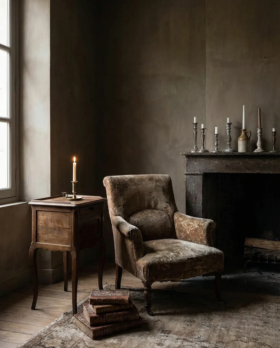
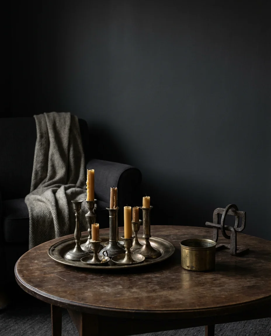
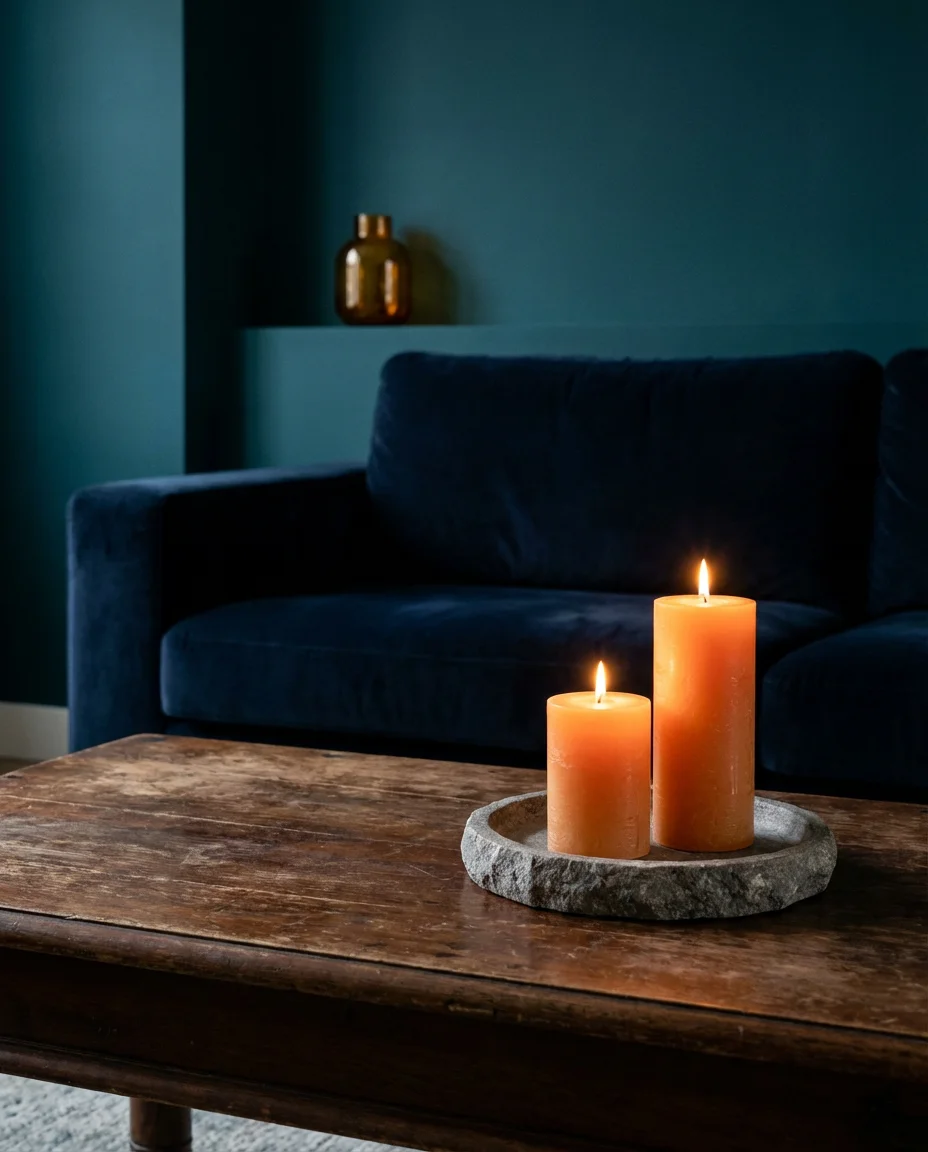
5. Romantic Candlelit Layers With Jewel-Toned Decor
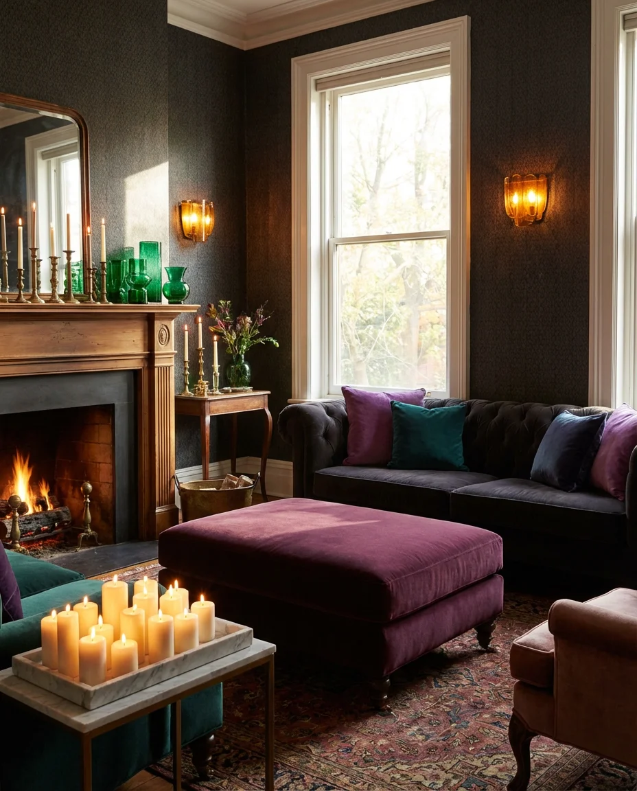
The romantic living room aesthetic has always lived somewhere between maximalist and moody, and in 2026 it’s thriving. This look layers jewel-toned decor—think amethyst throw pillows, emerald glass vases, and deep plum velvet ottomans—against walls in a rich, saturated hue. Candlelight is essential: clusters of pillar candles on a stone or marble tray, taper candles in mismatched candlesticks on the mantle, and a few amber-tinted sconces or Edison bulbs to keep the overall warmth consistent. It’s a deliberately imperfect look—artfully mismatched—and that’s exactly what makes it feel so livable and personal rather than like a showroom.
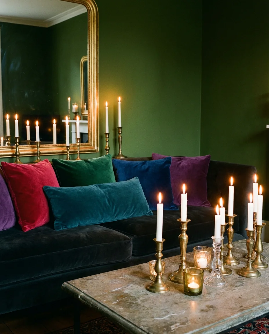
This aesthetic is surprisingly budget-friendly to build over time because it’s inherently eclectic—thrift stores, estate sales, and antique markets are treasure troves for the kind of mismatched candleholders, velvet cushions, and richly colored glassware that make this look come alive. You don’t need to buy everything at once. Start with a single jewel-toned accent—a deep teal lumbar pillow or an amethyst vase—and build from there. The trick is keeping the base of the room (sofa, rug, walls) in a unified tone so the layered accessories feel curated, not chaotic. Think of it as setting a stage, then filling it slowly with character.
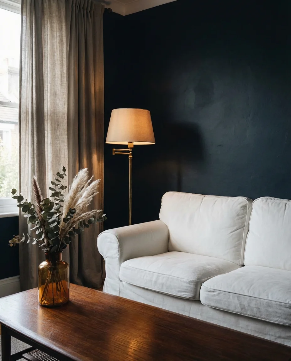
6. Moody White Walls Done the Right Way
Not every moody room needs a dark wall. White walls can absolutely anchor a brooding, atmospheric living space—the key is everything that surrounds them. The approach gaining traction in 2026 uses a warm, slightly off-white, or aged linen tone on the walls (never bright stark white), then layers in deeply saturated textiles, low-slung dark wood furniture, and heavily textured accessories. The result is a room that feels neutral but far from flat—like a black-and-white photograph with just enough warmth to feel human. It’s a particularly smart approach for renters who can’t paint, because the moodiness lives entirely in the furnishings.
In regions like the Pacific Northwest and New England, where gray skies are a given for much of the year, this warm-white-plus-dark-textures approach is especially effective. It keeps the room from feeling like a cave while still delivering that cocooning, enveloping quality people are after. An interior designer based in Portland once described it as “the moody room for people who are afraid of the moody room”—and that’s not a slight. It’s an entry point that still delivers atmosphere. The biggest mistake is pairing stark white walls with light-toned furniture; without contrast, the moodiness evaporates entirely.
7. Forest Green Couch as the Room’s Anchor
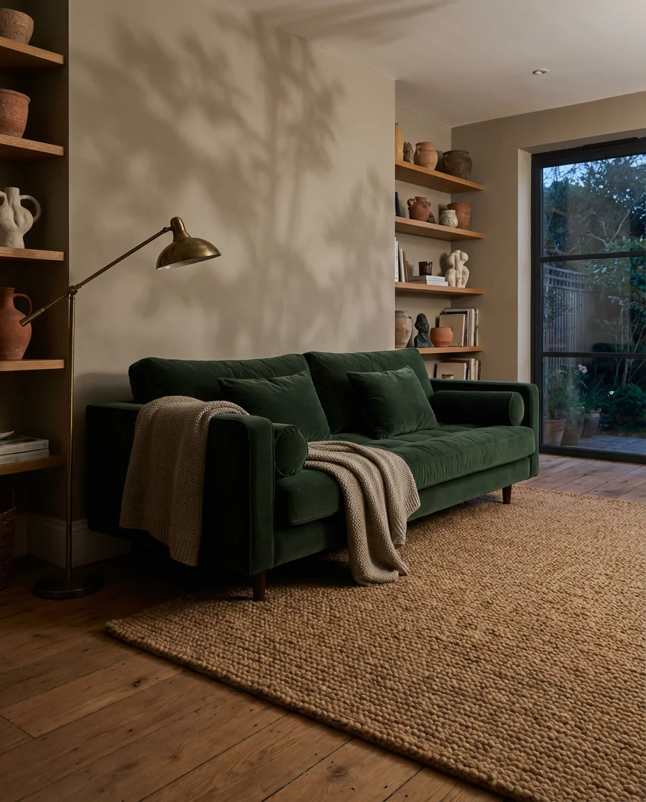
The green couch has become one of the most pinned furniture pieces of the last two years, and for good reason—it instantly shifts a room’s energy from generic to intentional. A deep forest or hunter green sofa works as the boldest piece in an otherwise restrained space: pair it with warm greige walls, a chunky wool rug in oat or camel, and plenty of natural wood to keep the look grounded and organic. Accent with terracotta pottery, brass lighting, and a stack of coffee table books with earthy or dark-toned spines. The couch does most of the heavy lifting—everything else just has to not compete with it.
This setup works brilliantly in open-plan living spaces where the sofa essentially defines the “room” within a larger footprint—the green acts as a visual anchor that tells guests exactly where the living area begins and ends. It’s also one of the most practical bold choices for families with kids or pets: green hides a surprising amount of daily wear, and performance velvet or boucle versions are widely available now at mid-range price points from brands like Joybird, Article, and Maiden Home. If you’re nervous about committing, look for a floor model or a gently used option on Facebook Marketplace—this style has been popular long enough that secondhand finds are plentiful and often in great condition.
8. Grey Couch in a Layered Moody Interior
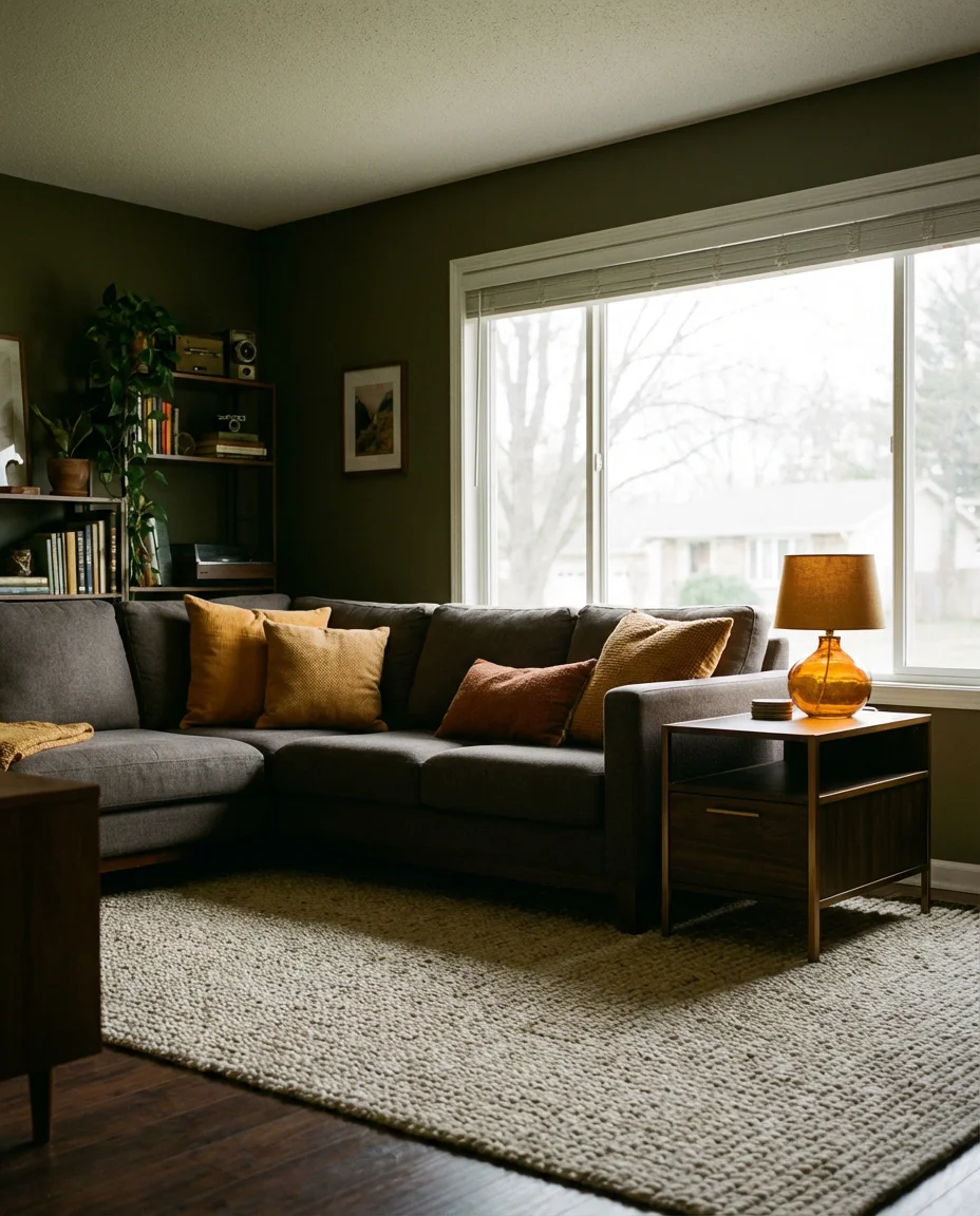
The grey couch gets a bad reputation for being safe and forgettable—but in a truly layered, moody interior, it becomes one of the most sophisticated anchors imaginable. The secret is choosing the right shade of grey: warm charcoal, slate, or a greyed lavender rather than a cold blue-grey. Set against walls in deep olive, dusty plum, or near-black charcoal, a warm grey sectional or sofa reads as quietly luxurious. Layer it with dark throw blankets, oversized textured pillows in ochre or rust, and a chunky woven rug in a complementary tone. The result is moody without being heavy—complexity without chaos.
For Americans who already own a grey sofa and want to transform the room around it without a full renovation, this is genuinely one of the most practical paths into the moody aesthetic. You’re not replacing the anchor—you’re reframing it. Start by painting one wall (ideally the one behind the sofa) in a deep, moody tone. Then swap out any cold-toned accessories—chrome, cool blues, stark white—for warmer alternatives: amber glass, aged wood, and burnished metal. In most cases, this transformation can happen over a single weekend for a few hundred dollars, and it feels like a completely new room by Monday morning.
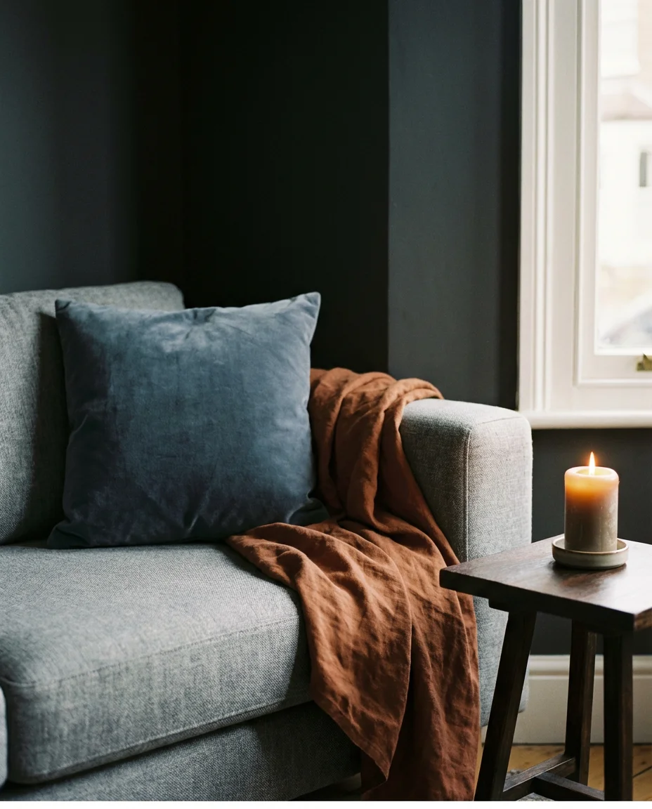
9. Deep Blue Living Room With Layered Textiles
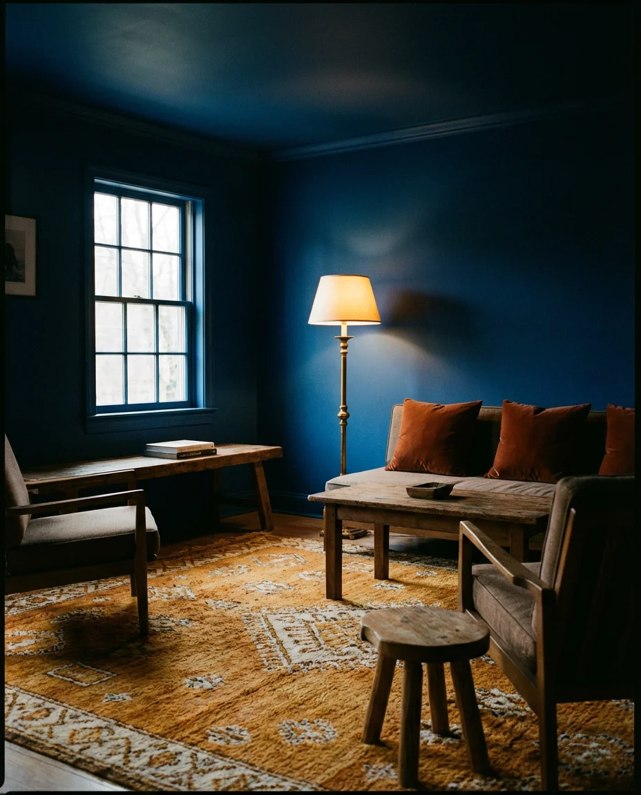
When people think of a moody blue living room, they often picture something cold and unwelcoming—but that’s the result of wrong choices, not the concept itself. The version gaining real traction in 2026 layers deep cobalt or sapphire walls with warm-toned textiles: rust-colored velvet throw pillows, a Moroccan-style wool rug in amber and cream, woven baskets, and timber-framed furniture that brings softness and warmth into the deep blue envelope. Brass or antique gold lighting is non-negotiable here—it bridges the gap between the cool wall tone and the warm layers filling the room. Think of it as blue that hugs back.
This look performs particularly well in formal living rooms and parlors—spaces that, in many American homes, sit underused because they feel too stiff or formal to actually relax in. A deep blue palette with generous textile layering immediately gives these rooms permission to be lived in. According to color psychology research frequently cited by interior designers, blue tones actually slow the pulse and encourage a sense of calm—which makes deep blue a genuinely therapeutic choice for a room meant for rest and conversation. The key is avoiding cold, harsh lighting, which can make the blue feel institutional. Stick to warm bulbs (2700K or lower) and dimmers wherever possible.
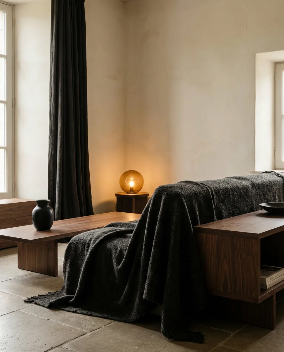
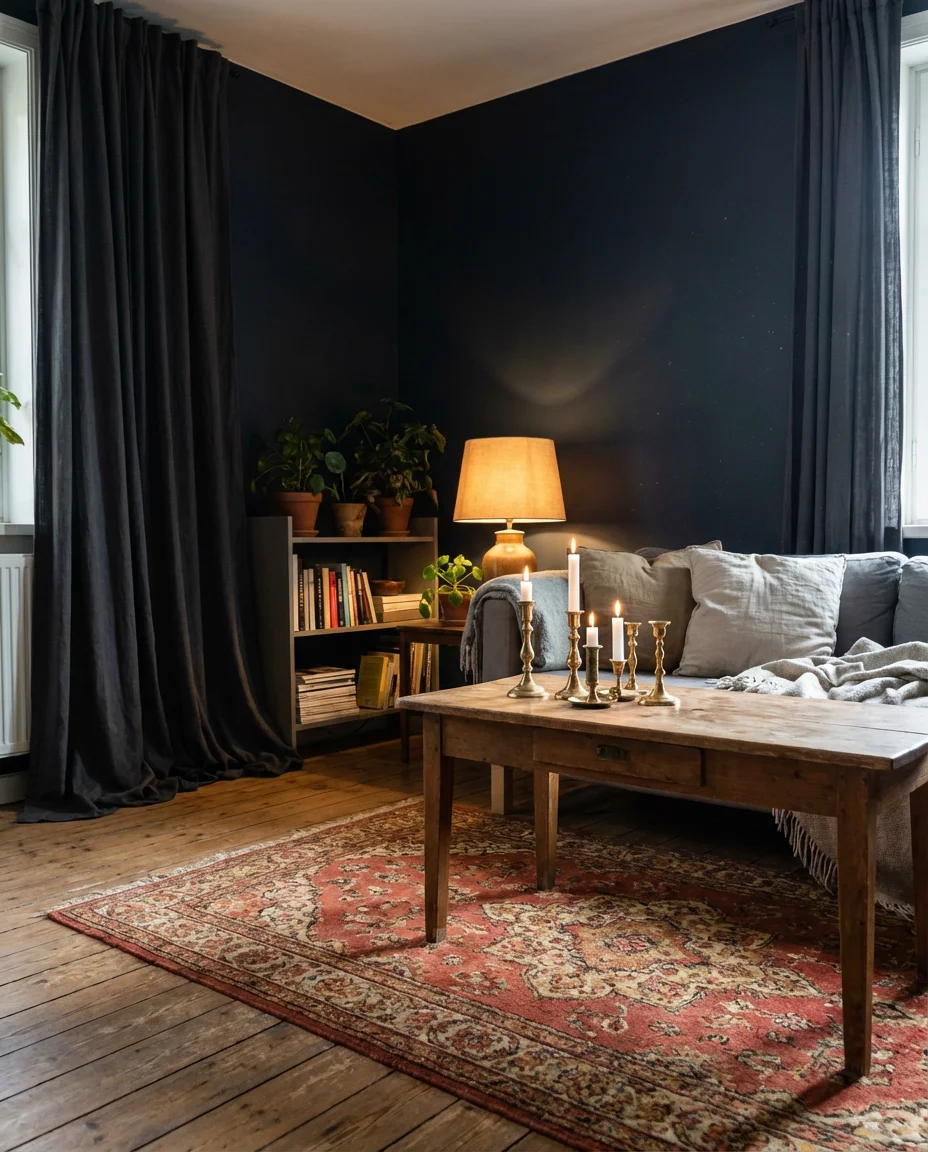
10. Dark Curtains That Frame and Cocoon
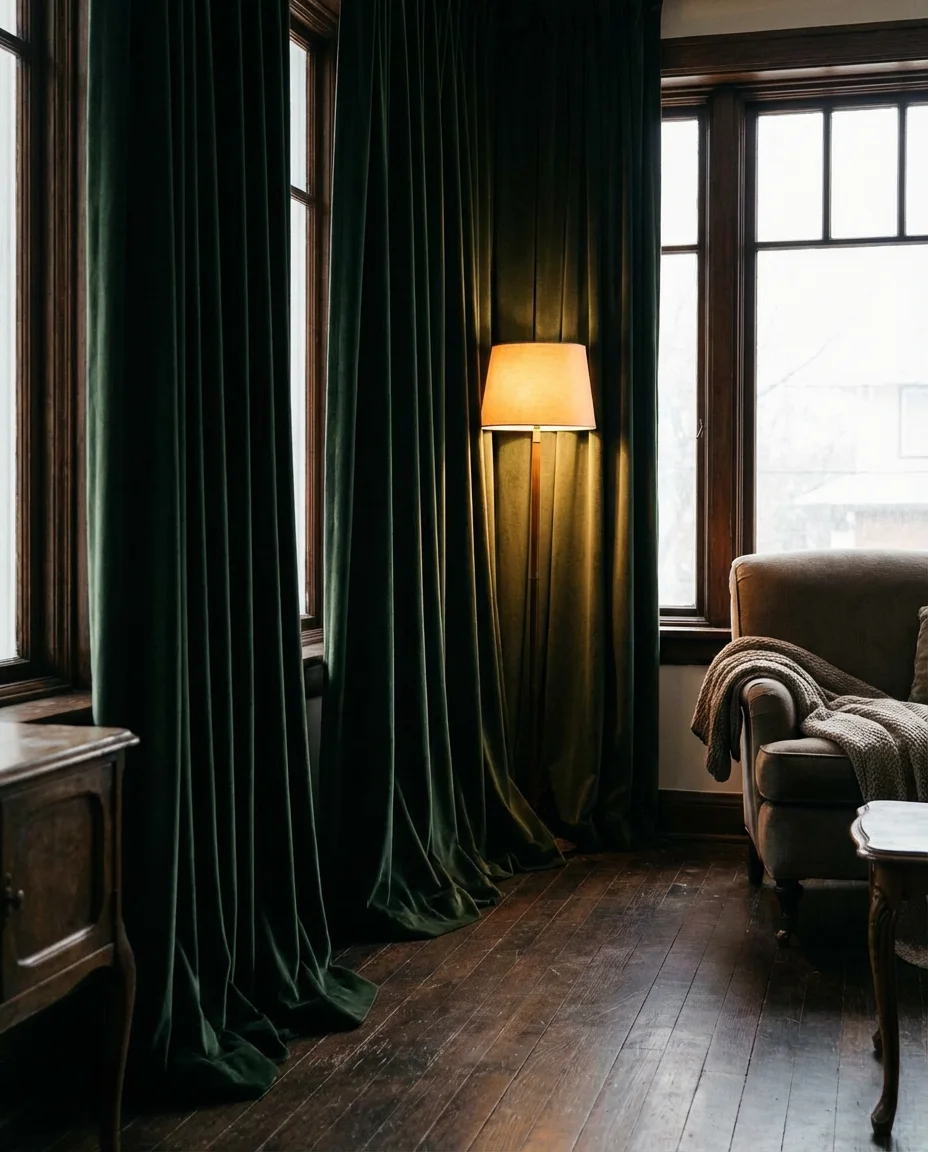
Curtains are one of the most underestimated tools in the moody living room toolkit. Floor-to-ceiling drapes in deep charcoal, forest green, or midnight navy immediately add drama and height to any space—and they’re one of the most budget-conscious ways to shift a room’s energy without touching paint or furniture. In 2026, the look calls for generously wide panels that puddle slightly on the floor, hung from a rod mounted close to the ceiling. The fabric matters: velvet, linen, or a heavy cotton blend all absorb light beautifully and create that enveloping, theater-curtain quality that makes a room feel immersive rather than merely decorated.
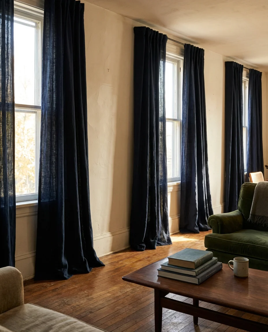
For renters and apartment dwellers, dark curtains are one of the few high-impact, fully reversible design moves available—nothing is permanent, nothing requires permission, and the transformation is immediate. The most common mistake is buying panels that are too narrow or too short: curtains should always extend well beyond the window frame on both sides and reach as close to the ceiling as possible, falling to the floor. Skimping on width makes windows look small and curtains look like an afterthought. Budget for at least two to three panels per window, and if ready-made options fall short on length, IKEA’s MAJGULL or H&M Home’s linen panels are reliable, affordable starting points.
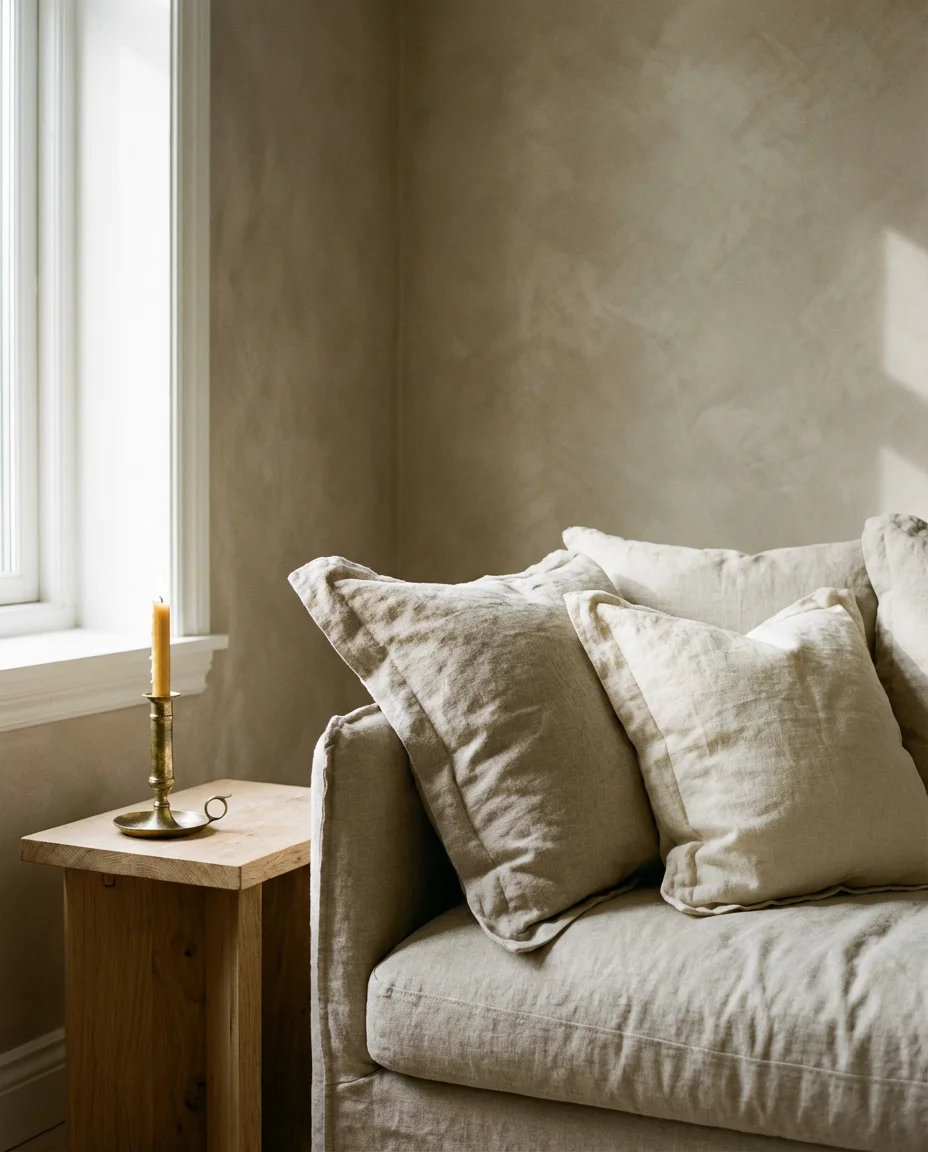
11. Neutral Moody Palette With Warm Layering
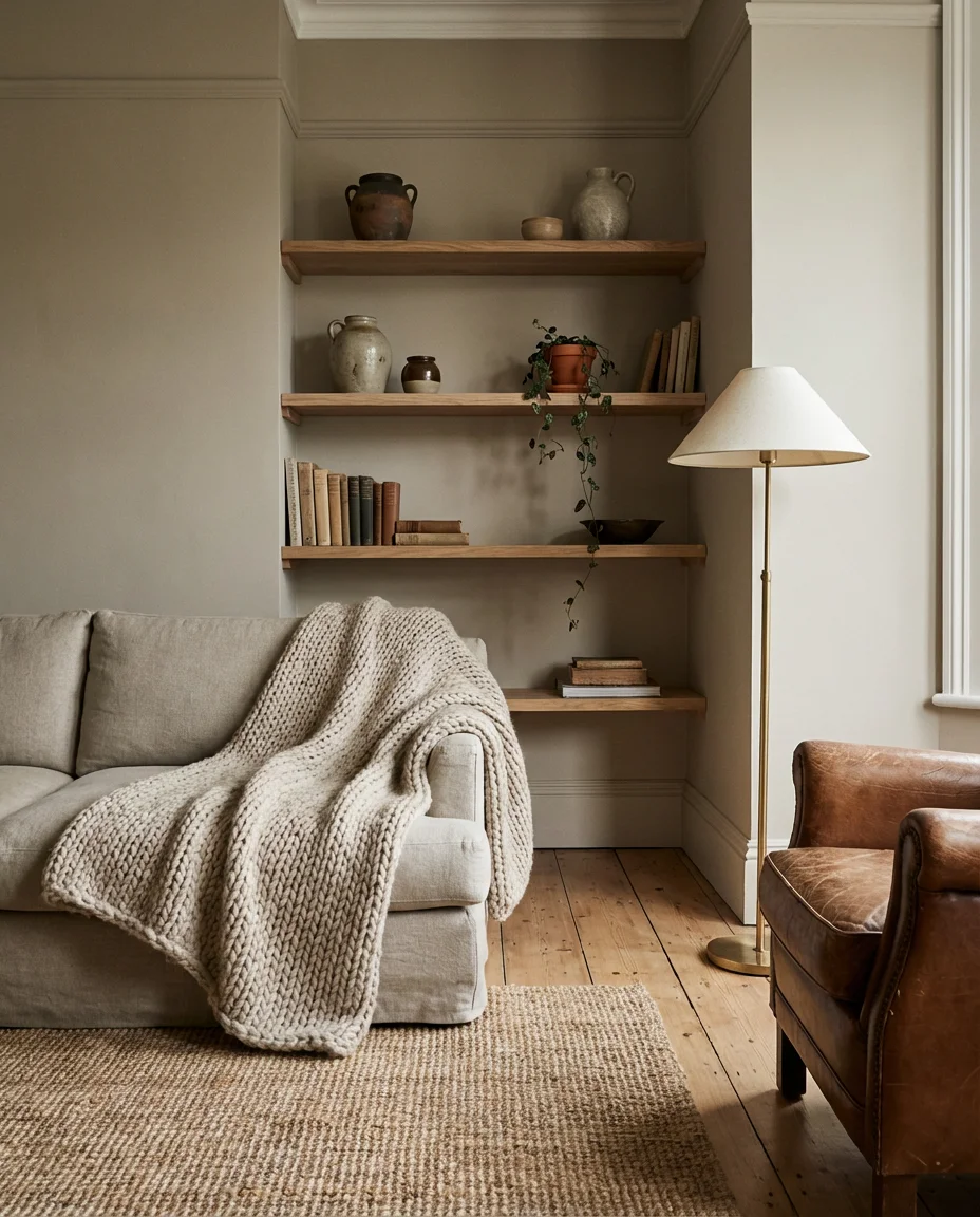
A truly neutral moody living room is something of a paradox—and that’s exactly what makes it so compelling. This isn’t beige-on-beige minimalism. It’s a carefully considered stack of warm greige, weathered taupe, raw linen, and aged timber that creates atmosphere through depth and texture rather than saturated color. The color palette stays intentionally restrained—no jewel tones, no bold accents—but the layering of materials keeps the room from feeling empty. Think unfinished oak shelves, a chunky wool throw in oatmeal, a terracotta pot with a trailing plant, and walls in a soft warm greige that shifts between tan and stone depending on the light.
This is the moody living room direction that works across the widest range of American homes—from new builds in the suburbs to renovated bungalows in the Midwest—because it doesn’t demand dramatic architecture or unusual light conditions. The warmth comes from the materials themselves, not from paint or contrast. A lifestyle blogger in Austin who documented her entire living room refresh noted that the moment she swapped her cold-toned grey rug for a natural jute option and replaced chrome hardware with unlacquered brass, the room transformed without a single wall being painted. Small material swaps, made thoughtfully, carry enormous visual weight in this kind of palette.
12. Moody Living Room Inspiration From European Apartments
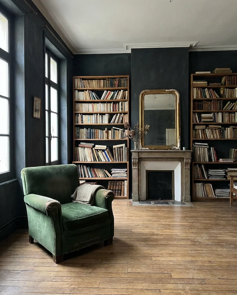
Some of the most compelling inspiration for moody American living rooms comes straight from European apartments—particularly those in Paris, Copenhagen, and London, where smaller spaces demand every design choice count. The look is defined by high ceilings, original parquet or wide-plank floors, walls in deep plaster-like tones, and furniture that looks like it’s been collected over decades rather than purchased all at once. There’s a studied imperfection to it: a chipped gilt mirror, a velvet chair with slightly worn arms, and a bookshelf so full it’s spilling onto the floor. The aesthetic feels deeply personal and impossible to replicate exactly—which is, of course, the point.
For Americans trying to capture this energy in newer construction—homes with standard eight-foot ceilings and wall-to-wall carpet—the approach requires creative translation. Start by adding architectural interest: picture rail molding, a statement cornice, or even a simple wallpaper border at the ceiling line can suggest the bones of an older home. Flea markets and estate sales are essential for sourcing the kind of lived-in, slightly worn pieces that anchor this look—pieces with provenance, even invented provenance. And here’s the expert insight worth saving: resist the urge to replace. The apartments that inspire us most never look freshly furnished. They look as though they were always exactly this way.
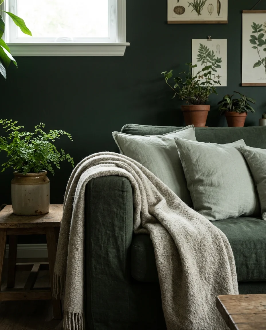
13. Moody Green Living Room With Natural Textures
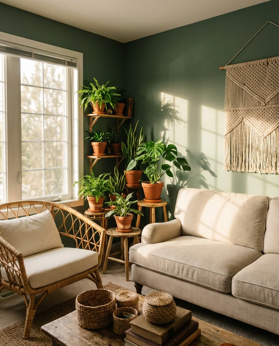
There’s something almost primal about surrounding yourself with green—it reads as safe, alive, and deeply calming in a way that very few other colors can match. A moody green living room in 2026 leans into this by pairing deep sage or forest-toned walls with organic textures: rattan furniture, linen upholstery, woven wall hangings, and living plants clustered in corners and on shelves. The overall effect is somewhere between a greenhouse and a library—lush, layered, and slightly untamed. It’s a look that rewards slow mornings and long evenings equally, and it photographs in natural light in a way that makes every corner feel intentional.
This approach works especially well in homes that have generous natural light—a south- or west-facing living room gets the kind of afternoon warmth that makes deep green walls glow rather than absorb. For north-facing rooms, choose a green with yellow or olive undertones (like Farrow & Ball’s “Mizzle” or Sherwin-Williams’ “Sage”) rather than a cool, blue-based green, which can feel clinical in lower light. Layer in plants of varying height—floor-level fiddle leaf figs alongside hanging pothos and tabletop succulents—and the green of the walls and the green of the living plants begin to blur together in the most satisfying way.
14. White Couch in a Dark Moody Setting
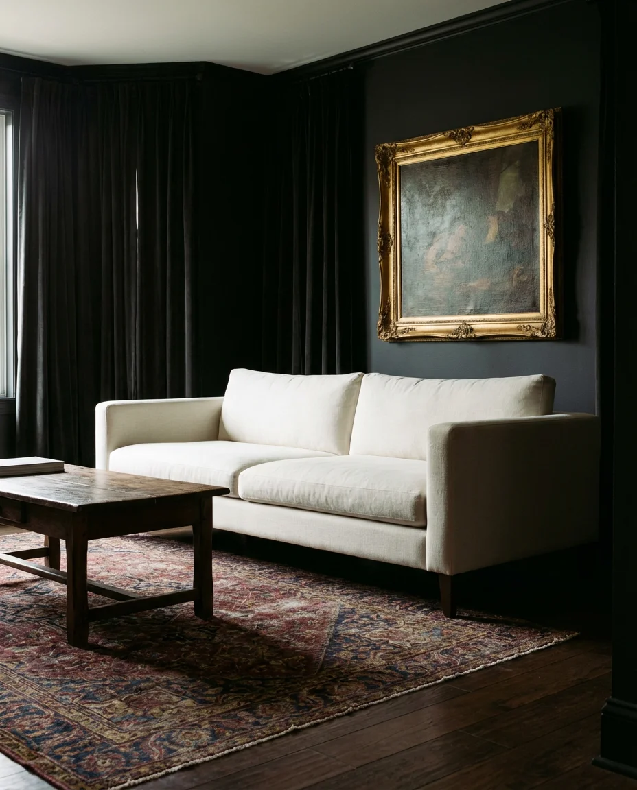
Placing a white couch in a deeply moody room feels counterintuitive—and that’s precisely what gives it such striking visual power. Against walls in near-black, deep charcoal, or navy, a white or ivory sofa creates the kind of high-contrast tension that makes a room feel curated and deliberate. The look is maximized when the other elements stay dark and rich: a dramatic vintage Persian rug, dark wood or lacquered furniture, heavy window treatments, and moody artwork in gilded frames. The white sofa floats in the space like a source of light, drawing the eye immediately and anchoring everything around it.
The practical concern most people have with a white sofa is, of course, maintenance—and it’s not unfounded. But this is one area where doing your homework genuinely pays off. Slipcover sofas are making a serious comeback, and companies like Comfort Works and Sure Fit offer high-quality removable covers in crisp cotton duck or heavy linen that can be machine-washed regularly. Performance fabrics from brands like Crypton or Revolution Fabrics also offer bright white and ivory options that resist staining far better than traditional upholstery. The drama of a white couch in a dark room is worth the care it requires—just go in with a plan and you’ll be fine.
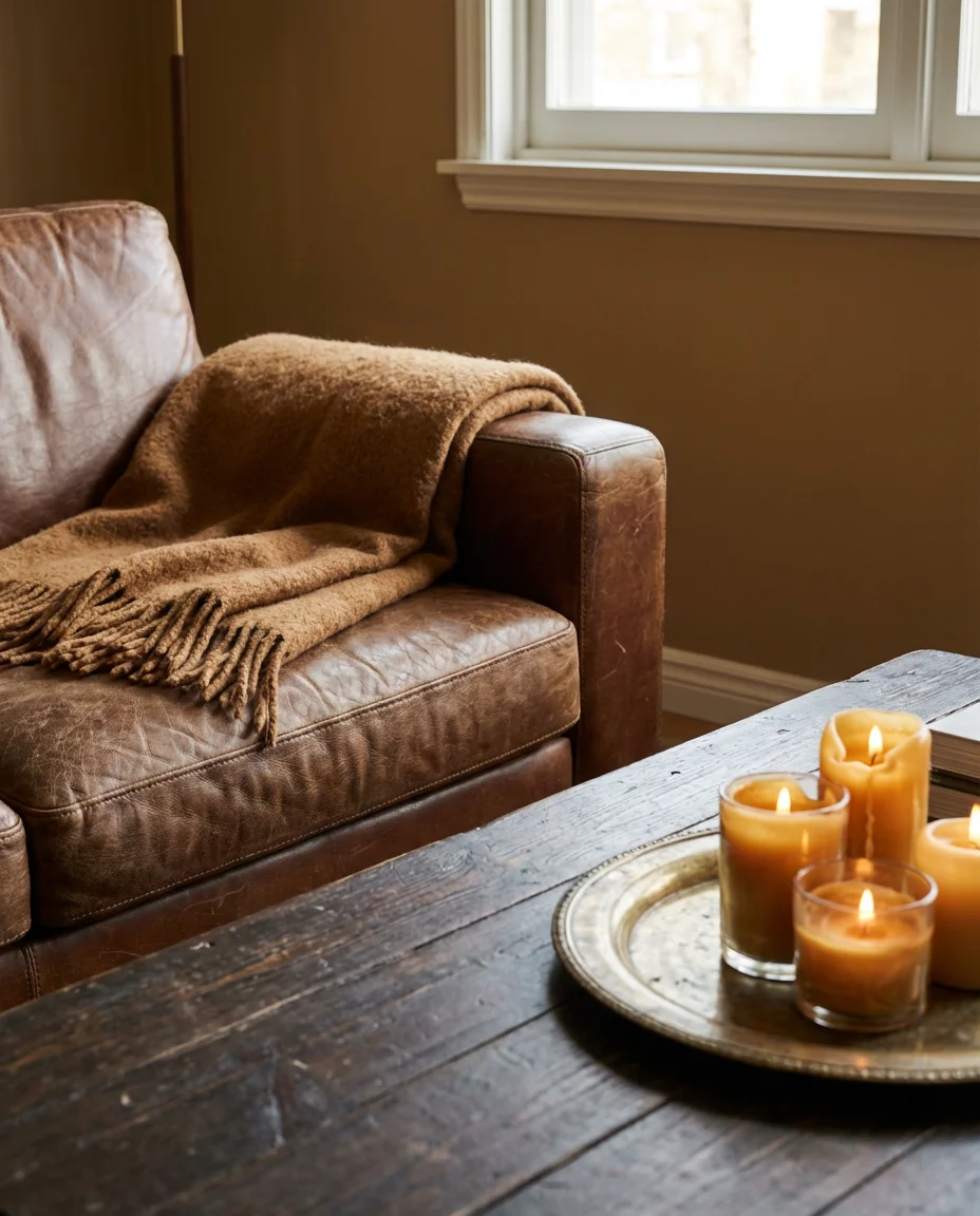
15. Brown and Cognac Tones for a Warm Moody Room
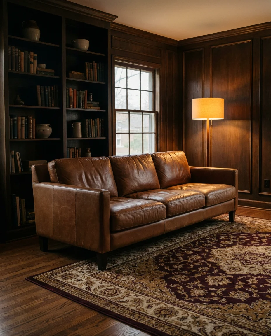
Brown is back—fully and unapologetically. After a decade of everything grey, warm cognac leathers, chestnut wood tones, and caramel upholstery are flooding living room mood boards in 2026. This color family creates a moody atmosphere that leans into richness rather than drama—it’s the design equivalent of a great bourbon: complex, warm, and better with age. A cognac leather sofa anchors the space naturally; surround it with dark-stained wood shelving, a Persian rug in burgundy and gold, and walls in a deep warm tan or chocolate brown. Add low amber lighting, and the room becomes something close to irresistible.
Cognac and brown-toned living rooms are particularly well-suited to homes with existing wood floors—the warm tones unify across the floor, walls, and furniture without feeling monotonous, especially when you vary the depth and finish of the wood tones (raw, oiled, and dark-stained pieces can absolutely coexist). This is also one of the most practical luxury-looking palettes for American families: brown, cognac, and caramel tones hide everyday wear, pet hair, and the inevitable coffee spill with remarkable grace. Vintage leather in particular improves with age in this color range, developing a patina that synthetic alternatives can’t replicate. It’s genuinely a long-term investment that gets better the longer you live with it.
16. Moody Living Room Paint Colors Worth Trying
Choosing the right paint colors for a moody living room is where most people get stuck—and it’s usually because they’re choosing from memory or from a small chip under fluorescent store lighting. The shades generating the most excitement in 2026 span a specific range: Farrow & Ball’s “Down Pipe” (a deep blue-grey), Benjamin Moore’s “Black Raspberry” (a mysterious near-plum), Sherwin-Williams’ “Cavern Clay” (warm terracotta), and Backdrop’s “So Glum” (a moody sage). Each one reads completely differently depending on the light in your room, which is why sampling—not guessing—is non-negotiable. A sample pot and a 12-by-12-inch painted board viewed at different times of day will tell you more than any Pinterest board ever could.
One consistently useful expert insight: finish matters as much as color in a moody room. Flat or matte finishes absorb light and intensify the depth of a dark color—they make a space feel more enveloping. Eggshell offers a slight sheen that keeps the room from going too cave-like. Avoid satin or semi-gloss on walls in dark tones, as the reflection tends to flatten the richness rather than enhance it. If you’re painting a room with imperfect walls, a flat finish will also do a better job of hiding texture irregularities. The investment in good paint and the right finish will always return more than a higher budget on furniture or accessories.
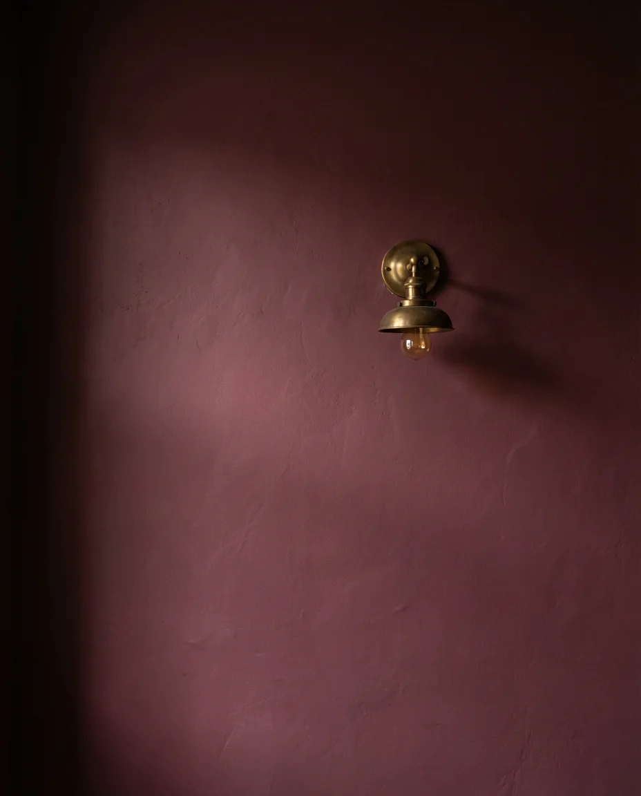
17. Moody Living Room Inspo With Mixed Metals
Mixed metals used to be considered a design mistake—the rule was pick one and commit. But the most compelling moody living room inspo circulating on Pinterest right now breaks that rule deliberately and beautifully. Aged brass floor lamps alongside matte black side tables and burnished copper candle holders next to an iron and glass coffee table—the combination feels collected and considered rather than mismatched when the underlying palette is cohesive. The key is keeping dark and warm-toned metals (brass, bronze, copper, blackened steel) and avoiding anything shiny or chrome-polished, which reads as too modern and clean for the moody direction.
This is a look that builds naturally over time—and that’s arguably its biggest strength for American homeowners who don’t want to design their entire room in one shopping session. Start with one or two anchoring metal pieces (a floor lamp, a coffee table base) and add other metallic accents gradually through thrift store finds, estate sales, and vintage markets. The patina and imperfection of older metal pieces are assets here, not flaws. One common mistake to avoid: buying all your metal accents from the same brand or collection. Identical finishes undermine the “collected” energy. Variation—in tone, weight, and texture—is exactly what makes this approach feel real and alive.
18. Bright Accents Against a Dark Moody Base
One of the most energizing directions in 2026 moody living rooms is the deliberate use of bright accents against a deeply saturated base. Think of a single chartreuse ceramic vase on a shelf full of dark-spined books, a cluster of citrus-yellow candles on a charcoal coffee table, or a pair of tangerine throw pillows on a midnight-blue sofa. The contrast is intentional and bold—it prevents the dark palette from feeling oppressive and introduces a playfulness that keeps the room from taking itself too seriously. The color palette reads as sophisticated precisely because the bright accent is so unexpected and so controlled at the same time.
The most important rule here is restraint: one or two bright accents, not five. The power of this contrast depends entirely on how sparingly the light color appears. If you spread bright accents throughout the room, the tension dissolves and the look becomes just another colorful interior. Choose one area to focus the accent—the coffee table, the bookshelf, or the mantle—and keep everything else in the darker palette. This approach also gives you an easy seasonal refresh: swap out the accent color with the seasons (warm yellow in fall, muted coral in summer, icy white in winter) without touching the base of the room at all. It’s effortless variety built right into the design.
19. Moody Living Room With a Statement Rug
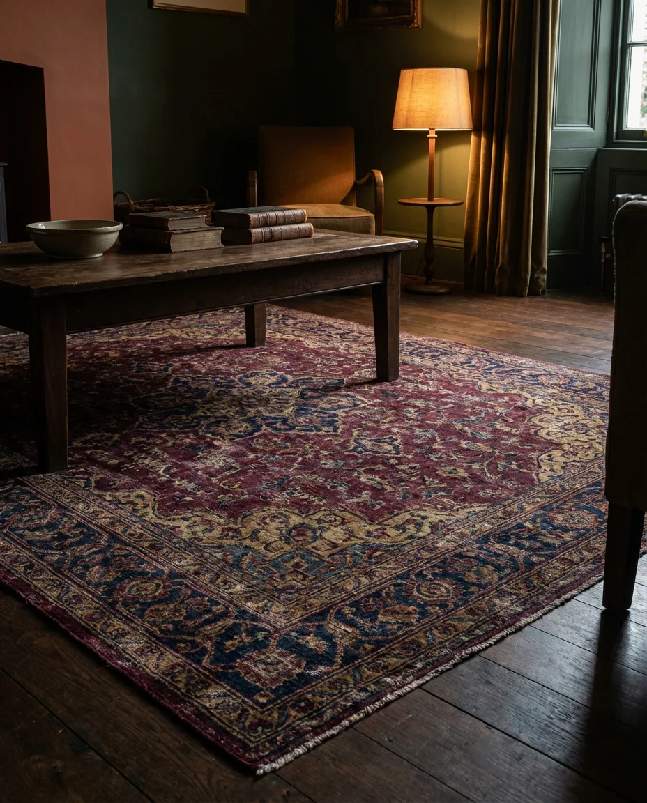
In any moody living room, the rug is doing more work than it usually gets credit for. A vintage or vintage-style Persian or Oushak rug in burgundy, navy, and gold can single-handedly give a room with plain walls and simple furniture an air of depth and history that would take years to achieve any other way. In 2026, the trend is toward rugs that feel deliberately aged—slightly worn, slightly irregular—rather than the too-perfect machine-made versions that dominated the mid-2010s. Pair a rich-toned vintage rug with dark walls, and you get a room that feels like it was assembled slowly, over time, by someone with genuinely good taste.
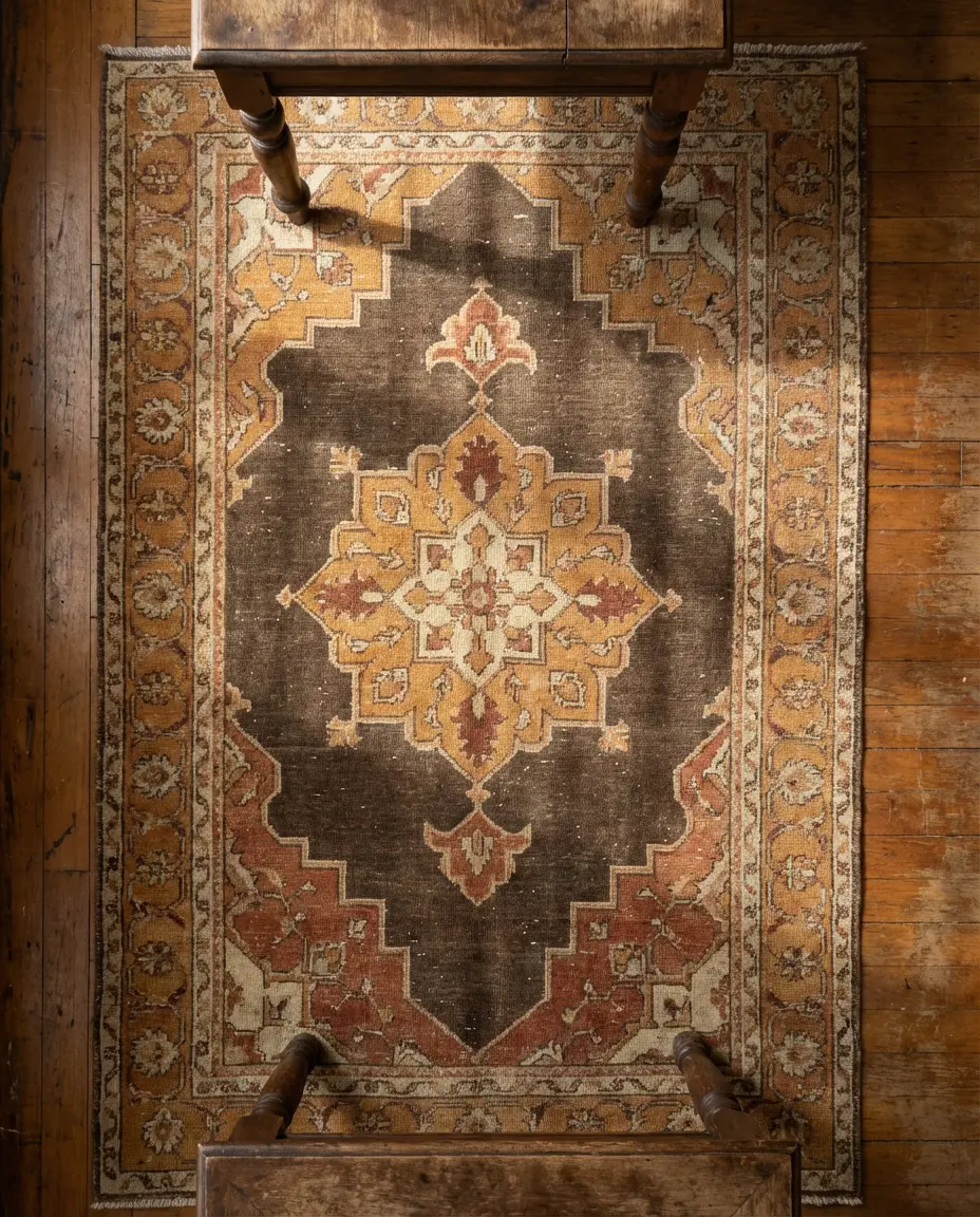
For homeowners building a moody room on a tight budget, the rug is often the single best place to invest. A genuine vintage rug—sourced from eBay, Etsy, or a local estate sale—will outperform a brand-new mid-range rug in almost every measurable way: character, durability, and the ability to anchor a room visually. Prices for smaller vintage pieces (four-by-six or five-by-eight) can be surprisingly reasonable, particularly for Turkish or Romanian pieces that don’t carry the premium of Persian labels. The most common sizing mistake is going too small—in a living room, always size up. A rug that only fits under the coffee table leaves the seating area feeling disconnected and incomplete.
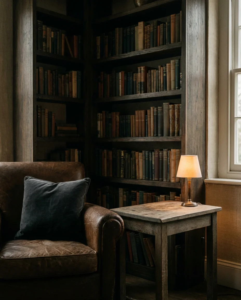
20. Dark and Cozy With Maximalist Bookshelf Styling
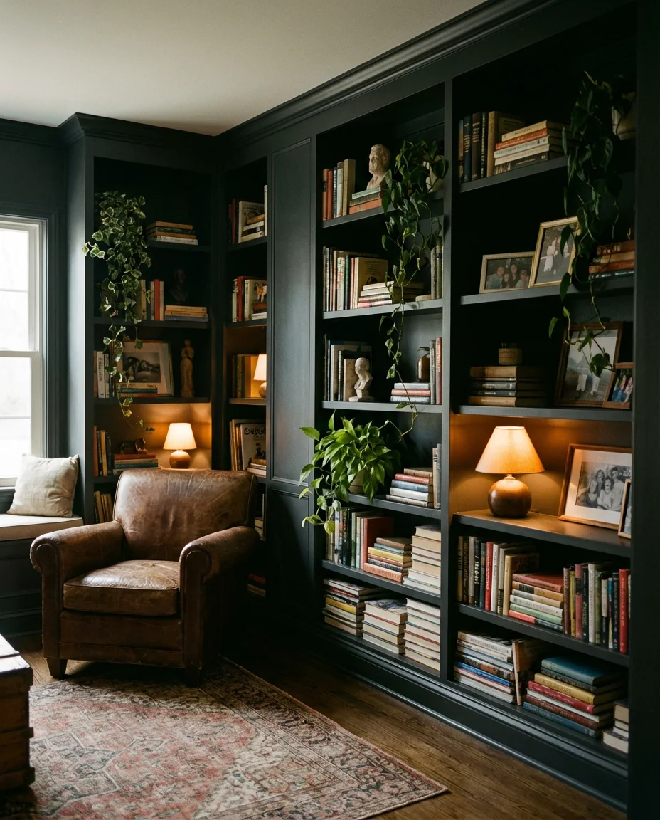
Nothing makes a living room feel more like a sanctuary than walls lined with books—and in a cozy, dark living room, a fully styled bookshelf becomes a piece of art in its own right. The maximalist shelf styling trending in 2026 moves away from the sparse, color-sorted Instagram shelf and toward something more genuinely bibliophilic: books stacked both vertically and horizontally, interspersed with small sculptures, trailing plants, framed photos, and meaningful objects. The result is a shelf that looks like it evolved organically over years rather than being curated for a photo. Against a deep painted wall, this kind of shelf creates layers of texture and story that no piece of furniture can replicate.
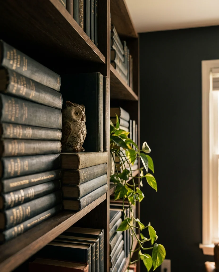
For Americans who already own built-in bookshelves—a common feature in craftsman bungalows, colonial revivals, and mid-century ranches—painting the interior back panel of the shelves in a deep, contrasting tone is one of the highest-impact, lowest-cost upgrades available. A half-pint of paint transforms the shelves from a utilitarian storage solution into a dramatic design feature. The actual styling of the books matters too: face a few outward to show their covers, keep a loose section of horizontal stacks to add visual rhythm, and let things be slightly imperfect. The lived-in quality is the whole point—perfectionism is the enemy of a truly cozy room.
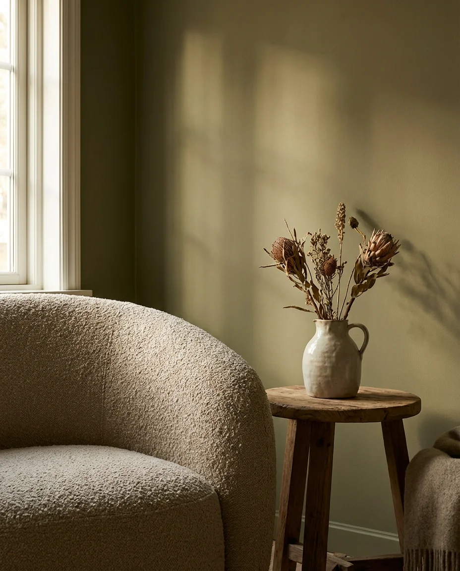
21. Organic Modern Moody Room With Sculptural Furniture
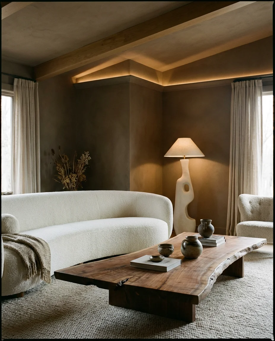
The organic modern direction is one of the most compelling intersections of aesthetics in 2026 — it takes the clean lines and intentionality of modern design and injects them with natural imperfection and warmth. In a moody context, this translates to sculptural furniture with curved, biomorphic silhouettes in natural materials: a boucle curved sofa, an irregular live-edge coffee table, and a ceramic floor lamp with a hand-thrown asymmetric base. The walls stay in a rich but quiet tone—deep taupe, warm mushroom, or muted olive—and the lighting is architectural and warm. There’s nothing loud about this room; its atmosphere comes from the quality and honesty of every object in it.
This direction works best when each piece earns its place—which means fewer, better objects rather than more. The sculptural quality of the furniture means it needs visual space to be appreciated, so resist the urge to fill every corner. This aesthetic is particularly well suited to newly built homes where the architecture is clean but lacks character—the furniture itself becomes the character. Budget-wise, this is a look that rewards patience: buying one genuinely well-made, beautifully designed piece at a time will always outperform a roomful of trendy approximations. West Elm, CB2, and BDDW all operate at different price points within this aesthetic and are worth comparing before committing.
22. Full Moody Living Room Transformation on a Real Budget
The assumption that a moody, atmospheric living room requires deep pockets is one of the most persistent myths in home decor—and it simply isn’t true. The elements that create atmosphere cost far less than the elements that simply fill a room. A single can of rich dark paint, floor-length curtains from IKEA, a vintage rug from eBay, and a cluster of thrifted brass candleholders can transform a bland rental living room into something genuinely striking for well under $500. The cozy quality of a moody room comes from layering and intention—not from a specific price point. This is a design direction that actively rewards thrifting, DIY, and slow accumulation over time.
The most valuable reframe for budget-conscious decorators: stop thinking about what the room is missing and start thinking about what it could become with what you already have. Most people already own more of the raw material for a moody room than they realize—dark throw blankets, wooden frames, plants, and candles. The transformation often begins not with buying something new but with subtracting something cold or generic that’s been draining the room’s energy. Remove the cold-toned overhead light and replace it with a warm lamp. Take down the mass-produced wall art and leave the wall empty for a week. Editing is the first step—and it costs nothing at all.
Conclusion
There’s no single right way to do a moody living room, and that’s honestly the best thing about this direction—it stretches from deeply dramatic to quietly earthy, from maximalist to pared-back, and every version of it is rooted in the same desire: to create a space that actually feels like somewhere you want to be. Which of these ideas resonated with you most? Drop your thoughts in the comments below—are you leaning into dark walls, chasing that cozy fireplace energy, or building a moody room around a bold statement sofa? We’d genuinely love to see what you’re working on.