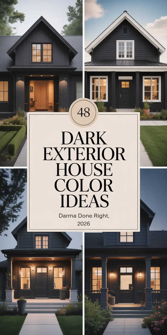
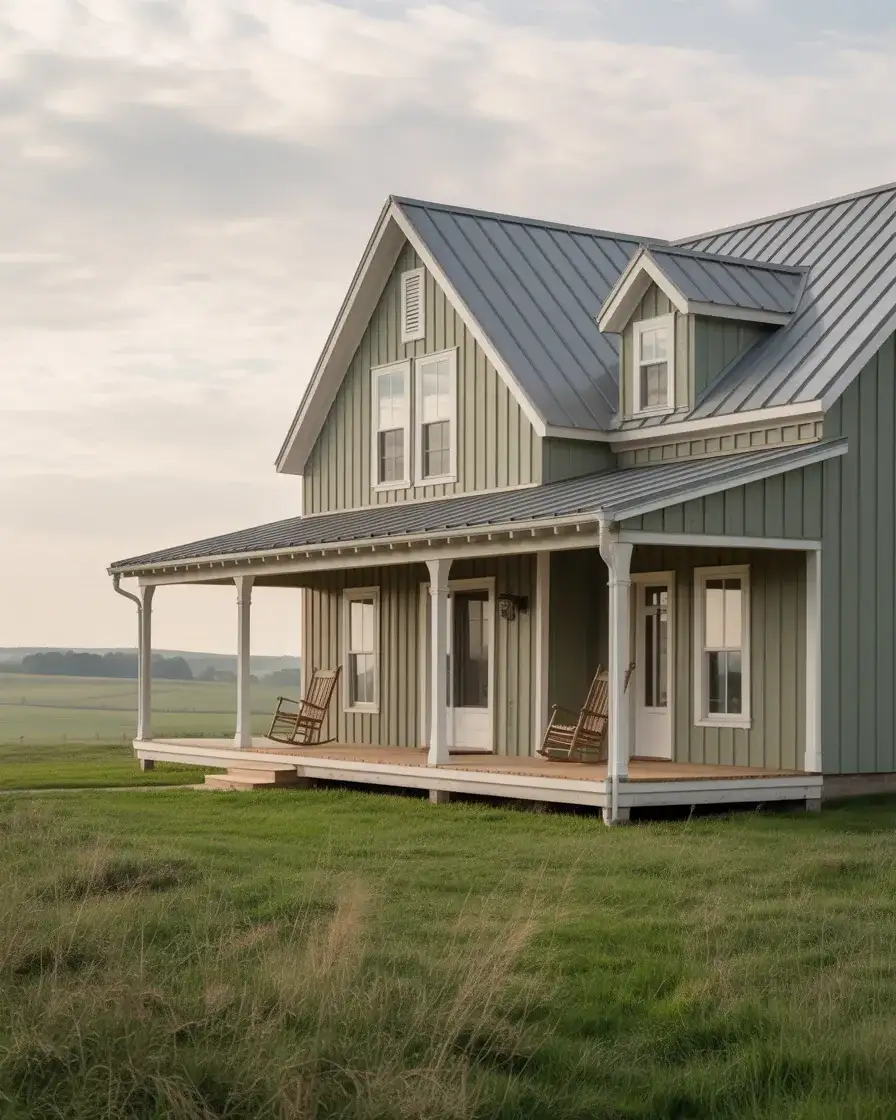
If your home’s exterior is looking a little tired—or you’re simply ready for a change—you’re in the right place. Exterior paint colors are having a major moment right now, and what’s trending in 2026 is a beautiful mix of bold, grounded, and deeply personal choices that feel anything but ordinary. Americans are turning to Pinterest in droves to pin and save palettes for everything from farmhouse cottages to sleek contemporary builds, and the inspiration out there is genuinely stunning. Whether you’re planning a full repaint or just hunting for your next dream color, this guide walks you through some of the most exciting, livable, and conversation-starting exterior paint ideas of the year—so you can walk away with a real direction for your home.
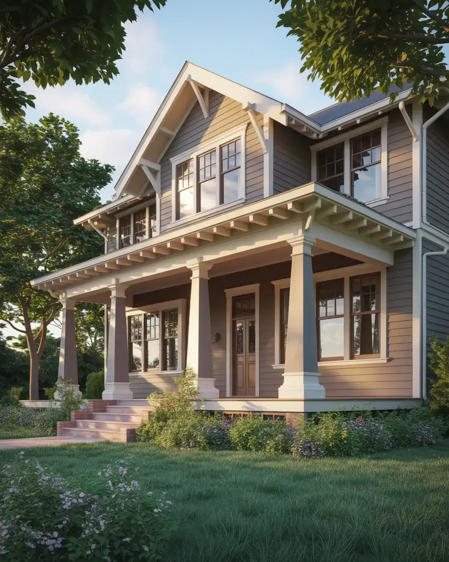
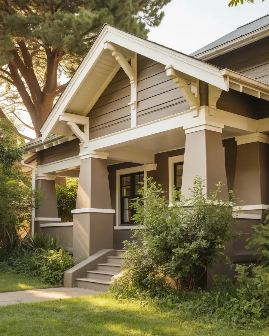
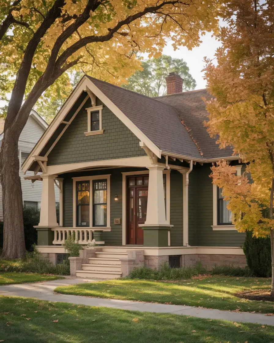
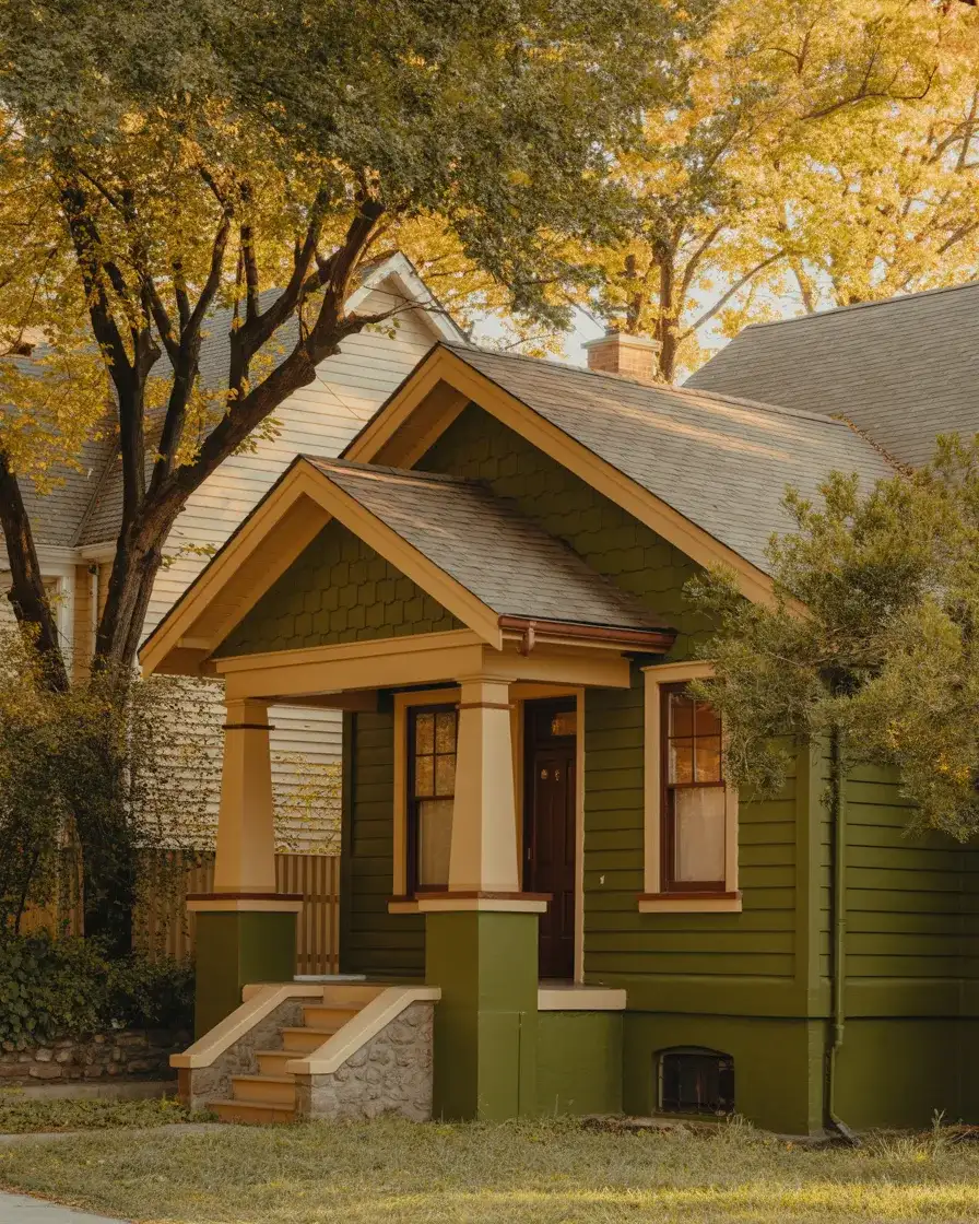
1. Warm Taupe with Crisp White Trim
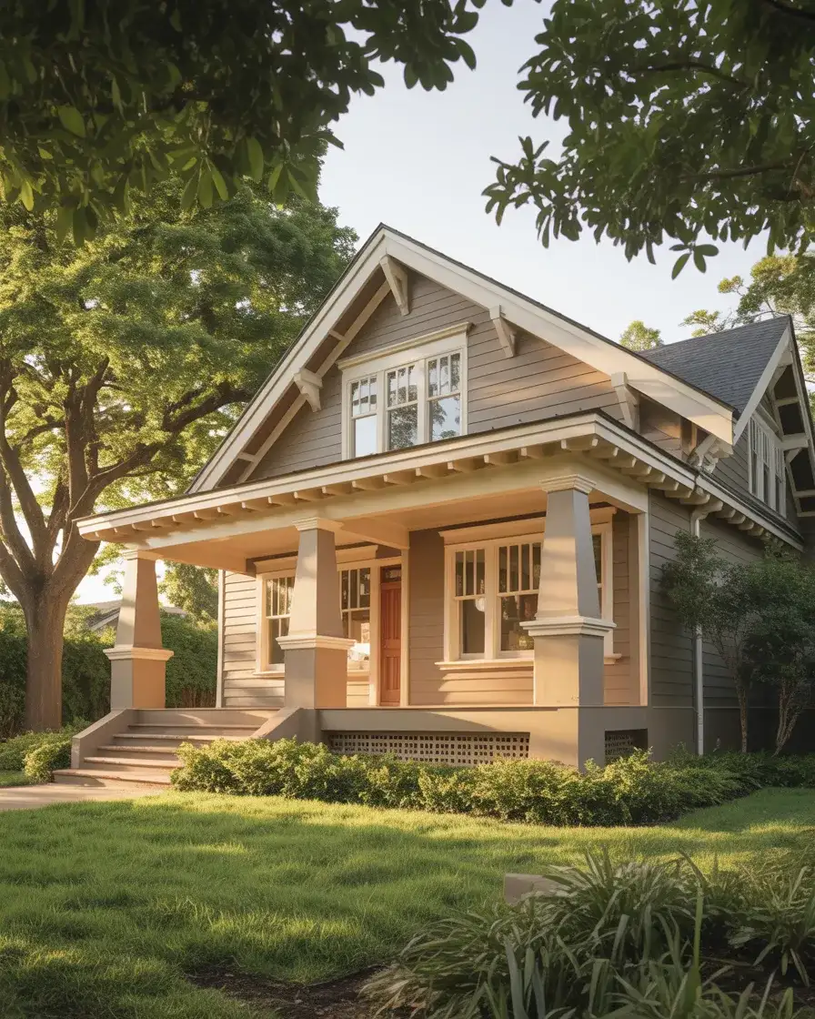
There’s a reason taupe keeps finding its way back to the top of every trending paint list. It’s that rare color that reads as sophisticated without trying too hard—warm enough to feel welcoming, neutral enough to play nicely with nearly any landscape or roof color. In 2026, designers are pairing warm taupe siding with crisp white trim for a look that feels refreshed and intentional. It works especially well on Craftsman-style homes and traditional colonials where the trim detail deserves to shine.
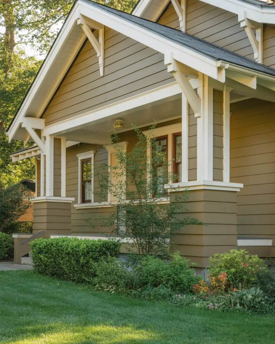
This combo is one of the most budget-friendly ways to completely transform a home’s exterior. Because taupe is widely available in standard paint lines—Sherwin-Williams, Benjamin Moore, and Behr all carry beautiful options at every price point—you don’t need to special-order anything. Homeowners report this palette photographs beautifully in every season, which makes it a perennial Pinterest favorite for a reason.
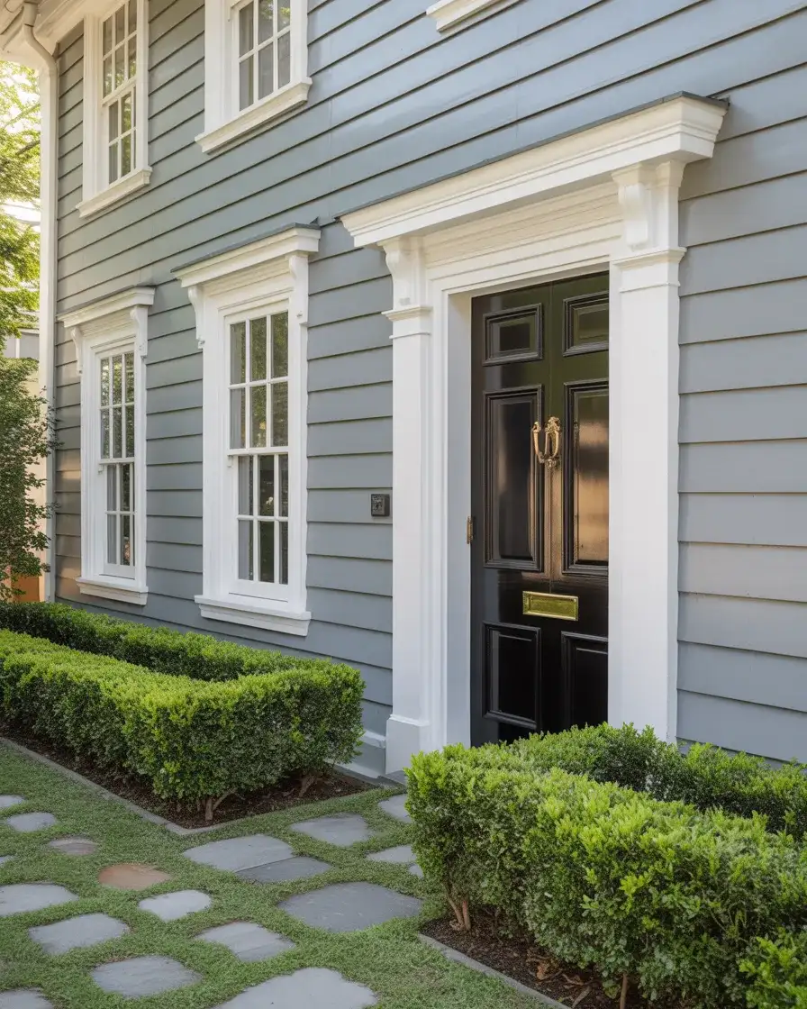
2. Classic White with Black Doors and Windows
You can’t talk about exterior paint without landing on the combination that has dominated design conversations for years now—and it’s still going strong. White siding paired with black doors and black window frames is the kind of look that’s simultaneously timeless and decidedly current. The light gray, white trim, and black doors palette, in all its variations, is everywhere on Pinterest boards right now, and it’s easy to see why: the contrast is graphic and clean and gives any home an almost editorial quality.
One thing real homeowners sometimes get wrong here is choosing a stark, cool white rather than a warmer off-white—the result can look harsh under certain lighting conditions, especially in sunnier southern states. The fix is simple: test your white on a large sample board before committing. Warm whites like Sherwin-Williams’ Alabaster or Benjamin Moore’s White Dove read as crisp without the clinical edge, giving you that Pinterest-perfect look without the regret.
3. Sage Green Farmhouse Exterior
The farmhouse aesthetic isn’t going anywhere—and in 2026, it’s getting a color upgrade. Sage and muted green tones are replacing the all-white farmhouse look with something that feels more grounded, more intentional, and honestly more interesting. There’s a softness to sage that connects a home to its surroundings, almost as if it grew there alongside the trees. On a classic farmhouse silhouette with a metal roof and wide front porch, this color is nothing short of dreamy.
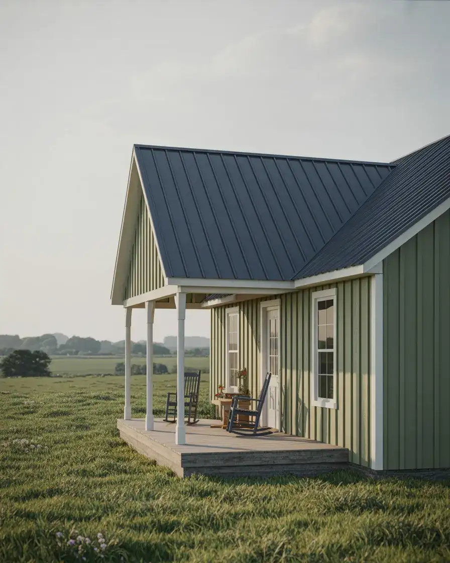
This palette works best in the rural Midwest, the Pacific Northwest, and anywhere with mature trees—the green of the paint and the green of the landscape create a harmony that’s genuinely hard to beat. For urban or suburban lots with minimal landscaping, add some climbing plants or window boxes to soften the look and bring in that same organic quality. It turns a painted house into something that feels like it belongs to the land around it.
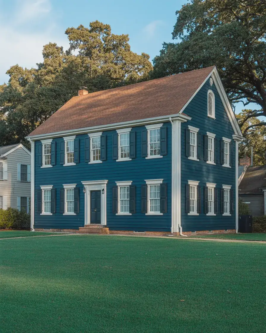
4. Navy Blue with White Trim and a Brown Roof
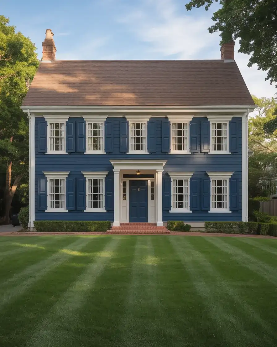
Deep, saturated blue exteriors are among the boldest trending choices of 2026, and the pairing with a brown roof is one that many homeowners are discovering feels more natural than expected. Navy grounds a home visually, giving it weight and presence without being aggressive. The earthy tones of a brown or cedar-shake roof pull warmth into the palette, preventing the dark blue from reading as cold or stark. It’s a combination that feels at once coastal and mountainous, versatile across regions.
A design consultant in New England once noted that this palette became the most-requested look in her practice after a single viral Pinterest post—and that tracks. When homeowners in Connecticut and Maine started seeing this combination on older colonials and Victorians, they realized dark blue felt native to the region’s character. The contrast between the navy body and white architectural trim has an almost nautical elegance that resonates particularly well along the East Coast.
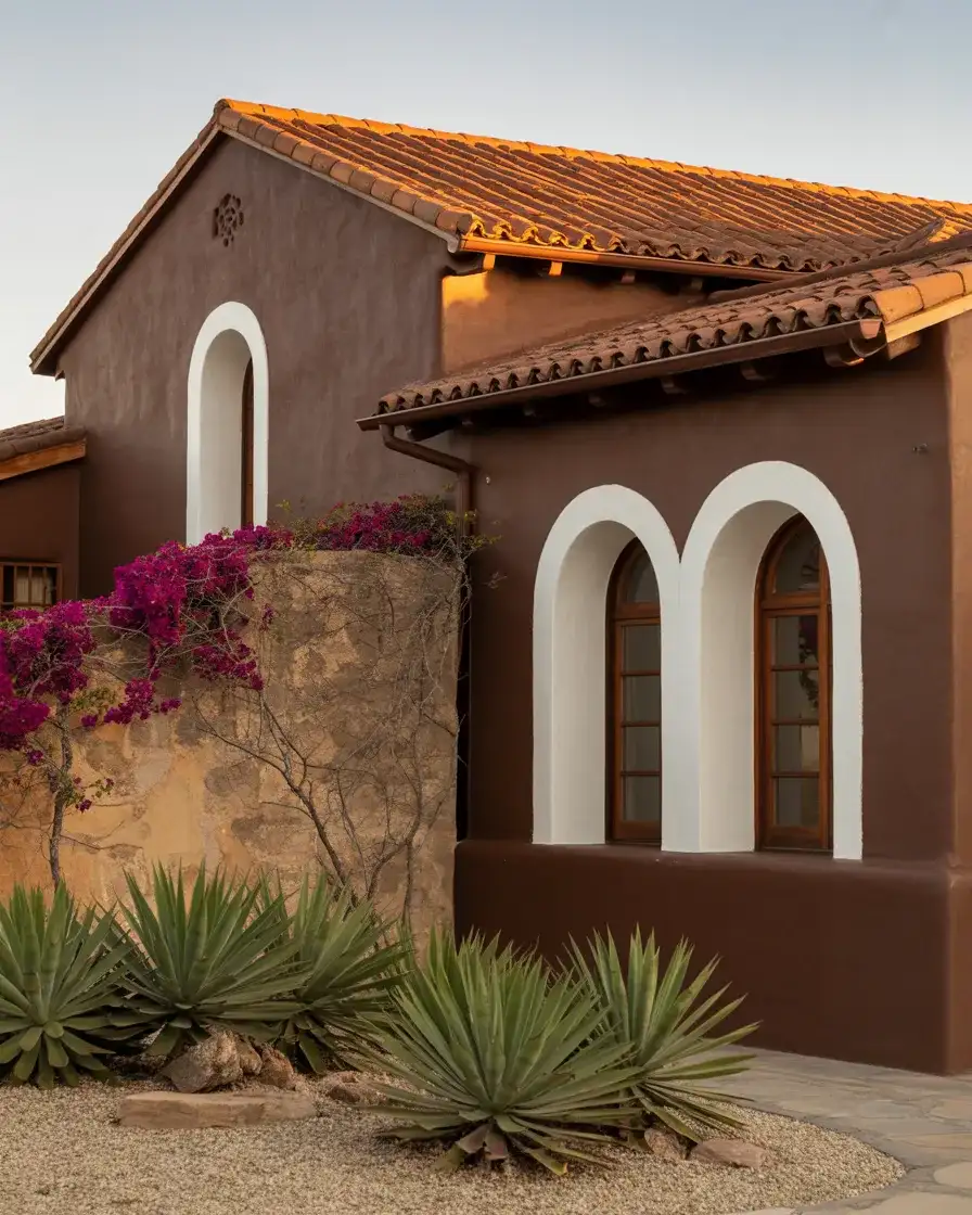
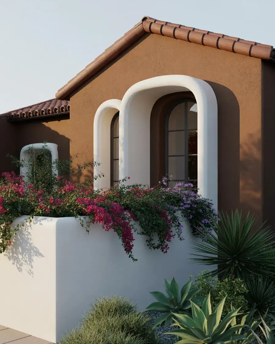
5. Terracotta with White Windows on a Mediterranean Home
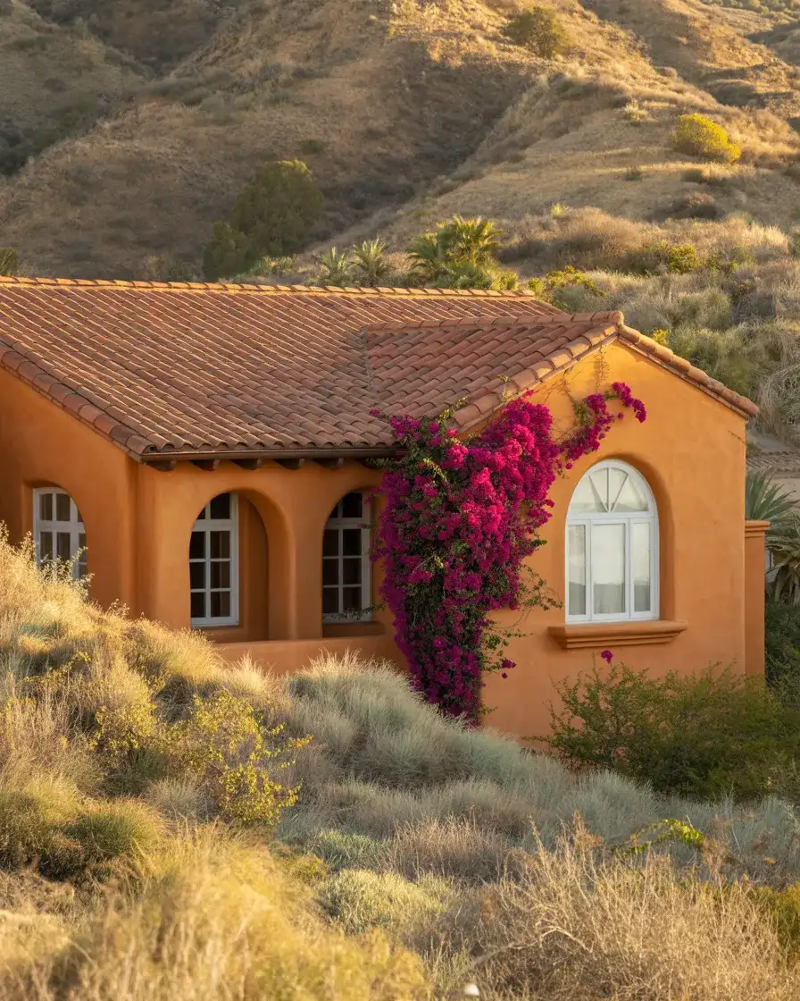
Terracotta is having one of its biggest moments in years, moving beyond interior tile work and landing firmly on exterior walls. Paired with a terracotta roof and white windows, this look channels Mediterranean and Spanish Colonial architecture in the most beautiful way. The warm, clay-baked tone feels earthy and sun-drenched—a natural fit for California, New Mexico, Arizona, and Florida homes where the light actually does justice to the richness of the color.
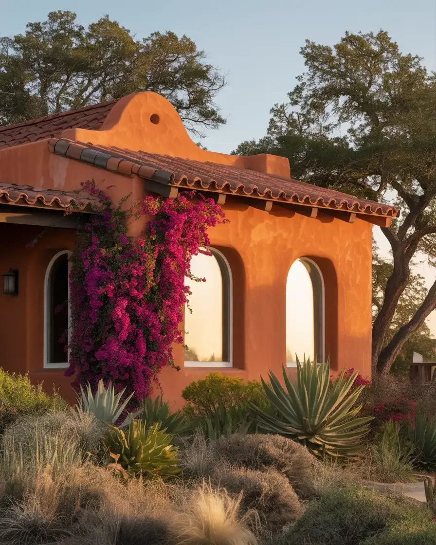
Terracotta reads completely differently depending on the finish—flat stucco gives it that authentic, hand-plastered old-world quality, while smooth painted siding makes it feel more contemporary and graphic. If you’re working with an older stucco home in the Southwest, consider embracing the imperfections in the texture rather than re-smoothing everything. Those slight variations in surface are exactly what make the color feel alive and real, rather than flat and painted-by-numbers.
6. Charcoal Gray with Red Brick Accents
One of the most striking combinations making the rounds on design Pinterest boards right now is dark charcoal grey siding set against exposed brick—specifically that warm, ruddy red brick you see on older American homes. The brown roof and red brick wall combination with a dark painted body creates a layered, almost cinematic exterior that’s equal parts moody and polished. It’s the kind of look that photographers love and neighbors ask about.
This palette is particularly well-suited to Tudor-revival and mid-century ranch homes that already have partial brick facades. Rather than painting over the brick—a choice many homeowners later regret—letting the original masonry remain as a feature and painting only the wood or fiber cement siding creates a beautiful material conversation. The contrast between the rough texture of old brick and smooth charcoal paint is tactile and genuinely sophisticated in person.
7. French Country Blue Exterior
If there’s one color story that feels simultaneously romantic and very right for the current moment, it’s French country blue. Think faded periwinkle, dusty slate, and muted cornflower—colors that feel as though they’ve been softened by decades of sunlight and salt air. This look, inspired by the painted shutters and facades of Provence, is being translated onto American homes in the most beautiful ways. In a cottage, a bungalow, or a story-and-a-half home surrounded by gardens, it’s completely transportive.
The secret to getting this look right is in the saturation—or rather, the deliberate lack of it. Vivid, clean blues will read as nautical or modern, which isn’t the goal here. You want something that looks as though it was once bolder and has gracefully aged. Sherwin-Williams’ Smoky Blue and SW’s Meditative are both excellent starting points that land in that wistful, sun-washed register this palette demands. It’s one of those rare choices that looks even better as it weathers.
8. Light Gray Siding with White Trim and Black Doors

There’s a version of the light gray, white trim, and black doors combination that, done right, is as close to a perfect exterior palette as most American homes will ever achieve. Light gray siding has this wonderful quality of reading almost like a white in bright sun while holding depth and dimension in the shade—it’s endlessly photogenic. Pair it with white trim and a glossy black front door, and you have something that works for a Tudor revival in Connecticut, a ranch in Texas, or a bungalow in Oregon.
What makes this palette so universally appealing to American homeowners is its flexibility—it raises property value without alienating buyers. Real estate professionals consistently rank this type of neutral-plus-contrast exterior among the top five choices for homes going on the market. Even if you’re not selling anytime soon, choosing a palette that photographs well and reads as universally appealing means your home will feel fresh and relevant for the next decade or more without needing a redo.
9. Earthy Brown with Stone Foundation and Black Trim
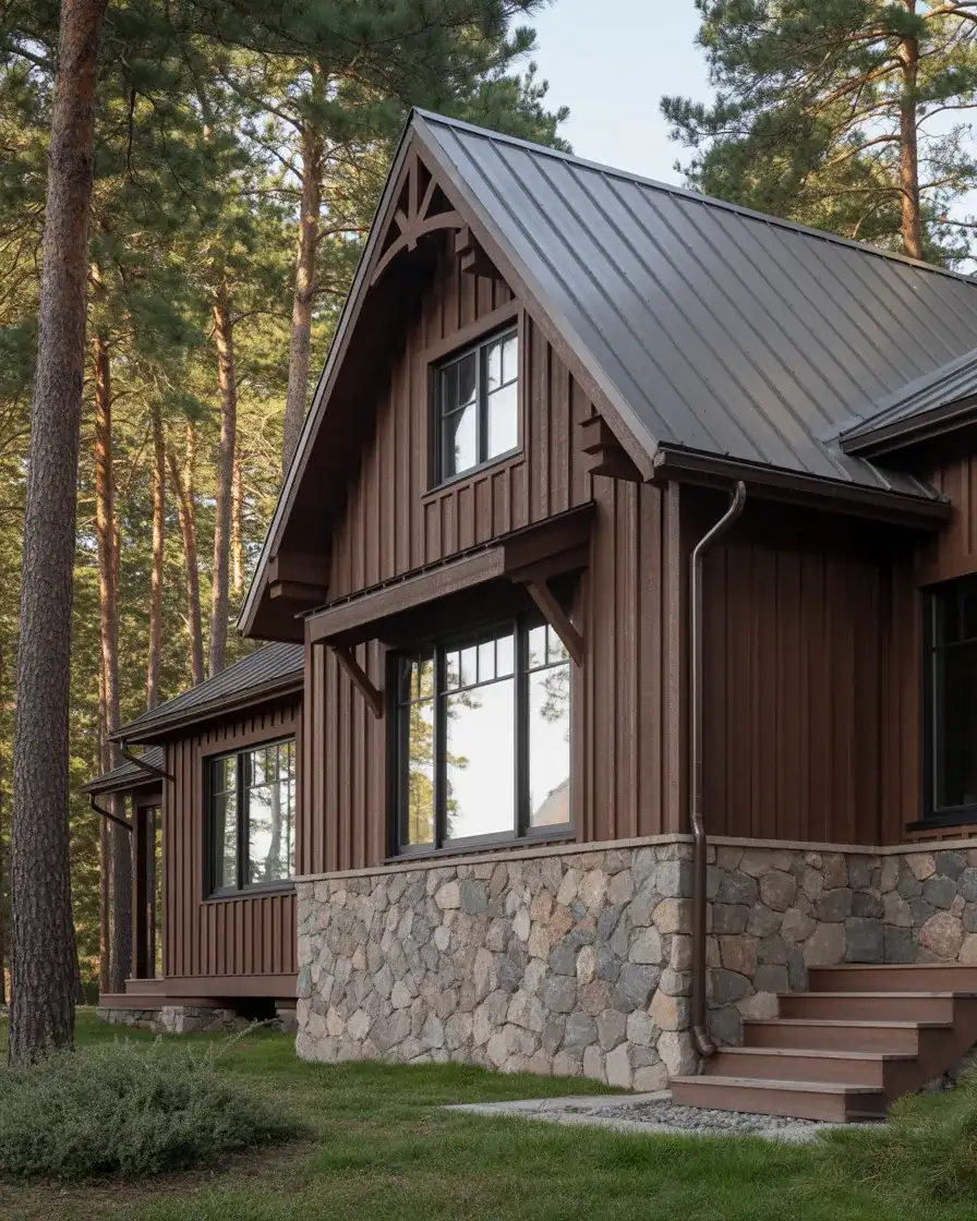
There’s something deeply grounding about an exterior painted in a rich, warm brown. Not muddy, not murky—but the kind of brown that feels like tree bark, coffee, or weathered leather. In 2026, designers are pairing these warm earth tones with natural stone foundations and matte black trim for an exterior that looks both rustic and composed. It’s a particularly strong look on homes in wooded settings where the palette allows the house to feel like a natural extension of its surroundings.
This is one of those palettes that homeowners in mountain towns—think Asheville, Boulder, Bend, or the Adirondack region—seem to gravitate toward intuitively, almost as if the landscape itself demands it. Brown homes disappear into the treeline in the best possible way, becoming part of the scenery rather than imposing on it. Add a copper or weathered brass door hardware detail, and you have an exterior with real material richness that no single-color approach can replicate.
10. Modern Dark Exterior with Warm Wood Accents
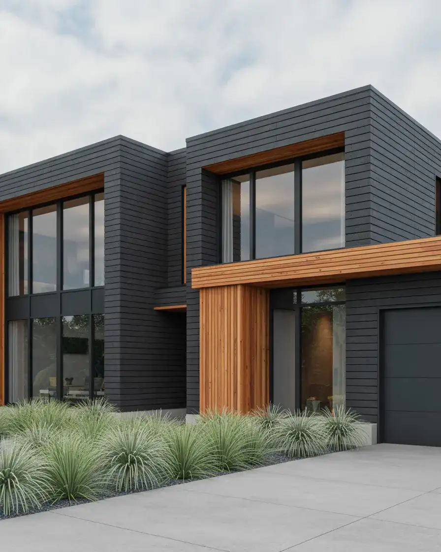
The modern dark exterior trend is one of the most searched looks on Pinterest heading into this year, and it’s easy to understand the appeal. A near-black or very deep charcoal body, paired with natural wood soffits, cedar cladding details, or warm teak deck elements, creates an exterior that feels architectural, intentional, and sophisticated. It’s the kind of house that looks like it was designed by someone who thought about every detail—because it actually was.
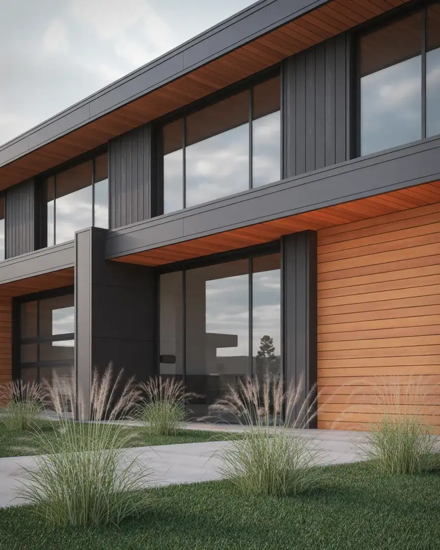
One common mistake with very dark exteriors is underestimating heat absorption—this matters especially in warmer climates like Arizona or Southern California, where dark surfaces can dramatically increase cooling costs. The practical solution is to choose a high-quality exterior paint with heat-reflective pigments, which several manufacturers, including Behr, now offer in their premium lines. Pairing a dark body with lighter wood accents also breaks up the visual mass and prevents the home from reading as a dark box.
11. Soft Indian Red with Cream Trim
Indian red—that dusky, muted crimson that sits somewhere between terracotta and burgundy—is a color with centuries of architectural history, and it’s finding new life on American homes right now. Unlike a bright fire-engine red, India red has been softened by earth and time, making it a color that reads as both historical and genuinely fresh. Paired with a warm cream or ivory trim, it creates an exterior with the kind of character that newer palettes can struggle to achieve.
This is a palette that tends to work its best magic on older homes with genuine architectural bones—Greek Revivals, Second Empire Victorians, and New England saltboxes wear this color like they were born to. If you’re in a newer subdivision with more modest architecture, consider using Indian red on just the front-facing elements like the porch ceiling or shutters rather than the full body, letting the color serve as a punctuation mark rather than the entire statement. Small doses can be just as impactful.
12. Contemporary Mid-Century Modern in Desert Sand
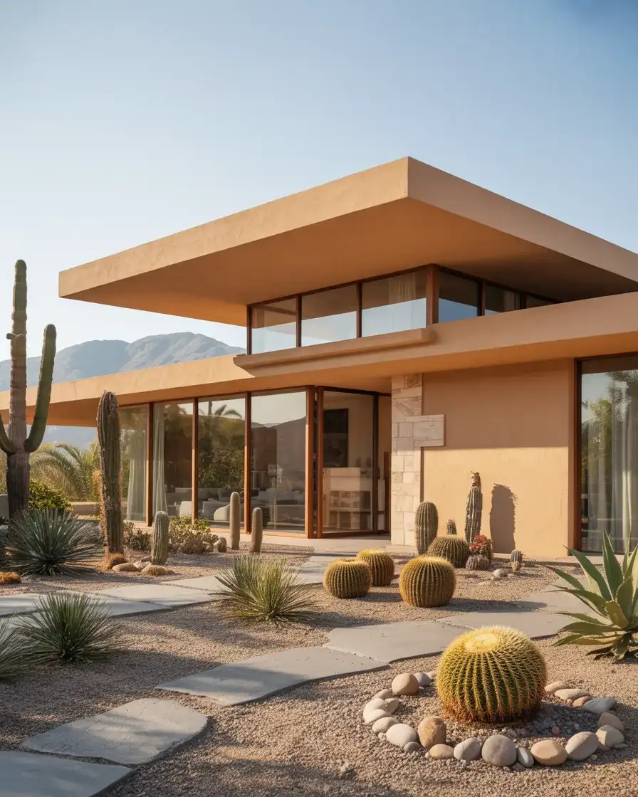
The contemporary mid-century modern revival is one of the dominant design stories of recent years, and on the exterior, that translates into warm, sandy neutrals that honor the original palette of postwar American architecture. Ochre, raw linen, warm sand, and pale adobe—these colors connect directly to the California and Palm Springs mid-century canon. They feel of-the-moment precisely because they’re actually rooted in a specific, beloved design moment in American history.
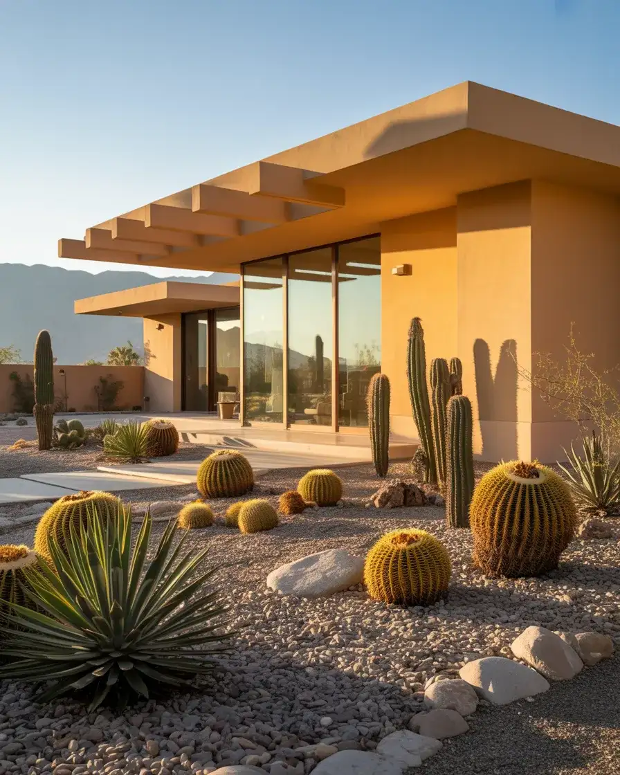
What makes this palette feel so livable is how effortlessly it ages—sand and warm neutrals don’t show dust, don’t read as dated after a few seasons, and look equally good in photos taken at noon or golden hour. Homeowners who’ve repainted their mid-century ranches in these colors consistently report that the neighborhood response is immediate and positive. There’s a shared cultural recognition that happens when a palette and an architectural style are truly well-matched, and this is one of those combinations.
13. Bright White Farmhouse with Natural Wood Porch
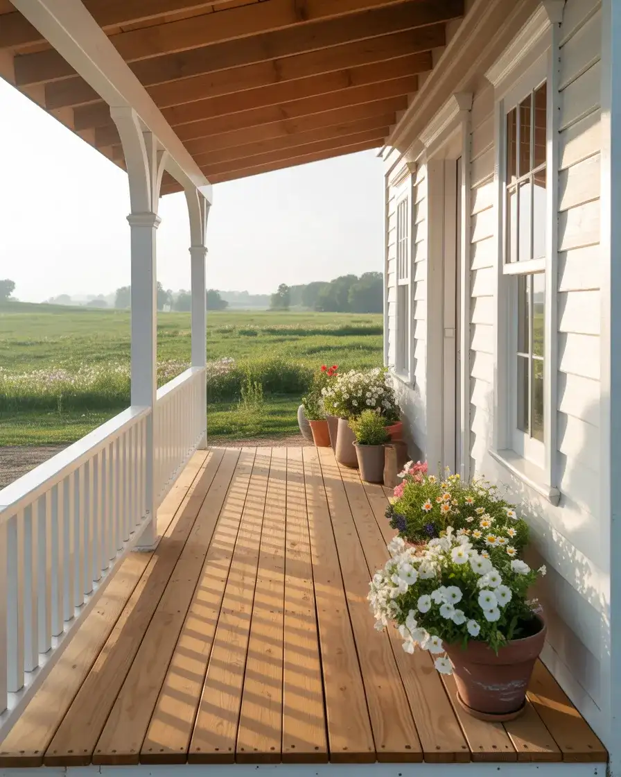
The all-white farmhouse look has been pinned millions of times, and the version that’s resonating most right now adds natural, unstained wood elements to break up the monochrome. Think raw cedar porch flooring, whitewashed shiplap siding, weathered wood garage doors, and white-painted board-and-batten—all offset by the warm honey tone of untreated wood. It’s a look that feels genuinely lived-in rather than staged, which is exactly the energy Americans are chasing on Pinterest right now.
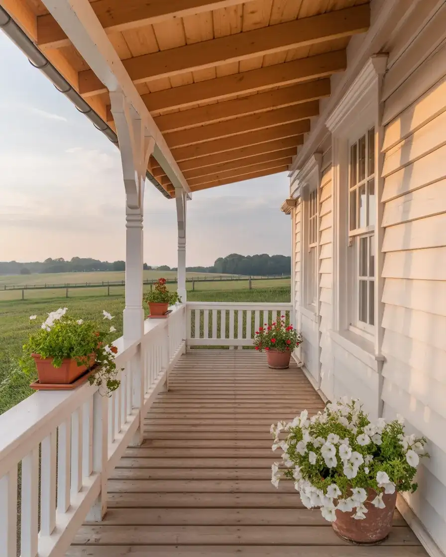
One of the most practical things to know about a white exterior is maintenance—it will show dirt, mildew, and oxidation faster than almost any other color. The trick homeowners in humid Southern states have landed on is using a paint with a mildewcide additive and giving the exterior a gentle pressure wash every spring. It sounds tedious, but the hour of work once a year is absolutely worth it when the payoff is a home that looks perpetually photogenic and fresh.
14. Trending Olive Green with a Brown Roof
Among the most trending colors of the year, olive green occupies a fascinating space—it’s muted enough to feel earthy and natural, but it has more personality than a straight gray or beige. Paired with a brown roof, olive green creates an exterior palette that reads as harmonious and organic, the siding and the roof existing in the same warm, autumnal color family rather than contrasting against each other. It’s a quietly sophisticated choice that’s gaining real traction across the country.
Olive green is one of those colors that shifts dramatically between product lines and finish choices—the same name on different brand chips can look almost completely different. Before committing to a full exterior repaint, it pays to buy test quarts from at least two or three manufacturers and paint large swatches on different sides of the house. You’ll quickly learn how your specific light affects the hue, and you’ll sidestep the all-too-common experience of choosing a color you love in the store and disliking it on the house.
15. Behr’s Latest Deep Teal on a Modern Cottage

Behr’s latest exterior palette releases always generate conversation, and their deep teal and petrol blue offerings have been catching eyes this season. On a modern cottage or a smaller craftsman-scale home, a deep teal functions almost like a jewel-tone accent at an architectural scale—it’s confident, a little unexpected, and it photographs beautifully against nearly any natural backdrop. This is the kind of color choice that transforms an ordinary house into something memorable from the street.

Teal can be a tricky color to get right at scale, but the homes where it sings share a few things in common: they’re modest in size, they have excellent white trim detailing, and they’re surrounded by natural greenery rather than concrete. In dense suburban settings without much landscaping, deep teal can feel overwhelming. But on a compact 1,200-square-foot bungalow with good bones and a lush garden, it’s the paint color equivalent of a perfectly chosen statement piece that makes the whole outfit work.
16. SW Alabaster White with Soft Gray Undertones
SW Alabaster has been one of Sherwin-Williams’ most beloved interior colors for years, and its exterior counterpart—a creamy white with the faintest gray or beige whisper—is becoming one of the latest go-to choices for homeowners who want a white exterior that never reads as cold or clinical. There’s a warmth to Alabaster-family whites that gives a home a sunlit quality even on overcast days, and it sits beautifully against virtually any trim color, roof tone, or landscape.
Interior designer and blogger Leah Williamson documented her own home repaint using an Alabaster-family white and noted that the shift from a cooler white made her thirty-year-old colonial feel freshly built—not because anything structural changed, but because the warmth of the color softened every line and shadow. That micro-anecdote resonates because so many homeowners are chasing exactly that feeling: new, without losing the home’s original character. This color finds that balance with surprising ease.
17. Dark Green with Black Metal Roof and Brass Details
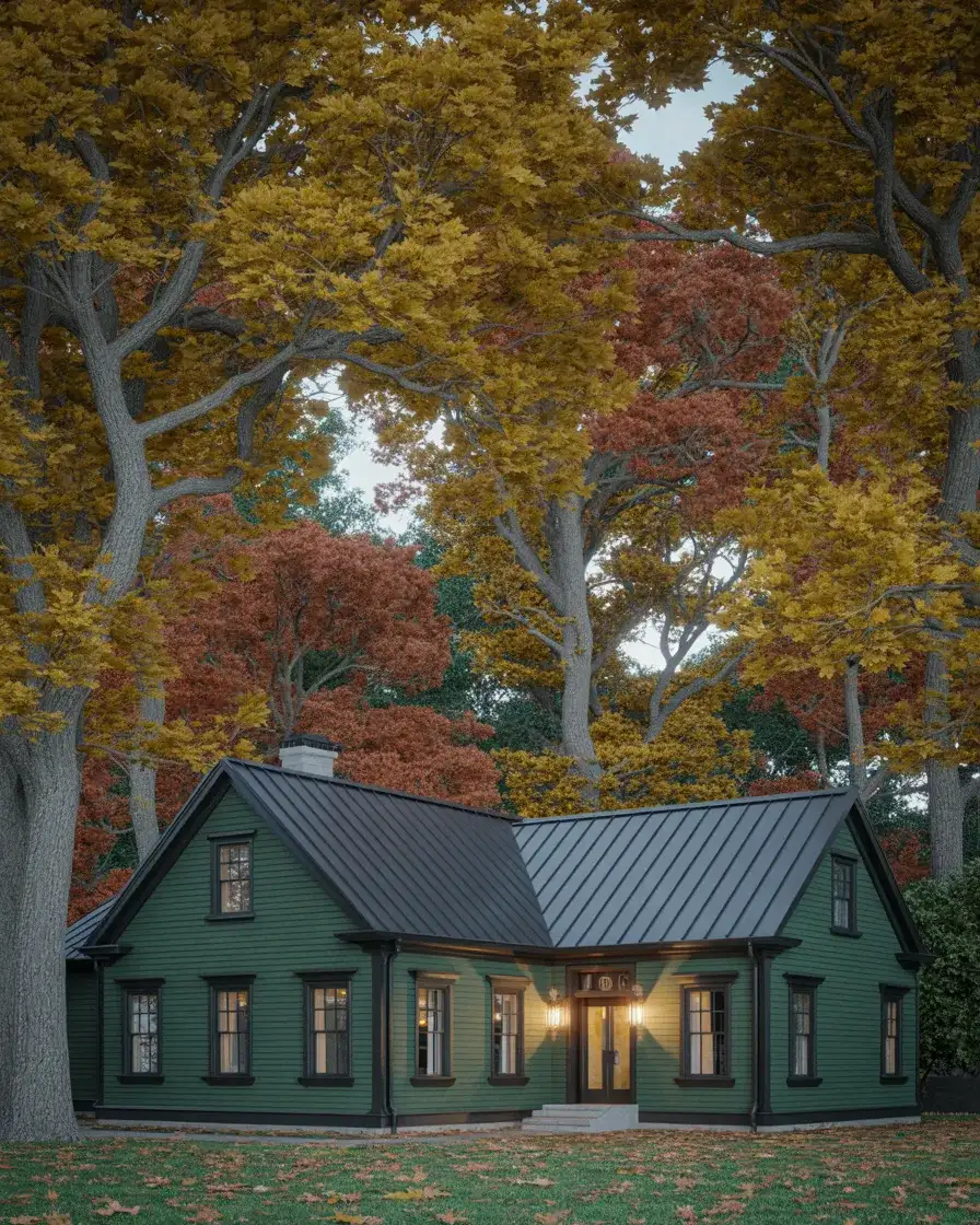
The deepest end of the green spectrum—forest green, bottle green, and hunter—paired with a black standing-seam metal roof is one of the most architecturally compelling exterior palettes you can choose right now. Add brass or aged bronze hardware, and the whole composition takes on a richness that feels luxurious without being ostentatious. This is a look that appeals strongly to homeowners who’ve grown tired of safe, neutral choices and are ready to commit to something that genuinely reflects a point of view.
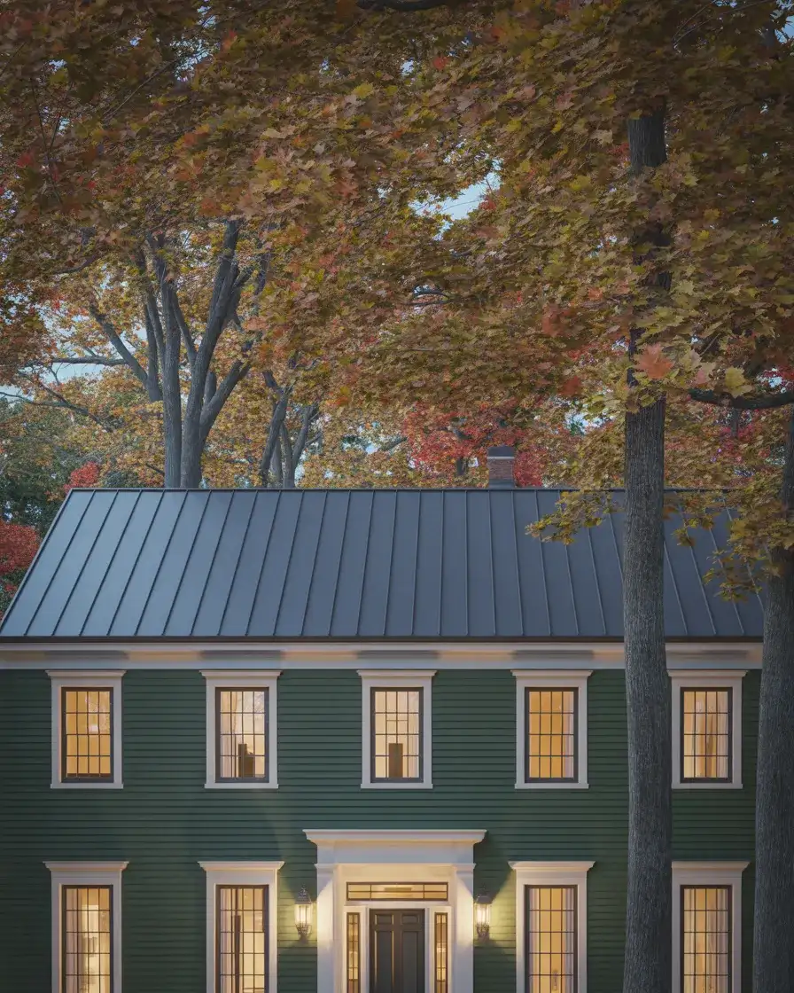
This combination works best on homes with strong architectural geometry—gabled rooflines, dormers, bay windows, or clear vertical and horizontal visual rhythm. The darker the palette, the more the architectural details need to carry the composition; without good bones, a very dark exterior can read as flat and oppressive. But in a home where the structure itself has something to say, deep green and black metal are a genuinely extraordinary pairing that gets more beautiful as the materials age together.
18. Gray-Beige Greige Exterior with Stone and Wood
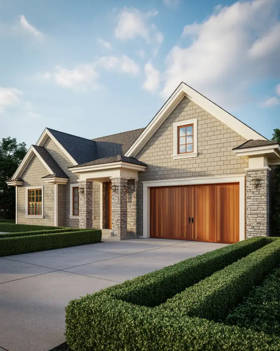
“Greige”—that perfect blend of grey and beige—has been a stalwart of the American exterior palette for good reason: it’s virtually impossible to get wrong. The color lives in a neutral zone that reads as sophisticated without demanding commitment to either a warm or cool direction. In the current design, the most interesting beige exteriors combine painted siding with natural stone and wood elements, giving the neutral a material richness that keeps it from feeling anonymous or builder-grade.
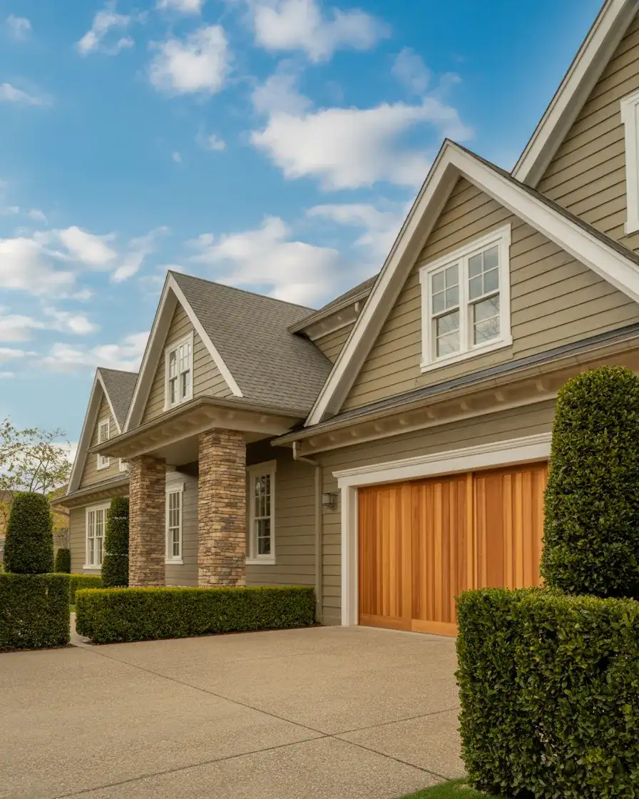
Greige is the exterior color equivalent of a well-cut blazer in a neutral tone—it makes everything around it look better without calling attention to itself. Homeowners who’ve chosen this palette rarely regret it, and it’s among the most consistently well-received exterior choices in neighborhoods where HOA approval is required. For something that reads this effortlessly, it requires remarkably little maintenance and retains its appeal across decades and changing design trends.
19. Moody Brown with a Terracotta Tile Roof
There’s something almost cinematic about a deep, espresso-brown exterior beneath a terracotta roof—it’s the kind of combination that appears on the covers of shelter magazines and in the backgrounds of lifestyle campaigns. The warmth of the clay roof draws out the reddish undertones in the dark brown paint, creating a sun-baked richness that feels rooted in the earth. It’s a look that’s particularly striking on Spanish-influenced architecture in Florida, California, and throughout the American Southwest.
One of the most useful things to understand about dark brown stucco exteriors is that the finish texture matters enormously. A smooth, freshly plastered surface will look stark and modern. A sand float or skip-trowel finish brings in those beautiful micro-shadows and textural variations that make the color feel alive and historically grounded. If you’re applying a brown paint over existing smooth stucco, add texture strategically at the entry or around the chimney to break up the flatness—it makes a significant visual difference.
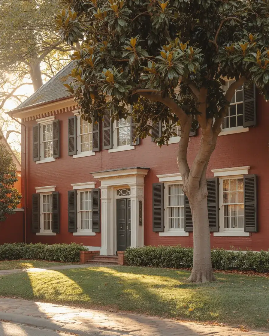
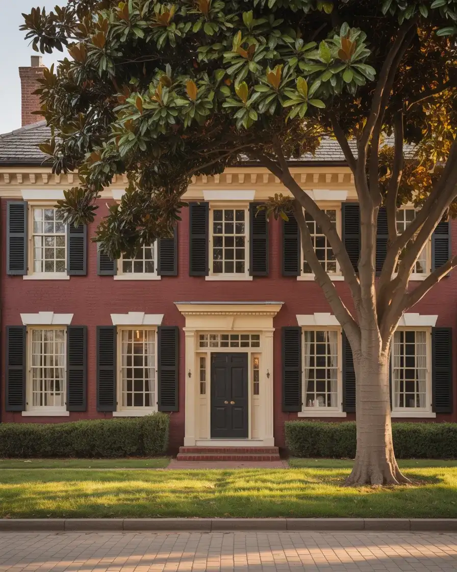
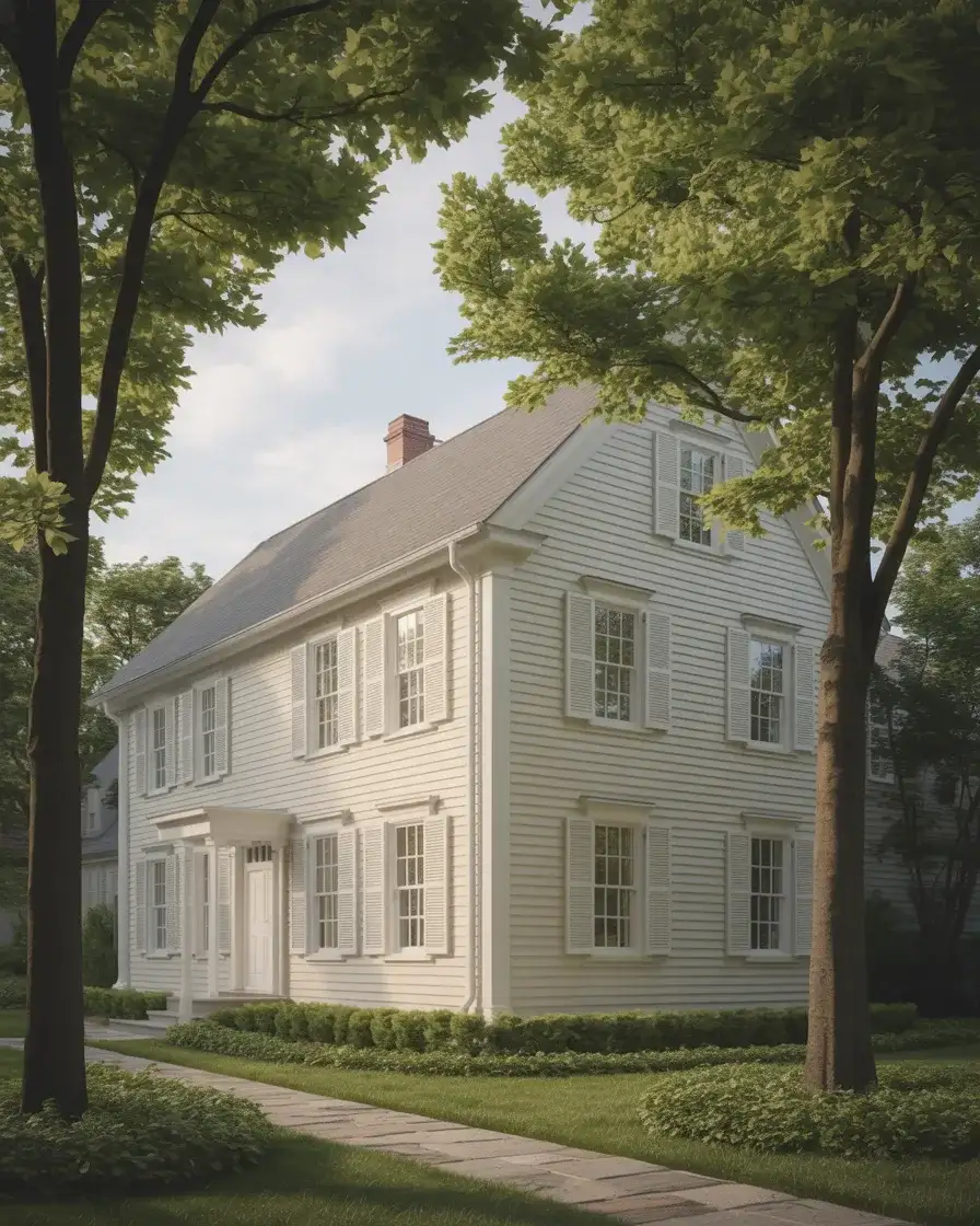
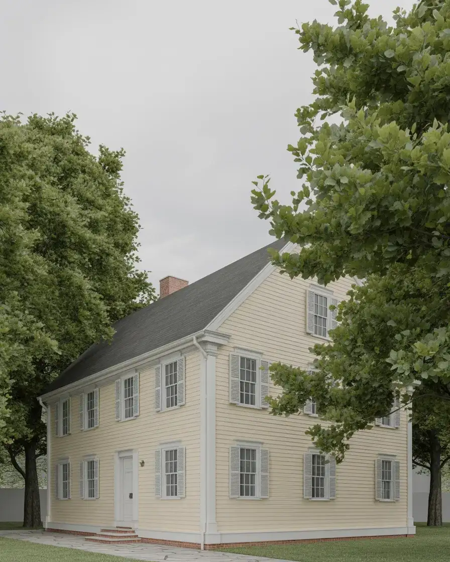
20. Classic Colonial White with Black Shutters
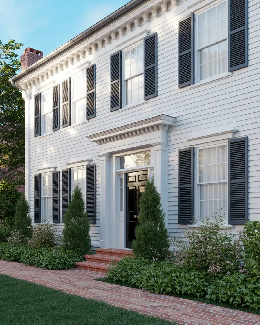
Sometimes the most trending thing you can do is return to a classic—and the white Colonial with black shutters is as foundational as American residential architecture gets. What makes this look feel current rather than dated is all in the execution: the quality of the white matters, the proportions of the shutters matter, and the relationship between the painted surfaces and any existing brick or stone elements matters enormously. Handled with care, this palette has an authority and confidence that newer, trendier choices often can’t match.
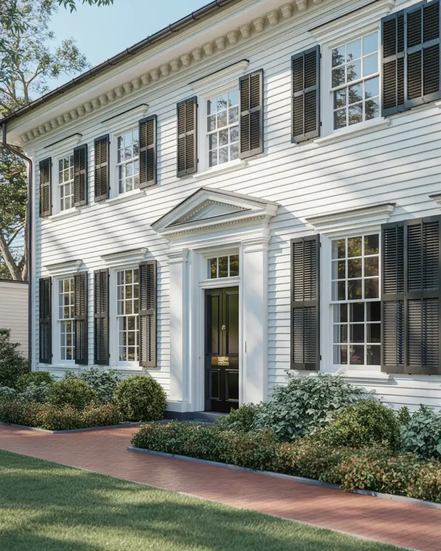
This is the exterior palette you choose when you want your home to say something quiet but absolutely certain—I belong here, I know what I am, and I don’t need to explain myself. It’s a particularly strong choice in established neighborhoods with mature street trees, where the architecture has actual age and the paint is working with real character rather than trying to create it. No other combination honors a traditional American home quite as honestly as white and black, simply and perfectly applied.
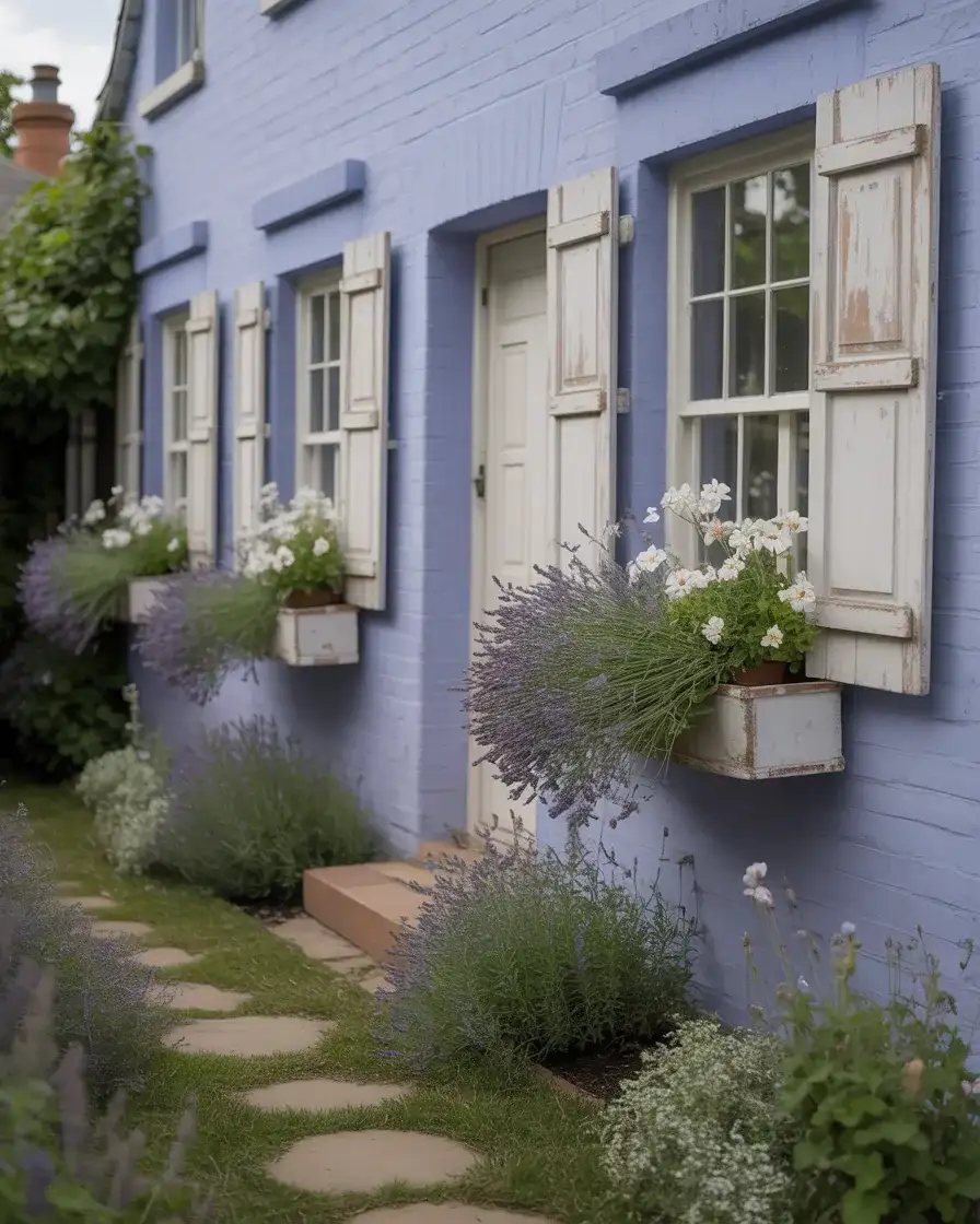
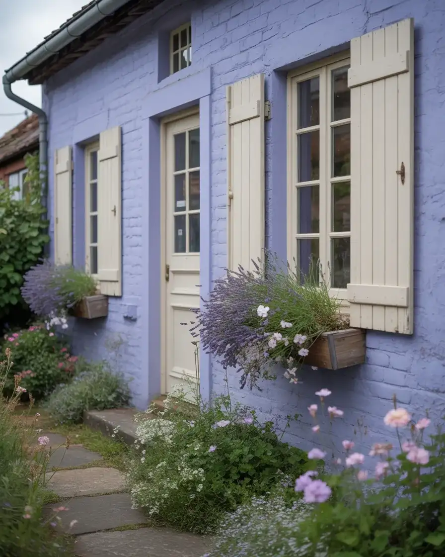
21. Dusty Lavender on a Victorian or Cottage
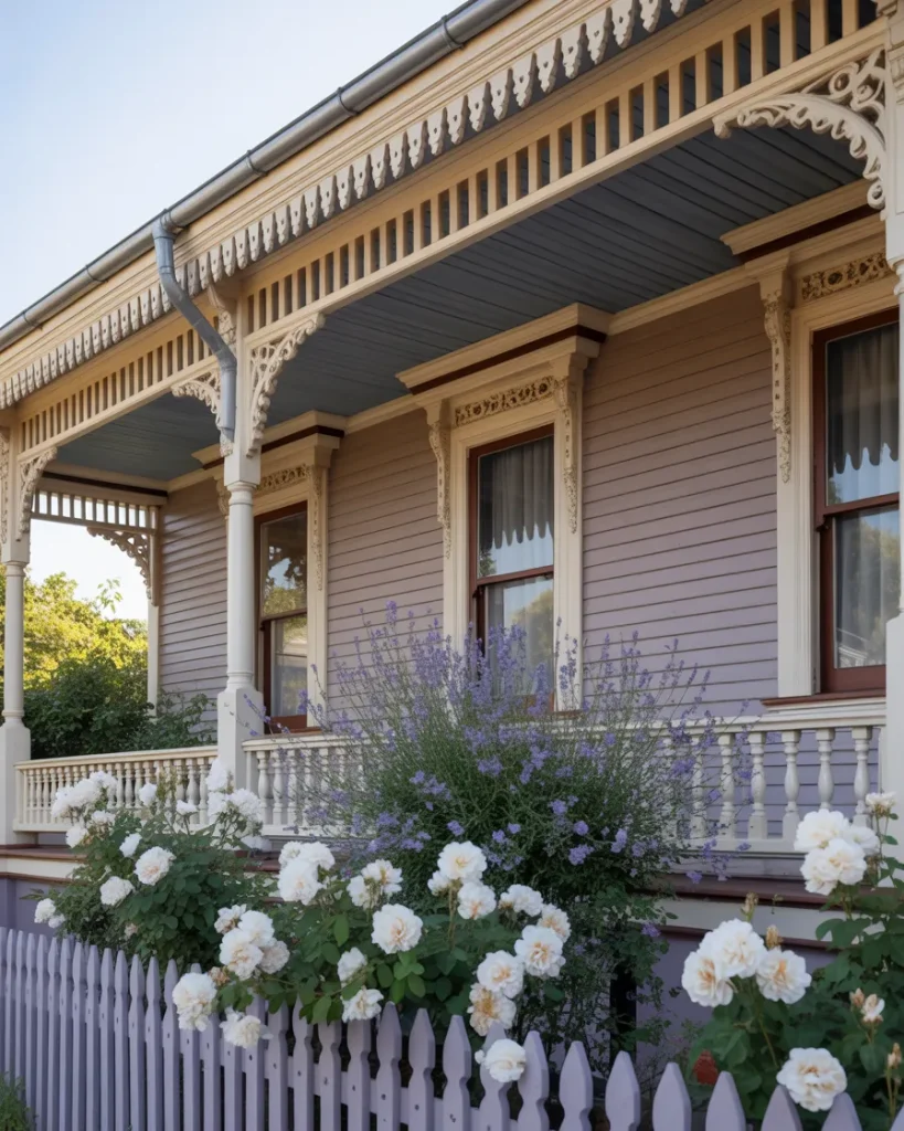
Lavender and soft purple-adjacent tones are among the more unexpected ideas gaining momentum right now, and when executed thoughtfully on a Victorian gingerbread or a cottage-style home, the result is completely enchanting. This isn’t a sugary, little-girl-bedroom lavender—it’s the faded, dusty version that reads almost like a gray in low light and softly reveals its purple identity in afternoon sun. It pairs beautifully with cream trim, dark charcoal window frames, and sage green accents in the garden.
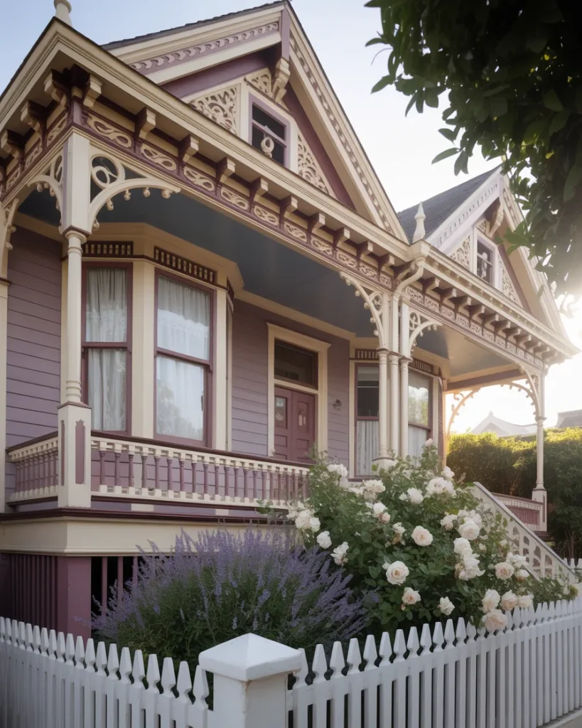
The best real-world examples of lavender exterior paint are found in historic districts in San Francisco, Cape May, New Jersey, and small New England towns where Victorian architecture is protected and celebrated. If you live in a neighborhood without such architectural heritage, consider this look with extra attention to supporting landscape—lavender bushes, white iceberg roses, and silvery artemisia plantings at the foundation can make a lavender cottage feel genuinely magical rather than merely unusual.
22. Warm Cream with Sage Shutters and a Brown Roof
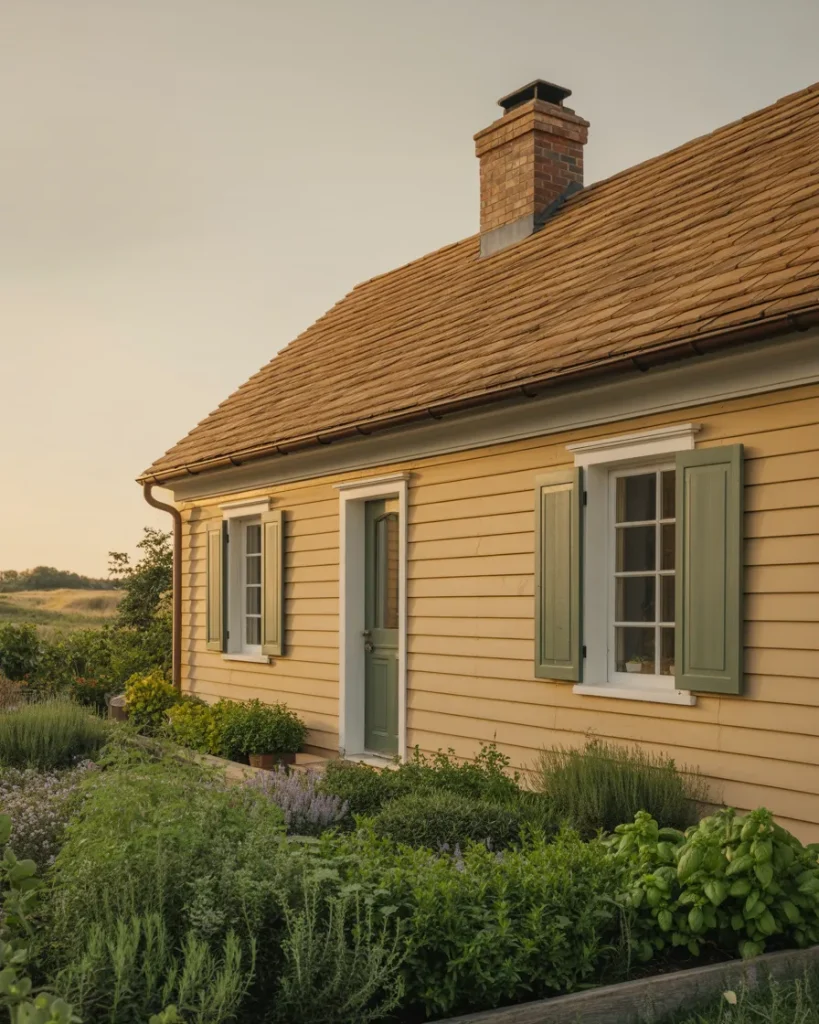
The final combination on this list is one of those palettes that sneaks up on you—it doesn’t shout for attention, but once you see it in the right home, you can’t stop looking. Warm cream siding, sage green shutters, and a brown roof create a three-way harmony that’s almost herbal, almost culinary—it has the same layered warmth as a bowl of fresh herbs, olive oil, and aged wood. It’s a 2026 take on something very old and very beautiful in the American residential tradition.
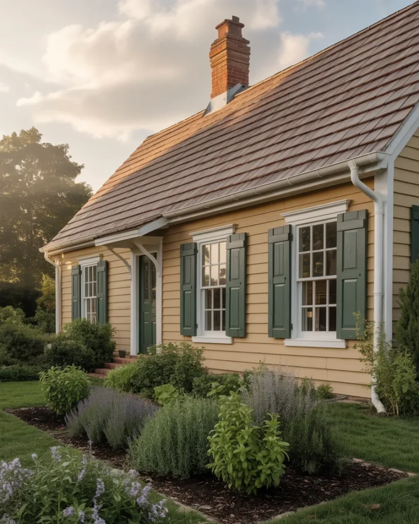
What makes this palette especially practical is how forgiving it is of the imperfections that come with real homeownership—a slightly weathered shutter, a roof that’s aged a few shades, and the creep of moss on the north-facing side. Rather than making these things look like neglect, the warm, organic palette absorbs them and makes them feel like patina. It’s a color combination that gets better with a little time on it, which is perhaps the highest compliment you can give any exterior paint choice.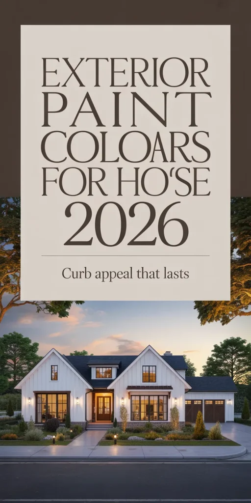
Conclusion
There’s never been a better time to be bold, thoughtful, and intentional about your home’s exterior—and this list barely scratches the surface of what’s possible when color meets architecture in the right way. Whether you’re drawn to the quiet confidence of warm taupe, the drama of charcoal and brick, or the romance of French country blue, we’d love to know which palette caught your eye. Drop your favorites in the comments below and tell us what your home looks like now—you might just inspire someone else’s next repaint.