If there’s one thing Pinterest made clear heading into this year, it’s that Americans are done playing it safe with their living rooms. The search for colorful living room 2026 ideas has exploded, and it’s easy to understand why—after years of all-white everything, people are craving spaces that actually feel alive. Whether you’re drawn to moody jewel tones, playful pastels, or a single bold accent wall that changes the whole energy of a room, this guide covers it all. We’ve pulled together inspired ideas to help you find the look that finally feels like you.
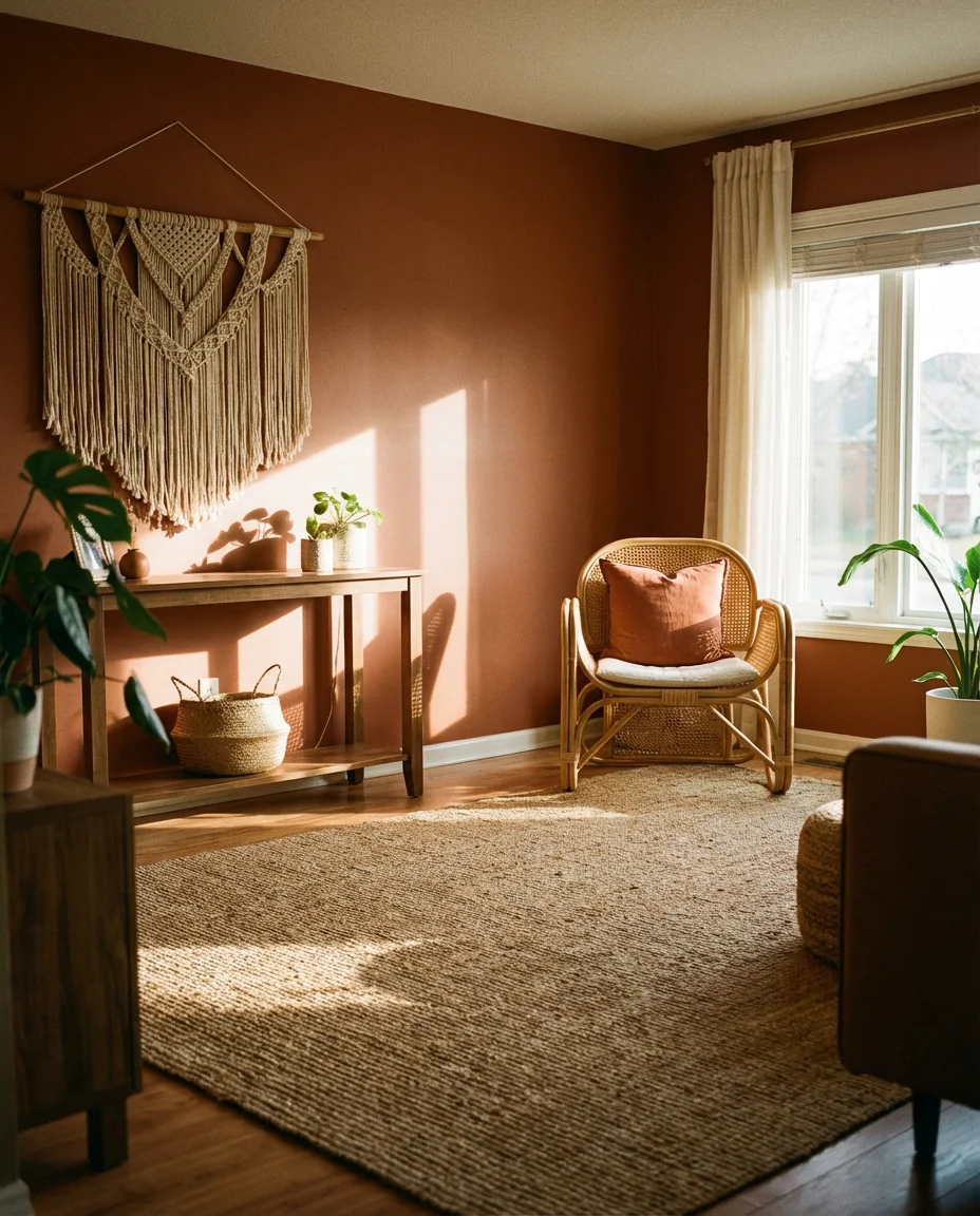
1. Warm Terracotta Accent Wall
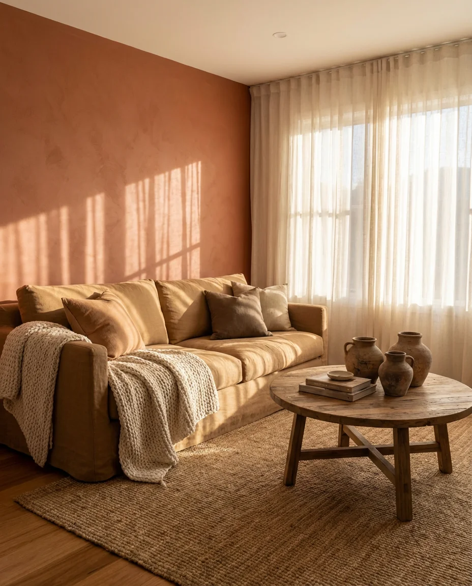
There’s something undeniably grounding about a terracotta accent wall in a living room. This earth-toned approach draws from Southwestern and Mediterranean design traditions, and it lands beautifully in modern American homes—especially those with natural wood floors, linen sofas, and plenty of afternoon sun. It doesn’t overwhelm the room; instead, it anchors it. One painted wall in a deep, baked-clay hue can do more for a space than an entire redesign.
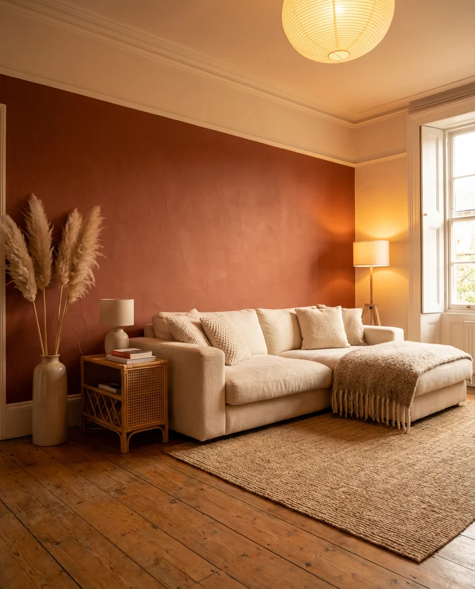
Behr’s Canyon Sunset and Sherwin-Williams’ Cavern Clay are two of the most-pinned wall paint choices for this look right now. If you’re renting and can’t commit to paint, terracotta-toned wallpaper or large-format art panels achieve a nearly identical effect. The key is balance: keep your furniture and textiles in creamy neutrals so the wall gets its full moment without tipping into sensory overload.
2. Cream Sofa with Colorful Throw Pillows
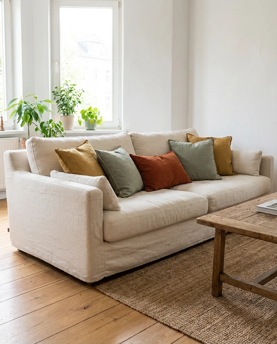
A white couch or cream sofa is one of the most versatile foundational pieces you can own—it’s basically a blank canvas waiting for color. The real magic happens when you layer in throw pillows in jewel tones, mustard yellows, or dusty sage. This approach works especially well for renters or commitment-phobes who love the idea of a colorful living room but want the flexibility to change things up by season or mood without repainting a single wall.
A real homeowner tip from the interior design community: buy pillow covers, not full pillows. Cover sets from Society6 or even Target’s Studio McGee line let you swap an entire look for under $60. The sofa stays the same; the whole room can shift from spring pastels to fall richness in about fifteen minutes. It’s one of the smartest, lowest-effort ways to stay on trend without overhauling your space.
3. Moody Dark Green Living Room
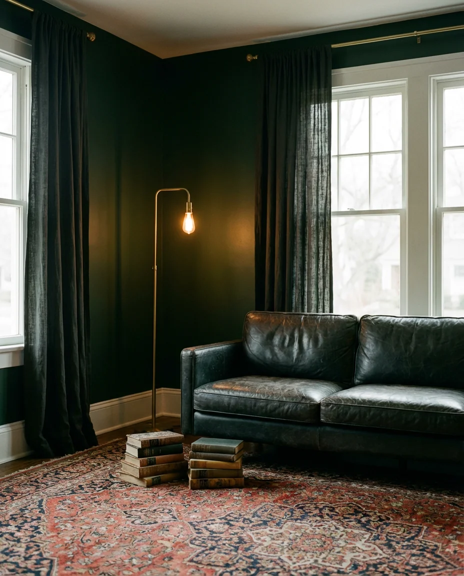
Deep forest greens are having a serious moment in interior wall design, and the moody, enveloping feel they create is exactly why. Think British library meets cozy Brooklyn apartment—walls painted in a rich hunter or bottle green, offset by brass fixtures, dark leather seating, and warm Edison bulb lighting. This dark color story doesn’t shrink a room when done right; instead, it makes the space feel intentional, curated, and deeply inviting.
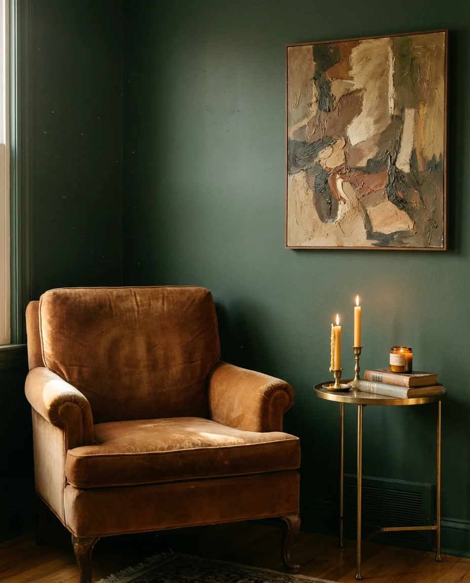
This look works best in homes with higher ceilings and ample natural light—but that doesn’t mean smaller spaces are off limits. In a compact apartment, painting all four walls the same deep green actually creates a cocoon-like atmosphere that many people find more restful than brighter alternatives. The common mistake is pairing this look with cool-toned metals; stick to brass, bronze, or unlacquered hardware to keep the warmth alive.
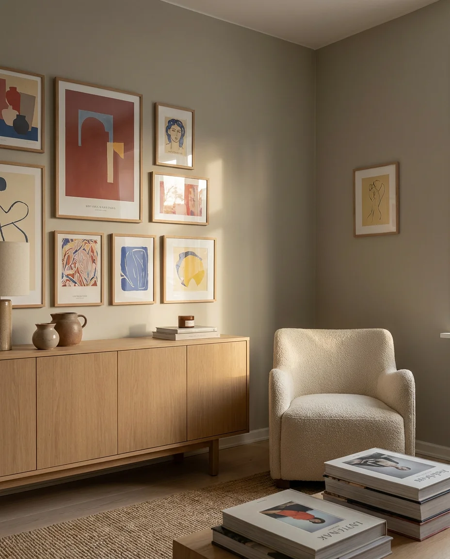
4. Pastel Rainbow Gallery Wall
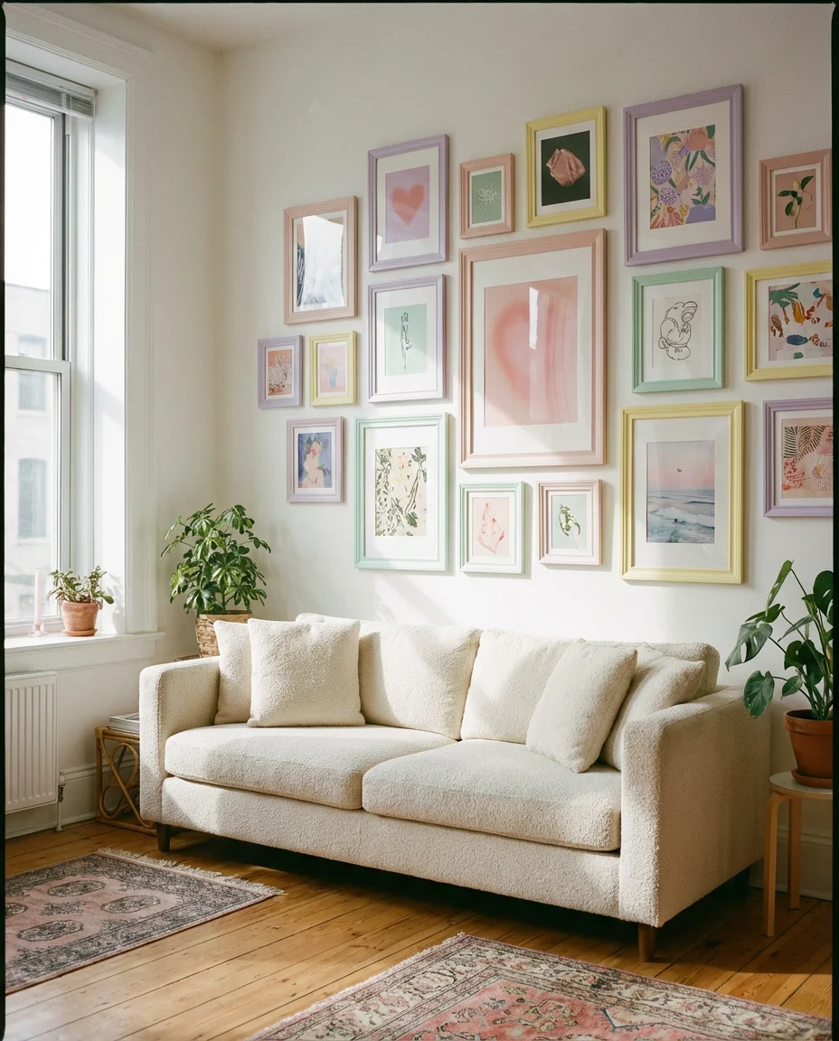
A pastel gallery wall is one of the most joyful ways to bring color into a living room without committing to paint. The idea is simple: curate a collection of framed prints, photographs, and small canvases in a soft, cohesive palette—think blush pink, lavender, butter yellow, and mint green—and arrange them in an organic cluster above your sofa or along a staircase wall. The aesthetic lands somewhere between playful and sophisticated, which is exactly why it resonates so strongly on Pinterest.
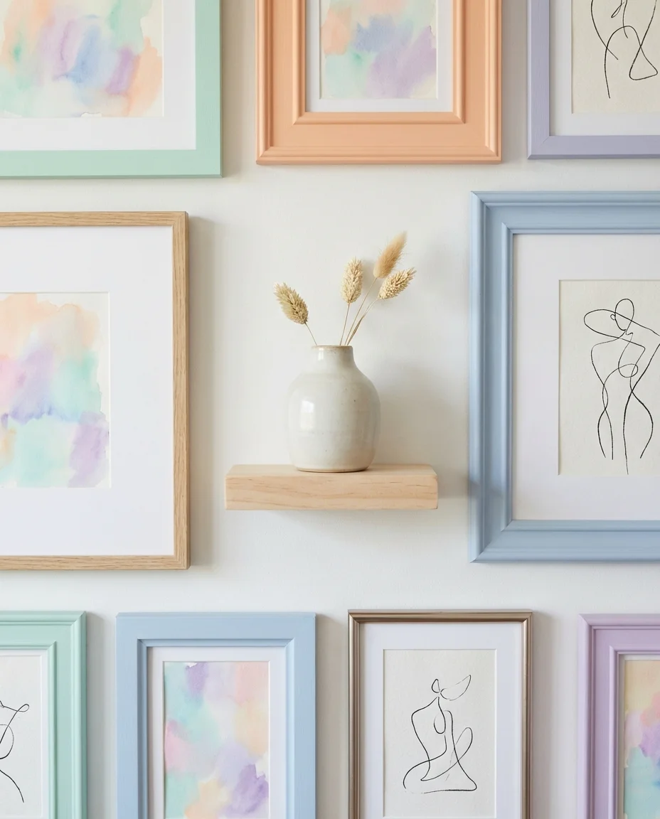
Where it works best: living rooms with white or off-white walls that let the pastel tones in the art do all the talking. Apartment Therapy editors often recommend starting with one anchor piece—usually the largest print—and building outward. IKEA Ribba frames in white or natural wood keep costs down while maintaining visual cohesion. Budget-conscious decorators can source art from Etsy printable shops for as little as $5 per print.
5. Bold Cobalt Blue Sofa Statement
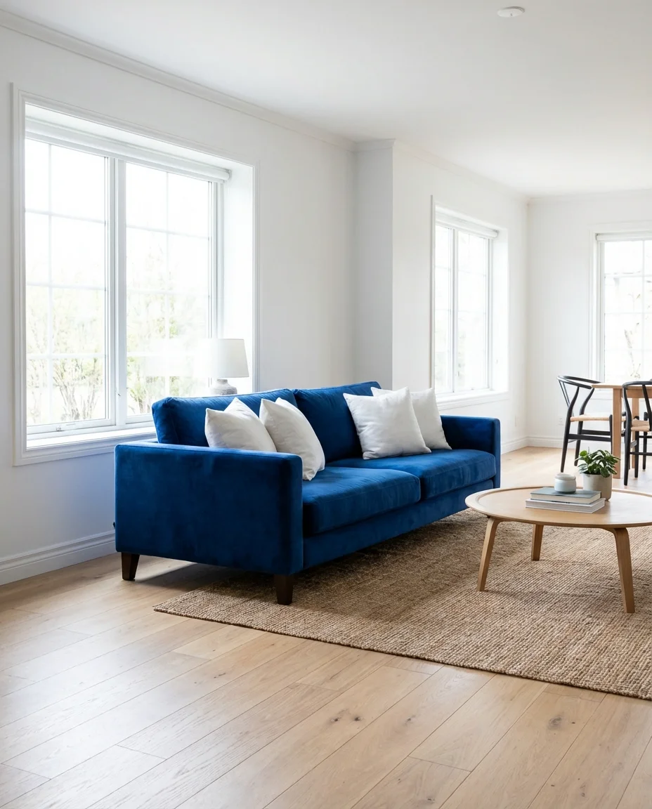
If you’re ready to commit to color in a truly bold way, a cobalt blue sofa is one of the most striking furniture investments you can make right now. This bright hue punches hard in a neutral room—it demands attention, sparks conversation, and somehow manages to feel both timeless and of-the-moment at once. The key to pulling it off is restraint everywhere else: keep the walls light, the rug simple, and the accent pieces minimal so the sofa is clearly the star of the show.
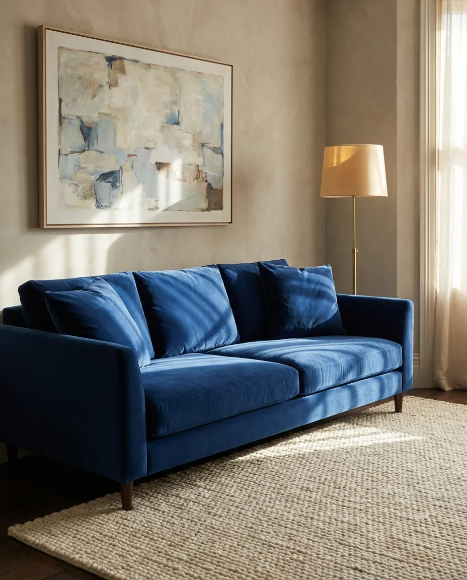
One interior designer shared that the number one client fear with a bold sofa is regret—and the number one cure is a fabric sample. Ordering a swatch before purchasing lets you live with the color in your specific light for a week. Many buyers who do this end up more confident, not less. West Elm, Crate & Barrel, and Article all offer cobalt or sapphire sofa options in the $800–$2,400 range depending on size and material.
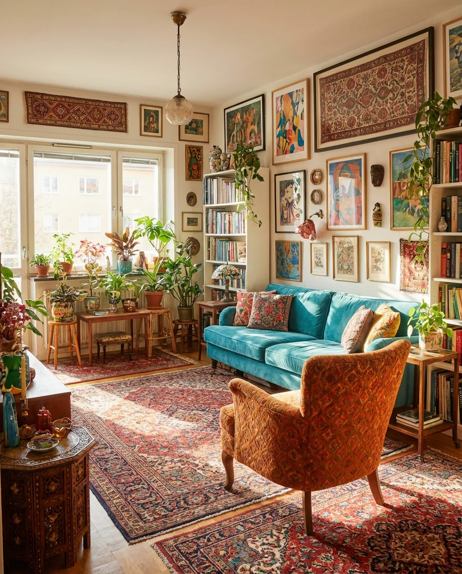
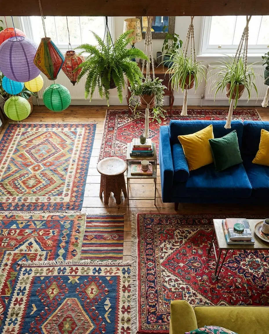
6. Eclectic Mix of Patterns and Colors
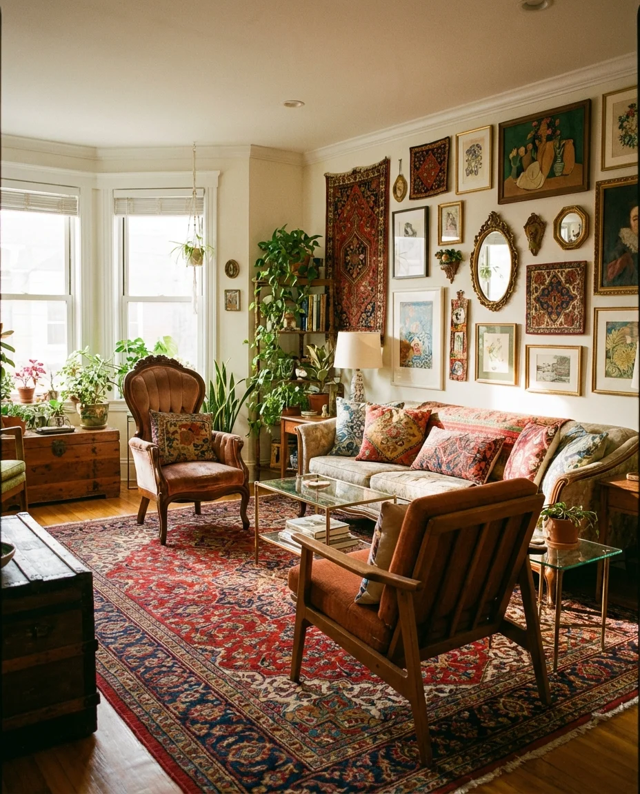
The eclectic living room is not a decorating accident—it’s a deliberate, joyful collision of color, pattern, and texture that reflects a life fully lived. Think Moroccan tile-print pillows next to a graphic black-and-white throw, a vintage Persian rug under a modern resin coffee table, and walls layered with art from a dozen different eras. The common thread isn’t a matching color palette—it’s a confident point of view. Done well, this style is the most personal and the most visually interesting of all.
The mistake most people make with an eclectic room is buying everything at once from the same store. The magic of this style comes from accumulation over time—a piece from a Nashville flea market, a pillow from a trip abroad, a lamp found at an estate sale. If you’re starting from scratch, anchor the room with one large vintage rug and build your palette from the colors already in it. That single move unifies even the most disparate collection of objects.
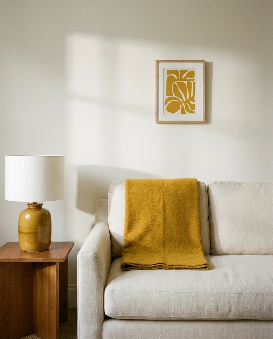
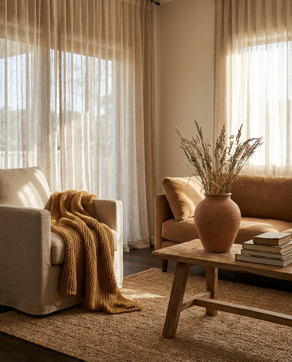
7. Neutral with a Pop of Mustard Yellow
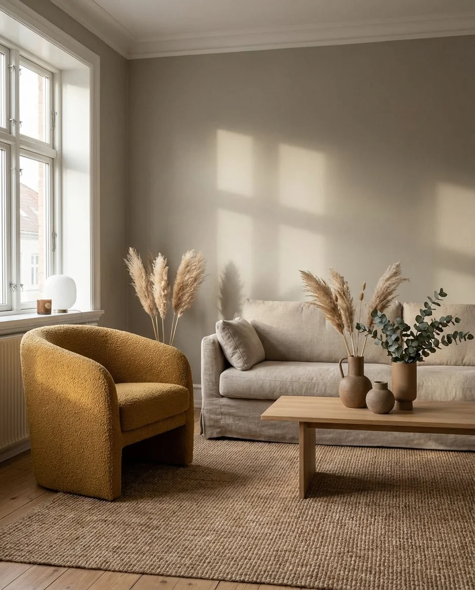
The neutral-with-pop formula is one of the most enduring approaches in American home design—and mustard yellow is its current MVP. A neutral room with greige walls, a linen sofa, and natural wood tones comes to life the moment you introduce a mustard throw, a ceramic vase in that unmistakable golden hue, or even a single accent chair in a warm yellow boucle. It’s cheerful without being chaotic, which is why it photographs so beautifully and dominates Pinterest boards year after year.
This palette is particularly popular in Midwestern and Southern American homes, where warm undertones feel natural against the light that comes through standard double-hung windows. A practical insight: mustard works in both cool-lit north-facing rooms (where it adds warmth) and sunny south-facing rooms (where it harmonizes with the golden light). It’s one of the few accent colors that flatters nearly every natural light condition you’ll find in a typical American home.
8. Greige Paint with Colorful Art
Greige paint—that perfect blend of gray and beige—has become the defining wall color of the 2020s for good reason: it goes with absolutely everything. But used alone, it can feel a little lifeless. The solution is colorful art. Bold abstract canvases, large-format prints in jewel tones, or a collection of small colorful illustrations create visual energy against the quiet backdrop of a greige wall without making the room feel loud or overwhelming. It’s color on your terms.
Behr’s “Painter’s White” and “Twig” sit in this greige zone and are consistently among Behr’s top-selling interior colors. Behr paint also offers a fan deck of trim whites that pair cleanly with greige, which makes the whole project feel more polished. For the art, Society6 and Minted both offer large prints in the $80–$200 range—a fraction of gallery pricing for results that look just as good on camera and in person.
9. Primary Color Block Living Room
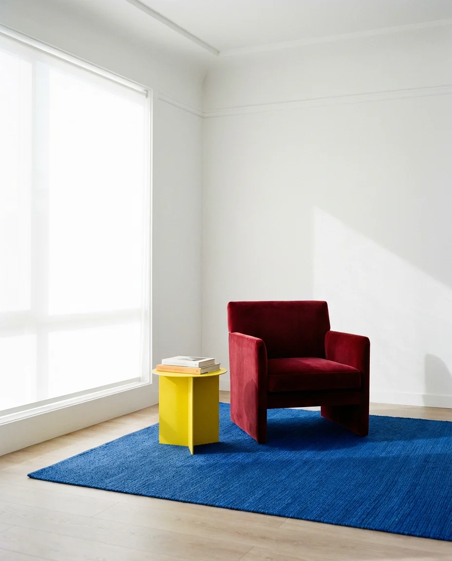
There’s a grown-up version of the primary color palette making a quiet comeback—and it looks nothing like a kindergarten classroom. Think deep red upholstery, a cobalt blue woven rug, a butter yellow side table, and walls in a clean bright white that lets each color block breathe. This approach channels the spirit of Mondrian and Memphis design while feeling completely fresh in a 2026 context. It’s bold, graphic, and surprisingly livable when the proportions are balanced.
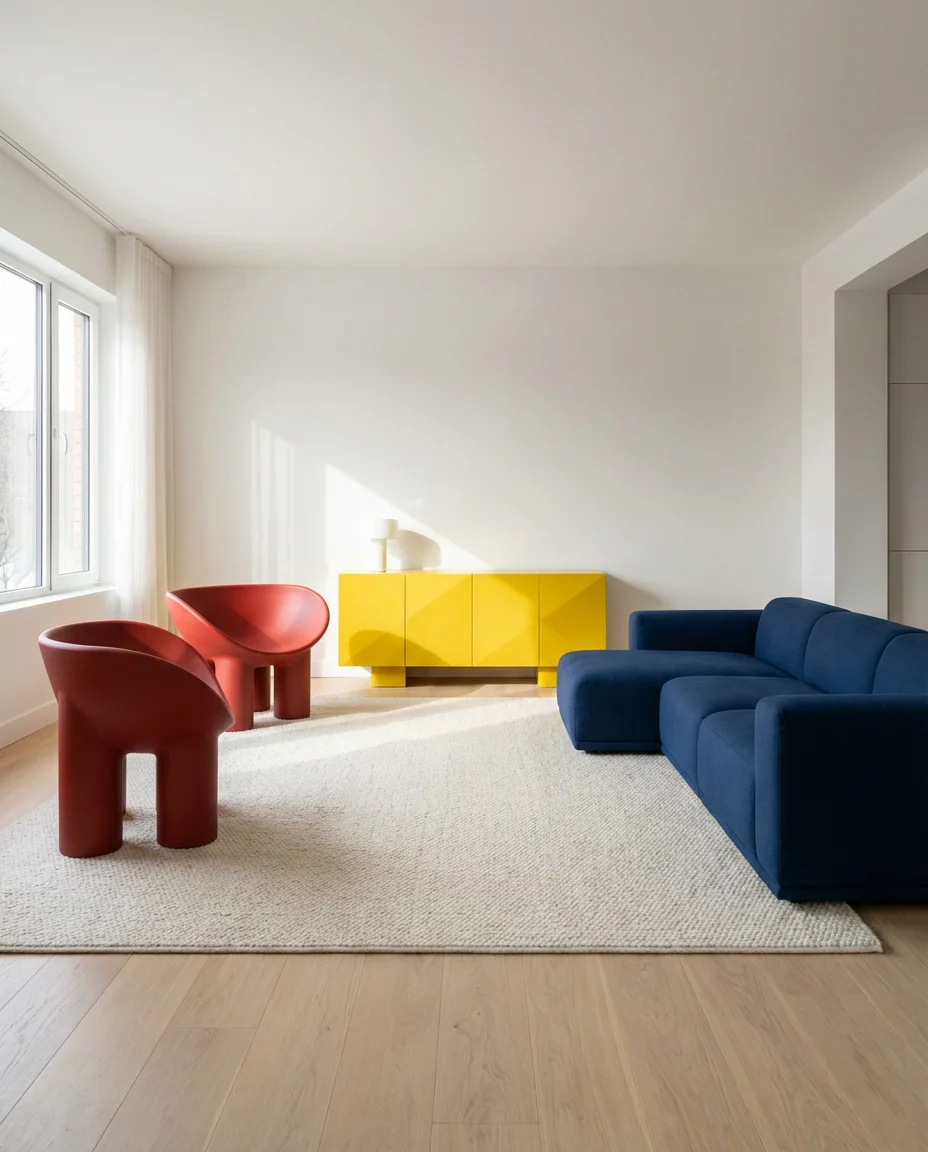
This look works best in open-plan living areas with plenty of natural light and clean architectural lines—think modern builds or renovated lofts rather than traditional Colonial or Craftsman floor plans where molding and trim compete visually. A design expert note: limit each primary color to one or two pieces per room, and keep every other element—walls, ceiling, floor—completely neutral. The restraint is what separates “designer” from “chaotic.”
10. Cozy Earthy Tones Living Room
The cozy living room aesthetic in 2026 leans heavily into nature—warm caramel browns, dusty ochre, raw linen, and the kind of natural textures that make you want to sink into the sofa and never leave. This palette is a direct response to the overly polished, Instagram-minimalist spaces that dominated the early 2020s. It’s tactile, warm, and deeply human. Wool throws, ceramic mugs, chunky knit cushions, and clay-toned walls all contribute to that hygge-adjacent feeling Americans have been craving.
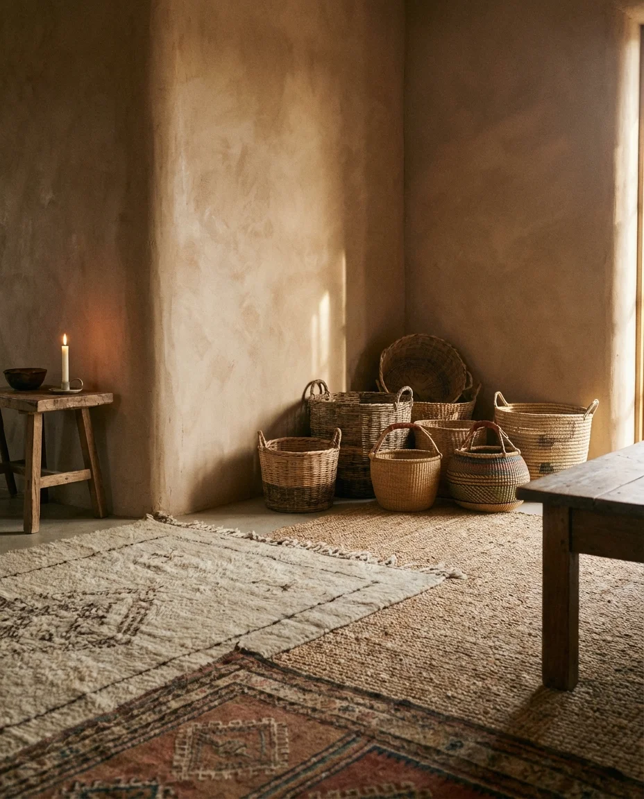
One homeowner in Portland described the transformation this way: she swapped her cool gray palette for warm clay tones and said the room finally felt like it matched the life she was actually living—coffee-stained weekends, movie nights under blankets, and a dog always on the couch. That real emotional resonance is exactly what this palette delivers. It’s not aspirational so much as it is deeply relatable, and that’s why it resonates so powerfully online.
11. Grey Couch with Colorful Rug
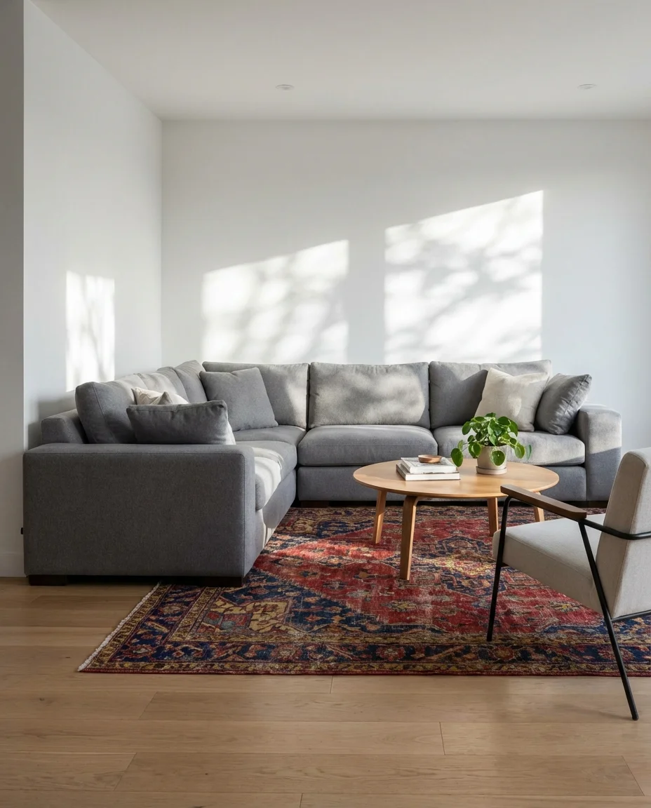
A gray couch is the workhorse of the American living room—practical, widely available, and endlessly versatile. The move that transforms it from safe to stunning is a colorful rug. A kilim in reds, golds, and navy; a Moroccan beni ourain-inspired design with pops of blue; or even a modern geometric rug in forest green and cream can completely reframe a gray sofa and make the entire room feel intentional and layered rather than builder-basic.
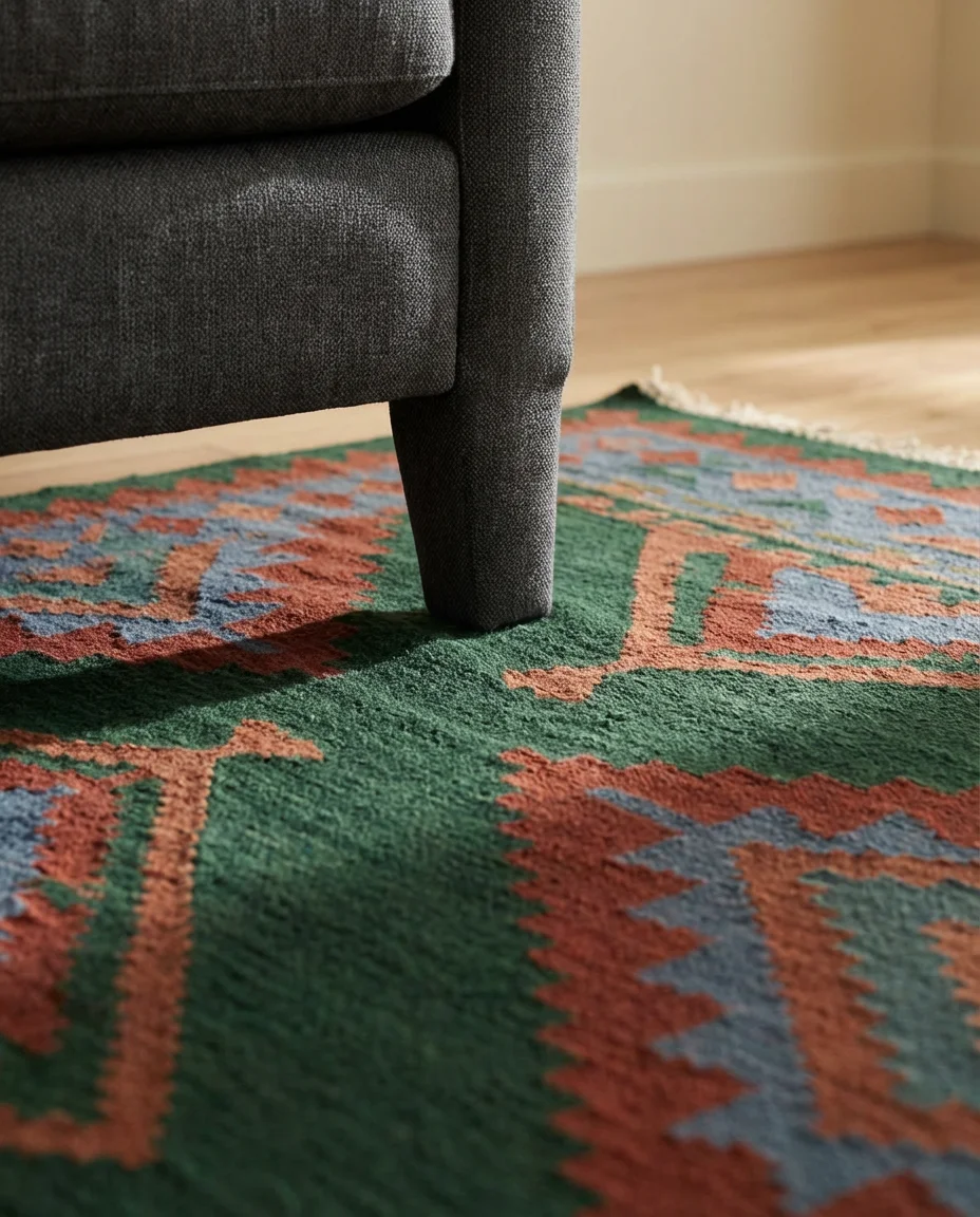
The rug is the most underrated tool in a living room redesign, and it’s often where people underspend. A too-small rug makes even beautiful furniture look disconnected and cheap. The rule most designers repeat: your sofa’s front legs should sit on the rug. For a standard three-seat sofa, that typically means a 9×12 or larger. Rugs USA and Loloi offer excellent colorful options in that size for $200–$600, which is genuinely affordable considering the visual impact.
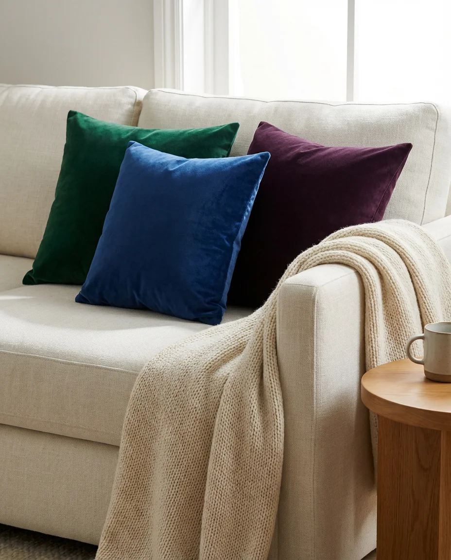
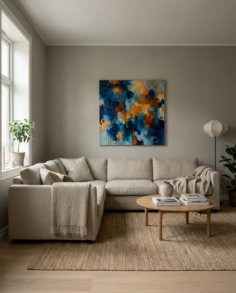
12. Inspiration Board: Jewel Tone Living Room
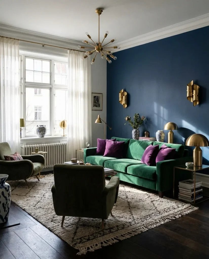
Jewel tones—emerald, sapphire, amethyst, and ruby—bring a richness to a living room that softer palettes simply can’t achieve. Used as inspiration for a full room concept, this color family creates spaces that feel dressed up without being stiff. An emerald velvet sofa, amethyst throw pillows, and a deep sapphire accent wall can coexist beautifully as long as you balance the saturation with plenty of warm metals, natural wood, and off-white negative space throughout the room.
Where this works best: formal living rooms, sitting rooms, or any space that doesn’t need to double as a playroom or homework zone. The richness of jewel tones demands a certain level of calm in the room’s function. That said, across the U.S. many design-forward apartment dwellers in cities like Chicago, New York, and Boston are using this palette to make small living rooms feel expansive and glamorous rather than cramped—and it works remarkably well in rooms with original architectural details like crown molding and built-ins.
13. Natural Wood and Green Plant Living Room
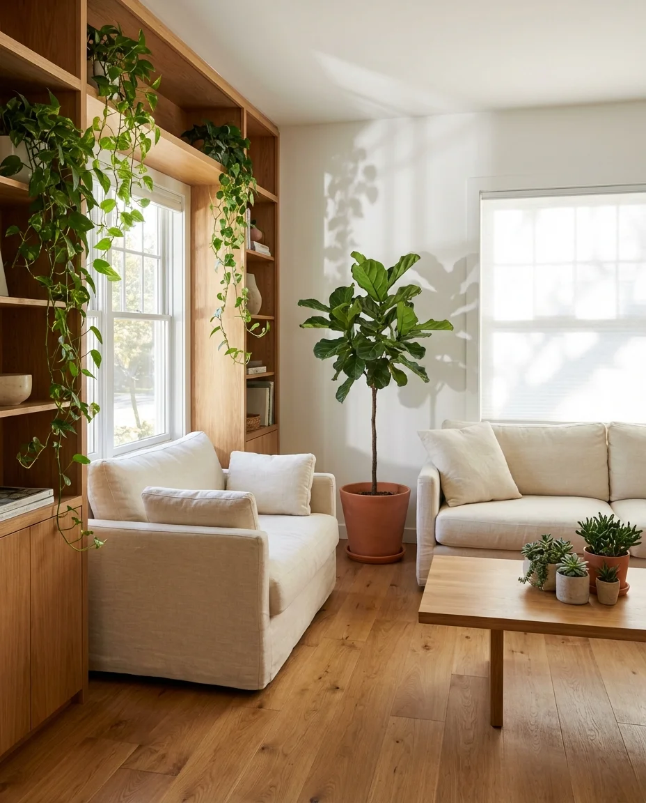
Bringing the outside in is one of the most enduring design philosophies, and in 2026 it’s taken on a fresh urgency as more Americans seek to create calming, biophilic spaces at home. The formula here is simple: warm natural wood tones—floors, furniture, open shelving—layered with an abundance of living plants in varied sizes and textures. The result is a living room that feels genuinely alive, breathing, and restorative in a way no amount of styled decor can fully replicate.
For those who worry about keeping plants alive—which, honestly, describes most of us—the best entry point is a pothos, snake plant, or ZZ plant. All three are nearly indestructible, grow quickly, and photograph beautifully. A fiddle-leaf fig in a large white ceramic pot can anchor a corner the same way a floor lamp does, with the added benefit of actually improving the air in your home. The indoor paint color that pairs best with this look is any warm white or soft sage green.
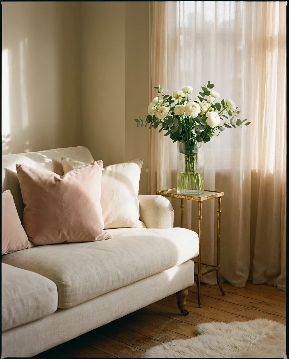
14. Pop of Pink in a Neutral Room
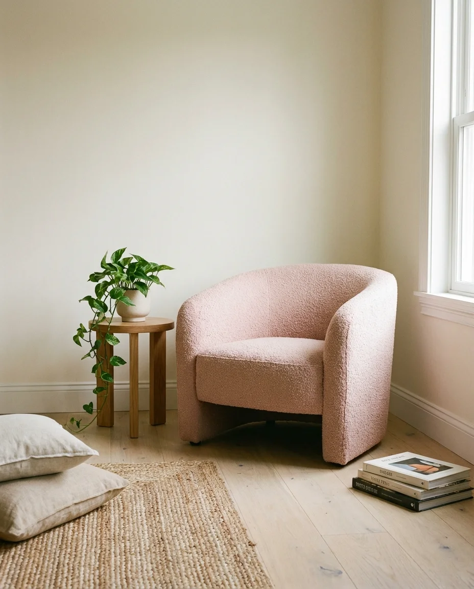
A pop of dusty rose or blush pink in an otherwise neutral living room hits a sweet spot between playful and polished that’s proven almost universally appealing. This isn’t the bubblegum-pink maximalism of a few years back—it’s a quieter, more grown-up version of the color. A single armchair in blush boucle, a pair of pink linen curtains, or a rose-toned abstract print above the fireplace can shift the entire emotional register of a room from cold to warm, from functional to beautiful.
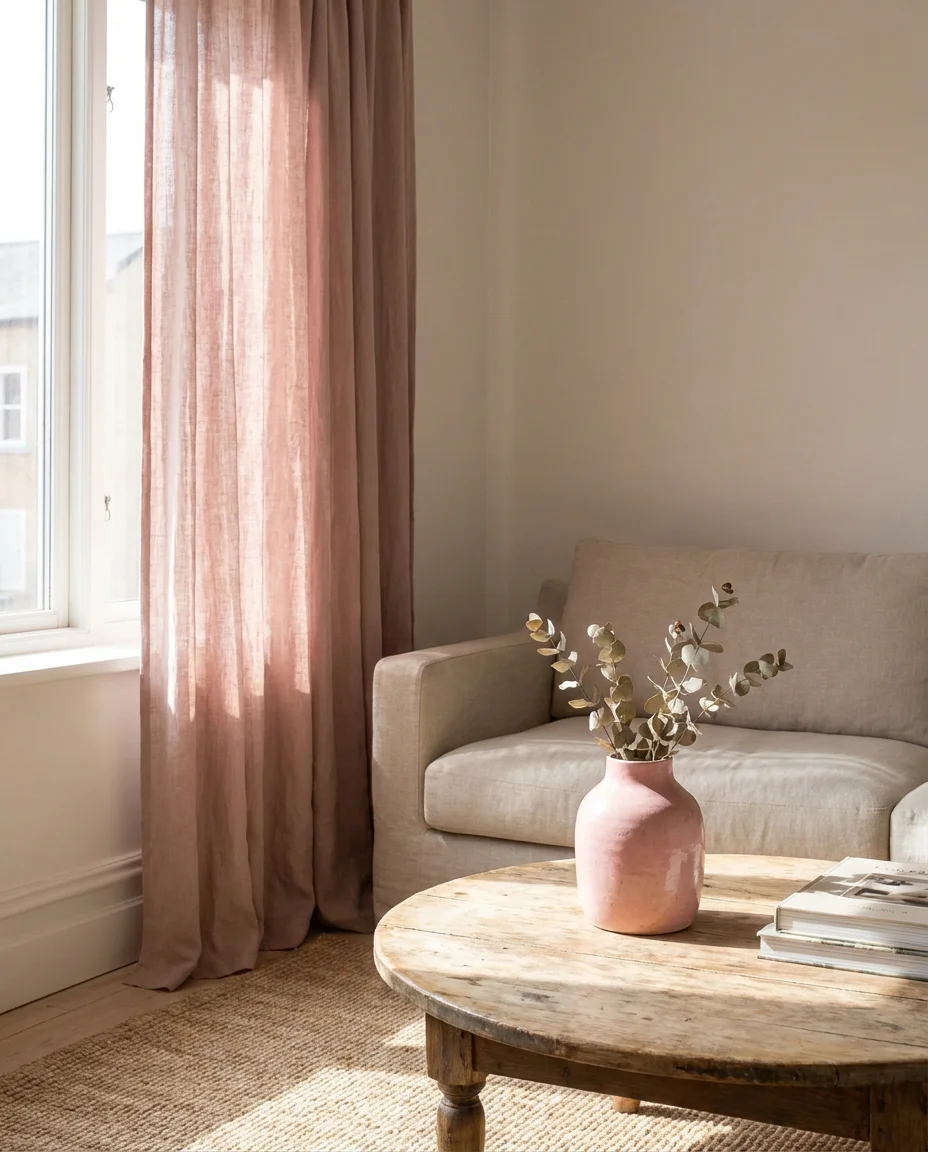
Budget angle: blush and dusty rose accessories are among the most widely stocked across American mass-market retailers right now. Target’s threshold line, H&M Home, and TJ Maxx all carry pink accent pieces at accessible price points—typically $15–$80 for throws, vases, candles, and small decor. You can convincingly achieve this look for under $150 total, which makes it one of the most cost-effective color updates in this entire guide.
15. Bright Maximalist Living Room
For those who believe more is more, the bright maximalist living room is pure freedom. Every surface is an opportunity—walls covered in colorful art, shelves packed with meaningful objects, patterns layered on patterns, and colors that shouldn’t technically work together somehow singing in perfect harmony. This is the antithesis of minimalism, and in 2026 it’s one of the most searched aesthetics on Pinterest from users who are done apologizing for loving stuff, color, and personality in their homes.
The biggest mistake in maximalist decorating isn’t having too much—it’s having things that don’t mean anything. The maximalist rooms that feel elevated versus overwhelming always have a curatorial eye behind them: every object has a story, and every color was chosen rather than defaulted to. Design consultant and author Jewel Marlowe has described this style as “joyful curation”—it”‘s not about filling space; it’s about filling space with things that genuinely bring you joy, arranged with enough care that the room still has visual logic to it.
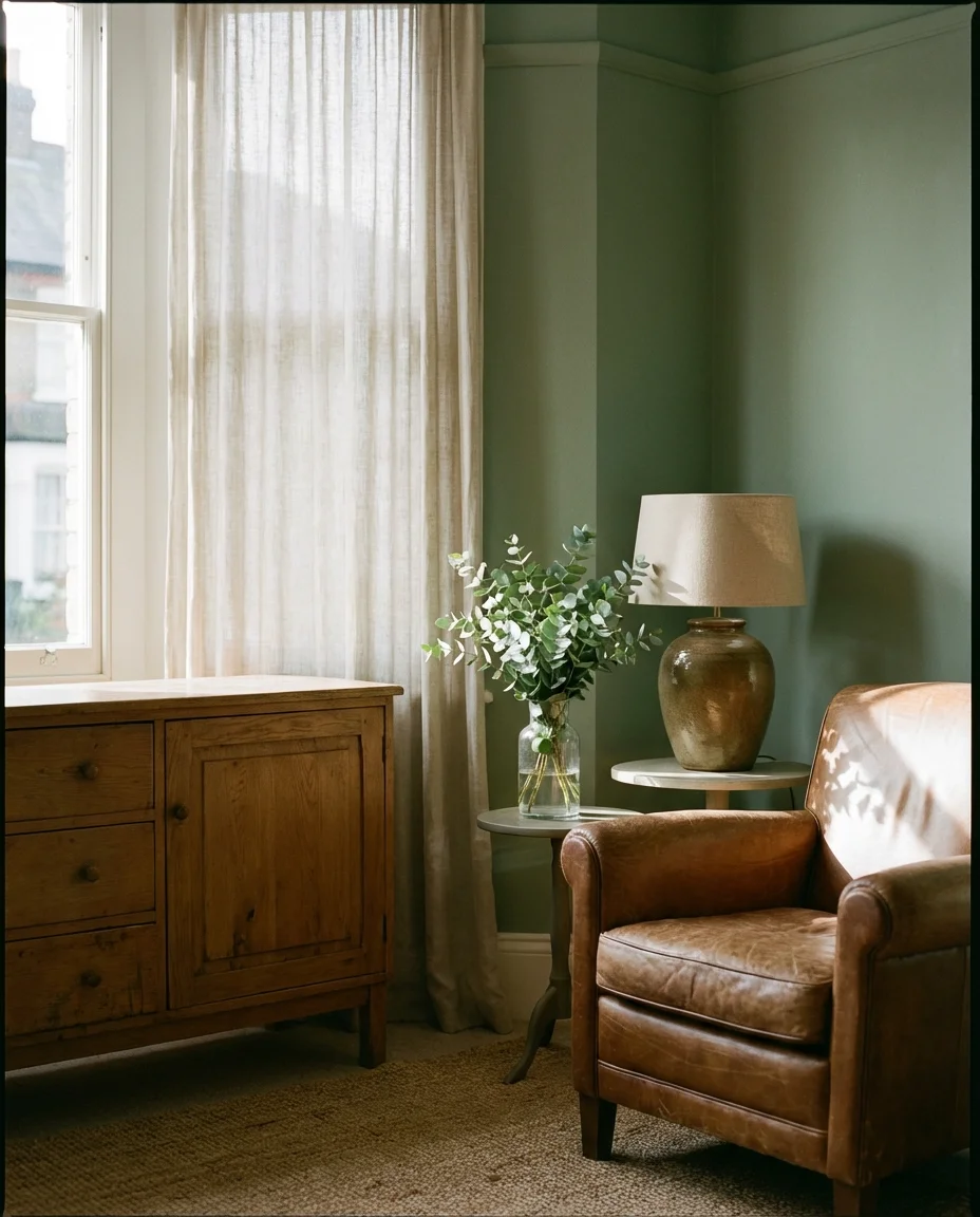
16. Soft Sage Green Walls
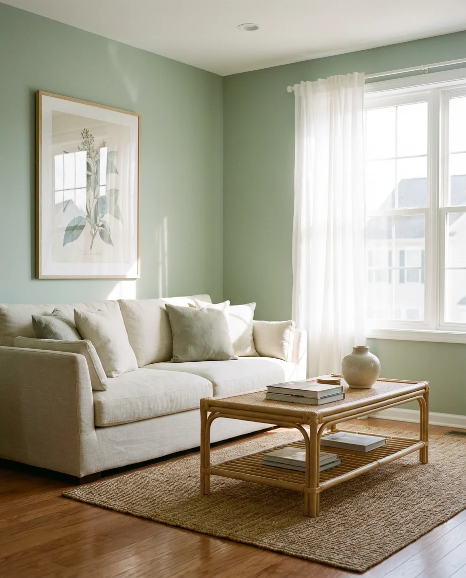
Sage green has cemented itself as the signature wall color of the mid-2020s—and unlike most trends, it’s showing no signs of fading. It’s the rare wall paint that works in both traditional and contemporary homes, pairs with nearly every wood tone, and flatters the widest range of natural light conditions. Applied to all four walls, it creates an incredibly cozy, enveloping feeling that’s softer than a deep green but more intentional than a white. It photographs beautifully, which explains its consistent dominance on Pinterest boards.
Top picks from the American paint market: Sherwin-Williams “Retreat,” Benjamin Moore “Saybrook Sage,” and Behr’s “Aloe.” All three lean slightly warm rather than cool, which prevents the color from reading blue-gray in low light—a common pitfall with sage selections. The pro tip is to test your swatch on the wall you’re least confident about, not the brightest wall in the room, because that’s where any underlying coolness will show up most dramatically in the evening.
17. Colorful Indoor Paint with White Trim
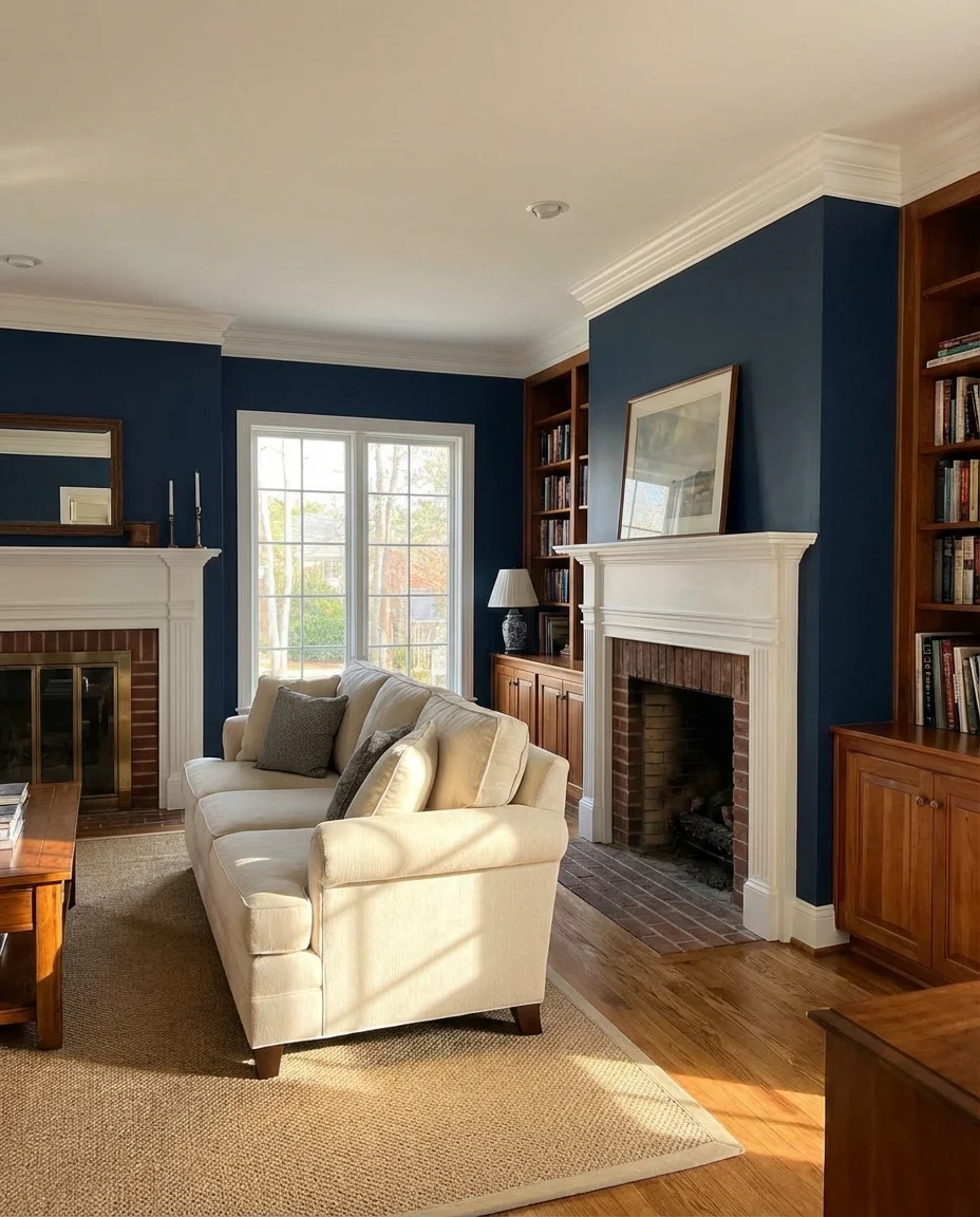
One of the most classically American decorating moves is pairing a colorful indoor paint color with crisp white trim—and it never goes out of style for a reason. The white baseboards, door frames, and crown molding act as a visual frame, containing the wall color and giving it clarity and elegance that prevents even the most unexpected hues from feeling overwhelming. This technique works from soft mints and lavenders all the way to deep navies and forest greens, and it’s accessible to virtually any budget or skill level.
This look is particularly at home in traditional American architectural styles—Colonial, Craftsman, Tudor, and Victorian—where the original trim details are part of the home’s character. A practical insight: if your existing trim is yellowed or dingy, painting it first in a bright white (Benjamin Moore “Chantilly Lace” is a benchmark in the industry) before adding your wall color makes an enormous difference. The contrast is sharper, the room looks cleaner, and your chosen wall color reads more accurately against a true white backdrop.
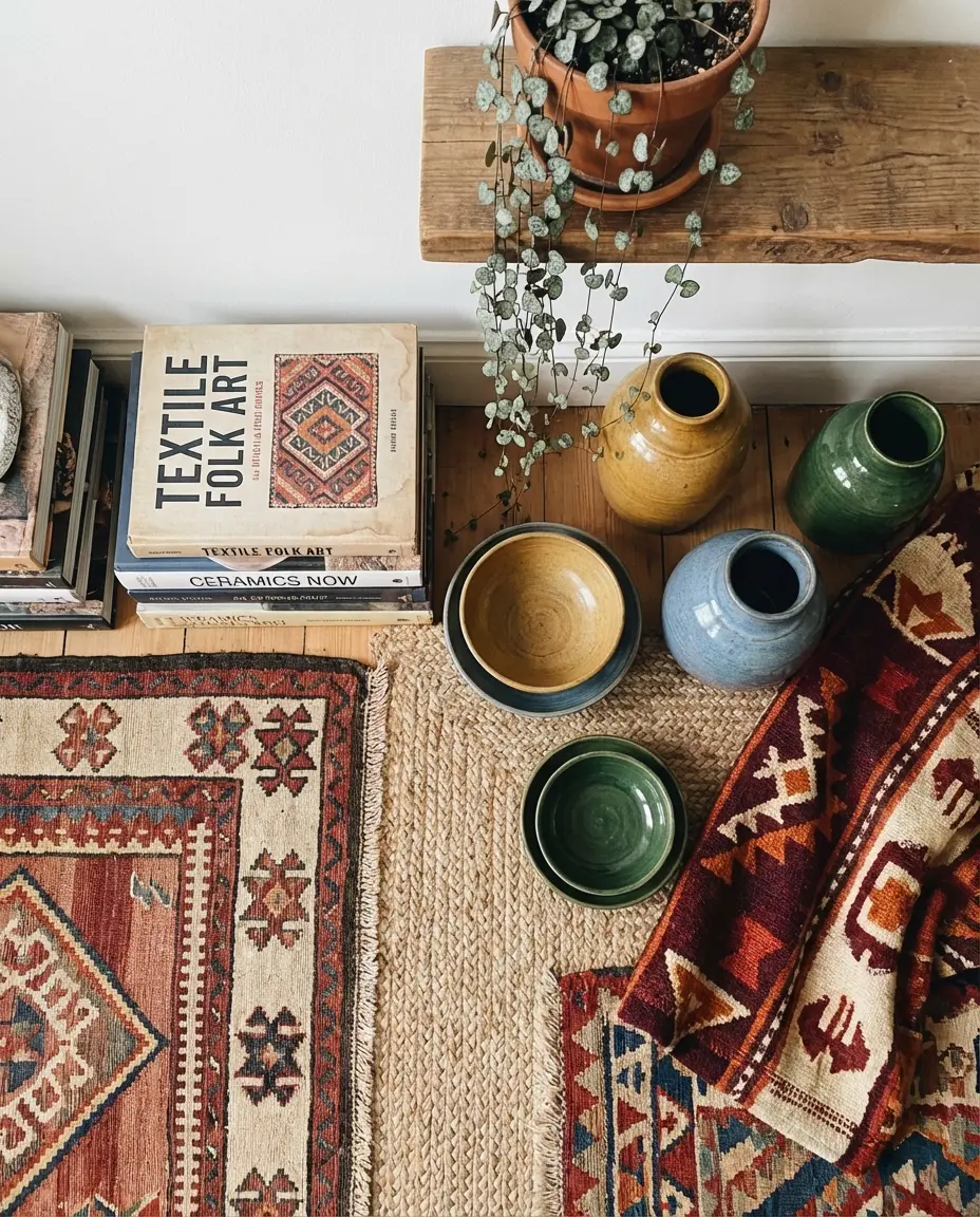
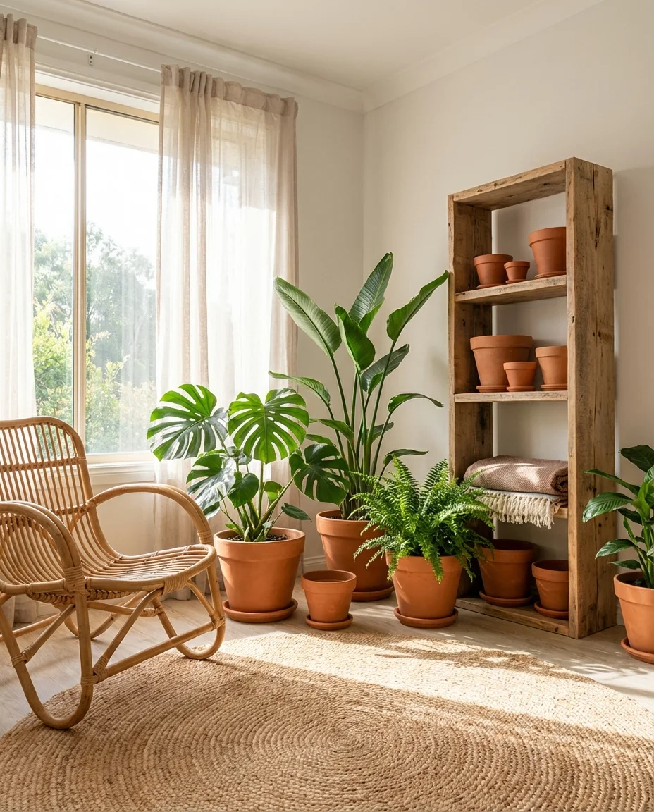
18. Earth Tone Layers with Woven Textures
Earth tones work best when they’re layered—warm browns, terracotta, burnt sienna, and soft ochre building on each other in a way that mimics the natural world’s own color compositions. When you introduce woven textures—a jute rug, a macramé wall hanging, a rattan chair, a chunky knit throw—the room gains depth and tactility that pure paint and smooth upholstery simply can’t achieve alone. This is the kind of living room that feels warm even before you turn the heat on, which is why it resonates so powerfully in American homes during fall and winter.
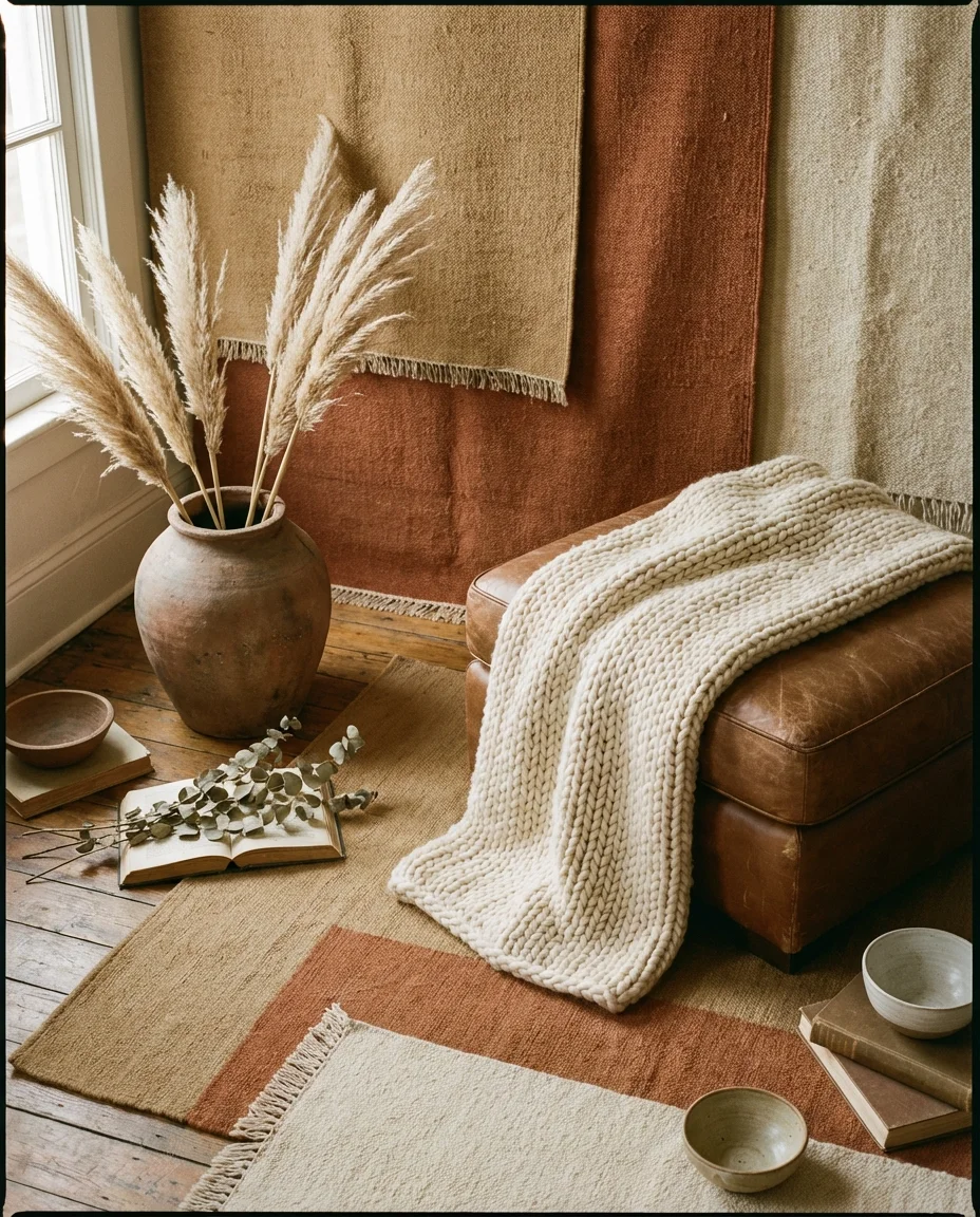
American lifestyle context: this design language has deep roots in the Pacific Northwest, where organic materials, muted color palettes, and a connection to the natural landscape have always informed interior choices. But thanks to Pinterest and Instagram, it’s spread well beyond Portland and Seattle into living rooms in Atlanta, Denver, and Kansas City. The warmth of the palette works regardless of climate, and the textures are achievable at every price point, from IKEA to Anthropologie to local artisan markets.
19. Bold Accent Wall in Cobalt or Teal
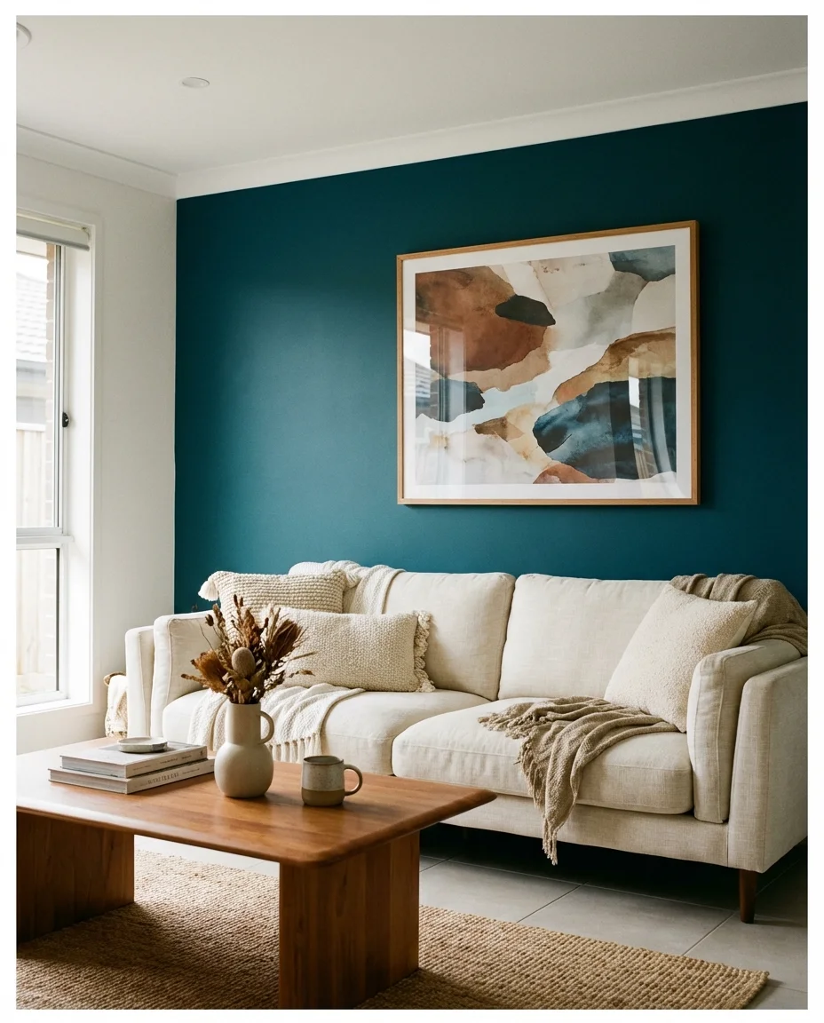
If you want maximum impact with minimum commitment, a single accent wall in a deep cobalt or teal is one of the most reliably successful moves in living room design. These colors have just enough depth to anchor an entire room without the full psychological weight of painting all four walls. The wall becomes an architectural feature in its own right—a backdrop for your sofa, your art, and your most-photographed corner. Paired with cream furniture and natural wood accessories, it’s sophisticated and approachable in equal measure.
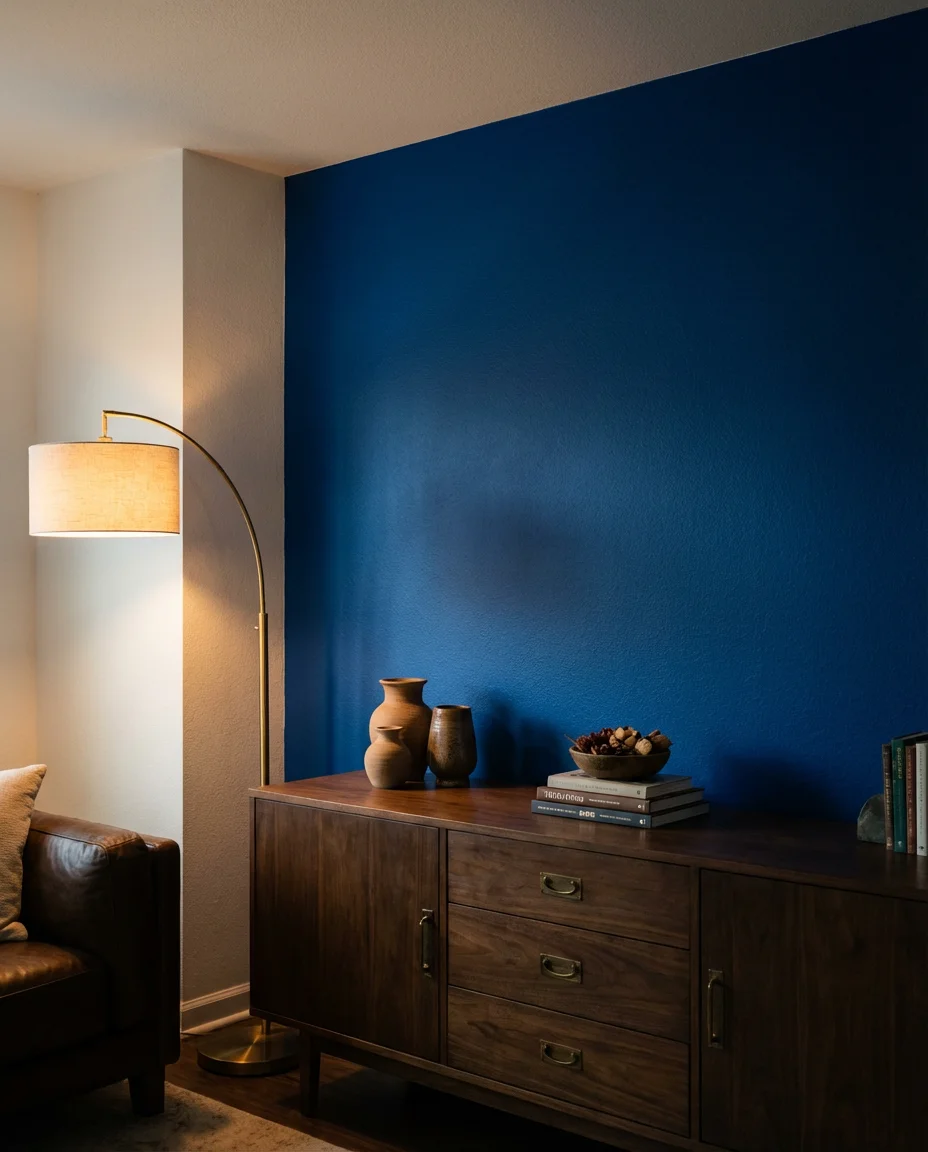
The most common mistake with an accent wall is choosing a color that doesn’t relate to anything else in the room—it ends up looking like an afterthought rather than a design choice. To avoid this, pull your accent wall color from something already present in the space: a rug, a piece of art, or a pillow fabric. That connection makes the wall feel like part of a deliberate composition. Even one small visual echo—a cobalt throw pillow, a teal ceramic on the shelf—is enough to tie the room together convincingly.
20. Cream and Blush Romantic Living Room
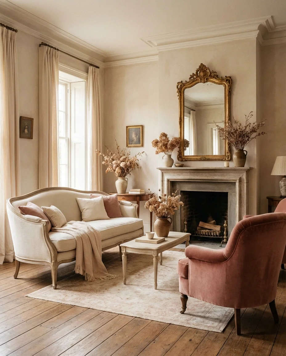
The combination of cream and blush creates one of the most effortlessly romantic living room palettes available—soft, luminous, and deeply flattering in both natural and artificial light. This isn’t a sugary look; when you ground it with antique gold metals, aged wood, and the occasional deep burgundy or dusty mauve, the whole composition grows up. Think French country meets modern American ease—something you’d find in a beautifully lit Brooklyn brownstone or a renovated Victorian in San Francisco’s Noe Valley.
Where this look works best: living rooms with good architectural bones—original moldings, bay windows, and herringbone floors. These spaces already carry a romantic energy, and the cream-blush palette amplifies it without overwhelming it. For newer builds or apartments with builder-grade finishes, adding a curved sofa silhouette and a chandelier or statement pendant light are the two fastest ways to introduce that romantic architectural feel without a full renovation.
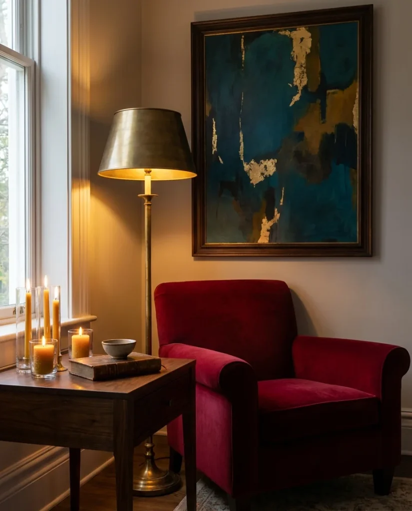
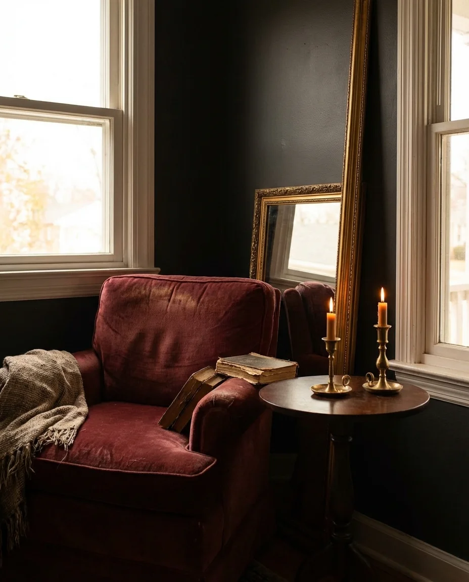
21. Moody Burgundy and Gold Living Room
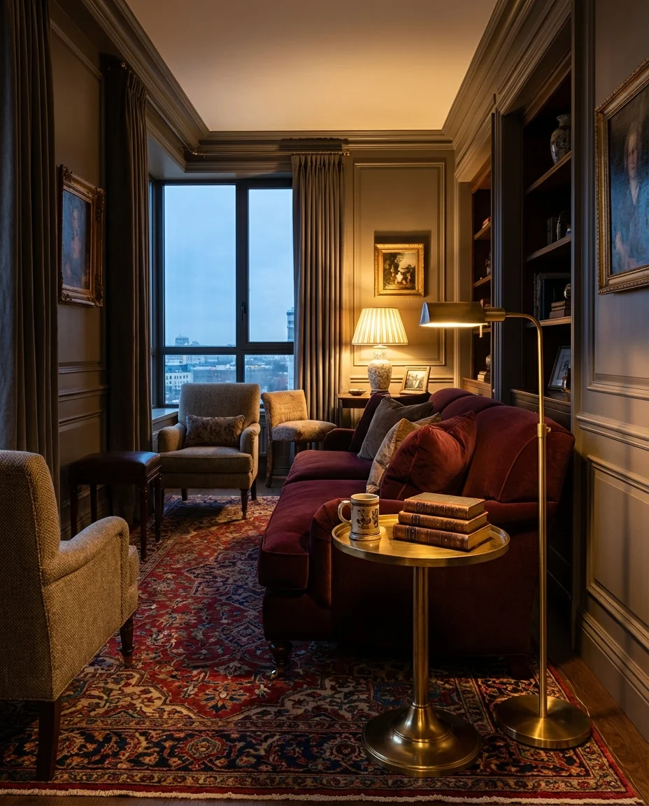
Burgundy and gold is one of the most opulent color pairings in interior design—bold, moody, and inherently theatrical in the best possible way. A deep wine-red sofa or set of curtains against a warm greige wall, punctuated by gold and brass accessories, creates the kind of living room that feels dressed for dinner every night of the week. This isn’t a daytime palette so much as an evening one—it blooms under lamplight and candlelight, growing richer and more beautiful as the day fades.
A micro anecdote: a designer working on a spec property in Nashville replaced a standard gray living room with this burgundy-and-gold palette the week before listing photos—and the listing received three times its average saves on Zillow compared to comparable properties on the same street. Color sells. And in a market where buyers are increasingly shopping with their emotions, a room that evokes warmth, luxury, and personality stands out in ways that safe beige simply never will.
22. Bright Citrus Accents on Grey Base
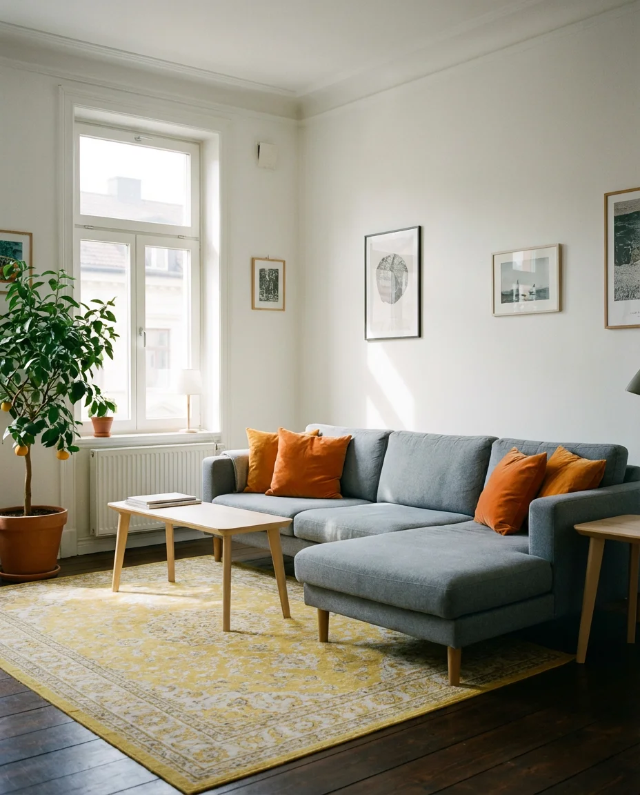
A gray couch or gray-toned room gets an instant energy injection when you introduce bright citrus accents—tangerine, lemon yellow, or lime green—in the form of throw pillows, a printed rug, or a pair of statement lamps. The pop of citrus color activates the coolness of the gray in a way that feels fresh and contemporary rather than cold. It’s particularly effective in urban apartments where natural light is limited, because the warmth of the citrus tones compensates visually for what the sun isn’t providing.
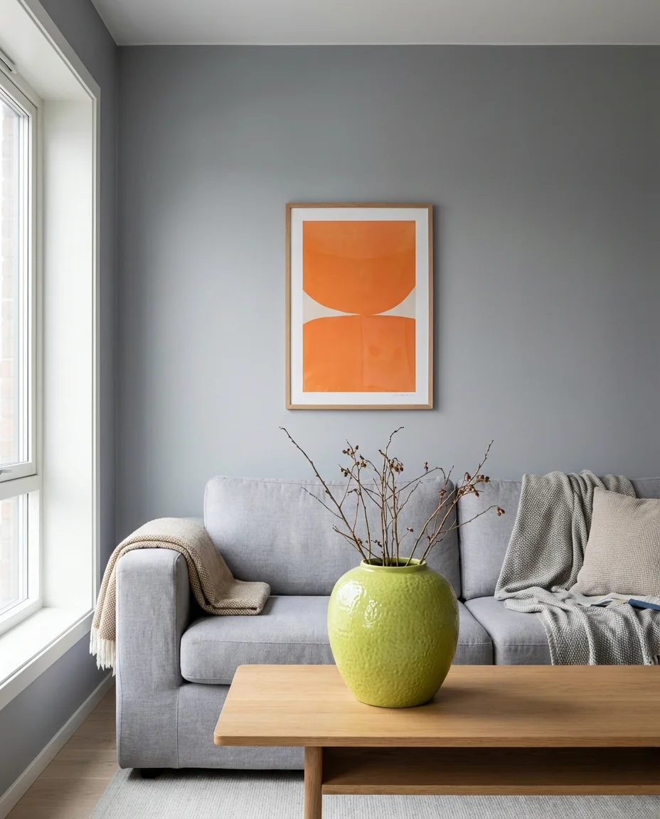
Real homeowner behavior insight: most people who attempt this look start too timid—one small citrus pillow barely registers against a full gray room. The trick is going slightly bigger than feels comfortable: a large-scale citrus rug, or three throw pillows instead of one, or a lamp and a vase both in the same warm tone. The citrus needs enough visual mass to hold its own against the cool gray base. Once you hit that threshold, the whole room snaps into focus with a clarity and joy that’s genuinely hard to achieve with any other color pairing.
Conclusion
There you have it—ways to bring color, warmth, and real personality into your living room in 2026. Whether you go all-in on a jewel-toned maximalist space or simply add a mustard throw to your existing gray sofa, every single one of these ideas is a genuine step toward a home that feels more like you. Which idea caught your eye first? Drop your favorite in the comments below—and if you’re working on your own colorful living room, we’d love to see what you’re creating.